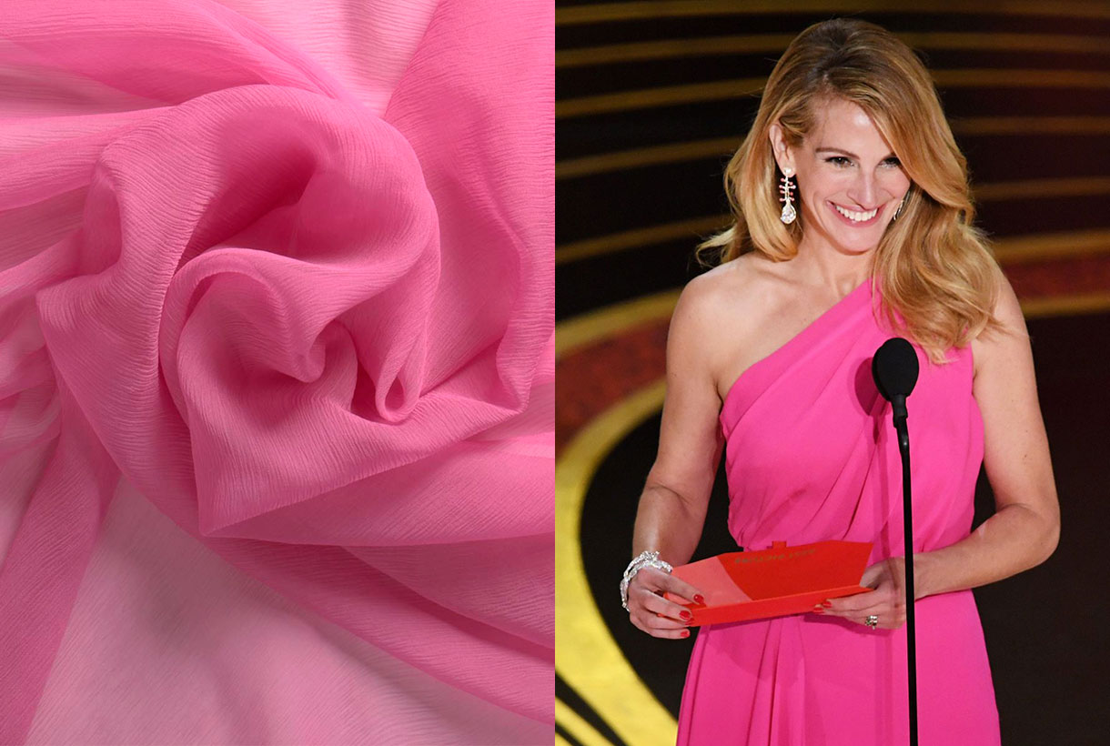
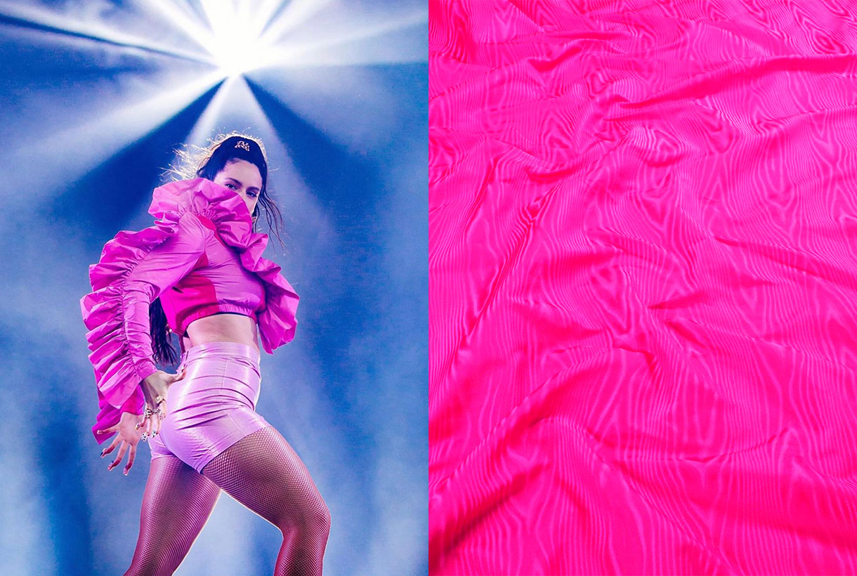
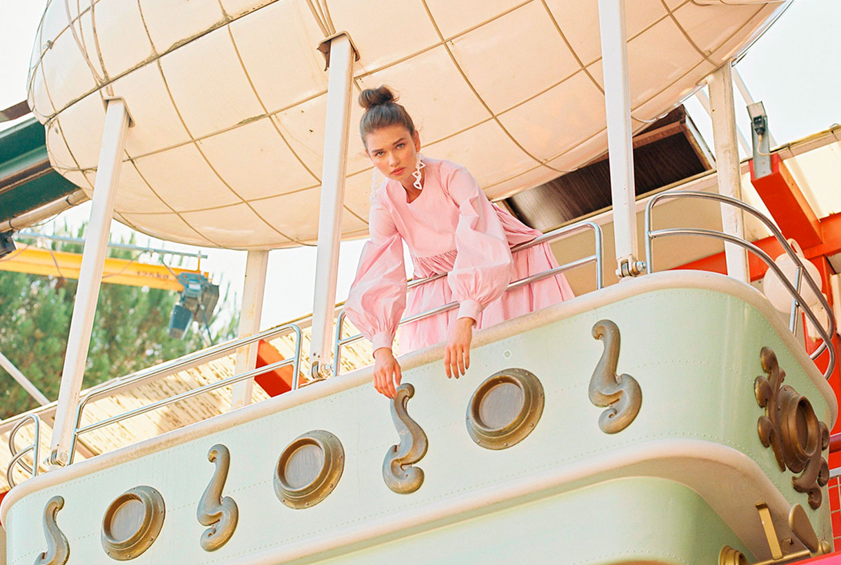
 Pink is a colour that generates debate. It never leaves you indifferent and its choice in fashion represents from the most classic to the most demanding femininity. The childish and the superfluous is tinged with pink, but also the controversial, the flashy as well as the minimalist. From Schaparelli pink to Millennial pink. Let’s review some anecdotes about one of our favourite colours via various seasonal fabrics.

The colour of delight, happiness and miracles
Rosa, Rosalía, Rosanna, Rosita and Rosamunda. They all come from the rose. The flower that names the colour in question. All the qualities attributed to the rose are considered feminine because traditionally the rose has symbolized the strength of the meek, delight and kindness. William Shakespeare wrote in ‘Romeo and Juliet’ a revealing comparison: “I am as polite as the colour pink” to symbolize the sensitivity that this colour radiates.
Happiness is also dressed in pink as it is a hue that evokes fantasy. A rosy world is too beautiful to be true or anyone who adopts the motto think pink seeks to live out their optimism in the face of a grey reality. When life is like a dream, the French have an expression that alludes to the colour in question: C’est la vie en rose, they say. A theme that Édith Piaf also immortalized.
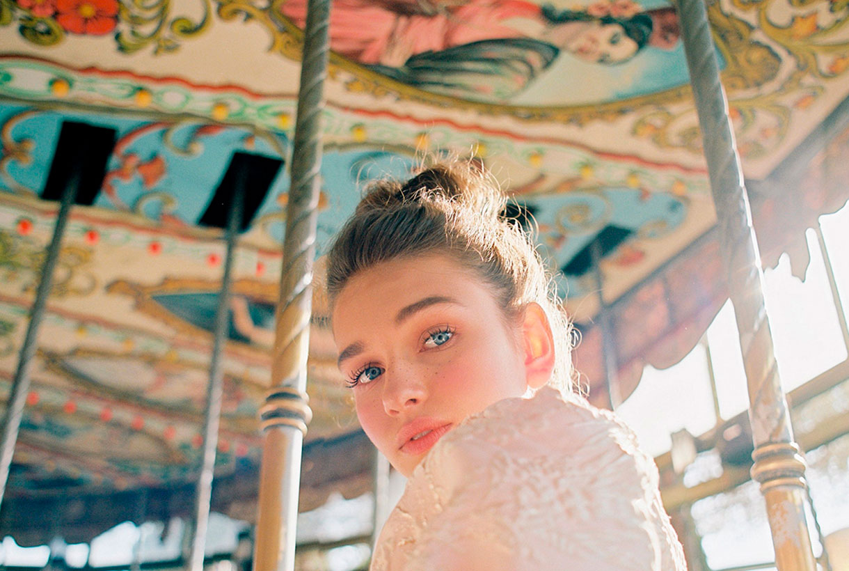
Pink in medieval paintings had also been linked to the colour of transfiguration, unreality, and extraordinary things. There are several works that represent the homeland or the life of a saint with pink details such as a house within a city or a pink aura around a person. The people of the time linked that colour with that of miracles.
Instead today’s artists (designers, illustrators, cartoonists …) use pink from a creative point of view to surprise the viewer through colour. When pink is used in an unconventional way, it directly draws attention and appeals to the object or subject in question. The most famous Panther in the world of cinema and comics is not exactly black.
Tender and sweet pink
Pink is soft and tender and on a psychological level it is associated with delicacy. Pink makes us think of skin, softness and youth. Pink also expresses sweetness. It is the colour of confectionery, delight and cloying. We know that any edible product with a sweet wrapper is a food with a mild, appetizing and sweet taste. Not in vain is it the most used colour in pastry shops or sweet shops that unconsciously seduce consumers through the tempting pink tones.
From masculine pink to feminine pink
Pink has not always been a colour associated with the “typically feminine.” In fact, before the 20th century it was considered a masculine colour. For example, in ancient religious paintings the Child Jesus was often painted in pink, the diminutive of red, and the Virgin Mary in an indigo blue cloak. Another example. Today’s pink press dedicated to a predominantly female audience would contrast with the typically male financial newspapers, such as the Financial Times and the Gazzetta dello Sport, which continue to be printed, in accordance with the old tradition, on pink paper.
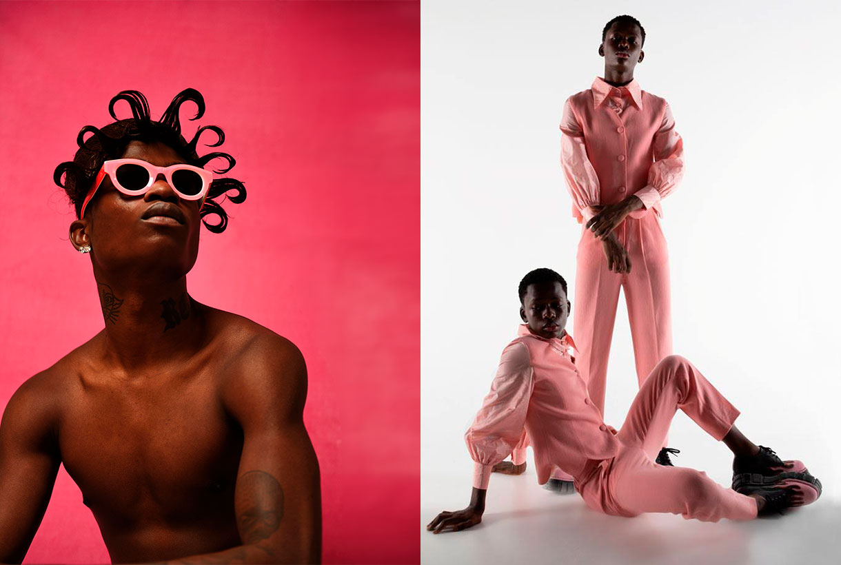
On the other hand, the convention to award pink to girls and light blue to boys arose around 1920. Before that little boys and girls were all clad in white. If they wore ribbons, they were almost always red, because according to tradition, this colour protected against the evil eye. After the First World War red disappeared from all men’s civilian fashion. At this time there was also a real revolution in clothing: the so-called “reformist fashion” that freed women from corsets and created a specific fashion for children who wore sailor suits and dresses, dyed with artificial indigo, the new fashion dye. Sailor suits derived from an almost forced logic, suggesting that light blue was the colour for boys and its opposite, pink, was awarded to girls. During World War II this message was reinforced through government propaganda with a “pink for a girl” mental association. In fact, in advertising, those perfect wives who took care of the children and the home wore dresses of that colour. At that time it also became the colour of discrimination: homosexuals who could not satisfy the ideal of masculinity were locked up in concentration camps and wore a pink triangle sewn to their clothing to distinguish them. The colour pink is indeed currently often identified with this group (the pink collective) who see in this shade a positive connotation of identification and of struggle to claim their rights.
From Pompadour pink to Schiaparelli pink
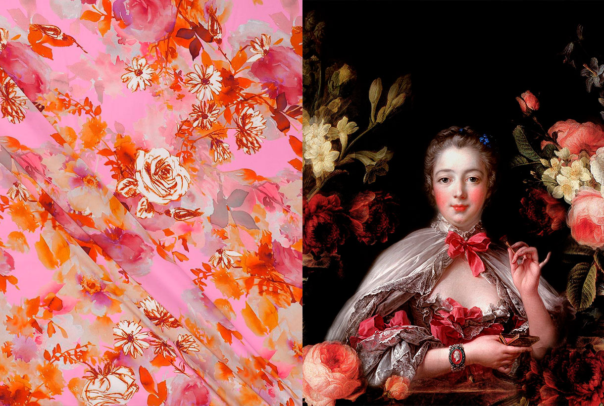
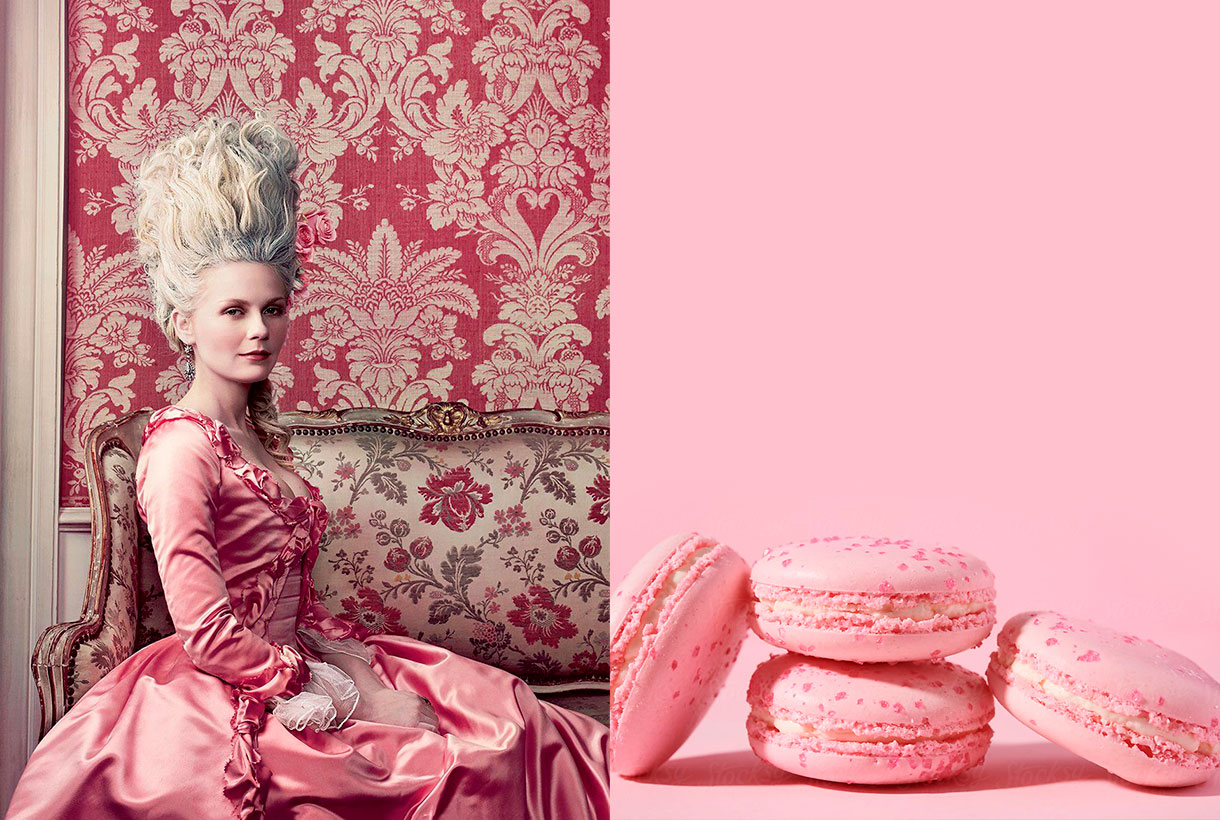
During the Rococo period, which lasted from approximately 1720 to 1775, the pastel colours dictated by the French court, which set the fashion of the time throughout Europe, were all, the rage. Aqua greens, straw yellows, azure blues, and powdery pinks were worn by aristocratic men and women alike. Madame Pompadour (1721-1764), prototype of the Rococo lady, lover of art and exquisite taste, made the combination of pink and light blue fashionable, something which today seems typical of this artistic movement. Today the Pompadour rose still endures, a princely rose that the porcelain makers of Sèvres created for the lover of the King of France Louis XV: a rose with obvious traces of blue, some black and yellow.
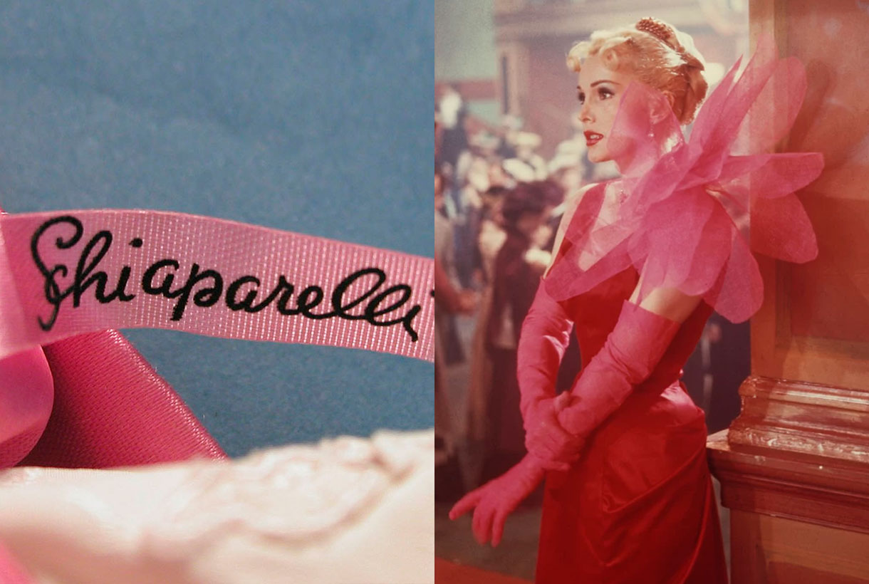
In fashion there is another rose worthy of mention, precisely because it does not go unnoticed: Elsa Schiaparelli‘s shocking pink. In 1931 the Italian dressmaker, who brought the ideas of surrealist painters into fashion, launched a new colour: shocking Pink (magenta with a hint of white). She also created a perfume that she called by the same name and which was sold in a box of that garish colour that scared the public by its aggressiveness. Yes, pink could be subversive and transgressive. In fact, this colour is currently used in outfits aimed at attracting attention whether on a runway or a red carpet.
Interestingly, Pink is the loudest colour in the range of roses. It is the colour that is usually present in advertising not very serious objects, the most strident accessories in fashion and the cheapest or most banal plastic articles.
The pink of the millennial generation
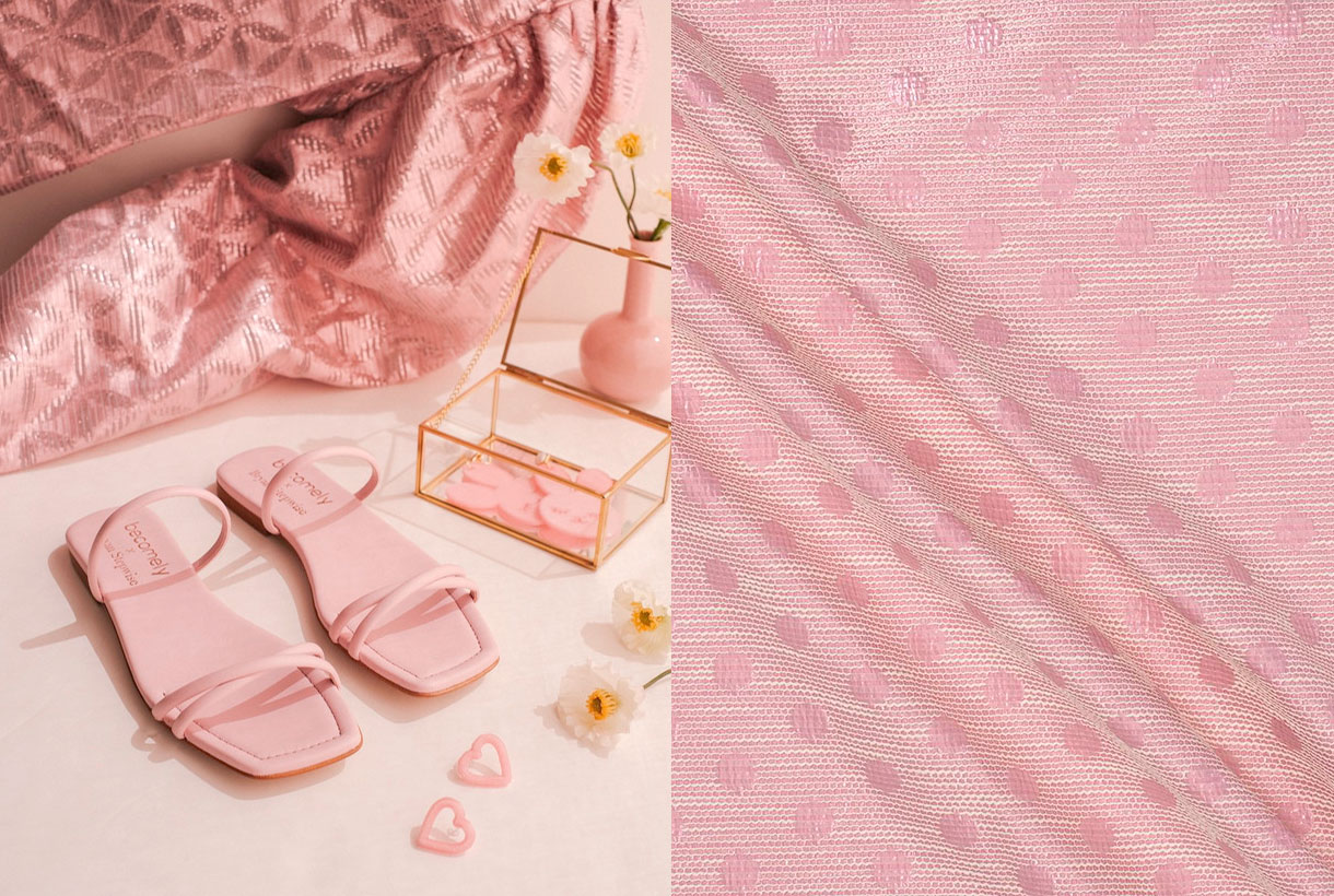
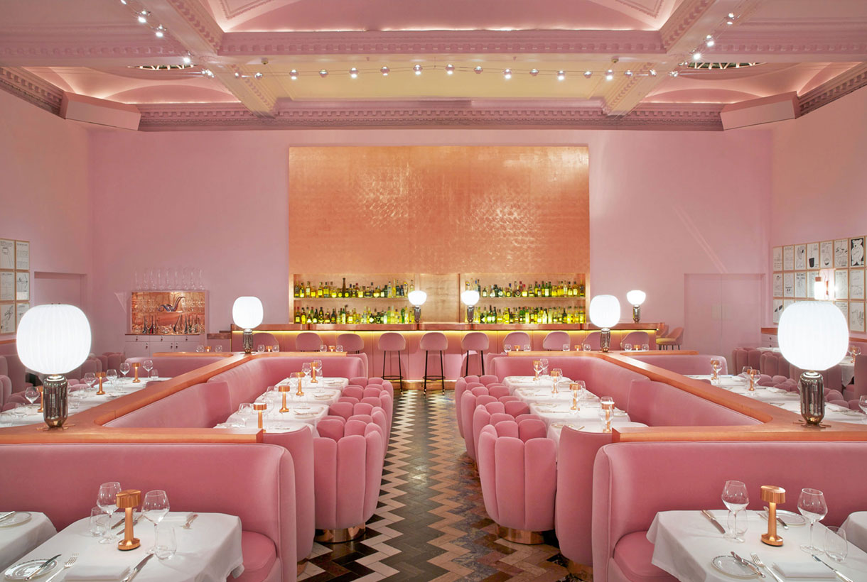
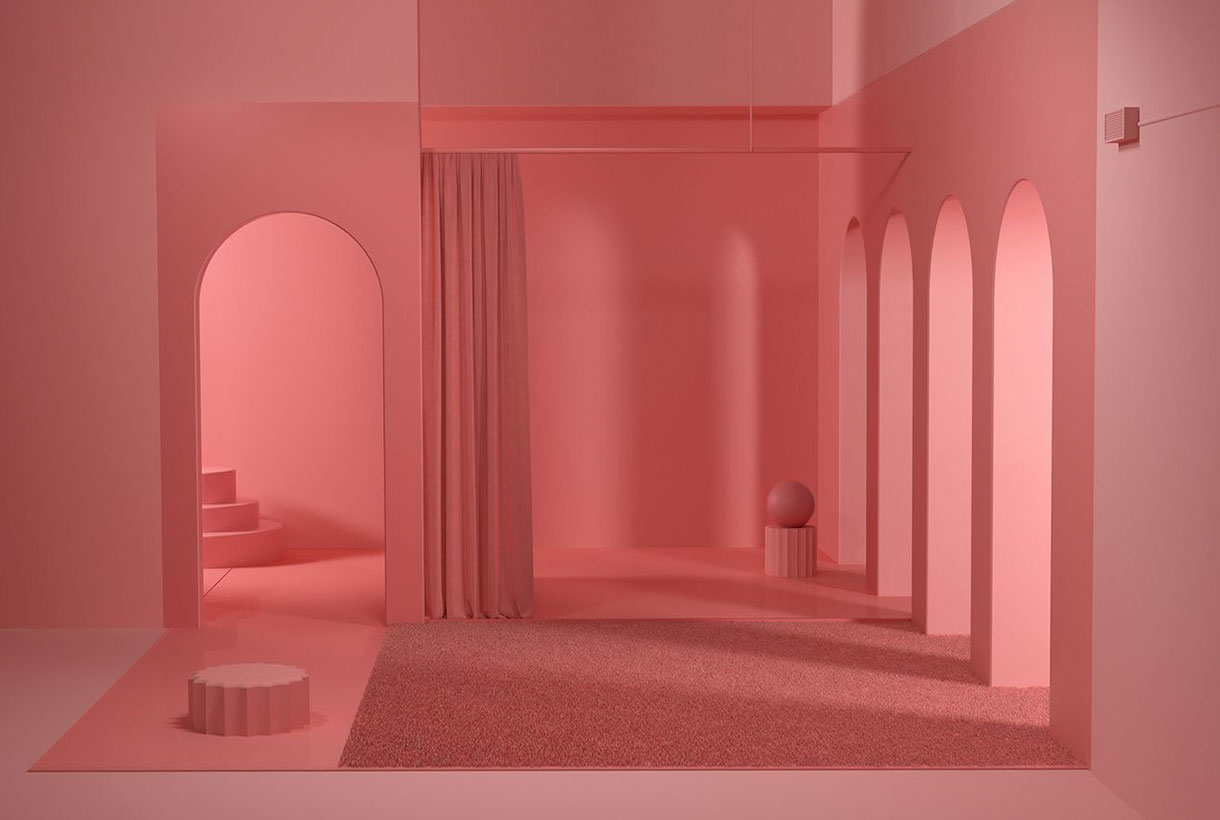
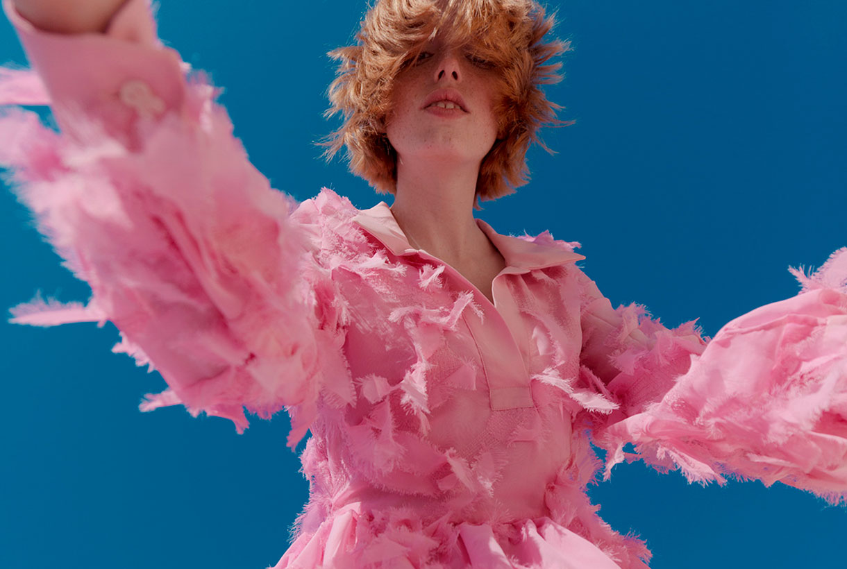
There is a type of pastel pink that has been appropriated by millennials during the first decade of the 21st century. A neutral tonality that unifies genres, identifies a generation and that has taken over a cultural movement that ranges from fashion to cinema. For example, millennial pink has been seen in Wes Andersen’s movies or on the fashion-parades of Valentino, Marni, Dolce & Gabbana, Hermès or Dries Van Notens. A tone that has also appeared throughout the world of design, from social media and printed materials to furniture. This pink, which mixes salmon tones, conveys a sense of calm and is associated with words like “youthful” and “accessible”, explaining why so many modern companies have been so drawn to it. Millennial pink fever broke out in 2016 when Pantone announced quartz pink, a candy-cotton-like shade, as its colour of the year. Although generation Z has taken over from the new youth by appropriating other colours, this type of pink is still very present in today’s society.
