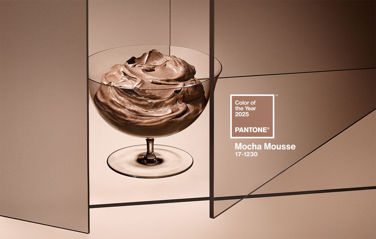
 Mocha Mousse. Pic by Pantone
Imagine a creamy dessert that combines the aromas of cocoa, chocolate and coffee, with evocative textures and an intense brown tone that awakens both the sight and the palate. This suggestive image, which mixes everyday life and small pleasures, connects directly with the colour of the year 2025 chosen by Pantone: 17-1230 Mocha Mousse. This shade, described by the company as “a soft and evocative brown, but also intense and warm”, invites our senses to enjoy pleasure and exquisiteness.
A colour that opens the appetite
Mocha Mousse, suggestive and inspiring, takes over from Peach Fuzz 13-1023, the delicate peach shade that was the colour of the year 2024. “Inspired by our desire for everyday pleasures, 17-1230 Mocha Mousse expresses a level of thoughtful pleasure,” explains Leatrice Eiseman, executive director of the Pantone Colour Institute, as said in the new release announcing the long-awaited reveal. “Sophisticated and exuberant, yet an unpretentious classic, this colour expands our perception of browns as humble, understated tones to embrace aspiration and luxury. Infused with subtle elegance and earthy refinement, it presents a touch of understated, tasteful glamour,” says Eiseman.
Connecting with the origins
Although some on social media have criticised the choice of brown, associating it with the current period of instability and lack of authenticity, Pantone defends its decision by highlighting the growing search for connection with nature and the origins of humanity. “Characterised by its organic nature, 17-1230 Mocha Mousse honours and celebrates the sustenance offered by our physical environment. Infused with authenticity, it strikes a balance between the demands of modernity and the timeless beauty of artistic creation,” the company explains.
Laurie Pressman, vice president of the Pantone Colour Institute, describes Mocha Mousse as an extension of Peach Fuzz that came before it, sharing its essence of comfort but taking it a step further by including “the simple pleasures we can give away and share with others,” like a glass of mocha mousse. “The eternal quest for harmony permeates every aspect of our lives: our relationships, the work we do, our social connections, and the natural environment around us. This colour brings us contentment, inspiring a positive state of inner peace, calm, and balance, while attuning us to the world around us. Harmony encompasses both a culture of connection and unity and the synthesis of our mental, spiritual, and physical well-being,” Pressman details, highlighting how this shade reflects that longing for connection and balance.
How is the colour of the year created?
Pantone, the global authority on colour and a set of professional standards for the design community, began defining the colour of the year in 1999. The first choice was the iconic cerulean blue (Pantone 15-4020), a shade that achieved worldwide fame thanks to the film The Devil Wears Prada, released seven years later. In this film, Meryl Streep, as the feared Vogue editor, immortalised the colour with an unforgettable fashion speech to Anne Hathaway: “What you don’t know is that that sweater isn’t just blue. It’s not turquoise, and it’s not navy. It’s actually cerulean.”
The initial goal of this initiative was to generate conversation around colour, involving both the design community and colour enthusiasts. But choosing the colour of the year is not a simple or arbitrary process. Behind this decision there is a rigorous analysis. Each year, a committee of colour experts studies cultural, artistic and social trends worldwide to identify significant references. Based on this analysis, they select an existing colour from the Pantone catalog and name it with an easy-to-remember name.
Over the years, these choices have reflected the global socio-economic context: from Marsala, which evoked the world of wine in 2015, to the double choice of 2021 – Illuminating yellow and Ultimate Grey – which symbolised the challenges of the pandemic. In 2022, Very Peri, a bold lavender shade, connected the real world with the digital one. Beyond their beauty, these colours invite a reflection on the times we live in.
In 2010, Pantone expanded its reach beyond the design niche to connect with the general public, adapting to new creative disciplines inspired by colour. This is when two key initiatives emerged: the Pantone Colour Institute and the Colour of the World. the Year. These proposals not only investigate and promote the use of colour, but have also transformed the brand’s marketing strategy, turning it into a global trend. Today, the colour of the year directly influences product development and purchasing decisions in sectors such as fashion, decoration, design and advertising.
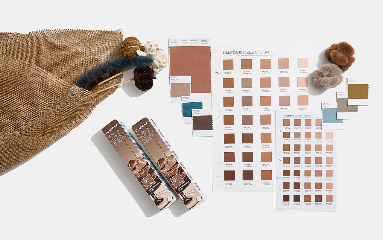
The Pantone guide, which began with 500 colours for the graphic arts, now has more than 2,000 references. Every 18 months, new and more precise shades are added, reflecting the evolution of colour in our daily lives. Today, Pantone is a multinational with a strong global presence. Since its acquisition by X-Rite, a company specialising in colour management, the company has grown exponentially. With 17 offices around the world, Pantone markets everything from its famous guides to branded products and strategic alliances. Recent examples include collaborations with Motorola for smartphones, special editions of Jägermeister bottles , and even coffee capsules in partnership with Nespresso, a partnership that raises the question: have these capsules inspired this year’s colour choice?
In 2025, to celebrate the 26th anniversary of the Pantone Colour of the Year, the company has taken the colour beyond its guides, highlighting it at global events and experiences. From New York and London to Shanghai and Mumbai, Pantone has curated public spaces and gatherings to make the colour of the year accessible to everyone.
The gentle elegance of Mocha Mousse: applications in fashion and design
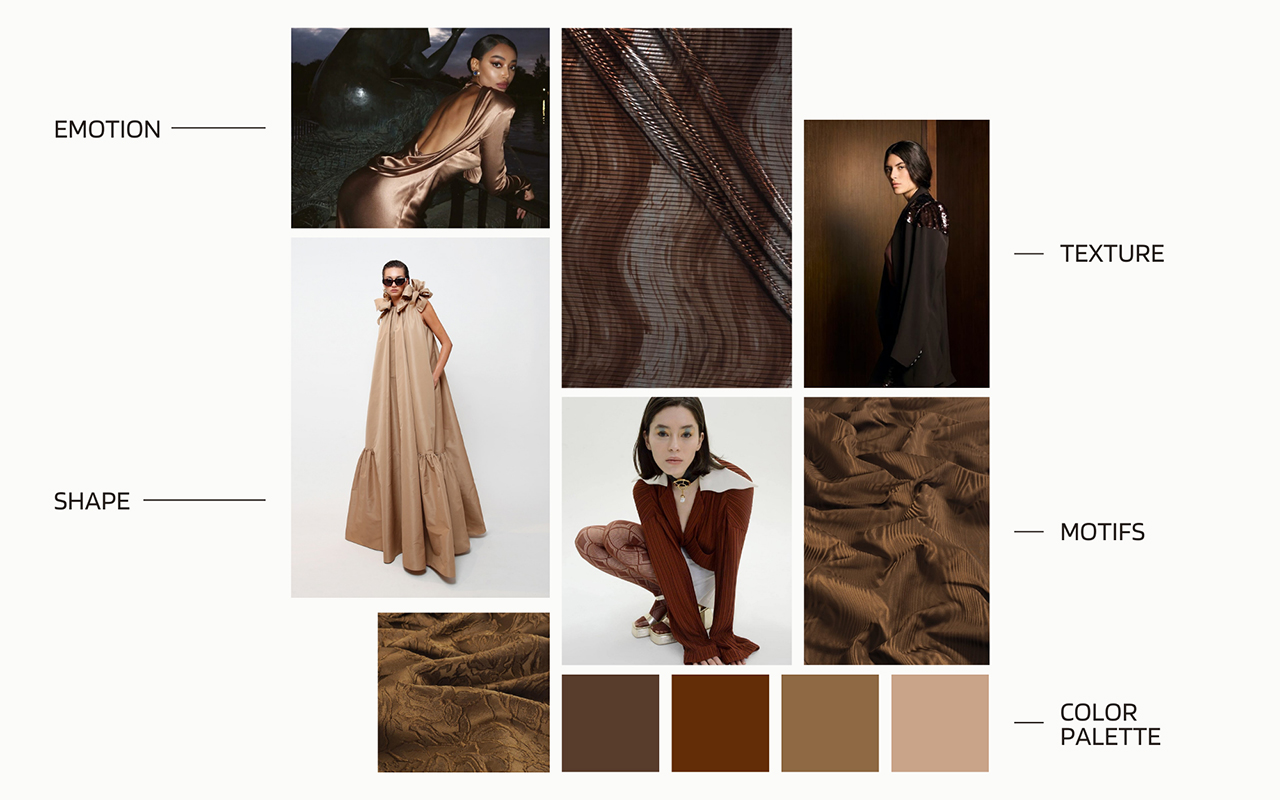
In the fashion world, Mocha Mousse is positioned as a highly versatile neutral shade. Dubbed “the colour of unpretentious elegance,” this shade stands out for its ability to create warm, minimalist looks that blend with different skin tones, creating a chromatic camouflage effect. The colour of the year 2025 also redefines our perception of brown, taking it from humble and earthy to luxurious and aspirational.
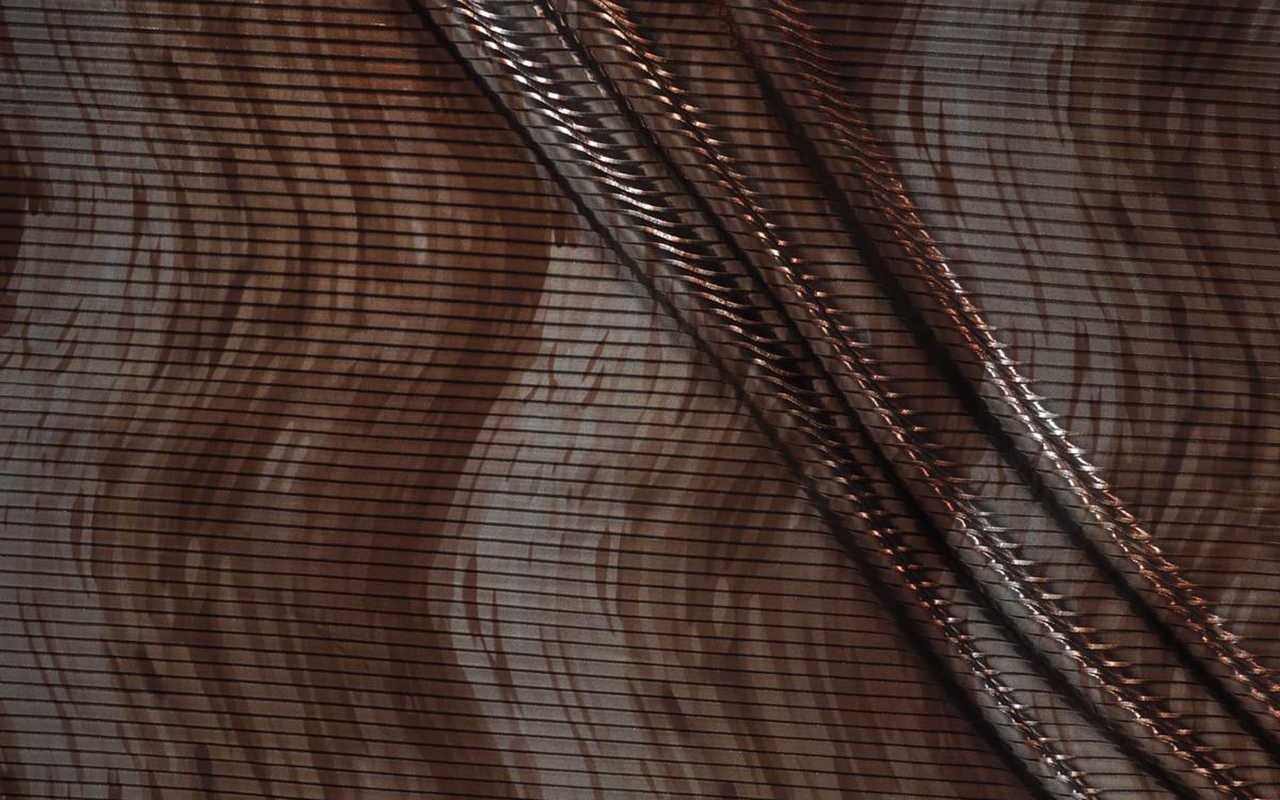
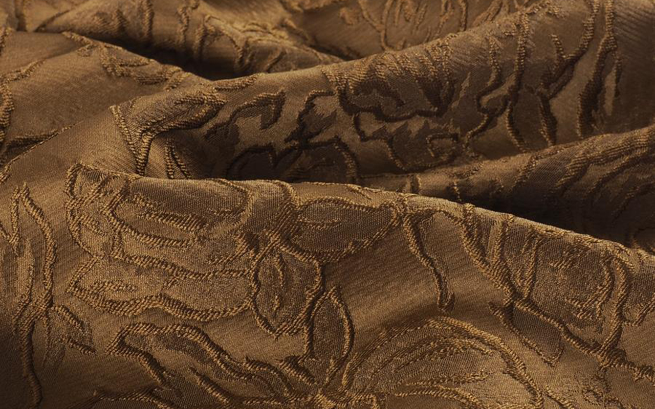
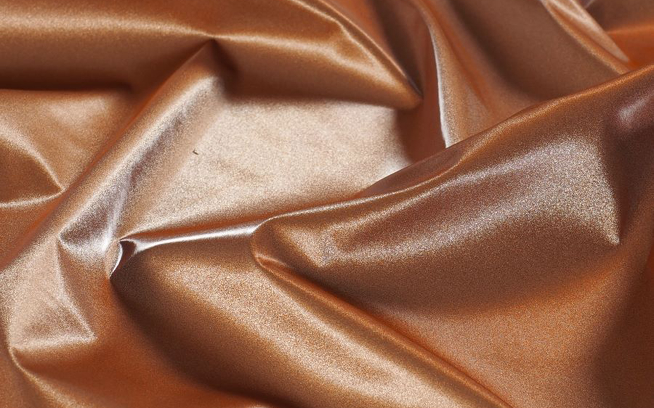
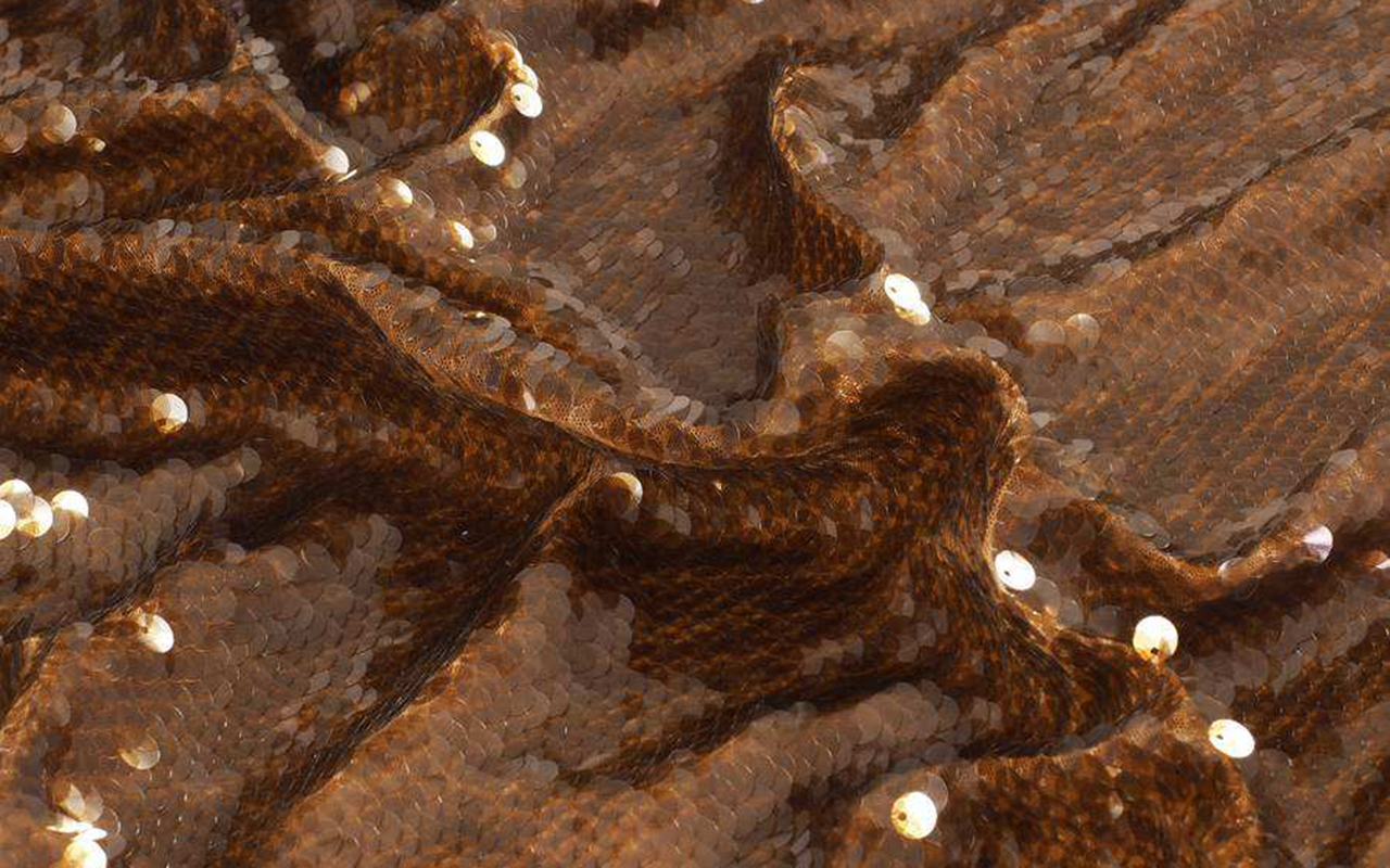
Translating this to the textile world, Mocha Mousse offers endless possibilities. Its sensorial warmth is reflected in fabrics with a delicate touch such as cashmere, angora, soft velvet and furry textures that envelop and comfort. It also shines in lighter materials such as airy chiffons, fluid satins or knits that provide movement and draped elegance. This shade, imbued with earthy refinement, embodies an organic and authentic luxury, promoting minimalist looks that opt for simplicity without artifice.
Mocha Mousse also adapts to various textures and finishes. From matte surfaces that highlight its naturalness to shiny or metallic finishes that give it a sophisticated touch, this colour works as a perfect base for bold colour combinations or monochromatic looks full of depth.
In decoration and interior design, Pantone 17-1230 Mocha Mousse connects with our desire for well-being and comfort. This earthy and refined brown brings a feeling of warm home, whether on floors, painted walls or decorative elements. Its presence stands out in natural materials such as wood, stone, rattan, wicker or leather, offering a balance between sophistication and homely warmth.
At Gratacós, we have selected some key fabrics that connect this colour of the year with our new collection. From luxurious textures to versatile finishes, you will find inspiration to bring Mocha Mousse to your fashion and design projects.
