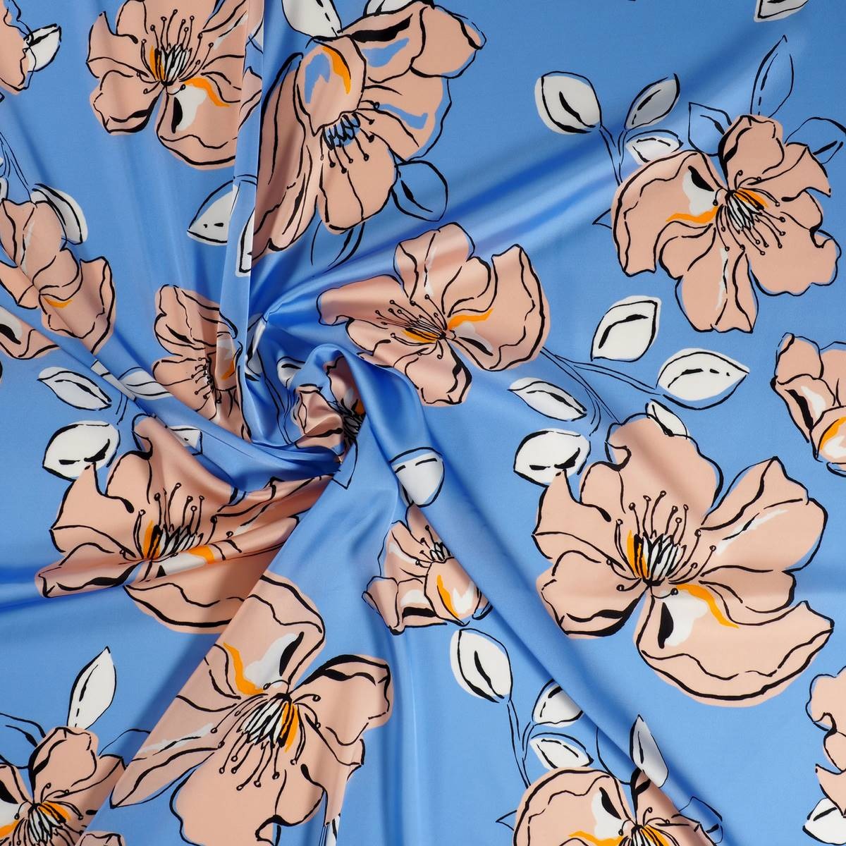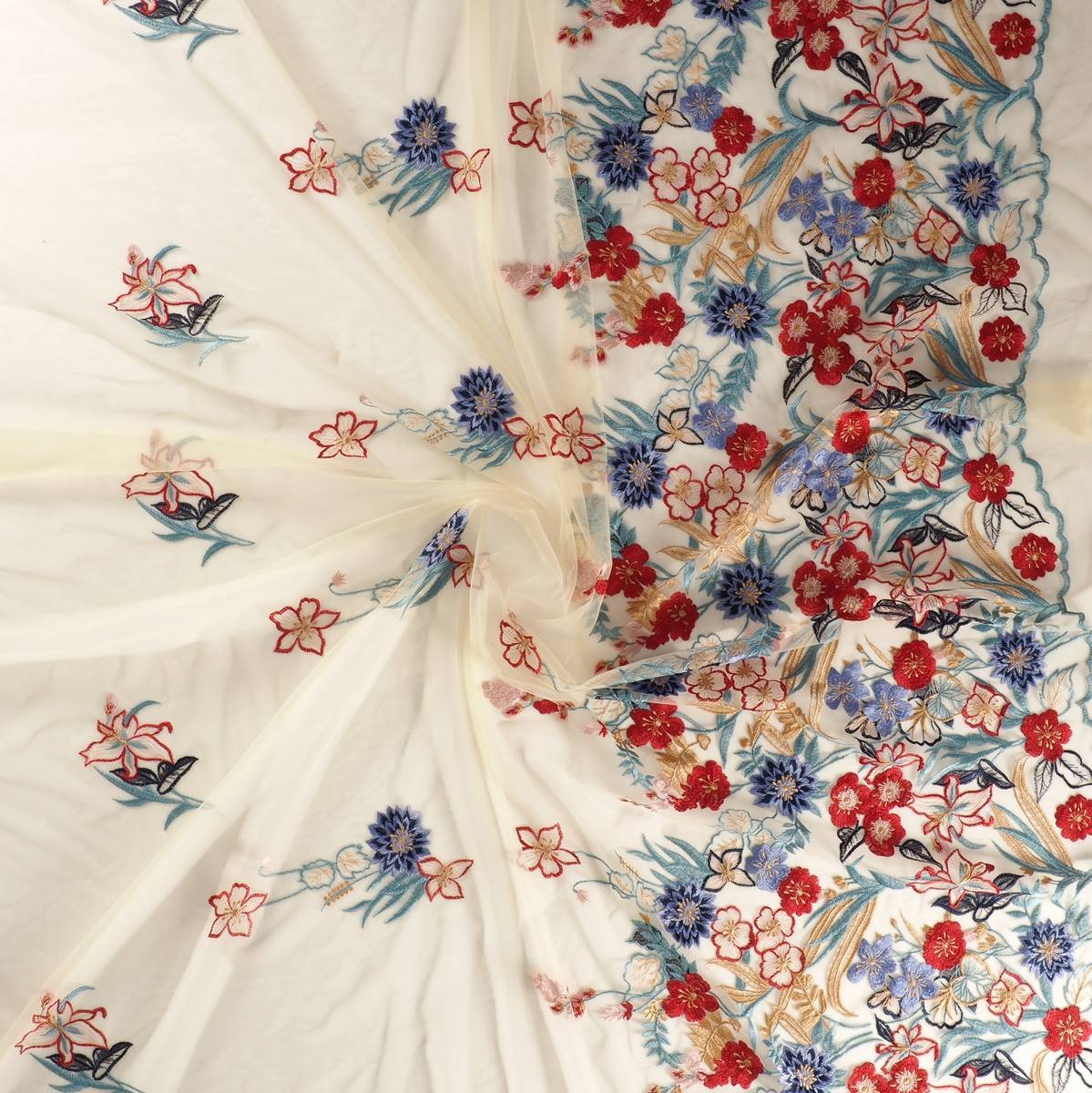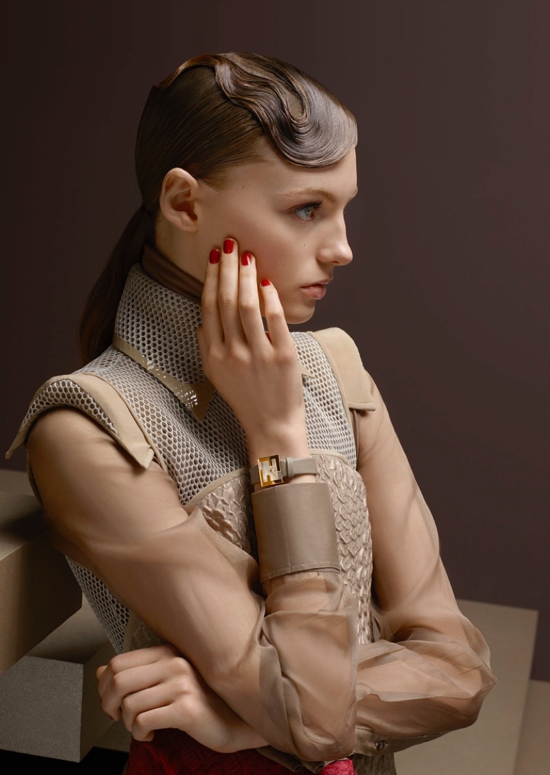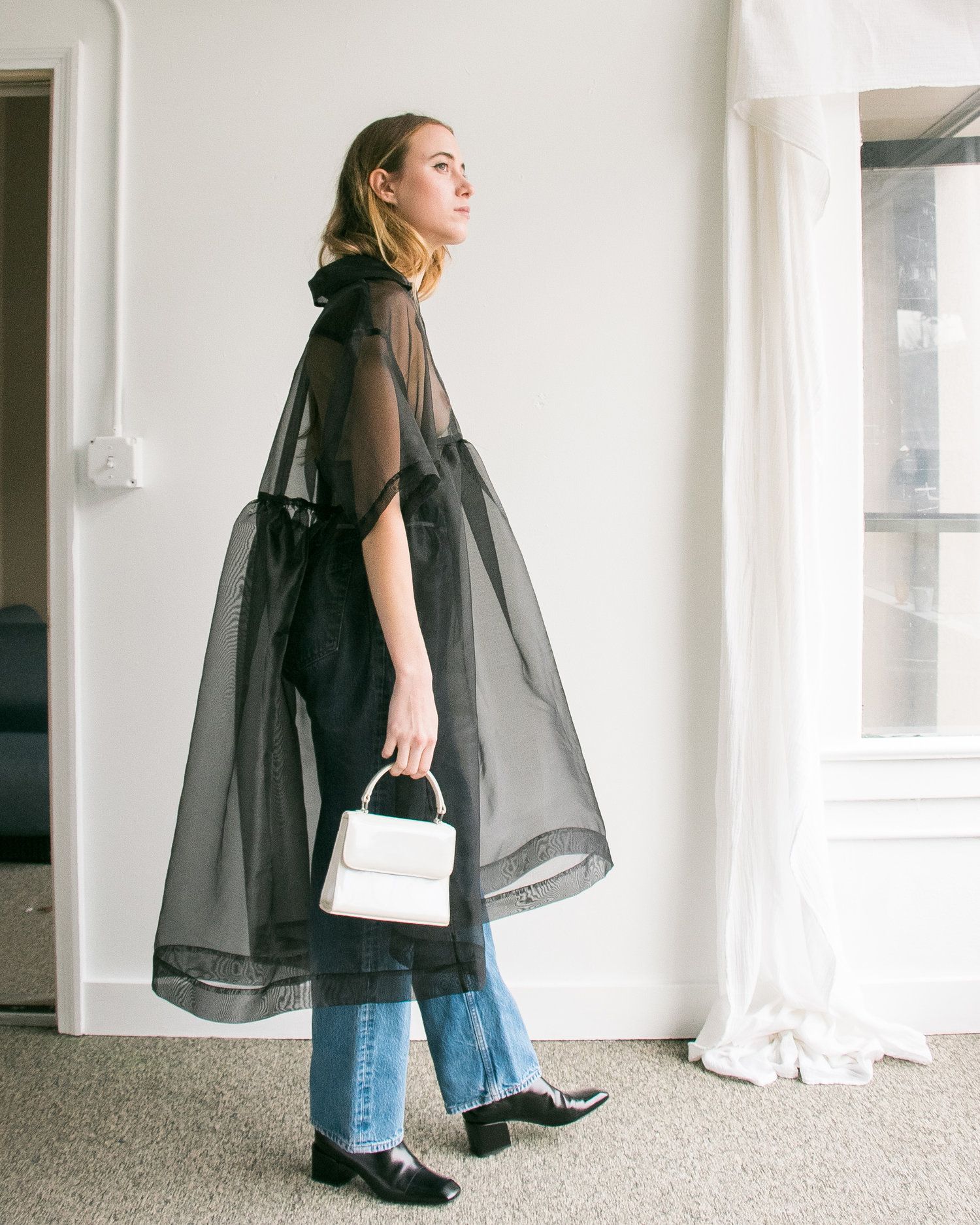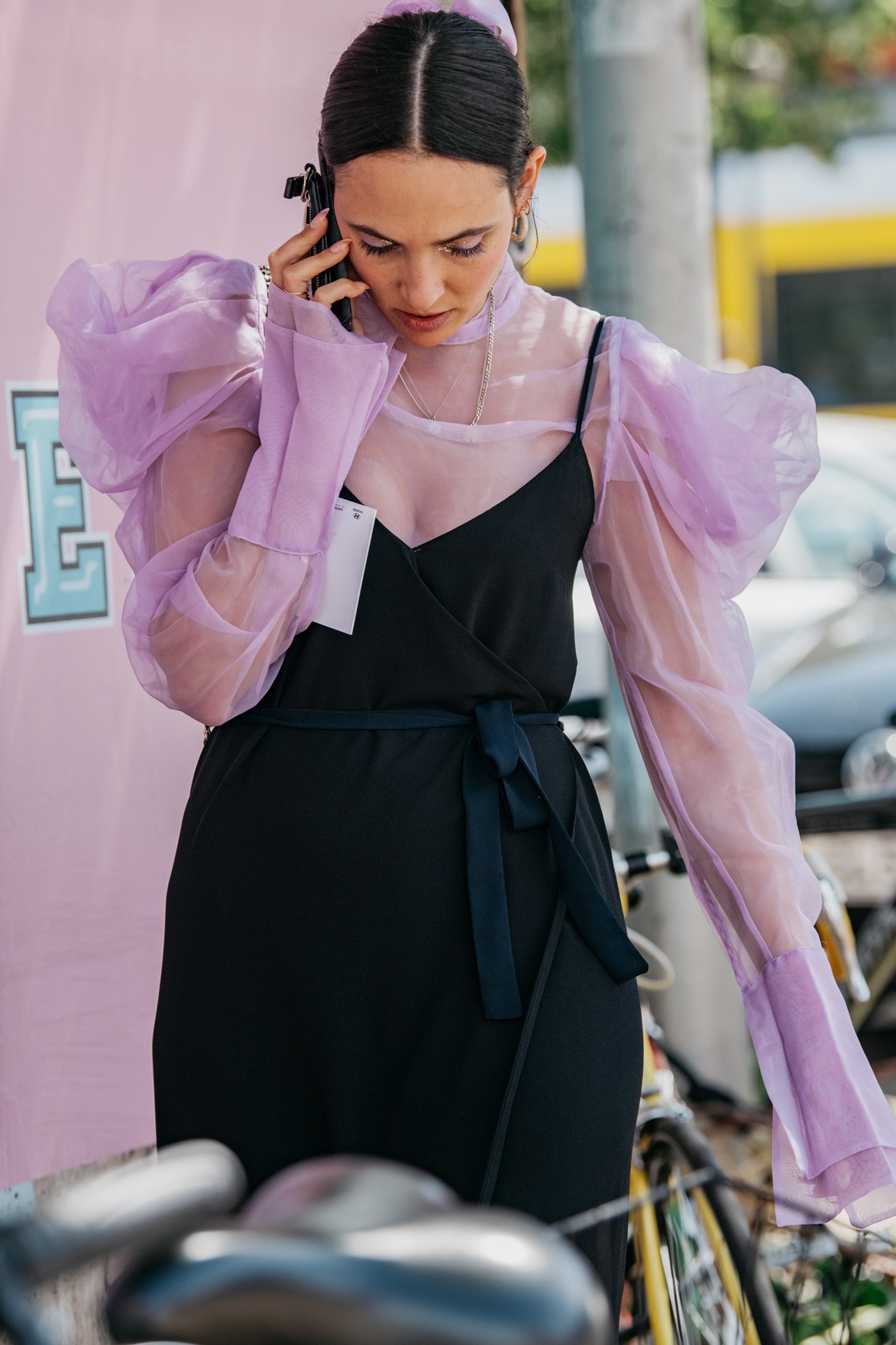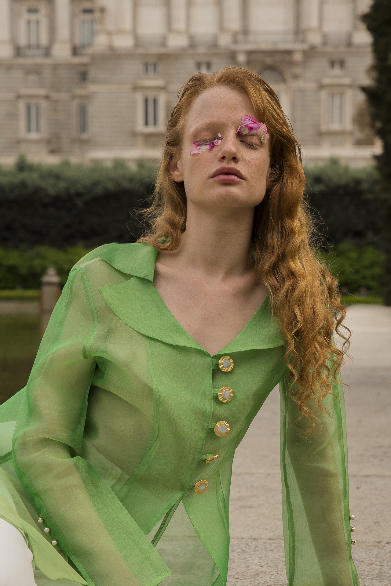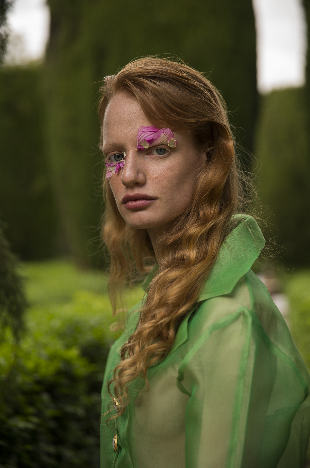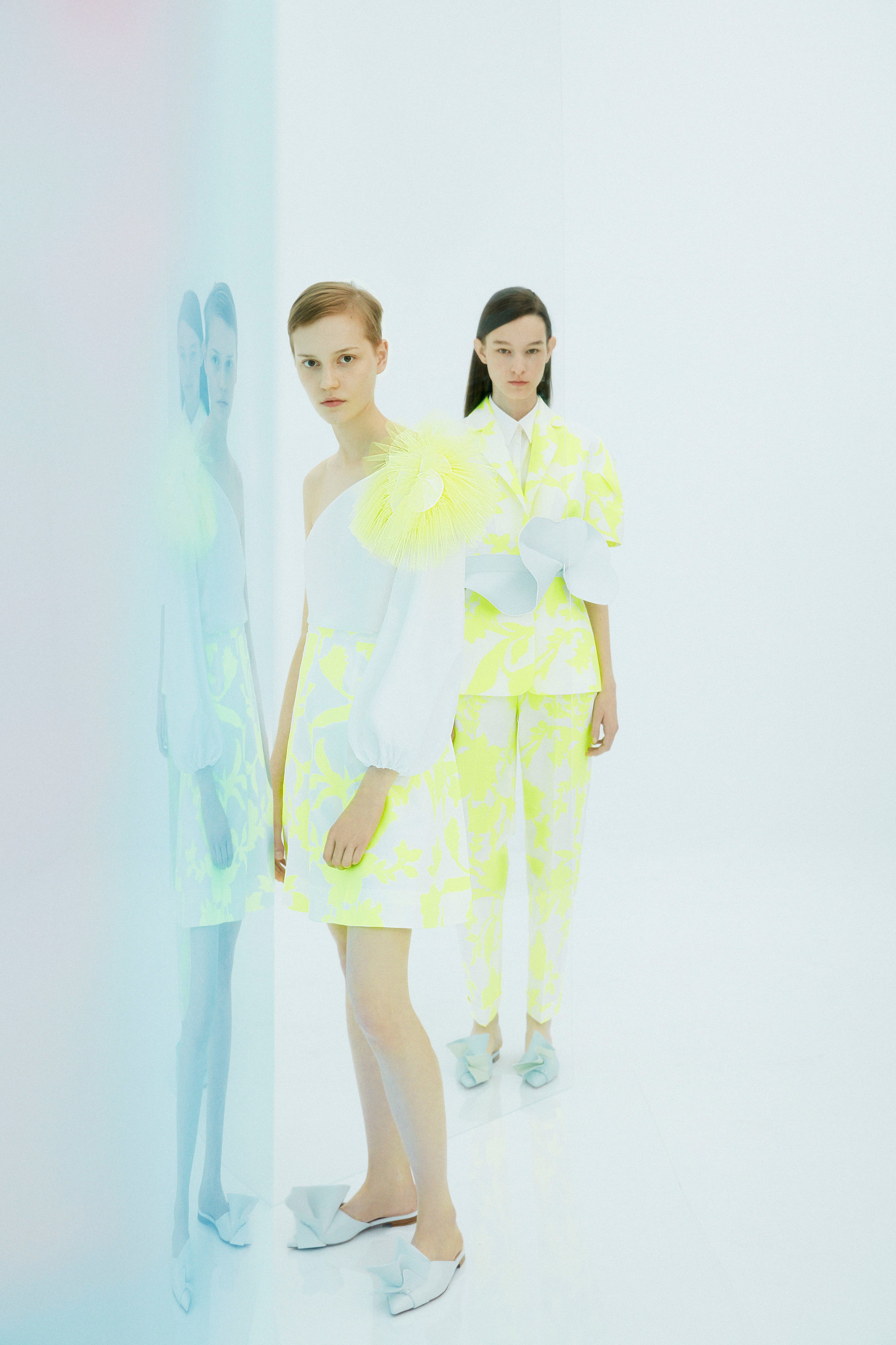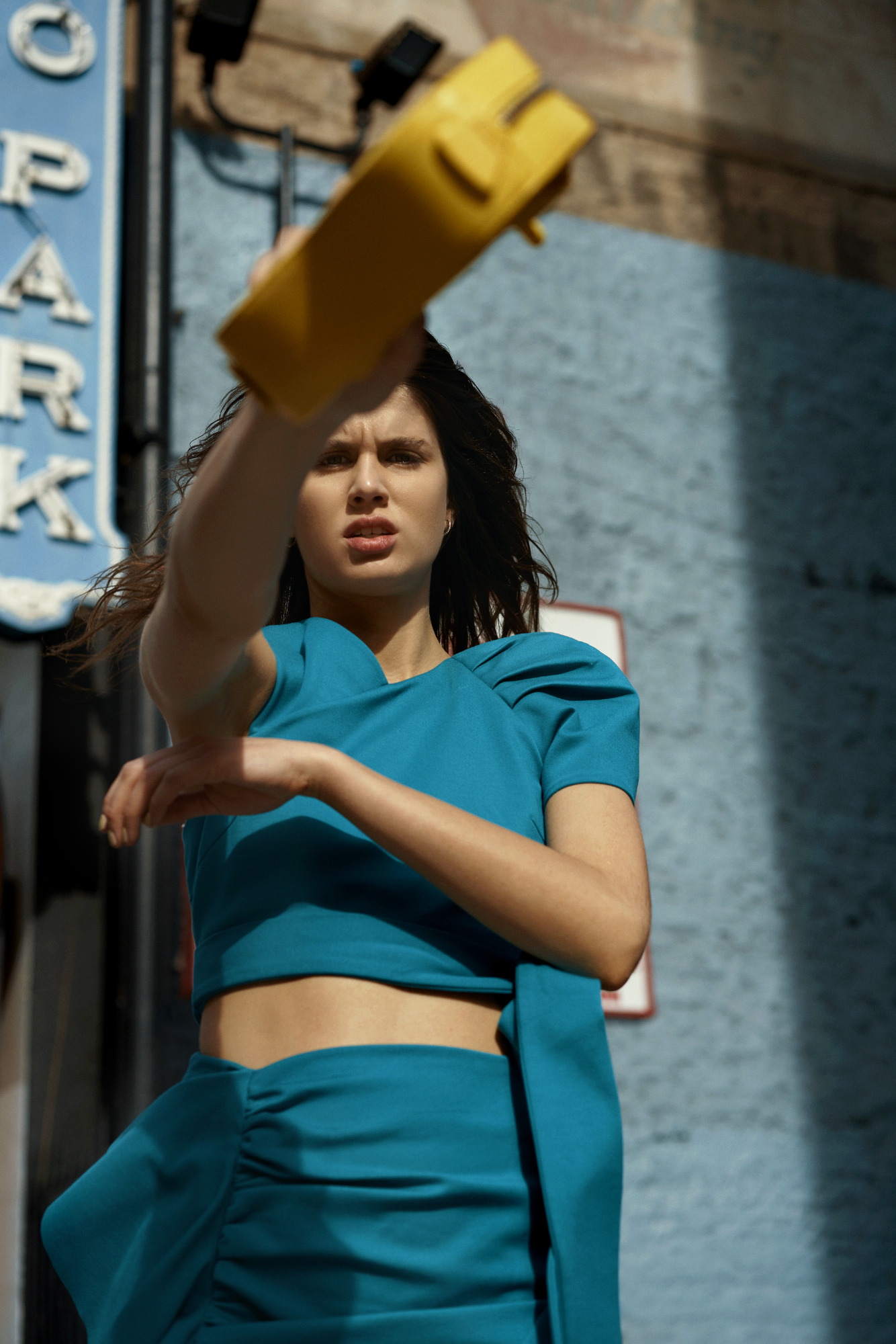
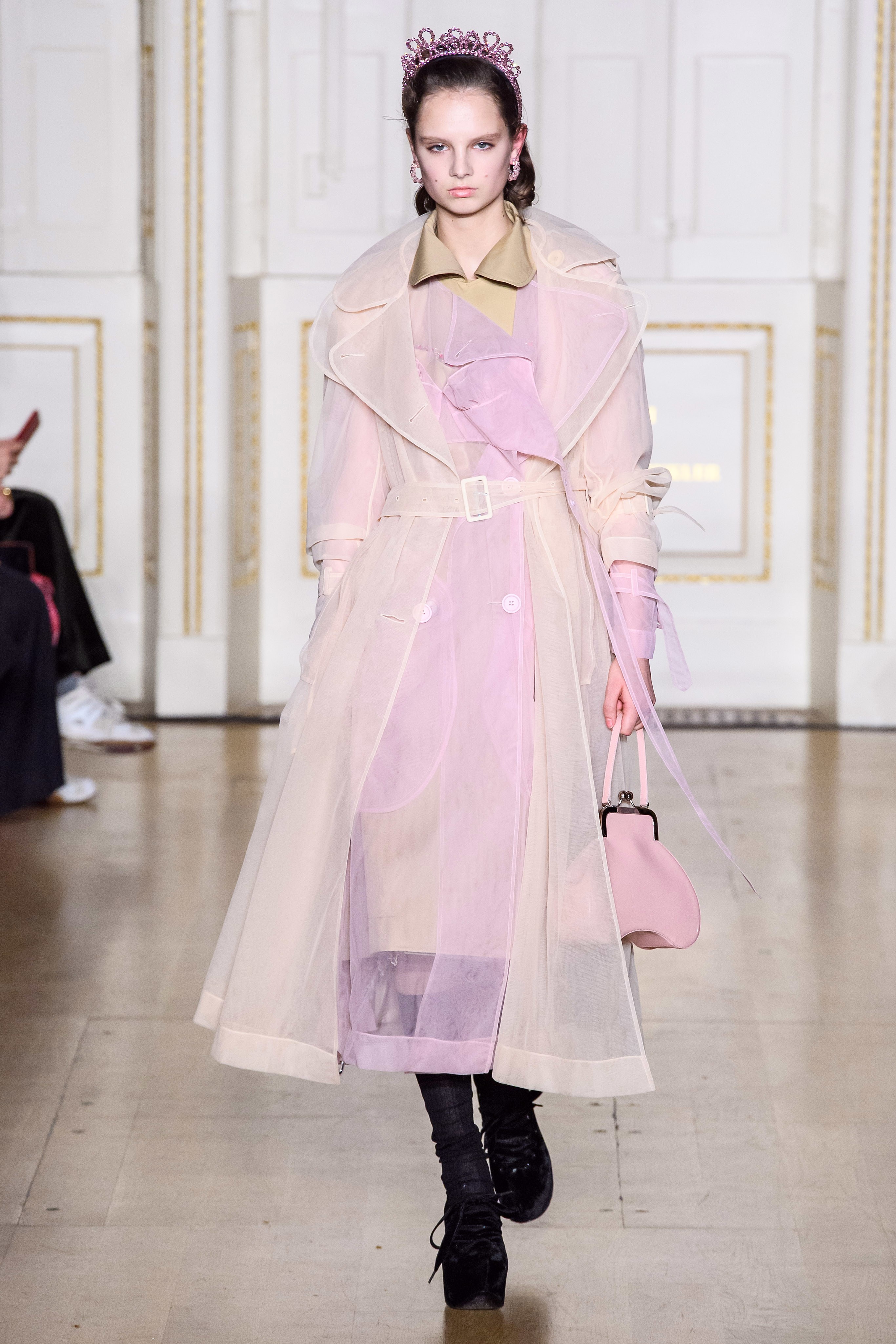
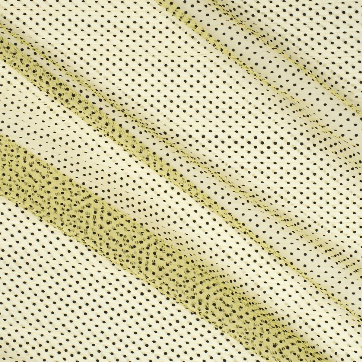
Transparencies are associated traditionally to the mild or warm months of the year, where the high temperatures justify the apparent nudity these translucent fabrics given to garments. Until now, it was the norm or accepted by a majority and obeyed, in turn, to market demands and needs of the consumers. In the end, everything applied to a simple rule: more transparent and light fabrics in summer, more thick and opaque fabrics in winter. Nowadays, transparencies have lost their usual seasonality and designers of large firms have been responsible for the public wanting them at any time of the year by gradually including them in their collections. Laces, tulles, transparent embroideries … all the fabrics that show the skin in an insightful way. However, there is one particular one that grabs the limelight so far this year: the organza.
Brief historical evolution
Organza is a very fine silk fabric that is treated to maintain a certain stiffness that gives it that starchy appearance. Its name comes from Urgenc, a city in Uzbekistan and arrived in Europe from India in the 18th century. Despite being present in the continent and after its initial links to the maids of the aristocracy, it was not until the twentieth century when this fabric became popular to all social strata. The person responsible for this was Yves Saint Laurent who placed this fabric in the altars of the trends. It was in 1966 when Yves revealed his first look with transparencies. At first, the organza subtly revealed some parts of the body, but the scandal came two years later when she designed a bold dress that completely showed the chest. In the decade of the 80s, the organza allied with frills and volumes typical of that time to make exaggerated combinations, in line with the fashion of the moment that immortalized icons such as Molly Ringwald, Liz Taylor or Ladi Di. In the 90s, the fabric came back to life again thanks to the 1997 spring-summer Prada collection that homaged transparency and the triumph of minimalism. Interestingly, the Italian firm was among the first to rescue this fabric last year, probably influenced by the new furor that organza currently relives.
 |
 |
The revelation fabric of the season
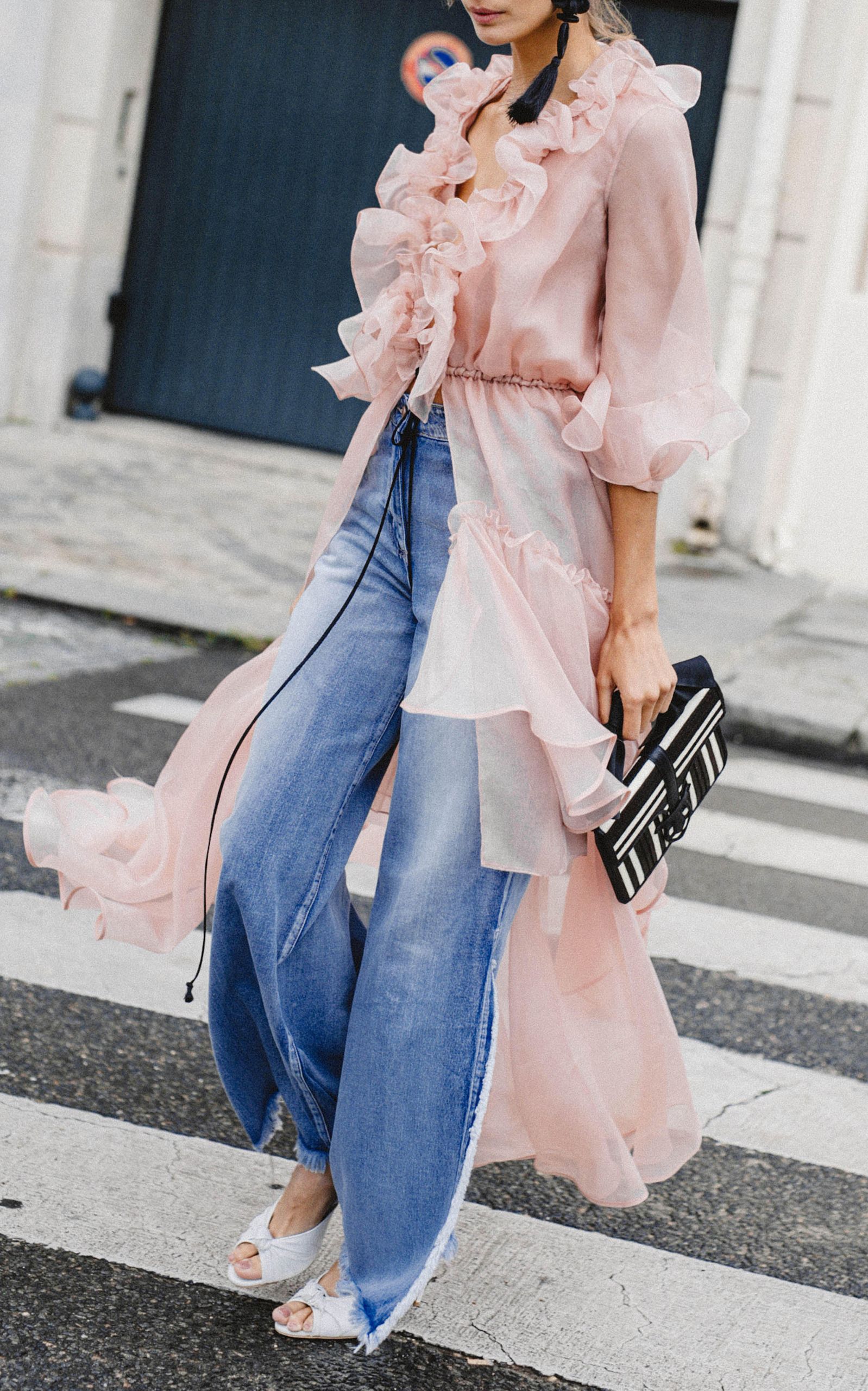
This fine, translucent and rigid fabric has the peculiarity of adding elegance, delicacy and a certain romanticism and therefore, can boost any look with a simple garment. So far, the organza had also been linked in the exclusive field of celebrations, and although it remains there, the demand for this fabric, for other occasions, has not stopped growing.
On the catwalks today, organza has been present in the collections of Ralph Lauren, Balmain, Dolce & Gabbana Simone Rocha and Fendi, to name a few firms, but also in the chains of high street fashion that have democratized its use to make it accessible to the general public. For example, Zara presented in summer a collection of blouses, skirts and dresses made with organza that had a fulminating success, running out of stock.
From the catwalk to the high street
If a fashion is adopted in parallel by international fashion prescribers, success is more than assured and will end up arriving sooner or later to the general public. Thus, of all the pieces made with organza, the clear favourite is the blouse with puffed sleeves, being the best ally to reinvent a pair of jeans. This piece gives a romantic touch to the looks without needing other accessories. Despite the triumph of the neutrals (white, black, beige …), it also takes the colour that can range from the most vibrant palette to the pastels, our favorites. This garment works even with volume skirts or palazzo trousers.
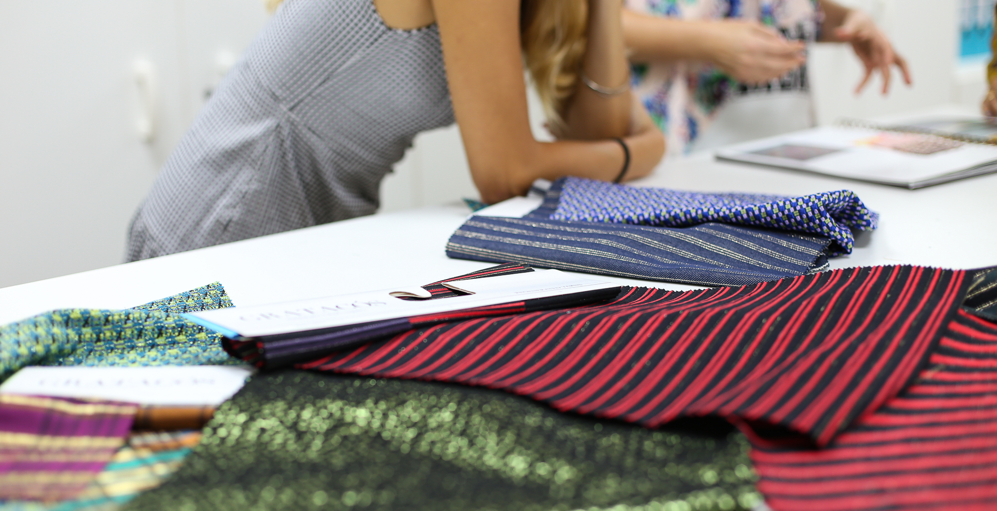
From Gratacós we want to show you some organza from our current collection and the upcoming seasons. In our space in Barcelona you will find a good assortment of fabrics to decide if you want to use the organza on a festive occasion, or you decide to join the trend and dazzle with a garment made with this fabric for dayime wear.

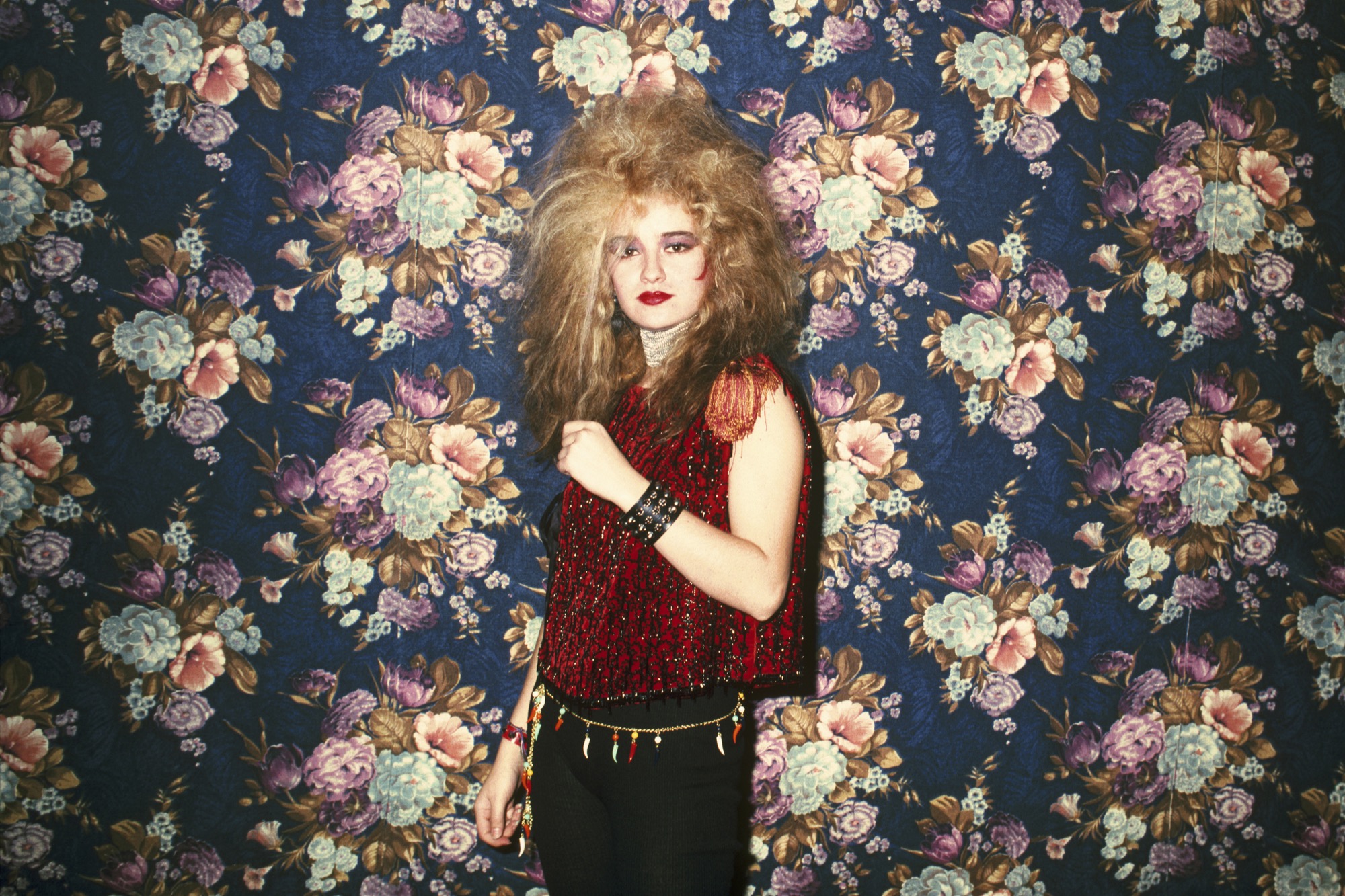
Madrid 1978. Spain was coming out of dictatorship and its capital experienced a prodigious decade that shook the cultural and artistic landscape. That revolution in technicolour that made Madrid the headquarters of fun and creativity was called La Movida. Do you remember it?
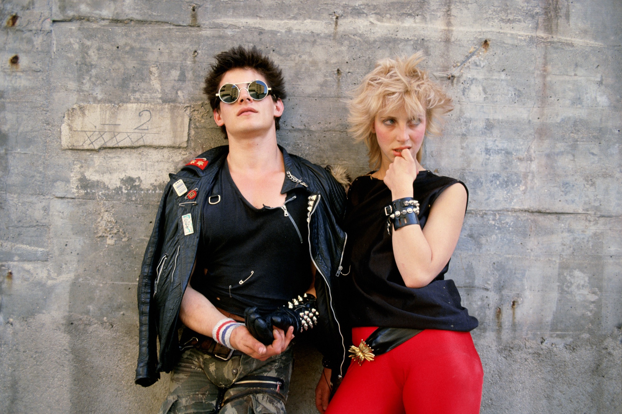
Now an exhibition organized by the Foto Colectania Foundation in Barcelona recalls those experimental years under a rebellious title: ‘La Movida. Chronicle of an agitation ‘. This recently opened exhibition offers an approach to this historical moment from the perspective of photography, addressing radically different areas and perspectives. The exhibition, presented in summer at the prestigious Les Rencontres d’Arles festival, focuses on the work of four photographers who immortalized some icons of La Movida: Alberto García-Alix, Ouka Leele, Pablo Pérez-Mínguez and Miguel Trillo. These professionals lived this cultural revolution in person, sometimes lived together, sometimes came across each other or simply found themselves in different environments, but the interesting thing about the exhibition is how each of them immortalized it from a different perspective, showing different faces of the same reality.
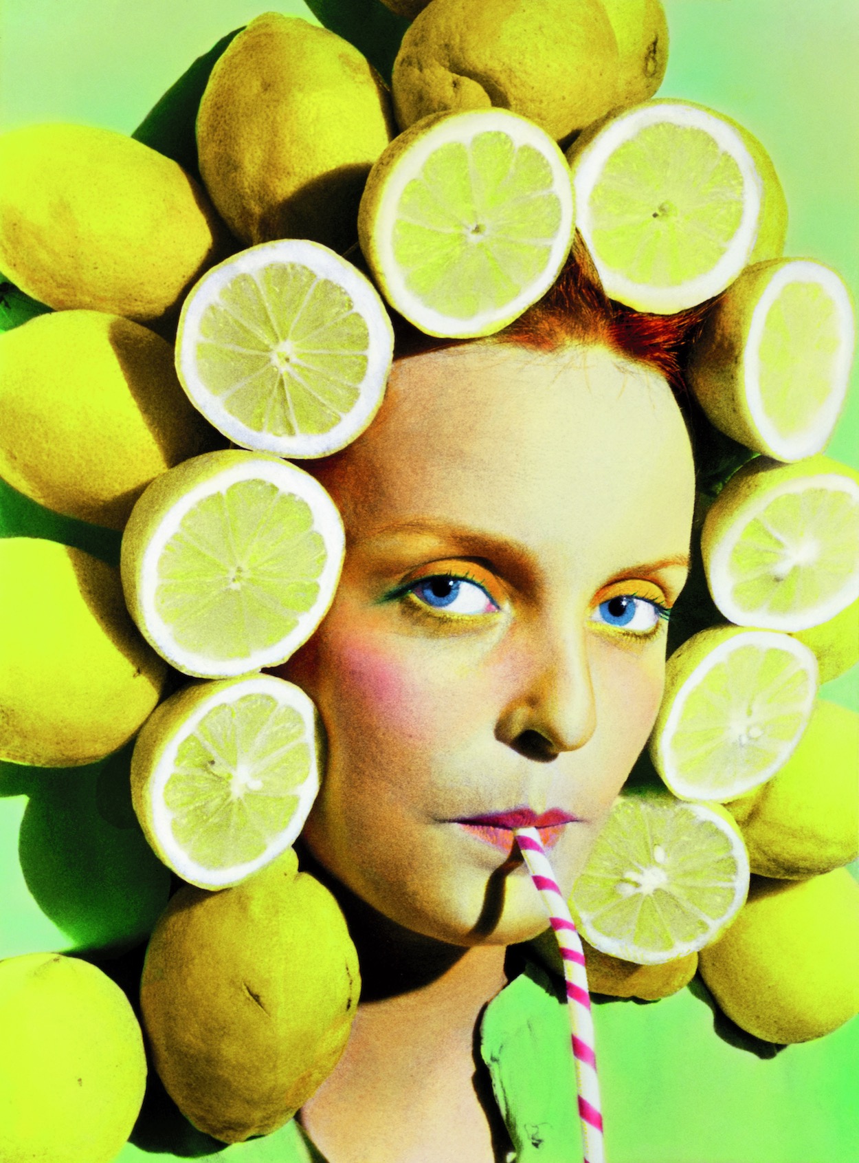
Thus the exhibition presents this polyhedral look at the movement, in which extraordinary photographs can be contemplated that bear exceptional testimony to the time. Authentic visual jewels such as García Alix’s vintage photographs that testify to how the street was transformed and also the characters that inhabited it; Ouka Leele’s dreamlike and coloured snapshots full of freshness and imagination; the rebellious perspective of Pablo Pérez-Mínguez in whose study all the main characters were photographed under the slogan “Everything goes” and the urban tribes of Miguel Trillo who portrayed the freedom of the street and the youth of the moment, grouped according to their way of dressing and their behaviour. The exhibition also includes a selection of materials such as vinyl, fanzines or posters, as well as a projection of musical performances that complement the personal universes of the photographers.

The uniqueness of La Movida
La Movida was a unique and spontaneous era of contemporary Spanish culture. It took place in Madrid at the end of the seventies and extended throughout the 80s, coinciding with the mayoralty of Enrique Tierno Galván. After several decades of dictatorship and ostracism the Spanish transition saw a new generation fascinated by modernity and the idea of the new, which would crystallize in creators from different fields such as music, fashion, film, painting or photography . This cultural heyday was distinguished in other European cities as a phenomenon that directly connected with the daily life of the moment.
The exhibition ‘La Movida. Chronicle of an agitation ‘ can be visited at the Foto Colectania Foundation in Barcelona until mid-February. A look back at the past of the most fun and free city of the moment.


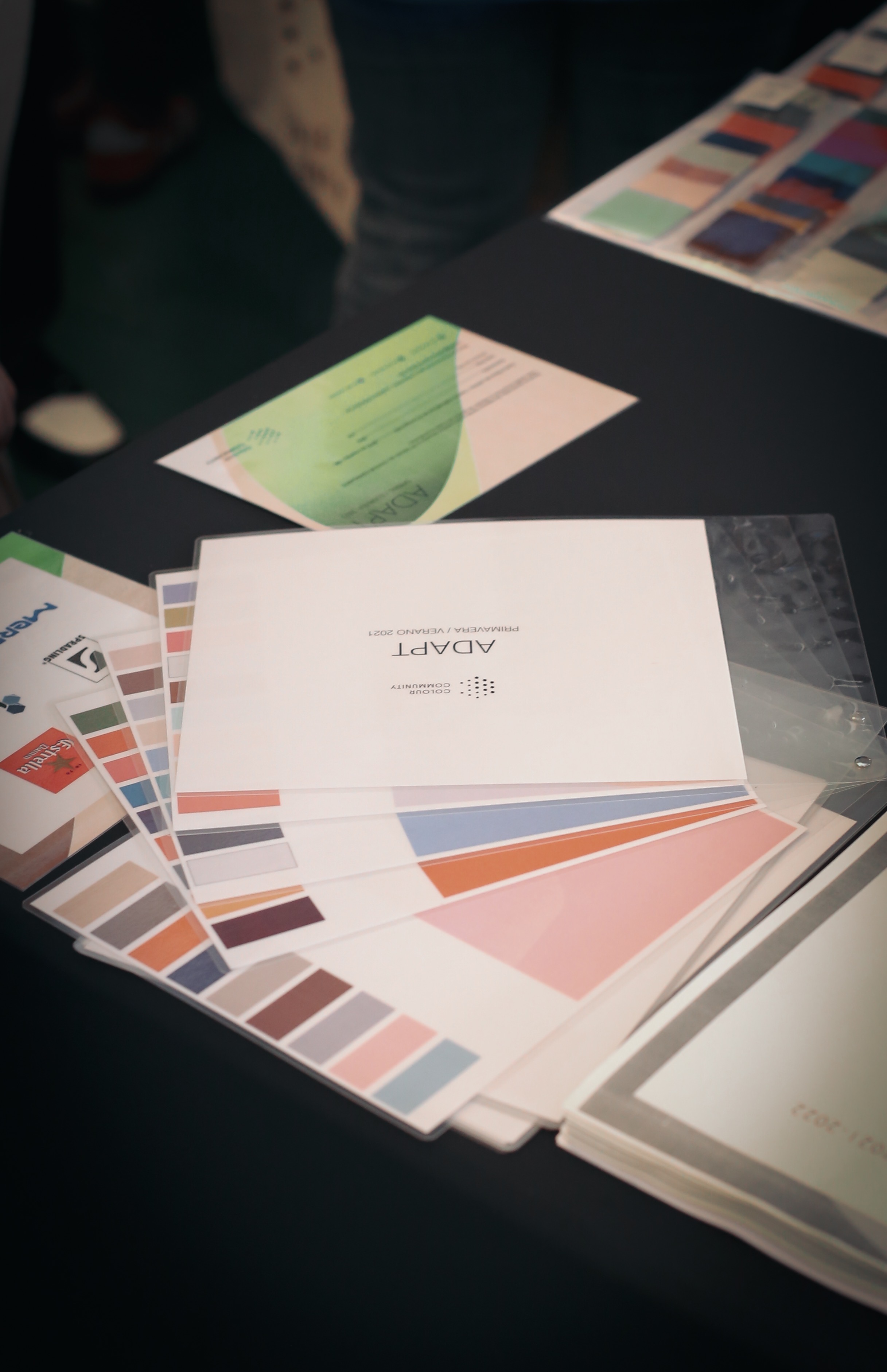
La “comunidad del color” crece edición tras edición generando una gran expectativa entre los profesionales del diseño que se marcan en el calendario, las citas que marca dos veces al año The Color Community. Como ya sabéis, se trata de una iniciativa dirigida por un grupo de profesionales que, desde diferentes disciplinas creativas, comparten un estudio global del color y la materia. Aunque en cada informe que se presenta participan varios colaboradores, el núcleo base lo forman tres profesionales: el arquitecto Pere Ortega; la diseñadora especializada en Colour & Trim, Eva Muñoz; y Rosa Pujol, Textil & Colour Stylist de Gratacós.
Como es habitual, The Color Community se celebra en la Antigua Fábrica Damm de Barcelona, un poderoso colaborador que cede las instalaciones y dispone de refrigerios para llevar a cabo la presentación del informe y un posterior afterwork. En esta decimotercera edición, se presentó la carta de colores que marcarán la temporada Primavera-Verano 2021. Es un informe orientativo que como cada año sirve de inspiración para los profesionales del sector.
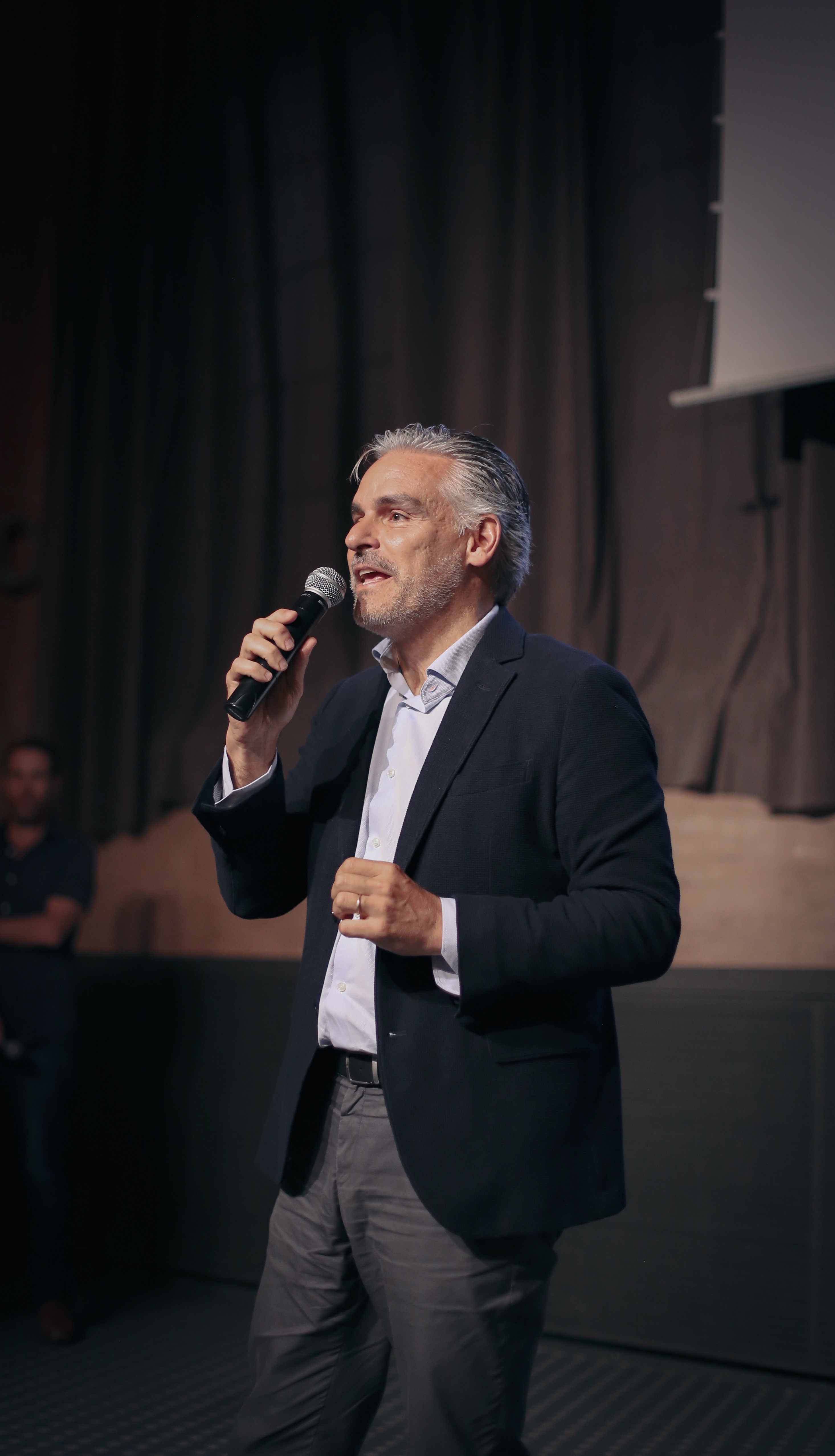
Juan Gratacós: “El tejido sin color sería aburrido”
En nuestro caso, esta cita es siempre imperdible. No solo por la participación de Rosa Pujol, encargada del departamento de diseño de la empresa, sino porque Gratacós se desvive por las gamas cromáticas. “Nos encanta el color y el tejido sin color sería aburrido”, comentó Juan Gratacós minutos antes de la presentación del nuevo informe.
Esta edición se inspira en el concepto de la adaptación con matices positivos. “Le sacamos la carga humilde o negativa a la palabra porque adaptarse no quiere decir conformarse, todo lo contrario”, detalló el arquitecto Pere Ortega en la presentación. Así, ‘Adapt’ se basa en la idea de ajustarse a un contexto determinado, utilizando un tipo de creatividad racional que permita buscar soluciones concisas y válidas. “Nos referimos a la creatividad inteligente que es fruto de una estrategia pensada y reflexionada que encaje con la situación actual. No tiene nada que ver con la genialidad del momento o un brillo puntual”, explicó. La adaptación como símbolo de la inteligencia, de la estrategia racional y la sabiduría popular.
Pere Ortega: “Entendemos la adaptación como un tipo de creatividad inteligente que es fruto de una estrategia pensada”.
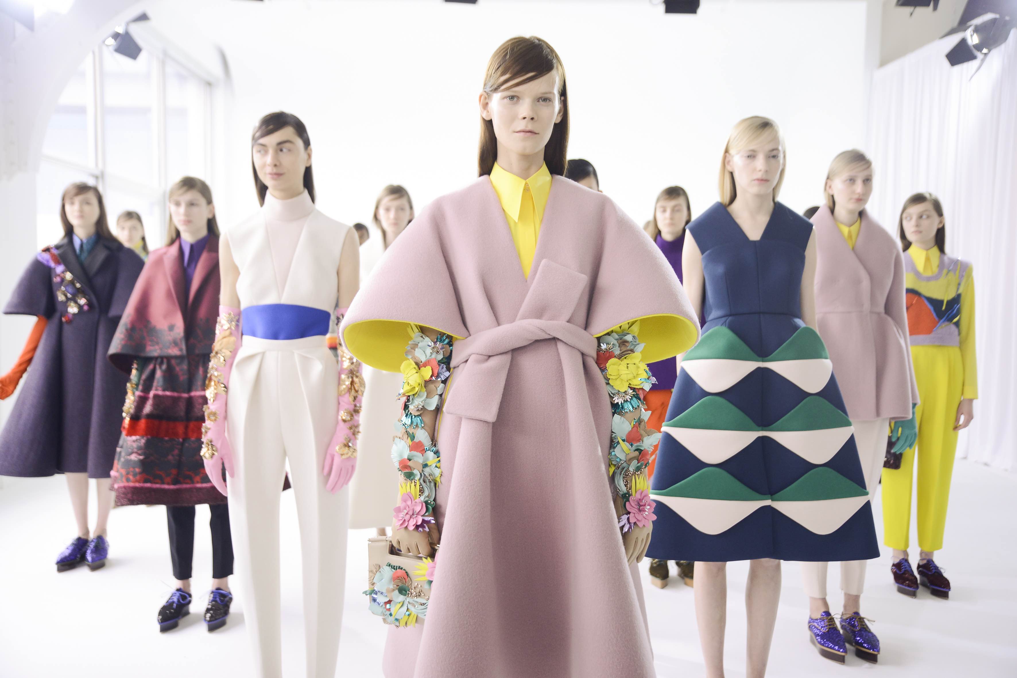
La propuesta cromática ‘Adapt’ se estructura a través de cuatro gamas de color, texturas y materias bautizadas como, Afterwork, Baltic Sight, Natif y Modern. A continuación, os explicamos un breve resumen con sus inspiraciones.
-
AFTERWORK
La primera inspiración se centra en el momento de ocio después de trabajar. Un espacio para el descanso, la diversión y el hedonismo, siempre compartido. Afterwork es una propuesta versátil, que se adapta en estos contextos festivos a través de tonos pastel como el rosa candy o el azul bebé que contrastan con algunos flúores que le dan ese punto de luz necesario en cualquier fiesta: se tiñen de verde lima, amarillo y fucsia. En esta inspiración se introduce el concepto del tono transparente a través de superficies vítreas y texturas y estampados que imitan el reflejo del agua.
-
BALTIC SIGHT
La segunda gama es más introspectiva y toma como fuente de inspiración el mar Báltico que baña los países del norte de Europa. Es una propuesta fría y racional que apela al confort y a la intimidad en esa búsqueda de los refugios interiores. La gama de azules se inspira en las aguas profundas en tonos fríos y grisáceos, verdes apagados y los tonos neutros como el blanco, el negro y el beige. Como nota de color juega con algunos tonos rojizos. La propuesta también hace un guiño a los patrones estructurados, las siluetas arquitectónicas, los estampados lineales y los accesorios verticales. Se trabaja el concepto de silencio.
-
NATIF
La tercera inspiración es un homenaje a la autenticidad, a la tierra y a la naturaleza. Representa un giro hacia la artesanía y también quiere transmitir la multiculturalidad con diseños sin denominación de origen. Todo forma parte del todo. La paleta de colores de Natif es vibrante con tonos poderosos que van desde los naranjas saturados, los morados, los azules mágicos y los rojos tierra. Las tonalidades verde se vinculan con las hojas y los bosques. La singularidad cultural se consigue a través de los estampados florales y los que imitan el trazo manual, los motivos geométricos y los acabados rústicos.
-
MODERN
Por último, la cuarta inspiración representa un pasaje por las otras gamas. La ciudad y su vida interior es el motor de la creatividad y la gama de colores expresa como los individuos se adaptan a la ciudad, a la vez que se mimetizan en sus edificios, asfalto, huertos urbanos, zonas verdes… Forman parte de la urbe las 24 horas. Para expresarlo se utiliza una paleta cromática muy sensitiva con colores que aportan vitalidad. Los falsos crudos, los verdes apagados, el azul petróleo, el rosa pálido, el denim, el naranja excéntrico…conviven con siluetas minimalistas, materias tableadas y estampados lineales.
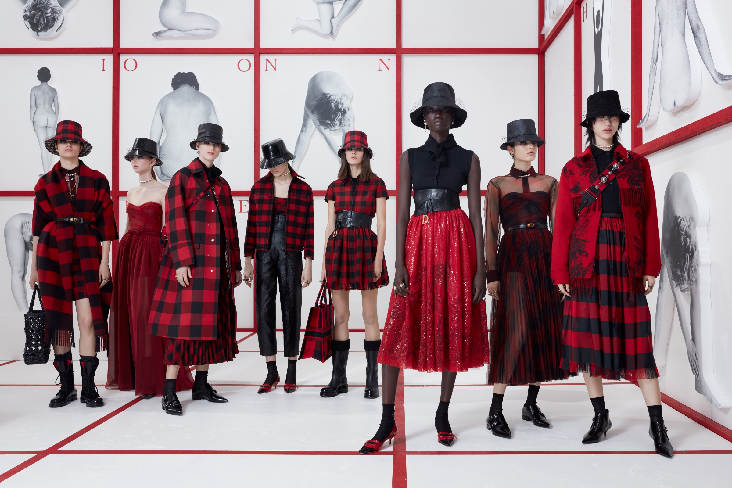
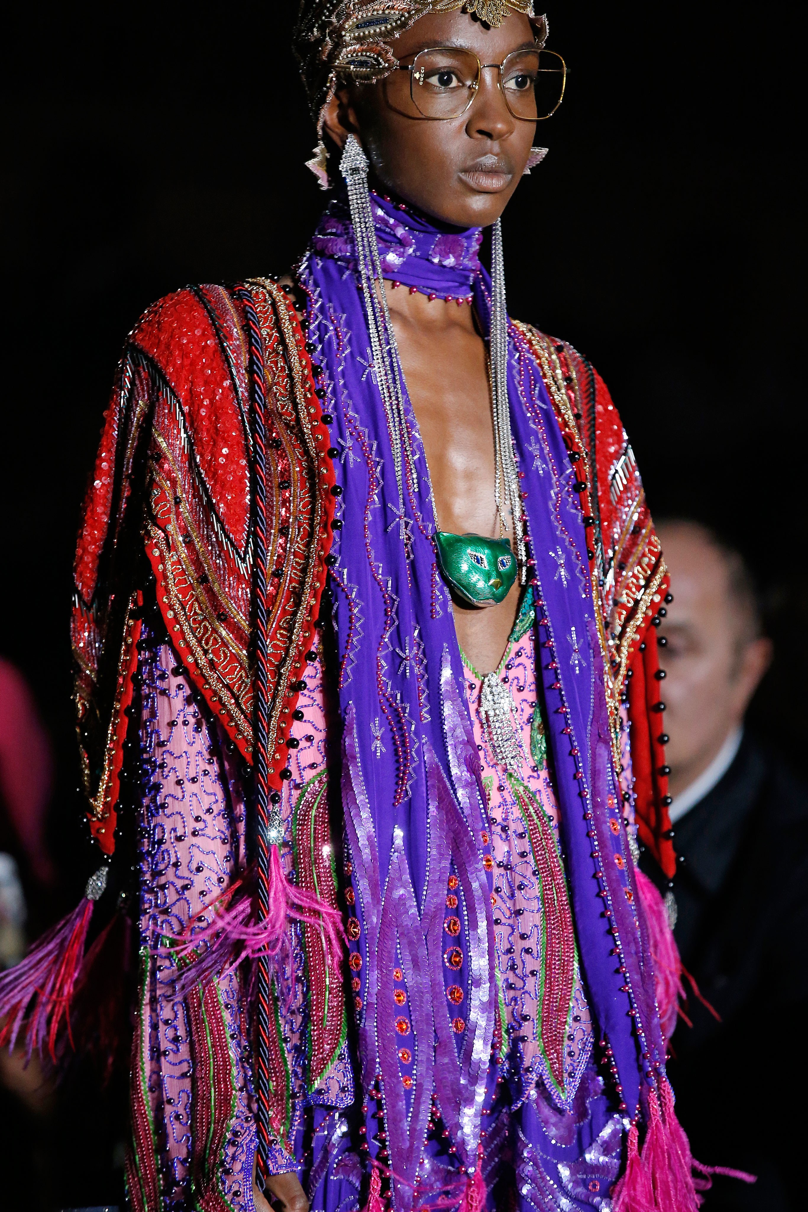
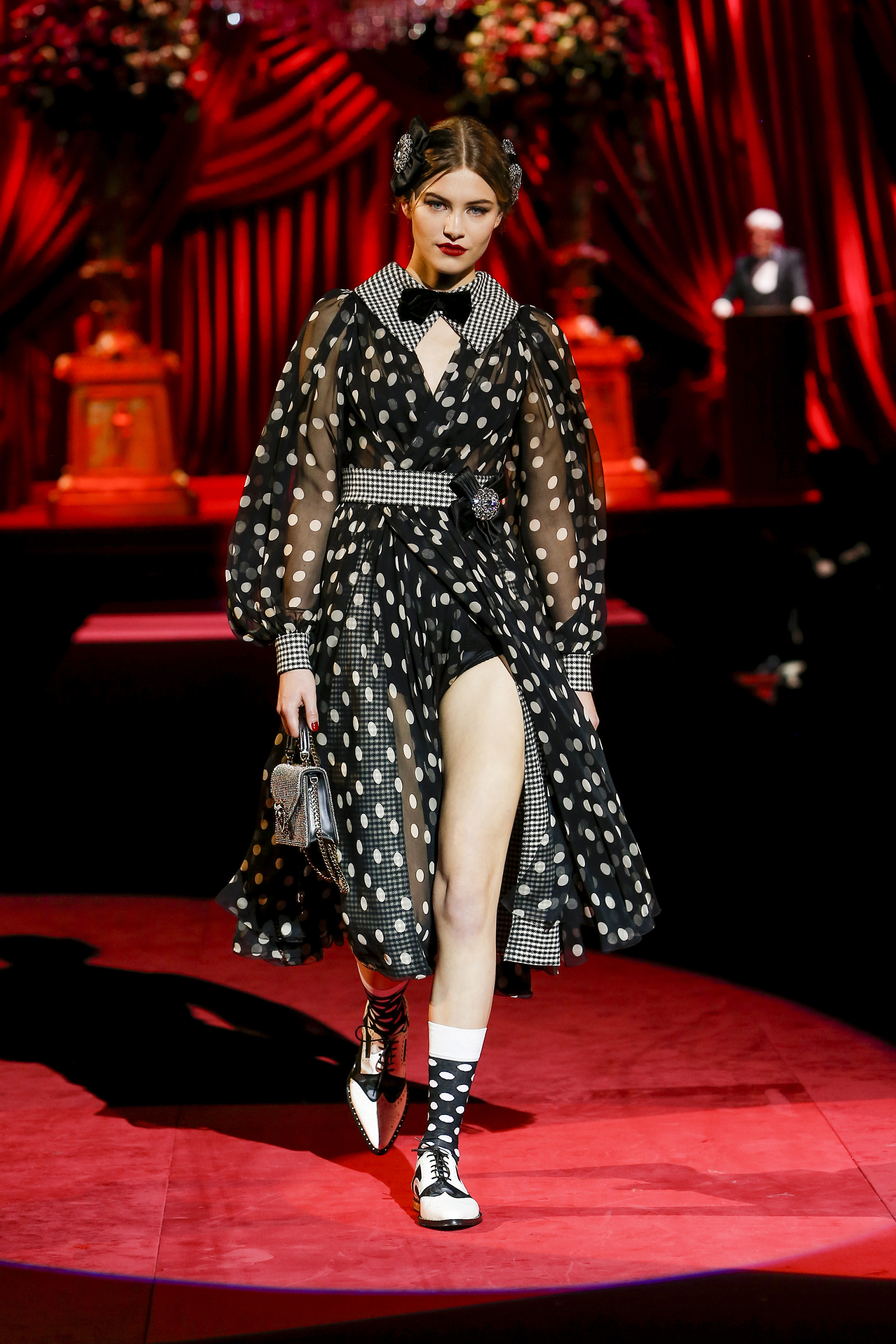
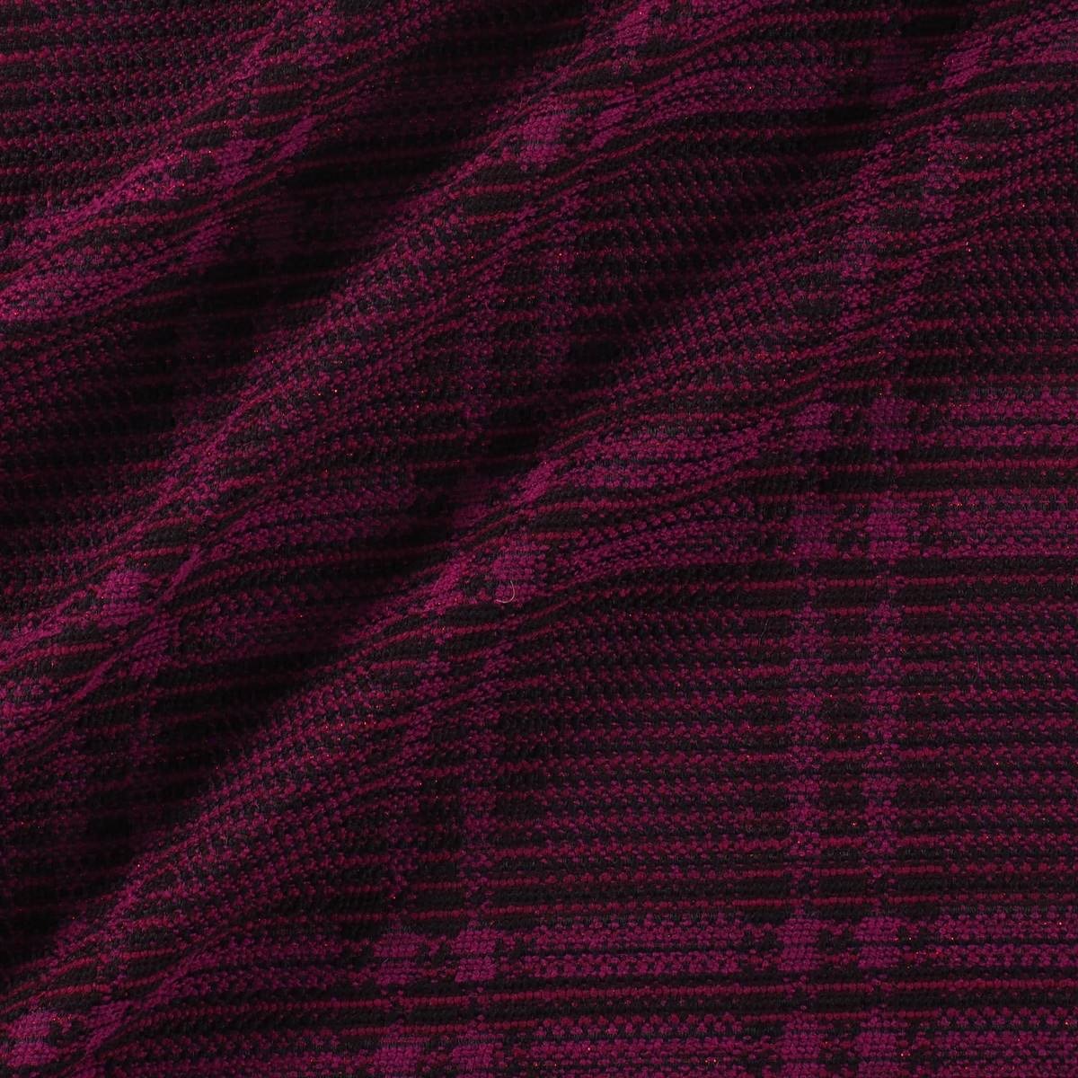
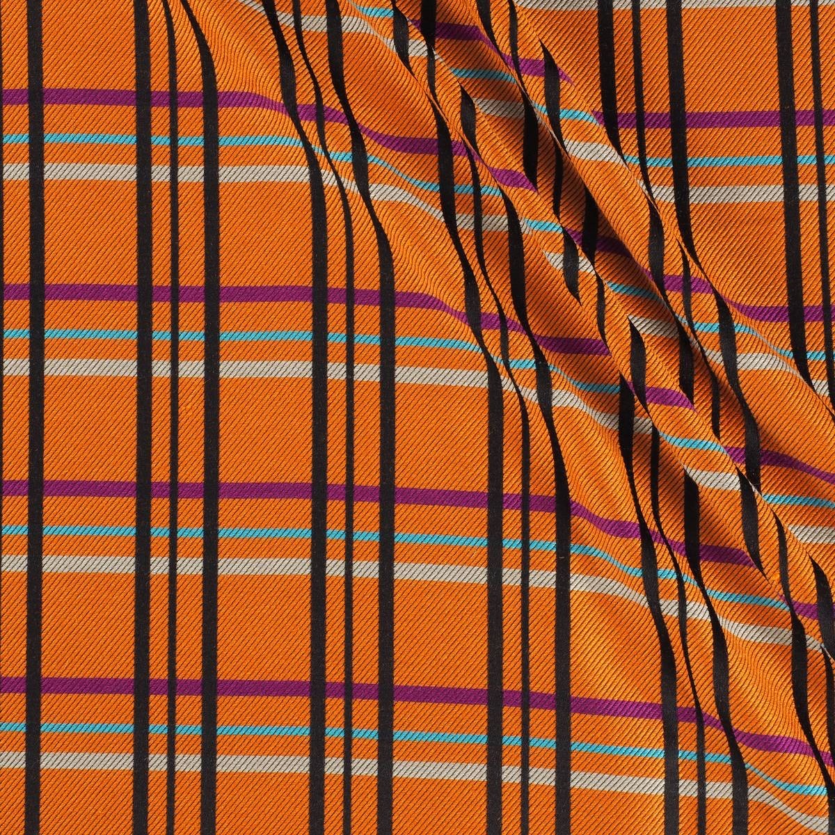
Checks have always been present in the history of contemporary fashion. Moreover, they are part of those unperturbed tendencies, oblivious to cycles, which are repeated and renewed without losing their identity.
A priori, when we talk of a check print the British style comes to mind with its classic costumes, the tartan reminiscent of the Scots or the vichy checks that refer us to the age of innocence. It is always time to opt for checks, whether in the winter or summer collections. The novelty is that today many checks break barriers and leave their comfort zone as they take over garments, accessories or complements which hitherto were less conventional.
We are going to analyze the three most common check prints on the cat-walks of the new Autumn-Winter 2019/2020 season:
Prince of Wales
It is a type of two-colour fabric design in the form of complex frames, sometimes with a third colour as a profile. It alternately combines large checks with a milrayas design along with smaller squares in crow’s feet. Frequently the different grey scales (or muted colours) are used as base colours and sometimes one more colour is added to that base tone, usually blue. The origin of this print is popular as it is a fabric used by the workers, although it was the Duke of Windsor (Eduard VIII) who ended up popularizing it in the 1930s and spreading it throughout the world.
When playing with the black and white binomial, this type of plaid print becomes a timeless classic, perfect in any wardrobe. This season, under a preppy style seen especially on cat-walks of Marc Jacobs, Prada, Givenchy, Balenciaga, Chloé and Marni, together with many others who opt for this pattern.
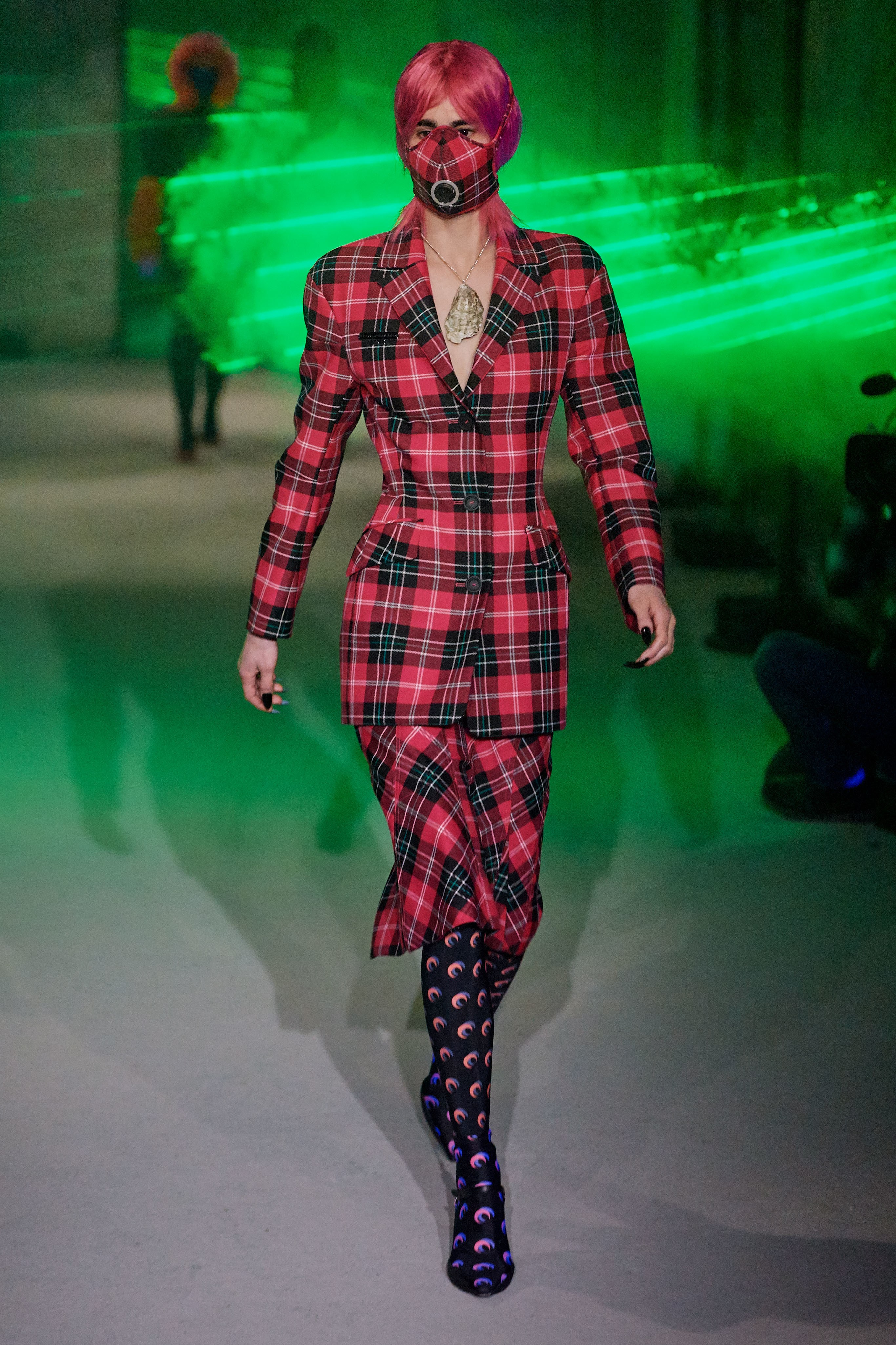
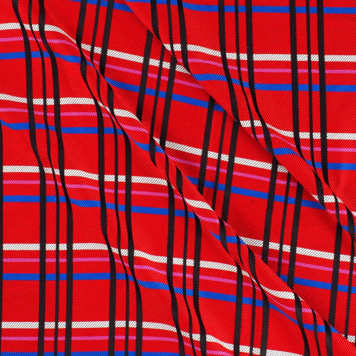
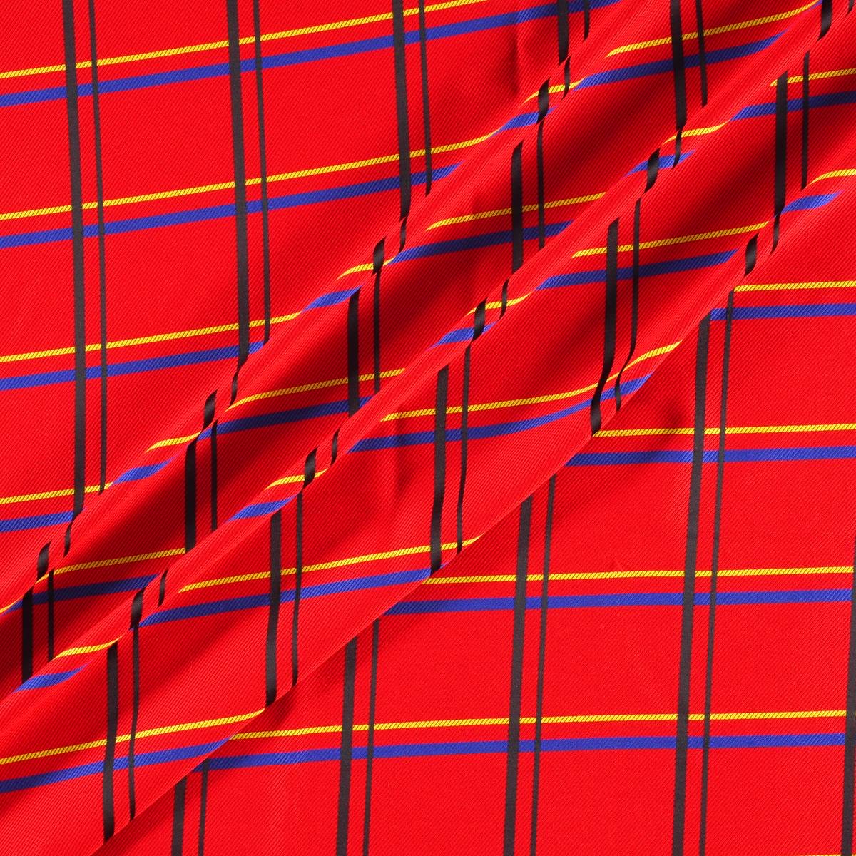
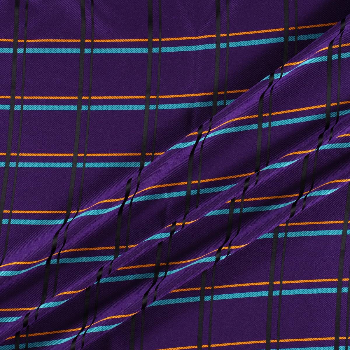
Tartan
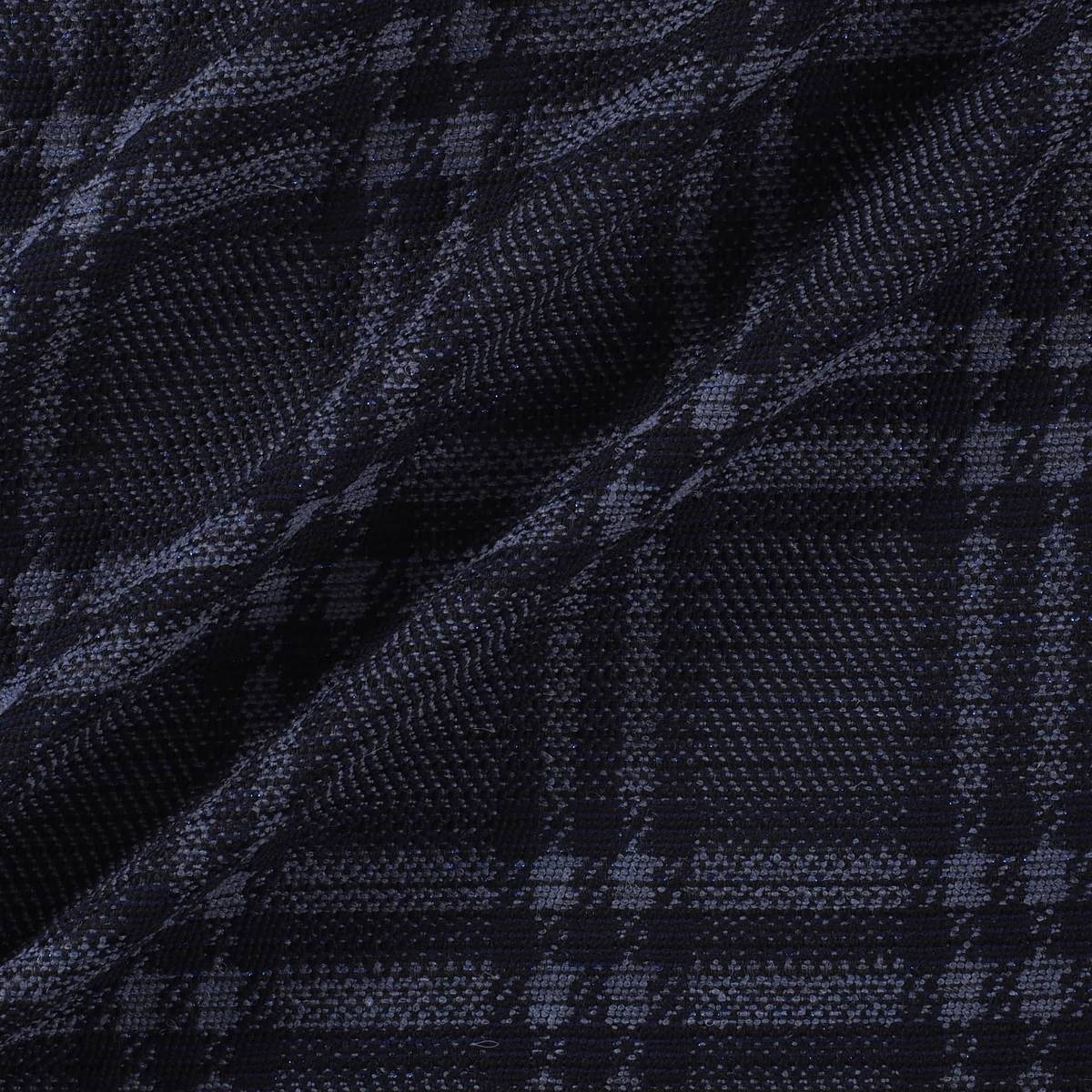
It is perhaps the most identifiable picture. A fabric whose pattern is formed by horizontal and vertical lines that draw pictures of different colours. Of Scottish origin, tartan is associated with the clans that used them to distinguish themselves. Each family adapted particular designs, as well as colours that identified them as members of each clan. There are named tartans like McAndrew, McQueen, Douglas … even modern designs like the Royal Stewart, created by Vivienne Westwood. In its origin the tartan was made of wool, although today it is shaped through several fabrics. At present, with the appearance of new materials the word tartan has gone from defining the fabric to the design, regardless of where it is shaped.
 |
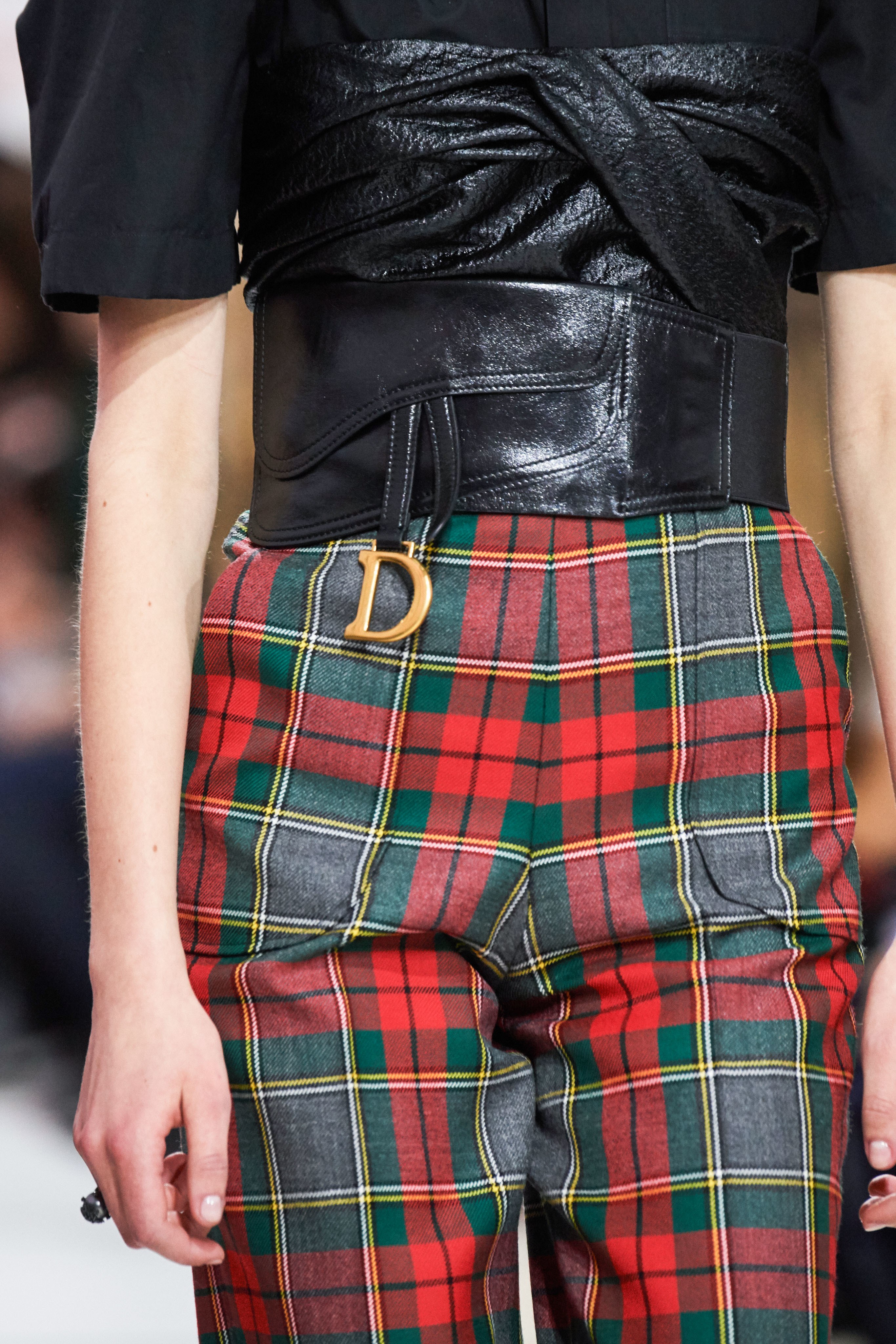 |
Tartan accepts countless colours and different combinations, the key lies in personal taste. The most common are the most classic in red or green or black and white and in XXL size. In the late twentieth century tartan was also associated with a more transgressive aesthetic and found adherents in the punk movement of the late 70s with designers such as Vivienne Westwood and grunge and its nineties counterculture. To cite some examples, at this time John Galliano and Alexander McQueen adapted it.
Window frame checks
We are talking about a type of simple frame that makes squares thanks to the fine lines that make it up. Thus on a dark background a light line is added that draws a broad picture. As a base the window frame can have a tartan (with finer wool) or a tweed (which gives it a more rustic look). This type of check became popular in the 30s in Britain when people began to look for more daring and informal prints that maintained that classical dandy image, but with certain licenses.
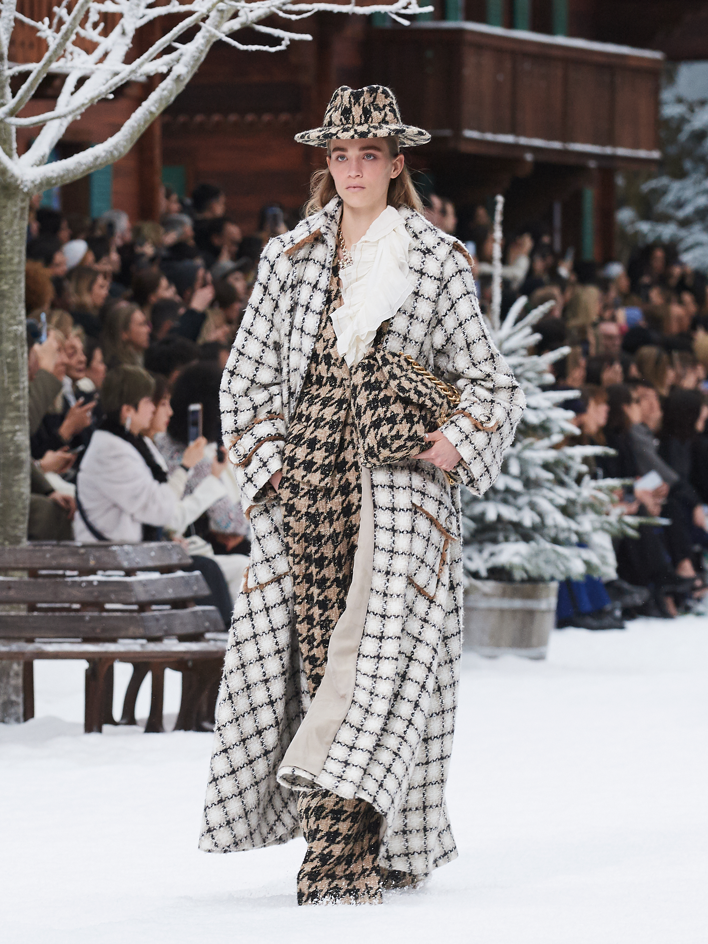
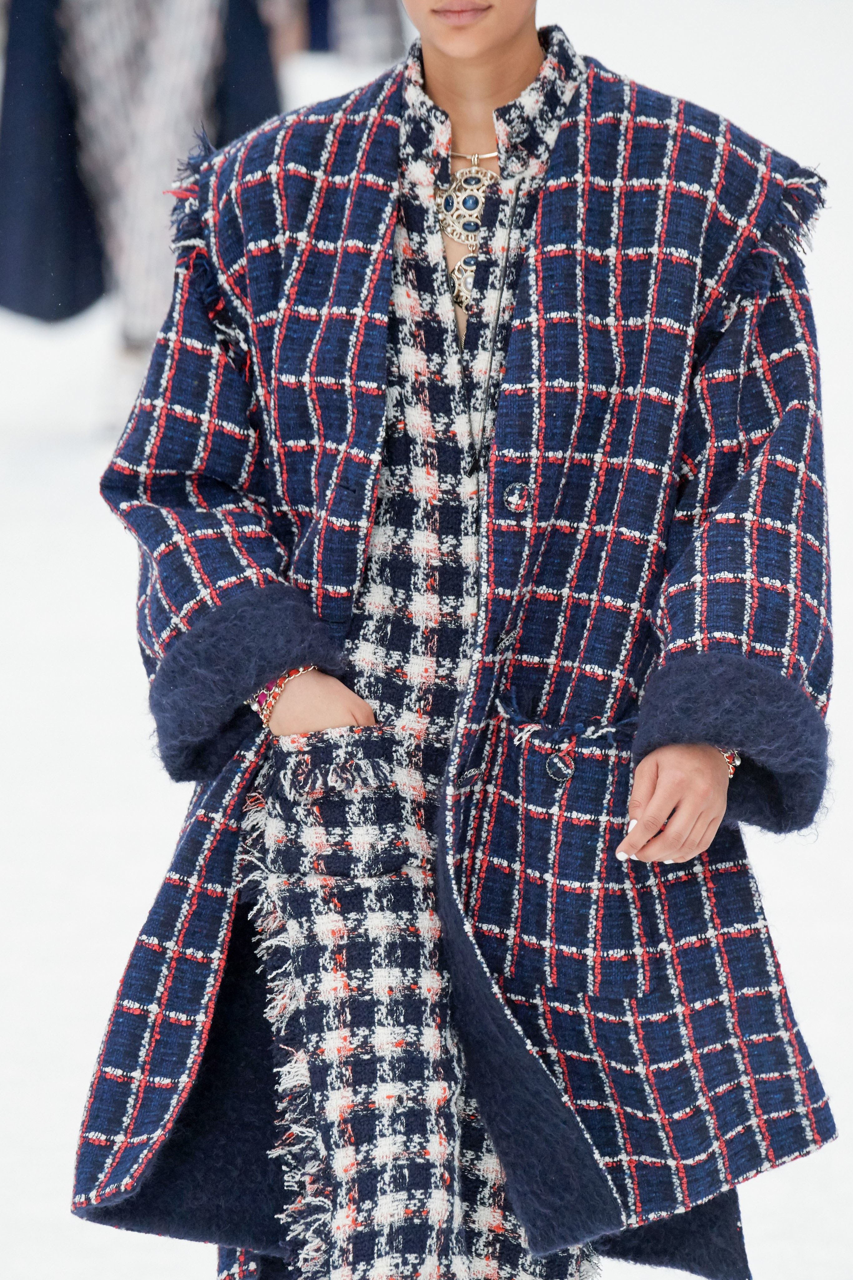
Today window frame checks are widespread and are used almost equally in winter and summer fashion collections. We refer you to the last collection made by Karl Lagerfeld for Chanel where you can observe these types of checks mixed with other fabrics and prints.
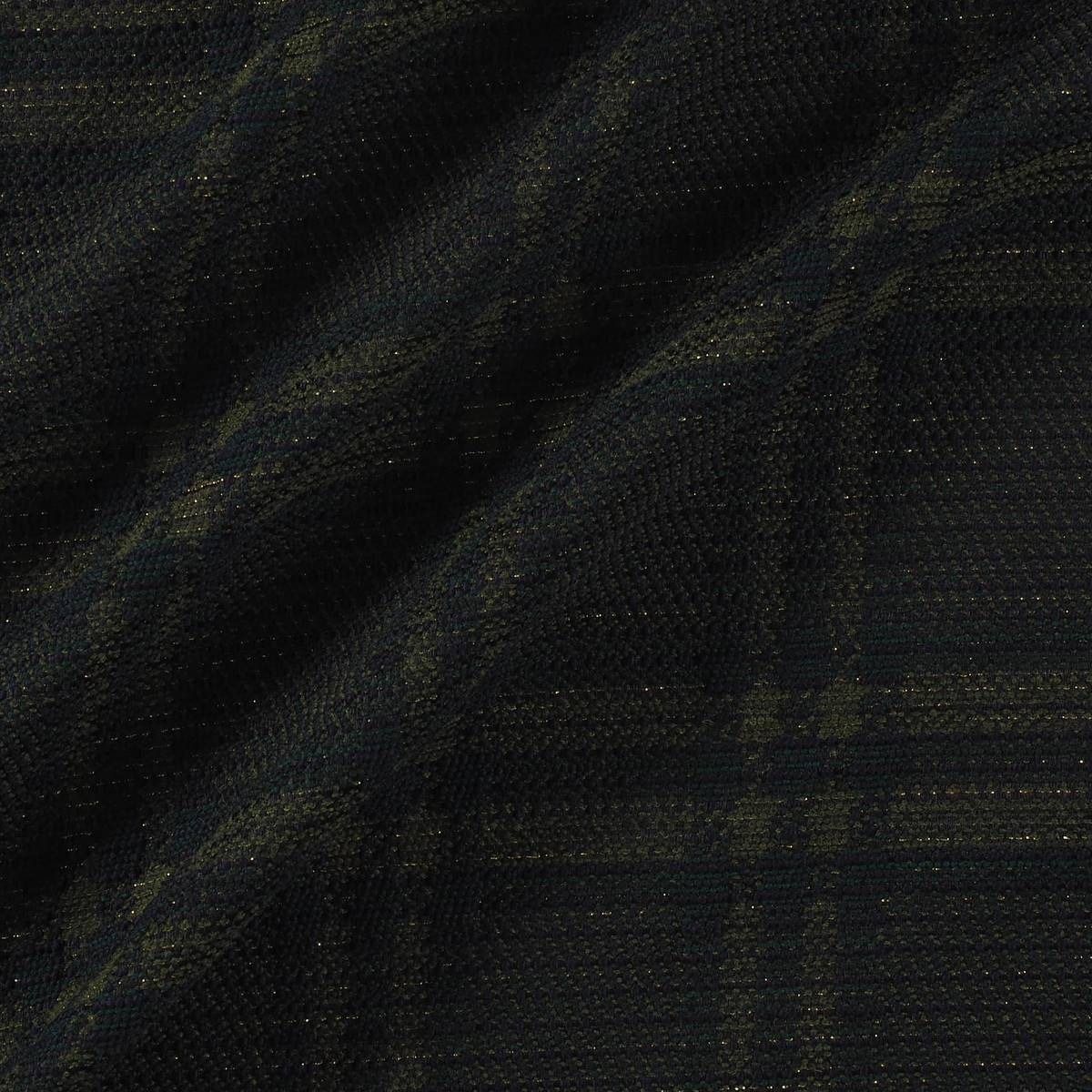
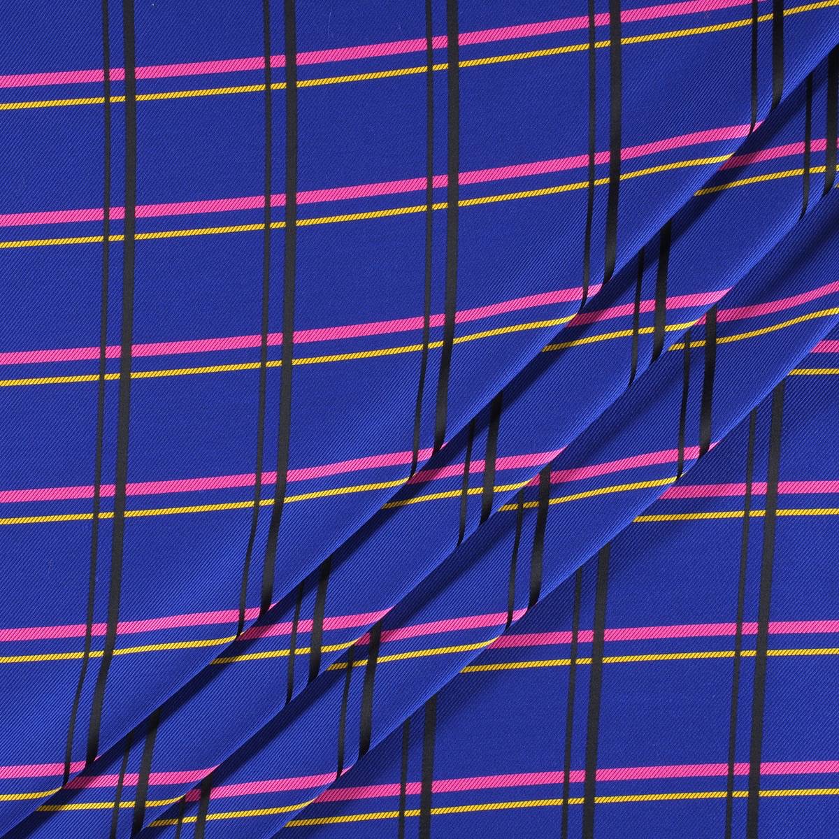
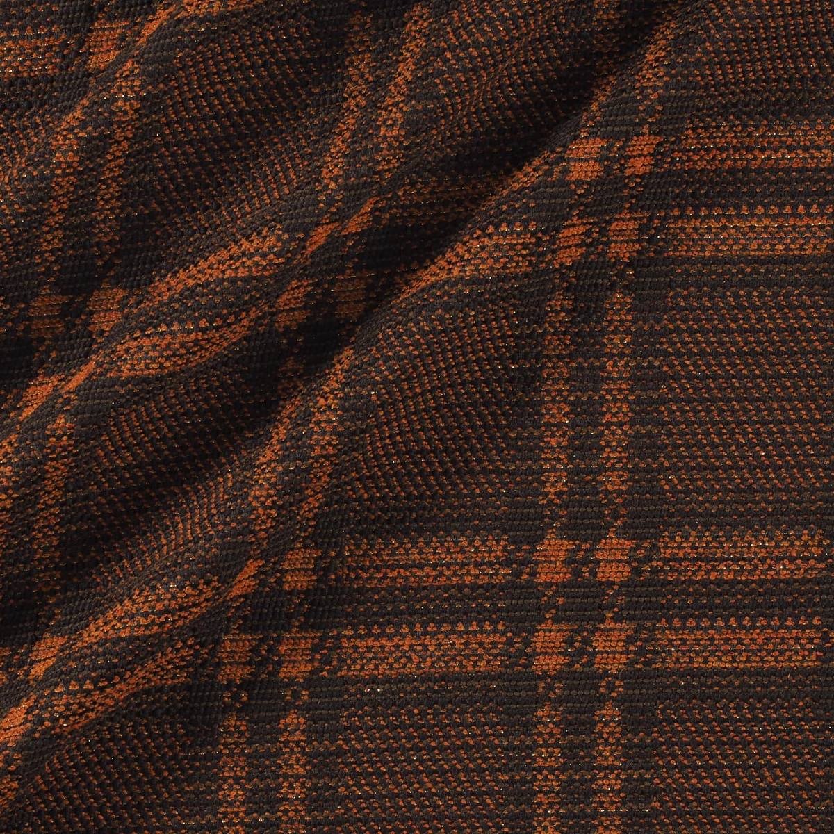
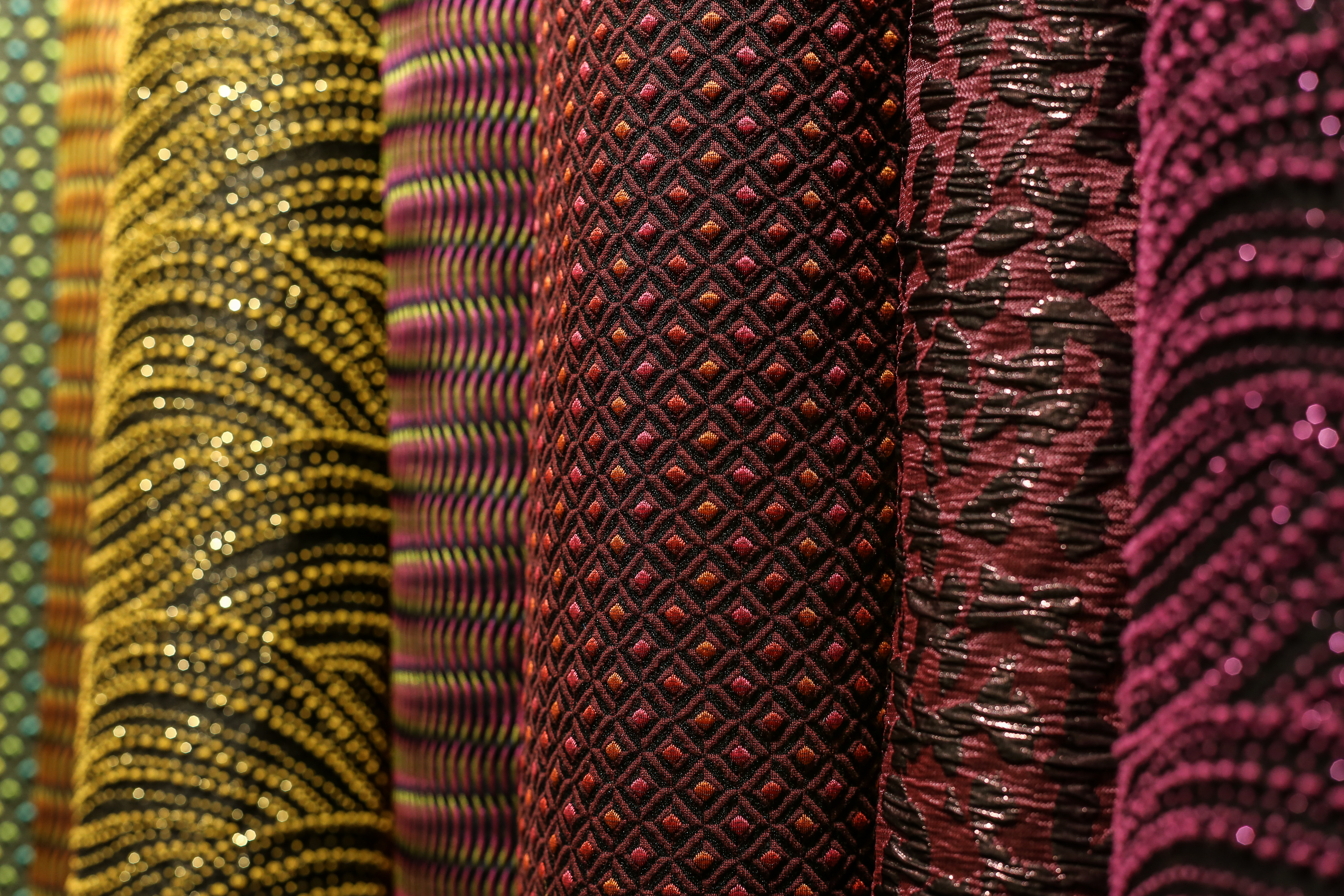
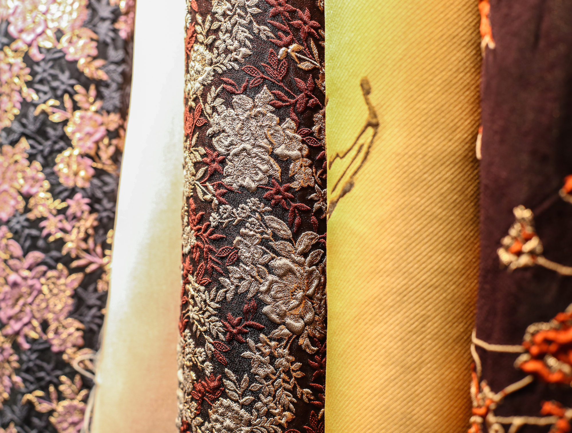
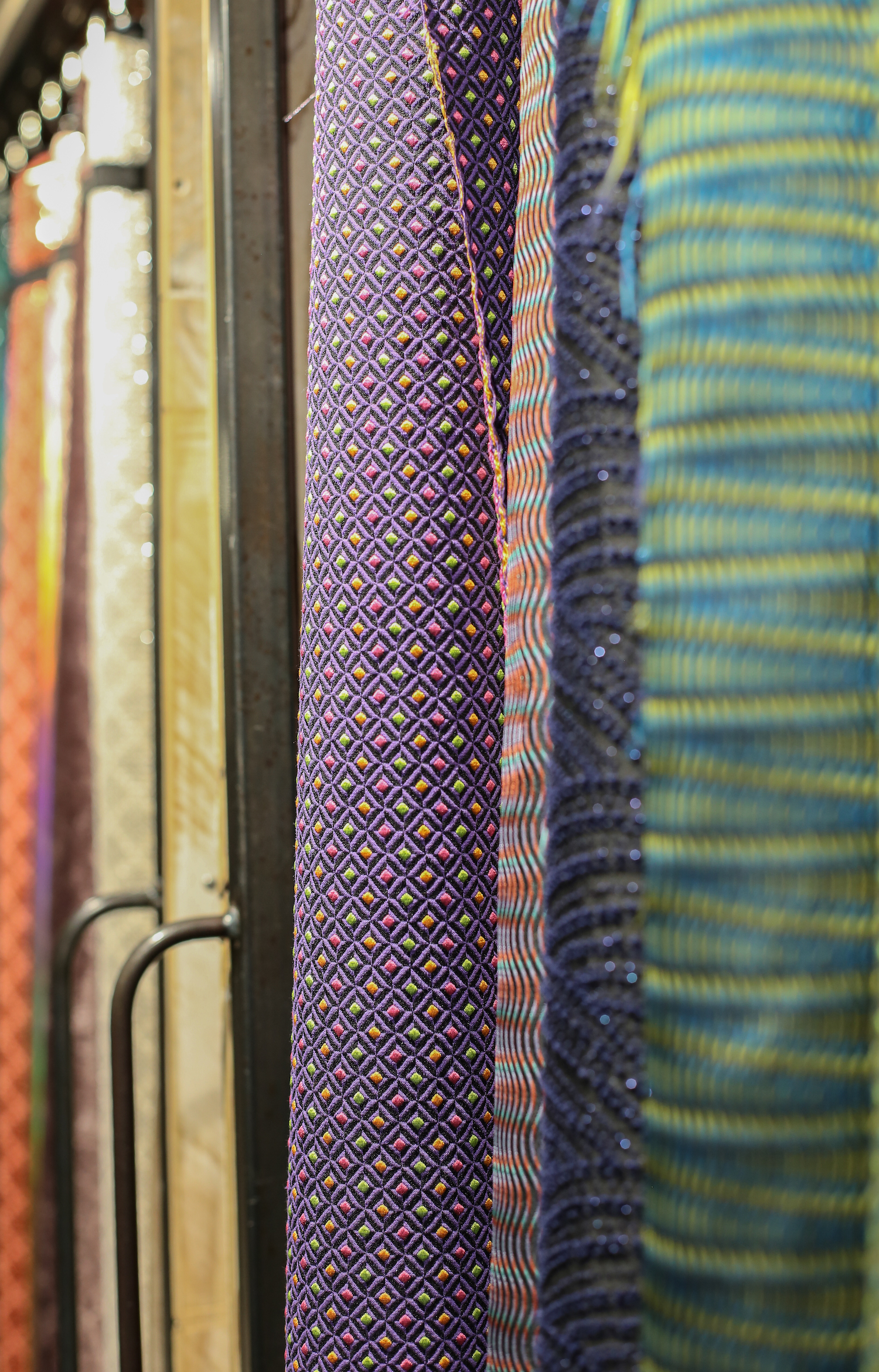
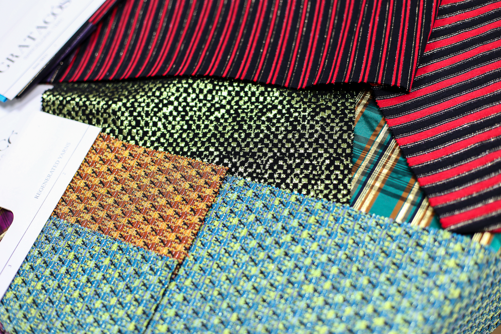
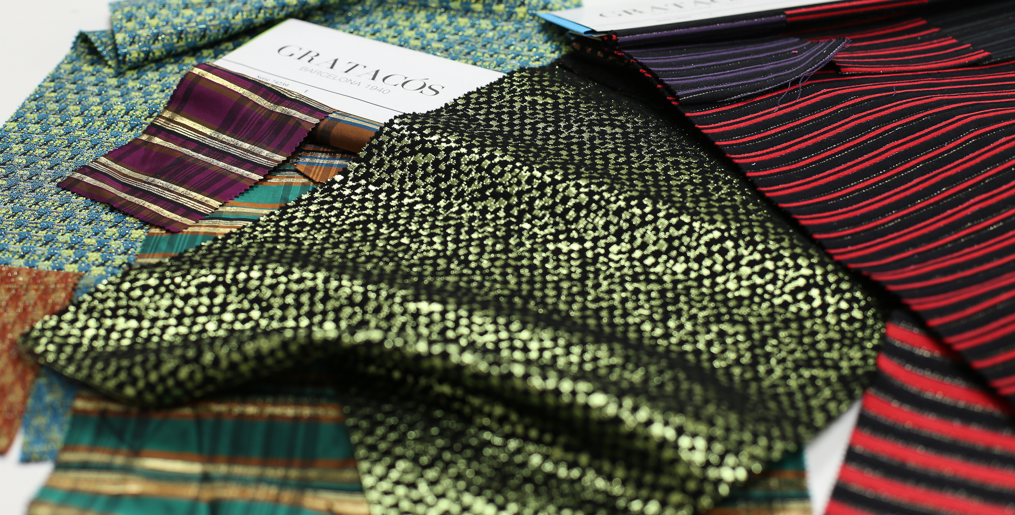
The current Gratacós collection also contains many plaid fabrics. Here are some references for you to get inspired.

Jueves 26 septiembre 2019
General concept
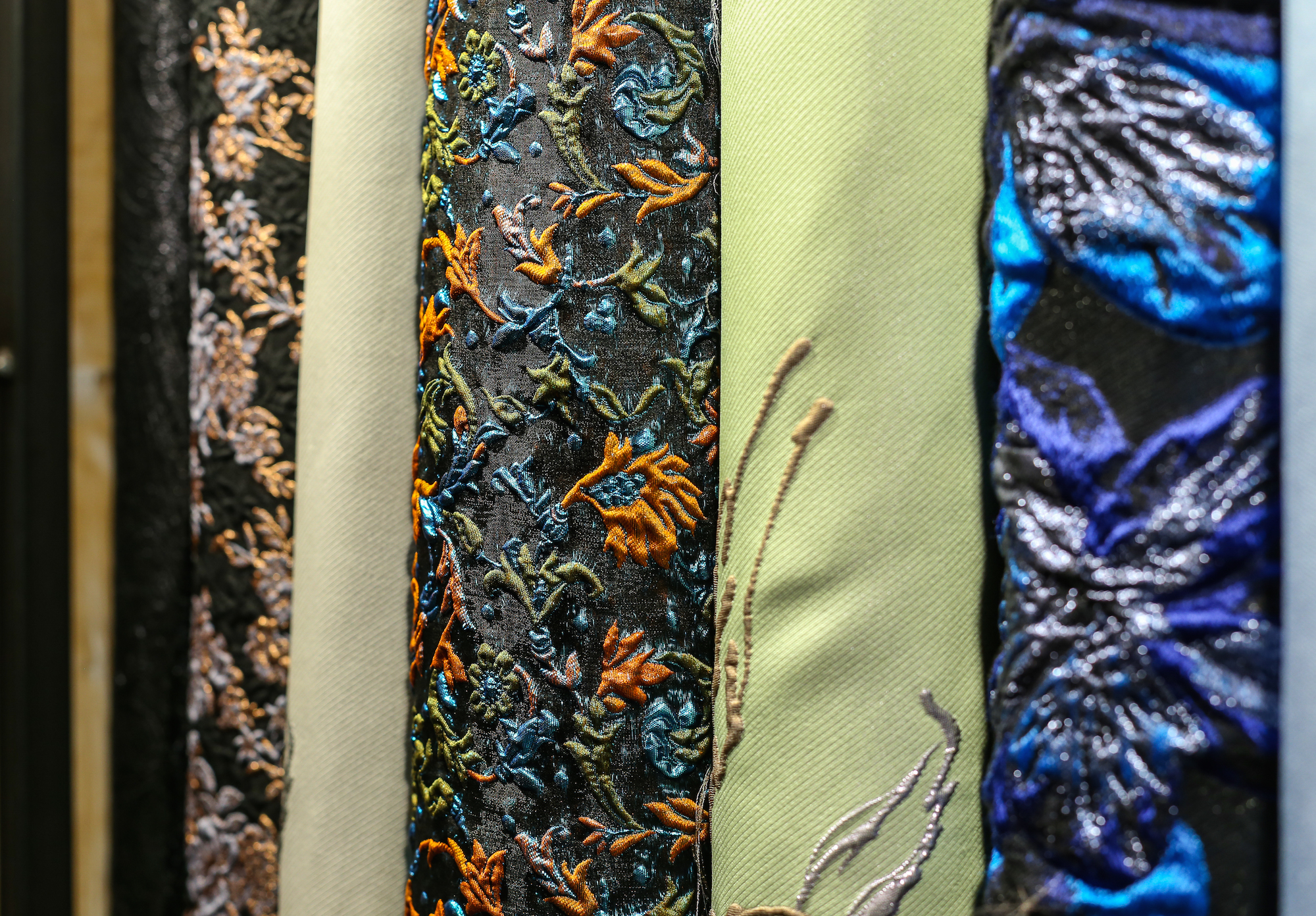
Technology and ecology. Are they two antagonistic concepts? Can they go hand in hand? At Gratacós we think so. Innovation and the latest technologies at the service of the new green economy, one that is at the service of sustainability in all its dimensions. A global strategy that affects companies in any sector and on which we at Gratacós have been working for many years in multiple ways, such as energy saving or the commitment to recycled packaging that complies with European regulations. Even so, it is in this Autumn-Winter 2019/2020 collection that the move towards sustainability is also affecting production processes, with the introduction of sustainable fabrics in our traditional seasonal catalogue.
In the era of fake news and information excess (which ironically generates more misinformation) we want to be more honest than ever. We have started on a path of transition towards sustainability, choosing recycled and regenerated fibres to produce sustainable fabrics that minimize the impact on the environment. In this collection we have introduced some rather anecdotal articles because we consider that it has been an experiment which seeks to mature processes. The idea is that through the ingenuity and creativity of the design department we will take new steps in future collections, but in advance we will supply you with abundant items made from recycled and regenerated raw materials. That is why we consider this to be the collection of change. From the beginning to this move towards greener technology and ecology which creates synergies for a more sustainable world.
That said, the proposal ‘ Technology vs Ecology ‘ was inspired in its day in a context of mutation and change that specifically affects the design department. It was not an easy collection to conceive because the global economic context was valued to create more contained (but no less creative )products for greater acceptance in a market that is unstable and low risk for a season that is born with a great difficulty in generating concepts. Even so, the collection was conceived from three points of view: a certain austerity with articles that cover the classics using new contemporary languages; a transeasonal vocation for an intelligent and flexible wardrobe with items that work during this interim period; finally, a line of items for special occasions with reflections and glitter that enrich the fabrics: beautiful jacquards, fancy threads, winter flowers, tartans, prints in vintage velvet … An evening creation interpreted freely and with some extravagance.
Fabrics
Given this sobriety and classicism, this collection has used noble materials for austere, serene and strident-free fabrics. Robust fabrics only in appearance with elaborate textures of strange touch where the glows merge with the matt. Velvets and silks become denser, but maintain lightness and softness to the touch to preserve a theatrical point without falling into excess. Tactile weaving designs and dark-coloured fabrics that play with well-studied points of light with dimmed brightness, but more rational than ever, have also been taken into account. Controlled light.
The Autumn-Winter 2019/2020 collection is also a collection rich in fabrics that mimic the fake fur or skin of animals with a clear cruelty-free spirit . Finally we have taken into account the fabrics that mimic manual techniques such as tie-dye , watercolours … It is obvious that they are manufactured via an industrial and digital process, but we try to make the final result seem handmade.
Designs
The designs also connect with nature from different angles: from floral elements, through spots and reliefs that mimic some minerals to prints that are reminiscent of of animal skins. The collection also includes the most basic linear graphics, pictorial motifs and a new reconfiguration of stripes and squares.
In fact, in general it is an eclectic proposal that mixes several codes, maintaining a basic tune: skin, manual-looking flowers, dimmed glosses, retro motifs inspired by the upholstery of the home, digitally printed tartans, surprising textures, night volumes …
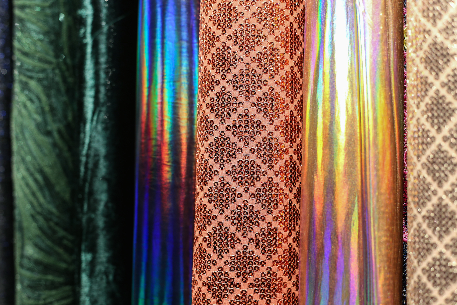
Colours
In chromatic matters there is talk of a dense but surprising collection where dark colours abound with small, carefully-worked glints that break with any monotony. A kind of poetic darkness. Black is a constant colour that articulates the winter creation. These muted winter tones refer to the beauty of imperishable classics. Sensual and elegant colours where textures and volumes become more evident.
Beyond the dark range there are other more cheerful tones such as some brush-strokes of winter blue, bright reds, caramelised bricks, cold turquoises with mustards, seductive greens (now paler compared to other seasons) and a palette of pinks in soft shades. There are also orange and strawberry nuances that seek harmony and contrast with the rest of the colours in the collection. All this colour flirts with the metallic shades, especially matt gold.
At Gratacós we hope you like this new feature and we invite you to come and see it in our store in Barcelona.
Viernes 20 septiembre 2019
The move towards greener companies is nowadays an obligation, not merely an option to contemplate. The superabundance of industrial processes and the consequent mass production of the last century are inconceivable in the 21st century if we fail to take into account the impact they have on the environment.
The industry has inherited an unsustainable development model based on the misuse of social and natural resources with consequences for the Earth which for decades have been evidenced in a frequent and increasingly common way: the increase in the temperature of the planet, the large-scale deforestation, the increase in greenhouse gas emissions or the expiration date of many natural resources and energy sources due to irresponsible use without considering the consequences. In short, the dreaded climate change we are already experiencing. Today we talk about environmental crisis, a type of global recession that adds to the financial, economic or industrial consequences with which we are too familiar. Quite apart from the large-scale ecological disasters, if adequate measures are not taken to stop this phenomenon, the environmental crisis can lead to social conflicts and the inability of companies to continue maintaining their economic activities.
Rosa Pujol: “Sustainability is a necessary collective commitment”
Aware of the situation, we believe that new opportunities also arise from the crises and those companies that commit to the new “green economy” will be the ones that will have competitive advantages and will position themselves as leaders. “Gratacós wants to grow and accordingly understands that other parameters must be taken into account. Sustainability is a necessary collective commitment in all sectors, ”says Rosa Pujol, creative director of Gratacós. There is a growing need and demand among consumers for sustainable and ethical products, especially among new generations that have greater sensitivity. “We create collections for generations of the future because change is in them and they are asking for the industry to take action,” says Pujol.
Rosa Pujol: “We create collections for generations of the future”
In this sense, at Gratacós we have been working for a sustainable future based on efficiency in the use of energy and natural resources. In the Barcelona offices and the Canovellas warehouse we have opted for an energy efficiency policy and a new BOP lighting system (with plasma base) that is currently the most technologically advanced product on the market. In addition all the plastic material we use for the packaging of our merchandise is supplied by a company that certifies its manufacture with 100% recovered material, whilst the cardboard in boxes has the REACH certificate that controls and restricts the use of chemical substances.
One step further
Currently our mission in the field of sustainability also extends to the production processes and a gradual commitment to innovation and research of sustainable fibres and fabrics that are already being integrated into the collections of each season. “We are talking about a change that affects weaving with regenerated and recycled fibres and the commitment to bio fabrics. Right now we are working under these guidelines, ”explains Rosa Pujol.
In the current Autumn-winter 19/20 collection, some recycled and regenerated fibres have already been introduced, but our real and palpable commitment will take shape in the next summer 2020 and winter 2020/2021 collections: recycled polyester, recycled or regenerated cotton and cupro are, among other innovations that we are already presenting at international fairs. This move towards greener attitudes is unstoppable!
This commitment to sustainability has a certain handicap. “These fibres are a bit more expensive because they have gone through a regeneration process. Gradually the customer will come to understand this added value, ”argues the creative director of Gratacós.
Could 100% sustainability be achieved?
The sustainable commitment is gradual but unstoppable and our intention is to strengthen and work in this direction in the coming years. “Right now it makes no sense to speak for so many future years because what matters is the position and attitude of the company looking for new formulas for sustainable development,” explains Rosa Pujol. And she adds by way of conclusion: “If we do not do so, we have no future.”

Viernes 13 septiembre 2019
Sorry, this entry is only available in Español.
Jueves 05 septiembre 2019
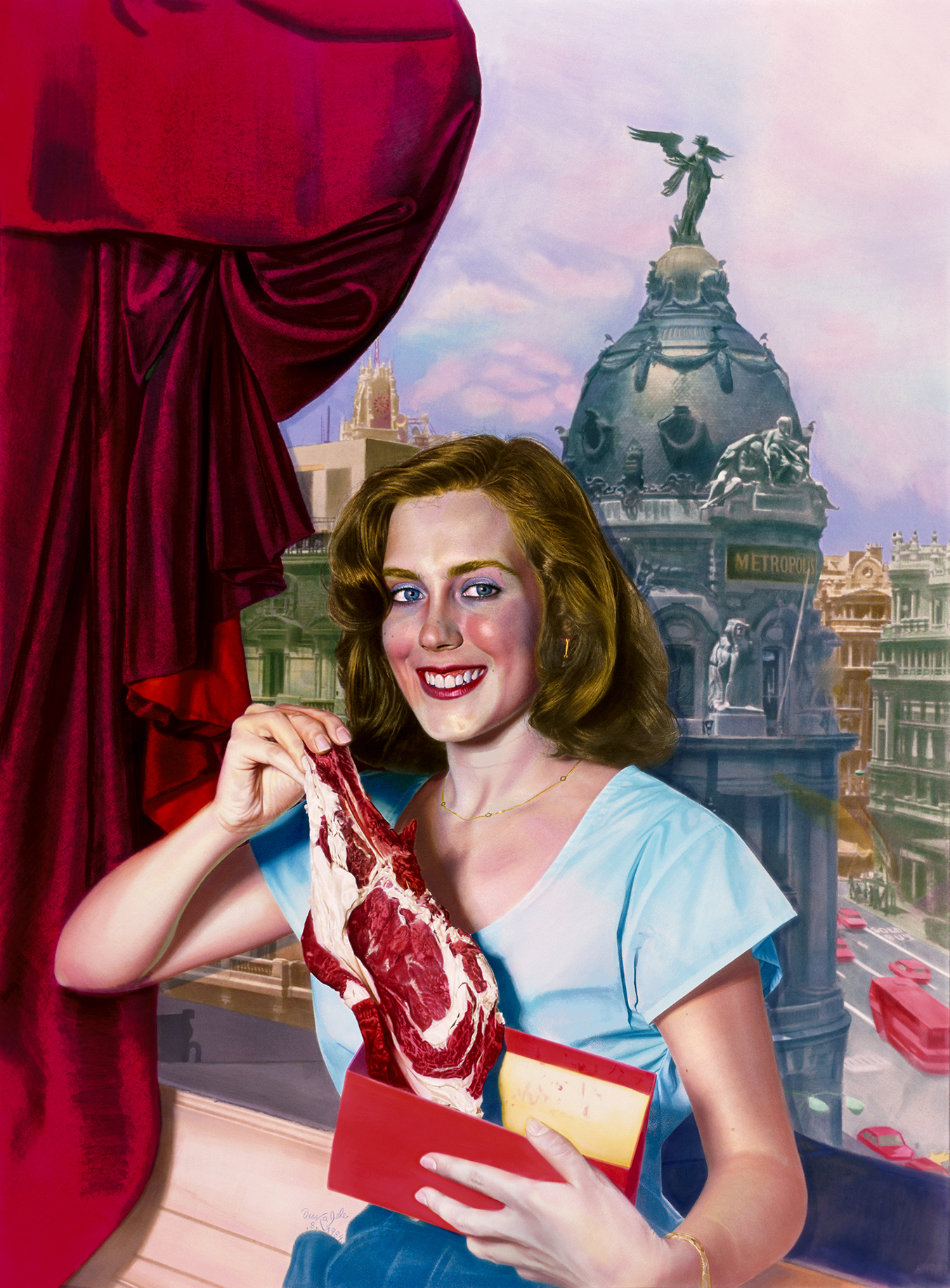
We kick off the season talking about another exhibition that extols the female figure and gives a new vision of the “body-fashion” relationship. Its title is evocative: ‘El Cuerpo Inventado’. (The Invented Body). A sample organized by Collectors Collective in Madrid that highlights the aesthetic canons that have remained in fashion since the early twentieth century to the present day, providing a new dialectic of evolution and changes that are especially appreciated in women’s clothing .
4 silhouettes and a century
The silhouette is responsible for creating the spirit of time beyond colours, fabrics or trimmings. It is precisely the silhouette that captures the aesthetic canon of an era.
In spite of its apparent richness and variety, the history of Western feminine dress has been repeating its forms throughout the centuries: there are only a handful of silhouettes with which the dressmakers have invented their creations. For example and focusing on the last 100 years, the silhouettes that have had more relevance in the twentieth century are four: tubular silhouette, triangular silhouette and double triangle silhouette, globular silhouette and anatomical silhouette. In addition, all of them have a history in previous centuries. Of course: the prevalence is not exclusive. The silhouettes can coexist in time, although the protagonism of one of them will be the one that defines the era.
In turn, the exhibition also proposes a reflection on “the tyranny of the invisible” and the naked body, a movement that has been consolidating in recent years to reach today unsuspected limits.
Collections and creators
‘The Invented Body‘ is formed of pieces by important fashion collectors (Antoni de Montpalau, Quinto, Maite Mínguez and López-Trabado), as well as three prestigious international renowned museums such as the Costume Museum of Madrid, MUDE : Lisbon Design and Fashion Museum and the Fashion Museum of Santiago de Chile.
The exposed designs are part of the most relevant names on the international scene such as Lanvin, Chanel, Christian Dior, Givenchy, Mainbocher, Versace, Yssey Miyake, Azzaro , Azzedine Alaïa , Pierre Cardin , Yves Saint Lauren, Pucci, Christian Lacroix, Commes des Garçons or Gucci. There are also first-class Spanish designer models such as maestro Cristóbal Balenciaga, Pedro Rodríguez, Lorenzo Caprile , Ágatha Ruiz de la Prada, Jesús del Pozo, Leandro Cano, Ernesto Artillo , Antonio Velasco or Josep Font.
Trendy icons of yesterday and today
Throughout the history of the suit, fashion has used influential people to spread itself. Until the nineteenth century, it was the aristocracy who used to have this mission, but at the end of that century this trend begins to change and it is women in the field of culture and entertainment who become fashion prescribers for the dissemination of fashions. Next to a specific silhouette there is usually an influential woman legitimizing it: how could we disassociate the silhouette that narrows the waist, projects the breasts and widens the hips of actress Marilyn Monroe?
Therefore, the exhibition also includes the role of these famous women who have consolidated the different aesthetic canons, taking a tour of the most influential names in fashion of the twentieth century, with dresses that belonged to Madonna, Claudia Schiffer, Rita Hayworth, Audrey Hepburn, Sophia Loren, Lady Gaga, or even her majesty Doña Letizia, among other relevant women.
‘The Invented Body ‘ of Collectors Collective opens next Thursday, September 12th at General Perón Avenue in Madrid and can be visited until December 15th.
Fotos: Alfonso Ohnur
Sorry, this entry is only available in Español.

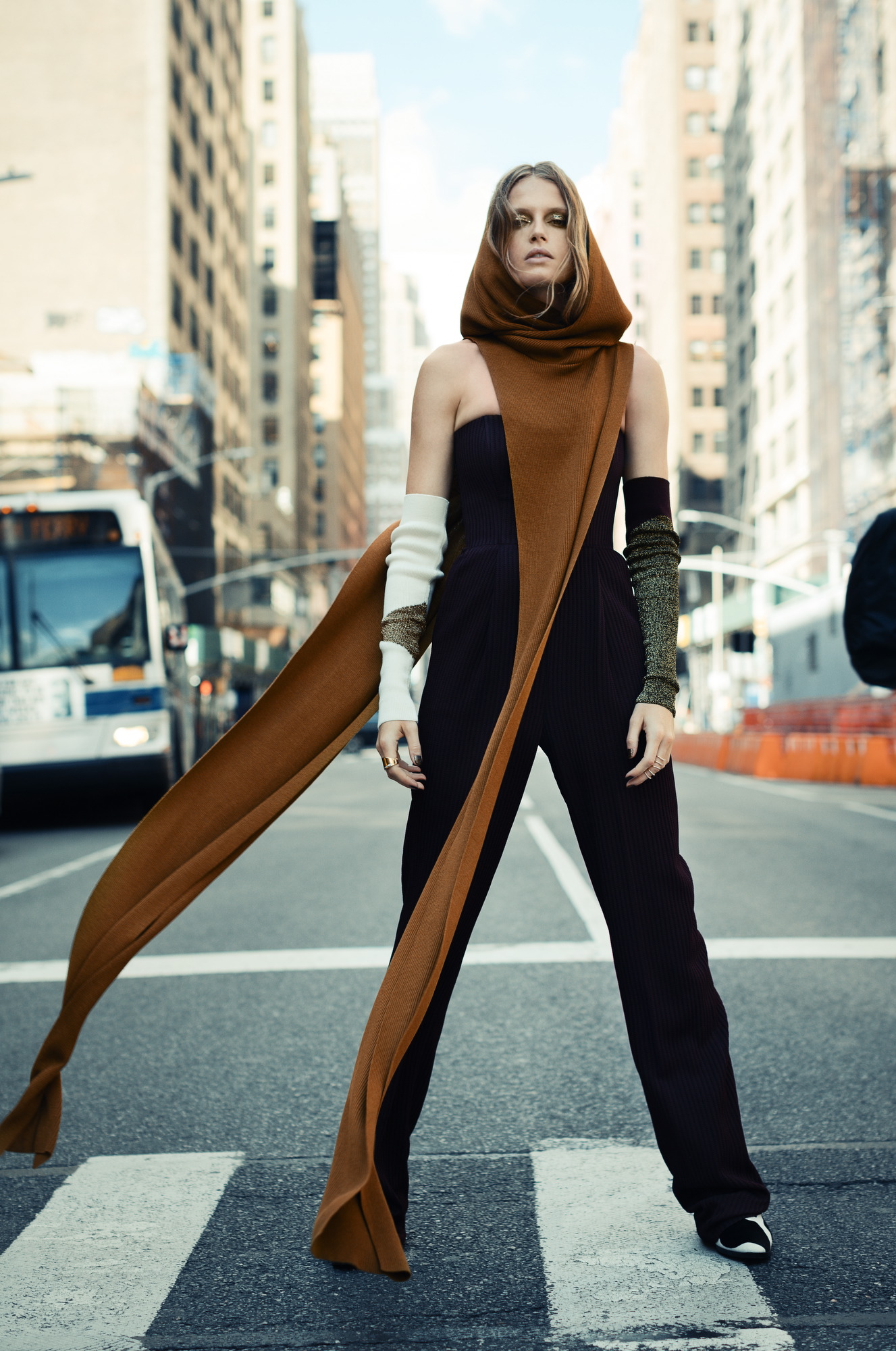
After Barcelona, it has been Madrid’s turn for catwalk shows. Again, Gratacós has been present in some creations for the upcoming season thanks to the support of Spanish designers who confide in us. Coming up, we analyze some proposals seen in the 70th edition of the Mercedes-Benz Fashion Madrid in the Spring-Summer 2020 collections. Do you recognize the fabrics?
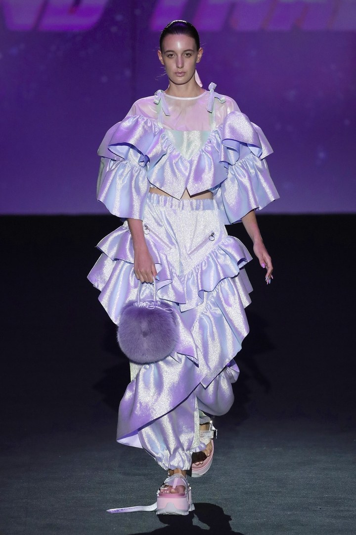
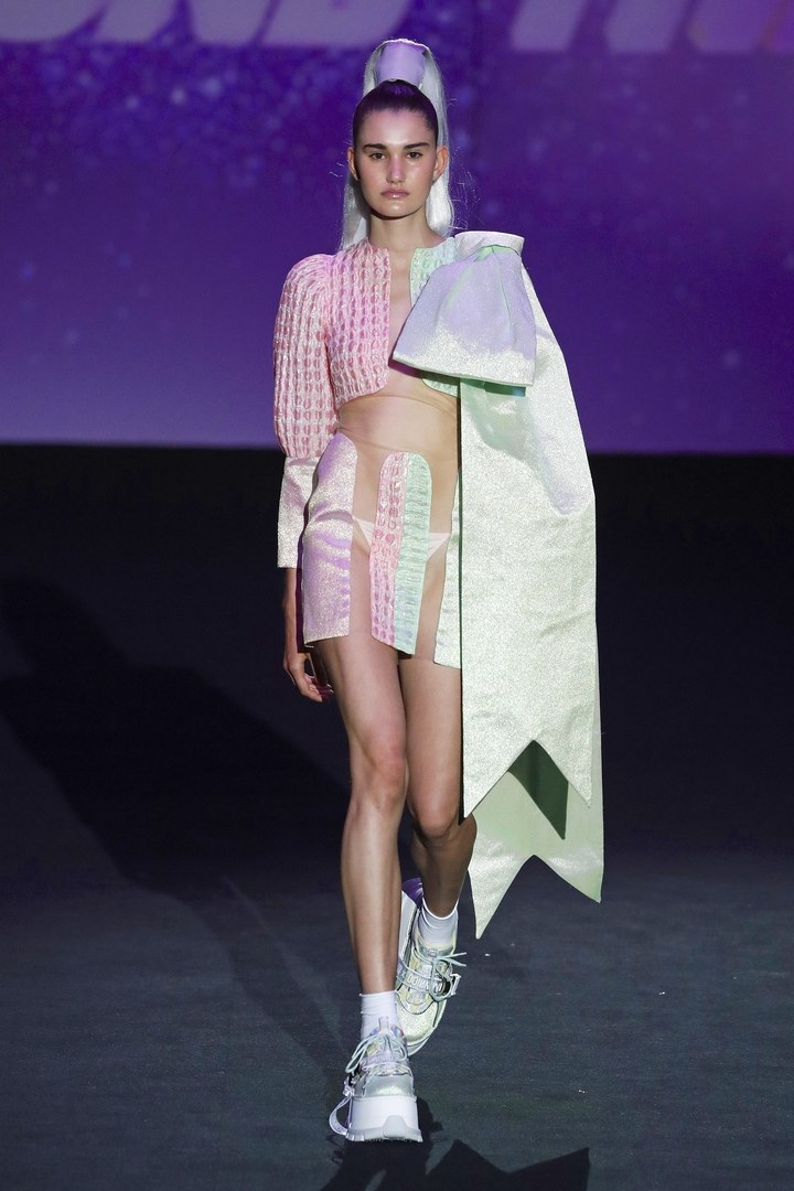
Dominnico The new generation
The winner of the Mercedes-Benz Fashion Talent, Domingo Rodríguez presented the award-winning collection on the Madrid catwalk: ‘ Harajuku Kids ‘ is a proposal that appeals to the young people of the Z generation inspired by Club Kids , the London generation of the nineties and also In the new digital age. A proposal that also takes into account the urban tribes of Japan and is conceived as an agenda , away from labels with extravagant shapes and silhouettes that are an invitation to individualism and to one’s own character.
The Dominnico collection, with a vast range of Gratacós fabrics, is imbued with textures, sequins, rolling, tulles, overlays and volumes wrapped in a range of pastel colours. Thus, inheritance, current affairs and even future were mixed thanks to an unusual sweetness and femininity in Dominnico that advances to gain maturity in its style.
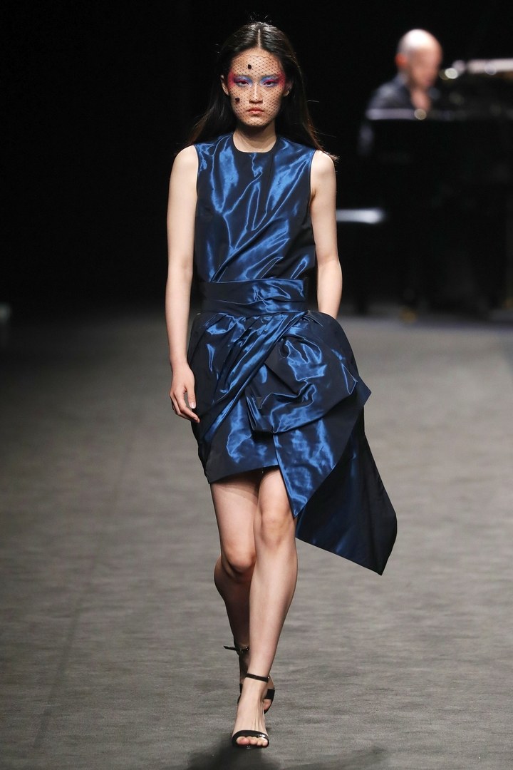
Brain & Beast: Is released from the clichés
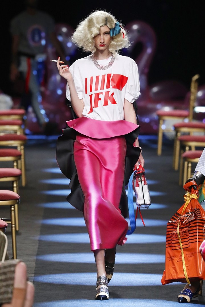
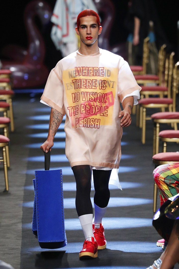
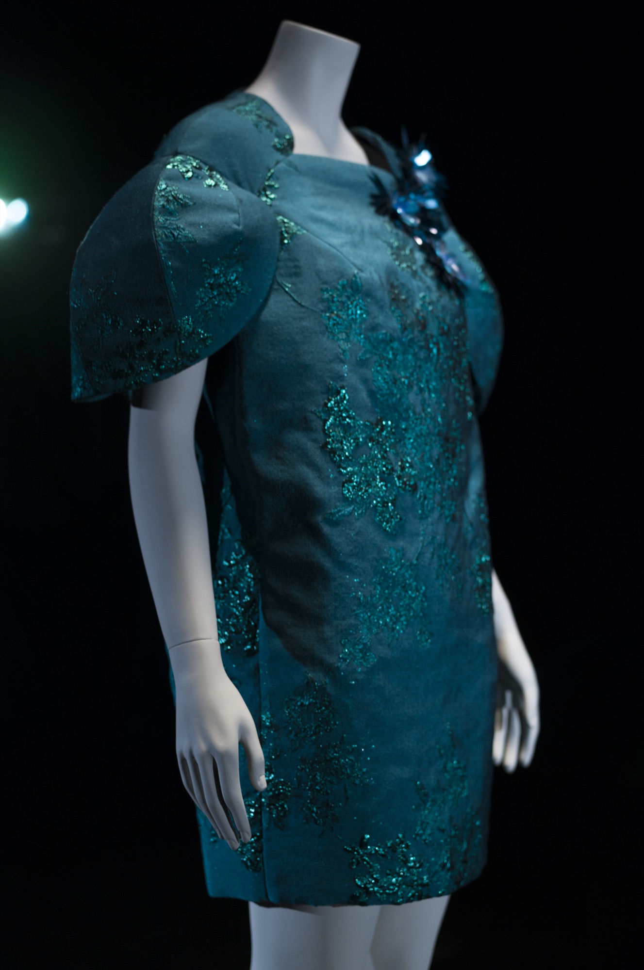
The Brain & Beast creative team, led by Ángel Vilda, presented in Madrid the second part of their proposal based on totems and taboos, initially introduced in Barcelona. If in 080 Barcelona Fashion , Vilda criticized the clichés and conventions that people impose on themselves, in ‘ Taboo ‘ the liberation of the alter ego was shown , the projection of real desire. On the catwalk no shortage of printed message such as ‘Happiness is a lack of fear’ in the most striking garments. Iridescent and satin fabrics coexist with classics that flee from the sober appearance combined with atypical proposals that give rise to renewed styles. The scenery, as always impeccable: a disco ball presided over the stage symbolizing the totem, while the chairs placed in the middle of the catwalk symbolized the taboos.
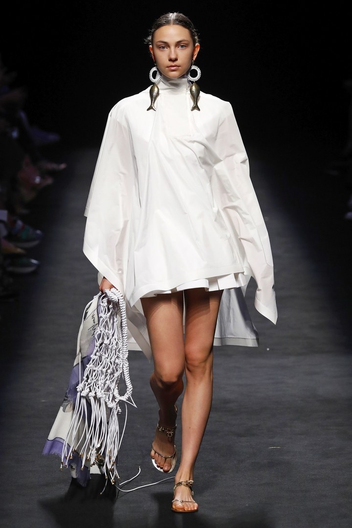
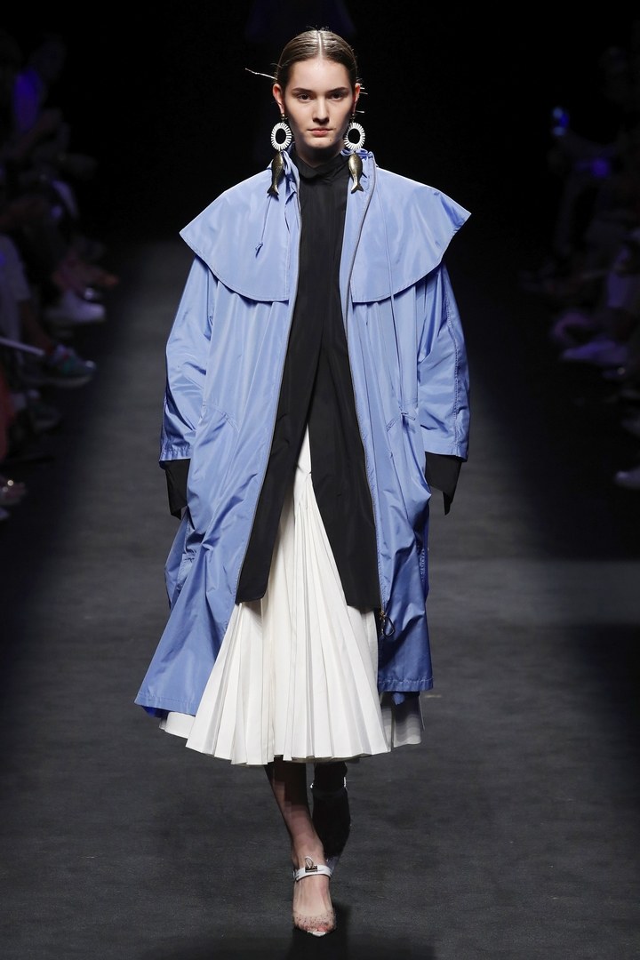
Juan Vidal: An ode to classic beauty
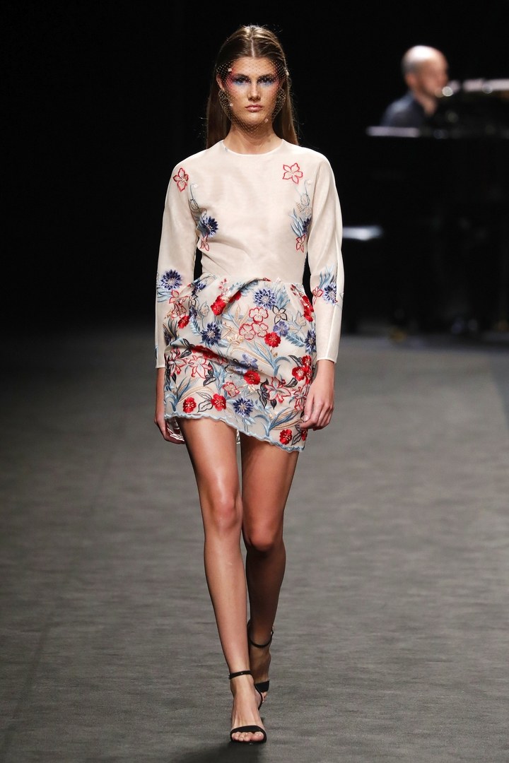
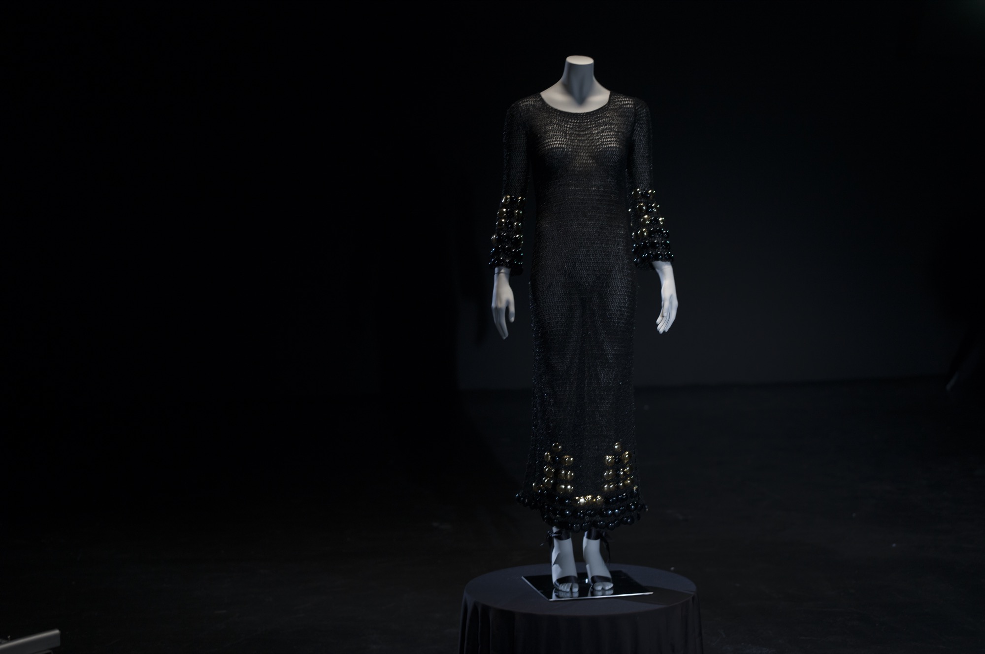
The Alicante designer specialized in enhancing the femininity of women presented a collection of Renaissance dyes dedicated to the goddess Venus, a classic beauty ideal. In this way, Juan Vidal collected all the Roman and Greco-Roman references and transported them in urban and contemporary with a pure and bright proposal, which empowers women. The goddesses of Juan Vidal wear white with brushstrokes of blue and gold, until they reach rigorous black. Skirts were seen constantly throughout the show, as well as the flowing garments, the XL shirts and the suggestive volumes. We loved seeing some of our fabrics in this powerful collection!
The 2nd Skin and Co: workshop crafts
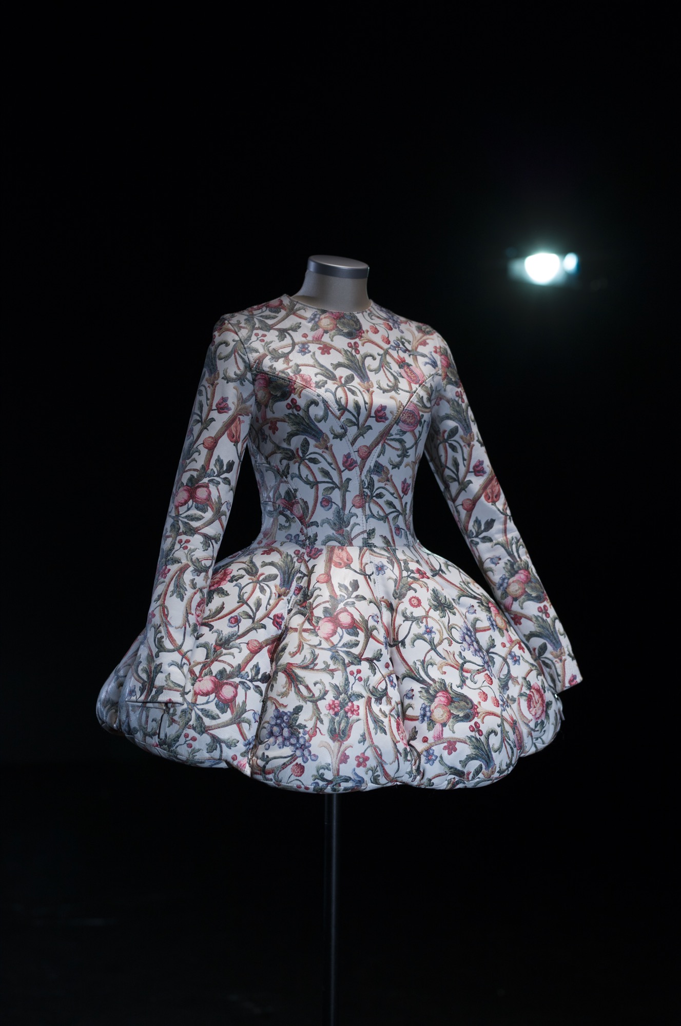
‘Atelier Madrid’ was the new proposal by The 2nd Skin Co. and refers to the location of his workshop with clear French touches. In this sense, the Spanish firm aims to merge Madrid aesthetics with the details of Haute Couture. Once again, designers Antonio Burillo and Juan Carlos Fernández seek to deconstruct patterns with a work that transform each garment so that what is traditionally hidden in a design comes to light and shapes it. This is how creations that look semi-finished look and some labels are visible. The main aspect of this collection are cocktail dresses with mini cuts, corseted bodies and voluminous skirts. The ties and floral motifs become the guiding thread of some proposals in which fuchsia color has a significant presence.
The exhibition: Juan Carlos Pajares
Within the Madrid Capital de Moda (MCDM) program, in parallel to the Mercedes-Benz Fashion Week , we make special mention to the exhibition by Juan Carlos Pajares in the Cecilio Rodríguez Gardens of the Spanish capital. That’s where the designer presented his collection ‘Yes, take the risk ‘ in a solid commitment to research new creative languages that are out of fashion conventions.
Pajares worked in collaboration with the music producer Meneo who tried to put sound to the 5 families of different ensembles that represent the 5 phases of the feelings that inspire the collection in a fun performance. The new proposal itself speaks of risk and courage through contrasting colours and fabrics such as silk organza and mikados, twill, crepes, neoprene and sequins. A collection for those who want and feel, value fashion, but, above all, that end up listening to that inner voice and express themselves with it.