(Español) Oriol Maspons, la fotografía útil
Dominnico wins the prize Mercedes-Benz Fashion Talent 2019
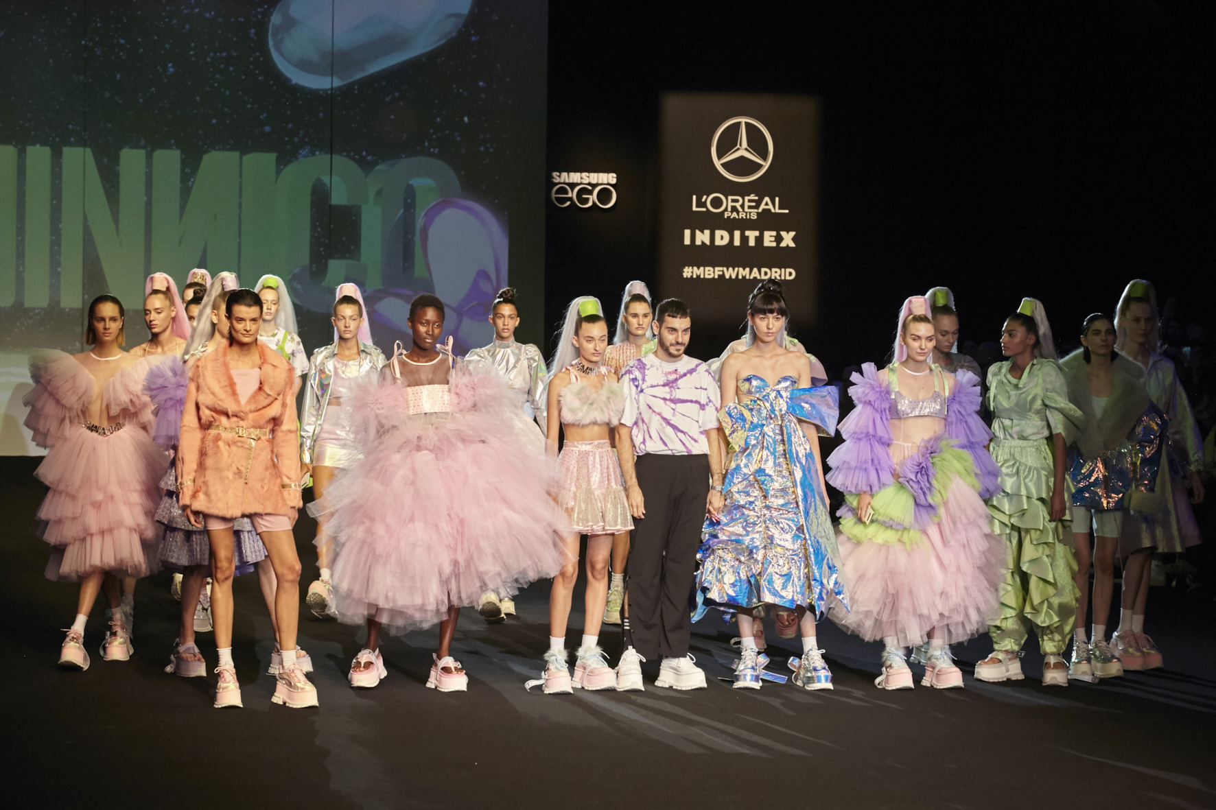
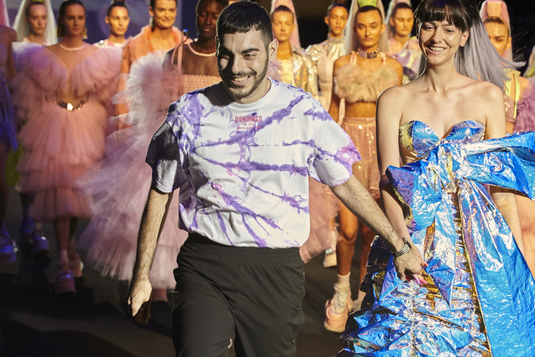
The rise of Dominnico was foreseen . It was just a matter of time for his meteoric career to take off. And this ascension has only just begun. Now, the restless Domingo Rodríguez has landed himself a new achievement that consolidates him within the map of young promises of Spanish fashion : becoming the winner of the Mercedes-Benz Fashion Talent.
“Winning this award means fulfilling a dream.It represents the start of my firm and the beginning of a new stage for this project “, explained the young designer after winning the prestigious award.In fact, the designer has already begun to gain fame outside our borders.At only 24 years of age, Dominic has dressed personalities from the world of entertainment such as Lady Gaga, Rita Ora or Rosalía, who have worn the outfits ,made in part with our fabrics on tours around the world.
His impeccable dressmaking, his huge national and international projection, his early maturity and his commercial outlook have been some of the attributes that have fascinated the jury. A project with a speech of its own and true to its essence that has made him the winner of the 14th edition of this contest that rewards young talents.
Domingo Rodríguez: “inning this award means fulfilling a dream and the beginning of a new stage for Dominnico”
An ode to Generation Z
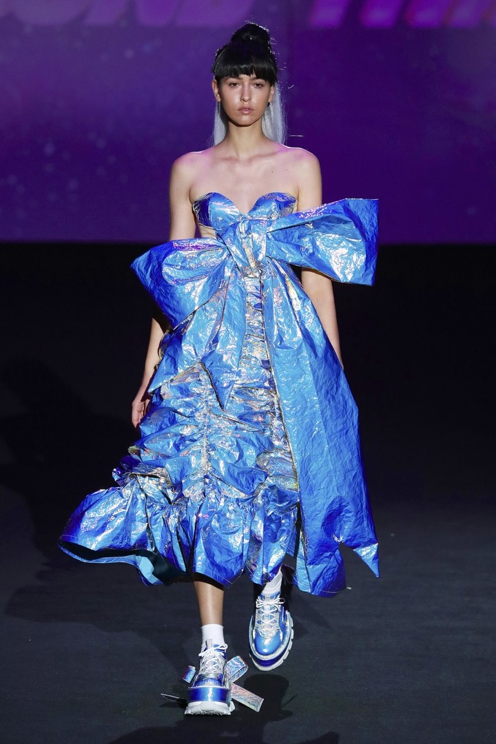
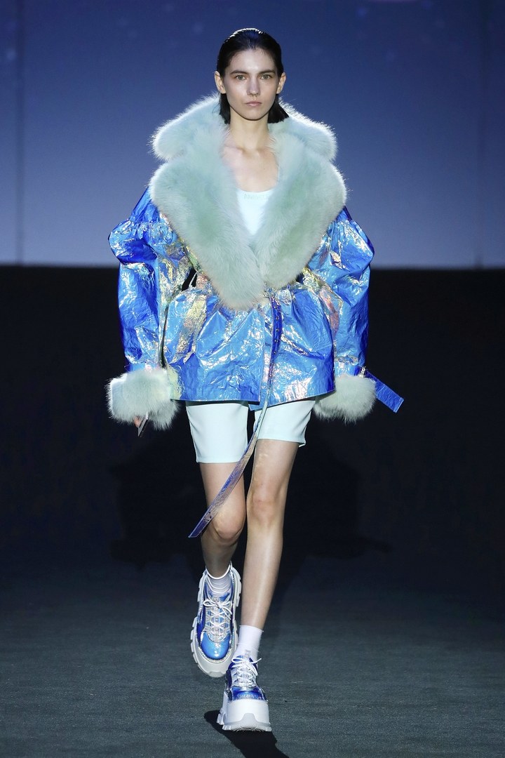
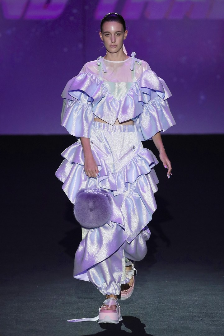
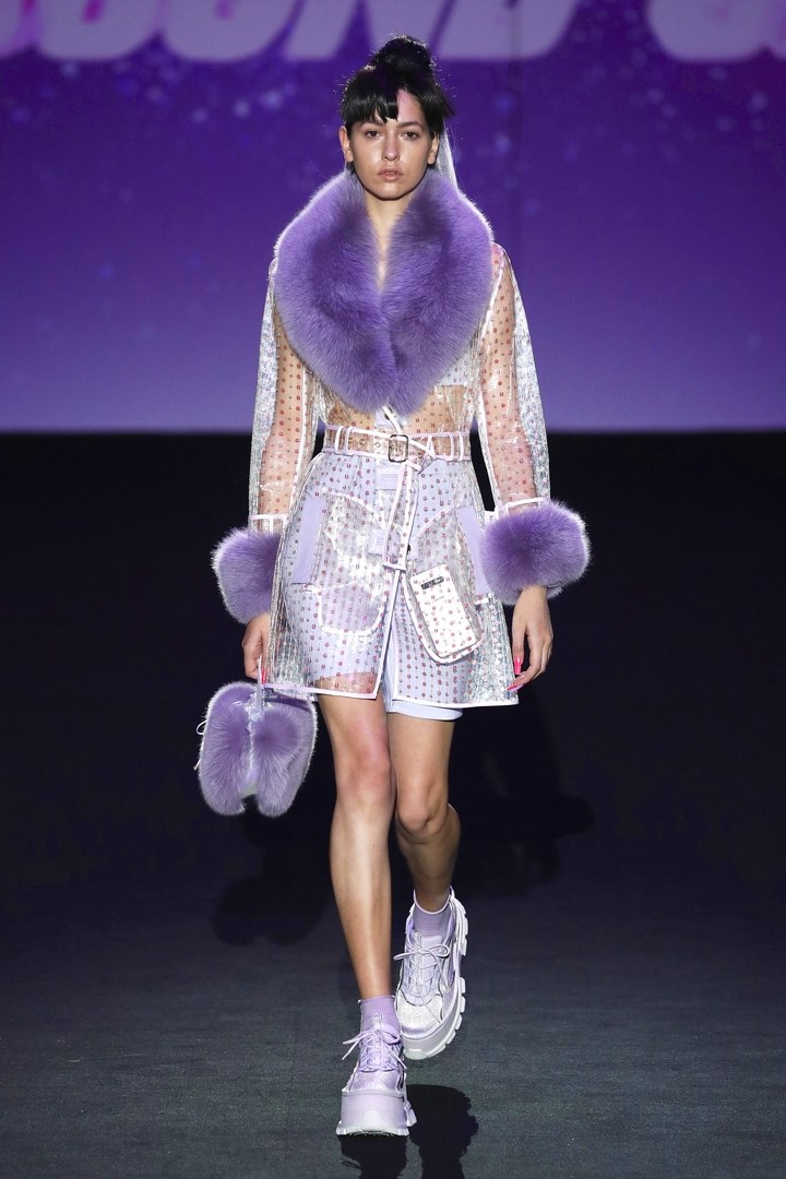
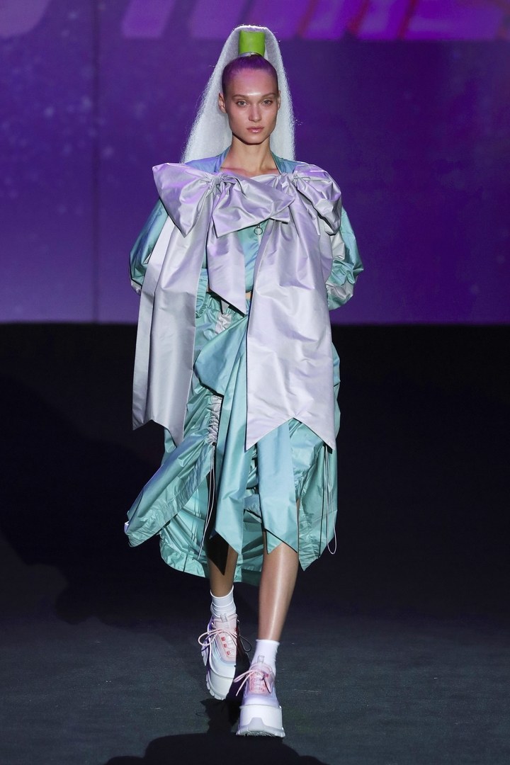
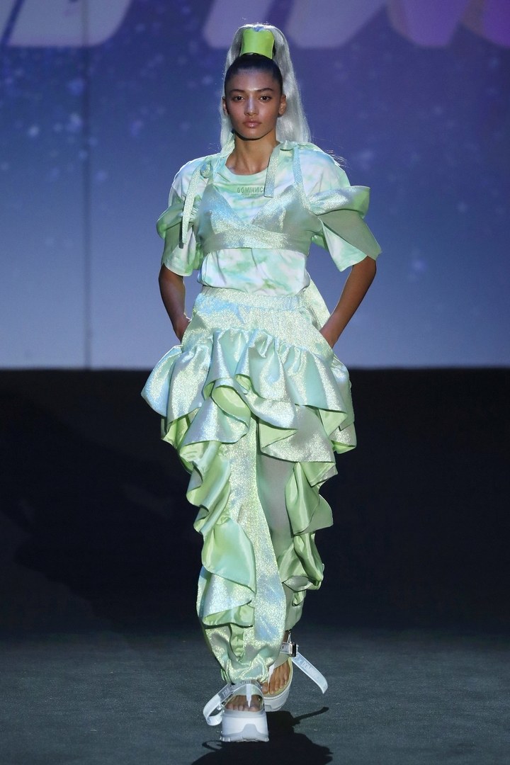
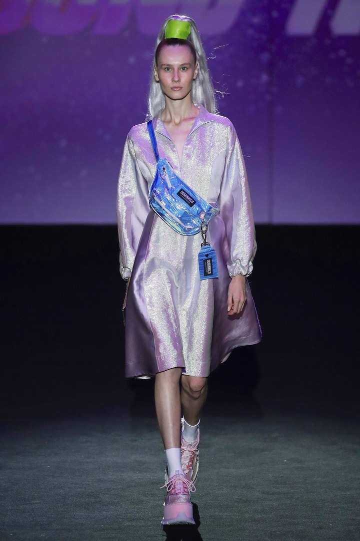
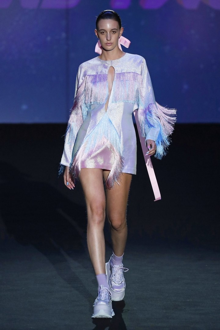
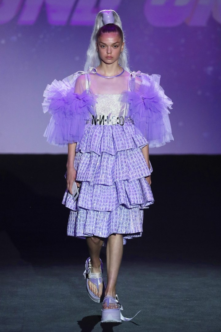
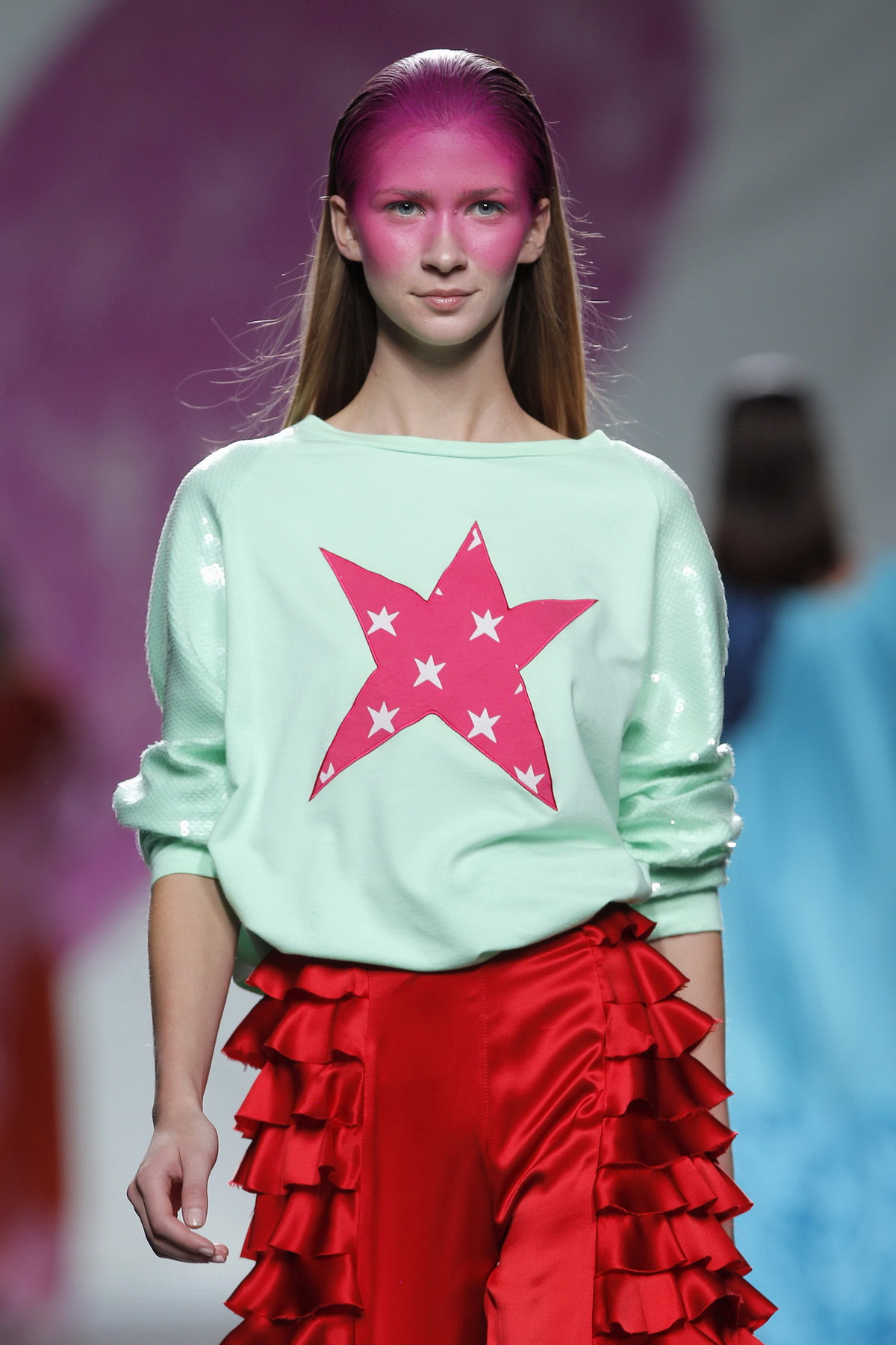
The award-winning collection , presented on the Madrid catwalk , is called Harajuku Kids and it is inspired by Club Kids, the London generation of the nineties, but also in the new digital era, centreed above all on social networks. Artists like Andy Dixon, Antoni Tudisco, Six N. Five, or the influencer Ruby Gloom have also been taken into account in the conception of the collection. A proposal that also takes into account the urban tribes of Japan and is conceived as agender, away from labels with extravagant shapes and silhouettes that are an invitation to individualism and character.
The collection, replete with Gratacós fabrics, is impregnated with textures, sequins, laminates, tulles, overlays and volumes wrapped in a range of pastel colours. In this way, inheritance, actuality and even future mix thanks to a sweetness and femininity unusual in Dominnico that advances to gain maturity in its style.
 |
 |
Next stop Georgia
Beyond the recognition, the prize includes the possibility of a catwalk next November at the international Mercedes-Benz Tilti Fashion Week in Georgia. A moment in which the designer from Alicante will already be presenting the winter collection of the following year. In this way, Domingo Rodríguez joins the successful group of great young talents who got this award back in the day, such as Outsiders Division, Célia Valverde, Juan Carlos Pajares, Ela Fidalgo, Xavi Reyes, María Clè Leal, David Catalán, Ernesto Naranjo or Pepa Salazar.
 |
 |

 |
 |

 |
 |

 |
 |

(Español) Gratacós en el 080: Colecciones SS20
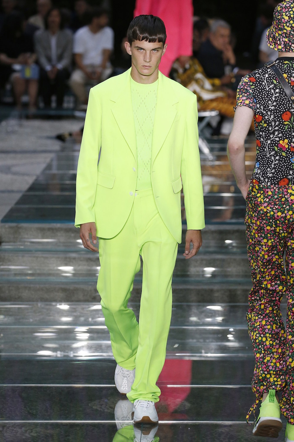
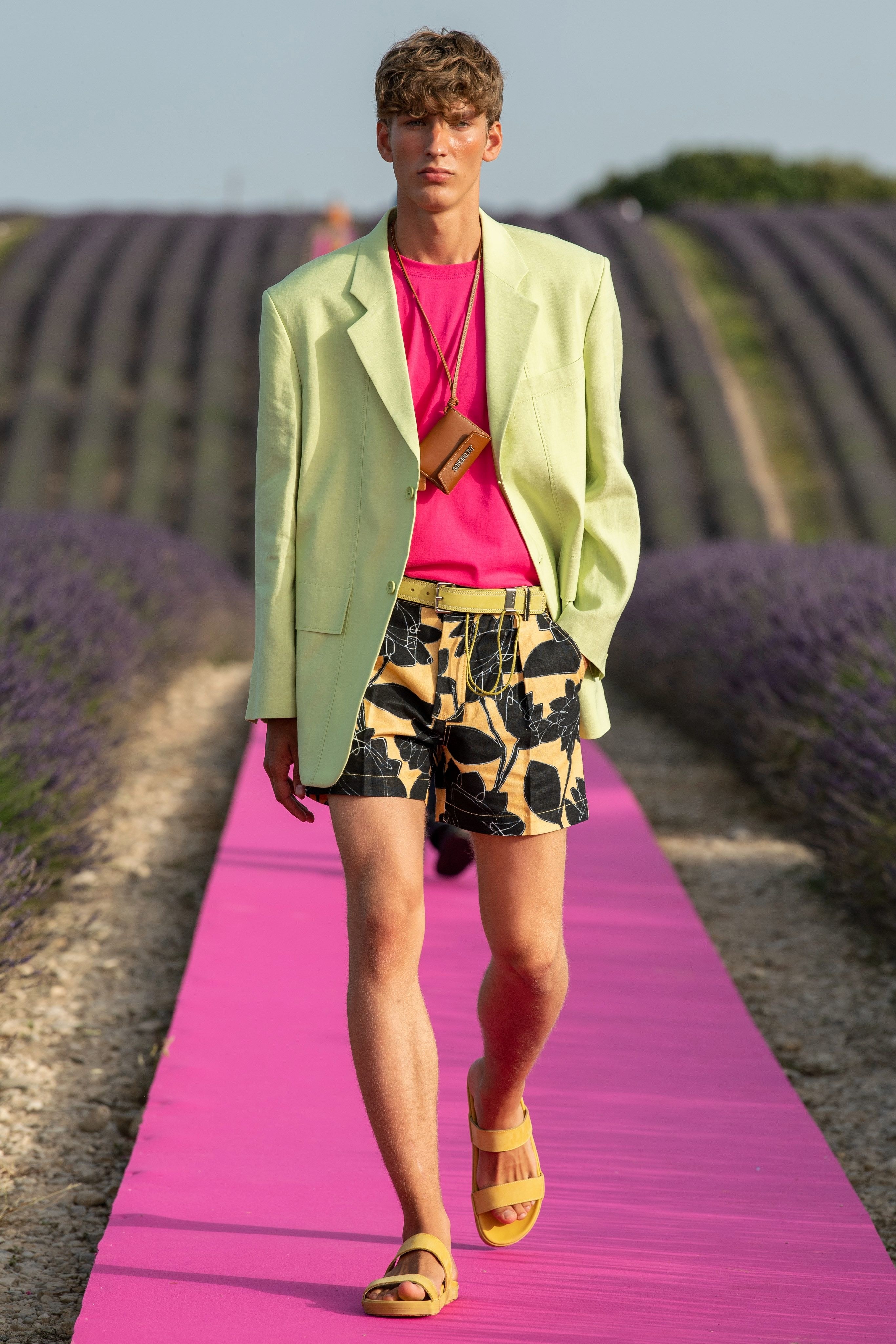
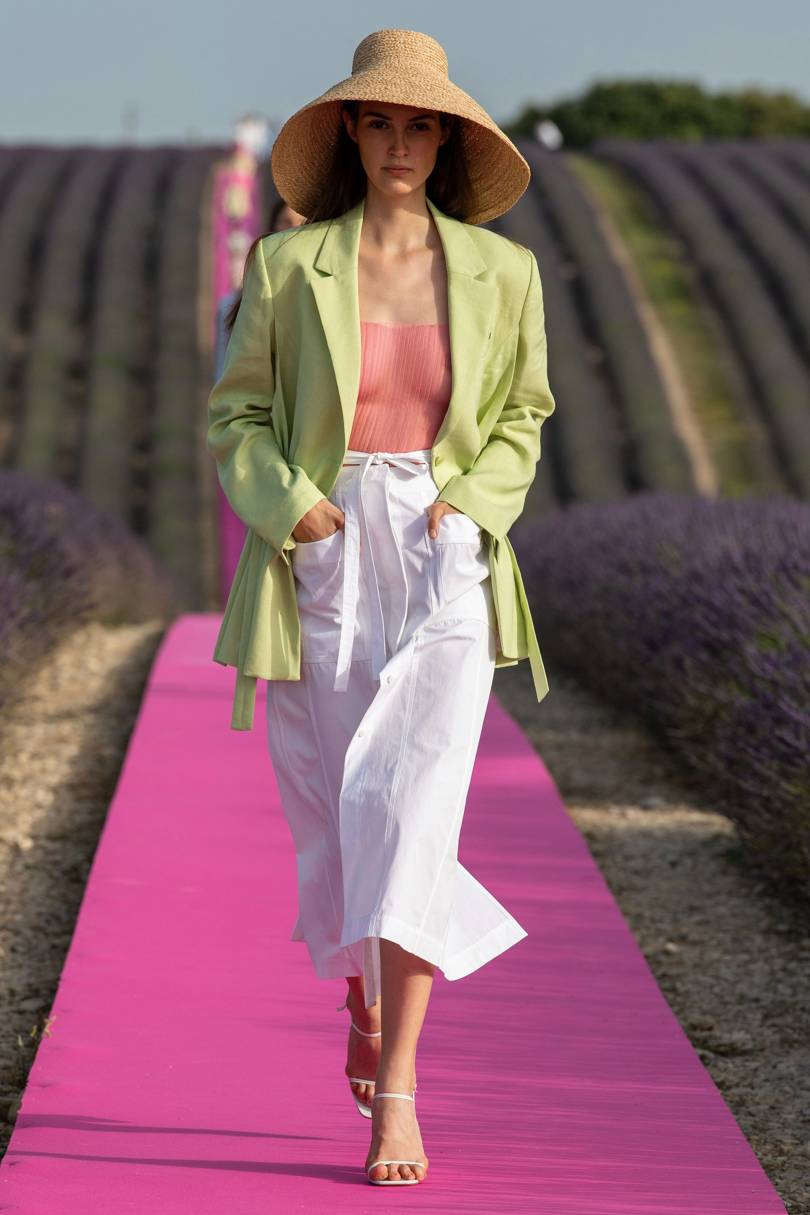
Lime green, the last chromatic obsession
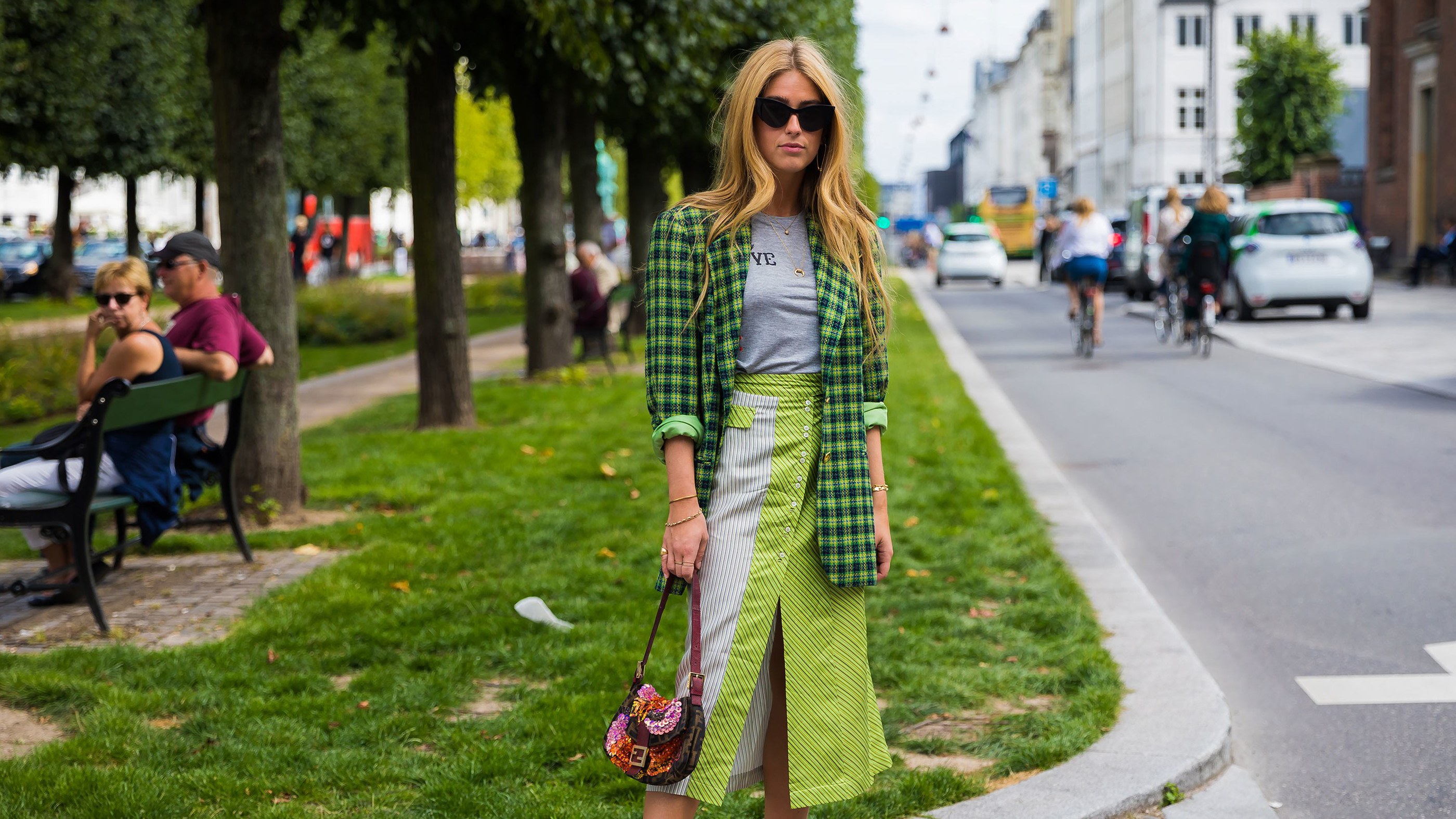
It is not a novelty this season, but it is reluctant to abandon the podium of trends. It has no rival in terms of strength, brightness and daring and has gone from being a simply radiant colour to becoming a symbol for generation Z. We are talking about the most shocking green: in neon, lime or pistachio. It is the true “king” of summer that permeates the street style with its rebellion and youth.
Almost a year ago this carefree colour began to resonate as a trend. Lime green in its fluorine version was slipping into the winter closet . The greatest impact was achieved through Instagram when it stormed surprisingly into the timelines of various fashionable influencers. This gaudy tone caught everyone’s eye through one viral garment: a tight-fitting perkins-neck sweater that was displayed brazenly with the same blinding force of a lightning bolt . Fluorescent green in all its glory! This garment was shown in different versions and by several different companies – both design and low cost – who adapted it in their own way. The lime green jersey became the most coveted trend of the moment.
 |
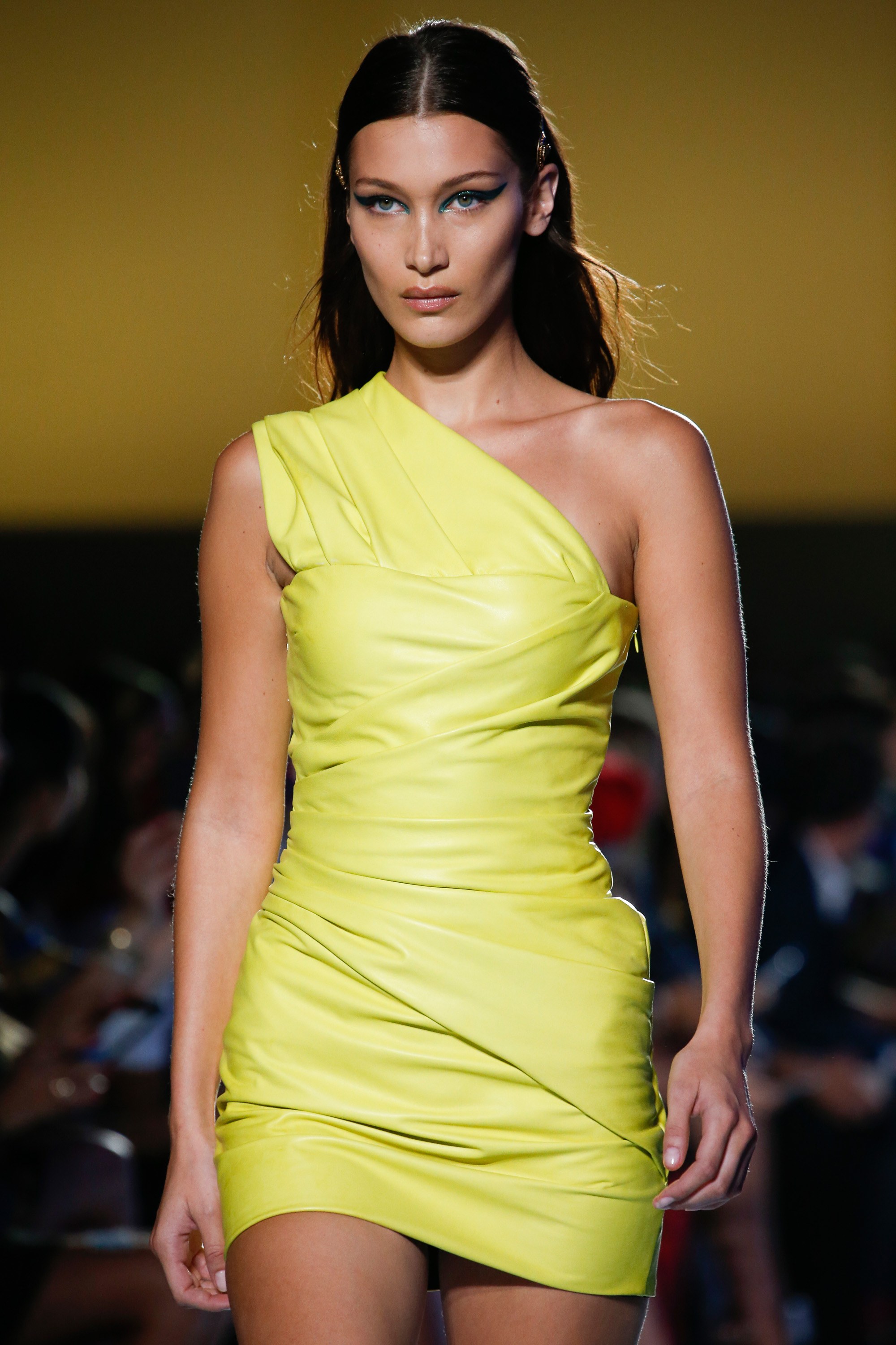 |
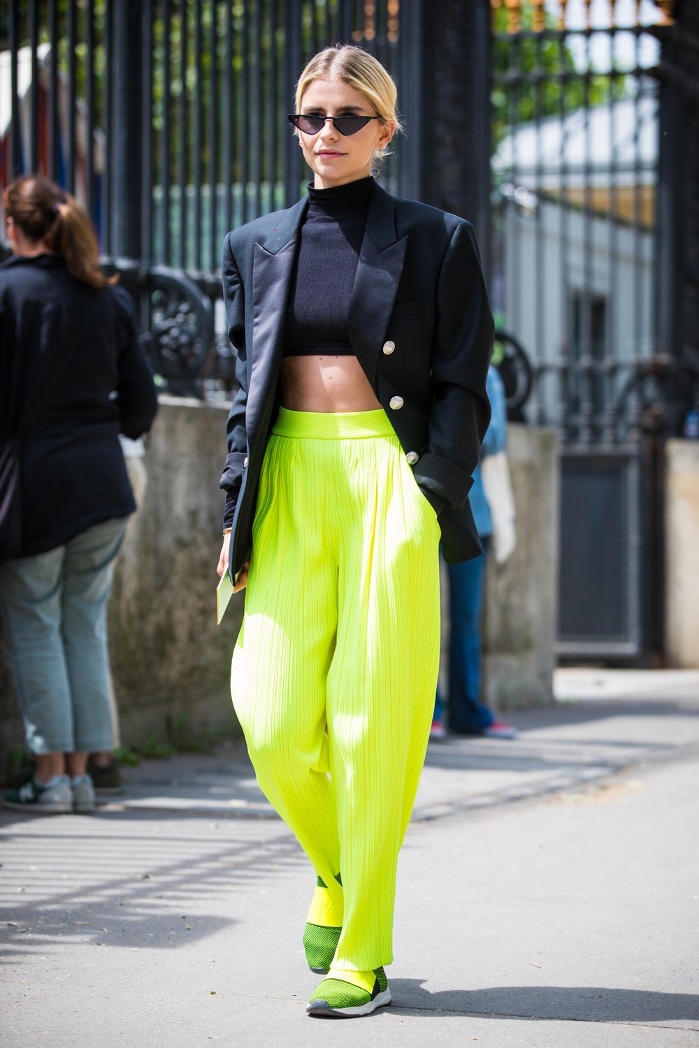
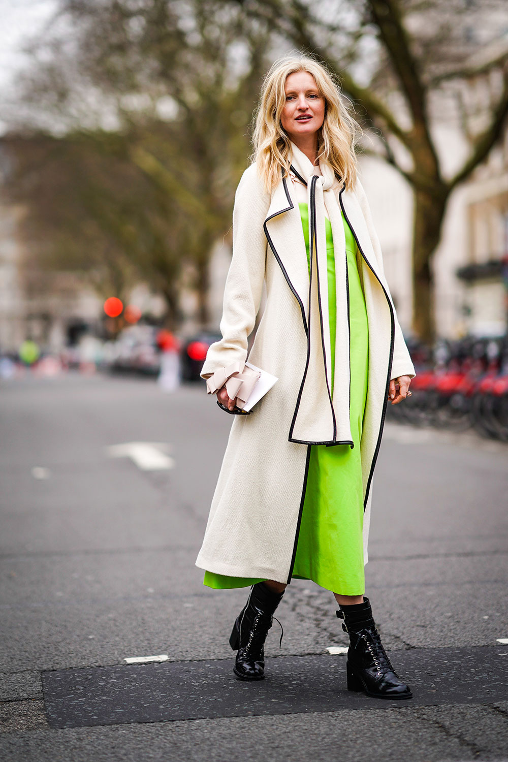
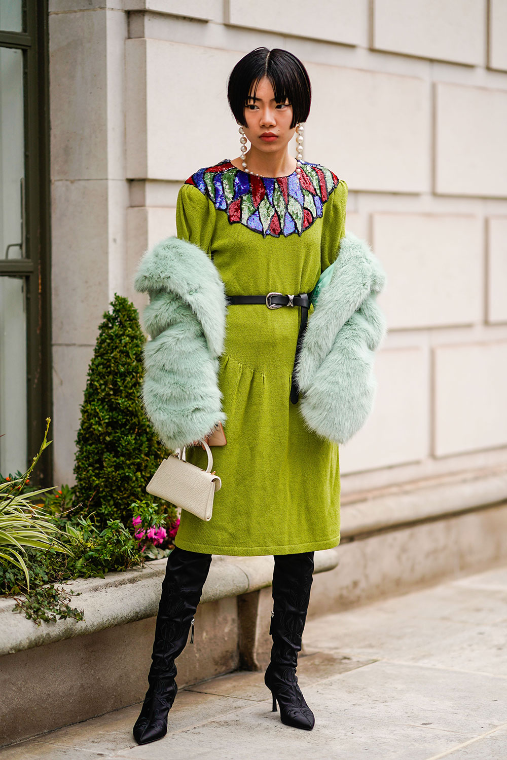
Subsequently this vibrant tone was one of the most repeated and adapted by those attending the international parades. It was worn in trousers, dresses and coats, also flirting with accessories-though to a lesser extent. The big brands reinforced their power by protecting neon colours -including the green in question – as one of the trends this summer. It is curious that of all the newly-popular colours this type of green was the best-acclaimed in the street, the thermometer which helps the sector to know what really people will wear or not, regardless of what fashion dictates.
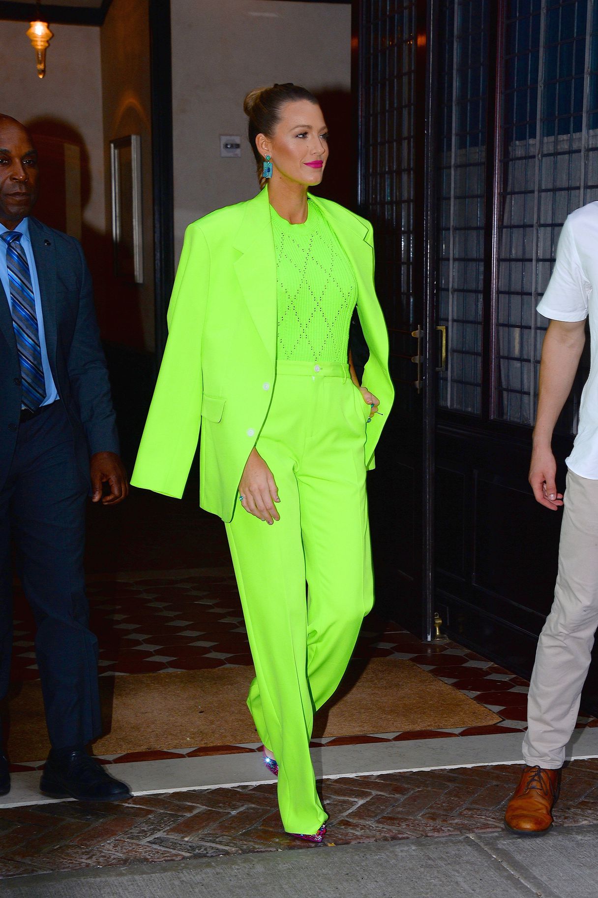
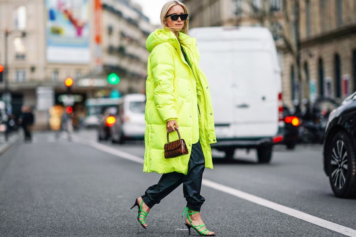
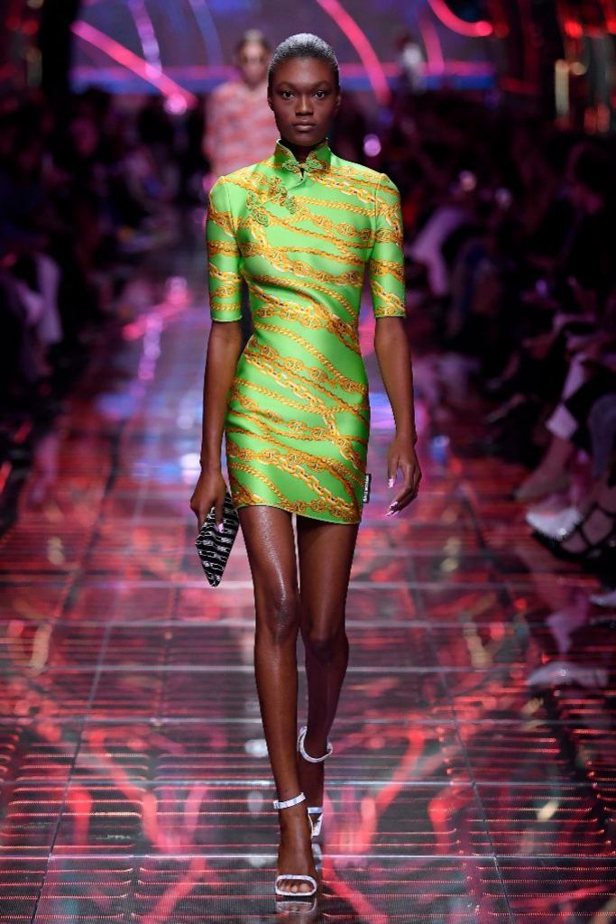
A prominent role was played by the power of attraction of world-wide influencers and celebrities , who did not hesitate to dress in lime green: Kendall and Kylie Jenner , Chiara Ferragni and Blake Lively dressed in looks favouring this colour and even dared to wear it in makeup. On the cat-walk this shade has seduced Balenciaga, Versace , Stella McCartney, Vetements , Gucci and Dolce & Gabbana, all of which have not hesitated to include lime green in their latest summer collections. Long live the most fashionable indiscretion!
 |
 |
And how is it worn ?
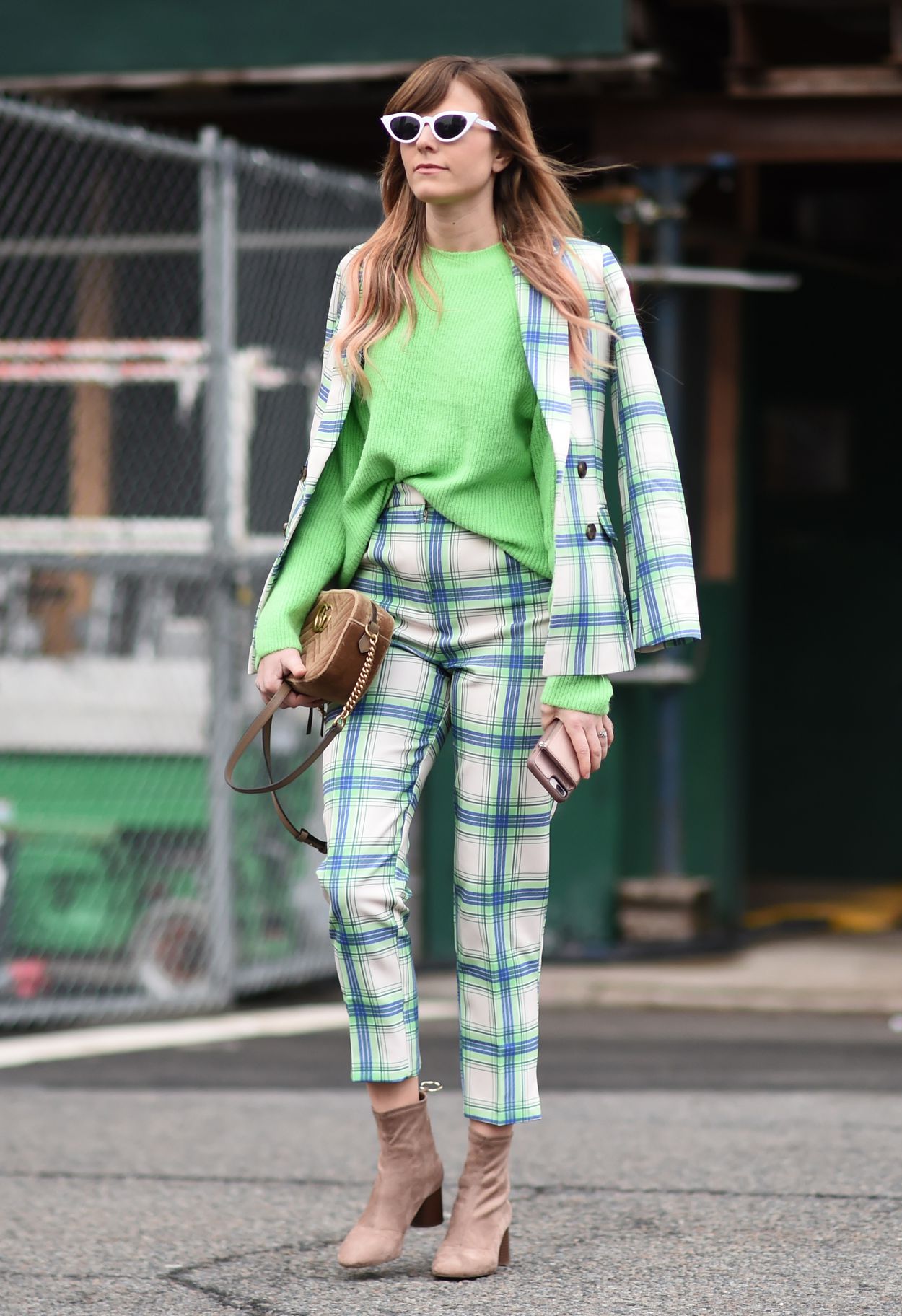
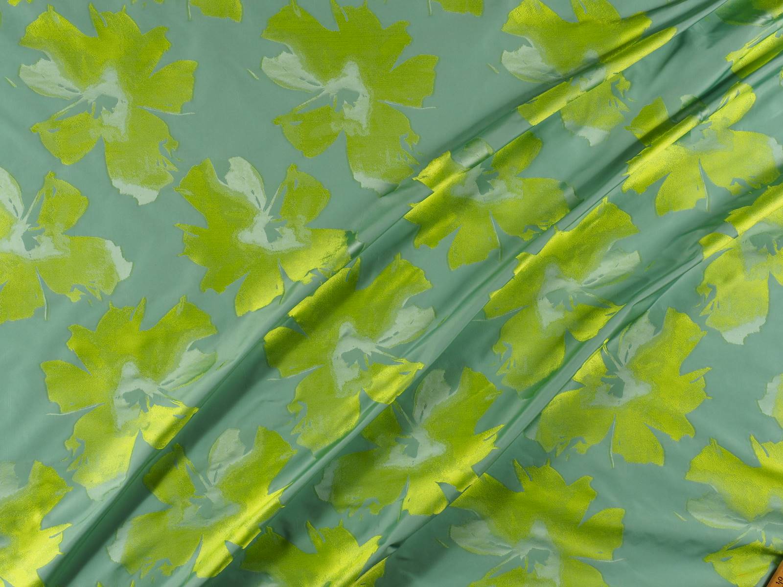
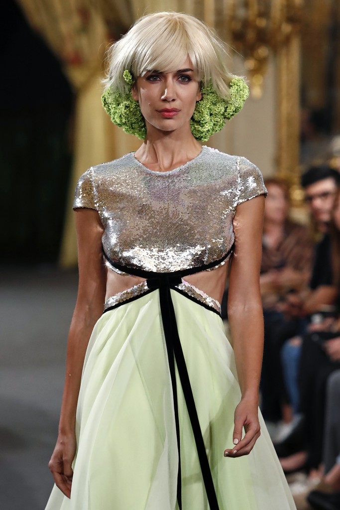
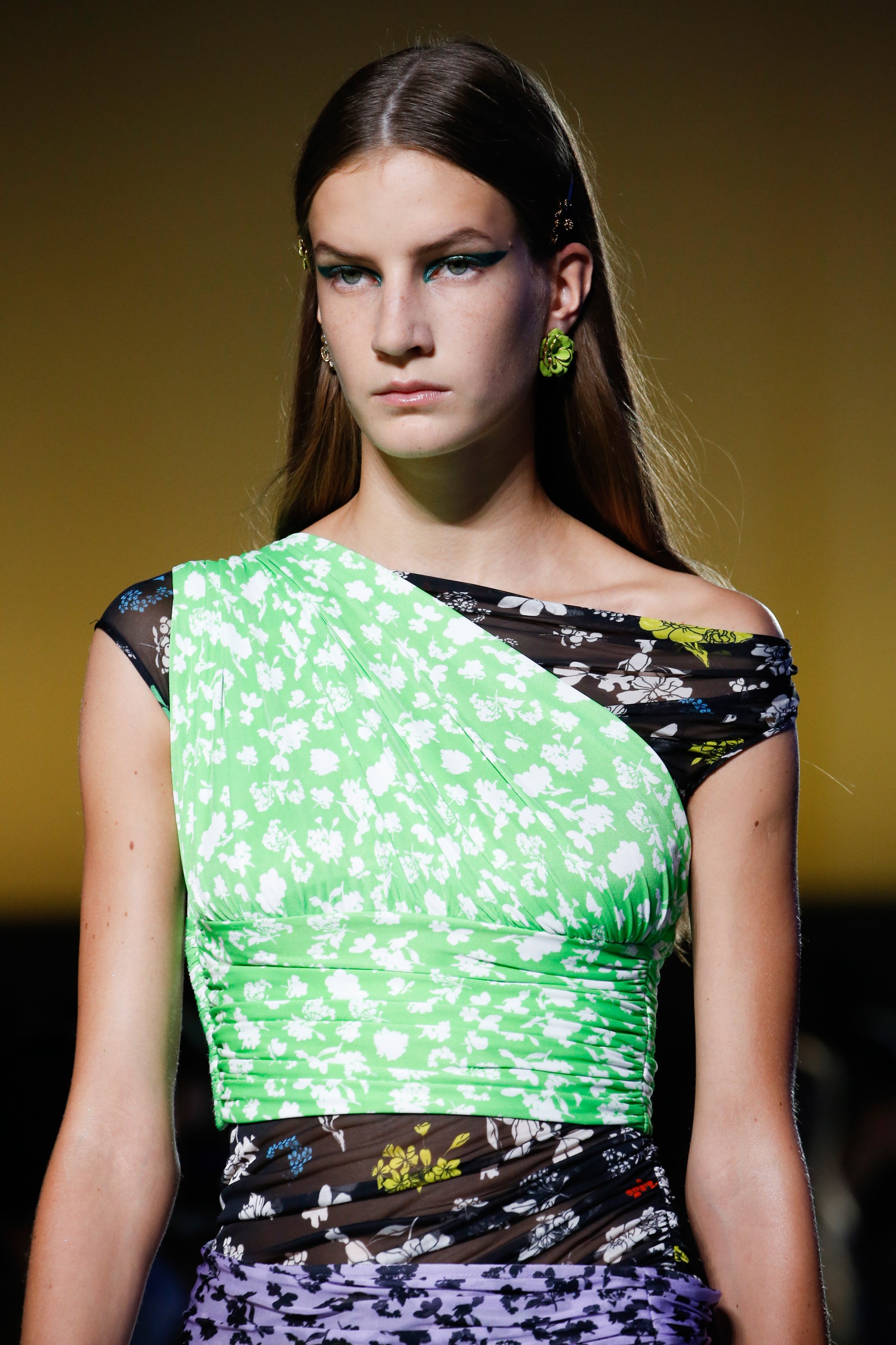
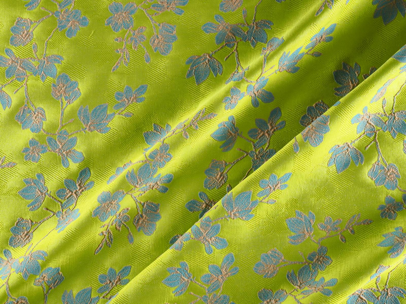
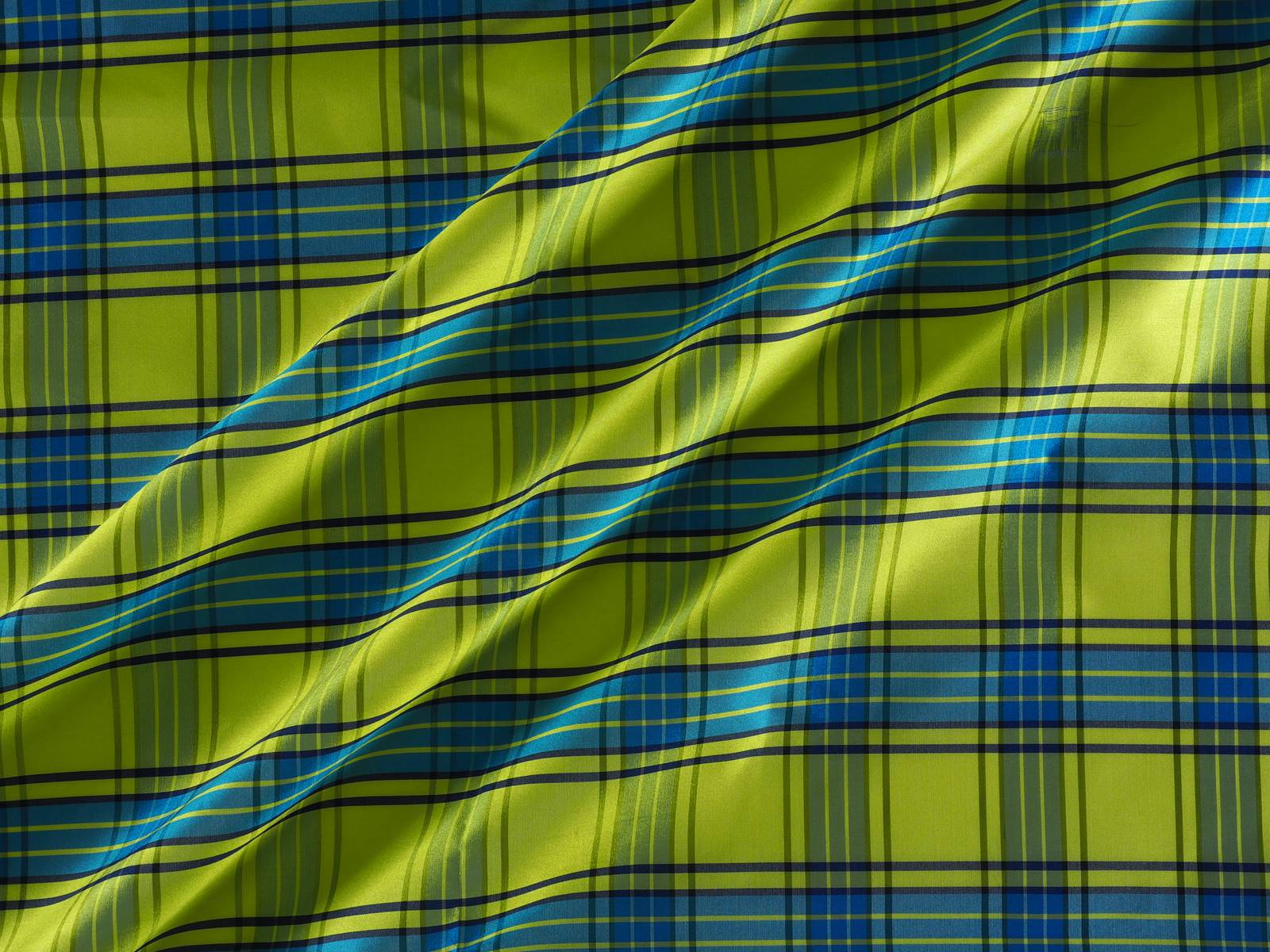
It is not easy to combine lime green. The key lies in the alliance of neutral tones such as the range of beiges and skin-colours or the incombustible white and/or black that represent the simplest and most practical option. Satin fabrics give the lime green more light and are flattering in flowing garments like skirts and dresses with movement. Smooth or stamped? Although the first option would be the most effective, it can also be mixed with prints and textures with relief . Our choice is for fabrics which play as different shades of lime green through geometric motifs, floral prints or embroidered sequins and in turn introduce other harmonious colours. Sometimes you don’t need to go for the strident version, you can still be trendy by discreetly opting for pastel colours. Here we are leaving you our inspirations in bold lime green. What do you think?
 |
 |

 |
 |
 |
 |

 |
 |
Balenciaga and Spanish painting
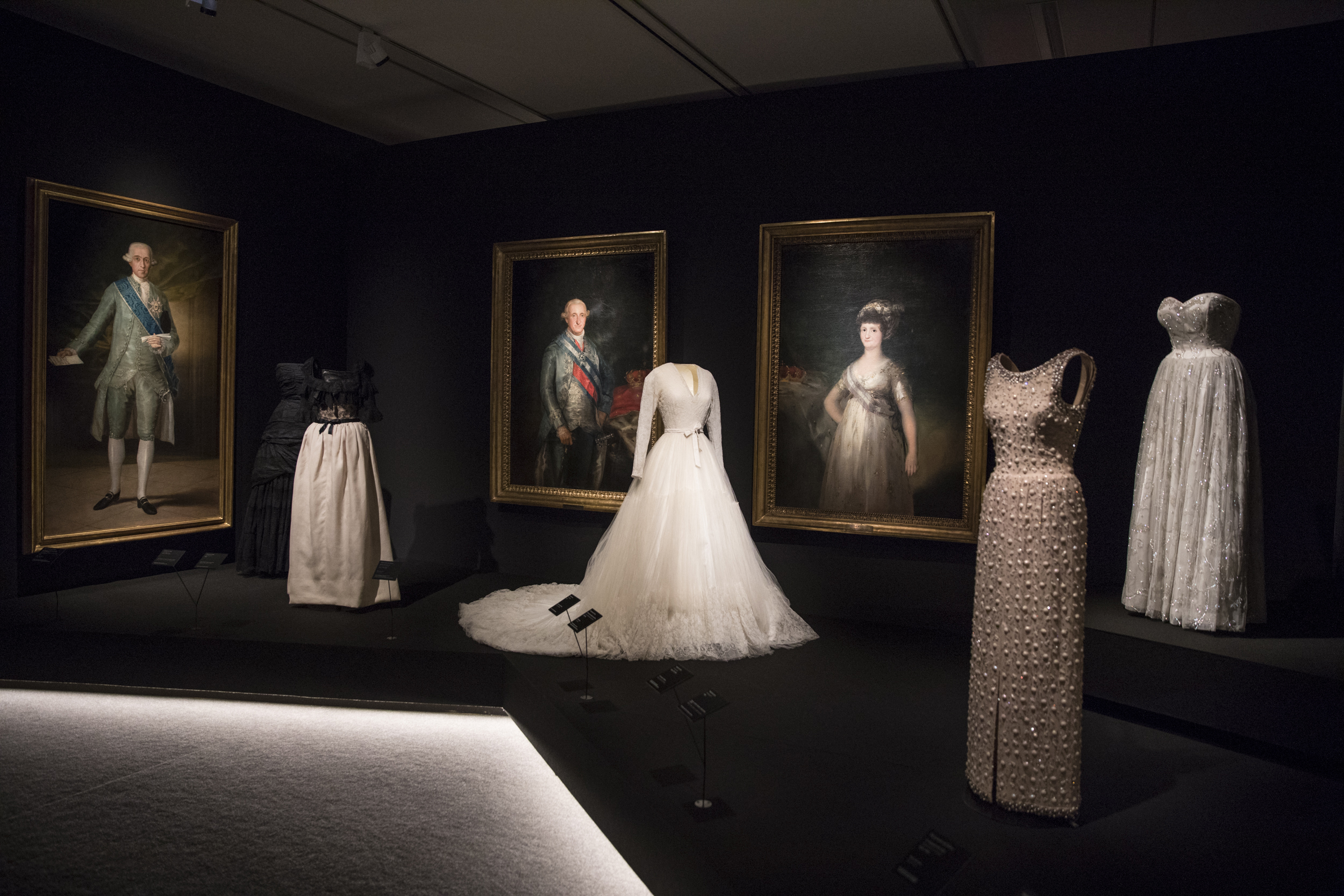
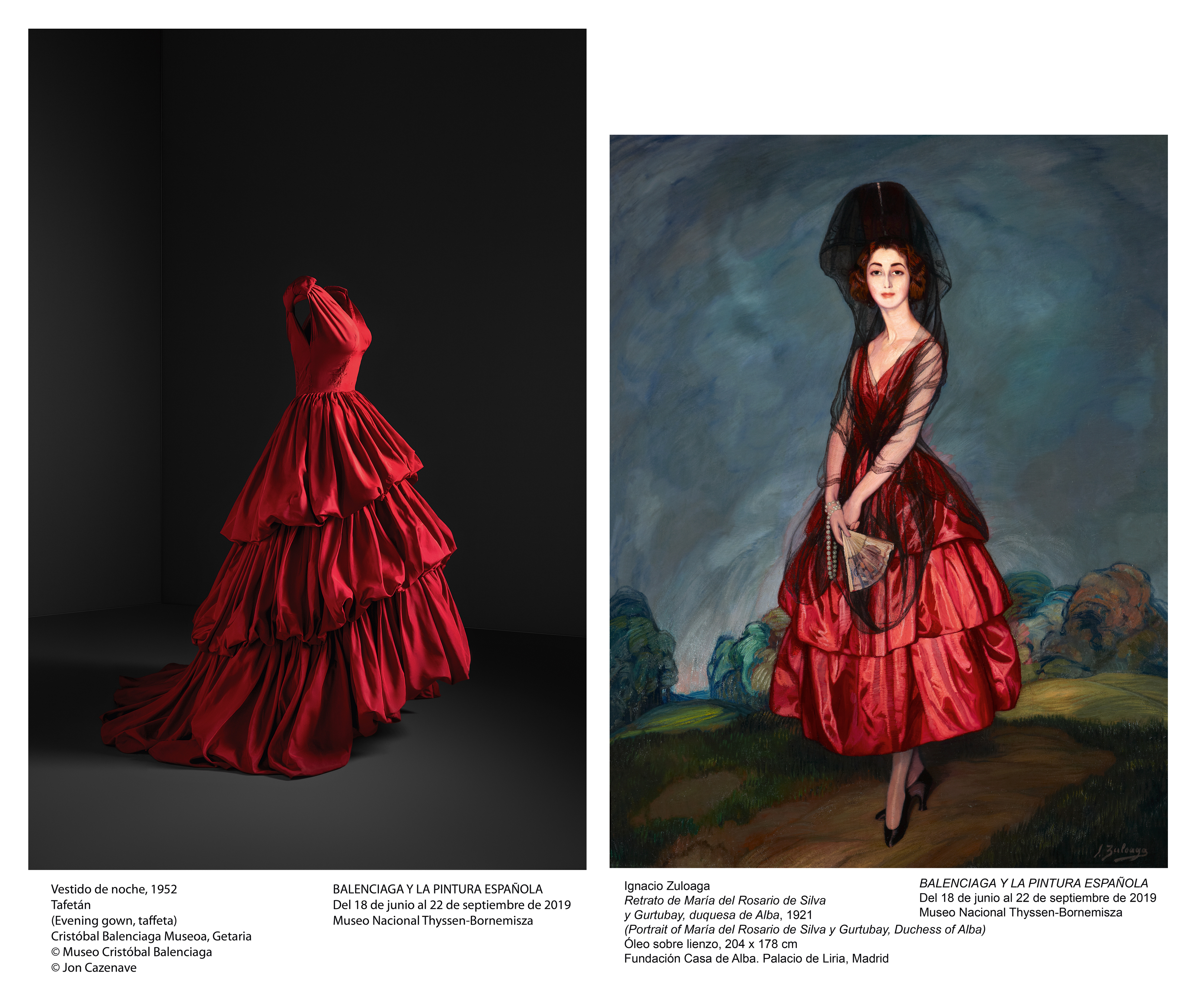
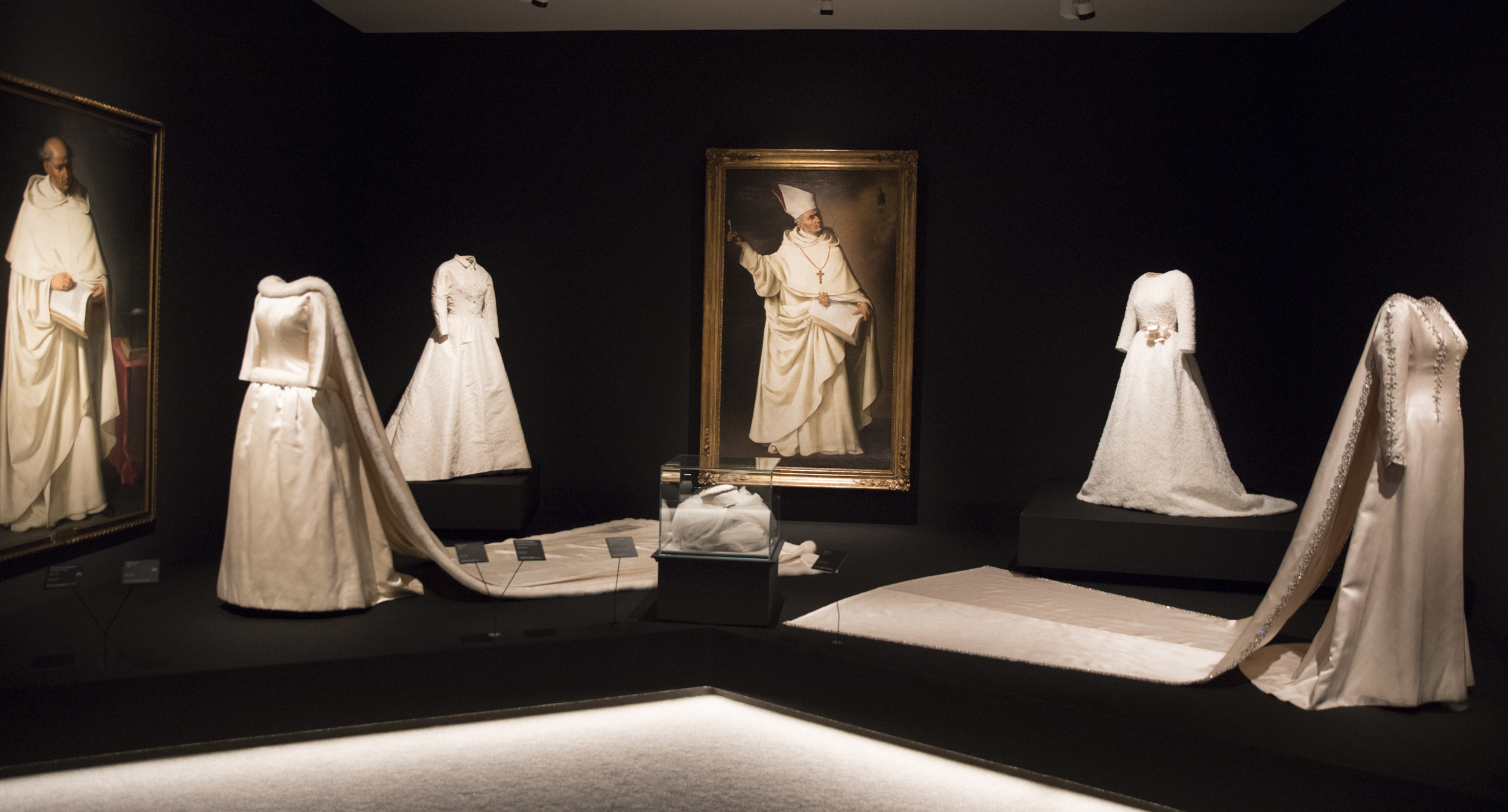
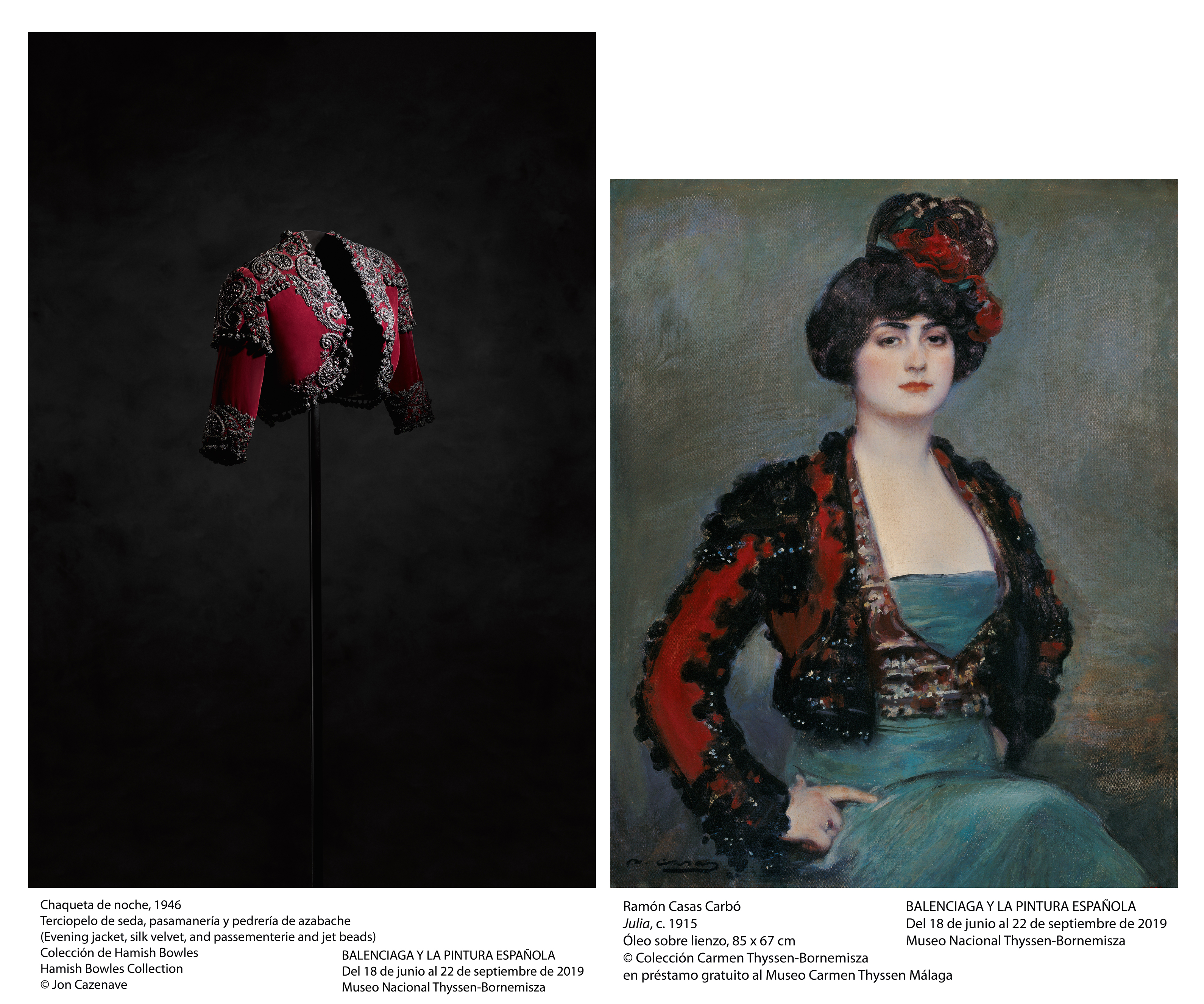
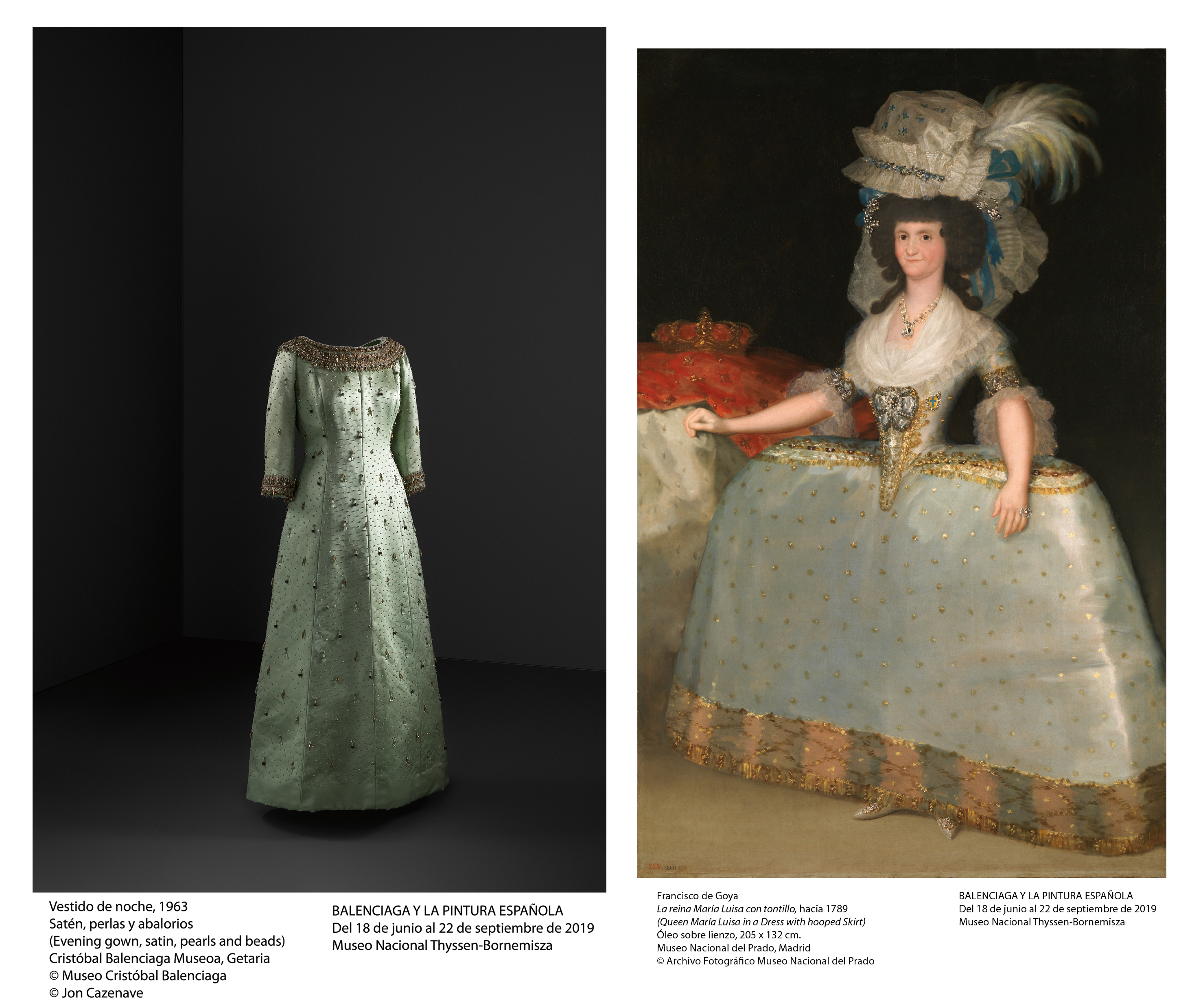
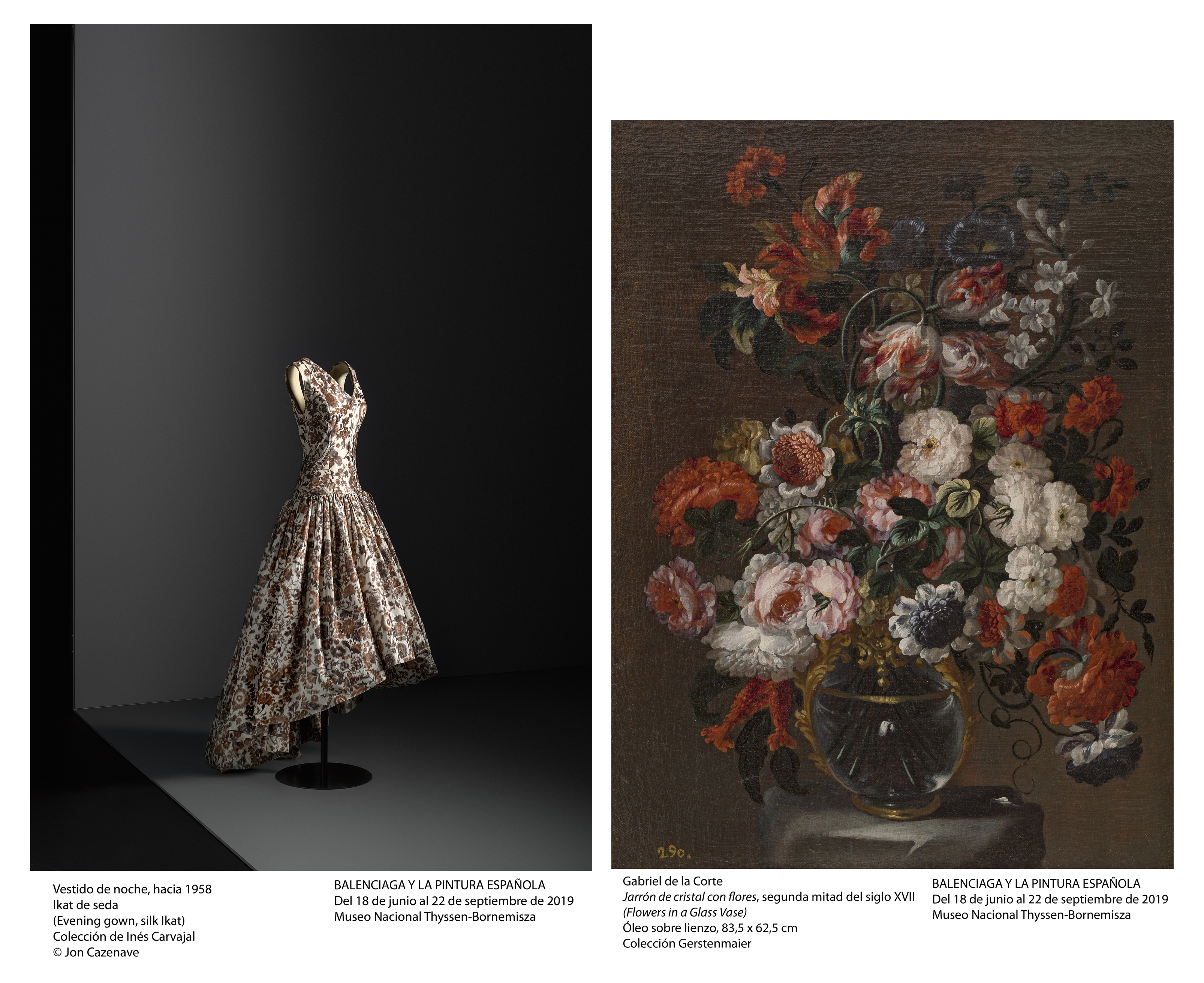
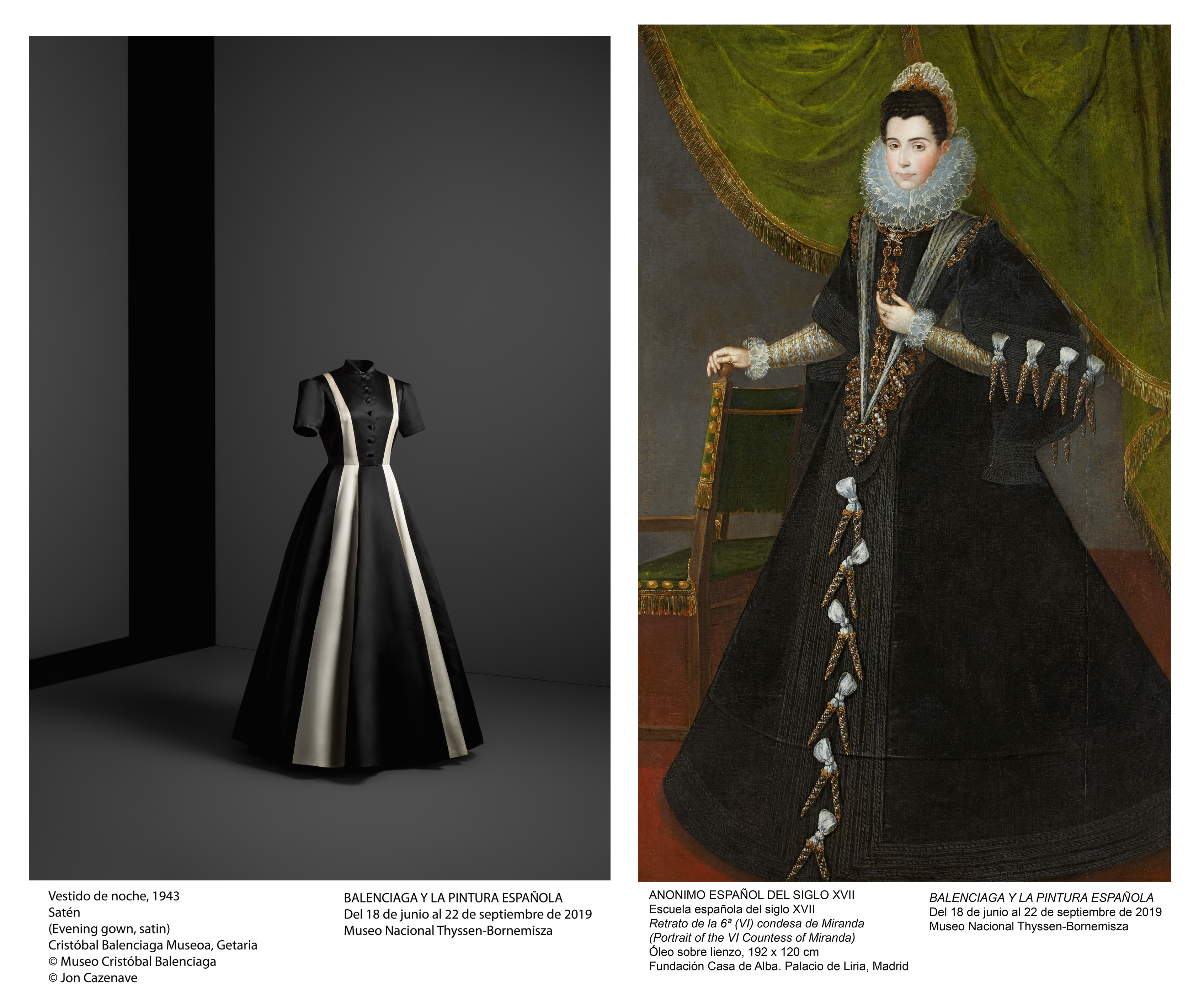
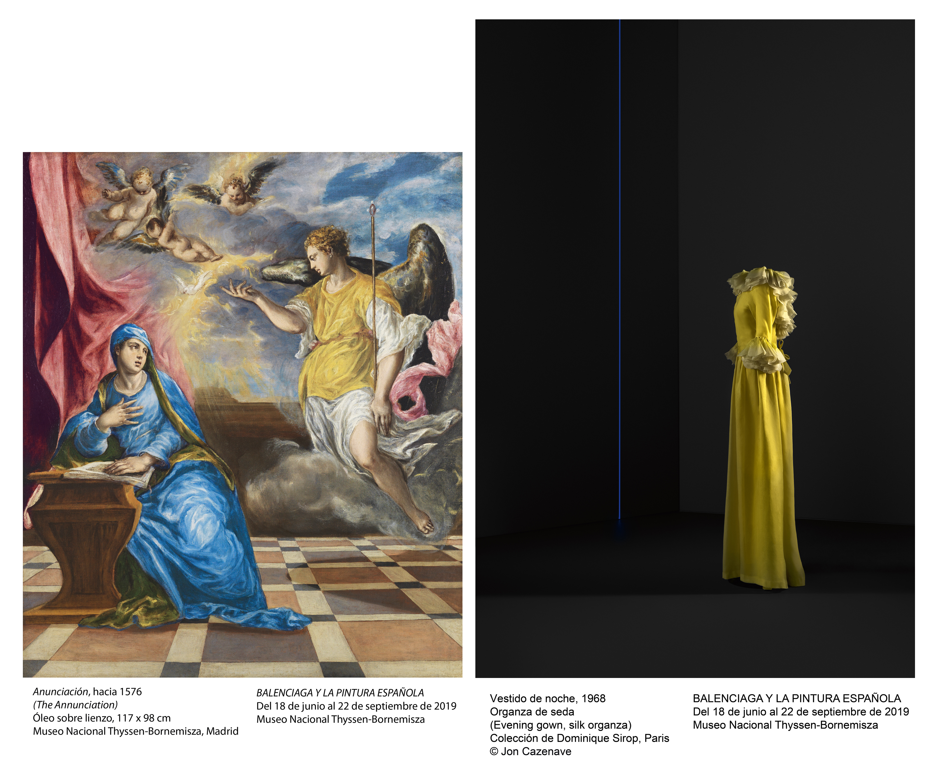
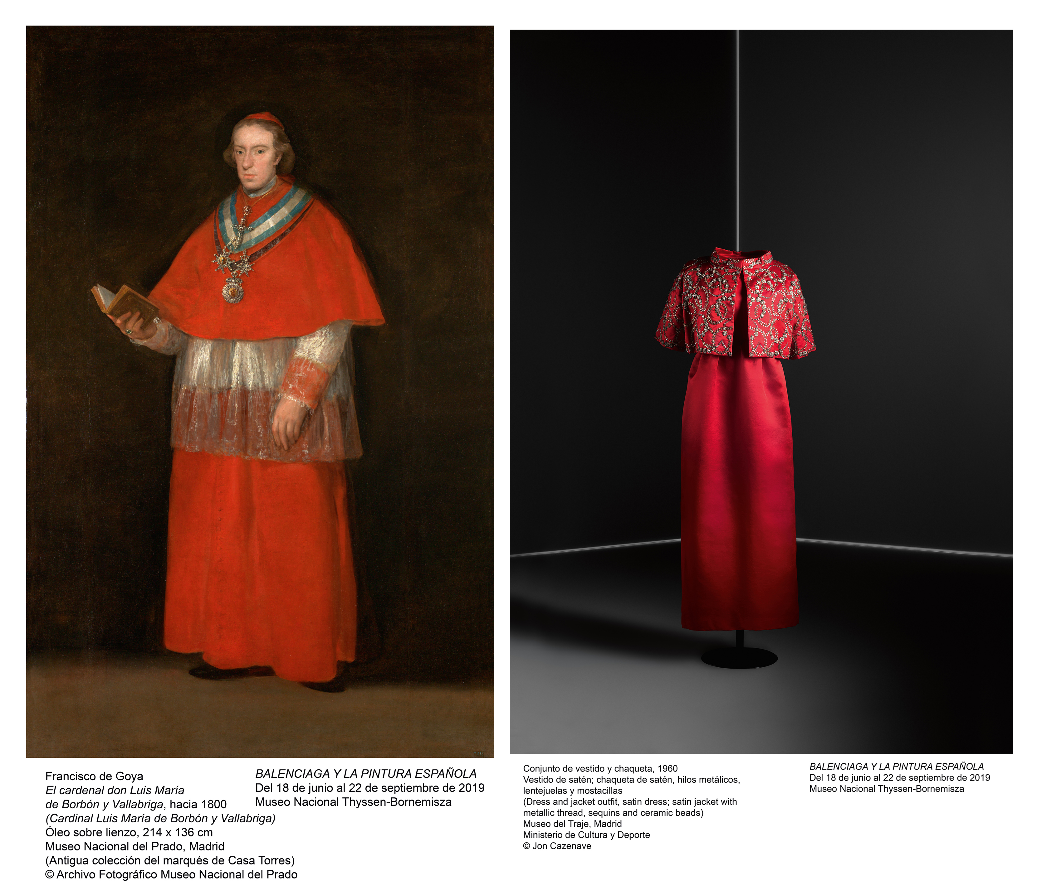
The Thyssen-Bornemisza National Museum has just inaugurated an exhibition that elegantly conveys the creation of Cristóbal Balenciaga with the tradition of Spanish painting from the 16th to the 20th centuries. It is an unusual show where the most admired and influential fashion designer of all time co-features with some of the paintings by great names in the history of Spanish art, one of his main sources of inspiration. This is how ambitious the exhibition ‘ Balenciaga and Spanish painting ‘ is .
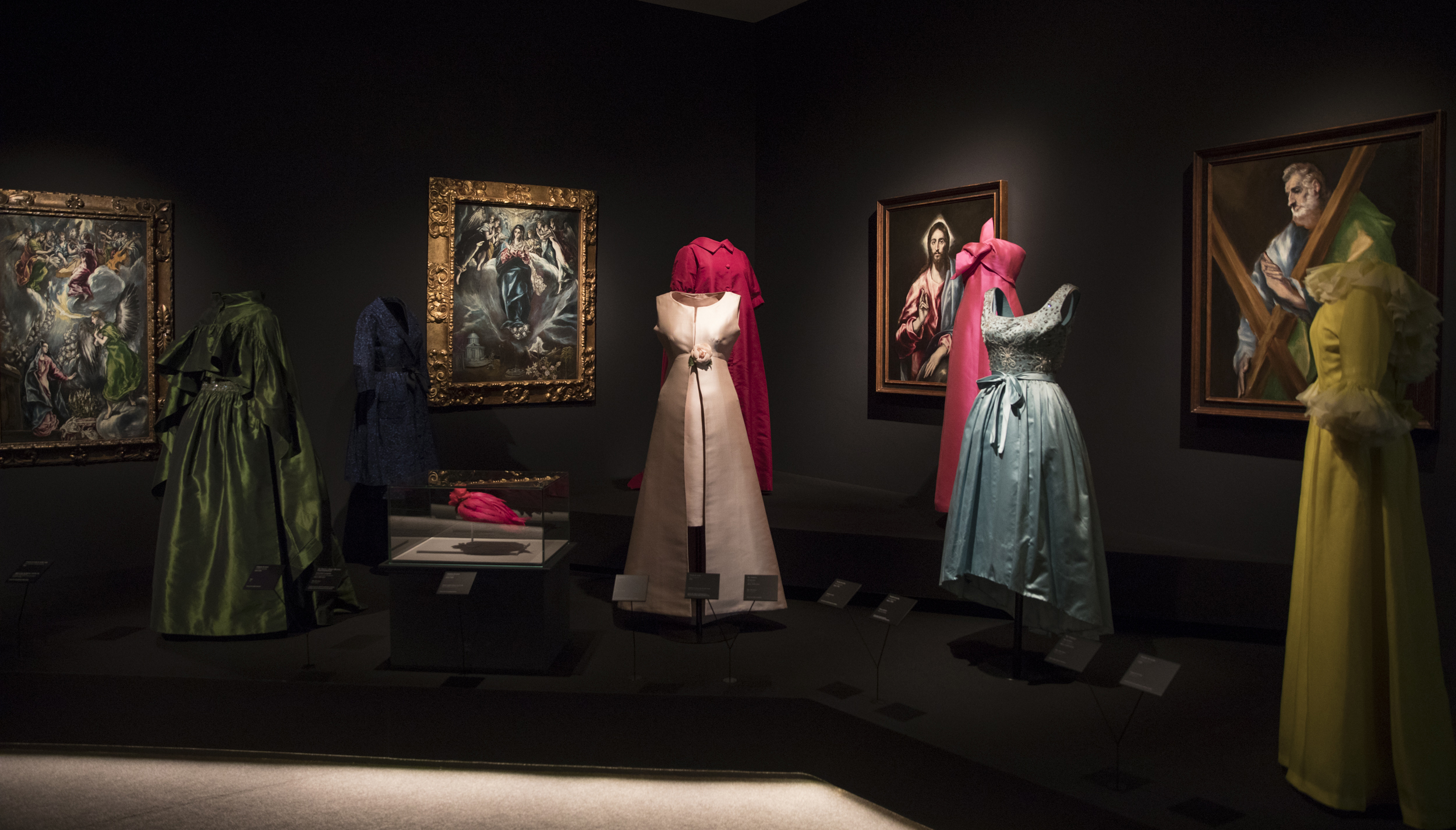
The exhibition is curated by Eloy Martínez de la Pera, who has selected for the occasion a total of 90 valuable pieces of clothing, many of them exhibited for the first time and leased from the Balenciaga Museum of Guetaria, Madrid Costume Museum and Barcelona Design Museum, as well as national and international private collections. They are accompanied by the dresses , an exceptional set of 55 paintings, among which are works by El Greco, Velázquez, Murillo, Carreño de Miranda, Zurbarán, Goya, Madrazo and Zuloaga. Altogether it is a selection of paintings from private collections and national museums such as the Prado Museum or the Bilbao Museum of Fine Arts.
The tour of the rooms follows a chronological itinerary through the paintings, accompanied by the dresses linked to each style or to each painter. This creates connections based on conceptual elements, on forms and volumes, on chromatic complicities, which present a fascinating dialogue between fashion and painting, between the creativity of the great Basque designer and his sources of inspiration.
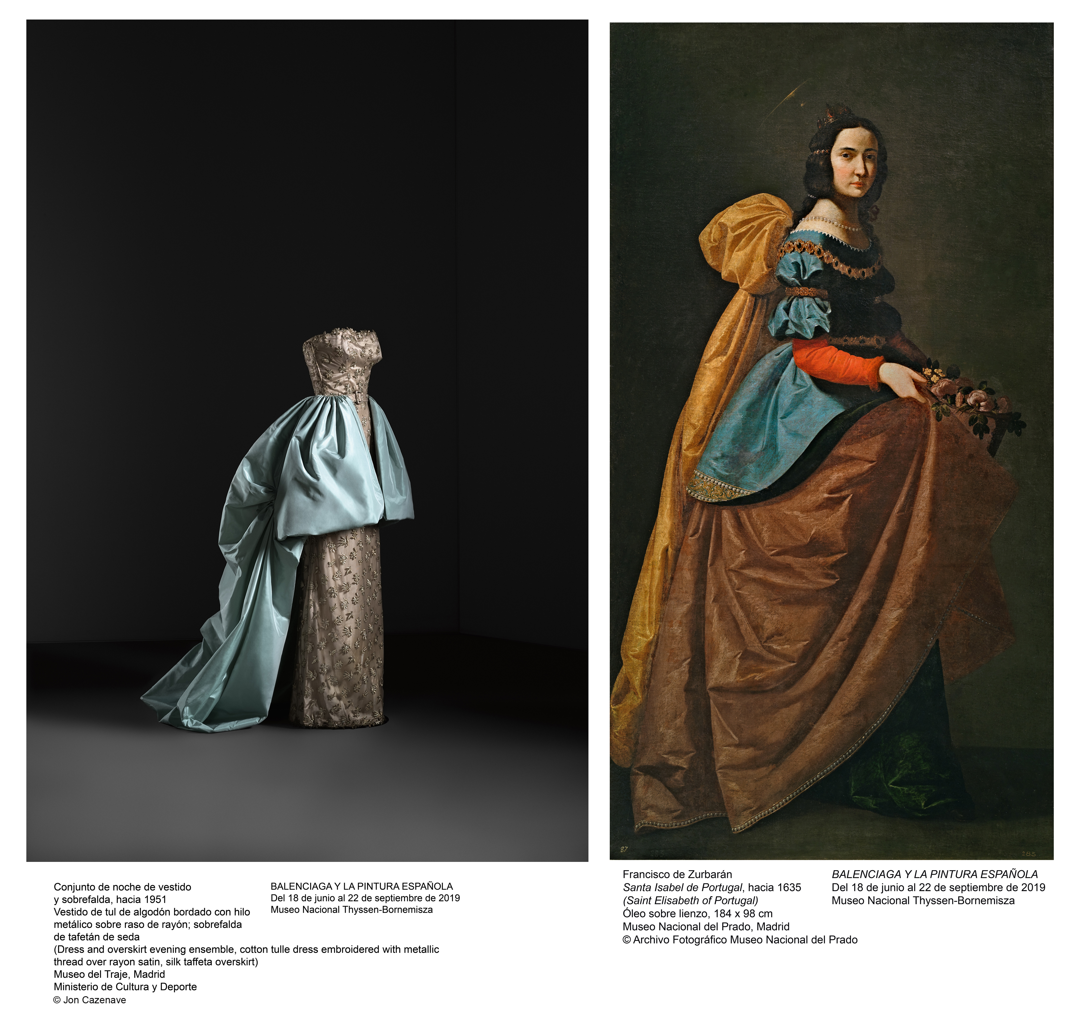
Balenciaga with Spanish art and culture
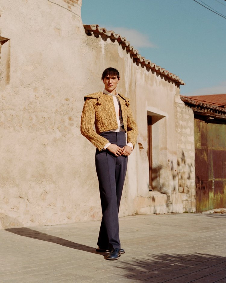
References to Spanish art and culture were always present in the work of Cristóbal Balenciag a. The simple and minimalist lines of religious habits or the architectural volume of these fabrics are a constant in many of his pieces. The air of a bata de cola of a flamenco dancer that is seen in the ruffles of some dresses or the flashes of a bullfighter’s suit of lights translated with mastery to the embroidered paillette of a bolero jacket , are some examples. Balenciaga continually reviewed the history of art and, with his strong personality and style, maintained those influences even in his most avant-garde period, recovering historical works and reinterpreting them in a modern way.
Cristóbal Balenciaga: “A good couturier must be an architect for the bosses, a sculptor for the form, a painter for the drawings, a musician for harmony and a philosopher for the measure”
Apart from following the chronological trajectory, the route of the exhibition allows us to review art from a different perspective, focusing on painters as creators and transmitters of fashion, and as masters in the representation of fabrics, textures, folds and volumes. Inevitably the exhibition in its entirety pays tribute to black, one of Balenciaga’s fetish colours, and for many of his great trade-marks such as barrel line, sem-tailored , balloon-skirts, tunic , sackdress or baby doll , which conclude at the end of the 60s in abstraction.
“Balenciaga and Spanish painting” is undoubtedly the most ambitious of exhibitions and represents the most complete presentation of this Spanish dressmaker since the first retrospective that was dedicated to him in 1973. The exhibition can be visited until September 22, 2019 at the Thyssen-Bornemisza National Museum in Madrid. The project has the collaboration of Herbert Smith, Freehills and Las Rozas Village .
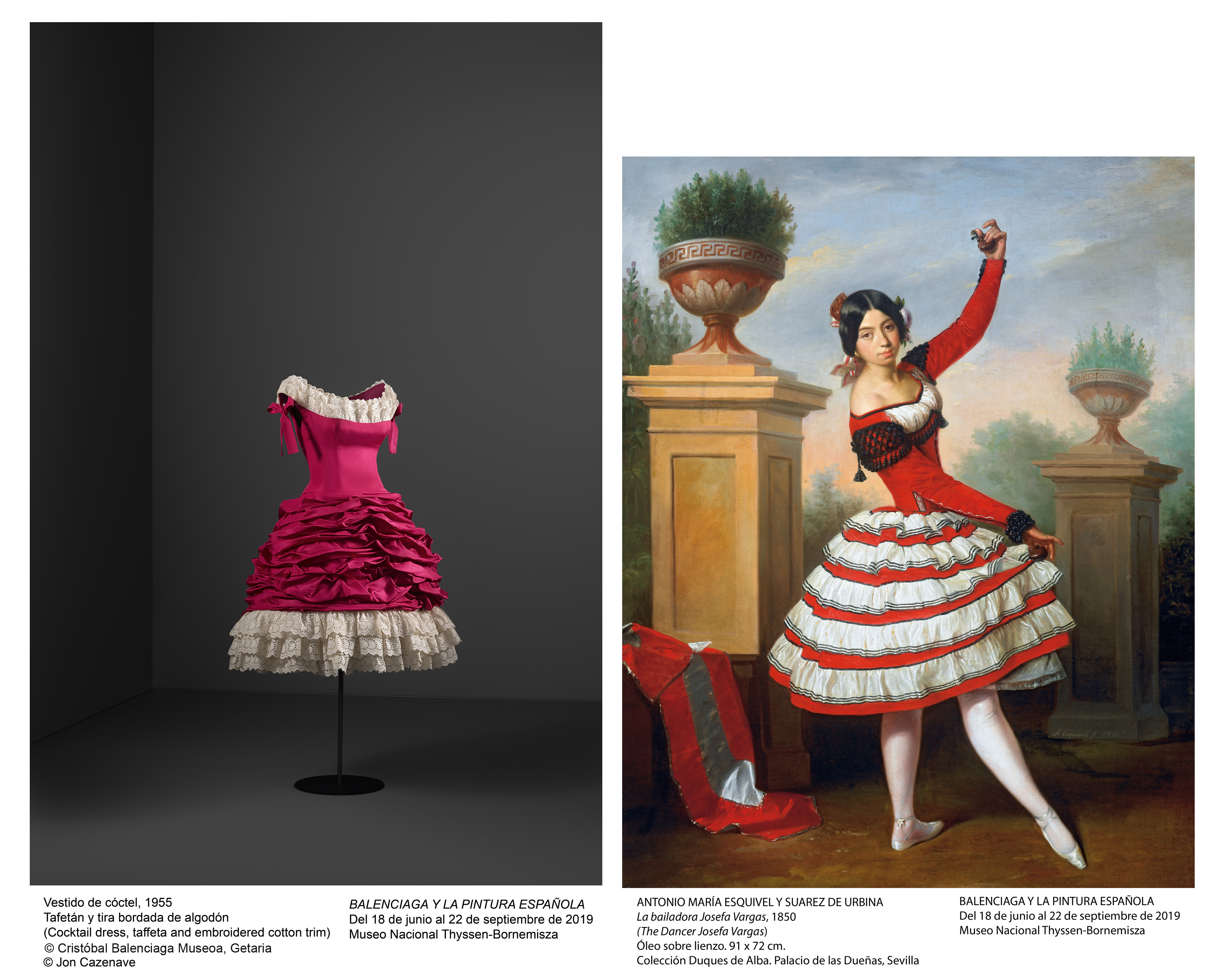
A life influenced by painting
Balenciaga was born in Getaria (Guipúzcoa) in 1895, son of José Balenciaga, fisherman, and Martina Eizaguirre, seamstress. As a child he began his craft with his mother, who sewed for wealthy families in the area, including the Marquis of Casa Torres, who spent summers at the Aldamar Palace in the Guipuzcoa town, also known as Ona view . It was there that the young Cristóbal came into contact with the taste of the aristocratic elite and where he could admire costumes and fabrics from the best tailors and fashion and textile shops in London and Paris. It was also there where he had the opportunity to contemplate and enjoy the magnificent collection of art that the marquises owned and their extensive library. This excellent introduction to the world of fashion and art, coupled with his extraordinary sensitivity, was what undoubtedly led him to dedicate his life to design from a very early date.
In 1939, Balenciaga was directly inspired by Velázquez for the design of his Infanta dress, a modern reinterpretation of the costumes with which the painter portrayed the Infanta Margarita of Austria and which the designer presented that same year in Paris. Three years earlier, in 1936 and as a result of the outbreak of the civil war in Spain, Balenciaga had moved to the French capital. He was already in a period of full creative maturity, having founded in the previous decades fashion establishments in San Sebastian, Madrid and Barcelona and having among his clientele high society and the Spanish Royal Family. In August 1937 he opened his workshop on George V Avenue in Paris. The creations of Balenciaga in these years were impregnated with the cultural context of their country of origin, turning this period into a tribute to the aesthetics of ‘all things Spanish’.
With his innovative style, total mastery of couture and a high level of demand, he soon became one of the most influential designers on the international scene. In Paris he came into contact with a cosmopolitan clientele and also began to attract the attention of the media around the world that elevated him as the “king of haute couture”. He had a predilection for weighty fabrics, which he enriched with handmade embroidery, rhinestones or sequins. With scarcely any cuts or seams he created dresses with straight or rounded shapes, giving his garments a perfect, almost sculptured finish. His sense of proportion and measure, handling of technique and search for excellence brought him the admiration of his contemporary colleagues -like Christian Dior, who considered him “the master of all of us”, or Coco Chanel, who described him as “the only authentic couturier ” -; and in his workshop or with his advice some of the most important designers of the 20th century were trained, such as Hubert de Givenchy , Emanuel Ungaro , Óscar de la Renta or Paco Rabanne.
Photos: Leased by the Thyssen-Bornemisza National Museum
(Español) Cuaderno de Tendencias: Primavera-Verano 2020

As usual, in the Gratacós learning space we are always carrying out actions related to design and creativity. This time, it’s the turn of the prestigious research agency Nelly Rodi with the commencement of the new edition of her traditional “Trend Notebook”. An agile and didactic presentation that we organize twice a year, where design students and professionals of the sector meet to find out about the main trends that will mark the Spring- Summer 2020 season. Always from a context that directly affects the fashion industry, taking into account the global socioeconomic situation. The spokesperson of this instructive talk for many years is Úrsula Uría, Nelly Rodi’s spokesperson in Spain, and we can hear about more concrete trends that affect consumption, lifestyles, colours, silhouettes … and will set the guidelines for next summer. Always from an orientation point of view. It is already know that this is a prediction is not always exact, but it helps to set some guidelines.
In this last initiative, Úrsula Uría places us within an economic context of waiting, where the world prepares to face a new economic crisis much tougher than the previous one. That is the key to understanding the Jump macro trend that will influence the four trends that are presented: “We need to gain momentum because what is coming is even worse than what we have experienced. We accumulate the crises that already evident within the political context, social movements or economic fragility, “she says.
Úrsula Uría: “”We need to gain momentum to face the crises that await us”
From this unencouraging scenario, Nelly Rodi Predicts four trends that will affect the fashion industry and that fall within the following categories: Holiness, Invincible, Vision Y Spotlight.
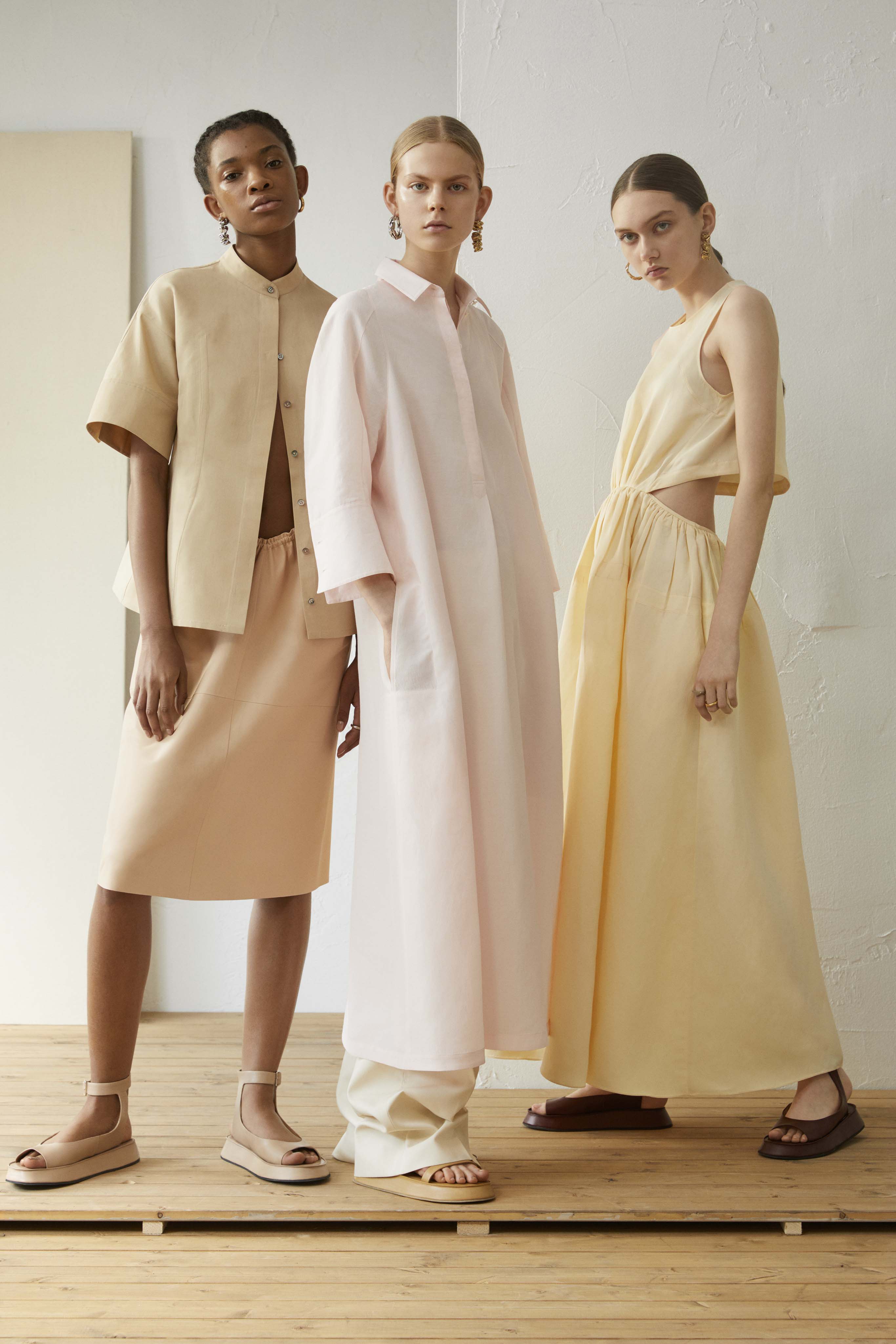
1. HOLINESS
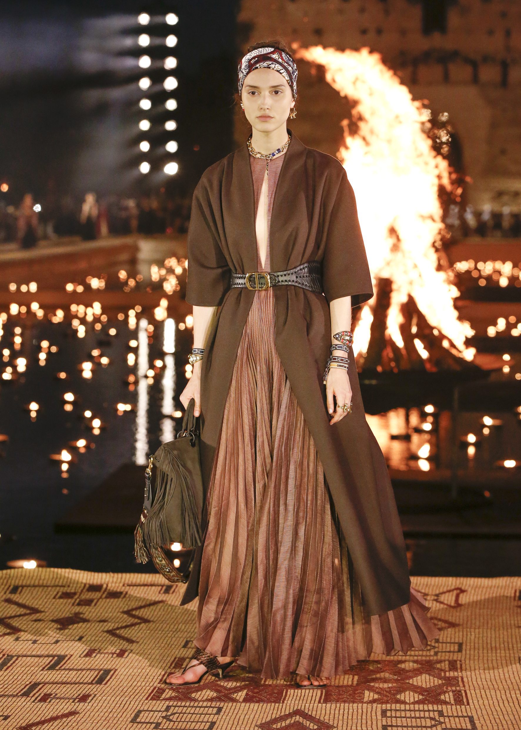
A minimalist trend that appeals to the classics, to the ancient era, to the splendor of classical Greece and the Roman Empire. A review of mythology and the first cultures to look for new creative solutions. “In the classic we will find the only way to advance as a society by taking the best they have done and innovate,” explains Uría. Holiness is also inspired by Morocco and Egypt, in the deserts of North Africa.
Visual references : The Yves Saint Laurent museum , the book ‘ Homo Deu s’ by Yuval Noah Harari, the influencer of Italian yoga Aria Crescendo, the austere hotel of Adrere Amellal in Siwa , meditation, introspection and spirituality .
Silhouettes: The Oversize garments Oversize, fluid and flowing, false minimalism, easy and comfortable looks, fluffy and soft materials, natural fabrics: linen, suede, leather, bamboo … prioritizes organic and handmade details. It is a premium line that does not include prints. The sophistication that seeks comfort above all. The artisan plays in another league.
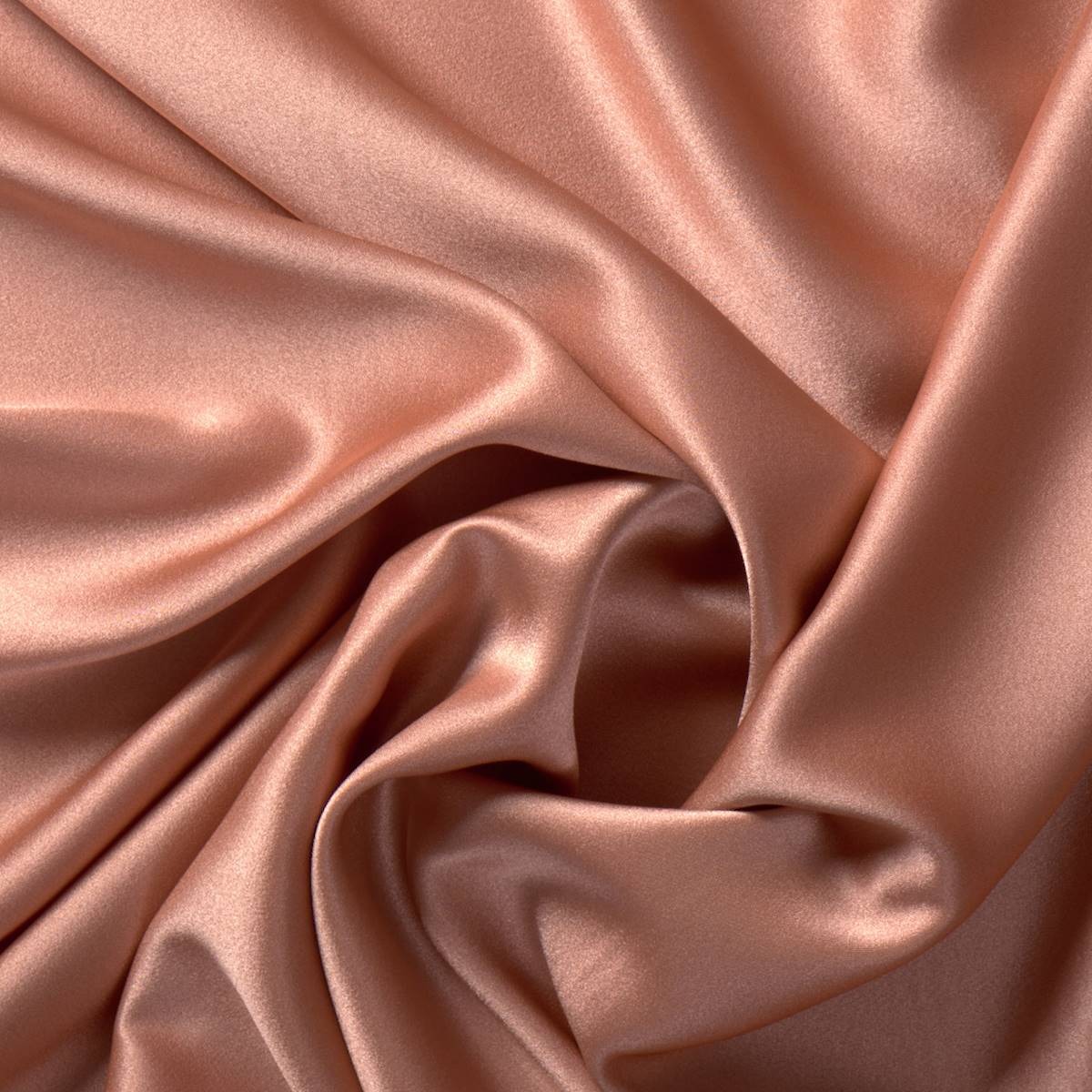
Colours : The palette of browns, beiges and off whites are the star of this trend. The tones that emulate the minerals with their shades and outlines. It is an evolution of all nudes. The second colour line refers to the terracotta and blue colours of Marrakech.
 |
 |
Silhouettes : Straight lines, well-marked lines and versatile and functional garments predominate.
Colours : They refer to the industrial and revolve around grey and blue. Black does not appear and ink tones give depth. The colour block in a single tone will also be in.
Key concepts : Modern pilgrim, ancient civilizations, ethical minimalism, introspection and origins.
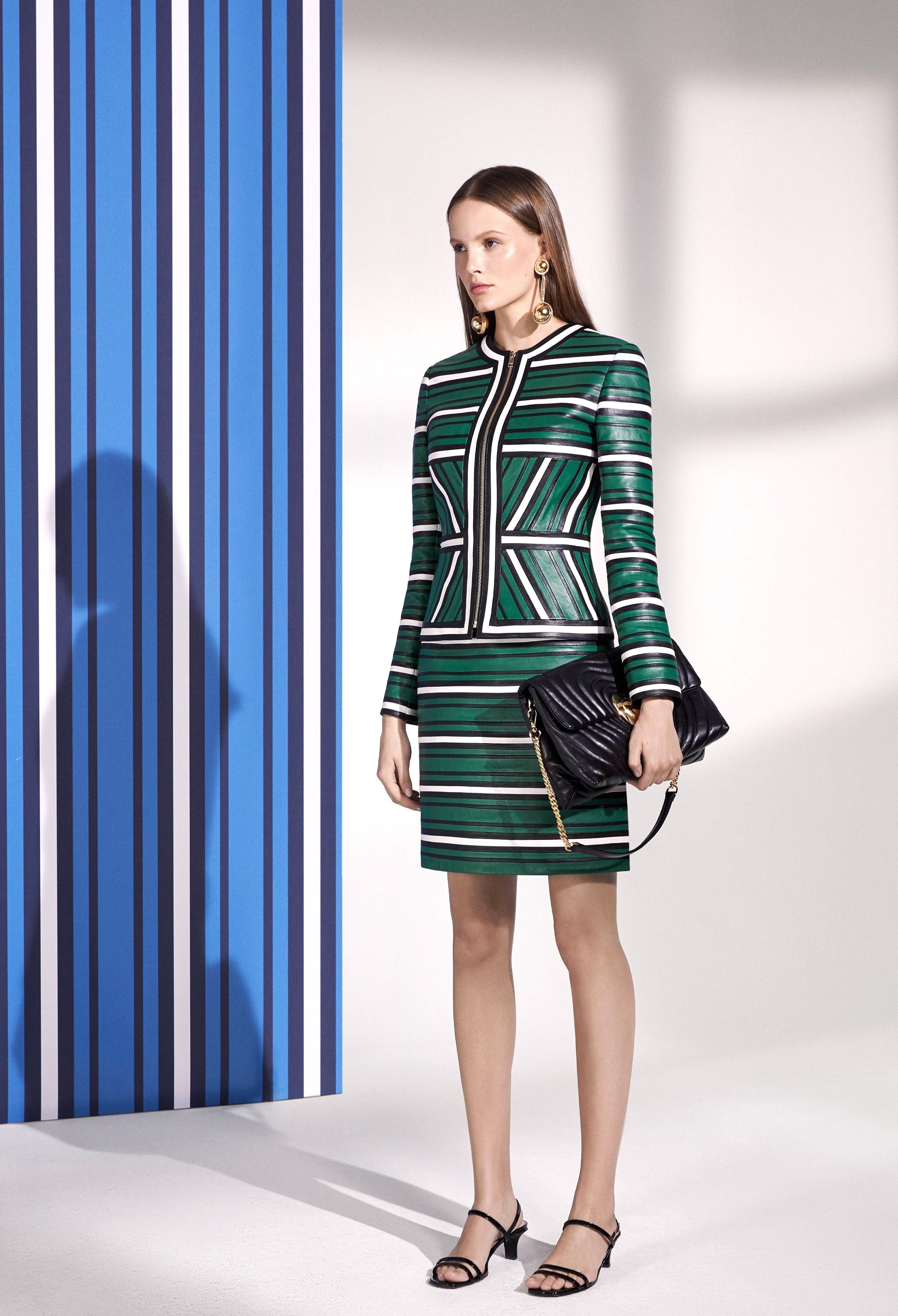
2. INVENCIBLE
A maximalist tendency that refers to cultural revolutions, social movements, activism and a greater awareness of global issues such as nature and the environment. “This trend connects to being a fighter in a creative, non-aggressive way, ” says Uría . A style that also connects with the passion for extreme sports like extreme risk, adrenaline and survival.
Visual references : The pop up of Adidas in Seoul, the athlete Emily Sukiennik, the multi functional garments, fashion tech, the Survival Living room in Paris, the concept of explorer, the mutational skin of the reptiles, Comme des Garçons …
Silhouettes : Technical fabrics, reversible garments and clothing inspired by sport that is conceived as a new way of relating. The patterns are mixed together, there are no limits.
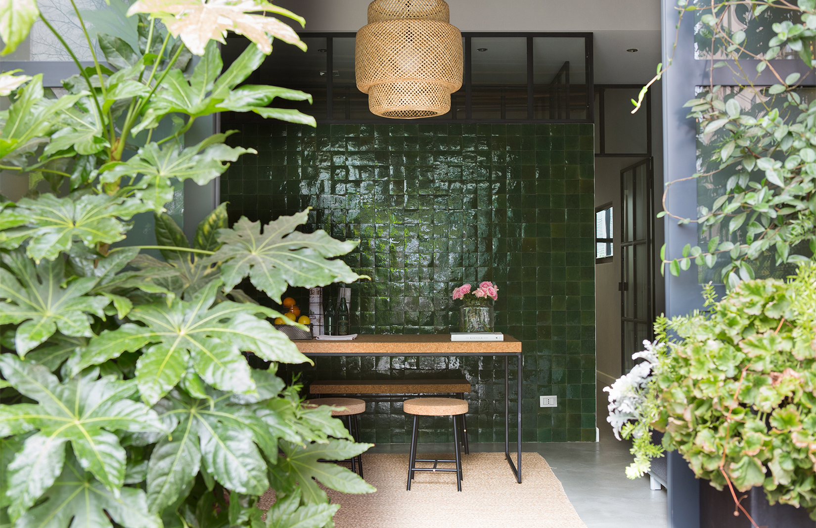 |
 |
Colours : The first palette is called alert and is much more explosive with tones linked to plastics such as vibrant blue and bottle green. The second palette refers to all tribal and is linked to camouflage tones: false blacks and the tones that emulate lizards and snakes’ skin.
Key concepts : Protection, extreme sports, outdoor and role of winner and defeater.
3. VISION
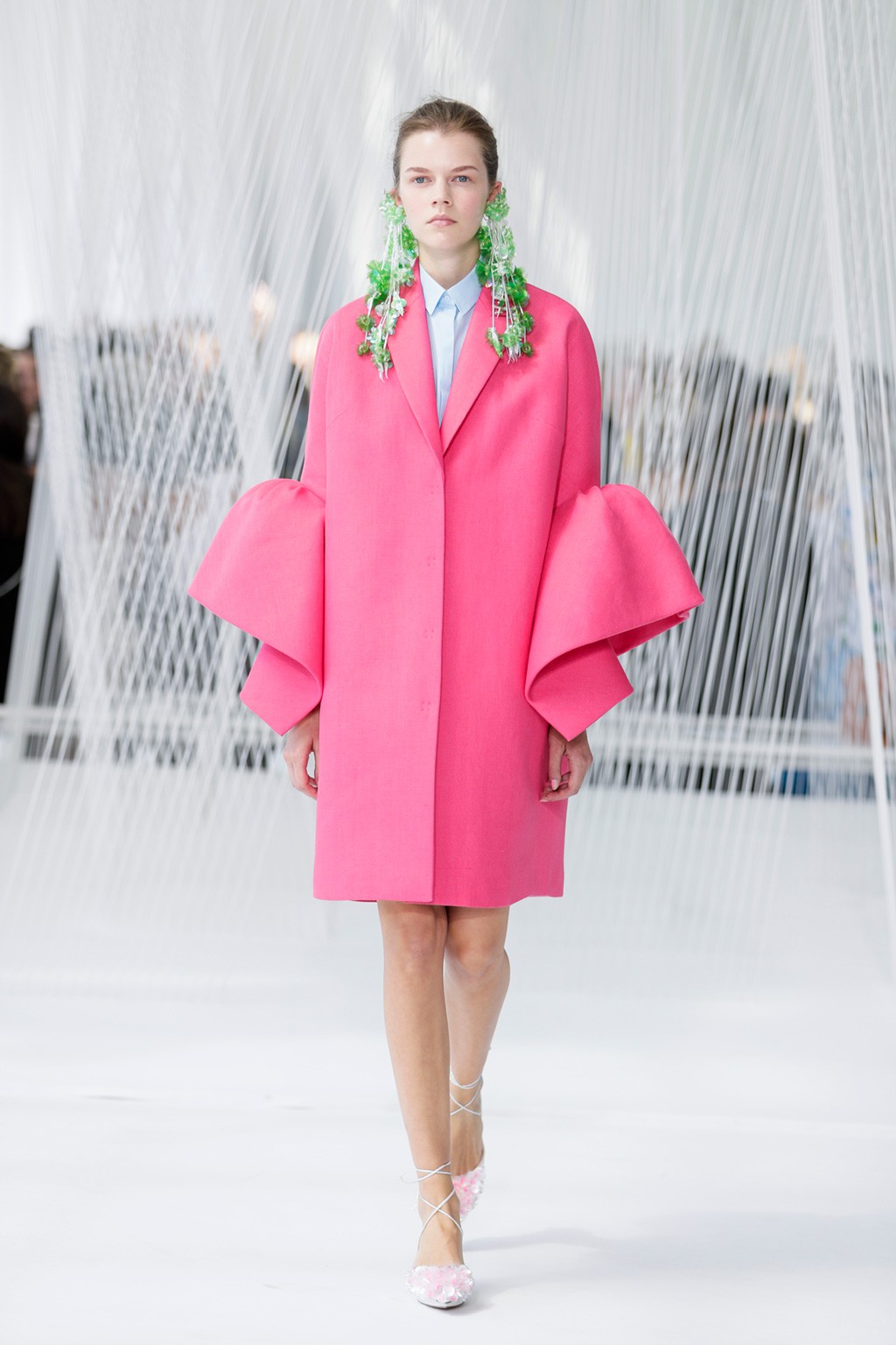
A minimalist trend that appeals to youth, sustainability and technology. There is talk of utopias: “We talk about the desire to change the world using happy therapy, ” says Ursula Uría. In this positive current there is no ugliness or weirdness because beauty is considered to be everywhere, as long as it is not offensive.
Visual references : The unconventional models, the sustainable fair in Berlin, the collaborative project The Student Hotel, the latest ASOS campaign, the latest Delpozo campaigns , the Agatha Ruiz de la Prada look …
Silhouettes : Comfortable garments with contrasting colours that surprise: yellow with greens, greens with oranges, oranges with pinks … Also arty prints that emulate the aerosols from a fresh and youthful point of view, the Bardot necklines that connect with the new feminine sensuality . The prints play around, for example, stripes with pictures … always with one colour as a main theme. Plenty of Geometric répétitions too.
 |
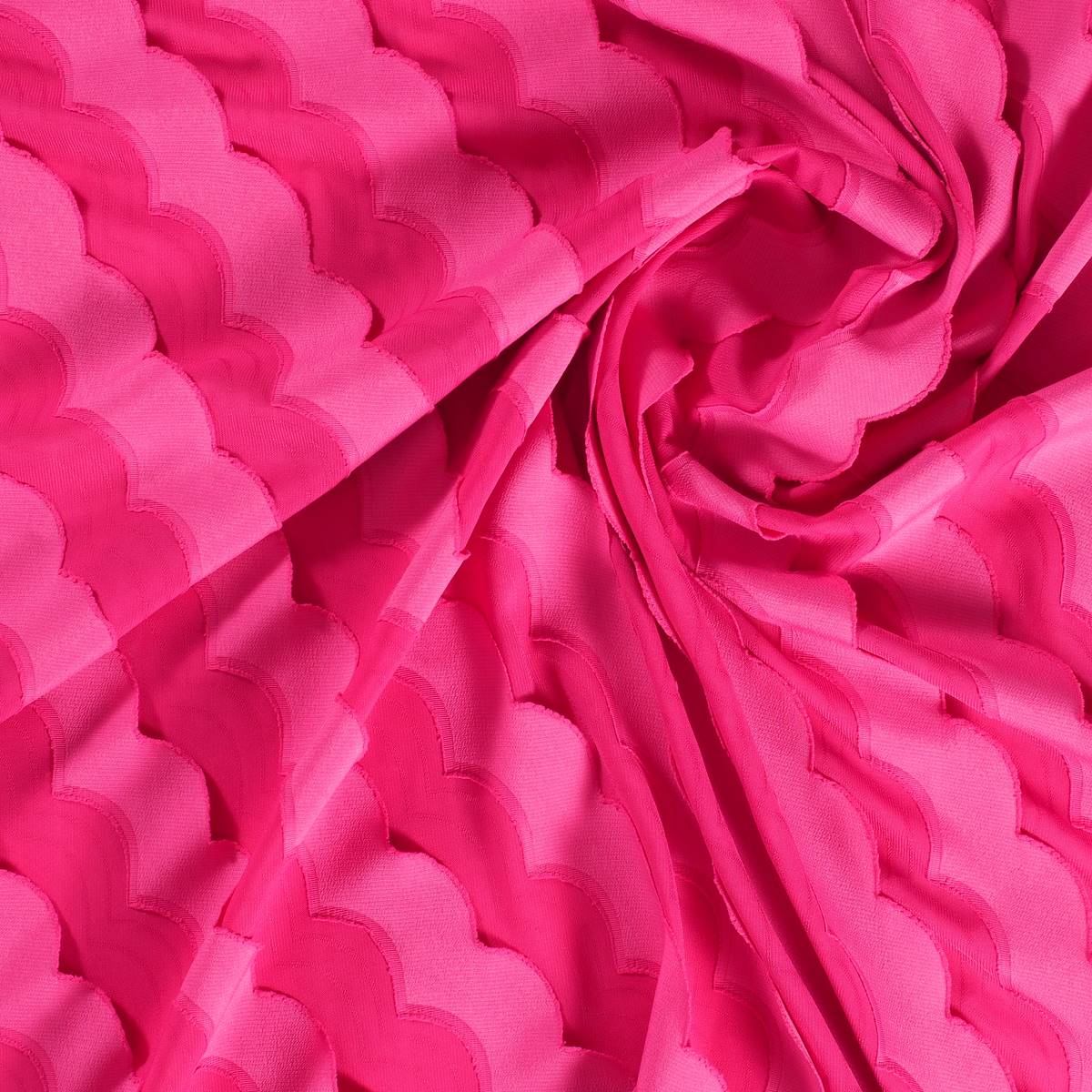 |
Colour : The first palette refers to baby tones in their most milky and decaffeinated version. The second appeals to a more sorbet range of colours with gelatinous textures.
Key concepts : Happy utopia, eco conscience, soft technological, positive future, contemporary romanticism and be a resolver.
4. SPOTLIGHT
A maximalist tendency that appeals to glamour and excess with a retro air. It refers to outdoor parties on terraces and pools in venues such as Las Vegas or Los Angeles. “The sexy, eccentric and daring woman inspired by the 50s returns,” adds Uría.
Visual references: Palm Spring, the Coco Chanel pop up in Malaysia with vending beauty machines, nightclubs, exclusive parties, bling bling, art-deco, Charlie’s Angels, the beauty of sexiness, denim, the shimmer of the pools both day and night.
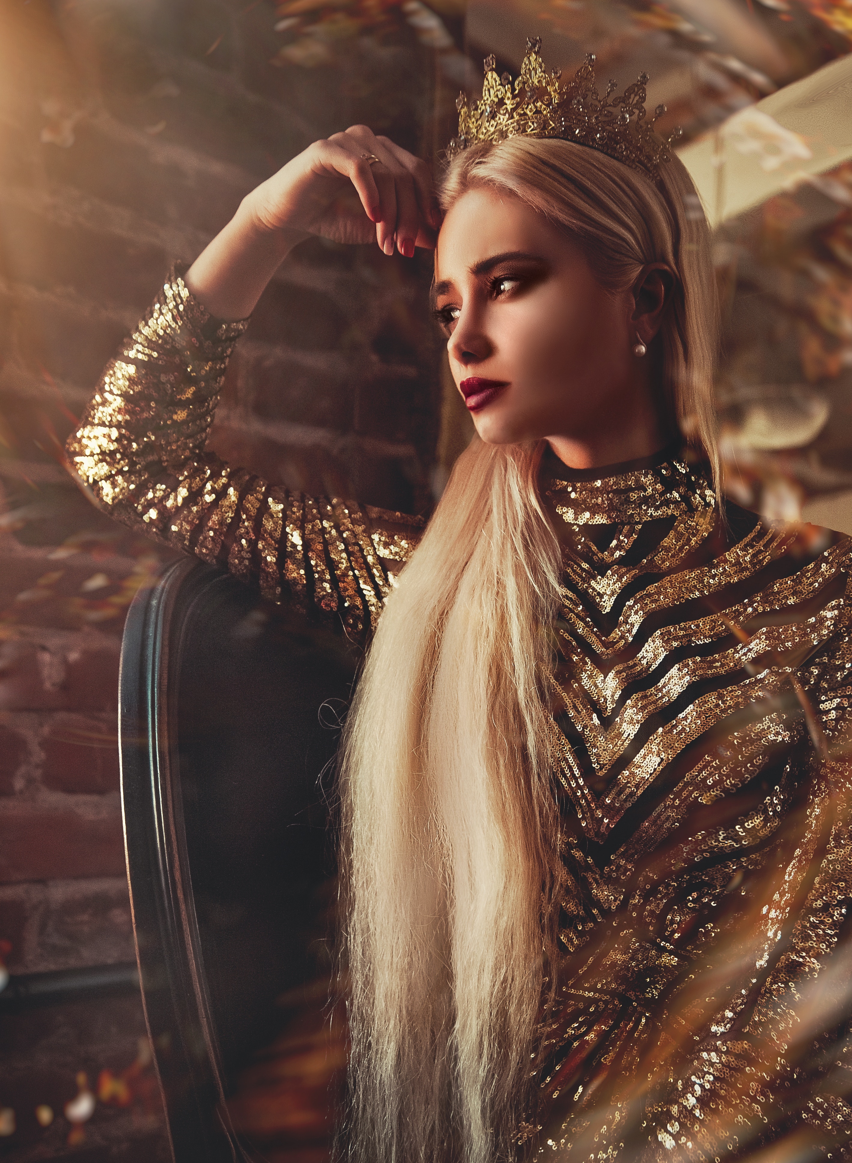
Silhouettes : Dresses, dungarees, long tunics, puffed sleeves, pronounced necklines … the most sophisticated garments in fabrics that radiate light like sequins or lames. Accessories are very important. Floral prints are also in, but with dark backgrounds
Colour: The first palette focuses on gold colour and its more aged tones. Also in the range of browns reminiscent of tobacco and leather. The second colour range appeals to violets, very dark reds and mauves that add that sophisticated touch
Key concepts: Extravagant glamour , hedonistic glam , pop power, tropical, positive attitude for your body and new empowerment.
 |
 |
Gratacós at Primavera Sound

There are powerful alliances, which work perfectly because they arise naturally and spontaneously. And the result is most impressive when a whole team of professionals coordinates to achieve a single goal which goes beyond surprise or emotion. In this cTase we are talking about the union between fashion and music through our latest collaborations which can be seen in the latest edition of Primavera Sound with some talented names within each discipline. Yes, we are pleased to say that Gratacós has jumped onto the stage via the wardrobe of three young artists with a lot of potential: Rosalía, Nathy Peluso and María José Llergo.
What was the collaboration?
Following one of our principles as a company, which is to support future professionals within the sector, whether young talents or established designers, as well as to develop cooperation with them, we faced a very motivating challenge earlier this year. The companies Dominnico, headed by the Alicante designer Domingo Lázaro Rodríguez and Colmillo de Morsa, from Barcelona contacted us offering a collaborative project which had us hooked from the very first moment. These companies were going exclusively to design the costumes of Rosalía and Nathy Peluso, designs that the artists would exhibit in person during their promotional tours around the world. In the case of Primavera Sound we also had the collaboration of Manuel Bolaño who sought to surprise with a design created for the performance of the singer María José Llergo.
These companies, which are friends and customers, were looking for something innovative, exclusive and of high quality for the costumes of the artists, something that would cause a real stir for its creativity and exclusivity! They know that we as fabric designers can count on a range of creations which meet these needs. Moreover, sometimes it is through the raw materials – in this case the fabric – that from the start the craziest ideas take their shape. And that point of slightly mad experimentation is what we adore and are entertained by ! In addition we firmly believe in the project of these three companies and the people behind them. So we were delighted to collaborate in the project of dressing three young divas of contemporary music at Primavera Sound .
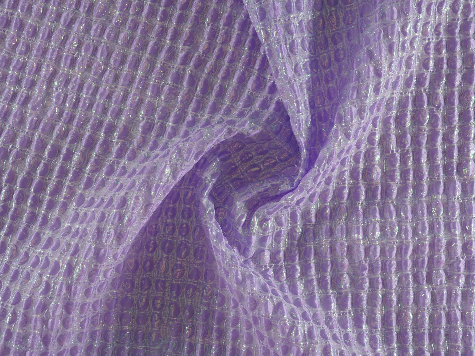
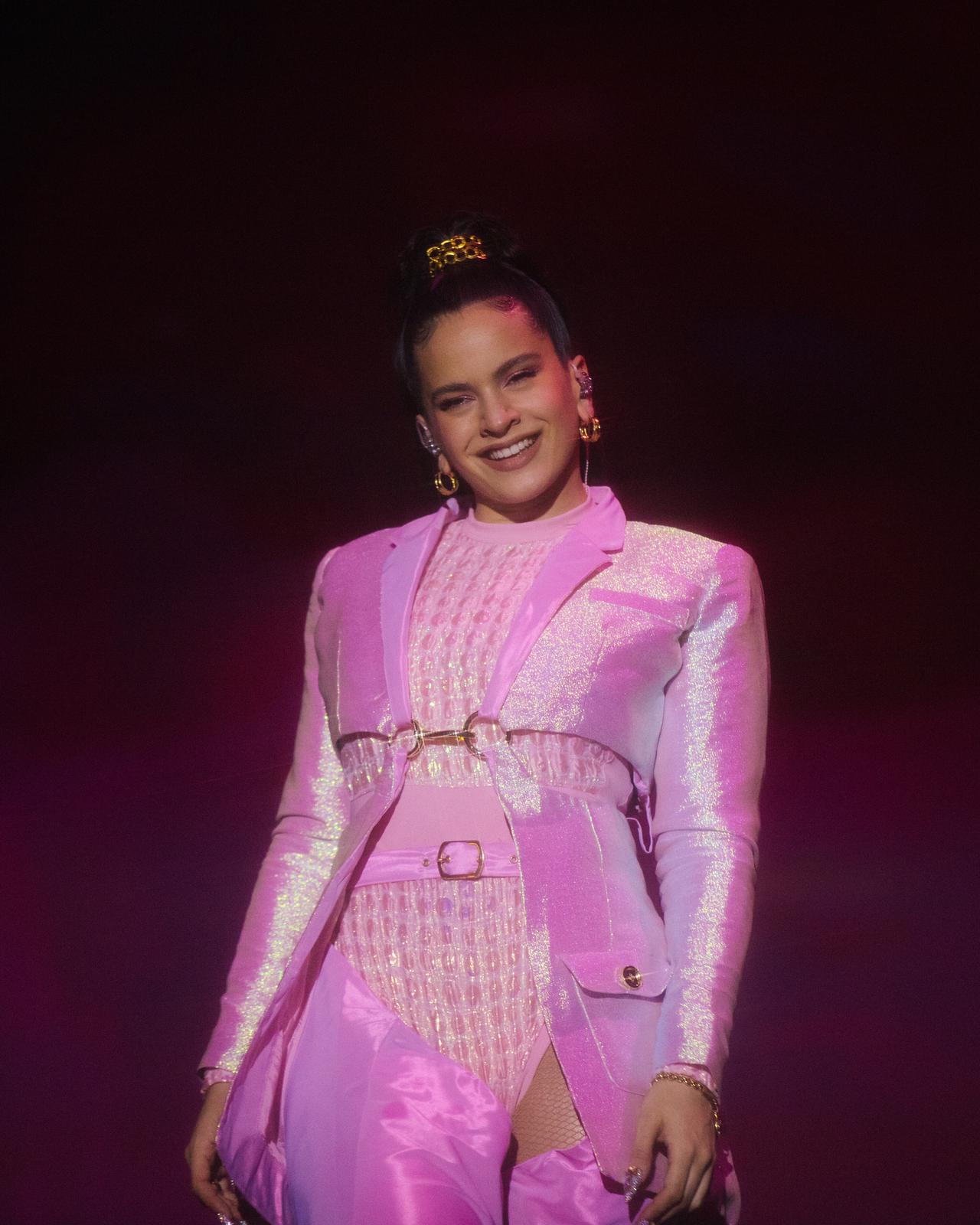
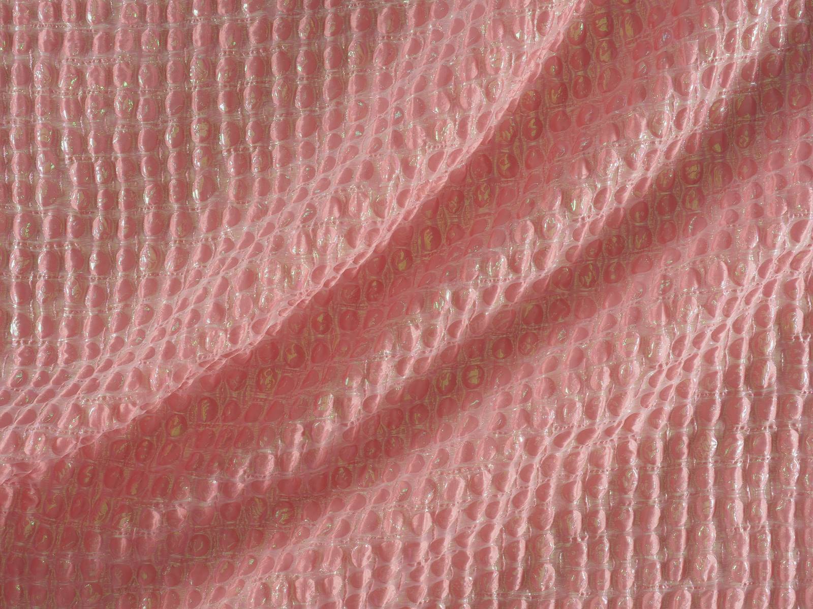
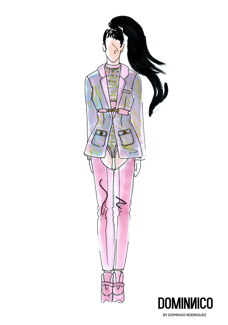
For the occasion Dominnico chose a wonderful Jacquard padded in bubblegum pink with iridescent stitchings to create that stunning amazon look worn by Rosalia in her performance at Primavera Sound. That fabric was present in the corset which the Catalan artiste wore with pronounced shoulder pads . The outfit was complemented by a jacket and matching leggings, which were defined at the waist with gold appliques. This bold outfit,which was inspired by the ‘ Dirty ‘ style of Christina Aguilera also bore the design and styling of Daikyri , Rosalia’s sister.Nobody was left indifferent by this wardrobe . We should mention the sure value of Domminico , which already counts as clients other international fashion and show artists such as Lady Gaga, who has worn the brand on three occasions .
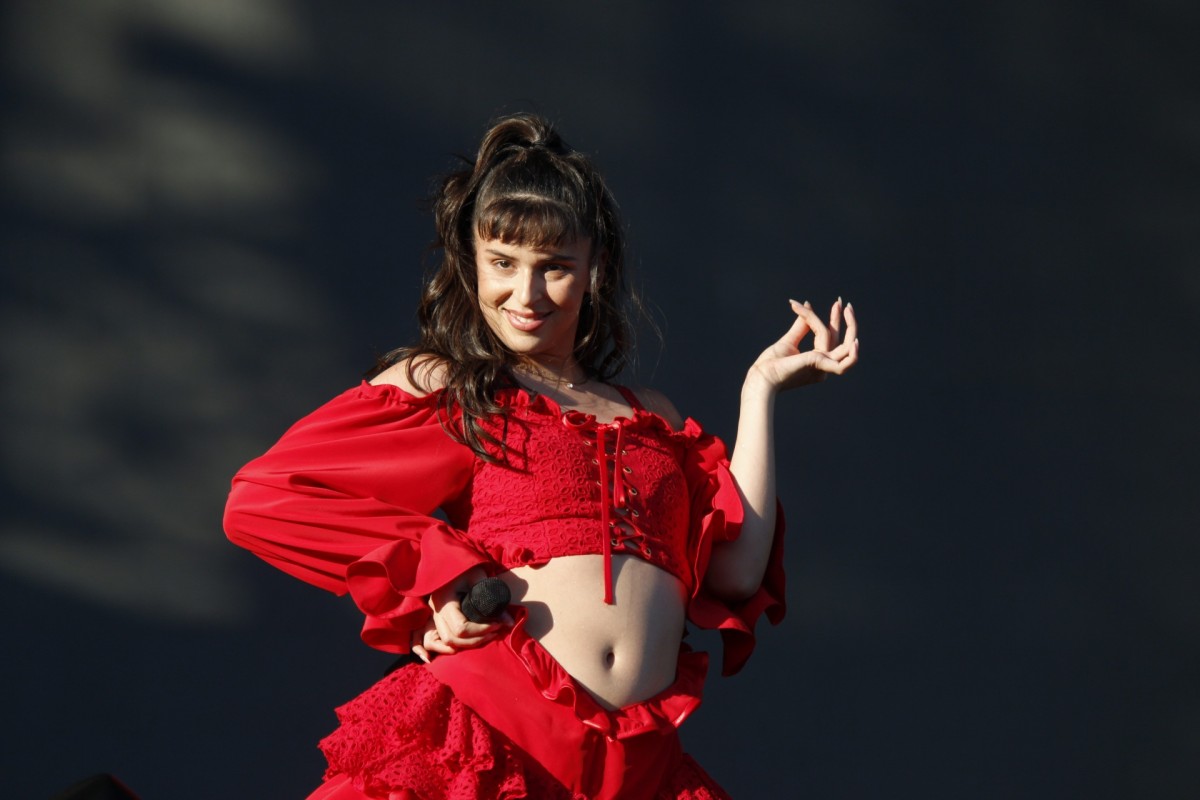
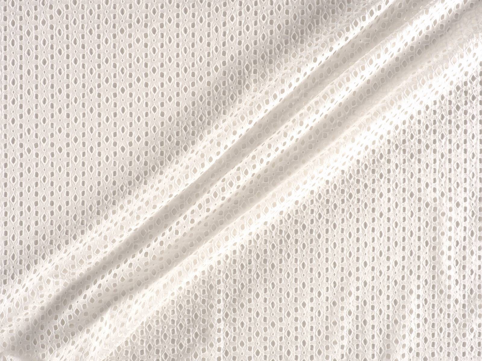
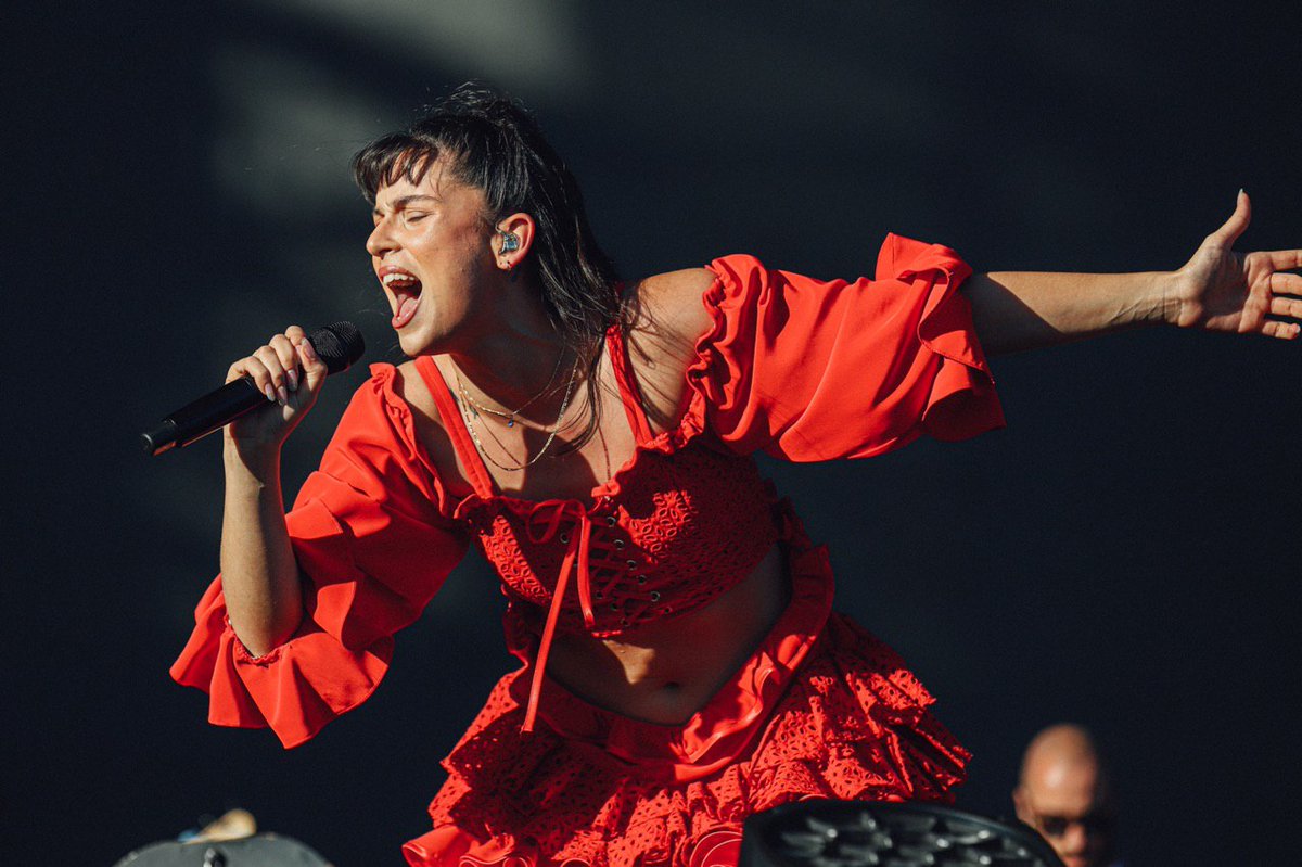
In the case of Colmillo de Morsa , the challenge was to dress Nathy Peluso , the Argentinian artist now based in Barcelona whose successful music ” is capable of making hip-hop danceable and accompanied by jazz”, and whose trap aesthetic captivates the young generation Z. They also recently designed for Berskha a capsule collection which embodied their aesthetic references. The designer Elisabet Vallecillo chose a cotton embroidery to make the countless metres of ruffles that she used to design the spectacular cascaded skirt and the top with crossed neckline worn by the Argentine artist. The embroidery was white and the designer dyed it afterwards to achieve this reddish tone so exuberant for an outfit inspired by Havana.
Finally, Manuel Bolaño was commissioned to devise a spectacular coat for María José Llergo . The Cordovan singer of 24 years , resident in the Gràcia district of Barcelona, is one of the young promises of singer-songwriting, as she writes and composes with a very unique style of flamenco rooted in and linked to her land of origin. Bolaño chose black taffeta to make for her a beautiful and impressive maxi coat that did not go unnoticed among the spectators of Primavera Sound .
The most appreciated is that in the three looks the designers respected the aesthetics of each artist, without losing their essence as creators. It is here when that magical fusion between fashion and music takes place. It is an art, through and through!

Carlota Barrera: an emerging designer
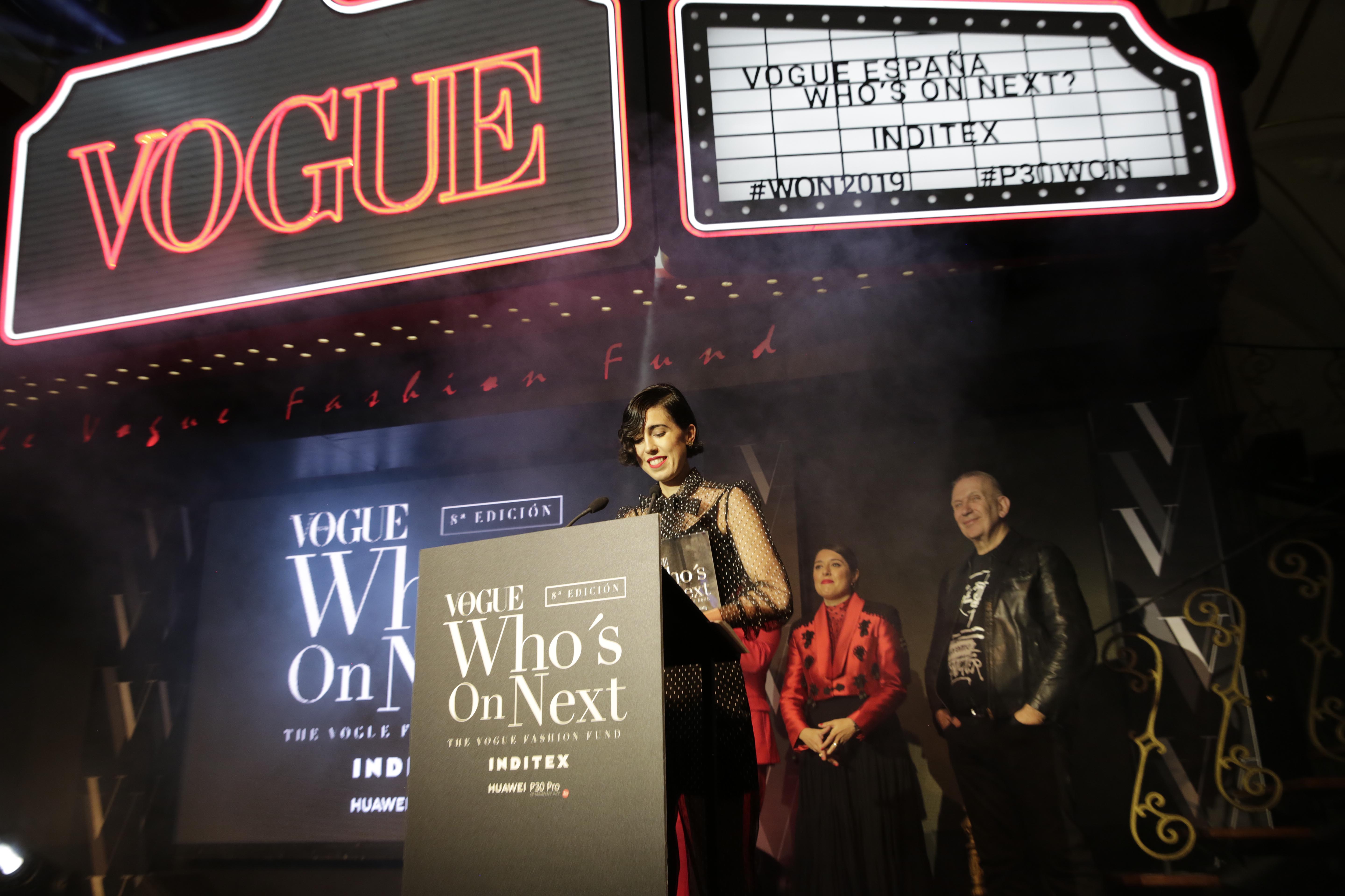
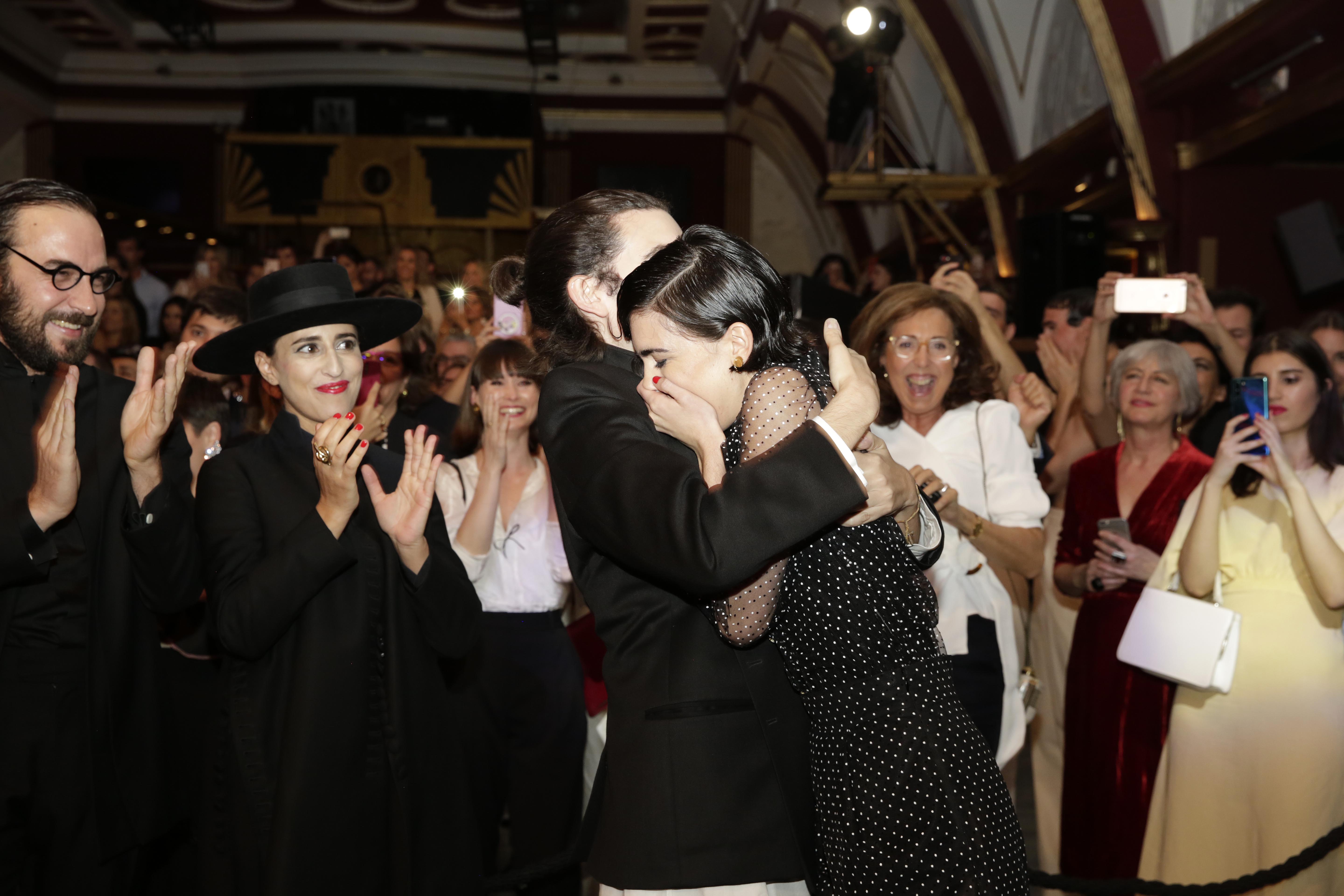
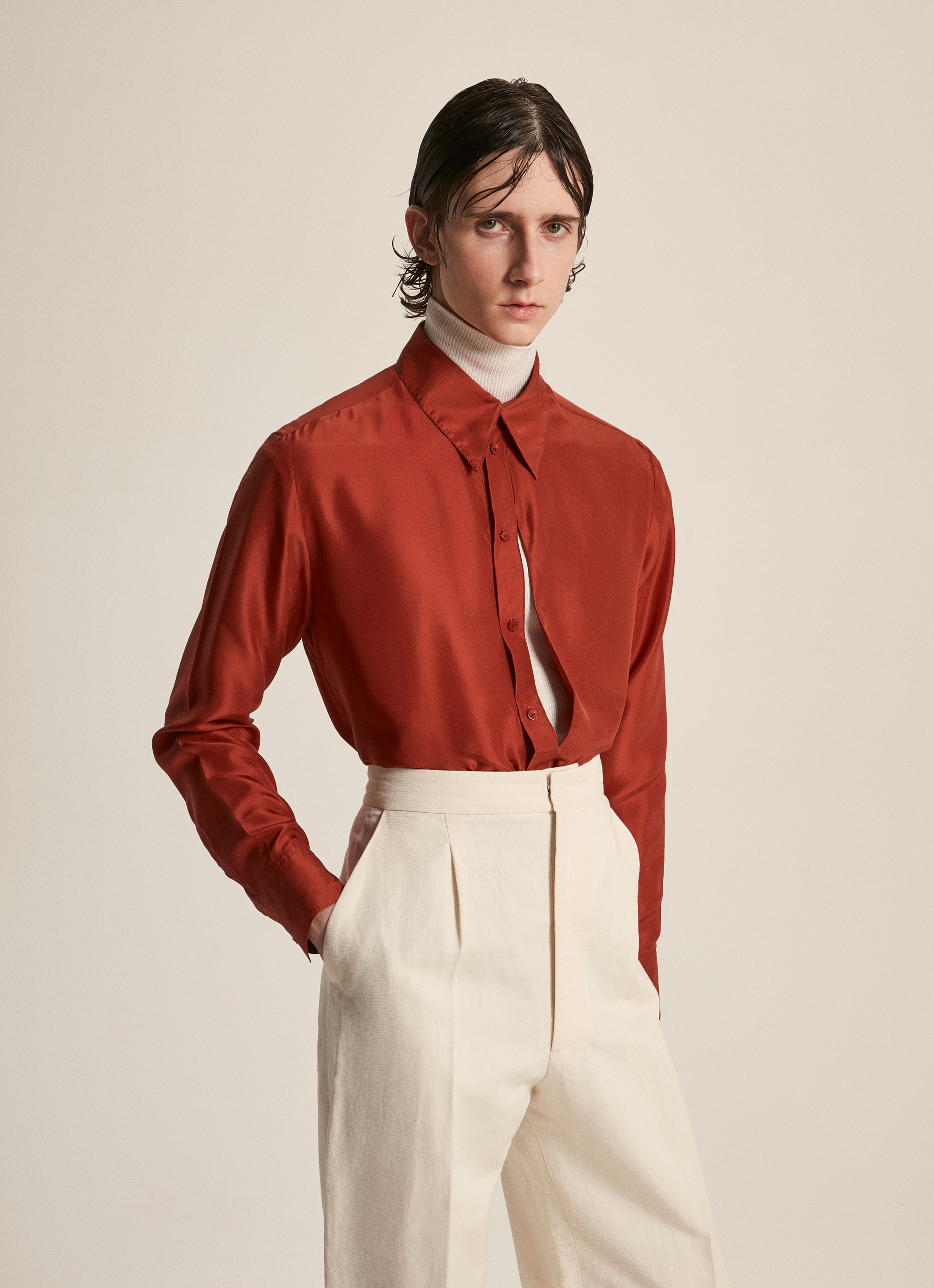
Remember her name,because she has only just started her career and her aura is already shining brightly against the panorama of young talents in Spanish fashion. Her name is Carlota Barrera, she is 26 years old and comes from Gijón. She was planning to become an architect, but fashion crossed her path and her bold efforts to give a contemporary twist to Spanish men’s fashion convinced the experts who recently awarded her the prize Vogue Who’s On Next 2019. This award, which is presented annually, is an international initiative by Vogue magazine and is the biggest prize in Spanish fashion, with an endowment of 100,000 euros by Inditex, which has supported the initiative since the first edition. The financial award is in recognition for talent which aims to develop a business plan and it also includes automatic registration in ACME (Association of Spanish Fashion Designers) plus the possibility of participating in the next edition of the Mercedes-Benz Fashion Week Madrid, as well as having the support of the influential magazine.

The controversial Jean Paul Gaultier, President of the Jury, was in charge of revealing the name of the winner during the ceremony. The other two finalists of this eighth edition were the Sevillian designer Ernesto Naranjo and the Madrid couple Oteyza. This award is a boost to the professional career of this Asturian designer who is resident in London, as was the case in past editions with winners such as Marcela Mansergas, Juan Vidal, Maria Ke Fisherman , ManéMané , Moisés Nieto, Leandro Cano and Palomo Spain , who won in 2018. Carlota Barrera thus becomes part of that cast of young promising Spanish fashion designers, the so-called Who’s On Next Generation
A turn to masculine fashion
Carlota Barrera is from Asturias, but resides in London. Her career actually began in the British capital, after taking a master’s degree at the London College of Fashion and after working in several haute couture houses. In 2018, the young designer decided to fulfill her dream by setting up a company that would shake up Spanish men’s fashion via three basic pillars: tradition, craftsmanship and responsibility. These are the foundations of the creations from her own branded company.
Her company is indeed constantly involved in the search for and innovation in the best fabrics that come from processes which respect the environment. And although her studio is located in London, from where she develops the brand, she presents her collections in Spain and her most emblematic products are those made with materials that evoke her country of origin. “We are a small brand and consider it essential to have control of the value-chain and to be able to maintain ethical and fair values throughout all processes,” said the designer at the award ceremony.
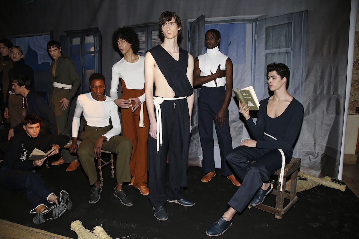
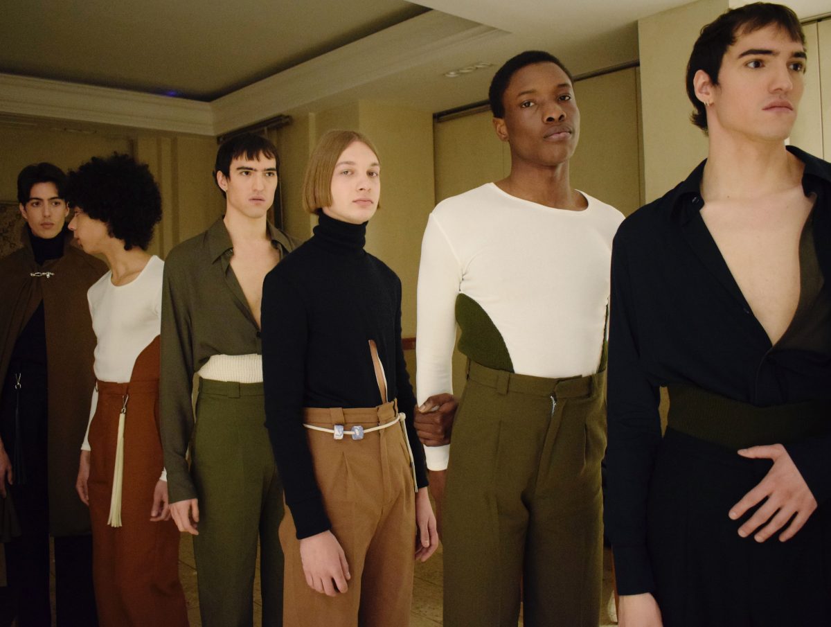
Carlota Barrera designs for an audience of age 20 to 45, for young men who seek heritage, luxury and sophistication in a type of garments that follow the mandates of classic tailoring with its clean patterns and artisan motifs, but with a more modern and aesthetic approach together with current vision. Although her main clients are men, Carlota Barrera also dresses women who are attracted by masculine image and clothing. Among her main objectives is the increase in brand awareness, its development and realisation via international expansion, but emphasizing local fashion and roots culture.
 |
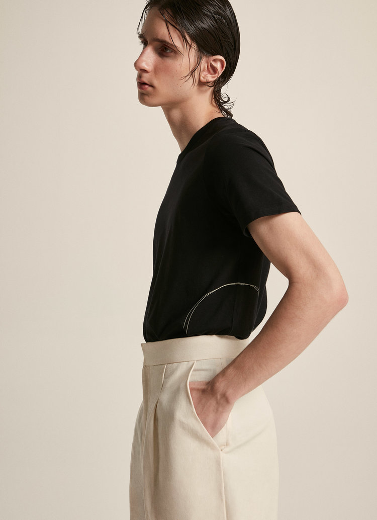 |
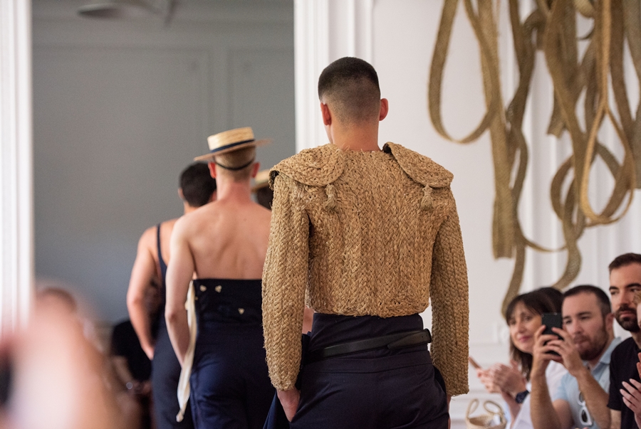
Her first men’s collection was “El Matador y el Pescador” and the mission that is evident in all her creations is to achieve the maximum quality in her collections, uniting tradition and contemporaneity to satisfy the demands of the most avant-garde of men. This injection of capital and the support of Vogue can deliver a huge boost to the career of Carlota Barrera, providing upward movement for this young company with plenty to say now as it will doubtless have in the future. The career of this Asturian designer has only just started.
The best design in Barcelona
Who are the current ambassadors of design in Barcelona? The unknowns have already been resolved with the winning names of the second edition of the MODA-FAD Awards, the awards given by the Association for the Promotion of Fashion as recognition for their work in the sector.
In this edition the awards of the four professional categories have been: Carlota Barrera in the category of Merit for Clothing Design; Sol Prado in the category of Merit for Complementary Design; Rebeca Sueiro in the category of Merit for Styling and Image , and Ignasi Monreal in the category of Merit for Visual Communication. In addition the MODA-FAD Board will give to Pedro Rovira the Honour Award in recognition of his creativity and for having valued the identity of local and national fashion. Finally, there is also a separate award: that for Student Sustainability, which this time has been awarded to Mireia Panisello, a BAU design student.
The jury that has decided the names featured in this edition are the stylist Ana Murillas , the fashion culture specialist Charo Mora, the designer Claudia Pérez, the fashion editor Estel Vilaseca , and the fashion designer Krizia Robustella.
Discover who is who
Carlota Barrera
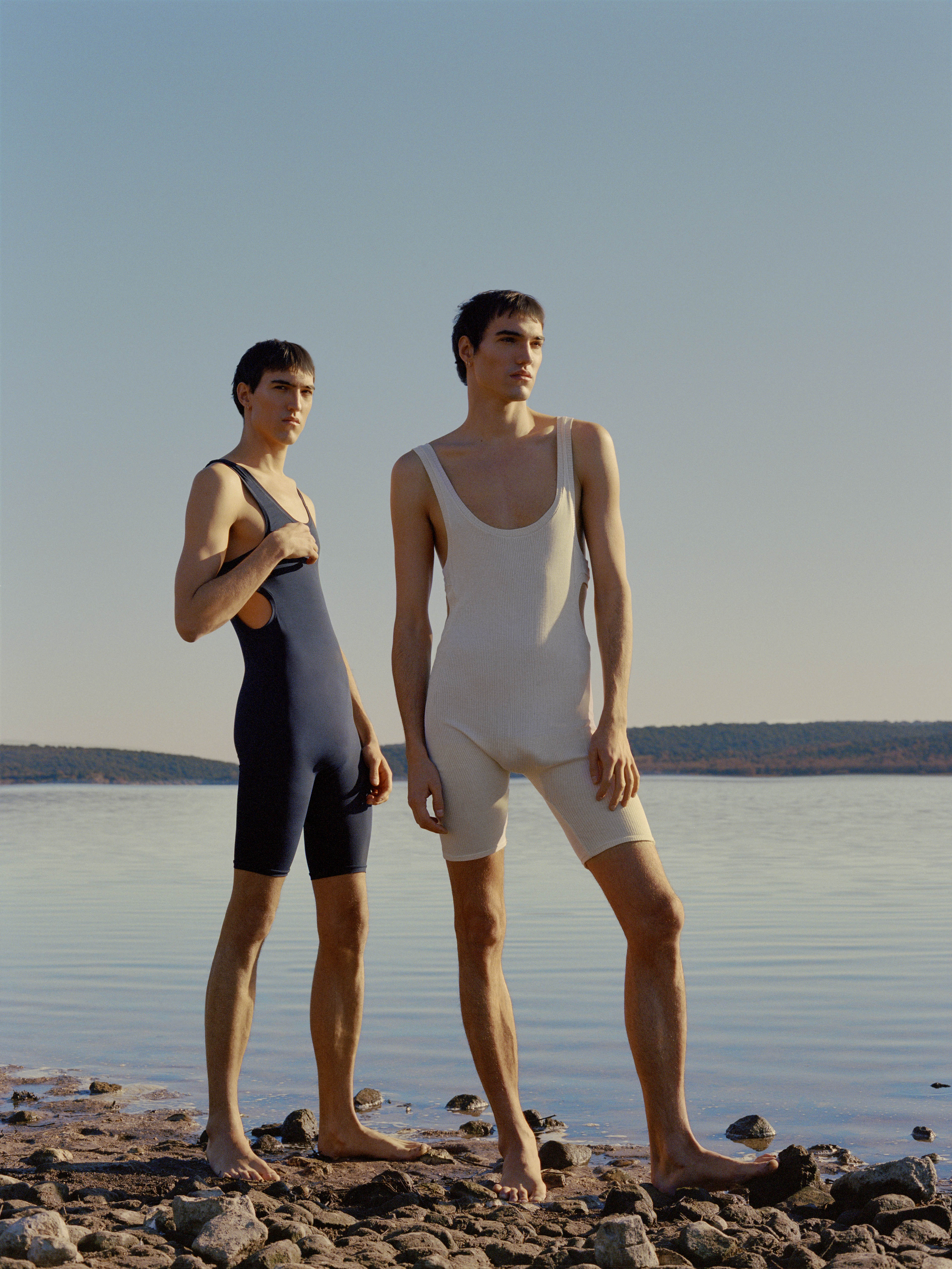
Carlota Barrera is a young designer based in London who holds a master’s degree from the London College of Fashion and has developed her skills working in several haute couture houses. Last year Barrera launched her own named brand with the men’s collection “El Matador y el Pescador”. This company explores modern silhouettes in collections that reflect the classic techniques of tailoring and artisan motifs with a contemporary vision and a very visual approach. Each garment fuses the concepts of heritage and luxury from a fashion-house that represents a vision of modern man.
Sol Pardo
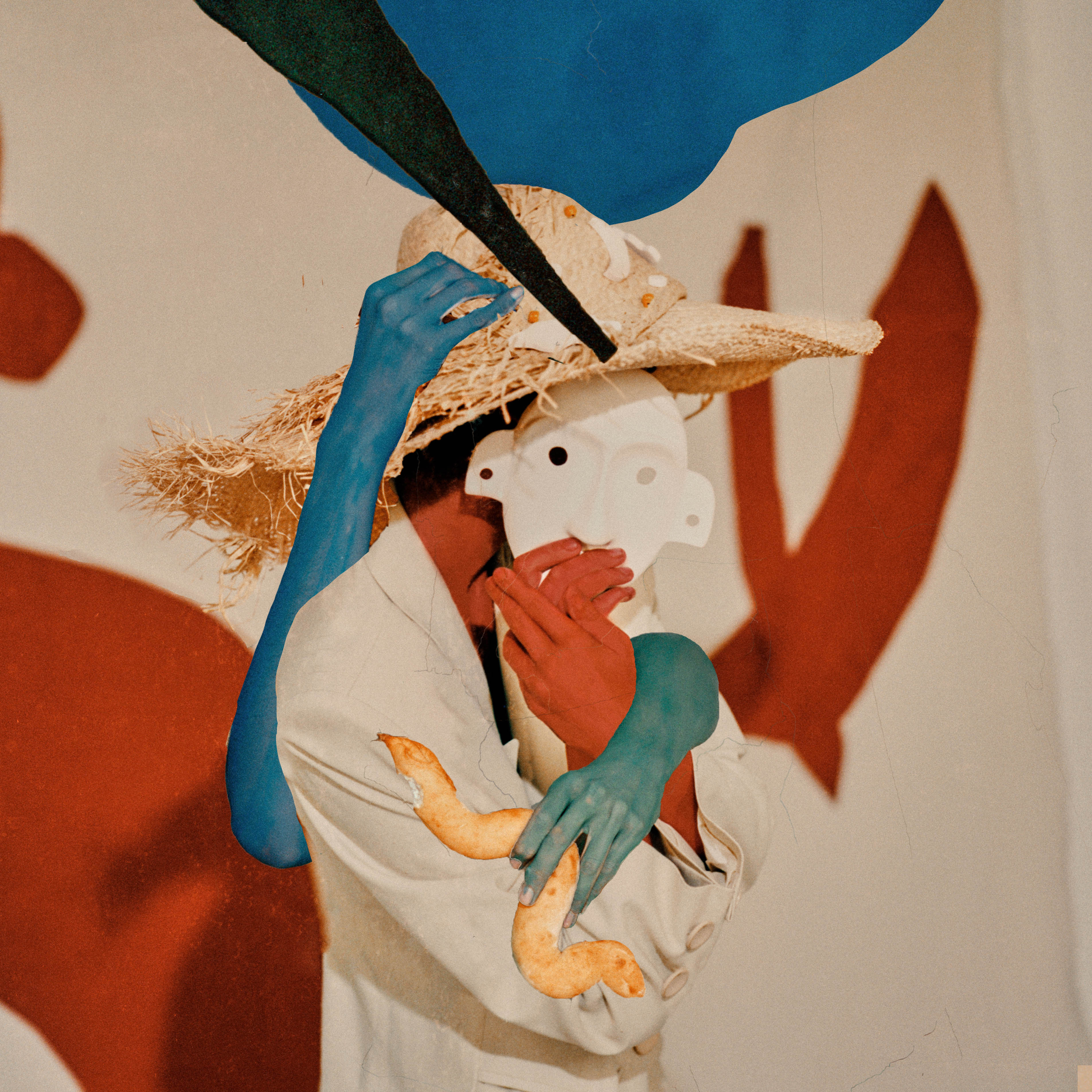
Sol Pardo shows her ideals through hats. Concepts such as art, design and craftsmanship are present in each of her creations that are characterized by using reusable hand-made materials. Thus, for example, hats combine acrylic as a distinctive raw material, with straw hats made by hand by a community of weavers. This is the essence of Pardo Hats: to defend the value of the slow fashion with timeless accessories that generate identity.
Rebeca Sueiro
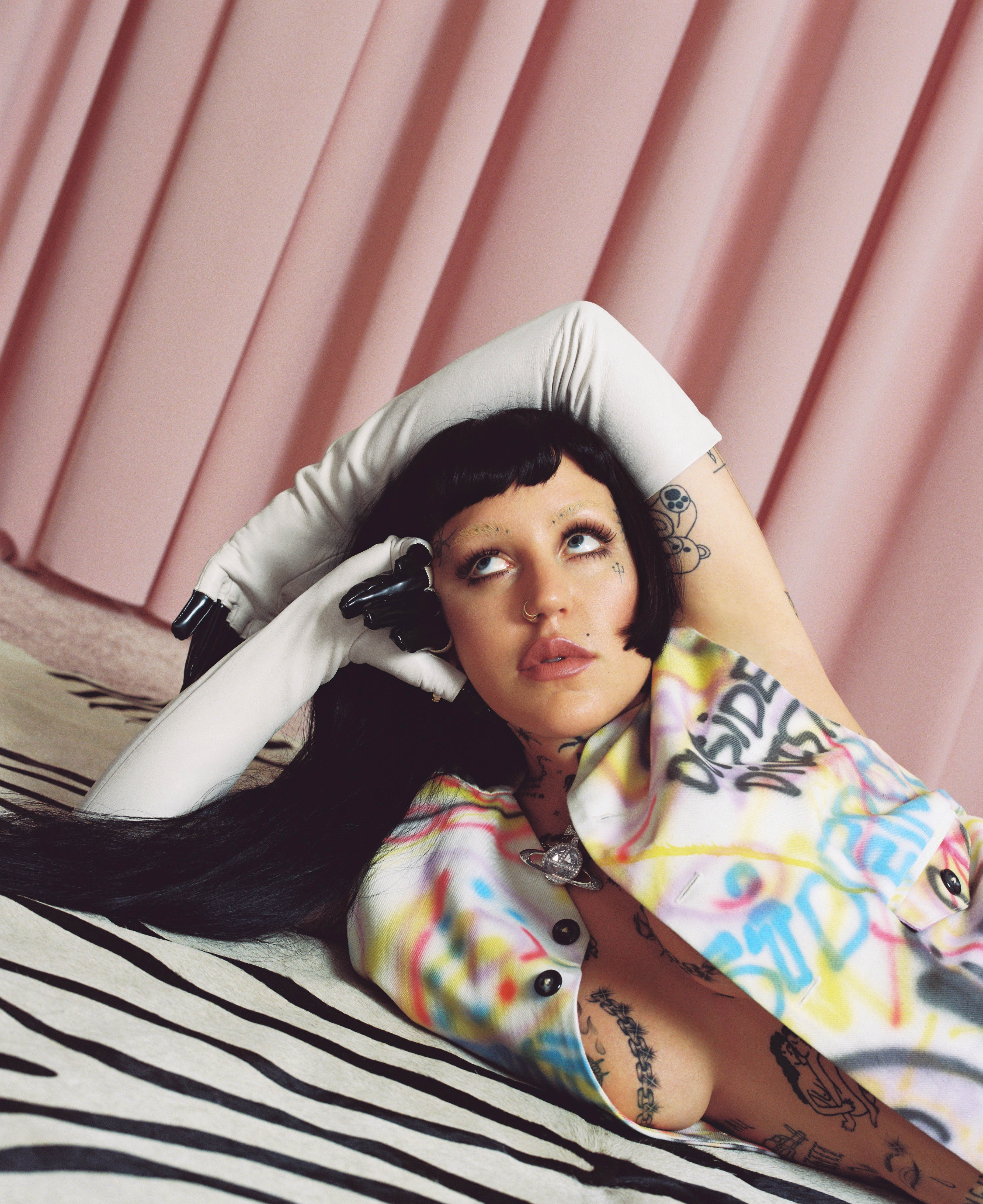
The Galician Rebeca Sueiro (A Coruña, 1982) began her relationship with the world of scenic costume in 2002 in her hometown, where she studied Industrial Pattern-making. Sueiro’s editorial work shows her admiration for the subcultures and the most underground artistic, aesthetic and musical scene as well as her travels in Europe, Africa and Asia, where she has actively participated in the rave scene and has lived in artistic communities related to it. Currently Rebeca works in Barcelona and her obsession as a stylist is to see how through clothing each individual constructs a unique language with which to communicate.
Ignasi Monreal
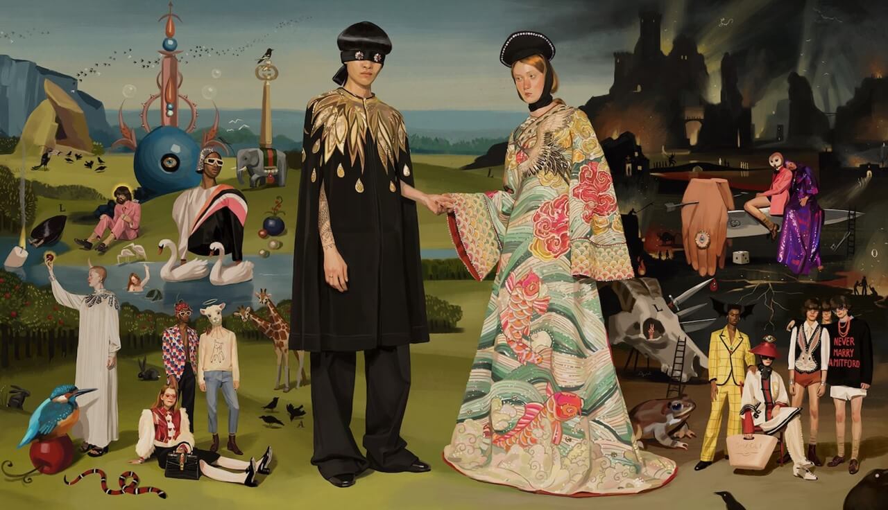
Who now is still not familiar with the illustration of Ignasi Monreal? The Barcelona artist based in Rome works in various media, including painting, design, creative direction, and cinema. He is the creator of the celebrated Gucci Spring / Summer 18 campaign , the first of its kind in which digital illustration is used entirely. He has also illustrated other international campaigns for Alessandro Michele and Dior. Monreal has recently exhibited at La Fresh Gallery, a show dedicated to the celebration of everyday gastronomy and called ‘ PlatsBruts ‘ (“Dirty Plates” ) .
The prizes will be awarded next June 15 in the building Disseny Hub of Barcelona. In parallel, the works by each of the prize-winners can be seen in the exhibition “Best design of the year”.
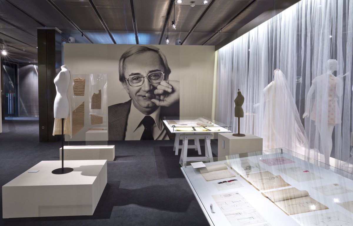
Pedro Rovira learned the trade in a tailor shop. In 1948 he founded his first fashion house in the square Gal·la Placídia, which years later moved to the Rambla del Prat in Barcelona. In 1957 he presented his collection at the Berlin International Exhibition, in 1964 he joined the Alta Costura Cooperative and the following year he presented his collection in the Spanish Pavilion of the New York International Fair.
In the 70s he started a ready-to-wear line, but he continued with haute couture. Rovira was the benchmark of Barcelona fashion during the 60s and 70s. He showed a predilection for pure lines, especially in day-time pieces. His creations stand out for the sharpness of the lines and the play of colour, for good construction and an impeccable cut.
The prizes will be awarded next June 15 in the Disseny building Hub of Barcelona. In parallel the works by pieces of each of the prize-winners can be seen in the exhibition “Best design of the year”.
