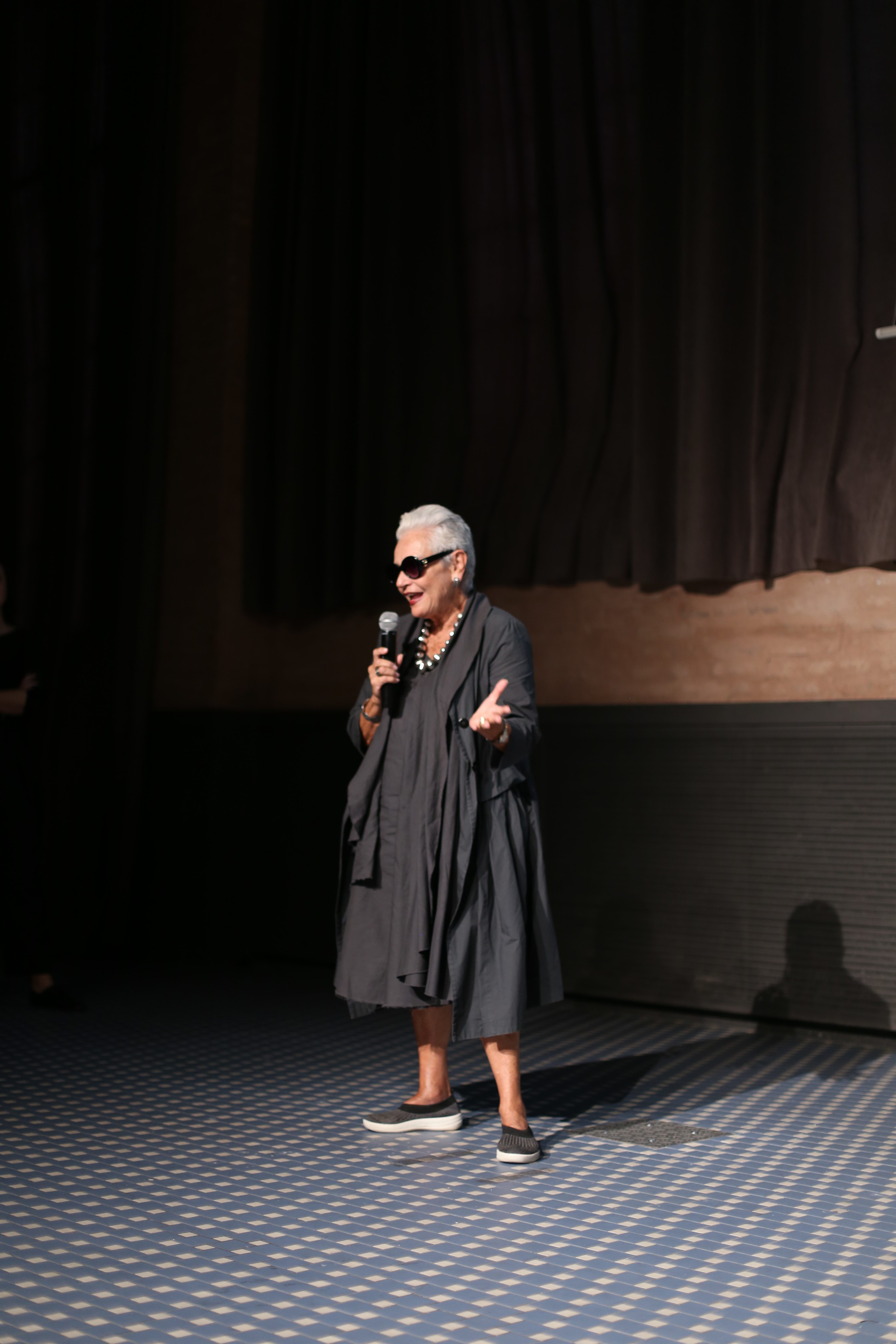
Miércoles 28 noviembre 2018
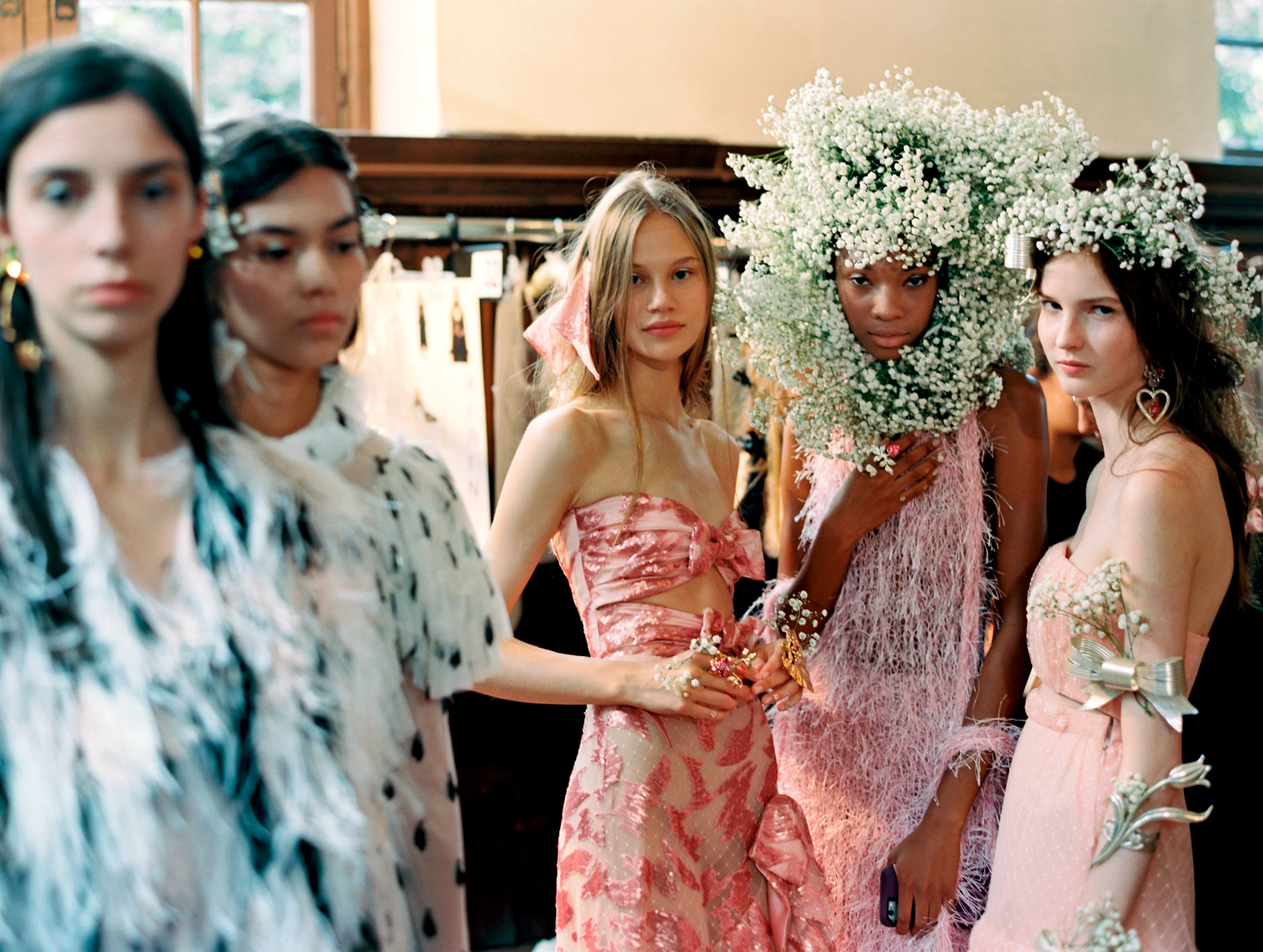
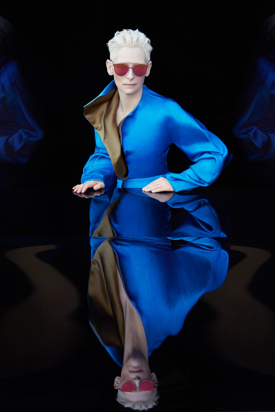
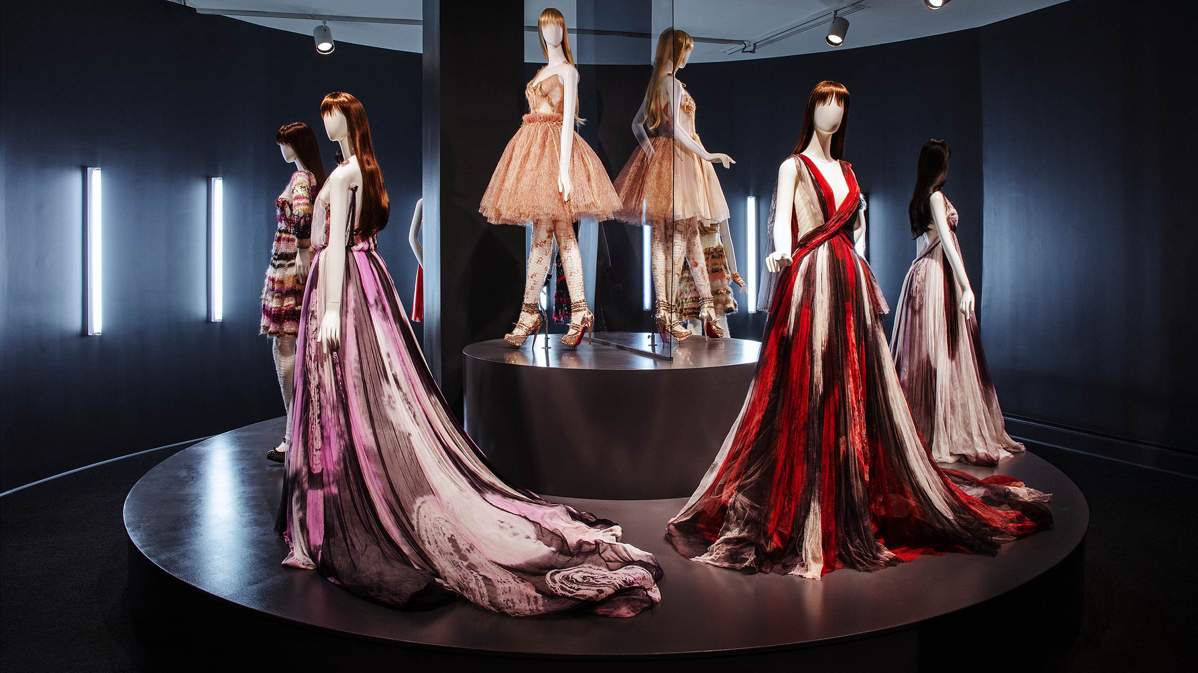
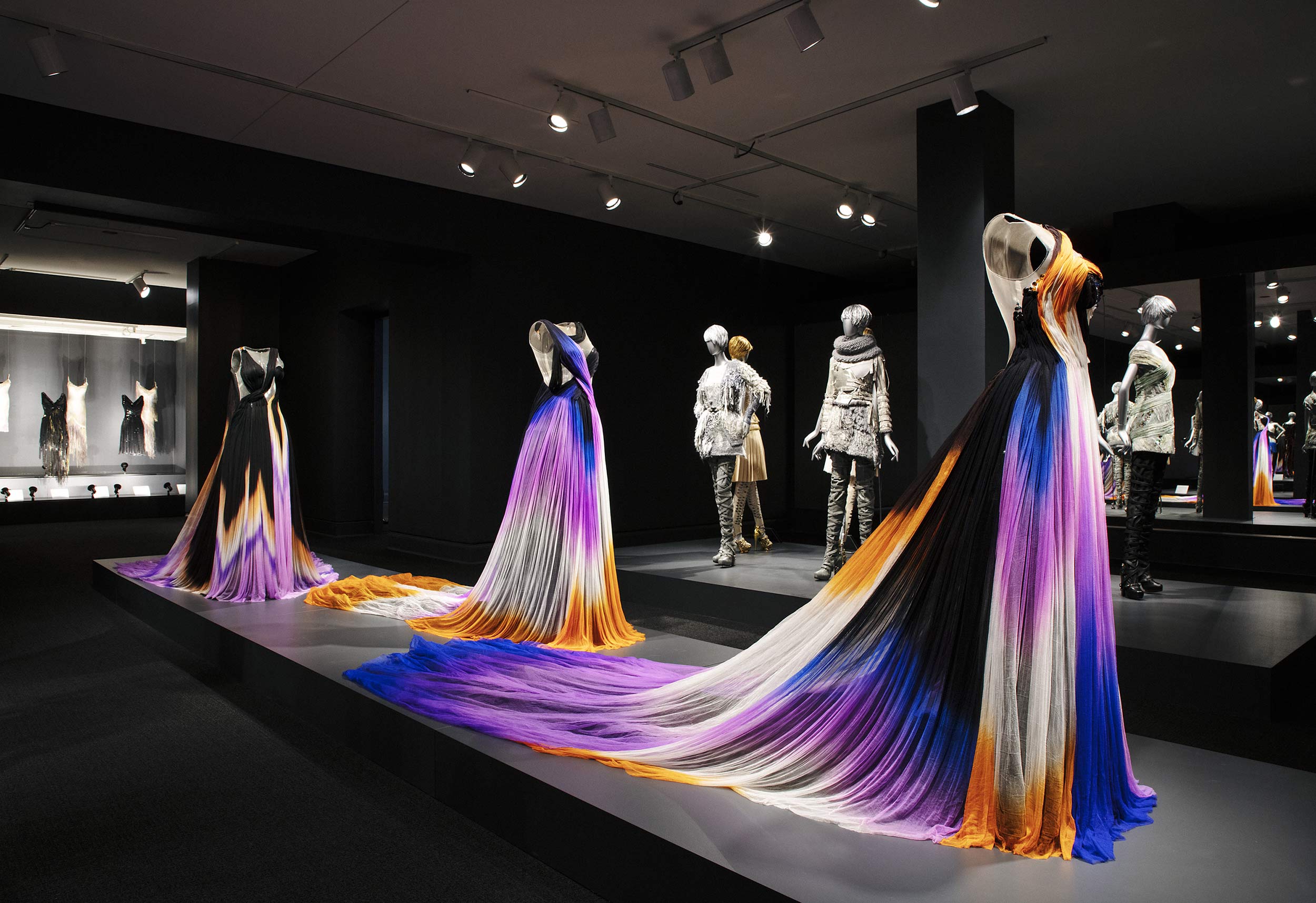
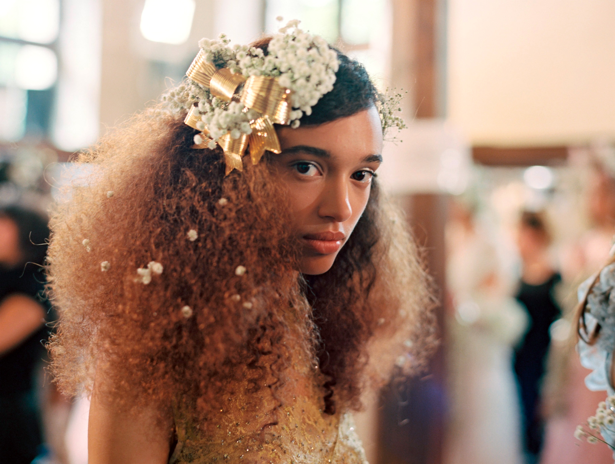
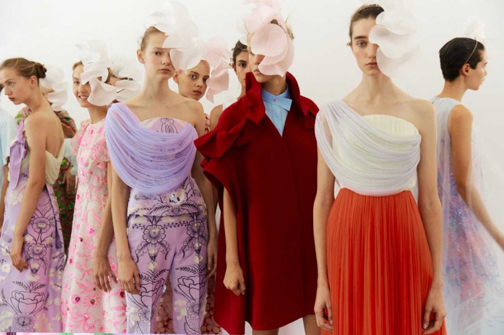
The National Museum of Women Artists (NMWA) in Washington DC is hosting a fashion show for the first time and is doing so in a big way, hosting the meticulous work of Rodarte. Thus, with the title ‘Rodarte’, the exhibition explores the universe of the famous American luxury fashion house, founded just 13 years ago by the sisters Kate and Laura Mulleavy . The exhibition reveals the visionary concepts of the designers, their impeccable craftsmanship and their impact on the fashion industry. Taking into account that currently only 14% of the big fashion companies are headed by women, this exhibition, located in a museum dedicated to women’s art is a declaration of intentions.
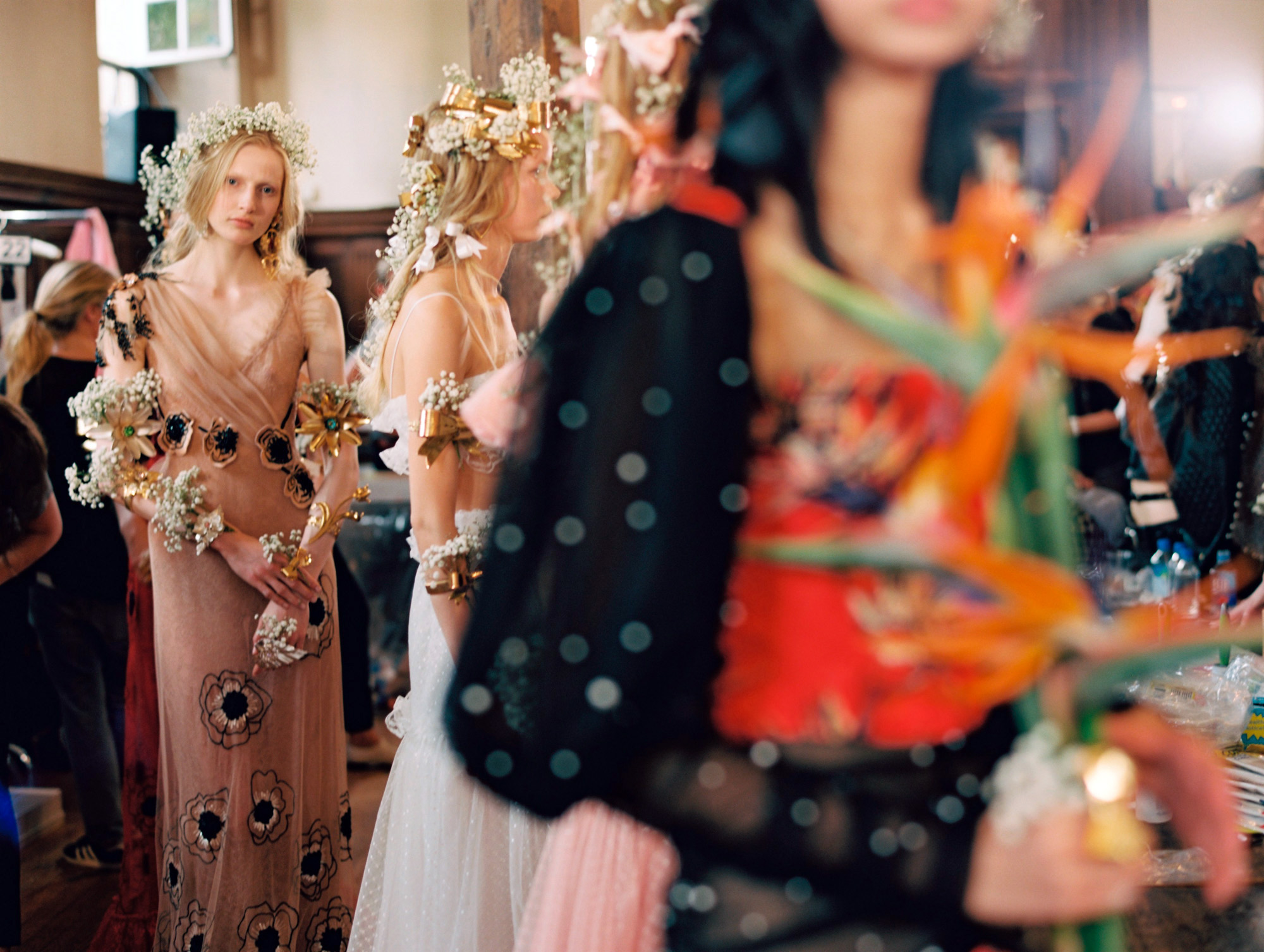
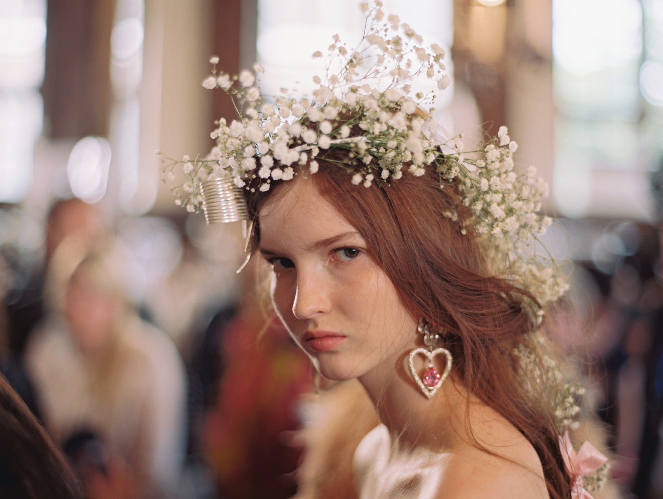
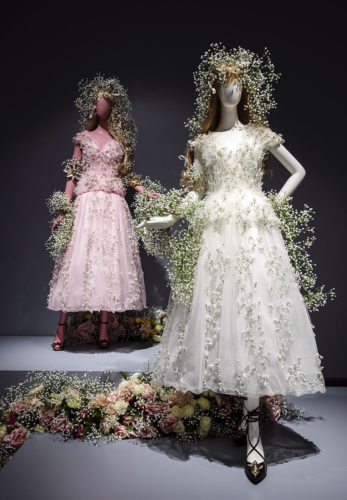
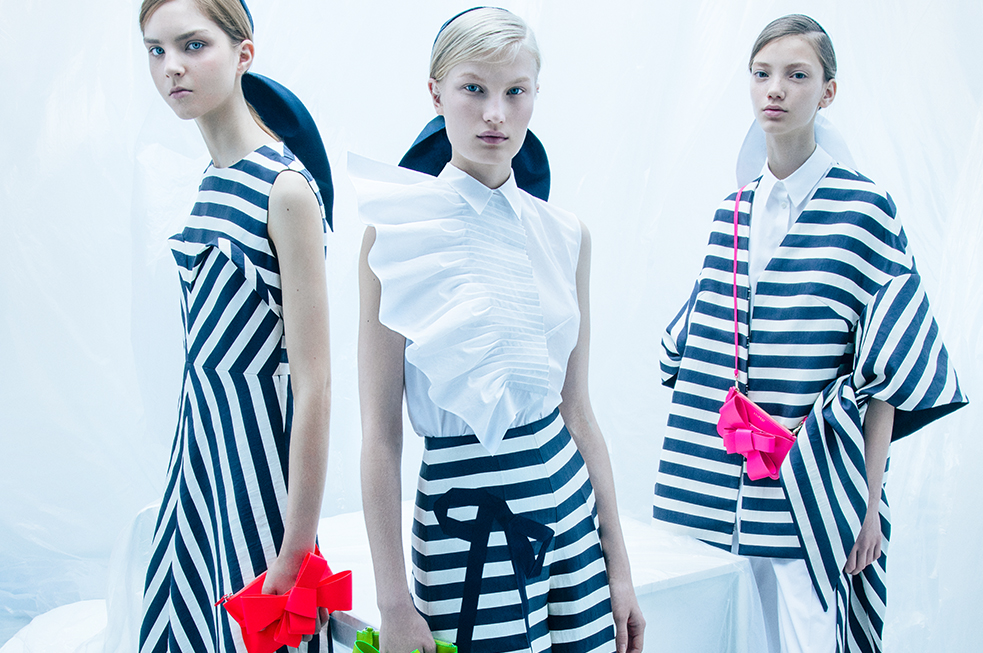
Specifically ‘Rodarte’ explores the distinctive features of its design, creative design and the recurring themes and inspirations that position the work of the Mulleavy sisters within art and contemporary fashion. It is not a retrospective view, something the curators of the exhibition themselves have made clear from the outset, as the company is very young and its founders are under forty, but rather an approach to the imagination of Rodarte starting from the different elements that make up its identity. These traits are revealed via the 94 complete looks that form part of the 12 seasons presented by the Californian company. In addition the dancer costumes that the Mulleavy sisters created for the film ‘Black Swan ‘ by Darren Aronofsky have also been included, as well as the costumes from his first film ‘ Woodshock ‘. These garments distill the concept of modern femininity that is the essence of Rodarte , together with other influences such as their passion for nature and humanity. It is a perfect blend of strength and delicacy that is also seen in the wide variety of fabrics used, combined with meticulous haute couture techniques. It is not for nothing that Rodarte is one of the companies that has received the most accolades in the world of art and fashion since its inception in 2005.
The exhibition ‘Rodarte’ will be open to the public until February 10.
Fashion conceived as art
Rodarte was founded in 2005 in Los Angeles (California), fruit of the imagination and creativity of Kate and Laura Mulleavy. Graduates in art history and literature , the sisters lacked a specialized training in fashion design when they started, but they had audacity, intuition and an exquisite taste for technique, craftsmanship and detail. With these talents they conquered the industry immediately. In this brief career of thirteen years Rodarte has won dozens of awards since its first parade and institutions such as the Metropolitan Museum of Art’s Costume Institute have acquired some of the company’s creations. Their garments, between post-apocalyptic and dreamlike, seek that duality inherent in beauty, between dark and luminous, with multiple references that cover recurrent themes such as cinema, art and nature.
Rodarte made its debut in 2005 at the Fashion Week in New York with a resounding success and after presenting the latest collections in Paris, this year they have decided to return to the Big Apple, the city where they claimed their first triumph . It is a return that coincides with this exhibition in Washington of one of the luxury brands with the most international exposure in the current fashion industry.
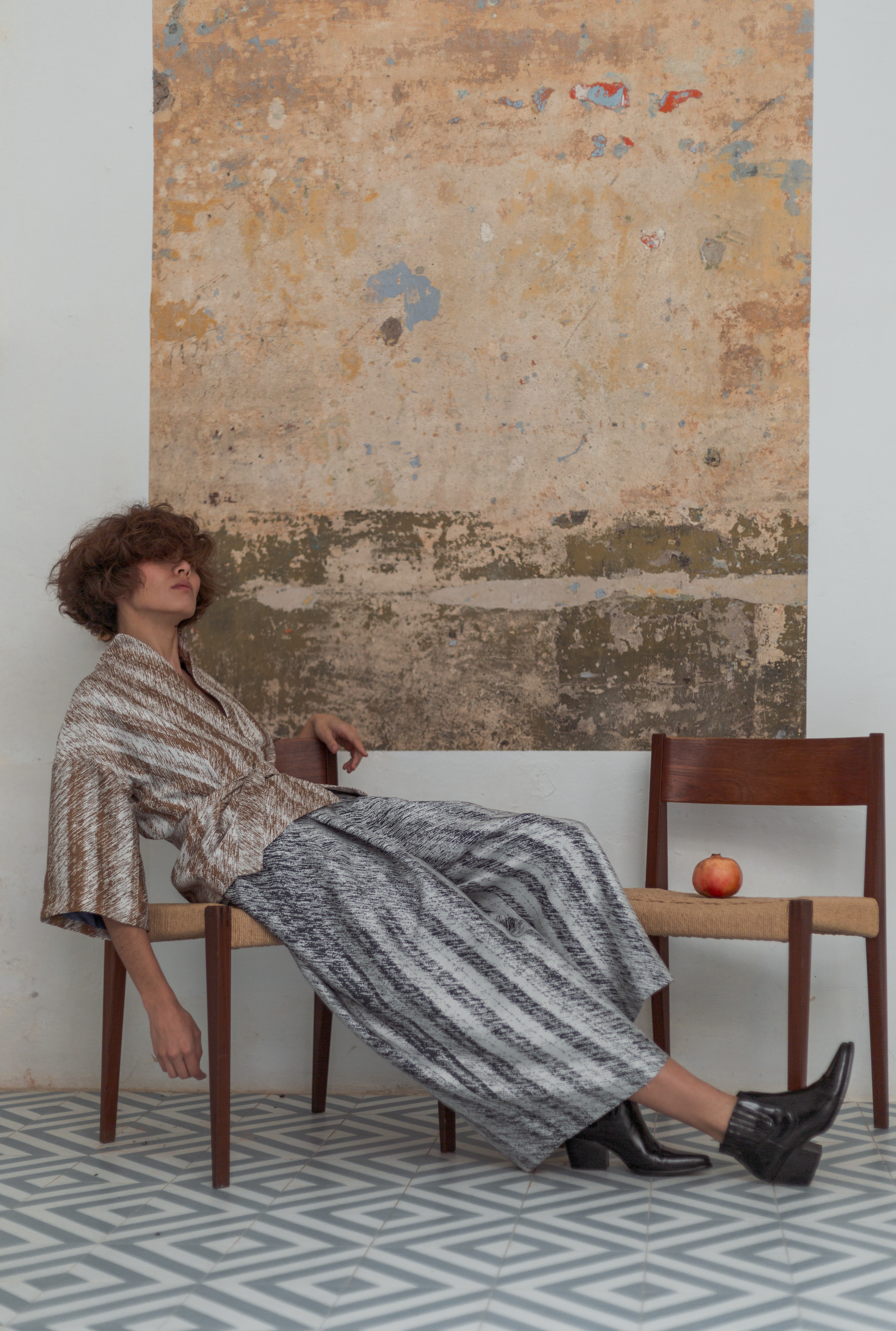
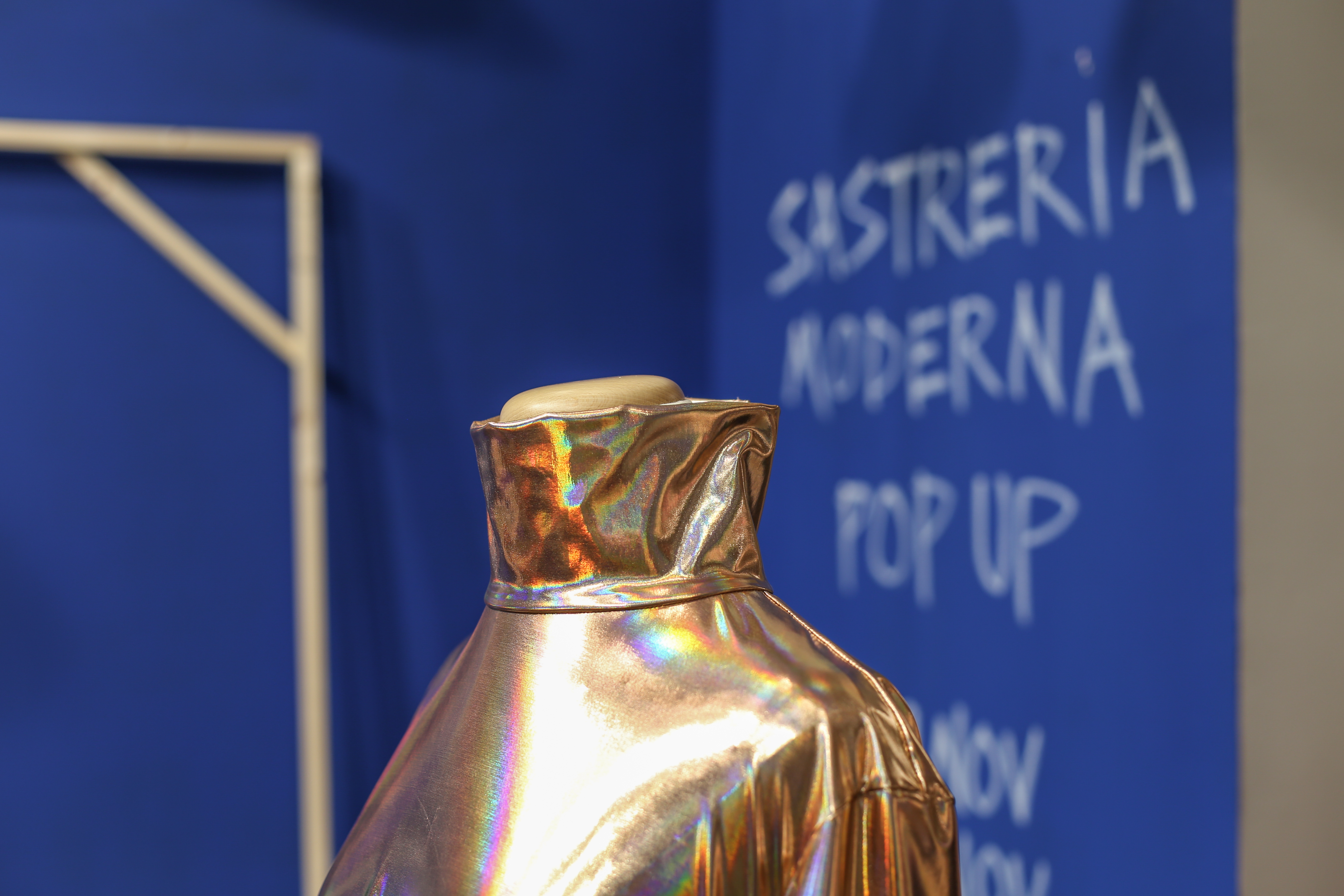
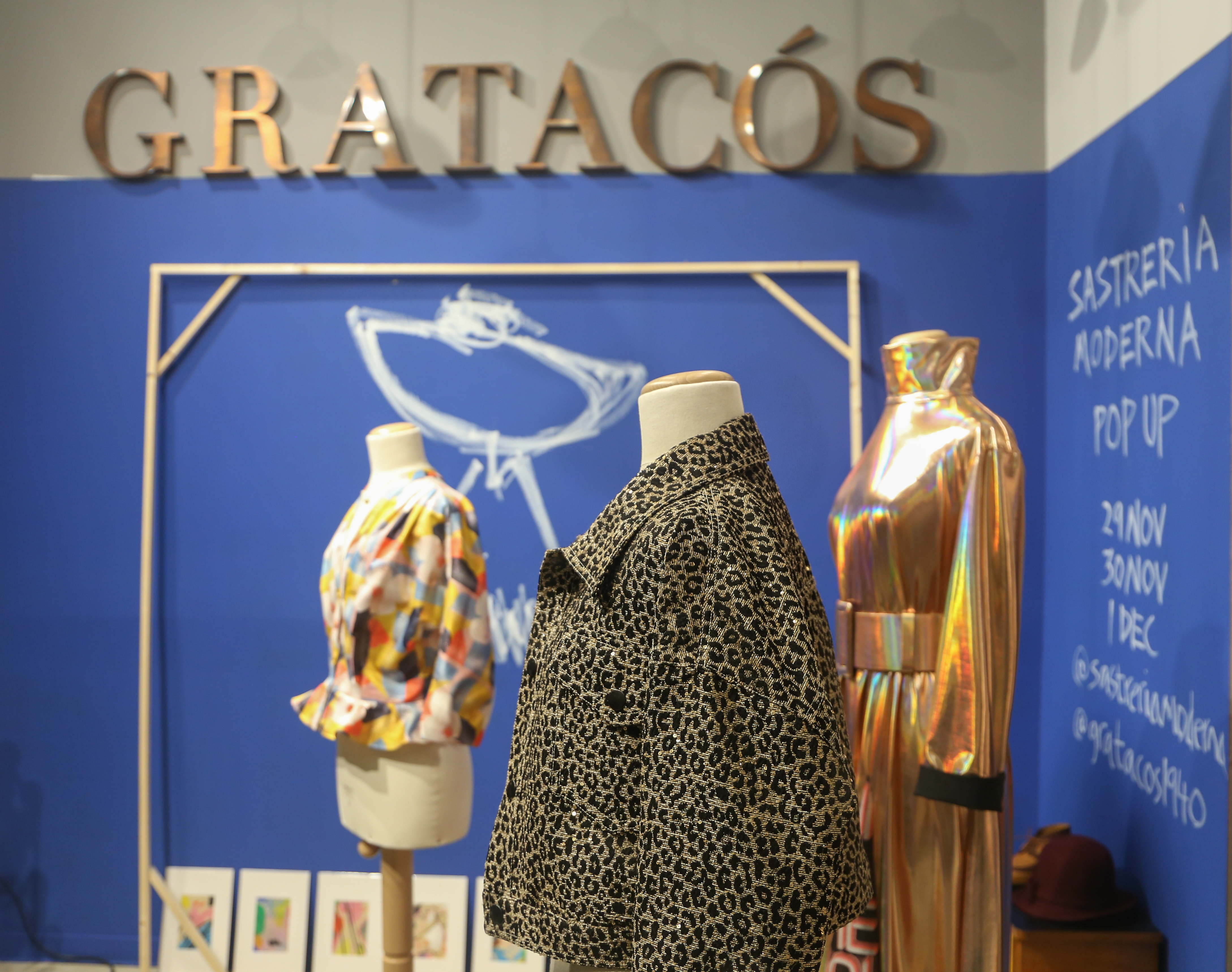
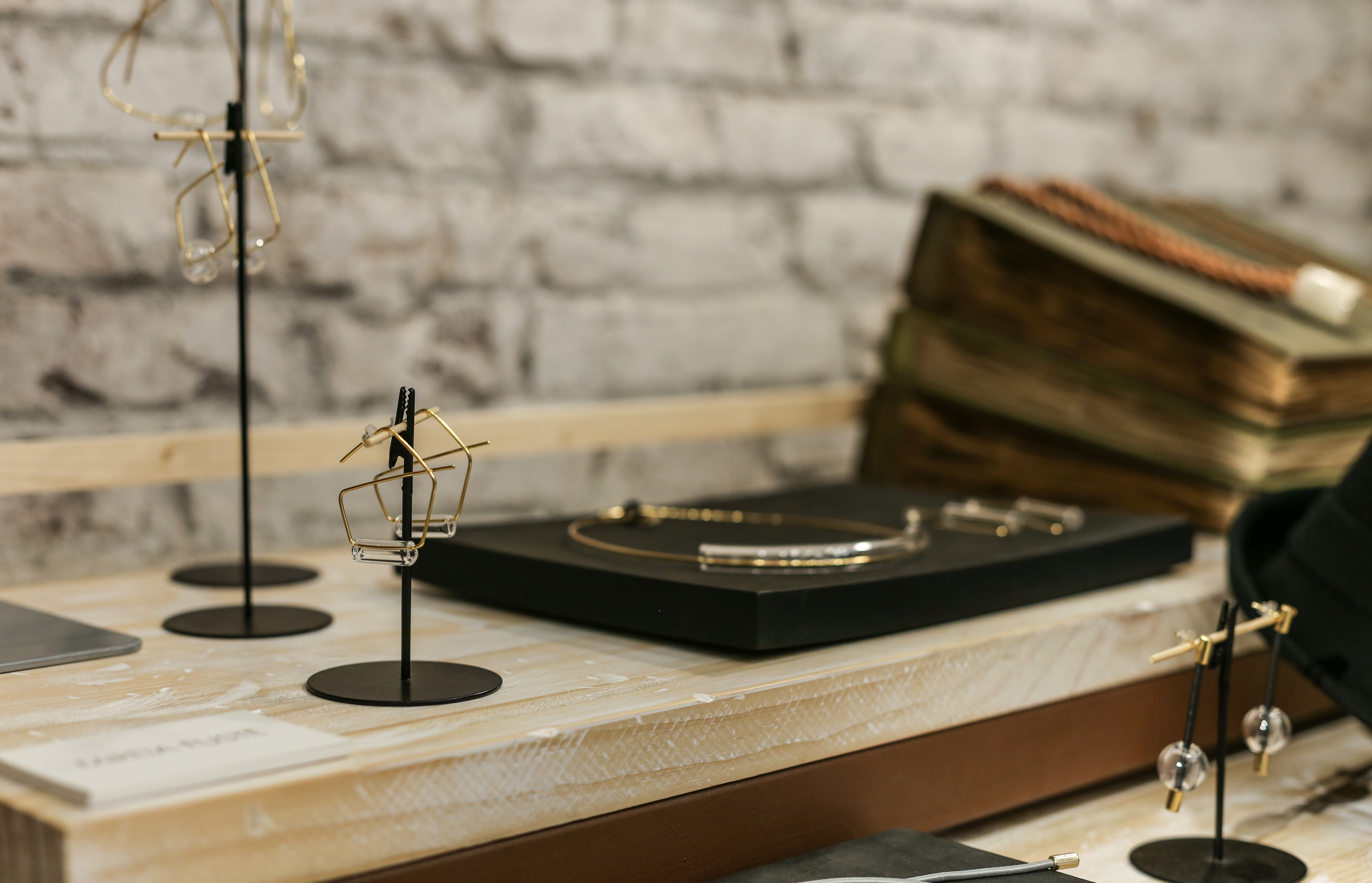
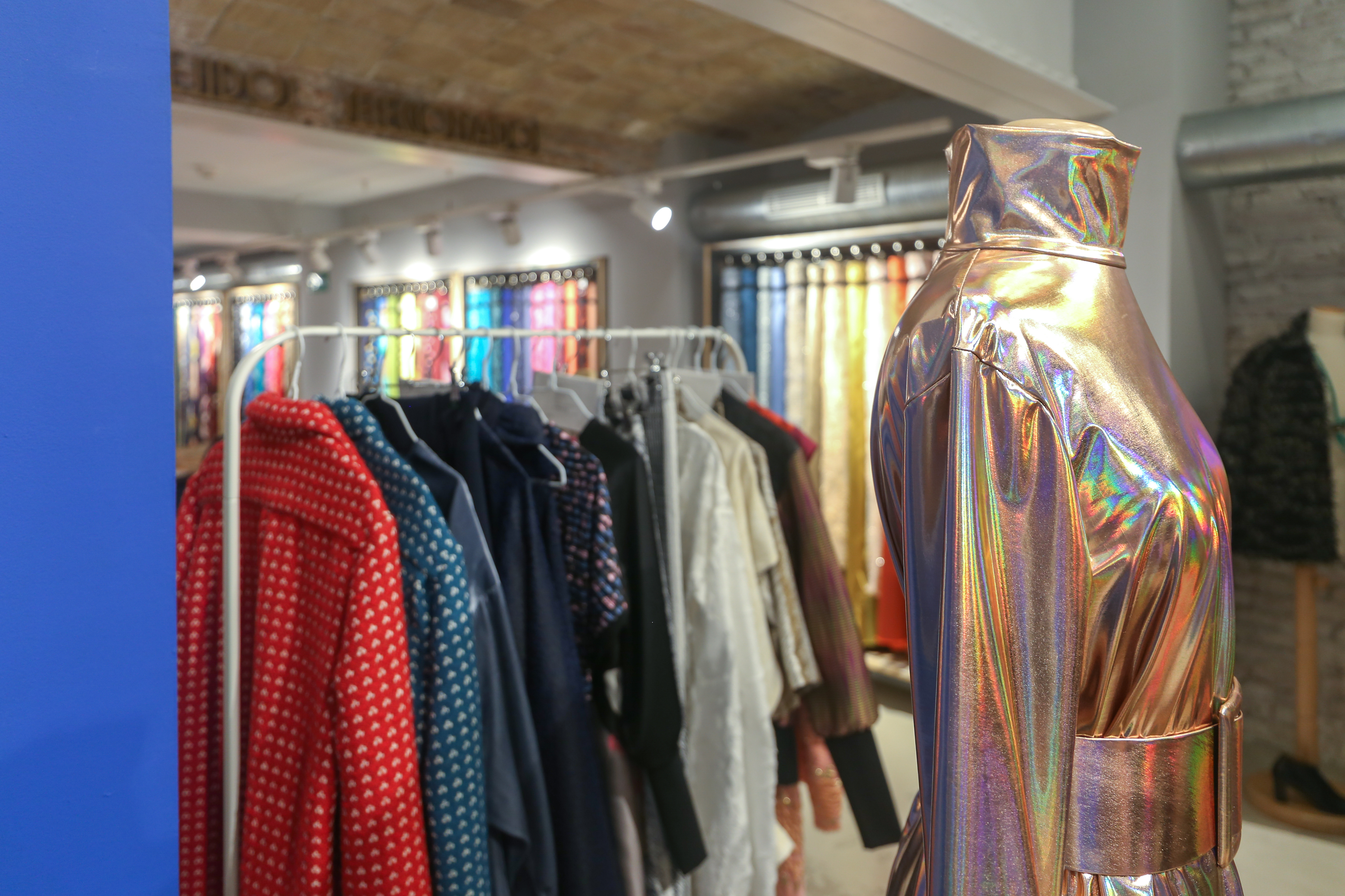
We’ve already announced it on social networks and also, some days ago , via the new November shop-window. It’s exactly one week before Gratacós hosts the most revolutionary fashion pop up in Barcelona: it is Sastreria Moderna , a unique initiative that gives a twist to the traditional concept of clothing through local designers who present a capsule collection of clothes and accessories made with different fabrics from the new collection.
In this fifth edition, Sastreria Moderna has invited 13 designers of different styles with a common philosophy: the commitment to conscious and conscientious slow-cooking fashion that emphasizes craftsmanship and detail. What is really interesting about this one-off initiative is that the participating designers make unique clothes and accessories in a special collection of our fabrics and where the customer can try them on site before purchasing. How should they be worn? This is the magic of Modern Sastreria : they are made exclusively on request and clients can choose a variation of fabric colour or a small modification of the design to their own specification. Within a fortnight orders can be collected either in our shop or at the client’s chosen address.
The collection has already taken shape
Each designer has made only two or three pieces within their own particular style using our fabrics and together they make up this capsule collection of Modern Sastreria. Each garment has a special, personal quality, a total guarantee that it has been made with great care both with regard to workshop quality fabrics and to those chosen by the designers: velvet, jacquard, lamé, tweed, crepe and even fringes! In this elaborate design feature there will be long dresses, asymmetrical skirts, shirts for boys and girls, wide trousers, jackets, bags, turbans, belts and even a mini -series of necklaces.In total there are almost thirty textile designs to choose from!
The real protagonists
Who are the designers participating in this edition? In total there are 9 clothing designers and they are: KM by LANGE, GIAN, Ana Tichy , Ene de Narcisa, Montse Cañadas, Lucía Rodríguez, Deltravés , Enero and Norima . The 4 accessory designers are Greta Serra (handbags), AndreaViêntëc (turbans), Mireia Fusté (jewelry) and Kimôh (belts). The capsule collection of the designers is accompanied by a series of brands of accessories that share the values of slow fashion and which will take the opportunity to sell their products during the fashion pop up: Becker & Co , Mireia Fustéand Philo K (jewelry) , The Henten Bag (bags and purses), Anna Perich (silk scarves), Eva vs Maria (shoes) and Verbena ( diadems ) and Andrea Viêntëc (turbans).
Do not miss the live show!
The pop up of Sastreria Moderna will be held on November 29 and 30 and Saturday, December 1 in the Gratacós shop. On these three days of sales anything can happen. For example, on Thursday and Saturday (from 6:00 pm to 8:00 pm) there will be a live sketching session led by the illustrator Lucy Davis, who will draw small lamina plates for all those interested. On Friday (from 6:00 p.m. to 8:00 p.m.), the designer Anna Perich will also give a demonstration of art & silk and will paint white silk fabrics and turn them into unique and multi-coloured handkerchiefs.
We hope to see you!
Viernes 16 noviembre 2018
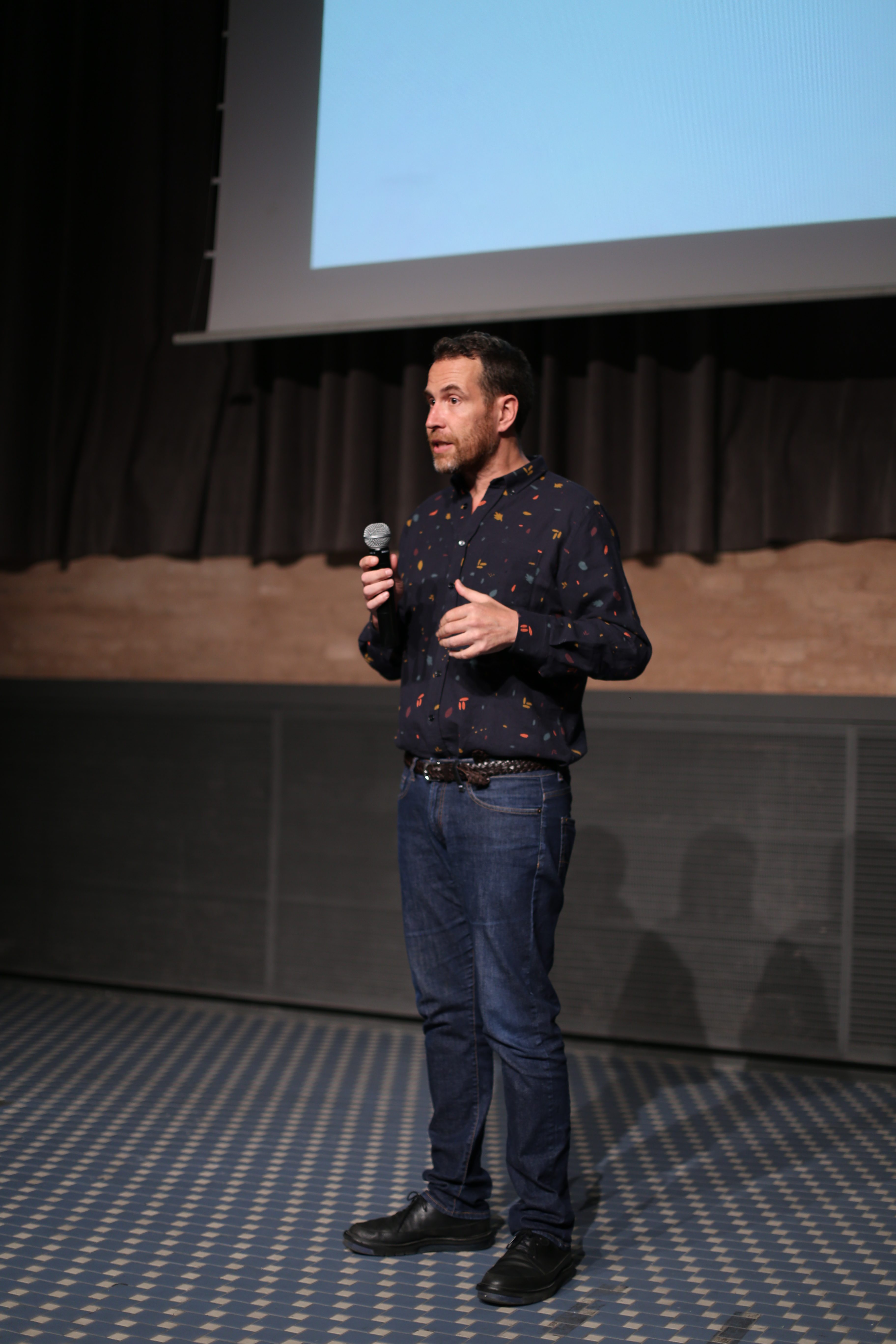
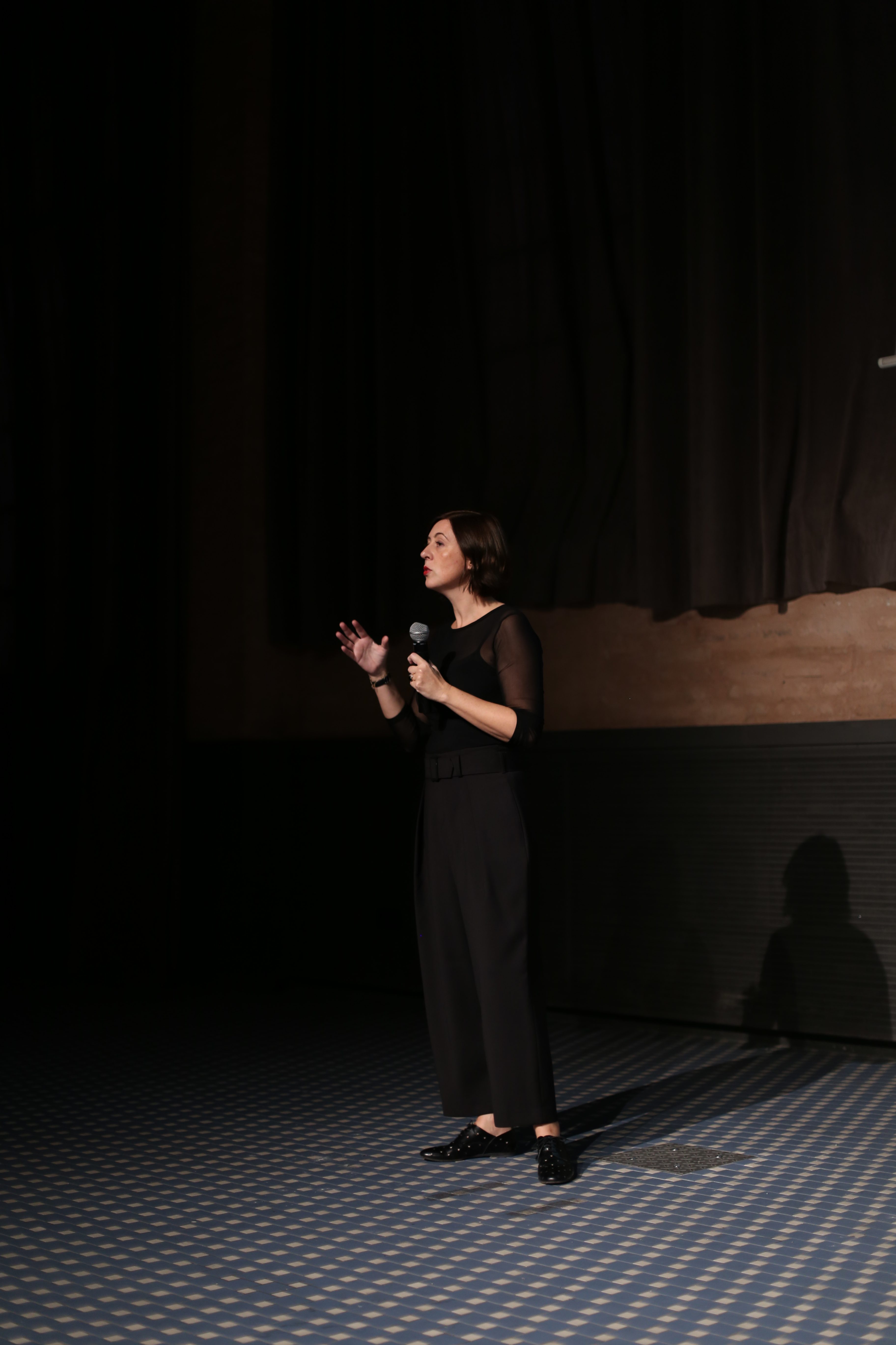
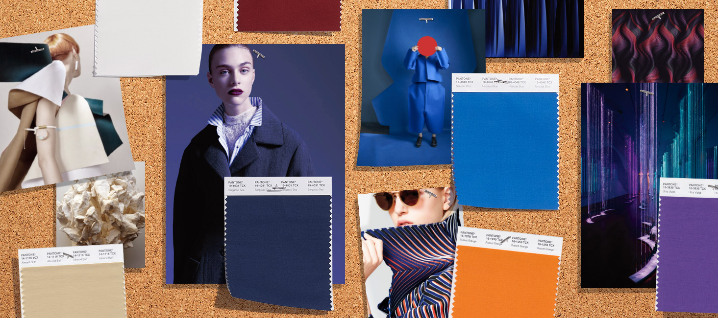
Successful convening of the new edition of ‘ Cuaderno de Tendencias’, a biannual educational initiative, which brings together in the Gratacós shop dozens of students from various design schools to learn about the main global trends that will mark the Autumn-Winter season2019 / 2020. A relaxed and instructive talk will be given by Ursula Uría, spokesperson in Spain for the prestigious research agency Nelly Rodi, who will explain the colours and textures that will mark the patterns of next winter.
As general points of influence on the conception of the fashion collections of the AW19 / 20 season, Uría has highlighted a complex economic and social situation: “We are not talking about crisis, but about a break that affects many sectors and that entails radicalization.” The polarization of politics, the rise of migratory movements, social demands … are some of the phenomena that will continue to mark the fashion industry. “The collections that emerge will be more ground-breaking and alternative,” explains Nelly Rodi’s spokeswoman in Spain. Current names such as Palomo Spain and her feminization of men, the return of Agatha Ruiz de la Prada with her colourful essence or the singer Rosalía with her flamenco-inspired tour are some examples that, according to Uría, show this general tendency towards the alternative.
Úrsula Uría: “Fashion collections will be more ground-breaking and alternative”
From this scenario, Nelly Rodi draws four fashion trends that encompass the following categories: Master, Ride , Oddity Y Spirit .
1.MASTER
A minimalist trend that represents the return of tailoring and pattern-making from the point of view of rigour and perfectionism. Return of well-made garments, crafts, geometrical tracings and functionality.
Visual references : origami , geometry, mathematics, sculptures, straight lines, defined strokes, designer Issey Miyake , the last campaign of Dior man, Tilda Swinton for Gentle Monster or Arket’s featured colour therapy.
Silhouettes: Straight lines, well-marked lines and versatile, functional garments predominate.
Colours: A hark back to the industrial era, revolving around grey and blue. Black does not appear, whilst tinted shades give depth. Single shade colour block is also being worn.
Fabrics: Bright finishes, quilting and experimentation in technical fabrics.
Audience: Rational consumers who buy selective and expensive products, who know what they want and consume it consciously.
2. RIDE
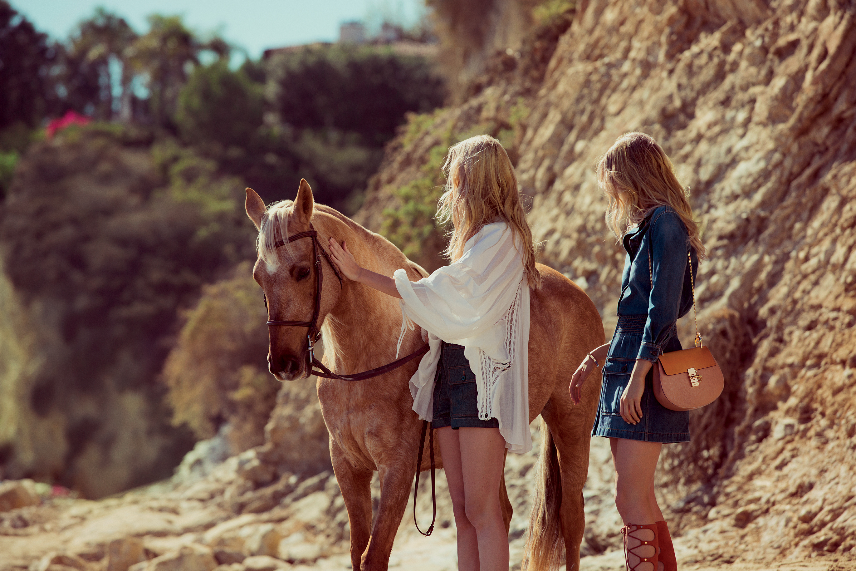
A premium trend inspired by the world of racing (horses and cars) and speed. Appeals to the reinvention of the classics as already done by companies such as Burberry, Hermès or Loewe.
Visual references: the equestrian world, the concept of private club, sagas, Amazons, the prestige of the uniform and elegant authenticity of it girls (Carlota Casiraghi , Olivia Palermo, Marta Ortega) with families linked to the world of horses.
Silhouettes: Structured garments, geometry, biker jackets with reformulated silhouettes..
Colours: Brown shades and red Ferrari which add a touch of warmth.
Fabrics: A return of classic fabrics such as suede, leather, hair applications and plaid prints inspired by riders.
Audience: A consumer who knows the stories of the brands and gives value to family sagas. Consume products that have a history behind them, a well- marked savoir faire.and
3. ODDITY
A youthful tendency that is inspired by the poetic aspects of protest movements. The alternative is not aggressive, but its creativity is radical. It has a hippy quality.
Visual references : the cover of Vogue USA on the empowerment of women, social movements, communities, identity, grunge aesthetics, activism and collaboration, the concept of Princess Peter Pan, eco-activism, futurism and withered flowers.
Silhouettes: Overlays, experimentation of materials, layers, surprising openings … functional and very technological garments.
Colours: Grey latex, electric blue and sweet tones (pastel colours ).
Fabrics: Mohair, plastic, lúrex, experimentation with alternative fabrics.
Audience: A young public that seeks to make a statement via fashion. Fashion as a channel for the expression of a message.
This autumn is especially colourful, with saturated and bright shades that radiate strength and energy for the darkest months of the year, where it is usual for neutral ranges and pale tones to predominate. Now it is just the opposite!
First it was the neon colours, then orange as a transition between summer and autumn and now there are other shades within the colder palette ready to take over. According to a Trends Report from Pantone (the international colour authority), the colours for Autumn-Winter 2018 “express our need for individuality, ingenuity and creativity”. They are unexpected autumnal tones that are complemented by more traditional ones that radiate this desire to break with the seasonal structures. The same report points out that they are “expressive colours that reinvent the history of seasonal colour and allow fashion to play with art and originality”.
Here we reveal four colours that illuminate the looks of autumn and that have already been seen on the catwalks:
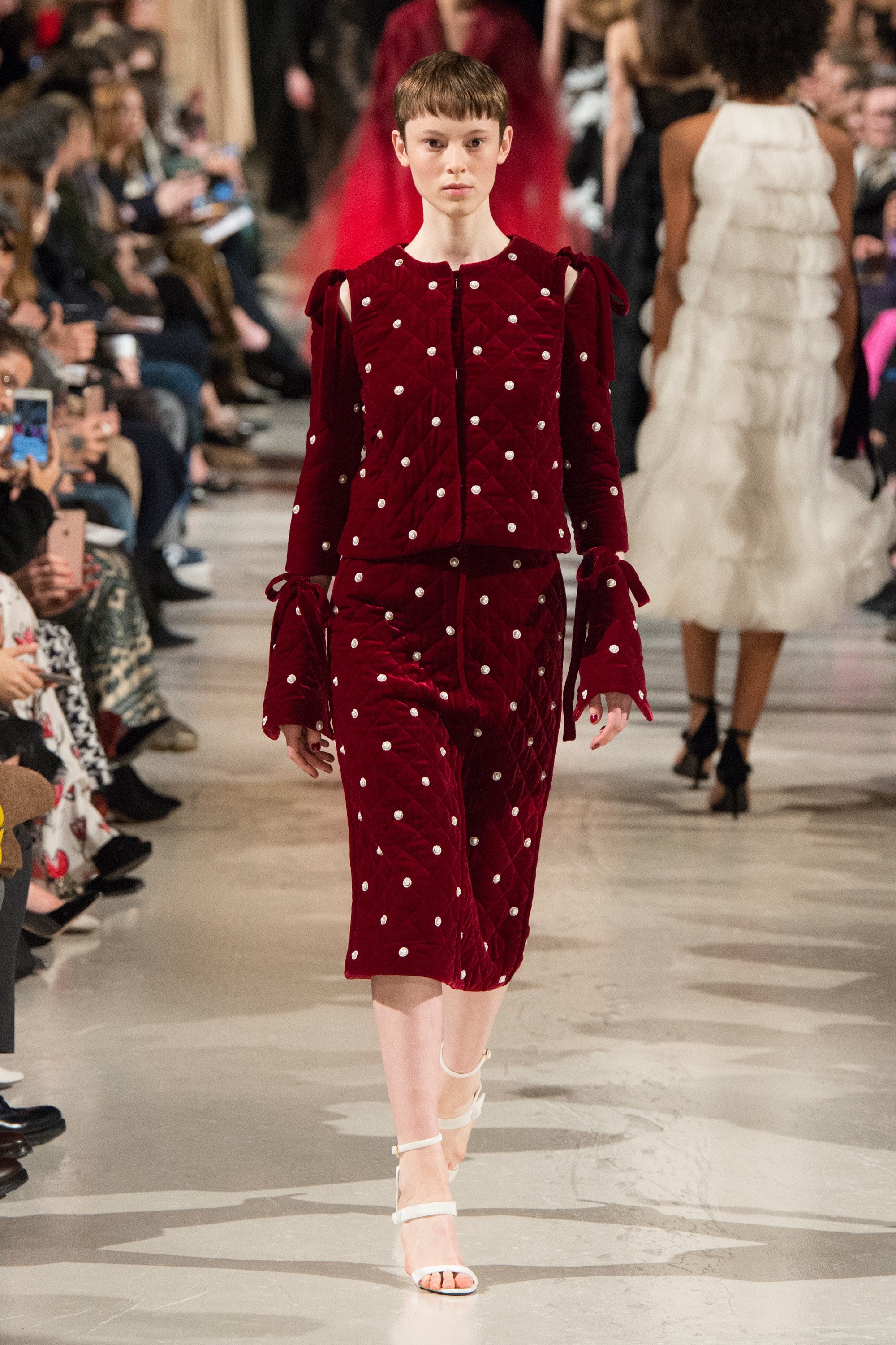
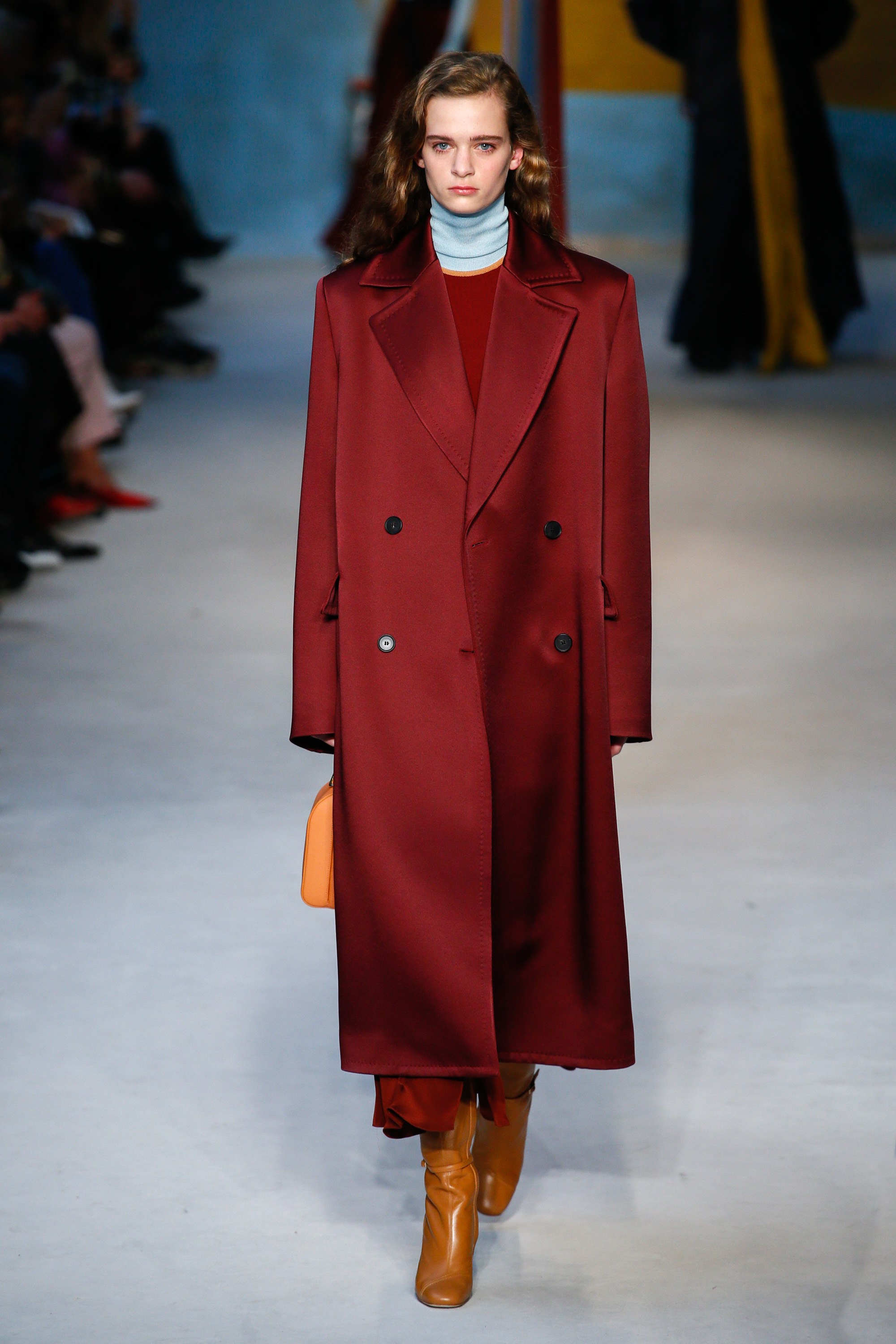
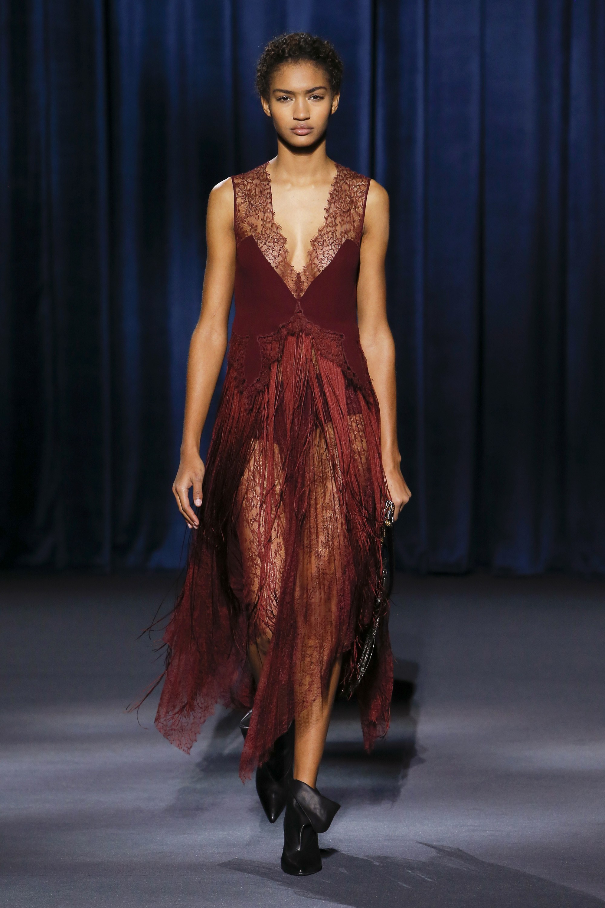
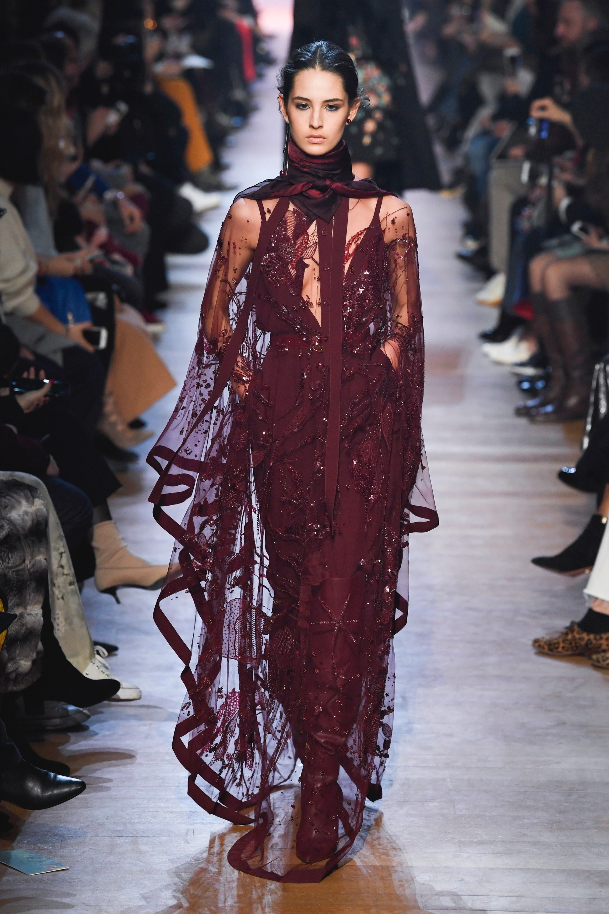
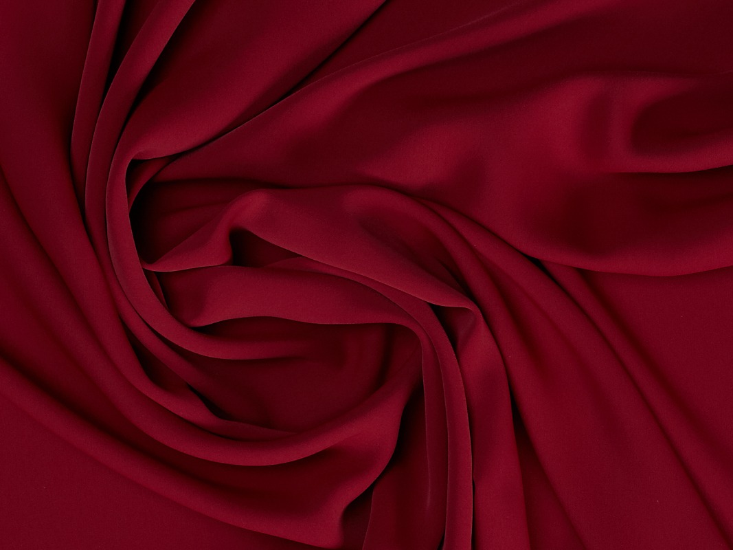
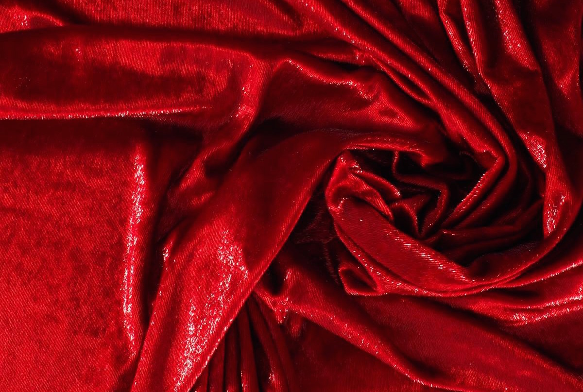
1.- Red Pear
This red is the most appealing of the palette and perhaps also the most classic of the fashionable colours. Red Pear is an intense and delicate red that attracts by its exquisite depth. It is a seductive color (reminiscent of burgundy), which admits a great variety of shades and in fabrics it appears frequently thanks to its versatility with fully evocative reliefs and textures. Companies suach as Elie Saab , Bottega Veneta , Roksanda , Givenchy , Lanvin or Oscar de La Renta have incorporated this shade tone into their autumn collections, creating easy-to-match looks.
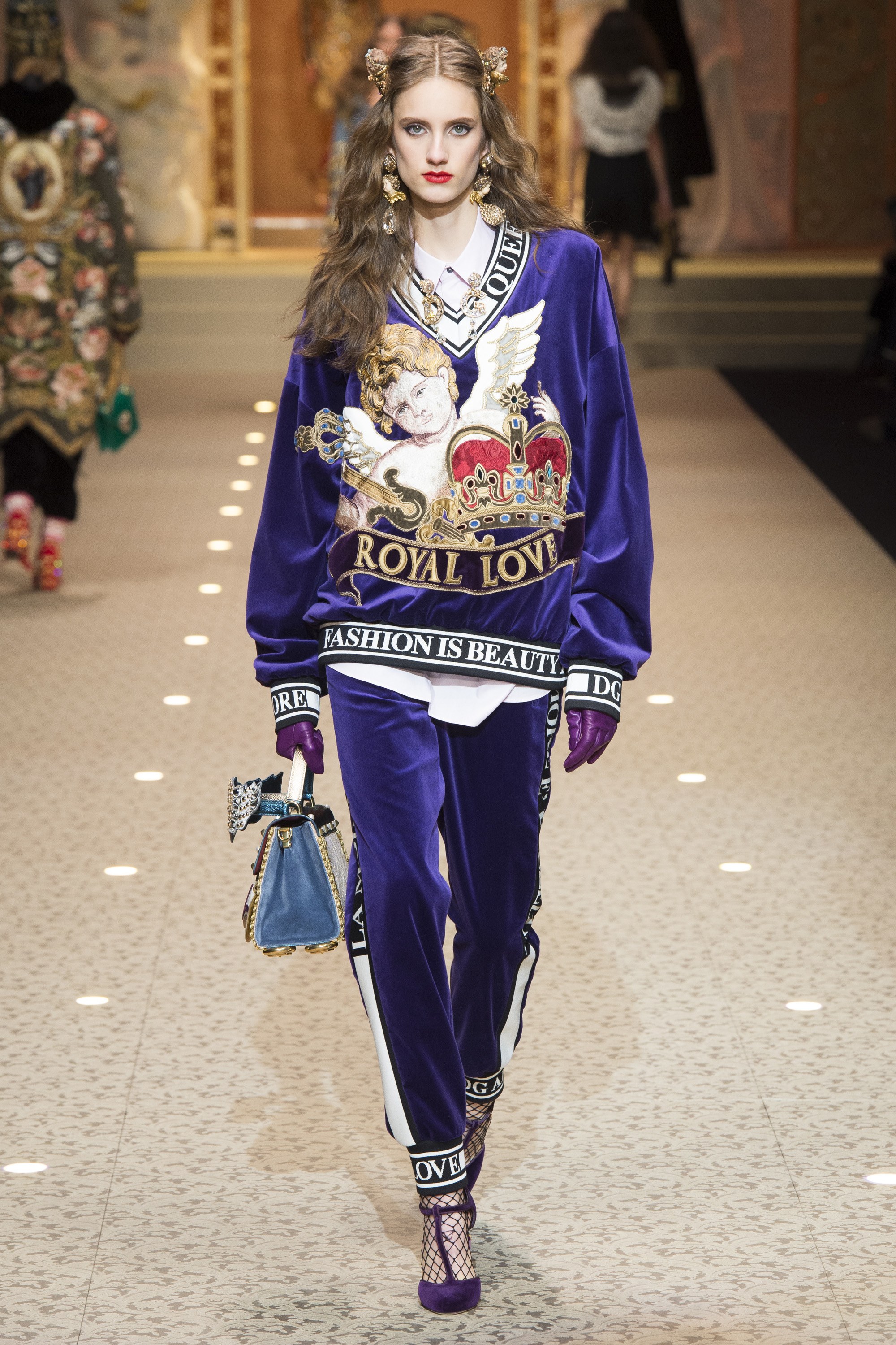
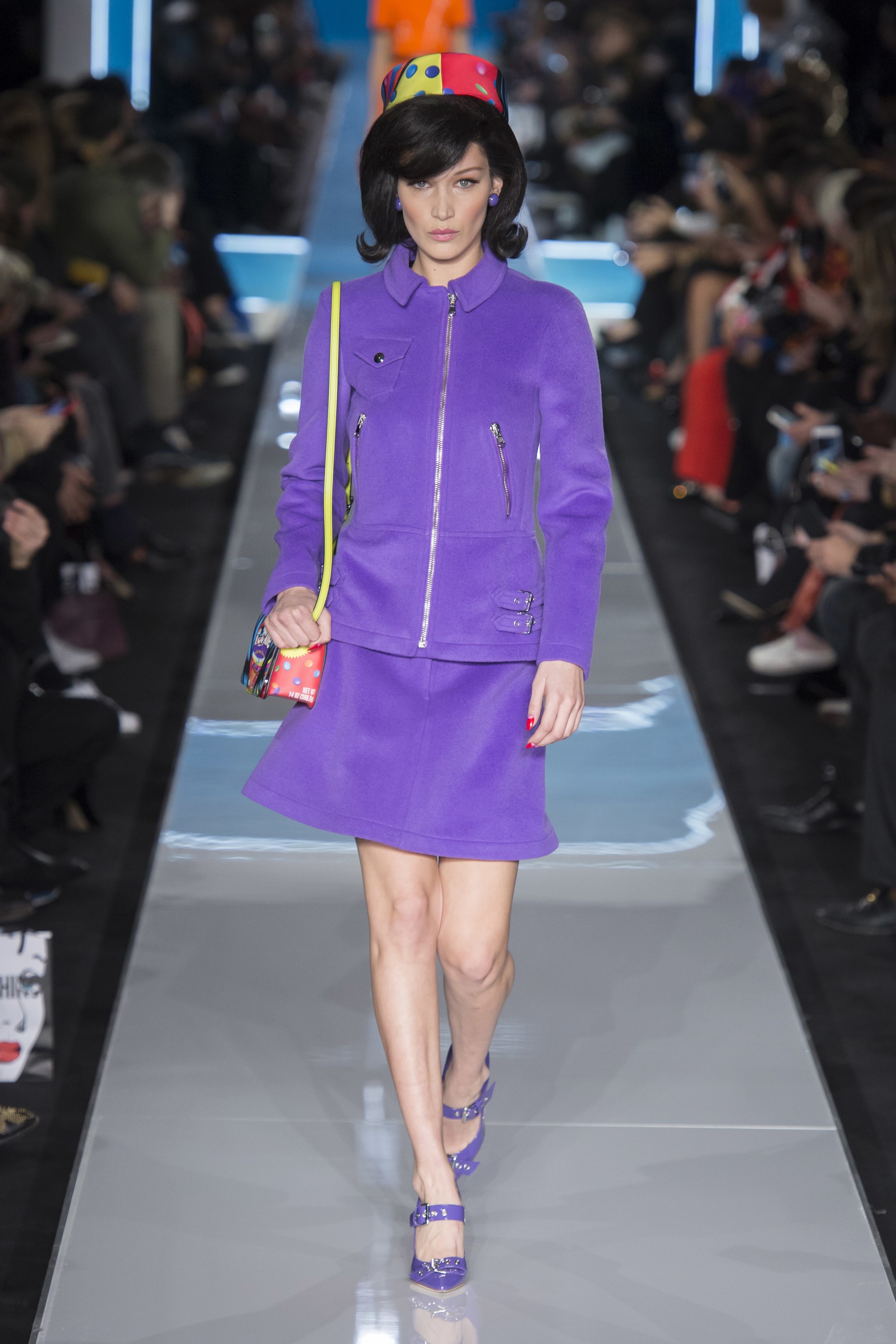
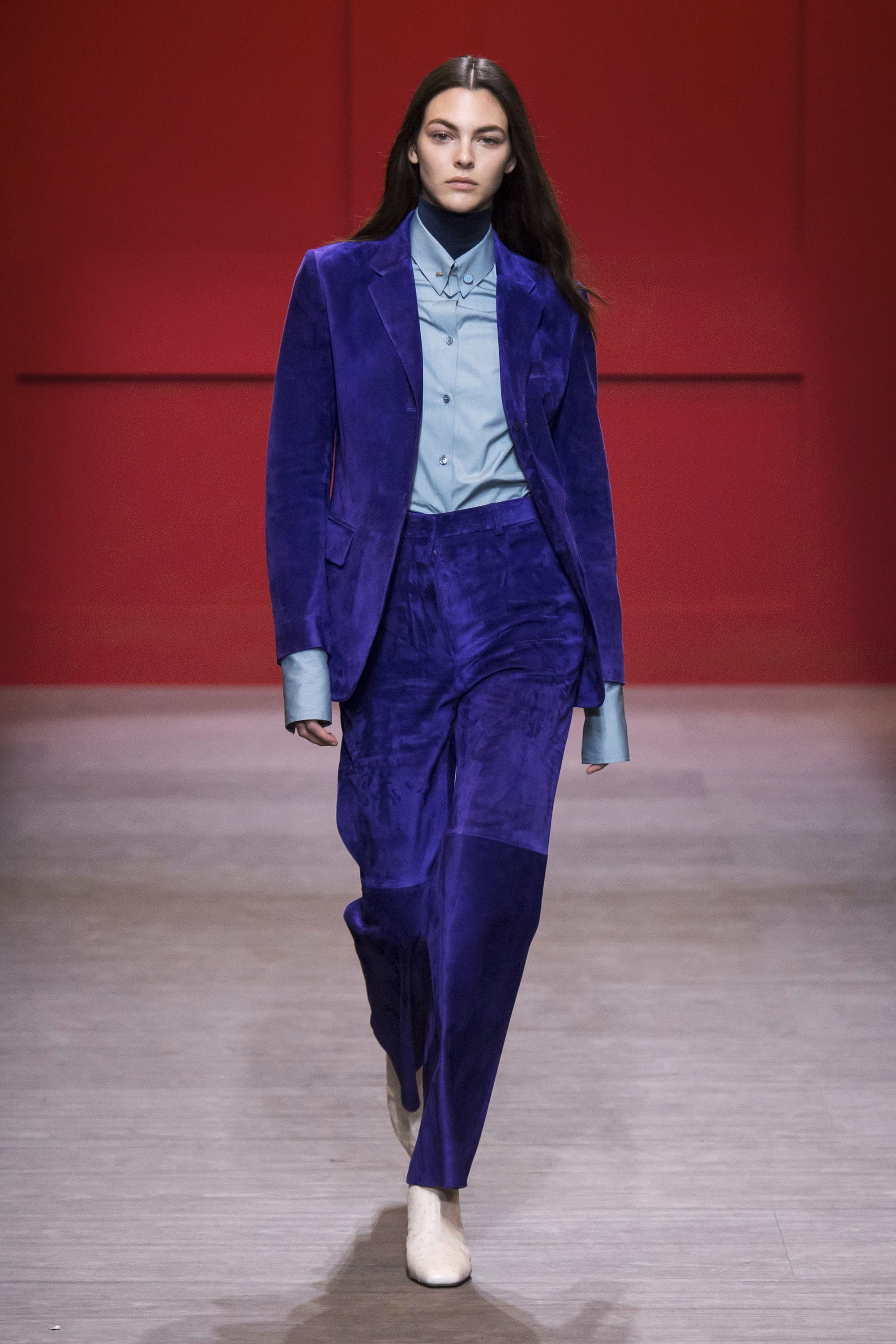
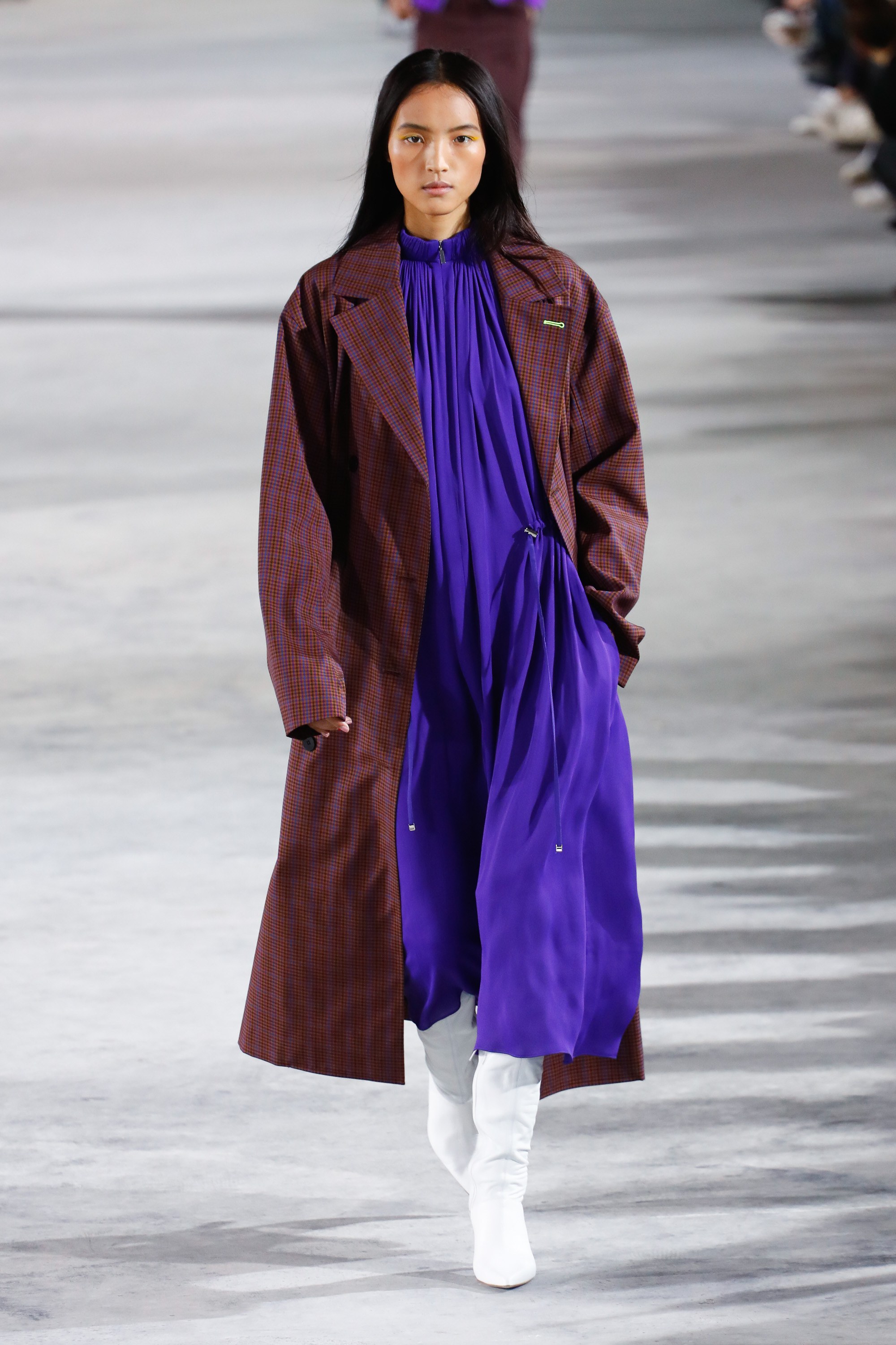
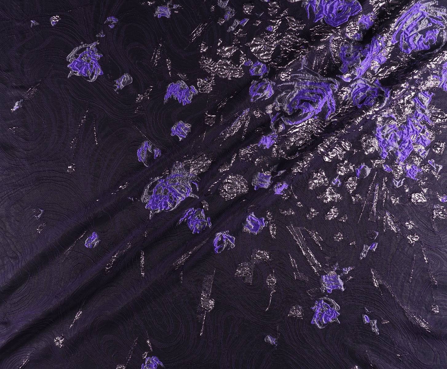
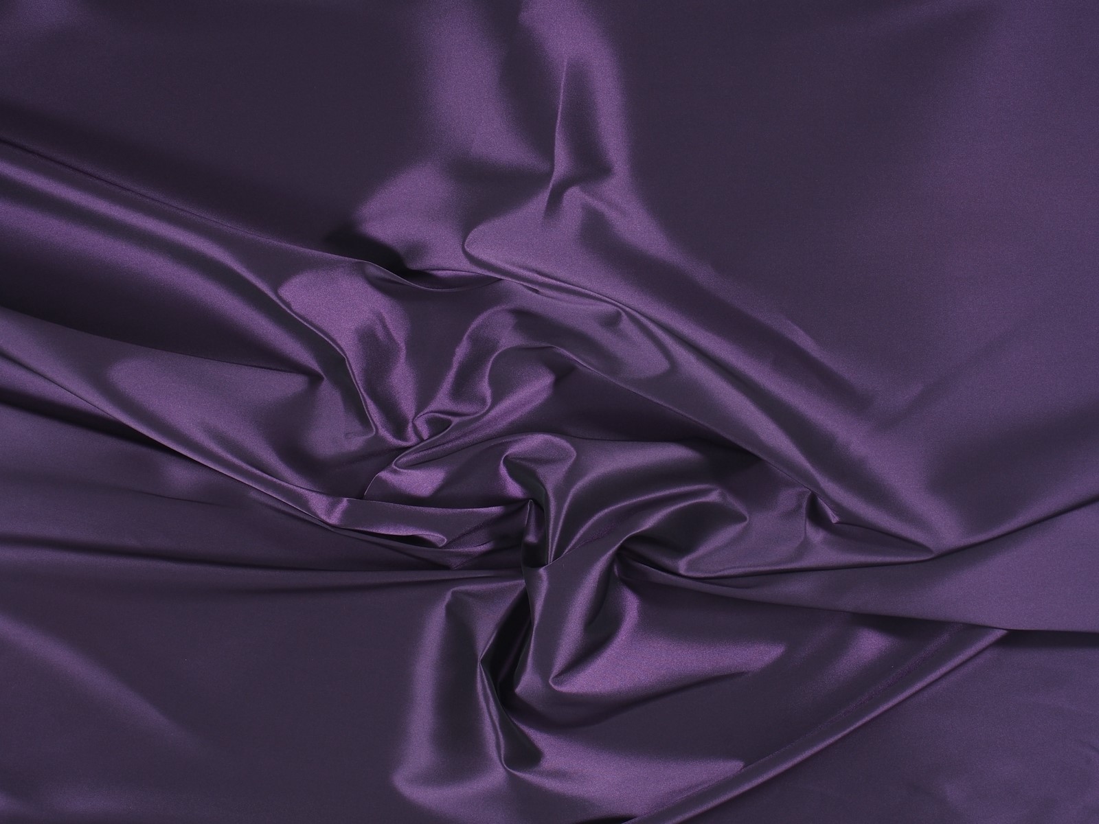
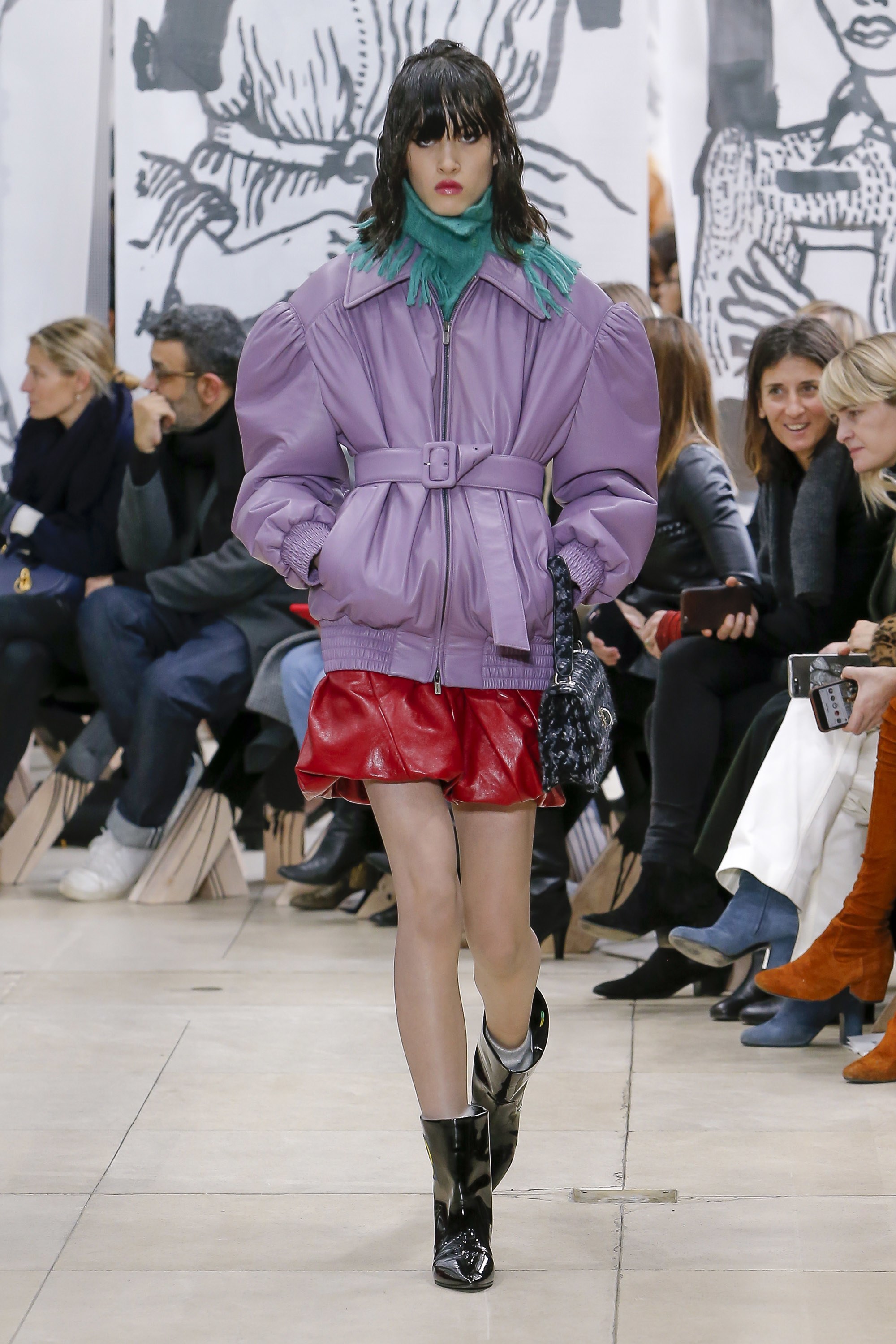
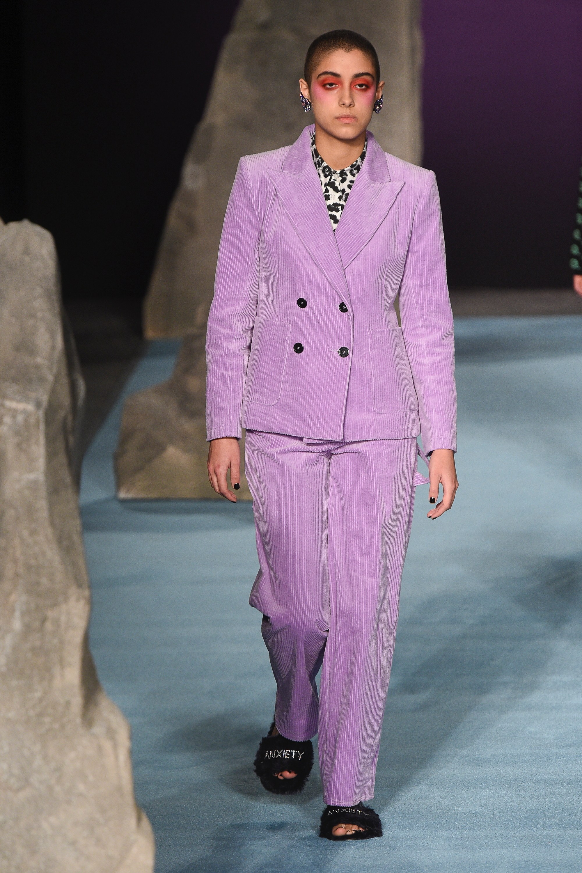
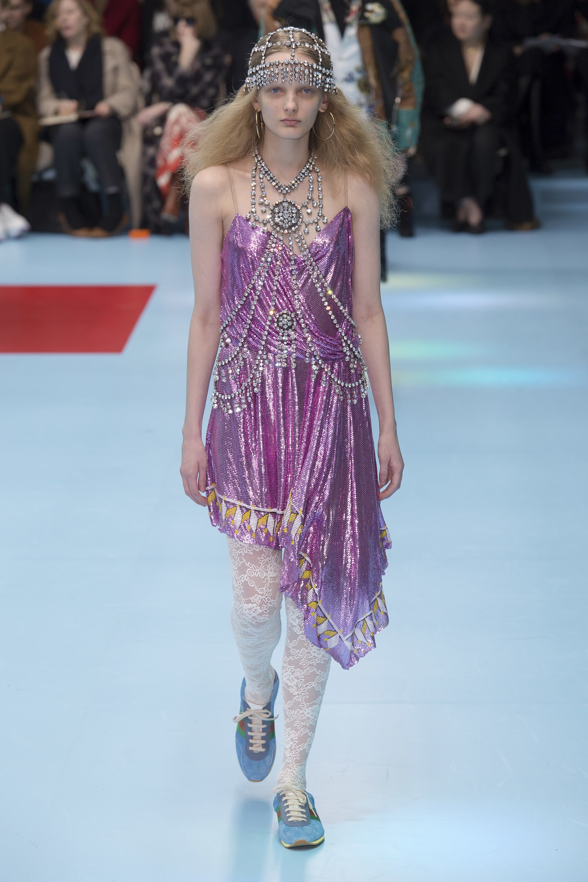
2.- Ultra Violet
This tonality is more present in our minds because Pantone chose it as the colour of the year 2018. Whilst we thought it was merely a passing mention, this radiant hue of violet appears in all its splendour in the autumn collections. It is a bold tone linked with creativity and imagination. In fabrics such as velvet Ultra Violet acquires a more sophisticated side, although it also suits floral embroidery and Jacquard. On the catwalk companies such as Moschino, Tibi, Salvatore Ferragamo , Marni or Dolce & Gabbana have shown daring with this variety of violet.
-
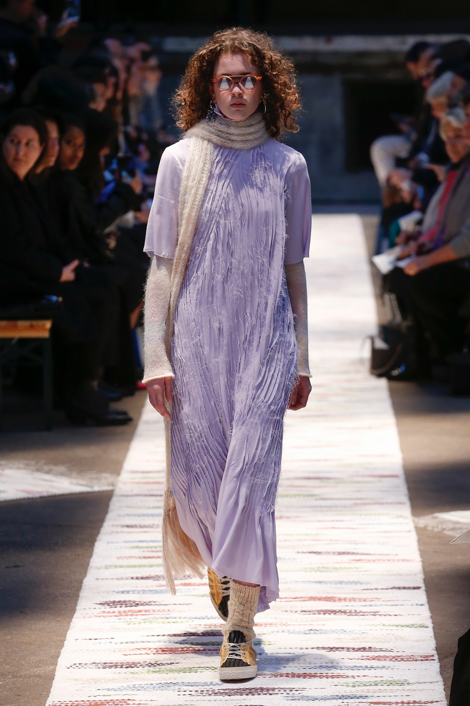
Crocus Petal
We continue with violet shades by focusing now on their softer version. Crocus Petal, according to Pantone is “a cultivated and refined shade that brings a feeling of lightness”. It is a very feminine pastel tone that softens traits and stands out from the rest for its unique character, a colour which enhances movement and which in fabrics can be appreciated very well on soft, smooth textures and with slight reflections. On the catwalk Crocus Petal has been seen in designs by Acne Studios, Miu Miu and Ashley Williams.
-
Quetzal Green
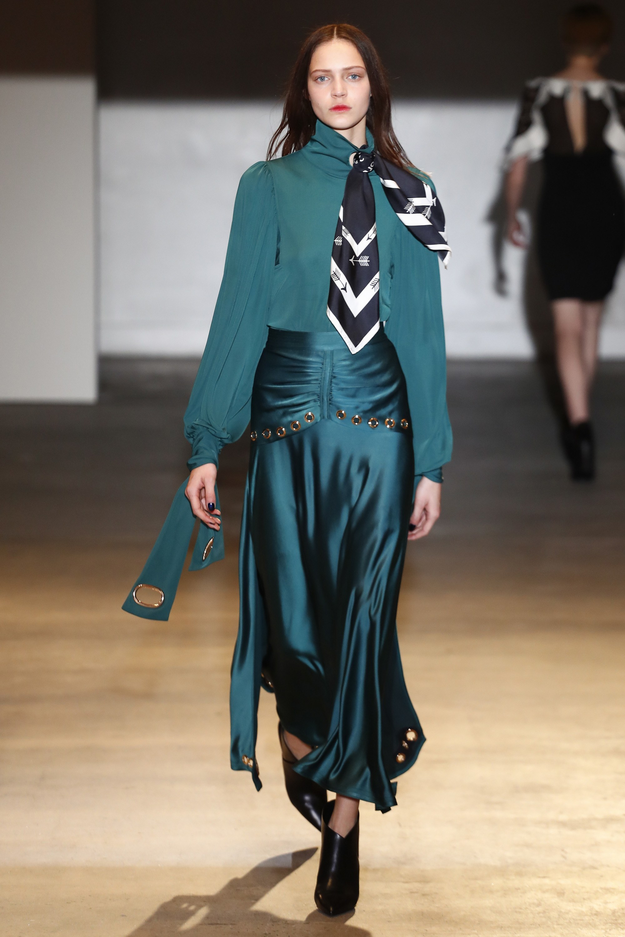
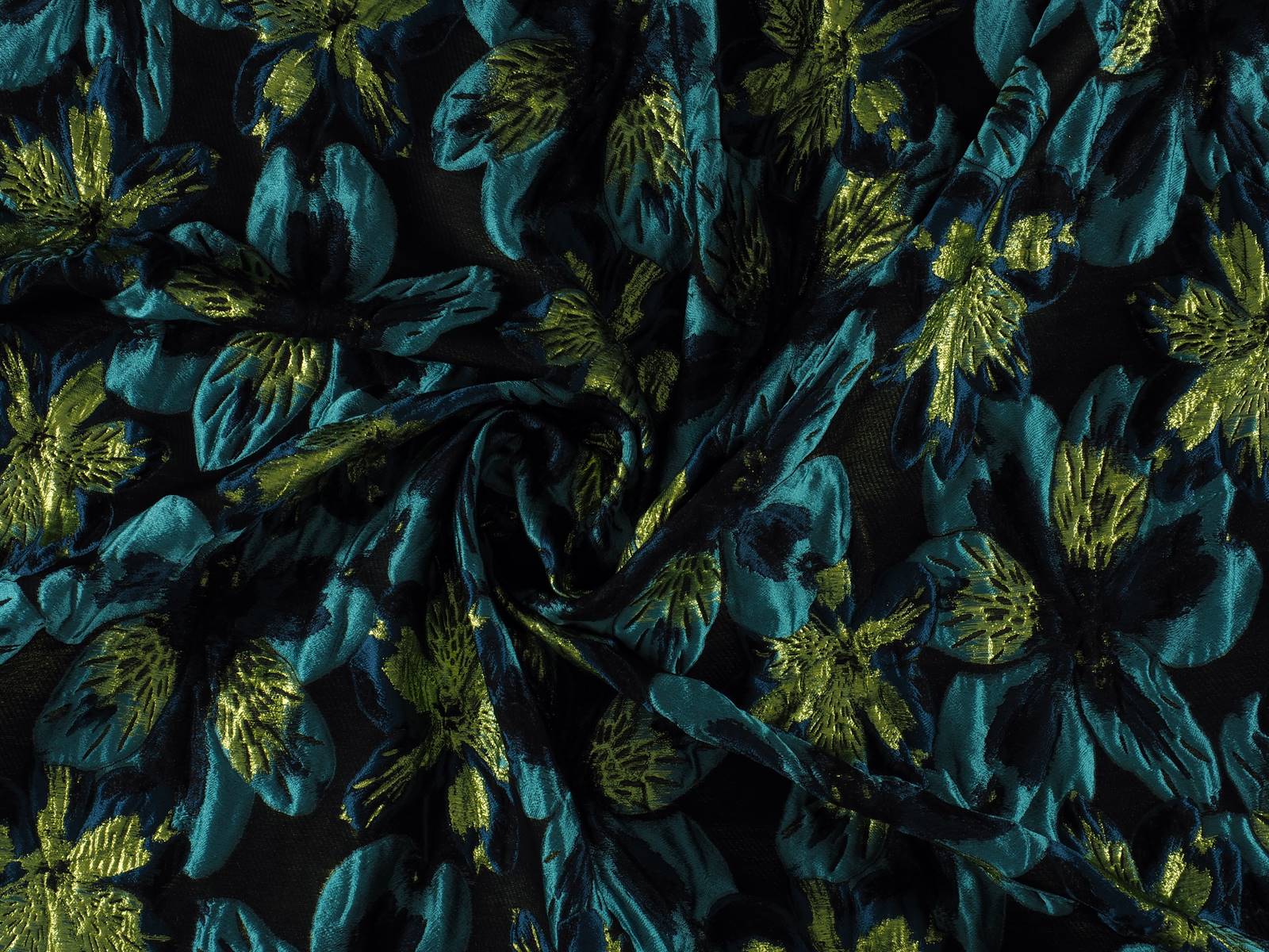
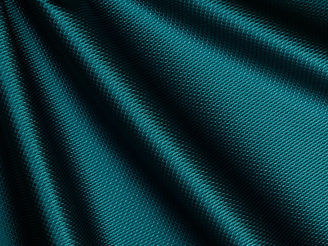
Deep, evocative, sophisticated … this shade of greenish blue is simply breathtaking. It is a colour that abounds in nature in certain bird plumages which stand out against females of the same species: ducks, peacocks … It is a beautiful mix of deep blue and turquoise that aligns with elegance and that allows practically all the textures that highlight the nuances of this rich colour. On the catwalk companies such as Alexander McQueen, Alberta Ferretti, Paul Smith or Self-Portrait have all given full expression to Quetzal Green.
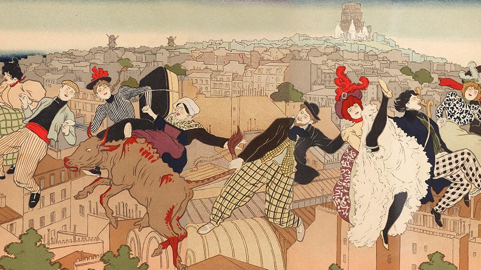
At the end of the year one of the most anticipated exhibitions is taking place in Barcelona, giving life to the most bohemian and boundary-breaking side of nineteenth-century Paris. This is the exhibition ‘Toulouse-Lautrec and the spirit of Montmartre‘ which is being housed today by the Caixa Forum of Barcelona. This home-production by the Obra Social of La Caixa, curated by Phillip Dennis Cate, presents an extraordinary collection of 350 works of paintings, drawings, engravings, posters and other objects of the time from different museums around the world. It is an extensive exhibition headed by the works of the multi-faceted painter Toulouse-Lautrec (61 works, including six oil paintings, a drawing and his best-known posters) which portrays the bohemian heart of Montmartre and its nightlife, in line with the vision of other contemporary artists who lived in Paris at the end of the 19th century.
Montmartre, the common denominator
In 1880, Montmartre was a marginal and dangerous area away from Paris that began to attract many young creators. Thus for example the artists Henri de Toulouse-Lautrec, Paul Signac, Pierre Bonnard and Henri-Gabriel Ibels, the philosophers Aristide Bruant and Yvette Guilbert, the writers Émile Goudeau, Alphonse Allais and Alfred Jarry, and the musicians Erik Satie, Vincent Hyspa and Gustave Charpentier moved there attracted by the neighbourhood: they wanted to live frugally, work and avoid the bourgeois centre of the French capital. This is how in a few years, Montmartre became the common geographical denominator of many artists who actively contributed to define the avant-garde aesthetic of the time.
The centre of bohemian life
At the end of the 19th century Montmartre was the epicentre of the social and cultural motor that defined its modern style and bohemian character. Its streets, the night cabarets, the neighbourhood cafés … were the scene of a creative explosion thanks to those young artists and intellectuals who through their works challenged the status quo. Henri de Toulouse-Lautrec (Albi, 1864 – Château Malromé, 1901) and other artists such as Vincent van Gogh, Jean-Louis Forain, T. A. Steinlen, Pierre Bonnard or Édouard Vuillard contributed to this flourishing of a break-through movement outside the bourgeoisie.
The artists of Montmartre had a critical attitude and in their works it was customary to reflect on the poverty in the streets and the harshness of prostitution, two recurring themes that were part of this social denunciation. On many occasions humour, satire and caricature were used to disseminate their ideas in a renewal of artistic language that was inclusive and appealed to ordinary people rather than the elite. Accordingly their work was also presented in unusual places: cabarets, experimental theatres, circuses or in the street itself, which was a continuous source of inspiration.
“The exhibition shows the boundary-breaking character of many Parisian artists of the 19th century”
This spirit was not only limited geographically to Montmartre, but became an avant-garde mentality that moved to the new leisure centres of Paris and the main European cities. It marked a before and after in the new forms of expression that are consolidated with the turn of the century. The exhibition ‘Toulouse-Lautrec and the spirit of Montmartre’ can be seen at the Caixa Forum in Barcelona until 20 January 2019.
FOTOS
Crédito: Fotos extraídas del CaixaForum, exposición ‘Toulouse-Lautrec y el espíritu de Montmartre’

After the summer The Colour Community is back with a new inspiring report. The association for those “passionate about colour and materials” has presented the latest innovations in its eleventh edition, held as usual in the former Damm Factory in Barcelona. It highlights a new logo that transmits the essence of the association: the union of several multidisciplinary professionals who together constitute a totality of visions of colour; there is a new website offering consultation and guidance to those interested in investigating the subject and finally a new colour chart that act as a guide to the Spring-Summer 2020 season.
The Colour Community is an initiative in constant evolution that we have supported from its birth because as an international textile company we are also interested in colour and texture and how they are applied in design. The founding team of the initiative consists of three people: the architect Pere Ortega, the designer Eva Muñoz, a specialist in Colour & Trim and Rosa Pujol, Textile and Colour Stylist in the same company. These professionals work day to day with trends and their implications for seasonal and socio-cultural factors, never losing sight of the vision of the market in order to try to adapt to future needs. As they say in their online portal, ” We Do Colour “.
This edition revolves around the concept of ‘ Double Poetry ‘ that refers to duality: antagonisms which are related to each other, such as as the rational and the impulsive, the scientific and the emotional … and concepts that complement each other, but always playing on this linking of two ideas. This fresh and energetic creation is articulated through four ranges of colour, textures and materials and given the names Iced Risk , Los Angeles , Mother Tech and New New .
Below we give a brief explanatory summary of each of them:
-
Iced Risk
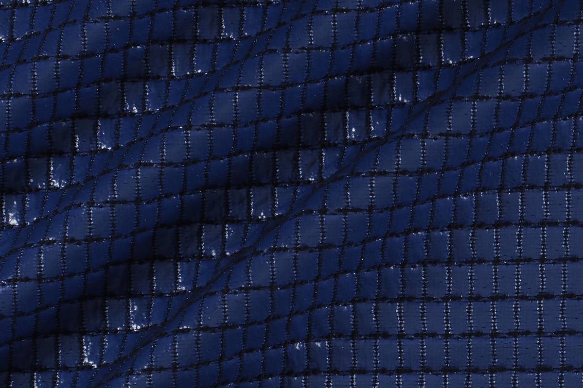
The first inspiration focuses on the idea of controlled risk. For the appropriate consumers it presents innovation in the service of functionality together with design without shrillness. It offers versatility and dynamism centred on geometrical lines, optical illusions, controlled volumes, technical,fluid and pleated fabrics, ethereal silhouettes and some grid motifs. It is represented mainly with a palette of greens inspired by nature, urban blues and brushstrokes of mustard yellow.
-
Los Ángeles
The second range is more youthful and is inspired by this Californian city and its more relaxed lifestyle. It draws on colour contrasts, forms inspired by water, by surfing and sailing aesthetic … Here there is an abundance of synthetic materials such as plastics, nets, faded or geometrical prints … in bright colours presented en bloc or which contrast with the purest white.
-
Mother Tech
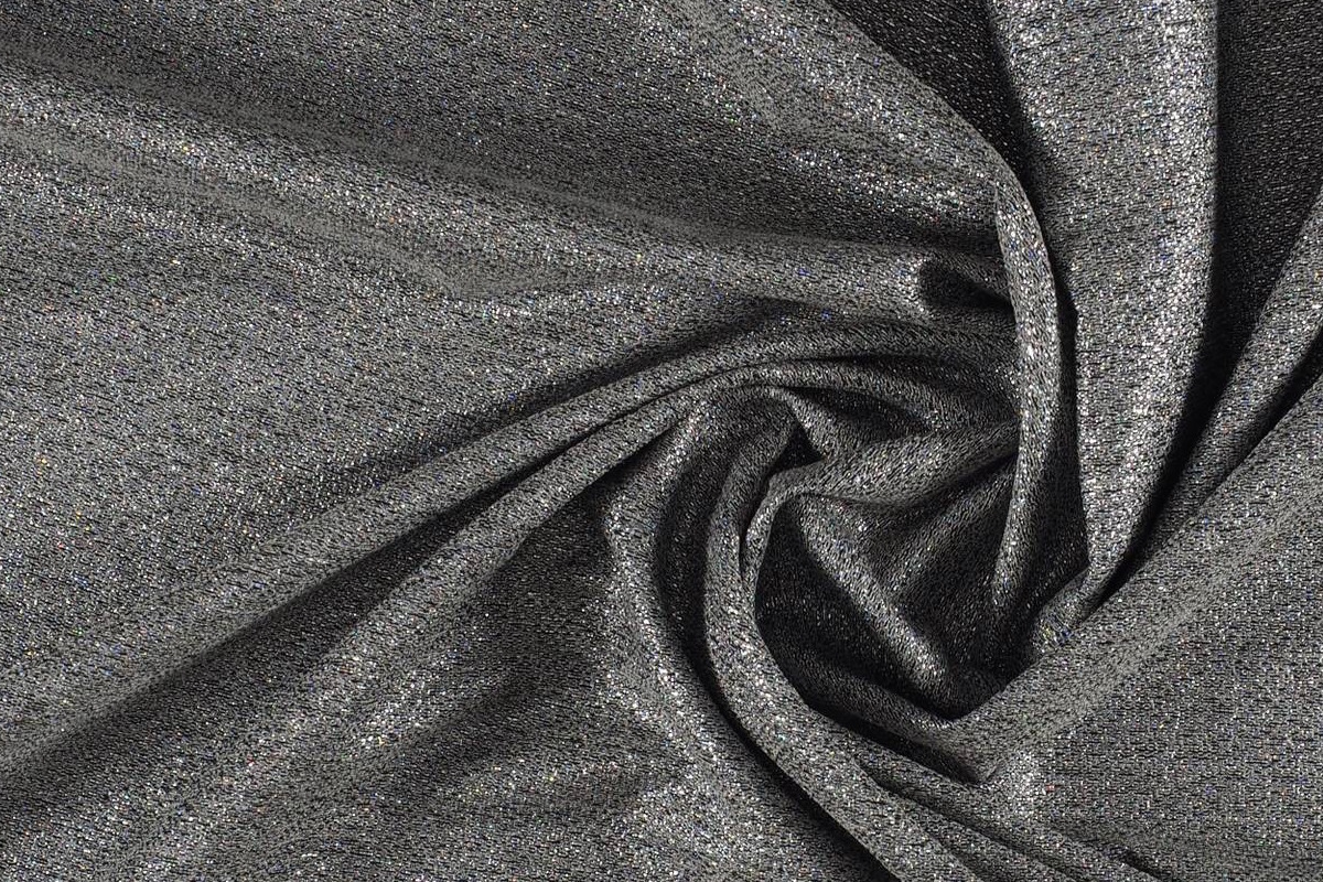
The third inspiration plays with the concept of technology and how it relates to the human being. It is a range which demands creative use and invites you to lose your fear. At the same time it also reflects how technology can coexist with nature and complement it. In terms of textures, it is expressed in experimental forms, water-marks, imperfect fibres, mirror-like sequins, iridescent fabrics, laser cuts … The range of colours goes from mint green to patina blue and metallics, especially the colour silver in both glossy and matt version.
 |
 |
-
New New
Finally, the fourth range is the most daring, connecting directly with Generation Z: young people of the 21st century who are now old enough to be consumers. It is inspired by the classics in a contemporary version, by collectors’editions, by the rare avis … It is a renewal of traditional codes for a totally new public unfamiliar with the past. Fabrics such as denim, non-typical shapes, textiles with a message … all combine in this presentation with a chromatic palette of the most strident colours, including yellow, lime green, chewing- gum pink or gold, among other shades
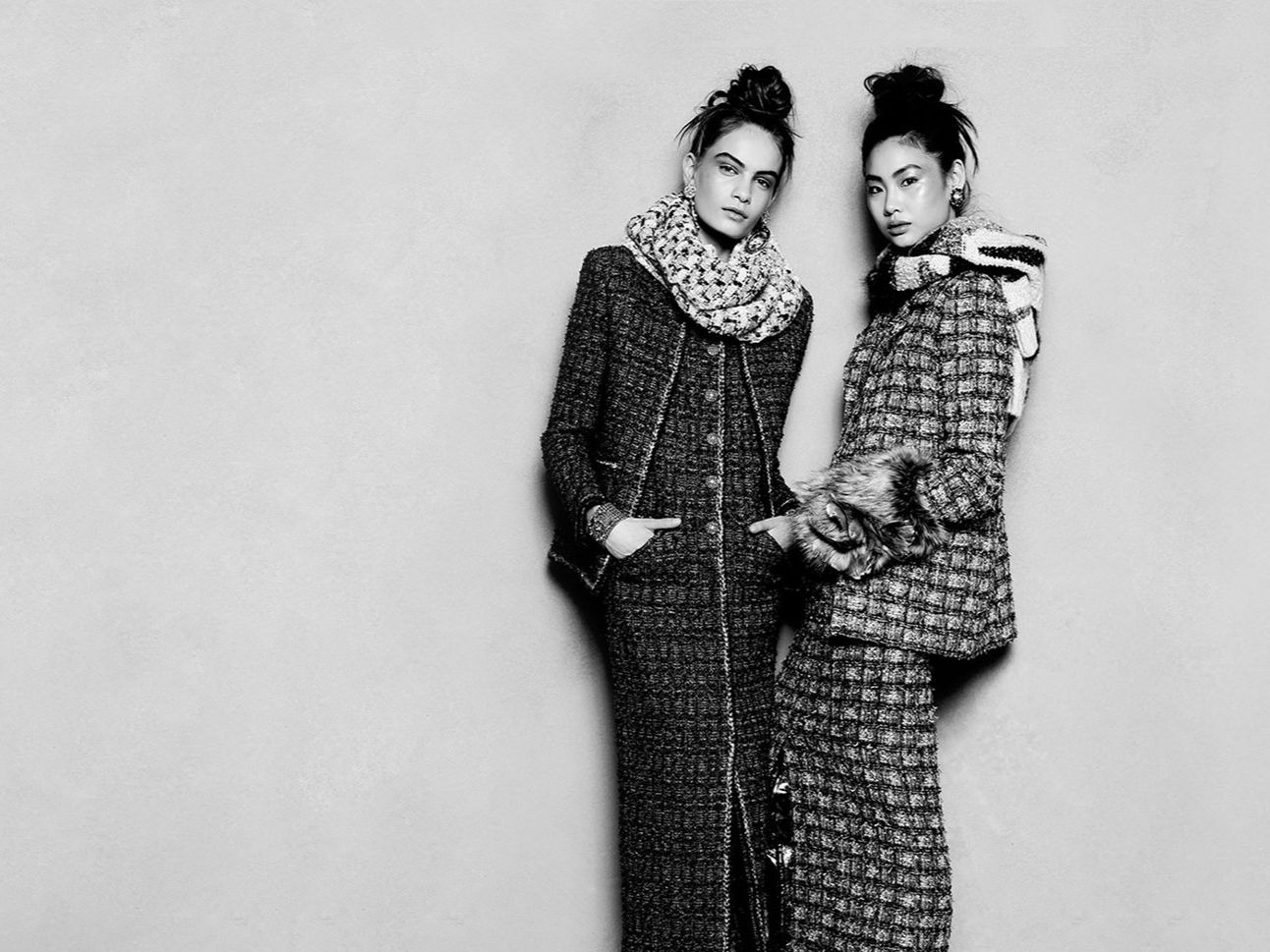
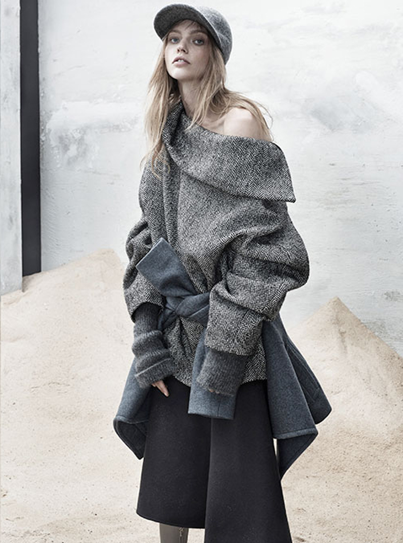
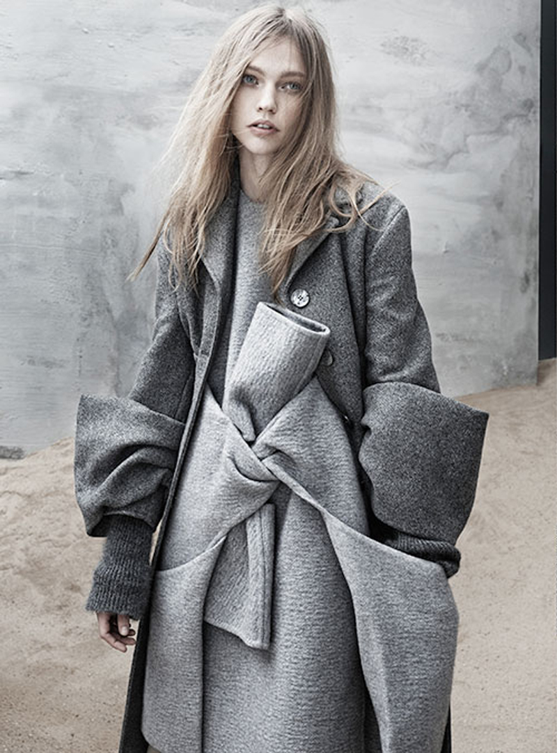
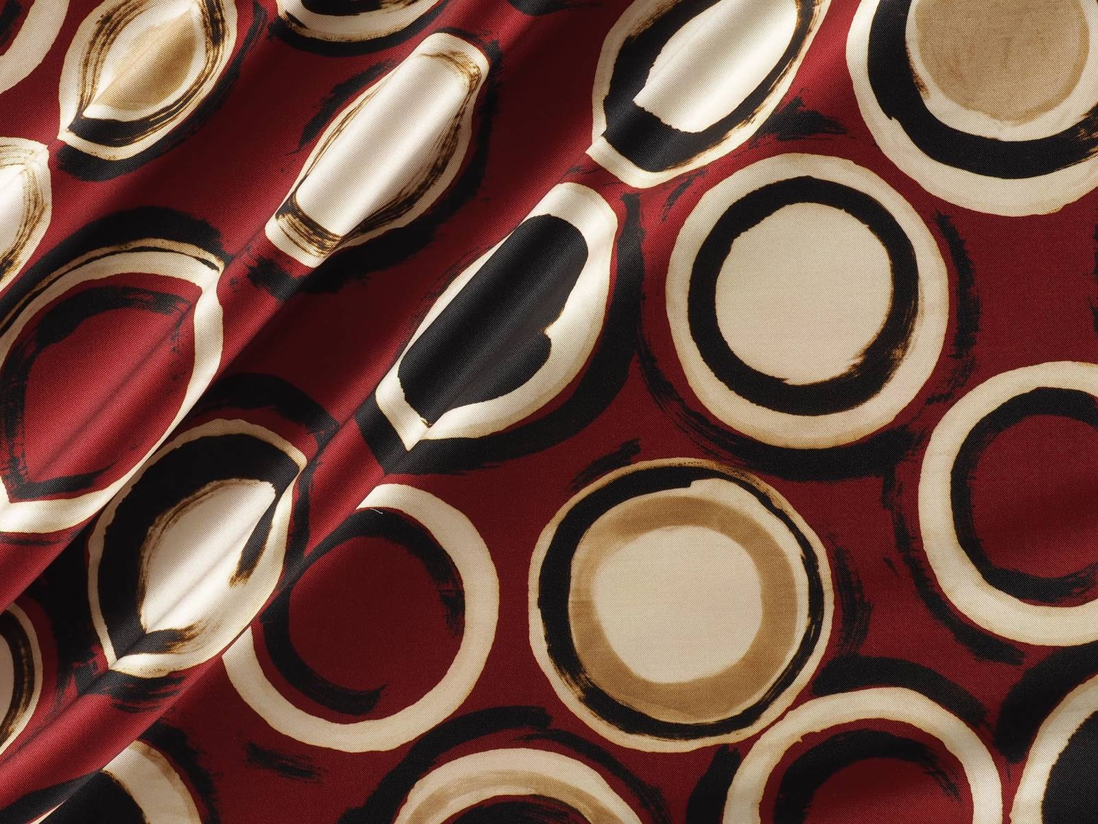
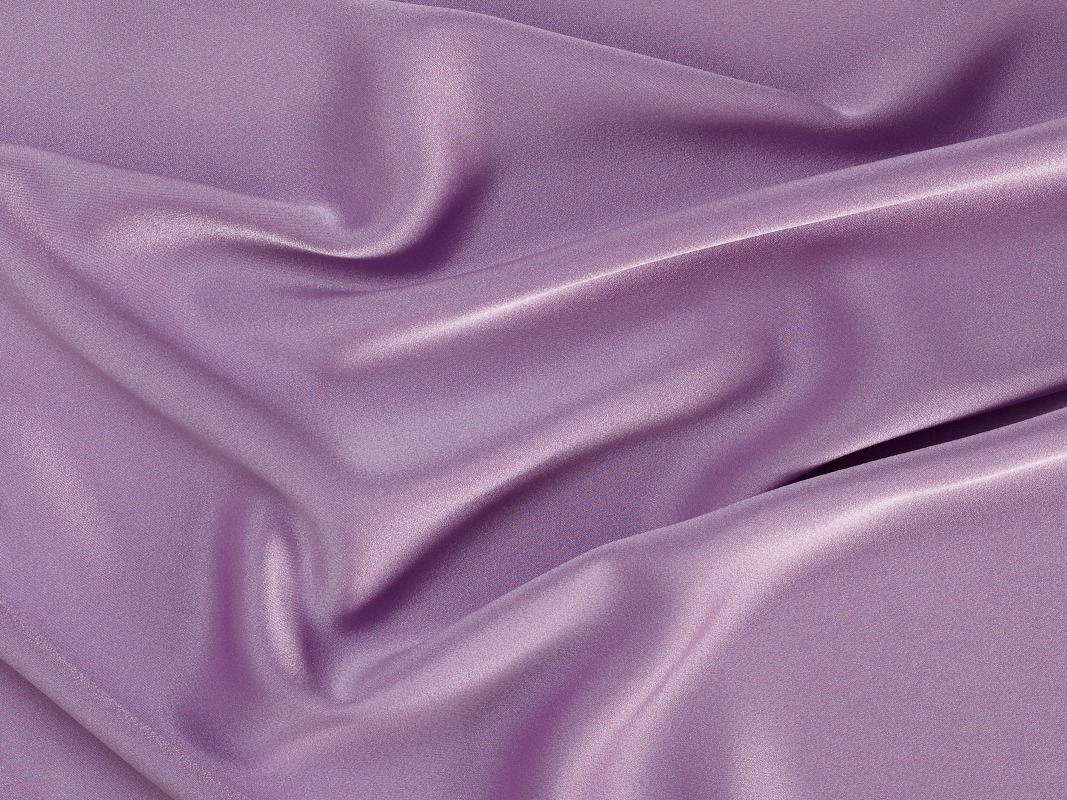
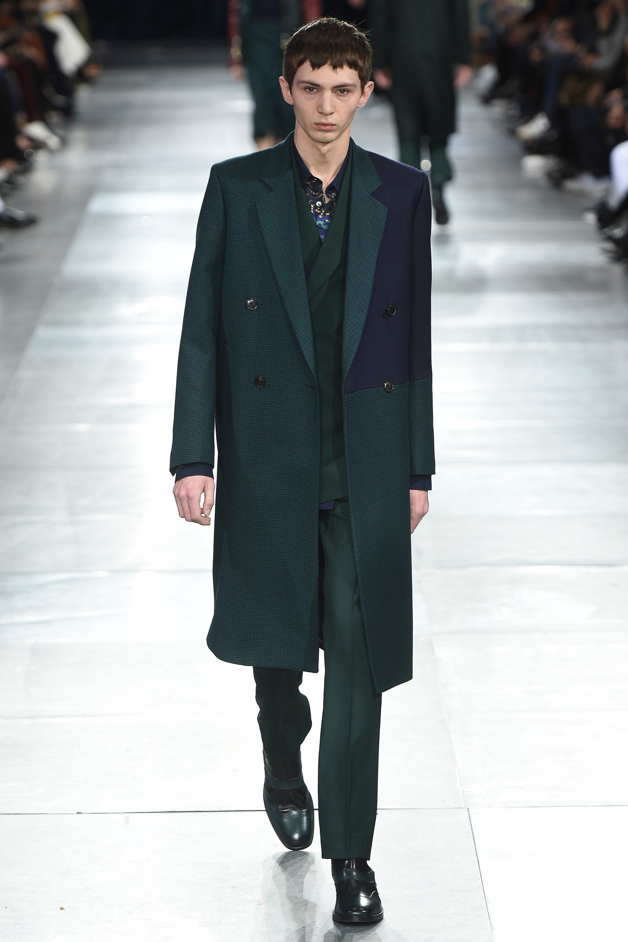
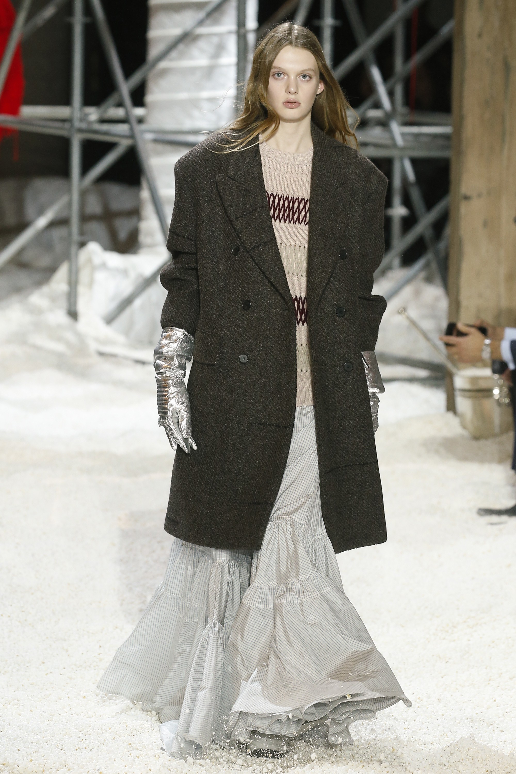
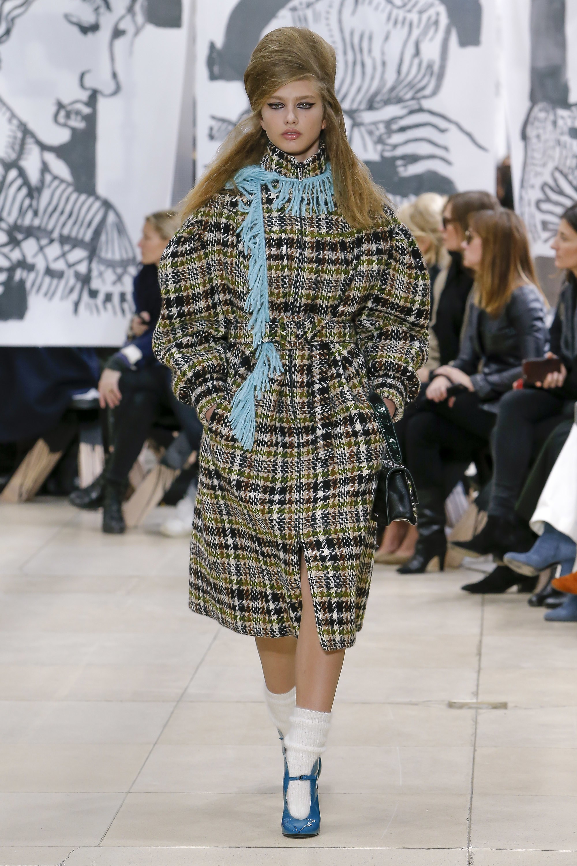
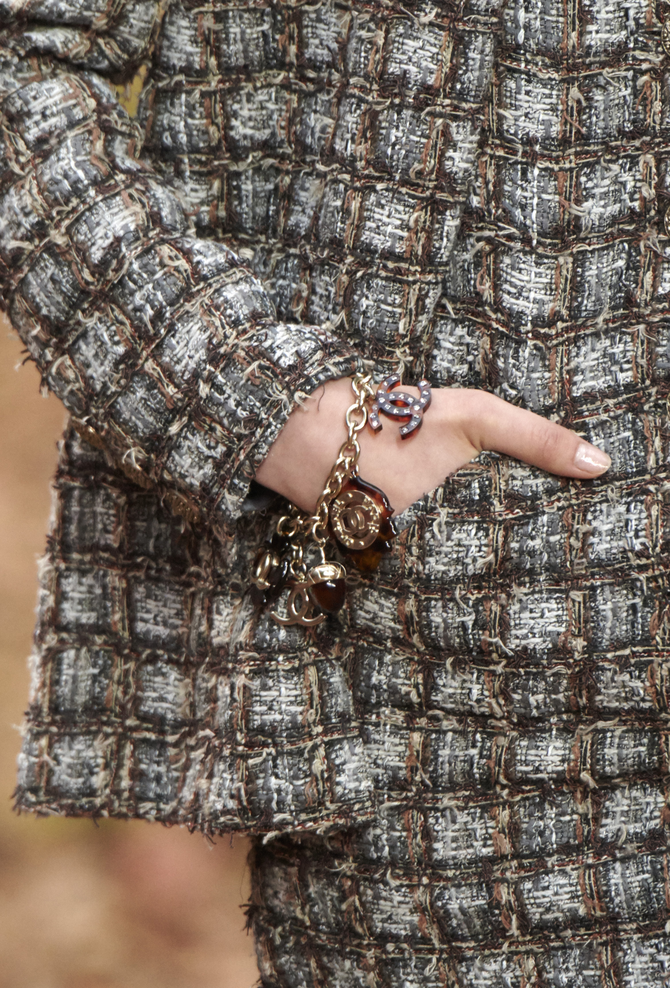
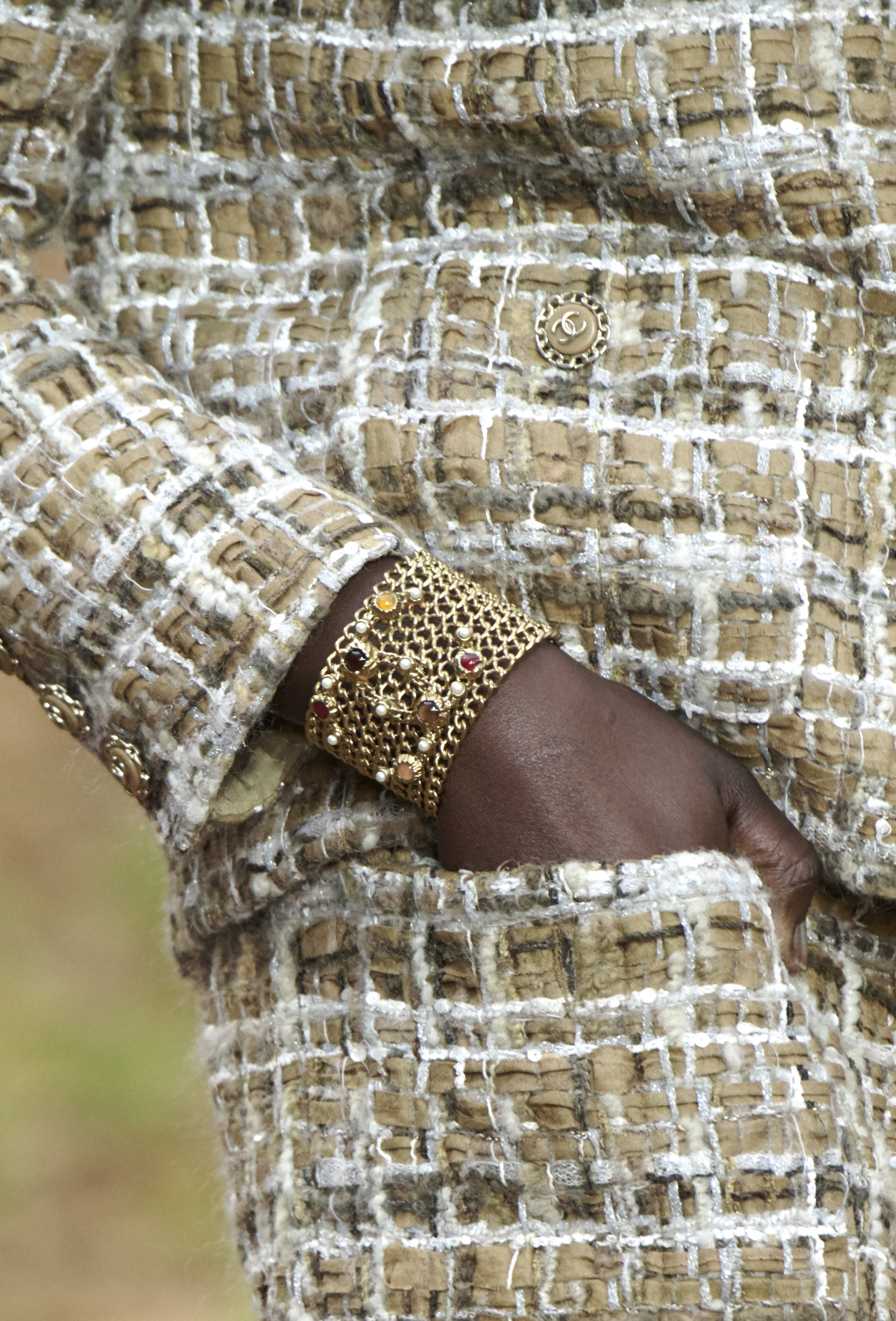
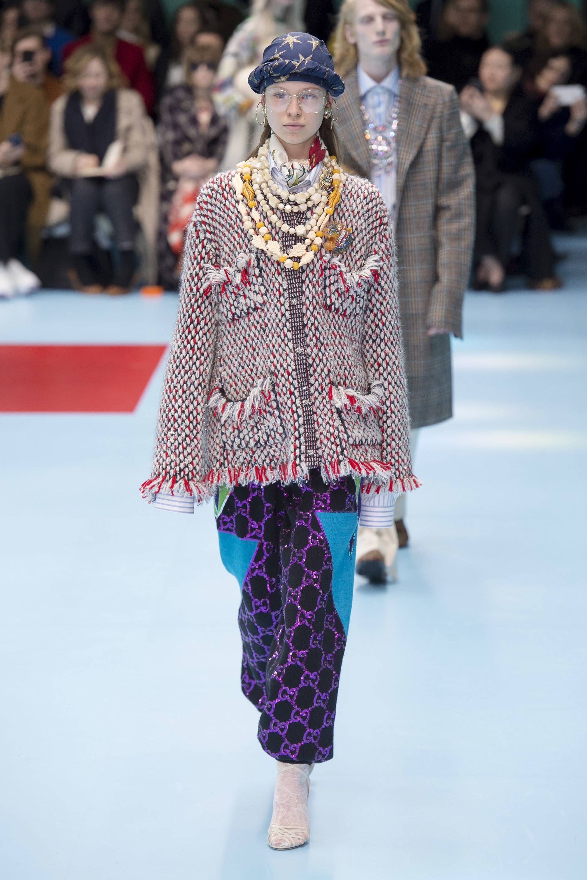
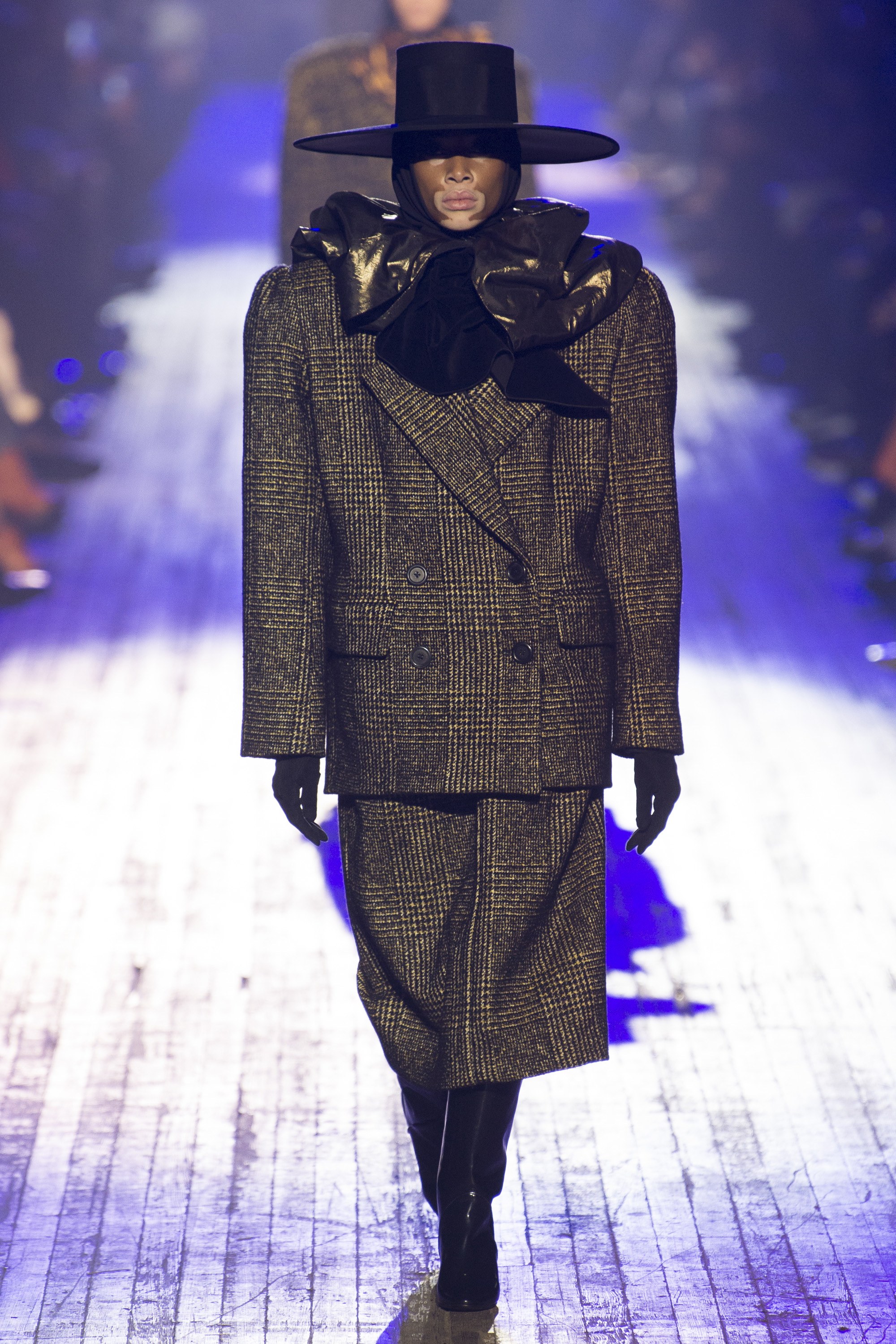
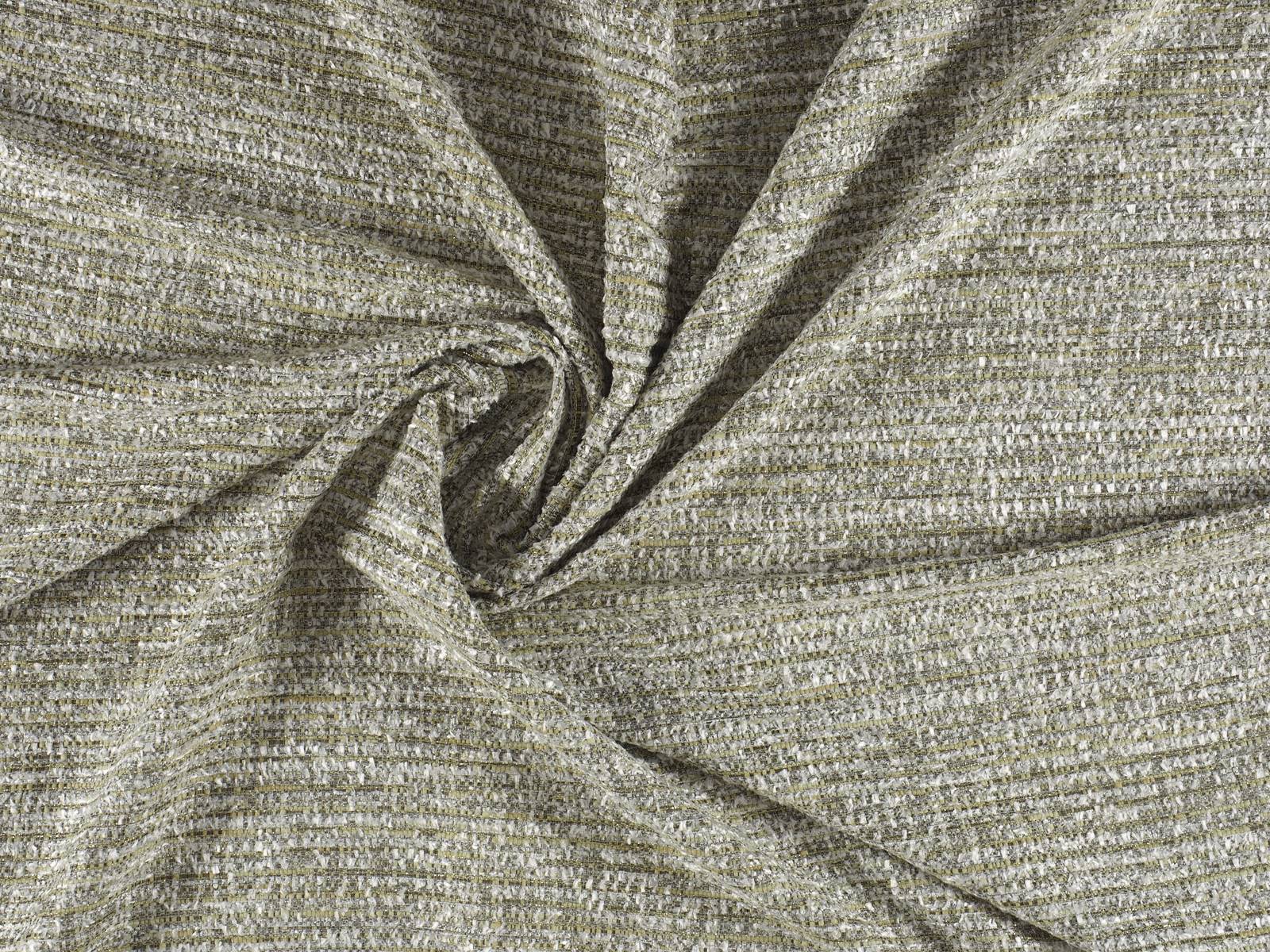
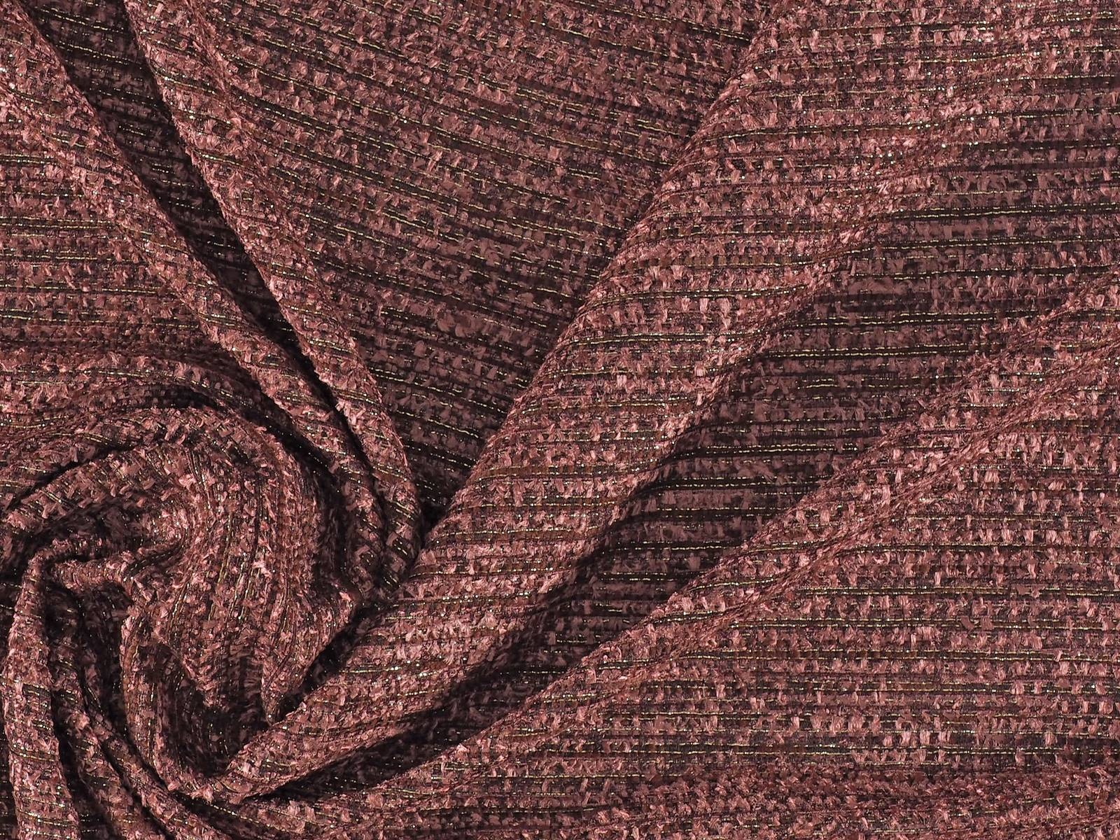
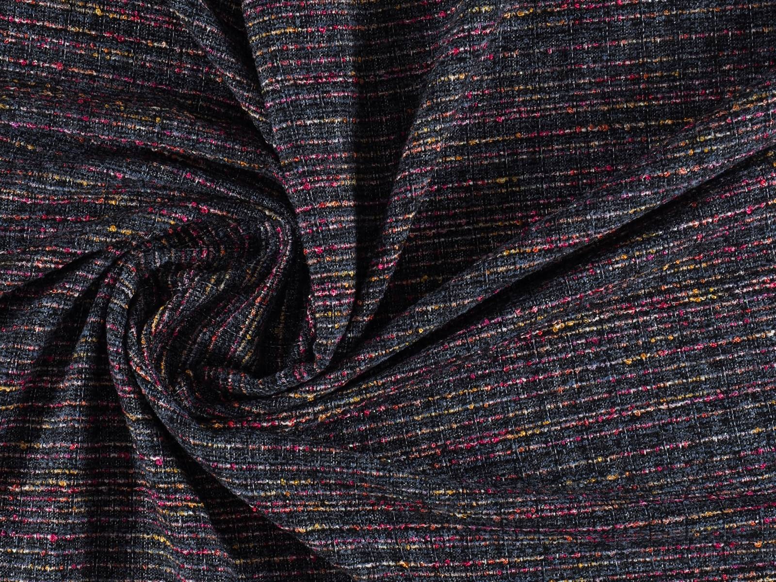
Tweed is an emblematic fabric that has a history, a wild card in constant evolution that appears, to a lesser or greater extent in the winter seasons. Classically inspired, elegant and chameleonic in turn, tweed retains a defined structure and aesthetic that remains intact over time, although it is renewed in clothes that change style according to current trends. Before focusing on the current collections we will delve a little into the history of this singular fabric, which is so recognizable to the naked eye.
To begin with, tweed is a wool fabric with an irregular appearance that does not have that natural look and smooth finish of a conventional fabric. It has a rugged touch, a solid and elastic texture and defined patterns such as houndstooth, windowpane, Prince of Wales check and herringbone. It also constitutes a fabric that lends itself to sewing and ironing with a versatility that has no limits in either the feminine or masculine wardrobe.
Humble origins
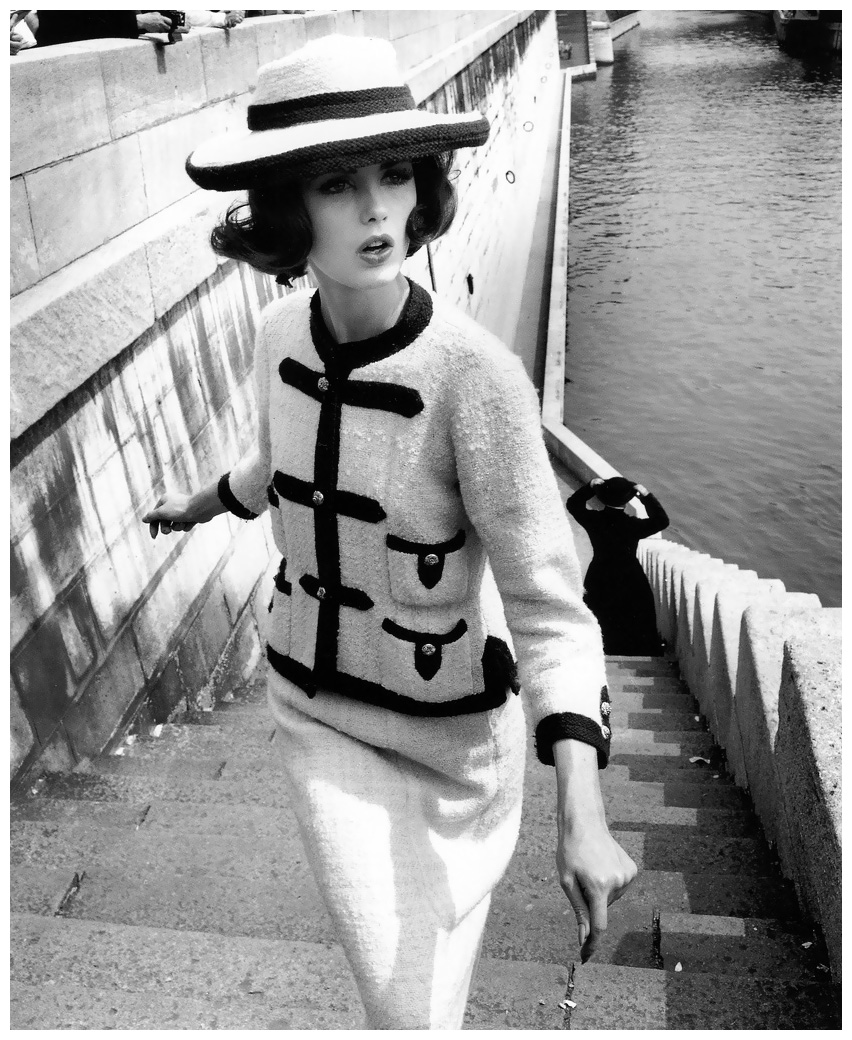
Tweed has its origin in Scotland and was initially linked to rural areas. It was a common fabric in the warm clothes of the popular classes and was used especially in the field to withstand the harsh weather conditions. During the nineteenth century tweed drew attention within English society: the British upper class saw it as the indispensable fabric for their hunting activities. They saw in tweed a versatile fabric closely linked to the countryside and sports activities that also had an elegant reverse side. You could be well-dressed when in the country.
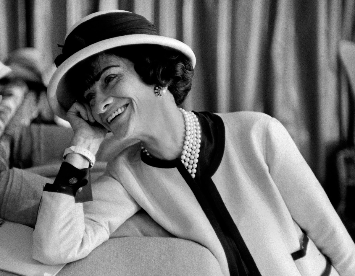
The legacy of Coco Chanel
If there is a fabric that is associated with Chanel‘s legacy and that of its founder, that is undoubtedly tweed. It was towards the end of the Twenties when the iconic designer decided to incorporate tweed into the feminine wardrobe, seeing its enormous potential as a fabric and its multiple virtues: despite being robust it was flexible and responsive, characteristics that allowed this fabric to adapt to the most casual wardrobe of an leisurely society that was beginning to enjoy free time. Thus Coco Chanel was the pioneer in offering women comfort and modernity through tweed with clothes such as suits, skirts and jackets (an icon of the maison) that were adapting to these new needs and which freed women from the rigidities of contemporary dress.
The success was immediate and turned the tweed into a key piece of Chanel style language, an authentic hallmark. In the Fifties tweed was a very popular fabric that had a follow-up of more modernized variants, new uses and surprising combinations. In short it would continue to revolutionize the fashion industry. Not in vain there have been many designers who have incorporated it into their collections to this day. Even so, no matter how many years pass, tweed is always associated with its pioneer, Mademoiselle Chanel, historically linked to the emancipation of women.
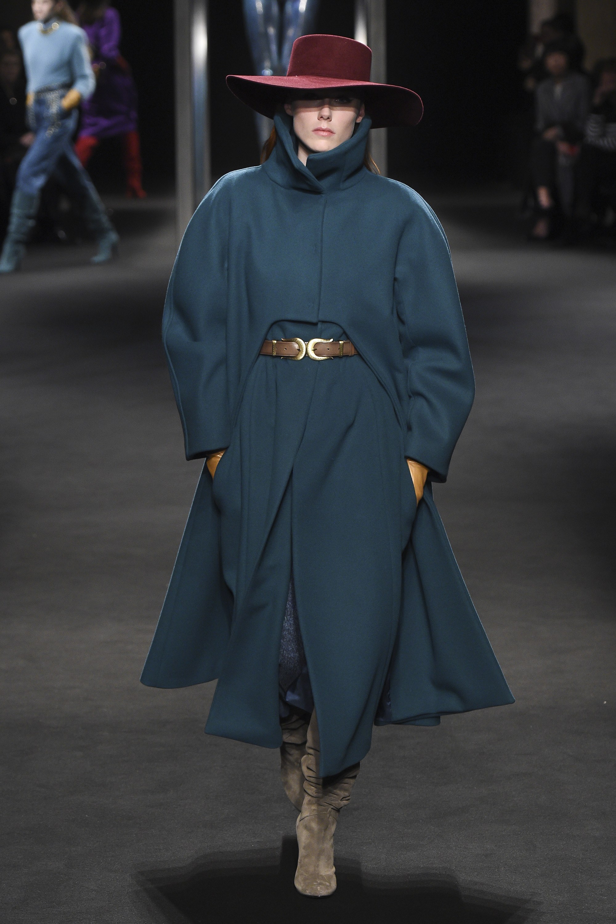
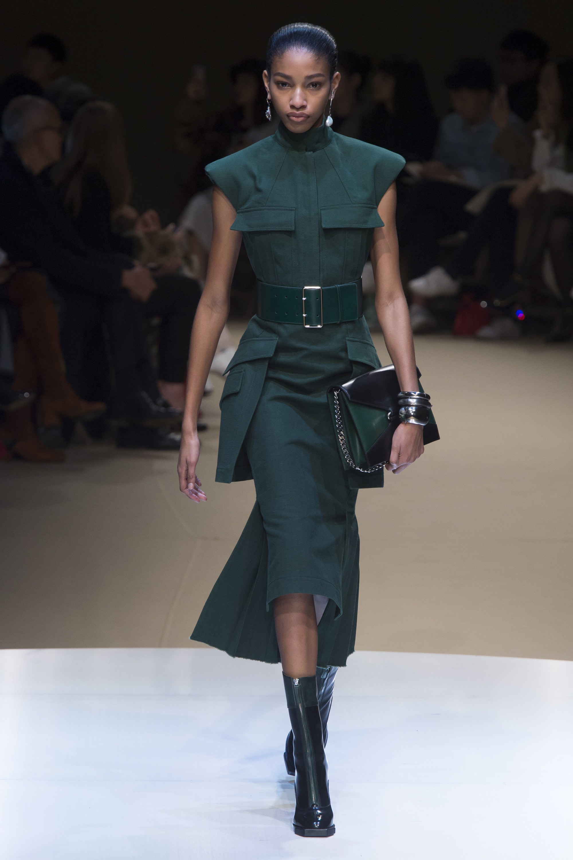
Tweed in the current season
Quite apart from Chanel, in its multiple versions and with a new facelift for every season tweed is a fabric that is practically repeated in most of the prêt-à-porter collections by the big fashion-houses. Apart from the lady style jackets and suits, it is also used in long coats with straight lines, midi-skirts and frock-coats. Look out for three details from what is currently on offer: the wearing of frayed effect, the introduction of more colour and the combination with denim and leather to give a more rebellious effect to the outfit. Take note of some of the cat-walk looks from Balmain, Gucci, Miu Miu and Michael Kors.
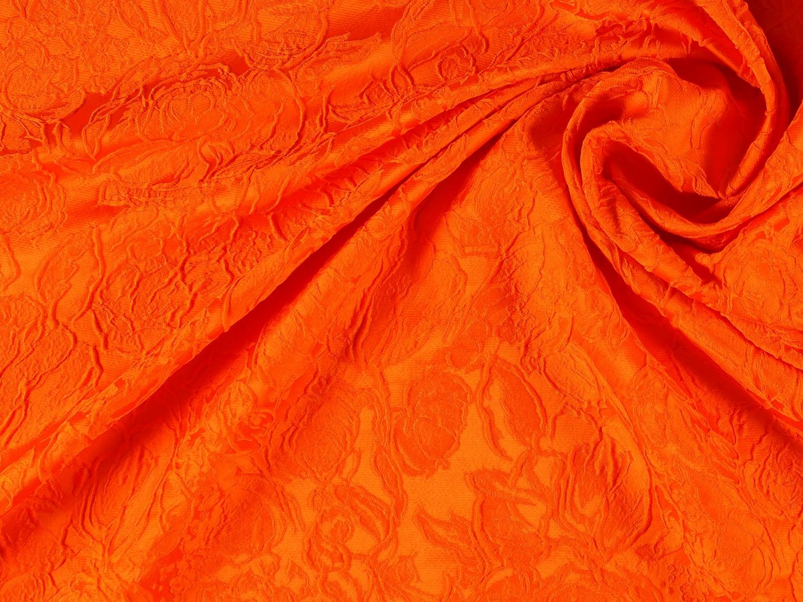
In Gratacós we also want to show you some of our tweeds, so that you can imagine your autumn outfits. Take good note of some of these ideas!
Jueves 27 septiembre 2018
“Thank you Delpozo for these six wonderful years. I have felt as if we were one family, and I am very proud of all the things we did together. ” This is the farewell phrase that Josep Font left last Tuesday on his Instagram, after six years leading the artistic direction of the company. At the same time Delpozo, for his part, thanked people for their excellent work over the years. It was an exchange of thanks which terminates a fruitful and successful collaboration.
Josep Font was responsible for the “rejuvenation and continuation of the legacy of Jesus del Pozo ” according to Pedro Trolez, president of Perfumes and Design Group and owner of the company, making the Spanish brand one of the most coveted at an international level. “He has an extraordinary ability to mix colours, textures and volumes, turning them into delicate and feminine collections. I am grateful for his loyalty and for having been a part of this first stage for Delpozo, “added Trolez .
 |
 |
An architect by training, Josep Font joined the Delopozo project a year after the death of Jesús del Pozo, who founded the company in 1974. In these six years, Font was responsible for renewing the identity of the Delpozo woman and giving her global projection via a parade first in New York and then in London, the two latest two parades . Apart from the reformulation of the name for commercial purposes(Jesús del Pozo became renamed DelPozo ), the Catalan designer devised his own language inspired by the forms of nature to create voluminous, ethereal and delicate designs in a very colourful palette characterized by its magnificent contrasts: it dances between the most dream-like pastel shades and fully saturated shades.
 |
 |
Apart from nature the designer has also fed from art, music and architecture to create each new collection,each of which was more surprising and more applauded. Passionate about craftsmanship, Font also opted for quality embroidery by recruiting suitable staff for his workshop., a task which bears witness to that minuteness of detail and to finishes in garments closer to haute couture than prêt-à-porter , presenting an incomparable vision of the feminine wardrobe. For all this, Josep Font has shown the value of well-made pieces, slow-cooked fashion, architectural silhouettes, tulle, ethereal volumes and good taste without excesses. All this through Delpozo .
At the moment Delpozo has not given clues as to who will be the designer to relieve Josep Font as the head of artistic direction. It is also not known what the next step will be for this Catalan designer, who has managed to fulfil the dreams of privileged women able to be dressed by Delpozo in the Josep Font era.
Jueves 13 septiembre 2018
Sorry, this entry is only available in Español.
Jueves 06 septiembre 2018
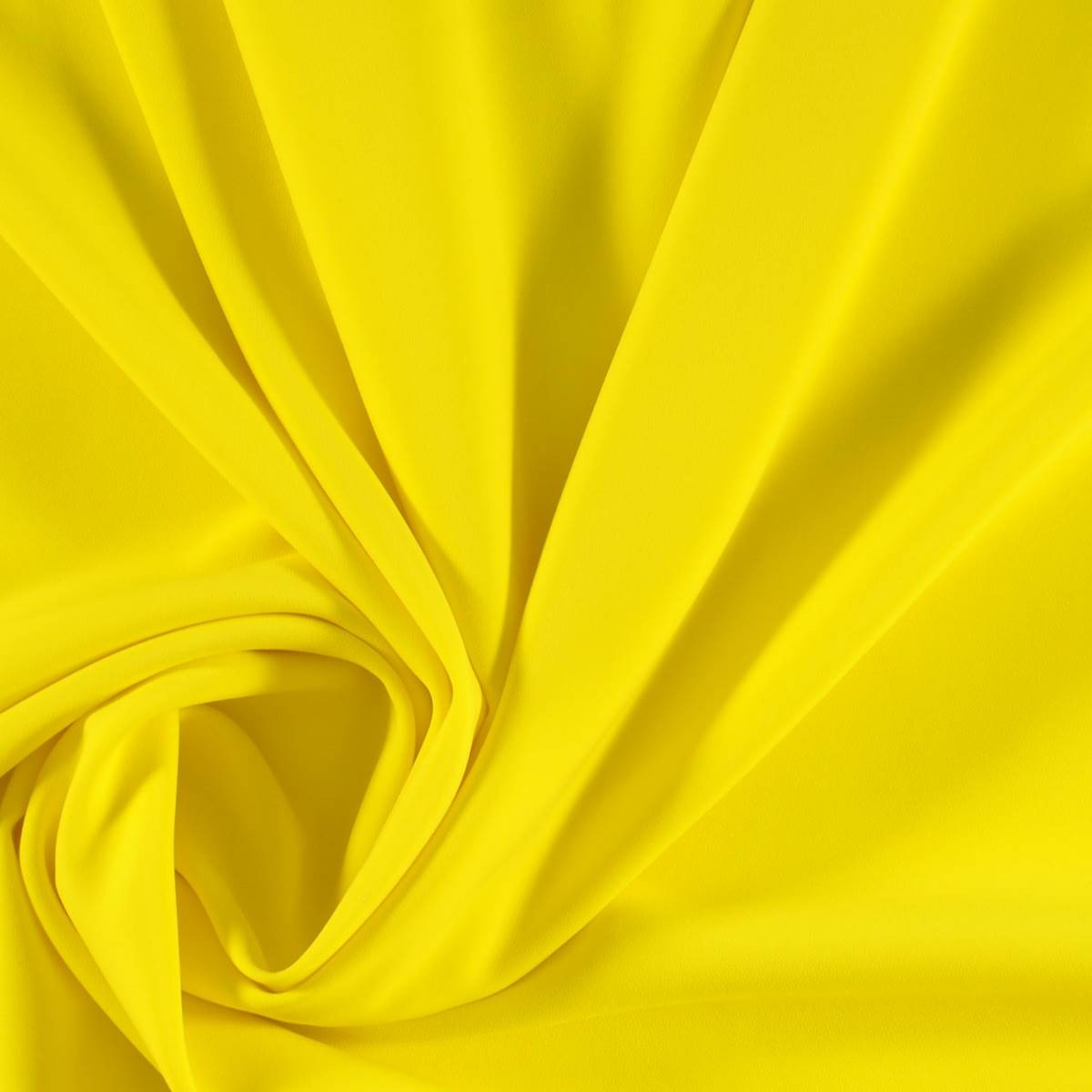
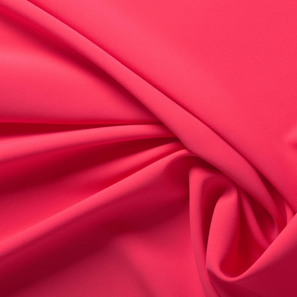
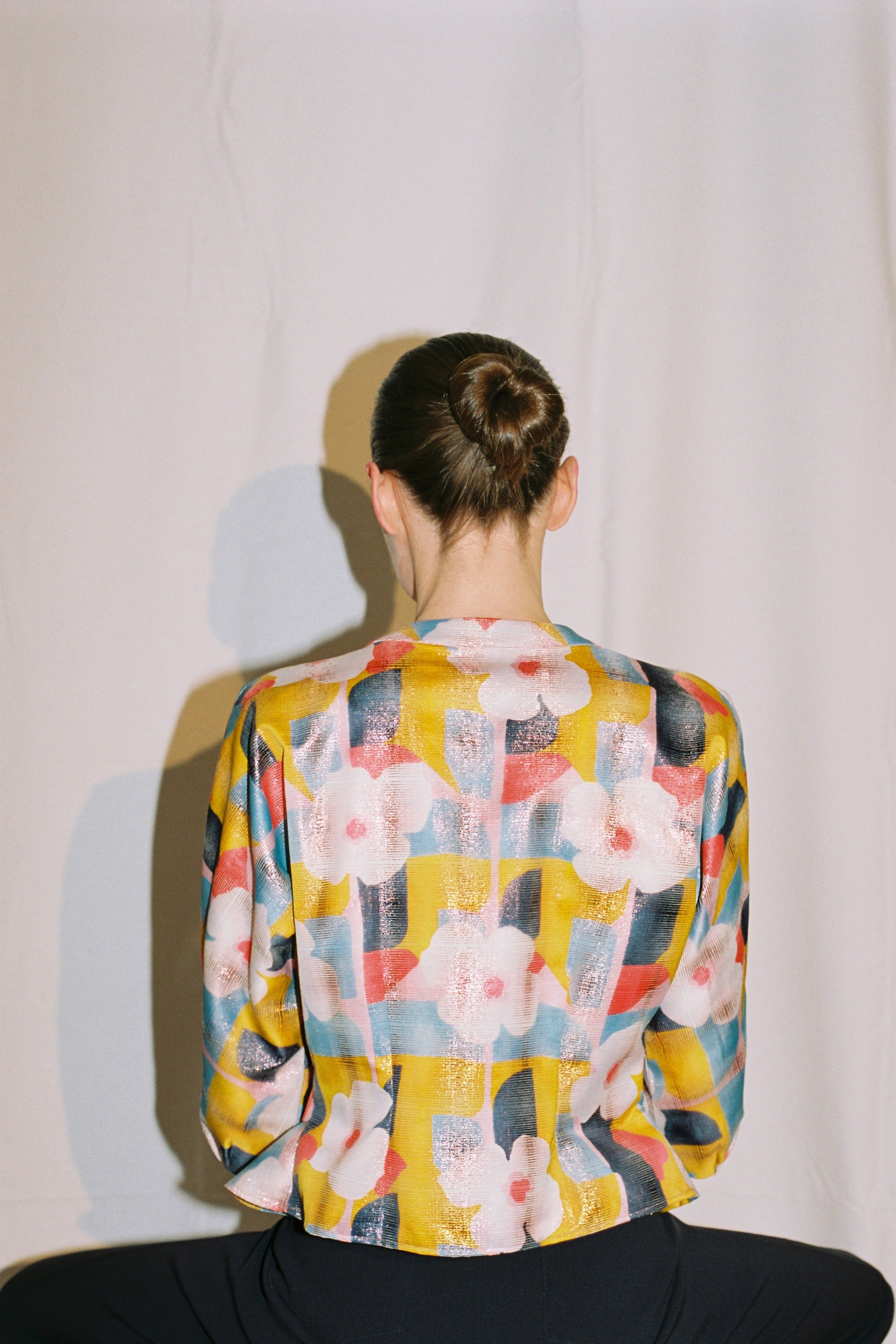
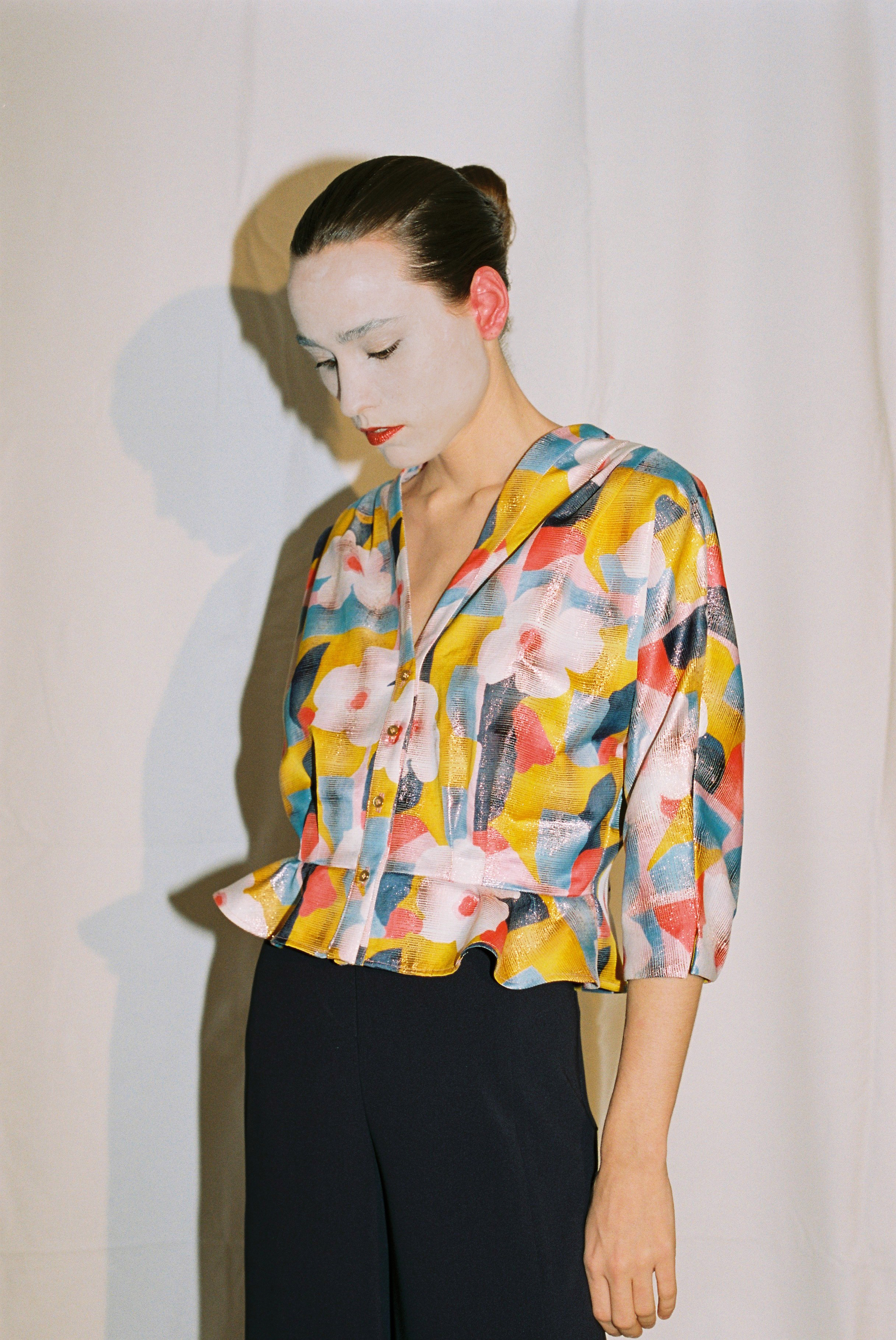
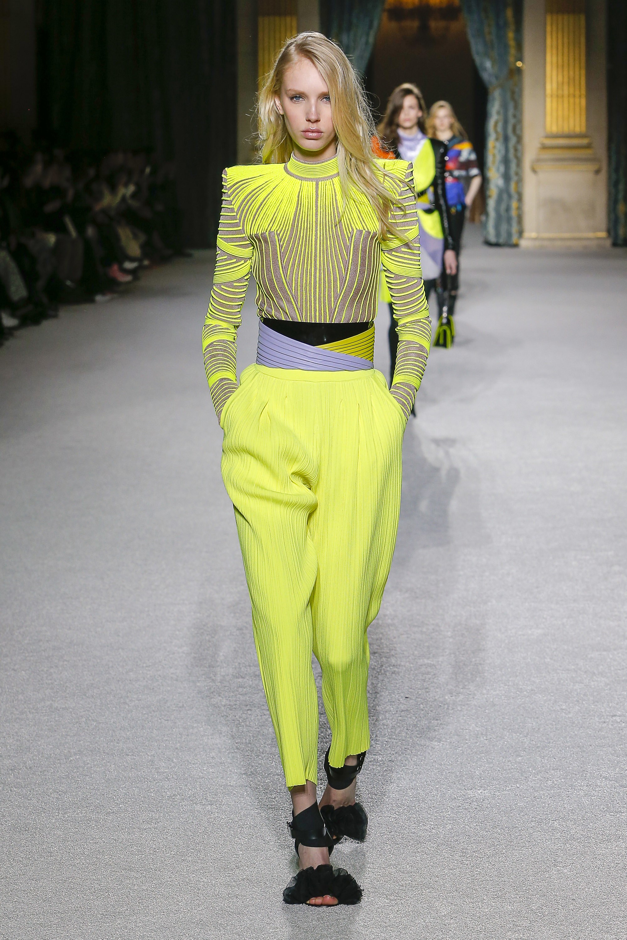
2018 has been filled to the brim with pastel shades: the millennial pink still resists, the soft lavender tone of last winter, the calming baby blue, mint green… After this feast of sweet colours, fashion marks just the opposite with shades willing to revolutionize customer’s retinas: fluorescents. Therefore, with the summer still marking the calendar, we welcome the autumn with this daring chromatic trend that has been rescued from the 80’s to bring a little light to our traditional winter wardrobe.
 |
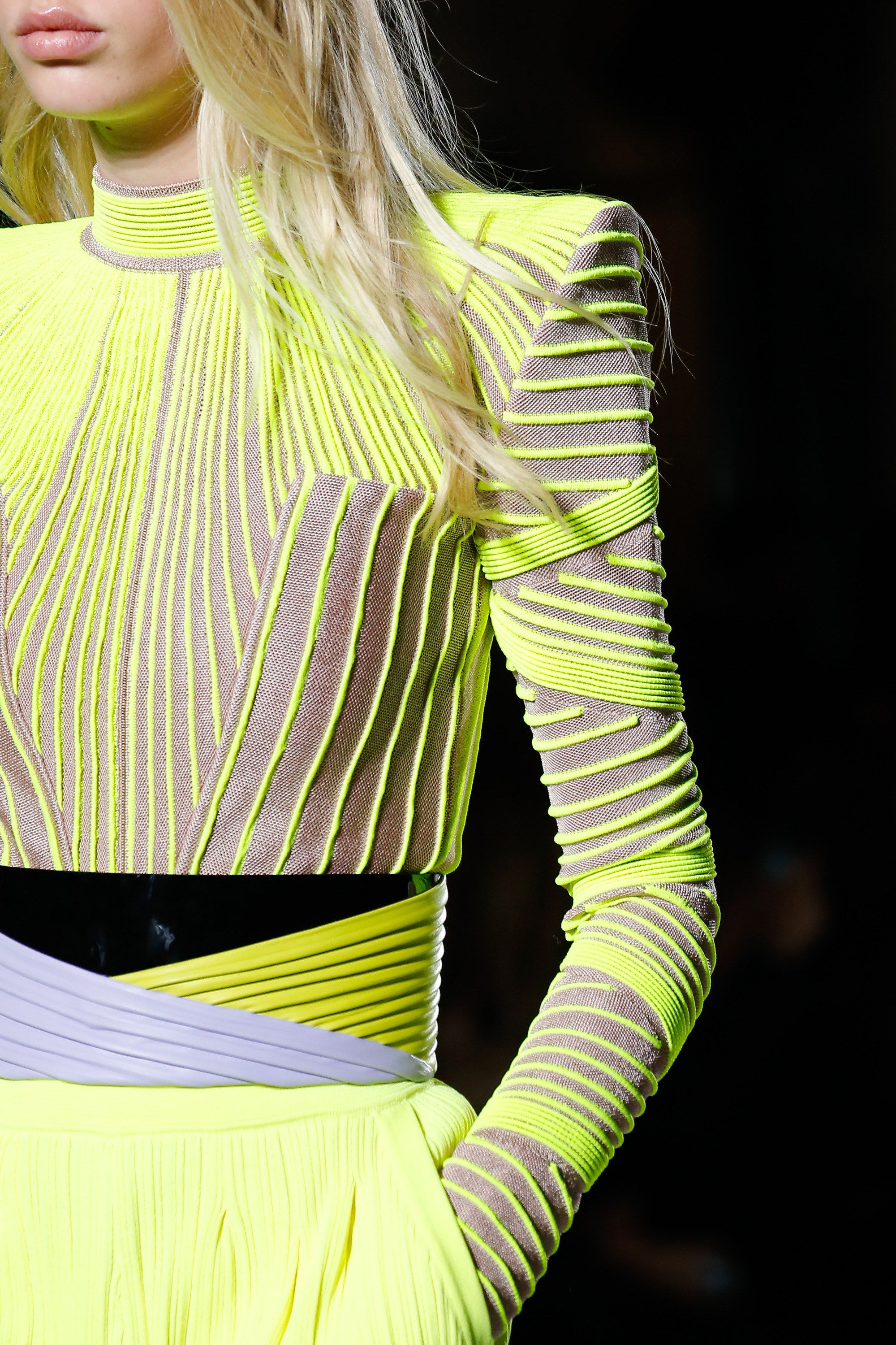 |
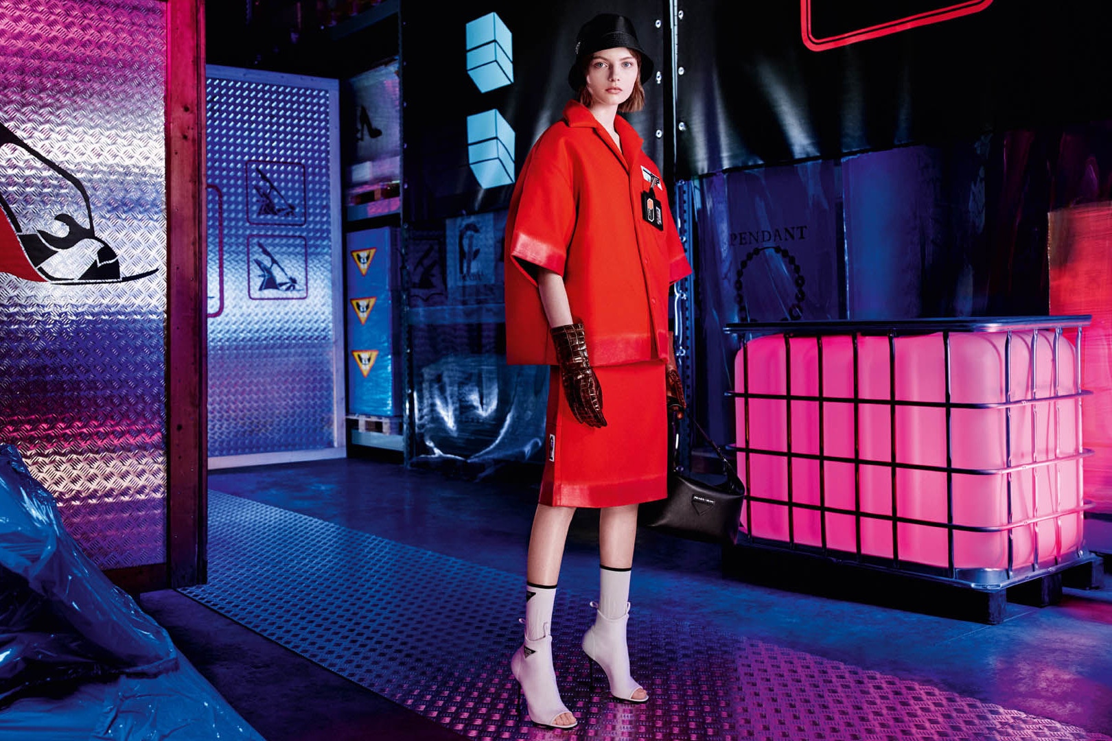
The return of neon colours is not something new. In fact, almost a decade ago they were back in apparel sporty style inspired by the outfits worn by rappers and hip hop artists, who sported it in accessories such as shoes, sunglasses and other details on clothing as sidebars that shone in the darkness. Now, some designers rescue this fever for fluorescent colors and they do so with new approaches and conceptual arguments. The two most obvious or representative have been Calvin Klein and Prada, although neon shades have also seen on the Moschino, Marni or Balenciaga catwalks.
The creative director of Calvin Klein 205W39NYC, Raf Simons celebrates his first year in the job by exploring the universe of American culture. In this case, fluorescent shades are used to highlight the concepts of “safety” and “protection” with garments that refer to reflective safety jackets, overalls and balaclavas and where these tones are used for fashion purposes.
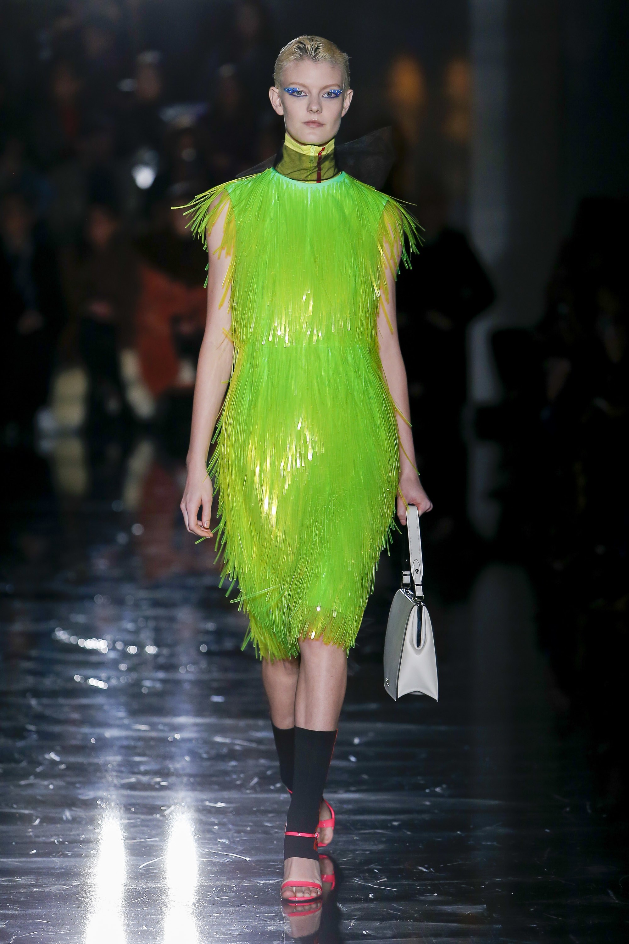
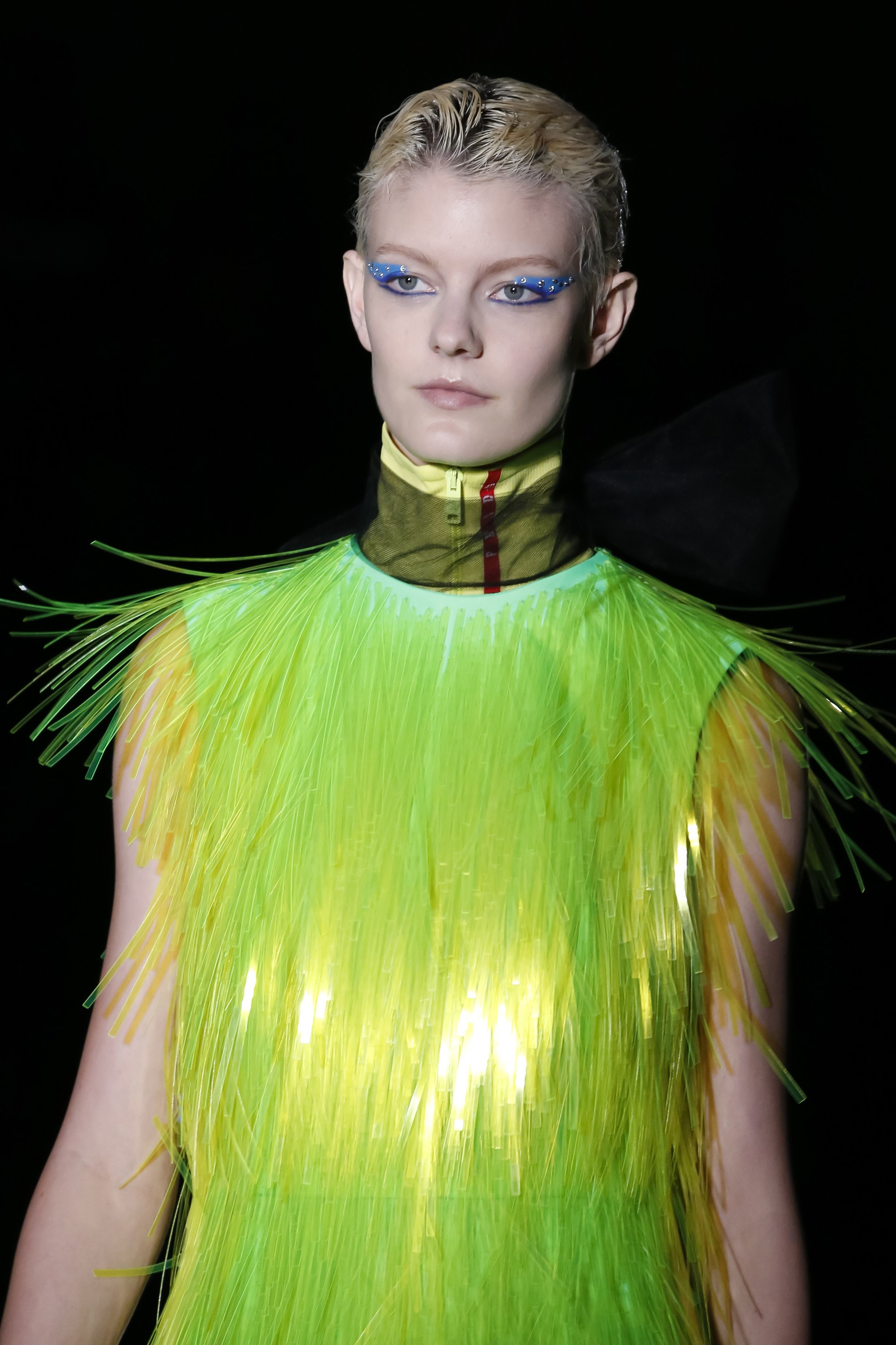
This season, Prada does a review of sporty style in futuristic key with oversized garments Inspired by outdoor sports. Waistcoats, windproof jackets, trench coats, wellies, fisherman hats in fluorescent colors, luminescent fringes that adorn dresses and superimposed fabrics that create an attractive iridescent effect on the catwalk.
 |
 |
And how do the fluor tones combine? They are colours that transmit dynamism and transgression and are associated with youth and fun. This power of visual attraction they exert is, in turn, their greatest defect because in the same way they entice, they repel instantly. It is easy to get fed up with them! The most risky option is to wear them with athleisure- style garments, in parkas, raincoats and windbreakers or in jackets that cut the formality of a closed dress or a midi skirt with a shirt. The most discreet way is to relegate them to small accessories or details such as side stripes or zips. The colours that best accompany them are white and black along with the range of neutrals.
In Gratacós we welcome neon tones with some daring fabrics that do not go unnoticed in the store. Do you want to come and see them and touch them for yourselves?