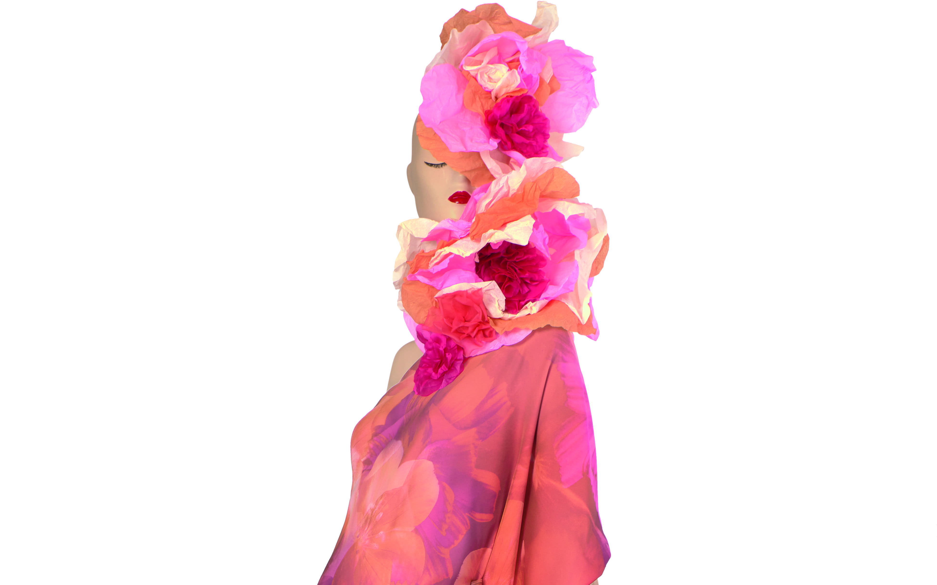
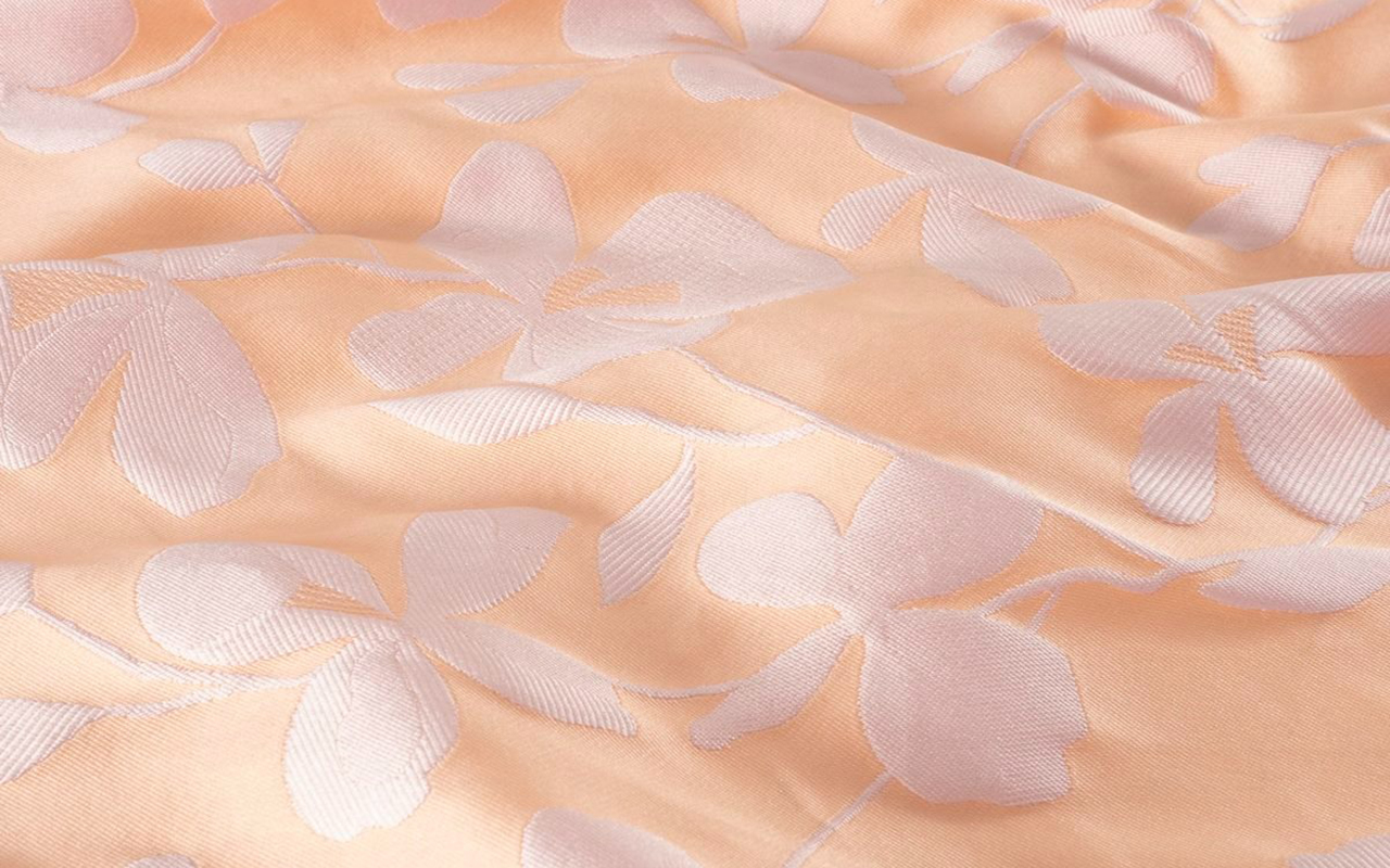
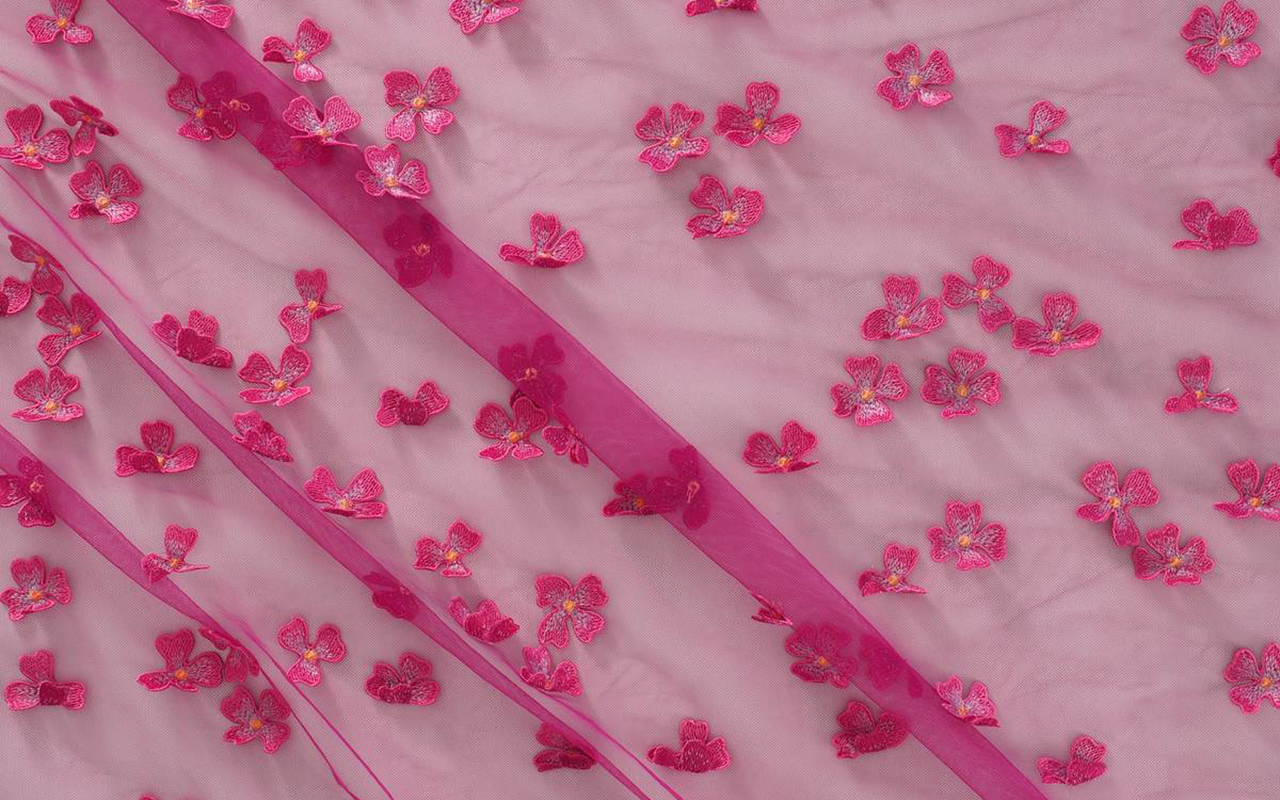
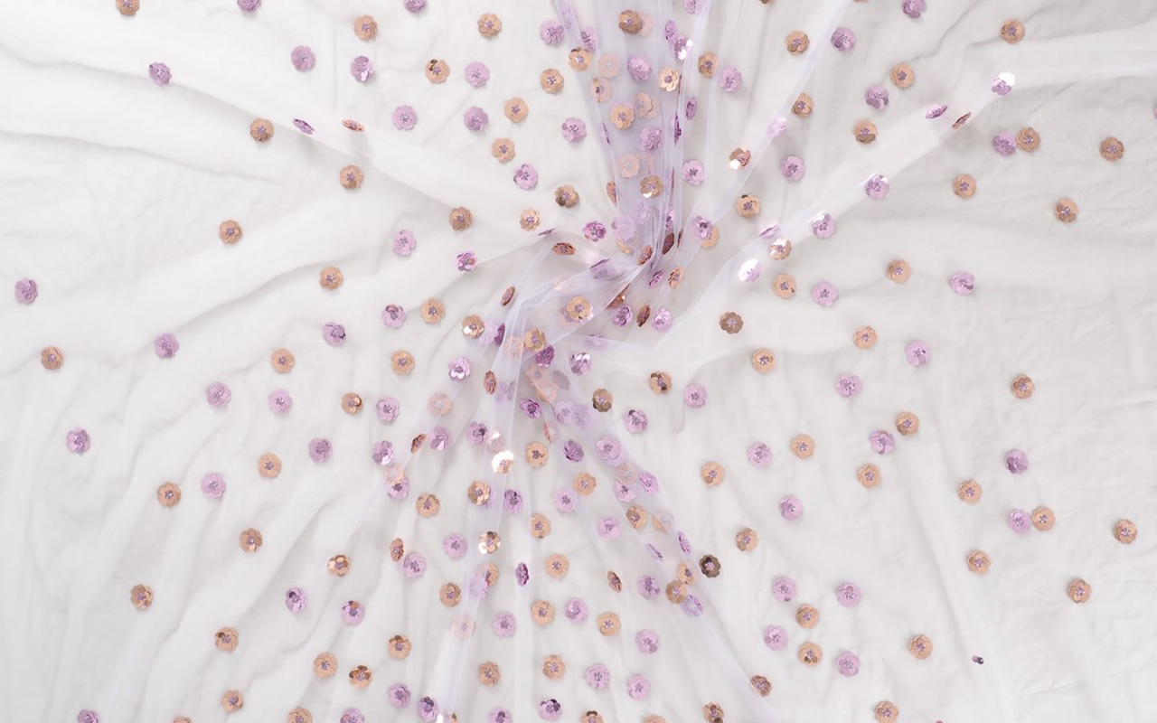
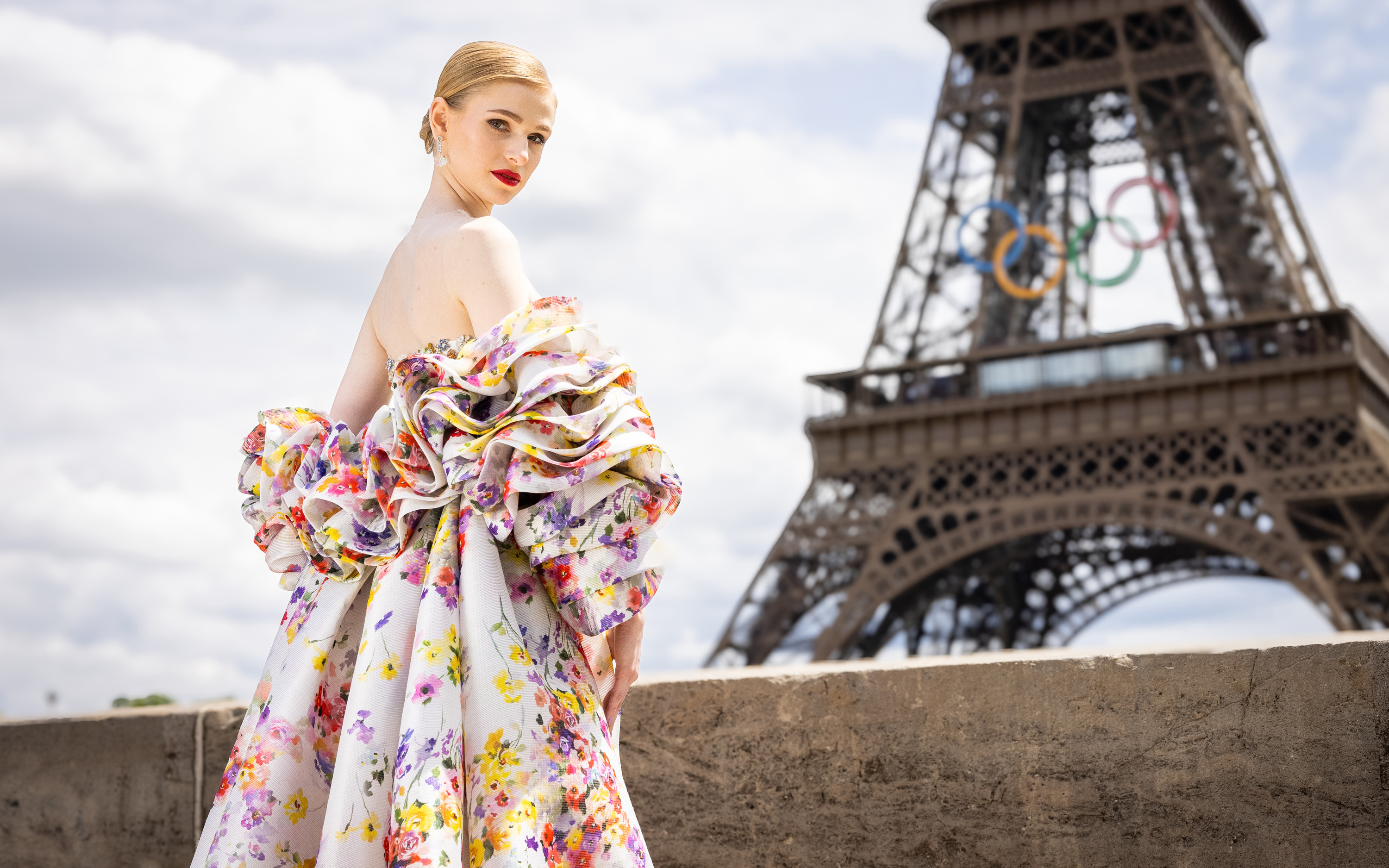
 The Olympic Issue. A stunning editorial by Mariano Moreno and Vogue World Paris 2024.
Fashion, a reflection of each society, is present in all areas and silently analyzes what it represents. At the Paris 2024 Olympic Games, one of the largest showcases in the world, it could not be less. Millions of eyes of different nationalities have observed the presentations of the uniforms in recent days, and will analyze, without being experts in the matter, the details of the opening show with their clothing created for the occasion, as well as the outfits of the athletes who will star in each of the sporting feats. We are curious by nature, and the Olympic Games teach us that style does not have to be at odds with the competitive spirit.

What must be considered?
Uniforms represent the media focus where the relationship between fashion and sport becomes more evident, especially in recent years. This relationship is beneficial as long as one does not engulf the other, something that these days is giving something to talk about both for its successes and for some mistakes, generating a large number of memes. Behind every uniform is a needle: the participation of a renowned designer or brand that promises to take the relationship between fashion and sport to a new level. Although aesthetics are key when representing the culture and style of each country, we must never forget the main objectives of these special suits: comfort and functionality. An Olympic uniform must be practical. It is at the service of athletes and its mission is to ensure the best performance. Furthermore, they are not worn by models with normative and standardized measurements, quite the opposite. Athletes champion a diversity of bodies with diverse morphologies and this physical diversity must be taken into account when looking for a design that feels good and is comfortable. That said, combining aesthetics with functionality is no easy task, and this is reflected in the results. Everyone wants to project a cool and modern image of their country, after all, athletes are the representatives of their land in the eyes of the world, but no one wants to look ridiculous or wear clothes that look like a moving flag. Therefore, the uniform also plays an important role in the confidence and self-esteem of each athlete.

Most representative uniforms of the Olympic Games
The different delegations have presented the uniforms that their athletes will wear throughout the competition. The proposals are very varied, seeking this perfect formula between modernity and identity, and aesthetics with functionality. Some countries, such as Italy and France, have taken the opportunity to show the great fashion design potential they have. Other delegations, such as Spain or Japan, have presented more practical proposals that are far from design. We review the most interesting proposals without overlooking some successes and errors.
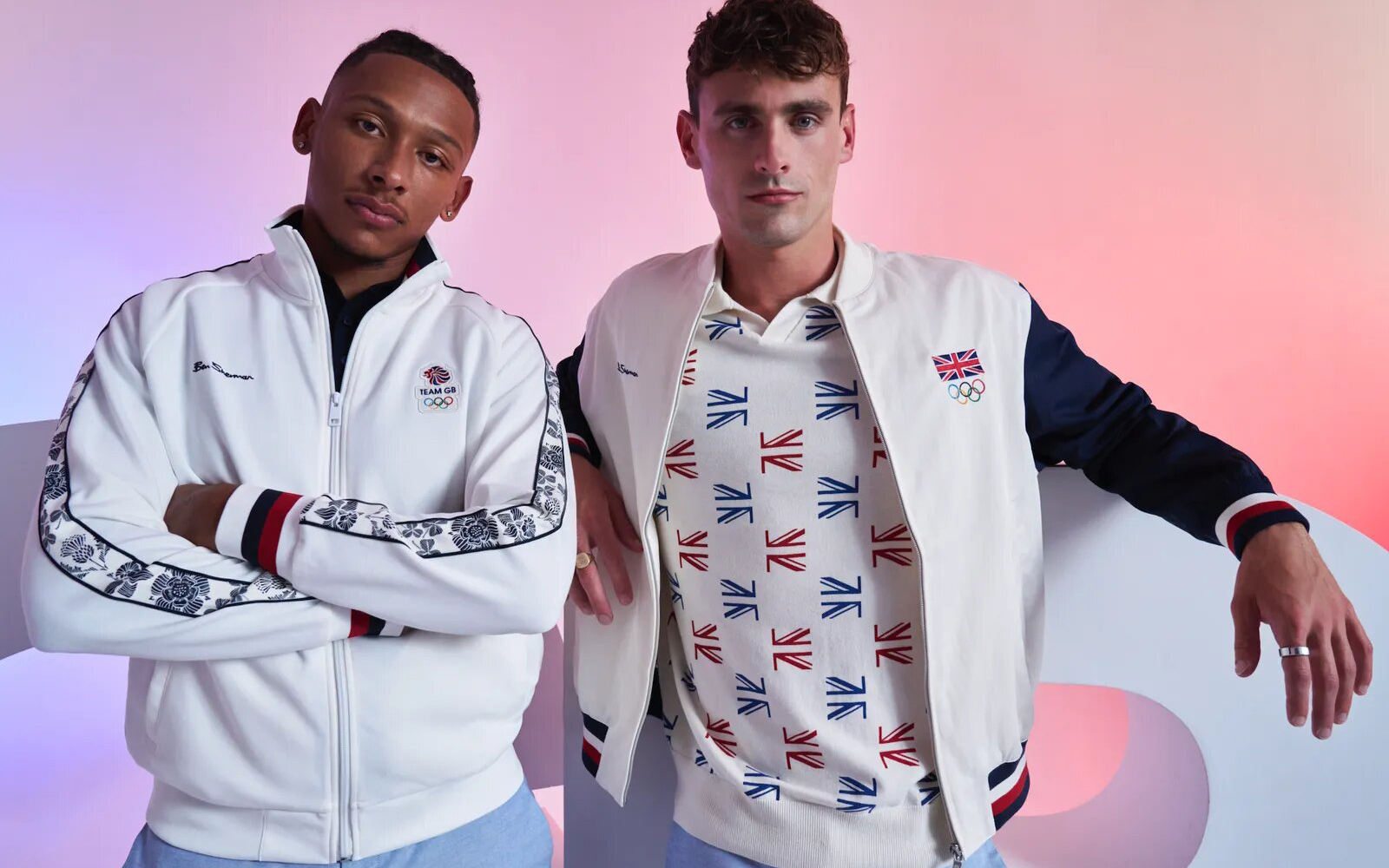
As host country, France has collaborated with Le Coq Sportif and Stéphane Ashpool to design a uniform adapted to both Olympic and Paralympic athletes, reflecting the essence of the culture and love of sport of the host country. The nineties-inspired t-shirts and sweatshirts are already a bestseller by achieving a fusion between fashion, sports and patriotism without fanfare. In the United Kingdom they have opted for a brand that represents English design and elegance: Ben Sherman. Dressed by mods in the 60s, this brand has always been characterized by encapsulating the magic of the unique British style. In addition to the colours of the Union Jack, the brand has added flowers to almost all the pieces in the Olympic and Paralympic collection.
Italy has trusted one of the great names in the history of fashion: Giorgio Armani. Their designs present a set of elegant and minimalist garments with navy blue as the main colour. On the sweatshirts, the word “Italy” in large white letters captures all the attention. Some critical voices claim that the result has been a bit dull, due to high expectations. The United States has once again trusted Ralph Lauren, a name synonymous with American fashion, to design its team’s uniforms. It has been doing so since 2008. This time, with a focus on sustainability, the uniforms are made from recycled materials, proving that eco-friendly fashion can also be stylish. Red, white and blue accents pay homage to the American flag, while modern silhouettes ensure maximum performance and comfort. Although the official uniform has been well received, Nike’s women’s track and field jersey has not been without controversy. Lauren Fleshman , former United States champion in the 5,000 meters, criticized the technical suit for its poor coverage.
Spain has opted for sustainability as a central axis. The Joma brand, in charge of the official equipment of Spanish athletes, has designed a collection that fuses tradition with modernity, making garments in high-performance fabrics inspired by the carnation, capturing the essence of Spanish culture with a contemporary touch. The kit has received mixed reviews: while some praise the chosen aesthetic, others compare it to the Iberia uniform. In Japan, faithful to their minimalism, they have trusted Asics, a flagship of the Japanese country, with a non-artificial proposal so that all the attention goes to the achievements of the athletes.

Other uniforms that have received good reviews have been those of Ethiopia. Adidas has created a uniform with a current and modern design for Ethiopian athletes. In Canada , Lululemon has designed a summer uniform focusing on adaptability, thermal comfort, fit and functionality, and national pride. The gender-neutral kit combines functionality and style through innovative construction and high-performance fabrics, with modern silhouettes and Canadian-inspired prints. In Australia, some critics have pointed out the length of the kit skirts and trousers. The Australian uniforms, designed by Sports Craft, present some similarities with Spanish clothing.
Finally, although in stylistic matters the colours vary, there is no doubt that some countries have won public opinion with sports uniforms that deserve an Olympic medal. This has been the case of Haiti. Haitian-Italian designer Stella Jean has collaborated with painter Philippe Dodard to create designs for the delegation that combine elegance and creativity. In terms of uniforms, Mongolia has presented the best design for its delegation, with intricately embroidered vests, pleated tunics and accessories inspired by traditional clothing. The designs are the work of Michel & Amazonka, a Ulaanbaatar -based brand that produces couture and ready-to-wear garments that “express the essence of Mongolian tradition and culture” in what the brand calls a “light contemporary”.

Sorry, this entry is only available in Español.

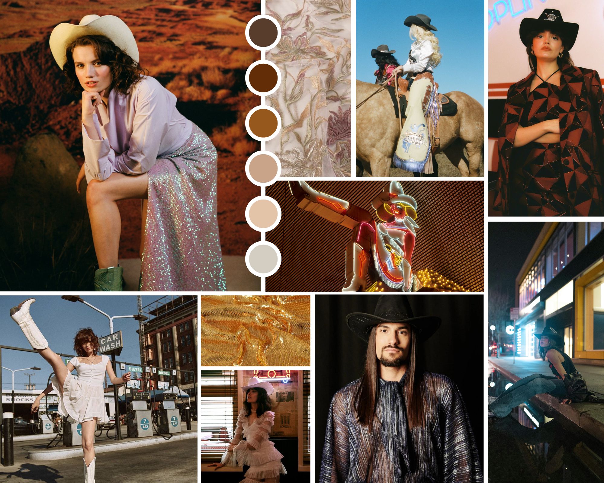
Collage cowboycore. Credits: Joplin Atelier, Free Form Style y Vanessa Mooney’s.
Every year we delight in a new microtrend that shakes up seasonal fashion in a whimsical way. The styling of an influential artist, the latest collection from a luxury brand, a revolutionary album, a blockbuster movie or the trends that accumulate the most hearts and likes on TikTok or Instagram. Social networks, which already create their own crushes, influence the creation of these passing trends that reach consumers like a gale and are established in editorials and fashion bazaars, also reinforcing themselves in the shop windows of fast fashion stores. Another phenomenon that confirms a microtrend is that as soon as they emerge, they disappear just as quickly.
If last year the fashion spotlight illuminated microtrends Barbiecore and Mermaidcore , inspired by the Mattel doll and the magnetism of mermaids, this spring season experiences a change of register, focusing on the aesthetics of Wild West cowboys. And yes, Beyoncé and her new country album have a lot to say about it. Indeed, the cowboycore style leaves the great American plains to capture the imagination of designers, celebrities and the general public with a contemporary interpretation of the western that renews style codes to get closer to the new generation, but maintains its hallmarks.
Why is cowboymania returning? The current resurgence of cowboycore can be attributed to a mix of nostalgia and a desire for authenticity. In an increasingly digital and globalized world, people seek to connect with styles that evoke a sense of history and tradition. Additionally, the trend toward sustainable and artisanal has made classic western garments, many of which are made from durable materials, even more attractive.
Origins of the trend
Cowboycore finds its roots in Western fashion, a recurring aesthetic in popular culture for decades. Classic western films, new adaptations, television series from the 60s and country music, with artists who capture the essence of deep America, have helped maintain this fashion that is perceived as a symbol of freedom and rebellion. Key pieces of this trend include all types of denim clothing, fringed leather and suede jackets, long ruffled dresses, and shirts with floral or check print motifs. As for accessories, country boots, wide-brimmed hats and belts with large metal buckles are essential. All this in a fusion of styles and other trends, such as glam and streetwear, creating unique and eclectic looks. This has been perceived on the streets of Milan and Paris among stylists and influencers who have worn their own interpretation of the cowboy – or cowgirl – aesthetic, coinciding with the main fashion weeks.
Cowboycore has been the protagonist in several fashion collections for 2024 and 2025, demonstrating its relevance and adaptability. Some notable fashion houses that have adopted this trend are, for example, Dior in its Pre- Fall 2024 collection, with fringed leather jackets and decorated cowboy boots. Also Balmain, with Olivier Rousteing incorporating elements of the microtrend in his Spring/Summer 2024 collection, fusing western aesthetics with glam and futuristic details. Calvin Klein reinterpreted the aesthetic in question with clean lines and a neutral colour palette, highlighting durability and classic style. Earlier this year, Pharrell Williams was inspired by the Old West and collaborated with Dakota and Lakota artists on his men’s collection for Louis Vuitton, filling the runway with turquoise stone bolo ties, pointed-toe cowboy boots (printed, by the way , with cacti) and worn jeans that looked like they had been worn during several rodeos. Finally, in the proposals of Ralph Lauren or Roberto Cavalli you can also find elements to the aesthetics of deep America.
 Credit: Joplin Atelier
Cowboy fashion among influential artists
Celebrities play a crucial role in its popularization. One of the most influential figures to showcase this trend is Beyoncé, who, beyond her new country music album, has incorporated the Wild West style into her stage costumes and music videos. Her ‘ Renaissance ‘ tour has witnessed numerous looks inspired by the trend, with a modern and glamorous touch, cementing her status as the queen of this fashion.
Artists like Lil Nas X and Miley Cyrus have also embraced the western aesthetic, combining western elements with modern touches. The American rapper has made this style a central part of his image, wearing cowboy boots and hats in his performances and music videos. Kacey Musgraves, a country star, has also popularized cowboycore, mixing traditional western elements with bright, futuristic details in her stage outfits. Her style has influenced both country and mainstream fashion.
The relationship between fashion and music is deep and symbiotic, and cowboycore is a clear example of this. Country music has been a constant source of inspiration for western fashion, and vice versa. Artists like Orville Peck, with his enigmatic style and cowboy mask, have brought the style to new audiences, fusing Western aesthetics with a more theatrical, but sophisticated touch at the same time.
The pop genre has also adopted elements with artists such as Billie Eilish and Post Malone incorporating cowboy boots and denim jackets into their personal styles, showing the versatility and universal appeal of this trend.
Beyond music
The impact of the microtrend extends beyond fashion and music, infiltrating other cultural spheres such as cinema, television and the visual arts. Recent movies and television series, such as “Yellowstone” and “The Power of the Dog “, have presented characters with styles that reflect Western fashion, contributing to its resurgence.
In contemporary art, the cowboycore aesthetic manifests itself in works that explore themes of identity, nostalgia and rebellion. Visual artists such as Richard Prince have incorporated elements of the west into their works, creating a dialogue between popular culture and high-end art.
These are just some examples of how this microtrend has demonstrated its ability to evolve and adapt to new contemporary languages, creating a unique fusion of styles. From the catwalks to the streets, and from music to art, cowboycore continues to influence and be influenced by various cultural spheres. Its enduring appeal and ability to reinvent itself ensure that it will continue to be a relevant force in fashion and beyond.
At Gratacós we have found in the current collection some fabrics that subtly refer us to this aesthetic. Here we leave you our inspirations:


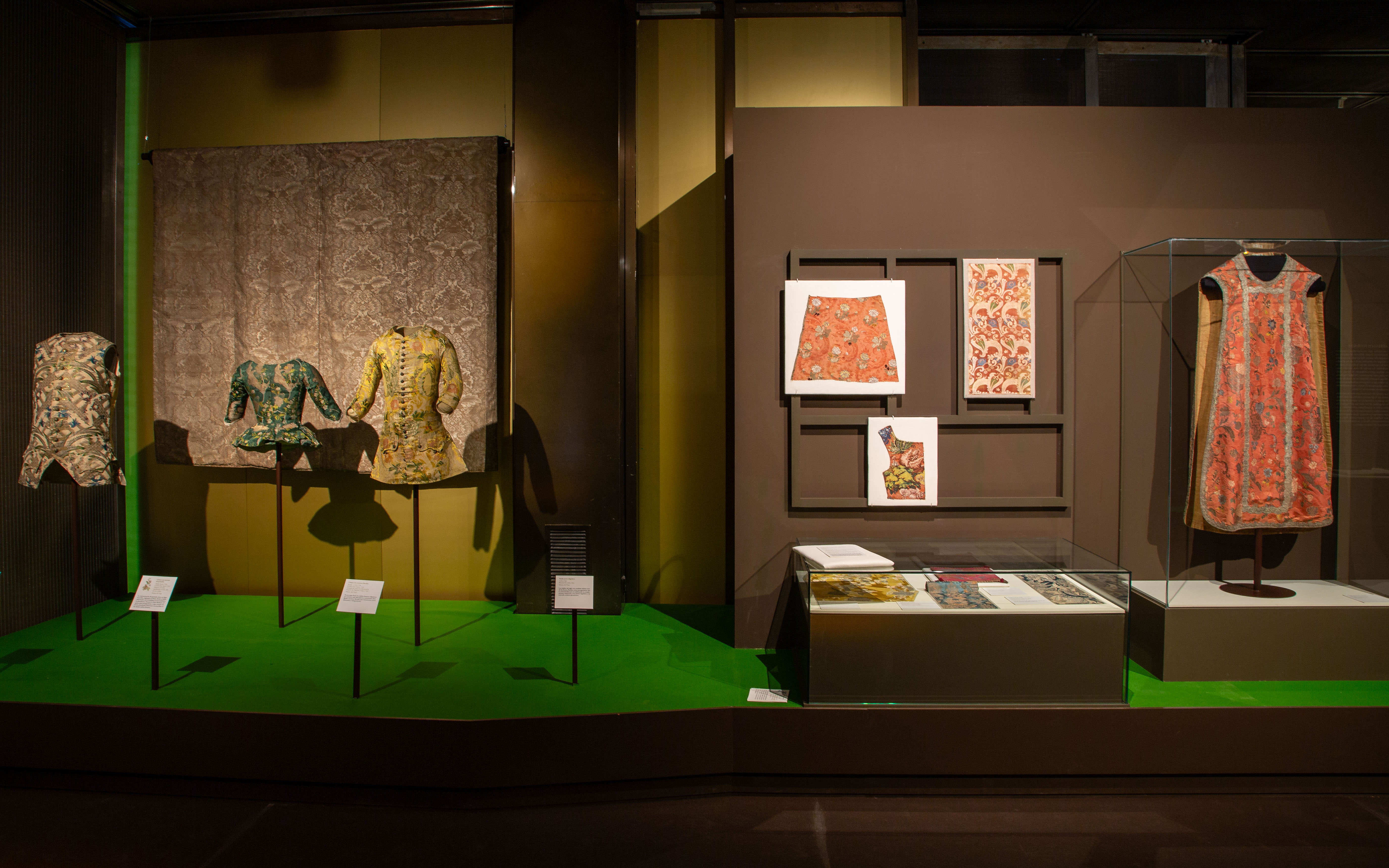
 Exhibition ‘Dressing a Garden’. All photos published are provided by: Museum of Costume CIPE.
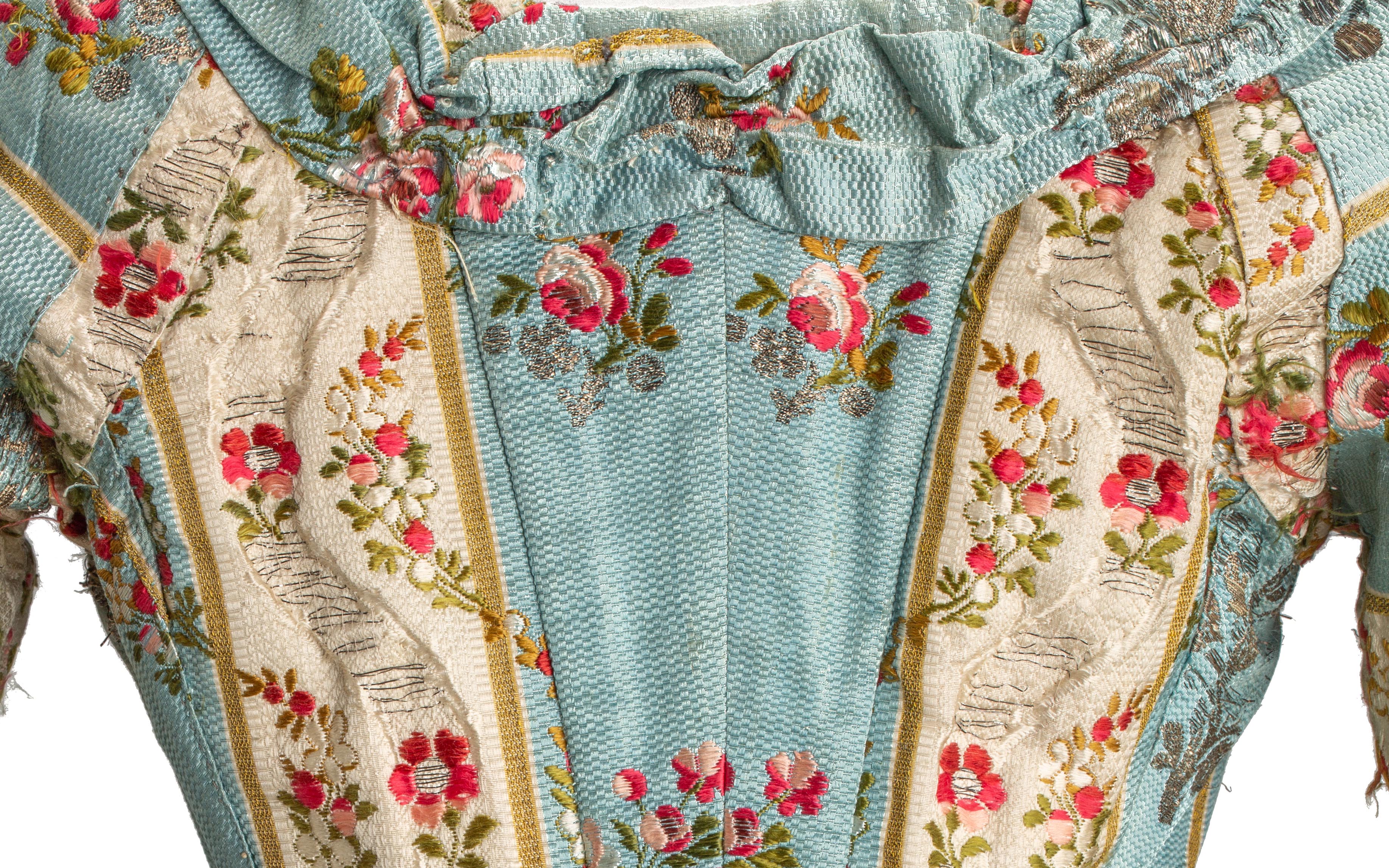
It has been a while since we recommended an exhibition, and we have just found a surprising exhibition that connects head-on with some of our most recurring inspirations and, specifically, with the floral theme of the 2024 Lookbook. The Madrid Costume Museum has just released the ‘Dressing a Garden’ exhibition, an exhibition curated by Gema Batanero that focuses on connecting nature with fashion through floral motifs as the backbone.
A historic binomial
Since ancient times, nature, and especially floral motifs, have been a constant source of inspiration for human beings. Like the self-portrait, flowers have focused attention and have become the first themes that humanity has captured in art and in all its cultural manifestations. This connection has endured over the centuries, especially in the field of fashion and interior design, where decorating with flowers meant a way of maintaining ephemeral beauty and union with the natural environment: the gardens, the countryside, the forests… In fact, each era has had its peculiar way of linking fashion and textiles with the language of flowers and doing so in an extraordinary way.
Starting from this historical premise, the exhibition “Dressing a Garden” at the Costume Museum explores how floral motifs in fashion evolved between the Baroque and the Enlightenment. This exhibition reveals how these floral representations reflect the profound changes in the relationship between humans and nature and the emergence of new artistic, scientific and philosophical ideas. Furthermore, the exhibition highlights how commercial exchanges and technological advances influenced the rapid transformation of these floral designs, making them a key testimony of the aesthetic taste of the 18th and early 19th centuries. Through the leitmotif of flowers, the exhibition also vindicates the study of creative and technical processes as a fundamental part in understanding the phenomenon of fashion, raising its transversality and continuous dialogue with different cultural fields.
 Detail of an 18th-century dress from the exhibition ‘Dressing a Garden’. All photos published are provided by: Museum of Costume CIPE.
Floral motifs in more than a hundred pieces
The exhibition includes around 120 pieces, the core of which are collections of historical clothing and textiles from the 18th century and part of the 19th century from the Costume Museum. These pieces are accompanied by documentary and bibliographic collections, painting, ceramics and decorative arts from institutions such as the National Prado Museum, the National Archaeological Museum, the National Museum of Decorative Arts and the Royal Botanical Garden.
The first stop on the tour is titled “The Forest of the Furies” and places the visitor in the 18th century with an explosion of textile creativity: unusual fabrics, also called furies, due to the passionate and vibrant character of their decorative motifs. The exhibition continues with “A naturalistic still life”, which shows how, during the 1830s, the fanciful bizarre vegetations gave way to much more naturalistic representations. Starting in the 1940s, “The Line of Beauty” marks the evolution towards the Rococo style, characterized by its lightness and refinement.
Next, “The Flowers of Enlightenment” addresses the development of Enlightenment ideas and the return to the ideals of the classical world, marking a profound aesthetic change with respect to Rococo taste. “Gardens of the East” discusses how indianas, a textile phenomenon from India and the Middle East, made its way to Europe. The note of bucolic celebration is provided by “A country party”, which addresses the genre of the gallant party in Rococo and alludes to the social enjoyment of the countryside. Finally, the tour culminates in “The Return of Spring”, a space that explores how the relationship with nature is a constant in the lives of human beings, and how floral motifs, although they experienced an unprecedented boom in the centuries XVIII and XIX, are repeated cyclically throughout the history of fashion.
The exhibition is completed by a catalogue created by the General Subdirectorate of Publications and Palaces and Museums, which further develops the areas covered in the exhibition. The exhibition ‘Dressing a Garden’ can be visited for free until September 29th at the Madrid Costume Museum. A good opportunity to delight in this inspiring pairing: nature and fashion.
We took advantage of the exhibition to bring out some of our floral fabrics, which maintain a similar dialogue with some pieces on display. Let’s give rein to our imagination!


Sorry, this entry is only available in Español.
Sorry, this entry is only available in Español.

The new SS24 collection is already blooming in all its splendor. We brought it to you at the end of February coinciding with the end of the winter sales, but now we provide you with all the details of this exciting proposal that was very well received when it was presented at Première Vision Paris.
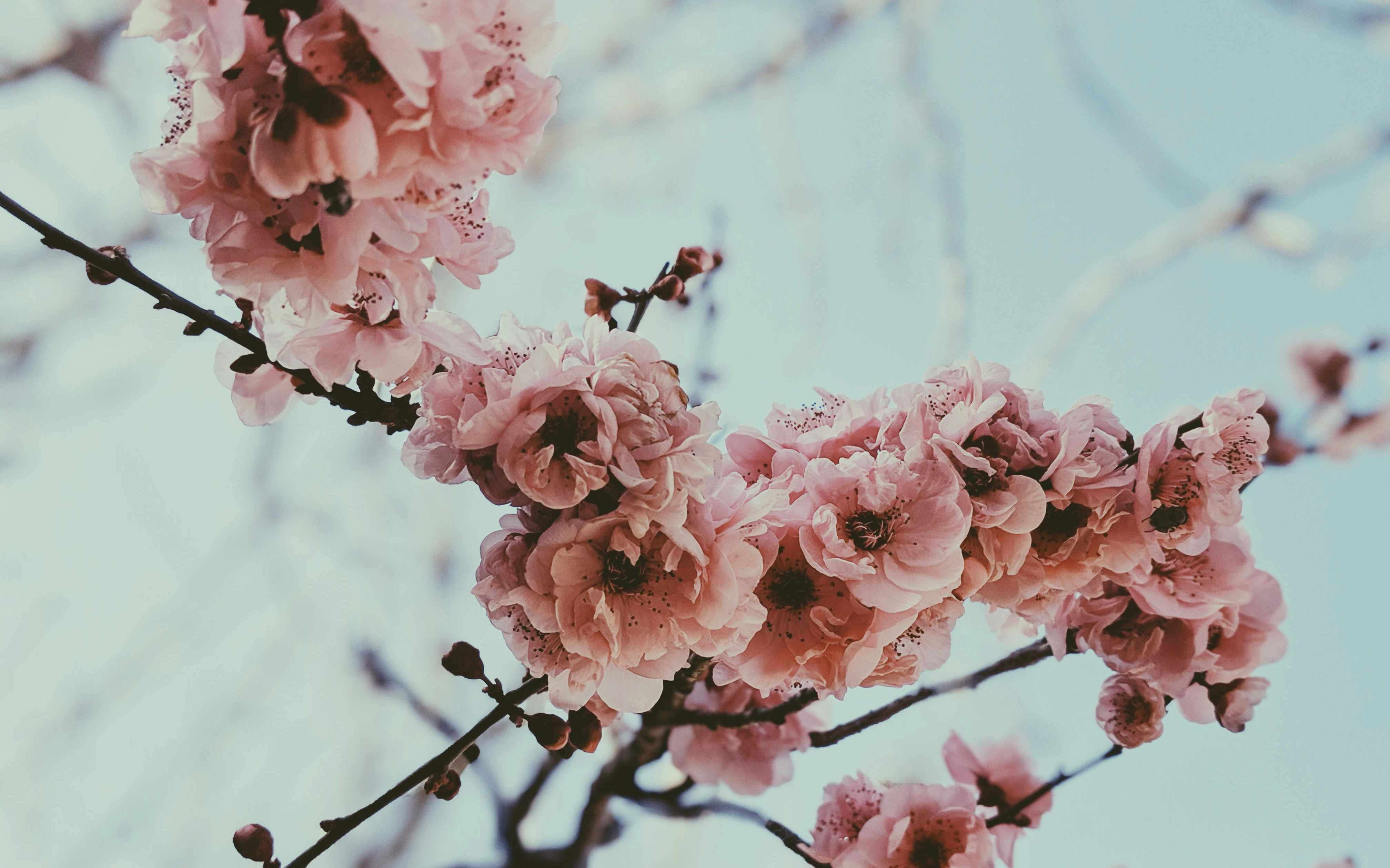
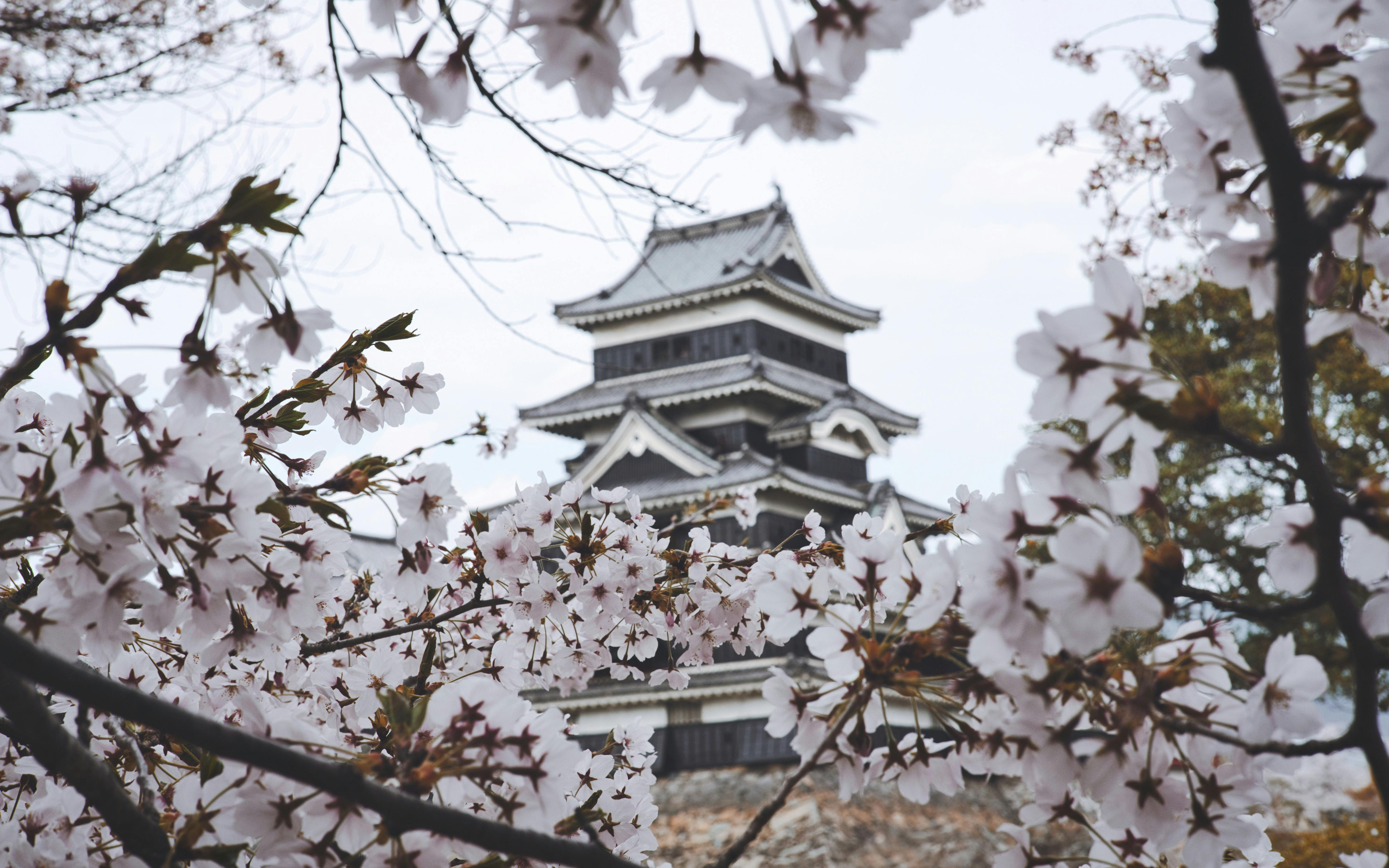
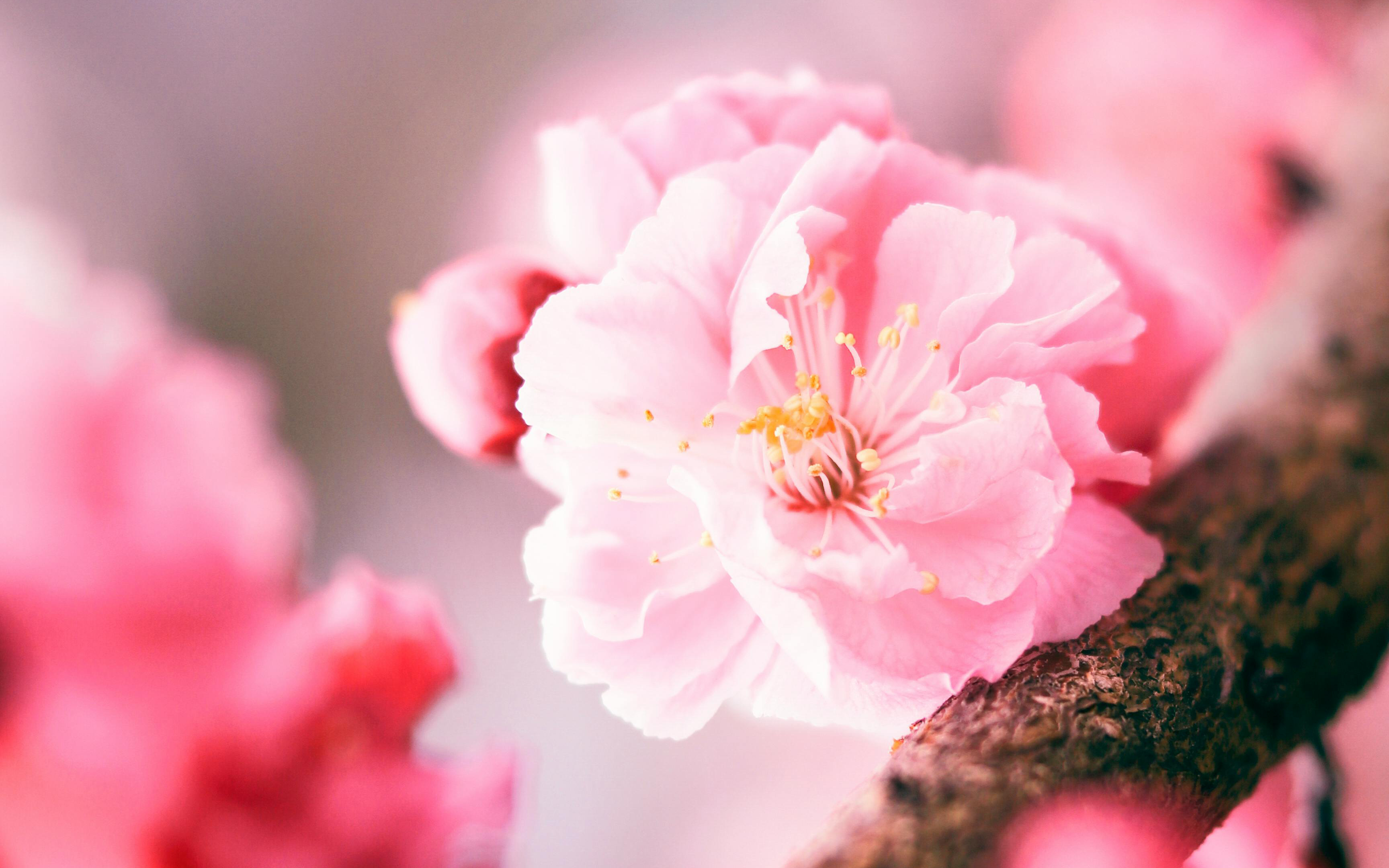
Under an inspiring concept, Hanami , the new collection focuses on the Japanese tradition of appreciating the beauty of flowers. This contemplative practice coincides with the beginning of spring and invites us to value the art of flowering. Hanami , which literally means “looking at the flowers”, carries with it a very representative image in Japan: that of the cherry blossom trees, known as sakura, which cover their parks and mountains with a pink mantle every spring for a very limited period that coincides with the beginning of this season.
This particular tradition dates back centuries, when the flowering of cherry trees marked the beginning of Spring and, therefore, signaled the ideal time to plant rice, a crucial food for the Japanese. During this period, cherry trees were considered sacred beings and the souls of the mountain gods were believed to reside in them. According to local beliefs, when the pink sakura flowers were in full bloom, the deities would come down to the villages and turn into rice fields to assist in rice production. Nowadays, with each new flowering season, thousands of Japanese gather under cherry trees, whether in parks, gardens or mountains, and enjoy a picnic surrounded by sakura, while a shower of delicate flowers turns everything pink.

Broadly speaking…
Returning to the proposal, the new Hanami collection maintains this double duality: it invites us to pause and reflect, but it is also a moment to let ourselves be carried away by fantasy and the evocative power of nature, activating all our senses.
This season, flowers are the clear protagonists of the collection, but we go much further. Plant motifs, organic reliefs, natural volumes and prints inspired by the wild nature of the fields or the multicoloured flora of urban gardens, all taken care of in detail. From the precious work of the botanical architects to the sensitivity of the signature florists, all of this makes up a poetic, stimulating and bold collection that appeals to emotions through creativity. At Gratacós, we do not understand fashion without art and culture, and we make craftsmanship one of our fundamental pillars.
Summer 2024 collection in detail, the colour becomes more vivid and bright, playing with different harmonies that reflect the light and contrasts present in nature. The fabrics are carefully selected in terms of materials, composition and combinations that recreate organic shapes. We once again give a new dimension to quality, because it is a necessary, clear and real value that distinguishes us.
“We don’t understand fashion without art and culture, and we make craftsmanship one of our fundamental pillars.”
Colours
The Gratacós proposal immerses itself in a world of colour, where various harmonies intertwine to create fresh and dynamic combinations. The contrasting colour palette will transform the fabrics, offering a richness of nuances that will energize the final results. The colours selected to star in the new season will give life to poetic, timeless and versatile collections, transmitting feelings through an intriguing interaction of strength, femininity and beauty, captured in the different textiles.
These colours transport you to a magical landscape, evoking a digital Eden where precious tones work with a enticing freshness of cold light. In times of uncertainty, who doesn’t yearn to use the power of highlighter pink, yellow, blue or green in a sheer frou-frou dress to experience a moment of happiness?
Fabrics
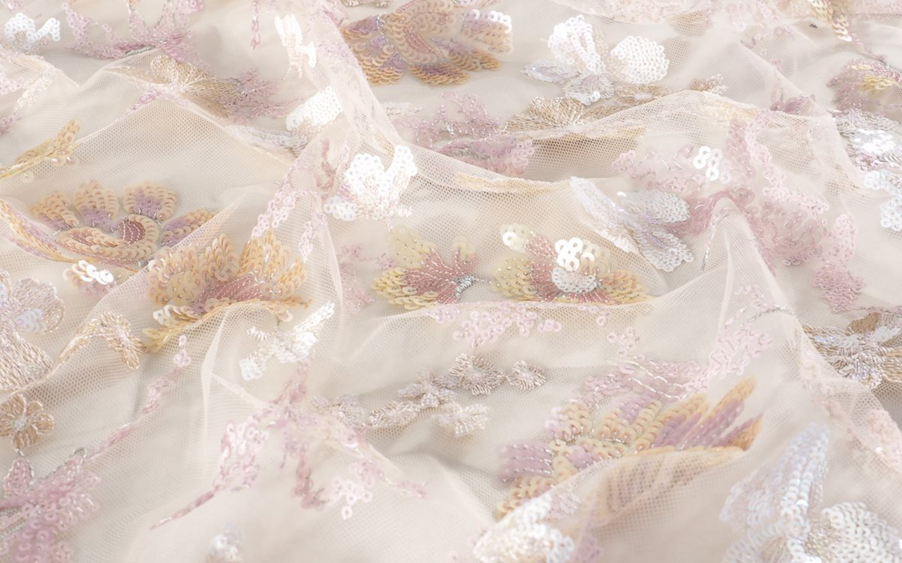
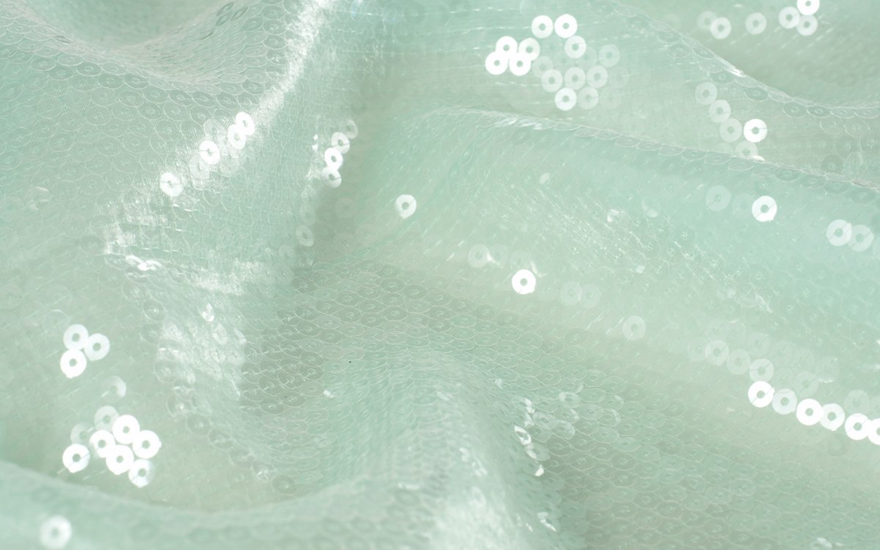
This season, the pleasure of creating and designing will be our impetus to develop new highly crafted fabrics with a sophisticated look. Our fabrics will be characterized by a renewed importance in the quality of the products, seeking a necessary and real authenticity. We have opted for soft lines, using light and transparent fabrics adorned with sequins to evoke the shine and clarity of water. This sense of summer vibrancy is reflected in graphic bursts of colour that extend throughout the collection.
Transparency will play an important role, conveying a fragility that is only apparent. For this reason, we have created light fabrics in various versions and transparencies, with sophisticated effects for a line of products with sweetened fantasies.

Aspects
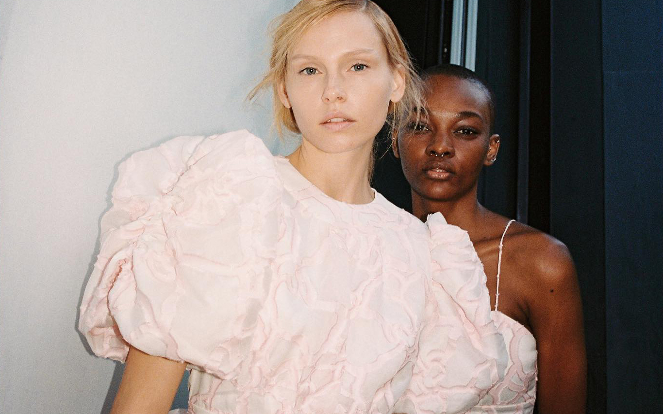
This season’s fabrics magnificently explore texture, with volumes that are delicate in appearance, but solid in their construction. The creative department has worked to give the items a three-dimensional dimension, taking advantage of the twists of the yarns and the fantasies of the threads with a more organic appearance. The importance of the reliefs and embossed finishes stands out, with ultralight padding ideal for summer.
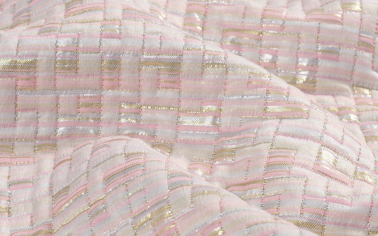
Jacquard takes on a leading role this season, presenting repetitive geometries and designs with sequential rhythms without interruption. We often overlook the technical complexity of small motifs, which is why it is crucial to revalue them. In addition, we have worked to create laminates with beautiful and sophisticated reflections, amplified by light to obtain a striking and elegant shine. In both jacquards and embroidery, the result will be dazzling, with shiny surfaces thanks to lame, iridescent threads and sequins.
The embroidery technique, as a universal method of beautification, is back in fashion. They bloom into unexpected and beautiful creations, with free settings and vibrant, fresh colours.
Designs
Overall, geometry will continue to be a prominent theme this season, especially as we explore flat and smooth handcrafted geometries, infused with special touches to create essential ingredients for this upcoming summer. The graphics in general will be soft, fresh and exquisite, with careful work on the designs.
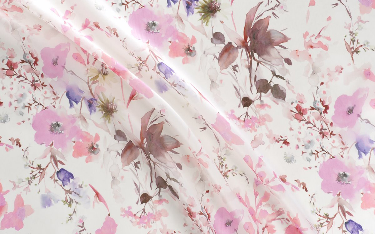
Florals will play an important role, like a sweet perfume that permeates the entire collection, through the abundant and varied use of floral prints. Botanical motifs centered on leaves, vegetal ornaments and ambiguous jungles will also be highlighted.
Finally, in this new season, it is essential to mention the influence of art in the designs of the collection, as well as the influences of the metaverse, which present natures that hybridize between the real and the digital.
From Gratacós we invite you to discover Hanami , our particular Eden.


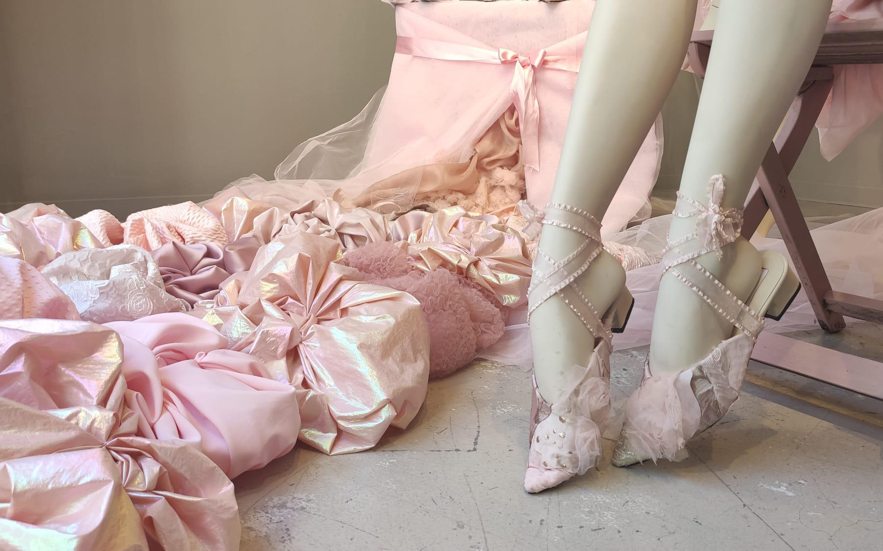
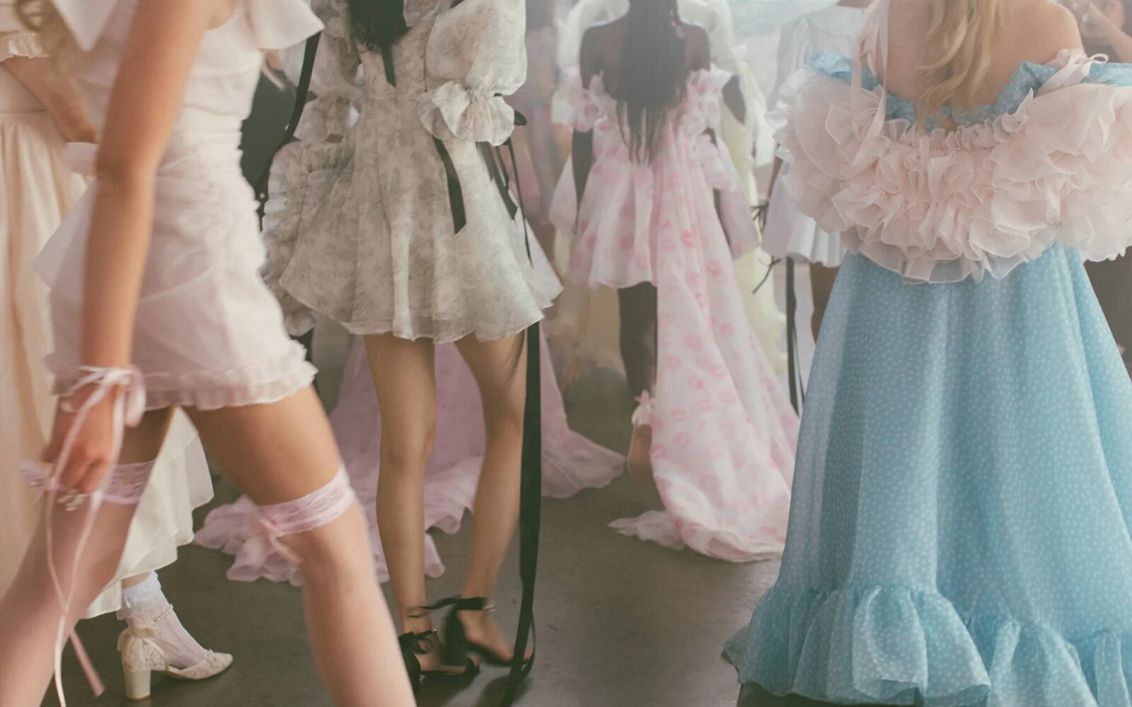
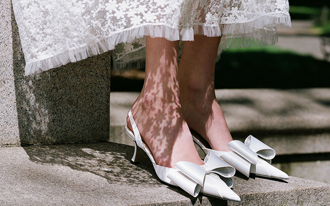
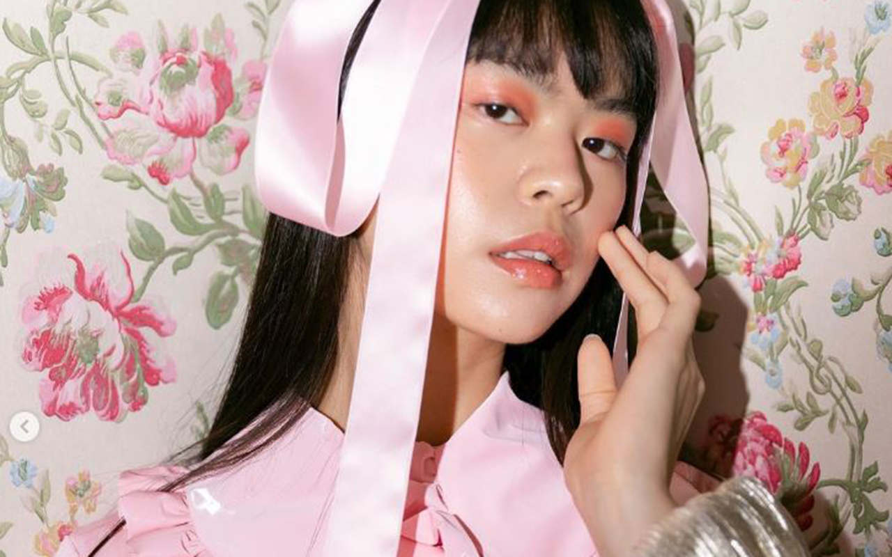
Bows, ruffles, pastel tones and baby doll dresses merge to elevate a hyperfeminine style with a baroque soul that seeks artificiality. Maximalism is displayed in all its splendor. We are referring to the coquette aesthetic , whose reign seems to have no end in sight, at least in this spring-summer season that we have just begun. Although this trend is not really new, in recent months it has reached a notable level of virality on social networks, specifically on TikTok in early 2024. With the hashtag #coquette, this instant video platform, which especially captivates the Generation Z, accumulated more than 18 billion views. This figure far exceeds its main competitor, Instagram, which registered nearly 1.5 million related publications.
This phenomenon shows how an aesthetic that seemed relegated to oblivion, with the exception of certain Japanese urban tribes, resurfaces strongly and is once again at the centre of attention of current fashion. We already know that the new generation of young people is fascinated by the nostalgic element, in a phenomenon that experts have described as an aesthetic revisionism of past trends.

Coquette style identified ?
Among all the descriptions offered to define this style that perfectly fuses femininity, innocence, sweetness and softness, the one provided by stylist Marisa Ledford in People magazine stands out, who describes it as “a hyperfeminine style that refers to the Victorian era. of the Regency, where doll dresses, ruffles, bows and pastel colours are the distinctive elements.”
This hyperfeminine trend experienced a rebound in 2010, coinciding with two cultural phenomena that generated great interest for months and that, in turn, fueled the fashion industry: the premiere of the film ‘ Marie Antoinette ‘ by Sofia Coppola and the rise of Lana del Rey as one of her main style icons. In fact, the singer and songwriter was on everyone’s lips again recently thanks to the campaign she starred in for the brand Skims to celebrate Valentine’s Day. This campaign included all the references that identify the flirty trend: abundant bows, transparencies, cats and delicate fabrics such as satin and lace.
Recently, another cinematographic phenomenon has given new impetus to the hyperfeminine and, incidentally, hyperbolic style: the Oscar-winning science fiction film, ‘ Poor Things ‘ , which has won, among other distinctions, the award for best costumes. This film characterizes its main character, Bella Baxter, as a Victorian woman with a wardrobe that revolutionizes the classic by maintaining a contemporary look that is reflected in each of the eccentric and stimulating looks in terms of shape, volume, relief and colour. Creations such as dresses with ruffles and puffed sleeves, Victorian bloomers, long silk robes or lavish nightgowns leave the viewer speechless and are reminiscent of the style in question: flirty is captivating.

On the other hand, the fact that this trend is still more alive than ever is also corroborated by fashion brands that make the flirty style their usual hallmark. For example, in its spring-summer 2024 collection, Rodarte was inspired by a flower garden and the silhouettes of the 1930s. Likewise, Simone Rocha presented for the same season voluminous bows, lace, tulle and flowers such as main elements of its collection, both in its feminine and masculine proposal. It is not necessary to review the trends of big brands, since small designers also opt for this style that enhances girlish femininity. For example, the creations of Quique Vidal through Becomely , his fashion alter ego, or the fantasies of Anel Yaos . In the collection presented last year on the 080 Barcelona Fashion catwalk, there were clear allusions to this aesthetic in a proposal that explored the most personal feelings through chiffon, transparencies and pastel tones.
Historical origin of the coquette aesthetic
The word ” coquette ” comes from French and means flirty. As a style, it takes elements from 18th century clothing, with a strong inspiration in the late Rococo of Queen Marie Antoinette, from which it incorporates decorative elements of clothing such as bows and lace. Likewise, it is based on the “infamous” chemise à la reine dress , a garment generally made of cotton and used as underwear, but which Marie Antoinette transformed into semi-transparent muslin, with ruffles on the chest and sleeves, with which The queen decided to spend her days in the countryside.
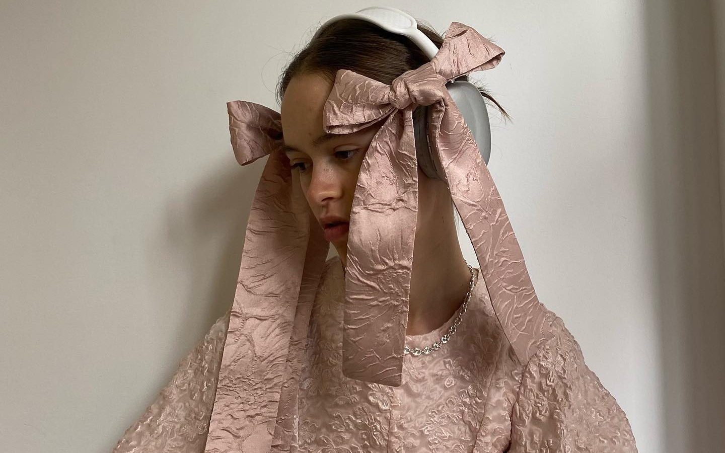
Perhaps the most iconic element of the style coquette, or at least the easiest to distinguish, is the bow or bow, which is used in both hair and clothing. This use dates back to the fashion of the romantic period, at the end of the 18th century and the beginning of the 19th century, when after the revolutions and the rise of the Republics, femininity became relevant again. This was reflected in the clothing and the decorations in them as an element associated with social class, since for the most part there were no longer monarchies.

A trend rooted in the street
Although these origins date back several centuries, their arrival in current fashion is framed in the revisionism of Generation Z, which now resorts to various aesthetics from the 90s and 2000s. Another factor that contributes to the triumph of this style It is how he has conquered urban looks. Thus, far from being saturated, they are the influencers themselves and fashion prescribers who star in street images style most talked about and, they certainly don’t seem to be tired of this trend. During the last fashion show season, it was not difficult to find references to this trend: bows adorning all types of garments, whether more or less extravagant, more or less romantic, present in the hair and even attached to the face, as well as allusions to the universe childish, such as the usual combination of shoes with openwork socks and bows, and the pastel colour palette. Without forgetting the red carpets where Hollywood stars parade. In fact, the flirty style has also starred in some looks at the 2024 Oscars celebration . This is attested to by the stylists who dressed actresses like Ariana Grande, who dazzled on the red carpet with a puffy pink number with a strapless neckline and train by Giambattista Valli Couture. Also Chloë Sevigny and Sofia Vergara, who wore flirty bows at the Oscars after- parties.
At Gratacós, we also wanted to pay our own tribute to the coquette style with a selection of our new season fabrics, so that you can be inspired and create your own designs within this very feminine, fanciful and girlish aesthetic.


Sorry, this entry is only available in Español.

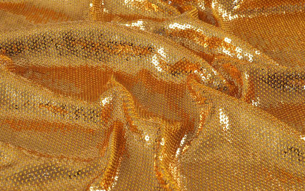
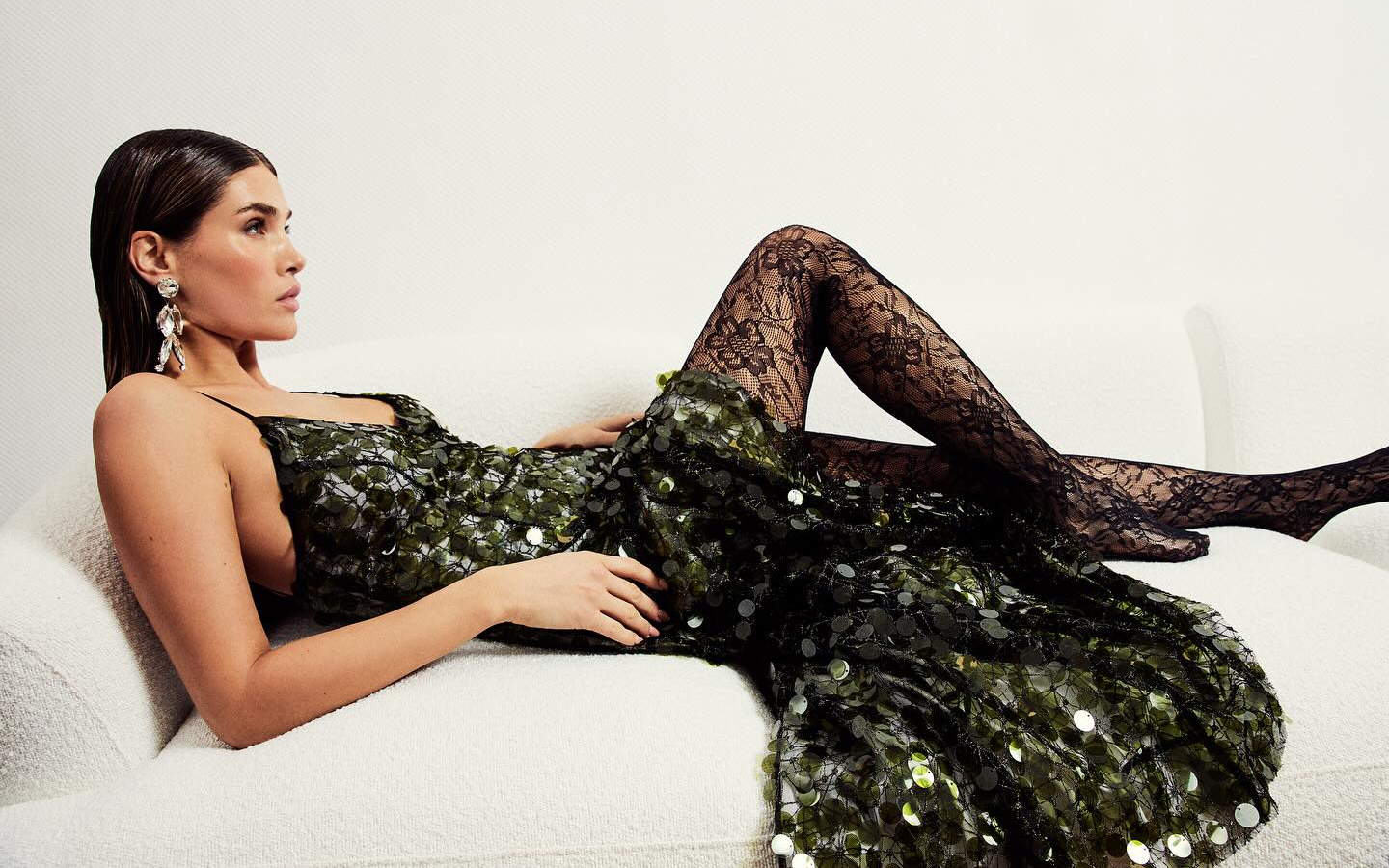
A stunning sequined dress by Acuamona.
Although we appreciate all fabrics equally due to their uniqueness, we recognize that there are certain items that best stand the test of time and become a smart investment for any time of year. Taking advantage of the last weeks of discounts on our winter collection, Gratacós presents you five items that do not lose their relevance, despite the ephemeral trends. In addition, now you can find them at more attractive prices in our outlet section
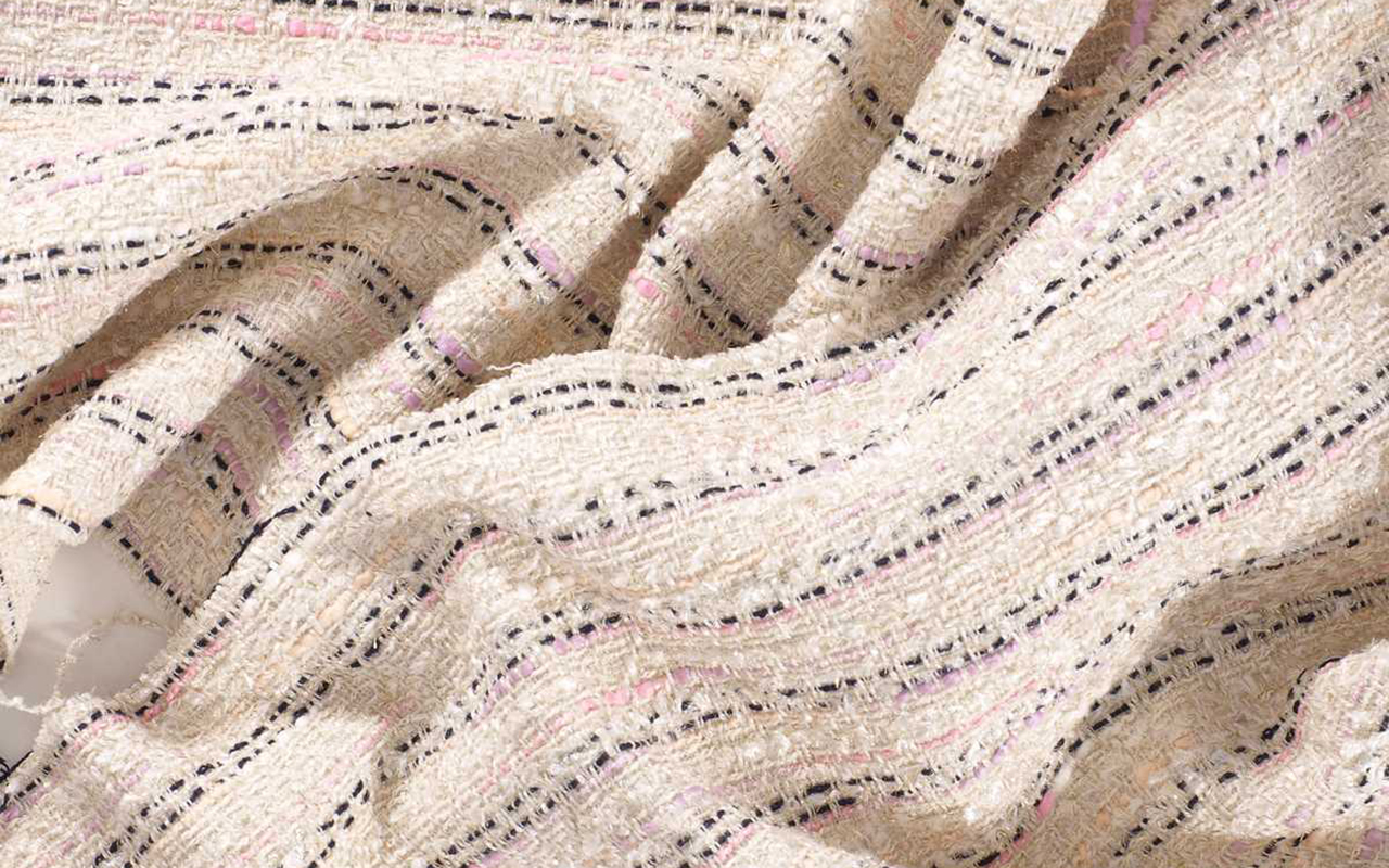
Tweed
This fabric stands out for its extraordinary richness in every imaginable aspect: it has a historical legacy that dates back to the Scottish Highlands; It is a wild card in constant evolution; It is easily recognizable at first glance and is inspired by classic elegance, while exhibiting a chameleon-like character that allows it to adapt to more contemporary versions. What more could you want?
It is a fabric wool fabric with an irregular appearance, a rough feel, openwork and elastic texture, with well-defined patterns such as houndstooth , windowpane and herringbone . This item is easy to sew and iron, offering a versatility that can transcend the limits of gender, or rather so, does not have limits.
Of modest origin, tweed comes from Scotland and was a common fabric in the warm clothing of the popular classes, used in the countryside to face adverse weather conditions. In the 19th century, the English aristocracy found in this fabric their best ally for carrying out country activities and outdoor sports. The person who knew how to give tweed an aura of glamour was, without a doubt, Coco Chanel, who in the late 1920s incorporated it into the women’s wardrobe in garments that have become symbols, such as her short jackets or pencil skirts. This fabric provided the woman of the time with extra comfort without losing an ounce of elegance.
Discover all our seasonal tweeds.

Mikado
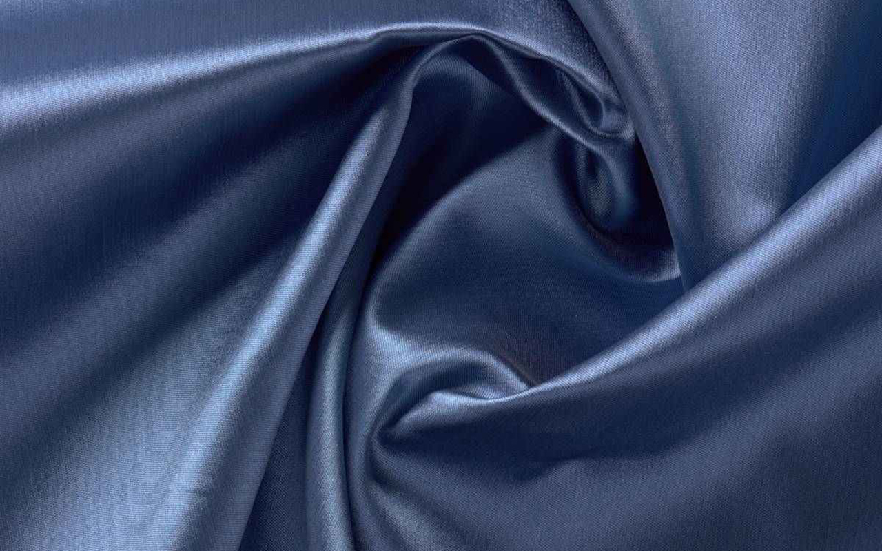
The mikado is a textile jewel that is distinguished by its exclusivity and sophistication, enclosing with it an ancient history. Originally from Japan, this fabric has managed to captivate designers thanks to its uniqueness and its ability to transform seemingly simple garments into authentic works of haute couture.
We start with his name. It means ’emperor’ in Japanese, a title that reflects its royal splendor. Mikado is produced through a special manufacturing and finishing process, giving it a luxurious appearance and a firm structure. Initially intended for making imperial kimonos and other ceremonial garments, the mikado symbolizes nobility and elegance. Given this rich symbolic load, it is not surprising that it is currently one of the most used and demanded fabrics in the bridal field.
Mikado is distinguished by its heavy structure and slightly shiny surface, giving it an opulent look and distinctive feel. Often composed of silk, this fabric stands out for its softness and the ability to create elegant folds. Additionally, its ability to maintain its shape makes it the ideal fabric for making couture dresses that require volume and structure.
Find our mikado proposals. From smooth designs to floral or geometric-inspired motifs.

Sequins
This fabric does not need presentations. Sequins are the true protagonists of women’s wardrobe, displaying their brilliance throughout decades. Whether day or night, on any occasion, sequins add luminosity and are linked to luxury and glamour.
Its historical legacy dates back to ancient times, when these tiny shiny pieces were used in clothing in Ancient Egypt, adding sparkles to the clothing of that era. However, their revival occurred in the 1920s, during the Jazz Age and the swinging twenties, becoming symbols of opulence and sophistication. Its heyday came in the 1930s, when Hollywood stars began wearing dresses decorated with this fabric on red carpets. Since then, sequins have been synonymous with glamour and a certain extravagance. World-renowned designers, from Coco Chanel to Versace, have incorporated this shiny fabric into their creations, cementing its status as a timeless element in luxury fashion.
What defines sequins is their ability to transform any garment into a masterpiece of shiny elegance. These small pieces, usually made of metal, plastic or reflective material, are sewn into patterns to create a dazzling visual effect. Its shine, often associated with the light of gala evenings, has been an essential component in evening fashion and haute couture.
Today, sequins have transcended festive occasions, conquering urban fashion with contemporary proposals that adapt to any style.
Find the sequins that suit your style.

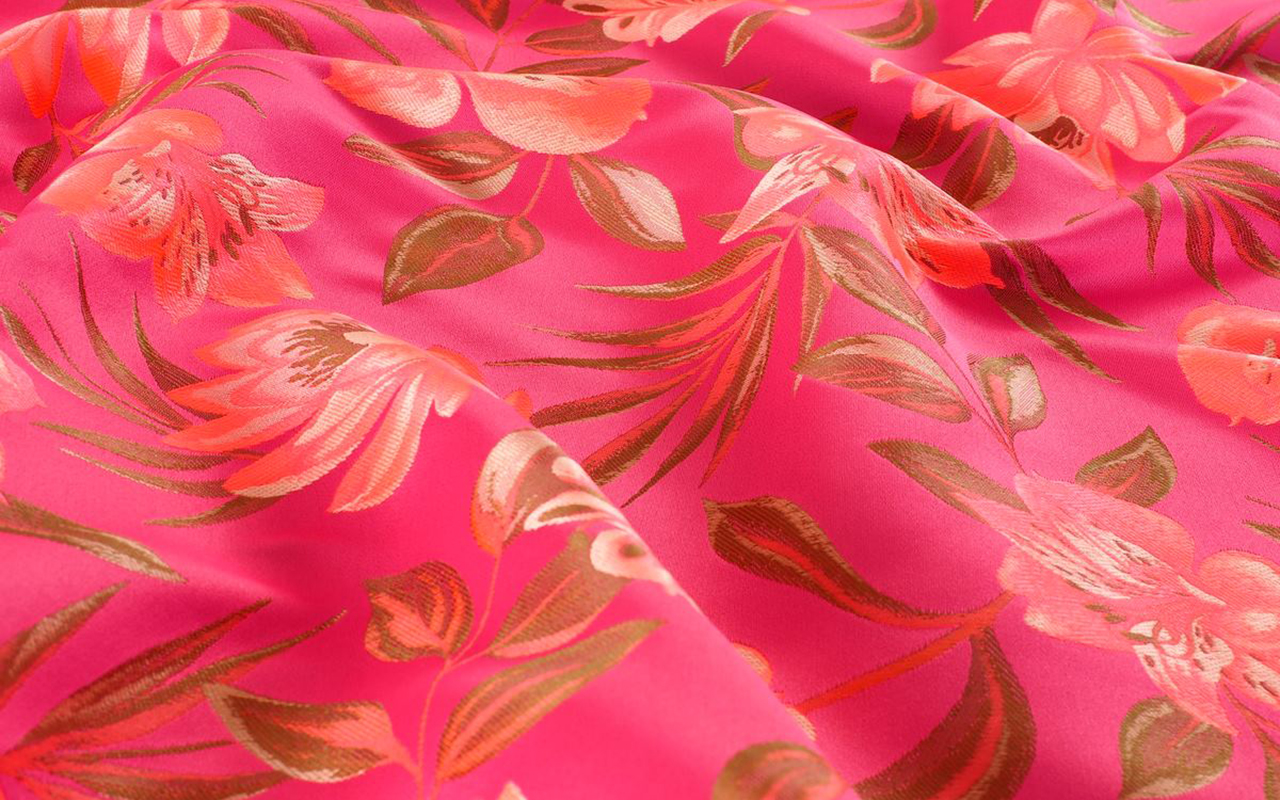
Floral jacquard
Floral Jacquard is a textile masterpiece that fuses technical skill with elements inspired by nature. Originating from France, this fabric is distinguished by its elaborate relief pattern. The key lies in its technique, named after Joseph Marie Jacquard, which has left a distinctive mark on the history of fabric making, becoming a symbol of luxury and sophistication.
In the 19th century, its inventor introduced an innovative weaving machine that revolutionized the textile industry by allowing the creation of intricate and detailed patterns. This pioneering technology took fabric manufacturing to new levels, enabling the precise reproduction of ornamental motifs and complex designs.
What makes Jacquard weaving unique is its ability to generate raised patterns with a variety of colours and textures. This process is achieved by carefully combining threads of different colours and types, creating a three-dimensional work of art in each thread. The resulting texture is rich and luxurious, providing a unique visual depth to the fabric. Jacquard has also earned its place in the fashion world thanks to its versatility in design. From haute couture suits to more casual garments, Jacquard has spread into a wide range of garments that incorporate everything from geometric patterns to the most exquisite floral motifs.
Add a touch of romanticism and femininity to your creations with these floral Jacquards.

Houndstooth
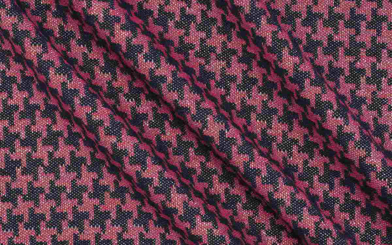
The houndstooth fabric is one of those timeless classics that resists ephemeral trends to become a symbol of elegance and style. Its history dates back to the 19th century in Scotland, where local weavers created it with care. Initially known as houndstooth , the pattern is distinguished by abstractly shaped blocks that evoke the footprints of a rooster. Over time, this pattern transcended Scottish borders, becoming an iconic element in global fashion.
What gives houndstooth pattern items their distinctive appeal is their ability to combine simplicity and sophistication. Typically composed of repeating black and white blocks, the pattern creates a bold and balanced visual effect. The versatility of this fabric is manifested in a wide range of garments, from suits and coats to skirts and accessories, adapting to both formal environments and casual outfits. From the catwalks to the streets, houndstooth continues to be a stylish choice that evokes an air of classic sophistication.
At Gratacós we recommend this houndstooth fabric.

 The Olympic Issue. A stunning editorial by Mariano Moreno and Vogue World Paris 2024.
