Miércoles 08 septiembre 2021
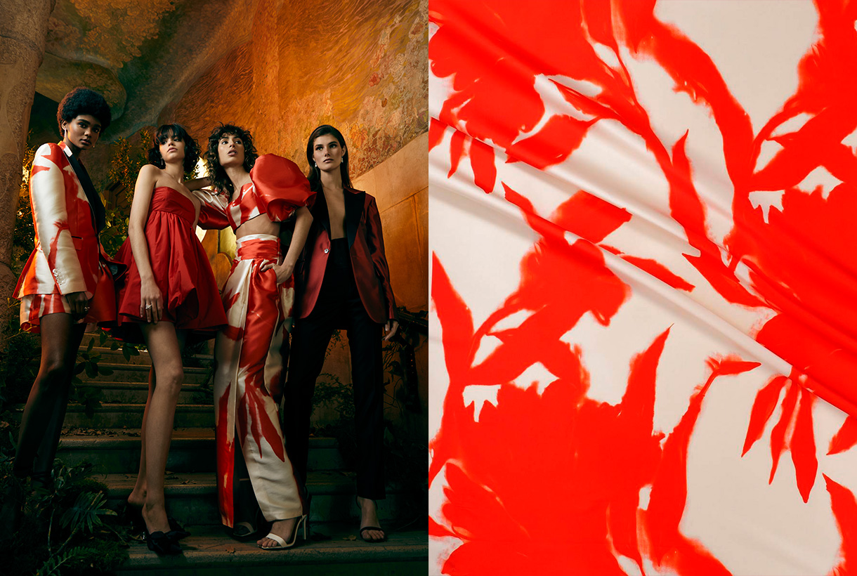
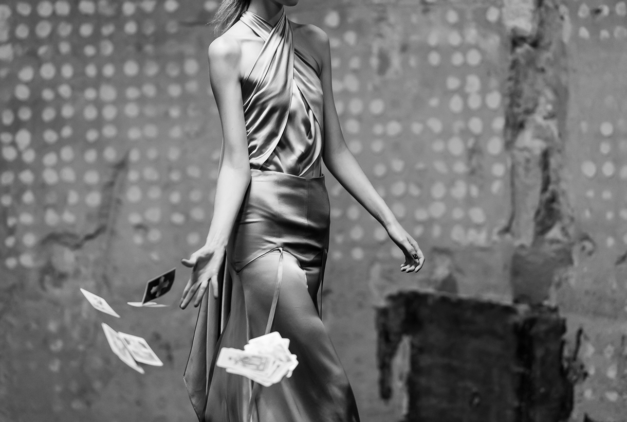 It was to be expected! Within its cyclical nature, fashion evokes fantasy after having spent almost two years stuck in comfort and austerity, two values influenced by the global pandemic. Remember that fashion is always a reflection of society. Thus, the reign of tracksuits, sweatshirts, pyjamas and slippers (whether they are at home or not), seems to be coming to an end with new inspirations that are postulated totally antagonistic: More luxury, more ornamentation and of course, more shine in festive garments and collections that cry out to escape from reality.
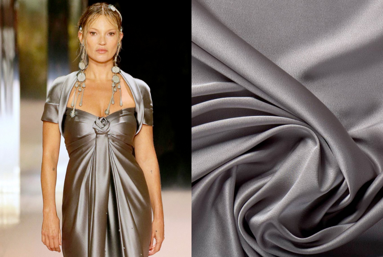
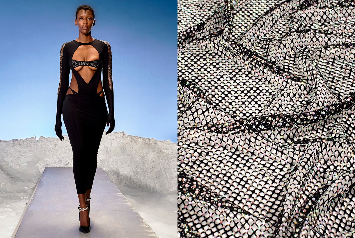
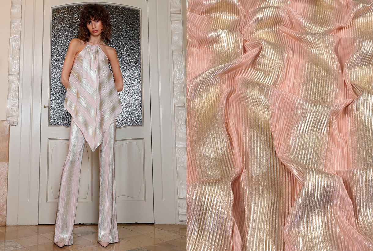
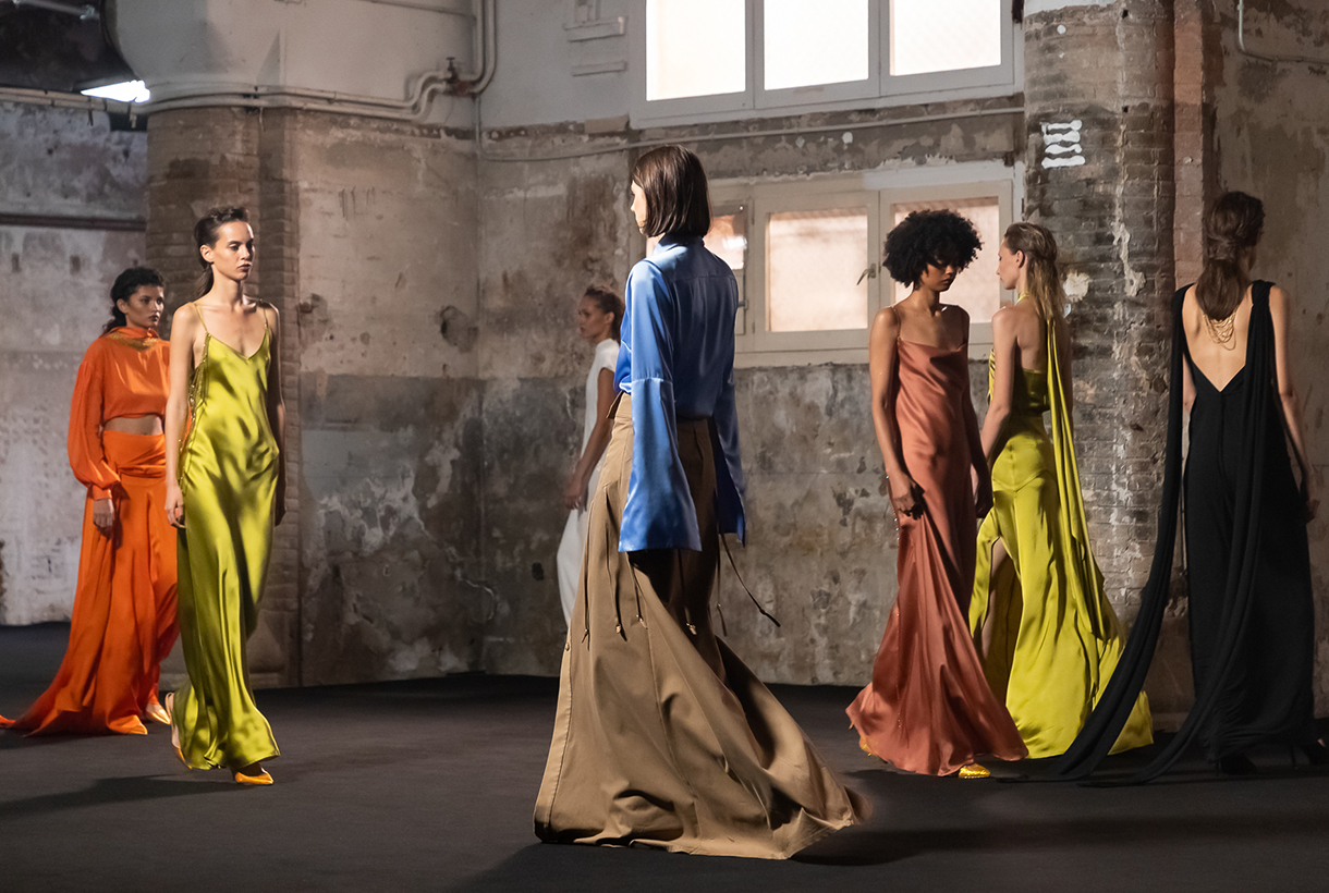
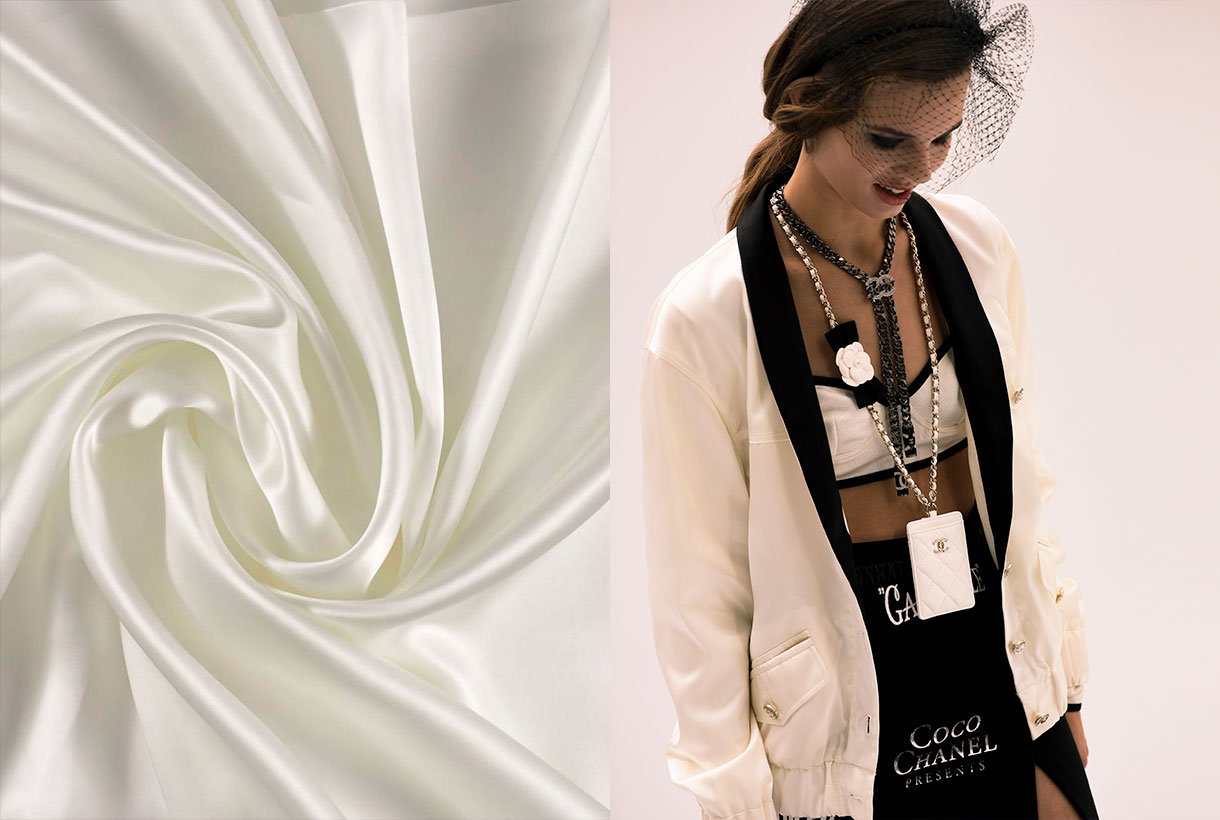
Of the three maxims, we want to focus on shiny fabrics as one of the trends that is going strong this Fall- Winter 21/22 season that we will premiere in September. Beyond the sequins that have had huge success as from now on and arrive in their most ostentatious version ( sequins on sequins in pants, jackets and voluminous dresses ), we want to talk about satin fabrics, one of the great bets of the new collections that we have seen in garments, shoes and bags and whose subtlety and sumptuousness continues to inspire us when it comes to making our fabrics.
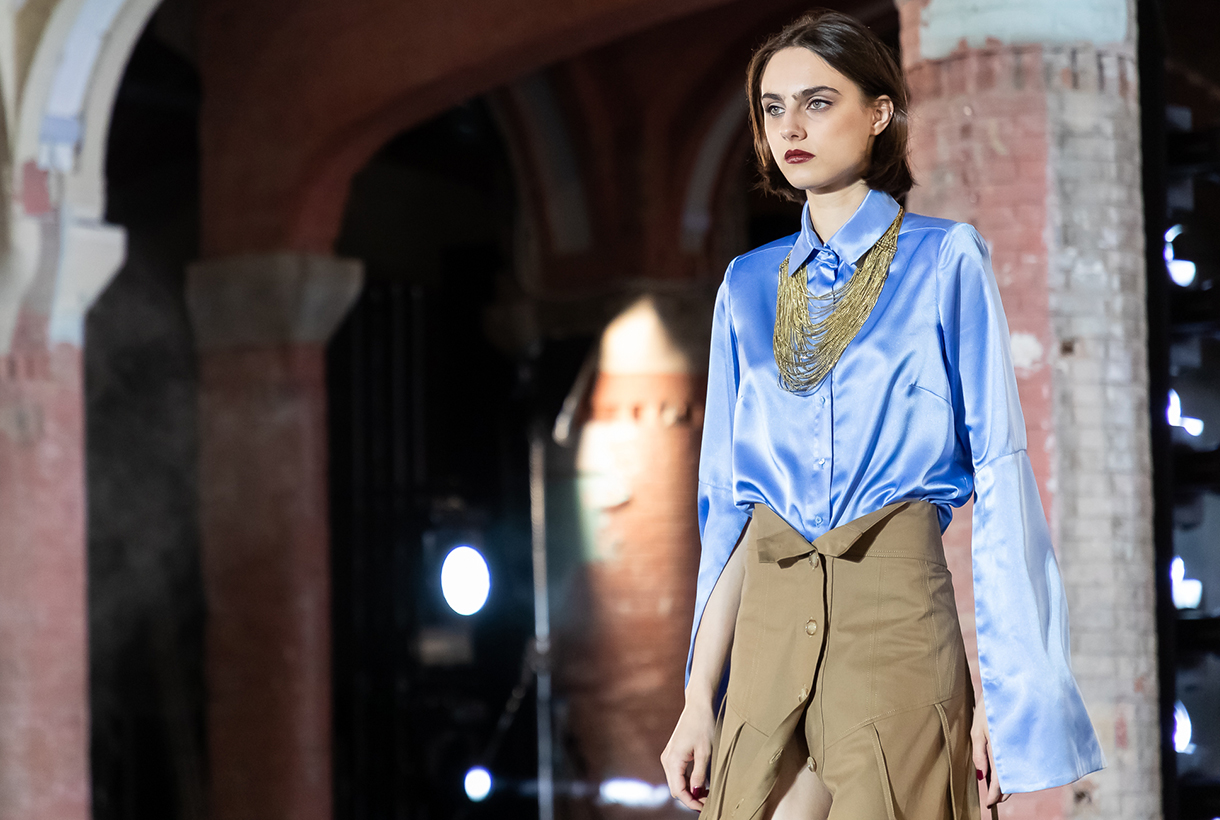
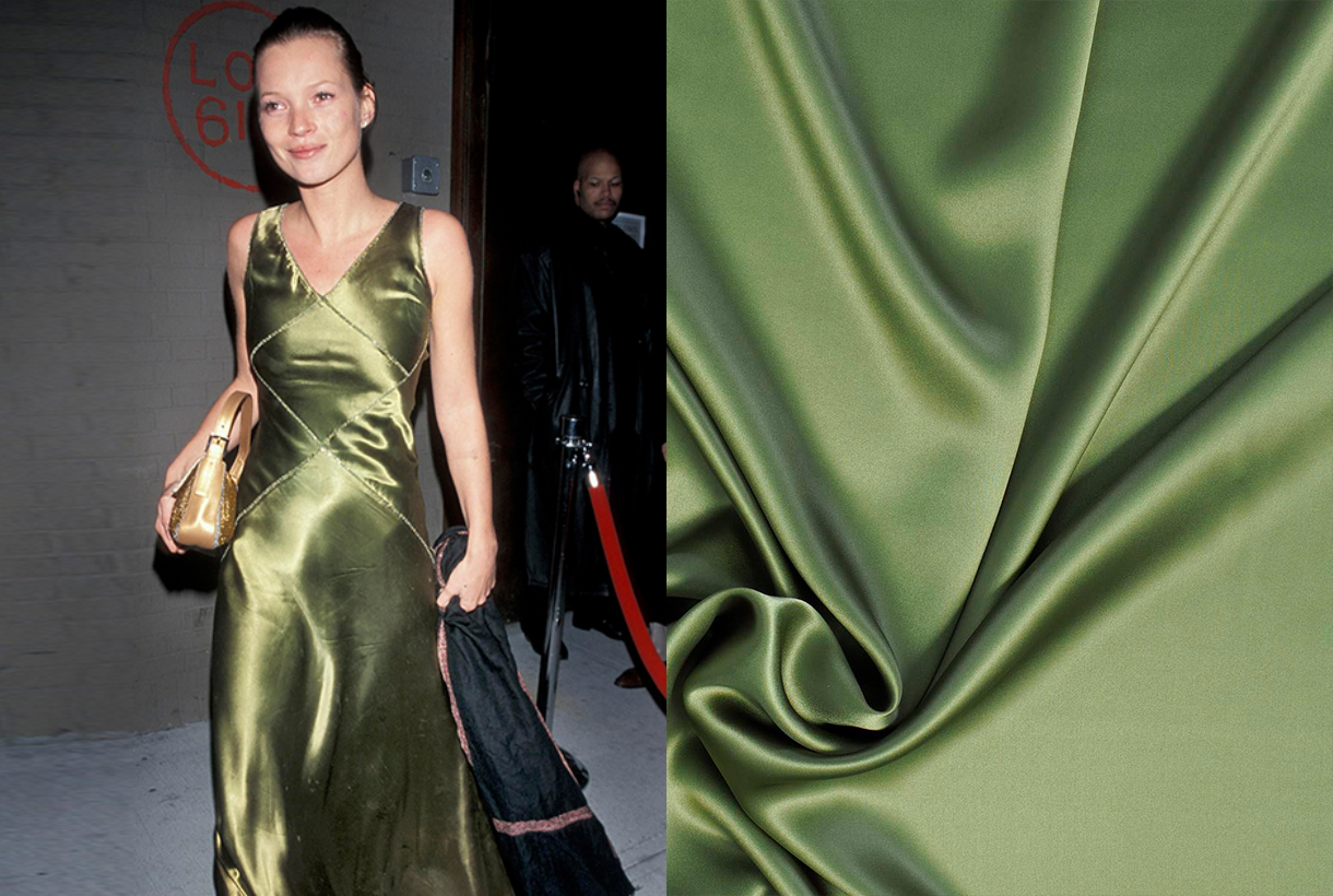
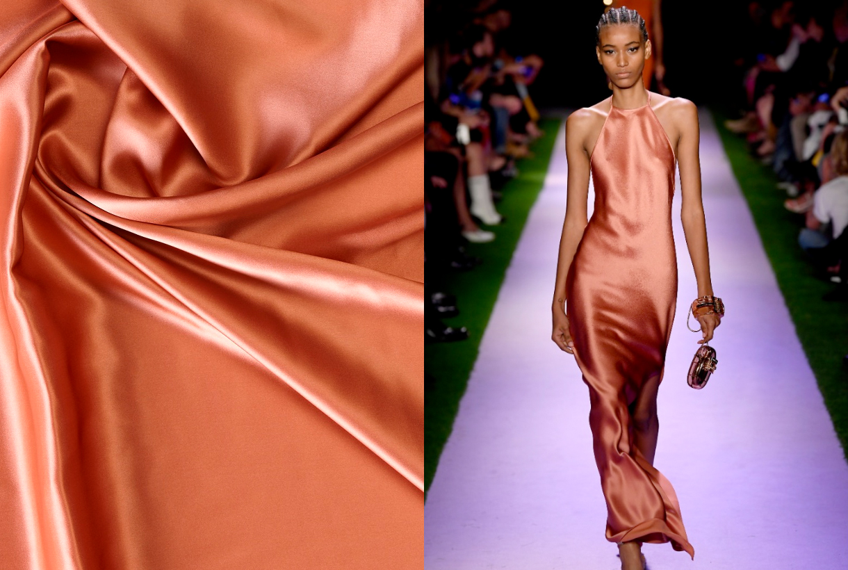
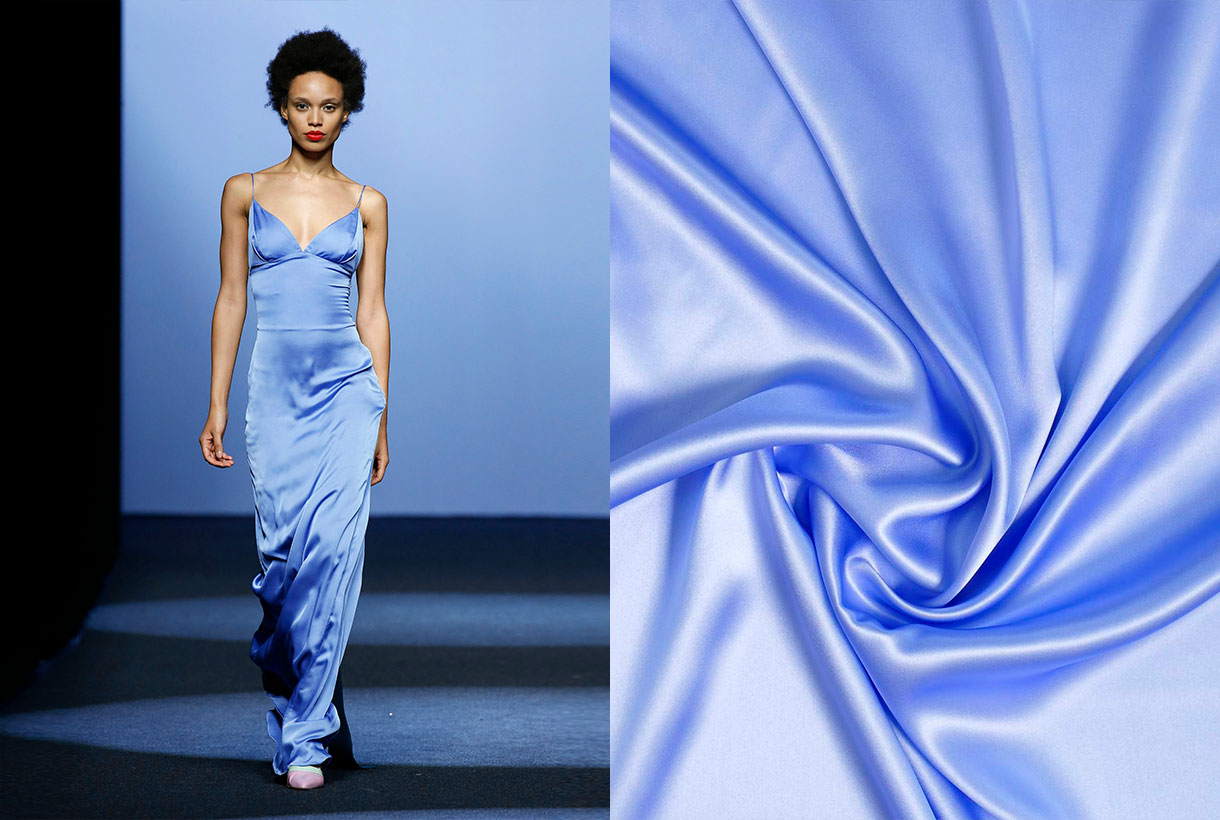
It is curious how satin is one of the few fabrics that knows no limits in the wardrobe: it serves us both for winter and summer, or between seasons. Beyond its timelessness, its versatility also stands out because it admits infinite possibilities, making it an indispensable fabric in anyone’s wardrobe. Satin has a nice drape thanks to its fluidity and soft sheen. It is a silky fabric capable of transforming a style and allowing it to navigate between formal and casual. On the catwalk, we have seen it in a variety of garments and accessories for a long time, especially in slip dresses (inspired by lingerie nightgowns), romantic tops and blouses, light and flowing skirts, and even handbags.
A brief history of satin
Satin originated in China more than 2,000 years ago and come from silk. In fact, its name derives from Zaitun, a Chinese port famous for exporting satin. Although it was popular and highly desired in Greco-Roman culture, the consumption of silk satin spread in Europe in the Middle Ages towards the 12th and 13th centuries. Italy was the main exporting and consumer port. Satin captivated for its richness, fluidity and splendor, it was cheaper than silk, and was one of the fabrics most used in clothing for the privileged classes. It was also used in textiles to decorate grand castles and palaces. Satin was not popularized en masse, until the 19th century, after the Industrial Revolution and advances in the production and marketing process. This fabric also spread to other areas such as underwear. Then, satin became an affordable and versatile fabric, that could emulate the softness, richness and elegance of silk.
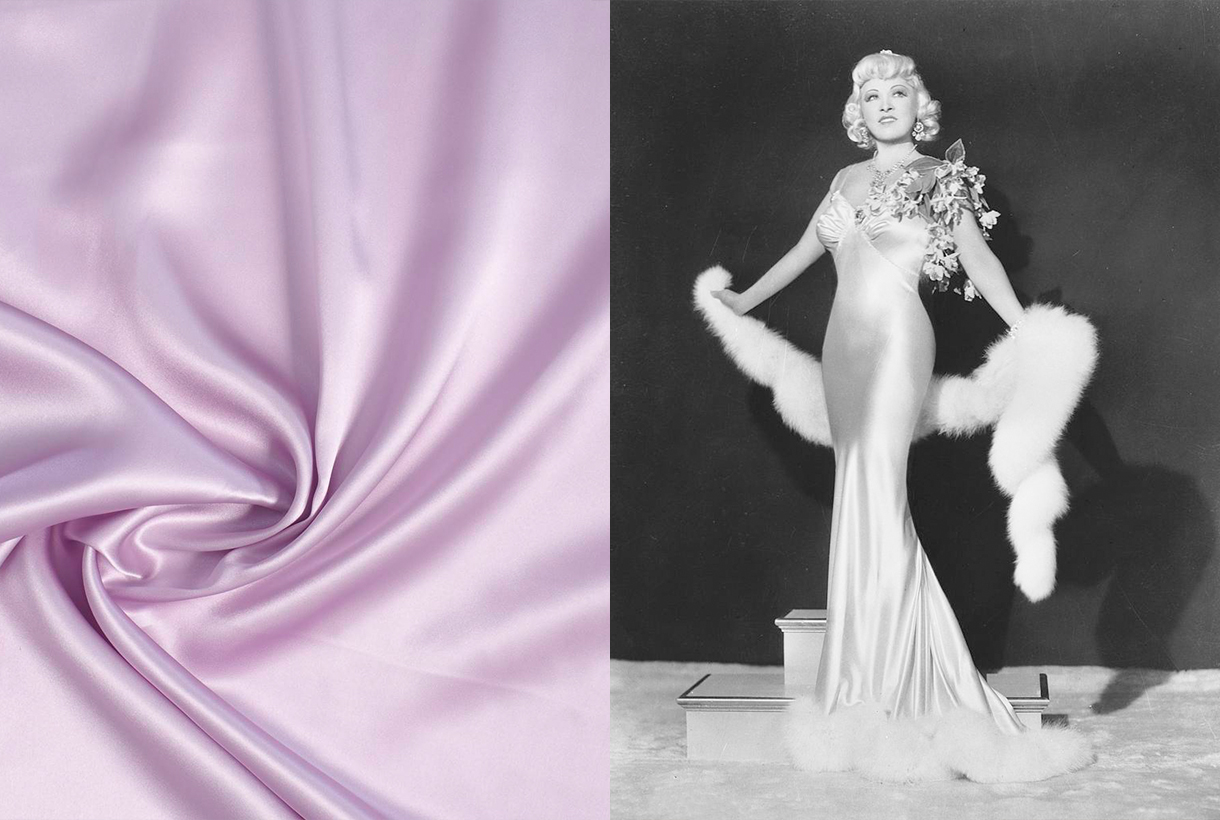
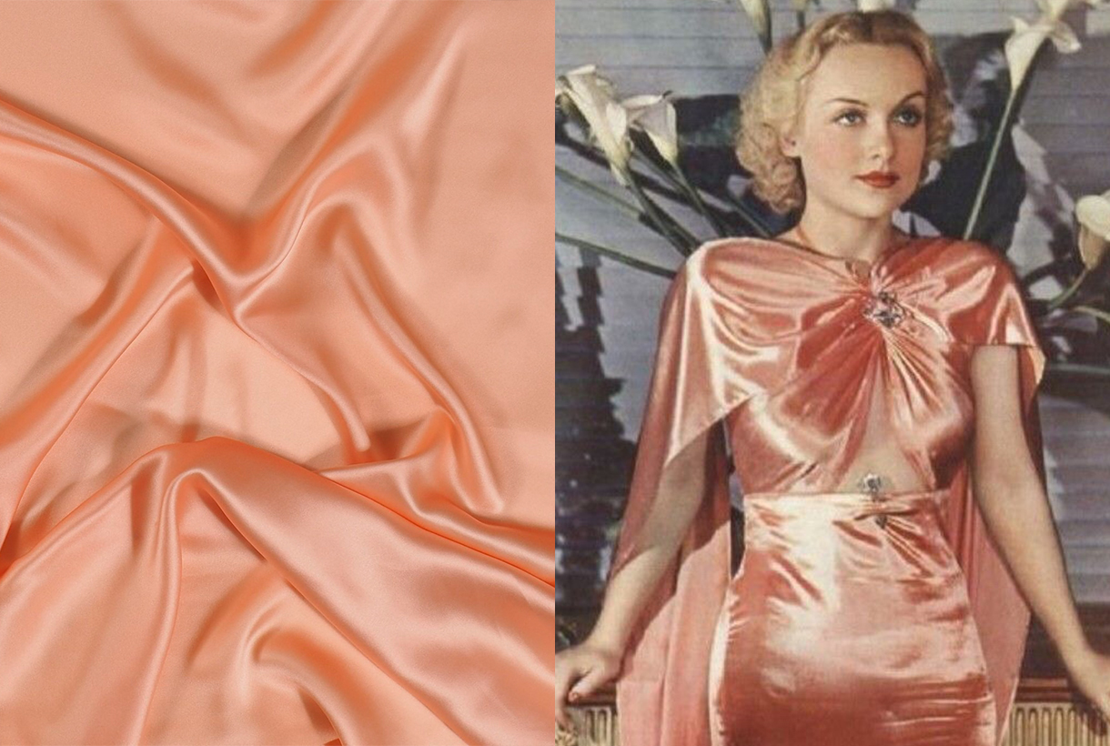
During the 20th century, satin conquered the sexiest and most chic clothing of the old Hollywood actresses. It was seen through lingerie dresses that were a scandal in their time for their daring. Some examples: the actress and sex symbol, Mae West wore in 1937 a satin dress adorned with flowers on the shoulder that marked her curves or could not go unnoticed. Also iconic was the tight white dress that sculpted Marilyn Monroe’s silhouette in ‘Gentlemen Prefer Blondes’ (1954) or the strapless outfit with lace motifs worn by Elizabeth Taylor in the movie ‘ Butterfield 8’ .
Decades later, the development of synthetic fabrics made satin even more affordable, bringing it into mainstream fashion. Since then, satin has transcended beyond a seasonal trend and has become a regular and staple fabric in everyday wardrobe.
Satin is not always silk
Although it may seem like it, satin is not always silk. It is actually a type of weft and not a fibre. In satin fabric, at least four weft threads are woven over one warp thread. Traditionally, satin has a shiny side and a duller side and can be made from different fibers, such as nylon, rayon, polyester, and even used silk. So it can be natural or artificial. In any case, it is a fabric that is characterized by its shine and softness. This makes it a star fabric for multiple applications, from fashion outfits to home décor.
Discover the new silk satins in our Gratacós space or in the online store. Click here 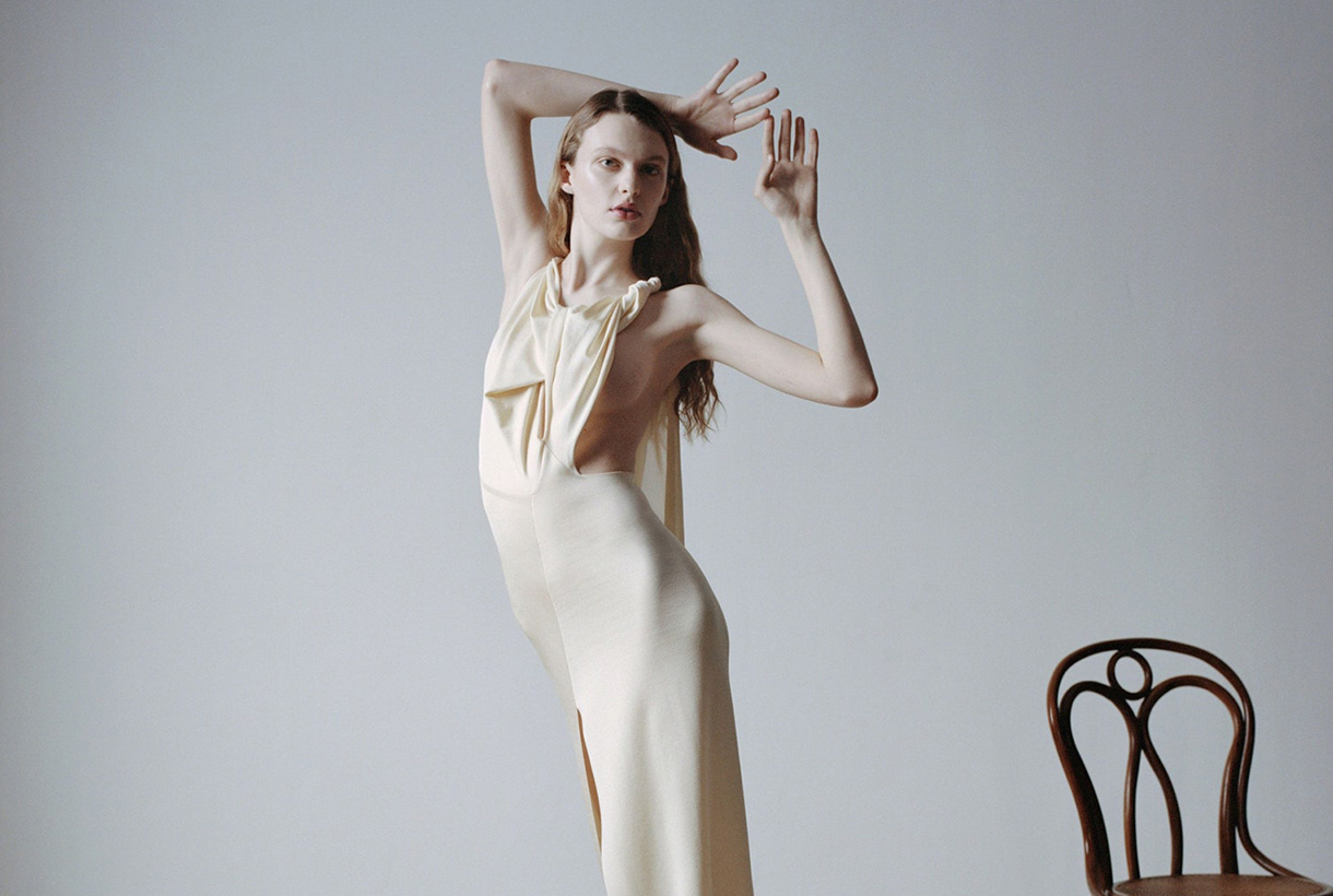
Sorry, this entry is only available in Español.
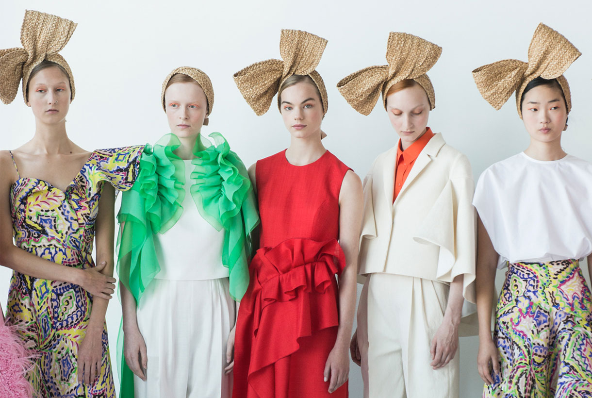 This summer the Spanish fashion industry received sad news that made evident once again the ups and downs that the sector is going through in an unstable time. Delpozo, one of the made in Spain firms with the greatest international projection, announced that it was closing its doors. After more than 47 years of history, the heir to the homonymous brand Jesús del Pozo has had to face liquidation due to the impossibility of reaching a sale agreement that could rescue them. A decision that puts an end to one of the most iconic brands in the country that has dressed countless models, movie personalities and even royals with their dream designs.
Madrid origins
Jesús del Pozo was founded in 1974 in Madrid and was part of the so-called “fifth commotion”, corresponding to the eighties, and to the generation of the nineties that was made up of designers such as Montesinos, Alvarado, Manuel Piña, Sybilla, Victorio & Lucchino , Amaya Arzuaga, Lydia Delgado or Hannibal Laguna. A firm defender of conceptual design, he began, like other colleagues such as Adolfo Dominguez or Antonio Miró, to design for men. It didn’t take long for the firm to also launch into feminine design and create dresses for independent women with sculptural garments with a childish air. “I avoid the flourishes, I prefer everything that is direct and simple, the feeling attracts me. I’m looking for the essential”, the Madrid-based creator used to argue.
Since its beginnings, Jesús del Pozo was a firm defender of the industrialization of the sector. He released his first perfume, opened new avenues of business and opened a new golden era for the economy of the firm. On a personal level, the creativity of Jesús del Pozo was awarded the Gold Medal for Merit in Fine Arts in 1988, the Cristóbal Balenciaga National Award in 1989 and the Golden Needle in 1981. The designer was also one of the promoters of ACME – Association of Fashion Creators of Spain – and served as president of the association until 2004.
The architectural romanticism of Josep Font
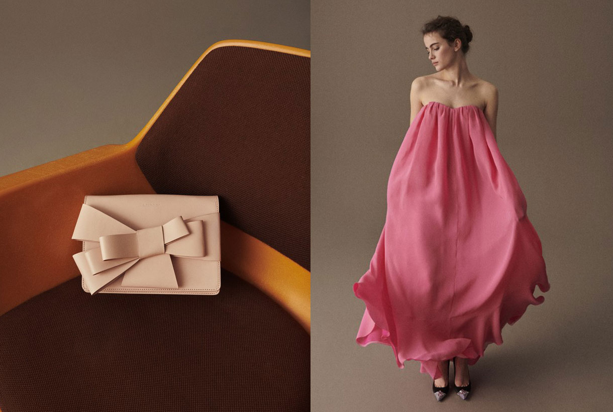
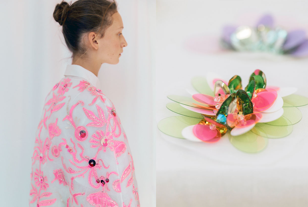
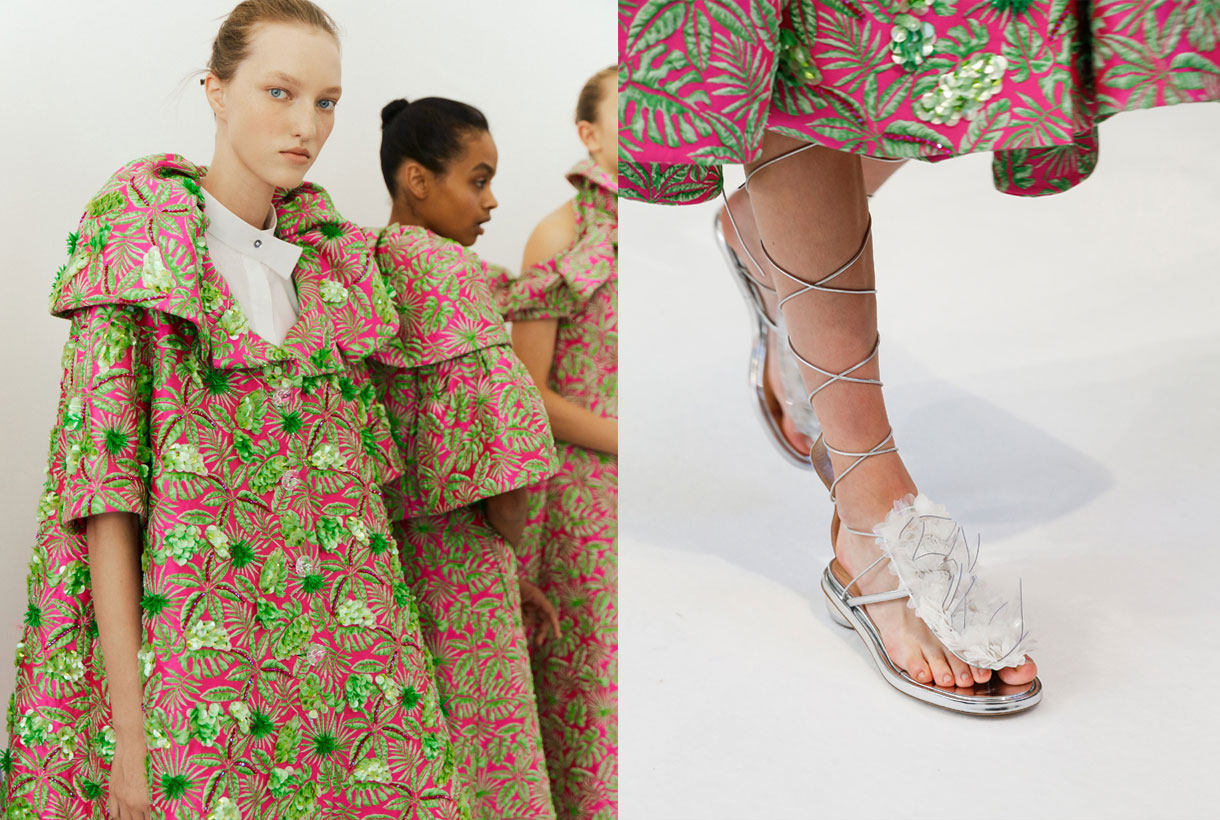
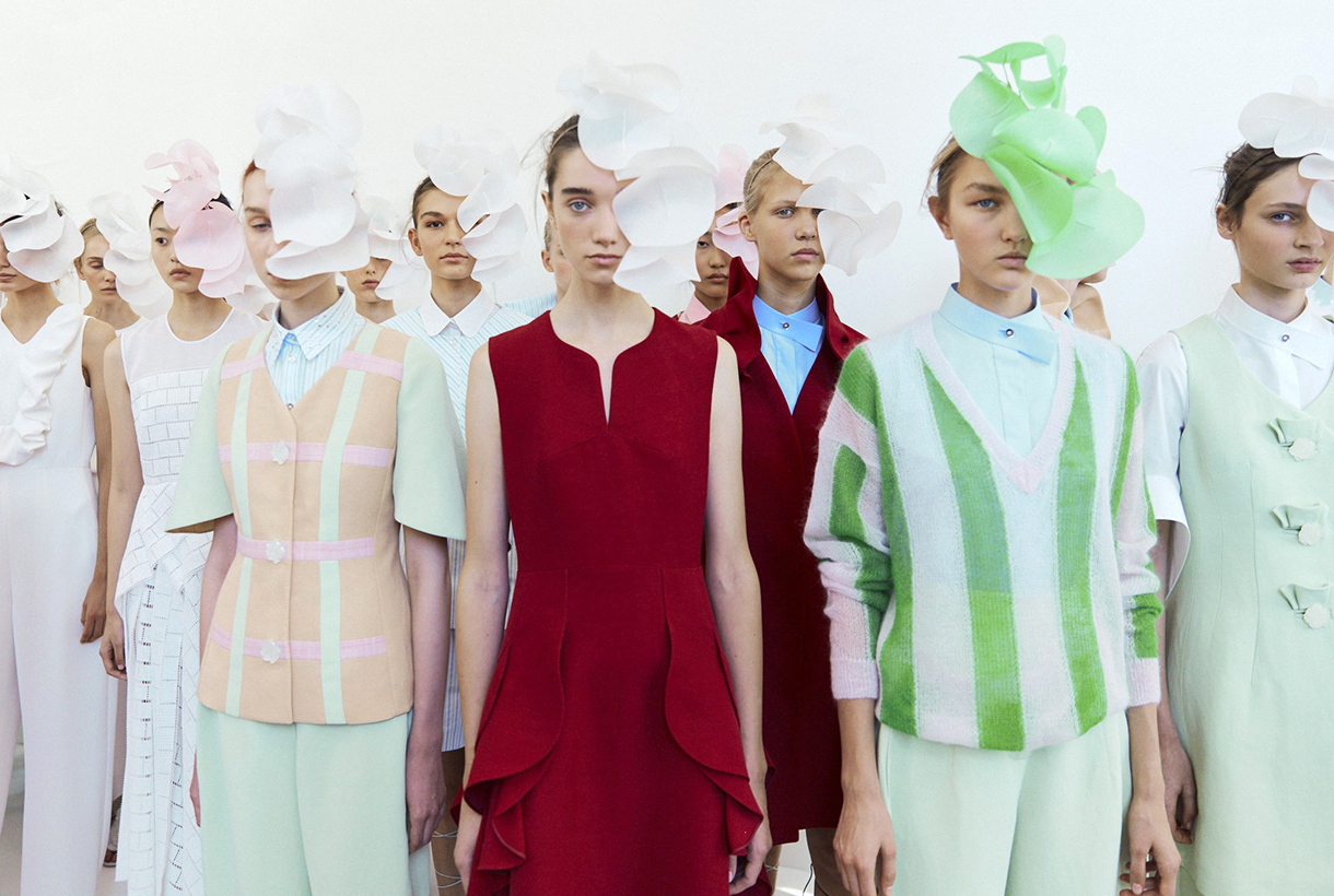
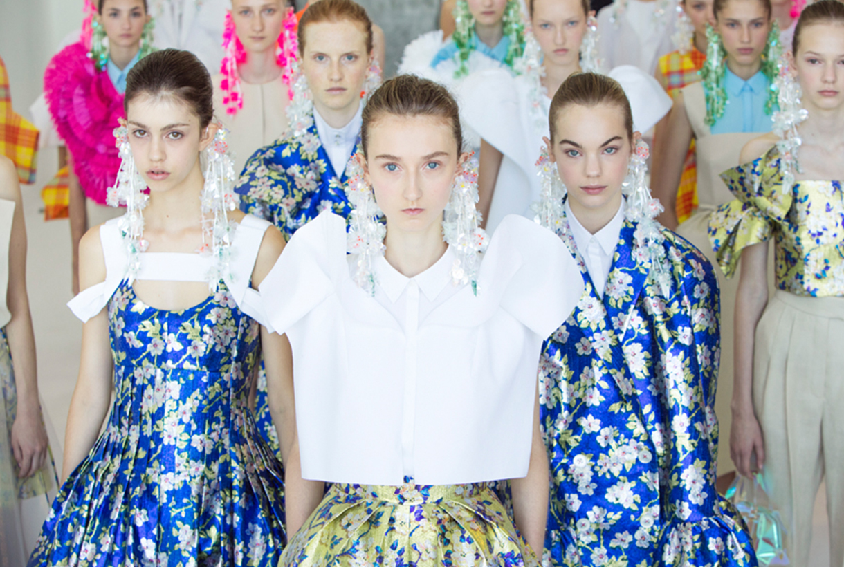
The designer died in 2011 and a year later the Perfumes and Design Group took control of the brand, reformulated its guidelines and passed on the creative management to the Catalan couturier Josep Font. The company changed its name to Delpozo, got back to the catwalk shows and opened stores in the capitals of the world. From 2012 to 2018, Josep Font was able to renew the identity of the Delpozo woman, respecting the foundation of Jesús del Pozo (good taste without excesses) and introducing his own language inspired by the forms of nature. Voluminous pieces, architectural designs, ethereal fabrics and colours that varied between pastel and saturated tones in bewitching colour combinations. Such were the creations under the legacy of the Catalan designer passionate about fashion, architecture and crafts.
Under his legacy, there was a second period of splendor for the brand that was accompanied by an internationalization strategy with shows in New York and London sponsored by fashion icons such as Olivia Palermo and Lauren Santo Domingo. Delpozo’s dresses also populated the most photographed red carpets at festivals, premieres and even the annual Met Gala. At this time, Font was in charge of dressing Zendaya Coleman, Kerry Washington, Margot Robbie, among many other Hollywood actresses. He also dressed the then first lady of the United States, Melania Trump and Queen Letizia in one of the most applauded looks of recent years.
New changes and decline
In 2018, Josep Font left the creative direction of the brand, leaving a successful legacy as a standard-bearer of the brand’s prêt -à-couture. German creator Lutz Huelle took the reins in the wake of his predecessor and sought to expand new clientele in a fast-paced and difficult market for artisan brands. For this, a reduction in prices was made to make fashion more accessible to new generations of consumers. Even so, the firm, little by little, was adrift: they did not get commercial agreements or purchase commitments due to the losses and they stopped producing collections a year later. In the midst of a pandemic, the firm has forever dismissed its romantic and fantasy-filled universe, leaving a void in the Spanish fashion industry. A dream of almost half a century that will be difficult to forget.
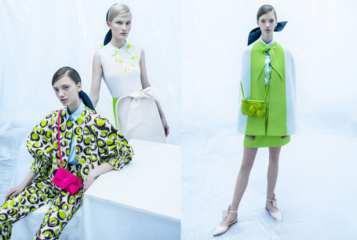
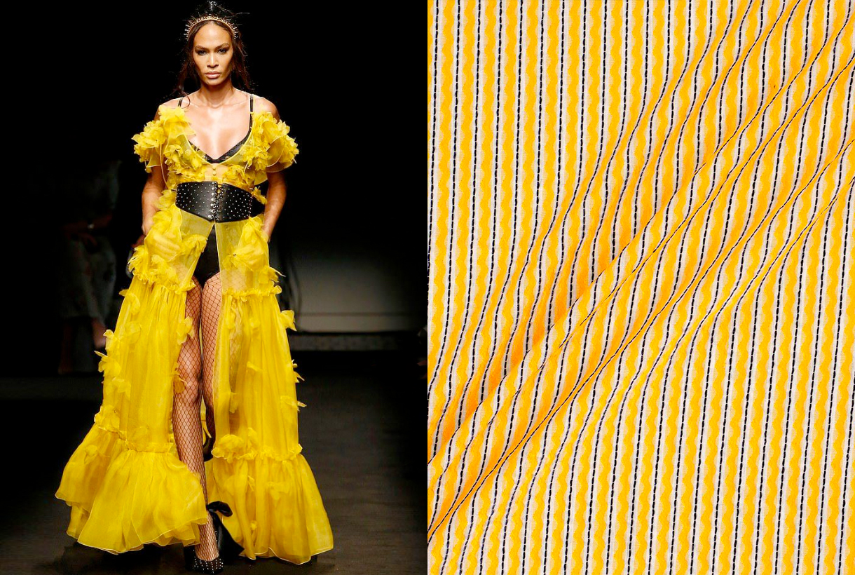
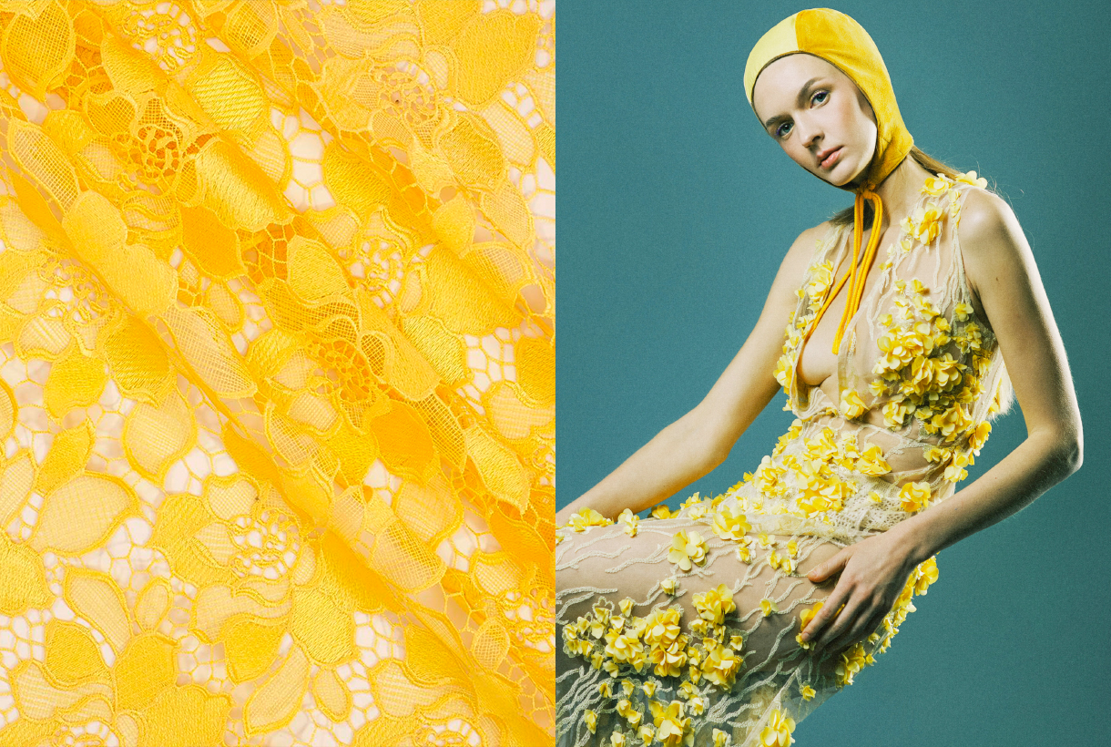
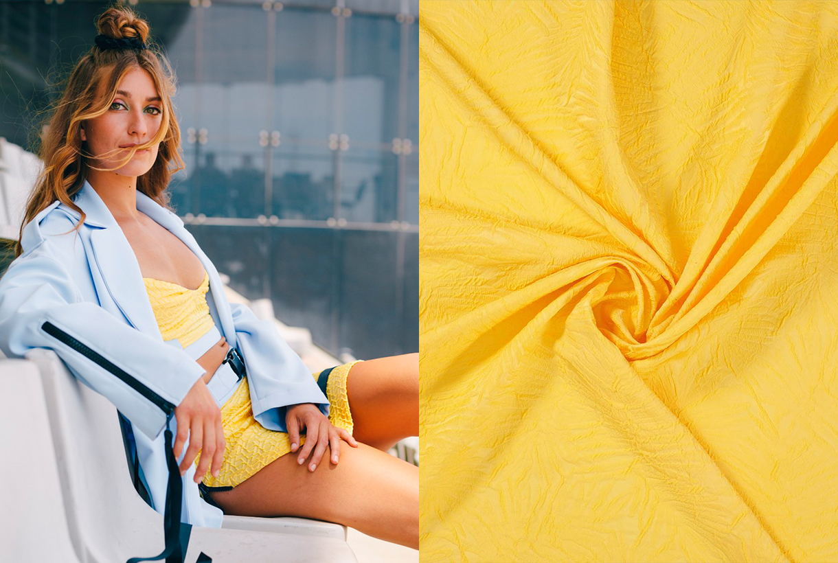
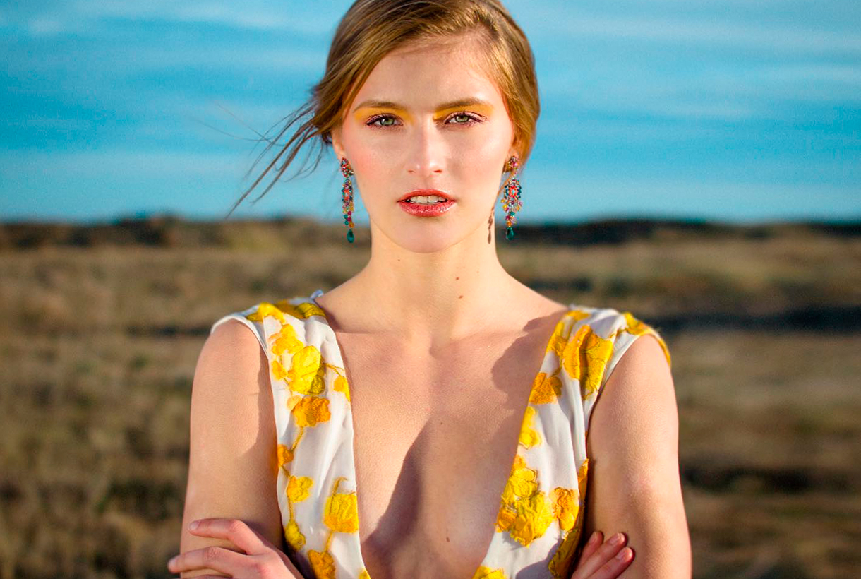 Yellow is pure contradiction. A dual colour that glows as the lightest of all vivid colors and symbolizes optimism, happiness and abundance. On its dark reverse side, yellow is also the shade that has traditionally been associated with anger, jealousy, and envy. A tone that is loved and hated in equal measure, adored by young people and precisely represents the new generation of consumers: GenZ Yellow. Yellow is in turn one of the colours that is marking this 2021, according to Pantone. We analyze some anecdotes and curiosities of this rabidly trending colour.
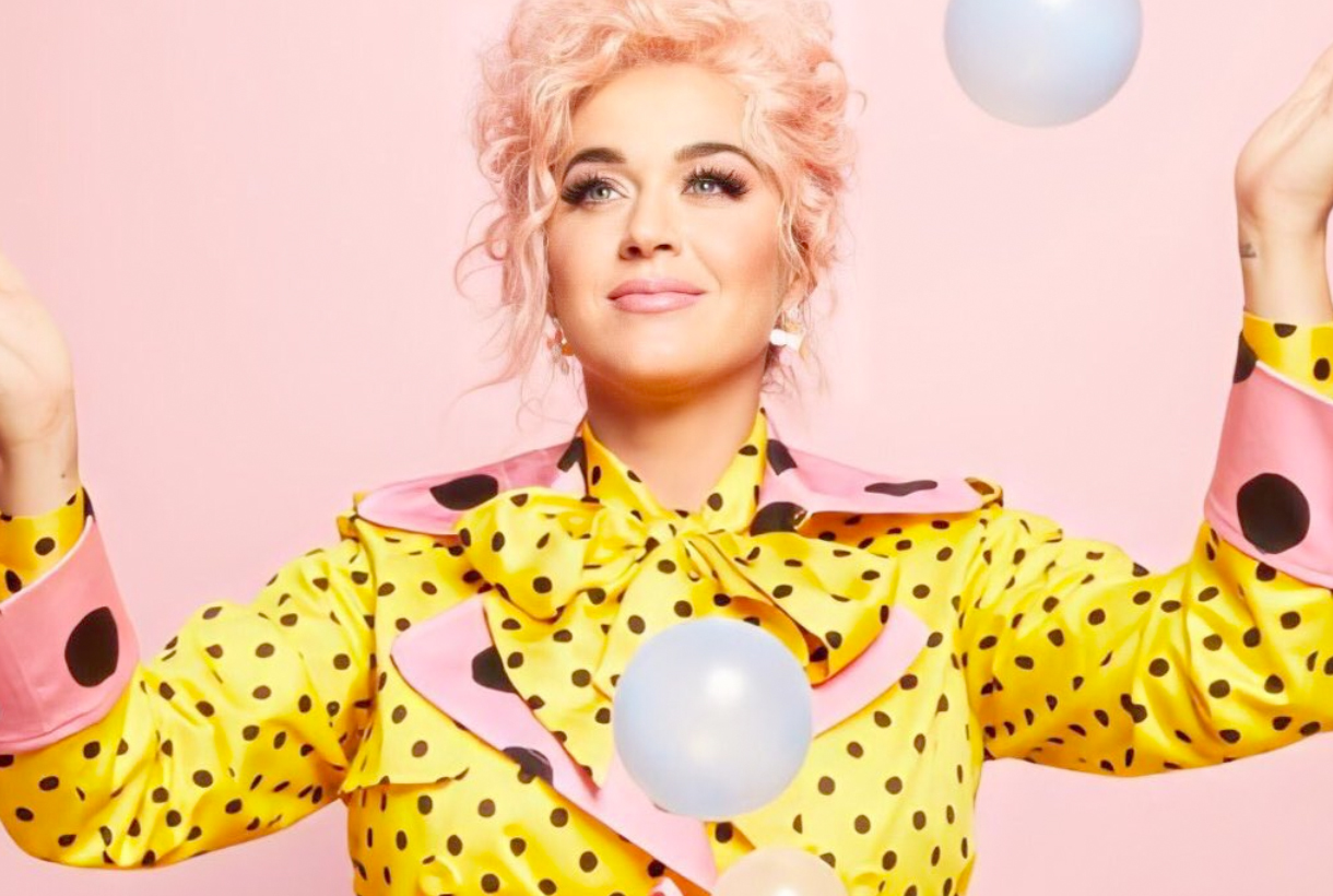
The colour of fun, kindness and joy
Yellow is traditionally associated with the sun and as it is linked to the main astro, it is an encouraging and serene color. Optimists have a bright mood and yellow represents their state. Yellow in itself is fun in, it’s radiant like a broad smile. Not surprisingly, smileys or smiley emojis are naturally yellow. Could you imagine them in another colour?
This colour radiates light and is the main color of kindness. “For yellow to be friendly, it needs to always have orange and red at its side, which instill and represent ideas of joy and wealth,” wrote the painter Eugène Delacroix. This is also the chromatic chord that is linked to the joy of living, of activity and of energy.
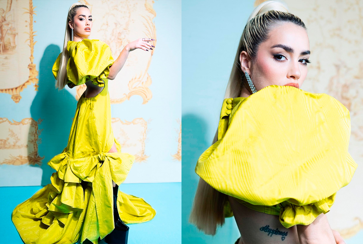
Illumination is yellow
Sunlight is also perceived as yellow, although it does not actually have any colour. That is why colour is linked to light and illumination. As a light and luminous color that it is, yellow is related to white. Bright and light are qualities of the same character, and yellow is the lightest and lightest of vivid colours. It has a light effect that because it seems to come from above. Therefore, the colour of light is, figuratively speaking, the colour of mental enlightenment. In the Islamic world, golden yellow is the symbolic colour of wisdom and in ancient European symbolism it was linked to the tone of understanding, belonging to the world of reason and ideas. Spiritually, God has been represented symbolically as a yellow triangle, often with an eye within that geometry. A symbol of the omniscience and omnipresence of the all-seeing Being that leads to clarity and enlightenment.
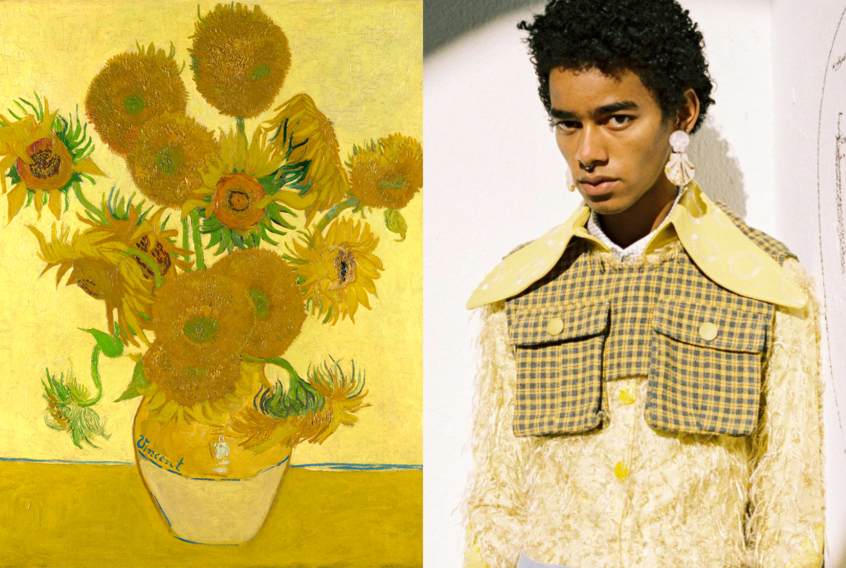
Psychologically, yellow is also linked to spontaneity and creativity as it is a colour that sharpens perception and invites reflection. Yellow are also Van Gogh‘s paintings that he painted with corm yellow, a very poisonous pigment that contains lead and sulfur, some of his most famous paintings such as ‘The sunflowers”
The colour of beautiful men and women
Since ancient times, yellow hair was related to the Sun with its brilliant reflections that seemed to be bathed in gold. Hence, the word blonde or blonde came out to designate a person with golden hair as the star king. The ancient Greeks represented their solar gods as Helios or Apollo of yellow color with statuesque bodies and blond hair, abundant and wavy. Faced with such beauty, all mortals wanted to be blonde. For this reason, they soaked their hair with a bleaching ointment that was manufactured in Athens, they sat for hours in the sun and waited until the hair turned blonde. The blonde symbolized the beautiful and the divine.
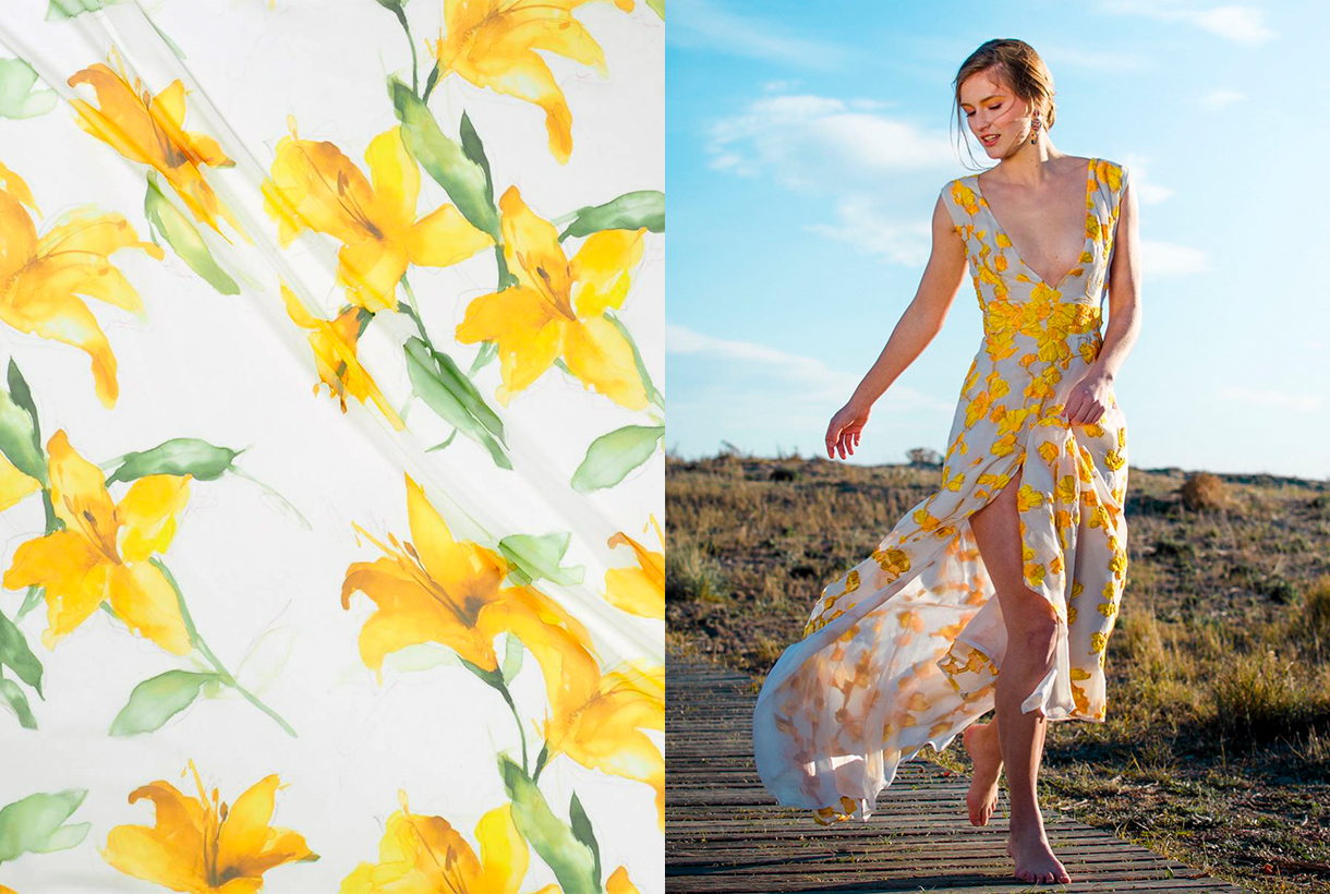
Yellow also represent fertility and maturity, idealized in summer fields with golden tones, and sensual love as it is the most frequent colour in flowers. Precisely, most of the flowers are of this colour: mimosa, sunflowers, forsythias, crocuses, primroses, physalis …
The dark side of yellow
Not all that glisters is gold, and yellow, as the most dual tonality of the colour palette, also hides its own contradictions. The warning of a hazard is yellow. This has a simple explanation: it is the lightest color and due to its optimal effect seen from afar and irritating seen from close up, it is the internationally adopted tone for signs indicating the presence of toxic, explosive or radioactive substances that show black signs on a background yellow. In fact, black writing on a yellow background is best read from afar.
Yellow is also the colour of everything you dislike: from envy (dislike for the posessions of others) to jealousy (dislike for the existence of others). Greed is also yellow, which, like envy, are capital sins, and are related to facets of selfishness. According to ancient belief, irritability and anger are linked to bile (yellow with greenish flecks), and when someone got angry they said that their skin turned yellow.
One more curiosity. In English, yellow means coward. The French call false laughter “yellow laughter”, and in France and Russia, “a yellow house” is a madhouse. What a dark reverse!
The colour of Generation Z
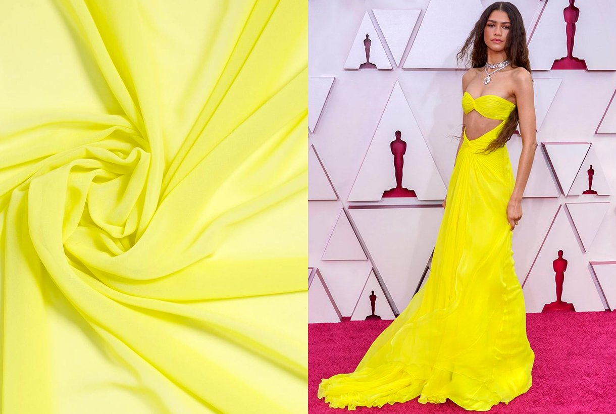
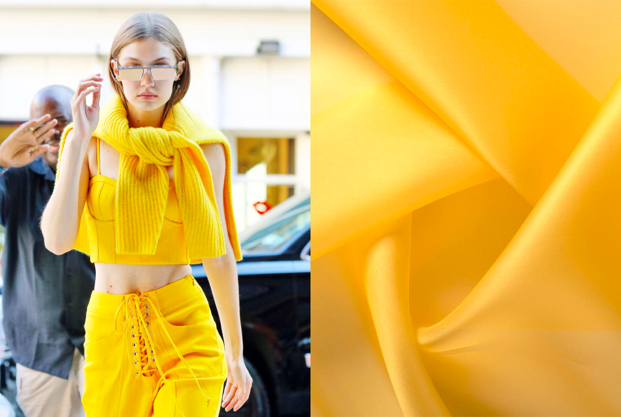
Pantone decided in 2021 that one of the colours that would mark the year would be Illuminating yellow. A bright and cheerful topne that generates liveliness and effervescence, and that, according to the authority of colour, symbolizes hope and positivity, values that connect with the future. And the future is marked by the new generation of young people: the effervescent Gen-Z, born between 1994 and 2008. Celebrities such as Zendaya, Gigi Hadid, Kaia Gerber, Kylie Jenner, Millie Bobby Brown, amongst many others, have taken yellow as their flag of style, and the fashion industry continues to use these tones to attract the attention of young, new consumers.
On the catwalks, yellow also does not go unnoticed this summer. From its most candy to the most acidic side, this colour has become one of the season’s stars in collections from firms such as Prada, Versace, Balmain or Etro that have not hesitated to combine it with golds, earth tones and the unbeatable neutrals. : black and white.
Therefore, yellow right now is the colour of the moment: of what flourishes in the fashion industry and is linked to the joy and dynamism of the carefree generation of young people. In less than a decade we have gone from millennial pink to GenZ Yellow.
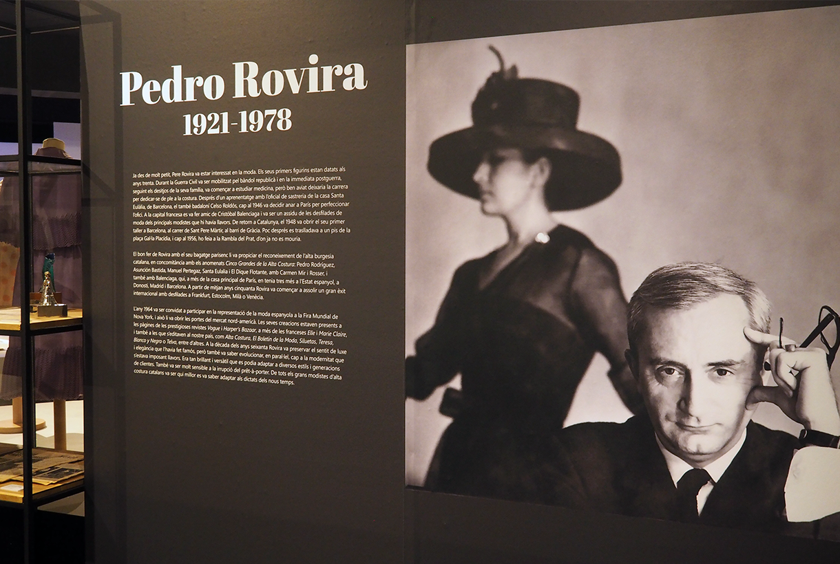
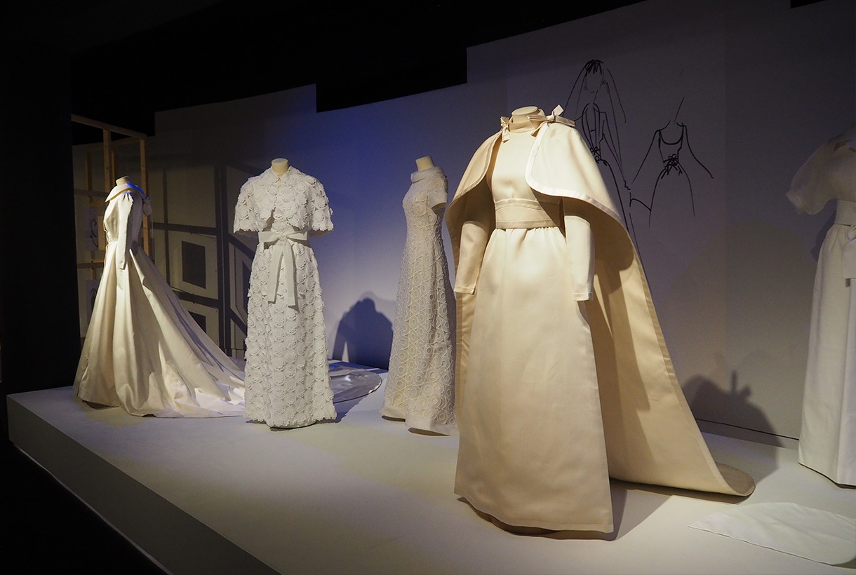
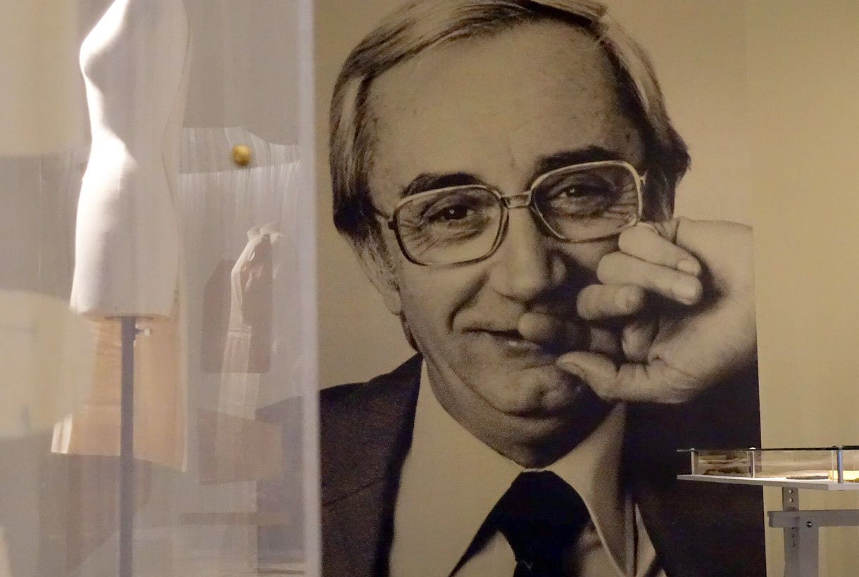
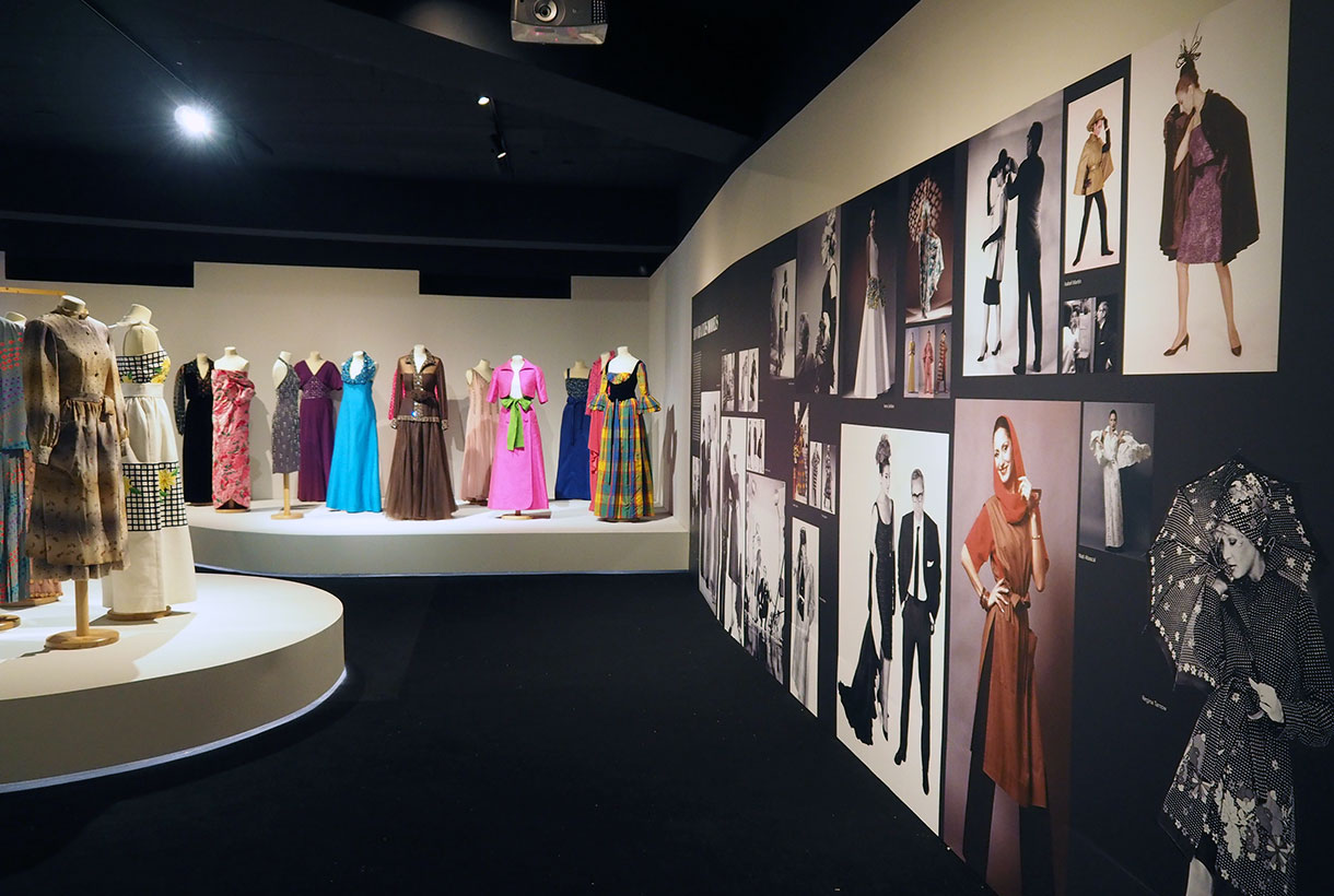 Who was Pedro Rovira? Why has his work been hidden for decades if it was one of the great Spanish tailors? Coinciding with the centenary of the birth of the dressmaker Pere Rovira i Planas (1921-1978), the Badalona Museum pays tribute to one of their illustrious sons with a wide retrospective that recovers the figure and contemporary spirit of the Badalona born couturier’s legacy .
In an illustrated monograph recently presented in parallel to the exhibition, Lorenzo Caprile assures in his prologue that Pedro Rovira “was in the middle of it all, but he stayed halfway”, referring to his premature death that prevented him from becoming a legend. The designer managed to develop his own identity throughout his career and was able to embrace two opposing currents: he began working with more classic Haute Couture through exclusive collections and later took a turn towards democratic fashion with more versatile and plural series productions that brought design closer to the new generations of consumers, beyond the bourgeois elites. On a historical level, his legacy also coincides in a time of transition: from the end of the dictatorship to the beginning of a new democracy with new customs, needs and ways of conceiving fashion.
From the oven to the needle
Pedro Rovira’s family owned a bakery in Badalona, but since childhood he had a great passion for sewing, making dresses for his friends’ dolls or painting figurines. A hobby his father did not like. He began studying medicine, but quickly abandoned the career for another job related to the needle: Celso Roldós, from Badalona, a tailor officer at the prestigious Santa Eulalia house in Barcelona, taught him the trade. Very soon Rovira would fulfill his wish to travel to Paris in search of new opportunities. He had high ambitions and he wanted to perfect his technique. In the French capital he became friends with Cristóbal Balenciaga, who would influence him greatly in his early days. In Paris he soaked up two years of trends through the fashion shows of the leading dressmakers of the time. When he returned in 1948, he founded his own haute couture workshop in Barcelona, in the Gracia neighborhood, although he continued to live in Badalona.
Boom and internationalization
Pedro Rovira’s fame spread like wildfire in the 1950s. The designer’s savoir faire, thanks to his Parisian background, together with his personal magnetism, quickly led to the recognition of the Catalan bourgeoisie with the support of several high-ranking ladies society who were assiduous to their refined designs. Later, when the Balenciaga atelier closed in 1968, some of the Basque dressmaker’s clients such as the Marchioness of Torroella de Mongrí, María del Carmen Ferrer-Cajigal and her daughter Carmen de Robert would also knock on Rovira’s door. In fact, Pedro Rovira was adept at dressing several generations of women from the same family with versatile and flexible designs that were adapted to every occasion. For Rovira, fashion was a servitude.
At the end of the 1950s, Pedro Rovira’s fame spread throughout Europe with shows in Frankfurt, Stockholm, Milan and Venice, and in 1964 his designs reached New York, seducing the North American public. On those trips he was accompanied by the most illustrious models of the moment who acted as ambassadors of his style: María del Carmen Aznar, Carmen Paré and Isabel Martín were the most common. Later, with the boom in ready-to-wear collections, he would work with the model and businesswoman Francina Díaz, the actress Teresa Gimpera and some sporadic ones like Nati Abascal, photographed by Antoni Bernad. International success continued in the sixties and seventies with criticism in their pockets and Rovira’s designs appeared on the pages of prestigious magazines such as Vogue, Harper’s Bazaar, Elle, Marie Claire. After being acclaimed internationally and gaining recognition from specialized critics, in 1964, finally Rovira was admitted to the Cooperative of Haute Couture, which brought together the most elite fashion designers of the country as Pedro Rodriguez, Asuncion Bastida, Manuel Pertegaz, Santa Eulalia and the Floating Dam, considered the Big Five of Spanish Fashion. Carmen Mir also joined the cooperative the same year as Rovira.
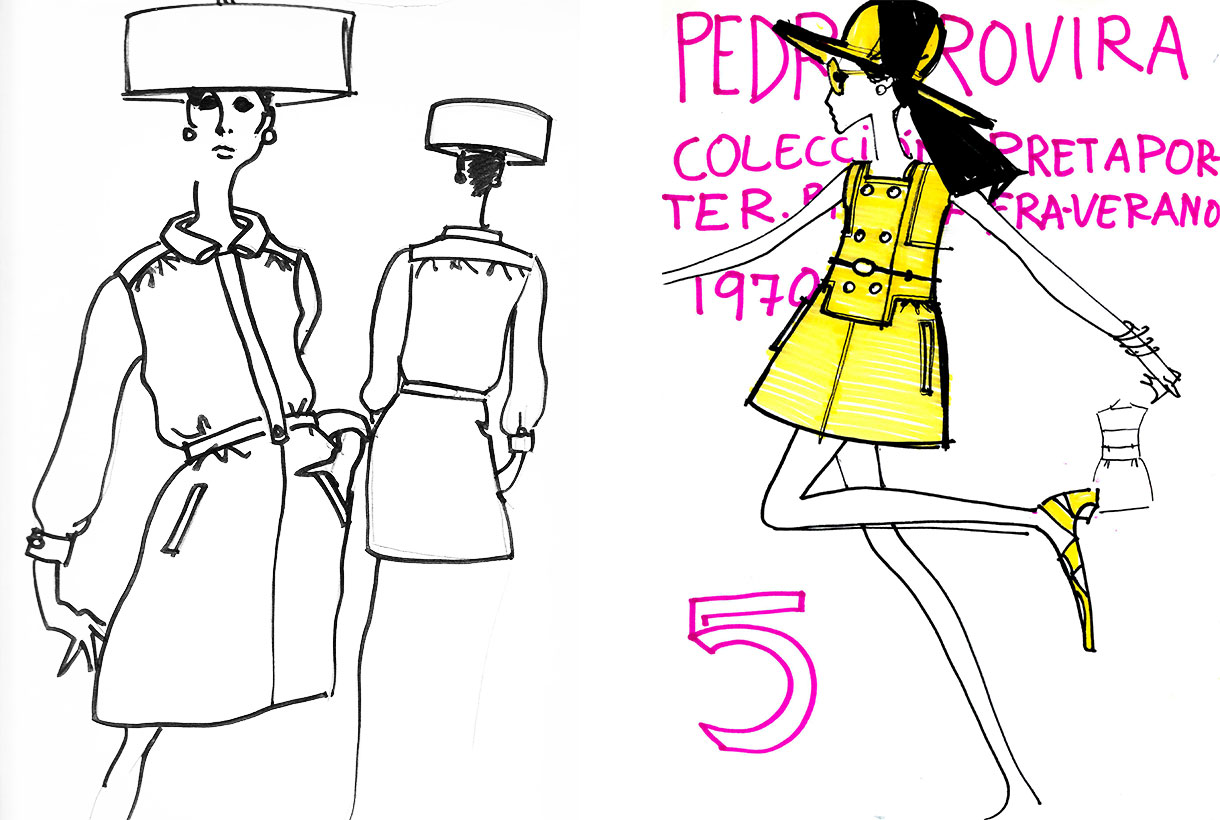
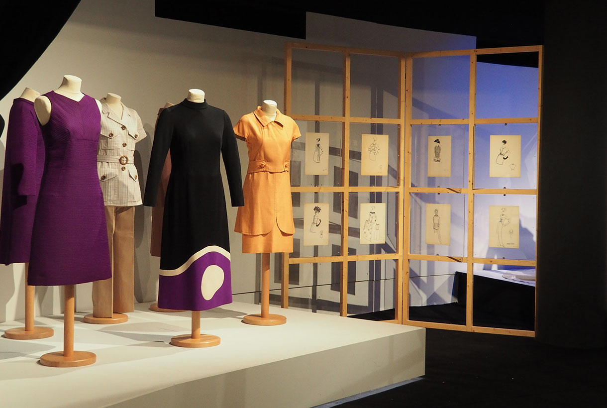
The year 1968 was historical for Pedro Rovira. In full expansion of the brand, the designer decided to launch the first collection of democratic fashion with different lines for all ages, occasions and moments. That was a remarkable breakthrough in the history of Spanish fashion because despite some attempts by other designers, serialized proposals have never been launched with designer garments at more affordable prices. Pedro Rovira’s ready-to-wear designs were daring but very wearable. They combined fantasy brought to the street through geometric fabrics, graphic prints and vibrant colors for a cosmopolitan and contemporary woman who embraced the society of change in Spain.
An unexpected end
In the early seventies the brand had two boutiques in Madrid and throughout the country. Just when the firm was experiencing its greatest splendor, there was a setback that condemned it to a sudden fall and later oblivion: the designer’s precipitous death from a heart attack in 1978. He was only 57 years old. The firm that bore his name still worked for a time, since it had achieved a lot of diffusion and presence in the market, but without the claim and the great creative power of Rovira, the brand had to close in 1980.
An extensive legacy
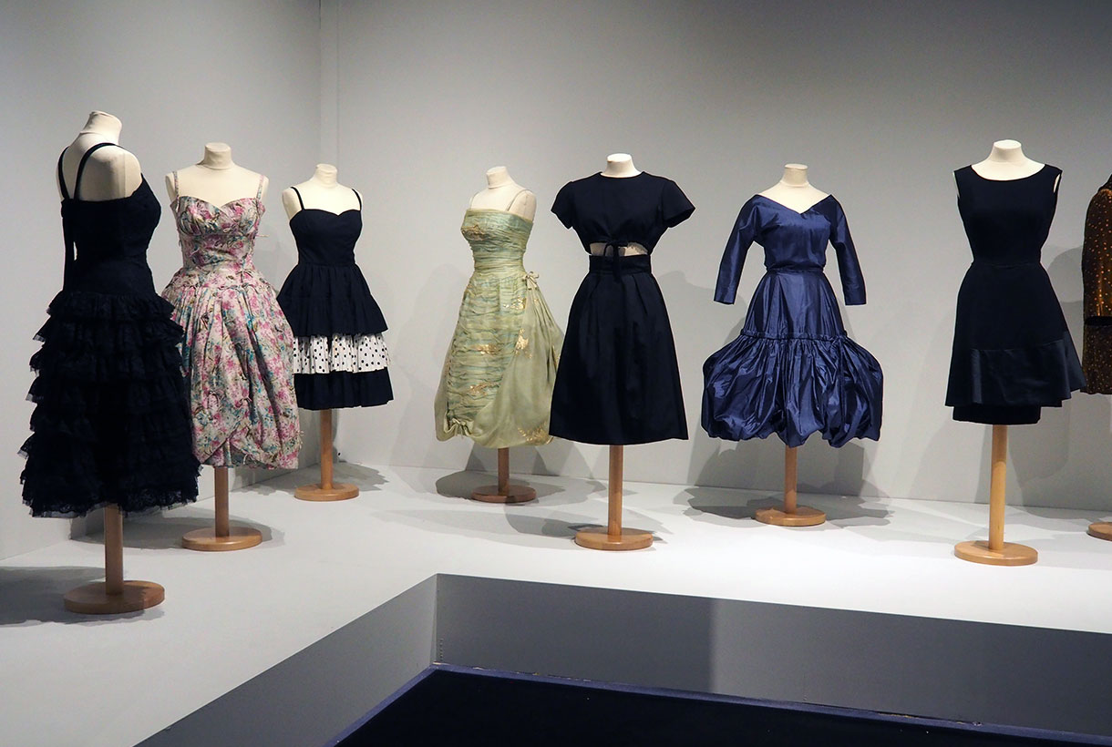
After a first tribute at the Madrid Costume Museum by the Fundació Antoni de Montpalau, the Barcelona Museum has displayed all of Pedro Rovira’s work in a large retrospective exhibition dedicated to the couturier to commemorate the centenary of his birth. This exhibition, open from 4th June 4 to 18th October 2021, represents a broad and complete review of the work of the Badalona born couturier: it occupies two floors of the museum and is arranged chronologically following the production of Rovira from the early 1950s to the last collections from 1978. Some eighty dresses and more than one hundred drawings come from the Col·lecció Antonio de Montpalau, collaborator of the initiative, and pieces from the Badalona Museum collection and from the Rovira heirs are also exhibited. The tribute is completed by a documentary that rescues the memory of his legacy and a widely illustrated monograph. An extensive tribute to resuscitate the great figure of Pedro Rovira from oblivion and place it where it deserves in the history of Spanish fashion.
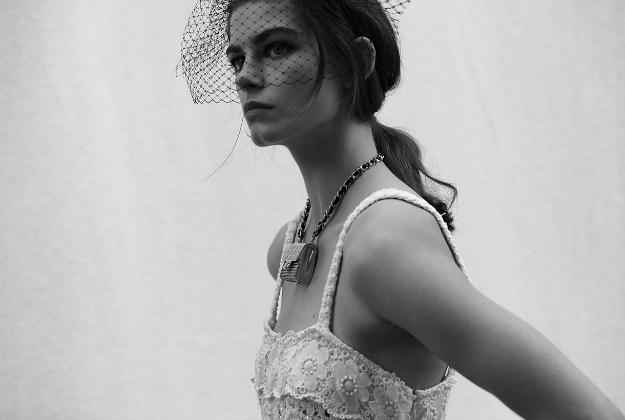 The history of women’s intimate fashion is curious because it is not only linked to the trends of each era, but also to the rebellions of women and the strength of some female icons such as the dancers Isadora Ducan and Irene Castle, the writer Simone de Beauvoir or the pop diva, Madonna, who broke ground in her time, breaking some conventions and marked taboos. It is also remarkable, as in recent decades, the conception of what is intimate and what is not, is conspicuous by its absence because fashion evolves and transforms, merging concepts and adapting pieces that were once created to remain hidden behind the outer layers of the visible clothing.
From Egyptian to French. A brief historial view
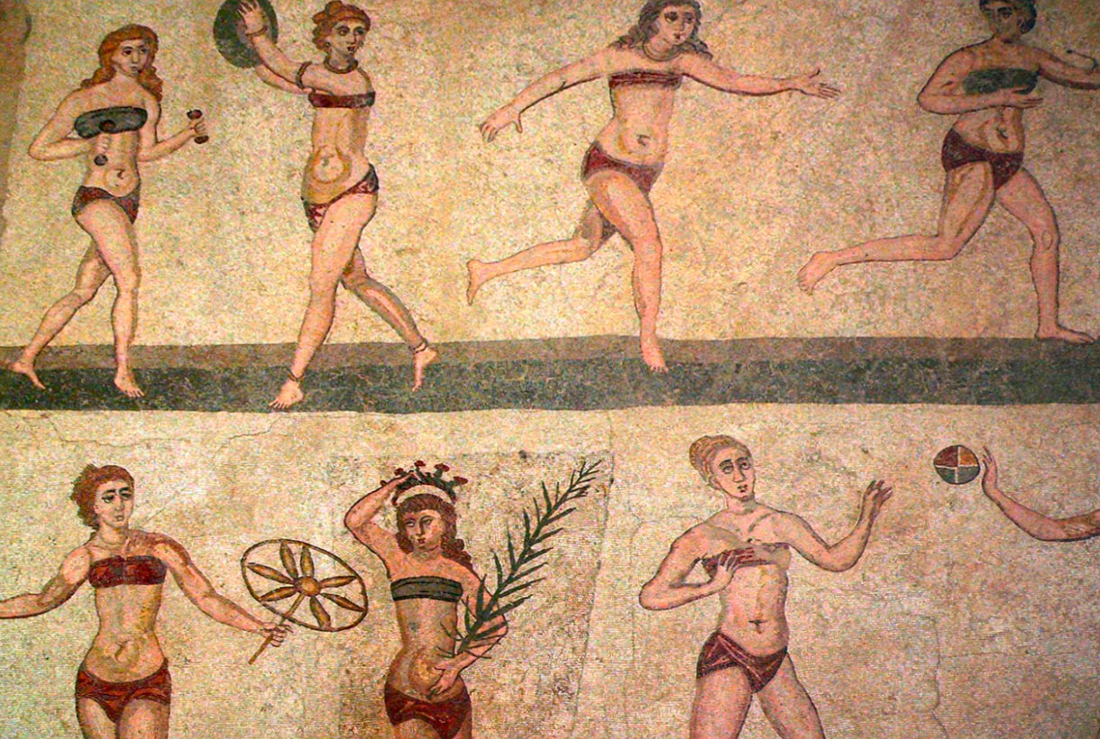
Intimate clothing was born to cover a basic need: hygiene and shelter for the female parts. Then, over the centuries, they became garments to mold and correct the female figure. It is estimated that they were the Egyptians of high society, who began to use some type of lingerie. Back then it was linen and cotton tunics glued to the body with a sort of petticoat that began below the chest and ended below the ankles as part of their daily dress. In ancient times, to lift the breasts, – the anatomical part that symbolized femininity, motherhood and pleasure, women accepted many sacrifices. For this reason, in Crete the bra was invented almost four thousand years ago. Also in Ancient Greece, the zoster was born, a girdle that single women used to enhance the bust. Married used another piece to hold the breast, called apodesmo, and used to be fabric with bright colors and decorated with care. In Rome, a band wrapped around the chest was used to give the female figure the harmony and shape that was considered beautiful at the time. During the Middle Ages, the brial and the camisole imprisoned the chest at a time when only maidens were allowed to show off the bust. As for panties, the garment was not conceived as part of the undergarment until the Renaissance. Finally, corsets emerged in the Middle Ages and had ups and downs in their use until the end of the 19th century. The famous corset was not only an intimate garment to maintain hygiene, but was also used to style and seduce.
France is considered the inventor country of underwear, similar to what we know today, and the popularization of its use. Towards the year 1830 there was a shift towards the use of underwear that coincided with the growing trend towards a public morality that during the Victorian era would reach its peak. The appearance of new materials and thinner and lighter fabrics, which were appropriate for use in certain areas of the body, also influenced. From 1860, the design of women’s underwear began, and in 1880, silk became the preferred fabric for such uses. Later, wool (in colder areas) and cotton were also used, fabrics that allowed the skin to breathe. Its use also extended to petticoats, nightgowns and panties. It took until the end of the 19th century for women’s lingerie to acquire a definitely sexy air with the appearance of the first silk stockings and garters. Although its use was reserved exclusively for the privacy of the bedrooms and for the so-called “women of bad life”.
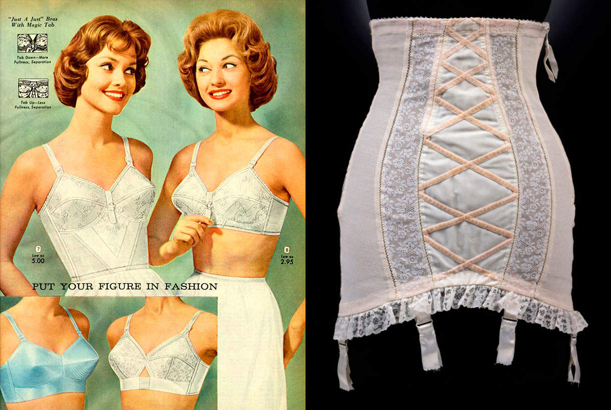
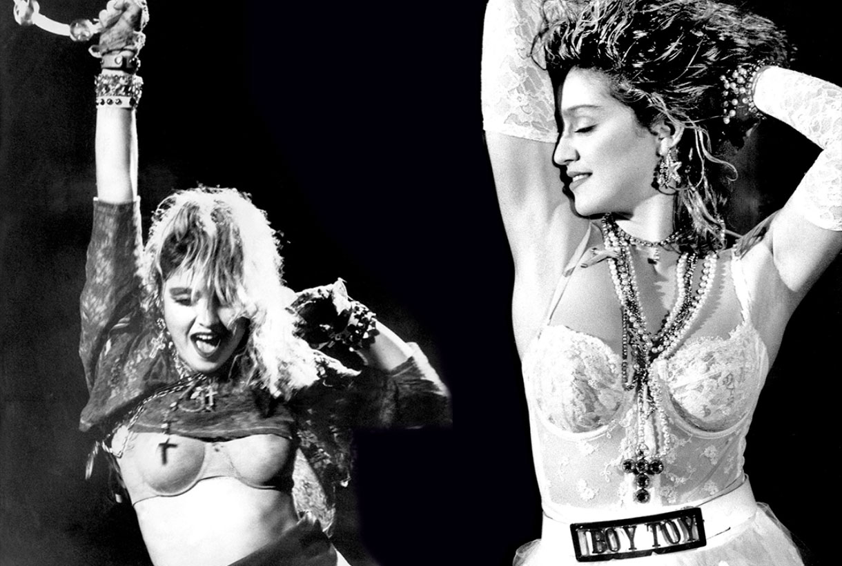
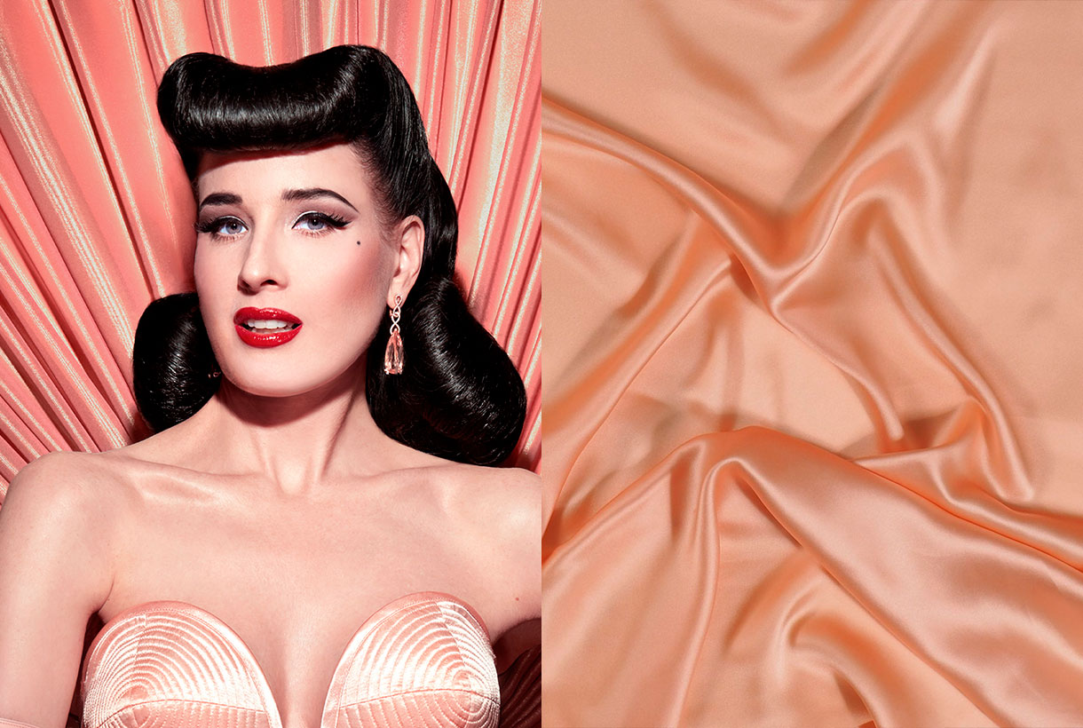
The 20th century was the century of the bra that ended up burying the corset as a garment to shape the chest and the introduction of cups in bras, showing that there were women with different sizes and bust sizes. In the 1950s, conical pointed cup bras were introduced, which immortalized the pin-up aesthetic models and later, Madonna in the transgressive 80s. Corsets were introduced as streetwear thanks to the influence of the cinema and the Golden Years of Hollywood. Finally, in 1990 was the boom of the wonderbra, a bra that enhanced the breast without the need for cosmetic surgery.
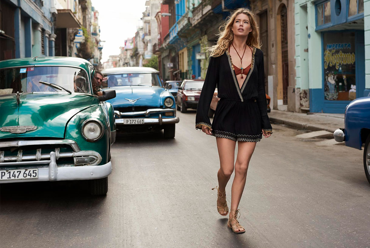
From indoors to outdoors. The lingerie is displayed without shame
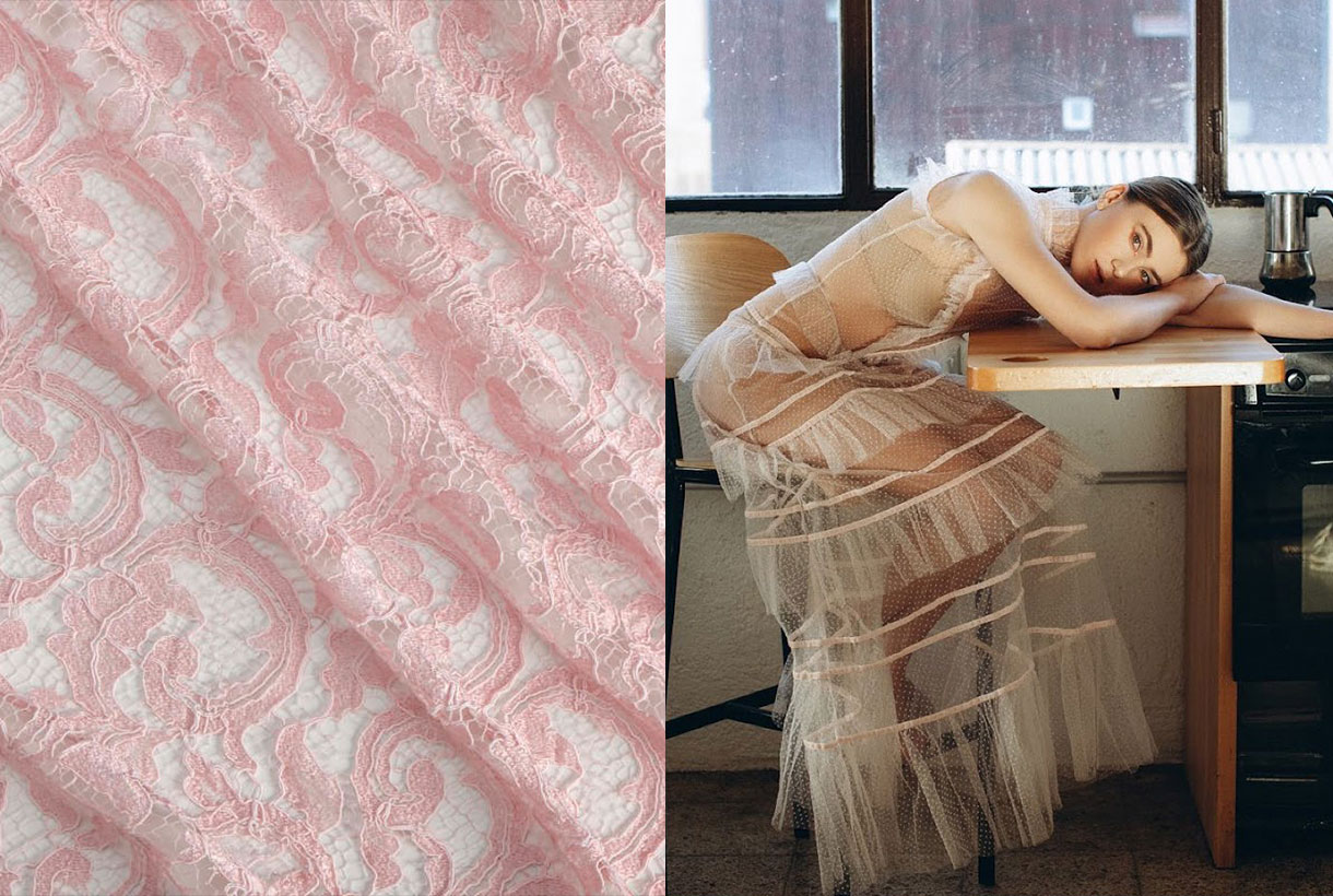
As we have just mentioned, lingerie was born in France at the end of the 19th century to liberate women from the corsets of the time. The actresses of the film industry of the last century were in charge of giving it that glamorous touch by displaying their most intimate clothes in lavish film shoots. Garments such as nightgowns, tunics and kimonos made in beautiful light satin and silk fabrics, jumped from the bed to the stage, along with voluptuous lingerie sets that evoked sensual games of transparencies through tulle and lace, which went beyond the bedroom. Intimate fashion was under the spotlight ready to be consumed for a new generation of female consumers.
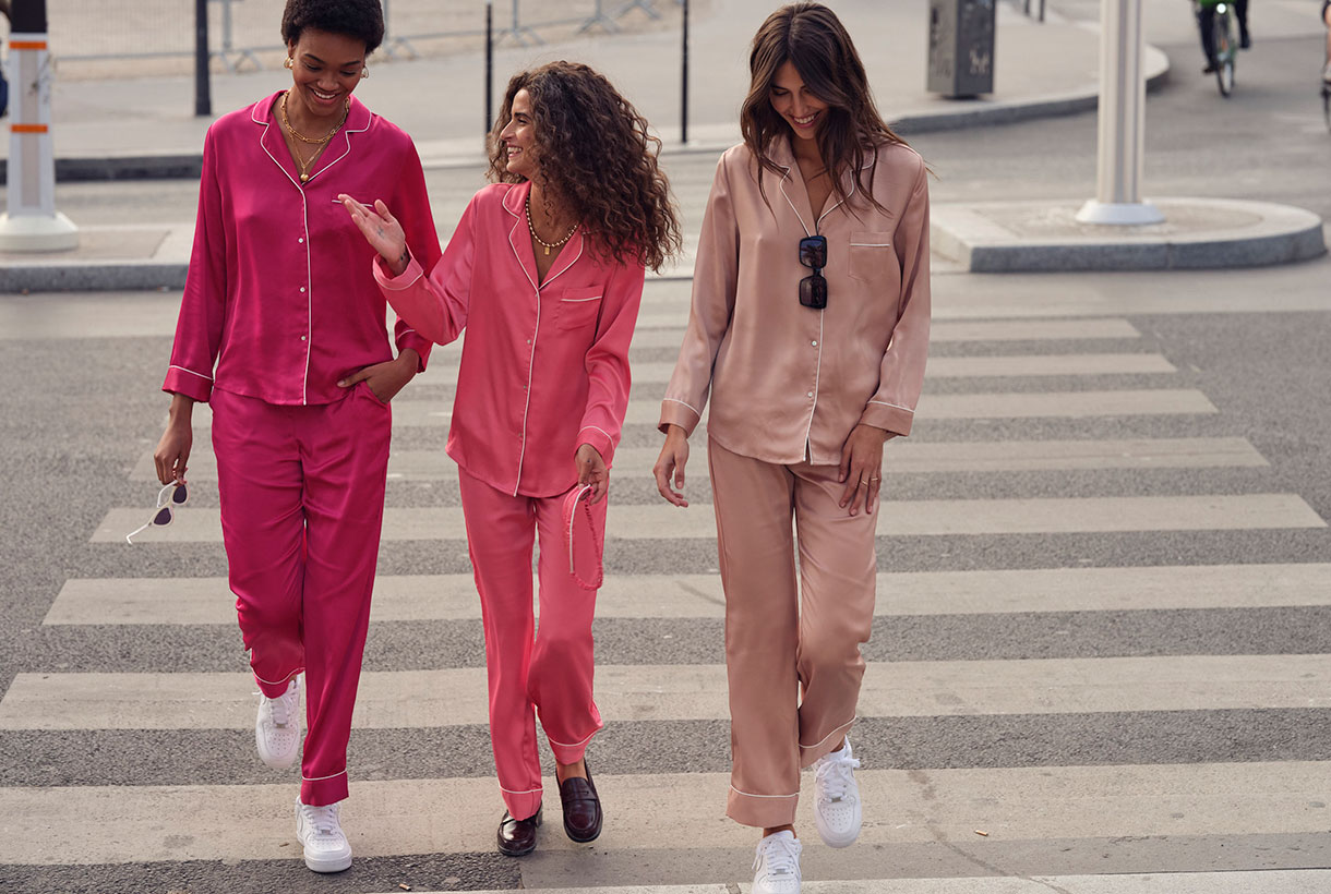
From the end of the last century to the present, we have experienced an authentic explosion of lingerie fashion that conquers en masse a new terrain until now forbidden: the street. They are not pieces of lingerie as such, but an adaptation that large firms create of these models to be exhibited in public. Thus, in the 90s, the boom in silk slip dresses or nightgowns with thin straps and lace motifs were immortatilized by the it girls of the time such as Kate Moss, Winona Ryder or Jennifer Anniston . Then came the outer bras or crop tops popularized by American rap and hip hop singers who shamelessly showed a foot above (or below) the navel. They were also the first to bet on showing off panties or thong straps underneath their low-rise sweatpants. Garments that create sensual games of transparencies are also experiencing their best moment, through plumeti tulle and lace in romantic Victorian-inspired outfits. Other parts such as two piece satin pyjamas and oriental kimonos have settled in our closet over the last decade as being completely normal, providing that elegant touch, but suggestive in the daily styles.
Regardless of style and trends, what is clear is that lingerie has been claiming its space for a long time and the catwalks attest to this exhibitionist trend that, at the moment, does not know its end.
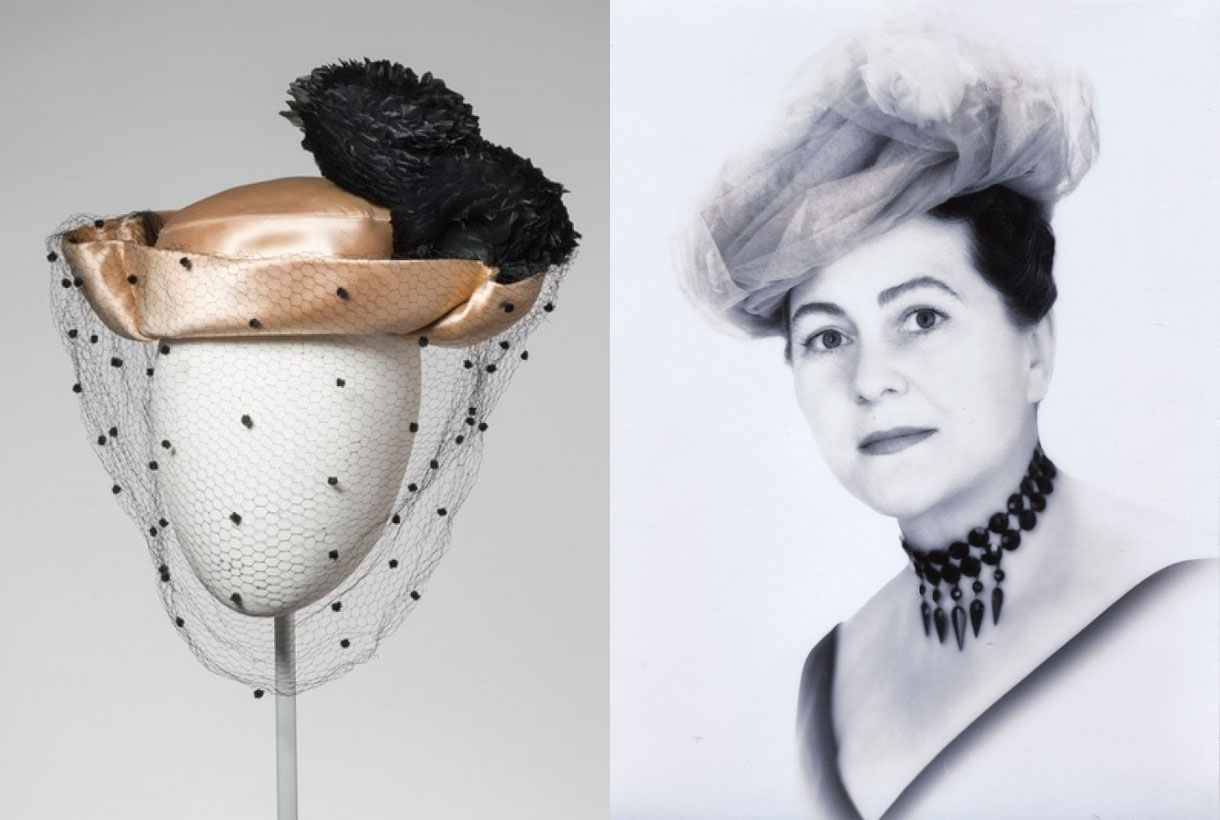
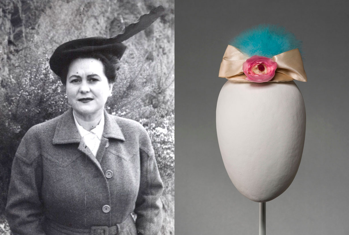
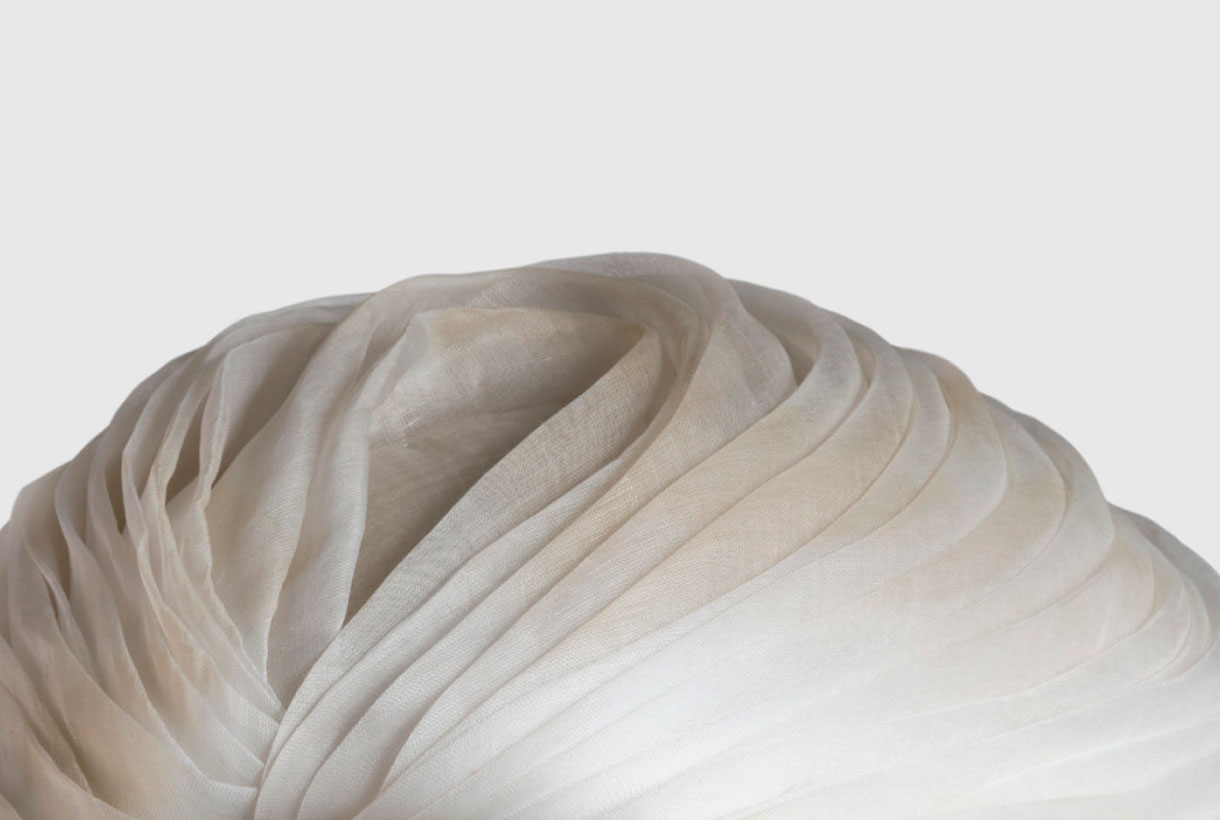 To dress well you have to do it accordingly, from head to toe. We must never neglect to decorate any part of the body, especially the one that covers the source of all ideas. As a good couturier, Cristóbal Balenciaga never forgot the importance of the hat when it came to making a perfect outfit. Perhaps this aspect of him as a hatter was overshadowed by his innovative designs that gave him fame and prestige in his time. Not for nothing is this Basque designer considered one of the great needle-workers in the history of fashion. Now, in order to unearth the brilliance and perfectionism of this add-on, a separate chapter is being dedicated to it. Thus Barcelona is hosting for the first time a unique exhibition focused on the hats and headdresses of Cristóbal Balenciaga . An extraordinary sample , the result of years of joint research on the collections of hats at Museo Cristóbal Balenciaga, located in Guetaria, and the Museu del Disseny de Barcelona, institutions which have co – produced the exhibition , curated by Igor Uría the curator of the Museum Cristobal Balenciaga and Sílvia Ventosa, curator of textiles and clothing from the Barcelona Museum of Design .
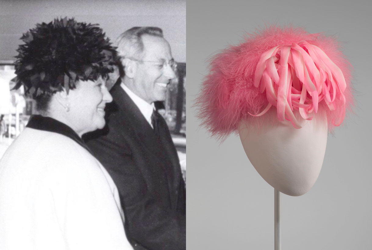 A key complement
Thus ‘ Balenciaga. The elegance of the hat ‘ is the first international exhibition focused on the hats and headdresses of the master Balenciaga that were created in the headgear departments of the Haute Couture House in Paris and Madrid from the late 1930s until the closing of Balenciaga’s fashion- houses in 1968.
In the exhibition 87 hats are on public show, 78 of which are presented individually, 9 with a linked set of clothing and a dress with stole. To be precise 43 are from the collection of the Museu del Disseny and the other 44 from the collection of the Cristóbal Balenciaga Museum.
For the first time the elements in the collection are studied as creative objects with their own entity and are integrated into their own exhibition discourse.
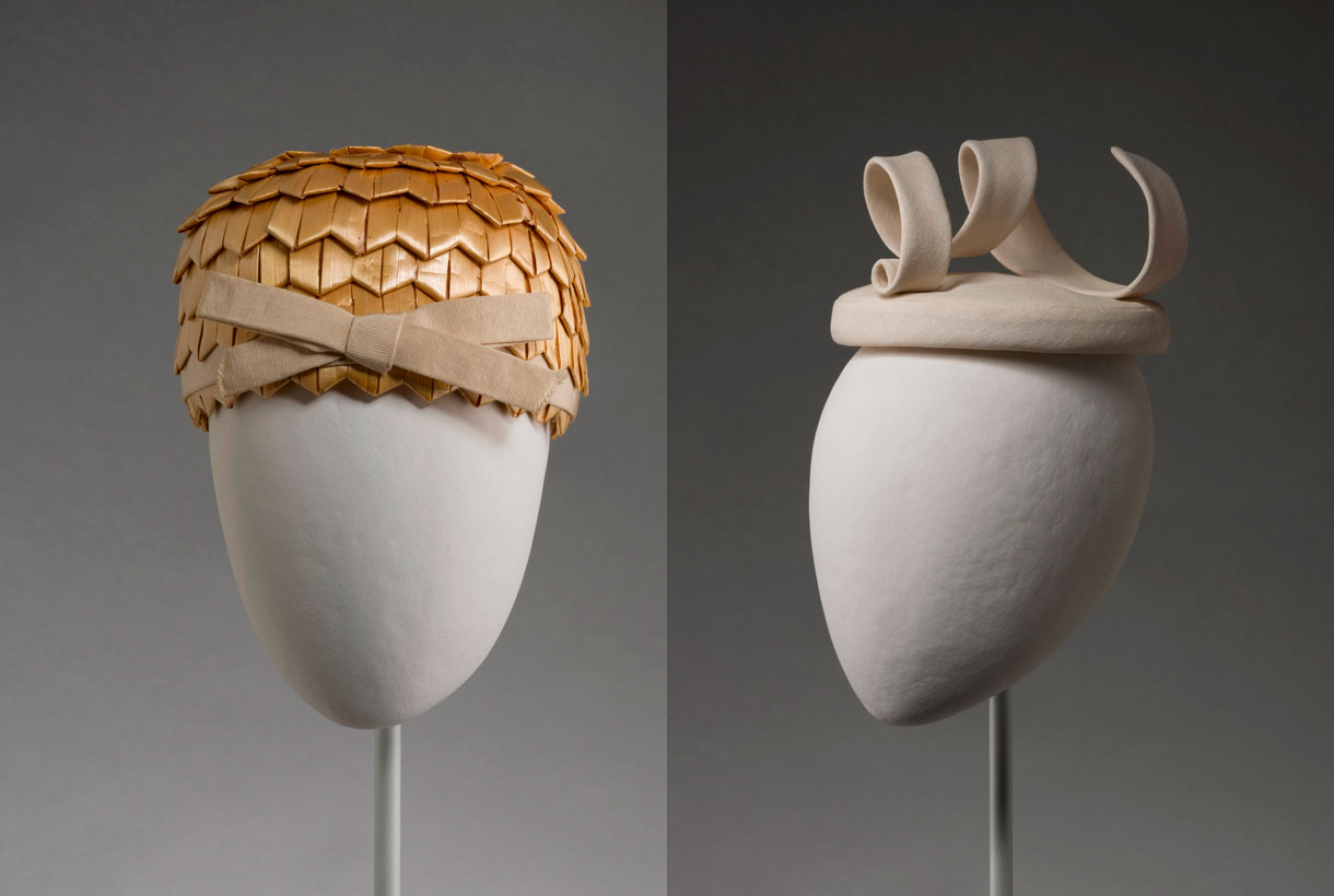
Architect of form
Cristóbal Balenciaga established a very characteristic style and shape in his designs for hats, with refined, stylized volumes that are created via very simple, almost abstract forms, being in themselves authentic sculptures. The exhibition delves into the uniqueness of the designer’s work, highlighting the innovative and imaginative forms, the selection of exquisite materials, the search for techniques, and the artisan character of his hat production. The sum of all these factors makes them unique, unrepeatable and magnetic.
A good connoisseur of historical and popular headdresses, Balenciaga updated them and made them fashionable, always experimenting to create new models. At the same time he studied hats from multiple cultures, which he reinterpreted in a modern way and played with the harmony and contrast of colours seeking to create a profound visual impact.
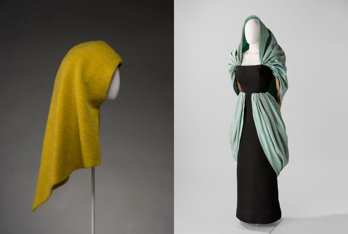
The secret is in the clothing
This monographic exhibition allows us to admire some unique pieces and at the same time reveal certain aspects of the making of hats that are quite unknown, both in terms of the work in the workshops and their dissemination, both tasks fundamentally carried out by women. Therefore the exhibition highlights the feminine world that shaped Balenciaga’s design and creations: the Paris and Madrid departments were run by women : hat makers and saleswomen. And this women’s work as a counterpoint in the feminine world that used them : the women of the social elite dressed by Balenciaga. They were colloquially called “the Balenciagas”.
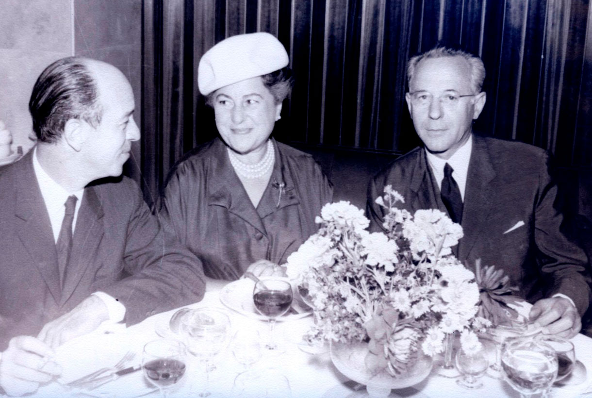
Identity and class symbol
From a contemporary perspective, ‘Balenciaga. The elegance of the hat‘ details the importance of this accessory to distinguish itself in the social and cultural context of the time. The headdress is an essential piece of clothing that balances volumes and completes the silhouette and image of the person. It is also a marker of identity, hierarchical distinction and social status. Since ancient times this accessory has been both an element of protection and a symbol of authority, thanks to the extravagance of its ornamentation or its size. It was not until the end of the 19th century, with the appearance of new purchasing and consumption habits, that women’s hats were introduced to all levels of society.
In the world of haute couture in the mid-20th century, headdresses brought glamour with a touch of boldness. In parallel hats were an element of daily use until the 1960s when, in the context of social movements that advocated social and gender egalitarianism, their use declined, it being symbolically related to the upper classes and a society organized according to a patriarchal hierarchy. Today, hats occasionally appear at fashion shows and at private parties or social ceremonies.
Greater outreach
The exhibition also has a “get to know” area, a library service with consultation and loan of more than 300 titles offered by the Documentation Centre of the Design Museum in collaboration with the Josep Benet Library in El Clot. The exhibition catalogue is packed with articles by the curators and a special collaboration from the renowned hat maker Philip Treacy. There are editions in Catalan, Spanish, Basque and English.
‘Balenciaga. The elegance of the hat’ opens in Barcelona from June 17 to October 3, 2021. Then the exhibition will migrate to the couturier’s hometown and can be seen at the Cristóbal Balenciaga Museum in Getaria from May 2022.
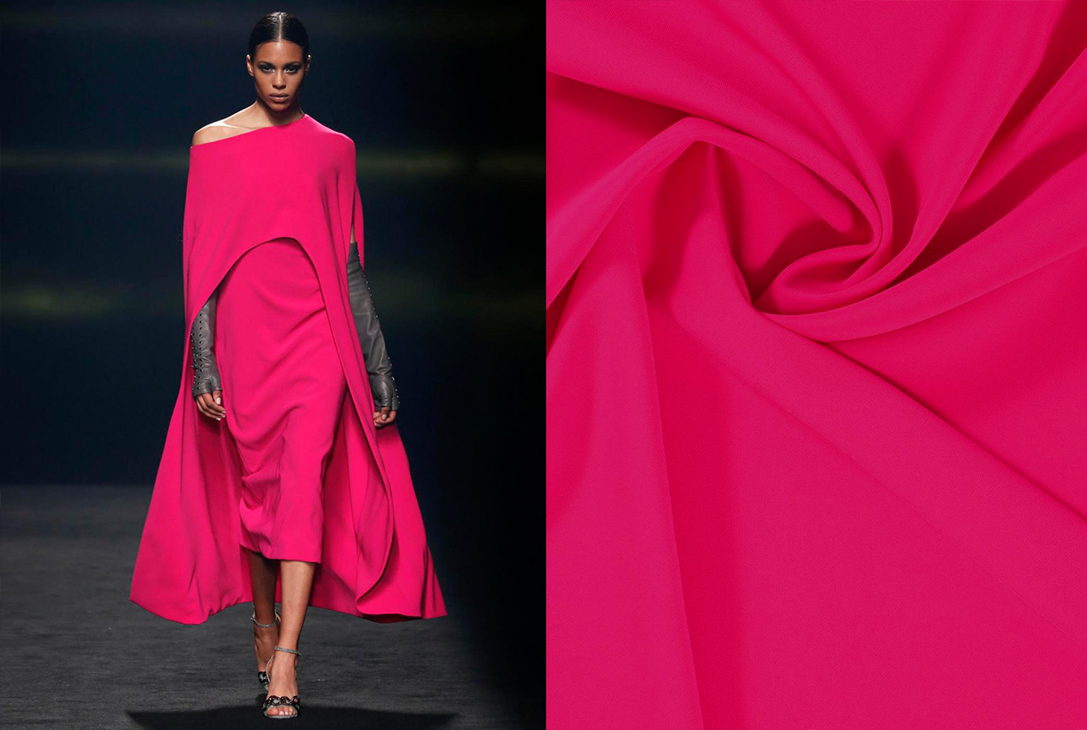
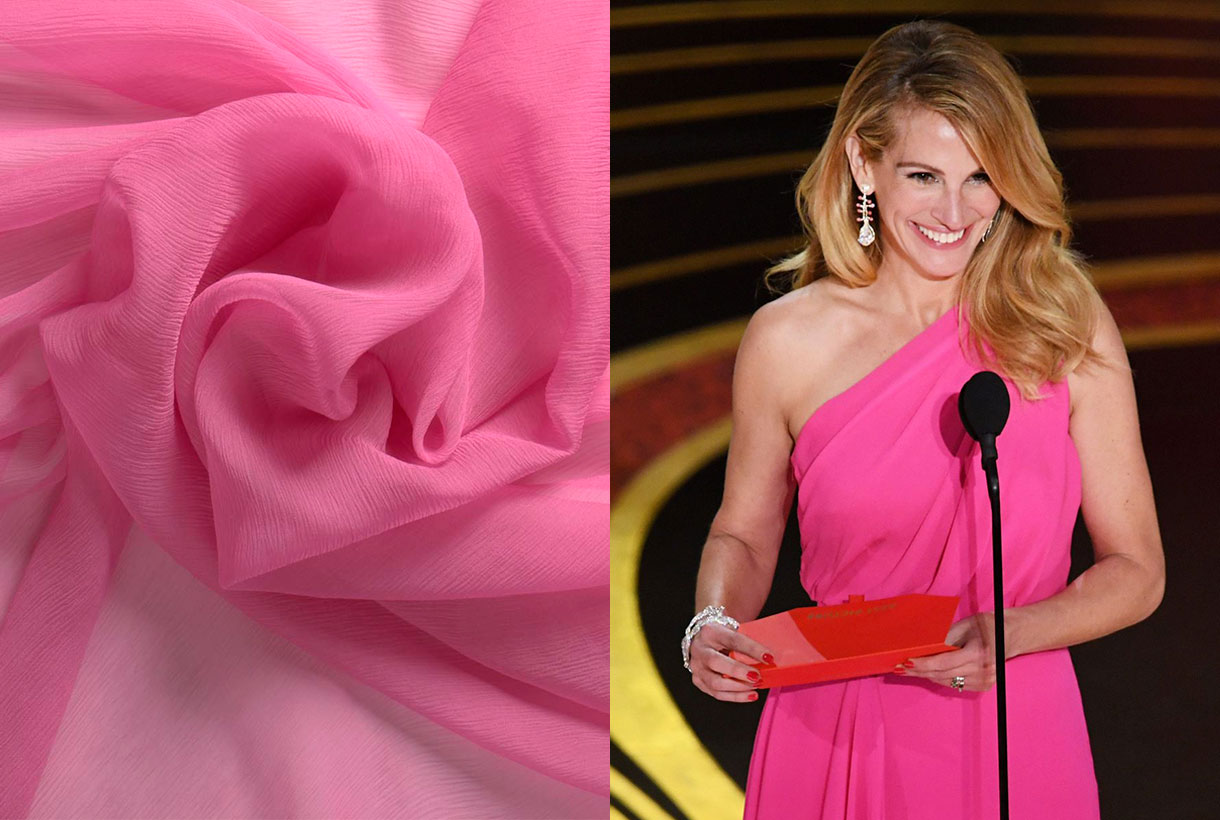
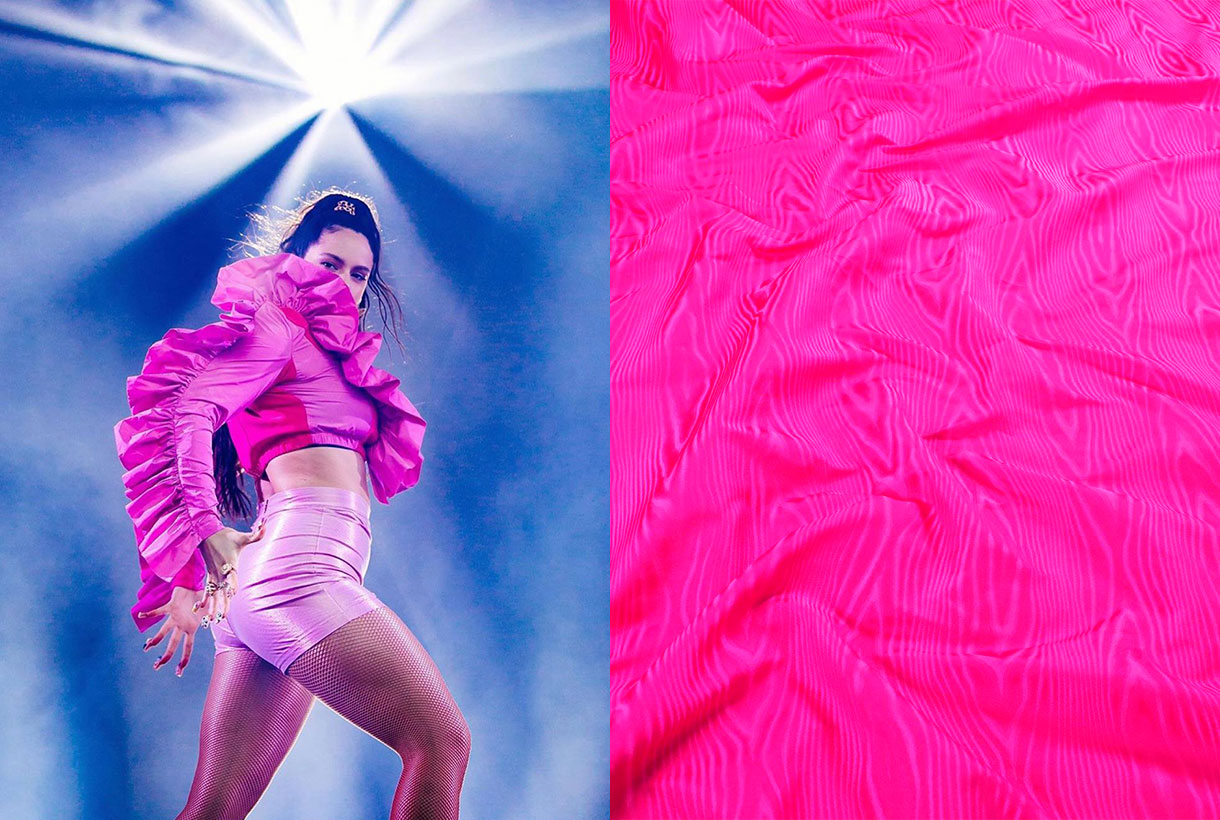
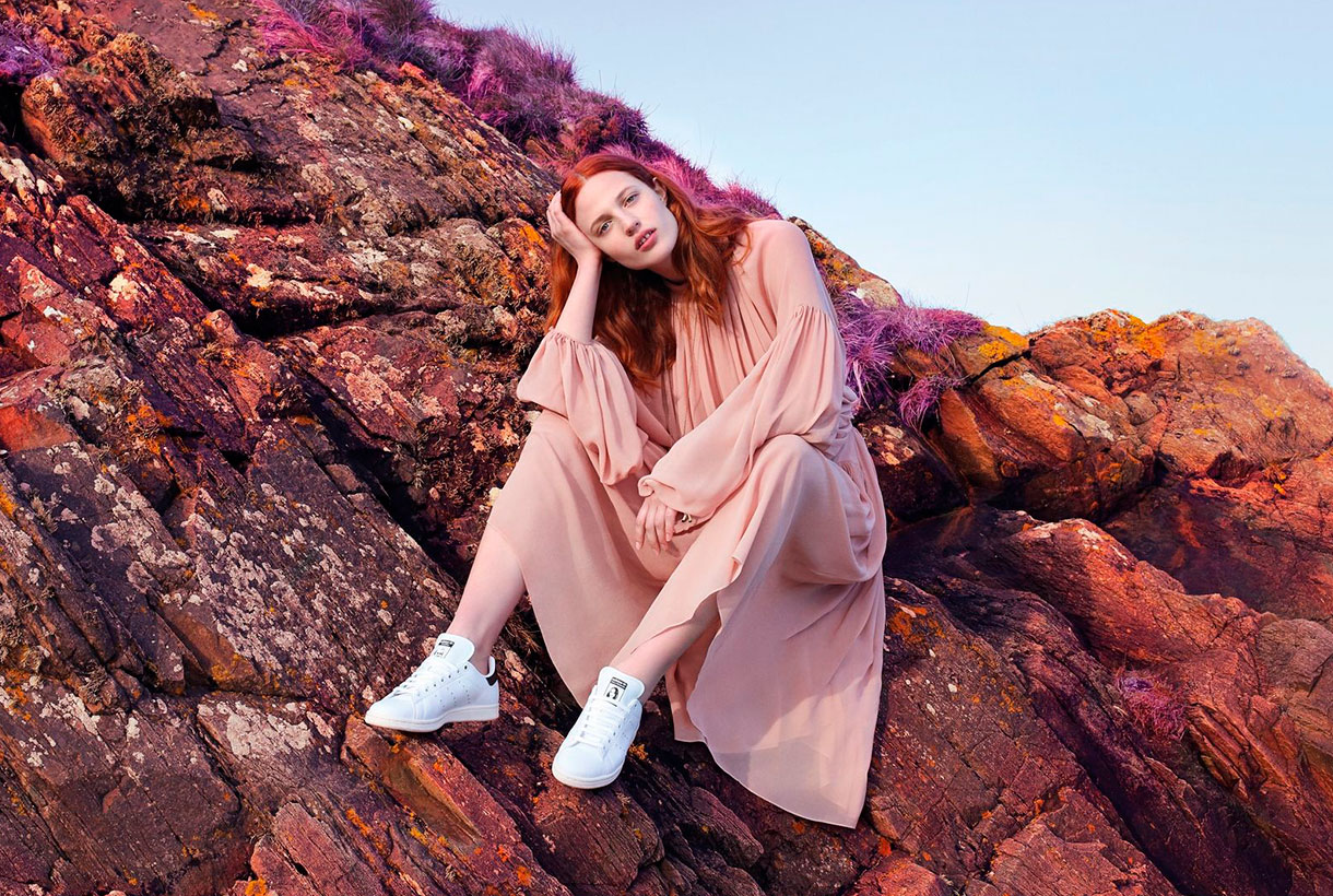 Pink is a colour that generates debate. It never leaves you indifferent and its choice in fashion represents from the most classic to the most demanding femininity. The childish and the superfluous is tinged with pink, but also the controversial, the flashy as well as the minimalist. From Schaparelli pink to Millennial pink. Let’s review some anecdotes about one of our favourite colours via various seasonal fabrics.

The colour of delight, happiness and miracles
Rosa, Rosalía, Rosanna, Rosita and Rosamunda. They all come from the rose. The flower that names the colour in question. All the qualities attributed to the rose are considered feminine because traditionally the rose has symbolized the strength of the meek, delight and kindness. William Shakespeare wrote in ‘Romeo and Juliet’ a revealing comparison: “I am as polite as the colour pink” to symbolize the sensitivity that this colour radiates.
Happiness is also dressed in pink as it is a hue that evokes fantasy. A rosy world is too beautiful to be true or anyone who adopts the motto think pink seeks to live out their optimism in the face of a grey reality. When life is like a dream, the French have an expression that alludes to the colour in question: C’est la vie en rose, they say. A theme that Édith Piaf also immortalized.
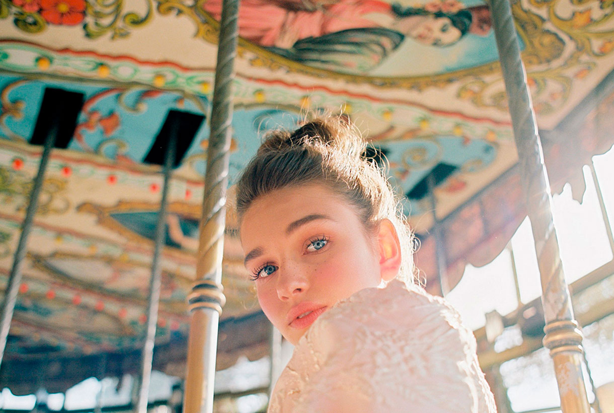
Pink in medieval paintings had also been linked to the colour of transfiguration, unreality, and extraordinary things. There are several works that represent the homeland or the life of a saint with pink details such as a house within a city or a pink aura around a person. The people of the time linked that colour with that of miracles.
Instead today’s artists (designers, illustrators, cartoonists …) use pink from a creative point of view to surprise the viewer through colour. When pink is used in an unconventional way, it directly draws attention and appeals to the object or subject in question. The most famous Panther in the world of cinema and comics is not exactly black.
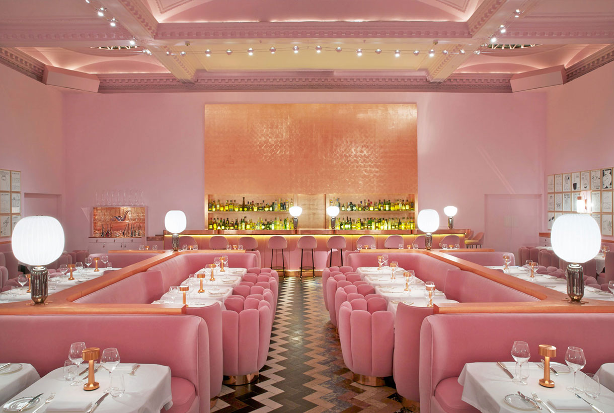
Tender and sweet pink
Pink is soft and tender and on a psychological level it is associated with delicacy. Pink makes us think of skin, softness and youth. Pink also expresses sweetness. It is the colour of confectionery, delight and cloying. We know that any edible product with a sweet wrapper is a food with a mild, appetizing and sweet taste. Not in vain is it the most used colour in pastry shops or sweet shops that unconsciously seduce consumers through the tempting pink tones.
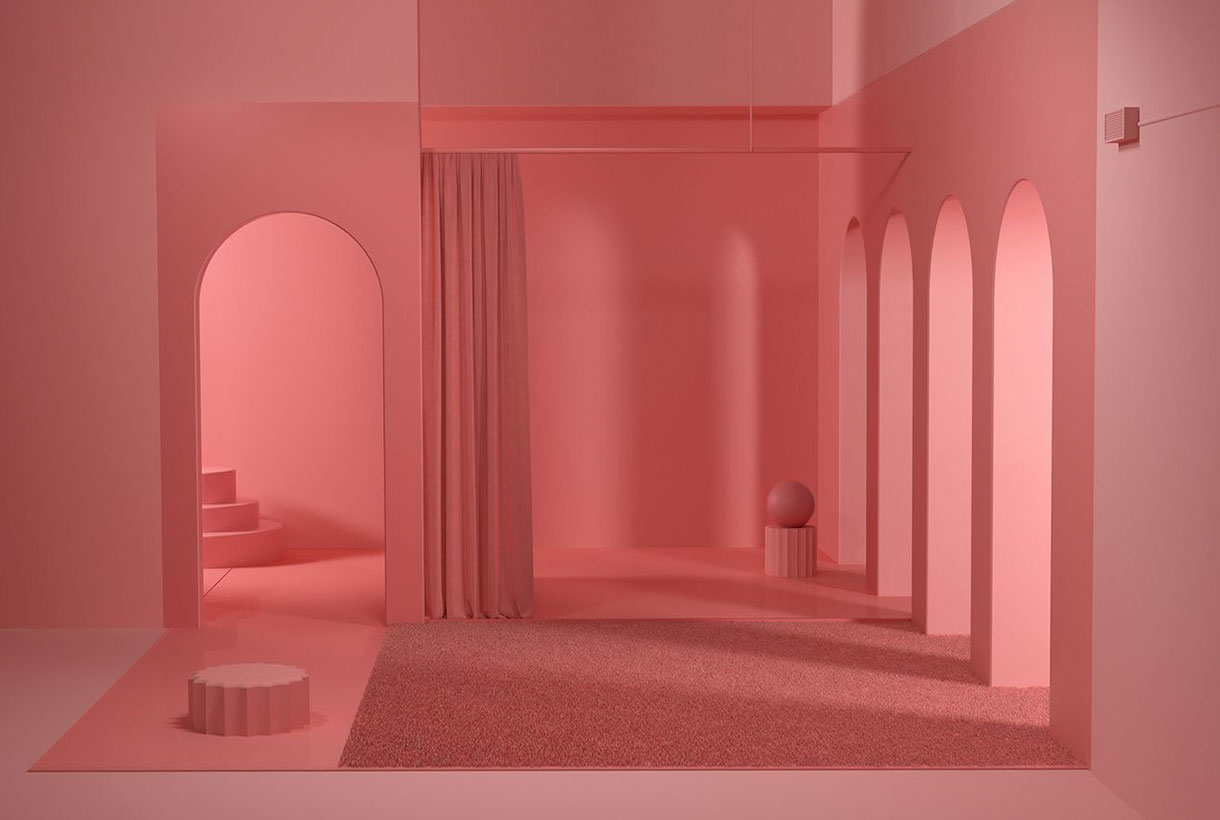
From masculine pink to feminine pink
Pink has not always been a colour associated with the “typically feminine.” In fact, before the 20th century it was considered a masculine colour. For example, in ancient religious paintings the Child Jesus was often painted in pink, the diminutive of red, and the Virgin Mary in an indigo blue cloak. Another example. Today’s pink press dedicated to a predominantly female audience would contrast with the typically male financial newspapers, such as the Financial Times and the Gazzetta dello Sport, which continue to be printed, in accordance with the old tradition, on pink paper.
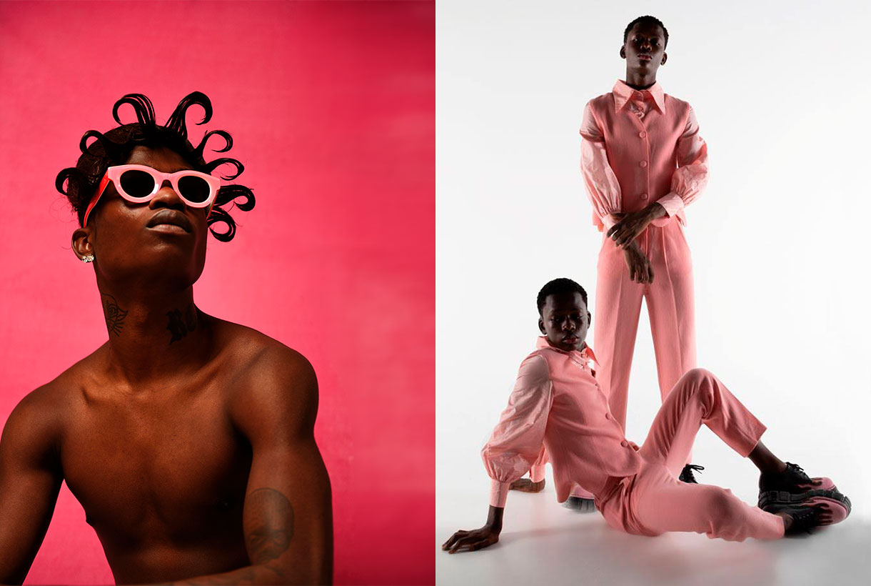
On the other hand, the convention to award pink to girls and light blue to boys arose around 1920. Before that little boys and girls were all clad in white. If they wore ribbons, they were almost always red, because according to tradition, this colour protected against the evil eye. After the First World War red disappeared from all men’s civilian fashion. At this time there was also a real revolution in clothing: the so-called “reformist fashion” that freed women from corsets and created a specific fashion for children who wore sailor suits and dresses, dyed with artificial indigo, the new fashion dye. Sailor suits derived from an almost forced logic, suggesting that light blue was the colour for boys and its opposite, pink, was awarded to girls. During World War II this message was reinforced through government propaganda with a “pink for a girl” mental association. In fact, in advertising, those perfect wives who took care of the children and the home wore dresses of that colour. At that time it also became the colour of discrimination: homosexuals who could not satisfy the ideal of masculinity were locked up in concentration camps and wore a pink triangle sewn to their clothing to distinguish them. The colour pink is indeed currently often identified with this group (the pink collective) who see in this shade a positive connotation of identification and of struggle to claim their rights.
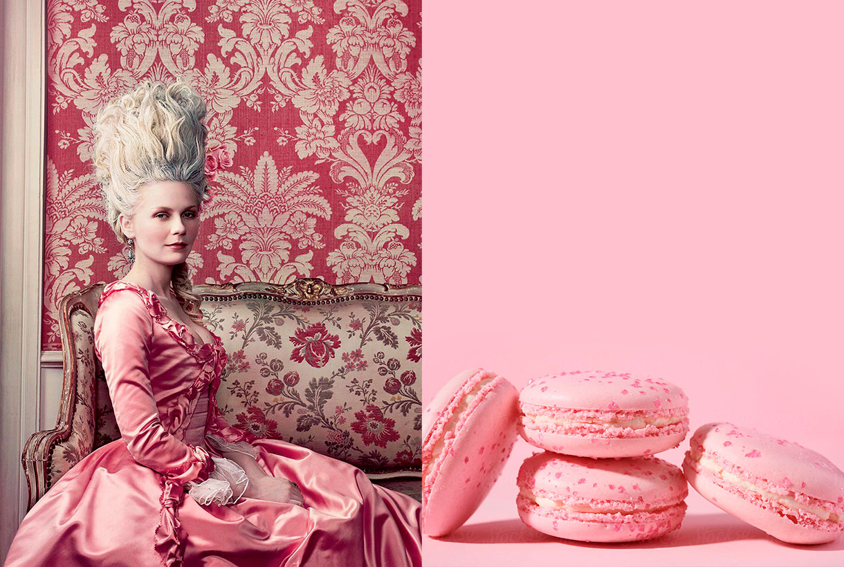
From Pompadour pink to Schiaparelli pink
During the Rococo period, which lasted from approximately 1720 to 1775, the pastel colours dictated by the French court, which set the fashion of the time throughout Europe, were all, the rage. Aqua greens, straw yellows, azure blues, and powdery pinks were worn by aristocratic men and women alike. Madame Pompadour (1721-1764), prototype of the Rococo lady, lover of art and exquisite taste, made the combination of pink and light blue fashionable, something which today seems typical of this artistic movement. Today the Pompadour rose still endures, a princely rose that the porcelain makers of Sèvres created for the lover of the King of France Louis XV: a rose with obvious traces of blue, some black and yellow.
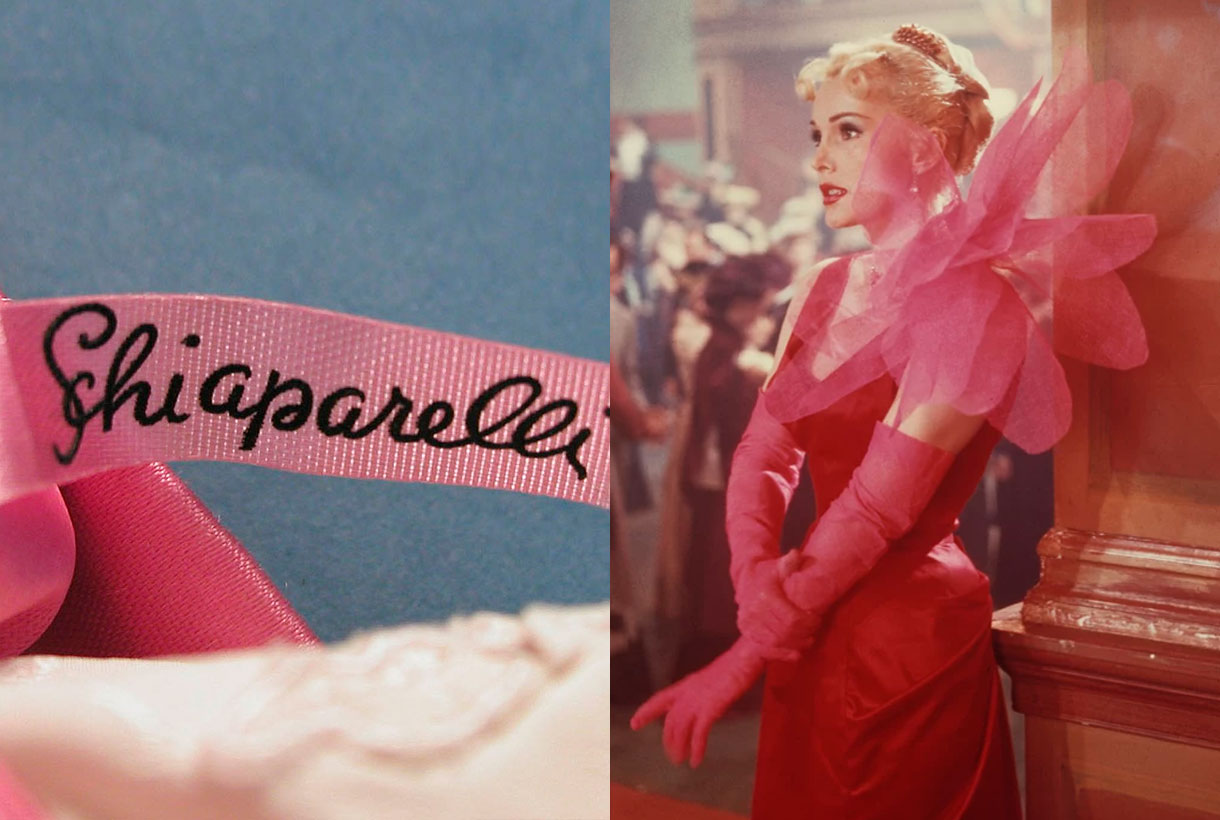
In fashion there is another rose worthy of mention, precisely because it does not go unnoticed: Elsa Schiaparelli‘s shocking pink. In 1931 the Italian dressmaker, who brought the ideas of surrealist painters into fashion, launched a new colour: shocking Pink (magenta with a hint of white). She also created a perfume that she called by the same name and which was sold in a box of that garish colour that scared the public by its aggressiveness. Yes, pink could be subversive and transgressive. In fact, this colour is currently used in outfits aimed at attracting attention whether on a runway or a red carpet.
Interestingly, Pink is the loudest colour in the range of roses. It is the colour that is usually present in advertising not very serious objects, the most strident accessories in fashion and the cheapest or most banal plastic articles.
The pink of the millennial generation
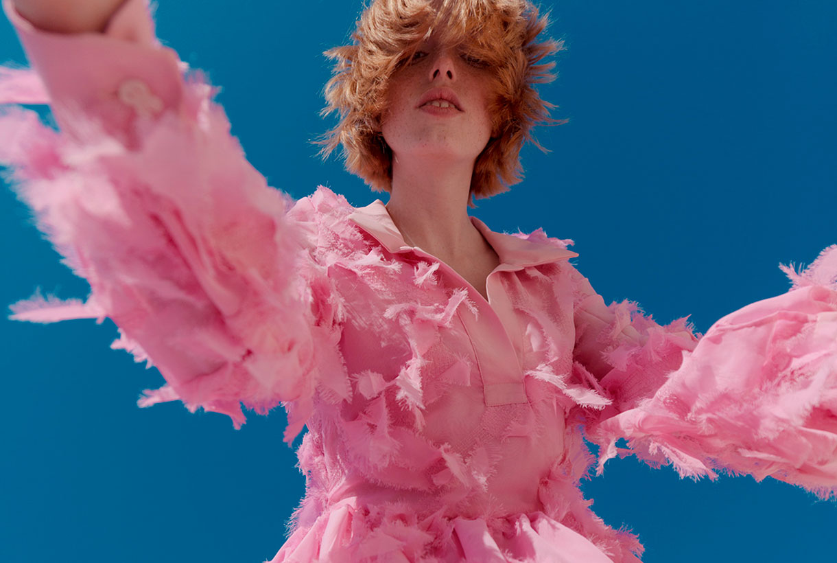
There is a type of pastel pink that has been appropriated by millennials during the first decade of the 21st century. A neutral tonality that unifies genres, identifies a generation and that has taken over a cultural movement that ranges from fashion to cinema. For example, millennial pink has been seen in Wes Andersen’s movies or on the fashion-parades of Valentino, Marni, Dolce & Gabbana, Hermès or Dries Van Notens. A tone that has also appeared throughout the world of design, from social media and printed materials to furniture. This pink, which mixes salmon tones, conveys a sense of calm and is associated with words like “youthful” and “accessible”, explaining why so many modern companies have been so drawn to it. Millennial pink fever broke out in 2016 when Pantone announced quartz pink, a candy-cotton-like shade, as its colour of the year. Although generation Z has taken over from the new youth by appropriating other colours, this type of pink is still very present in today’s society.
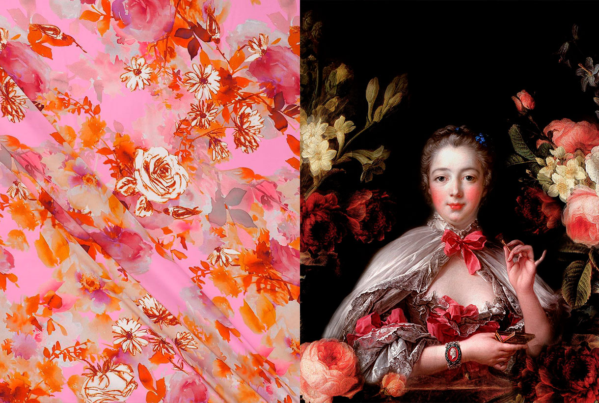
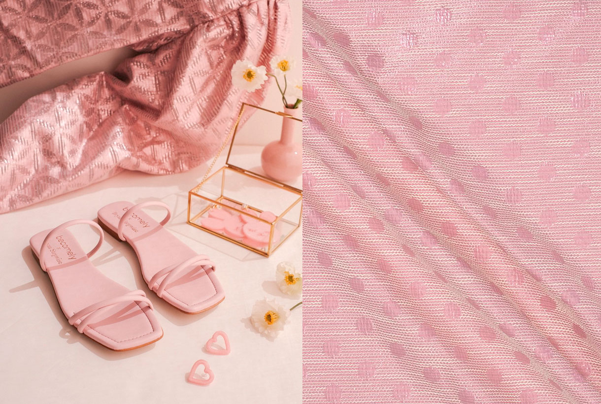
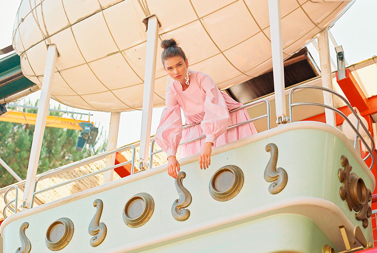
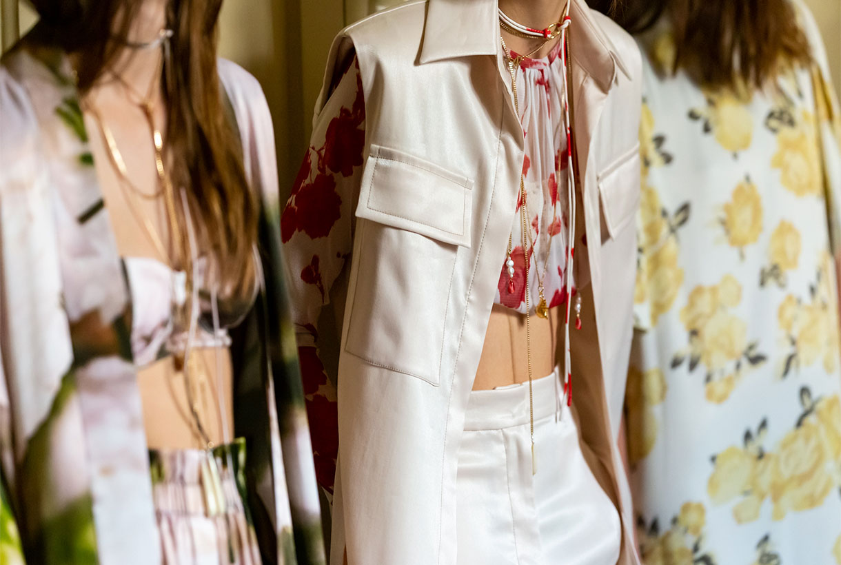 Although in fashion they do not have seasonality, flowers triumph in spring: they sprout in all fabrics and take over the main trend-setting outfits, whether romantic spirit, eighties aesthetics, sports or boho-chic style. In addition, this season the motifs of small and delicate flowers coexist with other tropical-inspired maximalists in bright and radiant colours. In fact, if there is something that unites the spring floral prints, it is the explosion of colour that they use to enliven the looks of the moment.
At Gratacós we propose to organize our seasonal prints according to three inspirations:

Poppies, daisies, dandelions, hollyhocks, lavenders… The most common wildflowers found in the field make the leap onto the catwalk and are presented individually or in colourful bouquets that add a youthful touch to the garments in which they star. Wild flowers tend to link with the looks of a folk spirit in flowing dresses, asymmetrical jumpsuits or extra- long tunics.
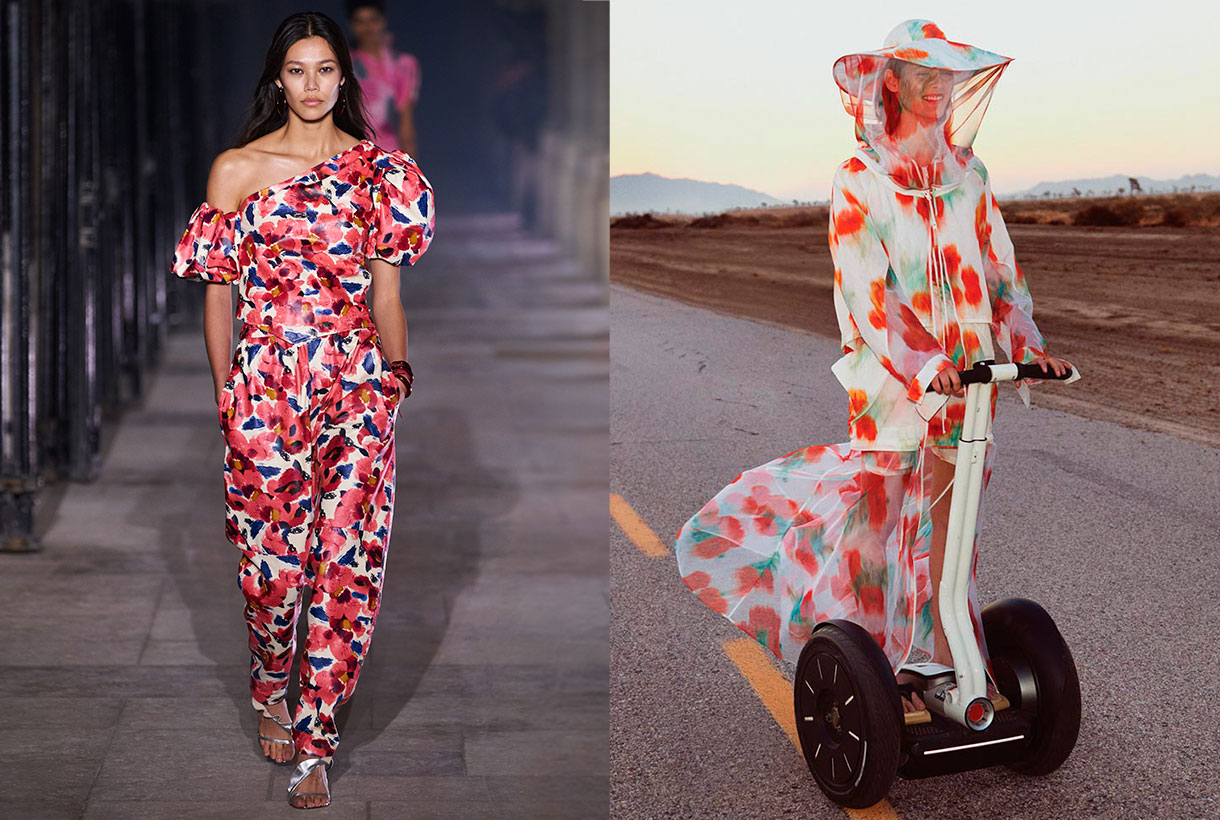
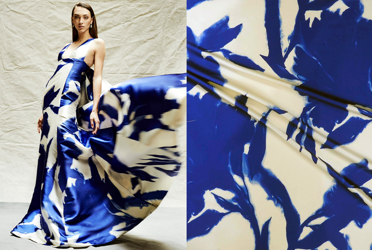
The flowers that live in the garden are a constant source of inspiration for designers when they create their dress designs for the summer collections. Hydrangeas, carnations, peonies, geraniums are some of the flowers that also appear in celebrity guest looks. For yet another season roses are the queen of flowers and are amongst the most prominent of floral prints because they represent romance, mystique and femininity. At Gratacós this season we are committed to combining roses with other garden flowers, creating patterns with attractive and very colourful visual play.
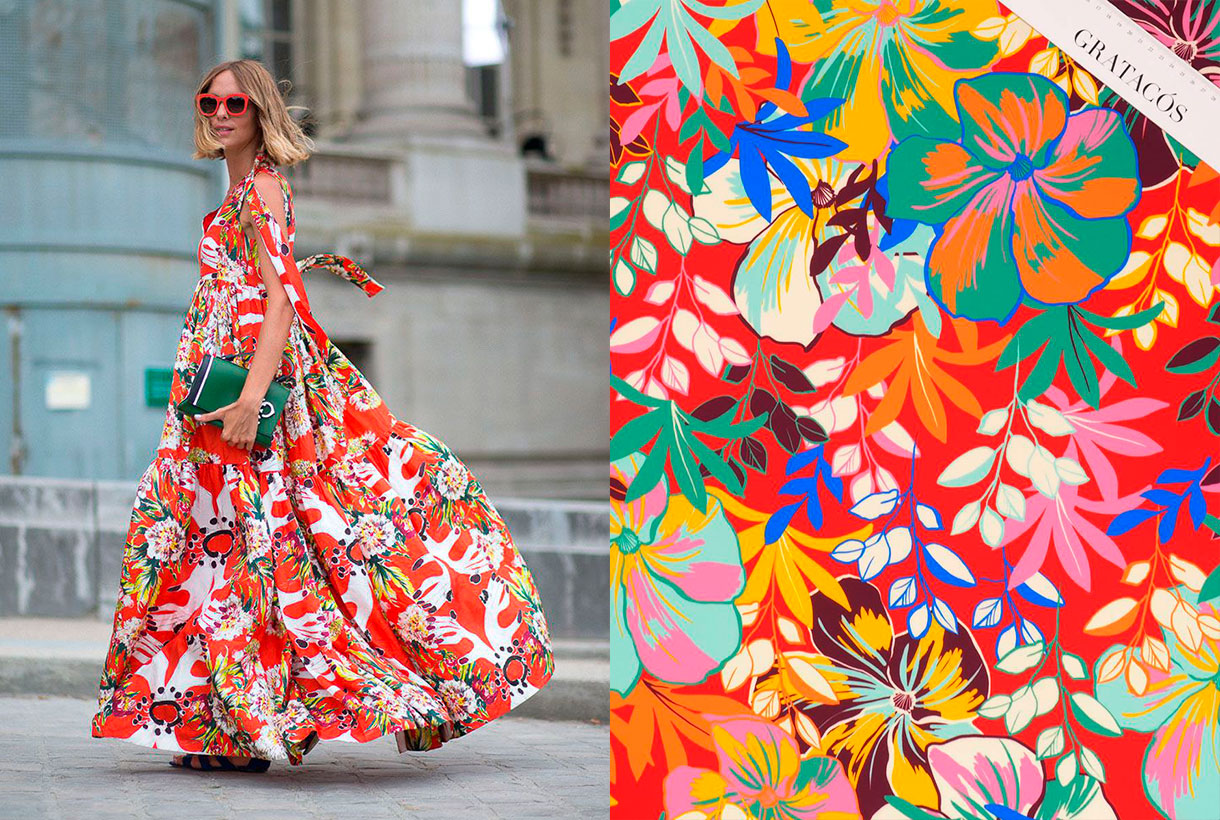
Prints inspired by the flora and fauna of tropical paradises are a classic that never fails in Spring-Summer collections, especially in lighter fashion garments with holiday-inspired clothing. Exotic flowers such as hibiscus, abundant vegetation and some animal print motif sneak into these more relaxed and carefree designs with bold colours that help to enhance a suntan.
These are some of our suggestions, but you already know that in our online store or in our shop in Barcelona you can discover all the floral prints of the new collection. What designs can you imagine yourself creating with seasonal floral fabrics?
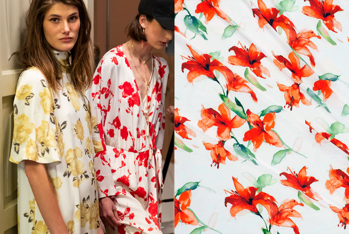
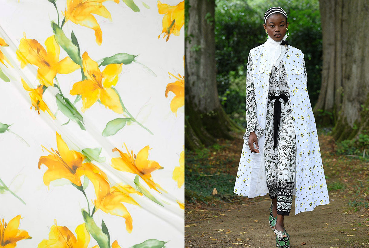
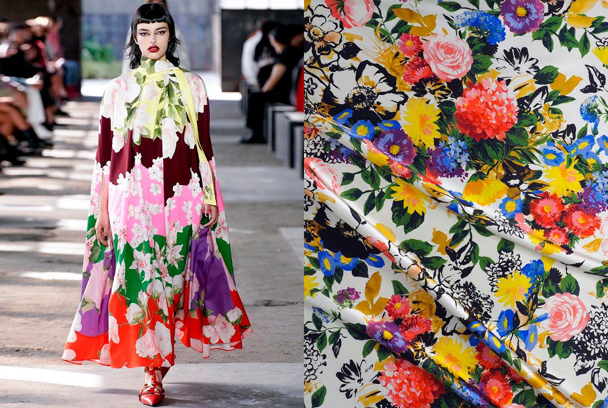
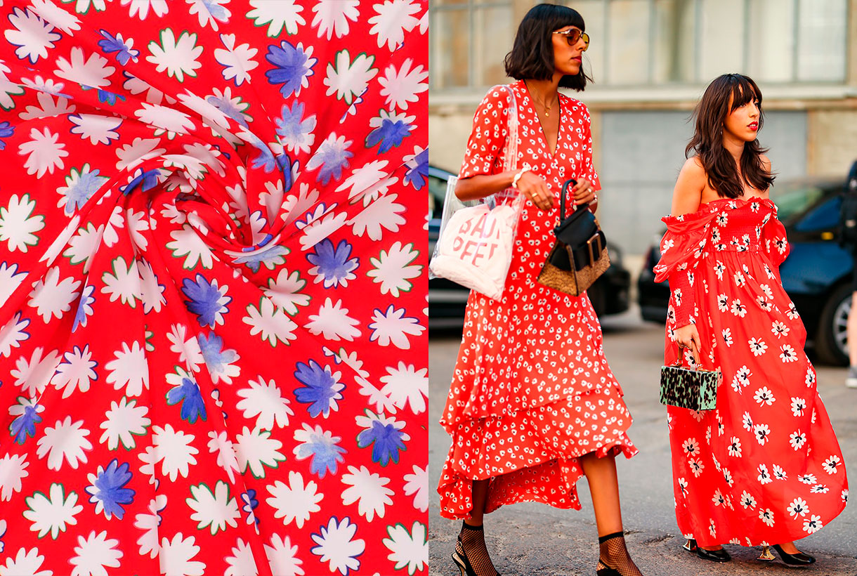
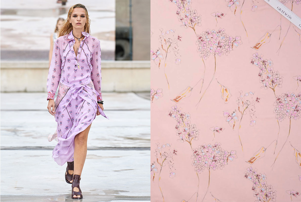
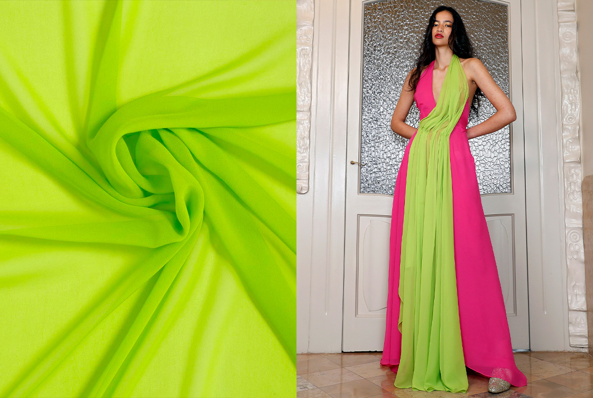
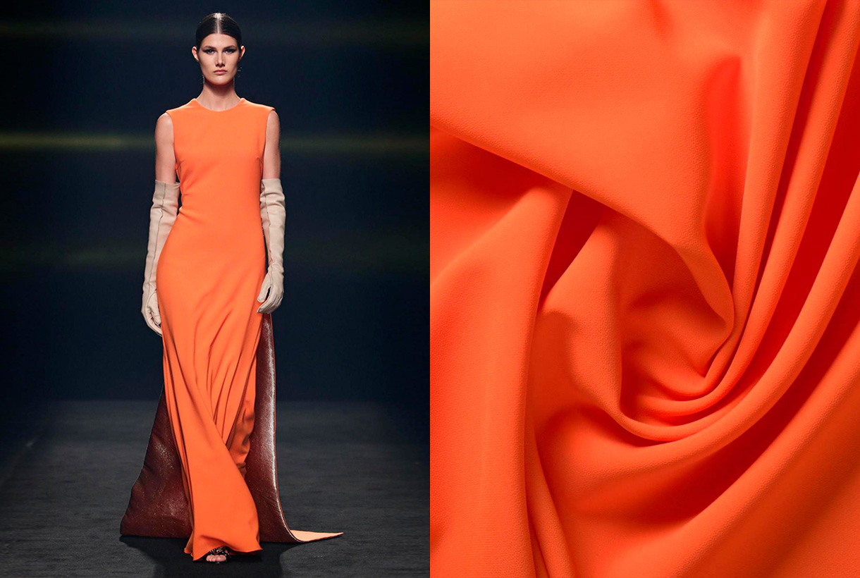
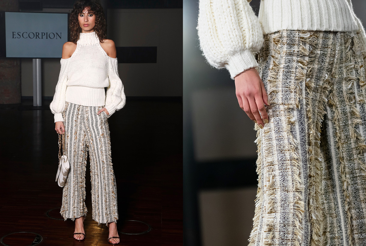
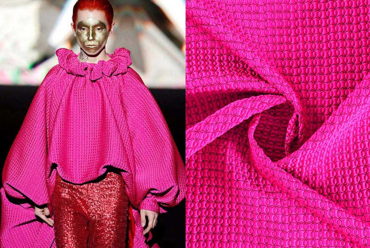
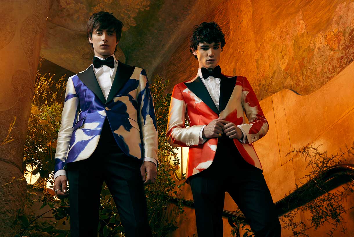 Gratacós ends the month of April by reviewing the first Spanish catwalks of the year: Mercedes-Benz Fashion Madrid in hybrid format and 080 Barcelona Fashion with collections presented through fashion films. These are the proposals, designs and looks that we have found on the catwalks and that are made with various seasonal fabrics. Thanks to all the designers for trusting in us!
Mercedes-Benz Fashion Week

Brain & Beast souvenirs
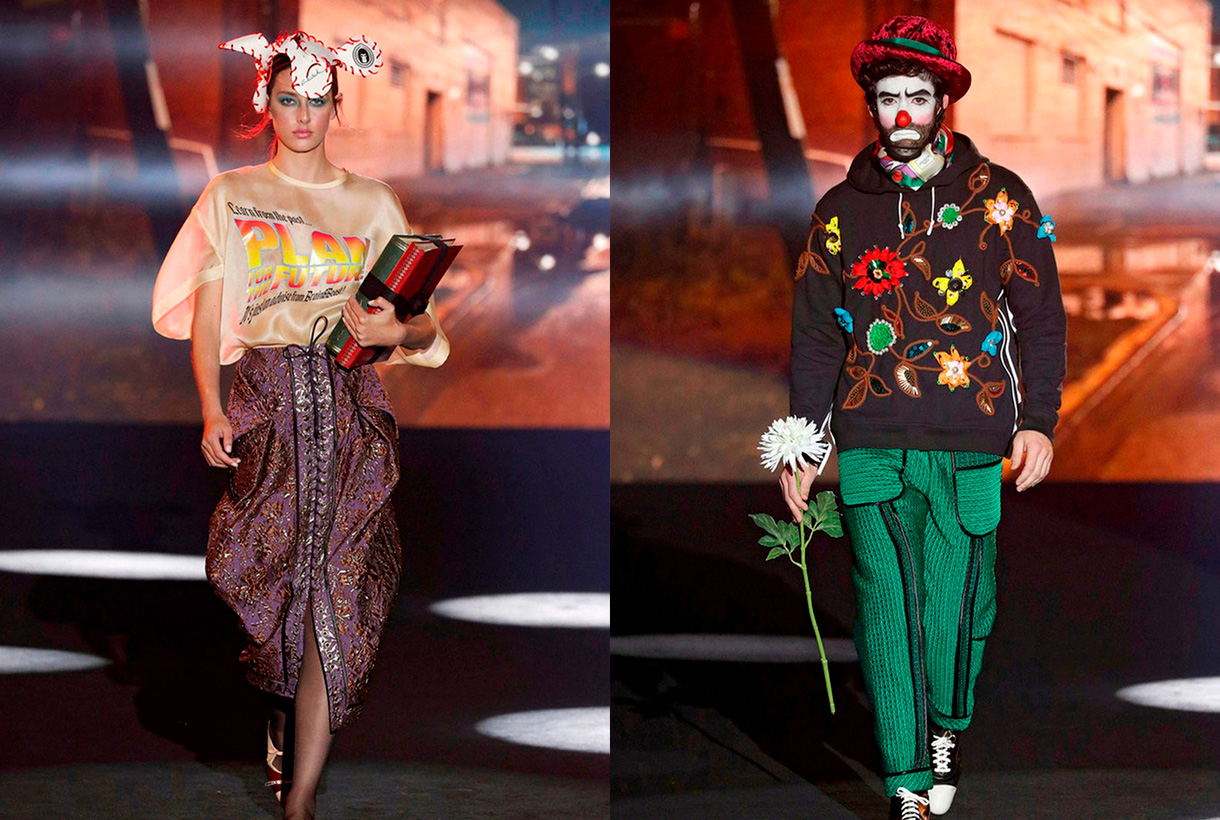
Ángel Vilda, the alma mater of Brain&Beast has transmitted the concept of memory and nostalgia to the Madrid catwalk, via family memories with his new creationl ‘Souvenir’. Thus this daring designer, who turns shape, volume and colour upside down in each collection, has reverted to his childhood to reproduce garments that have marked him and that constitute valuable objects in themselves: the patterns of the dress his grandmother wore at her mother’s wedding, a coat that recalls the dressing-gown she wore on her holidays in Salou, a reconstruction of his grandfather’s dressing gown … All this personal memory takes shape via his customary design tics: oversize patterns, overlapping layers and textures, geometric motifs and some symbols inspired by contemporary culture that mix irony and humour. This company combines powerful social discourse with a strong visual identity and has managed to establish itself within the scene with its irreverent style. At Brain & Beast nothing is left to chance.

The art of volume by Isabel Sanchís
The Valencian designer once again magnifies the femininity of women via a new Autumn / Winter collection 2021/2022 full of pieces with intense silhouettes and volumes of sculptural inspiration that appeal to the five senses. To recreate these architectural figures, Isabel Sanchís uses elements such as shoulder- pads that provide volume and a certain futuristic air, drapes, embroidery, intertwined motifs, fringes and silicone appliqués. With regard to colour neutral tones, especially in grey, accompany touches of fuchsia, yellow and orange in strategic looks that reduce volume and enhance the feminine silhouette.

Maison Mesa, life is a party
Juan Carlos Mesa has actively contributed to the visibility and development of Spanish fashion. With his own company, Maison Mesa created in 2017, the designer exhibits his unique vision of fashion in a contemporary key, combining tradition (materials, classic and artisanal sewing techniques) with new technologies (3D printing and experimental materials). Under this concept the latest collection entitled ‘Rave’ was presented, inspired by the history and evolution of those bohemian parties born in London in the 50s that have been transformed over the decades into well-known electronic music events.
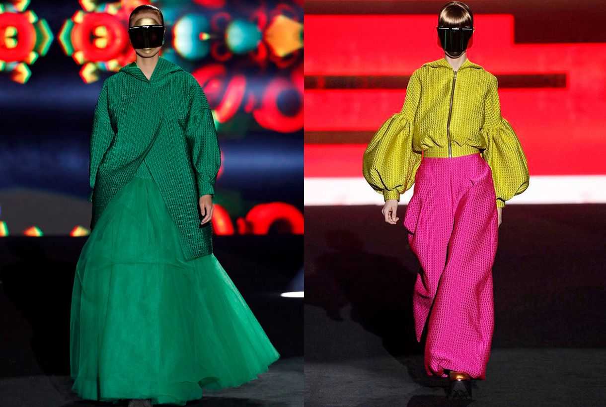
To represent this spirit of escape via partying Juan Carlos Mesa goes for clean and simple lines, full of references to urban clothing that stand out for their comfort and freedom of movement: wide pants and overalls, baggy pants and oversize garments. , cargo pockets, hoods and zippers, rubber or automatic, which hark back to sport garments. In terms of fabrics the designer uses a surprising mix of combinations: wool, satin and lurex twill, mixes of crepes with denim or quilted fabrics with a 3D effect together with tulle. All, within a colour range that ranges from the purest and primary colours such as yellow, green or magenta, to burgundy, indigo, grey, white or black along with touches of gold and silver.

The OFF catwalks
Parallel to the official calendar for the Mercedes-Benz Fashion Madrid, OFF shows were also scheduled, featuring young fashion designers.
In these alternative shows we highlight designers who habitually trust our fabrics, like Dominnico. This time Domingo Rodríguez Lázaro is inspired by the social crisis of coronavirus to create an imaginary uncertain future through the eyes of a generation of young people who want to socialize at a moment of emotional breakdown. To recreate this concern Dominnico goes for an upcycling exercise, recovering part of the brand’s fur leather inventory to create new pieces. In addition the denim fabric that appears with exclusive prints and also a new genderless fashion line is given prominence.

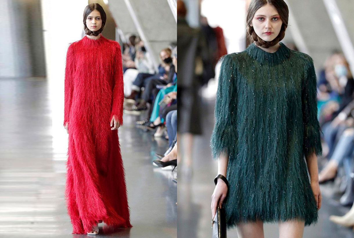
For her part, Pilar Torrecillas from the company Pilar Dalbat has presented a collection dedicated to the figure of Mariano Fortuny Madraza, taking as reference the 150th anniversary of the birth of this famous painter from Granada. We highlight the feminine designs featuring our fabrics with small fringes creating an interesting hair effect.

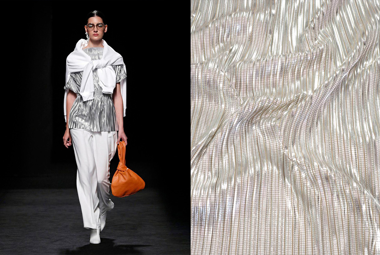
The Corsicana firm of Paula Currást tends to merge different disciplines and interests for its catwalk shows: fashion, design, cinema or music all appear together. The latest collection focuses on the home as a space for inspiration. ‘La Casa’ represents reflections on an environment of intimacy and introspection via fluid designs of urban inspiration, sartorial garments and pleated fabrics that are combined in a very controlled colour range.

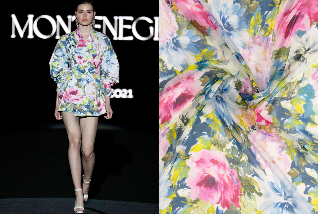
Finally, Montenegro, the debut of Nicolás Montenegro on the Madrid catwalk with a ready-to-wear proposal inspired by southern Morocco. The Sevillian’s creations abound in shirt dresses inspired by Moroccan djellaba with materials such as silk. The extremely striking cuffs and collars with character are some of the details that the creator applies to his shirts. Exceptional pieces that are dotted with lace, ruffles and delicate finishes, always topped by the company’s hand-made buttons.
080 Barcelona Fashion

The glamour of Avellaneda invades the Catalan catwalk
Juan Avellaneda has opened the 080 Barcelona Fashion calendar with a proposal that invites you to dream via sophisticated looks full of fantasy that connect with beauty, joy, escape and the desire to celebrate life. Thus in the proposal ‘La nuit éclairée’ the celebrity designer opts for the characteristic features that make up his DNA: tuxedos for men and women together with classic shirt and tailoring patterns, introducing novelties such as porcelain-china inspired prints and a collection of dresses inspired by tailored garments. The chromatic range makes a return to essentials via pure and energetic colours such as white, black, red and Klein blue that suggest Mediterranean culture and its celebration of the essential.

The magic of Menchén Tomàs
Menchén Tomás is inspired by the ‘Duende’ for the next Spring-Summer 2021 collection, that is, by the innate and intangible talent that causes almost magical sensations in those who witness it. In a fairy tale atmosphere and with various elements that refer to the tarot, Olga Menchén showed off her usual design skills through a sophisticated and feminine collection, full of volatile volumes, iridescent fabrics, radiant colours, evocative long dresses where craftsmanship is appreciated: prints suggesting astral charts, embroidered flowers and a laboriously- created wedding dress with almost a hundred hand-sewn pieces that closed the show. The use of oriental-inspired silk and patterned gauze with colours such as porcelain- blue, apple- green or mandarin- orange give the collection an energetic air.

The experimental craft of Y_Como
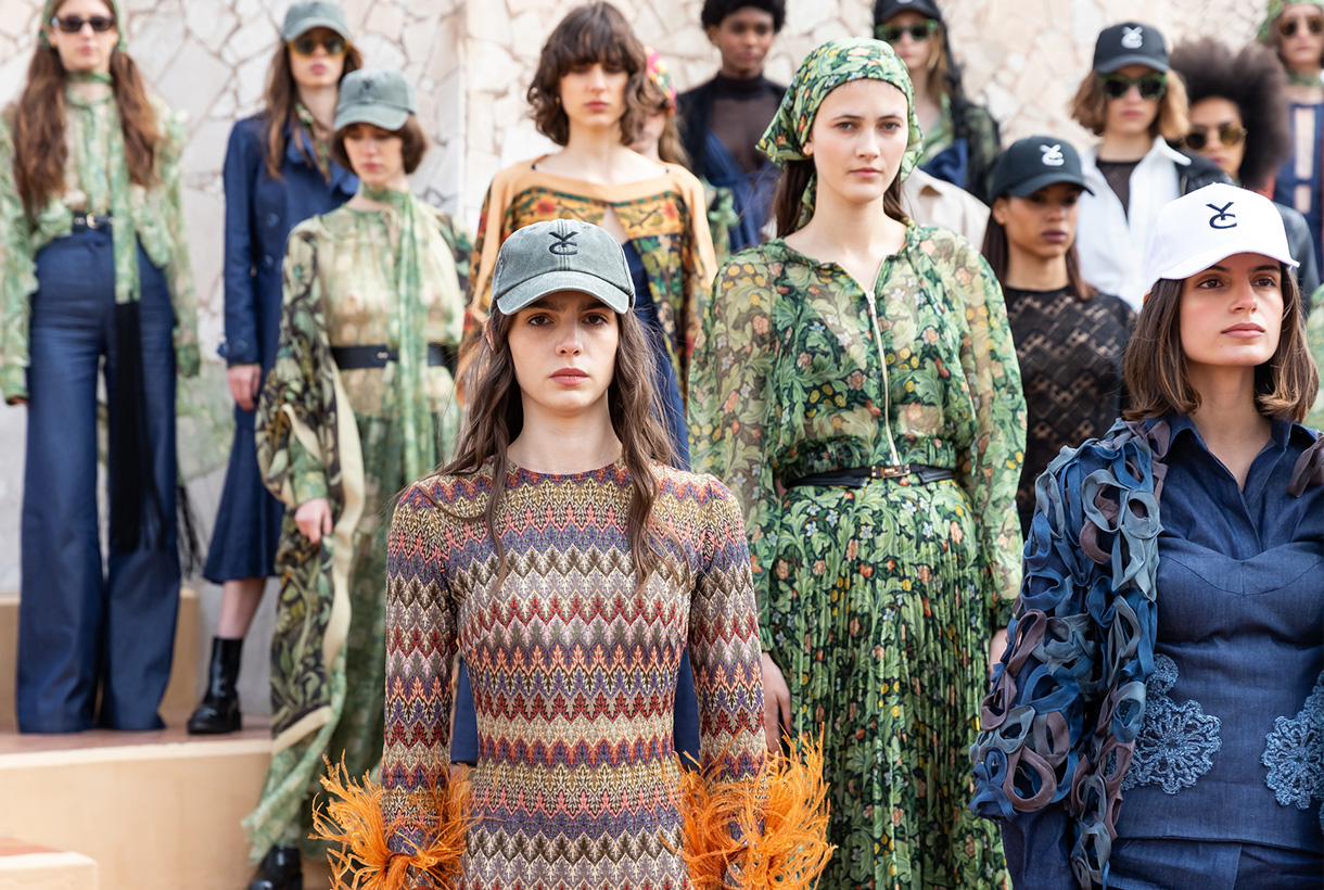
Born during lock-down, Y_Como is the new adventure of sisters Cristina and Yolanda Pérez, founders of Yolancris, the Catalan haute couturehouse that has catwalked in Paris. This new brand was born with the desire to explore the creative processes of the pieces, experimenting through innovative techniques, fabrics and silhouettes. The debut collection was actually presented at 080 Barcelona Fashion and is a declaration of intentions: it reclaims the spirit of freedom via the humanist poem ‘If’ by Rudyard Kipling in a manifesto that also combines the Arts & Crafts movement of designer William Morris and the naturalist architecture of Antoni Gaudí. Thus this proposal of great visual richness is in practice a great exhibition of the craftsmanship and experimentation of its designers. Particularly noteworthy is the meticulous way in which they have worked denim through draping, pleating and hand embroidery, together with hand-made prints and embroideries with floral and plant motifs. An exquisite hand-made proposal makes such a difference.

The free love of Paola Molet
Finally we also highlight Paola Molet who has made her debut on the Catalan catwalk with her own company, which was created 6 months ago. Her style is defined as neo-romantic and the collection is genderless, non gender-specific, with pieces that can be interchangeable. The proposed creation for next winter deals with how society understands love and the pursuit of happiness, whether following established canons or not. The young designer transmits this search in design through rigid, dense, hard and straight-shaped looks that are combined with de-constructed silhouettes and contrasting fabrics. The proposal is mostly black and white, with a touch of red.
I hope you enjoyed the collections as much as we did!


 It was to be expected! Within its cyclical nature, fashion evokes fantasy after having spent almost two years stuck in comfort and austerity, two values influenced by the global pandemic. Remember that fashion is always a reflection of society. Thus, the reign of tracksuits, sweatshirts, pyjamas and slippers (whether they are at home or not), seems to be coming to an end with new inspirations that are postulated totally antagonistic: More luxury, more ornamentation and of course, more shine in festive garments and collections that cry out to escape from reality.


 Yellow is pure contradiction. A dual colour that glows as the lightest of all vivid colors and symbolizes optimism, happiness and abundance. On its dark reverse side, yellow is also the shade that has traditionally been associated with anger, jealousy, and envy. A tone that is loved and hated in equal measure, adored by young people and precisely represents the new generation of consumers:


 The history of women’s intimate fashion is curious because it is not only linked to the trends of each era, but also to the rebellions of women and the strength of some female icons such as the dancers Isadora Ducan and Irene Castle, the writer Simone de Beauvoir or the pop diva, Madonna, who broke ground in her time, breaking some conventions and marked taboos. It is also remarkable, as in recent decades, the conception of what is intimate and what is not, is conspicuous by its absence because fashion evolves and transforms, merging concepts and adapting pieces that were once created to remain hidden behind the outer layers of the visible clothing.


 A key complement


 Pink is a colour that generates debate. It never leaves you indifferent and its choice in fashion represents from the most classic to the most demanding femininity. The childish and the superfluous is tinged with pink, but also the controversial, the flashy as well as the minimalist. From Schaparelli pink to Millennial pink. Let’s review some anecdotes about one of our favourite colours via various seasonal fabrics.


 Although in fashion they do not have seasonality, flowers triumph in spring: they sprout in all fabrics and take over the main trend-setting outfits, whether romantic spirit, eighties aesthetics, sports or boho-chic style. In addition, this season the motifs of small and delicate flowers coexist with other tropical-inspired maximalists in bright and radiant colours. In fact, if there is something that unites the spring floral prints, it is the explosion of colour that they use to enliven the looks of the moment.


 Gratacós ends the month of April by reviewing the first Spanish catwalks of the year: