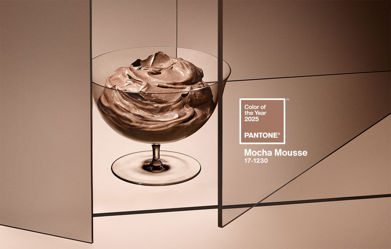
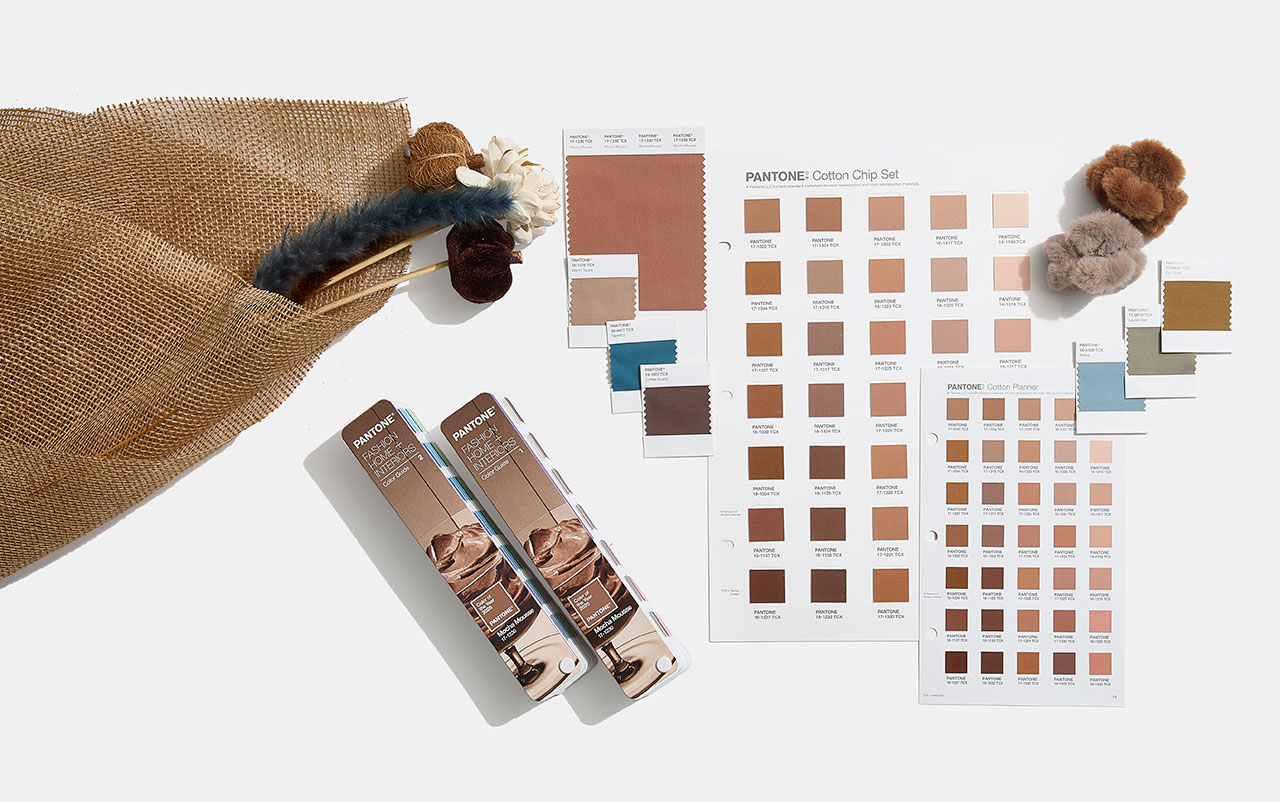
 Mocha Mousse. Pic by Pantone
Imagine a creamy dessert that combines the aromas of cocoa, chocolate and coffee, with evocative textures and an intense brown tone that awakens both the sight and the palate. This suggestive image, which mixes everyday life and small pleasures, connects directly with the colour of the year 2025 chosen by Pantone: 17-1230 Mocha Mousse. This shade, described by the company as “a soft and evocative brown, but also intense and warm”, invites our senses to enjoy pleasure and exquisiteness.
A colour that opens the appetite
Mocha Mousse, suggestive and inspiring, takes over from Peach Fuzz 13-1023, the delicate peach shade that was the colour of the year 2024. “Inspired by our desire for everyday pleasures, 17-1230 Mocha Mousse expresses a level of thoughtful pleasure,” explains Leatrice Eiseman, executive director of the Pantone Colour Institute, as said in the new release announcing the long-awaited reveal. “Sophisticated and exuberant, yet an unpretentious classic, this colour expands our perception of browns as humble, understated tones to embrace aspiration and luxury. Infused with subtle elegance and earthy refinement, it presents a touch of understated, tasteful glamour,” says Eiseman.
Connecting with the origins
Although some on social media have criticised the choice of brown, associating it with the current period of instability and lack of authenticity, Pantone defends its decision by highlighting the growing search for connection with nature and the origins of humanity. “Characterised by its organic nature, 17-1230 Mocha Mousse honours and celebrates the sustenance offered by our physical environment. Infused with authenticity, it strikes a balance between the demands of modernity and the timeless beauty of artistic creation,” the company explains.
Laurie Pressman, vice president of the Pantone Colour Institute, describes Mocha Mousse as an extension of Peach Fuzz that came before it, sharing its essence of comfort but taking it a step further by including “the simple pleasures we can give away and share with others,” like a glass of mocha mousse. “The eternal quest for harmony permeates every aspect of our lives: our relationships, the work we do, our social connections, and the natural environment around us. This colour brings us contentment, inspiring a positive state of inner peace, calm, and balance, while attuning us to the world around us. Harmony encompasses both a culture of connection and unity and the synthesis of our mental, spiritual, and physical well-being,” Pressman details, highlighting how this shade reflects that longing for connection and balance.
How is the colour of the year created?
Pantone, the global authority on colour and a set of professional standards for the design community, began defining the colour of the year in 1999. The first choice was the iconic cerulean blue (Pantone 15-4020), a shade that achieved worldwide fame thanks to the film The Devil Wears Prada, released seven years later. In this film, Meryl Streep, as the feared Vogue editor, immortalised the colour with an unforgettable fashion speech to Anne Hathaway: “What you don’t know is that that sweater isn’t just blue. It’s not turquoise, and it’s not navy. It’s actually cerulean.”
The initial goal of this initiative was to generate conversation around colour, involving both the design community and colour enthusiasts. But choosing the colour of the year is not a simple or arbitrary process. Behind this decision there is a rigorous analysis. Each year, a committee of colour experts studies cultural, artistic and social trends worldwide to identify significant references. Based on this analysis, they select an existing colour from the Pantone catalog and name it with an easy-to-remember name.
Over the years, these choices have reflected the global socio-economic context: from Marsala, which evoked the world of wine in 2015, to the double choice of 2021 – Illuminating yellow and Ultimate Grey – which symbolised the challenges of the pandemic. In 2022, Very Peri, a bold lavender shade, connected the real world with the digital one. Beyond their beauty, these colours invite a reflection on the times we live in.
In 2010, Pantone expanded its reach beyond the design niche to connect with the general public, adapting to new creative disciplines inspired by colour. This is when two key initiatives emerged: the Pantone Colour Institute and the Colour of the World. the Year. These proposals not only investigate and promote the use of colour, but have also transformed the brand’s marketing strategy, turning it into a global trend. Today, the colour of the year directly influences product development and purchasing decisions in sectors such as fashion, decoration, design and advertising.
The Pantone guide, which began with 500 colours for the graphic arts, now has more than 2,000 references. Every 18 months, new and more precise shades are added, reflecting the evolution of colour in our daily lives. Today, Pantone is a multinational with a strong global presence. Since its acquisition by X-Rite, a company specialising in colour management, the company has grown exponentially. With 17 offices around the world, Pantone markets everything from its famous guides to branded products and strategic alliances. Recent examples include collaborations with Motorola for smartphones, special editions of Jägermeister bottles , and even coffee capsules in partnership with Nespresso, a partnership that raises the question: have these capsules inspired this year’s colour choice?
In 2025, to celebrate the 26th anniversary of the Pantone Colour of the Year, the company has taken the colour beyond its guides, highlighting it at global events and experiences. From New York and London to Shanghai and Mumbai, Pantone has curated public spaces and gatherings to make the colour of the year accessible to everyone.
The gentle elegance of Mocha Mousse: applications in fashion and design
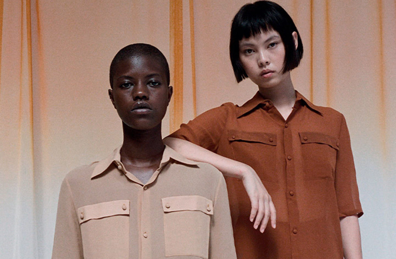
In the fashion world, Mocha Mousse is positioned as a highly versatile neutral shade. Dubbed “the colour of unpretentious elegance,” this shade stands out for its ability to create warm, minimalist looks that blend with different skin tones, creating a chromatic camouflage effect. The colour of the year 2025 also redefines our perception of brown, taking it from humble and earthy to luxurious and aspirational.
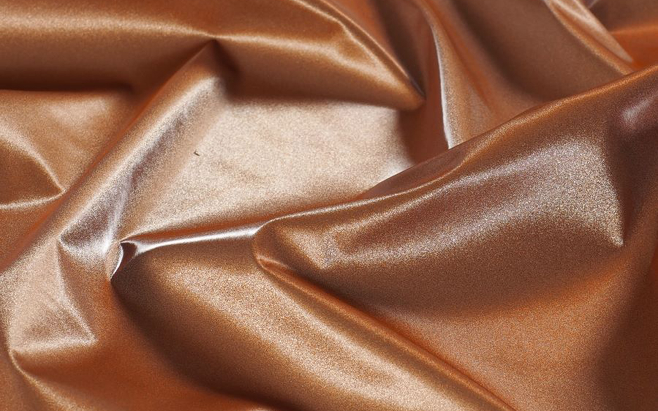
Translating this to the textile world, Mocha Mousse offers endless possibilities. Its sensorial warmth is reflected in fabrics with a delicate touch such as cashmere, angora, soft velvet and furry textures that envelop and comfort. It also shines in lighter materials such as airy chiffons, fluid satins or knits that provide movement and draped elegance. This shade, imbued with earthy refinement, embodies an organic and authentic luxury, promoting minimalist looks that opt for simplicity without artifice.
Mocha Mousse also adapts to various textures and finishes. From matte surfaces that highlight its naturalness to shiny or metallic finishes that give it a sophisticated touch, this colour works as a perfect base for bold colour combinations or monochromatic looks full of depth.
In decoration and interior design, Pantone 17-1230 Mocha Mousse connects with our desire for well-being and comfort. This earthy and refined brown brings a feeling of warm home, whether on floors, painted walls or decorative elements. Its presence stands out in natural materials such as wood, stone, rattan, wicker or leather, offering a balance between sophistication and homely warmth.
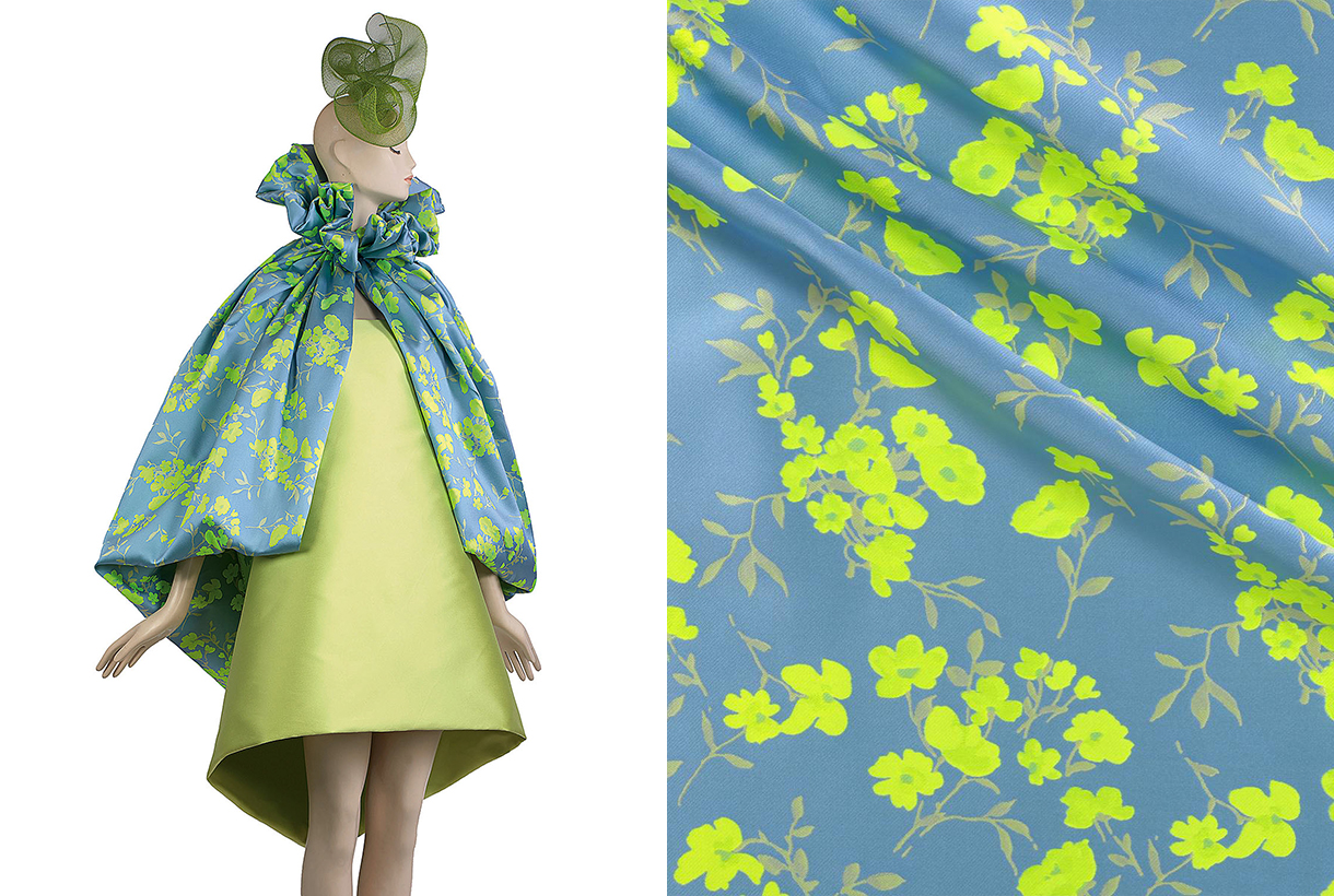
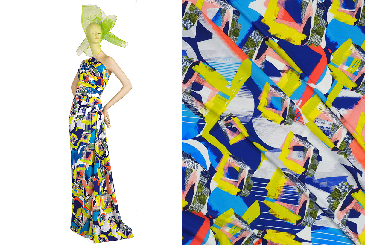
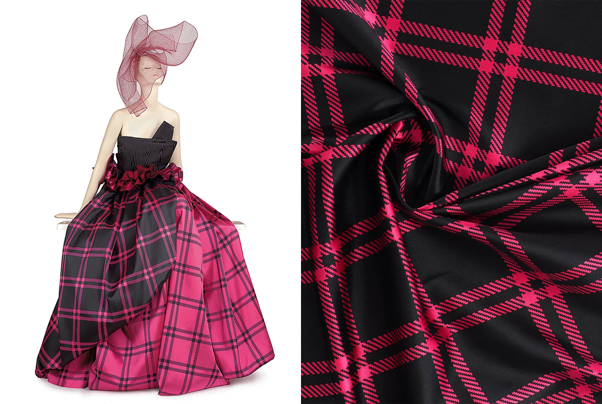
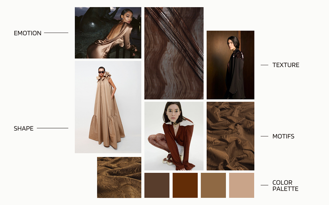
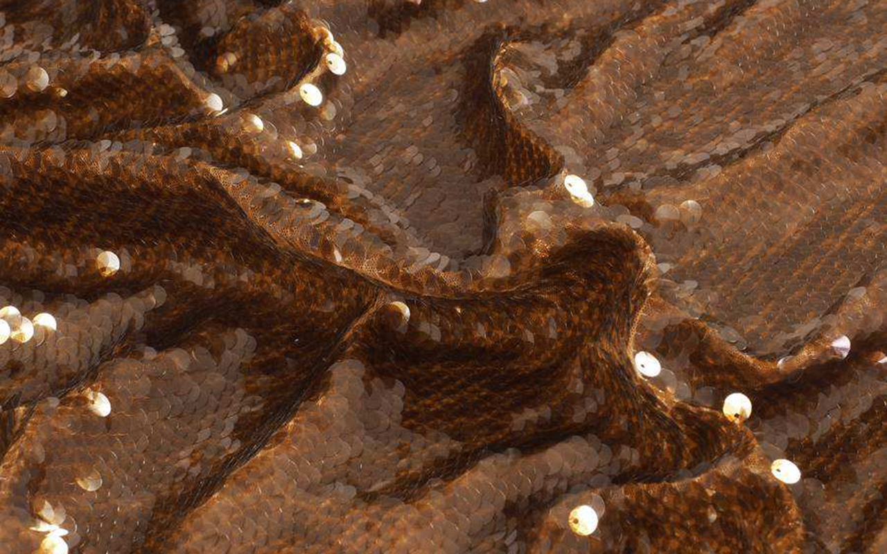
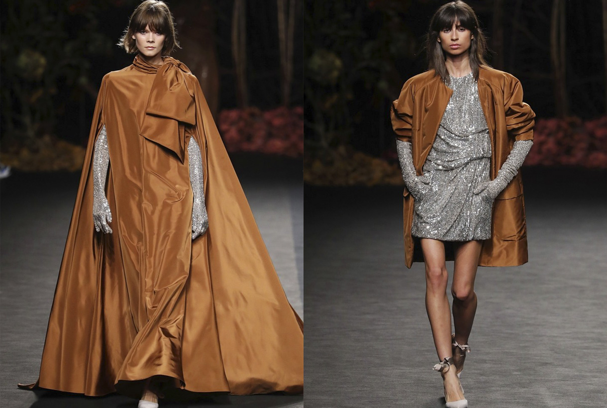
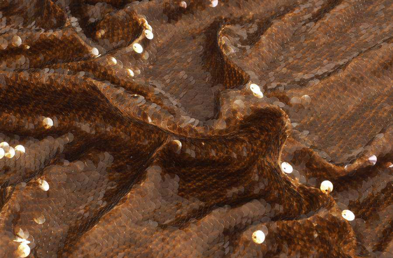
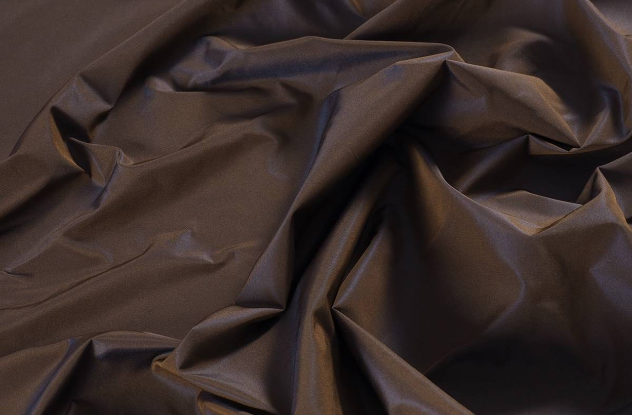
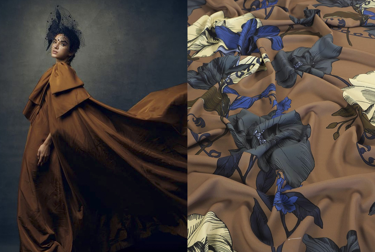
At Gratacós, we have selected some key fabrics that connect this colour of the year with our new collection. From luxurious textures to versatile finishes, you will find inspiration to bring Mocha Mousse to your fashion and design projects.
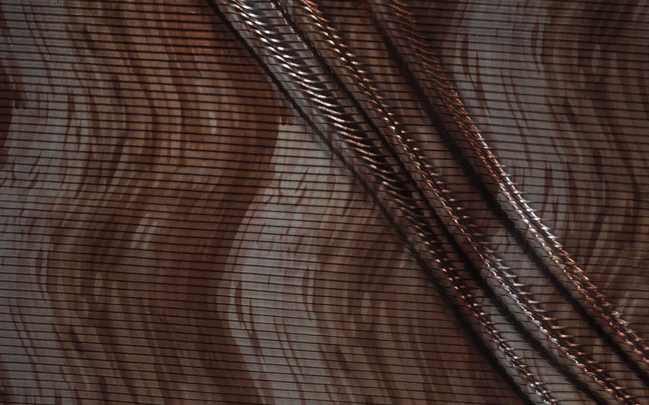

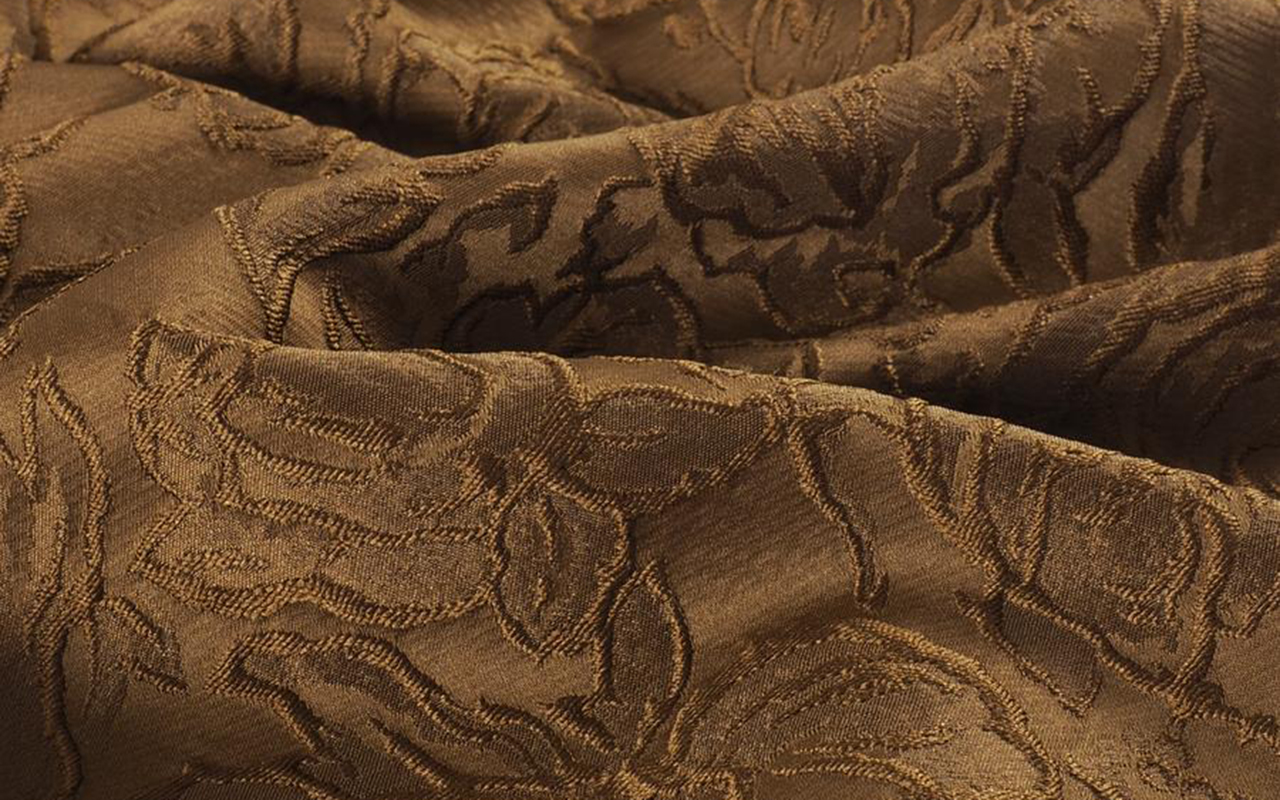
 Collage: 1. Rodarte, 2. Gonçalo Peixoto, 3. Mariano Moreno, 4. ON RUSH, 5. Joplin Atelier, 6. Acuamona. Courtesy of the brands
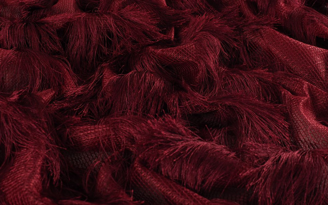
Maroon, scarlet, burgundy, wine, cherry… There are many ways to refer to the range of dark reds with a blue or violet touch. This range of possibilities encompasses a captivating colour, synonymous with luxury, power and status, which seduces with its warmth and has fascinated both designers and artists throughout the centuries. This autumn 2024, it is once again taking centre stage on the catwalks, reaffirming its place as an elegant, versatile and personality-filled colour. Some call it “the new neutral”, but why does this dark shade of red have such a timeless, almost bewitching appeal? We will explore its history, psychology and the reason for its triumphant return in this season’s collections.
Origin of Colour. On Wine, Clothing and Theatricality
The garnet or burgundy colour Marsala is named after the famous red wines from the Burgundy region of France, known for their refinement. This connection makes it a colour associated with wealth, luxury and sophistication. In 2015, Pantone elevated this association – between fashion and wine – by crowning Marsala as the hue that would guide industrial design, fashion, beauty, furniture and interior decoration. For that year, the international colour authority imagined a world tinged with “a warm, yet elegant hue that is universally attractive and easily transposed into multidisciplinary arts”. Pantone considered Marsala to be equally attractive to men and women, capable of moving and awakening the sense of taste, as well as inciting creativity and experimentation with colour.
If we look back in history, the use of burgundy in textiles and clothing goes back much further than its contemporary name. Since ancient times, dark red dyes were prized for their rarity and the status they conferred on those who could afford to wear them. During the Middle Ages and Renaissance, burgundy dyes were extremely expensive due to the rare ingredients needed to produce them, such as the Tyrian purple snail or madder root. Consequently, this colour was reserved for aristocracy and royalty, who wore garments in dark reddish tones to symbolise power and authority. At the court of Henry VIII, for example, burgundy was a shade frequently used by high nobility, such as Mary Tudor, who wore an iconic burgundy velvet dress at her wedding to Louis XII of France in 1514. Another historical reference is found in the burgundy velvet and satin dresses worn by European royal women in the 18th century, such as Marie Antoinette, whose taste for rich, deep colours set a trend in court fashion.
In modern times, burgundy remains associated with theatricality and drama. Consider the shade of a theatre curtain and drapery. In cinema, this vibrant shade has been immortalised in films such as Gone with the Wind, where Scarlett O’Hara wears a majestic dress in this shade, designed to convey both power and sensuality. The colour has also been a key element in contemporary films such as Moulin Rouge, where it is used to enhance the drama and passion of the characters.
Why is it back in fashion this Autumn 2024? From the catwalk to the streets
Burgundy combines the passion of red with the depth of brown, evoking luxury, ambition and power. It is a versatile shade that suits different skin tones: on light skin, it highlights its luminosity; on dark skin, it provides sophistication without being strident. Its intensity varies depending on the material it is used on, acquiring a visual texture that can be modern and minimalist in fabrics such as satin, or luxurious and opulent in velvet.
Garnet is the star of the autumn-winter collections, both in monochrome looks and in daring combinations. From sixties trench coats combined with platform loafers and structured bags, as proposed by Sabato De Sarno for Gucci, to tailored suits in the collections of Roksanda and Ferragamo . In a more casual version, Lacoste opts for jumpsuits combined with oversized coats, creating a mix between comfort and style.
This shade also lights up autumn evenings, where fitted leather microdresses stand out in the collections of Thierry Mugler and Ermanno Scervino. Other proposals include bow tops and pleated trousers in the collection of Philosophy di Lorenzo Serafini, providing a second skin in burgundy that redefines discreet luxury. In addition, burgundy is combined with neutral tones, such as beige or midnight blue, in proposals by Victoria Beckham and Khaite, or with bolder colours such as fuchsia, in a bold bet championed by Pierre Cardin.
And in fabrics… What do we recommend?
At Gratacós, we fall in love with burgundy, a classic that never goes out of style. This shade is enhanced in luxurious fabrics that allow you to play with texture and movement. To get the most out of it, we recommend these materials:
1. Silks and satins: Ideal for elegant garments with a fluid drape that enhances the sensuality of the garnet.
2. Wool cloths: Perfect for coats and outerwear, transmitting warmth and sophistication in winter looks.
3. Velvet: Provides depth and a luxurious air that turns any garment into a special piece.
4. Lace and tulle: For romantic and feminine looks, ideal for evening events or more delicate garments.
Check out our seasonal collection in our online store and discover the fabrics that best suit your style. Don’t miss the opportunity to be captivated by this timeless colour!


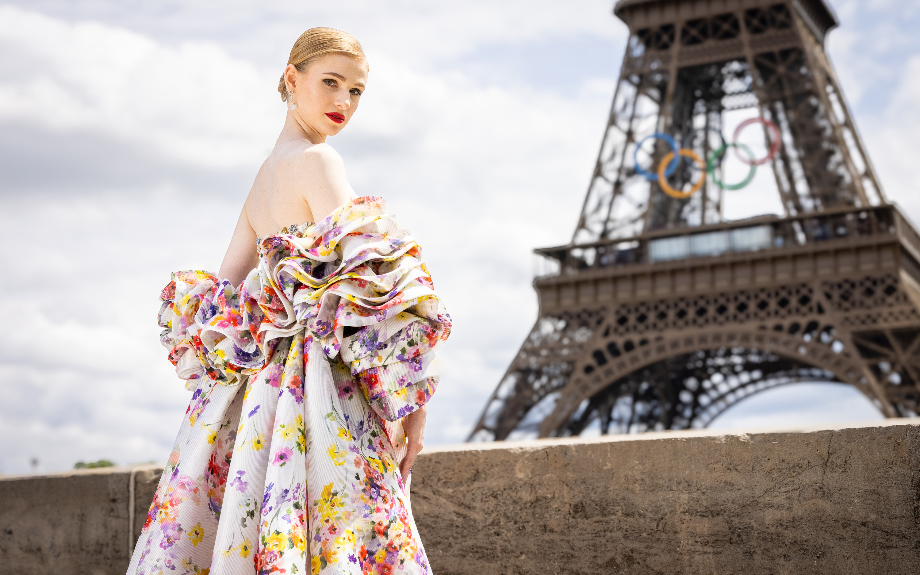 The Olympic Issue. A stunning editorial by Mariano Moreno and Vogue World Paris 2024.
Fashion, a reflection of each society, is present in all areas and silently analyzes what it represents. At the Paris 2024 Olympic Games, one of the largest showcases in the world, it could not be less. Millions of eyes of different nationalities have observed the presentations of the uniforms in recent days, and will analyze, without being experts in the matter, the details of the opening show with their clothing created for the occasion, as well as the outfits of the athletes who will star in each of the sporting feats. We are curious by nature, and the Olympic Games teach us that style does not have to be at odds with the competitive spirit.

What must be considered?
Uniforms represent the media focus where the relationship between fashion and sport becomes more evident, especially in recent years. This relationship is beneficial as long as one does not engulf the other, something that these days is giving something to talk about both for its successes and for some mistakes, generating a large number of memes. Behind every uniform is a needle: the participation of a renowned designer or brand that promises to take the relationship between fashion and sport to a new level. Although aesthetics are key when representing the culture and style of each country, we must never forget the main objectives of these special suits: comfort and functionality. An Olympic uniform must be practical. It is at the service of athletes and its mission is to ensure the best performance. Furthermore, they are not worn by models with normative and standardized measurements, quite the opposite. Athletes champion a diversity of bodies with diverse morphologies and this physical diversity must be taken into account when looking for a design that feels good and is comfortable. That said, combining aesthetics with functionality is no easy task, and this is reflected in the results. Everyone wants to project a cool and modern image of their country, after all, athletes are the representatives of their land in the eyes of the world, but no one wants to look ridiculous or wear clothes that look like a moving flag. Therefore, the uniform also plays an important role in the confidence and self-esteem of each athlete.
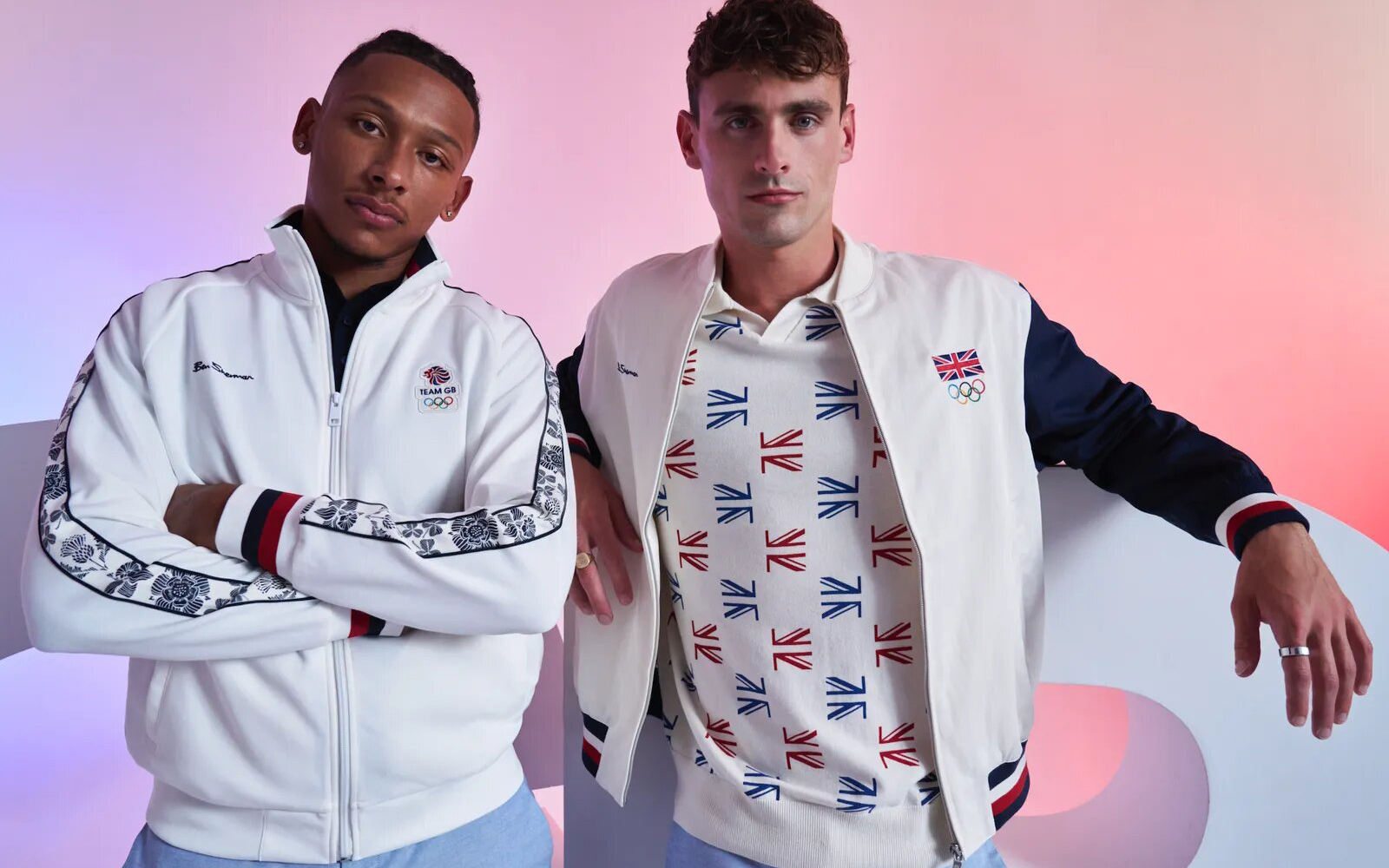
Most representative uniforms of the Olympic Games
The different delegations have presented the uniforms that their athletes will wear throughout the competition. The proposals are very varied, seeking this perfect formula between modernity and identity, and aesthetics with functionality. Some countries, such as Italy and France, have taken the opportunity to show the great fashion design potential they have. Other delegations, such as Spain or Japan, have presented more practical proposals that are far from design. We review the most interesting proposals without overlooking some successes and errors.
As host country, France has collaborated with Le Coq Sportif and Stéphane Ashpool to design a uniform adapted to both Olympic and Paralympic athletes, reflecting the essence of the culture and love of sport of the host country. The nineties-inspired t-shirts and sweatshirts are already a bestseller by achieving a fusion between fashion, sports and patriotism without fanfare. In the United Kingdom they have opted for a brand that represents English design and elegance: Ben Sherman. Dressed by mods in the 60s, this brand has always been characterized by encapsulating the magic of the unique British style. In addition to the colours of the Union Jack, the brand has added flowers to almost all the pieces in the Olympic and Paralympic collection.
Italy has trusted one of the great names in the history of fashion: Giorgio Armani. Their designs present a set of elegant and minimalist garments with navy blue as the main colour. On the sweatshirts, the word “Italy” in large white letters captures all the attention. Some critical voices claim that the result has been a bit dull, due to high expectations. The United States has once again trusted Ralph Lauren, a name synonymous with American fashion, to design its team’s uniforms. It has been doing so since 2008. This time, with a focus on sustainability, the uniforms are made from recycled materials, proving that eco-friendly fashion can also be stylish. Red, white and blue accents pay homage to the American flag, while modern silhouettes ensure maximum performance and comfort. Although the official uniform has been well received, Nike’s women’s track and field jersey has not been without controversy. Lauren Fleshman , former United States champion in the 5,000 meters, criticized the technical suit for its poor coverage.
Spain has opted for sustainability as a central axis. The Joma brand, in charge of the official equipment of Spanish athletes, has designed a collection that fuses tradition with modernity, making garments in high-performance fabrics inspired by the carnation, capturing the essence of Spanish culture with a contemporary touch. The kit has received mixed reviews: while some praise the chosen aesthetic, others compare it to the Iberia uniform. In Japan, faithful to their minimalism, they have trusted Asics, a flagship of the Japanese country, with a non-artificial proposal so that all the attention goes to the achievements of the athletes.
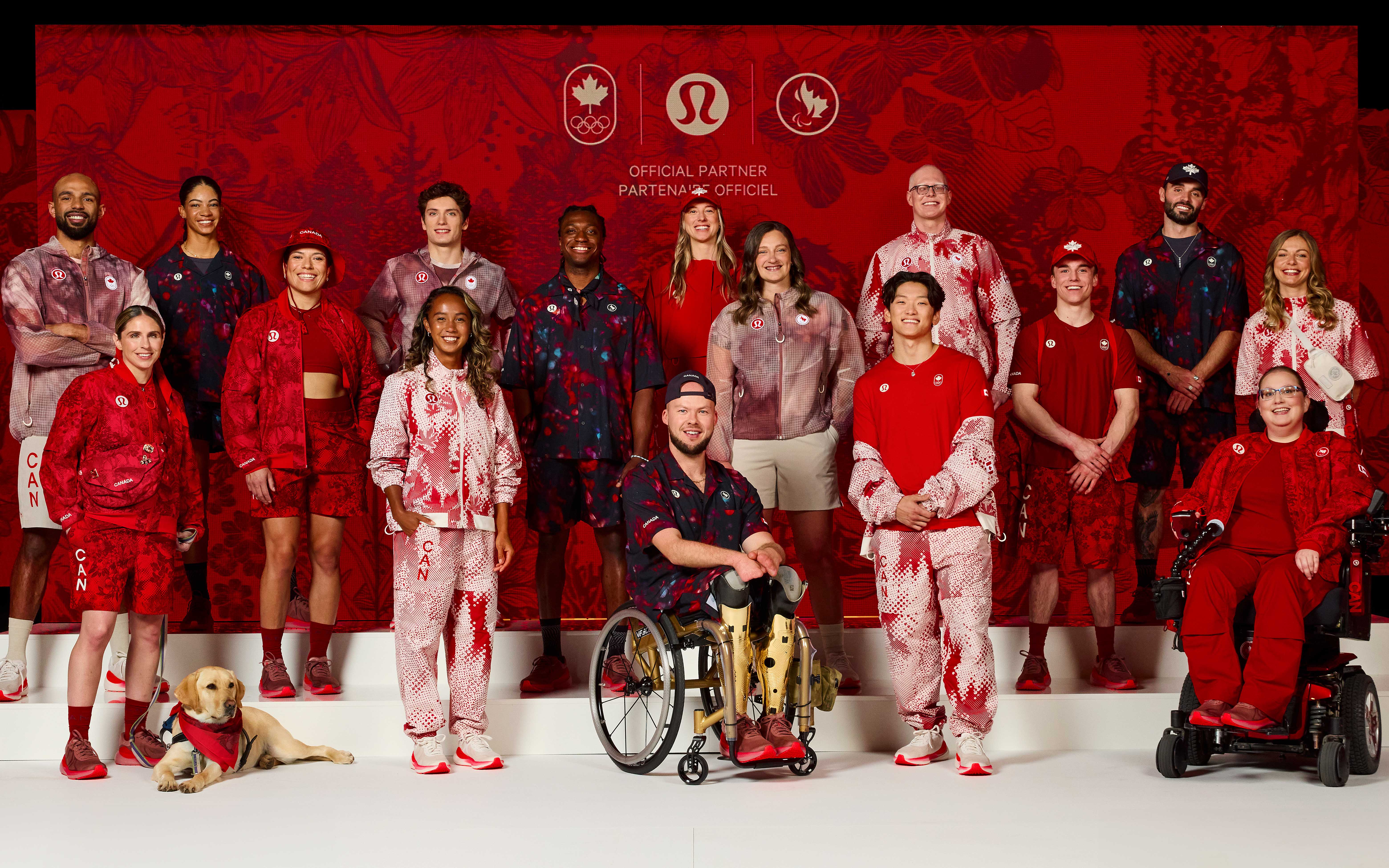
Other uniforms that have received good reviews have been those of Ethiopia. Adidas has created a uniform with a current and modern design for Ethiopian athletes. In Canada , Lululemon has designed a summer uniform focusing on adaptability, thermal comfort, fit and functionality, and national pride. The gender-neutral kit combines functionality and style through innovative construction and high-performance fabrics, with modern silhouettes and Canadian-inspired prints. In Australia, some critics have pointed out the length of the kit skirts and trousers. The Australian uniforms, designed by Sports Craft, present some similarities with Spanish clothing.
Finally, although in stylistic matters the colours vary, there is no doubt that some countries have won public opinion with sports uniforms that deserve an Olympic medal. This has been the case of Haiti. Haitian-Italian designer Stella Jean has collaborated with painter Philippe Dodard to create designs for the delegation that combine elegance and creativity. In terms of uniforms, Mongolia has presented the best design for its delegation, with intricately embroidered vests, pleated tunics and accessories inspired by traditional clothing. The designs are the work of Michel & Amazonka, a Ulaanbaatar -based brand that produces couture and ready-to-wear garments that “express the essence of Mongolian tradition and culture” in what the brand calls a “light contemporary”.

Sorry, this entry is only available in European Spanish.
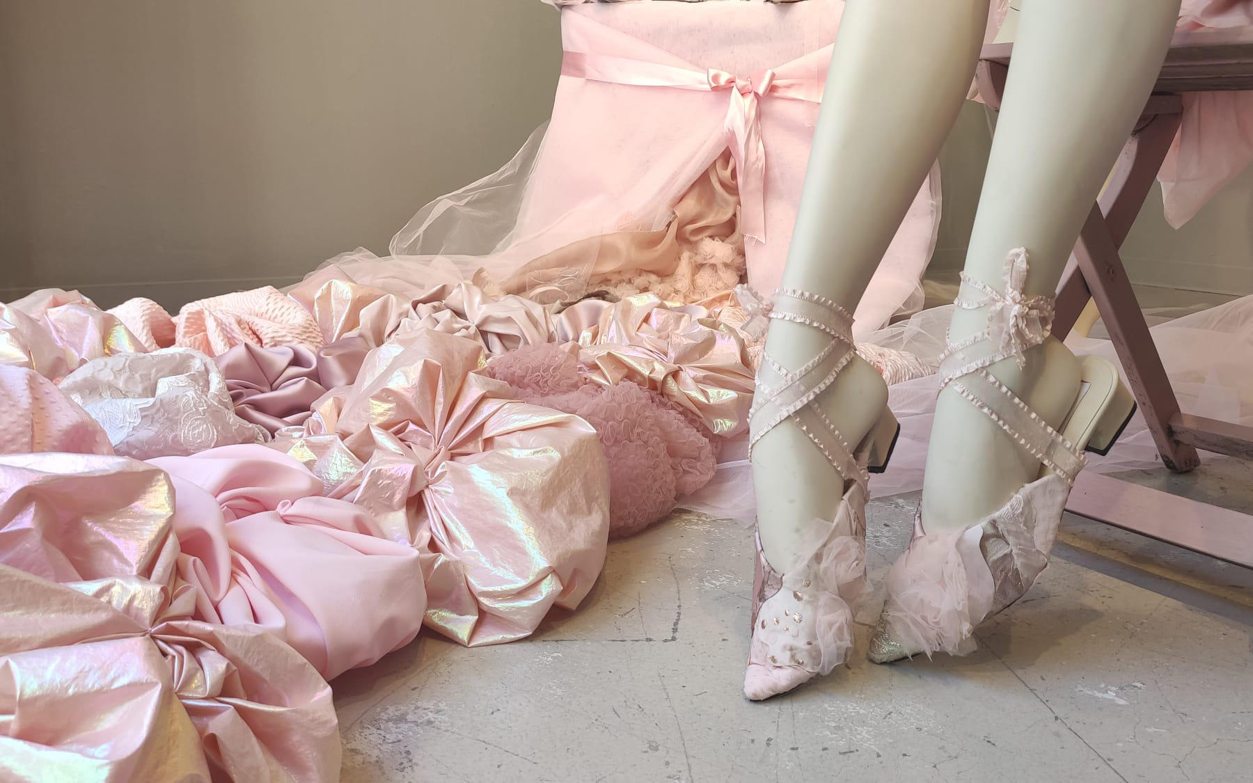
Bows, ruffles, pastel tones and baby doll dresses merge to elevate a hyperfeminine style with a baroque soul that seeks artificiality. Maximalism is displayed in all its splendor. We are referring to the coquette aesthetic , whose reign seems to have no end in sight, at least in this spring-summer season that we have just begun. Although this trend is not really new, in recent months it has reached a notable level of virality on social networks, specifically on TikTok in early 2024. With the hashtag #coquette, this instant video platform, which especially captivates the Generation Z, accumulated more than 18 billion views. This figure far exceeds its main competitor, Instagram, which registered nearly 1.5 million related publications.
This phenomenon shows how an aesthetic that seemed relegated to oblivion, with the exception of certain Japanese urban tribes, resurfaces strongly and is once again at the centre of attention of current fashion. We already know that the new generation of young people is fascinated by the nostalgic element, in a phenomenon that experts have described as an aesthetic revisionism of past trends.
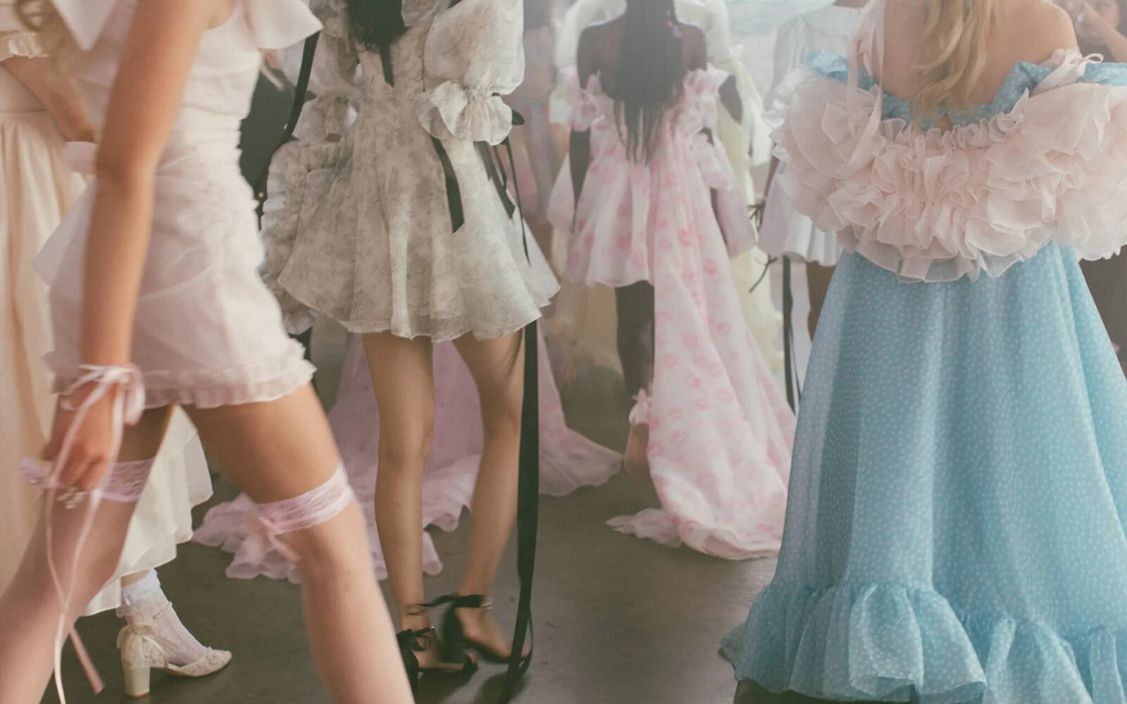
Coquette style identified ?
Among all the descriptions offered to define this style that perfectly fuses femininity, innocence, sweetness and softness, the one provided by stylist Marisa Ledford in People magazine stands out, who describes it as “a hyperfeminine style that refers to the Victorian era. of the Regency, where doll dresses, ruffles, bows and pastel colours are the distinctive elements.”
This hyperfeminine trend experienced a rebound in 2010, coinciding with two cultural phenomena that generated great interest for months and that, in turn, fueled the fashion industry: the premiere of the film ‘ Marie Antoinette ‘ by Sofia Coppola and the rise of Lana del Rey as one of her main style icons. In fact, the singer and songwriter was on everyone’s lips again recently thanks to the campaign she starred in for the brand Skims to celebrate Valentine’s Day. This campaign included all the references that identify the flirty trend: abundant bows, transparencies, cats and delicate fabrics such as satin and lace.
Recently, another cinematographic phenomenon has given new impetus to the hyperfeminine and, incidentally, hyperbolic style: the Oscar-winning science fiction film, ‘ Poor Things ‘ , which has won, among other distinctions, the award for best costumes. This film characterizes its main character, Bella Baxter, as a Victorian woman with a wardrobe that revolutionizes the classic by maintaining a contemporary look that is reflected in each of the eccentric and stimulating looks in terms of shape, volume, relief and colour. Creations such as dresses with ruffles and puffed sleeves, Victorian bloomers, long silk robes or lavish nightgowns leave the viewer speechless and are reminiscent of the style in question: flirty is captivating.
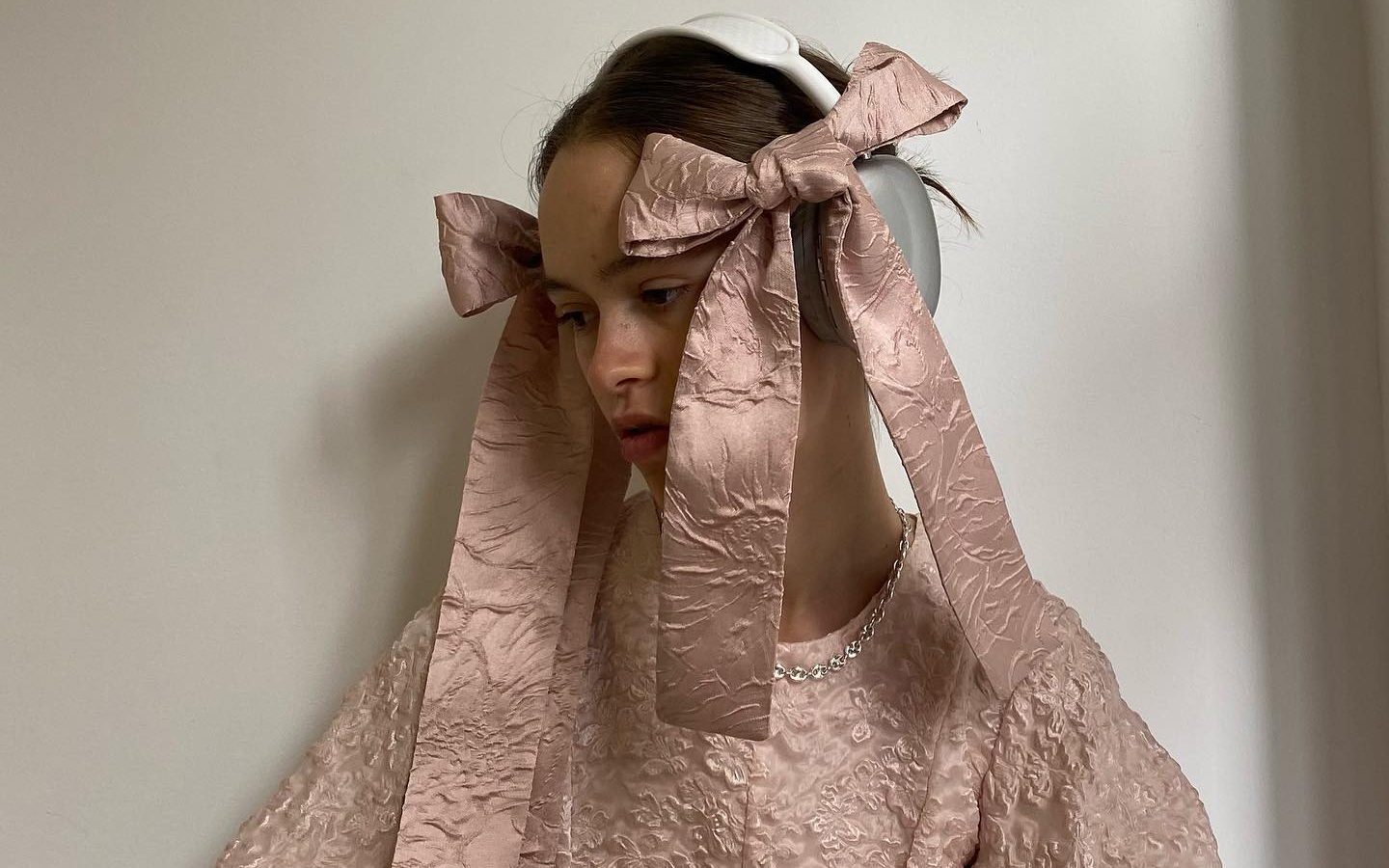
On the other hand, the fact that this trend is still more alive than ever is also corroborated by fashion brands that make the flirty style their usual hallmark. For example, in its spring-summer 2024 collection, Rodarte was inspired by a flower garden and the silhouettes of the 1930s. Likewise, Simone Rocha presented for the same season voluminous bows, lace, tulle and flowers such as main elements of its collection, both in its feminine and masculine proposal. It is not necessary to review the trends of big brands, since small designers also opt for this style that enhances girlish femininity. For example, the creations of Quique Vidal through Becomely , his fashion alter ego, or the fantasies of Anel Yaos . In the collection presented last year on the 080 Barcelona Fashion catwalk, there were clear allusions to this aesthetic in a proposal that explored the most personal feelings through chiffon, transparencies and pastel tones.
Historical origin of the coquette aesthetic
The word ” coquette ” comes from French and means flirty. As a style, it takes elements from 18th century clothing, with a strong inspiration in the late Rococo of Queen Marie Antoinette, from which it incorporates decorative elements of clothing such as bows and lace. Likewise, it is based on the “infamous” chemise à la reine dress , a garment generally made of cotton and used as underwear, but which Marie Antoinette transformed into semi-transparent muslin, with ruffles on the chest and sleeves, with which The queen decided to spend her days in the countryside.
Perhaps the most iconic element of the style coquette, or at least the easiest to distinguish, is the bow or bow, which is used in both hair and clothing. This use dates back to the fashion of the romantic period, at the end of the 18th century and the beginning of the 19th century, when after the revolutions and the rise of the Republics, femininity became relevant again. This was reflected in the clothing and the decorations in them as an element associated with social class, since for the most part there were no longer monarchies.
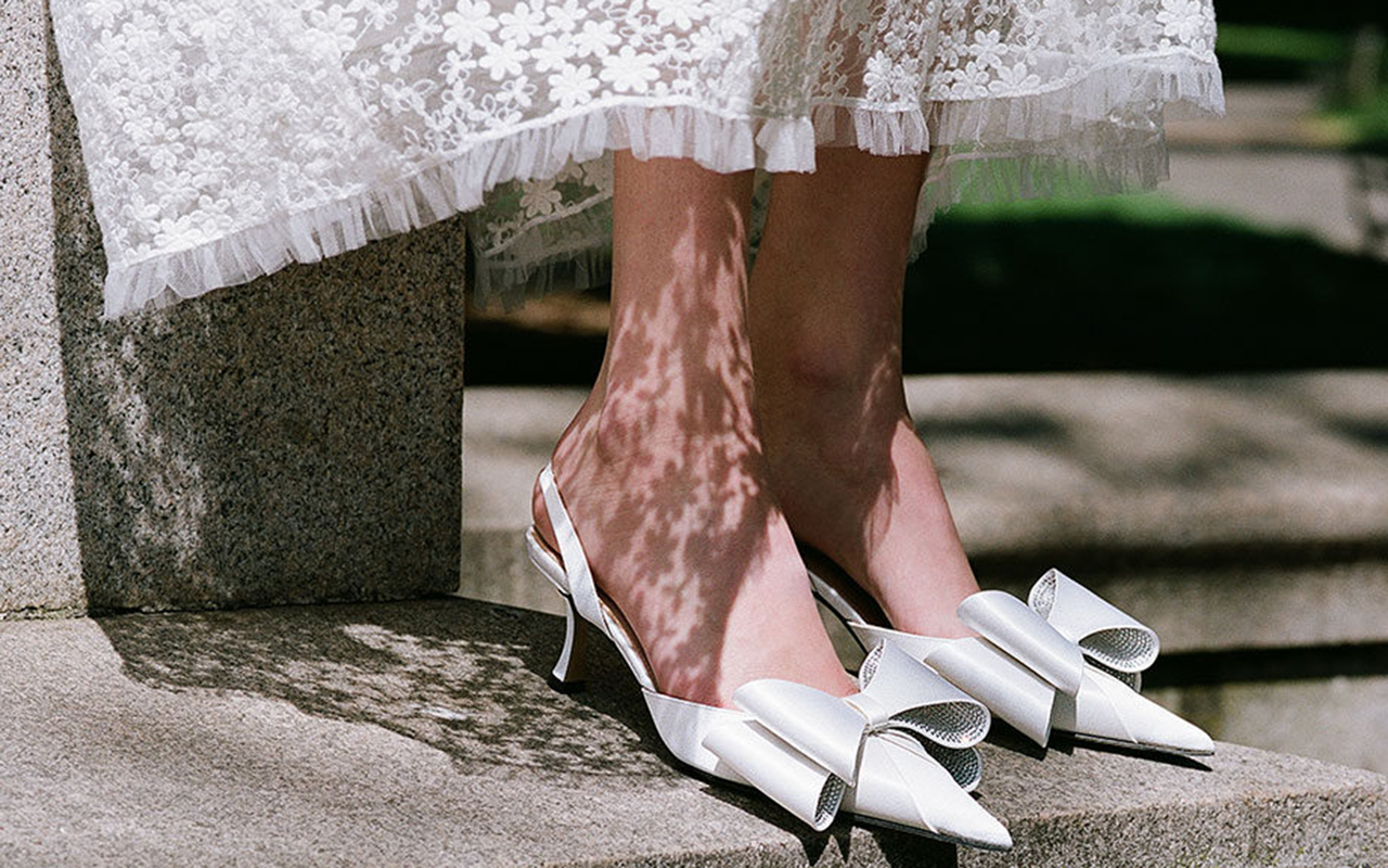
A trend rooted in the street
Although these origins date back several centuries, their arrival in current fashion is framed in the revisionism of Generation Z, which now resorts to various aesthetics from the 90s and 2000s. Another factor that contributes to the triumph of this style It is how he has conquered urban looks. Thus, far from being saturated, they are the influencers themselves and fashion prescribers who star in street images style most talked about and, they certainly don’t seem to be tired of this trend. During the last fashion show season, it was not difficult to find references to this trend: bows adorning all types of garments, whether more or less extravagant, more or less romantic, present in the hair and even attached to the face, as well as allusions to the universe childish, such as the usual combination of shoes with openwork socks and bows, and the pastel colour palette. Without forgetting the red carpets where Hollywood stars parade. In fact, the flirty style has also starred in some looks at the 2024 Oscars celebration . This is attested to by the stylists who dressed actresses like Ariana Grande, who dazzled on the red carpet with a puffy pink number with a strapless neckline and train by Giambattista Valli Couture. Also Chloë Sevigny and Sofia Vergara, who wore flirty bows at the Oscars after- parties.
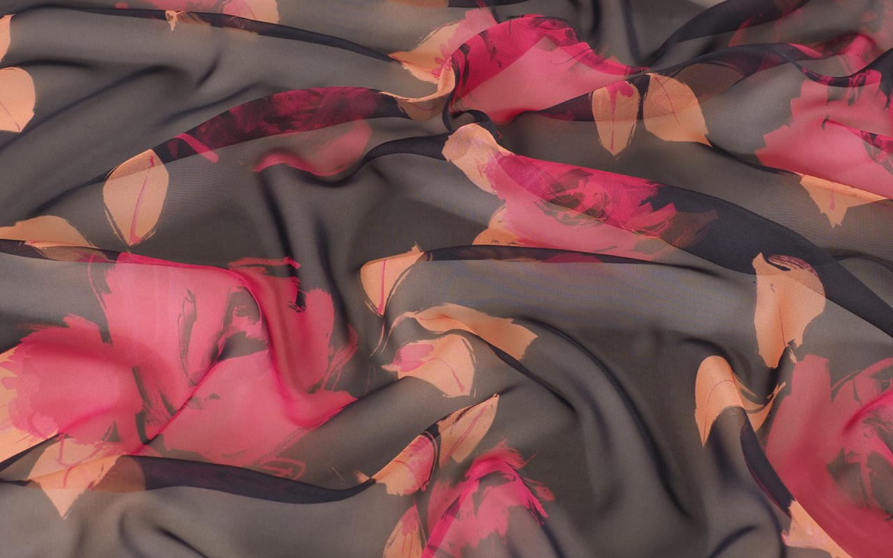
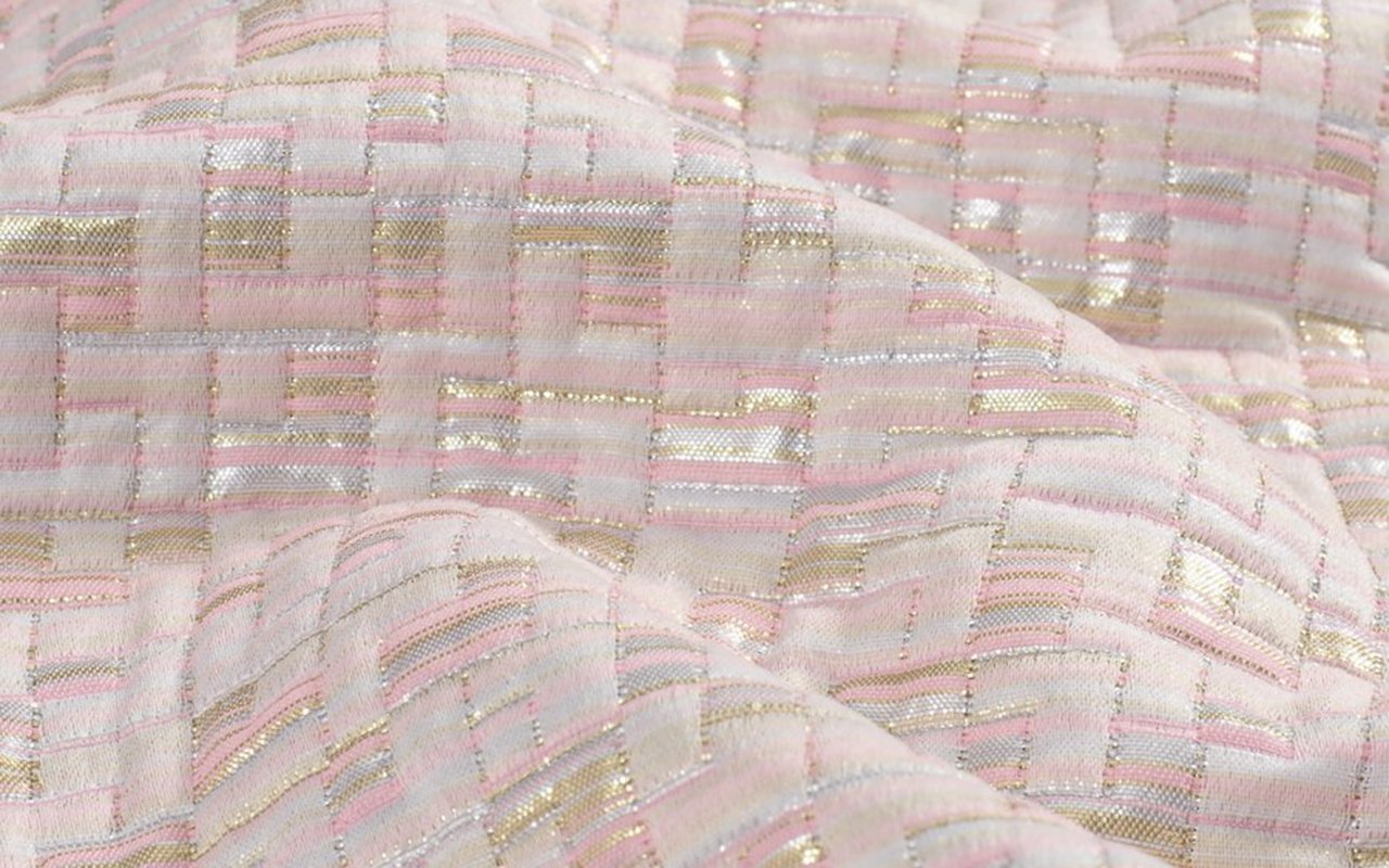
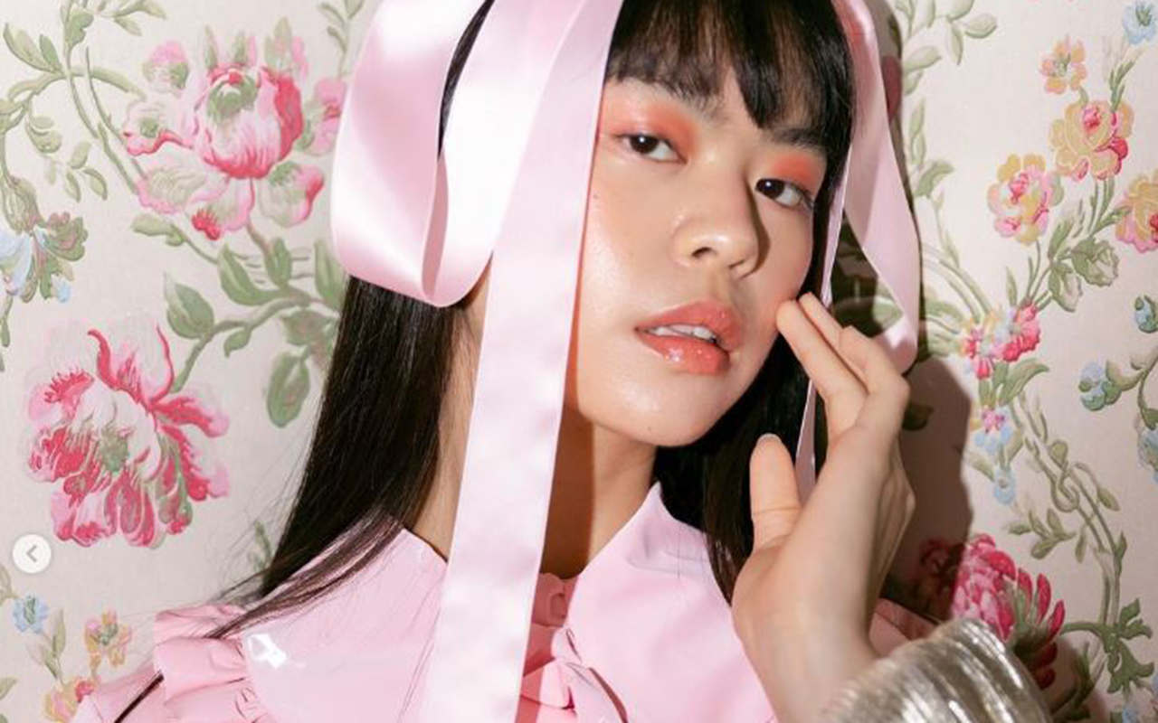
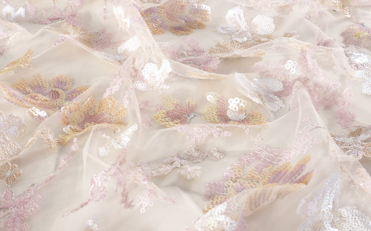
At Gratacós, we also wanted to pay our own tribute to the coquette style with a selection of our new season fabrics, so that you can be inspired and create your own designs within this very feminine, fanciful and girlish aesthetic.
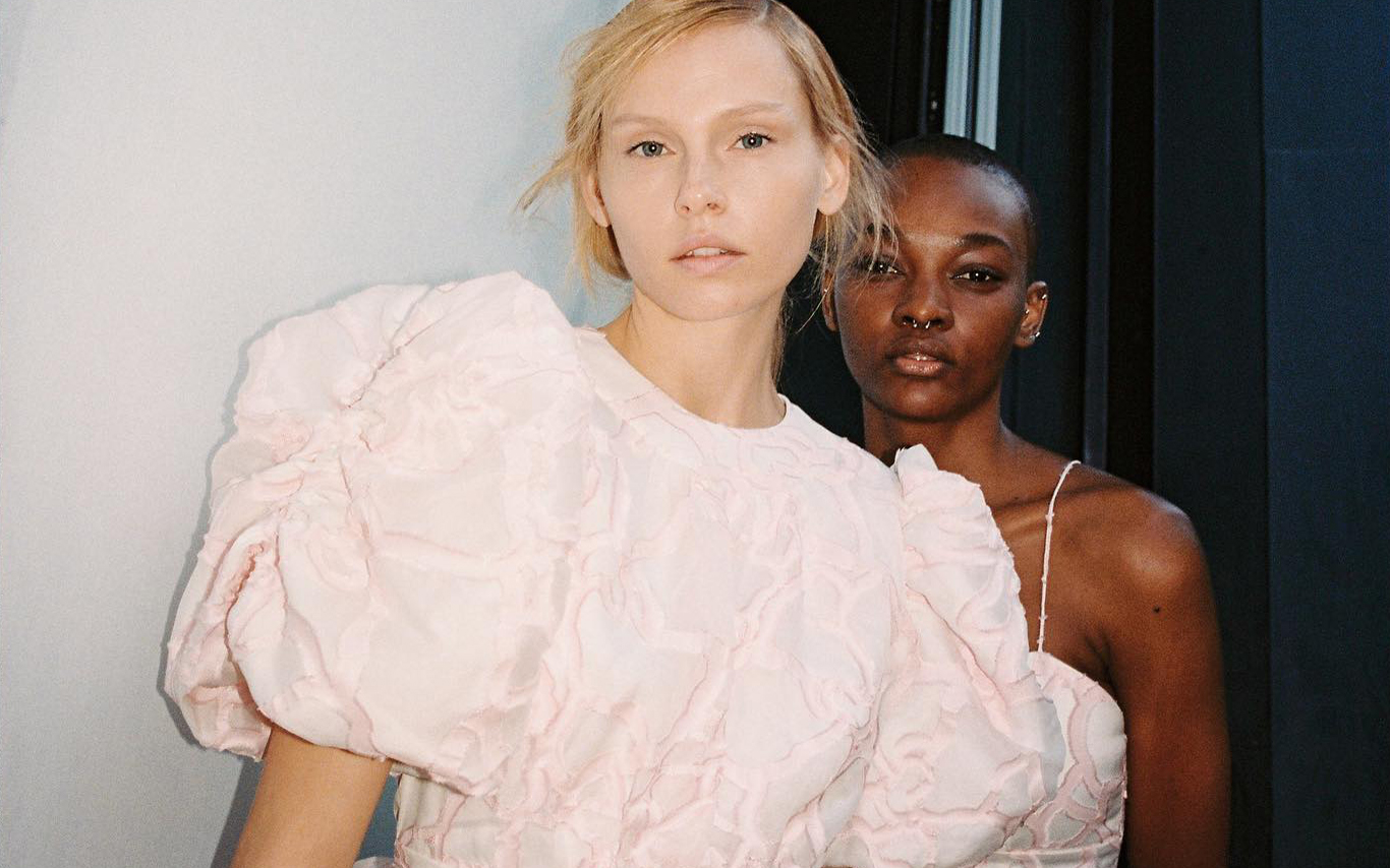
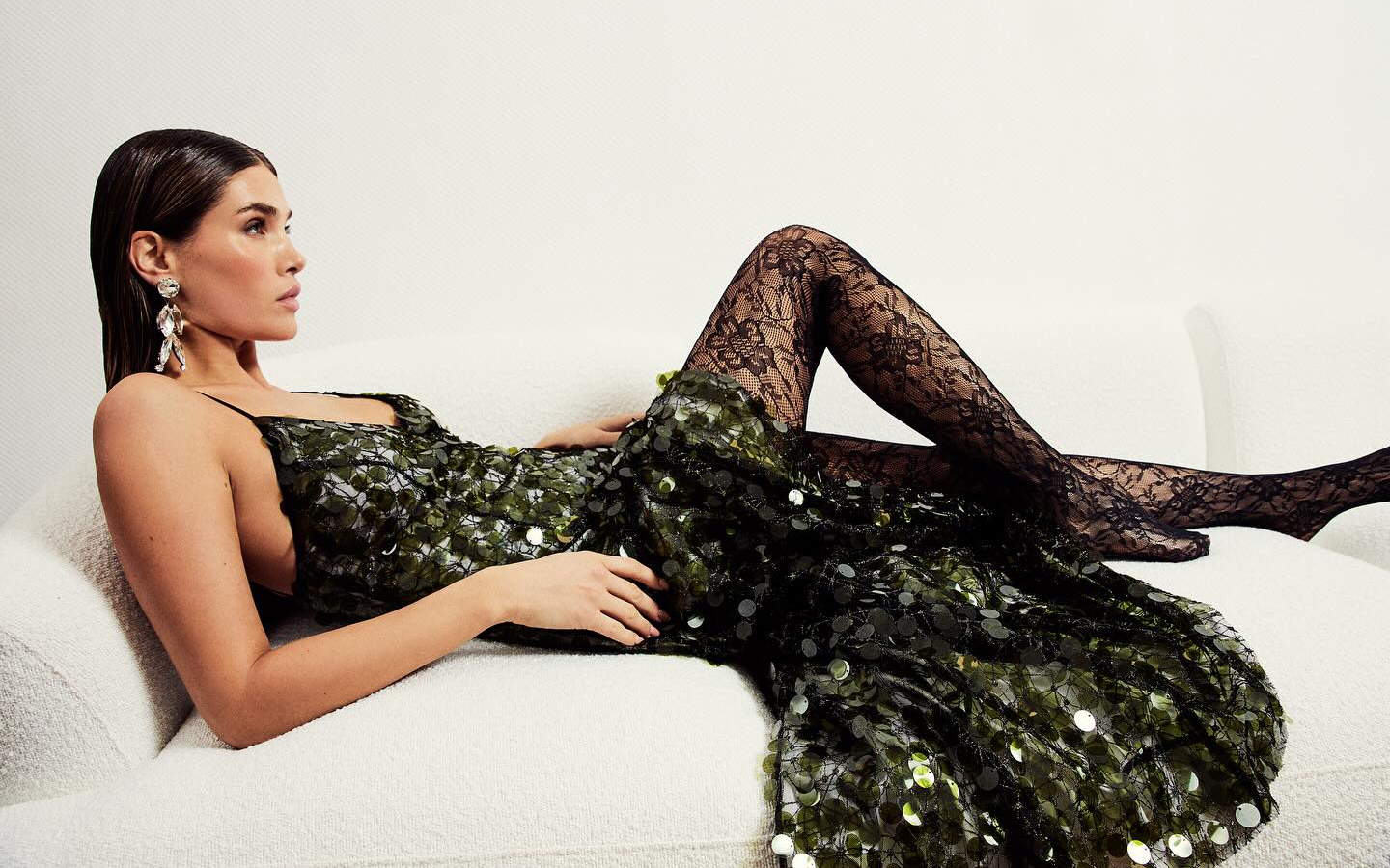
A stunning sequined dress by Acuamona.
Although we appreciate all fabrics equally due to their uniqueness, we recognize that there are certain items that best stand the test of time and become a smart investment for any time of year. Taking advantage of the last weeks of discounts on our winter collection, Gratacós presents you five items that do not lose their relevance, despite the ephemeral trends. In addition, now you can find them at more attractive prices in our outlet section
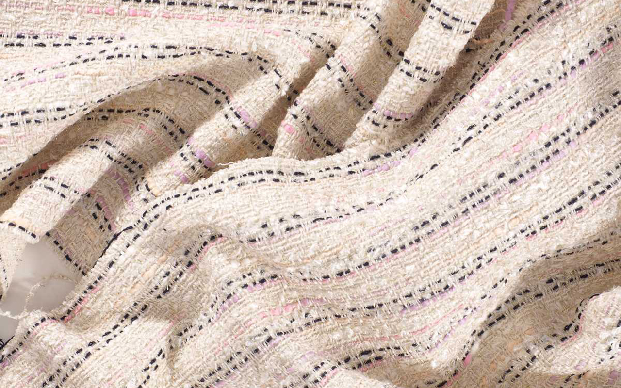
Tweed
This fabric stands out for its extraordinary richness in every imaginable aspect: it has a historical legacy that dates back to the Scottish Highlands; It is a wild card in constant evolution; It is easily recognizable at first glance and is inspired by classic elegance, while exhibiting a chameleon-like character that allows it to adapt to more contemporary versions. What more could you want?
It is a fabric wool fabric with an irregular appearance, a rough feel, openwork and elastic texture, with well-defined patterns such as houndstooth , windowpane and herringbone . This item is easy to sew and iron, offering a versatility that can transcend the limits of gender, or rather so, does not have limits.
Of modest origin, tweed comes from Scotland and was a common fabric in the warm clothing of the popular classes, used in the countryside to face adverse weather conditions. In the 19th century, the English aristocracy found in this fabric their best ally for carrying out country activities and outdoor sports. The person who knew how to give tweed an aura of glamour was, without a doubt, Coco Chanel, who in the late 1920s incorporated it into the women’s wardrobe in garments that have become symbols, such as her short jackets or pencil skirts. This fabric provided the woman of the time with extra comfort without losing an ounce of elegance.
Discover all our seasonal tweeds.
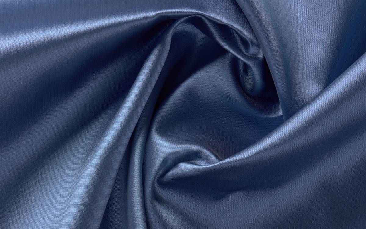
Mikado
The mikado is a textile jewel that is distinguished by its exclusivity and sophistication, enclosing with it an ancient history. Originally from Japan, this fabric has managed to captivate designers thanks to its uniqueness and its ability to transform seemingly simple garments into authentic works of haute couture.
We start with his name. It means ’emperor’ in Japanese, a title that reflects its royal splendor. Mikado is produced through a special manufacturing and finishing process, giving it a luxurious appearance and a firm structure. Initially intended for making imperial kimonos and other ceremonial garments, the mikado symbolizes nobility and elegance. Given this rich symbolic load, it is not surprising that it is currently one of the most used and demanded fabrics in the bridal field.
Mikado is distinguished by its heavy structure and slightly shiny surface, giving it an opulent look and distinctive feel. Often composed of silk, this fabric stands out for its softness and the ability to create elegant folds. Additionally, its ability to maintain its shape makes it the ideal fabric for making couture dresses that require volume and structure.
Find our mikado proposals. From smooth designs to floral or geometric-inspired motifs.
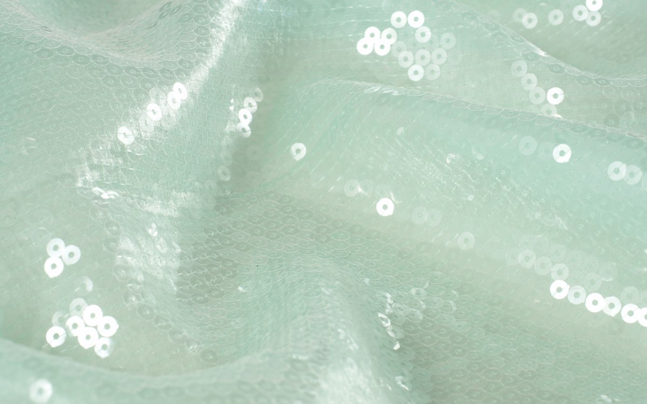
Sequins
This fabric does not need presentations. Sequins are the true protagonists of women’s wardrobe, displaying their brilliance throughout decades. Whether day or night, on any occasion, sequins add luminosity and are linked to luxury and glamour.
Its historical legacy dates back to ancient times, when these tiny shiny pieces were used in clothing in Ancient Egypt, adding sparkles to the clothing of that era. However, their revival occurred in the 1920s, during the Jazz Age and the swinging twenties, becoming symbols of opulence and sophistication. Its heyday came in the 1930s, when Hollywood stars began wearing dresses decorated with this fabric on red carpets. Since then, sequins have been synonymous with glamour and a certain extravagance. World-renowned designers, from Coco Chanel to Versace, have incorporated this shiny fabric into their creations, cementing its status as a timeless element in luxury fashion.
What defines sequins is their ability to transform any garment into a masterpiece of shiny elegance. These small pieces, usually made of metal, plastic or reflective material, are sewn into patterns to create a dazzling visual effect. Its shine, often associated with the light of gala evenings, has been an essential component in evening fashion and haute couture.
Today, sequins have transcended festive occasions, conquering urban fashion with contemporary proposals that adapt to any style.
Find the sequins that suit your style.
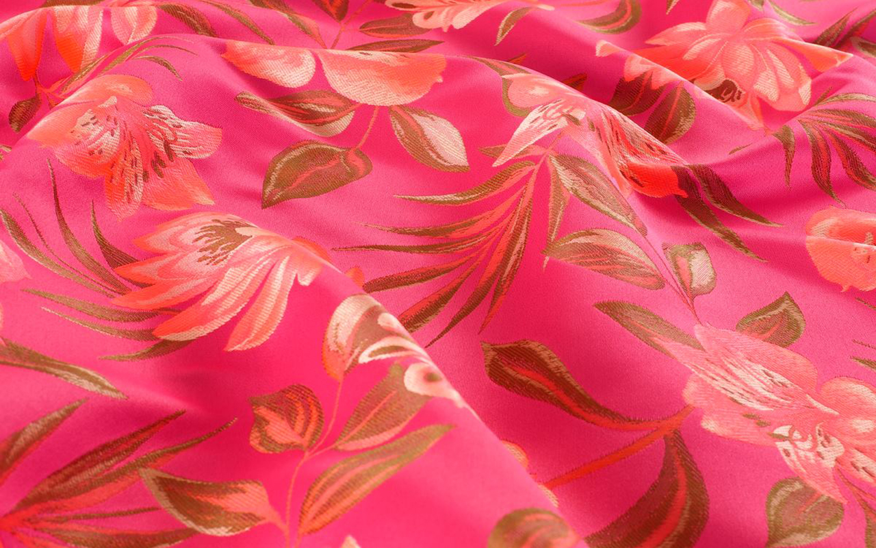
Floral jacquard
Floral Jacquard is a textile masterpiece that fuses technical skill with elements inspired by nature. Originating from France, this fabric is distinguished by its elaborate relief pattern. The key lies in its technique, named after Joseph Marie Jacquard, which has left a distinctive mark on the history of fabric making, becoming a symbol of luxury and sophistication.
In the 19th century, its inventor introduced an innovative weaving machine that revolutionized the textile industry by allowing the creation of intricate and detailed patterns. This pioneering technology took fabric manufacturing to new levels, enabling the precise reproduction of ornamental motifs and complex designs.
What makes Jacquard weaving unique is its ability to generate raised patterns with a variety of colours and textures. This process is achieved by carefully combining threads of different colours and types, creating a three-dimensional work of art in each thread. The resulting texture is rich and luxurious, providing a unique visual depth to the fabric. Jacquard has also earned its place in the fashion world thanks to its versatility in design. From haute couture suits to more casual garments, Jacquard has spread into a wide range of garments that incorporate everything from geometric patterns to the most exquisite floral motifs.
Add a touch of romanticism and femininity to your creations with these floral Jacquards.
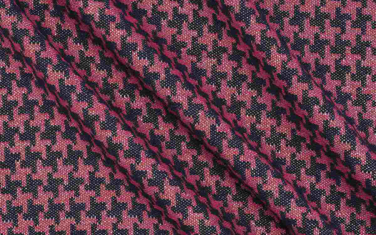
Houndstooth
The houndstooth fabric is one of those timeless classics that resists ephemeral trends to become a symbol of elegance and style. Its history dates back to the 19th century in Scotland, where local weavers created it with care. Initially known as houndstooth , the pattern is distinguished by abstractly shaped blocks that evoke the footprints of a rooster. Over time, this pattern transcended Scottish borders, becoming an iconic element in global fashion.
What gives houndstooth pattern items their distinctive appeal is their ability to combine simplicity and sophistication. Typically composed of repeating black and white blocks, the pattern creates a bold and balanced visual effect. The versatility of this fabric is manifested in a wide range of garments, from suits and coats to skirts and accessories, adapting to both formal environments and casual outfits. From the catwalks to the streets, houndstooth continues to be a stylish choice that evokes an air of classic sophistication.
At Gratacós we recommend this houndstooth fabric.
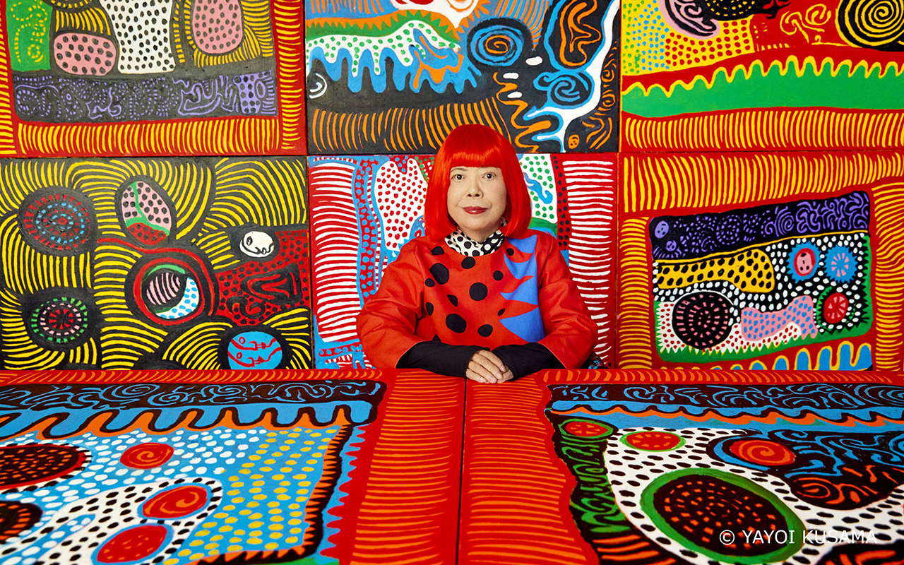
Portrait of Yayoi Kusama. Courtesy of Ota Fine Arts, Victoria Miro, and David Zwirner © YAYOI KUSAMA. Photo: Yusuke Miyazaki.
She is considered a living legend, a revolutionary who has stood out in multiple artistic movements from the 1960s to the present, an admired visual artist capable of connecting art with fashion through her unique universes, full of geometries. Or rather polka dots, her most identifying feature. Yayoi Kusama (Matsumoto, Nagano, 1929), yes the flesh and blood one -and not the hyper-realistic robotic figure that Louis Vuitton made for her in her latest collaboration with the brand- is the absolute protagonist of one of the most visited exhibitions in the Bilbao Guggenheim . Turned into a true global cultural icon, in the last seven decades, Yayoi Kusama has devoted herself to her avant-garde vision with conviction, perfecting her aesthetic vision, which is a faithful reflection of her philosophy of life. As the artist herself usually says: “What does it mean to live a life? I get lost in this thought every time I create a work of art.
This exhibition goes beyond a simple overview of her career. It seeks to focus on the existential questions that drive the creative explorations of the Japanese artist and writer. Through her paintings, drawings, sculptures, installations, and documentary material on her performances, the show offers an in-depth analysis of her practice, from her first drawings as a teenager during World War II to her latest immersive mirror installations.
Organized according to chronological and thematic criteria, Yayoi Kusama : from 1945 to today addresses the six key themes that run through the artist’s life: ‘Infinity’, ‘Accumulation’, ‘Radical Connectivity’, ‘The Biocosmic’, ‘Death’ and ‘ The energy of life’. These interrelated themes appear and evolve within the obsessive universe of Kusama, who has been agitating the art scene and society for decades in favour of the “healing of all humanity”.
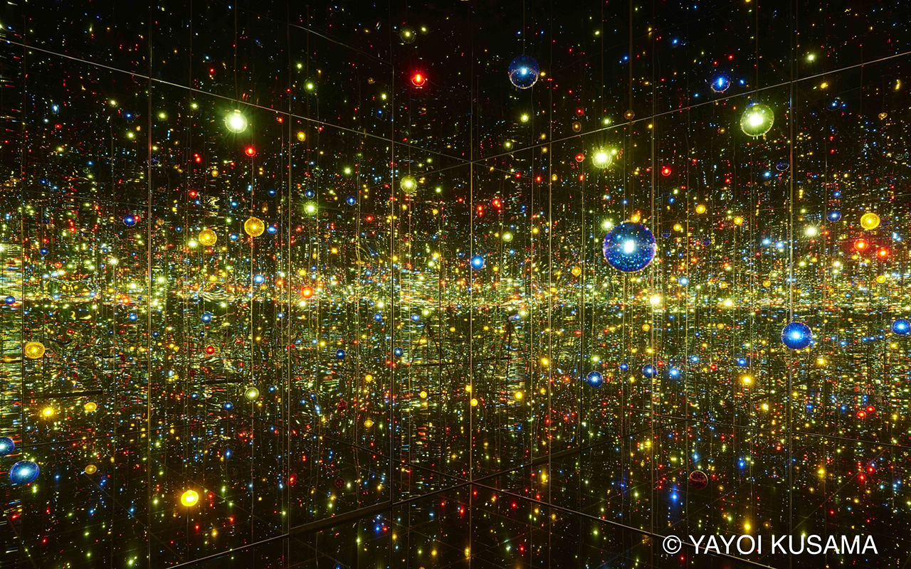
Yayoi Kusama. Infinity Mirrored Room – A Wish for Human Happiness Calling from Beyond the Universe, 2020. Mirrors, wood, LED lighting system, metal, acrylic panel. 293.7 × 417 × 417 cm. © YAYOI KUSAMA. Courtesy of Ota Fine Arts.
Some keys to understand Yayoi Kusama
Self portrait
Kusama ‘s work is based on self-affirmation , self-destruction , self-promotion , self-invention , self-referential and self-portrait, even in those creations where the representation of her own image is less explicit. This room brings together some of the paintings and drawings made by Kusama within the genre of the self-portrait, which occupies a prominent place in her production.
This section begins with Self-Portrait (1950), a dark painting in which a flesh-pink sunflower floats above a human mouth, and is one of the first works to be given that title; The space is presided over by her Portrait (2015), in which Kusama arranges some of her characteristic motifs —polka dots, pumpkins, nets and tentacular shapes— in a composition constructed as a collage and dominated by a hieratic figure.
Infinite
Kusama grew up in a seed nursery surrounded by vast fields of flowers. However, in 1957 while flying over the Pacific on her first flight to the US, the sight of the ocean inspired her well-known paintings of Infinity Webs. In this series, the canvases are obsessively covered in tiny arcs painted in one swift gesture, creating an expressionist pattern of interconnected dots and webs. The free brushstroke contrasts with the reiteration of the motif, which makes it impossible to identify the beginning and end of this universe without hierarchies, whose dimensions were expanding within Kusama ‘s production until the public was immersed in the infinity of her installations.
Accumulation
Kusama ‘s art , the concept of accumulation is not simply an obsessive-compulsive tendency, nor an innate desire for repetition, but can be interpreted as a desire for expansion driven by the artist’s need to broaden her creative vision.
After creating the ‘Infinity Nets’, Kusama developed ‘Accumulation’, a series of collages made with reused fragments of paper and soft sculptures in repetitive forms. In these pieces, an everyday object, such as a chair, is transformed by accumulating on it a large number of phallic and tubular shapes of stuffed and sewn fabric, which make the object itself and its function disappear. Little by little, the compulsive desire to multiply these soft shapes led Kusama to expand her vision to the mirrored rooms of infinity, which she began in 1965, and to the silver or patterned fabrics she made during the 1970s and 1980s, such as ‘Accumulation de manos’, where a sofa and chairs are covered in hundreds of silver gloves
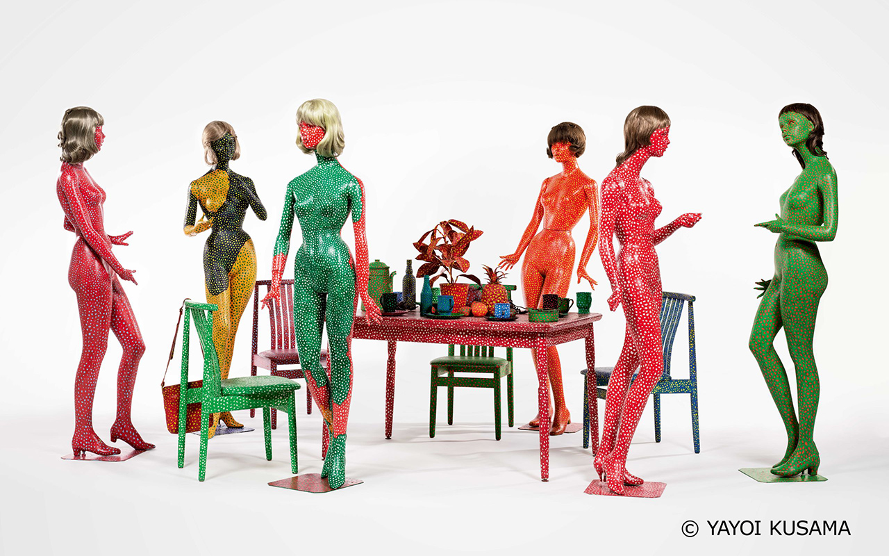
Yayoi Kusama. Self-Obliteration (Auto-obliteración), 1966–1974. Painting on mannequins, table, chairs, wigs, handbag, cups, plates, ashtray, pitcher, plastic plants, plastic flowers, plastic fruits. Variable dimensions. M+, Hong Kong. © YAYOI KUSAMA
Radical connectivity
In the late 1960s, the struggle for civil rights and the war in Vietnam generated a counterculture atmosphere in which Kusama developed a practice centered on public action and performance. The artist denounces race and gender stereotypes, criticizes the warmongering US policy and attracts the attention of the media with her provocative happenings, especially those featuring naked bodies covered with polka dots, which are acts of “self-obliteration”.
Kusama ‘s philosophy , which represents the liberation of the self as a form of group healing and deeply connects people, especially those who live on the margins of society. The Japanese artist uses the power of the media to spread her philosophy and intensify her visibility and notoriety.
Biocosmic
Where does your obsession with polka dots come from? Yayoi Kusama gives us the answer: “Our earth is just a mole among the millions of stars in the cosmos. Polka dots are a path to infinity. We erase nature and our bodies with polka dots, we integrate into the unity of our environment.”
Her childhood near her family’s plant nursery made the Japanese artist feel a deep bond with organic life, which the artist considers to be connected to the dimension and space of the cosmos. ‘Lo Biocósmico ‘ expresses her belief that the earthly and the heavenly are the same. As a child, she begins to observe the anatomy of plants, their life cycles, and the union between heaven and earth. Perhaps the most consistent image of the biocosmic in her work is that of her distinctive gourds, with whimsically undulating and mottled surfaces, which Kusama identifies as a benevolent plant spirit and reflection of her own soul. Her stance towards nature illustrates how Kusama expresses her alienation from the world and her expansive need to commune with the cosmos.
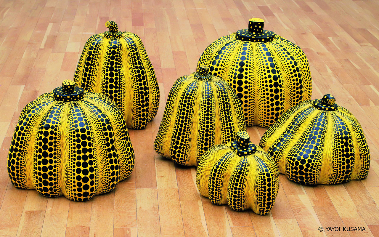
Yayoi Kusama. Pumpkins, 1998–2000. Mixed media. 6 pieces, variable dimensions. © YAYOI KUSAMA
Death
““What death means, its colours and its special beauty, the stillness of its footsteps and the ‘nothing’ after death. Now I am in a phase in which I create art for the rest of my soul, accepting all this”, says Kusama at the exhibition at the Guggenheim in Bilbao.
Kusama ‘s work is constantly on the threshold between life and death. A childhood surrounded by the ephemeral existence of plants in the family nursery, adolescence marked by the war and its consequences, and especially the death of her father and her close friend Joseph Cornell in the mid-seventies, led the artist to consider that death is not the end point, but another phase of existence that can give rise to a new one. Sometimes in her creative struggle and in despair, Kusama yearns to be free of what she describes as the “languorous weight of life.” However, through her artistic and literary practice, she transforms that desire into a kind of therapeutic fantasy, into a spiritual reward in the “solemn beauty” of death and in the loss of the ego as a return to eternity.
The force of live
Kusama ‘s art and psyche underwent a major change. With the arrival of the long-awaited and well-deserved public recognition, both from her international exhibitions and from her publications, praised in avant-garde literary circles, the healing power of art and the celebration of life become the central themes of her production. As she stated in 1999, Kusama came to believe that her role was to transform her suffering through art “for the healing of all humanity.” In the new millennium, the Japanese artist wants to amplify this message. For this reason, the colourful paintings and sculptures from one of her latest series, My Eternal Soul (2009–) and I Pray Every Day for Love (2021–today), perhaps represent the culmination of this commitment
The exhibition “Yayoi Kusama : from 1945 to today” will remain open to the public until October 8.
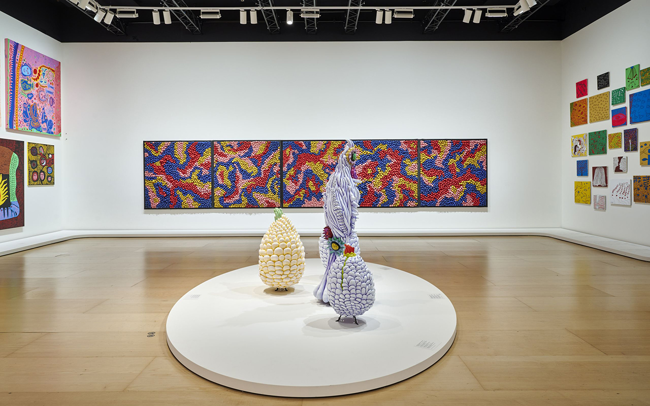
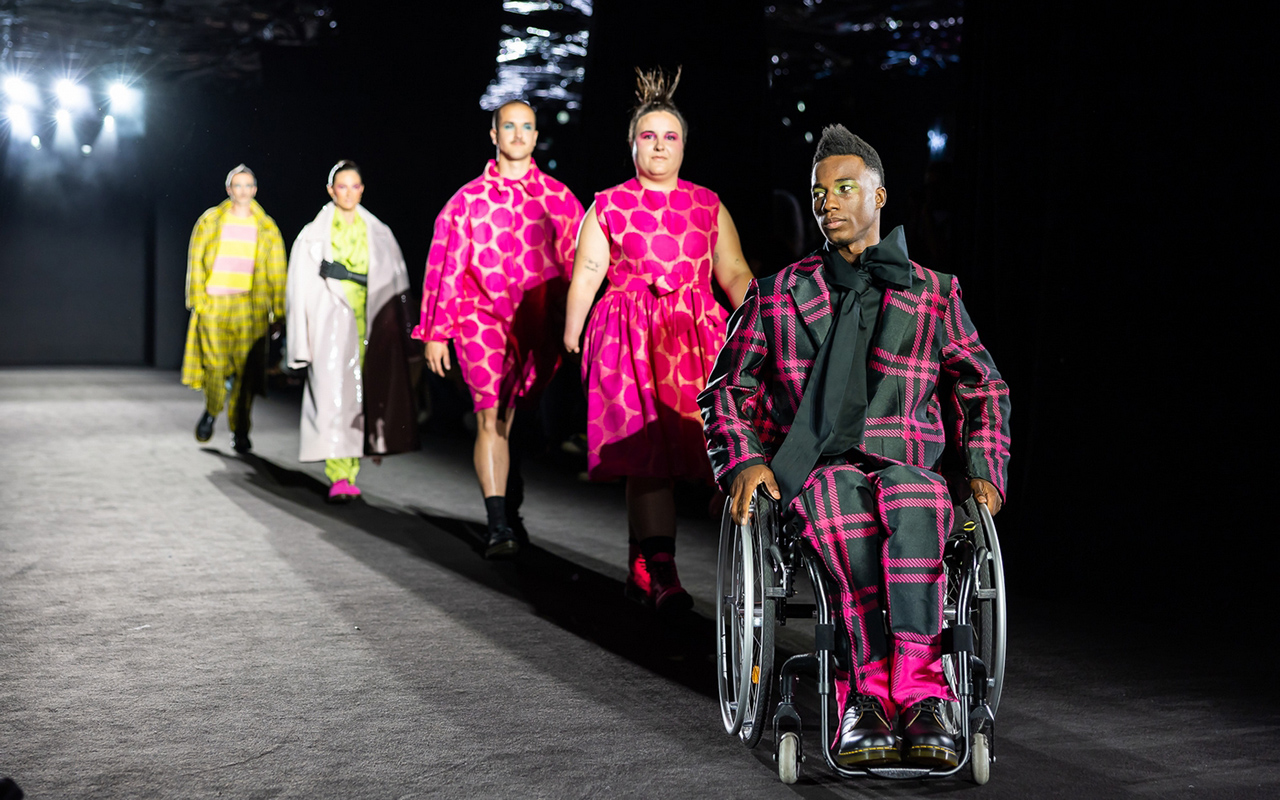
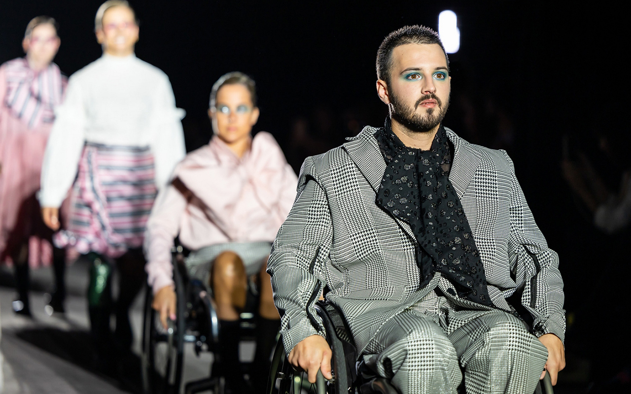
Diversity and inclusion. These are the values that the 080 Barcelona Fashion platform wanted to highlight in their latest edition held at the Sant Pau Art Nouveau Site. And it has done so in an obvious way, reinforcing in the casting of models, a wide variety of bodies that do not understand morphologies, sizes, functionalities, ages or skins that show all their richness of colour and textures. If fashion is a reflection of society, diversity is on the order of the day, it is visibly appreciated on the street and cannot be treated as an exception. For this reason, the Catalan catwalk has also encouraged designers and brands to exercise the power to favour this real change and, at the same time, to take charge of the different challenges of a changing and diverse society.
In this direction, the Catalan catwalk has taken a step further by hosting the first inclusive fashion show in Spain, through the Free Form Style brand. A government awareness initiative on body neutrality and functional diversity that is part of an action plan to combat aesthetic pressure. Founded in 2019 by Marina Vergés and Carolina Asensio, Free Form Style is positioned as a brave brand that is committed to comfort without sacrificing elegance. It is also a pioneer in designing fashion adapted to people with different disabilities with the premise of dignifying all types of bodies because fashion gives that power of dreaming and helps to promote the self-esteem of all groups.
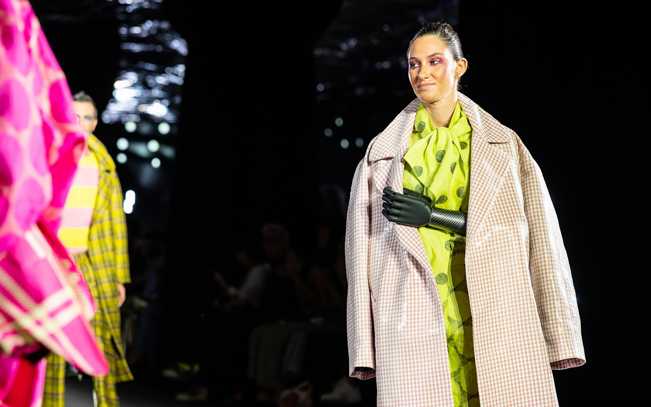
Gratacós collaborated in the inclusive fashion show
In its debut at 080, Free Form Style teamed up with Manuel Bolaño, who was in charge of creating all the designs for the 16 models that walked the runway, including Paralympic athletes Desirée Vila and Sarai Gascón. In this first collection, Bolaño carefully studied the patterns and adapted them to the specific needs of each person, taking into account physical diversity and possible difficulties in dressing: strategically placed side zips, surprising openings to avoid uncomfortable rubbing or small details that facilitate the action of putting on and taking off a piece of clothing.
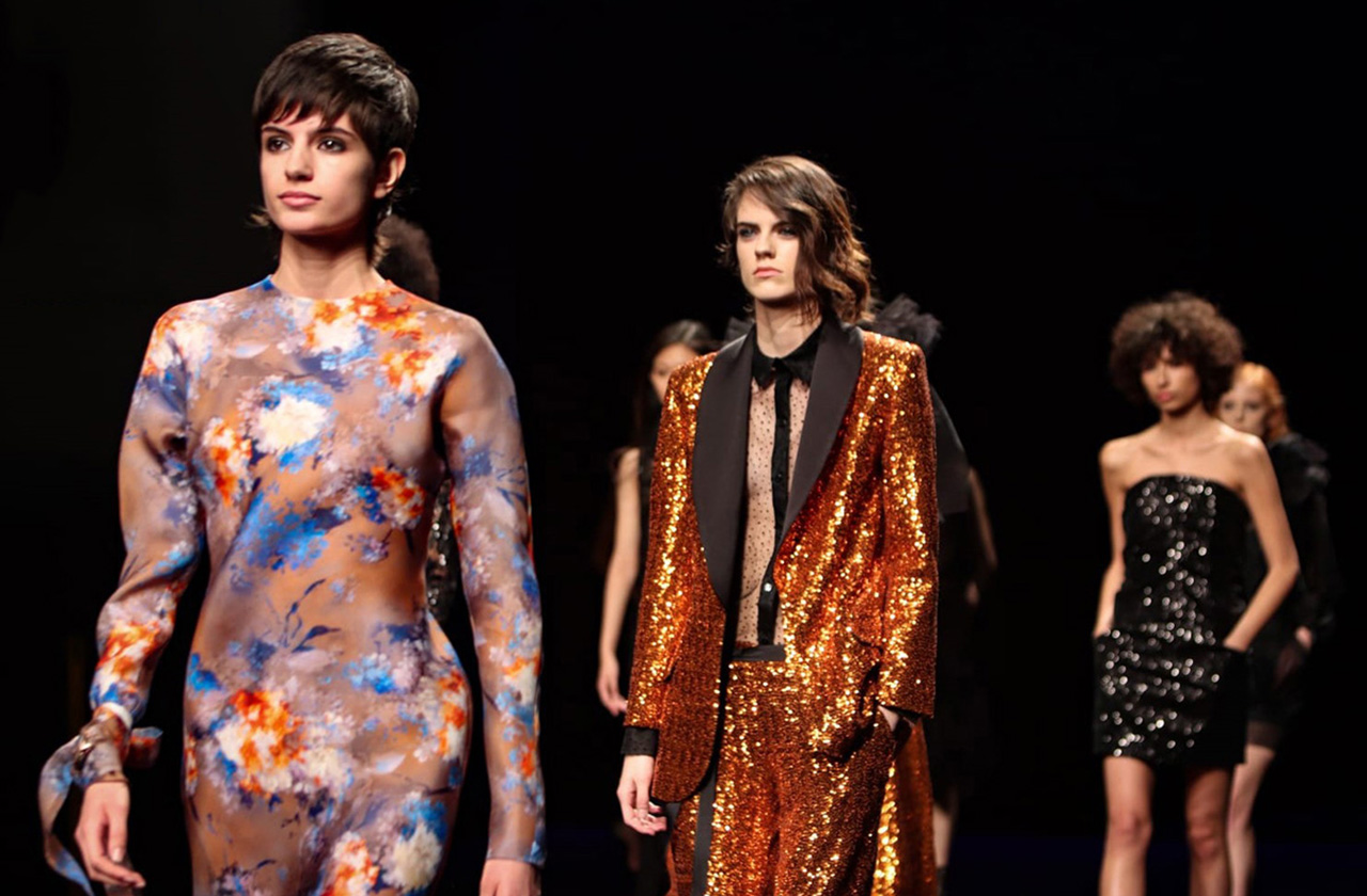
Gratacós also contributed its grain of sand in this awareness action and gave all the fabrics to the brand and the designer, so that they could devise the collection, giving free rein to creativity to transform the fabrics into surprising designs. On the catwalk there were spectacular Jacquards with checks in vibrant tones, houndstooth motifs, lace, embroidery and transparencies that gave sensuality and also sequins to provide that point of light that adds showiness. All of these fabrics were showcased in the debut collection ‘Just a perfect day’. A proposal that follows the principles of English tailoring and is influenced by the punk and new romantic movements, creating functional and comfortable pieces to dress diversity, but without forgetting fantasy because as Free Form Style defends, “having a disability does not mean not being able to be fashionable”.
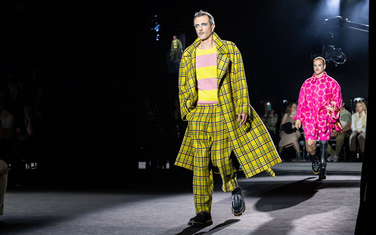
A special showcase
To give this action more visibility and promote the designs exhibited on the 080 catwalk, this month of May Gratacós has dedicated the showcase of our space in Barcelona to inclusive fashion. Thus, our mannequins will be dressed in some models from the debut collection that Manuel Bolaño has made with people with functional diversity in mind. We encourage you to visit our space and take a closer look at these designs that combine comfort with fantasy.
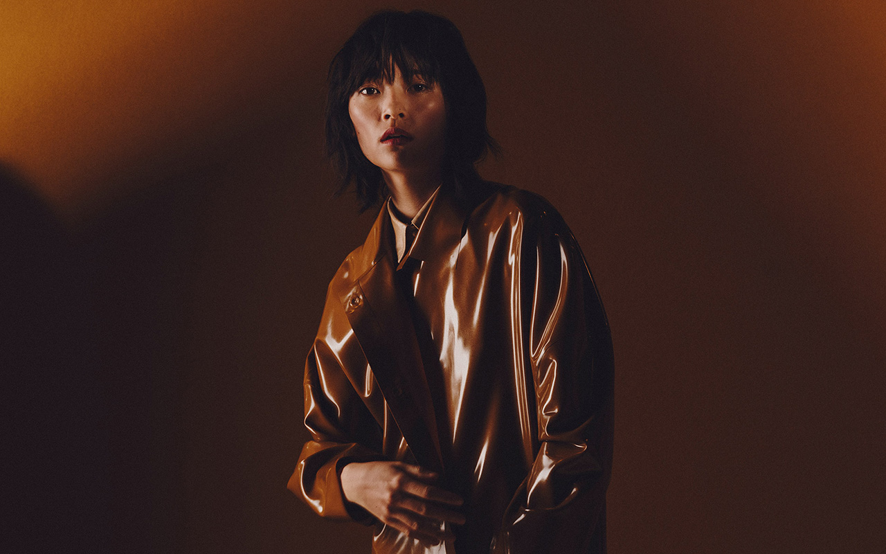
Brown. Right from the start it sounds ugly and unpleasant, it triggers some ridicule and in general, it represents an underappreciated colour: Only 1% of people admit to having it as a favorite, being the hue that generates the most rejection among the population. On a psychological level, brown has negative connotations because it is associated with the old and outdated, poverty, dirt or everyday life. The ordinary is represented in brown. The discreet also because brown, being the mixture of primary colours, goes unnoticed. These mental associations are related to the history of clothing and the use that was given to this underestimated colour in art. Despite this, brown also has a luminous underside: it represents the earth and is present in nature, through flora and fauna. In design and decoration, brown is highly appreciated because it refers to warmth, recollection and well-being. The rustic environments, with a great presence of wood, leather and mud and clay, are in brown tones. Below, we explain some curiosities about this reserved shade that is essential in autumn, the season that we psychologically associate with brown.
The origin of brown
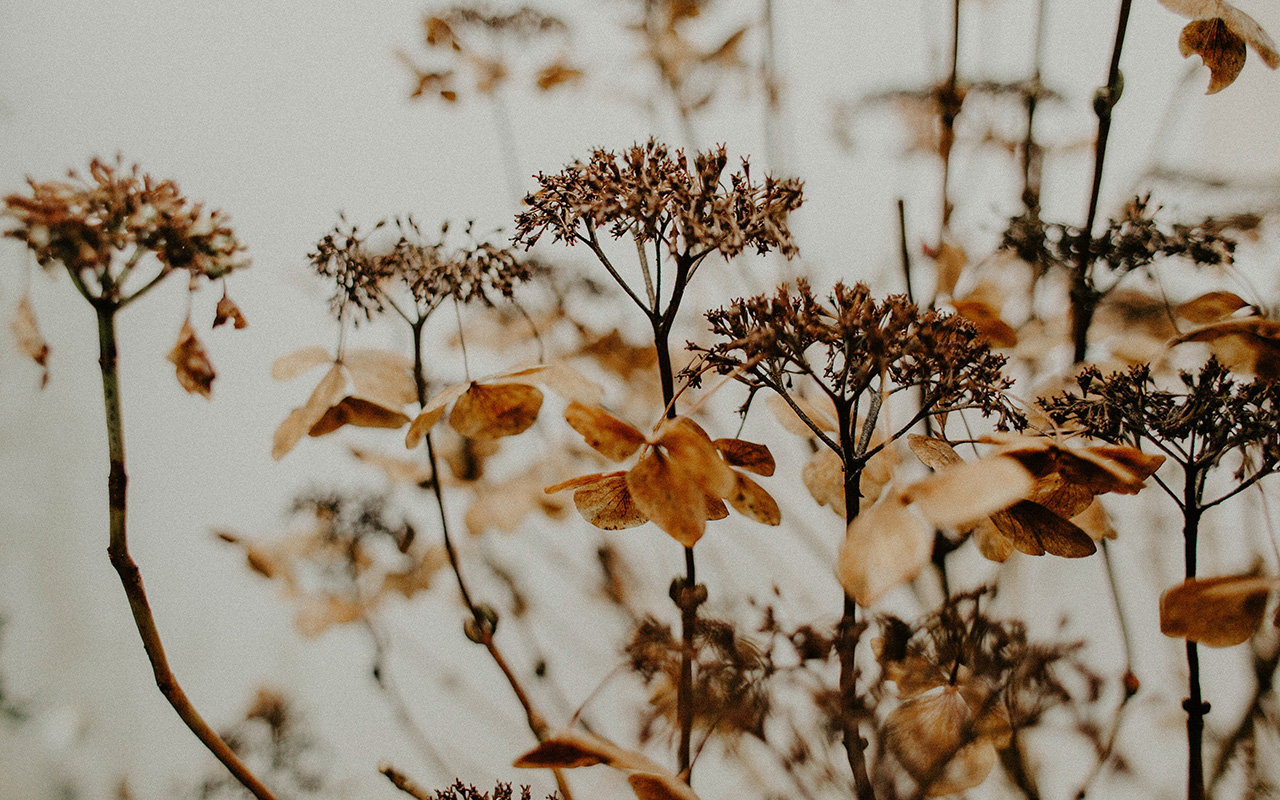
Brown has always been there, and it abounds all around us. These tones are very common in nature: the bark of trees, the skin and hair of animals, clay soil, arid soils, mud flows… Brown represents mother earth, where it emanates with all its force. , its nature, and, therefore, life and death. Maturity is brown, so in autumn, this colour shines in all its intensity. The flowers lose their youth and the leaves gradually turn this shade to announce the end of their cycle.
Etymologically, the name of the colour is a Gallicism. It refers to “marron” which means chestnut in French. This word was introduced in the mid-nineteenth century to designate what was previously known as chestnut. The acceptance and use of the term among the population was so great that it was introduced into the normative dictionary in 1927. Therefore, not even a century has passed since our language has accepted the word brown to designate the brown or brown colour. Despite this, today we continue to use the old adjective to name hair and hair that is neither blonde nor brown.
The colour of humility and poverty
Historically, brown has always been an abundant colour, easy to produce and in many cases, represented undyed fabrics through elaborate pieces of flock and hair of goat, deer and hare spun with raw and brownish flax and hemp. Therefore, the brown clothing was the original and did not need any added treatment. Since Classical Greece and practically up until the end of the 18th century, pieces of clothing in bright colours such as red, ultramarine blue, green or golden yellow were status symbols -they were expensive colours to produce- and were reserved for women. privileged classes. The undyed garments clearly showed an inferior status and for this reason, the popular classes used them frequently, with brown being the colour associated with simplicity, humility and poverty. For example, in Ancient Rome, brown clothing was associated with the poor or the barbarians – those peoples who did not master the dyeing arts. The term used to address the commoners was “pullati”, which literally means those dressed in brown. In the Middle Ages, brown was considered the ugliest colour on the spectrum because it was the colour worn by peasants, serfs, servants, and beggars. It also represented an abundant, ordinary and vulgar colour, values opposed to the opulence of the nobility. Therefore, brown was seen as a worldly colour, associated with the crowd, the mob and why not, with dirt. Feces, mud and bitumen are brown and frequently surrounded the plebs.
If brown also represented a symbol of humility, it was not surprising that the first Christian monks used this colour to preach a simple life, away from all kinds of luxuries. When the colours for the different orders were established, the brown and gray colours dressed the monks who took a vow of “maximum poverty” such as the Franciscans known for their brown robes as a symbol of Christian humility.
Brown was also, for centuries, the colour of mourning for the poor because black-dyed fabrics were inaccessible to the most popular classes.
A change of conception
The aesthetic ideal of vibrant colours lasted as long as the cost of luminous tints remained high. This paradigm began to change from the eighteenth century when it was possible to dye pure colours for the first time (red, blue and green were the most valued) at reasonable prices. This fact changed the value system: pure colours were then considered simple, and the dyer’s art was transformed into the art of mixing dyes. From there arose, in the rococo era, the predilection for pastel colours, and the introduction of chestnut as a fashionable colour among the nobility. To obtain the coveted brown, they were dyed several times with different colours, one after the other, to obtain a more varied tone. For example, Louis XVI had a predilection for flea colours (he called them coleurs de puce ) with very varied nuances: old flea, young flea, flea back, flea head, flea leg… All would refer to a type of brown distinct.
Goethe, on the other hand, considered pure colours to be negligible, since they were difficult to combine in the clothing of sophisticated people: “The use of solid colours undoubtedly has many limitations; On the other hand, colours such as dirty, dead, the so-called fashion colours, show many gradations and nuances, most of which are graceful”, he said. The “dirty colours” were all shades of brown, and the “dead colours” referred to those that darkened to black with its various variations that were more versatile. This is how German culture progressively turned the meaning of brown upside down. From the plebs and marginalization, it came to represent the culture and good taste of the upper classes.
Brown in art
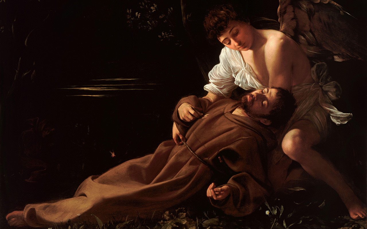
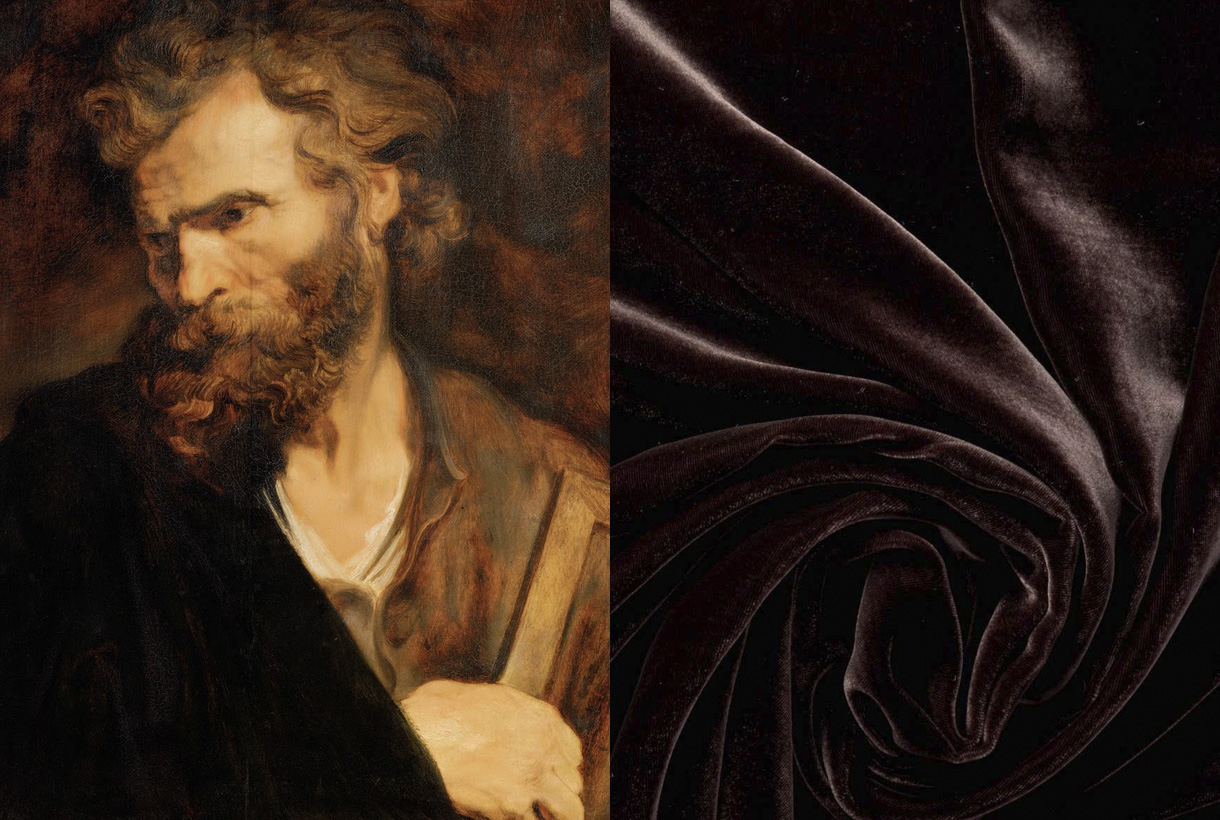
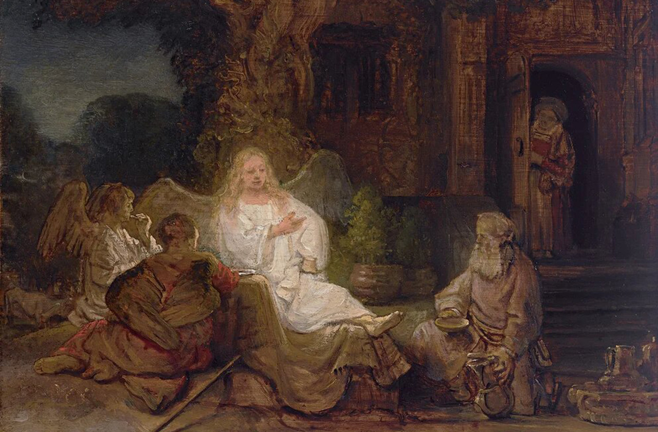
Although brown has been used in art since prehistoric times, this hue was rarely used in art until the Renaissance. In the Middle Ages, for example, artists preferred bright, distinctive colours to paint pictures or illustrate religious books. In the 17th and 18th centuries brown was in greater use. Caravaggio and Rembrandt used various shades of brown to create chiaroscuro effects, where the subject stood out from the darkness. Rembrandt also added shading to the ground layers of his paintings because it promoted faster drying. The artist began to use a new brown pigment, called Cassel earth or colony earth. This was a natural earth colour made up of organic matter, such as soil or peat. It was used by Rubens and Anthony van Dyck, and later became commonly known as Van Dyck brown. The French Impressionists of the 19th century were not very fond of the colour in question, with the exception of Paul Gauguin who created luminous brown portraits of the people and landscapes of French Polynesia.
A colour appreciated in fashion
Traditionally, it was thought that the person who wore brown conveyed to the world that they wanted to go unnoticed. The psychological effect it causes is that of being an ordinary colour, even mediocre. In fact, there are still rules attached to clothing issues that go back to this imaginary of colours. For example, high-ranking executives are said to be banned from wearing brown suits because they detract from their status.
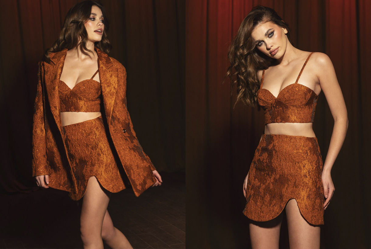
Beyond certain beliefs or traditions, fashion has adopted brown in its bed and has given it infinite possibilities. Brown is a warm and deep tone, it exudes magnetism, it is easy to combine, and therefore it adapts perfectly to countless looks because it makes its discretion its best asset. Not in vain is it considered a neutral like white, black or navy blue. Despite being traditionally related to autumn, brown this 2022 has been worn in spring and summer, through youthful and fresh looks that have been followed by some celebrities and fashion prescribers such as Cardi B, Dua Lipa, Selena Gómez, Kendell Jenner or Rihanna. Wearing it in a total look version has also been the preference of the big fashion firms.
At Gratacós we want to show you some of the key fabrics for the new season in shades of brown to show you their full potential. You will also find other items at discounted prices. You will find them available in our online store.
In short, brown will never go down in history as one of the most significant colours, but it will walk hand in hand with it thanks to its simple, versatile and discreet nature.
Mi�rcoles 23 febrero 2022
 Go back, start and use for the first time. These are the verbs that we wanted to put into motion after liquidating the last winter season and presenting the new collection for next spring at Première Vision Paris. In this limbo of past and future proposals, we can only talk about the present, in this case the spring-summer 2022 collection that we are eager to show in all its splendor through the catalogue, the online store and our physical space in Barcelona.
Roughly…
We start the season inspired by a quote from the Israeli historian and philosopher Yuyal Noah Harari : “This storm will pass, but the decisions we make now could change our lives in the years to come.” This phrase marks the course of the collection because, without neglecting the contributions of the past, our eyes are fixed on the future and on the path we have to follow to explore new territories without losing our identity.
“This storm will pass, but the decisions we make now could change our lives for years to come” – Yuyal Noah Harari
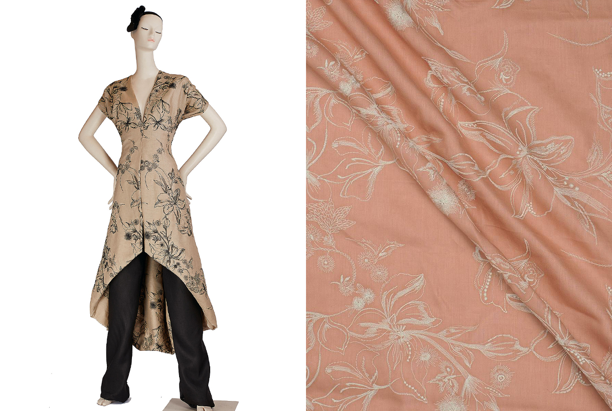 In the context of uncertainty that we have had since the start of the pandemic, we have seen people cling to solid values such as security and trust. For this reason, the textile proposals that we present this season will focus on articles that reassure, calm, do not disappoint and, above all, are durable. We are not interested in the frugal or the unstable. This season, colour is the catalyst that will bring consumers back to the world of design and trust in it. For this reason, colour is essential to shape fabrics and plays a key role in defining new proposals. From neutral tones, to their brightest reverses, through blues and greens to bright pinks and oranges.
In general terms, we present to you a season that we would like to be tranquil, brimming with calm, joy and optimism, but always guided by the need to make products that take into account the environment and the surroundings in which we live. Here below, we give you more details.
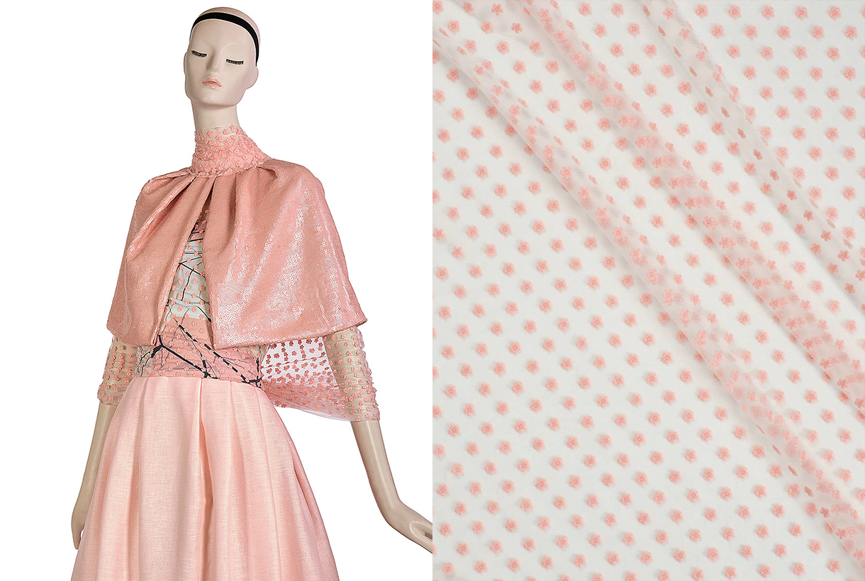
The colour softens
This season, colours are oxygenated and lose saturation to establish harmonic mixes and emotional combinations that calm and reassure. Neutral tones stand out, incorporating sparkles, transparencies and small brushstrokes of colour in blue, pink, green and yellow. The soft and delicate tones provide a contemporary vision and are understood discreetly, without excesses or additions.
If we discussing precisely, we highlight the beige colour of kraft paper, the white that helps us to work shapes and volumes, and the black that we will use to add sophistication and create total looks with designs of great graphic impact. As happier tones, within this palette of fresh but less saturated colours we highlight millennial pink, blue in its most multifaceted, versatile and adaptable version, and green that brings us closer to nature and continues to play a leading role in fabrics from the season. As a counterpoint, we highlight the optimism of lime yellow, attenuated orange and coral that are perfect for refreshing and adding light to items. These tones are mixed with an antagonistic hue: turquoise in a refreshing and unique combination.
Lastly, the colour will also be worked on in different ways: in plain, two-tone or multi-colour versions for a liberating and stimulating effect.
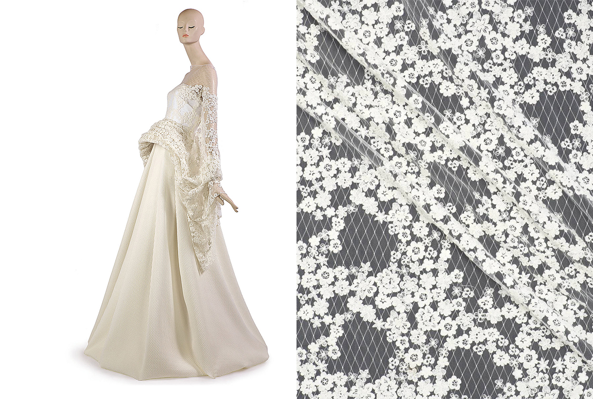
Huggable fabrics and commitment to sustainability
This season we highlight natural fibres that are involved in resource management and also recycled and regenerated synthetics. Specifically, we will work with BCI cottons, FSC viscose, tussah silk, undyed natural linens and recycled polyesters, some of them obtained from used plastic bottles.
In the spring-summer 2022 collection we want to enjoy simplicity for a more comfortable, minimalist and beautiful type of fashion. To do this, we will use gazar, voile and organza in neutral tones, gently differentiated between them, which will define the lightness of the fabrics. We want to produce that fresh and affectionate component, like a tender hug. We will also work with fil coupé techniques that connect us with a modern romanticism and weave structures with soft contrasts for simple beauty.
“We want to enjoy simplicity for a more comfortable, minimalist and beautiful type of fashion”
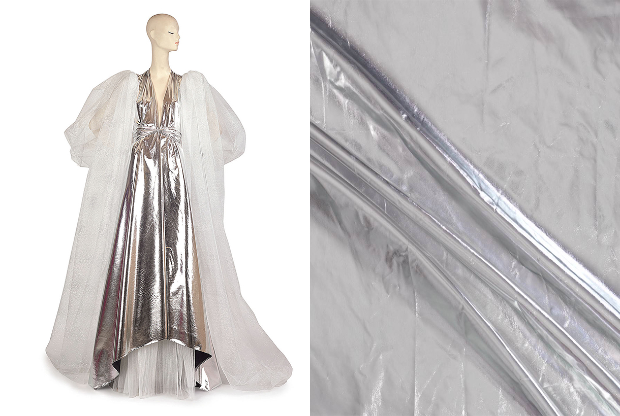 Within the collection we highlight clean-looking matte poplin and satin, classic weaves, embossed reliefs inspired by cardboard packaging, Jacquards with geometric structures in rhythmic repetition, summer tweeds with thick yarns and piqués for structured weaves. This season the rustic aspect is also plays a leading role and through the fabrics we want to achieve a tactile rusticity through fancy yarns.
Within the collection we highlight clean-looking matte poplin and satin, classic weaves, embossed reliefs inspired by cardboard packaging, Jacquards with geometric structures in rhythmic repetition, summer tweeds with thick yarns and piqués for structured weaves. This season the rustic aspect is also plays a leading role and through the fabrics we want to achieve a tactile rusticity through fancy yarns.
The season is also characterized by proposals with an irregular appearance through inspiring wrinkled fabrics and natural finishes, with other lighter ones such as precious organza that covers the body creating volumes without excesses, voiles that are worked in layers, gazar that provide the appropriate transparencies and sensual cotton satins that can be either plain or printed.

Refined designs that still bear the floral gardens
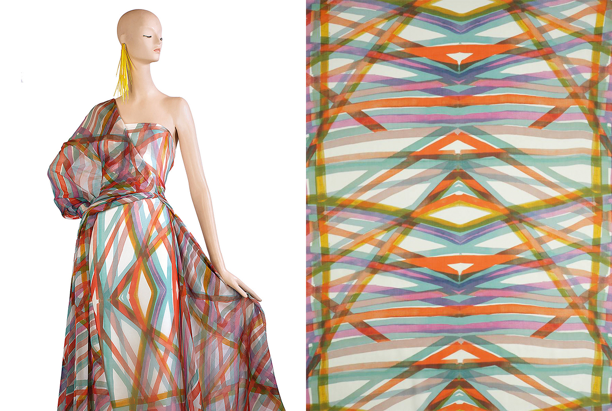
In general terms, the fabrics will be expressed without decorative excesses through serene geometries and visible contrasts, but without visual noise. It is not a season of excesses or shrillness, quite the opposite. We are inspired by the ethnic and folk style from a stylized and refined point of view. In terms of prints, there are fabrics that welcome abstract strokes with brushstroke details. Also the stripes with a manual stroke and the checks persist, but in their freer version.
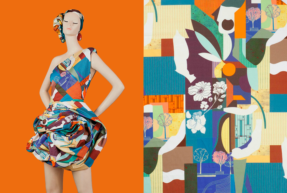
In spring, flowers cannot be missing, and this season will not be an exception either. A walk through the country gardens brings us renewed inspirations for a new creative spin on these prints that use flowers and leaves, chosen for their particular shapes, inspiring textures and surprising colours.
Finally, it should be noted that we continue with our commitment to sustainability, which began in previous seasons and is here to stay. Our collection uses regenerated and recycled yarns with European certificates and this helps to reduce the environmental footprint of textile production: BCI cotton, regenerated cotton, tussah silk, linen, FSC viscose, New Life and recycled polyester, are some of the yarns present in this new spring-summer 2022 collection that we have just launched. Brand new, this verb that we like so much…
We invite you to discover the entire collection in our shop online!


 Mocha Mousse. Pic by Pantone


 Go back, start and use for the first time. These are the verbs that we wanted to put into motion after liquidating the last winter season and presenting the new collection for next spring at


 Within the collection we highlight clean-looking matte poplin and satin, classic weaves, embossed reliefs inspired by cardboard packaging, Jacquards with geometric structures in rhythmic repetition, summer tweeds with thick yarns and piqués for structured weaves. This season the rustic aspect is also plays a leading role and through the fabrics we want to achieve a tactile rusticity through fancy yarns.