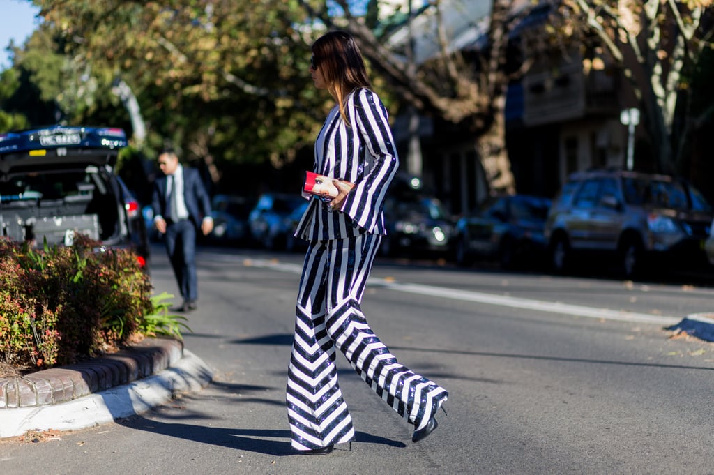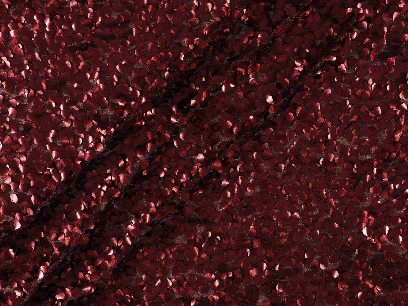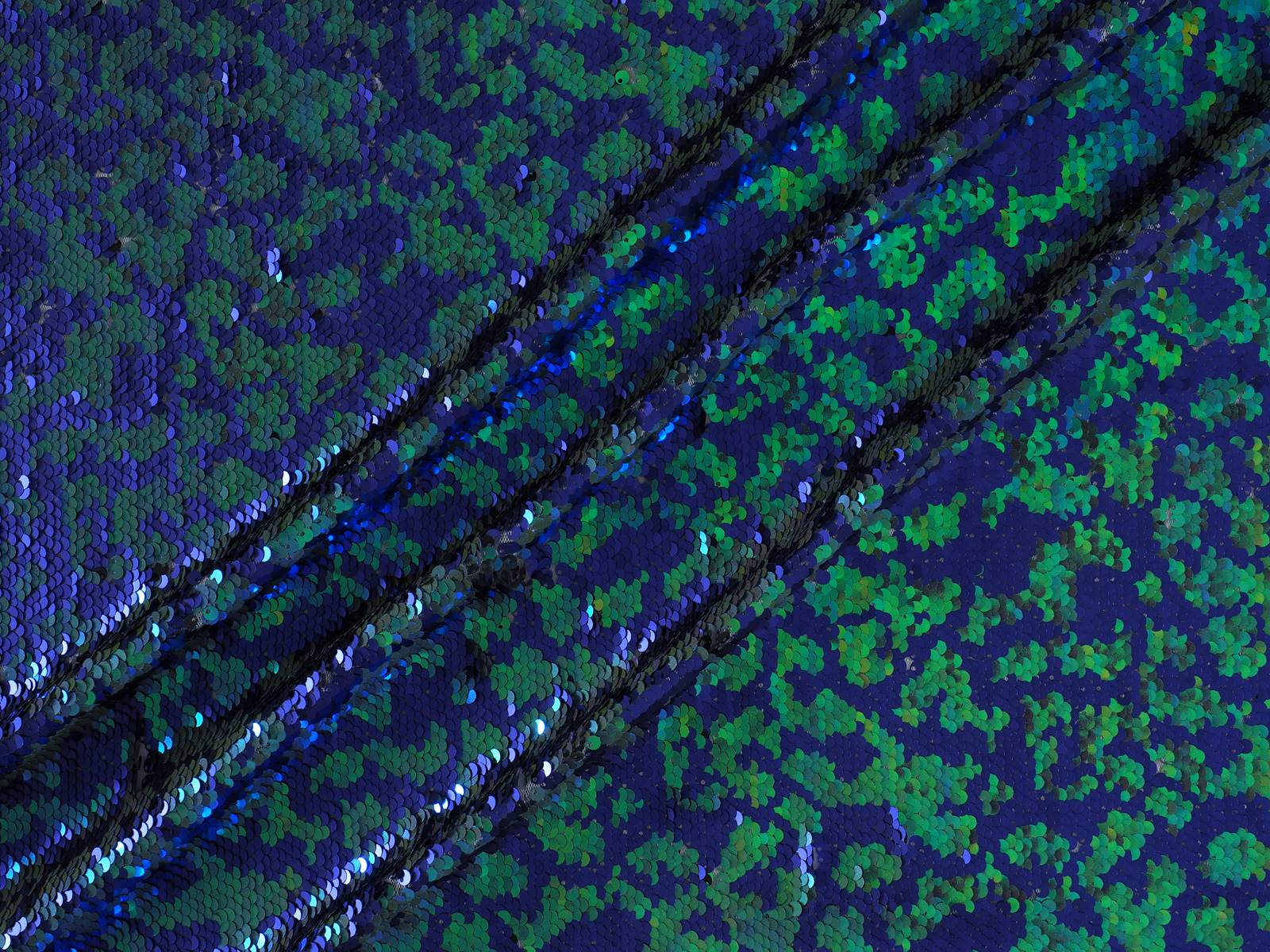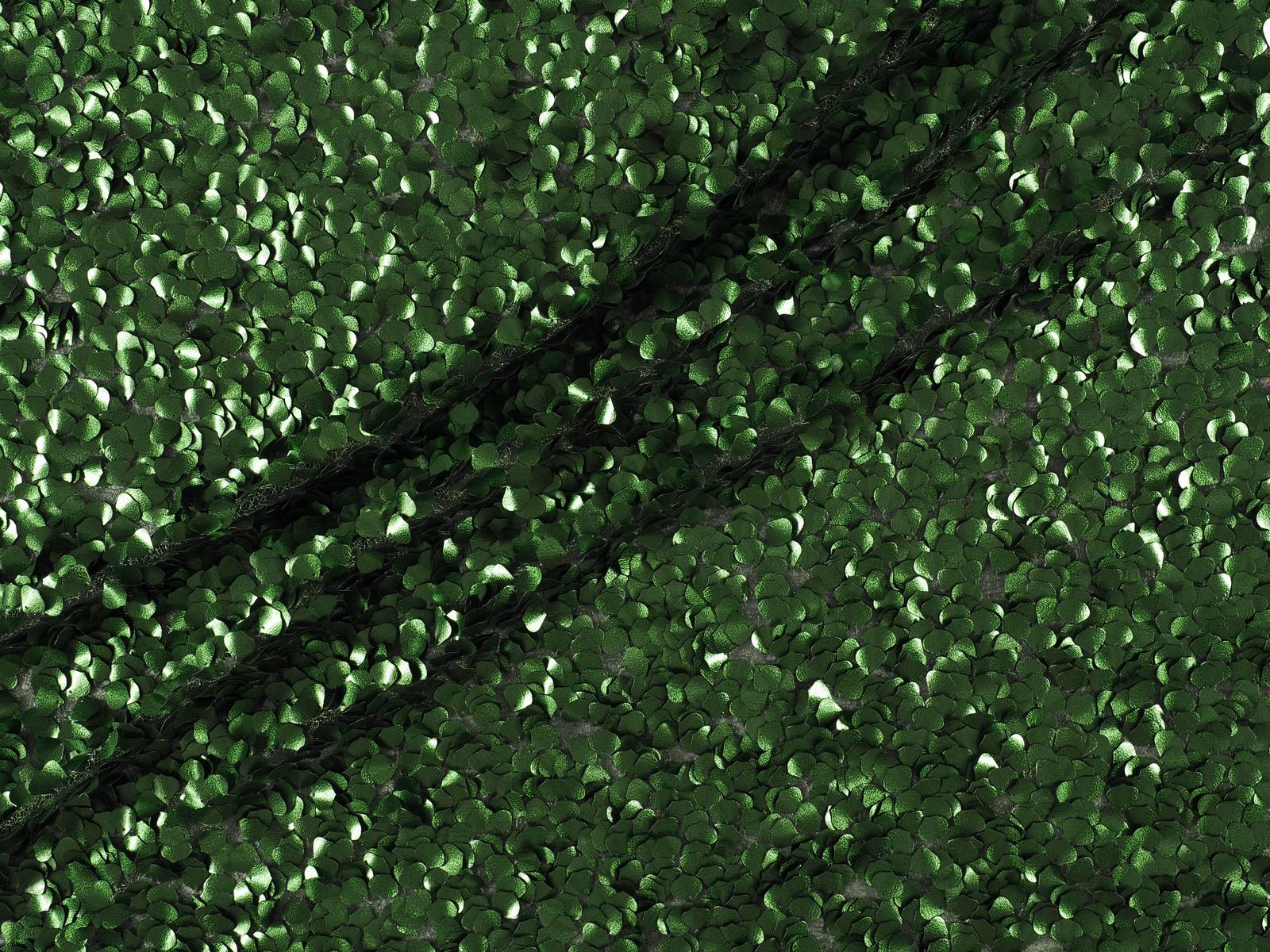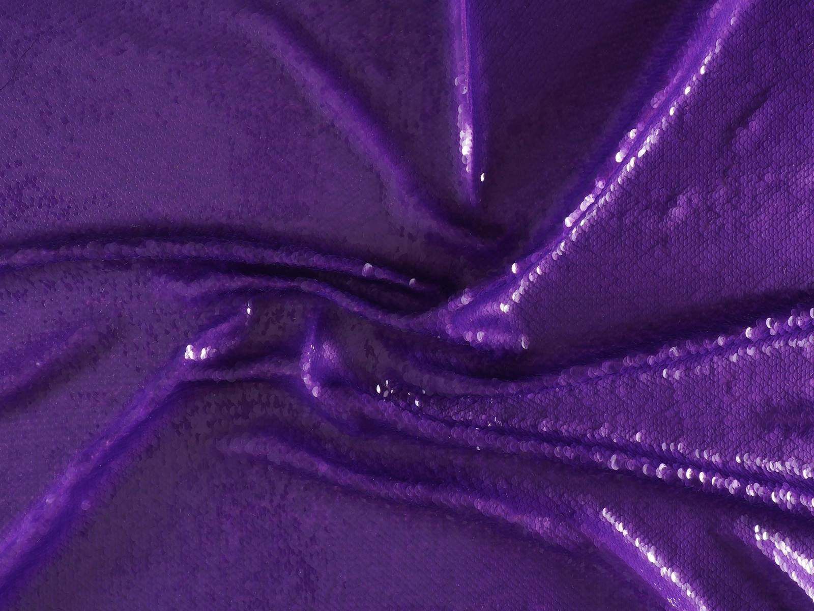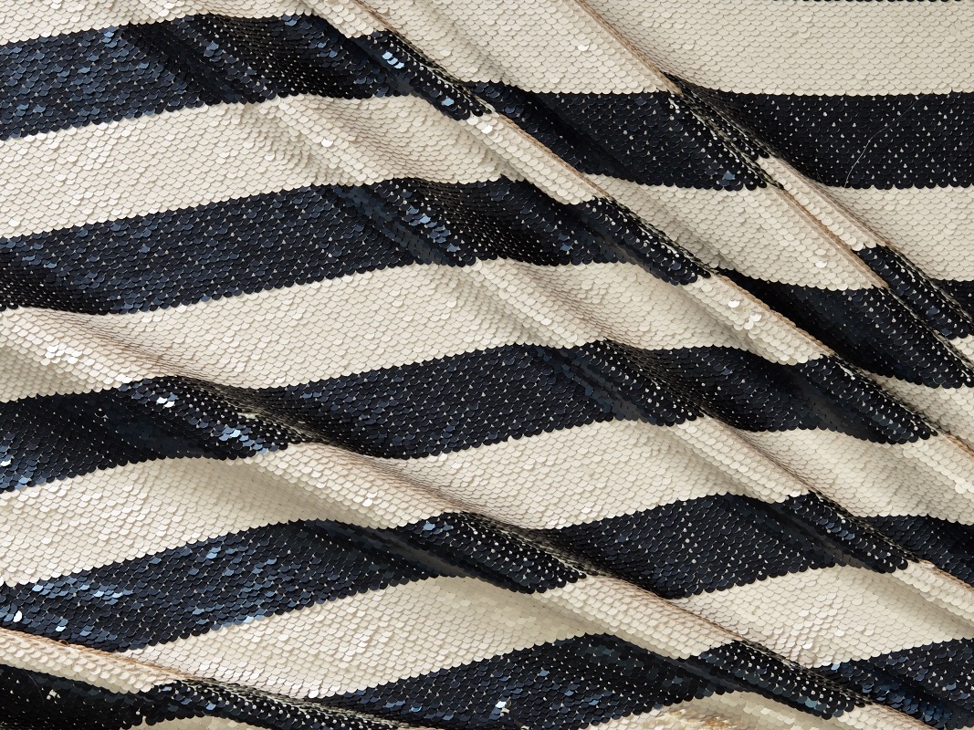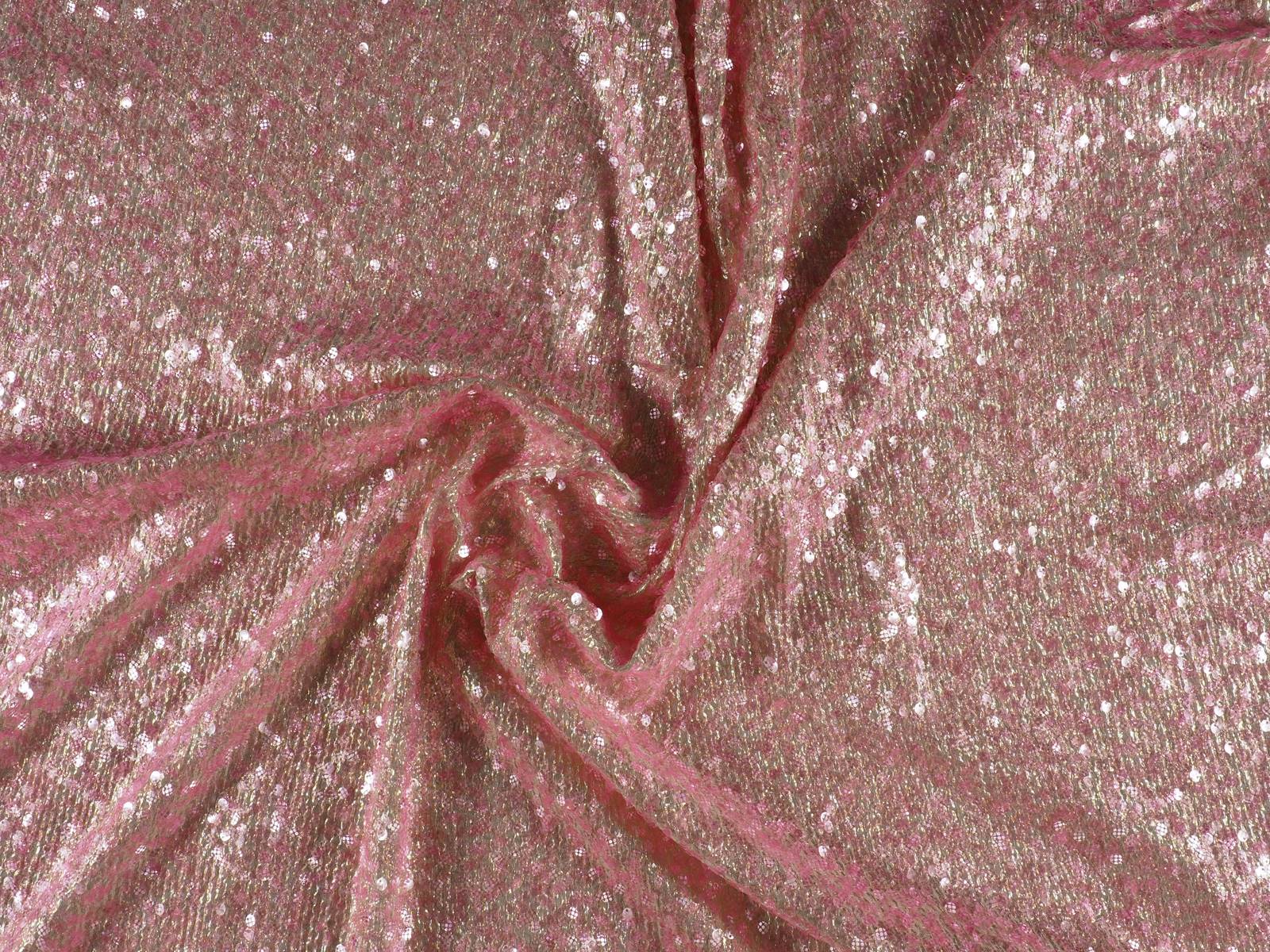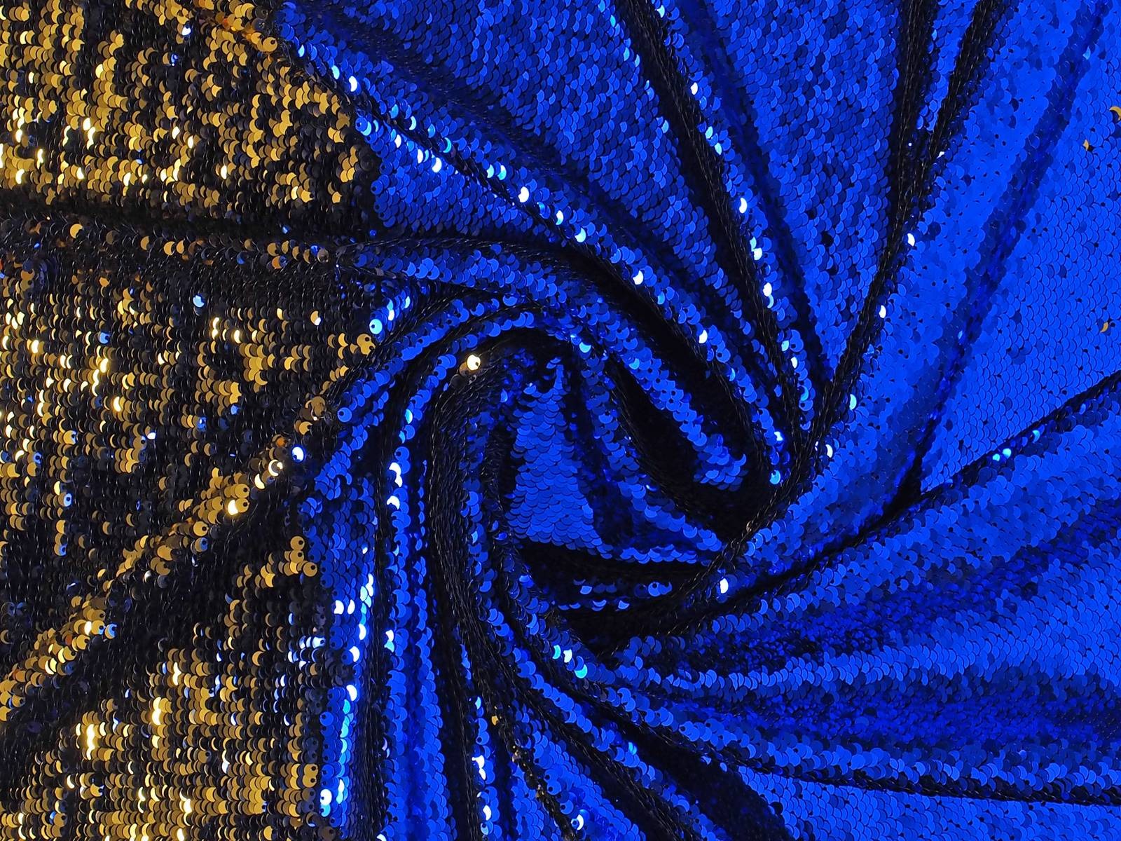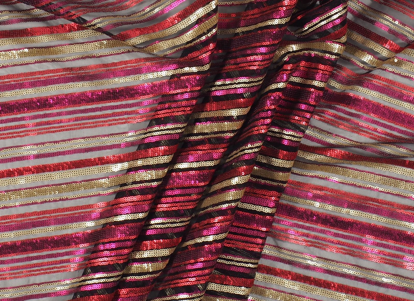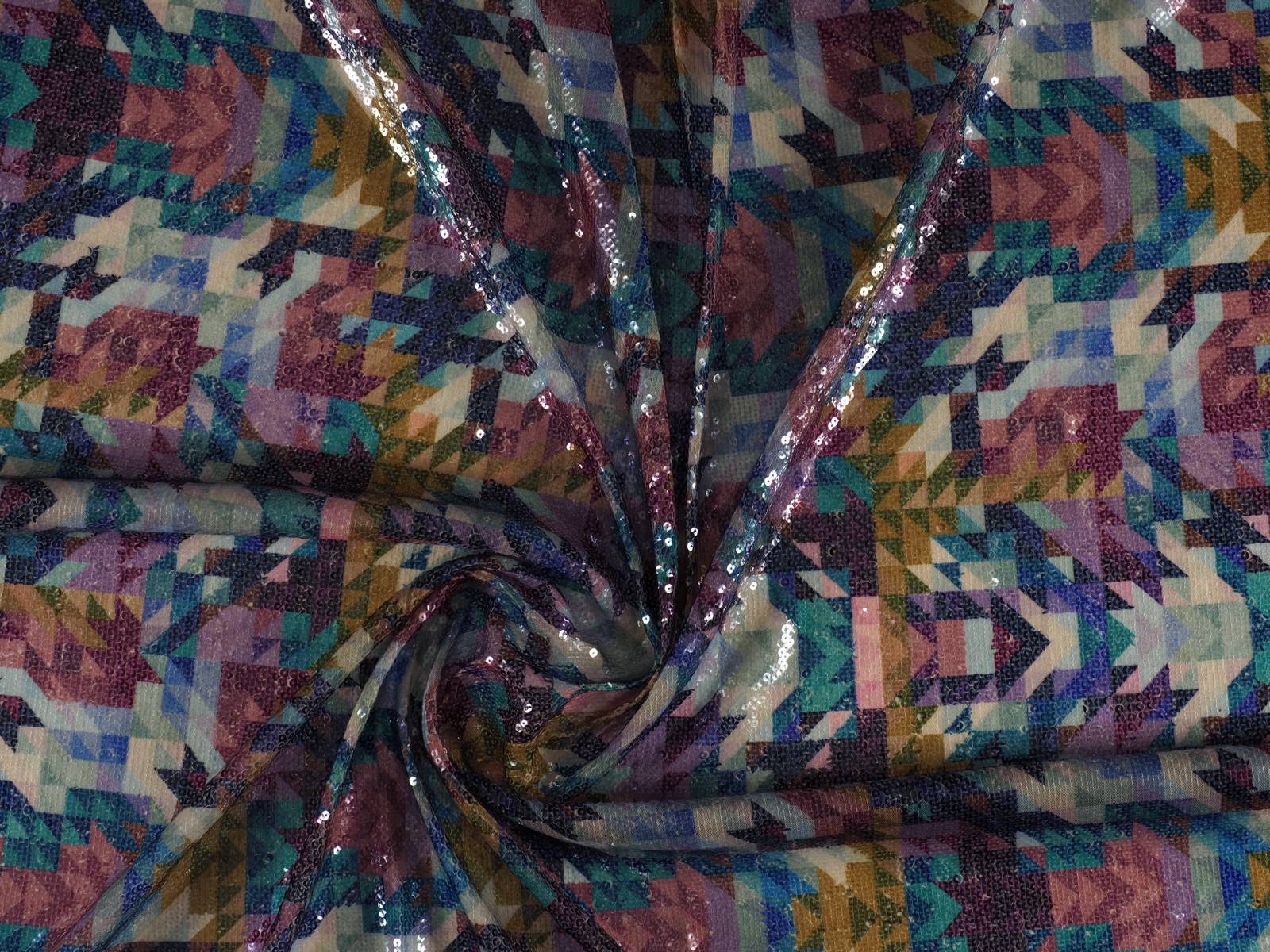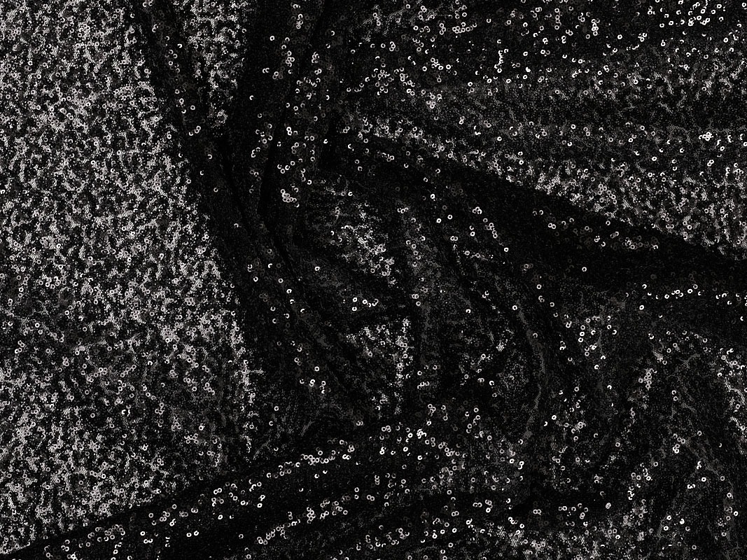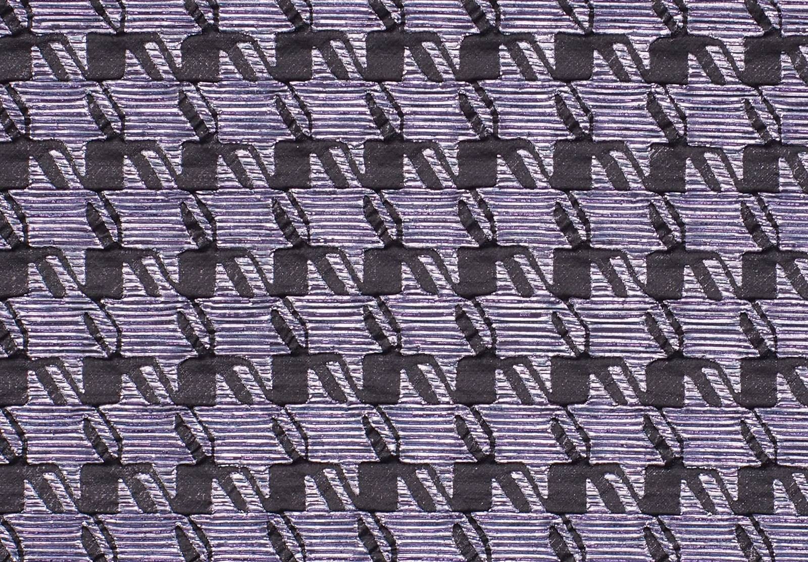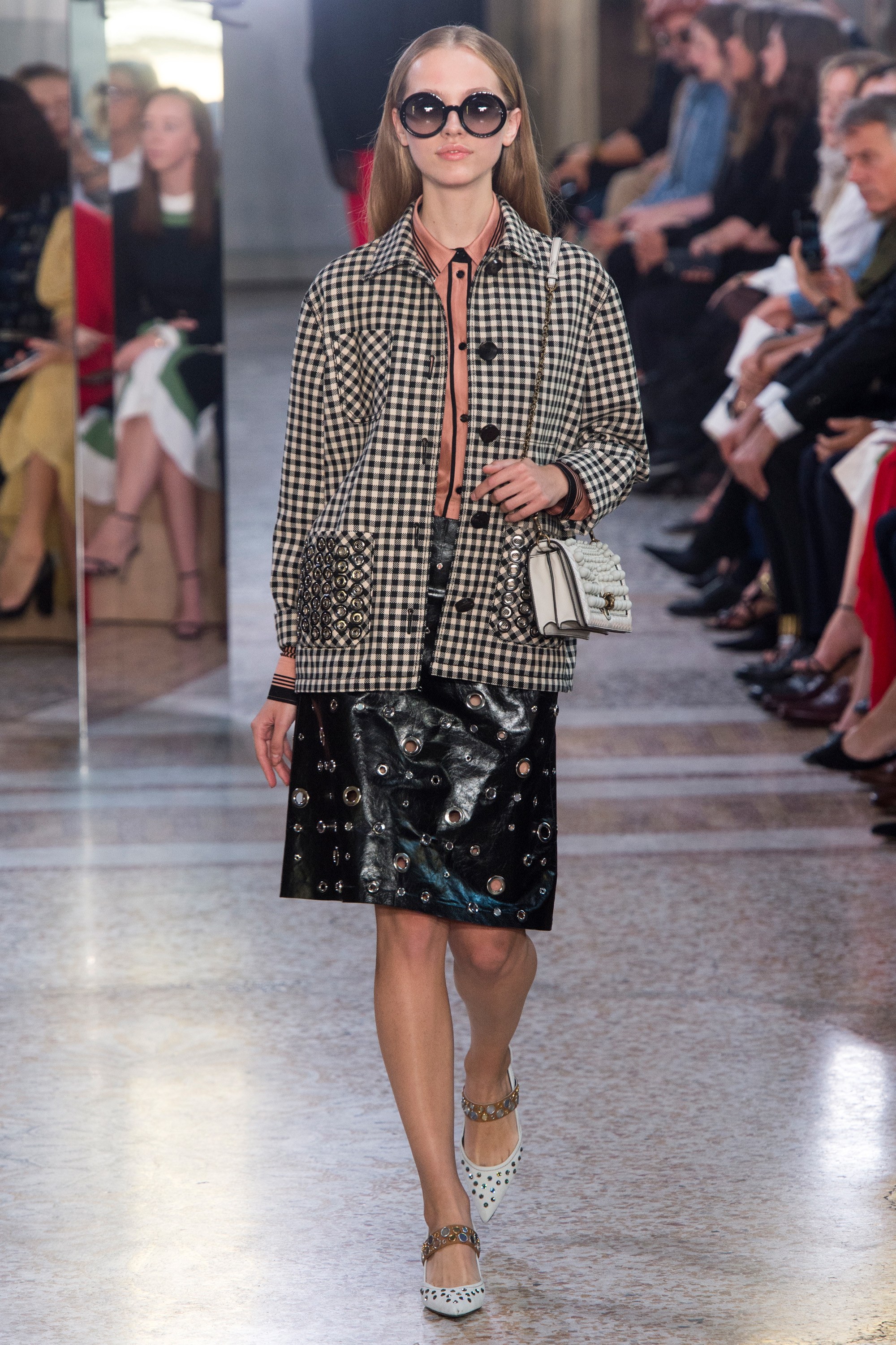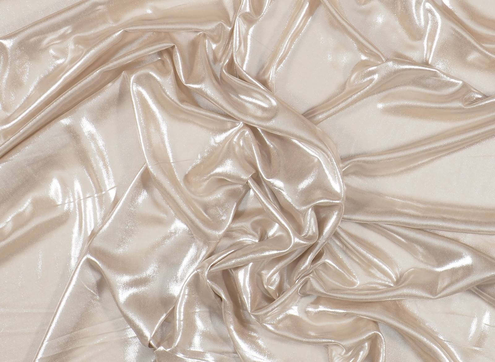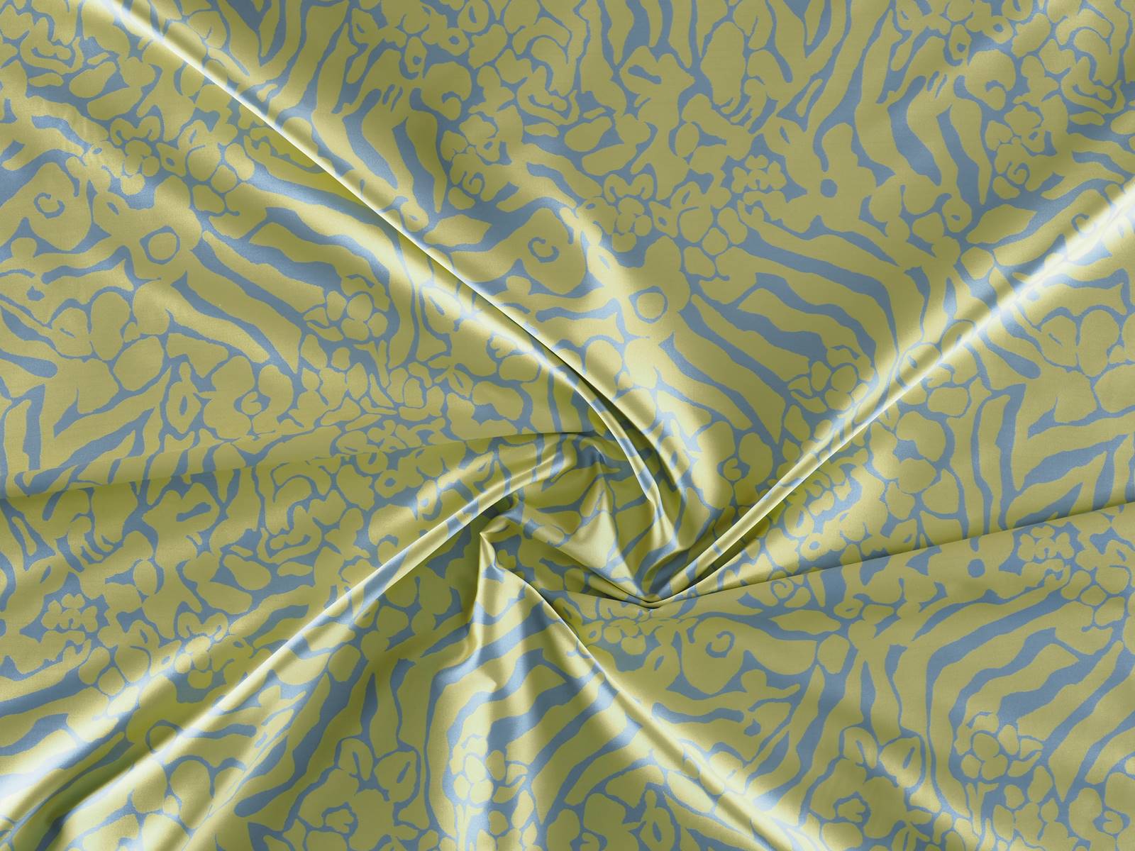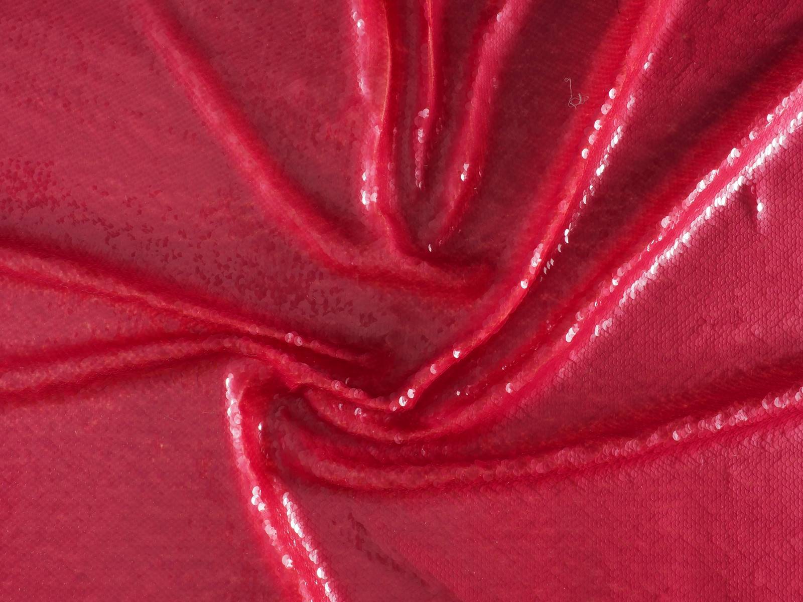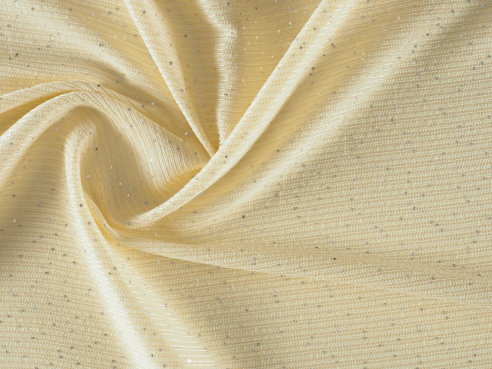
Sequins are not just synonymous with celebration. In any case, we will not deny the opposite either, because it is evident that during the festive periods -mainly between Christmas and New Year’s Eve- it is when they shine at their maximum splendor. But why do we insist on booking this shiny fabric for special occasions?

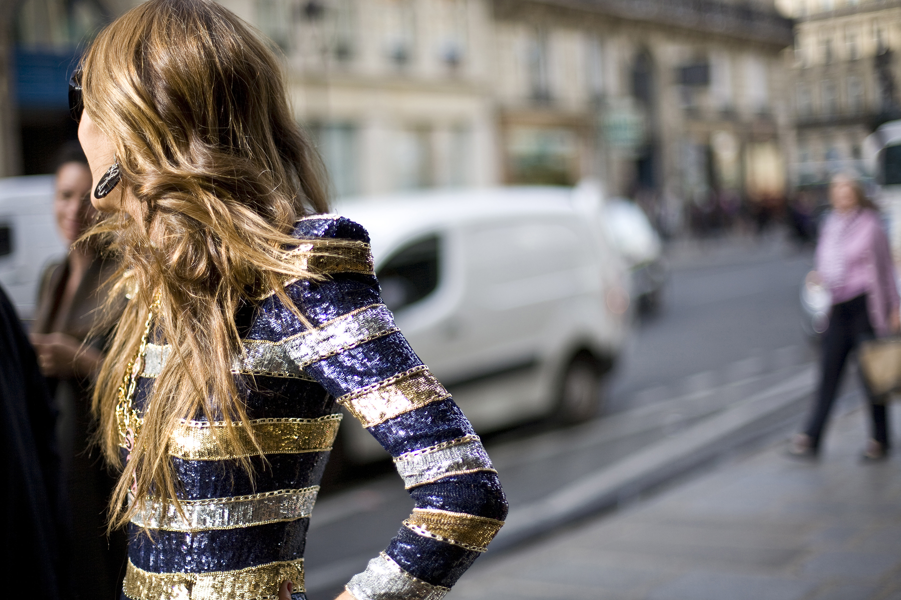
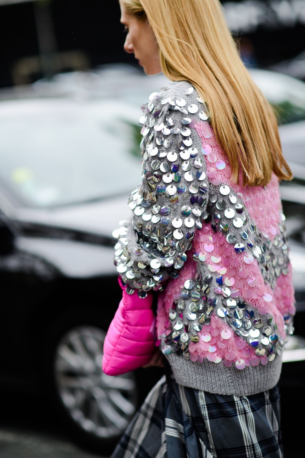
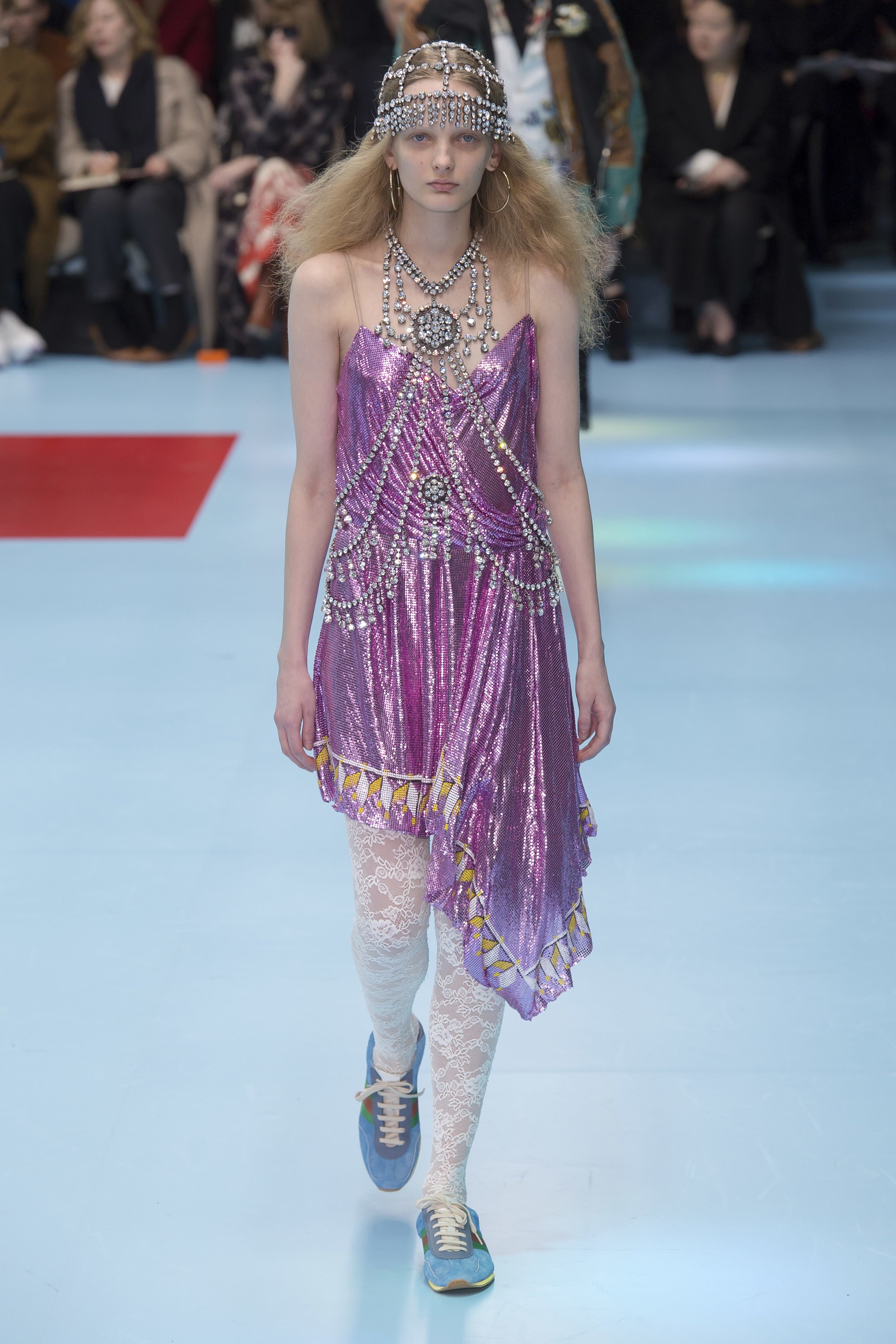
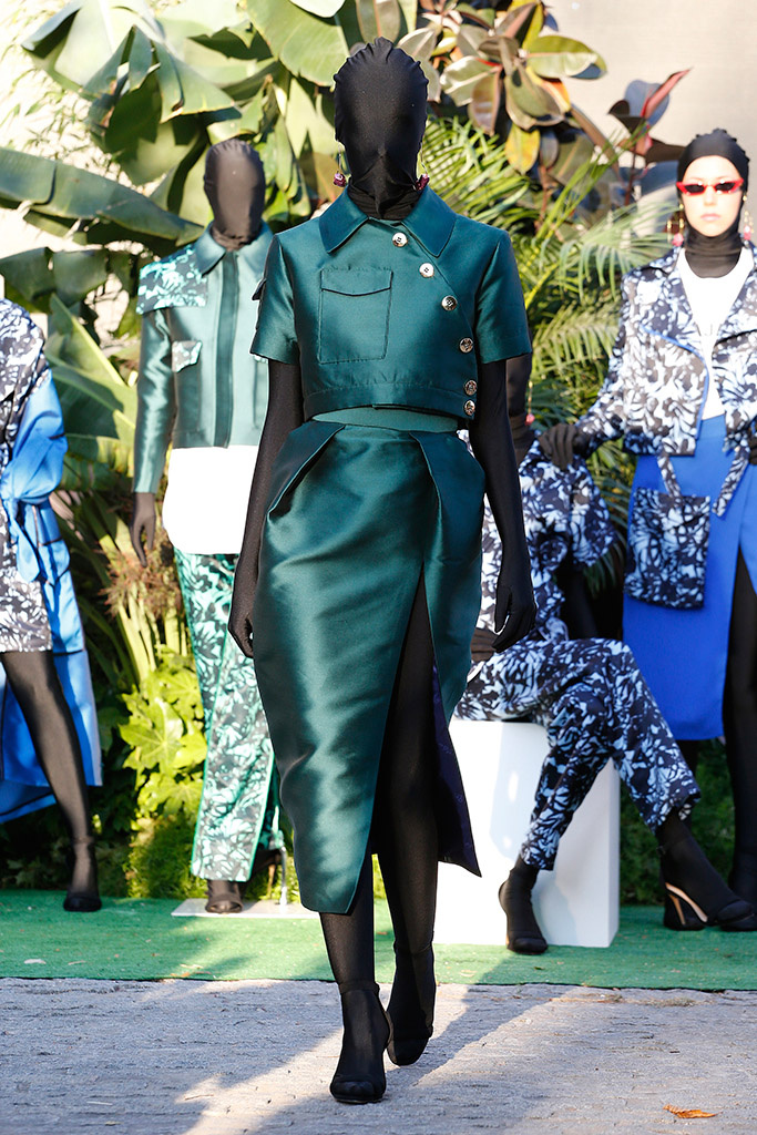
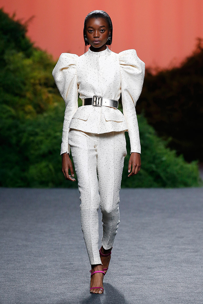
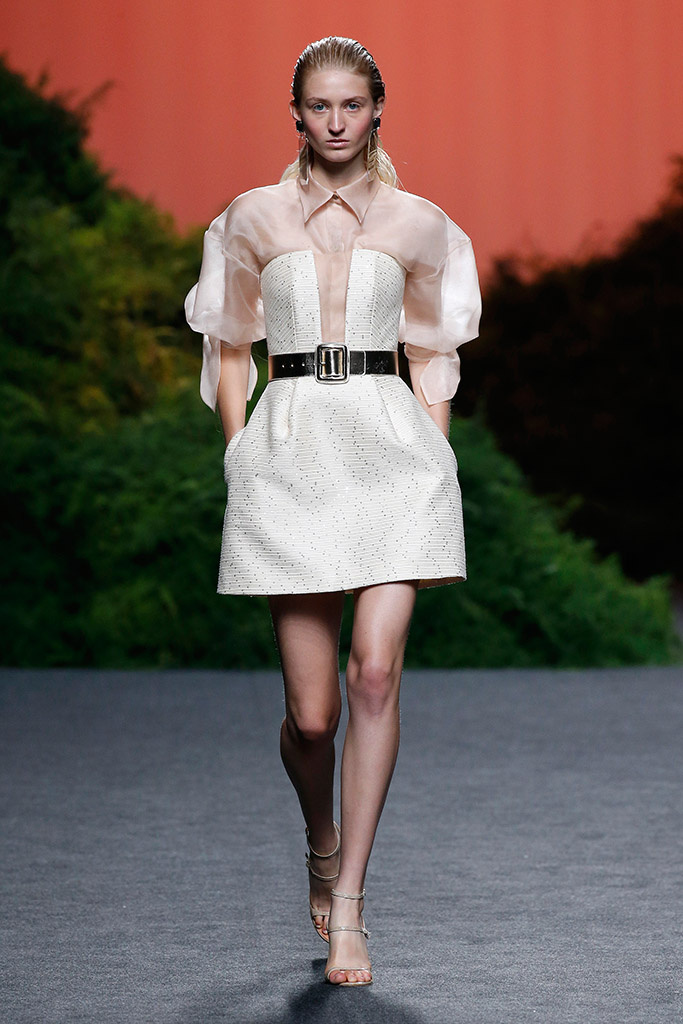
The change has already begun. In recent seasons, we have seen how, little by little, sequins have conquered the ground featuring in the daily outfits of celebrities and prominent personalities from the world of fashion. In various sizes from XS to XL, creating colourful graphic mosaics or blocks of colour, in this transition to street fashion, the sequins have appeared in all its versions to give that radiant air to daily looks.

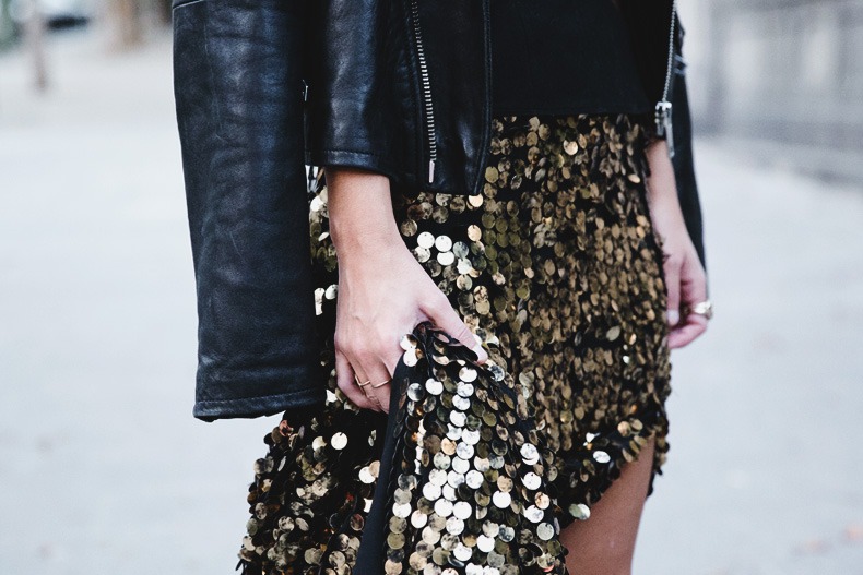
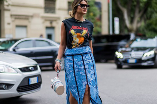
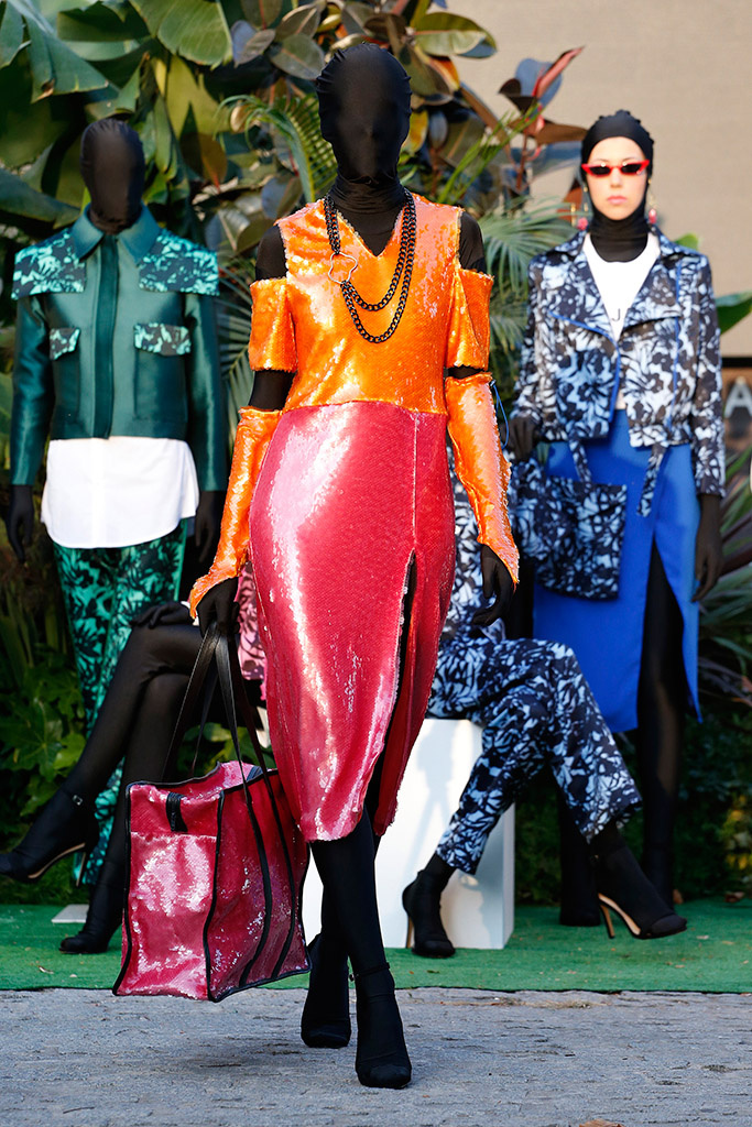
How to combine these brilliant accounts in day to day wear? The key, more than in the fabric, lies in the garment itself and in the way it is combined. The star garment of the season is the narrow midi skirt. An ideal piece to add shine to a daily outfit without the risk of making mistakes. This garment can be combined with neutral garments such as basic sweaters, white shirts or coats in muted tones, which attenuate the brilliant effect of the sequins. In this way an elegant, daring and youthful outfit is achieved.

Beyond skirts or narrow trousers, you can use other garments with sequins that are also easily combined with a vest top, a shirt or a thin jumper. A trick to integrate it into your wardrobe is to play the overlays: it is an effective resource to combine several garments subtracting the bling bling effect of the sequins.

Finally, there is a garment that maintains all of its power if it is made with sequins: short jackets and blazers. A versatile and useful option for evening wear. To reduce its intensity, it is advisable to wear a black and white look underneath. Even so, its shiny effect means that, with sequins, it never goes unnoticed.
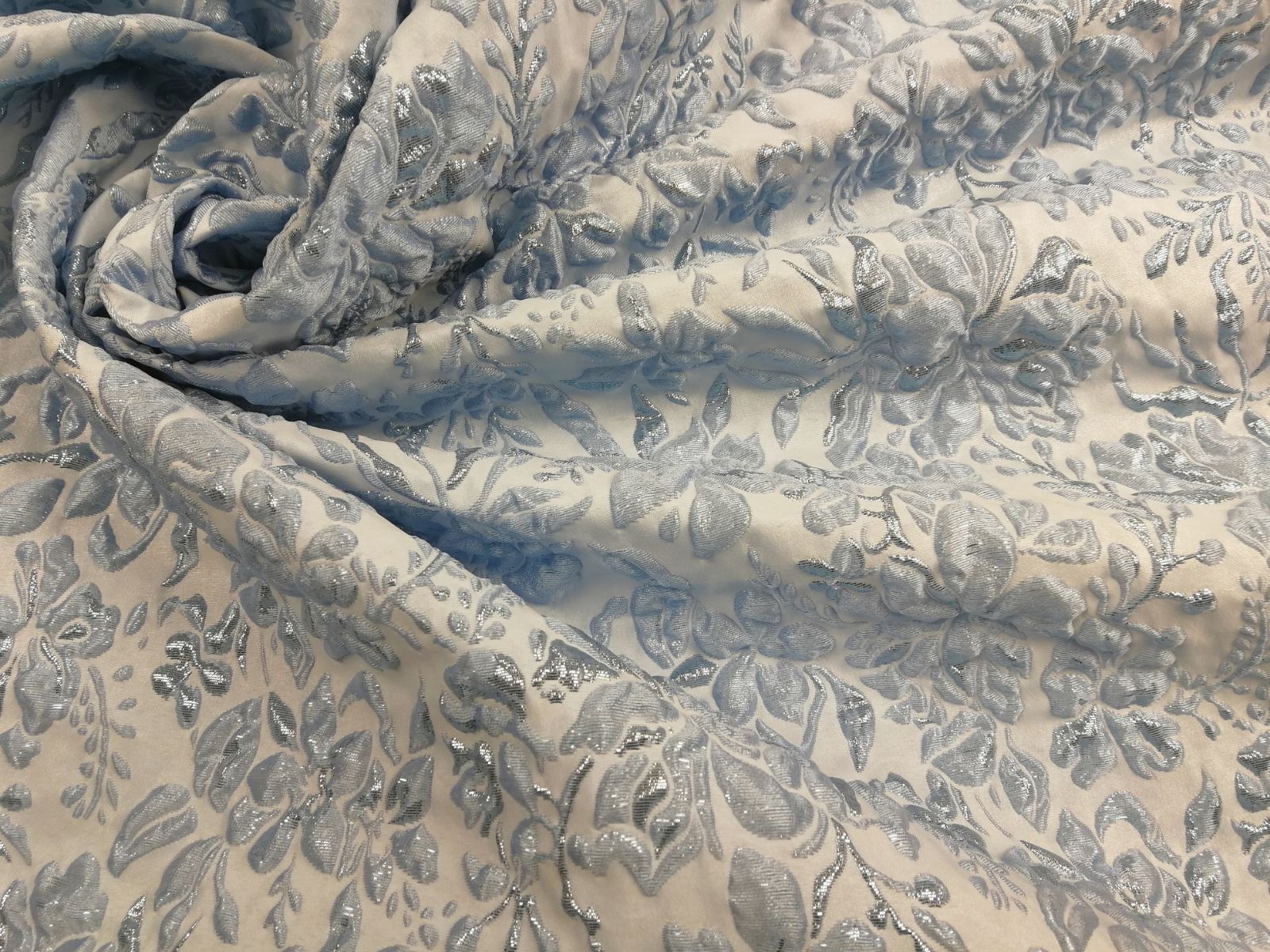
In Gratacós , we have a selection of very varied and colourful sequin fabrics for you to invent with them the garments that will star in the looks of the new season. Imagination to the power!


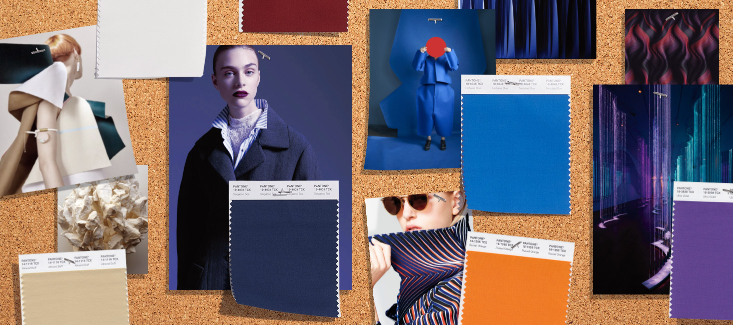
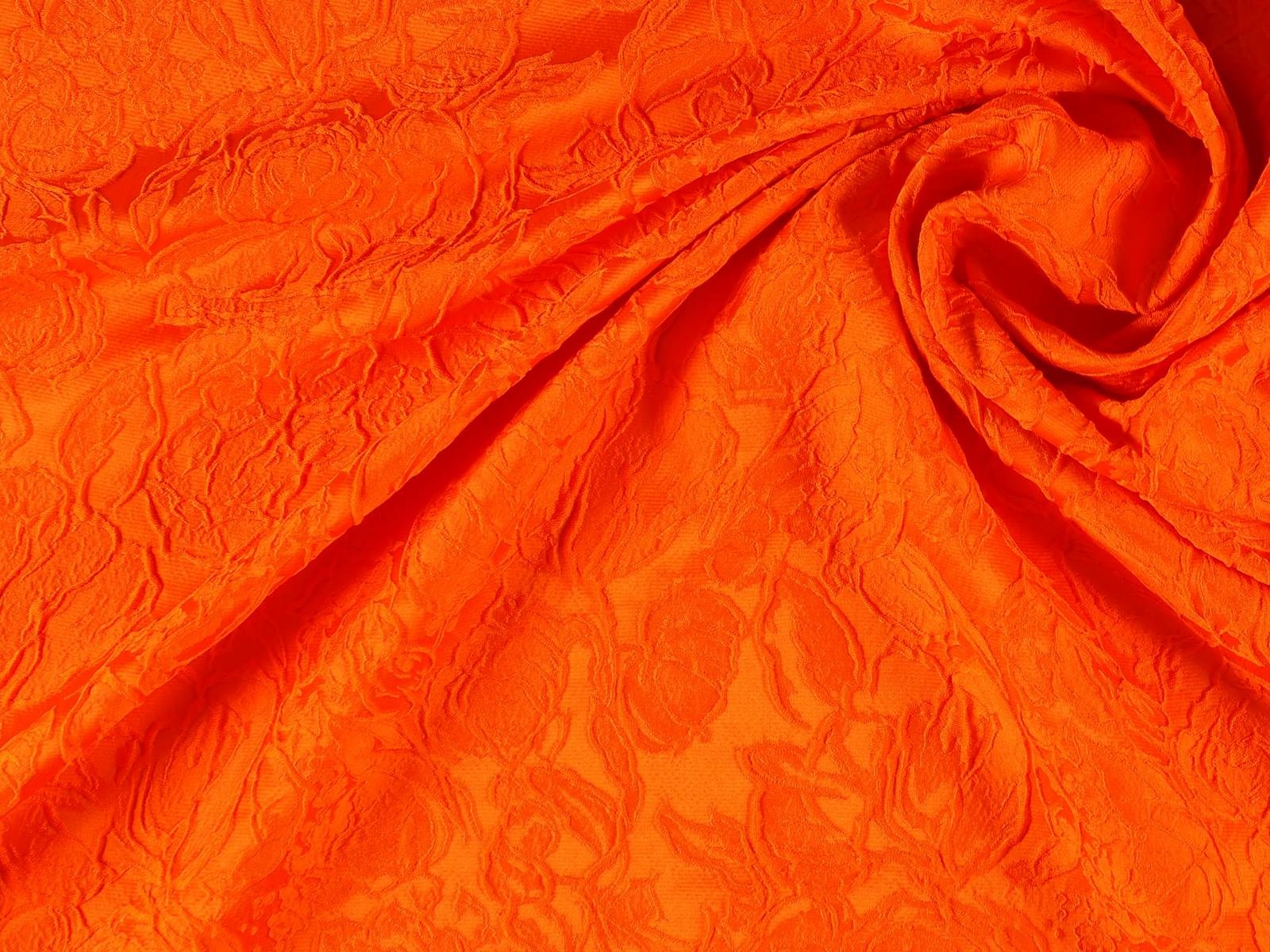
This autumn is especially colourful, with saturated and bright shades that radiate strength and energy for the darkest months of the year, where it is usual for neutral ranges and pale tones to predominate. Now it is just the opposite!
First it was the neon colours, then orange as a transition between summer and autumn and now there are other shades within the colder palette ready to take over. According to a Trends Report from Pantone (the international colour authority), the colours for Autumn-Winter 2018 “express our need for individuality, ingenuity and creativity”. They are unexpected autumnal tones that are complemented by more traditional ones that radiate this desire to break with the seasonal structures. The same report points out that they are “expressive colours that reinvent the history of seasonal colour and allow fashion to play with art and originality”.
Here we reveal four colours that illuminate the looks of autumn and that have already been seen on the catwalks:
1.- Red Pear
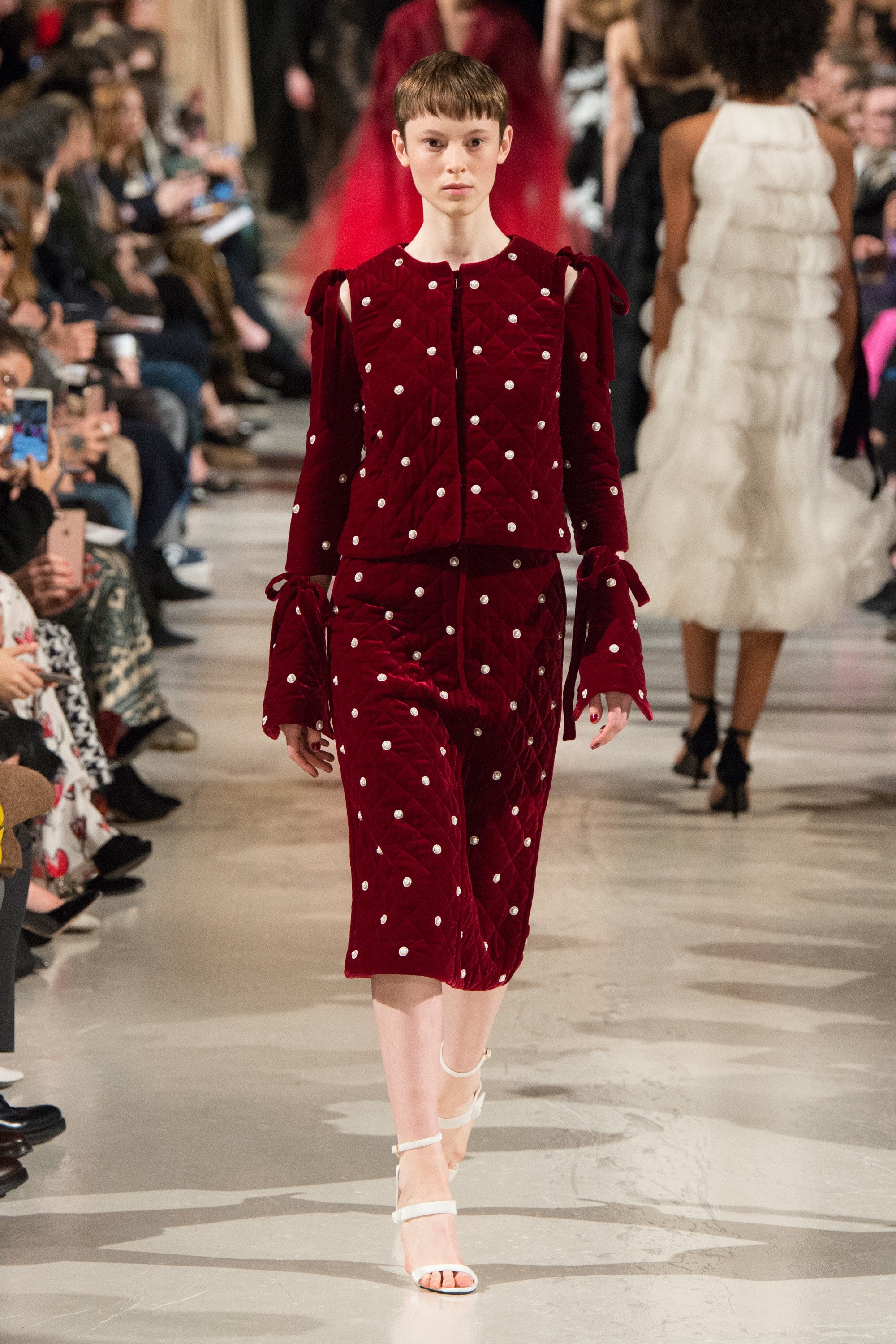
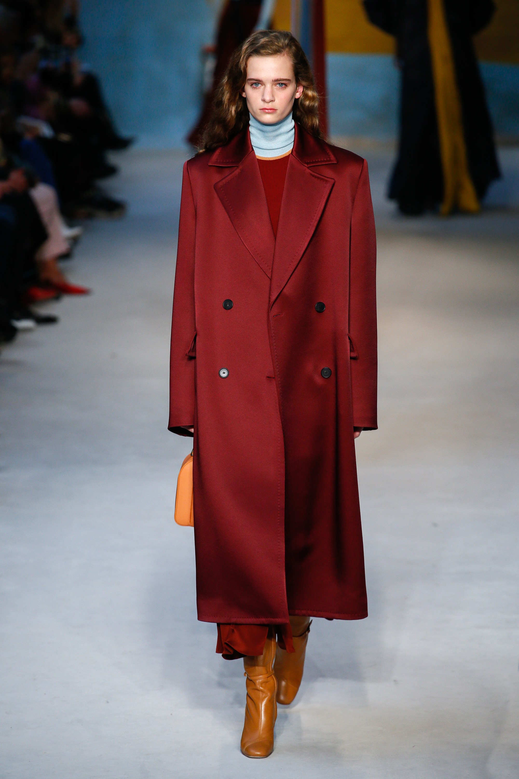
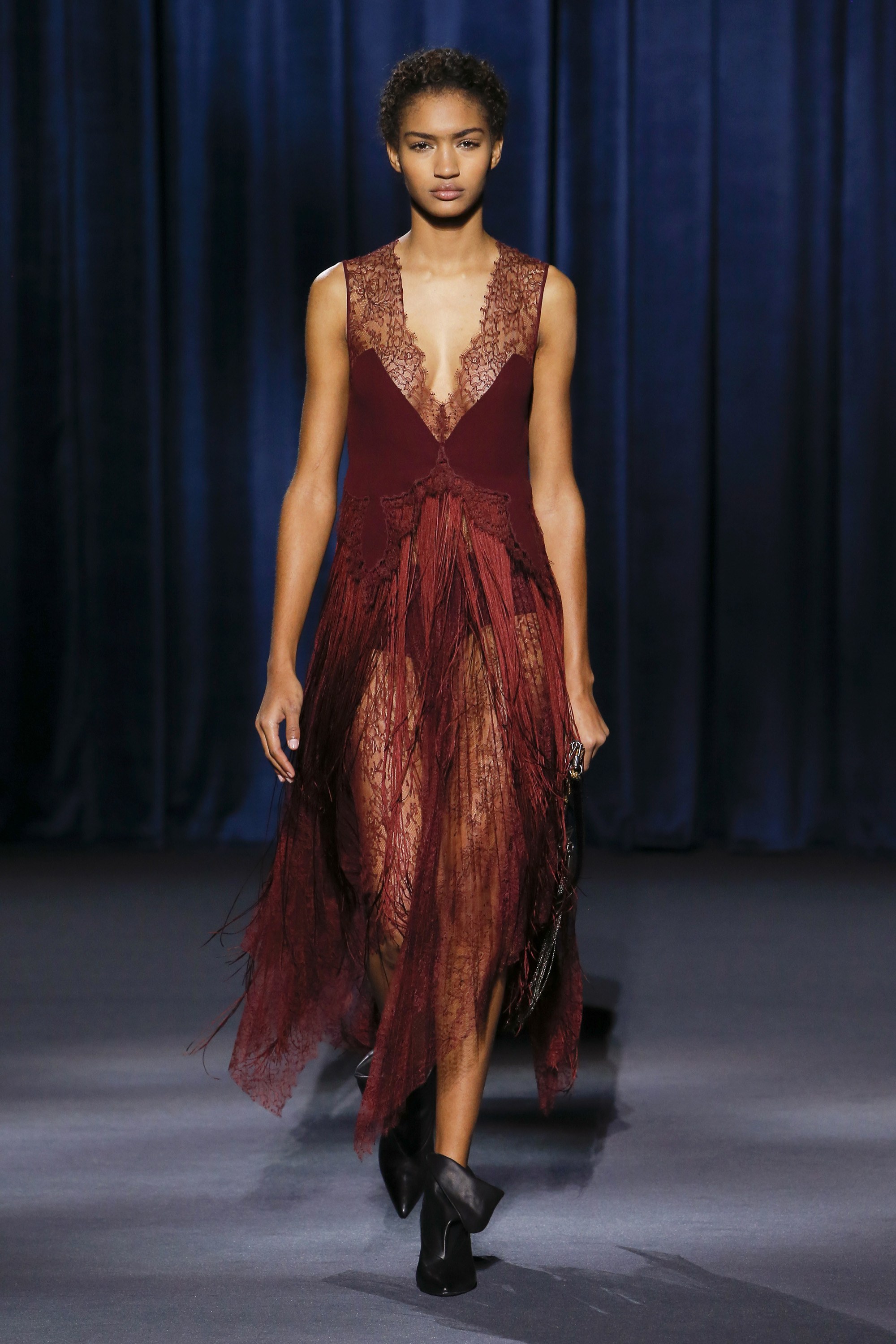
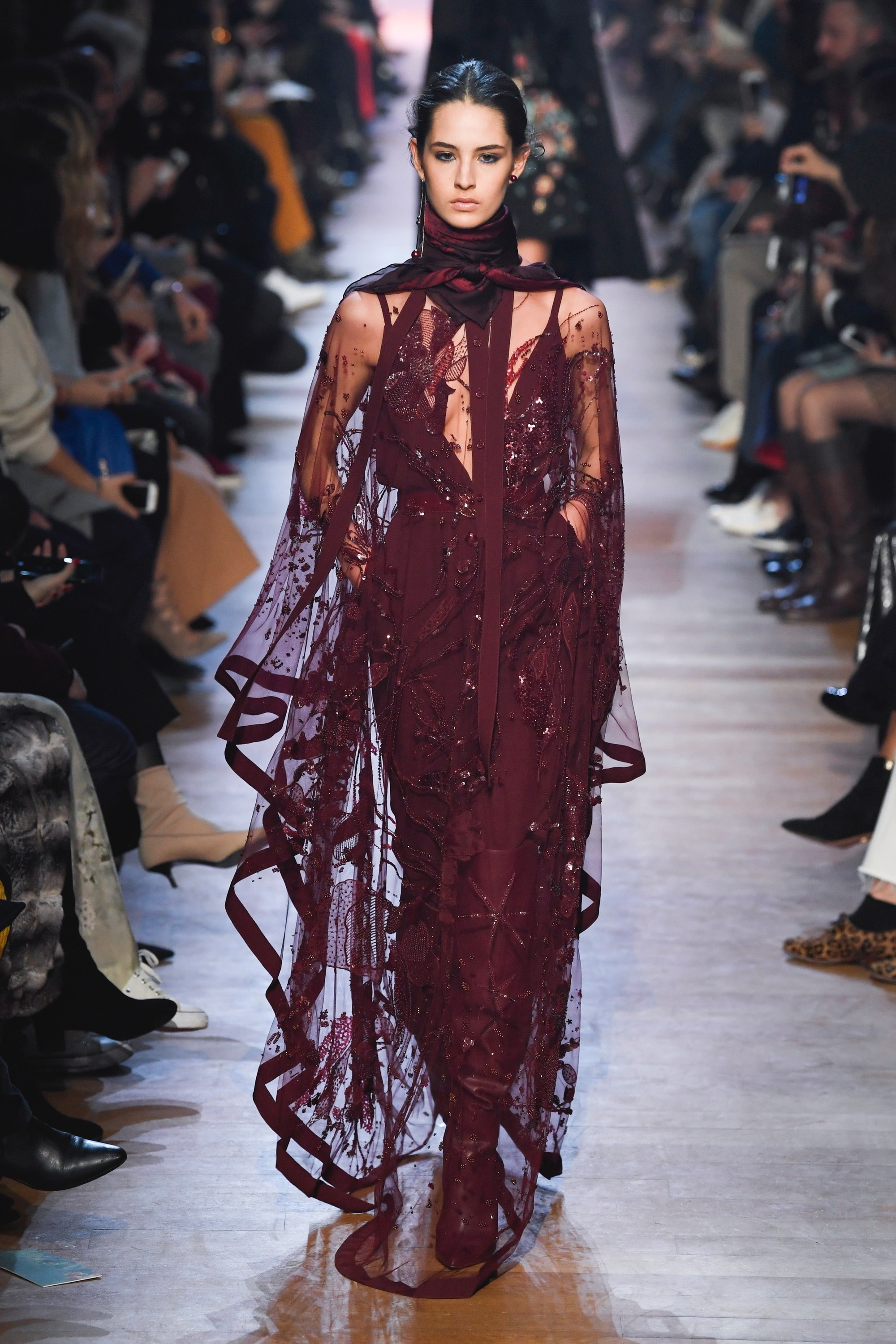
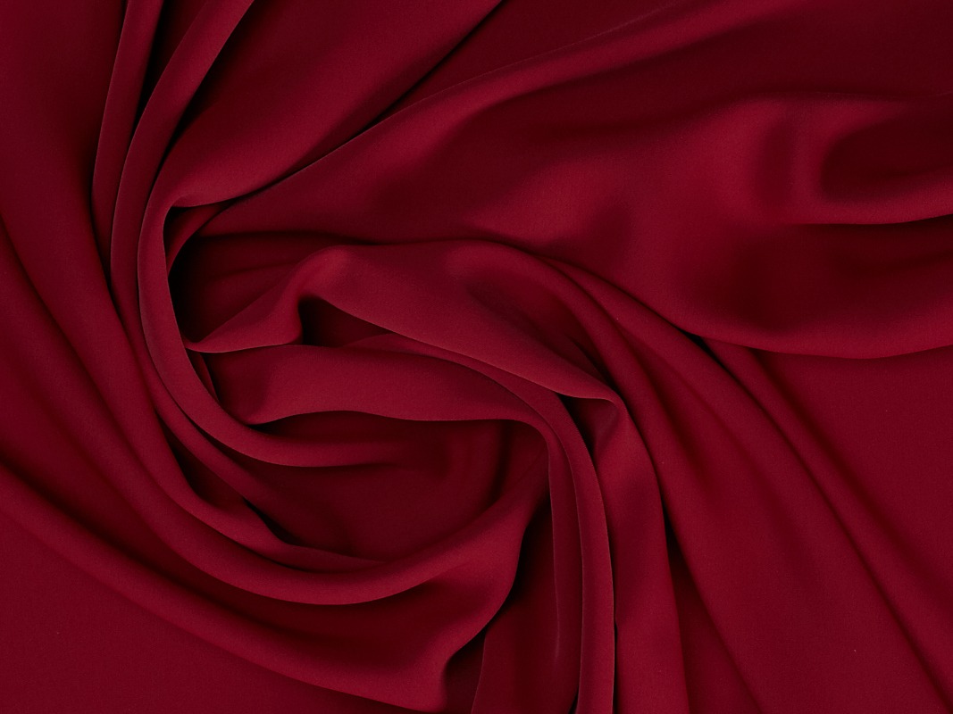
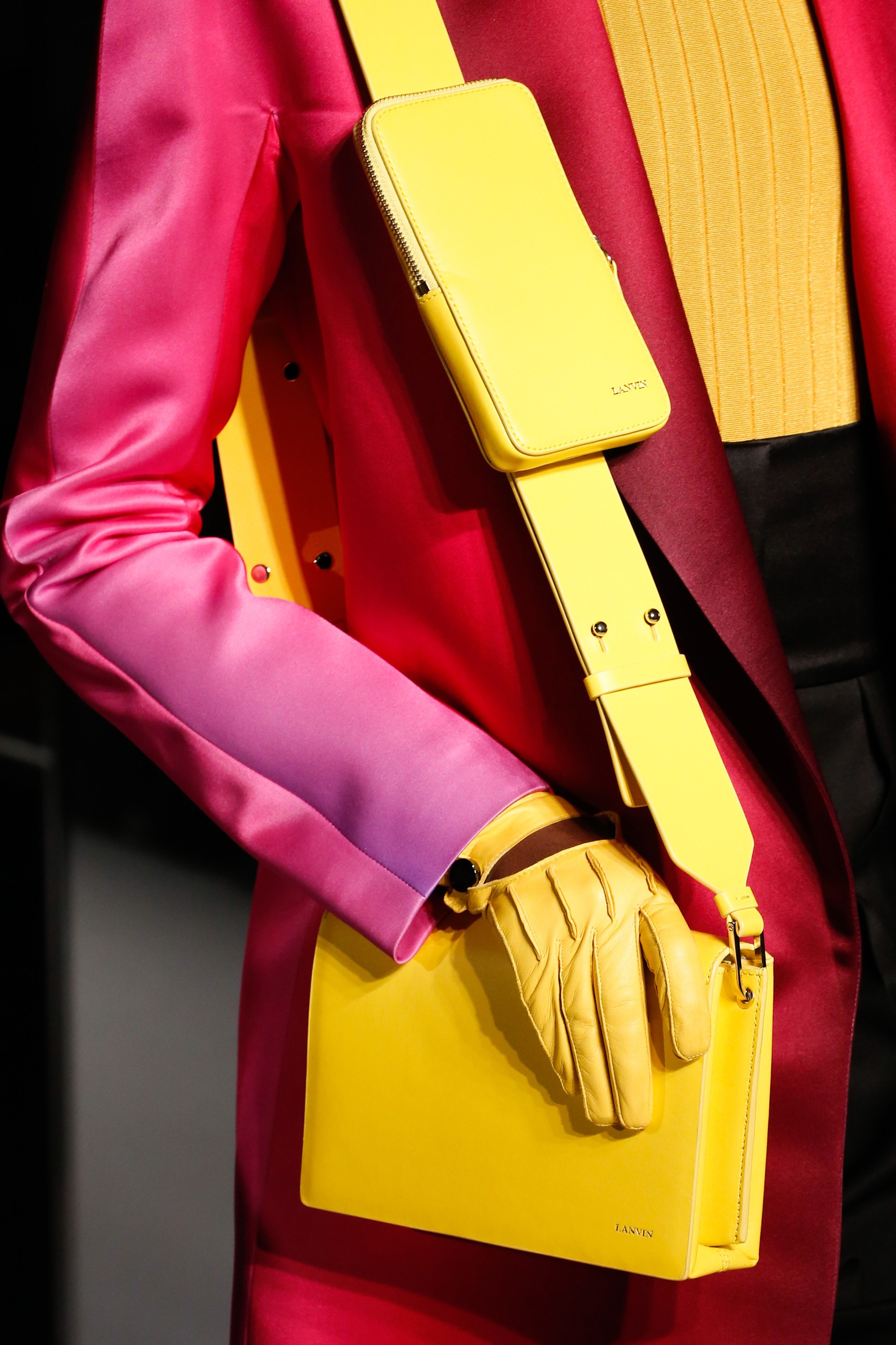
This red is the most appealing of the palette and perhaps also the most classic of the fashionable colours. Red Pear is an intense and delicate red that attracts by its exquisite depth. It is a seductive color (reminiscent of burgundy), which admits a great variety of shades and in fabrics it appears frequently thanks to its versatility with fully evocative reliefs and textures. Companies suach as Elie Saab , Bottega Veneta , Roksanda , Givenchy , Lanvin or Oscar de La Renta have incorporated this shade tone into their autumn collections, creating easy-to-match looks.
2.- Ultra Violet
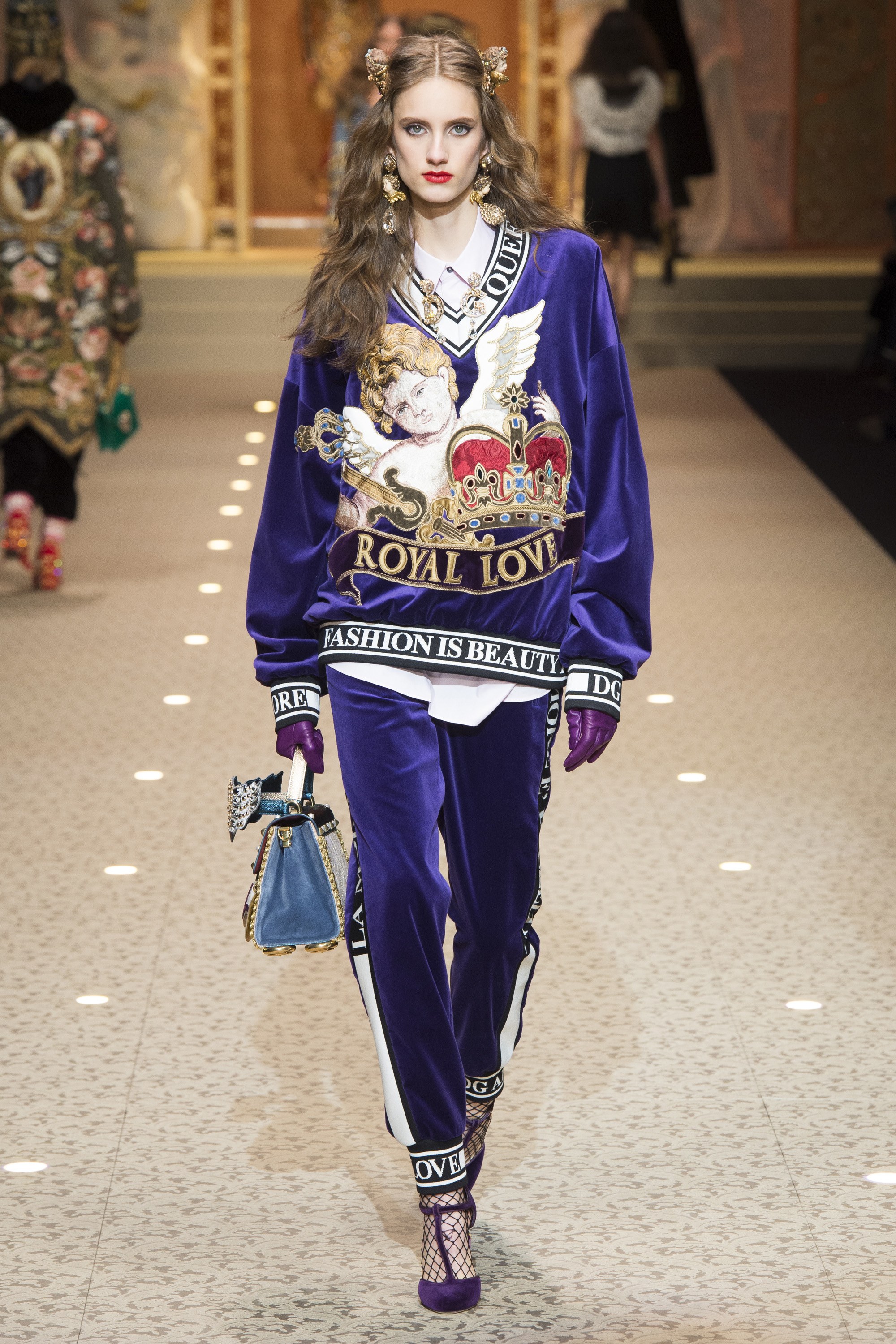
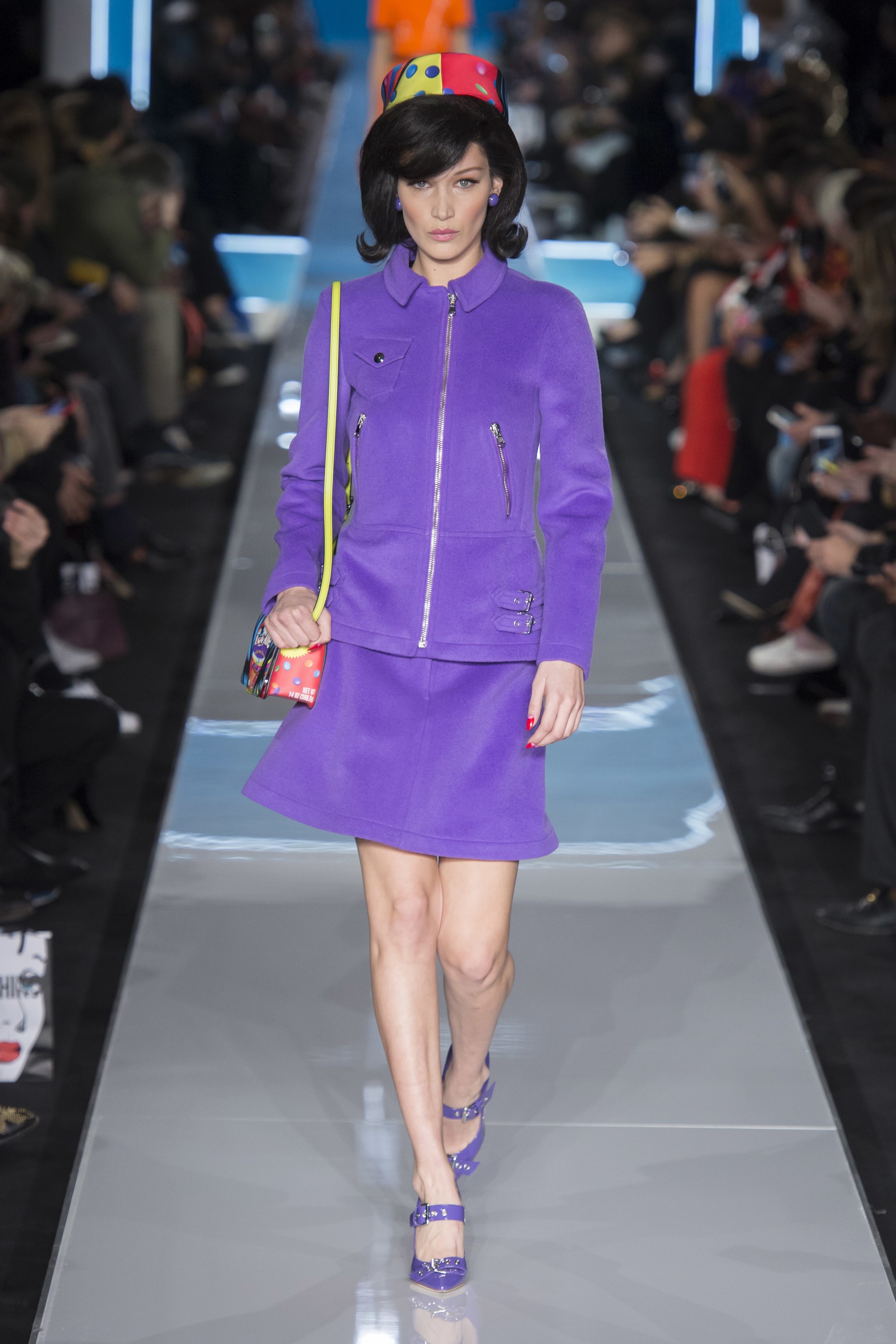
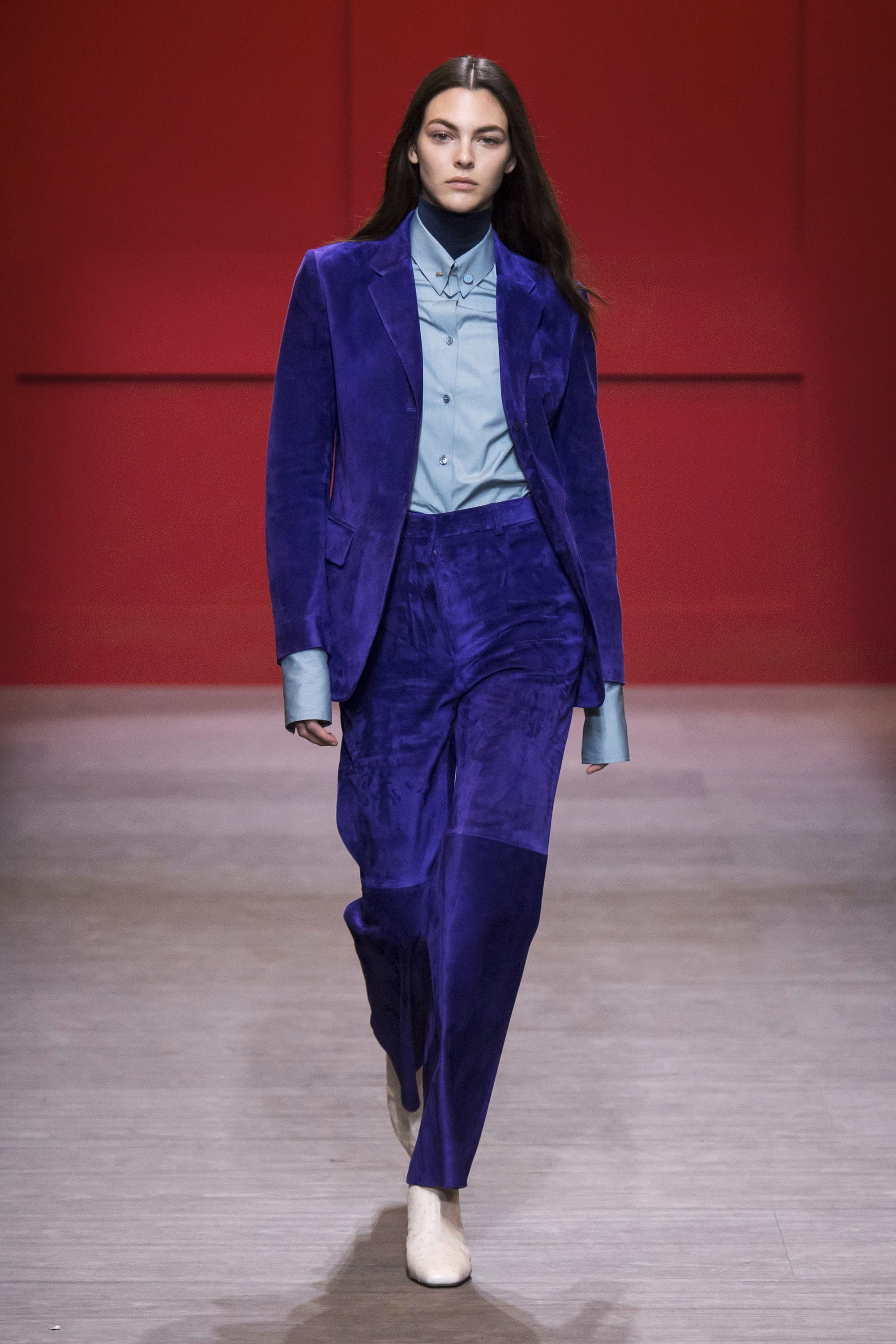
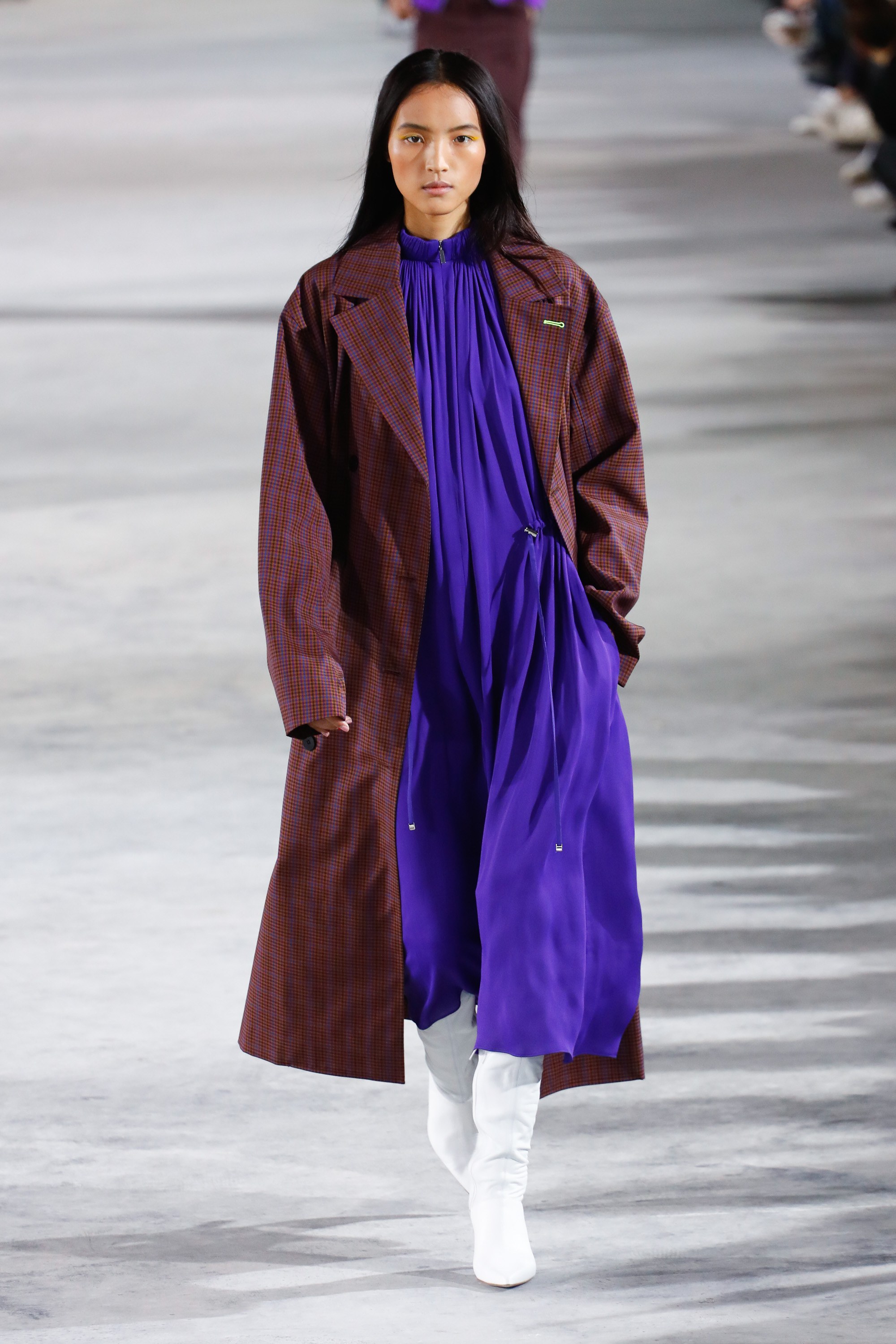
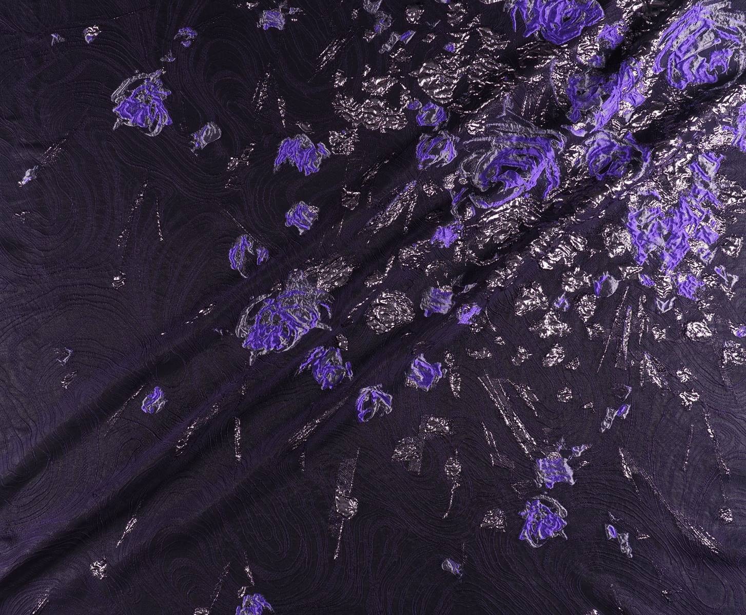
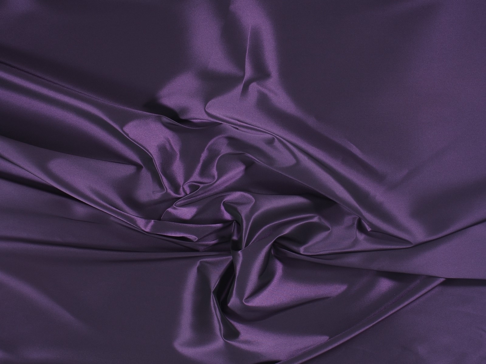
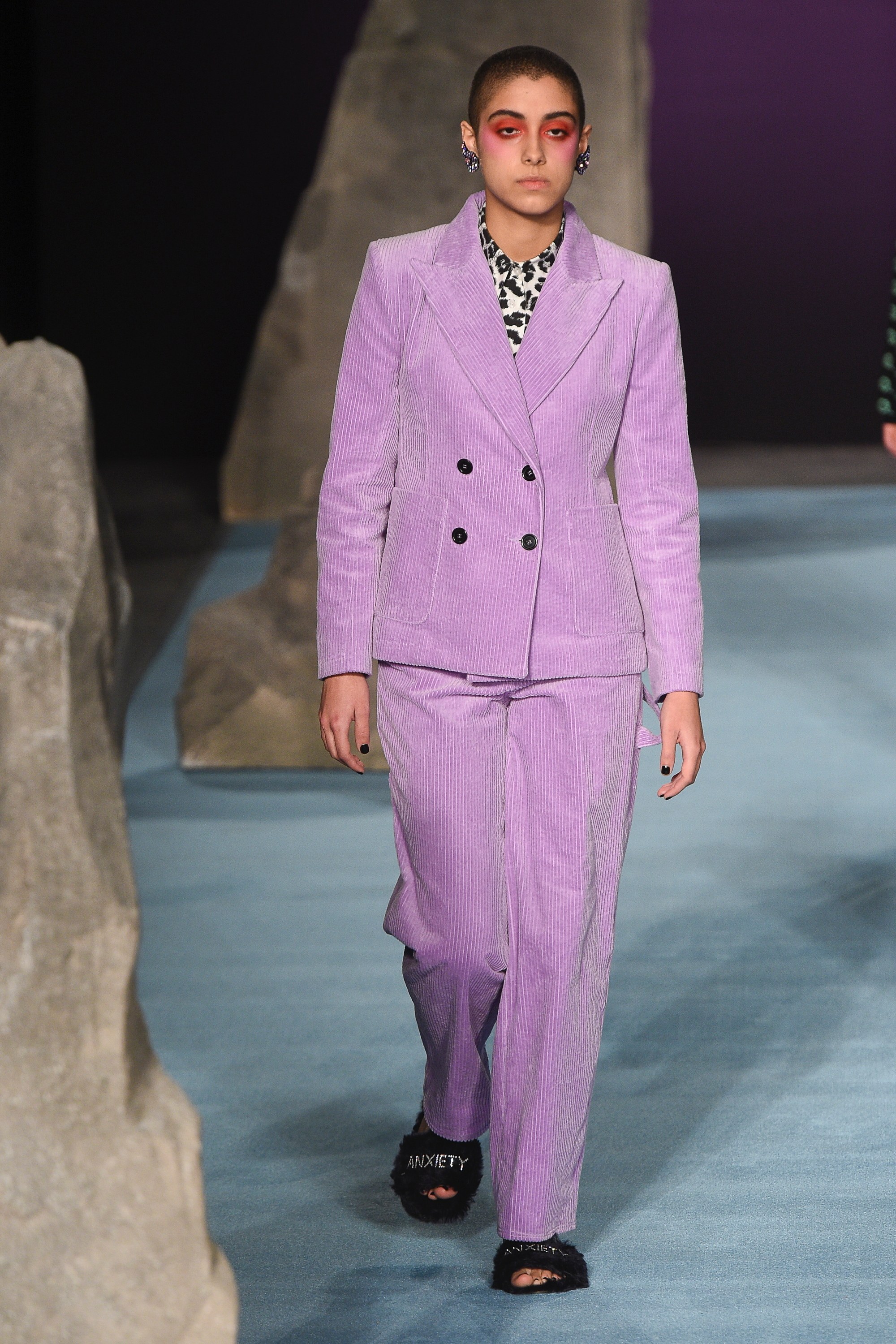
This tonality is more present in our minds because Pantone chose it as the colour of the year 2018. Whilst we thought it was merely a passing mention, this radiant hue of violet appears in all its splendour in the autumn collections. It is a bold tone linked with creativity and imagination. In fabrics such as velvet Ultra Violet acquires a more sophisticated side, although it also suits floral embroidery and Jacquard. On the catwalk companies such as Moschino, Tibi, Salvatore Ferragamo , Marni or Dolce & Gabbana have shown daring with this variety of violet.
-
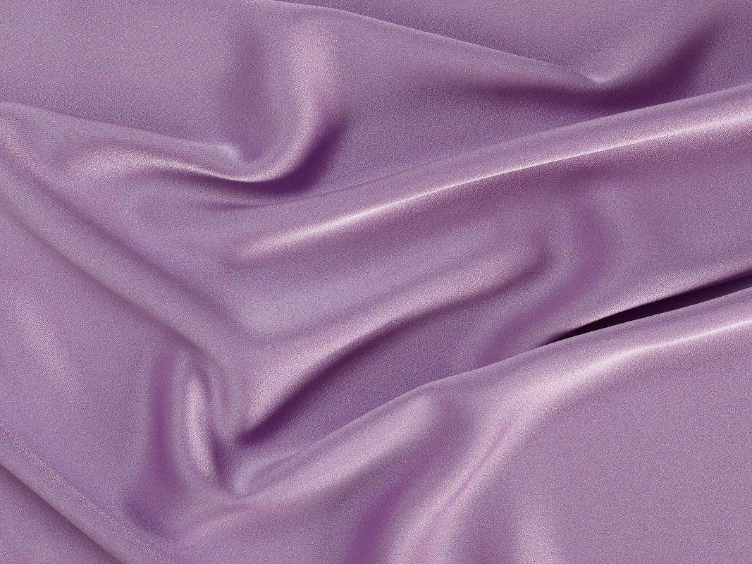
Crocus Petal
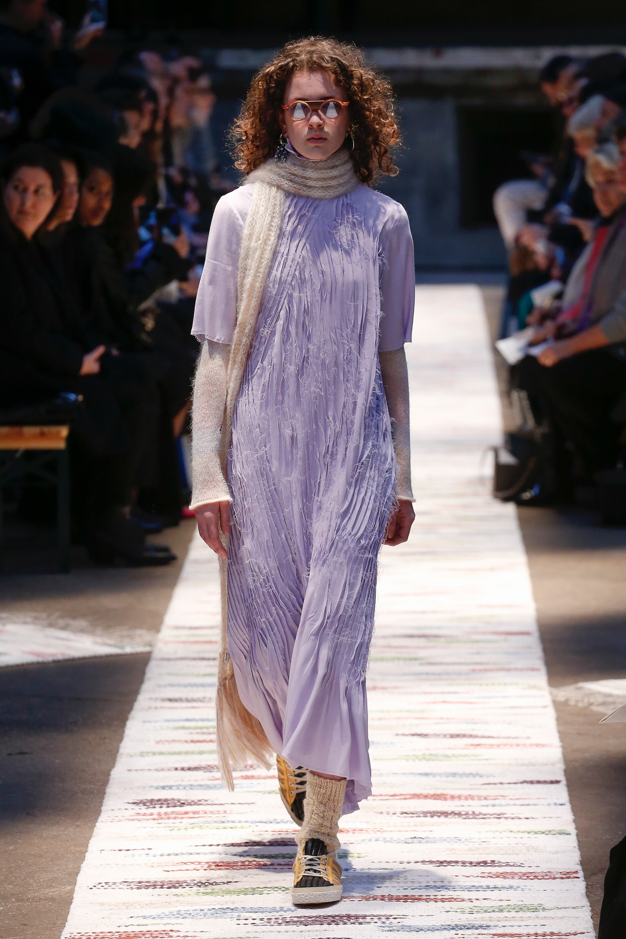
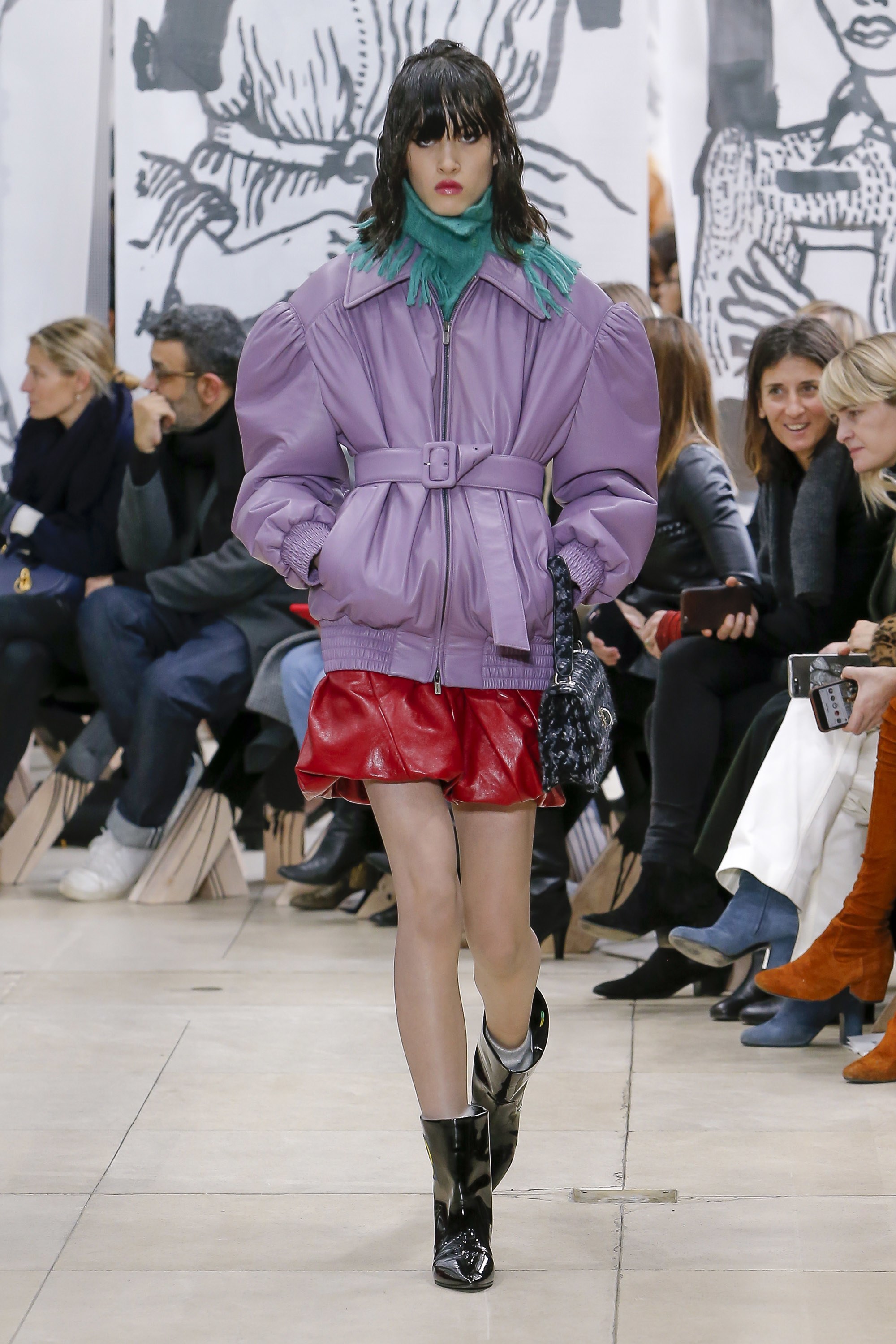
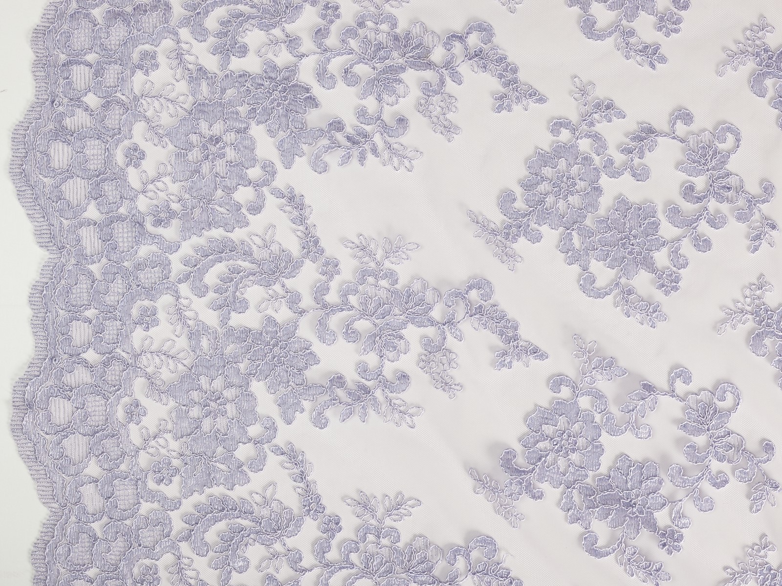
We continue with violet shades by focusing now on their softer version. Crocus Petal, according to Pantone is “a cultivated and refined shade that brings a feeling of lightness”. It is a very feminine pastel tone that softens traits and stands out from the rest for its unique character, a colour which enhances movement and which in fabrics can be appreciated very well on soft, smooth textures and with slight reflections. On the catwalk Crocus Petal has been seen in designs by Acne Studios, Miu Miu and Ashley Williams.
-
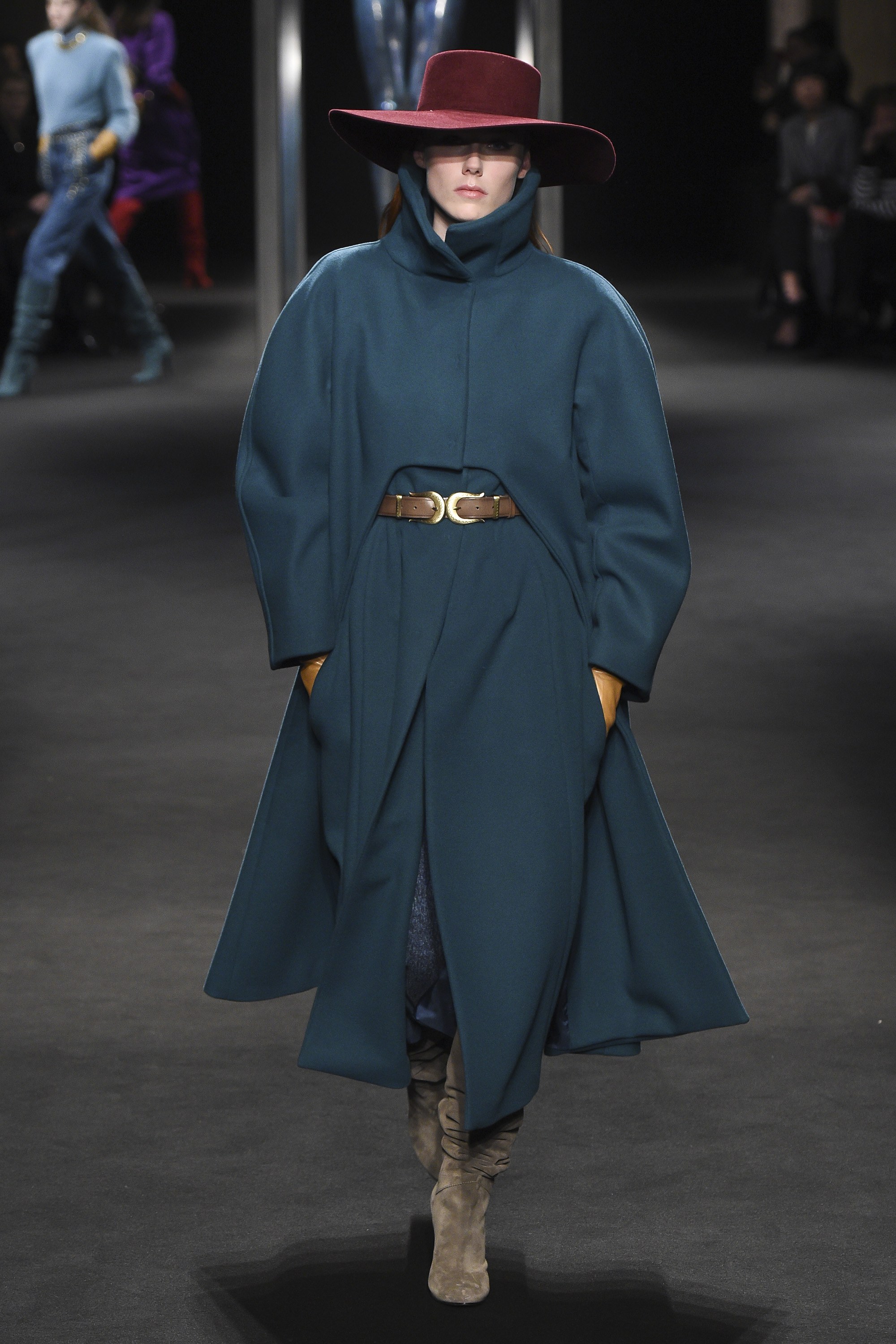
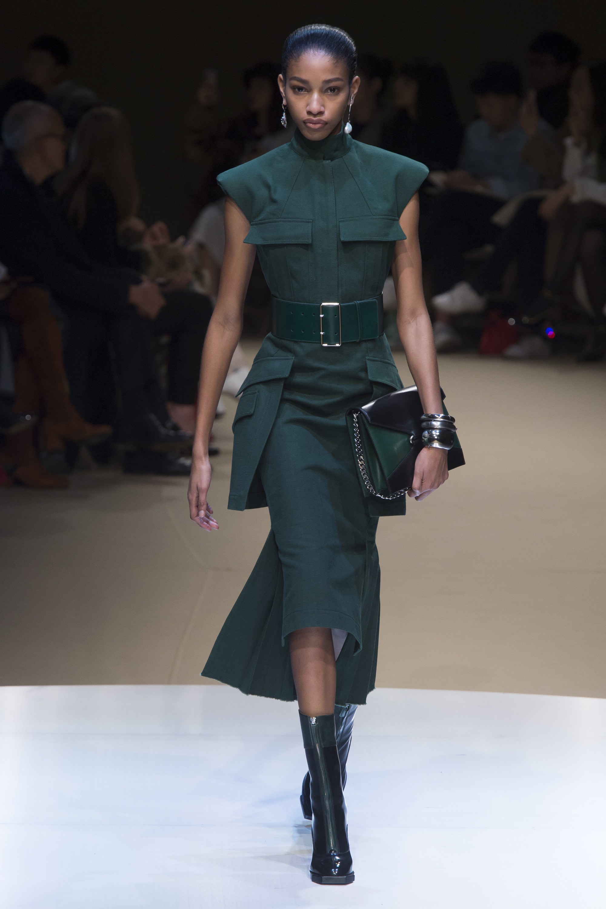
Quetzal Green
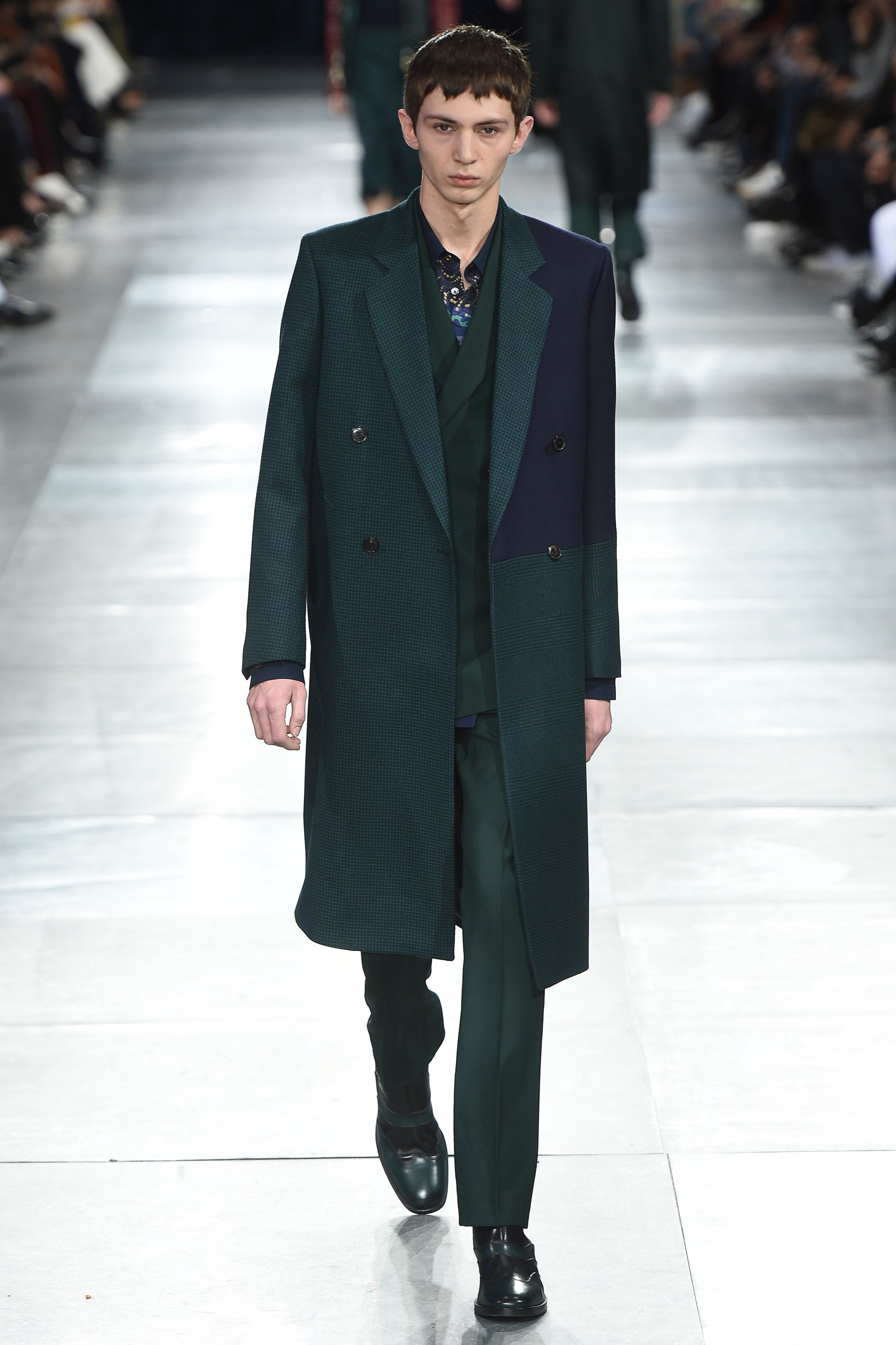
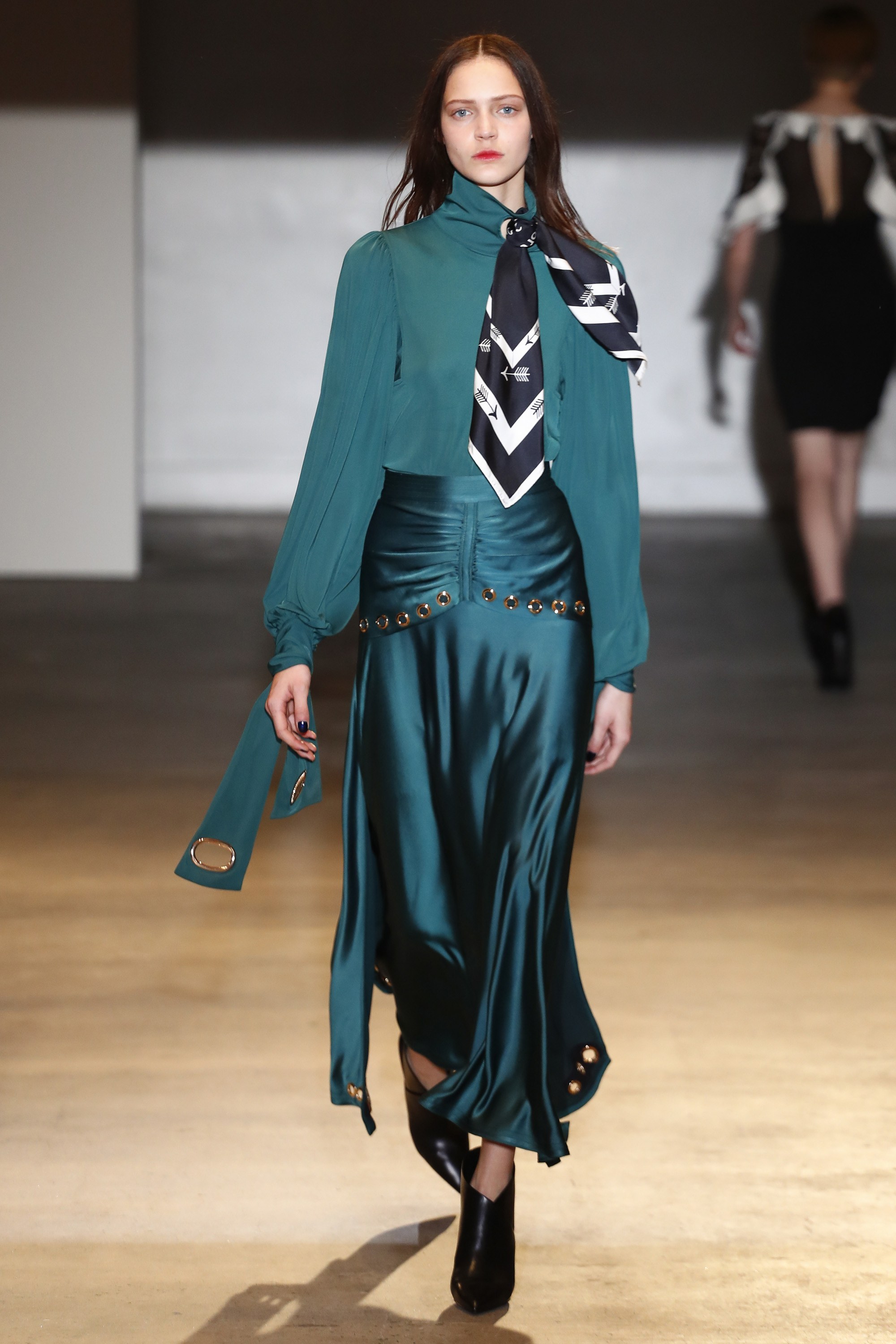
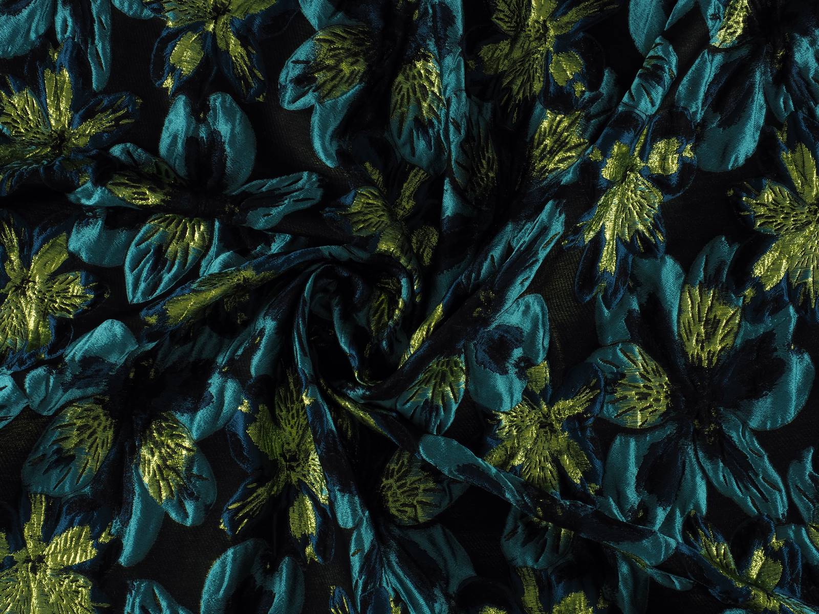
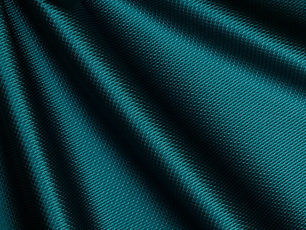
Deep, evocative, sophisticated … this shade of greenish blue is simply breathtaking. It is a colour that abounds in nature in certain bird plumages which stand out against females of the same species: ducks, peacocks … It is a beautiful mix of deep blue and turquoise that aligns with elegance and that allows practically all the textures that highlight the nuances of this rich colour. On the catwalk companies such as Alexander McQueen, Alberta Ferretti, Paul Smith or Self-Portrait have all given full expression to Quetzal Green.
Jueves 06 septiembre 2018

2018 has been filled to the brim with pastel shades: the millennial pink still resists, the soft lavender tone of last winter, the calming baby blue, mint green… After this feast of sweet colours, fashion marks just the opposite with shades willing to revolutionize customer’s retinas: fluorescents. Therefore, with the summer still marking the calendar, we welcome the autumn with this daring chromatic trend that has been rescued from the 80’s to bring a little light to our traditional winter wardrobe.
 |
 |
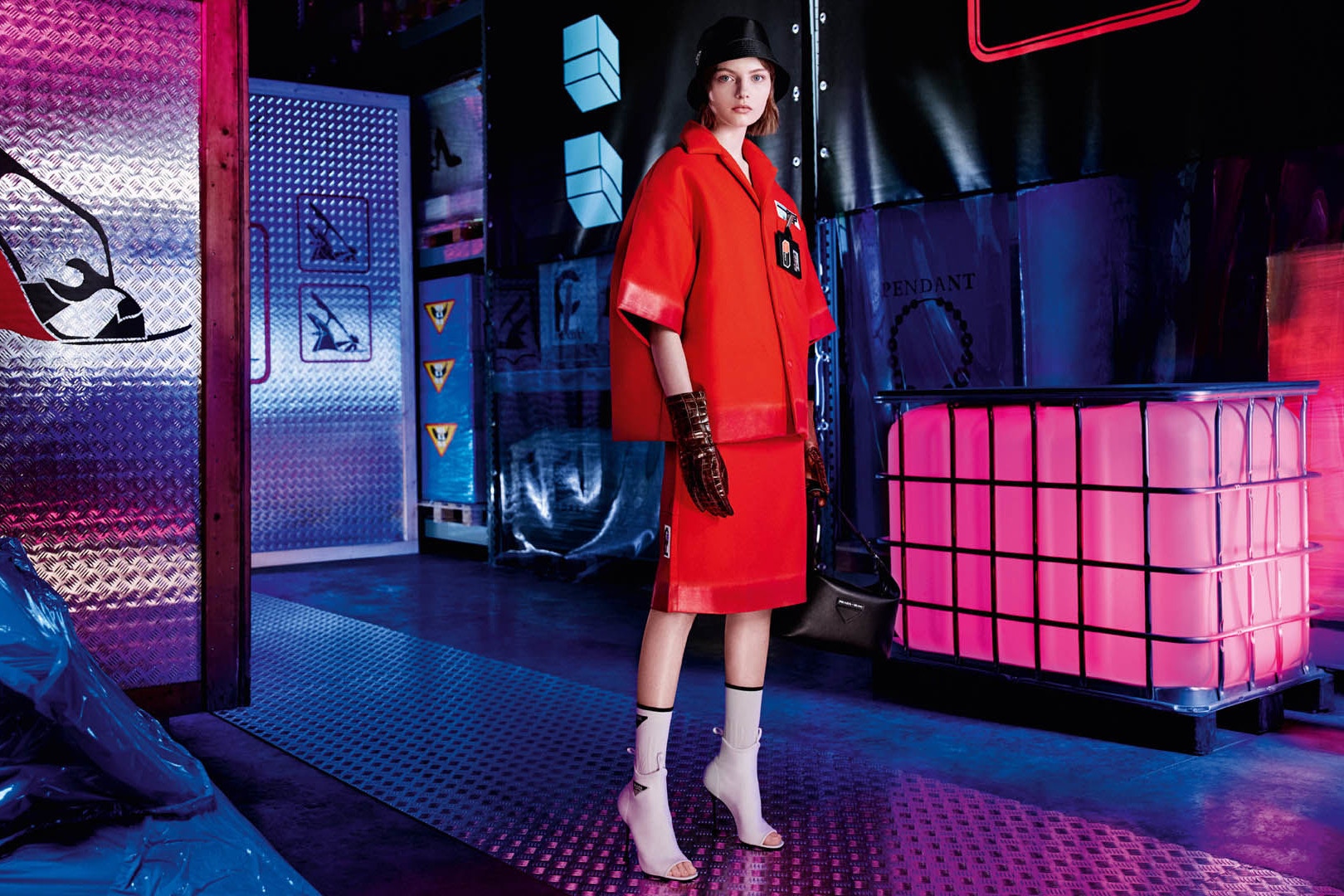
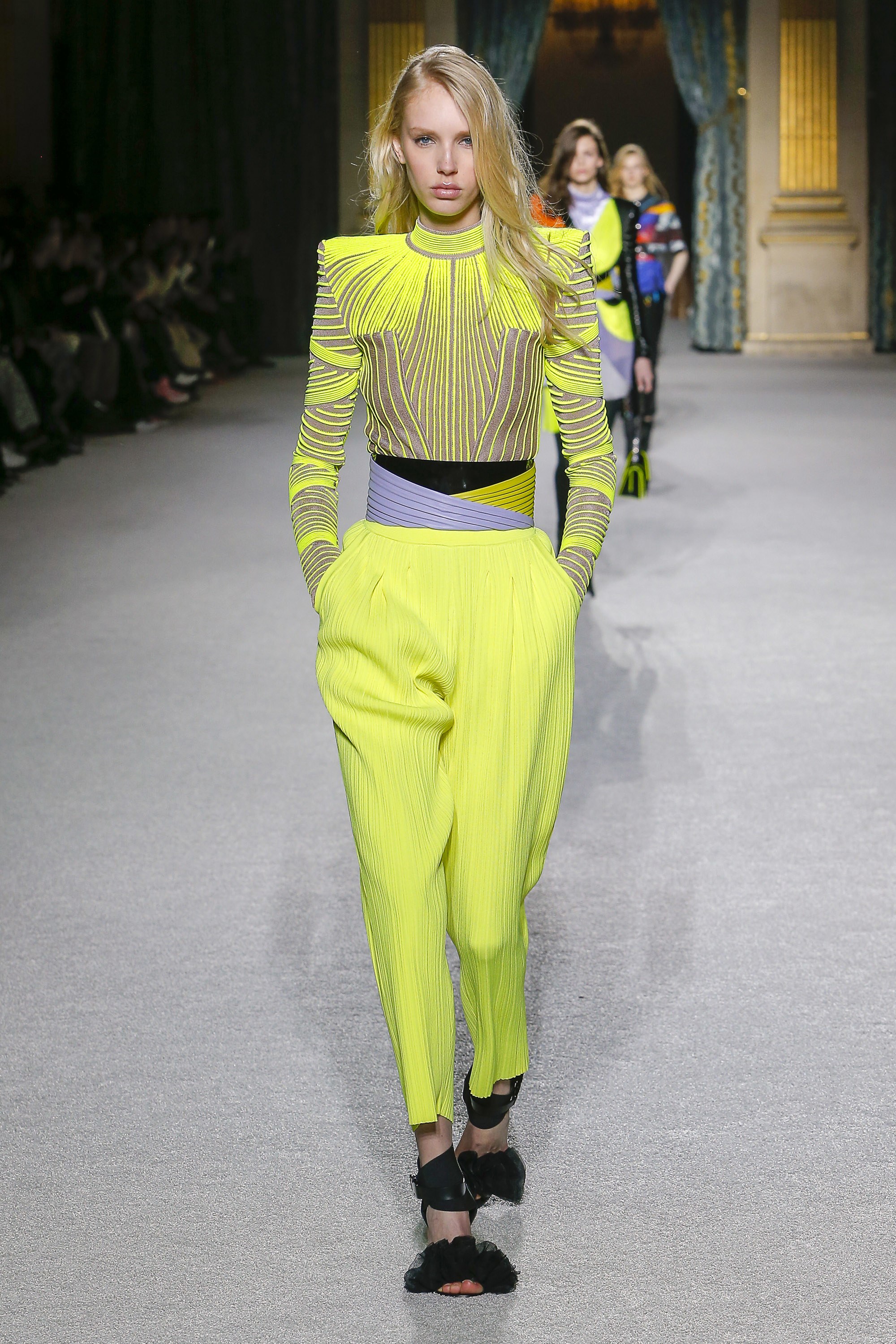
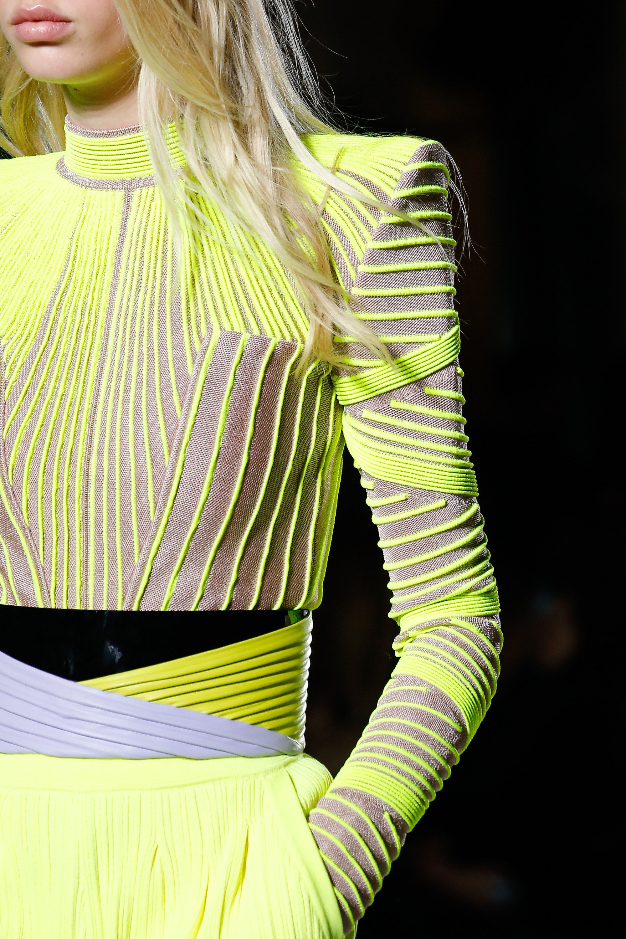
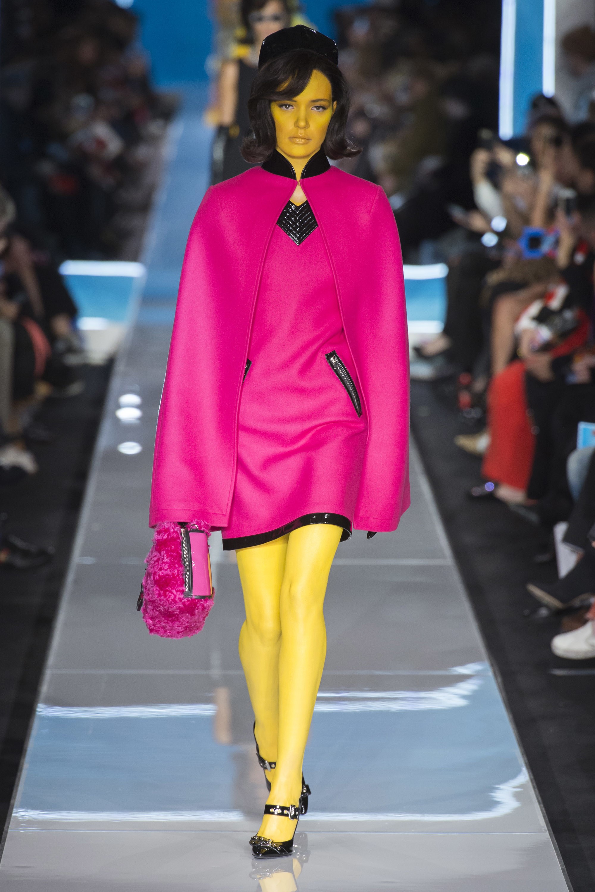
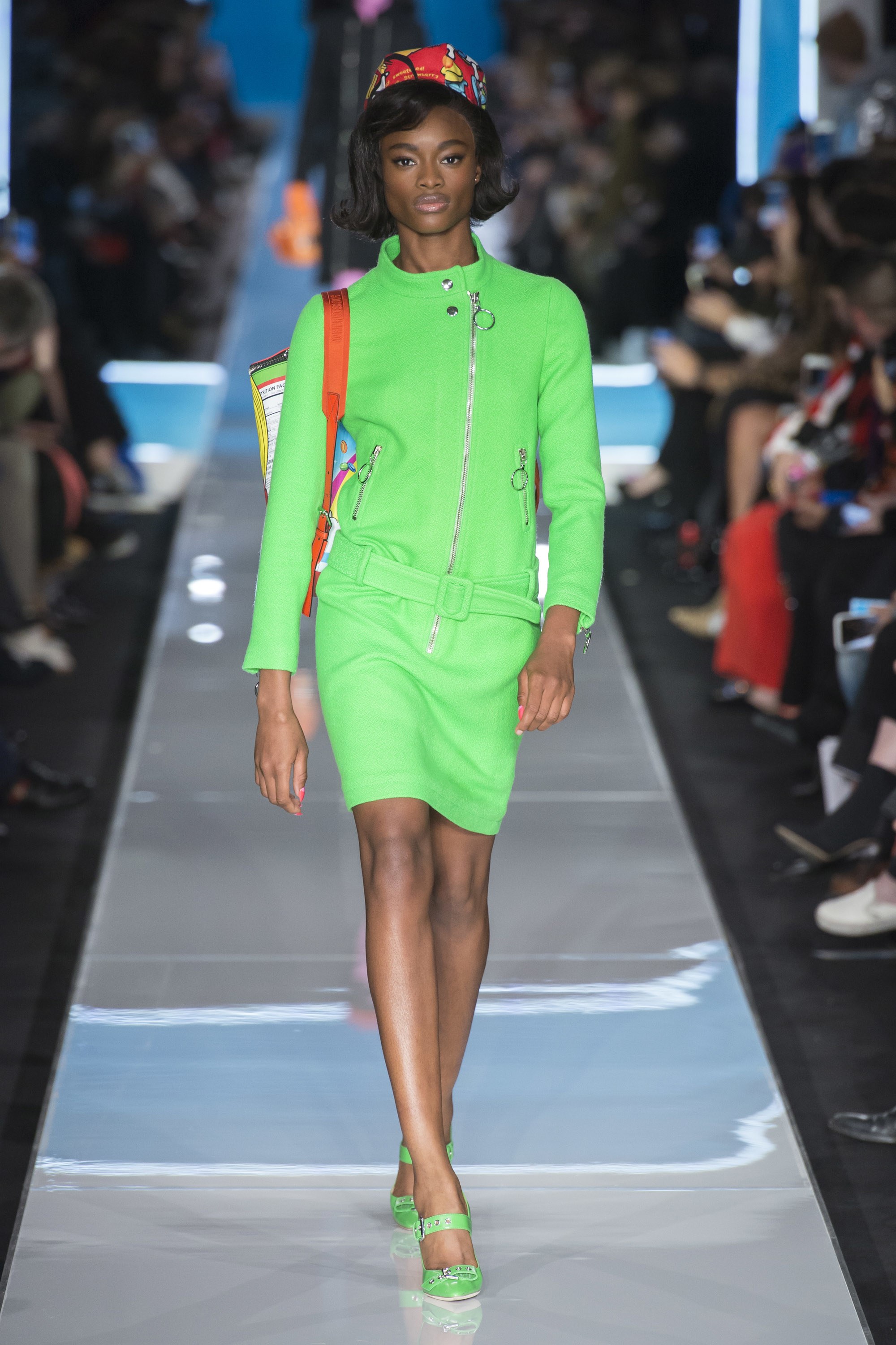
The return of neon colours is not something new. In fact, almost a decade ago they were back in apparel sporty style inspired by the outfits worn by rappers and hip hop artists, who sported it in accessories such as shoes, sunglasses and other details on clothing as sidebars that shone in the darkness. Now, some designers rescue this fever for fluorescent colors and they do so with new approaches and conceptual arguments. The two most obvious or representative have been Calvin Klein and Prada, although neon shades have also seen on the Moschino, Marni or Balenciaga catwalks.
The creative director of Calvin Klein 205W39NYC, Raf Simons celebrates his first year in the job by exploring the universe of American culture. In this case, fluorescent shades are used to highlight the concepts of “safety” and “protection” with garments that refer to reflective safety jackets, overalls and balaclavas and where these tones are used for fashion purposes.
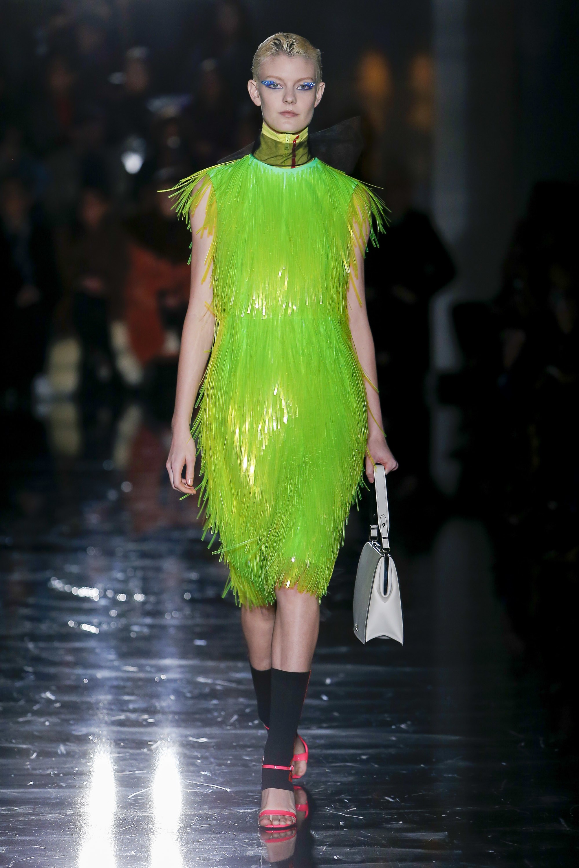
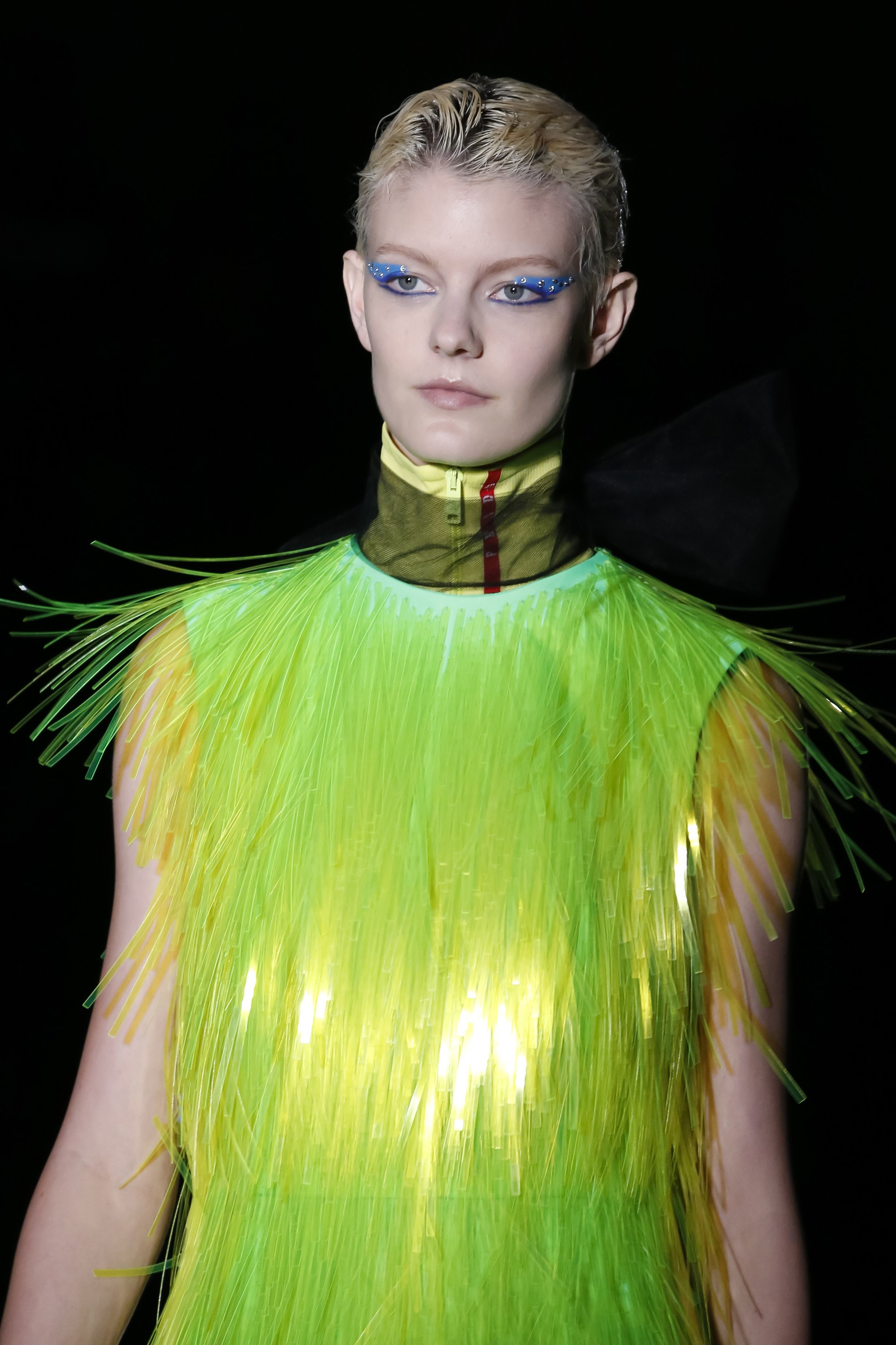
This season, Prada does a review of sporty style in futuristic key with oversized garments Inspired by outdoor sports. Waistcoats, windproof jackets, trench coats, wellies, fisherman hats in fluorescent colors, luminescent fringes that adorn dresses and superimposed fabrics that create an attractive iridescent effect on the catwalk.
 |
 |
And how do the fluor tones combine? They are colours that transmit dynamism and transgression and are associated with youth and fun. This power of visual attraction they exert is, in turn, their greatest defect because in the same way they entice, they repel instantly. It is easy to get fed up with them! The most risky option is to wear them with athleisure- style garments, in parkas, raincoats and windbreakers or in jackets that cut the formality of a closed dress or a midi skirt with a shirt. The most discreet way is to relegate them to small accessories or details such as side stripes or zips. The colours that best accompany them are white and black along with the range of neutrals.
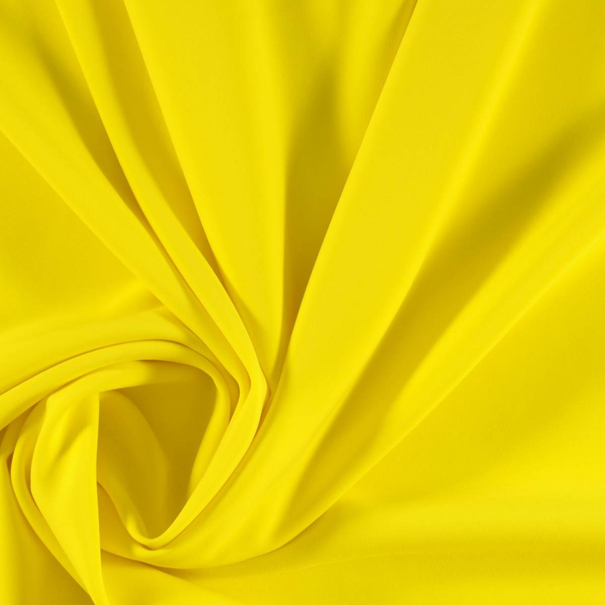
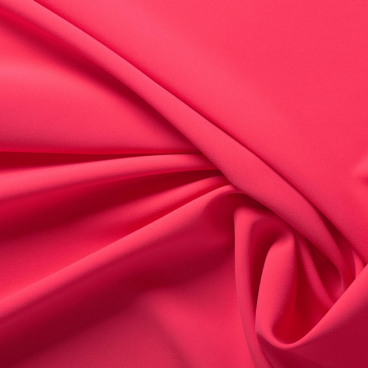
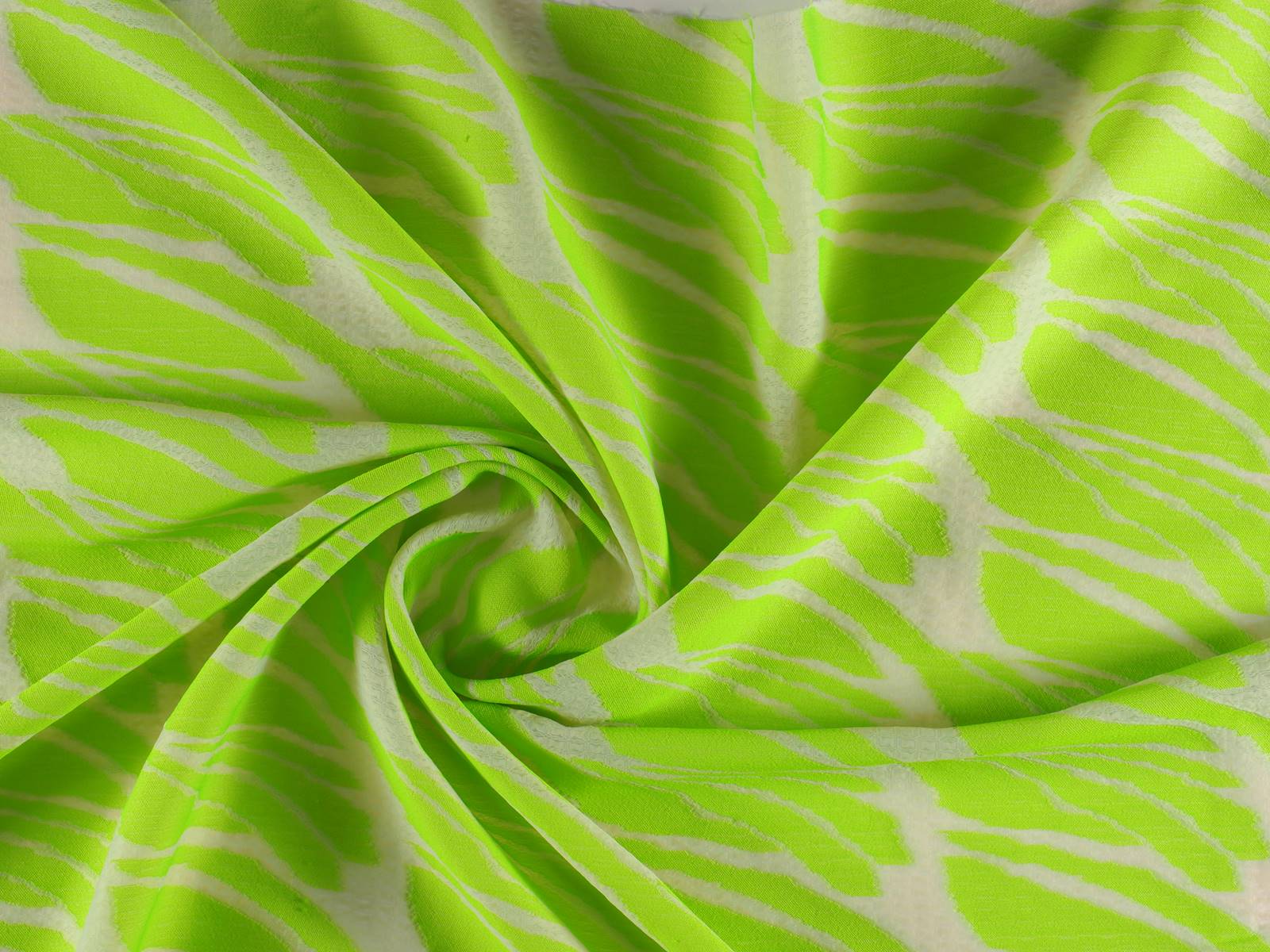
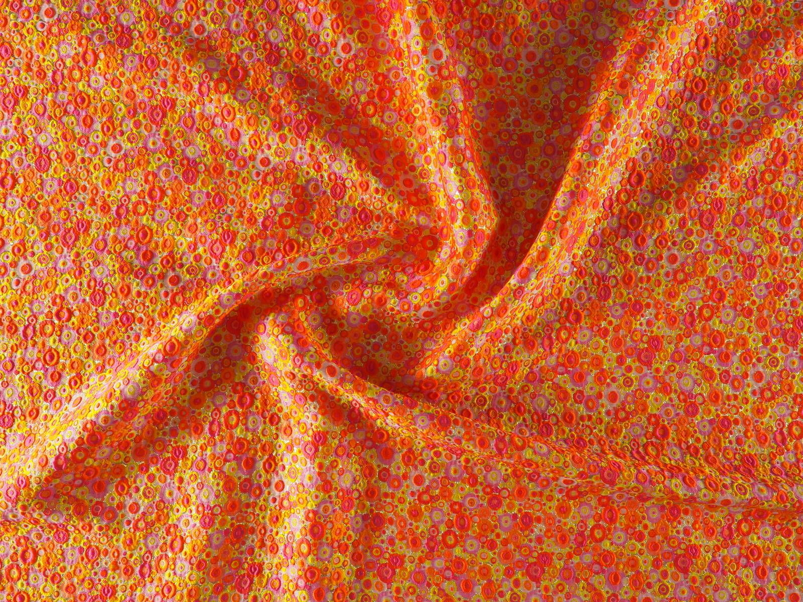
In Gratacós we welcome neon tones with some daring fabrics that do not go unnoticed in the store. Do you want to come and see them and touch them for yourselves?


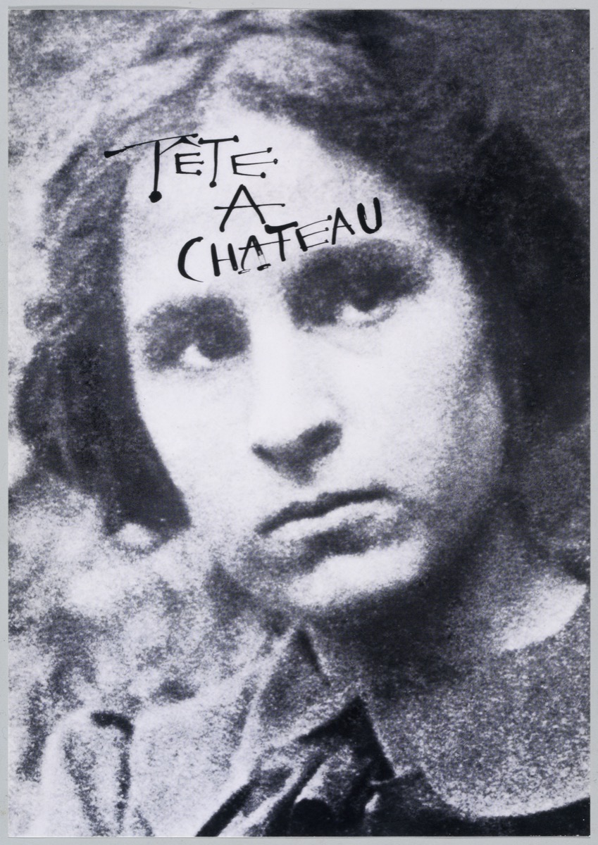
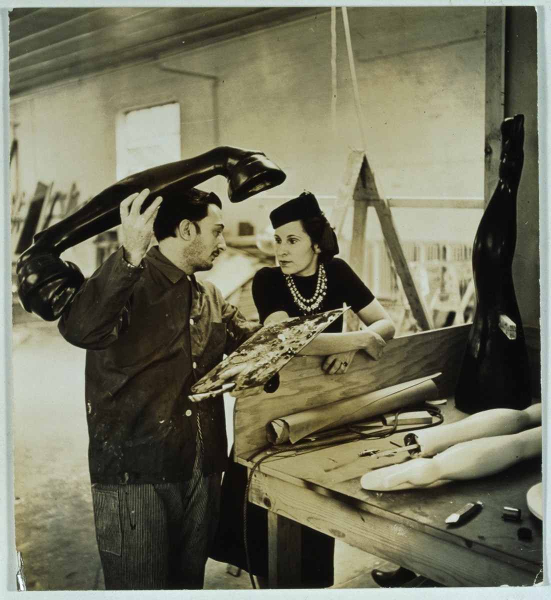
Who really was Gala? Who was this enigmatic woman who never went unnoticed and who raised contradictory feelings between the artists and poets of the time? Was she a muse or a creator? Never before to this day has such a large and detailed exhibition been focused on this visionary figure with the new exhibition Gala Salvador Dalí in Barcelona.

The National Museu d’Art de Catalunya and the Fundació Gala-Salvador Dalí have set a challenge with this event: to unveil Gala, muse, artist and a key figure in twentieth century art. Curated by Estrella de Diego, professor of Art History (UCM), the exhibition explores the life of Gala, companion of Salvador Dalí and before that of the poet Paul Éluard. Sometimes admired, sometimes forgotten or even insulted, Gala is undoubtedly a key character of the avant-garde.

A long journey
Gala (September 7, 1894 – June 10, 1982), was born into a family of intellectuals from Kazan (Russia), and spent her childhood in Moscow. She settled in Switzerland, where she met Paul Éluard, with whom she moved to Paris, where she contacted members of the Surrealist movement, such as Max Ernst.
In 1929 she travelled to Cadaqués, where he met and fell in love with Dalí and they decided to start a life together. For eight years they were in exile in the United States, and on their return they commuted between Portlligat, New York and Paris. Gala was indeed known worldwide as the woman of Salvador Dalí, his muse and the protagonist of some of his paintings. From this point followed the transformation of Gala into an artist in her own right, since the couple opted for an artistic cooperation which meant the shared authorship of some works.

Admired at times, sometimes forgotten or even insulted, Gala is a key figure of the avant-garde.
A key figure
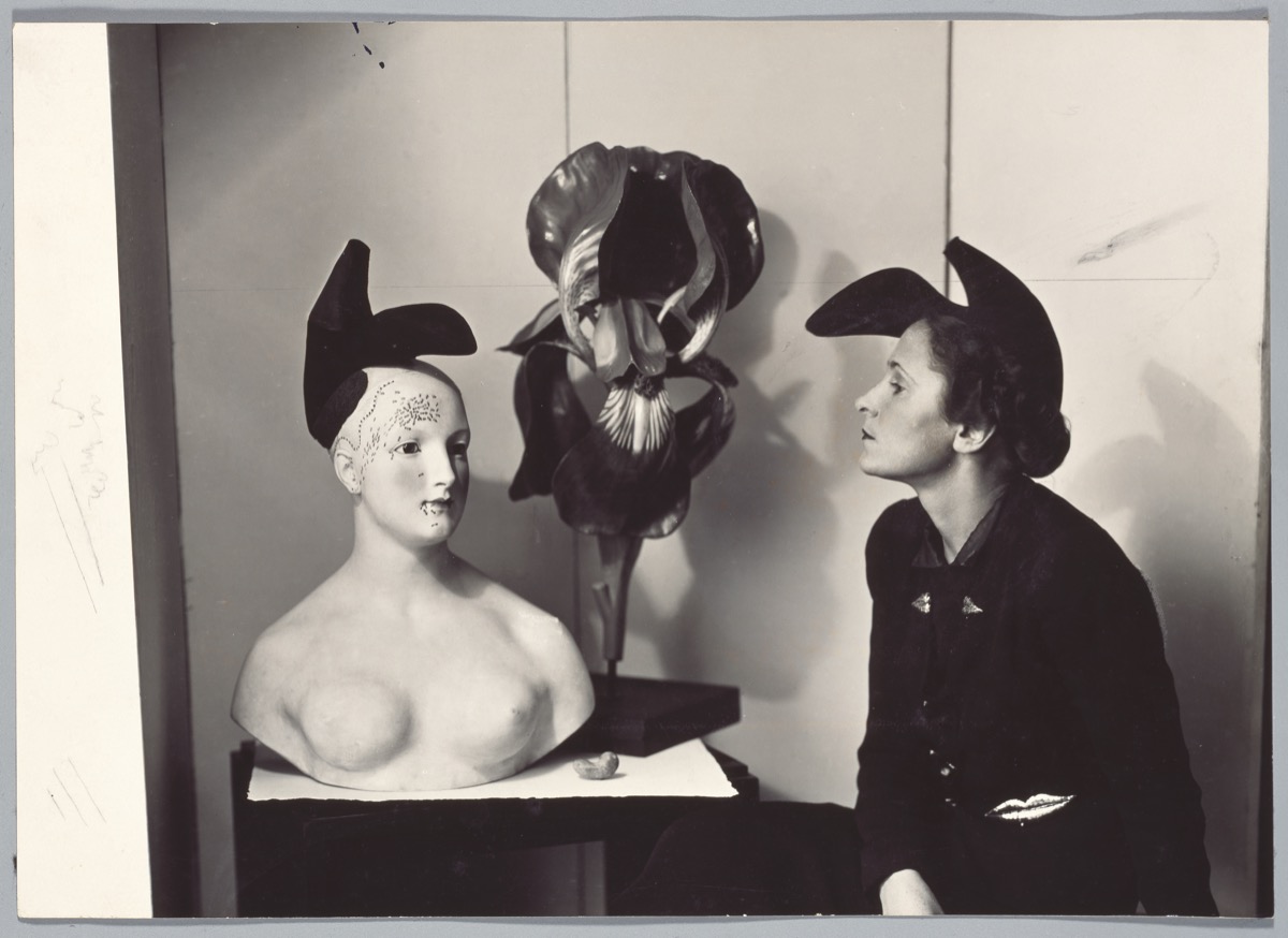
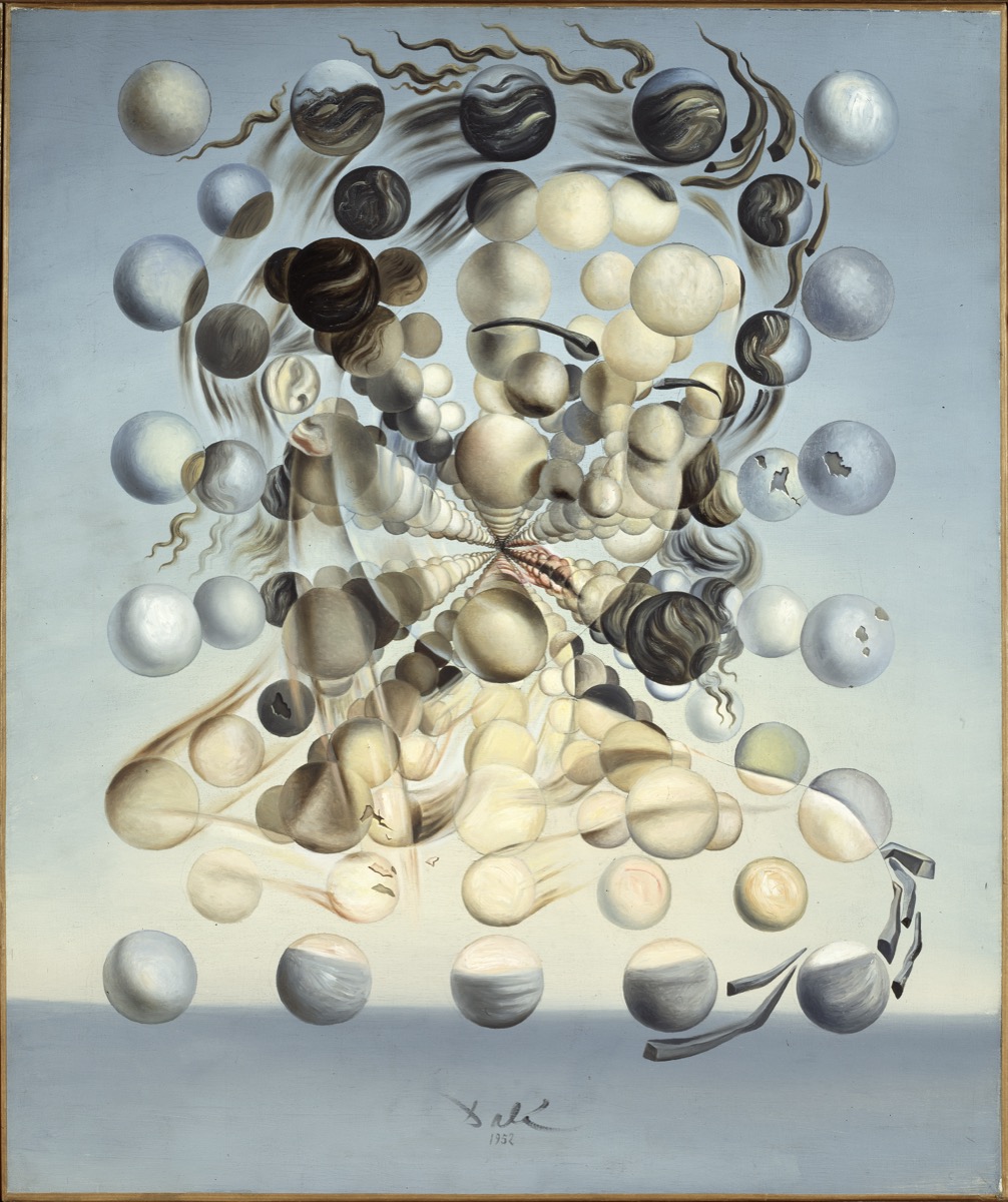
Without Gala the surreal game board would appear incomplete. The paintings of Max Ernst, the photographs of Man Ray and Cecil Beaton and especially the works of Salvador Dalí are much more than portraits: they make up an autobiographical journey in which, as a postmodern heroine, Gala imagined and created her image.
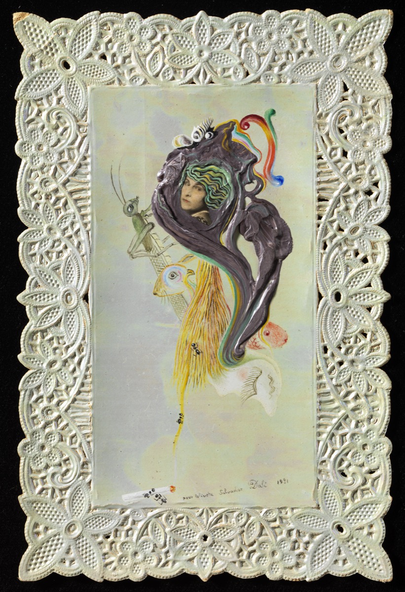
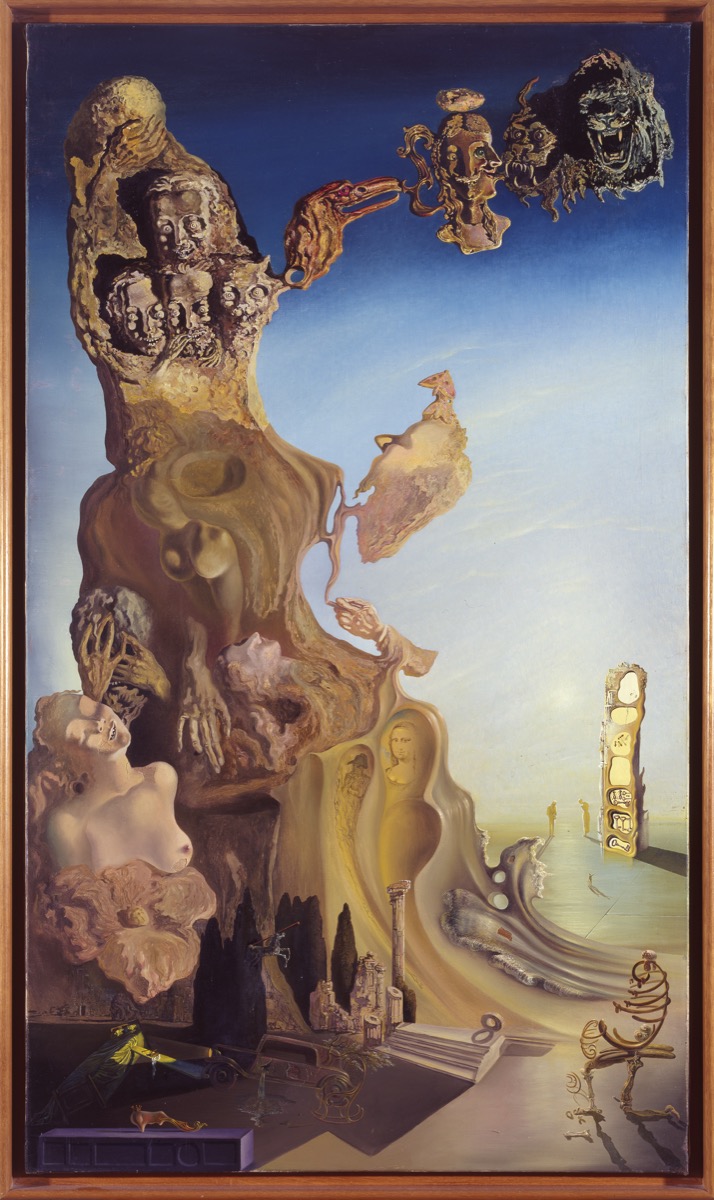
For this reason the show will discover a Gala who is camouflaged as a muse while building her own path as an artist. It is also undeniable that to follow the evolution of Salvador Dalí as a painter she was essential in the artistic development of the Empordà painter. In this sense the exhibition gathers together a very important set of his works, some 60 in total, between oils and drawings. There is also a selection of paintings, drawings and photographs by other artists who gravitated in the surrealist universe with Max Ernst, Picasso, Man Ray and Cecil Beaton or BrassaÏ. Exhibited for the first time too is an interesting set of letters, postcards and books, as well as clothes and personal items from Gala’s toiletries.

As a postmodern heroine, Gala imagined and created her image.
In total, the exhibition brings together some 180 works that allow the reconstruction of the complex and fascinating figure of Gala. The works in the exhibition come mainly from the Dalí Foundation, but there are also objects from private collections and international museums in the United States, Germany, France and Italy, among others.
The Gala Salvador Dalí exhibition will remain open to the public until October 14.


Source: Photos provided by the National Art Museum of Catalonia and the Gala-Salvador Dalí Foundation
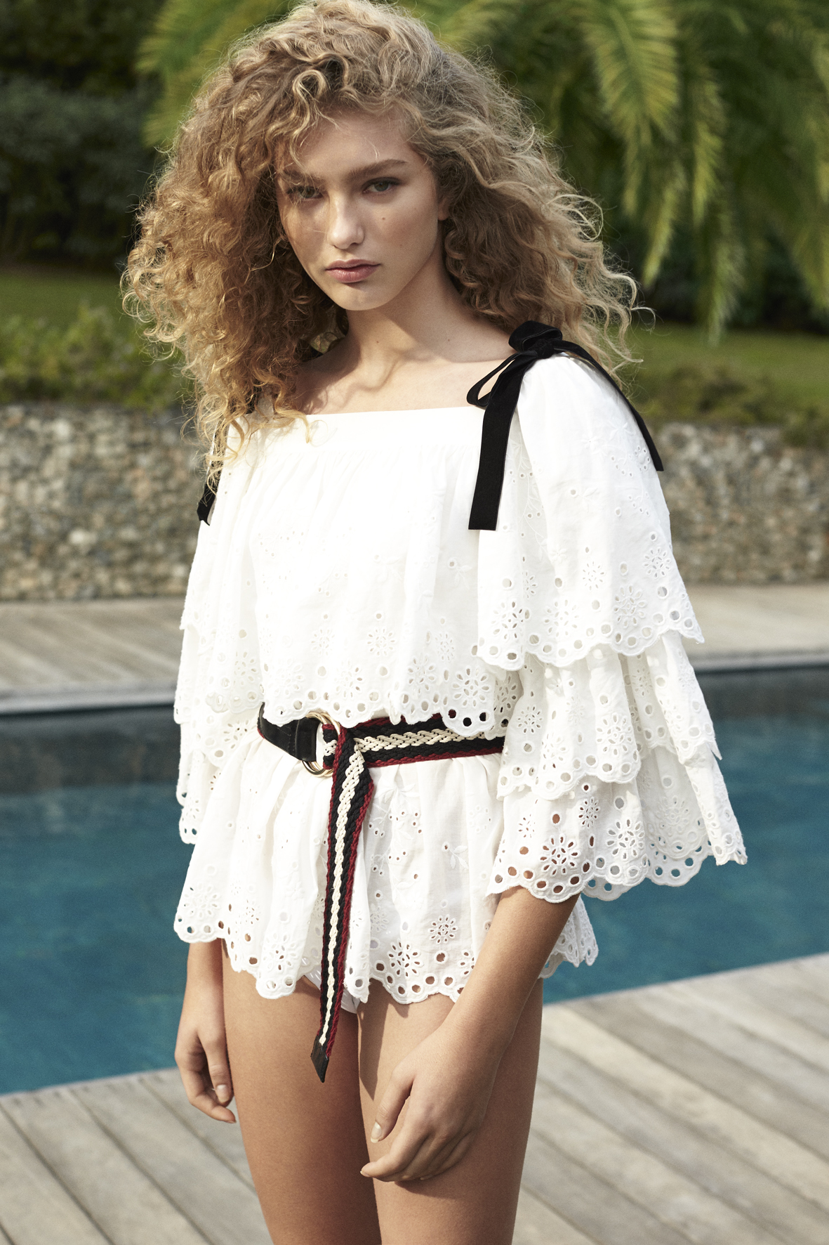
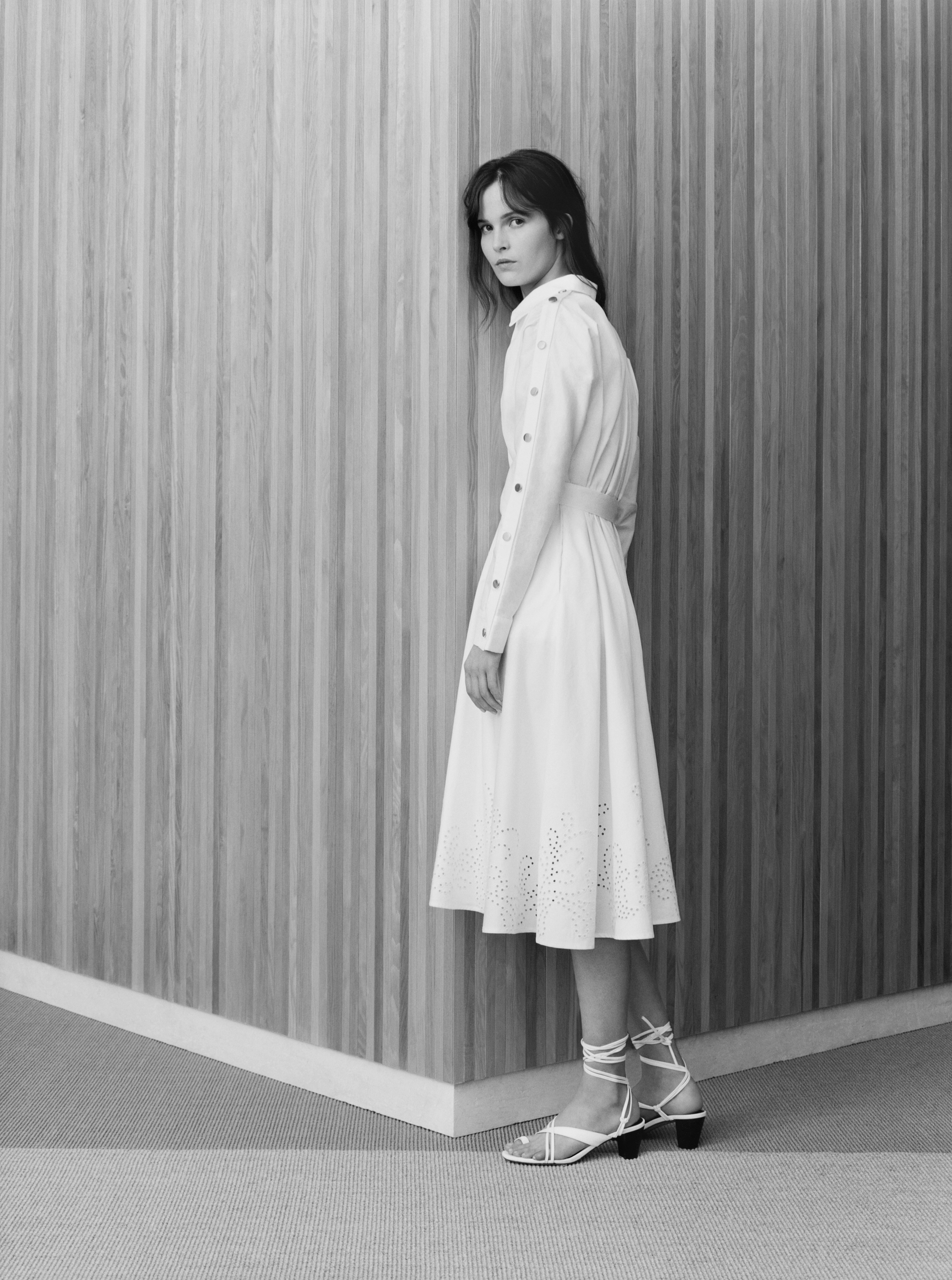
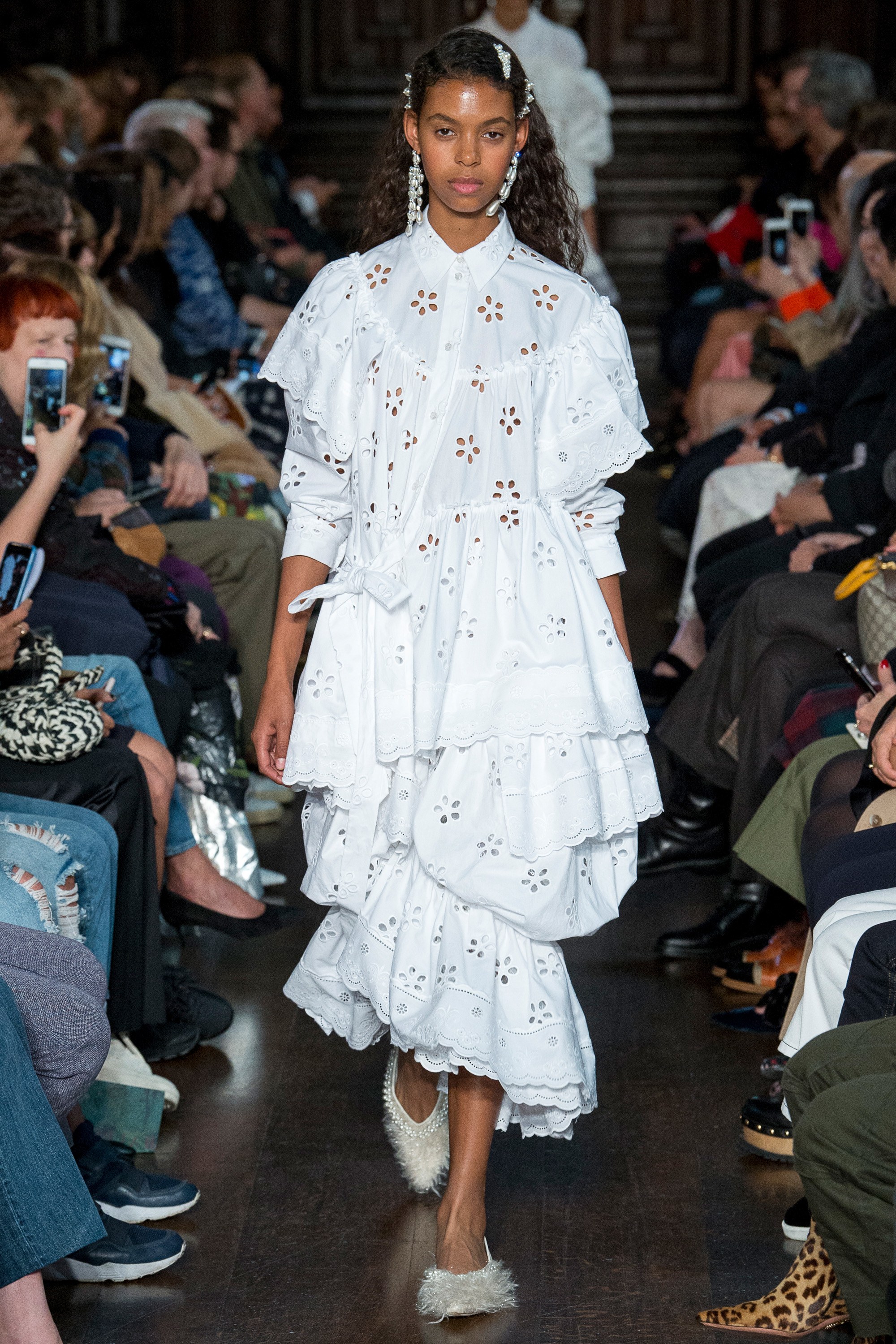
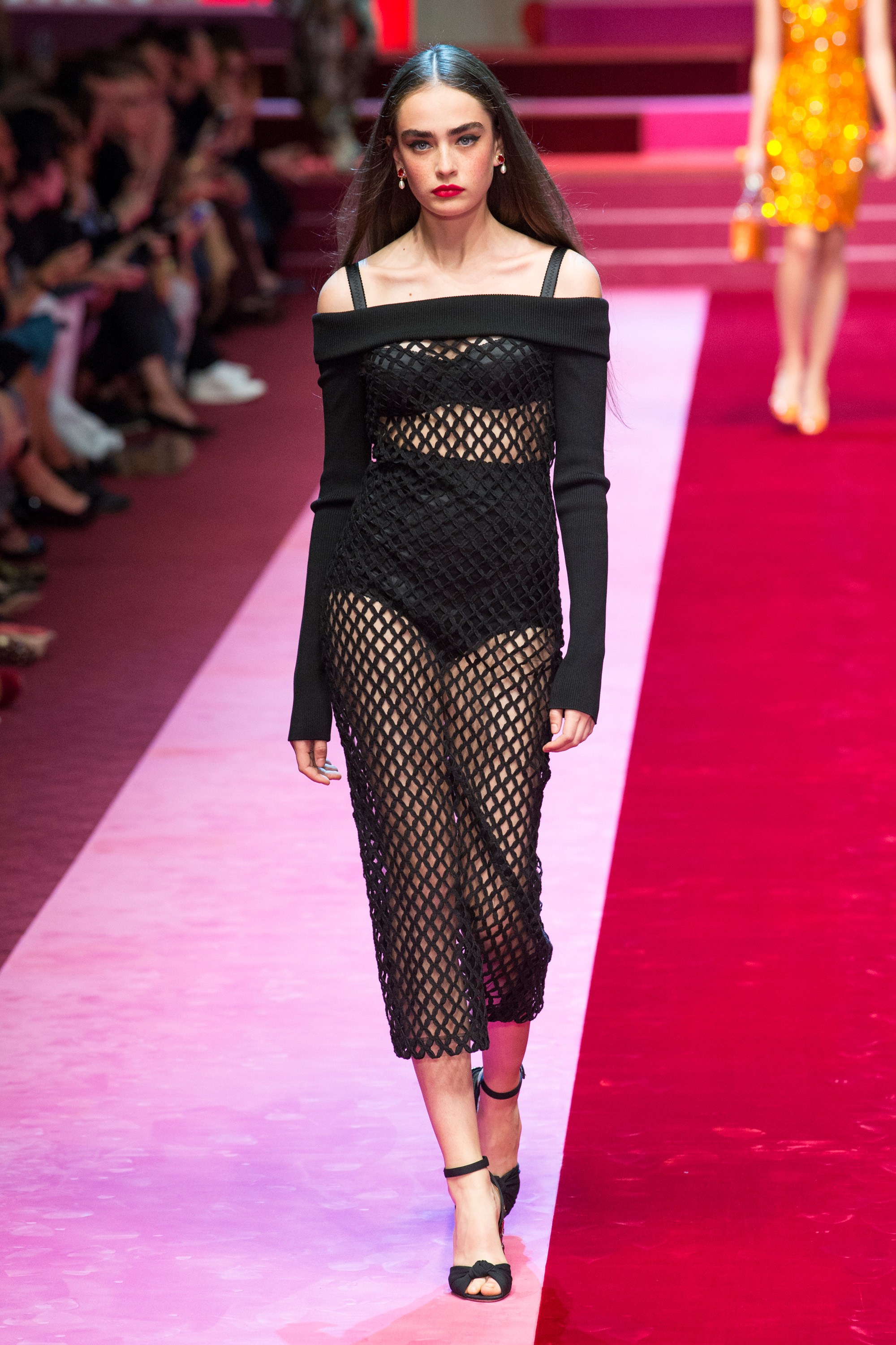
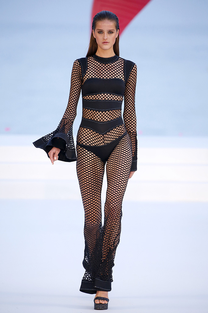
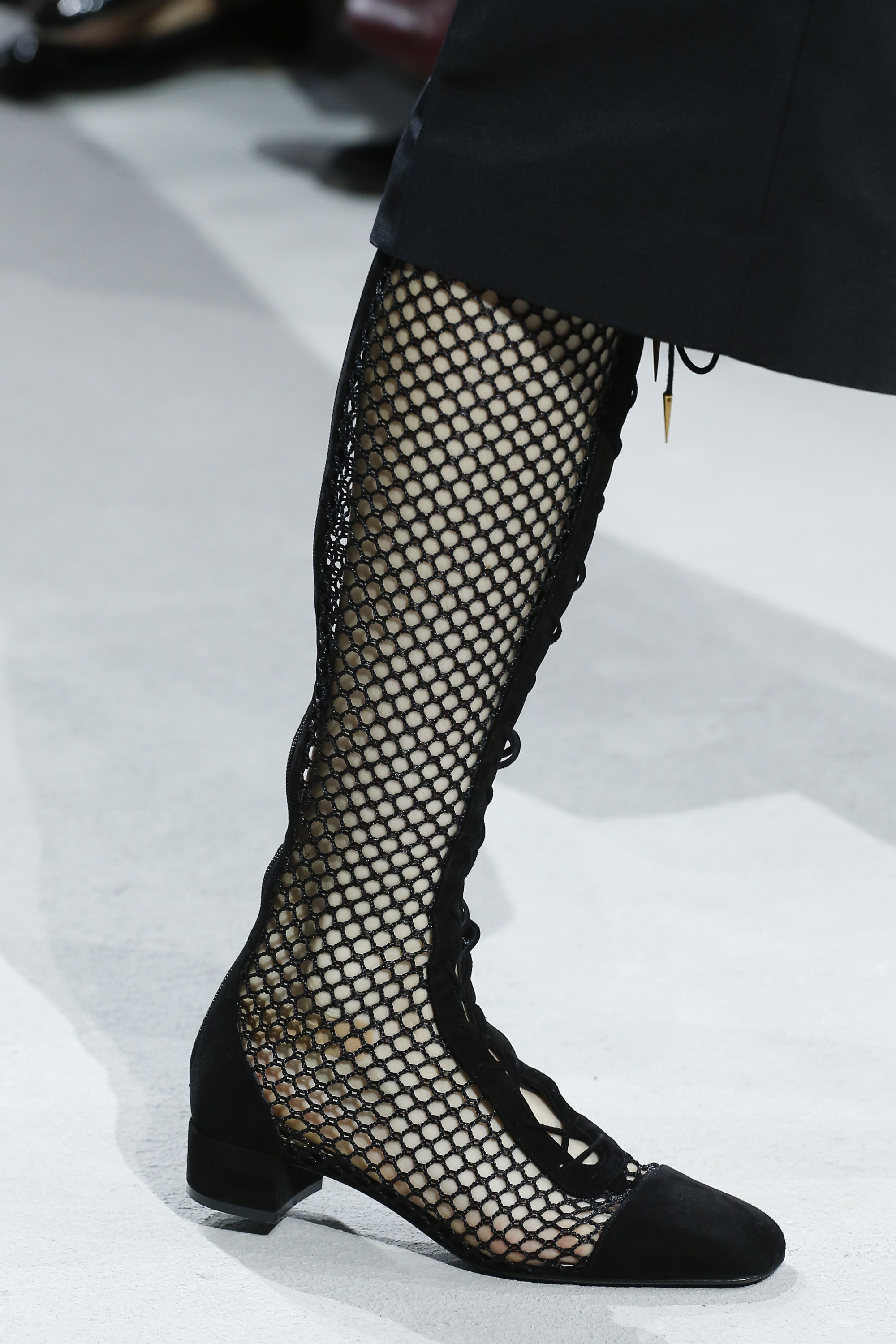
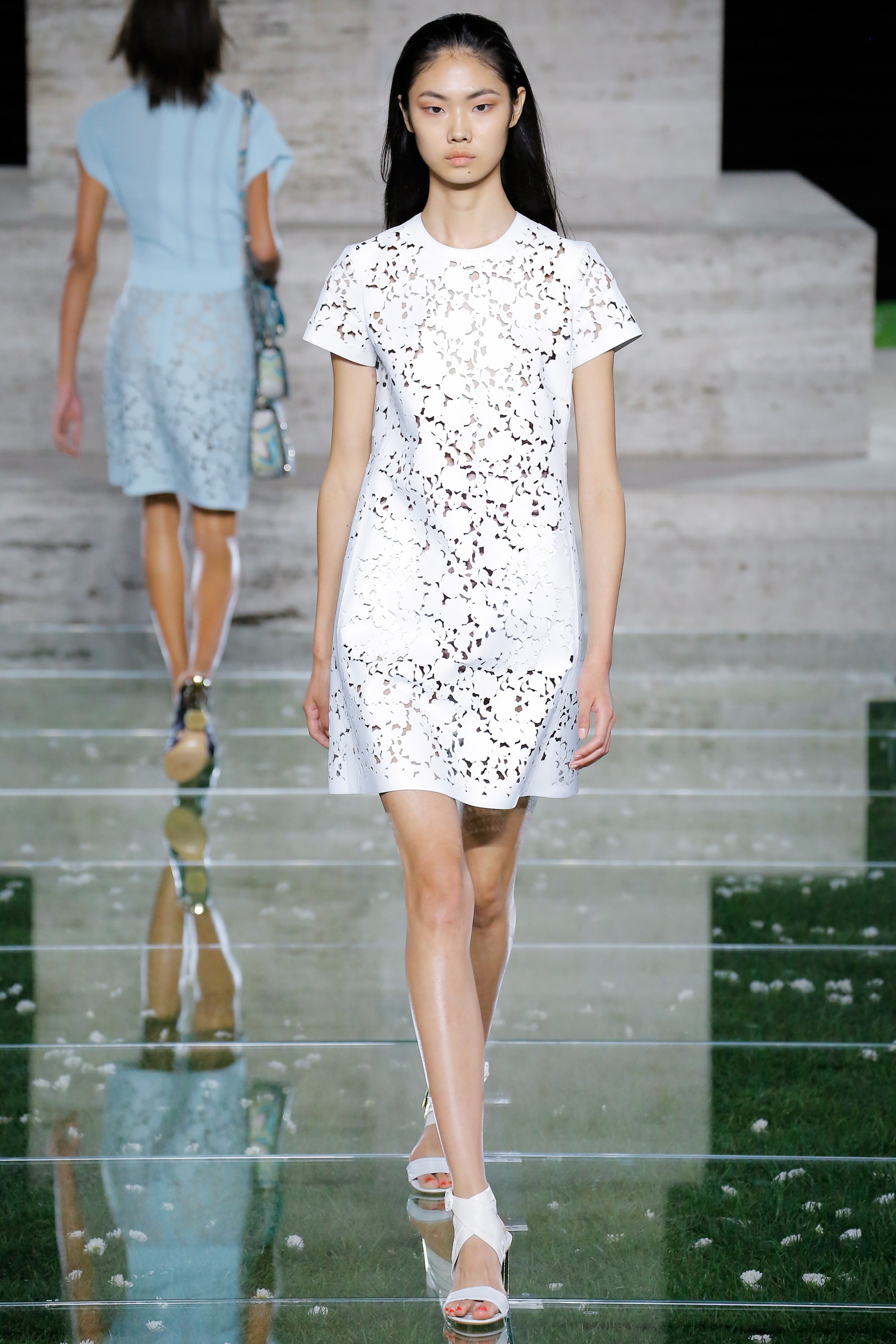
Although we have an eye on the 2020 collections – we are working on those fabrics likely to be in fashion in the next couple of years – we want to send off the current collection by focusing our attention on the freshest and lightest fabrics that to a lesser or greater extent always have a certain presence in what is on offer for summer. We’re talking about perforated fabrics that can be presented in various ways as sensual cotton embroidery, with a die-cut effect, in the form of net or laser-cut, which allows just a glimpse of skin. Hinting, but not revealing.
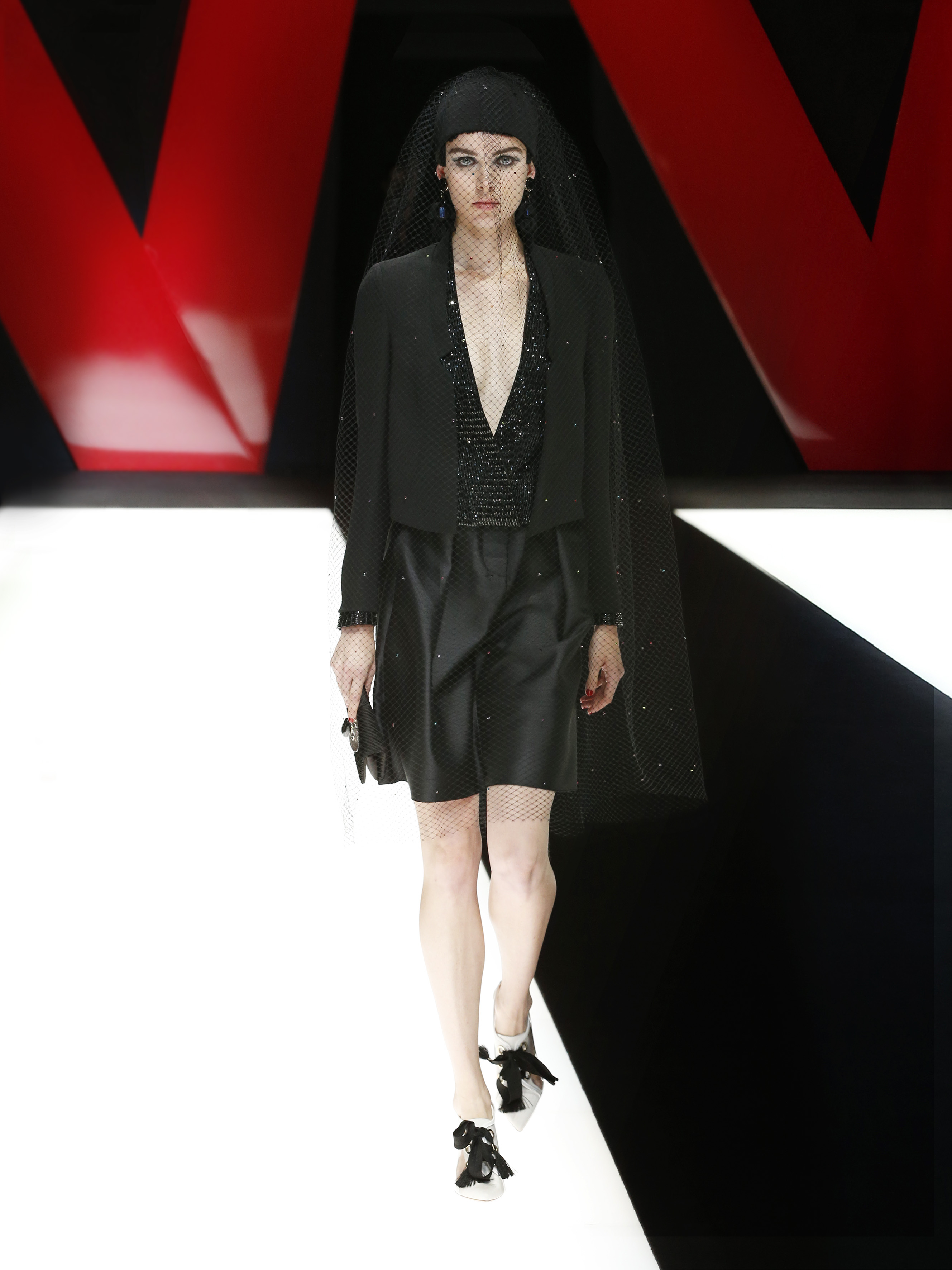
From our analysis of the catwalks we give some examples of these fabrics and notice a chromatic tendency that is practically timeless because it is no longer subject to any season: the black-white binomial.
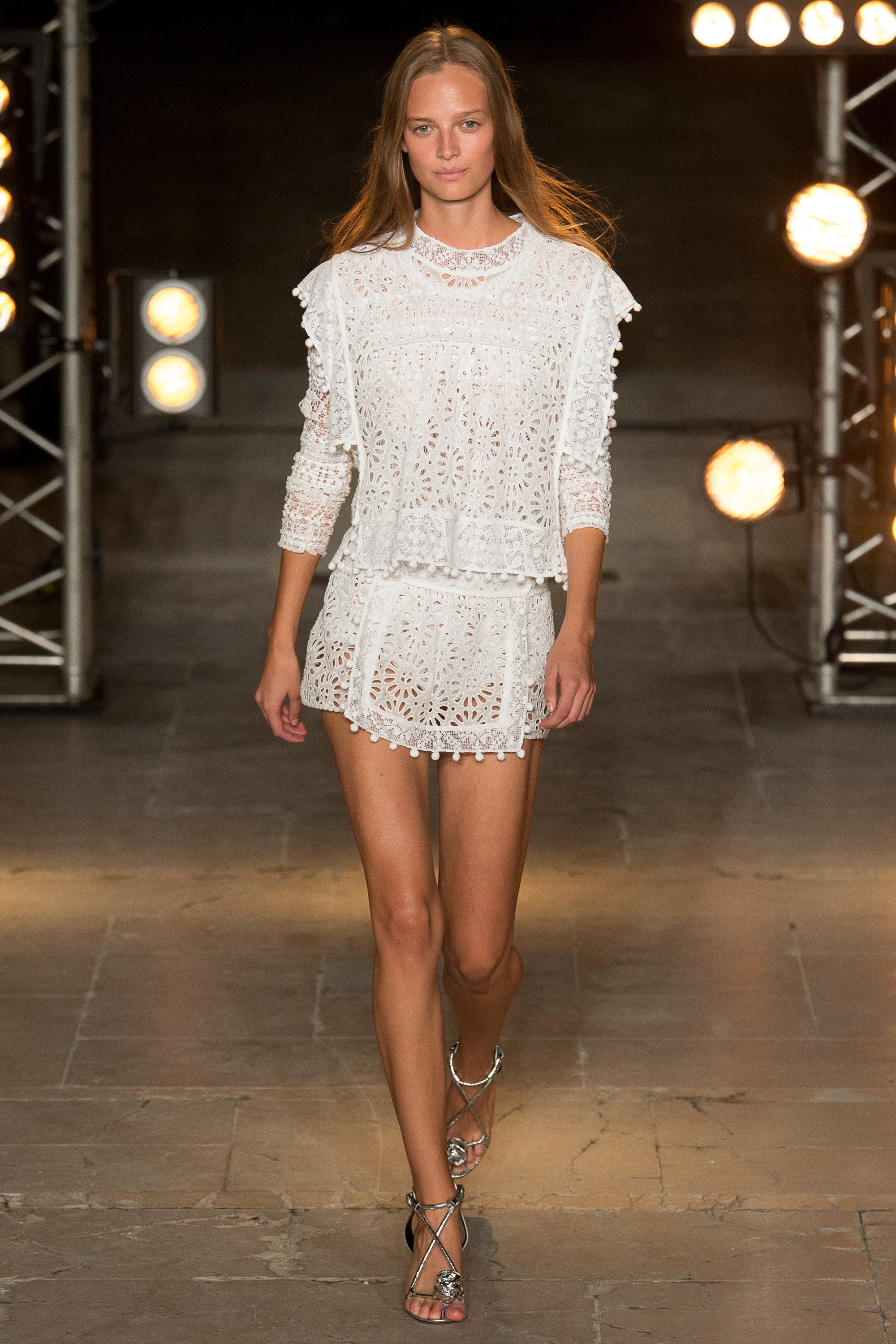
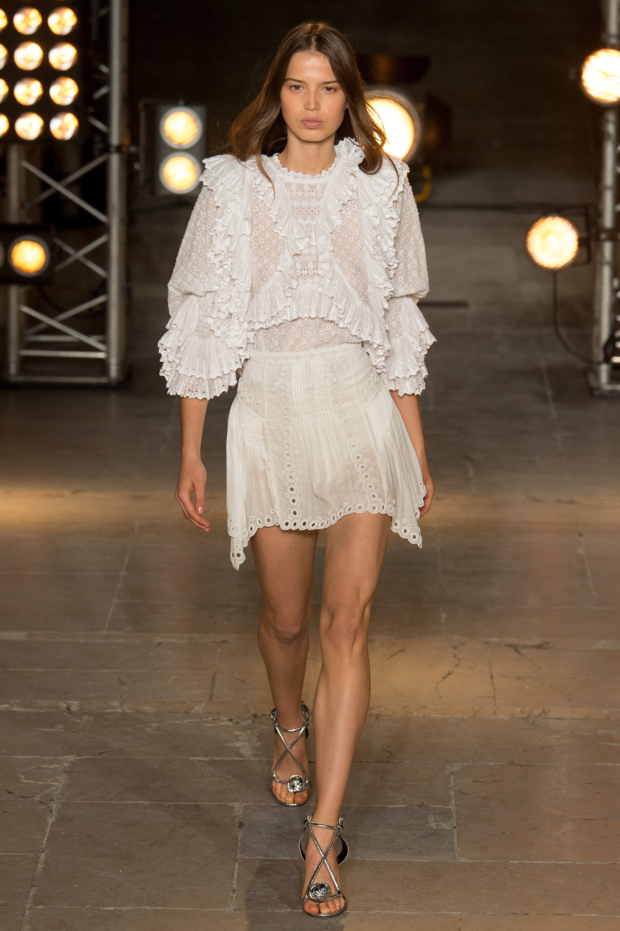
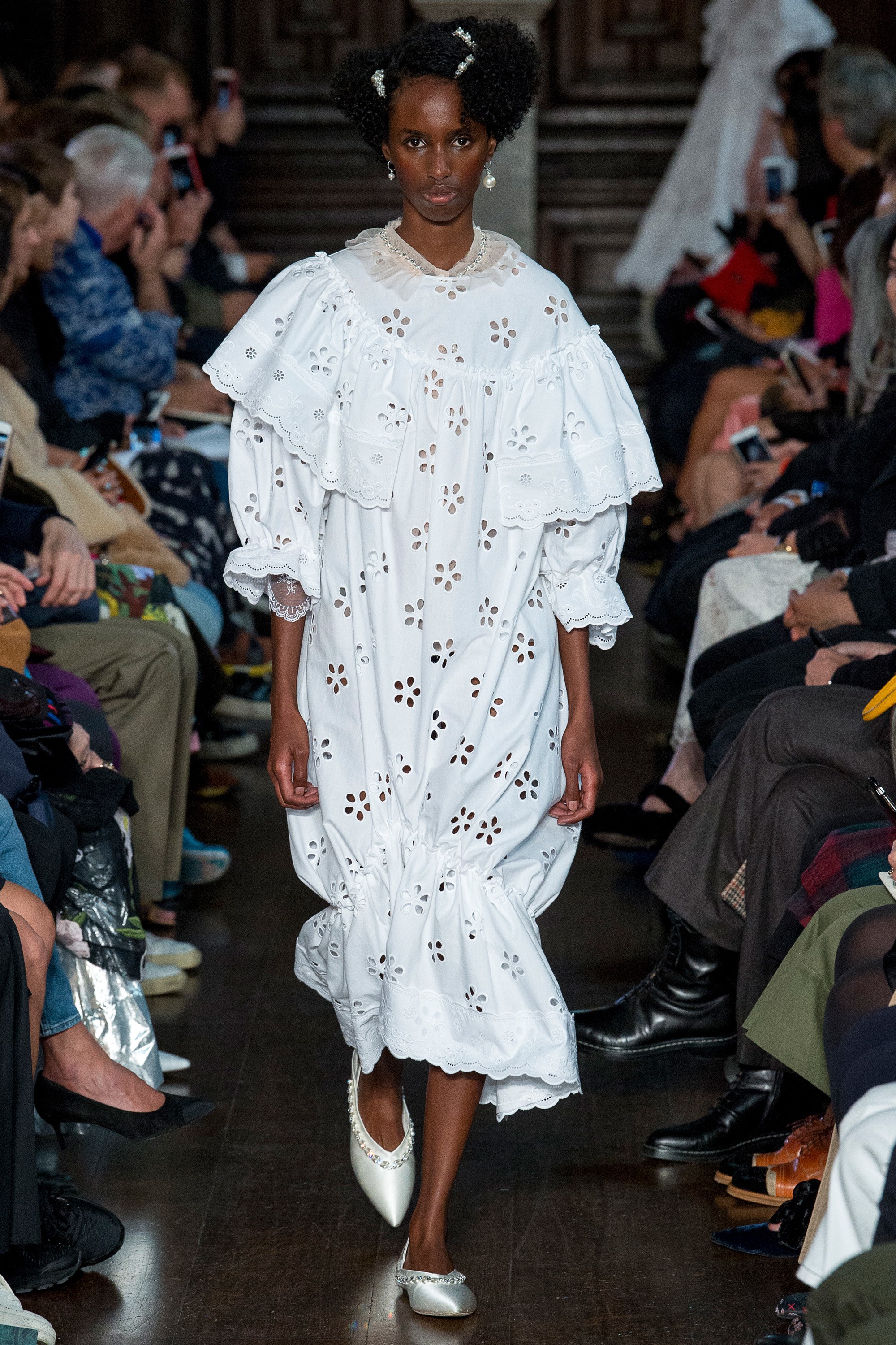
Cotton embroidery
Cotton embroidery is associated especially with the boho -chic style through oversized garments with maxi volumes. As an example , the designer Isabel Marant has used these fabrics in puffed blouses accompanied by skirts and shorts.
For her part this same fabric also forms part of a dream-like creation from Simone Rocha, through whose designs women can be both naughty and innocent at the same time. Here we focus on her wide cotton dresses, some with stamped fabrics which give them this quality of apparent naïvity. The preferred colour for the die-cut continues to be a pristine white.
Net effect
If before we focused on a more romantic and evocative proposal, net fabrics are at the other extreme in that they highlight the more urbane and contemporary side of women. Woven fabrics are living a moment of splendour by abandoning intimate fashion and conquering new feminine garments such as skirts, dresses and sports-inspired tops. Net effects are combined with each other or superimposed, leaving in their wake a sensual play of transparencies.
From net fabrics we highlight two novelties that have surprised us this season : that of opting almost entirely for the colour black – rejecting all those colourist fantasies – and the application of this fabric to all kinds of complements and accessories. Proof of this are the summer collections by Emporio Armani and Dior.
Perforated
Finally we are highlighting those perforated fabrics where small circles reveal glimpses of the skin and laser cuts on leather or other light, transpirable fabrics. These create unique floral or fantasy prints that emulate the tattoo effect on the skin. In this case we are highlighting the looks of Salvatore Ferragamo, which go beyond mere white to include more daring pastel tones.

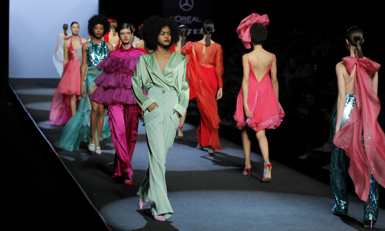
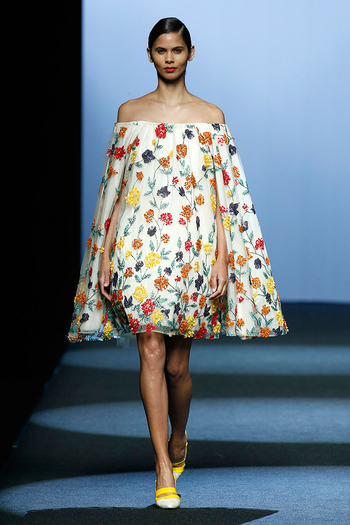
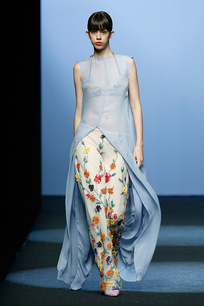
As usual, the Gratacós fabrics have also been present in the latest edition of the Mercedes-Benz Fashion Week Madrid in the Spring-Summer 2019 collections presented by the best designers of current Spanish fashion. Consolidated firms that confide in us such as Juan Duyos, Menchèn Tomás, The 2nd Skin, Malne, Moisés Nieto, Palomo Spain and also young designers who are building a promising future in the sector such as Juan Carlos Pajares who is already integrated into the official calendar of the Madrid show, after his participation in the catwalks of emerging talents.
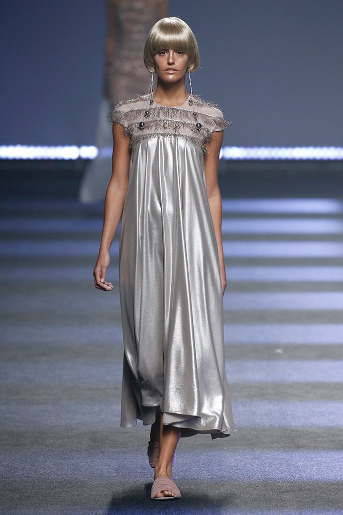
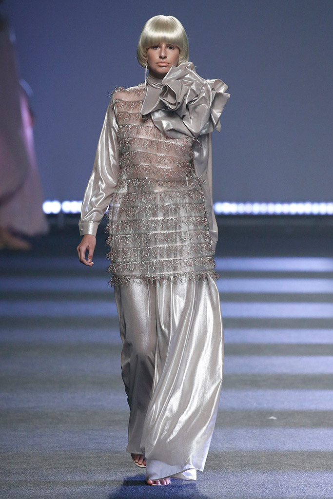
Here we reveal some details of the collections for the next summer season, as well as the fabrics and colours that were shown that most caught our attention. Roughly speaking, we would highlight the success of colour, the fabrics that radiate light, the metallic fibres and the sequins that also conquer the street looks and add that air of sophistication.
Duyos’ light
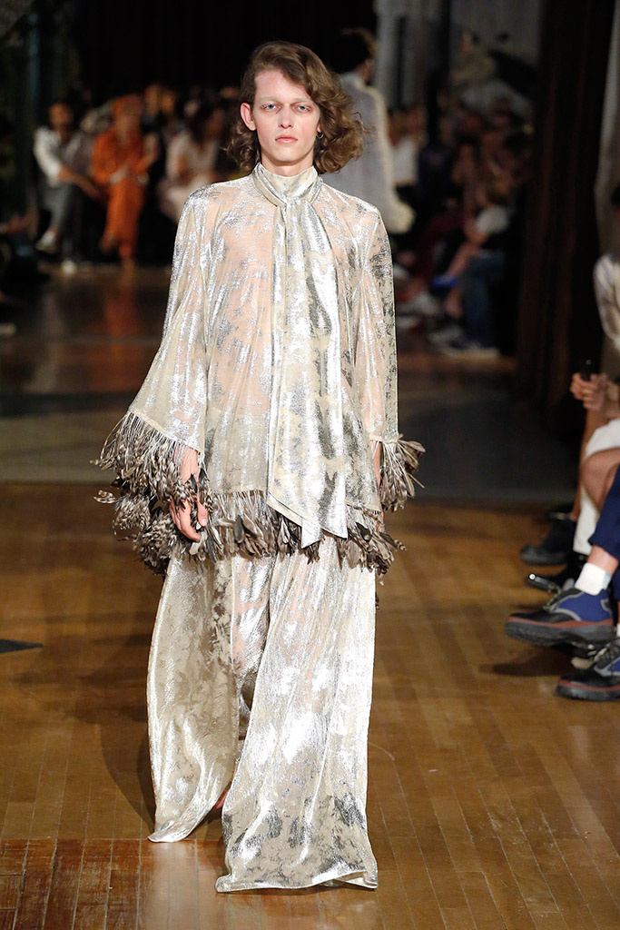
Juan Duyos pays homage to the light, in an ode to feminine beauty that shines the brightest. It is for this reason that in the collection ‘Light’, luminous fabrics such as metallic, paillettes, lurex, lame and several metallic threads stand out and capture all the flashes – and looks – on Madrid’s catwalk. In contrast to the bright materials, this proposal is tinted in ice green, lavender, lime or peach that coexist with gold and silver.
The strength of Anonymous women
Juan Carlos Pajares, one of the most successful emerging talents of Spanish fashion always surprises on the Spanish catwalk. This time, the designer from Madrid has found in the Amazons his source of inspiration in a collection that pays tribute to all those women who hid behind pseudonyms and even had to stop working or doing what they were passionate about. In the show, this spirit is transmitted through colour with a palette that includes pinks, greens, oranges, blues and greys. The blends of textures, oriental reminiscence prints and the superposition of urban garments made in formal fabrics are also noteworthy: mikado and silk ottomans, cottons, neoprenes, crepes, paillettes or vichys with touches of lurex.
In cuban lands
“Me desordeno, amor, me desordeno”, recites the poem by Carilda Oliver, one of the most reknowned contemporary poetesses in Cuba who has inspired the new Menchén Tomàs collection together with other artists such as Catalina Lasa and Lidia Ríos who lived in the greatest splendor of Cuban society before the revolution. It is precisely in the heart of the Havana where the Barcelona designer finds inspiration for her spring-summer fashion show. A sophisticated proposal arranged in three parts. The first begins with pure white, “the colour of Santeria” according to the designer ” with textured details. In the second part, the clothes turn quartz, the stone of the subsoil of the island. In the last part, there is an explosion of colour resulting in a happy and optimistic result.
Malne and the empowered woman
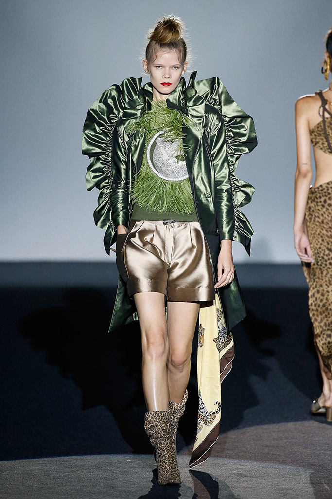
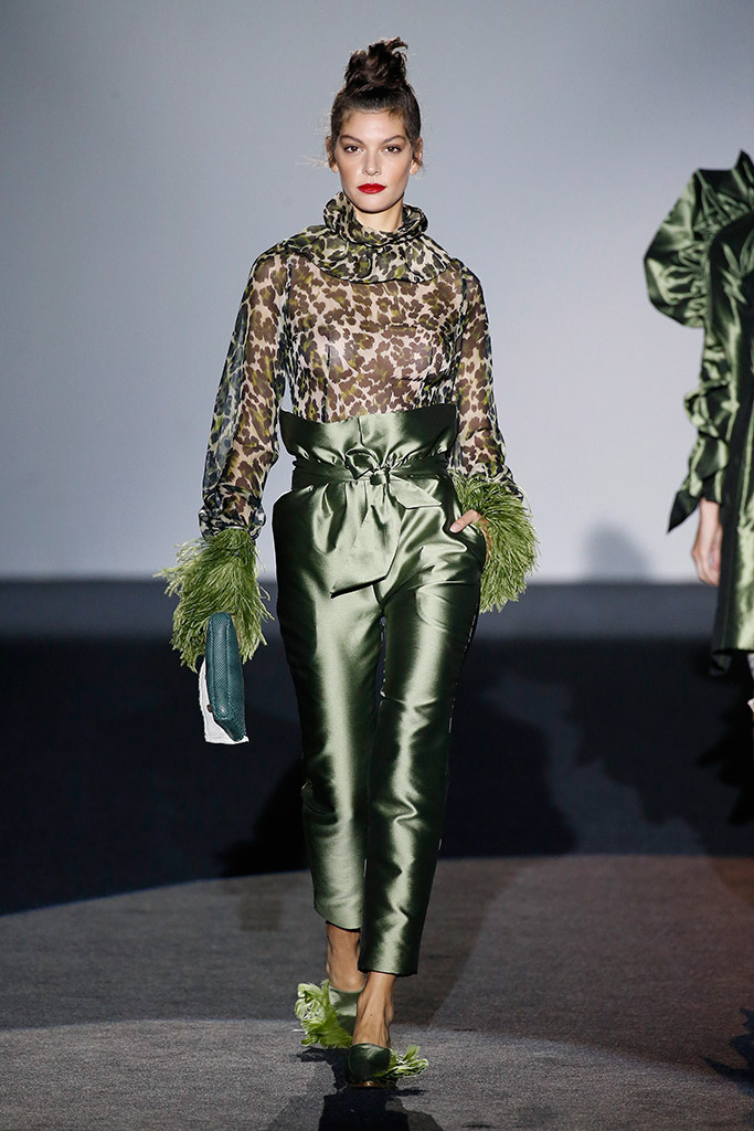
The creative duo behind Malne: Paloma Álvarez and Juanjo Mánez have presented a collection that plays with the mix & match in fabrics and prints for women who feel strong and free and transmit that spirit of rebellion. The animal print combines perfectly with dancer touches and maxi volumes with ruffles and feathers forming a solid and well-constructed proposal that structures the entire collection. Only suitable for the daring…
Palomo Spain
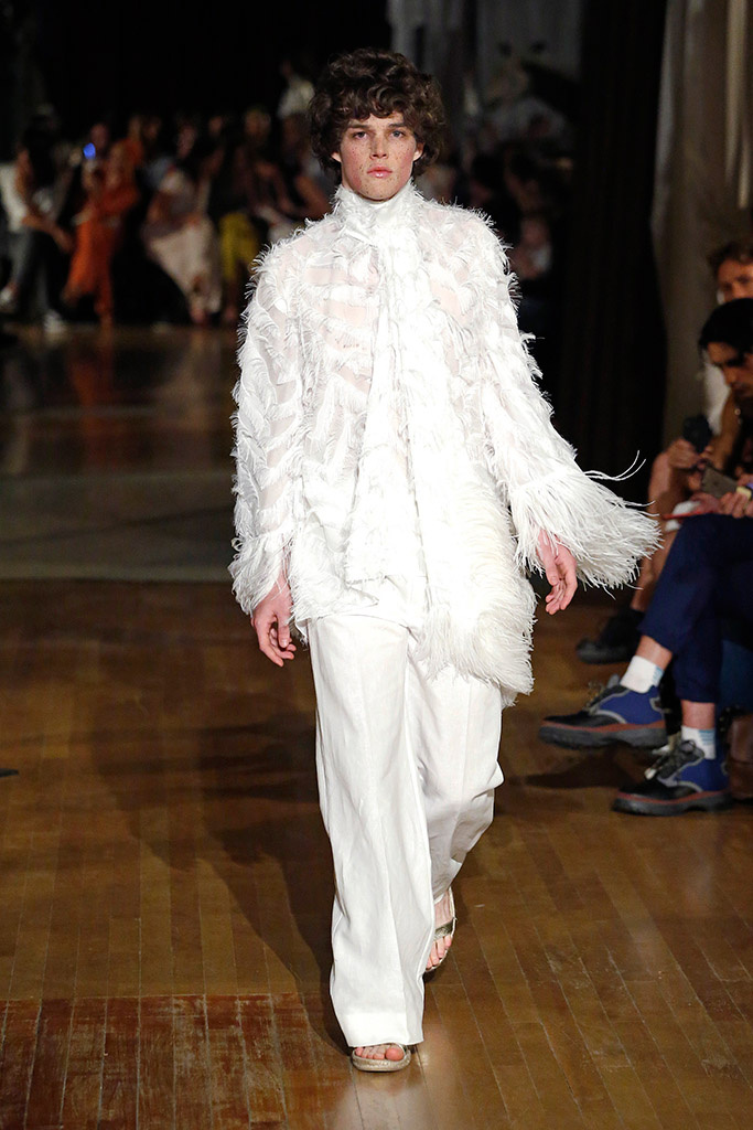
The enfant terrible of Spanish fashion, who revolutionizes the male wardrobe with his glamorous looks. This time he has inspired himself in the cabinets of curiosities to dress men in sophisticated style. Thus, Alejandro Gómez Palomo fills the catwalk with his exotic models that include wild silks and extravagant volumes, tortoiseshell buttons, sophisticated outfits in velvet jersey that are crowned with luxurious mosquito-net hats inspired by the explorers of the XIX century. The proposal by Palomo Spain is enriching, the kaftans, the jacket sets and the skirts in laminated fabrics and linen for the pure and traditional lines.
A full volumen Spring
Juan Carlos Fernández and Antonio Burillo presented ‘The Garden’, a dreamlike proposal inspired by a romantic garden. In this spring collection, The 2nd Skin focuses on dresses as main axis, maxi volumes, oversize garments and floral print as the basis of this evocative collection with a marked eighties air. In terms of fabrics, the mikados stand out, embroidered sequins -symbol of the brand- along with other lighter ones like tulle or silk chiffon.


Sorry, this entry is only available in Español.

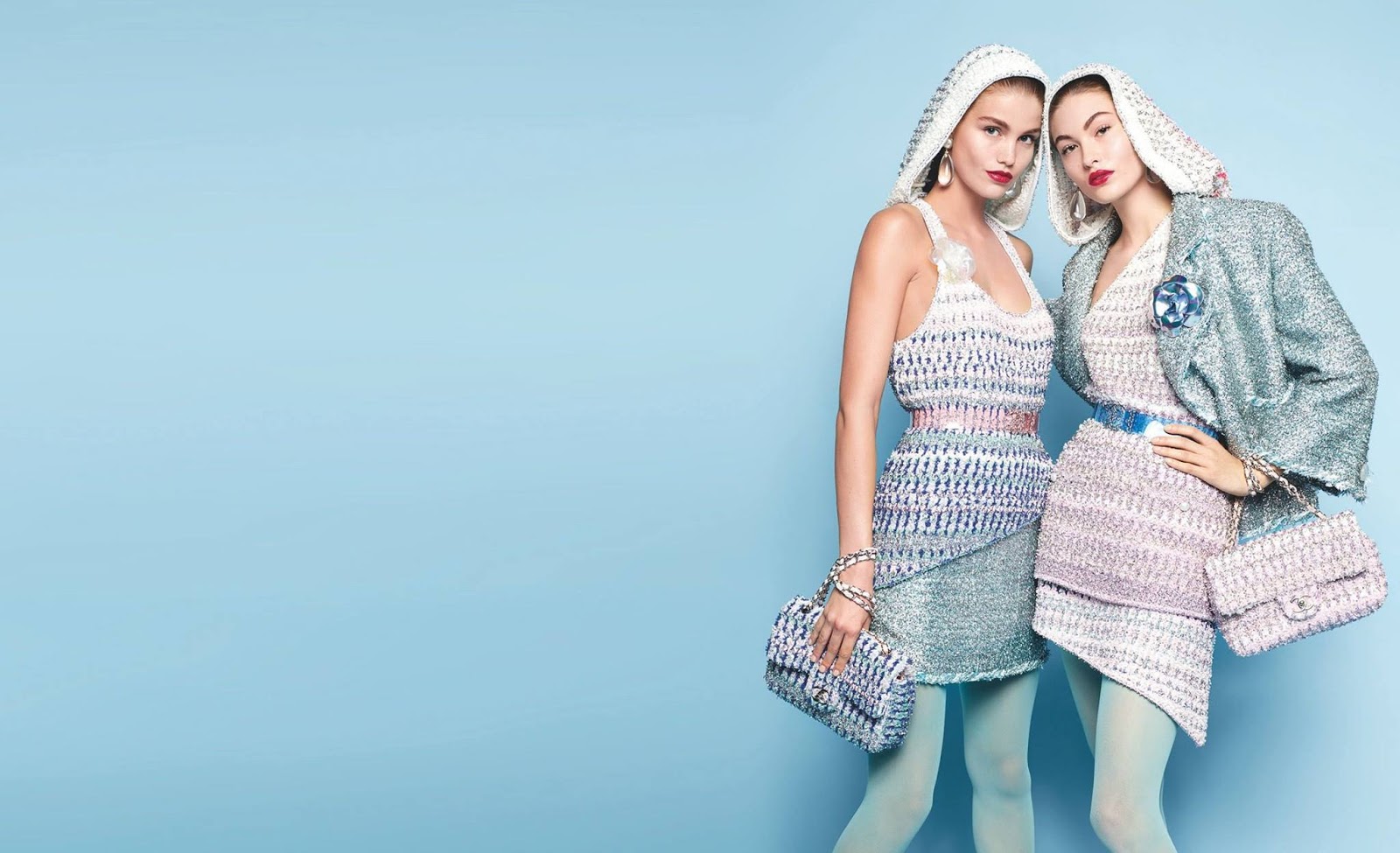
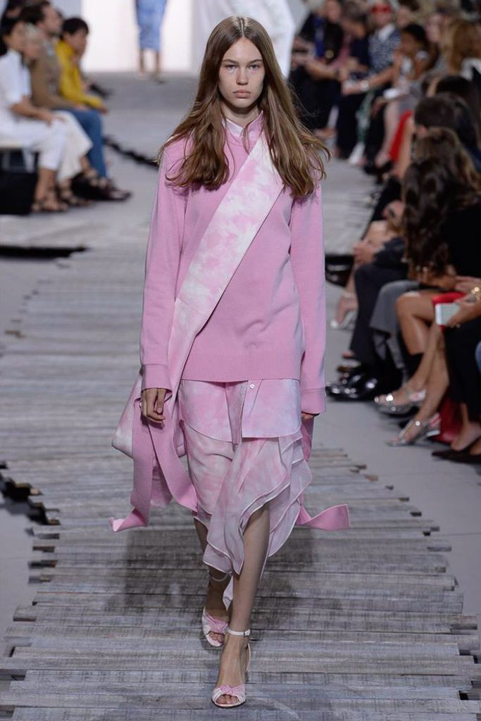
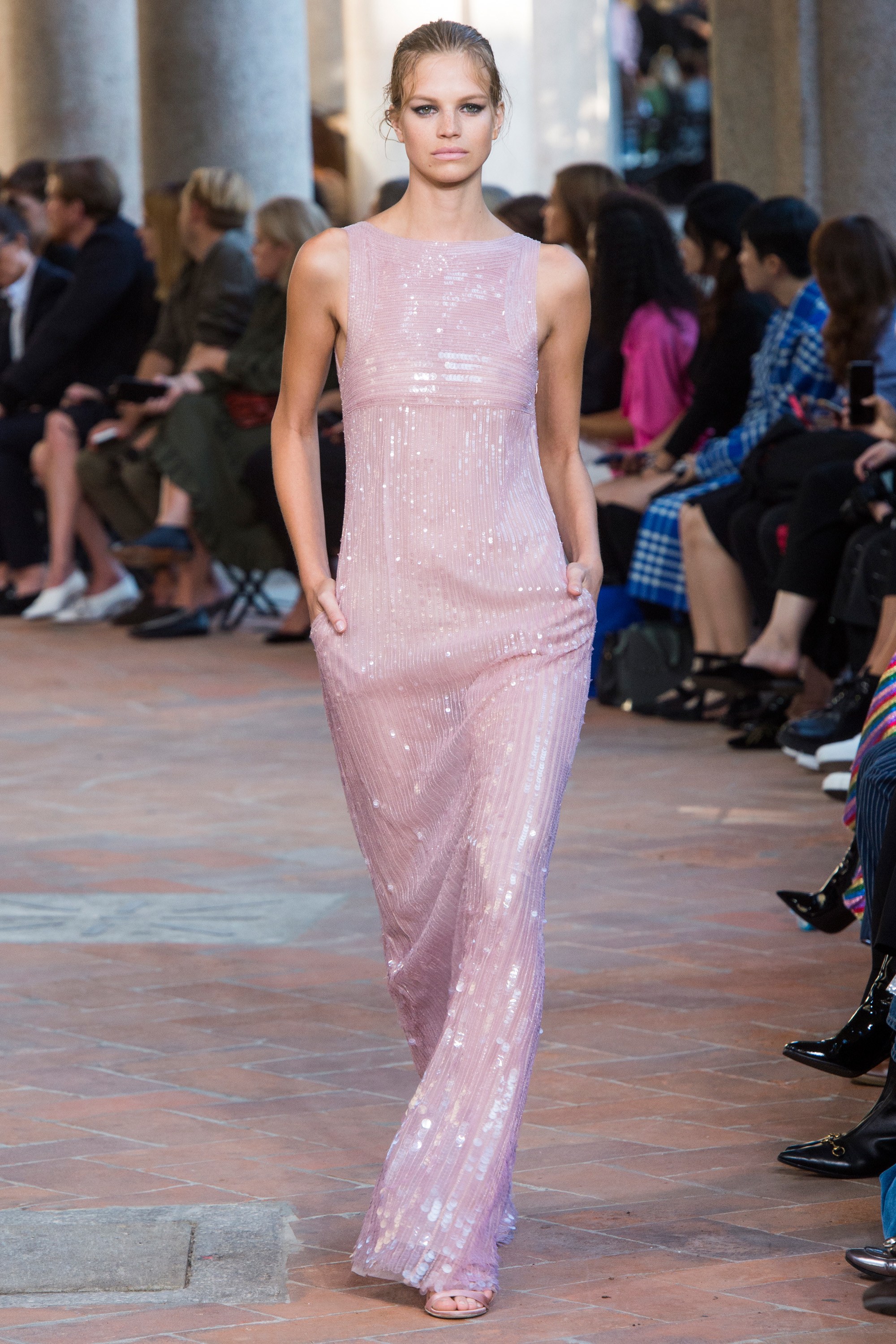
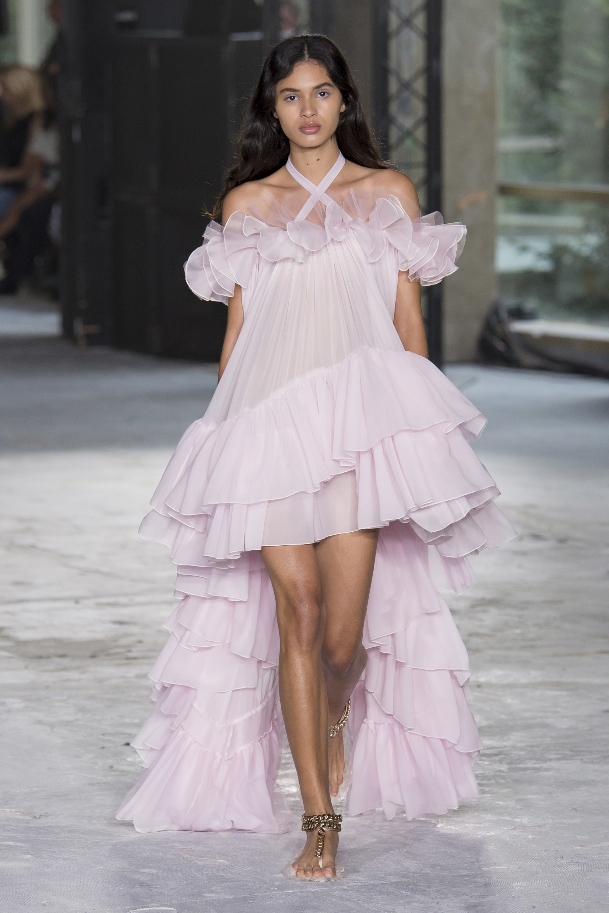
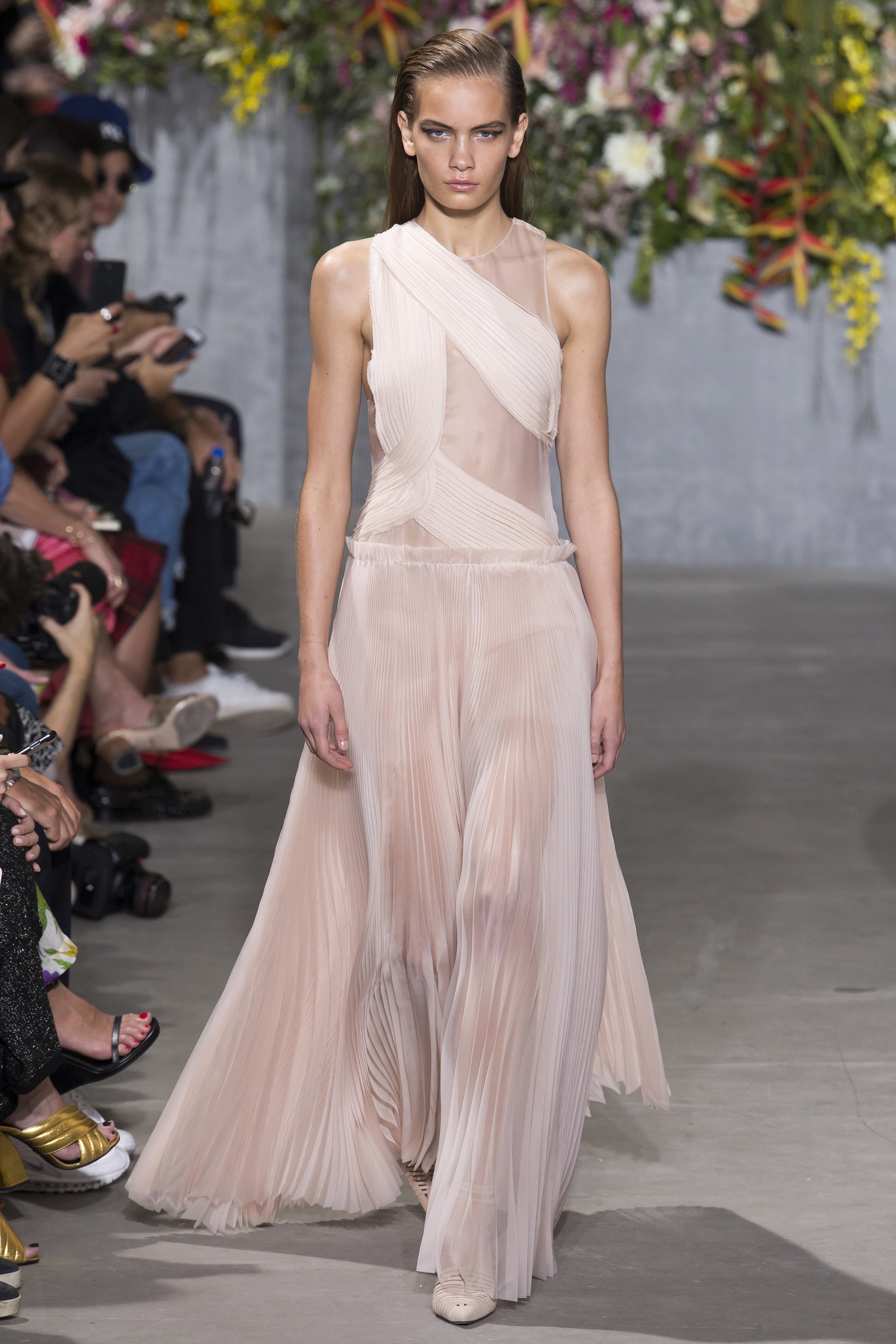
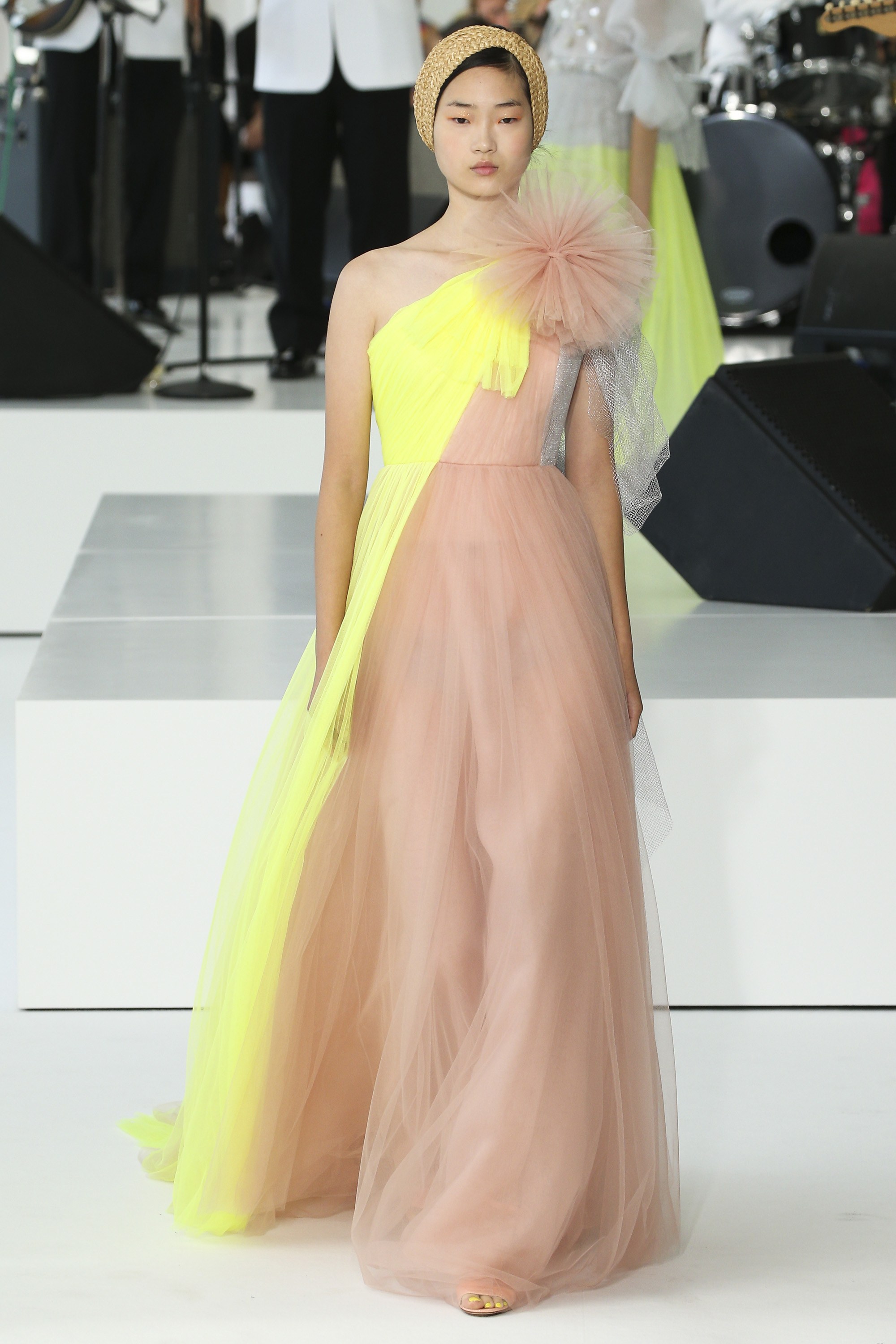
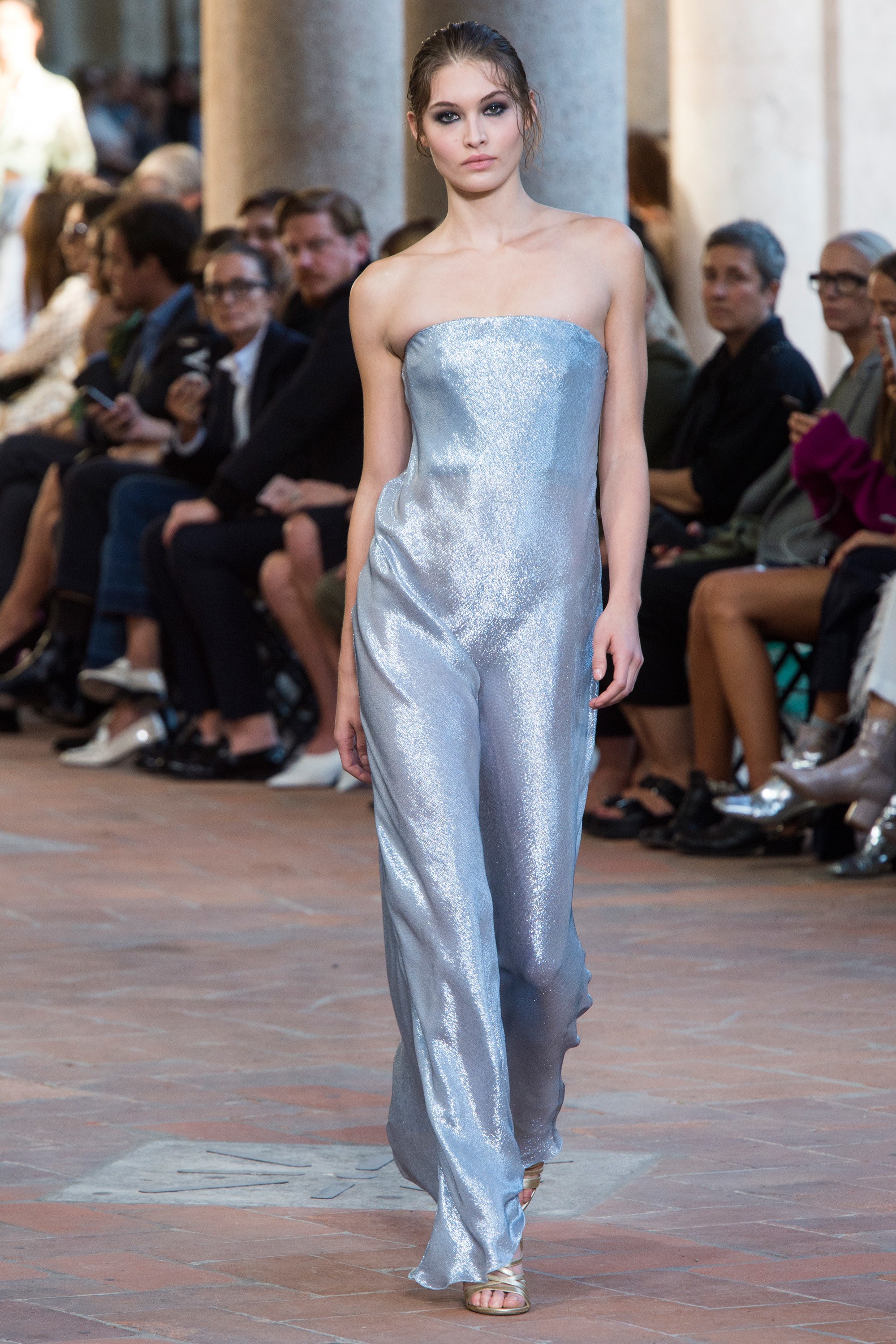
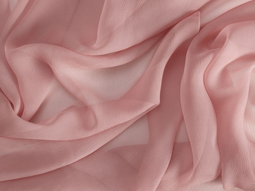
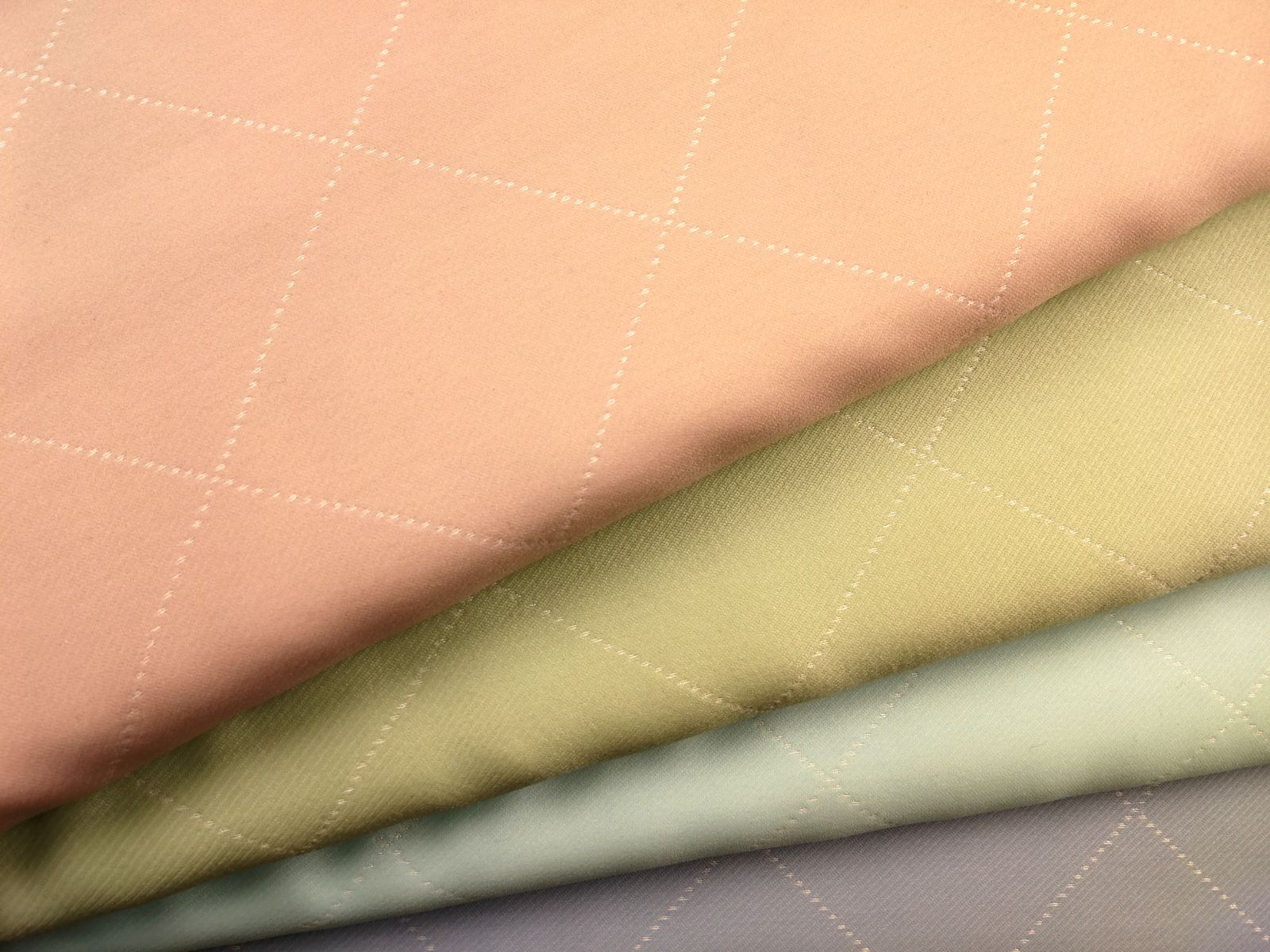
Fashion is paying homage to the sweetness of the softest tones in the chromatic spectrum. Pastel colours are the kings of a season, which is tinged in pale tones that give it a certain romantic and boyish look, with mixtures that include light blues, water green, pale rose, baby blue, lavender and the palest of greys. The collections of Michael Kors, Tom Ford, Emporio Armani, Giambattista Valli, Victoria Beckham and even Chanel, have been impregnated with this colour palette that is presented in complementary blocks within the same look and that without any doubt express the freedom to experiment with colours, soft textures and gradually lightening fabrics. They are tones that when well combined, soften traits and favour tanned skin.
Let’s look at some of the colours most in fashion this Spring-Summer 2018 according to Pantone.
Lavender Pink
This pink shade with bluish reminiscences is taking over from the Millennial Pink that so much triumphed last season – and that continues to mark the spirit of a generation-. It is a lavender pink colour, very fine and delicate, that gives off calm and tranquility. Michael Kors, Kenzo or Tom Ford have opted for this tone in Spring.
Almost Mauve
Another seductive pink from the soft palette. Almost Mauve is a very soft, almost mauve shade, which seems almost white, an ephemeral and delicate colour like a rose petal that lends a very subtle tone to the chromatic creation. Some designs by Rachel Zoe, Giambatista Valli and Tom Ford go for this most nostalgic of hues.
Flowering Dahlia
Orange is present in its most subdued version: peach, a warm tone that intermingles with the pink and whose reference is the flowering dahlia. It is a discreet, but attractive colour that is also a hit in the make-up industry. Rachel Zoe and Paul Smith have opted for it wihout hesitation.
Little Boy Blue
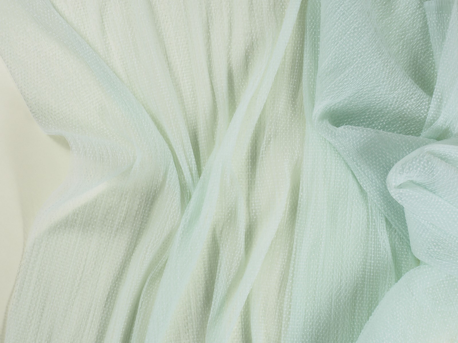
Baby blue is back once again for the warmer months. This inspiring colour of the brightest of skies reminds us of innocence and purity, transmitting tranquility and comfort. This calm tone finds its best allies in lavenders and quiet greens. Versace and Ralph Lauren have featured it on the catwalks.
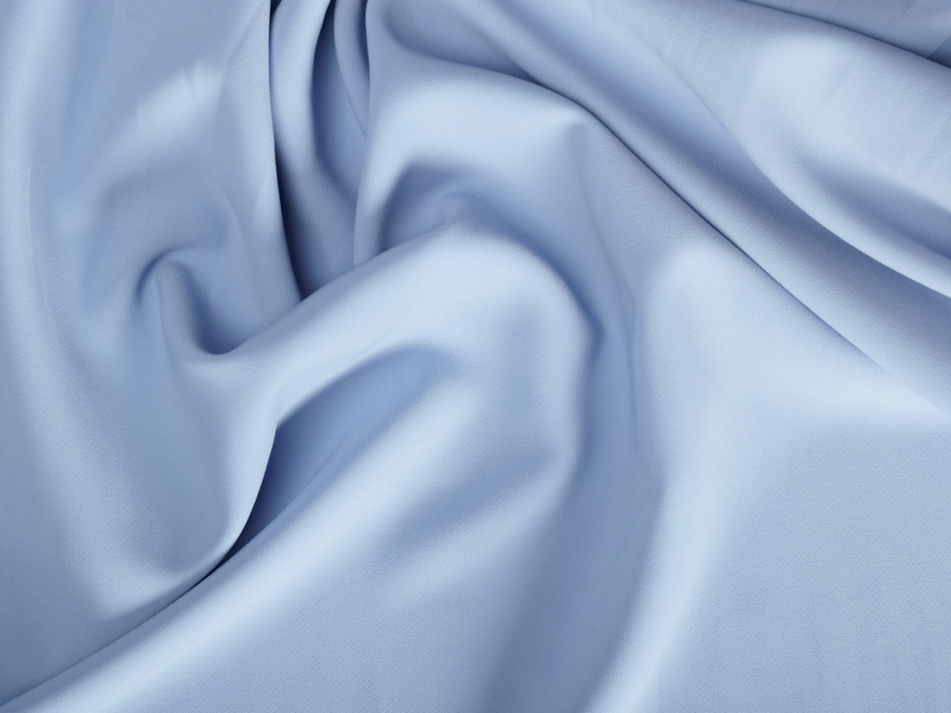
In our online website, as well as in the Gratacós shope you will also find the new selection of pastel fabrics, so that you can create your softest chromatic blocks. Choose fabrics without too many textures and dare to experiment.


OLYMPUS DIGITAL CAMERA


Sorry, this entry is only available in Español.
Sorry, this entry is only available in Español.
