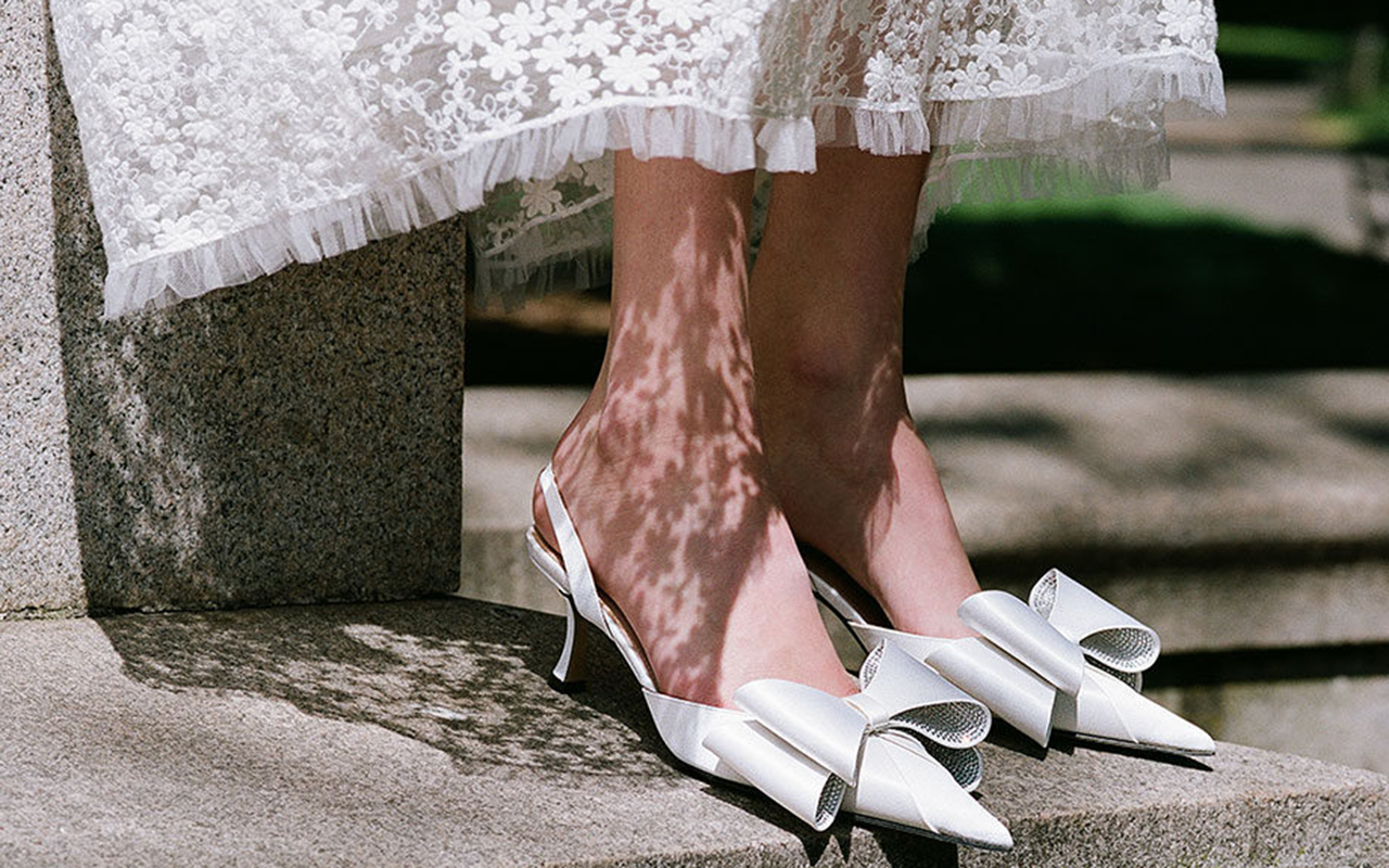
(Español) Nueva temporada nupcial 2025
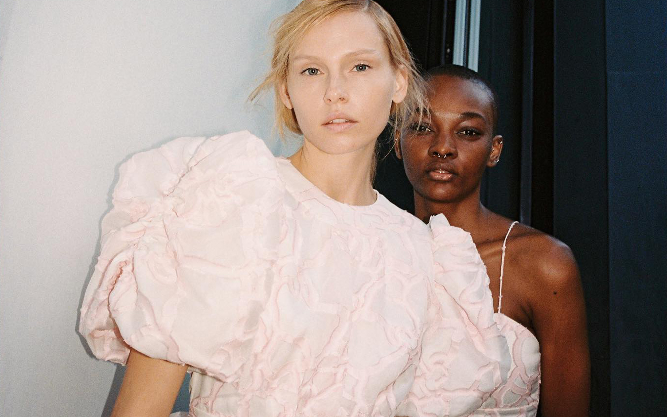
(Español) Gratacós en las colecciones AW24/25 del 080 Barcelona Fashion
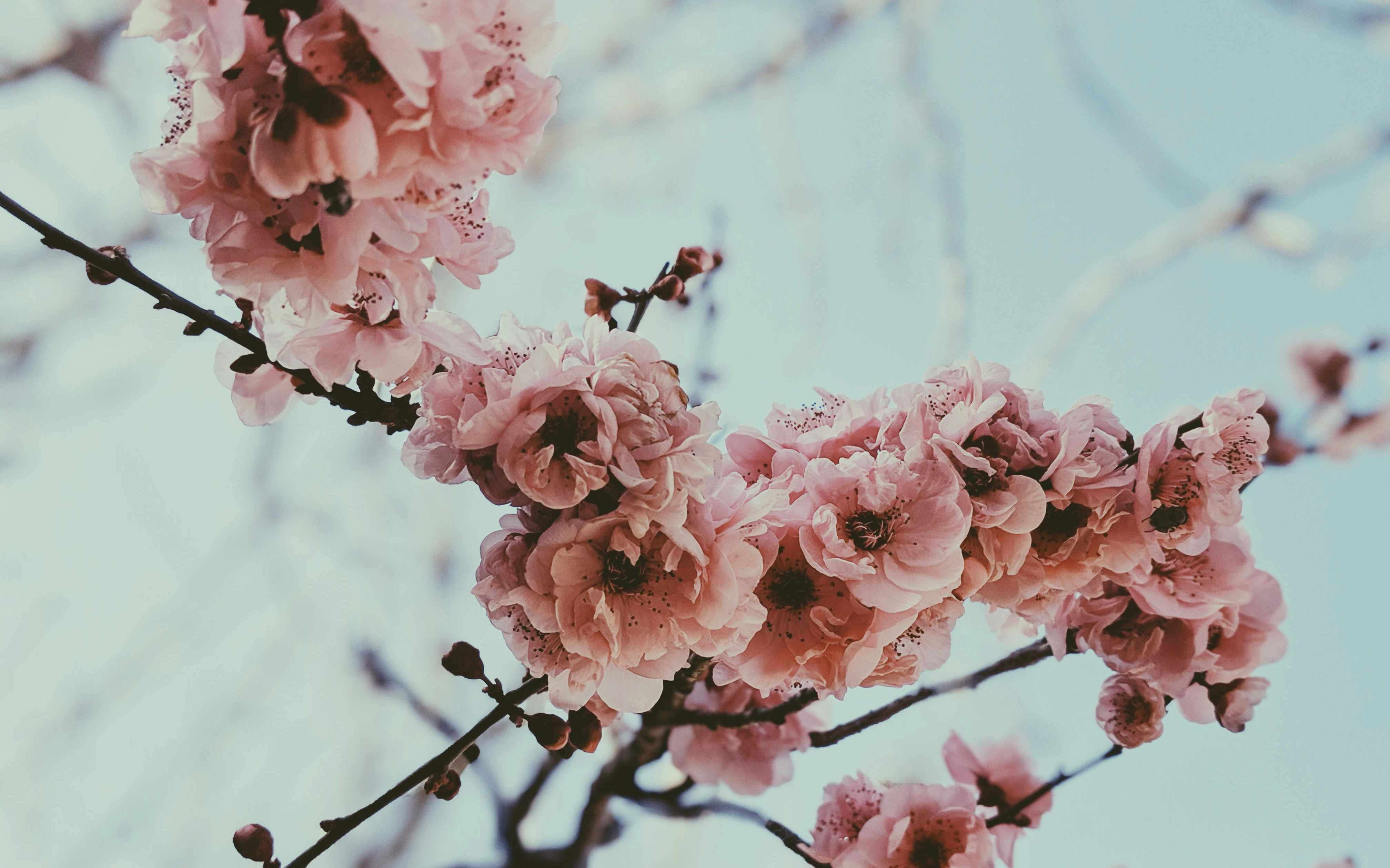
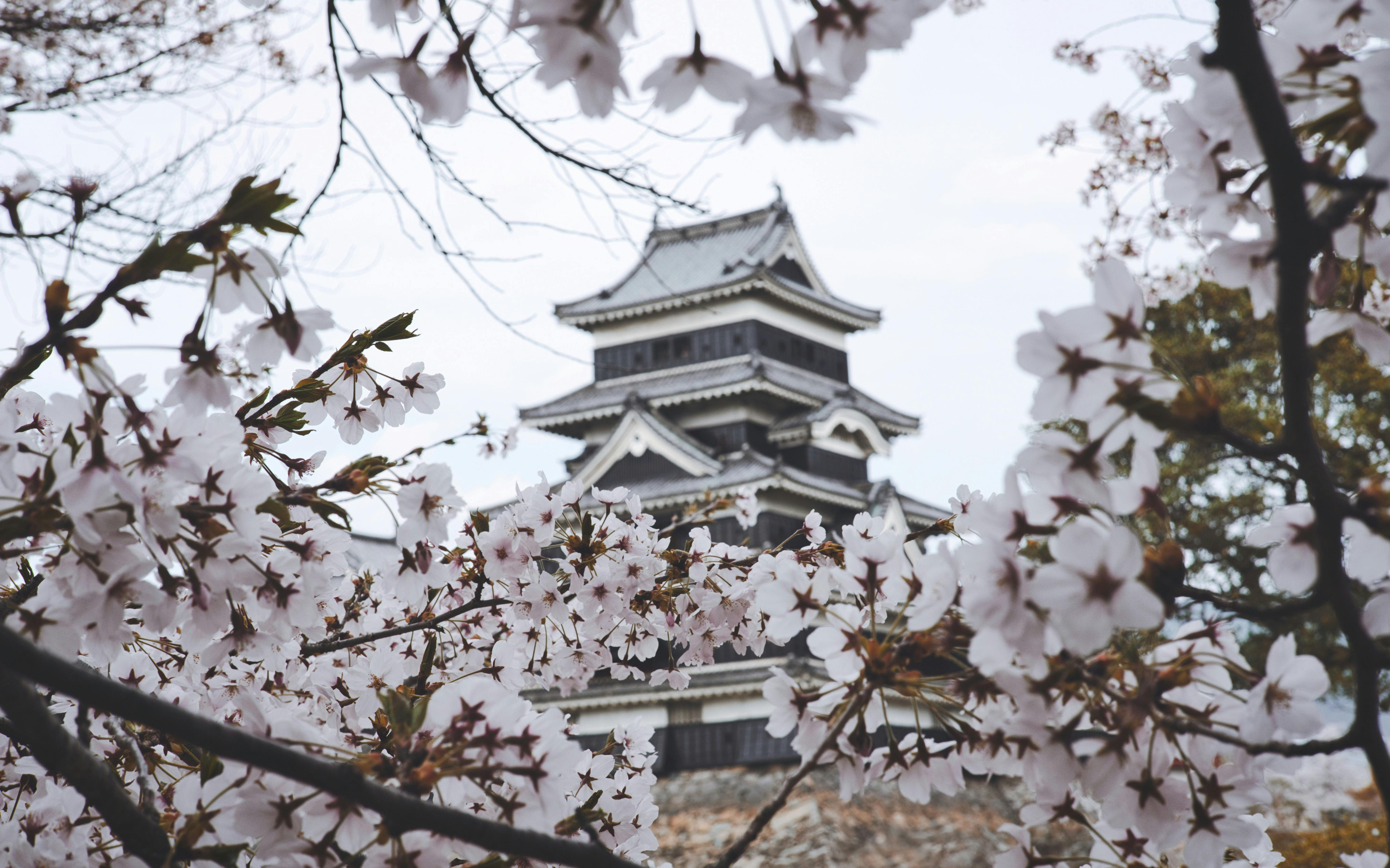
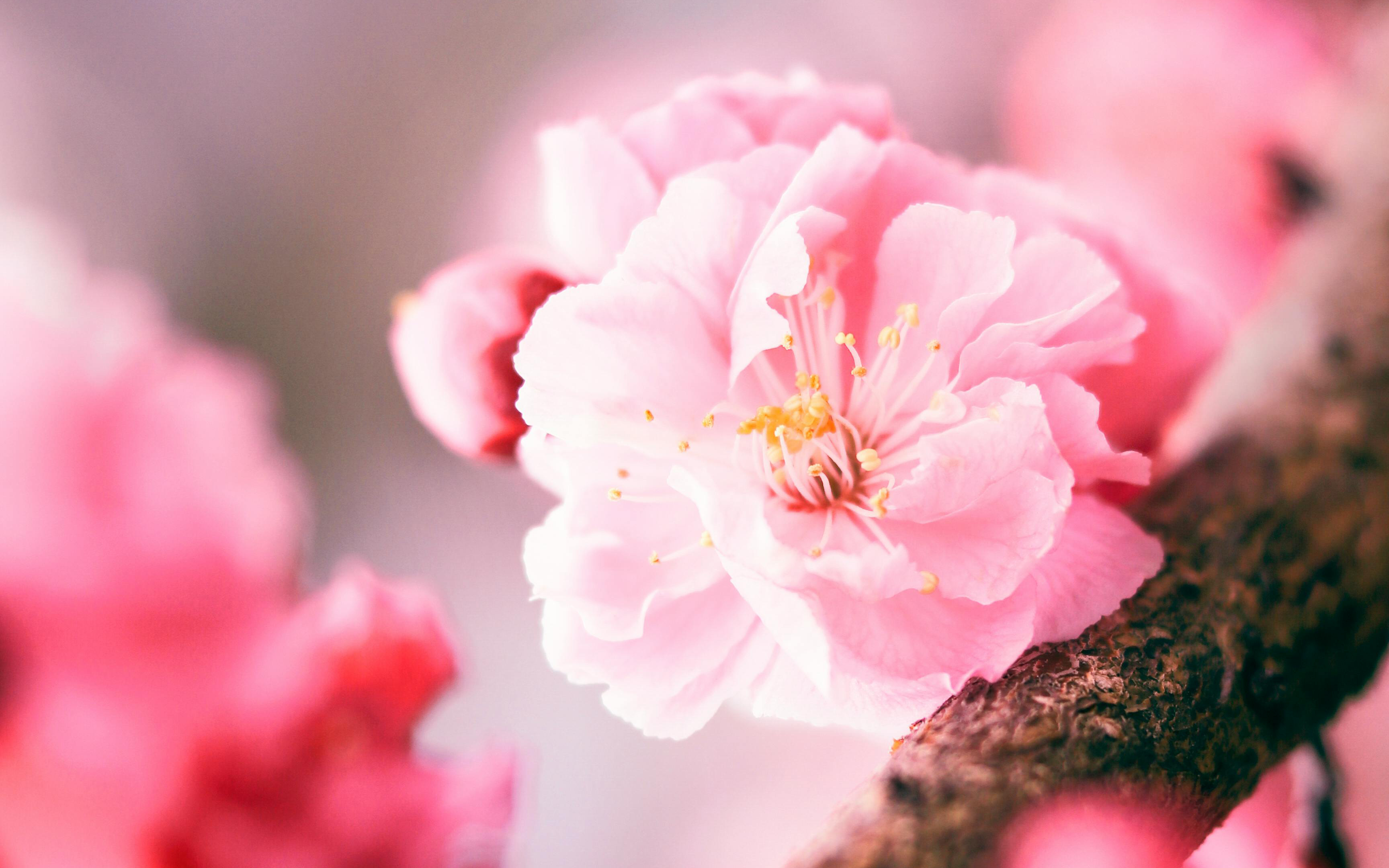
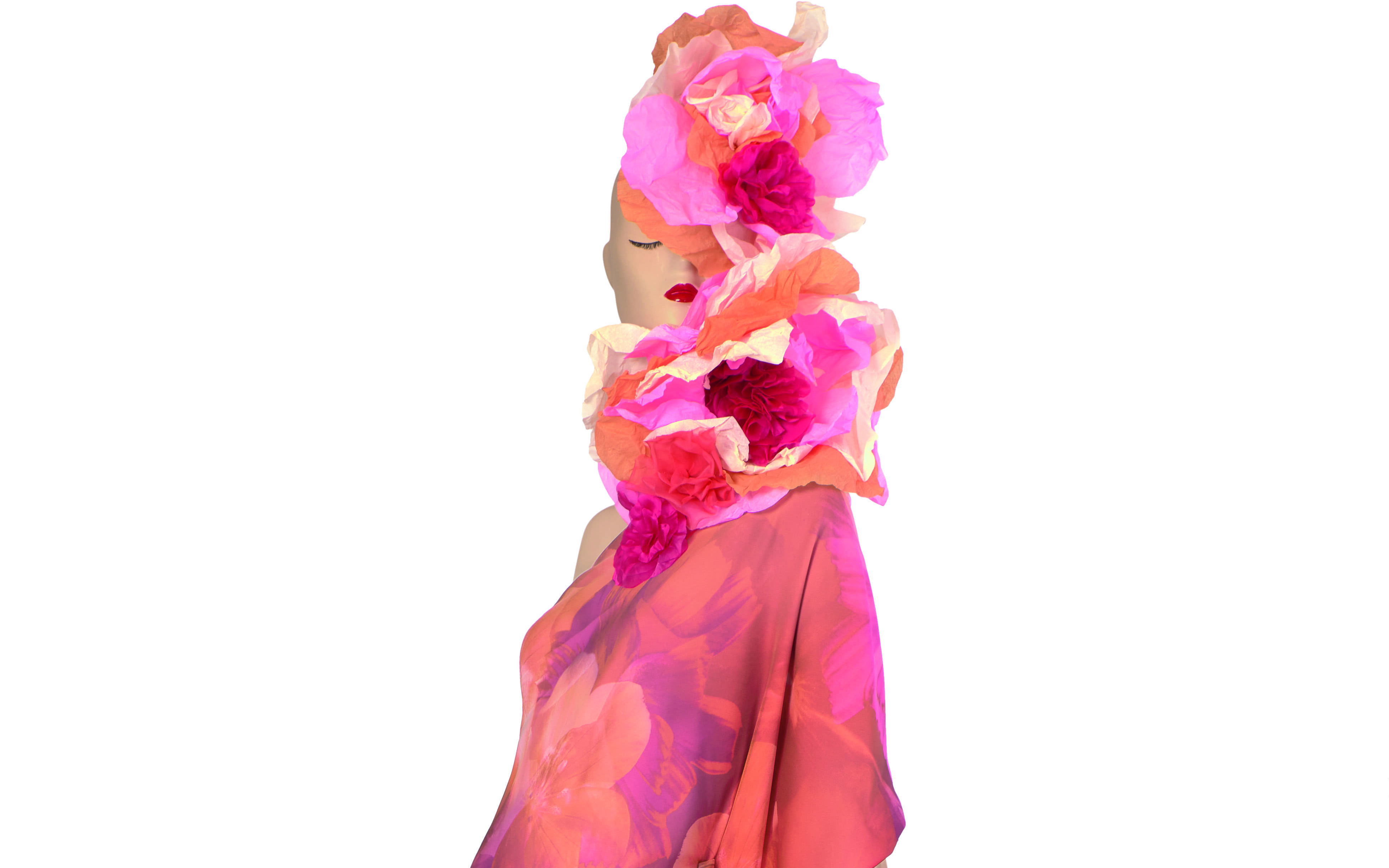
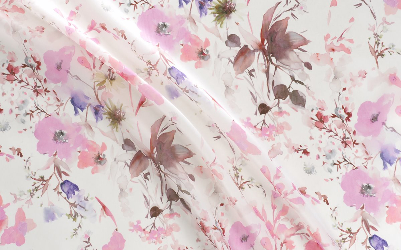
Hanami , the art of observing the beauty of flowers. This is our SS24 collection
The new SS24 collection is already blooming in all its splendor. We brought it to you at the end of February coinciding with the end of the winter sales, but now we provide you with all the details of this exciting proposal that was very well received when it was presented at Première Vision Paris.
Under an inspiring concept, Hanami , the new collection focuses on the Japanese tradition of appreciating the beauty of flowers. This contemplative practice coincides with the beginning of spring and invites us to value the art of flowering. Hanami , which literally means “looking at the flowers”, carries with it a very representative image in Japan: that of the cherry blossom trees, known as sakura, which cover their parks and mountains with a pink mantle every spring for a very limited period that coincides with the beginning of this season.
This particular tradition dates back centuries, when the flowering of cherry trees marked the beginning of Spring and, therefore, signaled the ideal time to plant rice, a crucial food for the Japanese. During this period, cherry trees were considered sacred beings and the souls of the mountain gods were believed to reside in them. According to local beliefs, when the pink sakura flowers were in full bloom, the deities would come down to the villages and turn into rice fields to assist in rice production. Nowadays, with each new flowering season, thousands of Japanese gather under cherry trees, whether in parks, gardens or mountains, and enjoy a picnic surrounded by sakura, while a shower of delicate flowers turns everything pink.
Broadly speaking…
Returning to the proposal, the new Hanami collection maintains this double duality: it invites us to pause and reflect, but it is also a moment to let ourselves be carried away by fantasy and the evocative power of nature, activating all our senses.
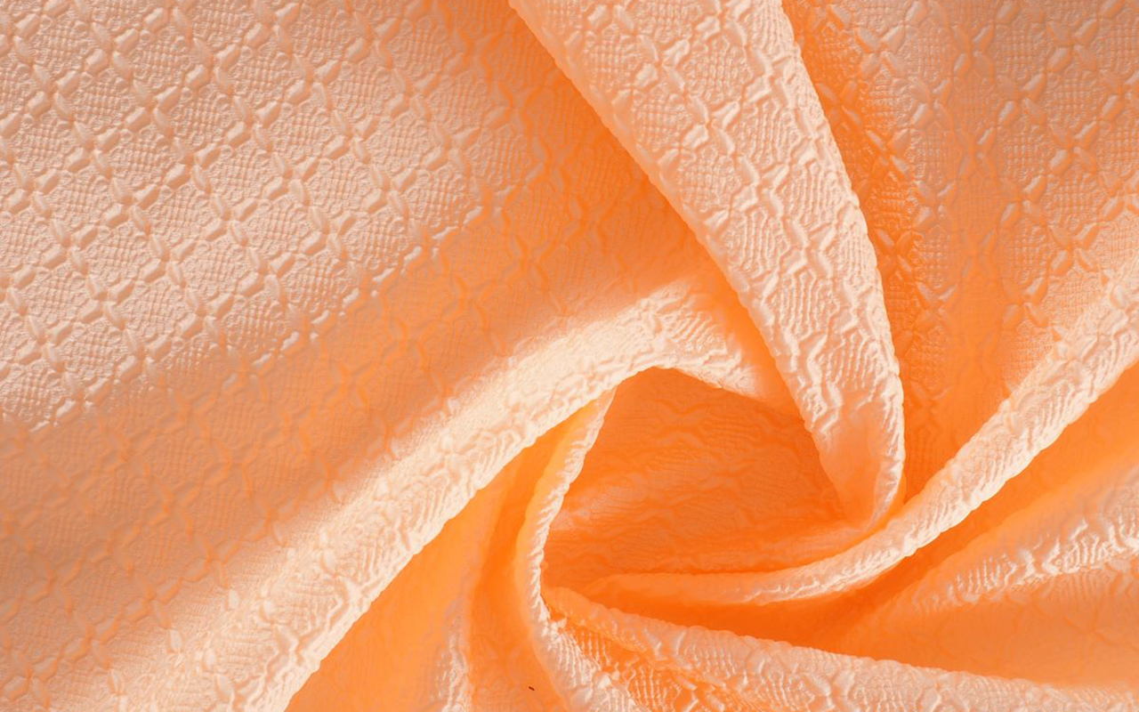
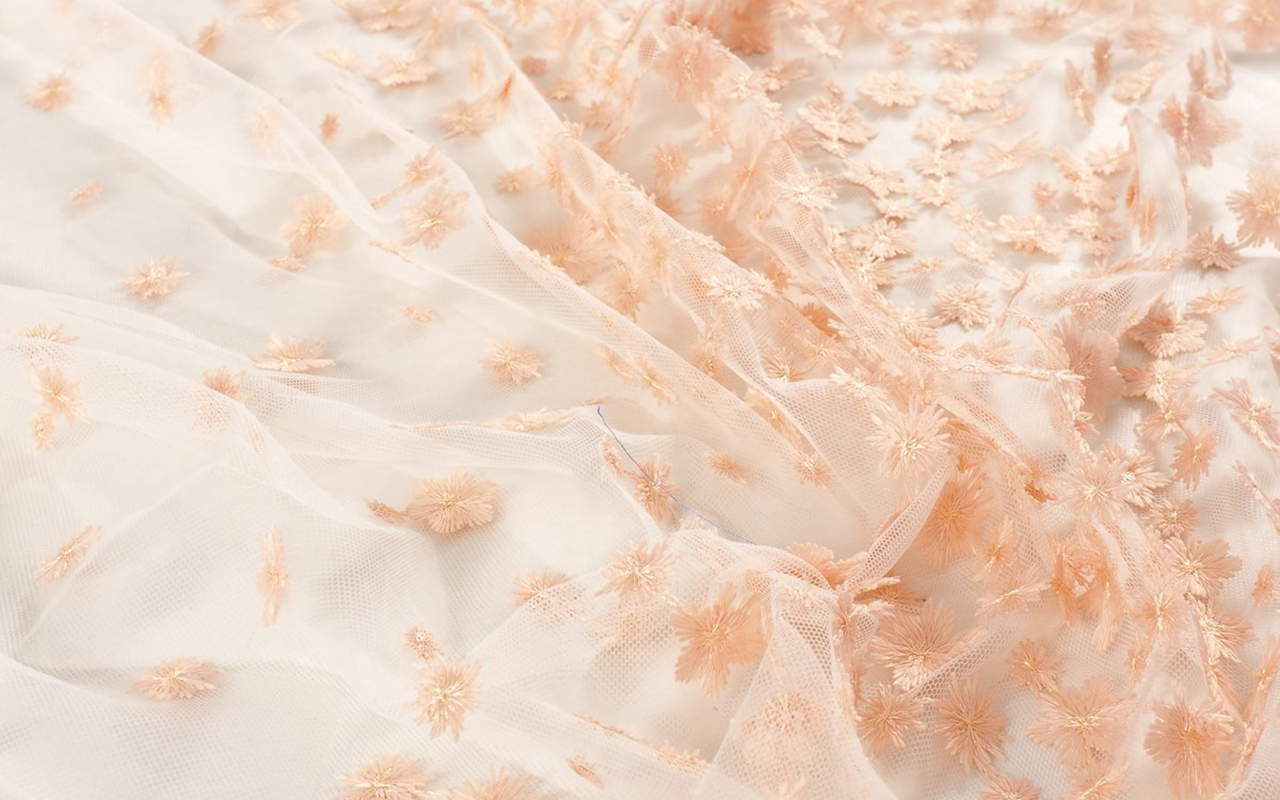
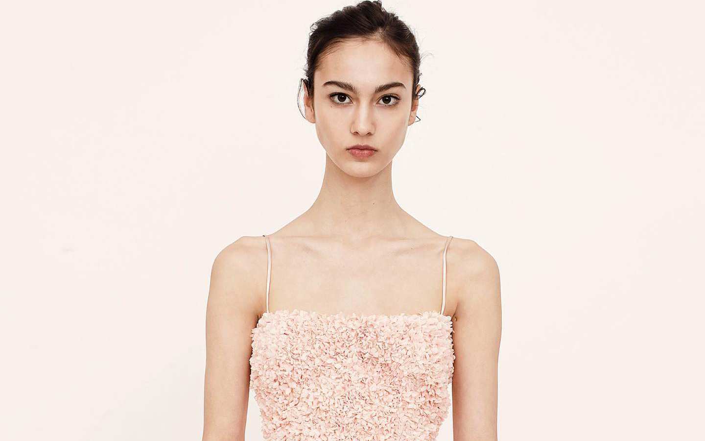
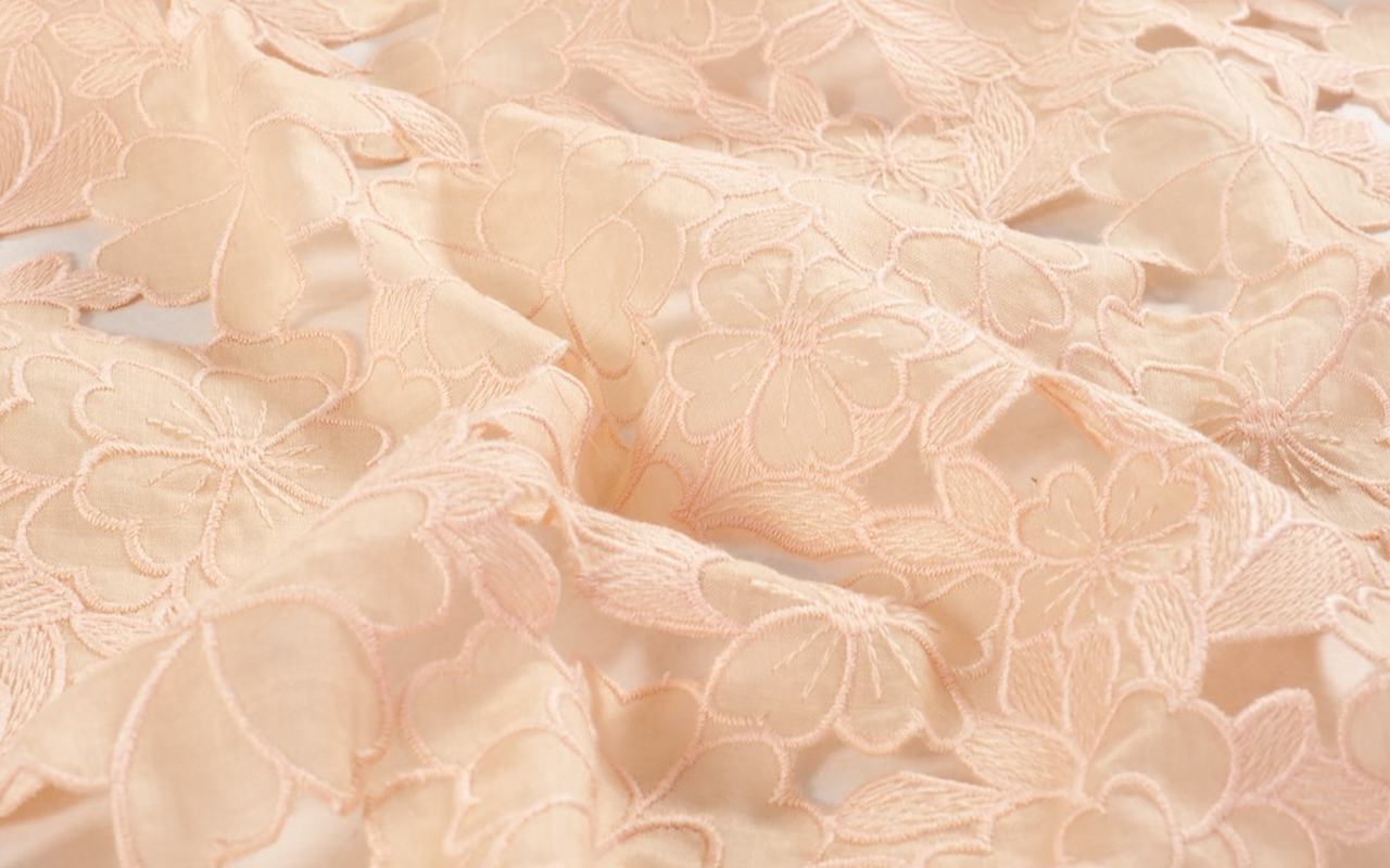
This season, flowers are the clear protagonists of the collection, but we go much further. Plant motifs, organic reliefs, natural volumes and prints inspired by the wild nature of the fields or the multicoloured flora of urban gardens, all taken care of in detail. From the precious work of the botanical architects to the sensitivity of the signature florists, all of this makes up a poetic, stimulating and bold collection that appeals to emotions through creativity. At Gratacós, we do not understand fashion without art and culture, and we make craftsmanship one of our fundamental pillars.
Summer 2024 collection in detail, the colour becomes more vivid and bright, playing with different harmonies that reflect the light and contrasts present in nature. The fabrics are carefully selected in terms of materials, composition and combinations that recreate organic shapes. We once again give a new dimension to quality, because it is a necessary, clear and real value that distinguishes us.
“We don’t understand fashion without art and culture, and we make craftsmanship one of our fundamental pillars.”
Colours
The Gratacós proposal immerses itself in a world of colour, where various harmonies intertwine to create fresh and dynamic combinations. The contrasting colour palette will transform the fabrics, offering a richness of nuances that will energize the final results. The colours selected to star in the new season will give life to poetic, timeless and versatile collections, transmitting feelings through an intriguing interaction of strength, femininity and beauty, captured in the different textiles.
These colours transport you to a magical landscape, evoking a digital Eden where precious tones work with a enticing freshness of cold light. In times of uncertainty, who doesn’t yearn to use the power of highlighter pink, yellow, blue or green in a sheer frou-frou dress to experience a moment of happiness?
Fabrics
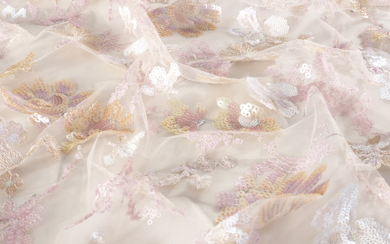
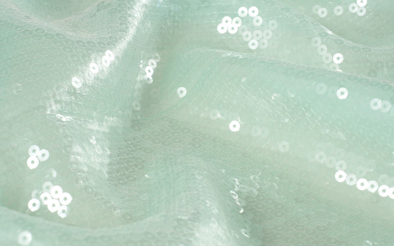
This season, the pleasure of creating and designing will be our impetus to develop new highly crafted fabrics with a sophisticated look. Our fabrics will be characterized by a renewed importance in the quality of the products, seeking a necessary and real authenticity. We have opted for soft lines, using light and transparent fabrics adorned with sequins to evoke the shine and clarity of water. This sense of summer vibrancy is reflected in graphic bursts of colour that extend throughout the collection.
Transparency will play an important role, conveying a fragility that is only apparent. For this reason, we have created light fabrics in various versions and transparencies, with sophisticated effects for a line of products with sweetened fantasies.
Aspects
This season’s fabrics magnificently explore texture, with volumes that are delicate in appearance, but solid in their construction. The creative department has worked to give the items a three-dimensional dimension, taking advantage of the twists of the yarns and the fantasies of the threads with a more organic appearance. The importance of the reliefs and embossed finishes stands out, with ultralight padding ideal for summer.
Jacquard takes on a leading role this season, presenting repetitive geometries and designs with sequential rhythms without interruption. We often overlook the technical complexity of small motifs, which is why it is crucial to revalue them. In addition, we have worked to create laminates with beautiful and sophisticated reflections, amplified by light to obtain a striking and elegant shine. In both jacquards and embroidery, the result will be dazzling, with shiny surfaces thanks to lame, iridescent threads and sequins.
The embroidery technique, as a universal method of beautification, is back in fashion. They bloom into unexpected and beautiful creations, with free settings and vibrant, fresh colours.
Designs
Overall, geometry will continue to be a prominent theme this season, especially as we explore flat and smooth handcrafted geometries, infused with special touches to create essential ingredients for this upcoming summer. The graphics in general will be soft, fresh and exquisite, with careful work on the designs.
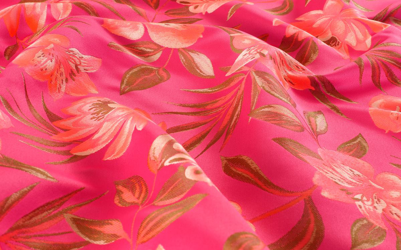
Florals will play an important role, like a sweet perfume that permeates the entire collection, through the abundant and varied use of floral prints. Botanical motifs centered on leaves, vegetal ornaments and ambiguous jungles will also be highlighted.
Finally, in this new season, it is essential to mention the influence of art in the designs of the collection, as well as the influences of the metaverse, which present natures that hybridize between the real and the digital.
From Gratacós we invite you to discover Hanami , our particular Eden.
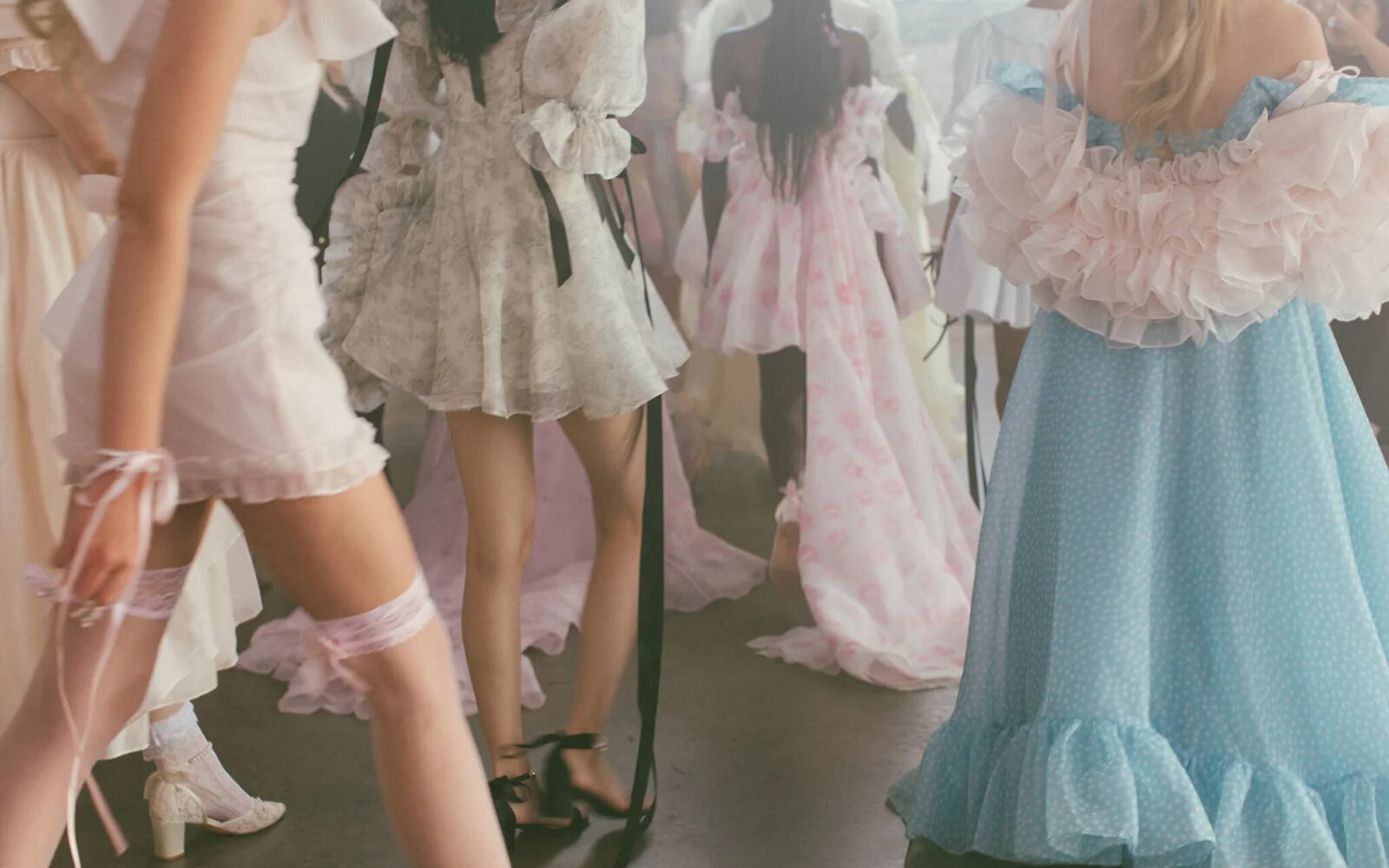
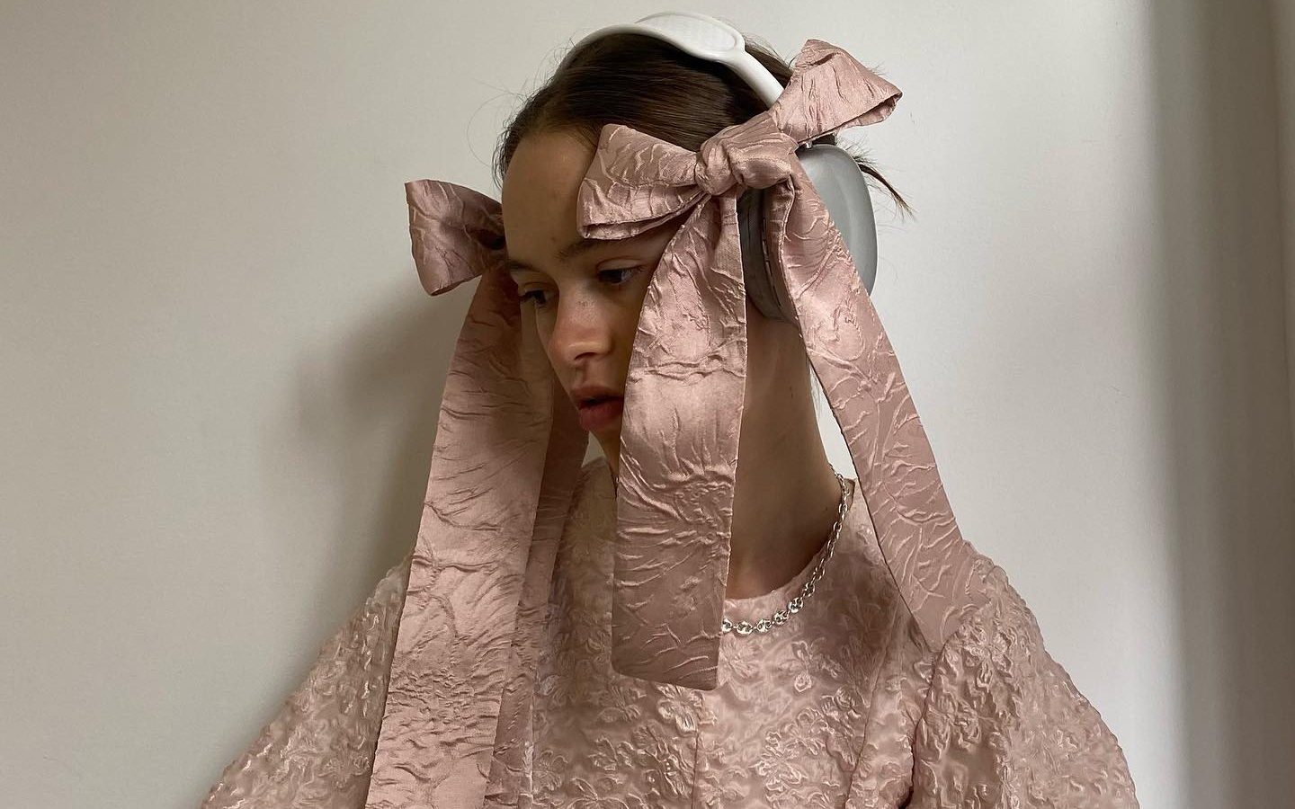
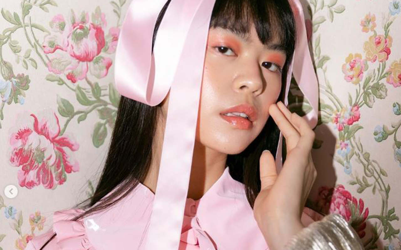
The coquette aesthetic also dominates this spring
Bows, ruffles, pastel tones and baby doll dresses merge to elevate a hyperfeminine style with a baroque soul that seeks artificiality. Maximalism is displayed in all its splendor. We are referring to the coquette aesthetic , whose reign seems to have no end in sight, at least in this spring-summer season that we have just begun. Although this trend is not really new, in recent months it has reached a notable level of virality on social networks, specifically on TikTok in early 2024. With the hashtag #coquette, this instant video platform, which especially captivates the Generation Z, accumulated more than 18 billion views. This figure far exceeds its main competitor, Instagram, which registered nearly 1.5 million related publications.
This phenomenon shows how an aesthetic that seemed relegated to oblivion, with the exception of certain Japanese urban tribes, resurfaces strongly and is once again at the centre of attention of current fashion. We already know that the new generation of young people is fascinated by the nostalgic element, in a phenomenon that experts have described as an aesthetic revisionism of past trends.
Coquette style identified ?
Among all the descriptions offered to define this style that perfectly fuses femininity, innocence, sweetness and softness, the one provided by stylist Marisa Ledford in People magazine stands out, who describes it as “a hyperfeminine style that refers to the Victorian era. of the Regency, where doll dresses, ruffles, bows and pastel colours are the distinctive elements.”
This hyperfeminine trend experienced a rebound in 2010, coinciding with two cultural phenomena that generated great interest for months and that, in turn, fueled the fashion industry: the premiere of the film ‘ Marie Antoinette ‘ by Sofia Coppola and the rise of Lana del Rey as one of her main style icons. In fact, the singer and songwriter was on everyone’s lips again recently thanks to the campaign she starred in for the brand Skims to celebrate Valentine’s Day. This campaign included all the references that identify the flirty trend: abundant bows, transparencies, cats and delicate fabrics such as satin and lace.
Recently, another cinematographic phenomenon has given new impetus to the hyperfeminine and, incidentally, hyperbolic style: the Oscar-winning science fiction film, ‘ Poor Things ‘ , which has won, among other distinctions, the award for best costumes. This film characterizes its main character, Bella Baxter, as a Victorian woman with a wardrobe that revolutionizes the classic by maintaining a contemporary look that is reflected in each of the eccentric and stimulating looks in terms of shape, volume, relief and colour. Creations such as dresses with ruffles and puffed sleeves, Victorian bloomers, long silk robes or lavish nightgowns leave the viewer speechless and are reminiscent of the style in question: flirty is captivating.
On the other hand, the fact that this trend is still more alive than ever is also corroborated by fashion brands that make the flirty style their usual hallmark. For example, in its spring-summer 2024 collection, Rodarte was inspired by a flower garden and the silhouettes of the 1930s. Likewise, Simone Rocha presented for the same season voluminous bows, lace, tulle and flowers such as main elements of its collection, both in its feminine and masculine proposal. It is not necessary to review the trends of big brands, since small designers also opt for this style that enhances girlish femininity. For example, the creations of Quique Vidal through Becomely , his fashion alter ego, or the fantasies of Anel Yaos . In the collection presented last year on the 080 Barcelona Fashion catwalk, there were clear allusions to this aesthetic in a proposal that explored the most personal feelings through chiffon, transparencies and pastel tones.
Historical origin of the coquette aesthetic
The word ” coquette ” comes from French and means flirty. As a style, it takes elements from 18th century clothing, with a strong inspiration in the late Rococo of Queen Marie Antoinette, from which it incorporates decorative elements of clothing such as bows and lace. Likewise, it is based on the “infamous” chemise à la reine dress , a garment generally made of cotton and used as underwear, but which Marie Antoinette transformed into semi-transparent muslin, with ruffles on the chest and sleeves, with which The queen decided to spend her days in the countryside.
Perhaps the most iconic element of the style coquette, or at least the easiest to distinguish, is the bow or bow, which is used in both hair and clothing. This use dates back to the fashion of the romantic period, at the end of the 18th century and the beginning of the 19th century, when after the revolutions and the rise of the Republics, femininity became relevant again. This was reflected in the clothing and the decorations in them as an element associated with social class, since for the most part there were no longer monarchies.
A trend rooted in the street
Although these origins date back several centuries, their arrival in current fashion is framed in the revisionism of Generation Z, which now resorts to various aesthetics from the 90s and 2000s. Another factor that contributes to the triumph of this style It is how he has conquered urban looks. Thus, far from being saturated, they are the influencers themselves and fashion prescribers who star in street images style most talked about and, they certainly don’t seem to be tired of this trend. During the last fashion show season, it was not difficult to find references to this trend: bows adorning all types of garments, whether more or less extravagant, more or less romantic, present in the hair and even attached to the face, as well as allusions to the universe childish, such as the usual combination of shoes with openwork socks and bows, and the pastel colour palette. Without forgetting the red carpets where Hollywood stars parade. In fact, the flirty style has also starred in some looks at the 2024 Oscars celebration . This is attested to by the stylists who dressed actresses like Ariana Grande, who dazzled on the red carpet with a puffy pink number with a strapless neckline and train by Giambattista Valli Couture. Also Chloë Sevigny and Sofia Vergara, who wore flirty bows at the Oscars after- parties.
At Gratacós, we also wanted to pay our own tribute to the coquette style with a selection of our new season fabrics, so that you can be inspired and create your own designs within this very feminine, fanciful and girlish aesthetic.
5 fabrics that are a good investment (now and always)
A stunning sequined dress by Acuamona.
Although we appreciate all fabrics equally due to their uniqueness, we recognize that there are certain items that best stand the test of time and become a smart investment for any time of year. Taking advantage of the last weeks of discounts on our winter collection, Gratacós presents you five items that do not lose their relevance, despite the ephemeral trends. In addition, now you can find them at more attractive prices in our outlet section
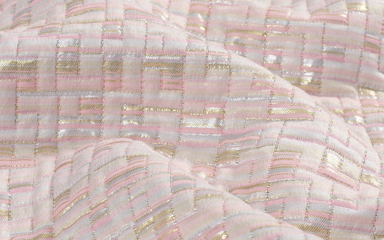
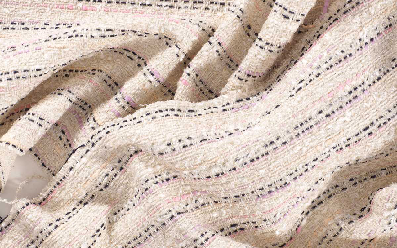
Tweed
This fabric stands out for its extraordinary richness in every imaginable aspect: it has a historical legacy that dates back to the Scottish Highlands; It is a wild card in constant evolution; It is easily recognizable at first glance and is inspired by classic elegance, while exhibiting a chameleon-like character that allows it to adapt to more contemporary versions. What more could you want?
It is a fabric wool fabric with an irregular appearance, a rough feel, openwork and elastic texture, with well-defined patterns such as houndstooth , windowpane and herringbone . This item is easy to sew and iron, offering a versatility that can transcend the limits of gender, or rather so, does not have limits.
Of modest origin, tweed comes from Scotland and was a common fabric in the warm clothing of the popular classes, used in the countryside to face adverse weather conditions. In the 19th century, the English aristocracy found in this fabric their best ally for carrying out country activities and outdoor sports. The person who knew how to give tweed an aura of glamour was, without a doubt, Coco Chanel, who in the late 1920s incorporated it into the women’s wardrobe in garments that have become symbols, such as her short jackets or pencil skirts. This fabric provided the woman of the time with extra comfort without losing an ounce of elegance.
Discover all our seasonal tweeds.
Mikado
The mikado is a textile jewel that is distinguished by its exclusivity and sophistication, enclosing with it an ancient history. Originally from Japan, this fabric has managed to captivate designers thanks to its uniqueness and its ability to transform seemingly simple garments into authentic works of haute couture.
We start with his name. It means ’emperor’ in Japanese, a title that reflects its royal splendor. Mikado is produced through a special manufacturing and finishing process, giving it a luxurious appearance and a firm structure. Initially intended for making imperial kimonos and other ceremonial garments, the mikado symbolizes nobility and elegance. Given this rich symbolic load, it is not surprising that it is currently one of the most used and demanded fabrics in the bridal field.
Mikado is distinguished by its heavy structure and slightly shiny surface, giving it an opulent look and distinctive feel. Often composed of silk, this fabric stands out for its softness and the ability to create elegant folds. Additionally, its ability to maintain its shape makes it the ideal fabric for making couture dresses that require volume and structure.
Find our mikado proposals. From smooth designs to floral or geometric-inspired motifs.
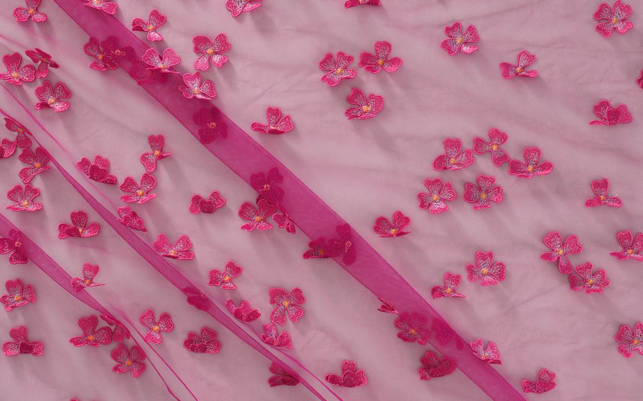
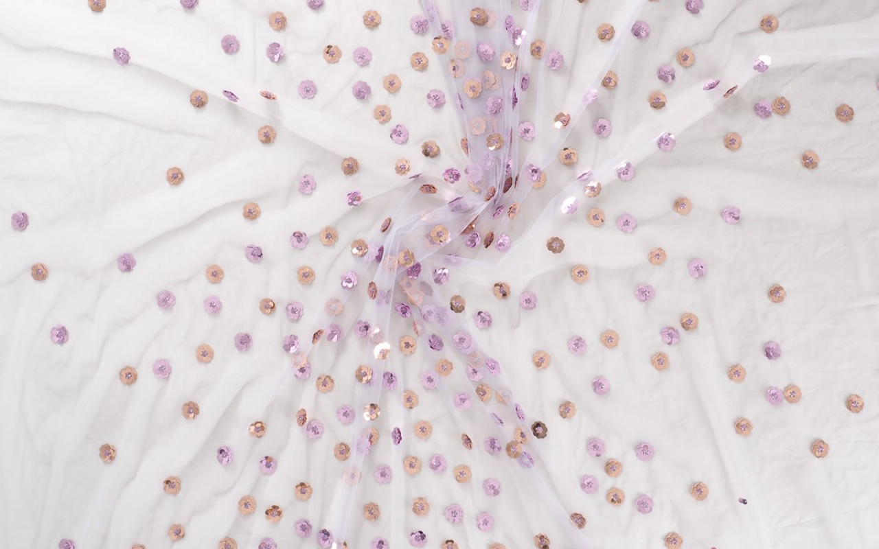
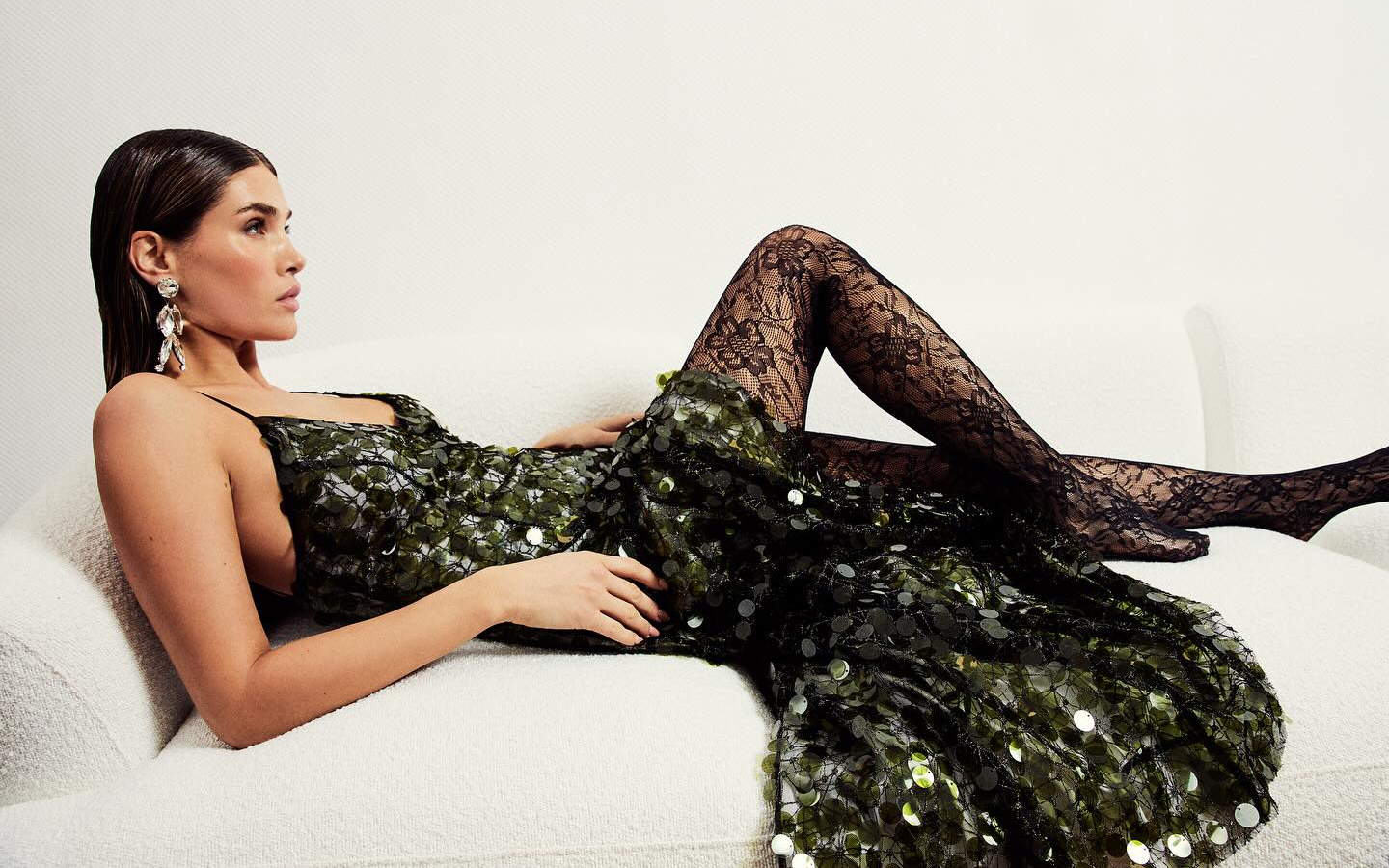
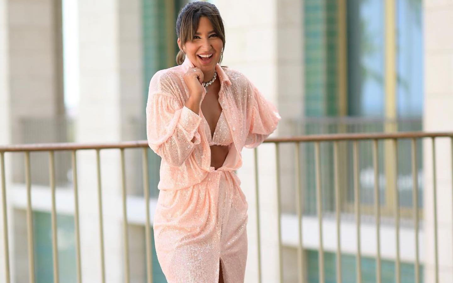
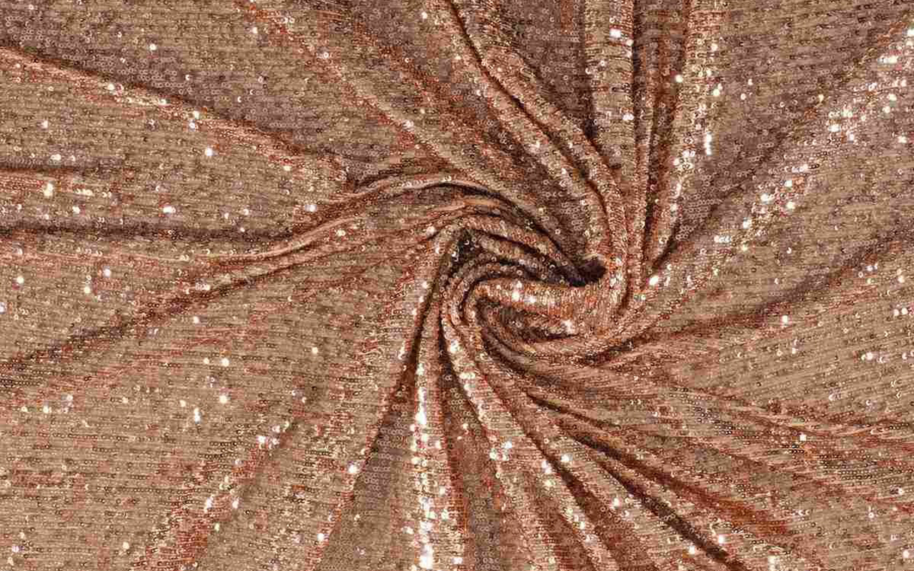
Sequins
This fabric does not need presentations. Sequins are the true protagonists of women’s wardrobe, displaying their brilliance throughout decades. Whether day or night, on any occasion, sequins add luminosity and are linked to luxury and glamour.
Its historical legacy dates back to ancient times, when these tiny shiny pieces were used in clothing in Ancient Egypt, adding sparkles to the clothing of that era. However, their revival occurred in the 1920s, during the Jazz Age and the swinging twenties, becoming symbols of opulence and sophistication. Its heyday came in the 1930s, when Hollywood stars began wearing dresses decorated with this fabric on red carpets. Since then, sequins have been synonymous with glamour and a certain extravagance. World-renowned designers, from Coco Chanel to Versace, have incorporated this shiny fabric into their creations, cementing its status as a timeless element in luxury fashion.
What defines sequins is their ability to transform any garment into a masterpiece of shiny elegance. These small pieces, usually made of metal, plastic or reflective material, are sewn into patterns to create a dazzling visual effect. Its shine, often associated with the light of gala evenings, has been an essential component in evening fashion and haute couture.
Today, sequins have transcended festive occasions, conquering urban fashion with contemporary proposals that adapt to any style.
Find the sequins that suit your style.
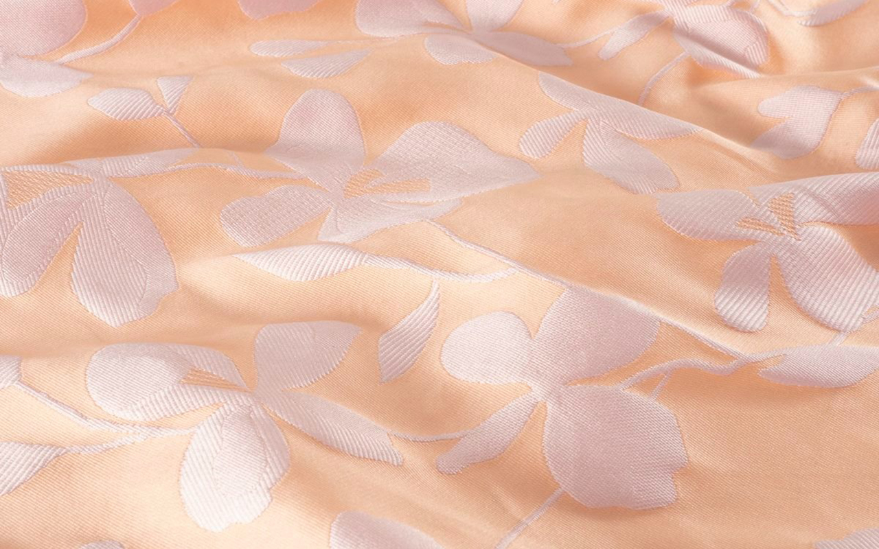
Floral jacquard
Floral Jacquard is a textile masterpiece that fuses technical skill with elements inspired by nature. Originating from France, this fabric is distinguished by its elaborate relief pattern. The key lies in its technique, named after Joseph Marie Jacquard, which has left a distinctive mark on the history of fabric making, becoming a symbol of luxury and sophistication.
In the 19th century, its inventor introduced an innovative weaving machine that revolutionized the textile industry by allowing the creation of intricate and detailed patterns. This pioneering technology took fabric manufacturing to new levels, enabling the precise reproduction of ornamental motifs and complex designs.
What makes Jacquard weaving unique is its ability to generate raised patterns with a variety of colours and textures. This process is achieved by carefully combining threads of different colours and types, creating a three-dimensional work of art in each thread. The resulting texture is rich and luxurious, providing a unique visual depth to the fabric. Jacquard has also earned its place in the fashion world thanks to its versatility in design. From haute couture suits to more casual garments, Jacquard has spread into a wide range of garments that incorporate everything from geometric patterns to the most exquisite floral motifs.
Add a touch of romanticism and femininity to your creations with these floral Jacquards.
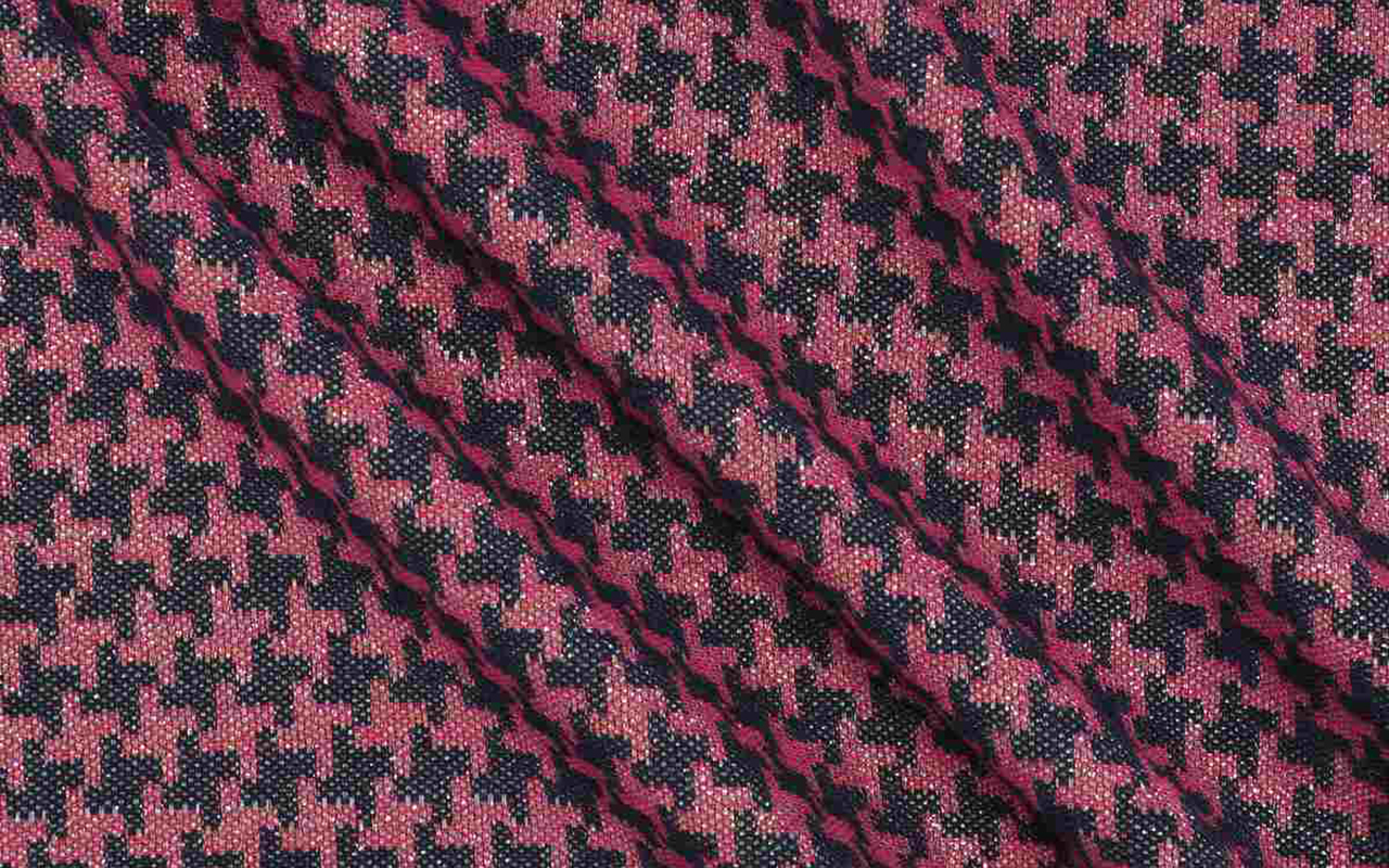
Houndstooth
The houndstooth fabric is one of those timeless classics that resists ephemeral trends to become a symbol of elegance and style. Its history dates back to the 19th century in Scotland, where local weavers created it with care. Initially known as houndstooth , the pattern is distinguished by abstractly shaped blocks that evoke the footprints of a rooster. Over time, this pattern transcended Scottish borders, becoming an iconic element in global fashion.
What gives houndstooth pattern items their distinctive appeal is their ability to combine simplicity and sophistication. Typically composed of repeating black and white blocks, the pattern creates a bold and balanced visual effect. The versatility of this fabric is manifested in a wide range of garments, from suits and coats to skirts and accessories, adapting to both formal environments and casual outfits. From the catwalks to the streets, houndstooth continues to be a stylish choice that evokes an air of classic sophistication.
At Gratacós we recommend this houndstooth fabric.
Peach Fuzz, the colour of 2024 according to Pantone
 Pantone has established a tradition that colour enthusiasts eagerly await as a prelude to the Christmas holidays. It is about the choice of the shade that will set the direction of trends in 2024 and that will influence art, design, fashion, decoration or advertising, among other creative disciplines directed by professionals who draw on the latest developments on the market, also chromatic.
A sincere, tender and empathetic colour
Following its vocation of naming colours with subtly sensual names, Pantone has chosen the winner for next year. The colour in question is called Peach Fuzz 13-1023 and it is a peach shade that evokes sincerity and tenderness, and conveys, according to the world authority on colourimetry, a desire to take care of ourselves and others. A soft and velvety shade whose enveloping spirit enriches the mind, body and soul. This is how Laurie Pressman, vice president of the Pantone Colour Institute, explains it in a statement about the colour that will take over everything in 2024. “We were looking for a hue that expresses our innate desire for closeness and connection, so we chose this radiant colour that exudes warmth and modern elegance. It is a colour that exudes empathy, wraps us in a hug that we can almost feel and naturally combines the youthful with the imperishable.” This warm and comforting tone stimulates the desire to unite with others or have moments of stillness, and the feeling of protection that this generates.
The tone of calm and inner peace
According to Pantone, Peach Fuzz 13-1023 is an alluring peachy hue, carefully balanced between pink and orange, that inspires belonging, relaxation and the opportunity to care, evokes calm and offers a space in which to live, feel, heal and prosper. Therefore, the colour of 2024 is comforting and encourages inner peace and well-being. Peach Fuzz 13-1023 has both an idea and a sensation and stimulates all the senses, as it makes one perceive its tactility and envelops people in its warmth.
A modern tone that takes refuge in nostalgia
Peach Fuzz 13-1023 is a sweet and light colour that evokes a new modernity. It focuses on the human experience of enriching and caring for the mind, body and soul, but it is also a subtly sophisticated, modern and deep peach tone, with a soft but effective luminosity that fills the digital world with beauty. A poetic, romantic peachy shade that conveys cleanliness and a vintage feel, Peach Fuzz 13-1023 reflects the past, but reimagined for modern settings. This last characteristic makes it especially interesting for the world of design and decoration.
The meaning of colour in an unstable context
Peach Fuzz 13-1023 is the colour that replaces Viva Magenta, which was chosen as the colour of 2023. The reasons given were: “A tone rooted in nature that vibrates with energy and vigor. “That descends from the red family and expresses a new sign of strength.” So, now we move from strength to warmth.
“When our lives are affected by instability, our need to care and to have empathy and compassion grows even more, as well as to imagine a future that brings more peace,” Laurie Pressman explains this meaning of the colour that we will see in the coming months throughout Instagram and Pinterest boards, aswell as, probably in the next trends in both fashion and decoration. “In a world where productivity and external achievements are often emphasized, it is crucial to recognize the importance of taking care of our inner self and seeking moments of calm, creativity and connection with other people in the midst of the hustle and bustle of modern life,” adds the vice president of the Pantone Colour Institute. Give value to the bonds, affection and home: “The colour we selected had to express our desire to be close to our loved ones and the happiness we feel when we connect with our own being and enjoy a moment of quiet alone. It had to be a colour that conveyed an enveloping warmth and a message of compassion and empathy,” argues Laurie Pressman.
25 years setting trends in colour
In 2024 it will be 25 years since the Pantone Colour Institute began putting colour on the sensory and creative map for the following year. It was in 1999 when the Pantone Colour of The Year educational program engaged the design community around the world in a conversation about colour. “We wanted to emphasize the relationship between culture and colour to make our audience aware of how what is happening in our global culture is expressed and reflected through colour language,” explains Pressman again. In this first session, a clear winner emerged: cerulean blue (Pantone 15-4020), a shade that returned to the stage thanks to the film ‘The Devil Wears Prada’ and Meryl Streep’s famous speech on how the fashion industry works. “Over the years, the Pantone Colour of the Year program has become a cultural touchstone around the world and has stimulated the imagination of many designers, brands and consumers,” explains Pressman.
To decide on each year’s selection, the Pantone Colour Institute team travels the world in search of new colour influences. They can be found in the entertainment industry (film, television series and even music), works of art and new artists. Of course, in fashion and design, but also in more aspirational places or concepts, such as travel destinations that are starting to become a trend, lifestyles, new technologies and materials, textures or effects (yes, like Instagram filters). that generate interest or capture attention in some way.
What began as a catalogue with 500 colours that served as a guide for graphic arts has grown in such a way that its influence on upcoming trends is comparable to what the biggest celebrity of the moment looks like on the cover of Vogue magazine. The Pantone guide already has more than 2,000 references that are updated every 18 months, with new, more precise shades being added to the list.
Another way to express the evolution as a society
Colour plays a fundamental role in people’s experience. It has a close relationship with emotions and the expression of feelings and its nuances can also be seen in how the story evolves year after year with its cycles of rise and fall. The impact of colour is also noticeable in the world of fashion, in the colours of cosmetics, in household items, in automotive and industrial design, and in products, packaging, multimedia design and retail interiors. “We are very pleased to have encouraged designers and colour enthusiasts around the world to tell their stories through colour language and show their creativity in their communities. We hope to continue doing this for many more years ,” concludes Pressman.
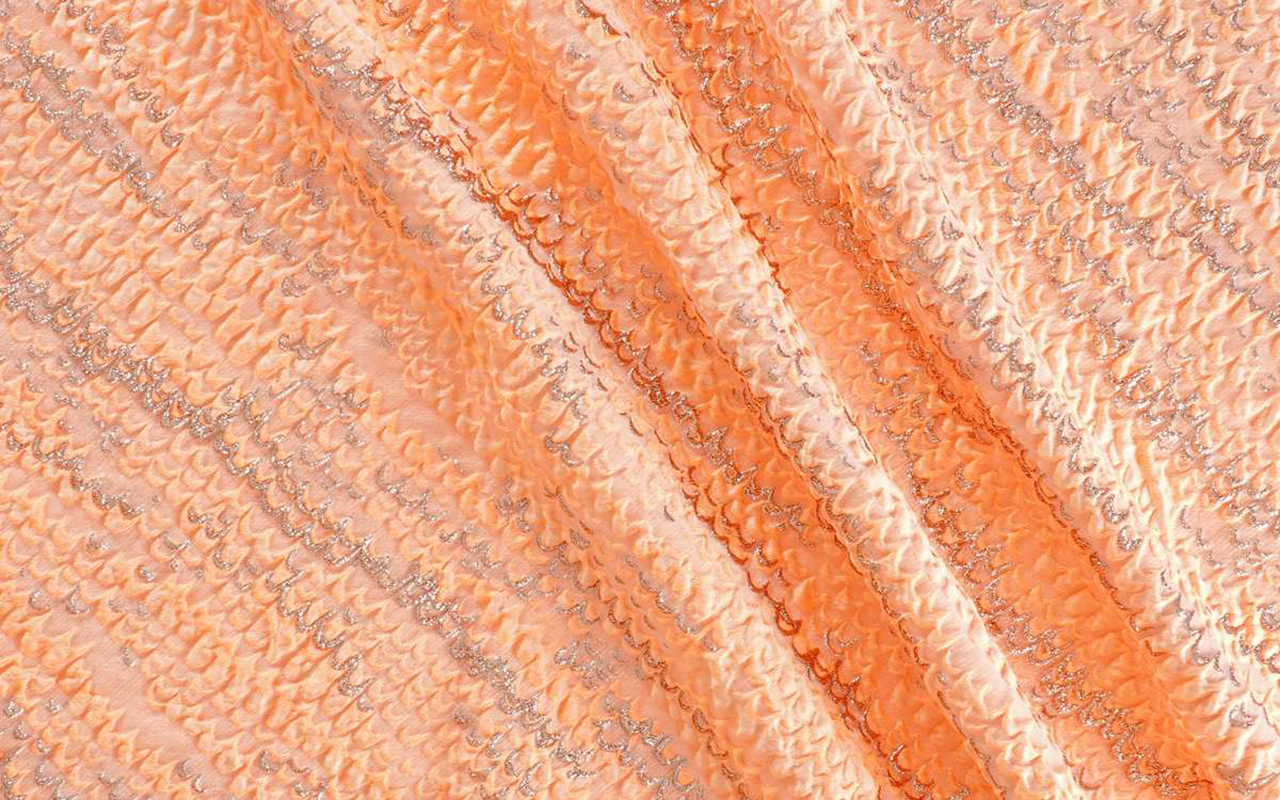
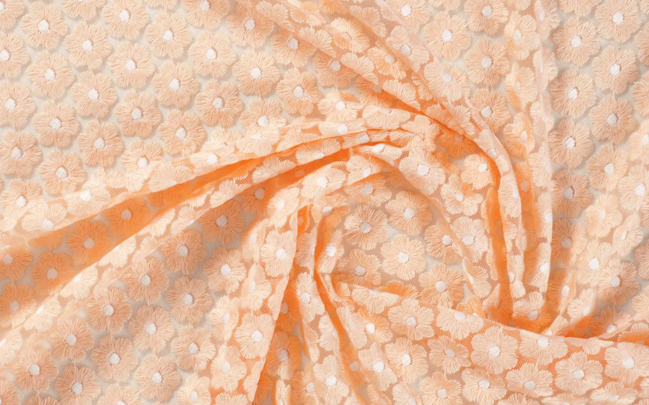
At Gratacós we also wanted to pay our particular tribute to Peach Fuzz 13-1023 with a selection of collection fabrics in peach tones so that you can think about a possible design for this 2024. You will find them here : Give free rein to your imagination!
Un color sincero, tierno y empático
Siguiendo su vocación de bautizar los colores con nombre sutilmente sensuales, Pantone ha elegido el ganador para el año que viene. El color en cuestión se llama Peach Fuzz 13-1023 y es una tonalidad melocotón que evoca sinceridad y ternura, y transmite, según la autoridad mundial en cuestiones de colorimetría, un deseo de cuidar de nosotros y de los demás. Una tonalidad suave y aterciopelada cuyo espíritu envolvente enriquece la mente, el cuerpo y el alma. Así lo explica Laurie Pressman, vicepresidenta del Pantone Color Institute, en un comunicado sobre el color que lo teñirá todo en 2024. “Buscábamos una tonalidad que expresara nuestro deseo innato de cercanía y conexión, así que escogimos este radiante color que rebosa calidez y elegancia moderna. Es un color que despide empatía, nos arropa en un abrazo que casi podemos sentir y aúna con toda naturalidad lo juvenil con lo imperecedero”. Este tono cálido y reconfortante estimula el deseo de unión con los demás o de tener momentos de quietud, y la sensación de protección que esto genera.
El tono de la calma y de la paz interior
Según Pantone, Peach Fuzz 13-1023 es una atractiva tonalidad amelocotonada, cuidadosamente equilibrada entre el rosa y el naranja, que inspira pertenencia, relajación y la oportunidad de cuidar, evoca calma y ofrece un espacio en el que se puede vivir, sentir, sanar y prosperar. Por lo tanto, el color de 2024 es reconfortante y fomenta la paz interior y el bienestar. Peach Fuzz 13-1023 tiene tanto de idea como de sensación y estimula todos los sentidos, ya que hace percibir su tactilidad y envuelve a las personas en su calidez.
Un tono moderno que se refugia en la nostalgia
Peach Fuzz 13-1023 es un color dulce y ligero que evoca una nueva modernidad. Se centra en la experiencia humana de enriquecer y cuidar de la mente, el cuerpo y el alma, pero también es un tono melocotón sutilmente sofisticado, moderno y profundo, con una luminosidad suave pero efectiva que llena de belleza el mundo digital. Un tono amelocotonado, poético y romántico que transmite limpieza y una sensación vintage, Peach Fuzz 13-1023 refleja el pasado, pero reimaginado para ambientes modernos. Esta última característica la hace especialmente interesante para el mundo del diseño y la decoración.
El significado del color en un contexto inestable
El Peach Fuzz 13-1023 es el color que substituye el Viva Magenta, que fue elegido como color de 2023. Lo defendían así: “Un tono arraigado en la naturaleza que vibra con energía y vigor. Que desciende de la familia roja y expresa una nueva señal de fuerza”. Así, ahora pasamos de la fuerza a la calidez.
“Cuando nuestra vida se ve afectada por la inestabilidad, crece aún más nuestra necesidad de cuidar y de tener empatía y compasión, así como de imaginar un futuro que traiga más paz”, explica de nuevo Laurie Pressman sobre el significado del color que veremos en los próximos meses a lo largo y ancho de todo Instagram y de tableros de Pinterest, así como, probablemente en las próximas tendencias tanto de moda como de decoración. “En un mundo en el que se suele enfatizar la productividad y los logros externos, es crucial reconocer la importancia de cuidar de nuestro interior y buscar momentos de calma, creatividad y conexión con otras personas en medio del ajetreo de la vida moderna”, añade la vicepresidente del Pantone Color Institute. Valorar los vínculos, el cariño y el hogar: “El color que hemos seleccionado tenía que expresar nuestro deseo de estar cerca de nuestros seres queridos y la felicidad que sentimos cuando conectamos con nuestro propio ser y disfrutamos de un momento de quietud a solas. Tenía que ser un color que transmitiera una calidez envolvente y un mensaje de compasión y empatía”, argumenta Laurie Pressman.
25 años marcando tendencias en color
En 2024 se cumplirán 25 años desde que Pantone Color Institute empezó a poner el color en el mapa sensorial y creativo del año siguiente. Fue en 1999 cuando el programa educativo Pantone Color of The Year involucró a la comunidad del diseño de todo el mundo en una conversación en torno al color. “Queríamos poner énfasis en la relación entre la cultura y el color para destacar ante nuestro público cómo lo que está ocurriendo en nuestra cultura global se expresa y refleja a través del lenguaje cromático”, explica de nuevo Pressman. En esta primera sesión salió un claro vencedor: el azul cerúleo (Pantone 15-4020), una tonalidad que volvió al estrado gracias a la película ‘El diablo viste de Prada’ y el célebre discurso de Meryl Streep sobre cómo funciona la industria de la moda. “Con los años, el programa Pantone Color of the Year se ha convertido en un referente cultural en todo el mundo y ha estimulado la imaginación de muchos diseñadores, marcas y consumidores”, explica Pressman.
Para llegar a la selección de cada año, el equipo de Pantone Color Institute recorre el mundo en busca de nuevas influencias cromáticas. Pueden encontrarse en la industria del entretenimiento (cine, series de televisión e incluso música), obras de arte y nuevos artistas. Por supuesto, en la moda y el diseño, pero también en lugares o conceptos más aspiracionales, como puedan ser destinos de viaje que empiezan a ser tendencia, estilos de vida, nuevas tecnologías y materiales, texturas o efectos (sí, como los filtros de Instagram) que generen interés o acaparen la atención de alguna forma.
Lo que comenzó siendo un catálogo con 500 colores que sirviese como guía para las artes gráficas ha crecido de tal manera que su influencia en las próximas tendencias se equipara a lo que la mayor celebridad del momento luzca en la portada de la revista Vogue. La guía Pantone cuenta ya con más de 2.000 referencias que se van actualizando cada 18 meses, con nuevos tonos más precisos que se van añadiendo a la lista.
Otra manera de contar la evolución como sociedad
El color desempeña un papel fundamental en la experiencia de las personas. Tiene una relación cercana con las emociones y la expresión de los sentimientos y en sus matices se aprecian también en cómo evoluciona la historia año tras año con sus ciclos de auge y descenso. El impacto del color también se nota en el mundo de la moda, en los colores de los cosméticos, en los artículos para el hogar, en el diseño automovilístico e industrial, y en los productos, embalajes, diseño multimedia e interiores de los comercios. “Nos complace enormemente haber estimulado a diseñadores y entusiastas del color de todo el mundo a contar sus historias a través del lenguaje cromático y a mostrar su creatividad en sus comunidades. Esperamos poder seguir haciéndolo durante muchos más años”, concluye Pressman.
Desde Gratacós también hemos querido hacer nuestro particular homenaje al Peach Fuzz 13-1023 con una selección de tejidos de colección en tonos melocotón para que vayas pensando un posible diseño para este 2024. Los encontrarás aquí: ¡Da rienda suelta a la imaginación!
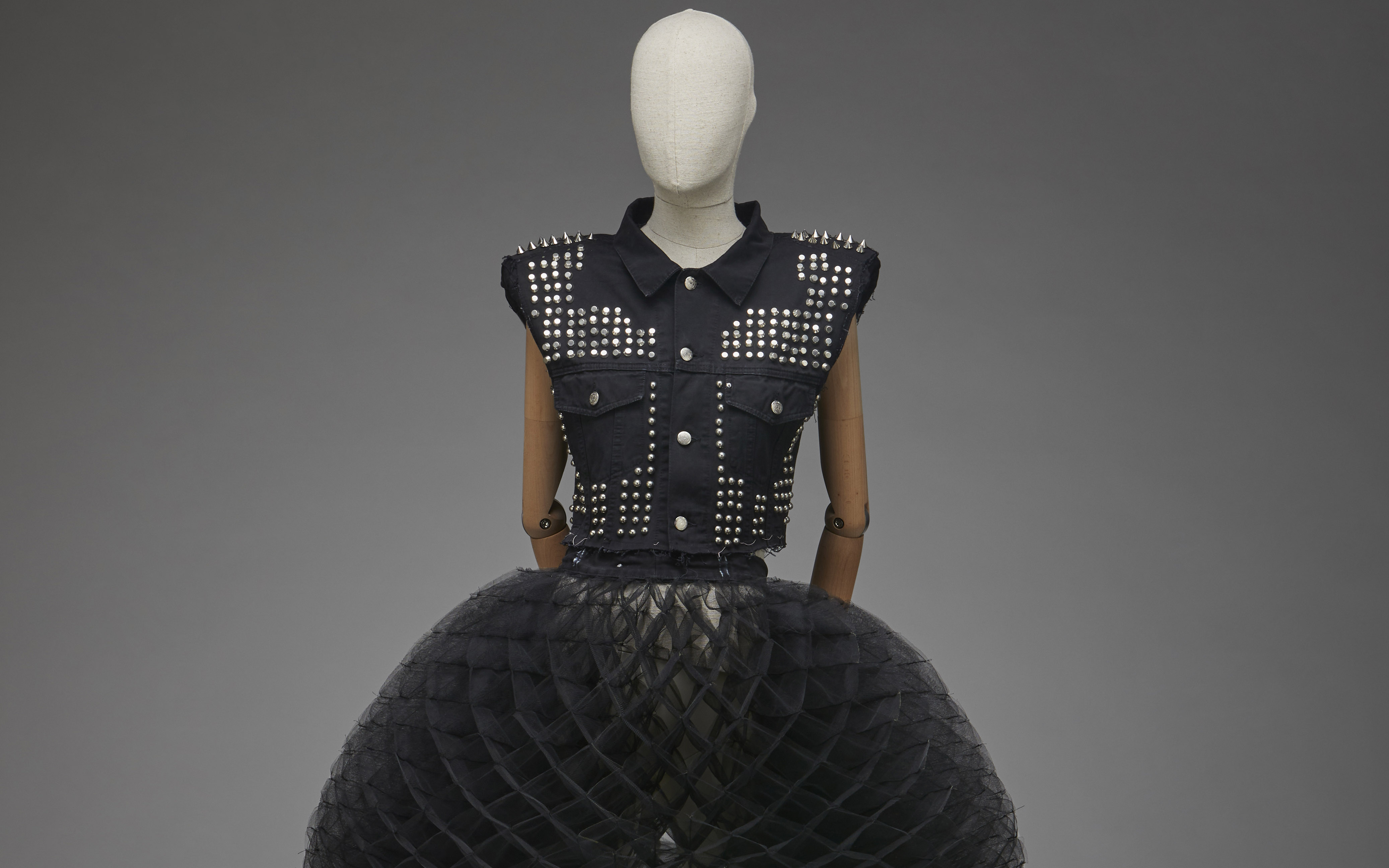
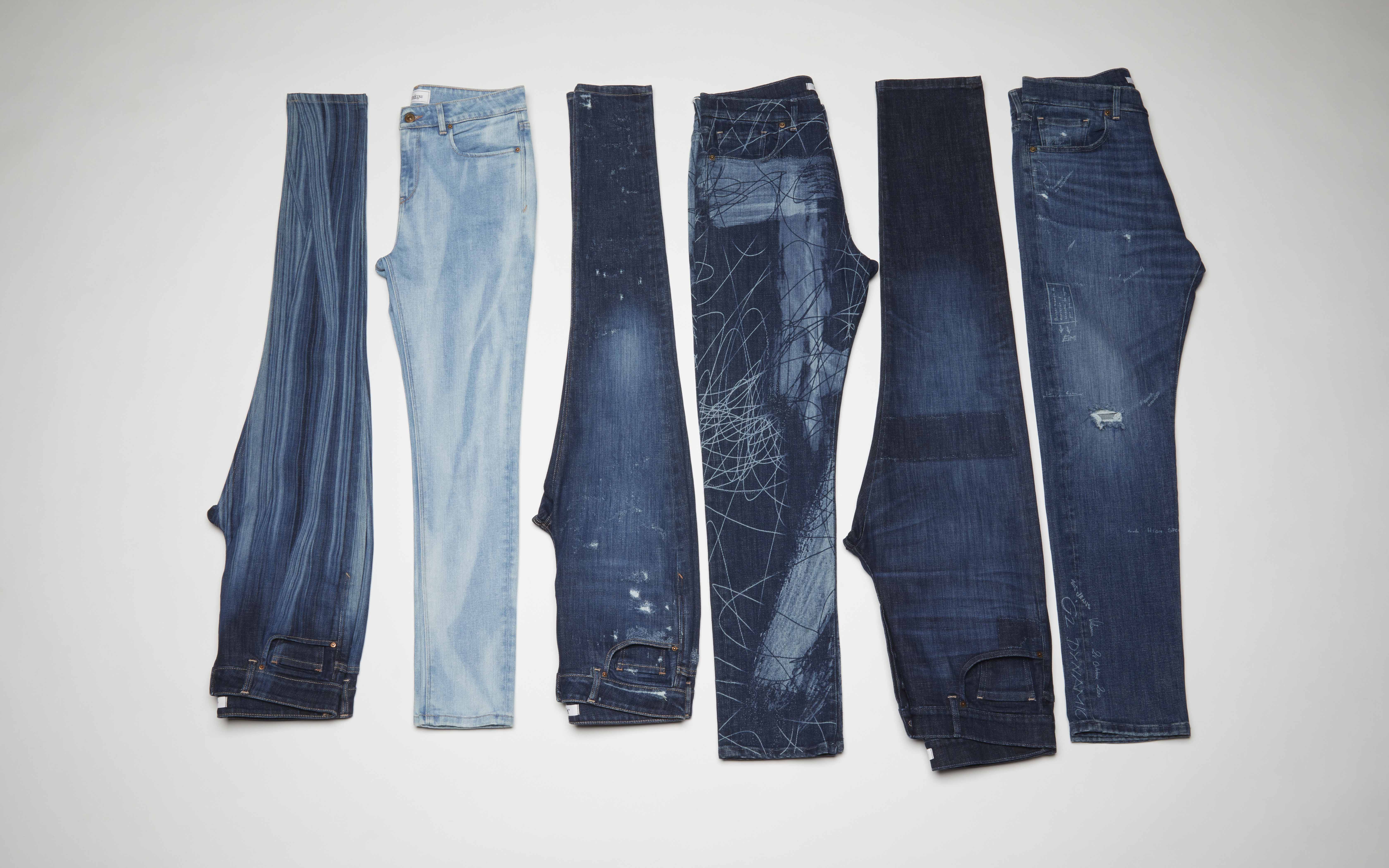
Jeans, from the street to the Ritz
 Pics: Museo del Traje CIPE.
How many jeans do you have in your closet? Or, rather, how many garments made with denim? Surely, the mental figure would occupy double digits if we start counting the number of trousers, skirts, dresses, shirts and jackets that hang on the hangers and are made with the world-famous denim, without a doubt, the king of fabrics.
Jeans and denim clothing are some of the most universal elements in contemporary fashion. These garments transcend social class barriers around the world and, although they initially emerged as utilitarian garments for the working classes, over time they have become common items that unify all wardrobes.
From the pioneer Levi’s, founded in 1853, to today’s ready-to-wear brands and luxury houses. If we had to define the 20th century to the present day in one piece, it would surely be a pair of jeans: whether it be a model with large tears, patchwork elements and misaligned hems, or the stylish model that Kaia Gerber wore at Valentino for the show Haute Couture Fall-Winter 2023-2024. In the words of Pier Paolo Piccioli: “Strength is not in the outfits, but in the clothes.”
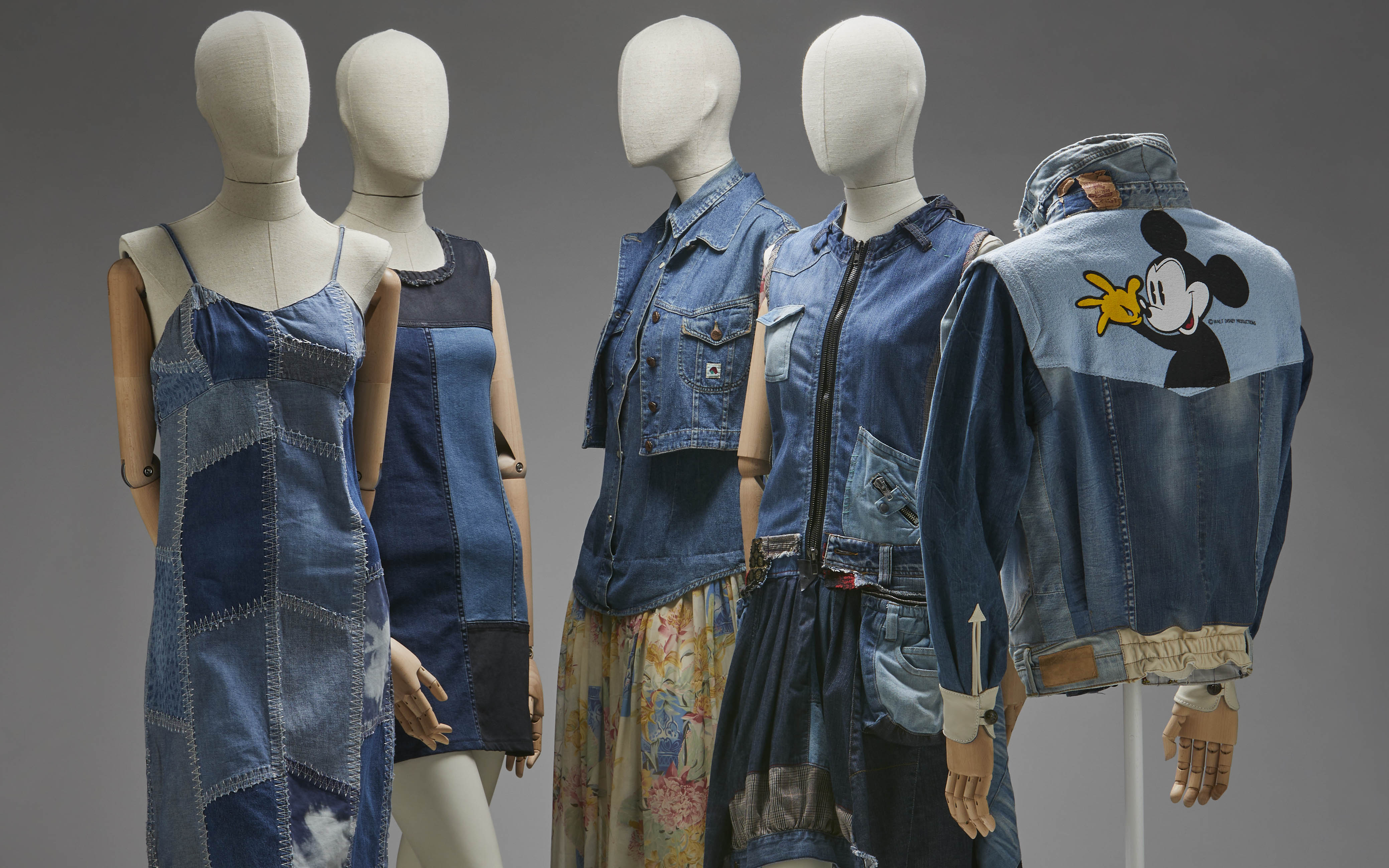
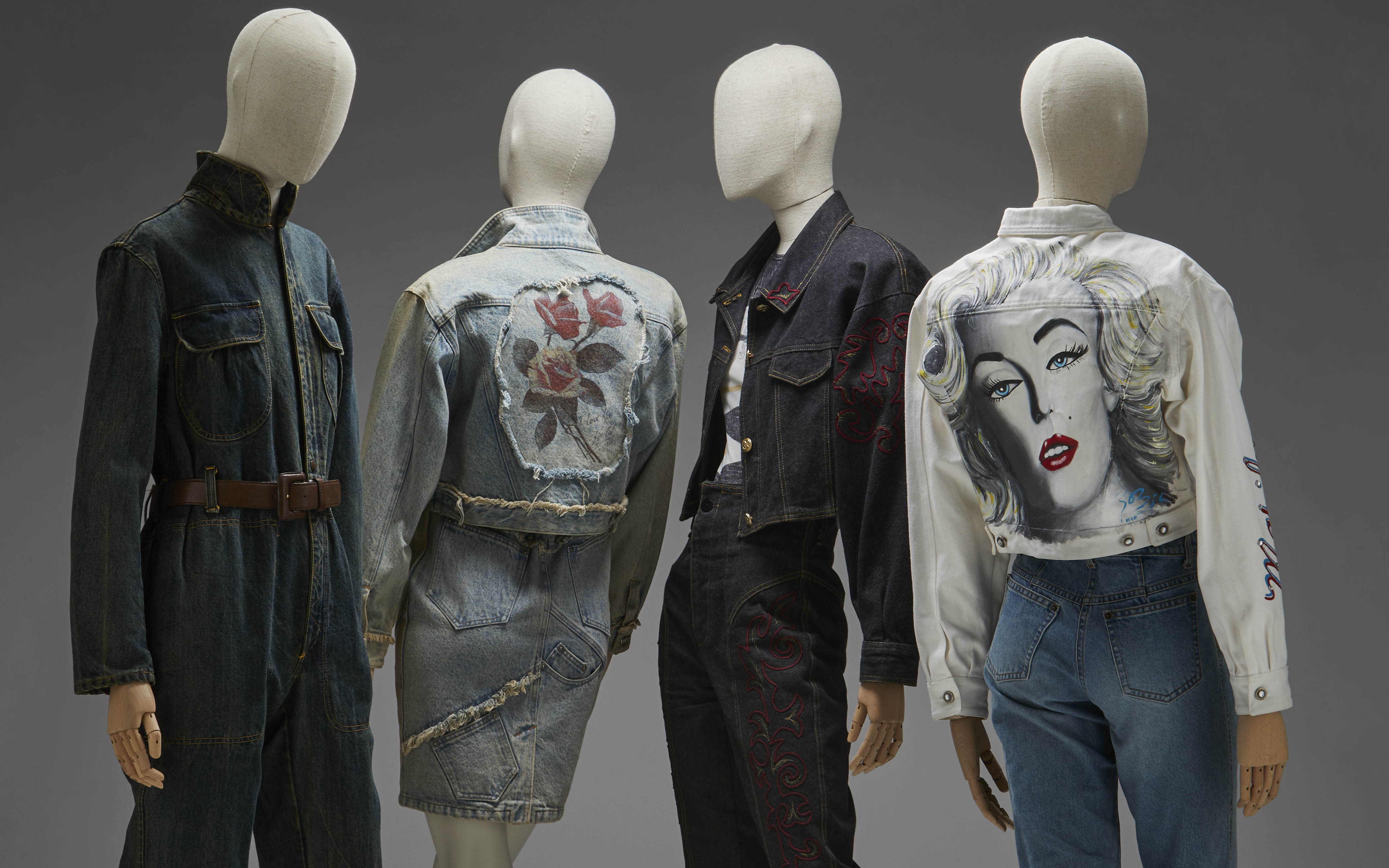
Aware of the universal power and conceived as a symbol of our contemporary culture, the Costume Museum wanted to pay tribute to the eternal jeans with the exhibition ‘Jeans, from the street to the Ritz‘.
Curated by Josep Casamartina i Parassols and Ismael Nuñez Muñoz of the Fundació Antoni de Montpalau and coordinated by María del Mar Belver, the exhibition pays tribute to the cowboy. How? Through a journey through the history of denim fabric, from its origins as a material in the 18th century, through the birth of the jean in the mid-19th century and its enormous expansion throughout the 20th century and the beginning of the 21st, to its infinite formal and textile variations, but also symbolic and social.
The proposal includes more than 200 pieces of clothing accompanied by graphic documentation and accessories from the Fundació Antoni de Montpalau, completed with loans from the private collections of the collector Josep M. Rovira, the historical archive of the Lois brand and the collector Paco Sifre, as well as the companies Jeanología and Evlox. Among them, classic brands dedicated to making jeans stand out, such as Levi Strauss, Lee, Lois or Pepe Jeans, but also brands such as Cavalli, Armani, Kenzo, Paco Rabanne, Gloria Vanderbilt, Calvin Klein, Thierry Mugler, Jean Paul Gaultier, Dolce & Gabbana, Moschino, Versace, Gori de Palma or Christian Lacroix.
From Europe to the United States. The origins of denim
The origins of this fabric date back to the 17th and 18th centuries, until the mid-19th century when the garment that takes its name from the fabric itself was born. Denim is a cotton twill made with very strong and durable twisted threads. The beginnings of the industry are located between Nimes – this is where the name comes from – and Genoa, where most of the factories that produced the fabric were concentrated. Jeans as such were not “invented” until 1860, when Levi Strauss began using twill fabric to make work clothes. Without disconnecting from the United States, the exhibition follows the course of history and strips the cowboy of its exclusive association with the working class, explaining how it came to be a symbol of masculinity and, later, a garment of female empowerment through its outstanding diffusion in the world of cinema, music or urban movements.
The exhibition also presents a section on denim production in Europe, with an industrial network of brands dedicated to denim clothing that would soon achieve great international dissemination. In fact, Spain was one of the most prominent producers, with companies in Catalonia, Valencia, the Basque Country and Castilla la Mancha.
A constant metamorphosis
Starting in the 1970s, the fashion world adopted denim and integrated it without complexes. The industry moved forward in search of new horizons and gave rise to countless variations in the types of denim garments. It is curious that, although jeans were born to last, at the end of the 20th century a taste for worn and torn jeans arose. In the same way, it was used to recreate modern versions of historical pieces totally removed from utilitarian clothing. Pleats, draping, puffing, pleating, extravagant prints and all kinds of embroidery flooded jeans in the world of luxury. In fact, the exhibition also explains how major luxury brands adopted denim and introduced jeans into the world of glamour, generating a kaleidoscopic denim universe.
Precisely, the exhibition culminates with a “brunch at the Ritz”, where the aim is to emphasize how denim has become a prominent part of the social elite. With a nod to the famous quote by Yves Saint Laurent, who proclaimed “Down with the Ritz! Long live the street!”, the exhibition shows how jeans would end up taking over the Ritz in their own right thanks to their enormous versatility and their role as absolute kings of the street.
The sustainable vision
Jeans, from the street to the Ritz’ also highlights an uncomfortable issue. Beyond being the most popular and durable fabric in the world, denim also has a dark back: it is the fabric that demands the most water resources. To produce a single pair of jeans, 3,000 liters of water are needed. In one of the challenges posed for the new century, the exhibition also addresses, although cautiously, the ecological implications of the manufacturing process and the search for sustainable alternatives for its production.
‘Jeans, from the street to the Ritz’ will be open to the public until the 17th March, 2024.

(Español) Gratacós rinde homenaje a la ilustración de moda
Yayoi Kusama , the revolutionary queen of polka dots, in Bilbao
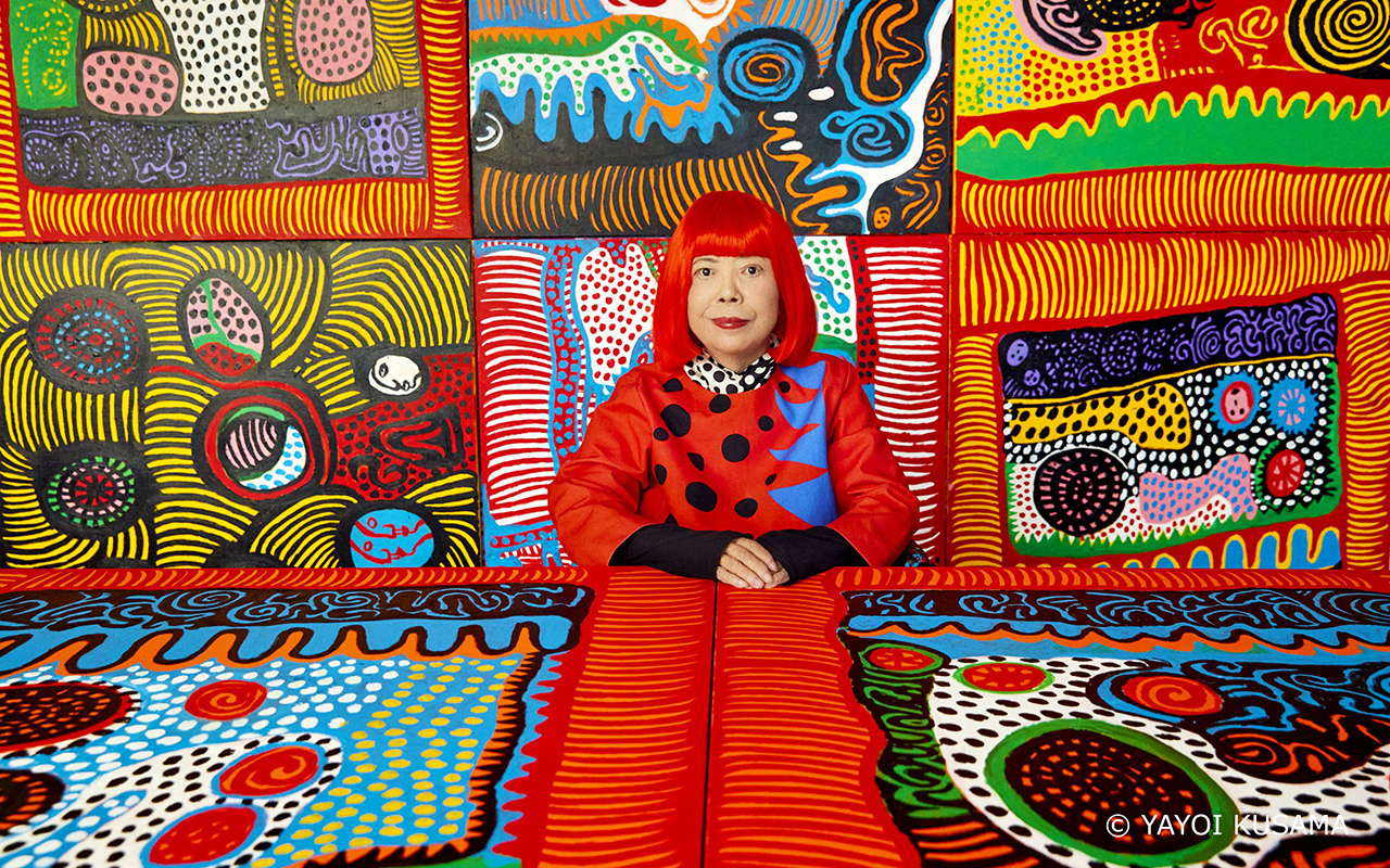
Portrait of Yayoi Kusama. Courtesy of Ota Fine Arts, Victoria Miro, and David Zwirner © YAYOI KUSAMA. Photo: Yusuke Miyazaki.
She is considered a living legend, a revolutionary who has stood out in multiple artistic movements from the 1960s to the present, an admired visual artist capable of connecting art with fashion through her unique universes, full of geometries. Or rather polka dots, her most identifying feature. Yayoi Kusama (Matsumoto, Nagano, 1929), yes the flesh and blood one -and not the hyper-realistic robotic figure that Louis Vuitton made for her in her latest collaboration with the brand- is the absolute protagonist of one of the most visited exhibitions in the Bilbao Guggenheim . Turned into a true global cultural icon, in the last seven decades, Yayoi Kusama has devoted herself to her avant-garde vision with conviction, perfecting her aesthetic vision, which is a faithful reflection of her philosophy of life. As the artist herself usually says: “What does it mean to live a life? I get lost in this thought every time I create a work of art.
This exhibition goes beyond a simple overview of her career. It seeks to focus on the existential questions that drive the creative explorations of the Japanese artist and writer. Through her paintings, drawings, sculptures, installations, and documentary material on her performances, the show offers an in-depth analysis of her practice, from her first drawings as a teenager during World War II to her latest immersive mirror installations.
Organized according to chronological and thematic criteria, Yayoi Kusama : from 1945 to today addresses the six key themes that run through the artist’s life: ‘Infinity’, ‘Accumulation’, ‘Radical Connectivity’, ‘The Biocosmic’, ‘Death’ and ‘ The energy of life’. These interrelated themes appear and evolve within the obsessive universe of Kusama, who has been agitating the art scene and society for decades in favour of the “healing of all humanity”.
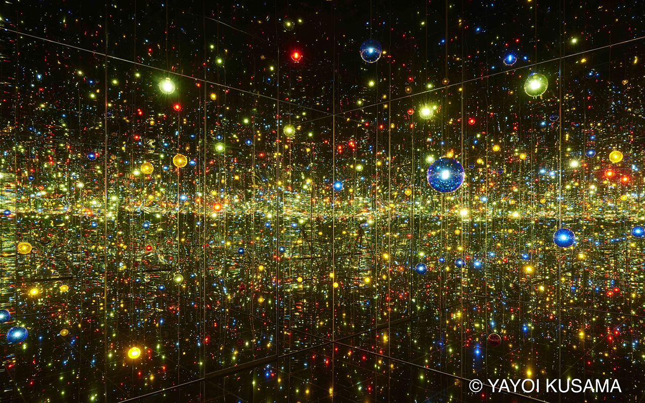
Yayoi Kusama. Infinity Mirrored Room – A Wish for Human Happiness Calling from Beyond the Universe, 2020. Mirrors, wood, LED lighting system, metal, acrylic panel. 293.7 × 417 × 417 cm. © YAYOI KUSAMA. Courtesy of Ota Fine Arts.
Some keys to understand Yayoi Kusama
Self portrait
Kusama ‘s work is based on self-affirmation , self-destruction , self-promotion , self-invention , self-referential and self-portrait, even in those creations where the representation of her own image is less explicit. This room brings together some of the paintings and drawings made by Kusama within the genre of the self-portrait, which occupies a prominent place in her production.
This section begins with Self-Portrait (1950), a dark painting in which a flesh-pink sunflower floats above a human mouth, and is one of the first works to be given that title; The space is presided over by her Portrait (2015), in which Kusama arranges some of her characteristic motifs —polka dots, pumpkins, nets and tentacular shapes— in a composition constructed as a collage and dominated by a hieratic figure.
Infinite
Kusama grew up in a seed nursery surrounded by vast fields of flowers. However, in 1957 while flying over the Pacific on her first flight to the US, the sight of the ocean inspired her well-known paintings of Infinity Webs. In this series, the canvases are obsessively covered in tiny arcs painted in one swift gesture, creating an expressionist pattern of interconnected dots and webs. The free brushstroke contrasts with the reiteration of the motif, which makes it impossible to identify the beginning and end of this universe without hierarchies, whose dimensions were expanding within Kusama ‘s production until the public was immersed in the infinity of her installations.
Accumulation
Kusama ‘s art , the concept of accumulation is not simply an obsessive-compulsive tendency, nor an innate desire for repetition, but can be interpreted as a desire for expansion driven by the artist’s need to broaden her creative vision.
After creating the ‘Infinity Nets’, Kusama developed ‘Accumulation’, a series of collages made with reused fragments of paper and soft sculptures in repetitive forms. In these pieces, an everyday object, such as a chair, is transformed by accumulating on it a large number of phallic and tubular shapes of stuffed and sewn fabric, which make the object itself and its function disappear. Little by little, the compulsive desire to multiply these soft shapes led Kusama to expand her vision to the mirrored rooms of infinity, which she began in 1965, and to the silver or patterned fabrics she made during the 1970s and 1980s, such as ‘Accumulation de manos’, where a sofa and chairs are covered in hundreds of silver gloves
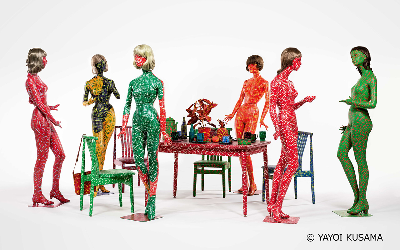
Yayoi Kusama. Self-Obliteration (Auto-obliteración), 1966–1974. Painting on mannequins, table, chairs, wigs, handbag, cups, plates, ashtray, pitcher, plastic plants, plastic flowers, plastic fruits. Variable dimensions. M+, Hong Kong. © YAYOI KUSAMA
Radical connectivity
In the late 1960s, the struggle for civil rights and the war in Vietnam generated a counterculture atmosphere in which Kusama developed a practice centered on public action and performance. The artist denounces race and gender stereotypes, criticizes the warmongering US policy and attracts the attention of the media with her provocative happenings, especially those featuring naked bodies covered with polka dots, which are acts of “self-obliteration”.
Kusama ‘s philosophy , which represents the liberation of the self as a form of group healing and deeply connects people, especially those who live on the margins of society. The Japanese artist uses the power of the media to spread her philosophy and intensify her visibility and notoriety.
Biocosmic
Where does your obsession with polka dots come from? Yayoi Kusama gives us the answer: “Our earth is just a mole among the millions of stars in the cosmos. Polka dots are a path to infinity. We erase nature and our bodies with polka dots, we integrate into the unity of our environment.”
Her childhood near her family’s plant nursery made the Japanese artist feel a deep bond with organic life, which the artist considers to be connected to the dimension and space of the cosmos. ‘Lo Biocósmico ‘ expresses her belief that the earthly and the heavenly are the same. As a child, she begins to observe the anatomy of plants, their life cycles, and the union between heaven and earth. Perhaps the most consistent image of the biocosmic in her work is that of her distinctive gourds, with whimsically undulating and mottled surfaces, which Kusama identifies as a benevolent plant spirit and reflection of her own soul. Her stance towards nature illustrates how Kusama expresses her alienation from the world and her expansive need to commune with the cosmos.
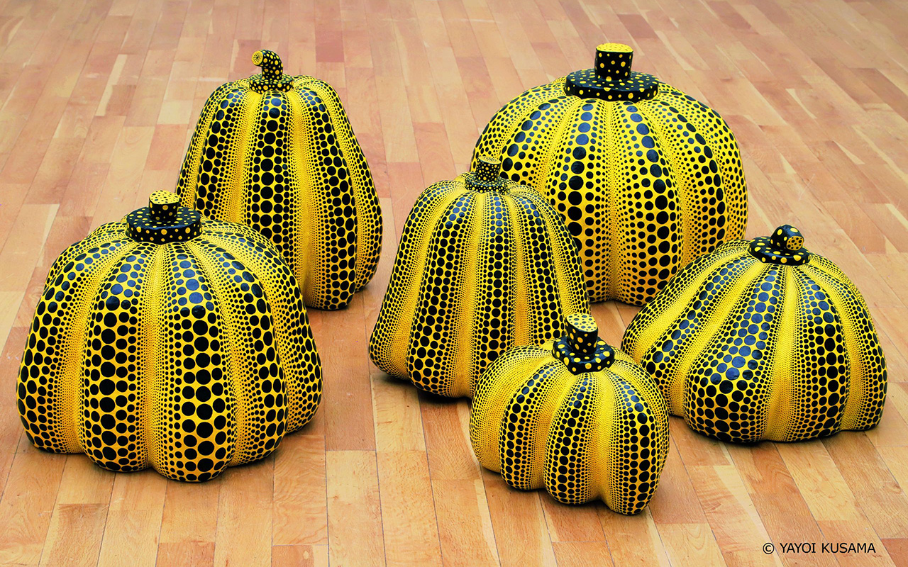
Yayoi Kusama. Pumpkins, 1998–2000. Mixed media. 6 pieces, variable dimensions. © YAYOI KUSAMA
Death
““What death means, its colours and its special beauty, the stillness of its footsteps and the ‘nothing’ after death. Now I am in a phase in which I create art for the rest of my soul, accepting all this”, says Kusama at the exhibition at the Guggenheim in Bilbao.
Kusama ‘s work is constantly on the threshold between life and death. A childhood surrounded by the ephemeral existence of plants in the family nursery, adolescence marked by the war and its consequences, and especially the death of her father and her close friend Joseph Cornell in the mid-seventies, led the artist to consider that death is not the end point, but another phase of existence that can give rise to a new one. Sometimes in her creative struggle and in despair, Kusama yearns to be free of what she describes as the “languorous weight of life.” However, through her artistic and literary practice, she transforms that desire into a kind of therapeutic fantasy, into a spiritual reward in the “solemn beauty” of death and in the loss of the ego as a return to eternity.
The force of live
Kusama ‘s art and psyche underwent a major change. With the arrival of the long-awaited and well-deserved public recognition, both from her international exhibitions and from her publications, praised in avant-garde literary circles, the healing power of art and the celebration of life become the central themes of her production. As she stated in 1999, Kusama came to believe that her role was to transform her suffering through art “for the healing of all humanity.” In the new millennium, the Japanese artist wants to amplify this message. For this reason, the colourful paintings and sculptures from one of her latest series, My Eternal Soul (2009–) and I Pray Every Day for Love (2021–today), perhaps represent the culmination of this commitment
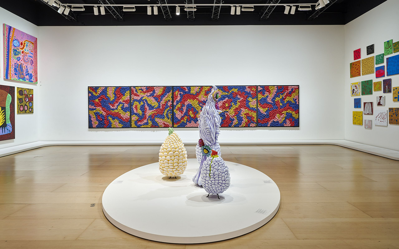
The exhibition “Yayoi Kusama : from 1945 to today” will remain open to the public until October 8.
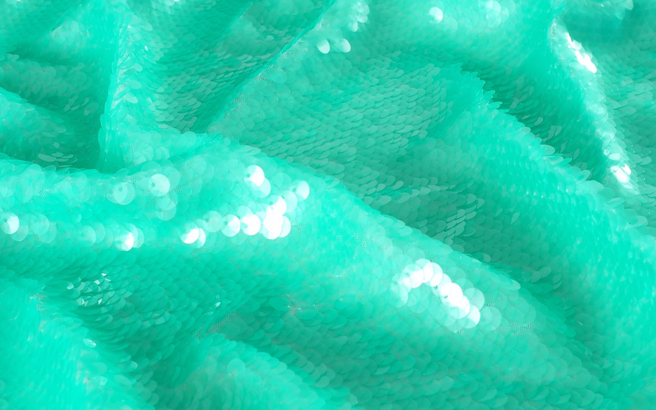
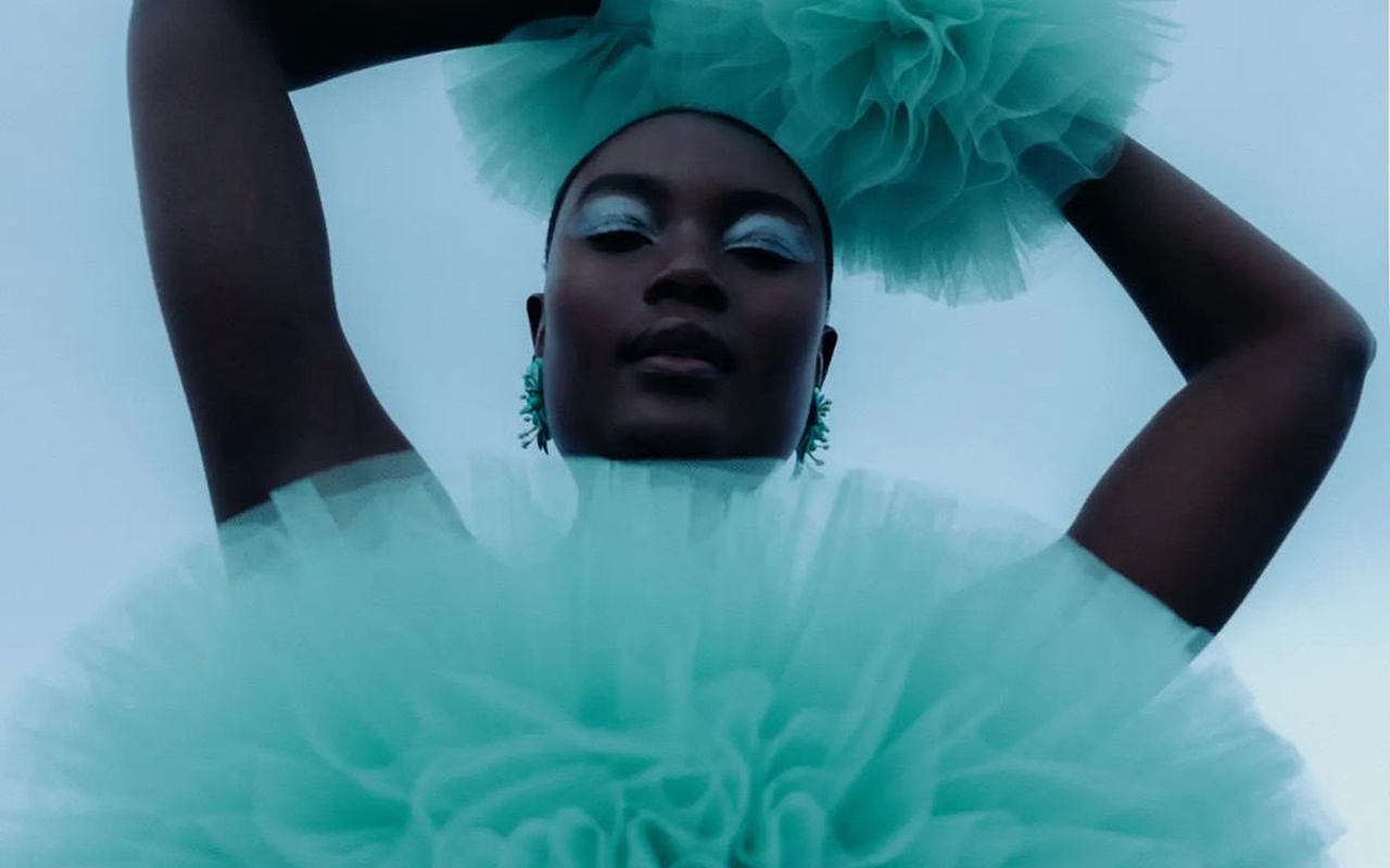
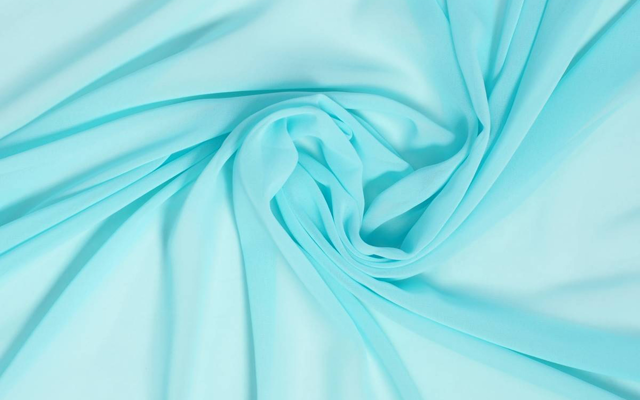
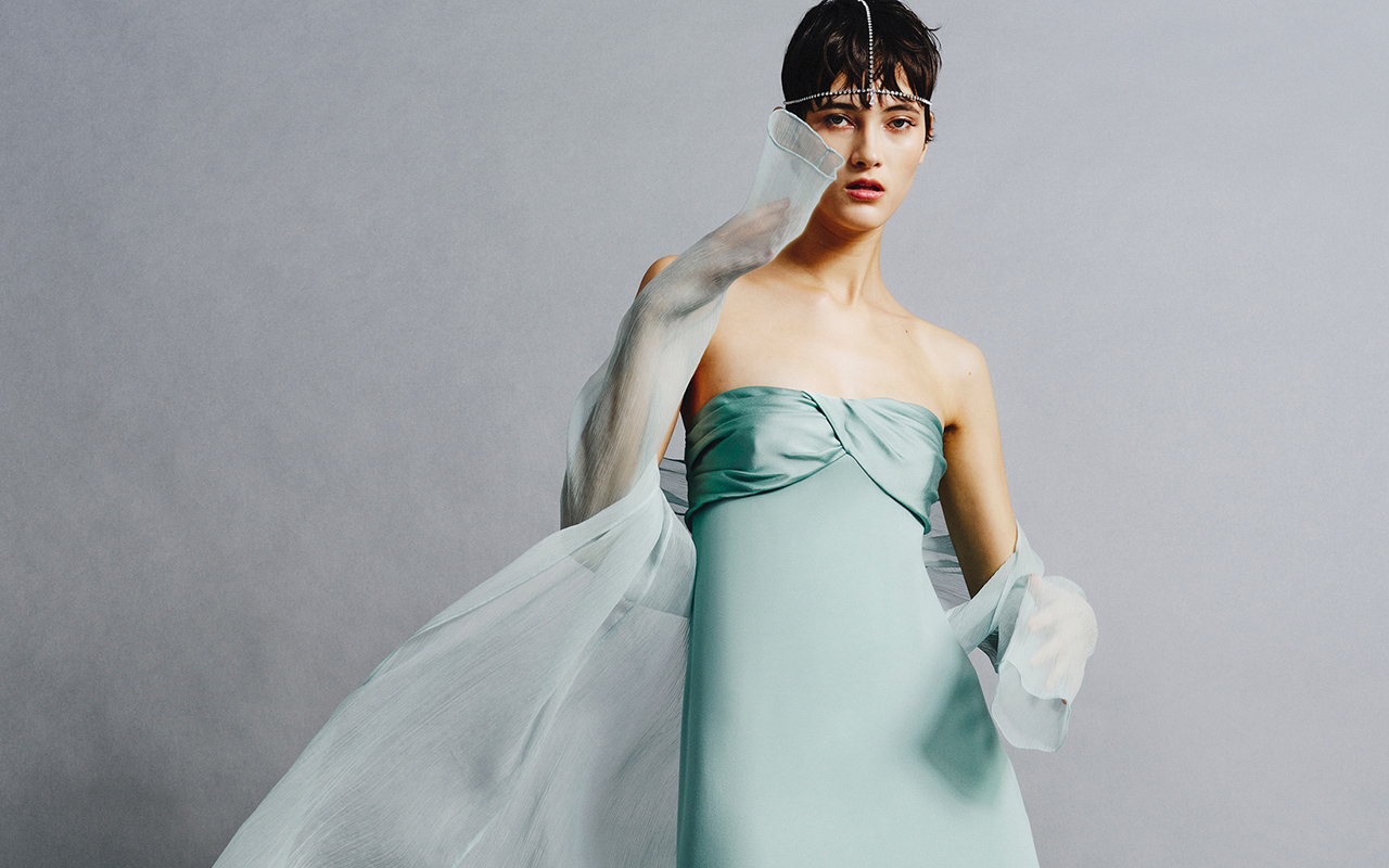
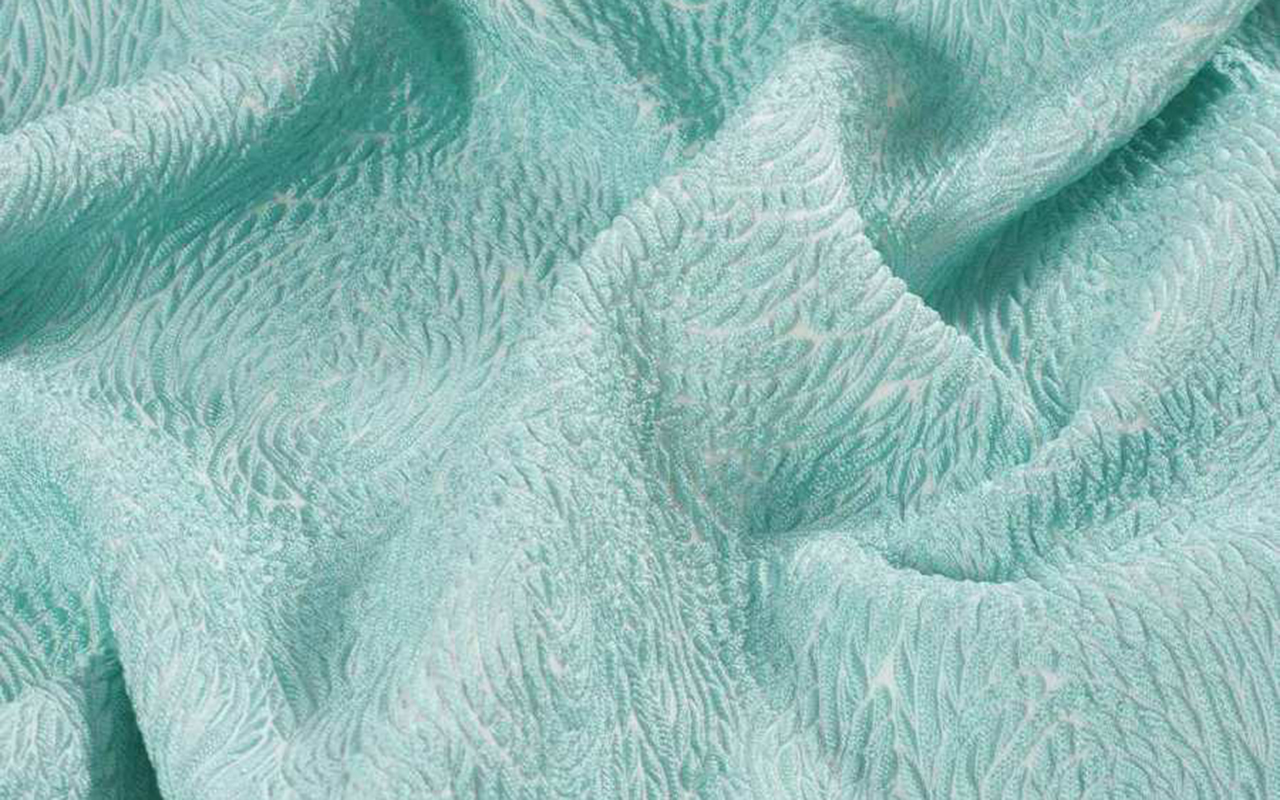
Aquamarine, the colour of calm and serenity
 Neus Bermejo in an aquamarine dress by designer Mariano Moreno. Photo: Courtesy of Mariano Moreno
No one doubts that the colour of the year is Barbie pink, a more striking transformation of the Millennial pink we’ve been seeing in the past decade. It resembles bubblegum pink or plastic pink, all of which have more artificial undertones. However, beyond the fuchsia and soft pink that dominate the Barbiecore trend, other colours are emerging this season. One of them is aqua green, which captivates with its discreet charm and its calming and refreshing nature.
Aqua green, also known as blue-green or aquamarine, immerses us in the fascinating transparent, warm and shallow waters, evoking emotions and transmitting subtle messages associated with summer. Paradisiacal tropical beaches, lagoons surrounded by nature and river beds with crystal clear waters are some of the images that come to mind when contemplating this pure tonality. It is perfect for the summer, since it is closely linked to the sea and nature.
The name makes the thing
This colour gets its name from the gemstone that represents it, aquamarine. A gem characterized by its beautiful light bluish-green hue. The term “aquamarine” comes from the Latin “aqua marina”, which means “sea water” to poetically evoke the sparkles and transparency of water.
Since ancient times, the colour aquamarine has been appreciated for its beauty and its connection to aquatic nature. The ancient Romans attributed protective and healing powers to this stone. Also, in the Christian tradition, aquamarine was associated with purity and innocence. Over the centuries, it has been used in jewelry, especially gemstones, but also in ceramics and ornamentation in different cultures, from the ancient Egyptians to the Native Americans.
Psychological and sensory properties
On a sensory level, aquamarine is a refreshing and calming hue for the eyes. It has a luminous, translucent quality that evokes feelings of serenity and freshness. Not surprisingly, this hue is associated with peace, clarity of mind, and harmony—valuable traits in fashion, advertising, and interior design when seeking to create a serene and welcoming environment. Also, their presence can stimulate creativity and promote a sense of relaxation.
This colour is also attributed qualities that encourage emotional openness and the ability to express yourself. Its soft and luminous hue makes it a popular choice for those who want to convey a fresh, sophisticated and elegant image. In addition, it is related to youth, since its shades instill confidence and magic, making people feel renewed both inside and out, with positive energy.
A notable example of a brand that has embraced aquamarine in its identity is Tiffany&Co. Its iconic shade of aquamarine blue is used in its packaging and presentation, providing a duality between elegance and carefree freshness. Likewise, the renowned sportswear brand Nike has incorporated the aquamarine color into its latest collections of sports footwear and clothing, providing a fresh and energetic look to its products.
Without being essential, it stands out
Let’s not fool ourselves. It’s true that aquamarine hasn’t been a front row colour on the fashion catwalks, at least until now. It is not usually the favourite of the designers and it is not abundant in the collections, since its relaxing nature is incompatible with the frenetic rhythms of the industry. However, it is true that aquamarine is more easily found in spring-summer collections, since it refers to crystal clear waters on sunny days and evokes paradisiacal destinations. In addition, it favours the tanning of the skin as it is a soft tone that gives it prominence.
Despite this, renowned designers have embraced aquamarine in their creations. For example, the Italian designer Roberto Cavalli has used this colour in his prints and haute couture designs, adding a touch of sophistication and freshness. Brands like Versace, Gucci and Carolina Herrera have also incorporated aquamarine into their collections, both in clothing and accessories.
This summer, through the mermaidcore trend, aquamarine has gained more presence. In this sense, the colour of the crystalline waters has been shown in total looks that Max Mara has explored with designs such as retro-style swimsuits, including hats. Fendi has also opted for this hue, combining pants with printed tank tops. For its part, Armani has presented a more subtle proposal, with a strapless dress combined with trousers.
Although aquamarine may not be the usual star in fashion, we cannot deny its charm and versatility. Its presence in the collections of renowned designers and its association with freshness and sophistication make it an attractive and elegant colour.
From Gratacós, we join the charm of the aquamarine colour. In our online store, we offer a selection of seasonal fabrics dyed with this refreshing colour, which brings vitality and sophistication. When we enjoy our well-deserved vacation, we will see life with a touch of aquamarine colour.
Pics: The 2nd Skin y Max Mara