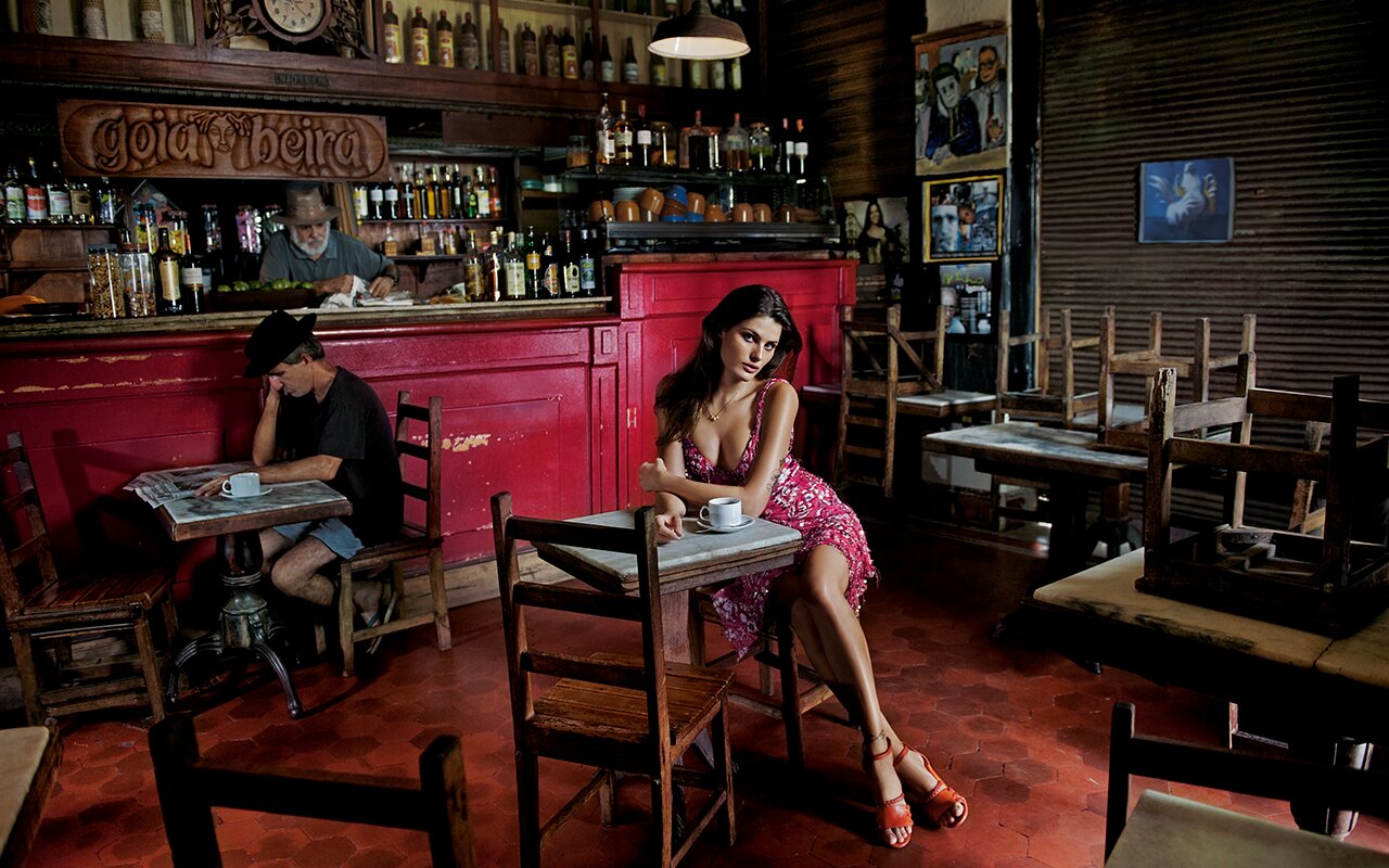
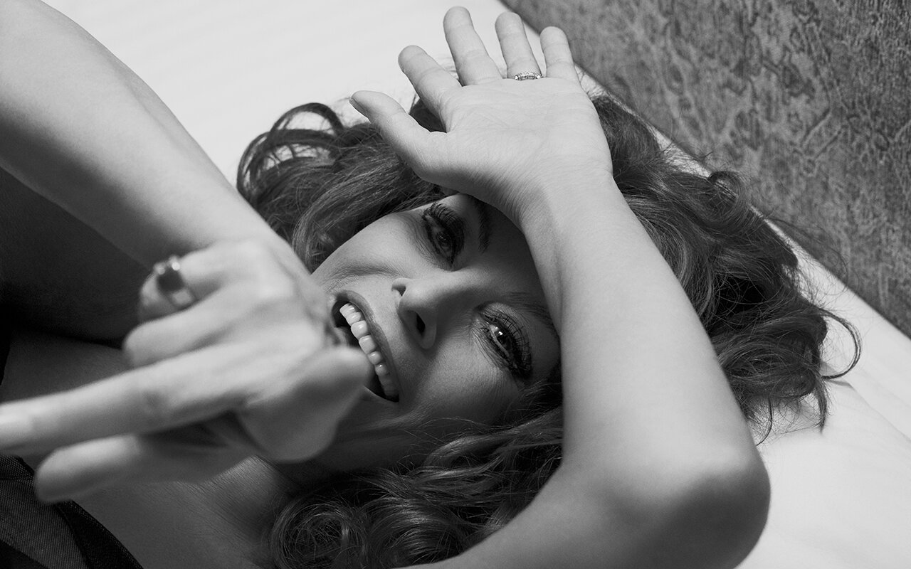
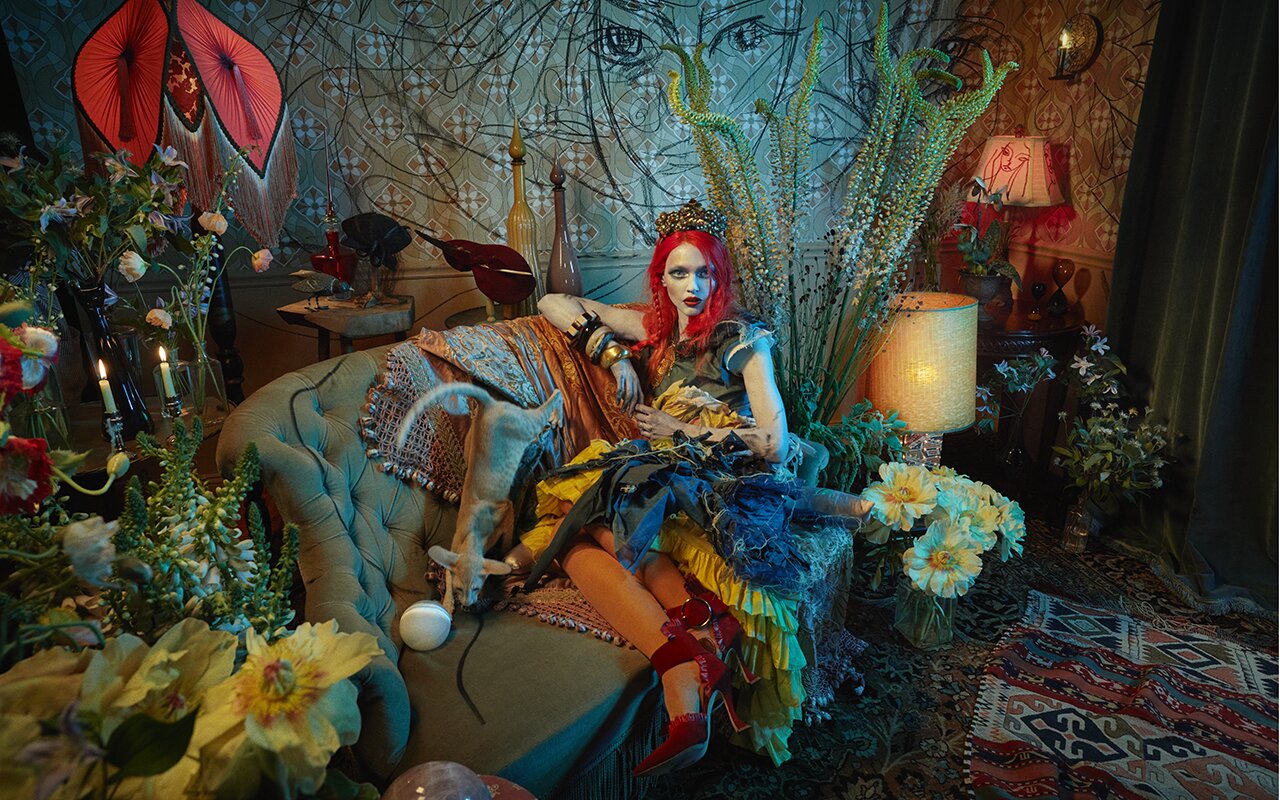
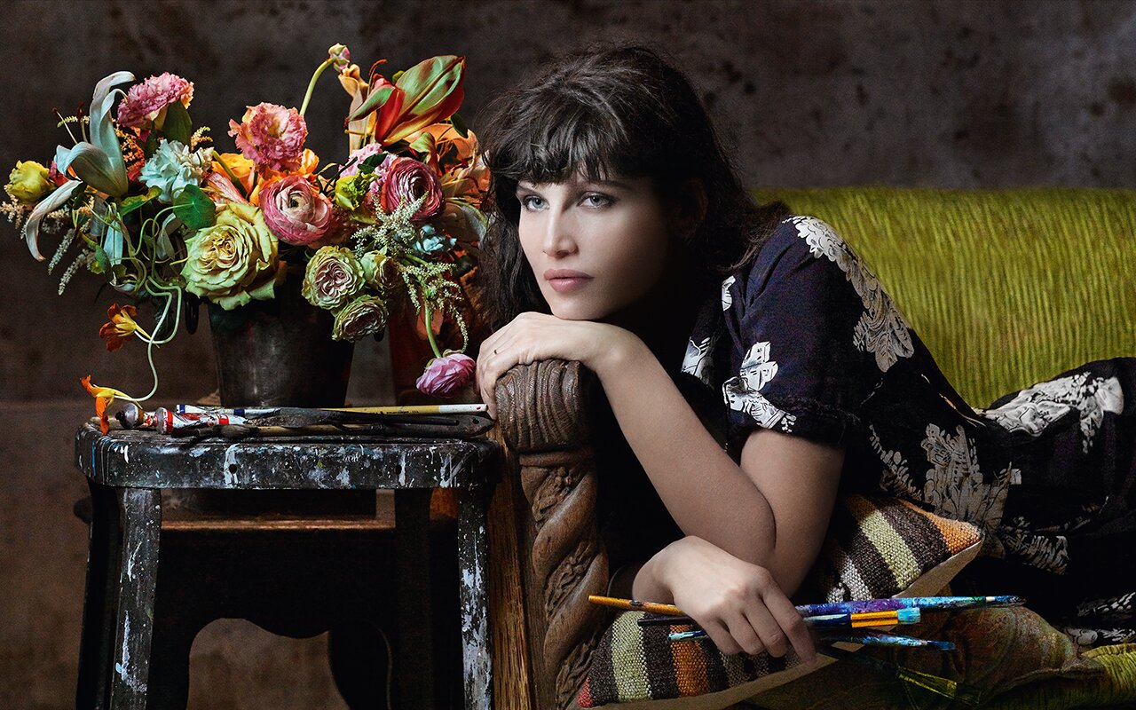
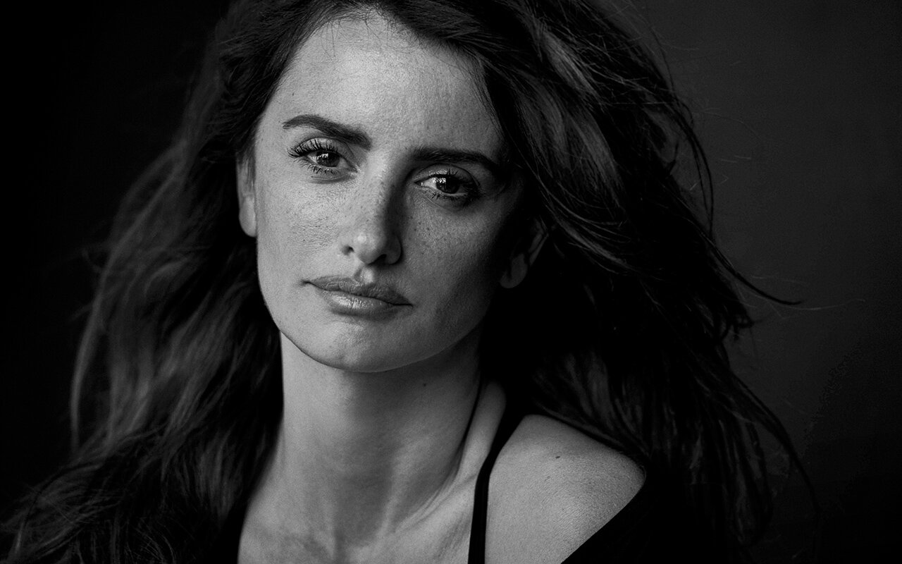
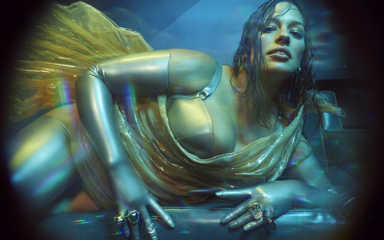
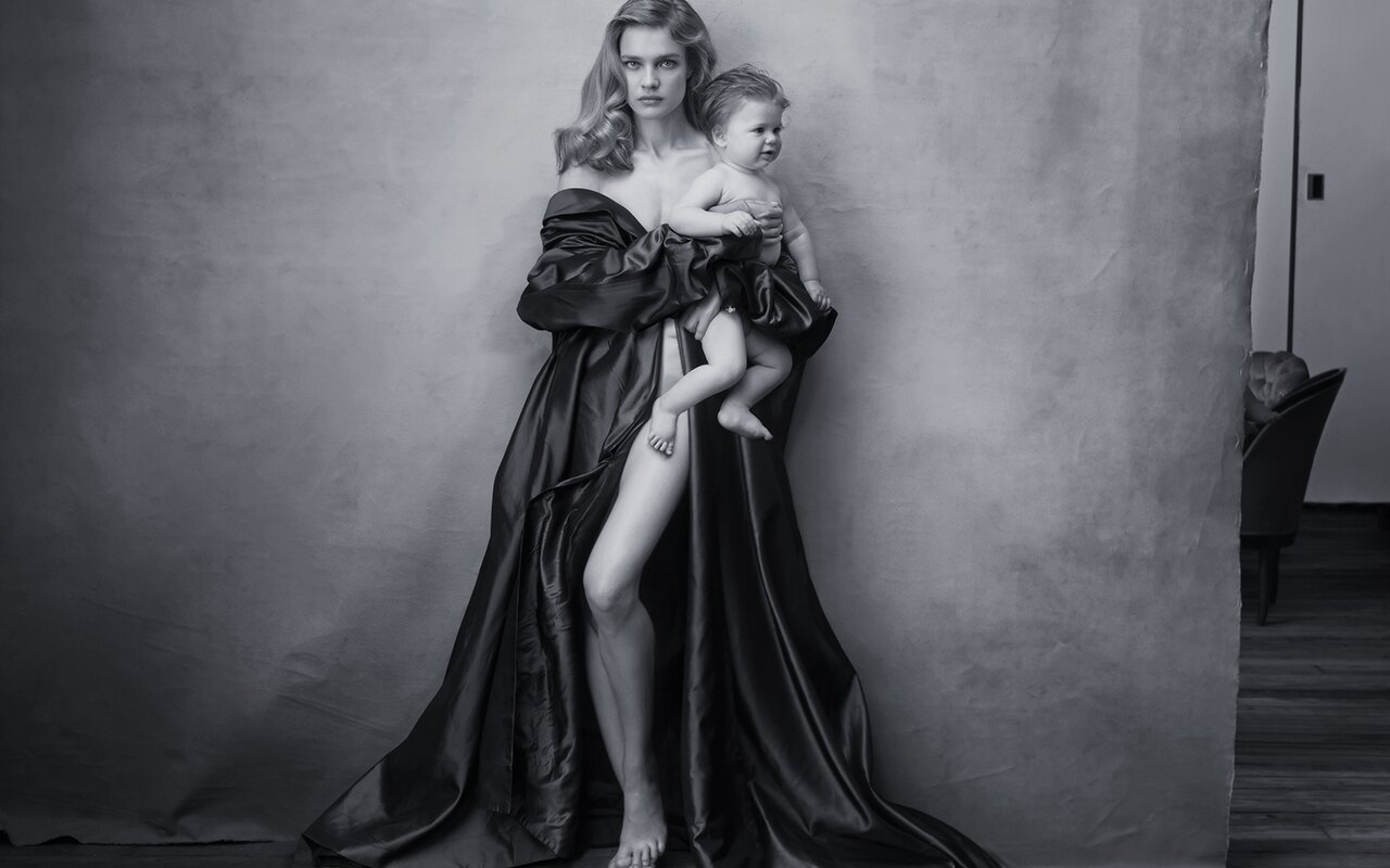
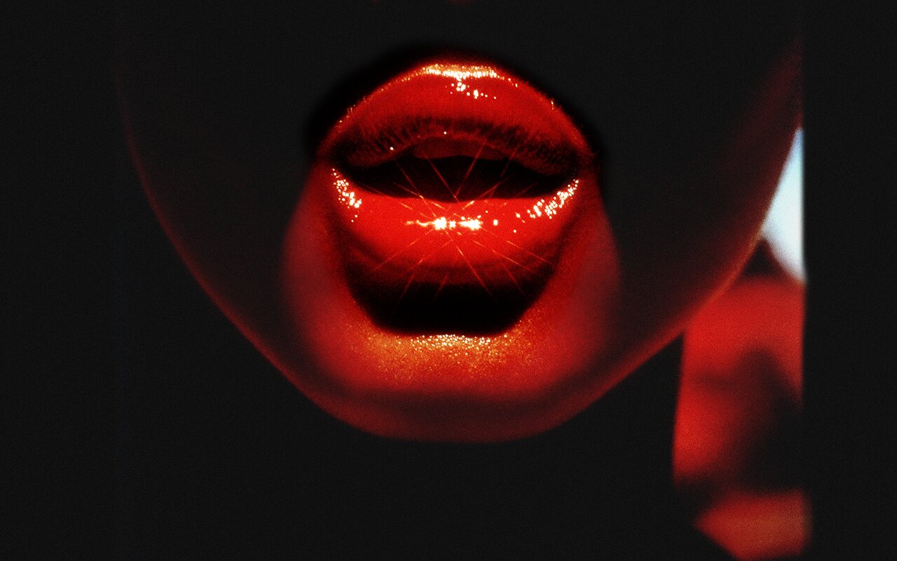
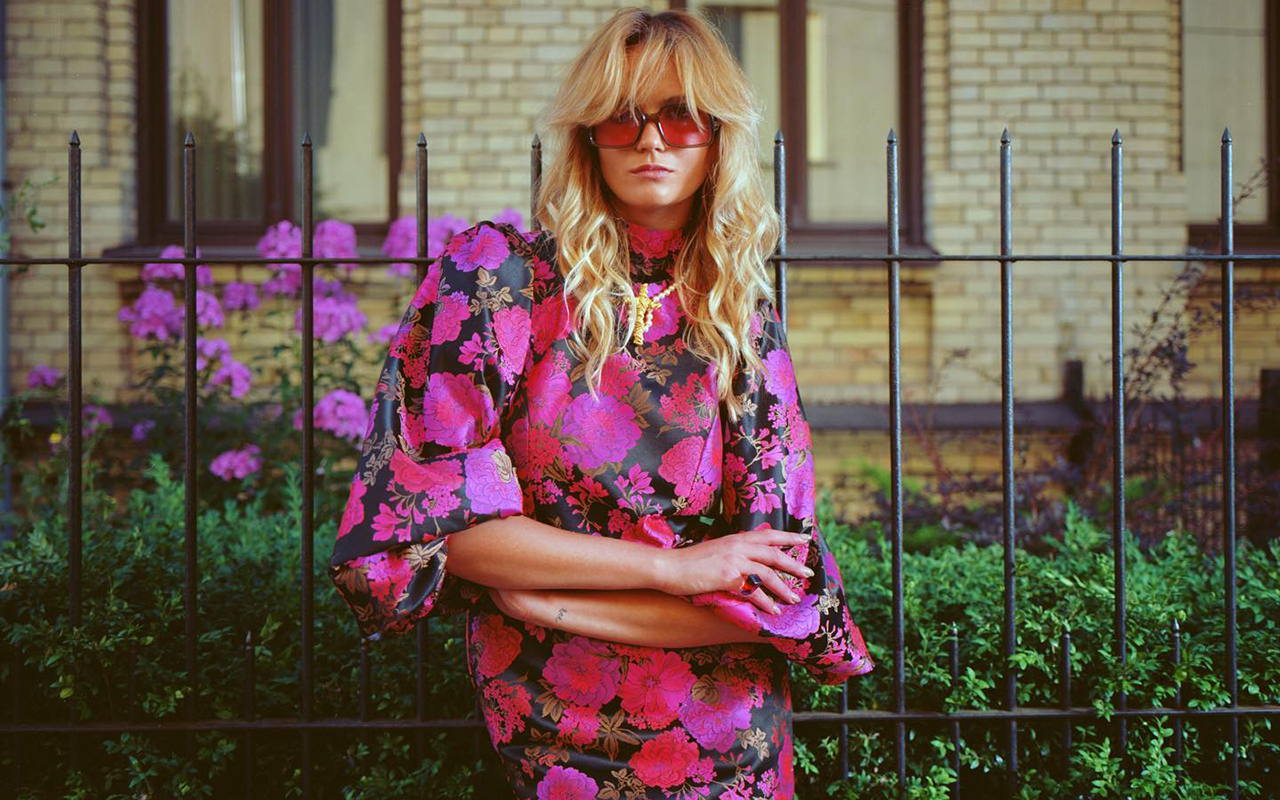
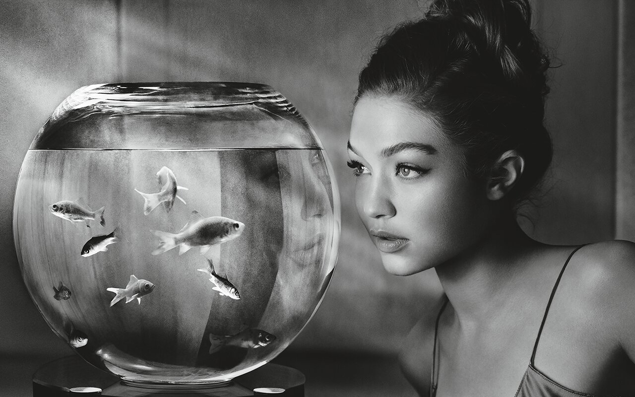
 Photos: Pirelli / FotoNostrum Barcelona
Feminine beauty has undergone a historical change in its conception and representation over time, and especially in the last half century. If we talk about beauty portrayed, the famous Pirelli calendar has become a tangible reflection of this transformation, being an everyday object that has played an important role in the representation of women in the world of fashion and photography.
Known for its iconic and sensual images that decorated mechanical workshops, garages and truck cabins in its early days, the Pirelli calendar has evolved over time to reflect social and cultural changes in the perception of femininity and the empowerment of women. . Now, the FotoNostrum gallery in Barcelona exposes this evolution by presenting the largest retrospective ever held of the iconic almanac of the renowned tyre company.

Beauty narrated by the best photographers
Under the title of ‘ L’Eterna Bellezza ‘, the exhibition exhibits more than 450 snapshots captured by 41 masters of fashion photography, who have contributed to making the Pirelli Calendar a legend in the world of photographic art. Masters like Peter Lindbergh, Annie Leibovitz, Helmut Newton, Herb Ritts , Paolo Roversi , Mario Testino , Steve McCurry, Bruce Weber, Patrick Demarchelier and Richard Avedon , among others, have portrayed over the years the sensuality of women, including models such as Gisele Bündchen , Naomi Campbell, Cindy Crawford, Gigi Hadid and Kate Moss; actresses like Monica Bellucci, Sofia Loren, Laetitia Casta, Jessica Chastain , Penélope Cruz, Uma Thurman , Kate Winslet , and Robin Wright, and singers like Cher, Rosalía, and Patti Smith.
Beyond the sensuality that becomes evident in some cases through the nakedness of the body, what draws attention in the exhibition is the change in gaze. In this sense, ‘ L’Eterna Bellezza ‘, protected by Amadeo M. Turello , Italian curator and preserver of the Pirelli Collection since 2015, has not wanted to ignore all the stages of the Pirelli calendar, from its beginnings in 1964 to 2022, through images that show everything from nudes where the The models’ bodies are presented explicitly as an advertising claim, as well as other more evocative images with messages of vindication of feminine power, which go beyond mere eroticism.
The images shown not only reveal the poetics of individual authors on the female body, they also constitute a reflection of society, aesthetics and the arts in the last 60 years. Thus, the exhibition reflects how the photographic language has evolved over time, highlighting other aspects such as fashion and pop culture of each era.

From object to subject
The Pirelli calendar was first launched in 1964 and has become a symbol of beauty, style and elegance. A leading photographer on the London scene, Robert Freeman, who was a personal friend of The Beatles, was commissioned to create a “beautiful calendar” and had complete creative freedom to do so. This talented photographer selected representative models of the time and took them to the beaches of Mallorca for a cheerful and informal shoot that captured the essence of that moment marked by an emerging counterculture and the sexual revolution.
At that time, calendars with images of women already existed and were used as a marketing tool in the automotive industry. Pirelli wanted to give his celebrated almanac a more sophisticated image and, in his quest for good taste, partnered early on with leading photographers of each era to provide their artistic vision of female beauty. The first calendars caused a sensation, but despite the change, they still reflected old stereotypes: women in pin-up poses displayed their bodies as objects of desire.
As time progressed, Pirelli changed its approach and adapted to the new changes, celebrating values such as diversity, talent, individualism and authenticity to portray a beauty that goes beyond the purely aesthetic and focuses on the personality and the way of being of the woman. In the 21st century, the Pirelli calendar has challenged traditional beauty canons and has captured the essence of successful women in various fields, such as music, cinema, fashion, sports and activism, promoting a more inclusive and empowered vision. of women in society.

The woman also as creator
Women are the absolute protagonists in the history of the Pirelli calendar, but they have not always been in the spotlight. The tyre brand has highlighted the role of women as creators and protagonists in the world of fashion and photography, providing a platform for female photographers to express their artistic vision and talent. This has been demonstrated by photographers such as Sarah Moon, Joyce Tenneson and Annie Leibovitz, who has worked twice for Pirelli.
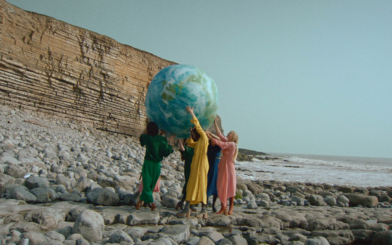
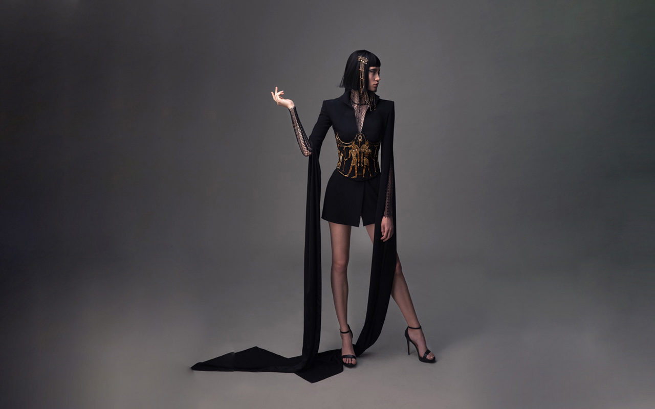
The latest signing for the creation of the famous calendar has been Emma Summerton , who has been inspired by the classic figure of the muse to vindicate the role of women as creators. For the Australian photographer, the conception of beauty transcends faces and bodies, and has given the models participating in the calendar, such as Bella Hadid, Cara Delevingne or Ashley Graham, an artistic role linked to the power they represent in life real. Thus, in a dreamlike setting with a great charge of fantasy and ornamental precision, the ” Summerton muses ” are presented as authentic warriors, queens, activists or writers in the 2023 edition of the Pirelli calendar.
Precisely, some of these fresh new images can also be seen in the retrospective of the Pirelli calendar, which will be open to the public until the 30th July at the FotoNostrum gallery in Barcelona.


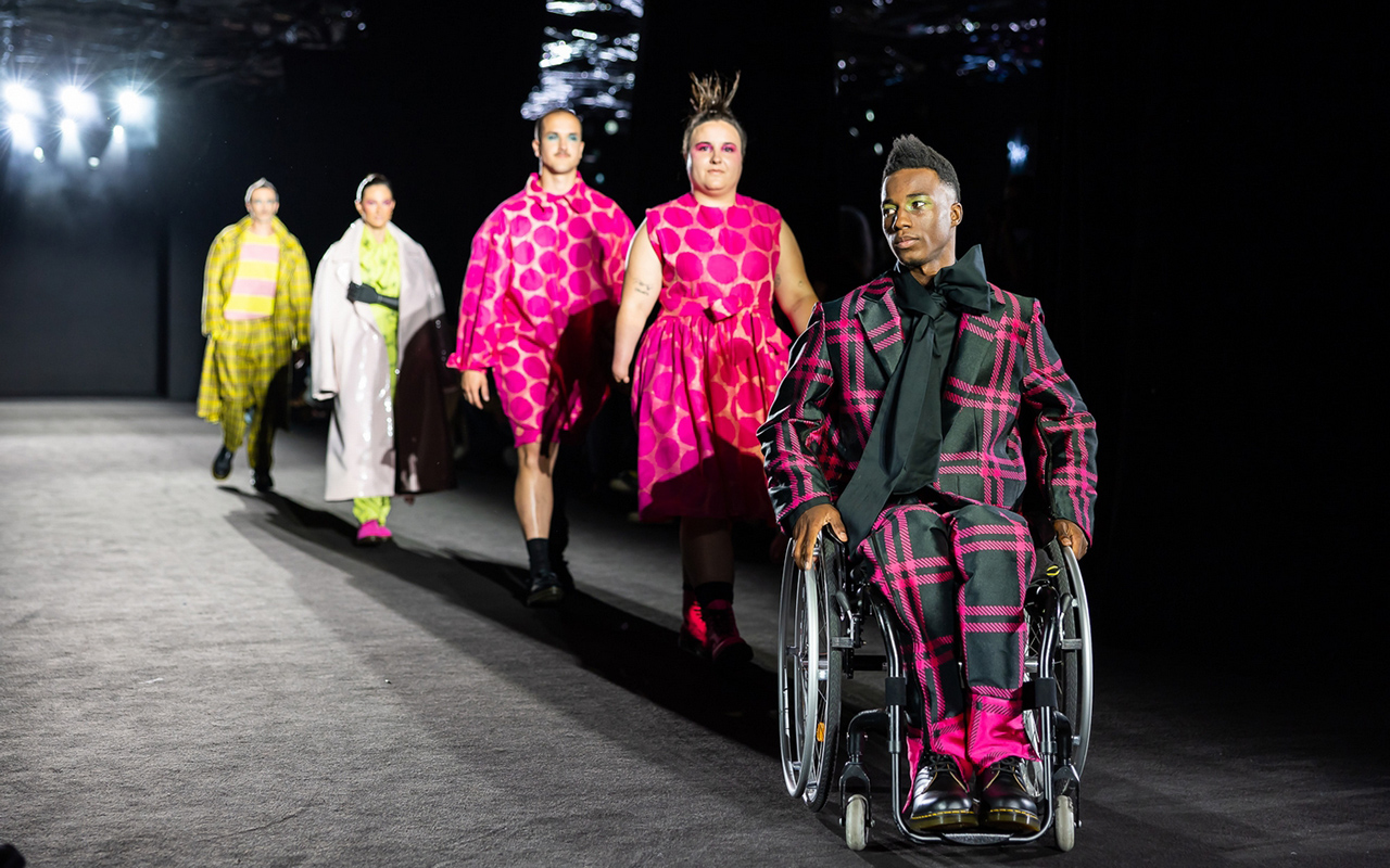
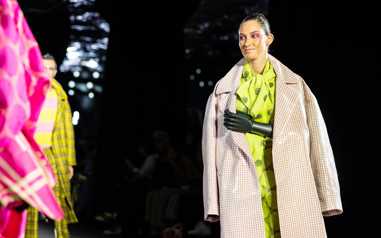
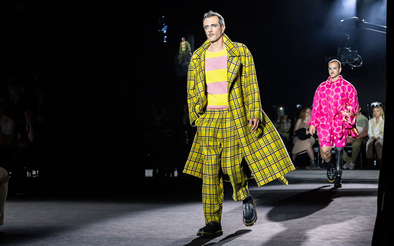
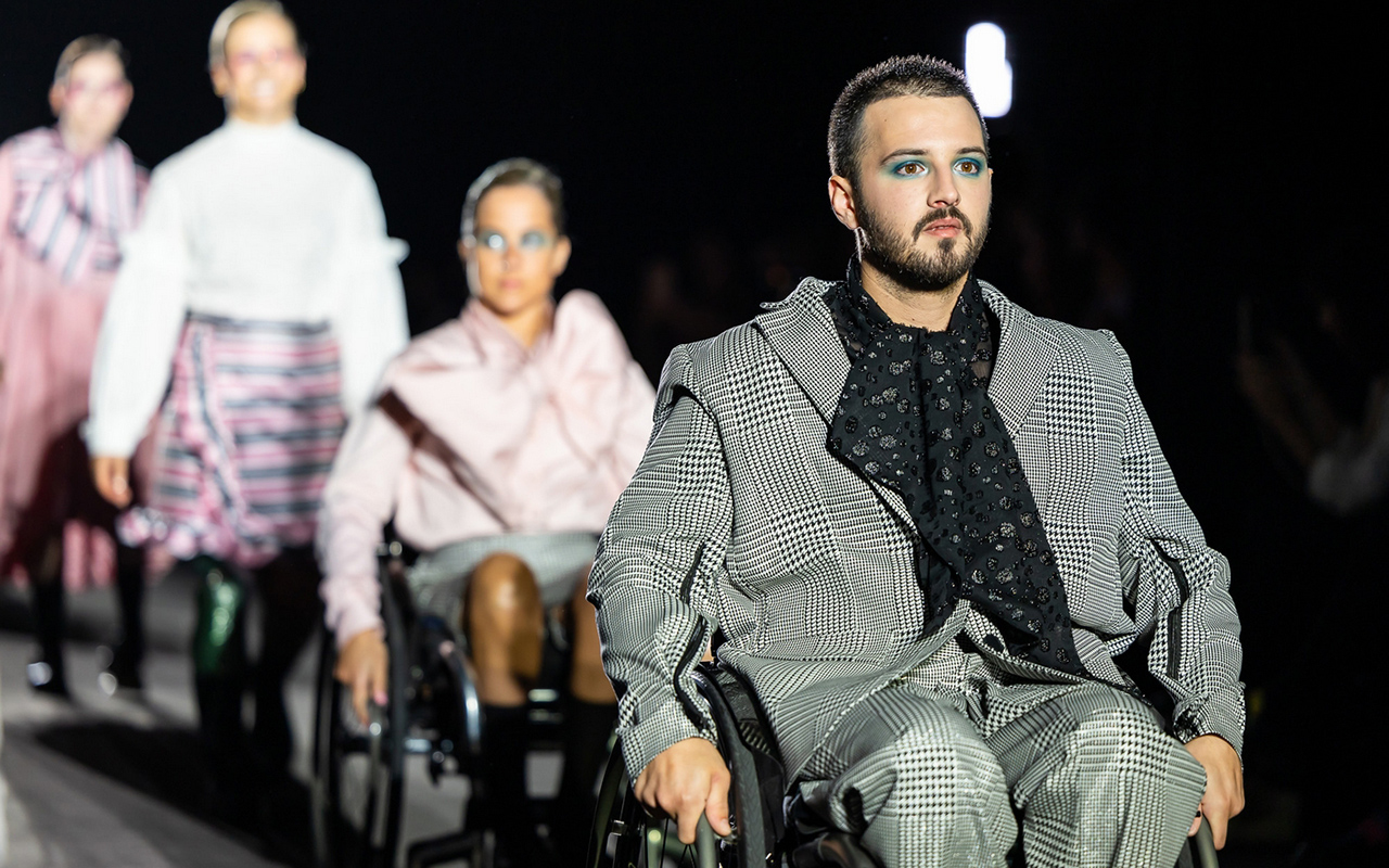
Diversity and inclusion. These are the values that the 080 Barcelona Fashion platform wanted to highlight in their latest edition held at the Sant Pau Art Nouveau Site. And it has done so in an obvious way, reinforcing in the casting of models, a wide variety of bodies that do not understand morphologies, sizes, functionalities, ages or skins that show all their richness of colour and textures. If fashion is a reflection of society, diversity is on the order of the day, it is visibly appreciated on the street and cannot be treated as an exception. For this reason, the Catalan catwalk has also encouraged designers and brands to exercise the power to favour this real change and, at the same time, to take charge of the different challenges of a changing and diverse society.
In this direction, the Catalan catwalk has taken a step further by hosting the first inclusive fashion show in Spain, through the Free Form Style brand. A government awareness initiative on body neutrality and functional diversity that is part of an action plan to combat aesthetic pressure. Founded in 2019 by Marina Vergés and Carolina Asensio, Free Form Style is positioned as a brave brand that is committed to comfort without sacrificing elegance. It is also a pioneer in designing fashion adapted to people with different disabilities with the premise of dignifying all types of bodies because fashion gives that power of dreaming and helps to promote the self-esteem of all groups.

Gratacós collaborated in the inclusive fashion show
In its debut at 080, Free Form Style teamed up with Manuel Bolaño, who was in charge of creating all the designs for the 16 models that walked the runway, including Paralympic athletes Desirée Vila and Sarai Gascón. In this first collection, Bolaño carefully studied the patterns and adapted them to the specific needs of each person, taking into account physical diversity and possible difficulties in dressing: strategically placed side zips, surprising openings to avoid uncomfortable rubbing or small details that facilitate the action of putting on and taking off a piece of clothing.
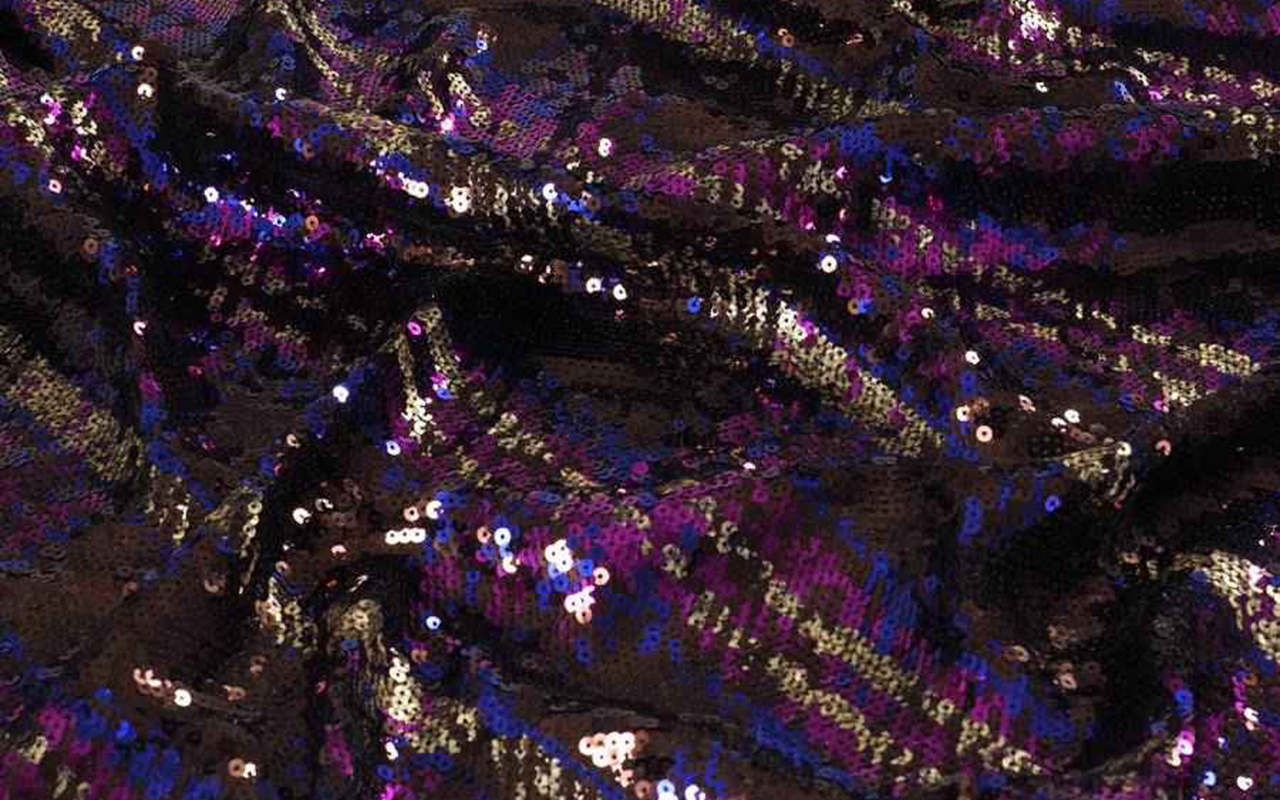
Gratacós also contributed its grain of sand in this awareness action and gave all the fabrics to the brand and the designer, so that they could devise the collection, giving free rein to creativity to transform the fabrics into surprising designs. On the catwalk there were spectacular Jacquards with checks in vibrant tones, houndstooth motifs, lace, embroidery and transparencies that gave sensuality and also sequins to provide that point of light that adds showiness. All of these fabrics were showcased in the debut collection ‘Just a perfect day’. A proposal that follows the principles of English tailoring and is influenced by the punk and new romantic movements, creating functional and comfortable pieces to dress diversity, but without forgetting fantasy because as Free Form Style defends, “having a disability does not mean not being able to be fashionable”.

A special showcase
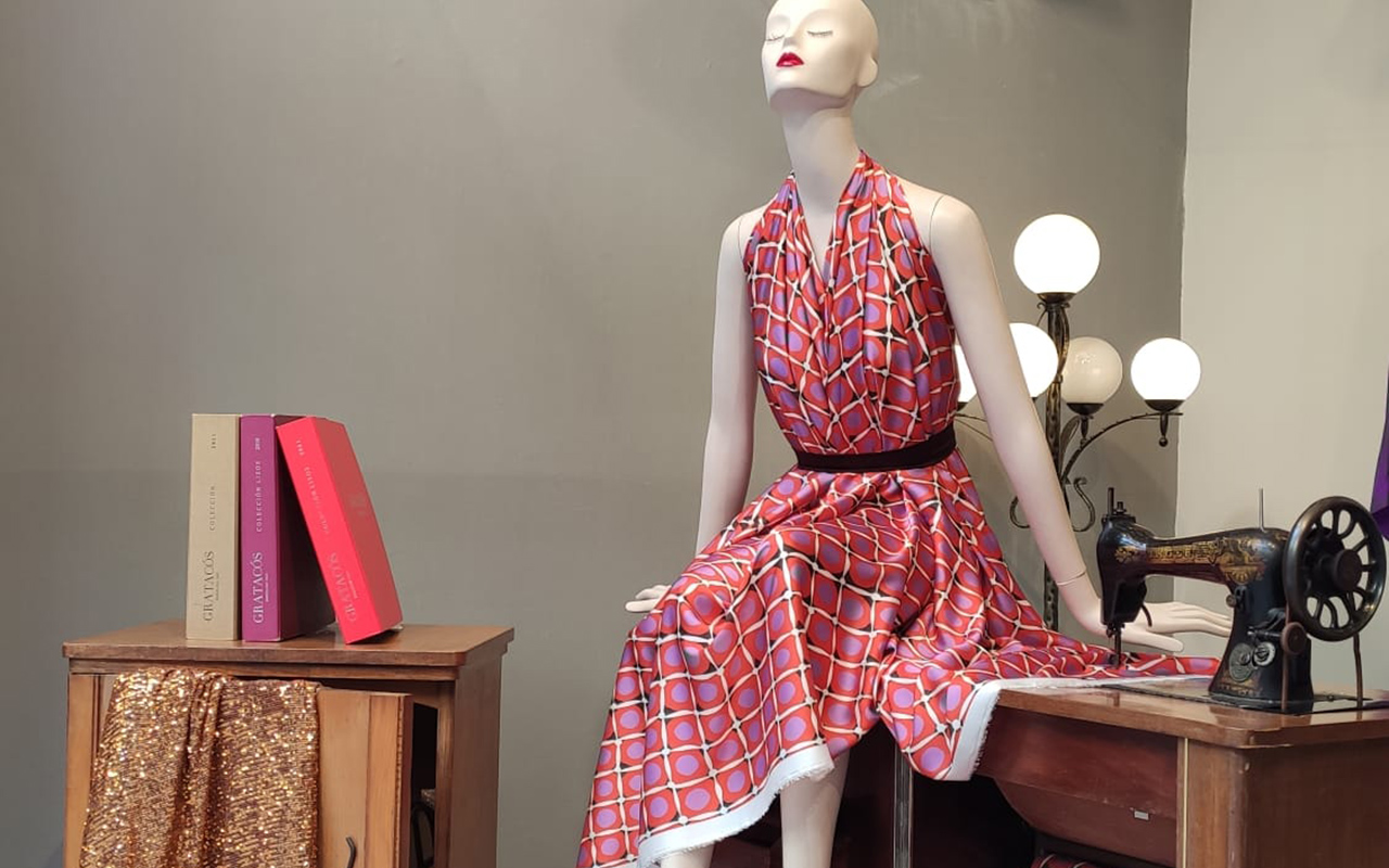
To give this action more visibility and promote the designs exhibited on the 080 catwalk, this month of May Gratacós has dedicated the showcase of our space in Barcelona to inclusive fashion. Thus, our mannequins will be dressed in some models from the debut collection that Manuel Bolaño has made with people with functional diversity in mind. We encourage you to visit our space and take a closer look at these designs that combine comfort with fantasy.

Sorry, this entry is only available in European Spanish.

A new edition of the Moritz Feed Dog is back. The contest dedicated to documentary film about fashion that takes place every year in Barcelona and this time, recovers its usual date welcoming spring with a new assortment of novelties in its programming. This festival is special for several reasons. Firstly, because it explores the universe of fashion in all its facets, giving a transversal vision of the sector: the positive values that it promotes, such as beauty, talent, identity or fun, among others, with those who are less friendly than they obscure the fashion industry and question its impact. This year the critical look focuses on essential values such as diversity, honesty, sustainability and animal abuse. Second, the Moritz Feed Dog specializes in documentary, a narrative genre that allows genuine stories to be told based on real events and that appeal directly to the viewer, expanding their mind towards a voracious industry that can be talented and creative, but also ambitious, irresponsible and cruel. The contradictions of fashion that are still a mirror of our society. For all this, the festival constitutes an idyllic environment where views are expanded, opinions are generated and debate around the fashion business is encouraged.
In this seventh edition that will take place from 22nd – 27th March at the Aribau cinemas in Barcelona, the Moritz Feed Dog has prepared a particularly careful programming: premieres, classic documentaries and films loaded with content with genuine stories. Also add that in the digital sphere, the fashion documentary film festival has partnered with CaixaForum +, the streaming platform of culture and science of the La Caixa Foundation that will issue various films free of charge in April, after Easter.

A memory to the designers who are no longer here
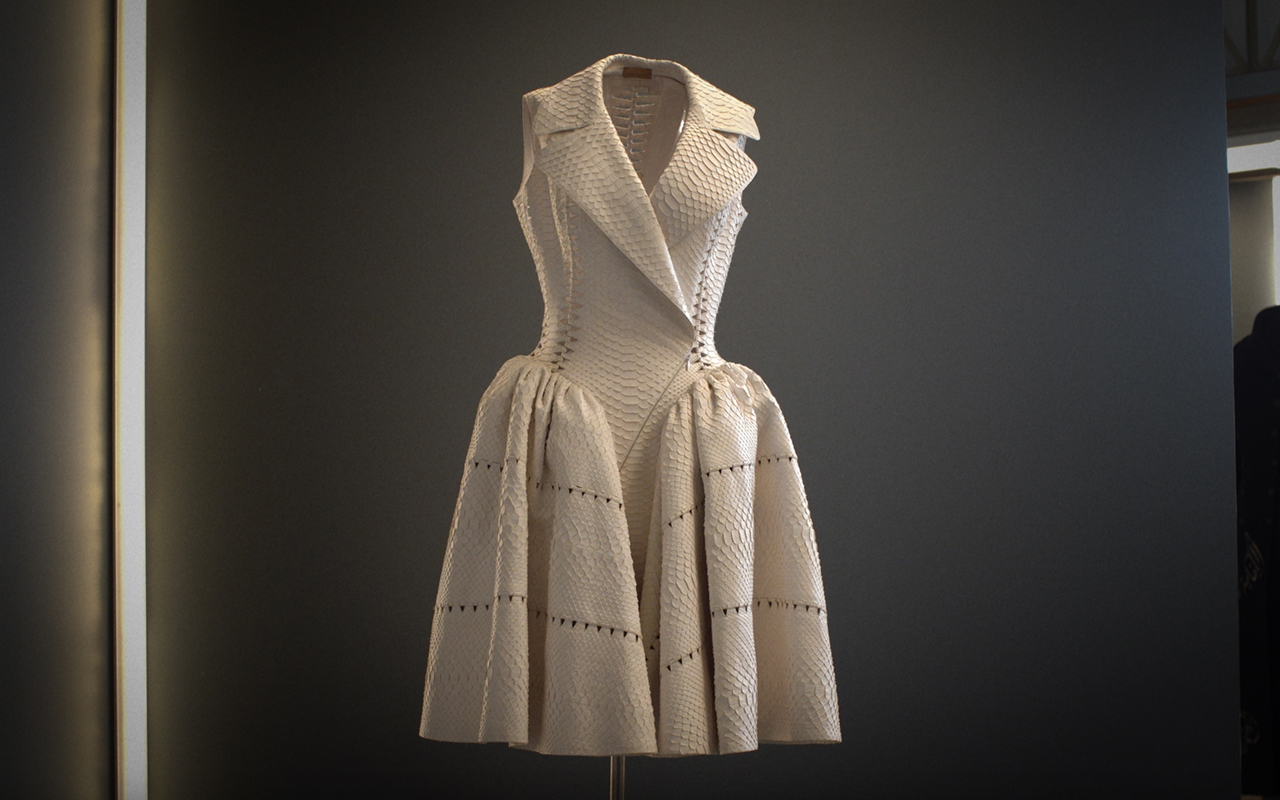
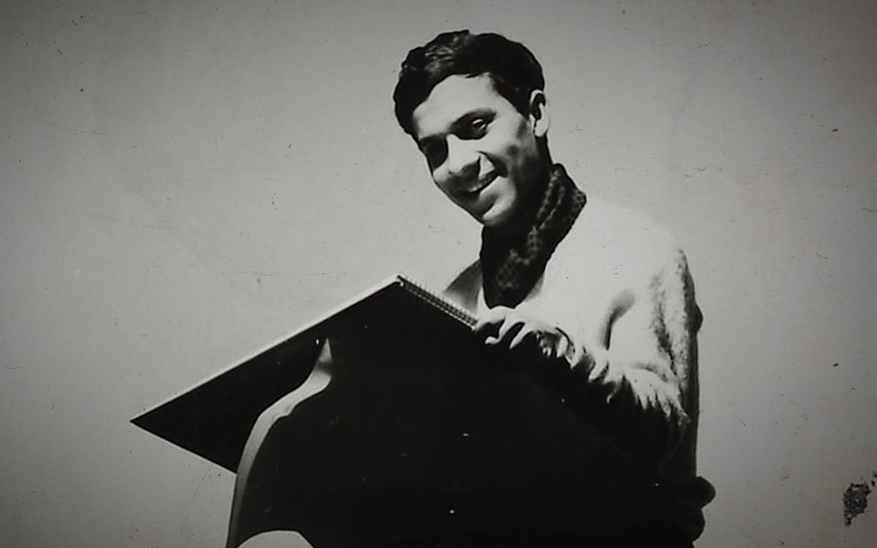
The seventh edition of the Moritz Feed Dog Barcelona kicks off with a retrospective of one of the greats: Azzedine Alaïa (1935-2017). The Franco-Tunisian couturier was known as the sculptor of fashion because he was capable of modeling human figures, using all kinds of fabrics. Alaïa was an outsider who broke the system with the help of his talent, his group of unconditional supporters and his devoted gaze towards women. Paris loved him, fashion loved him and women continue to dress him. Clients as diverse as Greta Garbo and Grace Jones, Kim Kardashian and Michelle Obama continue to be loyal fans of Alaïa . This documentary offers an exciting portrait of the life of the couturier. An outstanding piece by director Olivier Nicklaus to whom the festival pays tribute by exhibiting a selection of his most representative works: “ AntiFashion ”, “ Apocalypse Mode ” and “ Go Global”.
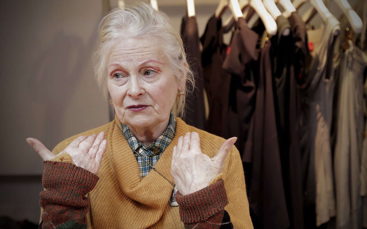
The Moritz Feed Dog commemorates the talent and unique personality of Vivienne Westwood , the queen of punk, with two titles that span her career as a designer and activist from its beginnings to her most recent work. The festival also recovers the figure of Gianni Versace offering a new vision of his career. This time, it is the male models who walked the runway for the firm in the eighties, who recall their professional and personal relationship with the designer. Finally, a documentary made and produced in Barcelona stands out, which rescues the multidisciplinary creativity of Toni Miró , one of the key designers in the history of contemporary Spanish fashion. Through his television interventions, the personality of this enigmatic Catalan talent is portrayed who walked the international catwalks in Paris and Milan, and was one of the first couturiers to incorporate anonymous people of all ages into his shows. Rigor, neatness and ease were the hallmarks of his brand, created in 1976.

The prism of fashion
Although everything revolves around the fashion industry, you don’t have to be an expert in the field to view the documentaries proposed by the Moritz Feed festival Dog. In its programming, suitable for all audiences, audiovisual pieces that offer a multidisciplinary vision through more personal perspectives and differentiated themes also stand out. From the transformation of men’s fashion and its relationship with men in “ All Man: The International Male Story ”, to an intimate piece that portrays the beauty universe of photographer Gian Paolo Barbieri in “ L’Uomo e la Belleza”, or a work has also been programmed that transmits the day-to-day life of the fauna that surrounds the sector, either in a backstage as immortalized by “Fashion Babylon ” or the not so idyllic life of an influencer teenager in “ Girl gang ”.

The other side of the industry
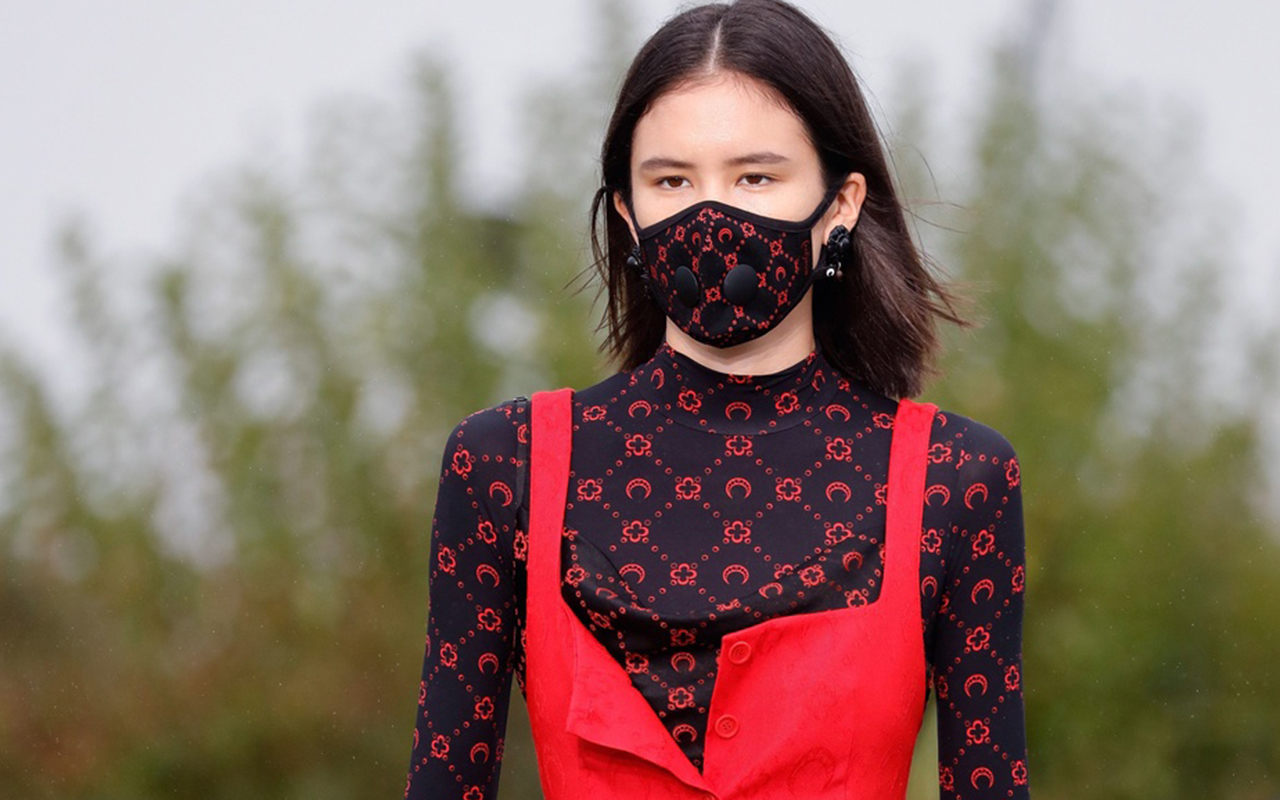
Fashion has its own shadows and the Moritz Feed festival Dog reveals them shamelessly. “Fashion Reimagined ” represents a manifesto on the sector’s impact on the environment through a small cult London firm: Mother of Pearl. In “ Wings are not for sale” the object of criticism is the fast fashion from the point of view of sociologists, activists and workers from the industry itself. The hottest topics are also reflected in “ Apocalypse Mode ” by Olivier Nicklaus , but this time, the subjects of these opinions are different generations of designers such as Agnès B, Marine Serre, Karl Lagerfeld or Alessandro Michele. Lastly, “ Slay ” brings to the table a thorny issue: animal abuse in a denunciation documentary that shows raw stories of abuse around the world. This audiovisual piece, which shows the dust under the rug, stirs consciences to demand a greater commitment from brands to animal welfare.


Moritz Feed Dog festival tickets can be found here . Make room in your schedule.
Sorry, this entry is only available in European Spanish.

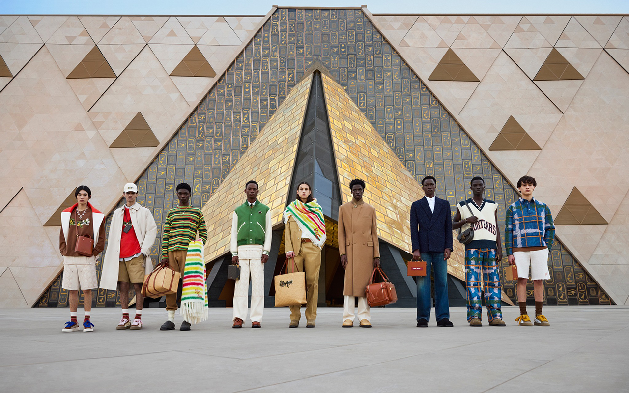
Egypt is once again in the spotlight of fashion. The celebration of the 100th anniversary of the discovery of the tomb of Tutankhamen and the awaited opening of the Grand Egyptian Museum scheduled for 2023, which hides the greatest treasures of the pharaohs in front of the pyramids of Giza, have positioned it as a desired destination that seduces by its thousand-year-old patrimonial legacy, its latest cultural offerings and some proposals for authentic luxury accommodation that revalue it on the international map.
The awakening of an icon
The enigmas of Ancient Egypt continue to fascinate the population and its power of attraction could not go unnoticed in the world of fashion. Connecting with the present, November 2022 marked the centenary of the discovery of the tomb of the young pharaoh in the Valley of the Kings. After a surprising discovery of a tomb with intact seals, Tutankhamen woke up from a slumber of more than 3,000 years and revealed unimaginable riches that helped to further understand the majesty of the reign of the pharaohs.
This discovery in 1922 came at a very opportune moment in history, after the First World War at a time of economic boom, and it quickly became a real sensation for several reasons. To begin with, it was a well-preserved royal mummy, which by its size was that of a child who had ascended the throne at a very young age. Unimaginable treasures were found next to the grave, such as the golden coffin and the famous funerary mask of Tutankhamen, which represents ancient Egypt like no other symbol in the popular imagination. A world icon oblivious to the passage of time.

The influence on the fashion of the 20s
Tutankhamen marked style leaving his mark on the fashion of the Roaring 20s. One of the treasures found in the tomb was the most complete and best preserved collection of clothing that has survived from Ancient Egypt. It included tunics, skirts, hats, children’s gloves and sandals in paper, rattan and leather. Anecdotally, these last two accessories were made contemporary replicas in the United States that sold out in department stores within a few weeks of being reproduced. Egyptian-inspired designs were also all the rage at the time, copying fitted silhouettes, straight and narrow dresses or the characteristic draping that hugged the hips and fell in the front. Before the discovery, the Egyptian style was an intermittent trend, like others that were rescued from the end of the 19th century such as Oriental inspiration or Edwardian fashion during the first decade of the 20th century. Garments and accessories with related motifs such as lotus flowers, hieroglyphics or pharaohs had already been used on their carriages on occasions, but they were not as direct or explicit inspirations as those that emerged from the designs from Tutankhamun’s tomb.
Other aspects that influenced the fashion of the 20s was the colour palette associated with the treasures of the young pharaoh. The red and brown tones of the papyri and mummies, the blue lapis lazuli in Egyptian divinities that contrasted with the powerful gold as a symbol of light or the white of the clothing. Also the fabrics: natural linens and cottons with little opacity in draped silhouettes that contrasted with the ornamental elements. In fact, the jewelry industry surrendered at the feet of Tutankhamen reproducing multiple bracelets, rings and necklaces worked in crystals and semi-precious stones. There was also no lack of ornamental elements that made reference to Ancient Egypt such as birds, beetles or the solar disk that represented the divinity Ra. The geometric motifs and the tendency to wear two or more bracelets on the same arm also arose from seeing the treasures of the child pharaoh exposed. The pioneers in this type of design were Lacloche, Van Cleef & Arpels and Cartier.
The Western world was already fascinated by Egypt long before the discovery of Tutankhamen’s tomb: Verdi’s opera ‘Aida’, Tiffany’s Cleopatra-inspired jewellry or the costumes of the dancer Mata Hari, who found her inspiration on a trip made o the country of the pyramids, are two good examples of this attraction.

A new rise
The fever for Ancient Egypt has not ceased in fashion and its presence has been intermittent over the last 50 years. For example, in the 1960s, Egypt mania returned to fashion with Elizabeth Taylor’s portrayal of the powerful Cleopatra. Her beauty, makeup and wardrobe were (and still are) an inspiration for many fashion designers and editorials. Or in the 1970s, a new traveling exhibition of Tutankhamen’s treasures received eight million viewers who were once again interested in the enigmas of Egypt. Various marketing objects were also exploited in the United States: jewelry, household products or small fashion accessories.

Ancient Egypt on the catwalk
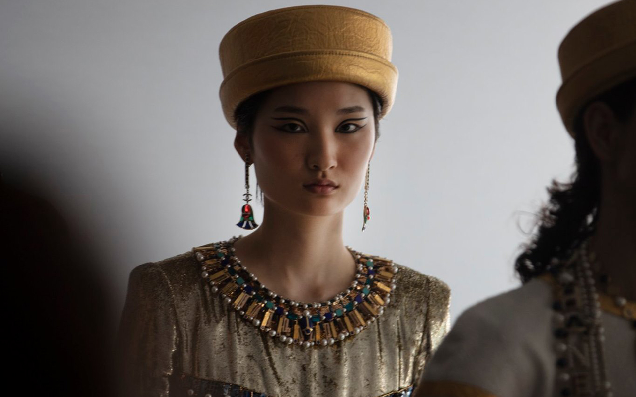
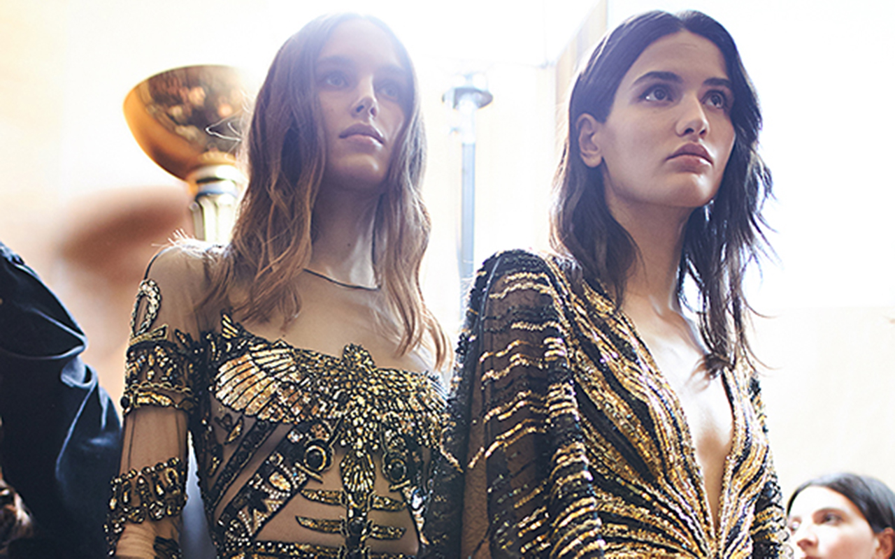
The historic civilization has also fascinated the designers of luxury firms who have found in its iconography a constant source of inspiration. From John Galliano in 1997 with a mixture of Egypt with punk aesthetics to the elegance of Karl Lagerfeld for Chanel in 2019, the catwalks have celebrated the splendor of Ancient Egypt with models that rescue the beauty of the female figure and the lavishness of the empire of the pharaohs. Golden fabrics, inlaid precious stones, flowing dresses, muslins, tunics, ethereal capes, embroidered hieroglyphics… each firm has interpreted this suggestive universe over the last few years.
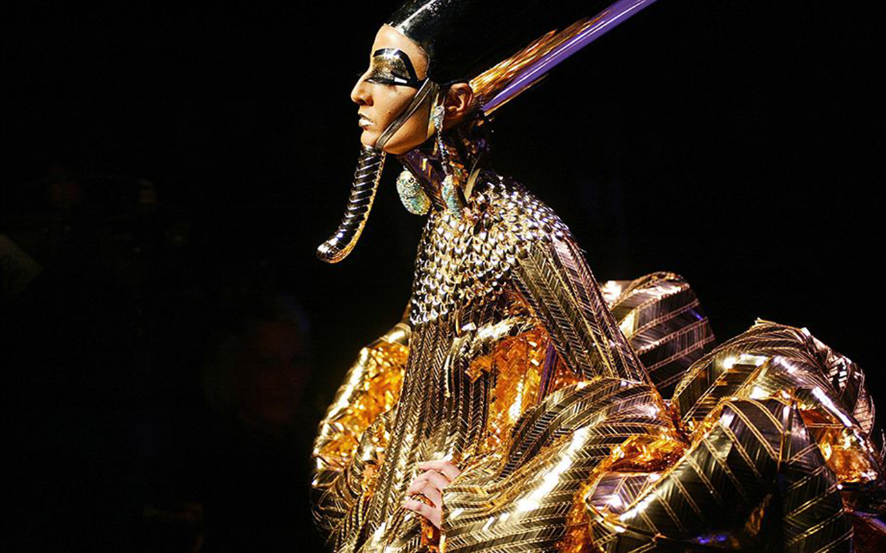
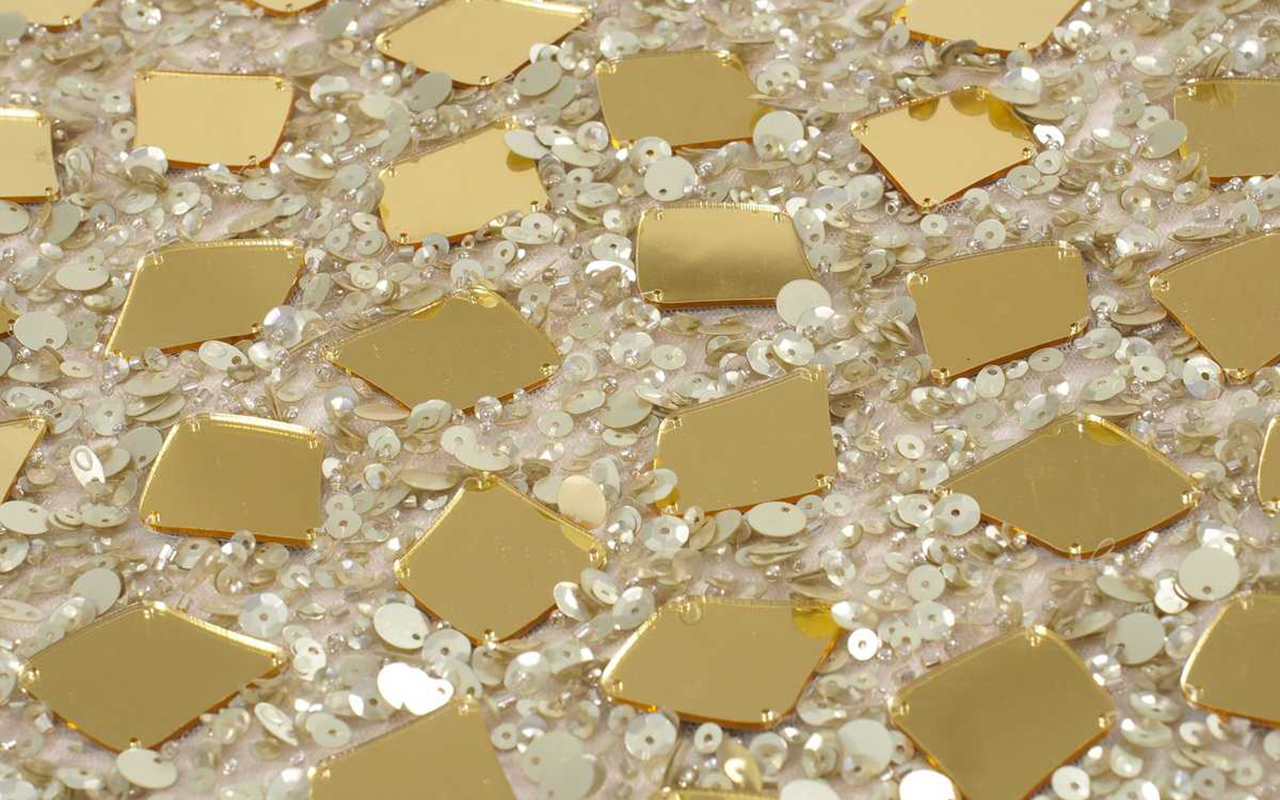
Among all the tributes that have been paid, the one paid by John Galliano when he was in charge of the artistic direction of Dior stands out. The haute couture collection for the spring of 2004 was presented in a show as grand as few can remember. On the catwalk there was no shortage of the most symbolic gods of the Egyptian pantheon, the Tutankhamen mask, the silhouette of the sphinx, fabrics that wrap around the body like a mummy and models inspired by Cleopatra herself. In this unusual collection there was no shortage of excessive volumes , dresses with exaggerated proportions, skirts with a pyramid silhouette, the golden colour, endless organzas and extreme attention to detail that earned it the title of Haute Couture. He also did his own interpretation of this fascinating Alexander McQueen universe in 2007 that focused more on investigating the relationship of Ancient Egyptian religion with the folk culture of British immigrants. In a more moderate way, the designers Bagley Mischka and Zuhair Murad have also been inspired. Also Givenchy in 2016, Balmain and Chanel. Karl Lagerfeld chose the temple of Dendur as the setting to create his own version of Egypt in the pre-fall 2019 collection.
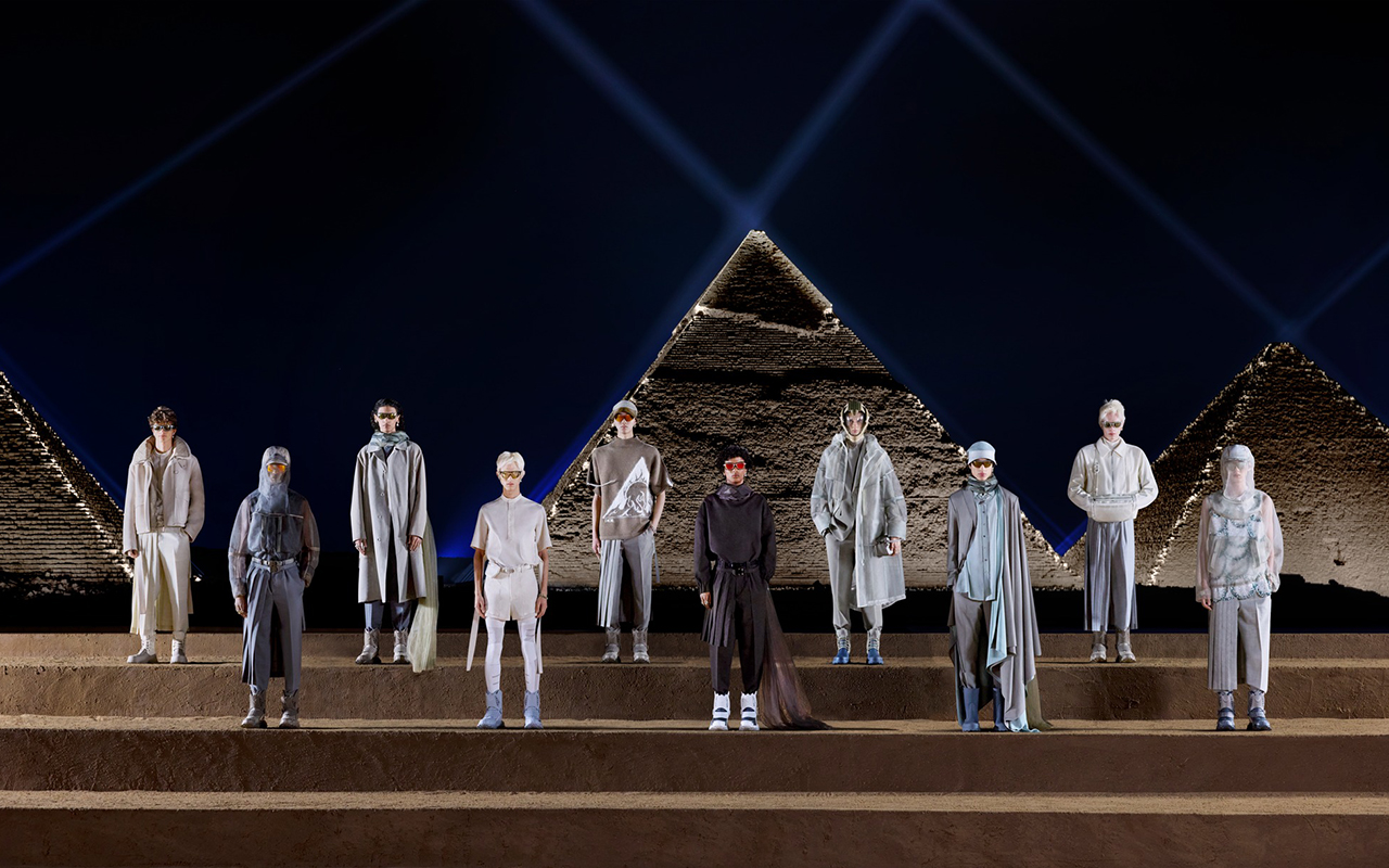
The last proposal that has been exhibited with clear references to Egyptian culture has been just a month ago. Kim Jones , artistic director of Dior Men, traveled to the Giza pyramids on site to present the autumn collection, evoking the colours of the monuments and looking up at the sky to link it with the stars, a common symbol in the historical French firm. A splendid proposal that represents the past, the present and the future of Dior.


All photos: Facebook Vivienne Westwood
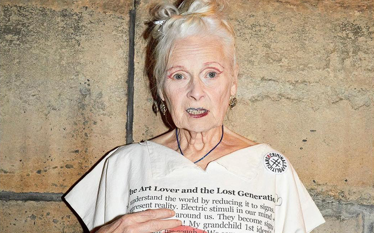
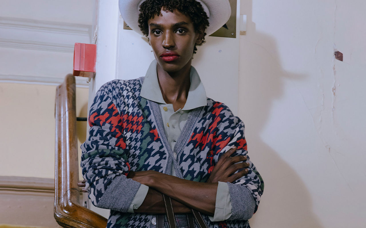
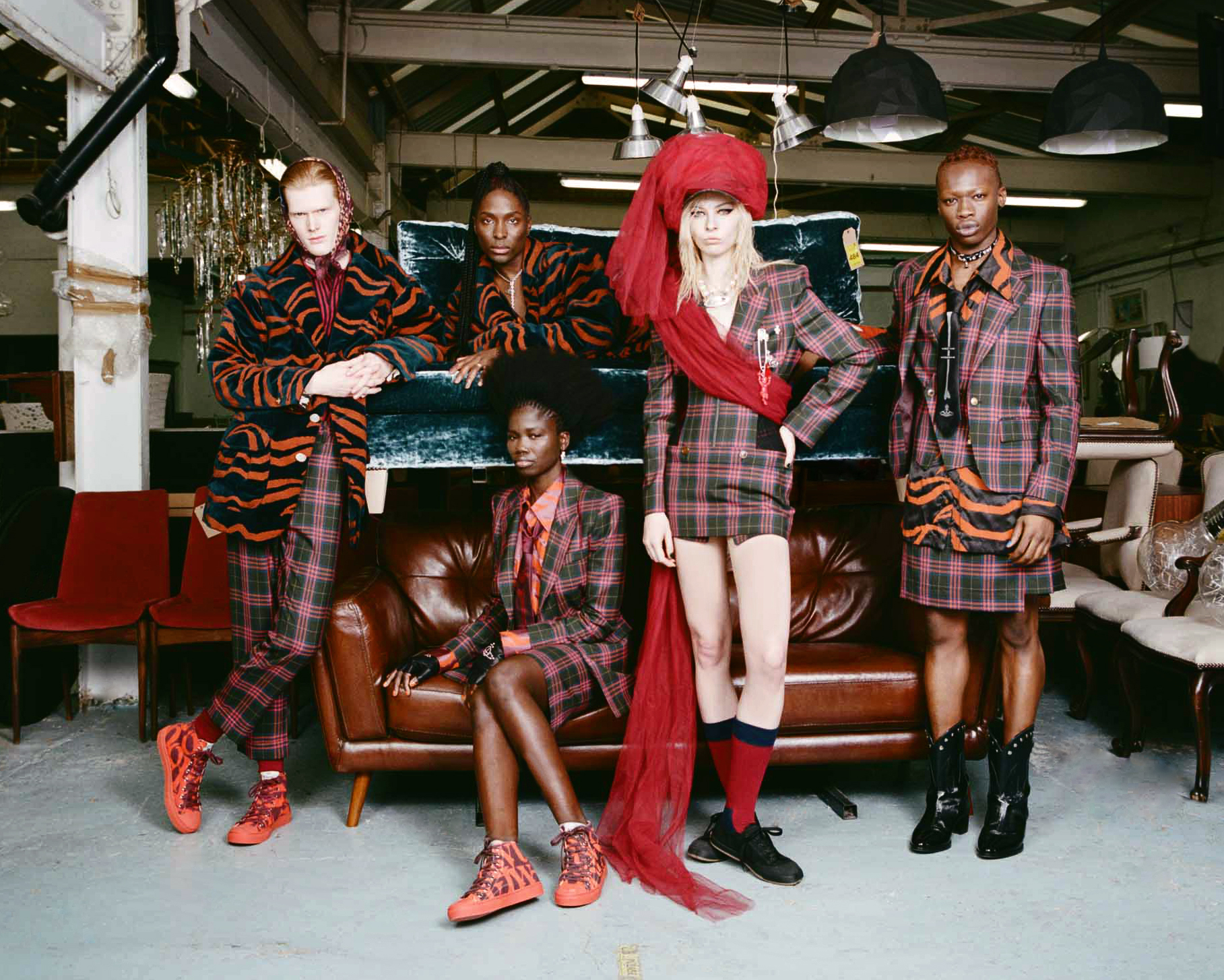
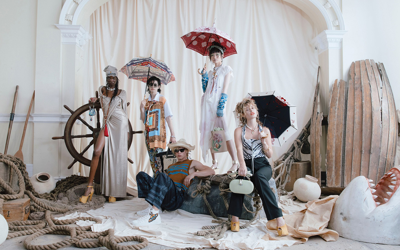
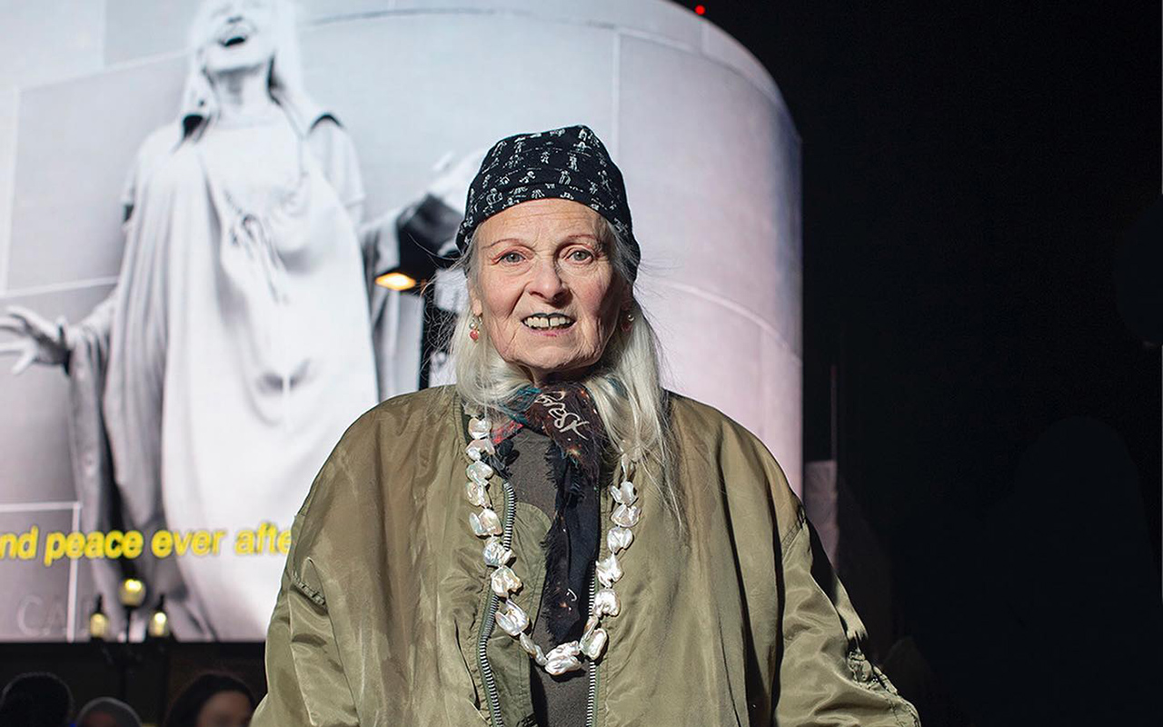
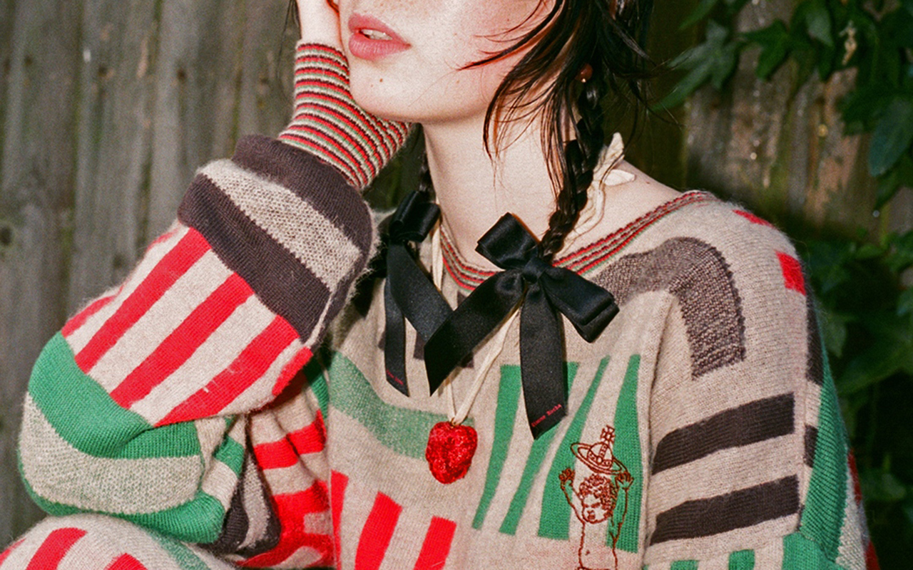
2022 ended with the farewell to one of the emblems of 20th century British design. Provocative, revolutionary, creative and political activist, Vivienne Westwood was a lawless idealist who forever transformed UK fashion. Her revolution was to make visible her aversion to corruption and injustice in the world, as well as to denounce the passivity of youth through clothing. Westwood gave birth to the punk movement in fashion, but also took couture by storm in the ’80s and ’90s; and built a global empire with stores all over the world, a priori antagonistic concepts (capitalism/anarchism) for a transgressor of the needle, but for Westwood there were no limits or labels. Fashion was a weapon and its objective was clear from the beginning: to change the rules of the game, destroy conventions and make the world more just and equal.
The renowned fashion designer died on December 29th at the age of 81 surrounded by her family in Clapham, South London. In a statement from the brand, they assured that Vivienne Westwood “continued to the end with her subversive design, her artistic activities and her activism, to change the world.” Her husband and creative partner Andreas Kronthaler said of the designer: “I will continue to hold Vivienne in my heart. We have been working to the end and she has given me many things to keep going.” Her legacy lives on.

As a child she showed proise
Vivienne Isabel Swire was born in 1941 in the town of Tintwhistle, near Manchester. Her working-class parents encouraged her to do crafts, a skill little Vivienne was extraordinarily good at. She also liked to read a lot and spent long afternoons in the library. As a child she had an enviable self-confidence, believing herself to be an exceptional craftswoman. “Honestly at the age of 5 I could have made a pair of shoes,” the designer said in an interview. Her family moved to North London in 1958. Despite her abilities, the young Vivienne graduated as a primary school teacher, then married Derek Westwood, a young blue-collar worker with a flamboyant mod aesthetic. The first creation, without knowing how to sew, was her own wedding dress, as well as the jewelry she wore.

The influence of Malcolm McLaren
Meeting Malcolm McLaren then changed the peaceful life of Vivienne Westwood. He studied art and shared a class with one of Vivienne’s brothers, he had curly red hair and a face bleached with talcum powder. He called himself the godfather of punk. With an eccentric appearance, McLaren impressed with his creativity and brilliance, at the same time that he offended the older generations and hated everyone, except himself. The attraction to Vivienne was immediate and together they began one of the great creative partnerships in recent UK history. For the young designer, McLaren was an awakening for her: introducing her to art, music, and the transformative power of fashion.

Fashion and punk
In 1970, McLaren became the manager of The Sex Pistols, a group that defined the punk movement. At that time, Westwood had learned the trade in a self-taught way and opened a store on Kings Road in London inspired by the aesthetics of the group. She called it a subversive name: ‘Sex’ with a huge pink sign alerting passers-by: “only the brave enter”. Inside, everything was shocking. The serving staff and the clothing on display were designed to explore the individualism and identity of the wearer. Clothes with studs, chains, zippers, tight leather garments, impossible heels, T-shirts with subversive messages… Everything was designed to shock. “We invented punk,” Westwood stated in her autobiography. In fact, the presence of Vivienne and McLaren was inherently intimidating. They wanted to impress, irritate and provoke a reaction, but also inspire change. Punk was still an explosion in all its magnitude.
McLaren later acknowledged that he was willing to misrepresent popular culture to reduce it into some kind of marketing campaign, but for Westwood, the move ran deeper because she saw it as a youth insurgency against the corruption of the old world order. The British designer believed that fashion and music would channel the anger of young people and bring about change, but later realized that many of them simply ignored global injustice, and with their nose studs and punk rock music the only thing that they did was dance and have a good time.

The jump to the big catwalks
Punk was just one chapter in the legacy that Westwood leaves behind in fashion. The designer took her subversive ideas and stormed the catwalks in London and Paris. Vivienne worked at first alone with a sewing machine at home and used the moulage technique, joining the pieces together and using her own body as a template. She researched the history of fashion, remade it in her own way, and challenged the world of haute couture. An alliance with the generation of supermodels: Kate Moss, Naomi Campbell, Laetita Casta… showing her designs also helped her to position herself and become the leading independent designer in the 1980s and 1990s. The key to Vivienne Westwood’s success was that of not losing her orthodox identity when she moved into the world of fashion shows and ready-to-wear collections with abruptly cut garments, games of semiotics, decontextualized objects, draping… Precisely her subversive style and her transgressive image (her hair was either bleached or dyed orange and extreme makeup), made her one of the most distinctive and original designers in the fashion world. In the early 1990s, Vivienne Westwood built a mini-empire: she opened her own boutiques and produced clothing, footwear, accessories, cosmetics, and perfumes. Even bridal fashion! When Carrie Bradshaw’s character in the mythical series ‘Sex and the City’ wanted a wedding dress, she turned to the famous designer, who by the late 90s had already become a major bridal brand.

The more committed side
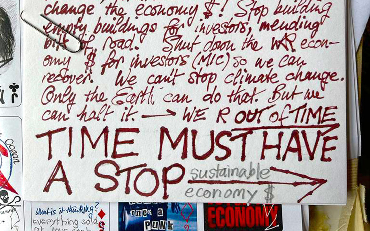
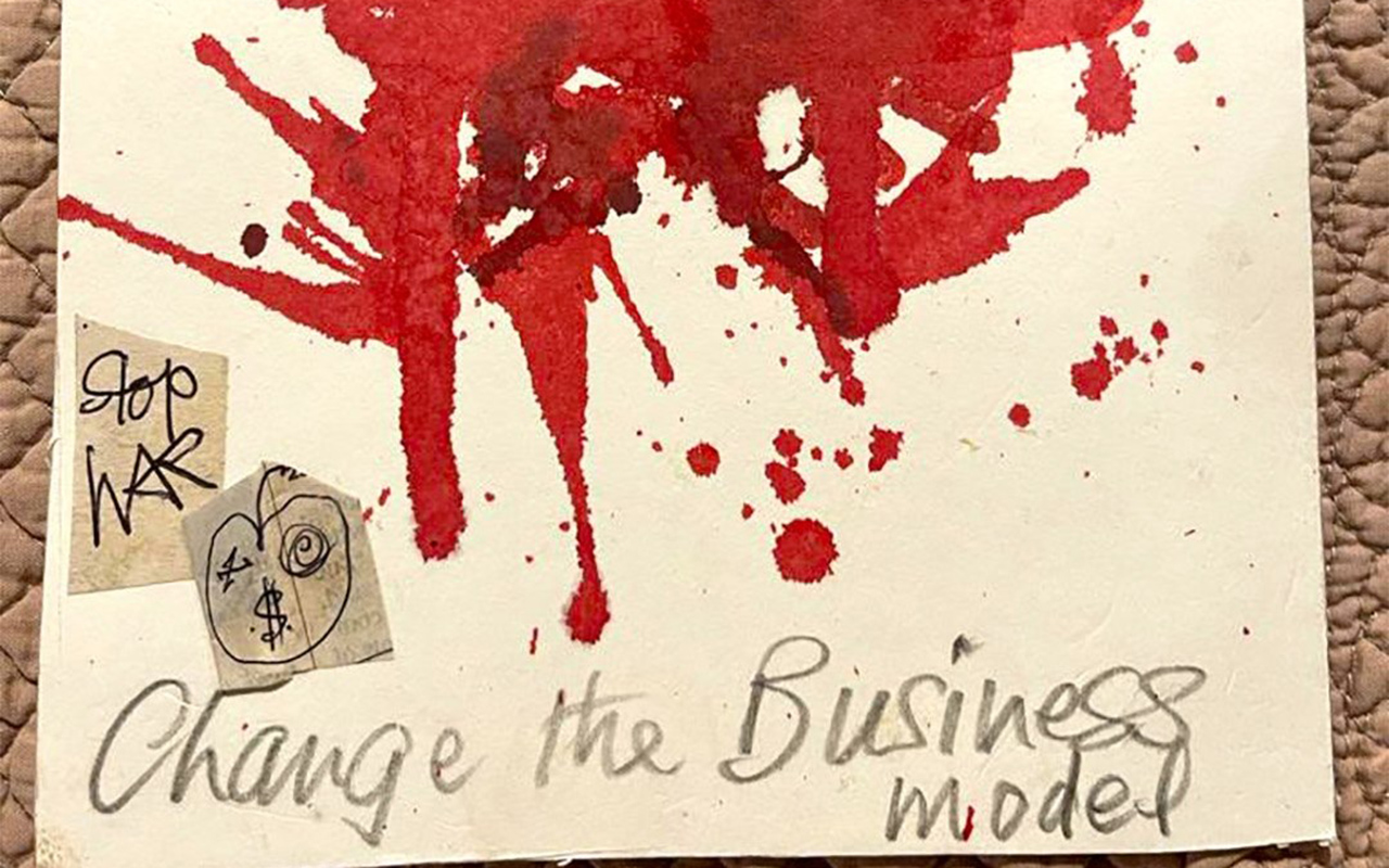
For Vivienne Westwood, fashion was a weapon and the message an inseparable part of her aesthetic heritage. Everything had a purpose. The British designer loathed the political class and launched a lifelong crusade to promote individual freedom, rid the world of nuclear weapons and combat the threat of climate change. “Buy less, choose better and make it last” is one of the lessons that still survives in times of climate emergency.
“I don’t want to be underground ,” she used to protest, defending that she wanted to be out of the spotlight to spread her message. She supported numerous causes, donating to the Green Party and becoming a regular visitor to WikiLeaks founder Julian Assange. She even parked a white tank outside the home of former Prime Minister David Cameron at an anti-fracking protest.
Vivienne Westwood was also honoured by Queen Elizabeth II. The late monarch presented her with the Order of the British Empire in 1992 and the designer appeared without underwear. Her Majesty was not amused by this rebellious gesture, but on her own merits she agreed to name her Dame a few years later. And this is how Lady Westwood, godmother of punk, defended to the last breath, her transgressive ideas applied inside and outside of fashion, but above all, maintaining a coherent attitude towards life by questioning, in her own way, the world order and the rules. of the game.
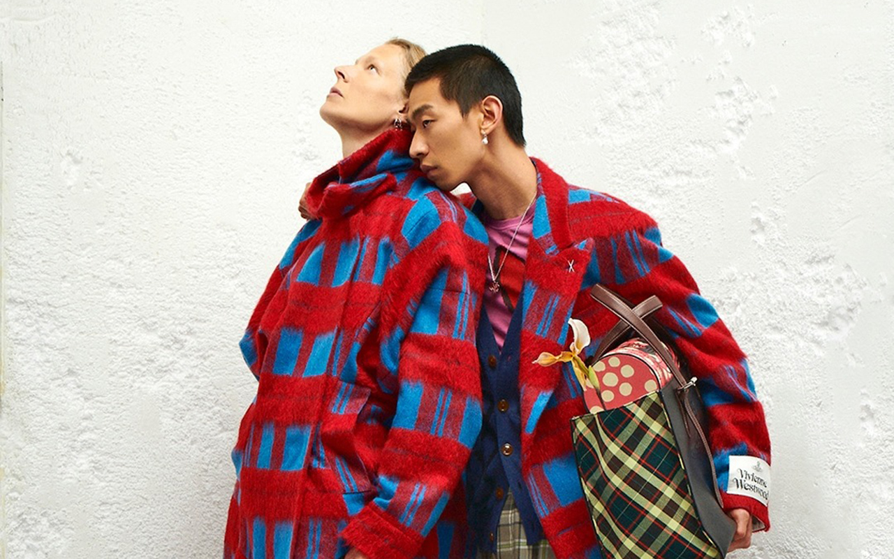
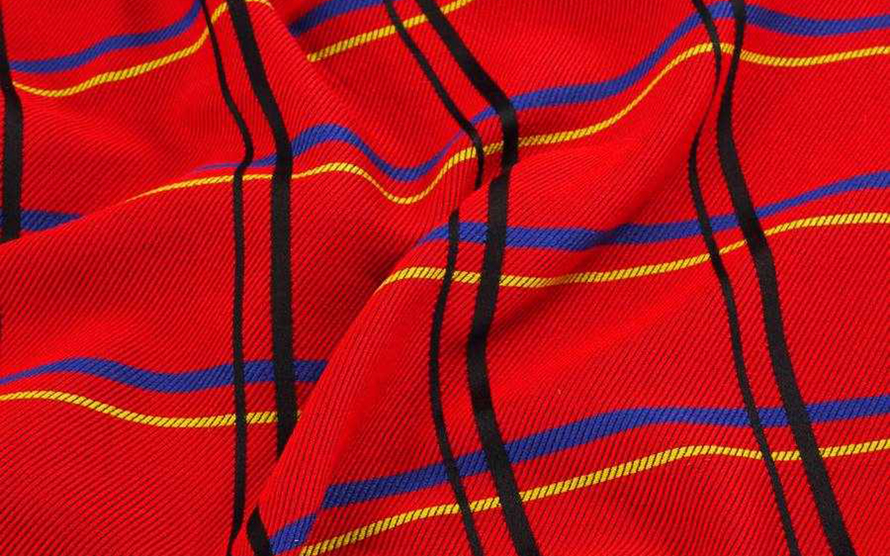
At Gratacós, we pay homage to Vivienne Westwood with a selection of our most irreverent fabrics. You can find them in our online store or in the Barcelona space.


Viernes 30 diciembre 2022

At the end of the year the evaluation lists come out: the best books, the most influential characters, the must-see series, the trends that have marked each season, the new fashionable words that we incorporate into the dictionary… At Gratacós we carry out our particular revival exhibiting the shop windows that have been created at the entrance of our space in Barcelona. In fact, it is nothing new that we bet on creating windows that attract attention. We have always done it and each window represents a new visual letter of presentation because it speaks of who we are and what we do in a creative, spontaneous and current way, using new languages of expression that go beyond fashion.
During this year of return to “neo normality” we have dressed our mannequins with spectacular fabrics from the new season, but we have also had the support of the students of the design schools we collaborate with, the creativity of brands made in Barcelona and some artists linked to Gratacós . All of them have put their grain of sand to build new windows that create that attraction effect to those who come to our physical store. We review them below:

February 2022. Echoes of spring
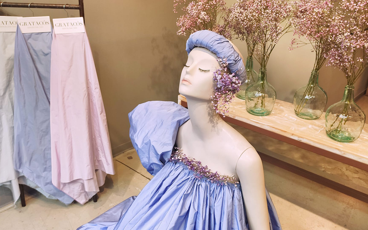
Winter was short-lived in 2022 and the high temperatures, unusual in February, were unknowingly a foretaste of what would come next and would remain the usual trend throughout 2022, one of the warmest years on record. In the traditionally coldest month of the calendar, we took a look at our shop window betting on the incipient spring that was already rearing its head. The first green shoots, the white and pink flowers of the almond trees and, in general, a new awakening of the flora that we express through taffetas (Picasso) and colour in its softest tones.

March 2022. An arty twist
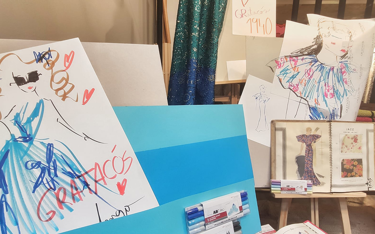
In March there was an artistic turn towards fashion illustration with the identifiable stroke of Joel Miñana, where his colourful mannequins were the absolute protagonists of the window. Using coloured pencils, markers and geometric lines, Joel interpreted some of the key fabrics of the season in an arty key . This contemporary vision was complemented with cuts from vintage dresses, fabrics from other seasons, and classic drawings that review the history of Gratacós, offering two visions that define our company: tradition with modernity.

April 2022. A book to remember
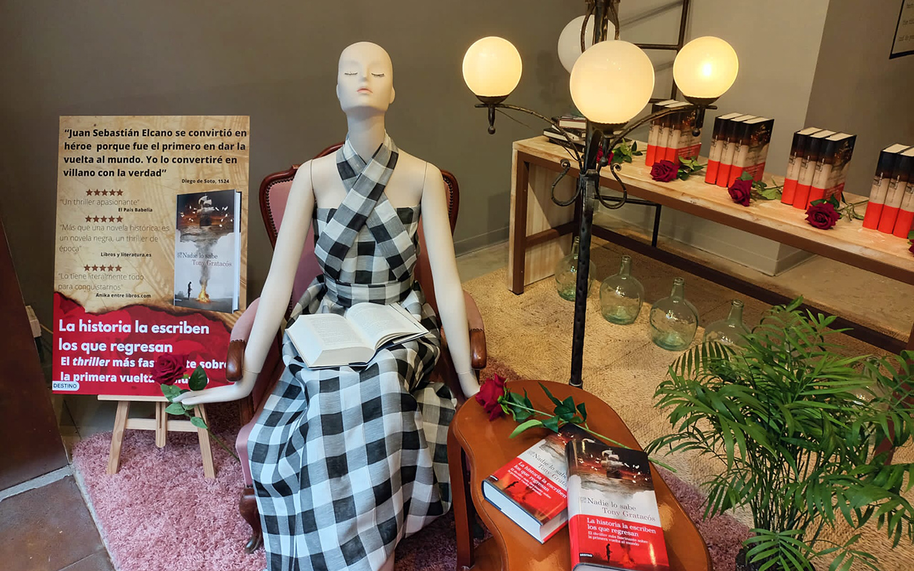
In the month dedicated to literary culture, we wanted to do our part by paying tribute to a specific book: ‘Nobody knows’ (Planeta, 2022) by Tony Gratacós . A historical thriller about some of the mysteries of the first circumnavigation of the world. The author gives a twist to the figure of the navigator Juan Sebastián Elcano, one of the few survivors of the Magellan expedition in an ambitious story that immerses us in one of the most splendid and fascinating periods in the history of Spain and that hides a secret that has taken five hundred years to come to light. The shop window could not miss some signed copies, roses and a mannequin with an imperishable fabric, the Gingham linen check that is renewed every year without losing its classic essence.

May 2022. The brides of the year
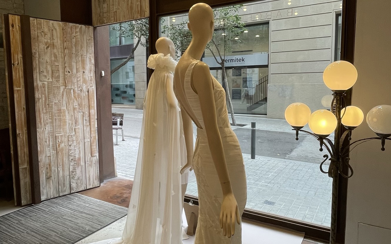
The bridal showcase took place in May this time, making visible the work of the last two winners of the contest IED Barcelona that the school organizes every year through their postgraduate course in Bridal Gown Design. On this occasion, the moulages by Myrian Medina, winner of 2022 and Nicole Claux , winner of 2021. Two wedding dresses, one made of georgette (Danubio) and the other made with mikado on the bodice and sequin embroidery on the tail of the skirt. The fabrics provided by Gratacós together with the unique cutting and sewing technique gave way to one of the most special showcases of 2022.

June 2022. Studio 54 returns
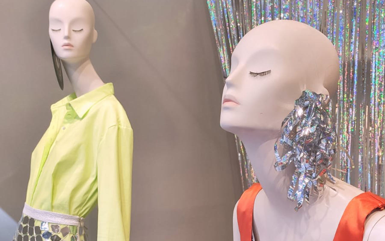
In June we welcomed what would be the longest summer of the 21st century, recalling the disco aesthetic of the 70s. Iridescent materials, reflective crystals and subtle shimmering fabrics to kick off a time full of outdoor celebrations. The bling bling aesthetic was achieved by Joplin Atelier, the Barcelona born firm of Laura and Aida Molano who succeed with their glam rock style , creating feminine and opulent looks in volumes, colours and fabrics. The mannequins wore two looks in lime cotton and orange silk satin combined with pieces made with mirror effect appliqués on tulle as a miniskirt.

July and August 2022. Sales time
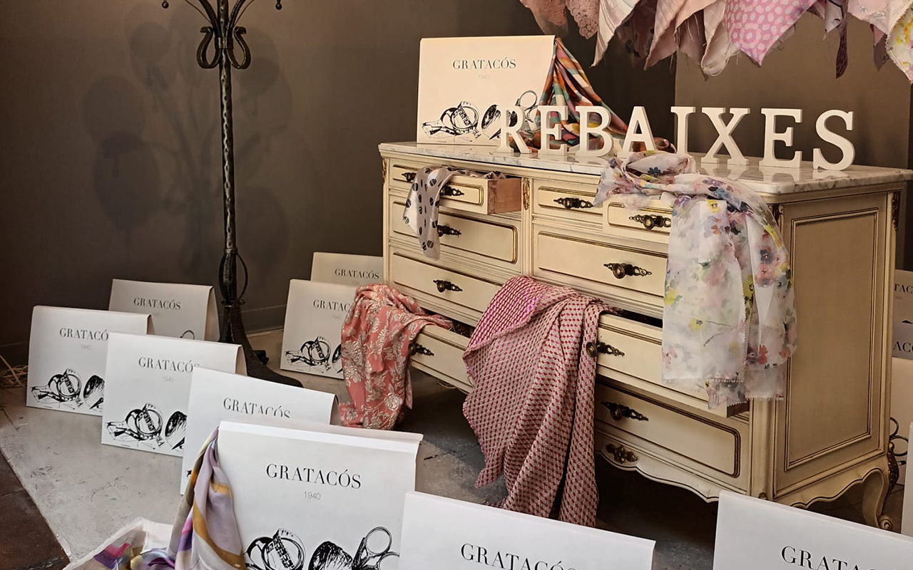
The sales were the stars of the holiday months and we showed a selection of our best seasonal fabrics in various shades of pink and ecru: jacquards , prints and embroidery mostly. The shop window recreated a feminine room with a certain air of disorder, through a chest of drawers with a vintage spirit , where sumptuous fabrics sprouted from each of the drawers. A tribute to the carefree divas of classic cinema brought to our land.

September 2022. Back to school
In the fashion industry, the year traditionally begins in September, coinciding with the change of season, the new catwalk calendar and the most powerful magazines in the world invest in million-dollar covers to compete in sales. This month, the designer Emile Albretch from the ICM school exhibited her latest models through pieces made with different jacquards , knitted with lamé and moiré. The result was an interesting mixing exercise with a colourful result that hooks the new generations.

October and November 2022. Home sweet home
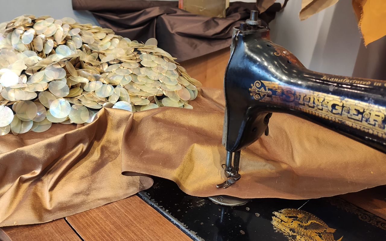
The quintessential autumn months were dedicated to exploring the traditional universe of the home. Sewing, cutting and sewing, leisurely hobbies that require the work of the hands with a dose of creativity, perseverance and patience. From this intimate refuge, the dreams of tomorrow are woven through wonderful fabrics such as wild silk in gold or transparent XXL paillettes.

December 2022. Red Christmas
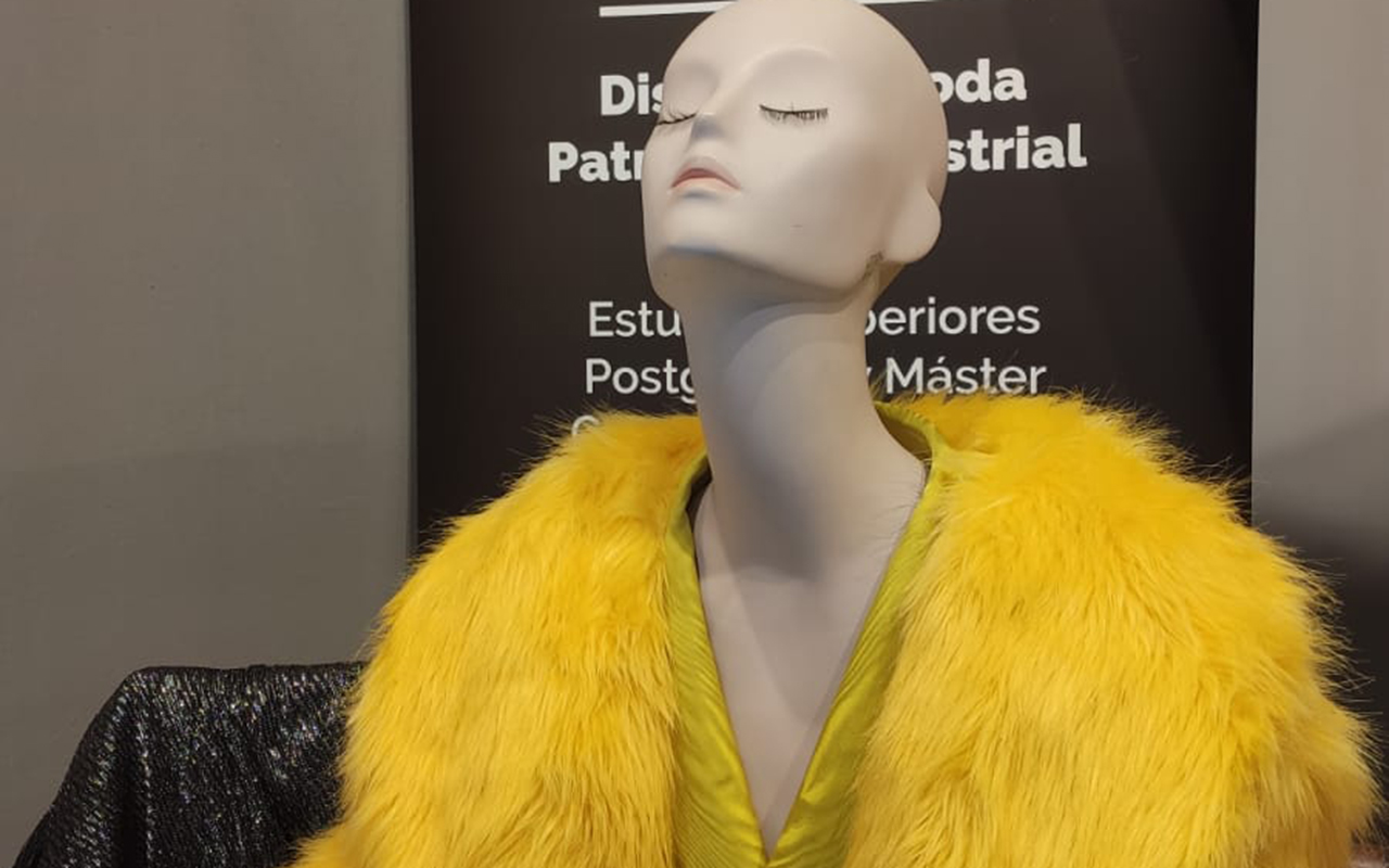
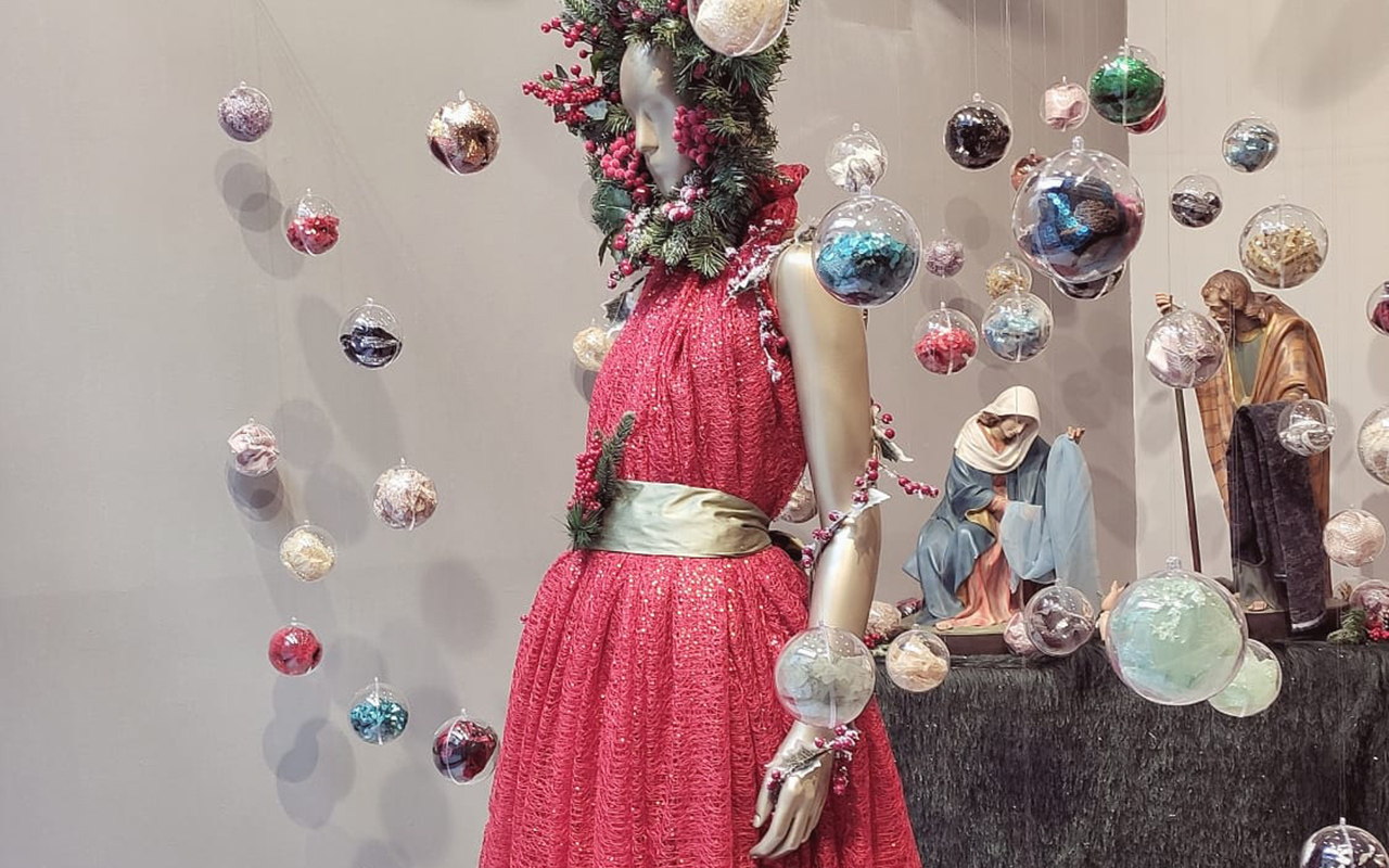
We say goodbye to the year with a classic tribute to Christmas. Crystal balls that enclose remnants of fantastic fabrics, the traditional nativity scene that reminds us that no matter how times change, there are customs that remain intact over time, and a spectacular mannequin in the centre dressed in red sequins with winter decorations that remind us that winter has already begun, despite being just as atypical as at the beginning of the year. What will 2023 bring us? Regardless of the desires of each one, we await the arrival of new shop windows that will surprise you and invite you to enter our space in Barcelona. Happy New Year!
 All About Viva Magenta, the Color of the Year 2023. Pic: Pantone
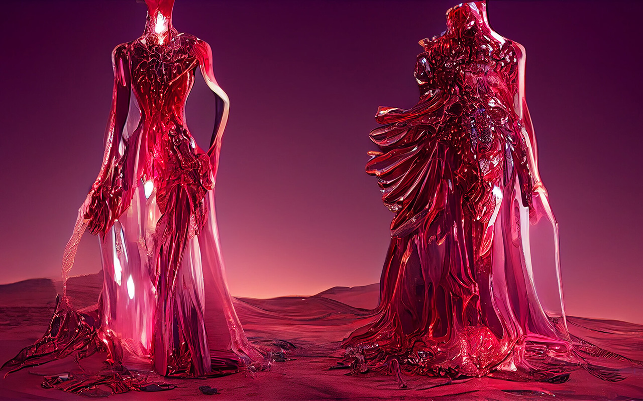
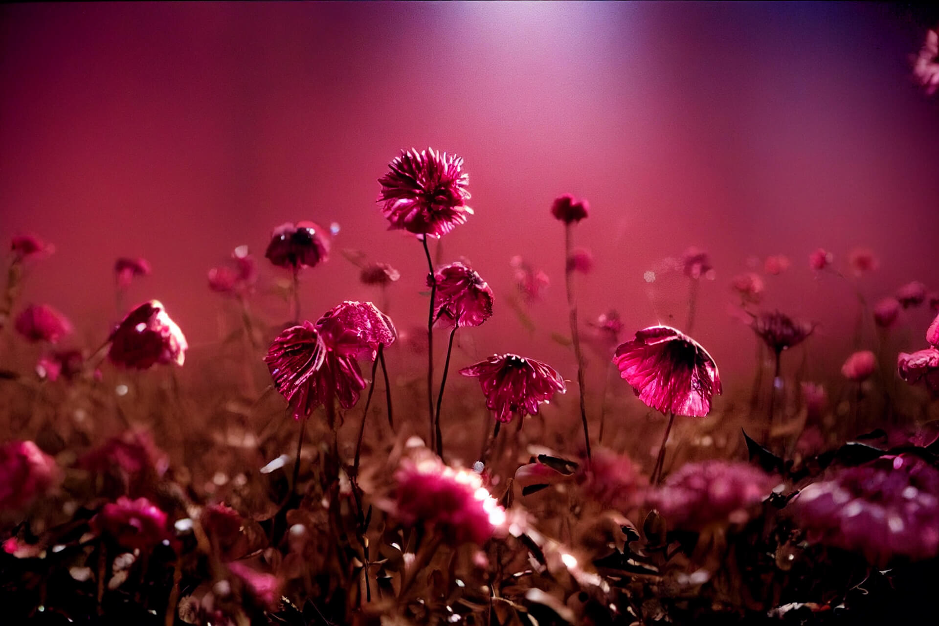
Is it rosy red? Reddish purple? Perhaps crimson red or rather, a deep raspberry hue. All these nuances that transition between red, pink and purple define the unique Viva Magenta , the colour that Pantone has chosen to guide 2023 and inspire disciplines related to art and design .“ It is brave and intrepid, and a pulsating colour whose exuberance promotes a joyous and optimistic celebration, writing a new narrative”, declared Leatrice Eiseman , Executive Director of the Pantone Colour Institute . Viva Magenta 18-1750, this is its technical name, is a tone that vibrates with energy and vigor. “A lively red that encourages experimentation and unrestrained self-expression. An electrifying, limitless tone that comes through with a bold statement,” said Eiseman .
“Viva Magenta promotes a joyful and optimistic celebration, writing a new narrative”

The arrival of this enigmatic red is not accidental. Pantone introduced the Viva Magenta shade in 2019, but it quickly rose in popularity to rise to stardom as the Colour of the Year 2023. This boom has been largely fueled by events in society in recent years. As Laurie Pressman, vice president of the Pantone Colour Institute , put it, “It’s an unconventional colour for an unconventional time.” The experience of Covid and its social and economic consequences have forced changes that, voluntarily or not, have transformed people’s lifestyles. And there, after two years of uncertainty expressed through cold tones ( Very Peri, 2022) or dual (Ultimate Gray + Illuminating , 2021), now comes a hybrid tone with enough personality to be able to light up 2023. Unlike its predecessor, Viva Magenta combines coldness and warmth in the same colour, and aims to mix the physical with the virtual, a dichotomy that cannot be more relevant today with the rise of virtual reality.

“It’s an unconventional colour for an unconventional moment”
Viva Magenta has already been spotted by trendhunters who work at the Pantone Colour Institute This choice is never the result of whim or chance, on the contrary, it is the result of a deep sociological and anthropological analysis of today’s society. Choosing the colour that will mark the year combines research, method and instinct. And magenta was there, in worlds as varied as fashion, cosmetics, concept store design , digital art, social networks or decoration. The question was, why pay attention to that carmine red that is already present in society and what emotional and psychological values is it transmitting? Pantone quickly looked up its meaning. According to the international authority on colour, in this era of technology, the aim is precisely to be inspired by nature and what is real. Pantone 18-1750 Viva Magenta is inspired by cochineal red, one of the most precious of all natural dyes, as well as one of nature’s strongest and brightest hues. Therefore, rooted in the primordial, the colour of 2023 reconnects with the original matter, revitalizes the spirit and helps build a new inner strength. “We set our sights on a colour that highlights our need to shift our perspective, highlights our desire to feel empowered, and gives us the strength to boldly, possibly, and fearlessly launch into a new path with complete confidence.” Pressman expressed.
“We have set our sights on a colour that makes us want to feel empowered”
Seen this way, Viva Magenta is a hue that is presented as a revitalizing balm that connects our interior to project ourselves strongly to the exterior.

How to apply Viva Magenta in our daily lives?
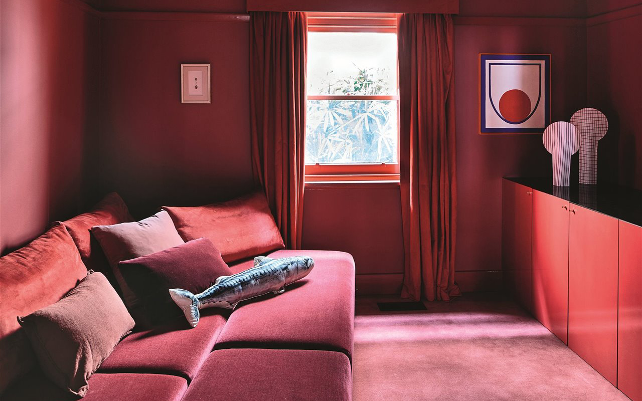
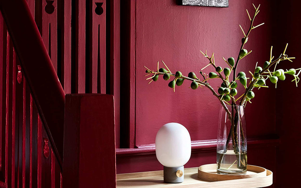
Reddish tones and explosive mixtures such as intense pink-red have been imposed everywhere, from the catwalks to the metaverse, and where it has the most possibilities of expansion is in interior design, be it a private home or a commercial establishment. According to Eiseman, kitchens (and appliances), which have long harbored a respect for red, can now be imbued with “a touch of novelty” through Viva Magenta and its ability to break away from the “same red hue of always”, which defined previous generations. Pantone 2023 colour is also suitable on glassware or any other reflective surface, and can even nestle in cushions and other small decorative items to make a “beautiful, dramatic and theatrical statement” in your home. Although such a lively colour can intimidate or condition the current of neutral tones that are prevailing in decoration, the truth is that Pantone affirms that consumers are more prepared than ever to begin to embrace all the possibilities of colour.
 Acuamona AW22/23. Pic: Acuamona
And in fashion, how is it appreciated?
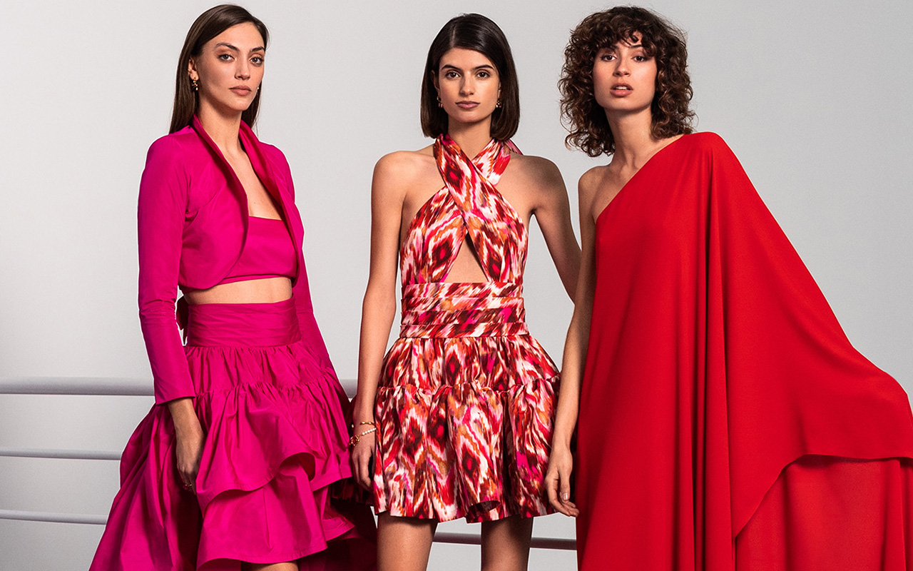
There is no doubt. The fashionable colour of 2022 has been the brightest fuchsia pink, a faithful ally of Valentino and its explosive Pink PP shade, and emblem of the entire Barbiecore aesthetic. Now, Viva Magenta is presented as a natural evolution of that hue, providing less stridency and keeping its magnetism intact. In truth, red has been one of the most repeated tones on the winter catwalks and for summer it returns with force, but it remains to be seen how the next collections that are being developed for 2023/2024 evolve so that Viva Magenta appears even more strength.
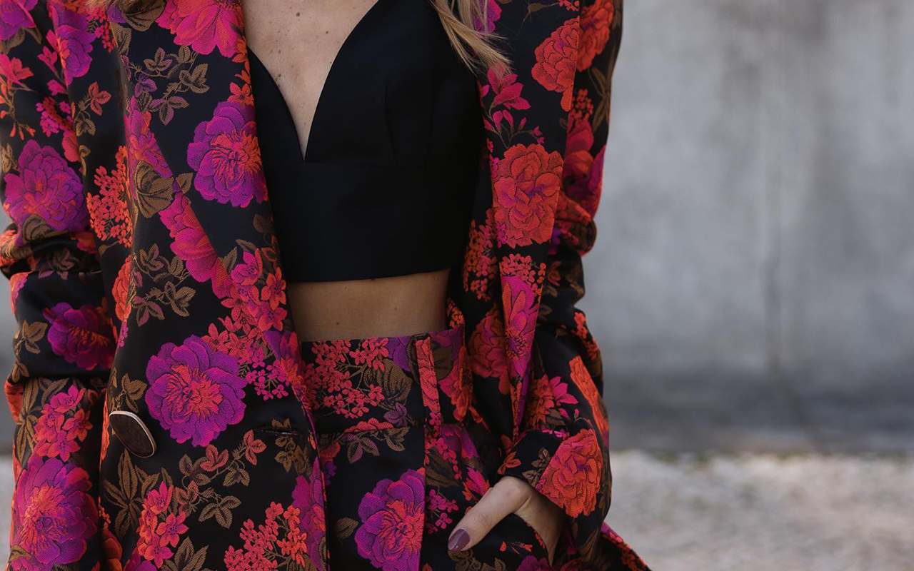
As the powerful colour that it is, Viva Magenta does not go unnoticed and takes centre stage in any outfit, even if it appears in small doses. On the one hand, it feels perfect surrounded by neutral tones such as black or white, or both together. They are the colours that best suit you with effortlessly flattering looks. On the other hand, for a more groundbreaking result, the colour of 2023 combines with its chromatic range: pastel pinks, lilacs or fuchsias, and also with complementary blues or greens, providing a touch of rebellion and transgression. In any case, if fashion needs a dose of optimism, strength and joy, to move forward it will inevitably embrace Viva Magenta. We’ll see it…


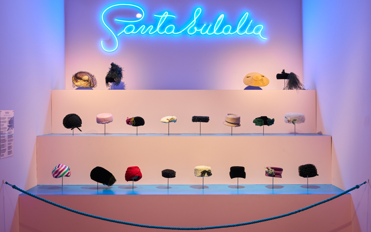
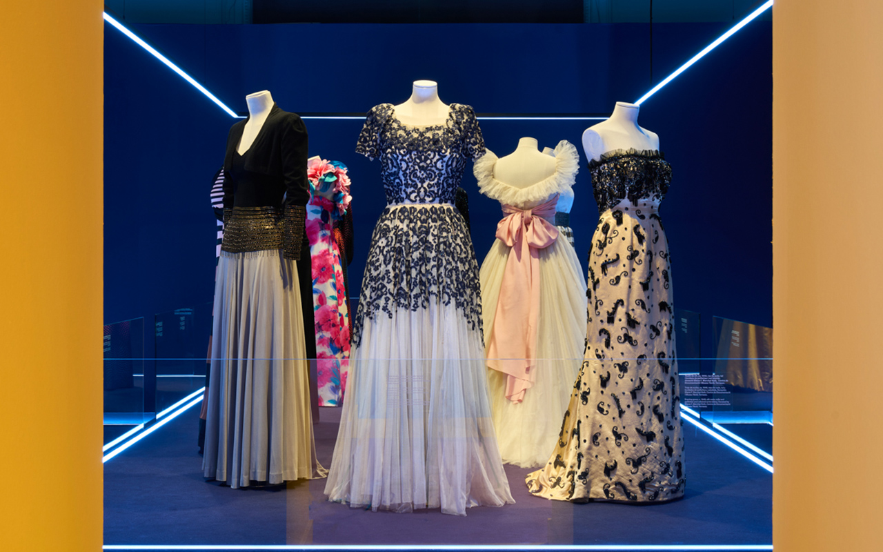
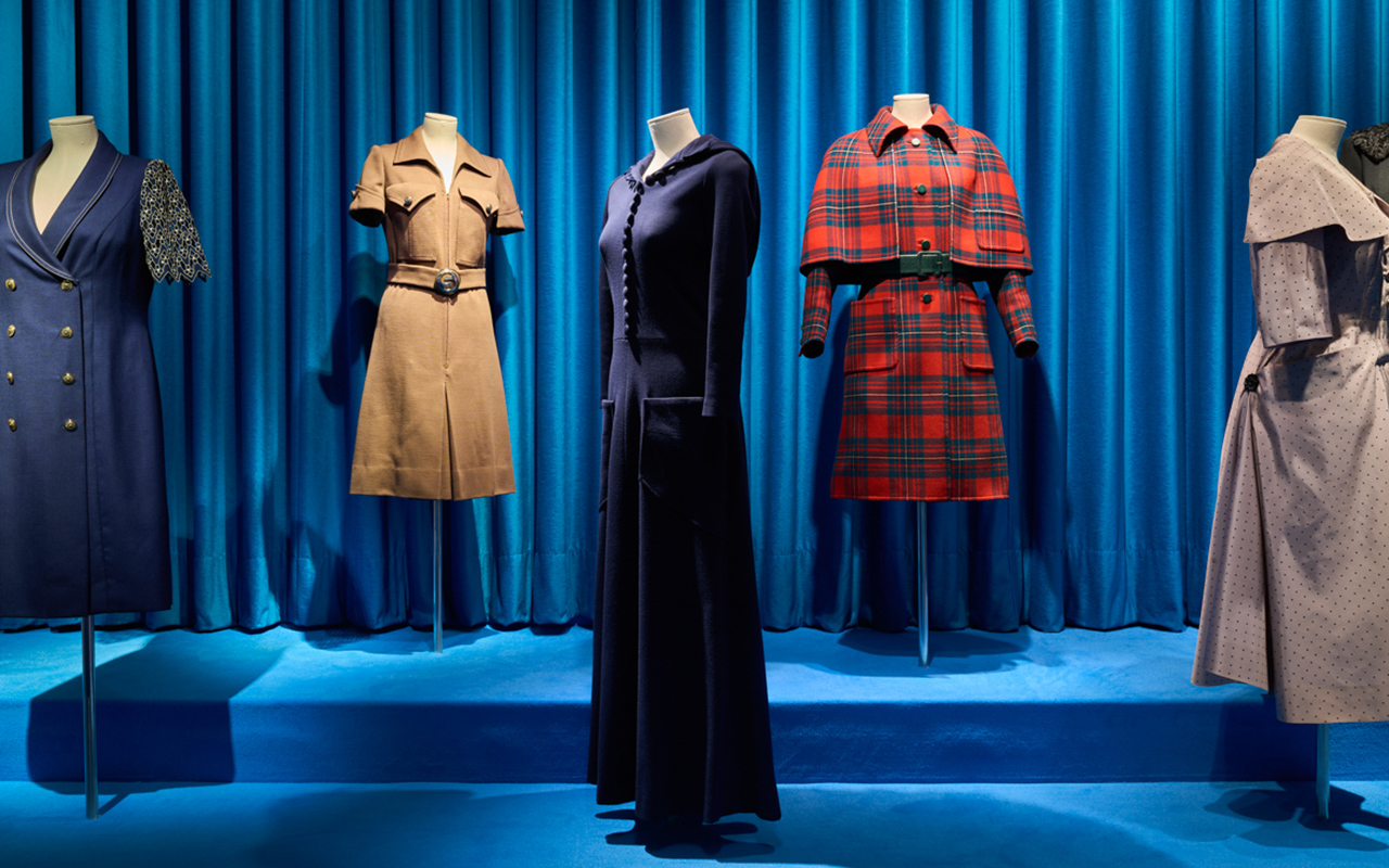
As a family-owned fabric company that blends tradition with innovation, we’re enthusiastic about long-standing businesses that have that respect for heritage, without losing sight of essence or curiosity to see out new things. Saint Eulalia It is one of those houses that has crossed generations and has established itself on its own merit as a reference emblem in Barcelona and abroad for elegant fashion. Now, an exhibition premiered in Palau Robert pays homage to her career through the most representative dresses of the golden years of haute couture in a brief but symbolic tour where the beauty of the festive models are the protagonists of this unique sample of anniversary.

A brief historical tour
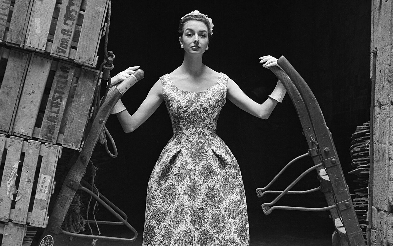
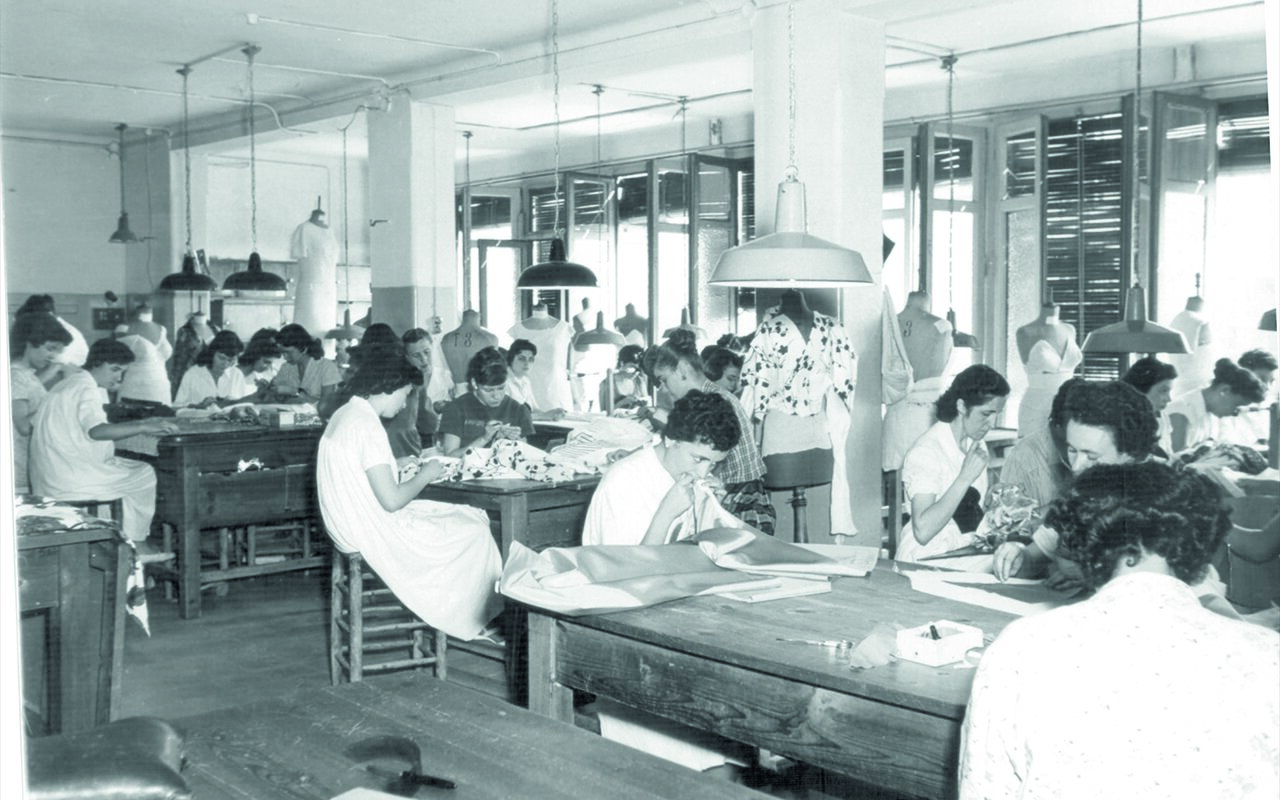
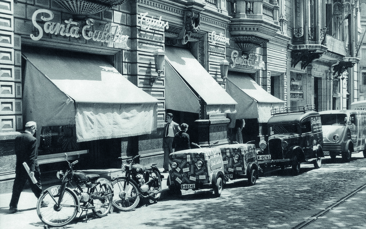
The history of Santa Eulalia is intertwined with the story of Barcelona. It was originally founded in 1843 and was installed in Calle Boqueria as a textile store. Over the years, the space changed and the business expanded to also house shirts and tailoring made to measure. With the fall of the medieval walls of the city and with the urban projection of the new Ensanche, where the Catalan bourgeoisie quickly settled, the establishment moved at the beginning of the 20th century to Paseo de Gracia, where it is currently located. There is a date that marks a before and after: 1926. It was when Santa Eulalia held the first haute couture show, being a pioneer in Barcelona of this new formula from Paris for presenting fashion. An initiative that took place fruit of the talent of Pedro Formosa, creative director of the house until 1970. Since then, the most elegant handmade dresses and hats in the city have come out of his workshops and have dressed the wealthy classes of Barcelona and beyond. Good art and know-how in clothing arose from the Santa Eulalia workshops thanks to the meticulous craftsmanship of the tailors and dressmakers who worked to create exclusive designs for their distinguished clientele. There is another date that deserves to be remembered that denotes the work and prestige of the establishment. In 1941, Santa Eulalia formed part of the Cooperativa de Alta Costura and led fashion together with Pedro Rodríguez, Asunción Bastida, Manuel Pertegaz and El Dique Flotante, recognized as the Big Five of Spanish Couture; honors that they shared, in parallel, with Cristóbal Balenciaga.

The legacy through the dresses
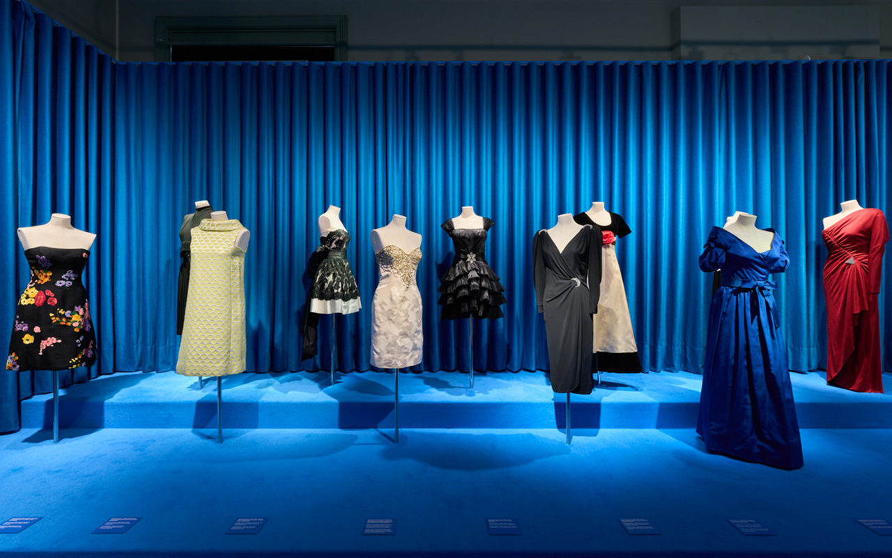
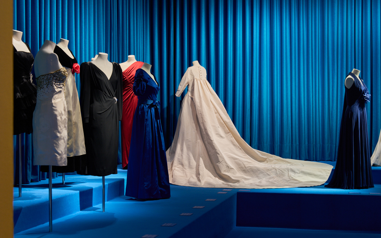
Under the name ‘Santa Eulalia, 180 years of fashion’, the exhibition proposes a journey of 70 years (1930-1990) to enjoy a time in which Barcelona, with Santa Eulalia as a reference, was a leader in fashion design. Throughout four different rooms, organized by types of Street and Day, Night, Long Dresses and Brides, the visitor will be immersed in the wonderful world of Haute Couture through carefully selected dresses and hats, as well as one audiovisual piece that also includes advertising posters, fashion photographs and communications from Santa Eulalia that evoke the golden age of Haute Couture.
The exhibition has been led by Josep Casamartina, a renowned art historian specializing in the history of fashion, who has structured a fascinating journey bringing together 40 pieces (of the 500 pieces recovered) not only from the Santa Eulalia own archive but also others from the Fundació Antoni de Montpalau, the Barcelona Design Museum (DHUB), the Terrassa Textile Museum and Documentation Centre, and the Madrid Costume Museum.

All the dresses recreate the beauty of the craftsmanship of Santa Eulalia characterized by a very refined pattern and quality fabrics perfectly turned into elegant designs far from the stridency, which maintain contemporaneity over the years. There are designs that bear witness to a time of celebrations: dances, cocktails, evening gowns or operatic premieres at the Barcelona Lyceum, brought together the women of the time in society and were special occasions to wear a Santa Eulalia dress for the first time. . The evolution of the models, according to the trends of each decade, feminine details or fantasy elements are present throughout the exhibition.
On the other hand, the creative and scenographic direction has been carried out by Nacho Alegre, who is in charge of the Apartamento Studio project. Alegre has also been the editor of the catalogue that accompanies and collects the content of the exhibition in an absorbing retrospective that brings together fashion photographs, historical archive material and previously unpublished objects from private collections. The catalogue is published in a limited edition of 4,500 copies and can be found both in Palau Robert and Santa Eulalia and in selected bookstores. The free access exhibition will remain open until the 22nd January, 2023.

Santa Eulalia, today
Today Santa Eulalia maintains its status as one of the most influential fashion stores in the sector internationally and continues to be a benchmark for luxury in Barcelona. The establishment, which each season offers the collections of the international designers most desired by the new generation of consumers, is currently led by Luis Sans, a member of the fourth generation of the owner family, and his wife Sandra Domínguez. This marriage, which is also a business one, adapts to the new times to maintain the artisanal essence and the good knowledge of Santa Eulalia, without losing sight of the latest trends that are triumphing in the market.


 Photos: Pirelli / FotoNostrum Barcelona