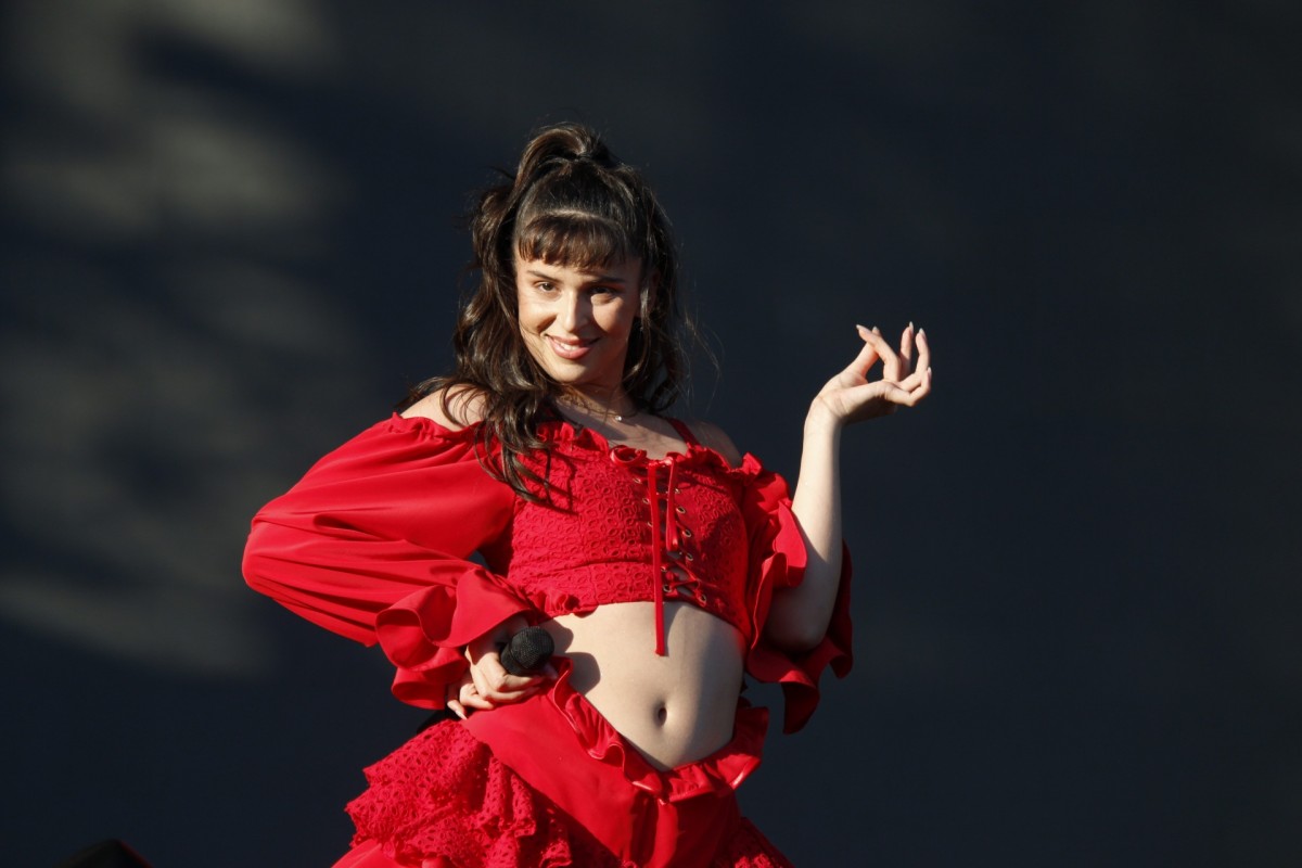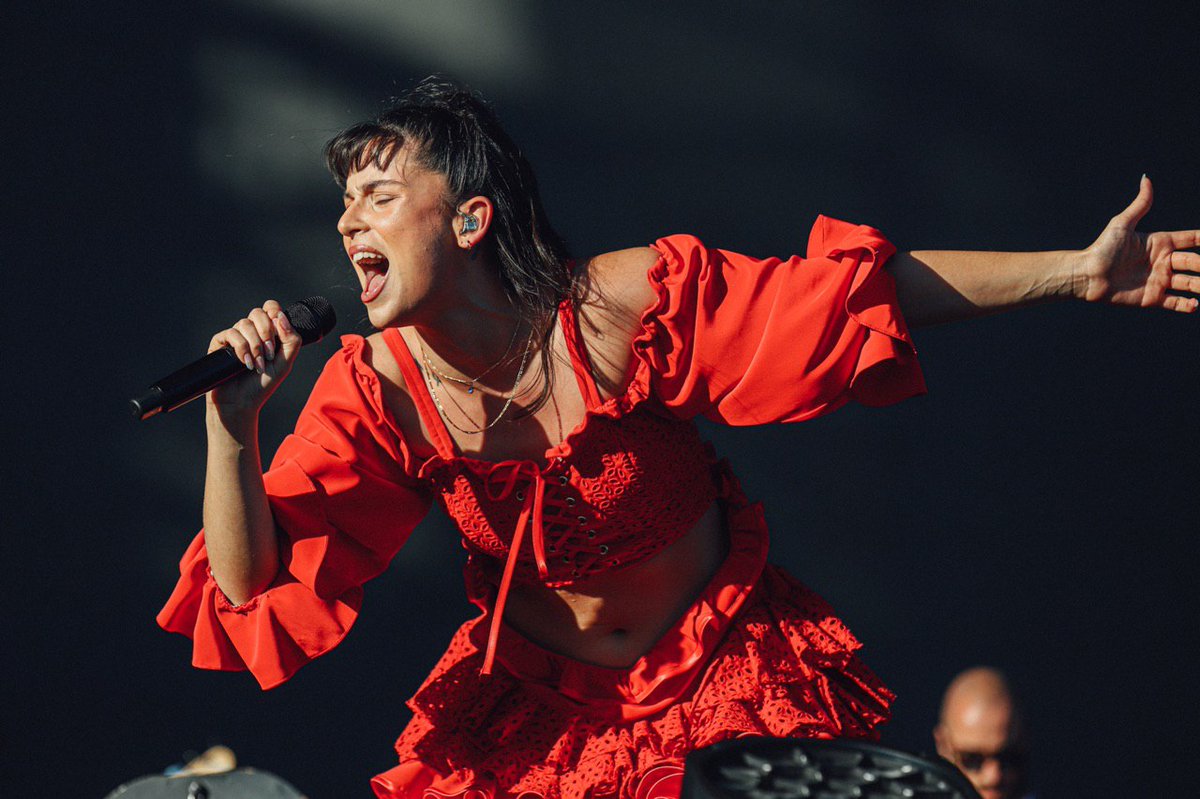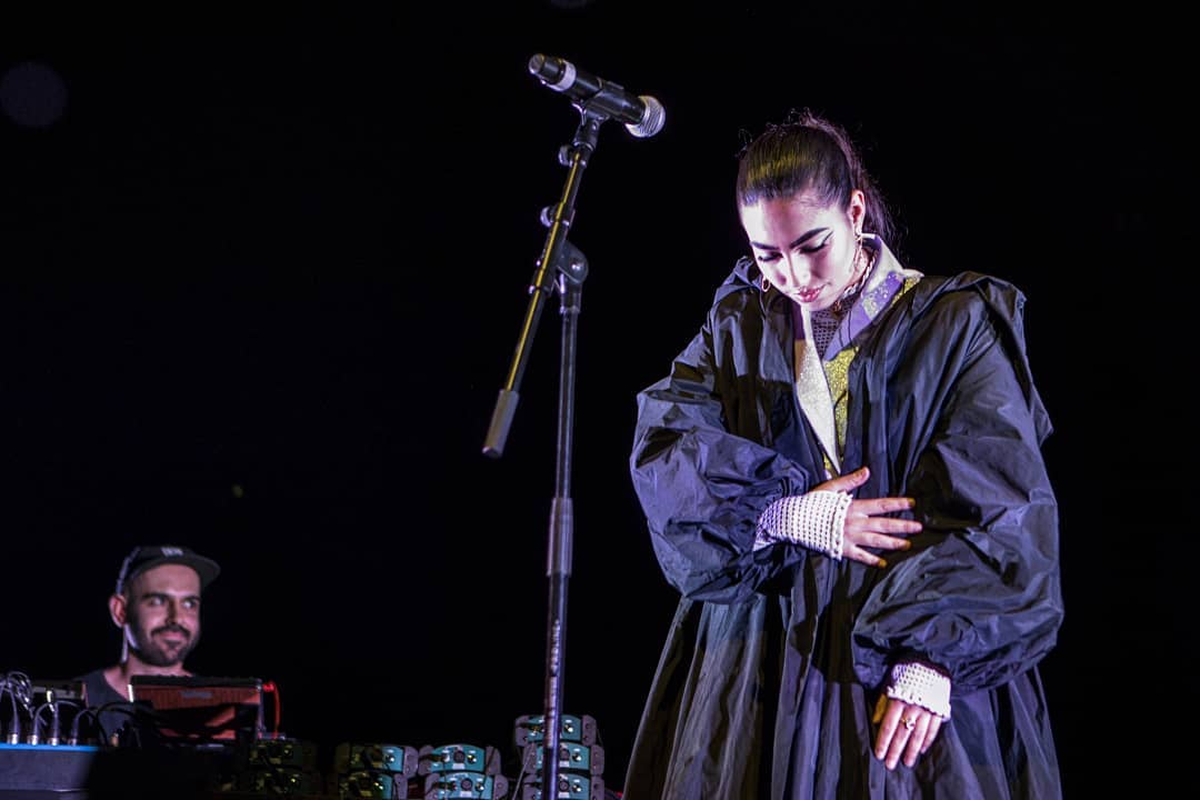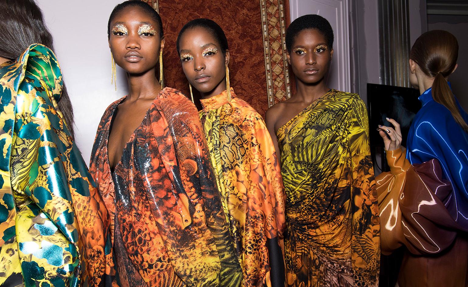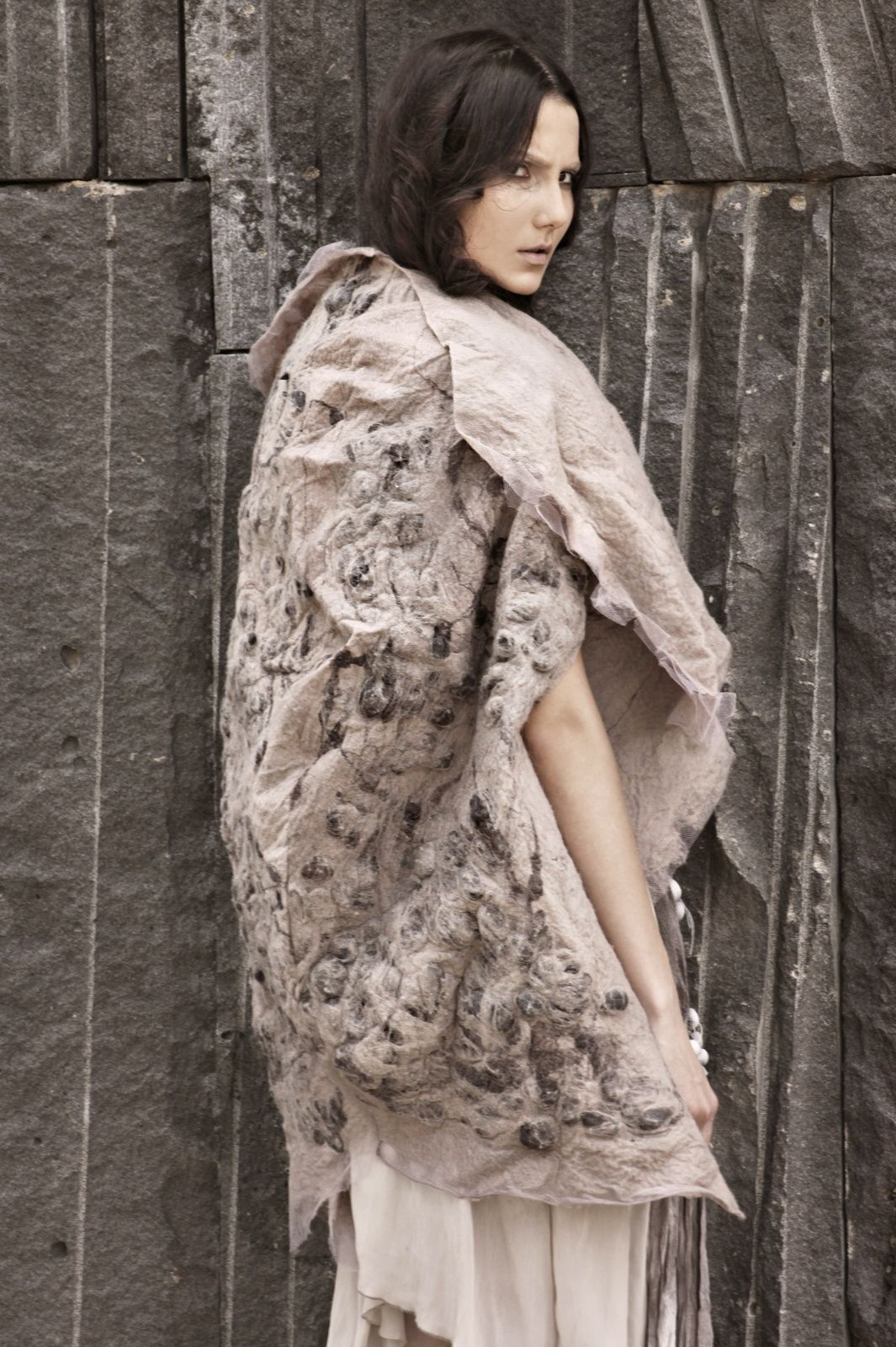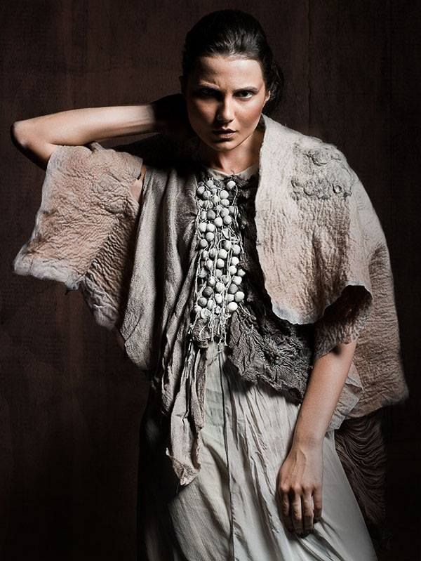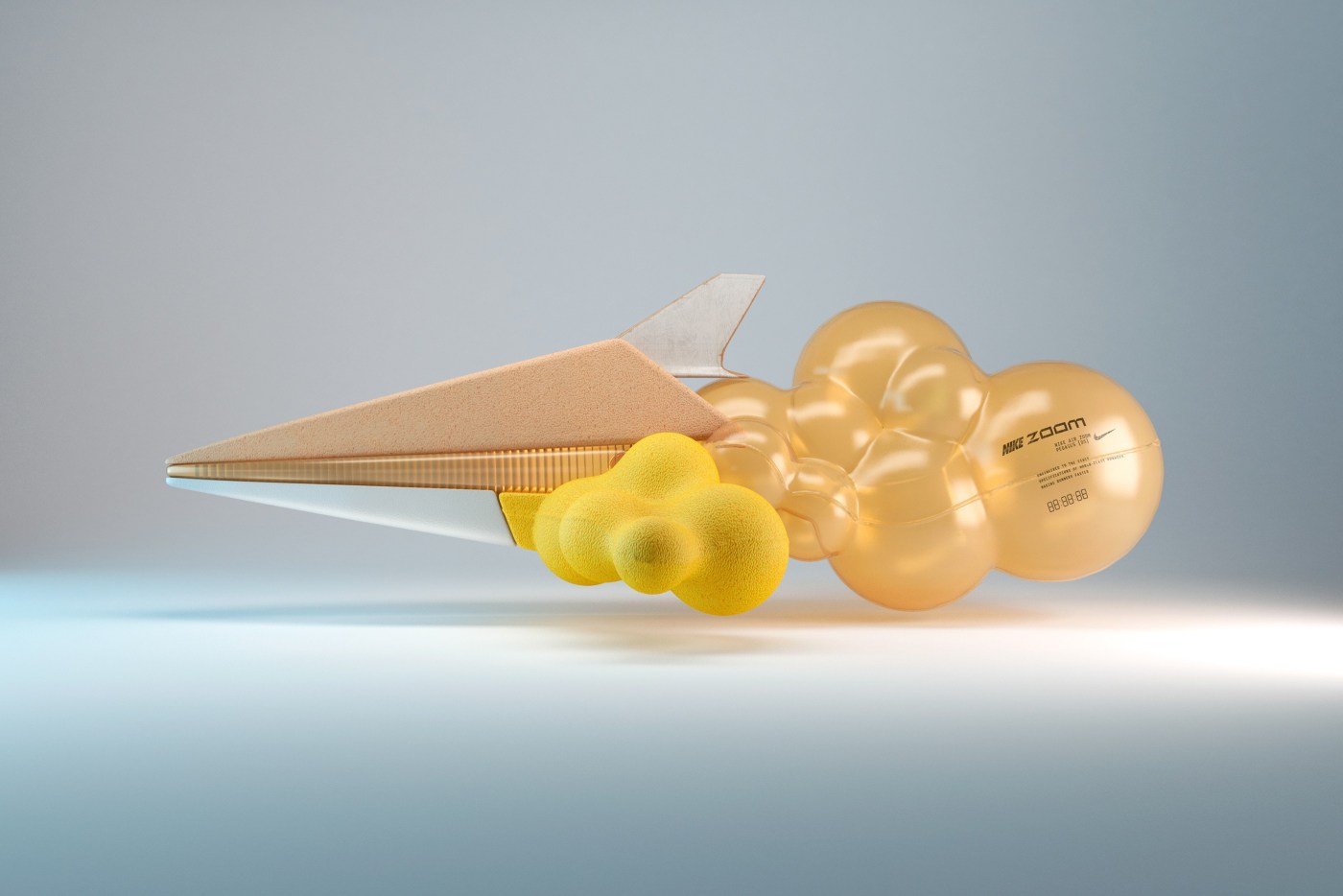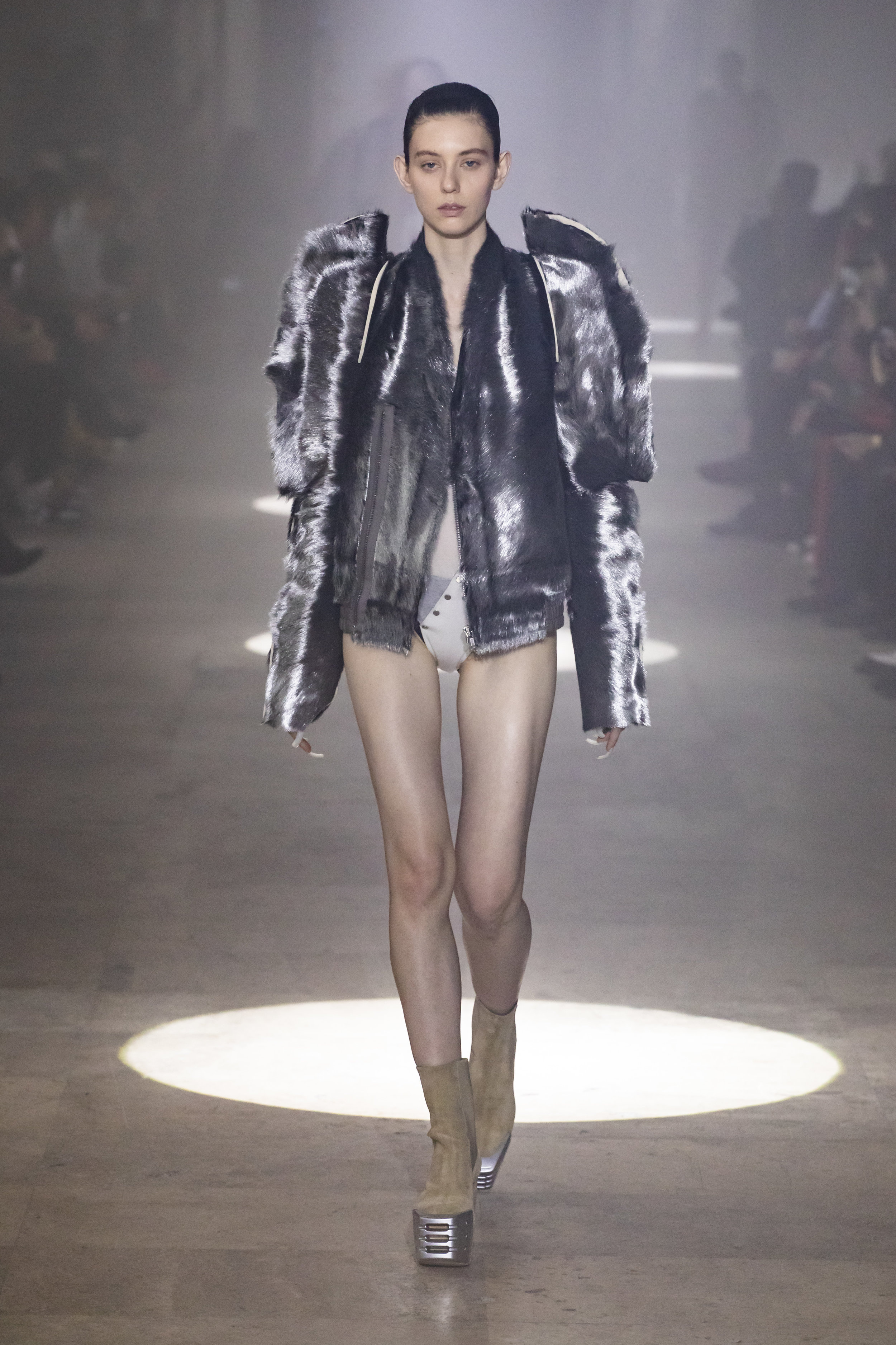
There are powerful alliances, which work perfectly because they arise naturally and spontaneously. And the result is most impressive when a whole team of professionals coordinates to achieve a single goal which goes beyond surprise or emotion. In this cTase we are talking about the union between fashion and music through our latest collaborations which can be seen in the latest edition of Primavera Sound with some talented names within each discipline. Yes, we are pleased to say that Gratacós has jumped onto the stage via the wardrobe of three young artists with a lot of potential: Rosalía, Nathy Peluso and María José Llergo.
What was the collaboration?
Following one of our principles as a company, which is to support future professionals within the sector, whether young talents or established designers, as well as to develop cooperation with them, we faced a very motivating challenge earlier this year. The companies Dominnico, headed by the Alicante designer Domingo Lázaro Rodríguez and Colmillo de Morsa, from Barcelona contacted us offering a collaborative project which had us hooked from the very first moment. These companies were going exclusively to design the costumes of Rosalía and Nathy Peluso, designs that the artists would exhibit in person during their promotional tours around the world. In the case of Primavera Sound we also had the collaboration of Manuel Bolaño who sought to surprise with a design created for the performance of the singer María José Llergo.
These companies, which are friends and customers, were looking for something innovative, exclusive and of high quality for the costumes of the artists, something that would cause a real stir for its creativity and exclusivity! They know that we as fabric designers can count on a range of creations which meet these needs. Moreover, sometimes it is through the raw materials – in this case the fabric – that from the start the craziest ideas take their shape. And that point of slightly mad experimentation is what we adore and are entertained by ! In addition we firmly believe in the project of these three companies and the people behind them. So we were delighted to collaborate in the project of dressing three young divas of contemporary music at Primavera Sound .
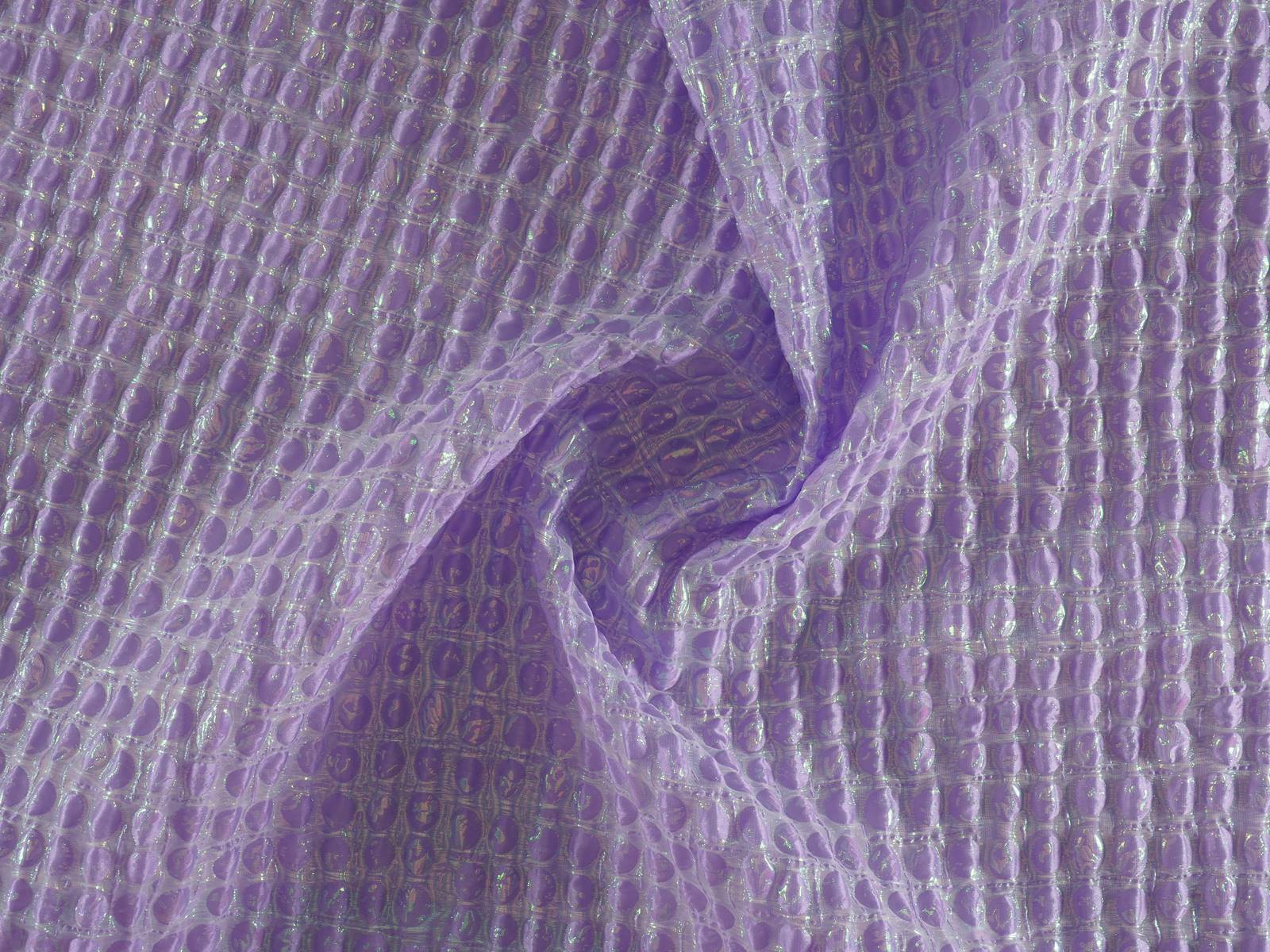
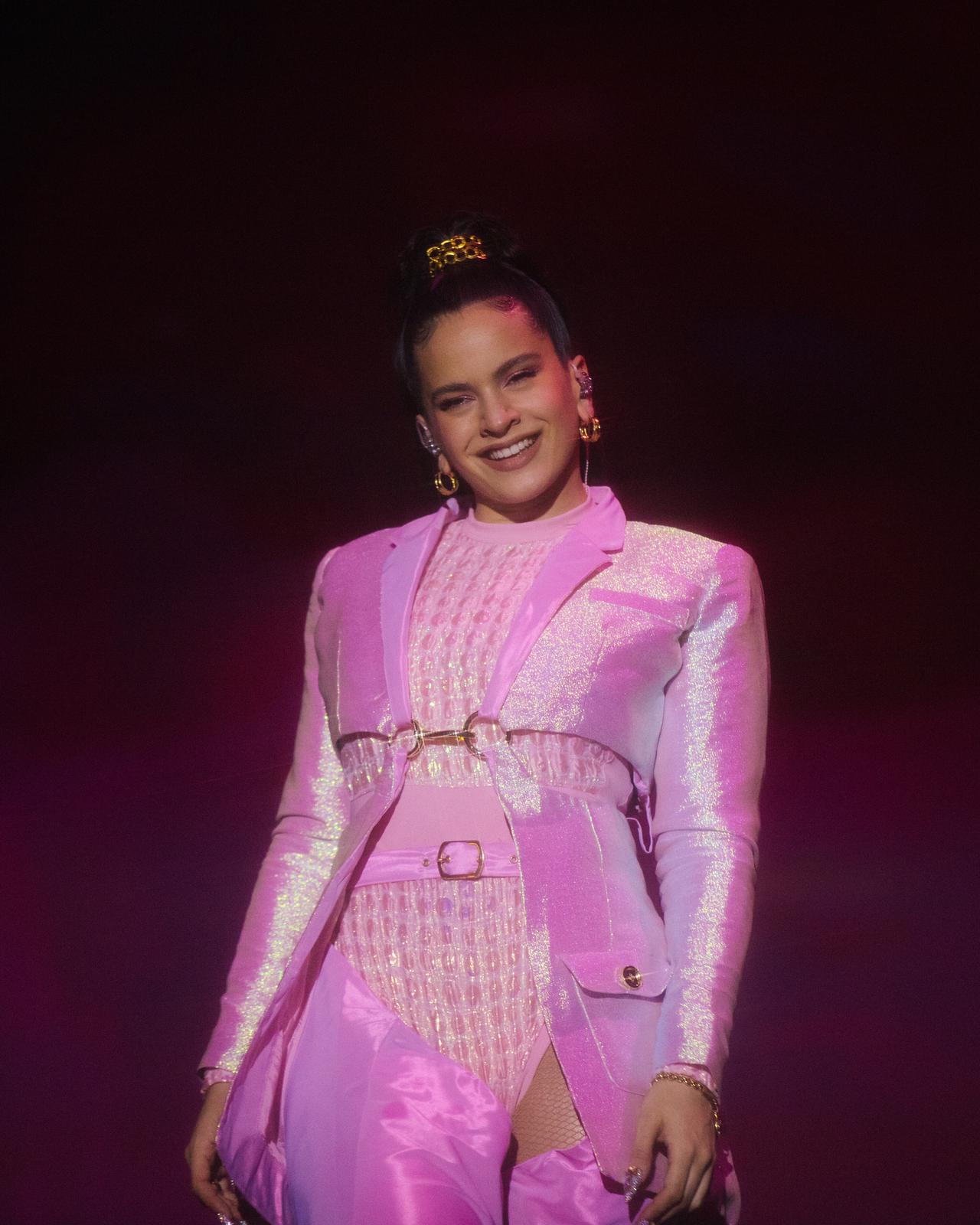
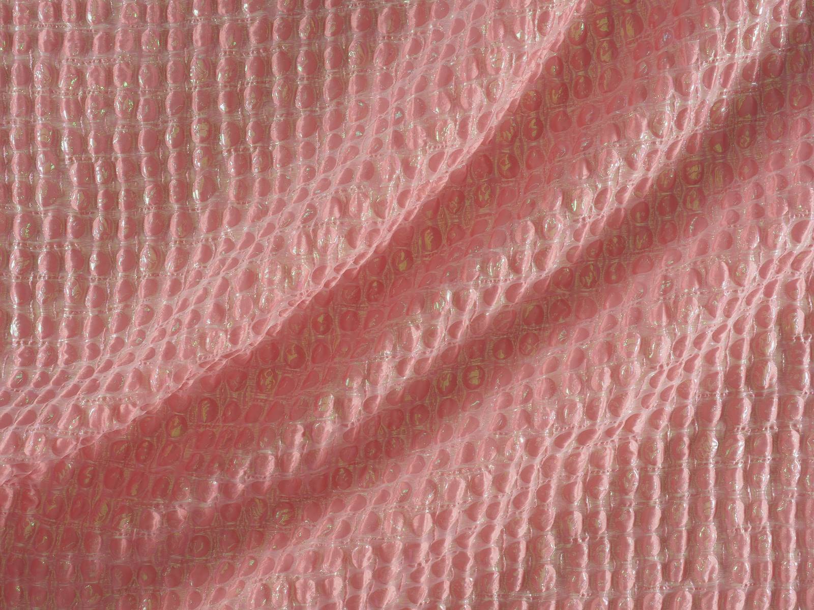
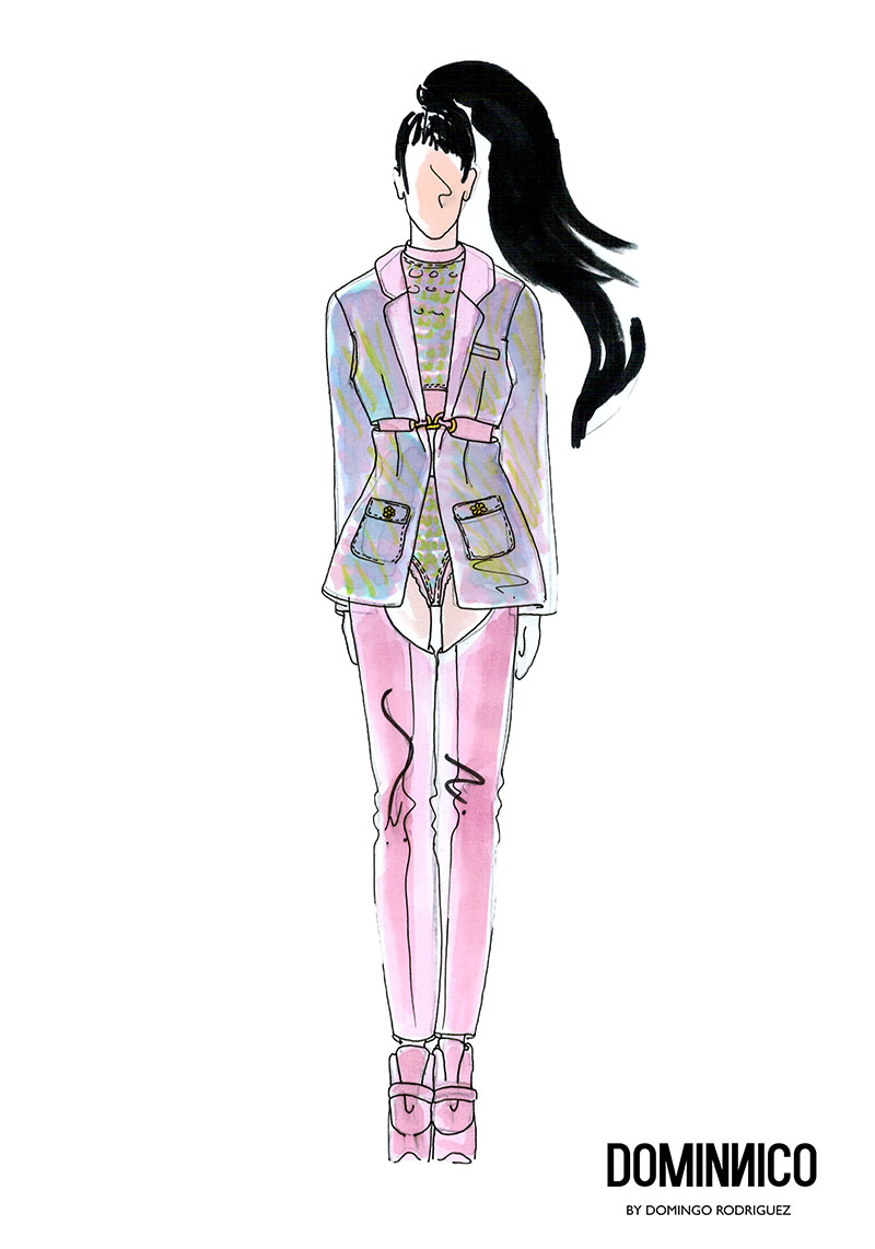
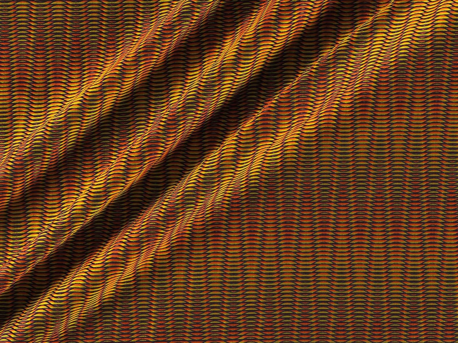
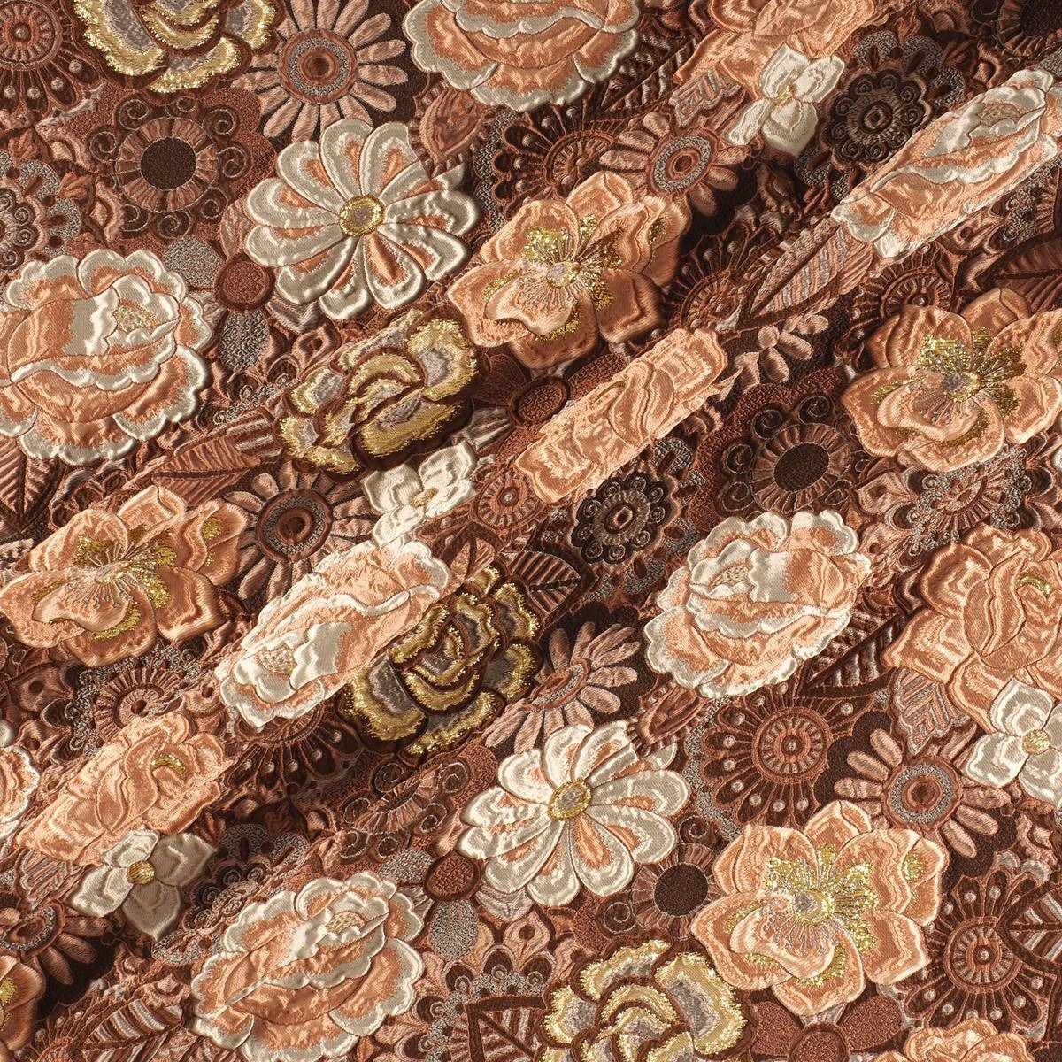
For the occasion Dominnico chose a wonderful Jacquard padded in bubblegum pink with iridescent stitchings to create that stunning amazon look worn by Rosalia in her performance at Primavera Sound. That fabric was present in the corset which the Catalan artiste wore with pronounced shoulder pads . The outfit was complemented by a jacket and matching leggings, which were defined at the waist with gold appliques. This bold outfit,which was inspired by the ‘ Dirty ‘ style of Christina Aguilera also bore the design and styling of Daikyri , Rosalia’s sister.Nobody was left indifferent by this wardrobe . We should mention the sure value of Domminico , which already counts as clients other international fashion and show artists such as Lady Gaga, who has worn the brand on three occasions .
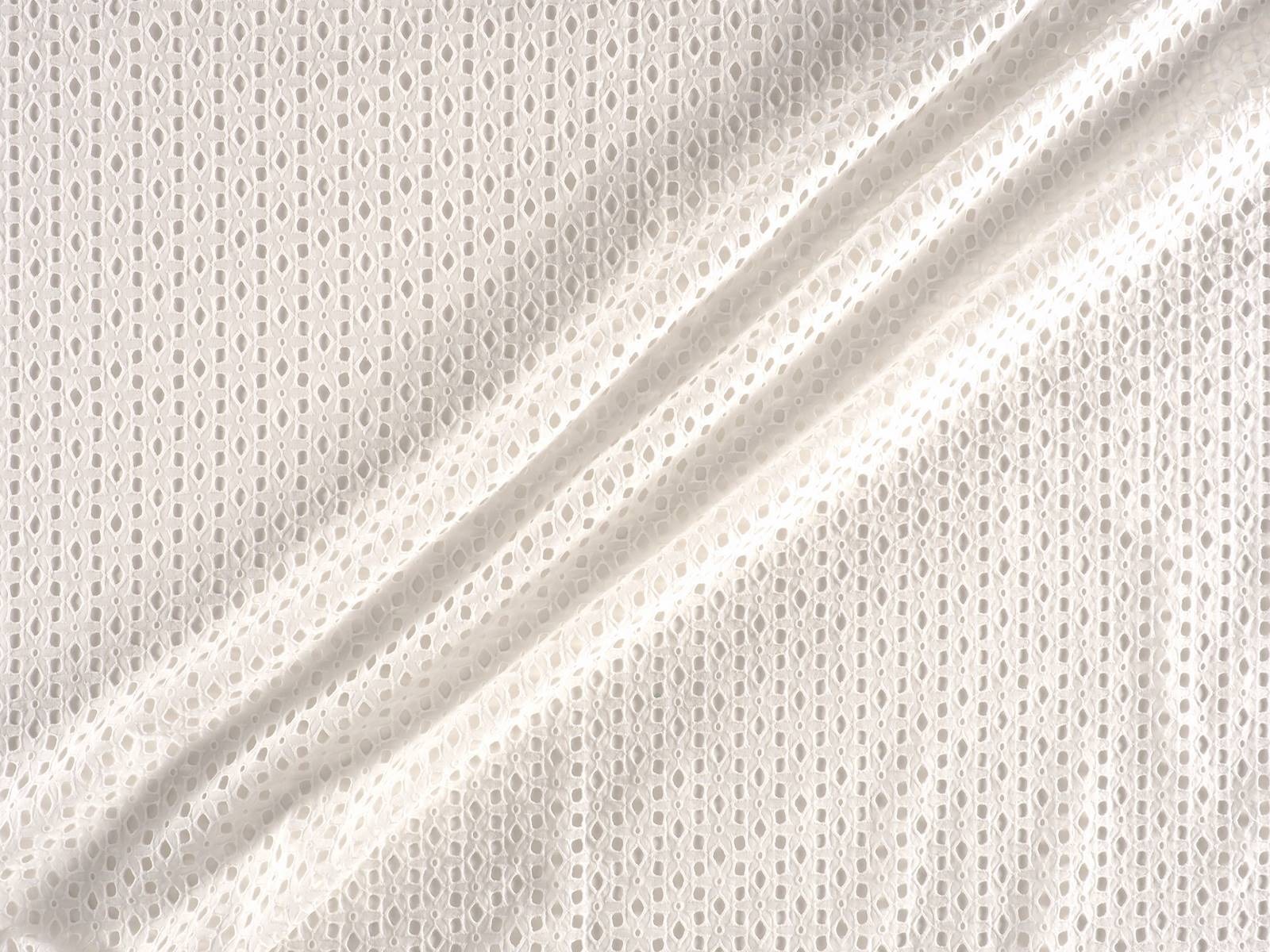
In the case of Colmillo de Morsa , the challenge was to dress Nathy Peluso , the Argentinian artist now based in Barcelona whose successful music ” is capable of making hip-hop danceable and accompanied by jazz”, and whose trap aesthetic captivates the young generation Z. They also recently designed for Berskha a capsule collection which embodied their aesthetic references. The designer Elisabet Vallecillo chose a cotton embroidery to make the countless metres of ruffles that she used to design the spectacular cascaded skirt and the top with crossed neckline worn by the Argentine artist. The embroidery was white and the designer dyed it afterwards to achieve this reddish tone so exuberant for an outfit inspired by Havana.
Finally, Manuel Bolaño was commissioned to devise a spectacular coat for María José Llergo . The Cordovan singer of 24 years , resident in the Gràcia district of Barcelona, is one of the young promises of singer-songwriting, as she writes and composes with a very unique style of flamenco rooted in and linked to her land of origin. Bolaño chose black taffeta to make for her a beautiful and impressive maxi coat that did not go unnoticed among the spectators of Primavera Sound .
The most appreciated is that in the three looks the designers respected the aesthetics of each artist, without losing their essence as creators. It is here when that magical fusion between fashion and music takes place. It is an art, through and through!


Dominnico,
gratacos,
Gratacós1940,
looks Primavera Sound,
manuel bolaño,
María José Llergo,
Nathy Colmillo de Morsa,
Nathy Peluso,
Primavera Sound,
Rosalía,
Rosalía Dominnico

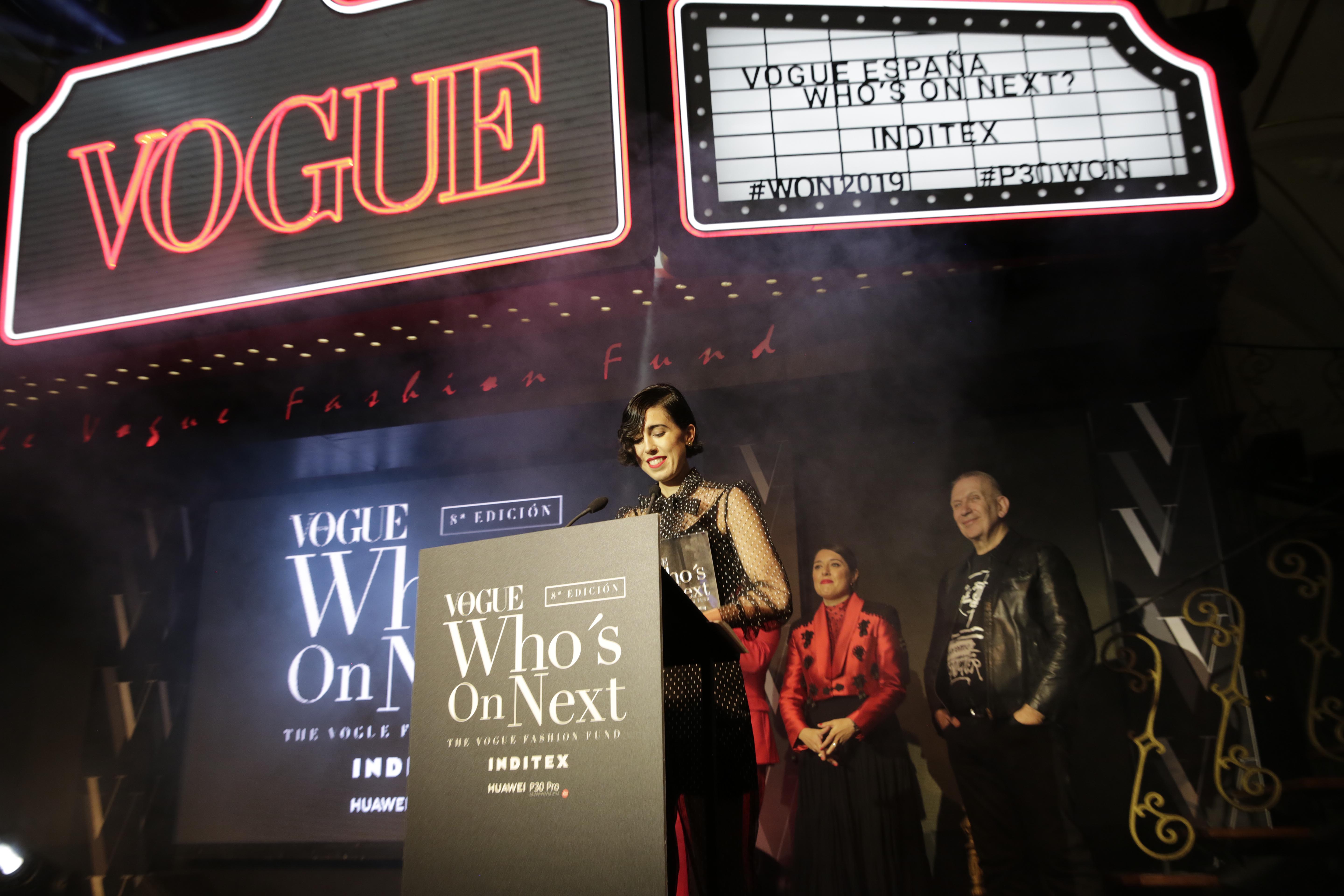
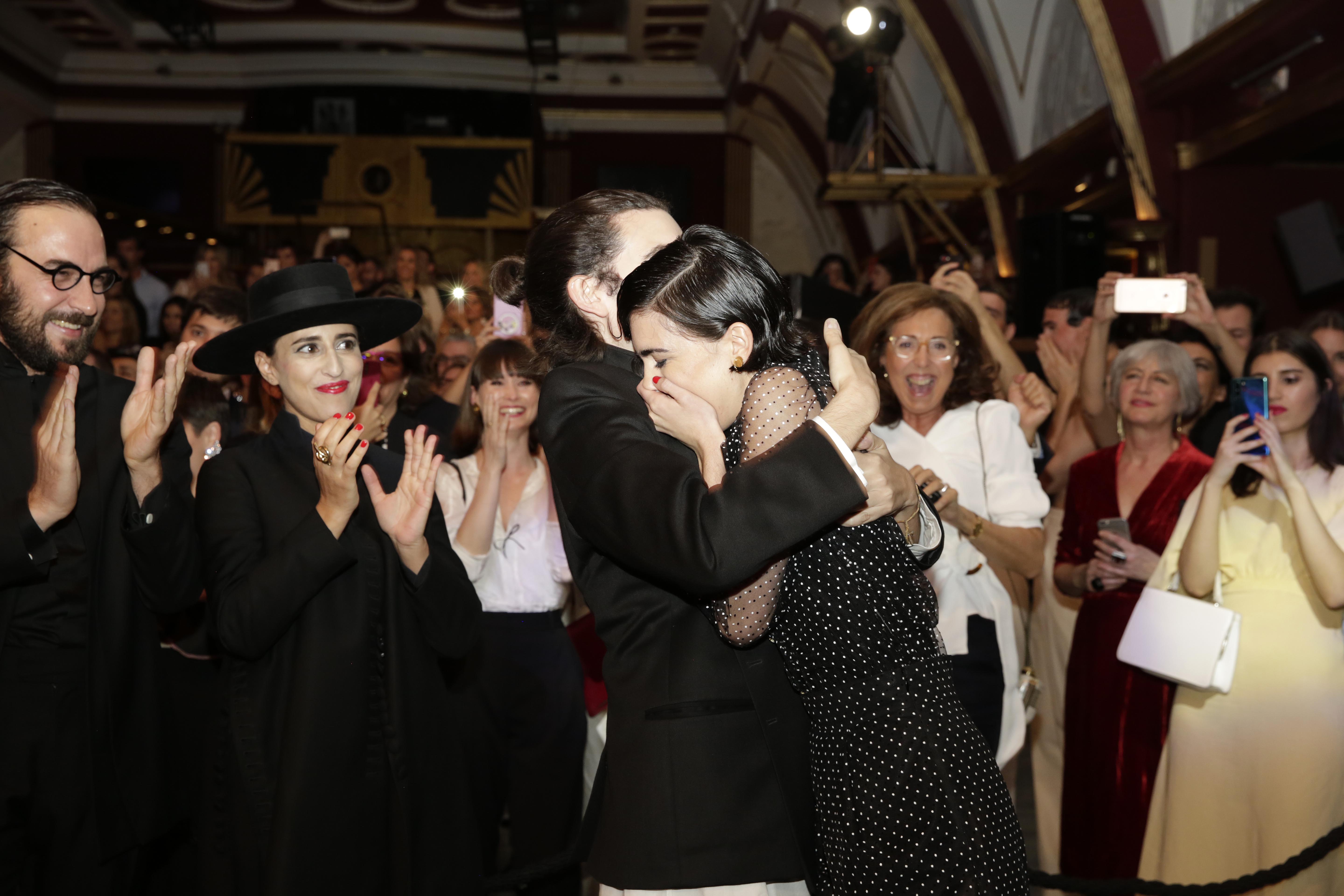
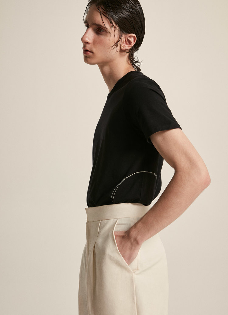
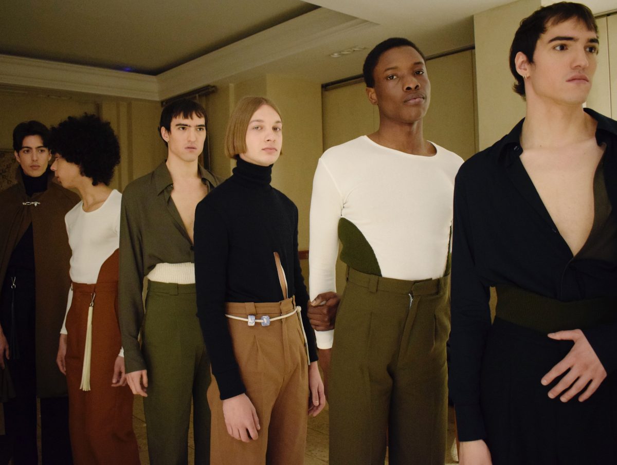
Remember her name,because she has only just started her career and her aura is already shining brightly against the panorama of young talents in Spanish fashion. Her name is Carlota Barrera, she is 26 years old and comes from Gijón. She was planning to become an architect, but fashion crossed her path and her bold efforts to give a contemporary twist to Spanish men’s fashion convinced the experts who recently awarded her the prize Vogue Who’s On Next 2019. This award, which is presented annually, is an international initiative by Vogue magazine and is the biggest prize in Spanish fashion, with an endowment of 100,000 euros by Inditex, which has supported the initiative since the first edition. The financial award is in recognition for talent which aims to develop a business plan and it also includes automatic registration in ACME (Association of Spanish Fashion Designers) plus the possibility of participating in the next edition of the Mercedes-Benz Fashion Week Madrid, as well as having the support of the influential magazine.

The controversial Jean Paul Gaultier, President of the Jury, was in charge of revealing the name of the winner during the ceremony. The other two finalists of this eighth edition were the Sevillian designer Ernesto Naranjo and the Madrid couple Oteyza. This award is a boost to the professional career of this Asturian designer who is resident in London, as was the case in past editions with winners such as Marcela Mansergas, Juan Vidal, Maria Ke Fisherman , ManéMané , Moisés Nieto, Leandro Cano and Palomo Spain , who won in 2018. Carlota Barrera thus becomes part of that cast of young promising Spanish fashion designers, the so-called Who’s On Next Generation

A turn to masculine fashion
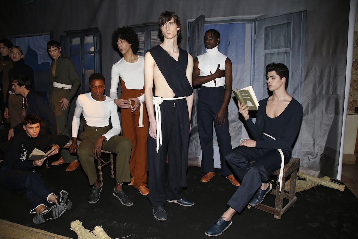
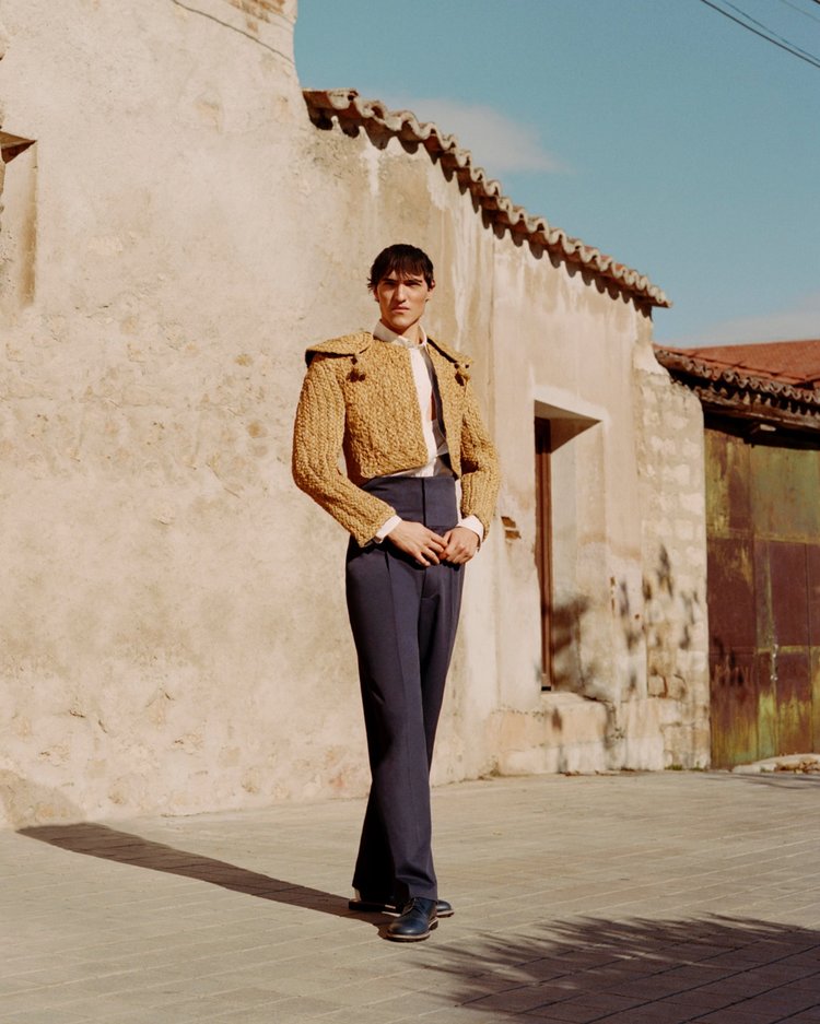
Carlota Barrera is from Asturias, but resides in London. Her career actually began in the British capital, after taking a master’s degree at the London College of Fashion and after working in several haute couture houses. In 2018, the young designer decided to fulfill her dream by setting up a company that would shake up Spanish men’s fashion via three basic pillars: tradition, craftsmanship and responsibility. These are the foundations of the creations from her own branded company.
Her company is indeed constantly involved in the search for and innovation in the best fabrics that come from processes which respect the environment. And although her studio is located in London, from where she develops the brand, she presents her collections in Spain and her most emblematic products are those made with materials that evoke her country of origin. “We are a small brand and consider it essential to have control of the value-chain and to be able to maintain ethical and fair values throughout all processes,” said the designer at the award ceremony.

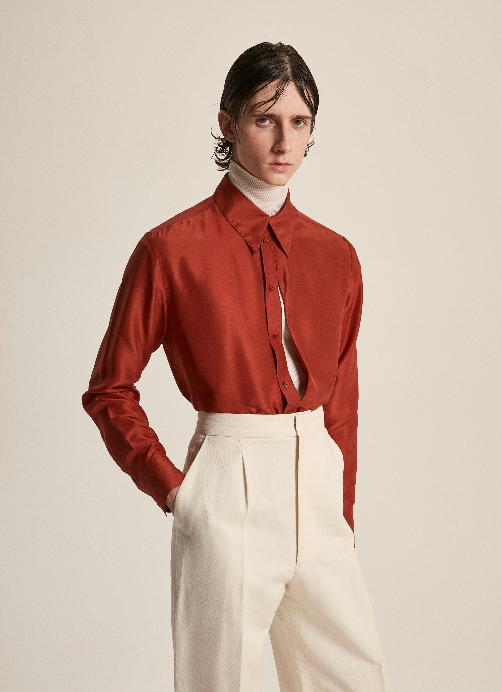
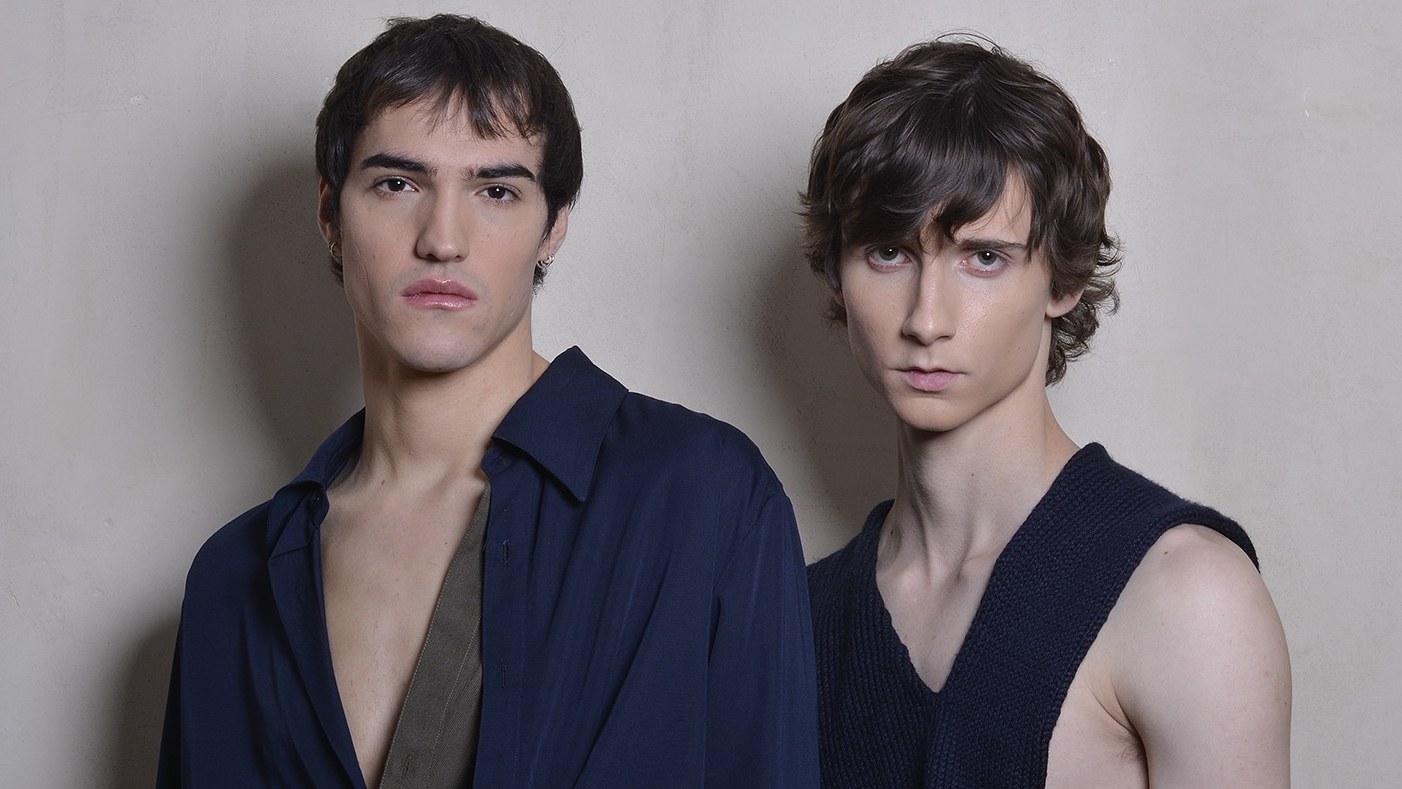
Carlota Barrera designs for an audience of age 20 to 45, for young men who seek heritage, luxury and sophistication in a type of garments that follow the mandates of classic tailoring with its clean patterns and artisan motifs, but with a more modern and aesthetic approach together with current vision. Although her main clients are men, Carlota Barrera also dresses women who are attracted by masculine image and clothing. Among her main objectives is the increase in brand awareness, its development and realisation via international expansion, but emphasizing local fashion and roots culture.
 |
 |
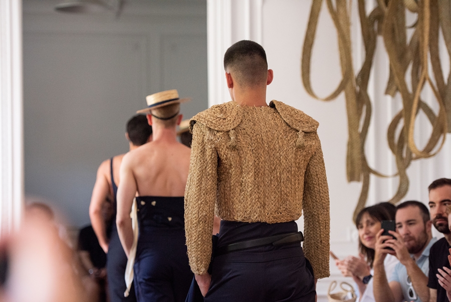
Her first men’s collection was “El Matador y el Pescador” and the mission that is evident in all her creations is to achieve the maximum quality in her collections, uniting tradition and contemporaneity to satisfy the demands of the most avant-garde of men. This injection of capital and the support of Vogue can deliver a huge boost to the career of Carlota Barrera, providing upward movement for this young company with plenty to say now as it will doubtless have in the future. The career of this Asturian designer has only just started.


Sorry, this entry is only available in European Spanish.

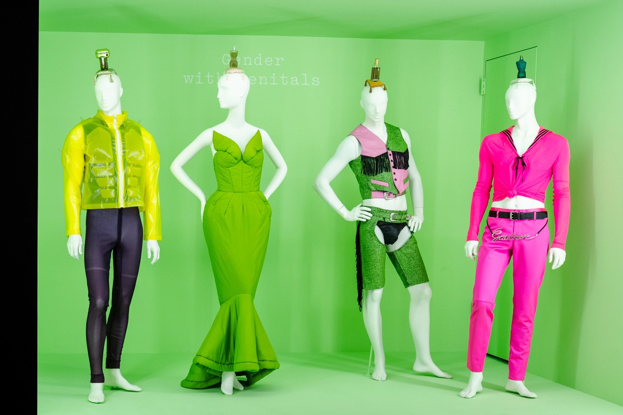
Think of some exaggerated, think of something extravagant, think of something theatrical. You got it? If so, you are thinking about the “Camp“ aesthetic, the neologism that is currently fashionable and that marks a trend toward maximalism.
What is the Camp? It is not an easy concept to approach at a theoretical level, perhaps aesthetically it is understood much better. Nor is it a new term, but a succession of ideas that draw it. Its conception comes from an essay by the writer Susan Sontag of 1964 entitled ‘Notes on Camp’ , a publication that deals with this artistic expression that reveals itself as a complex aesthetic that embraces multiple disciplines . The camp is defined as an ironic, humorous, artificial, theatrical, exaggerated movement … which is positioned between the highest art and popular culture. Between the divine and the earthly. The beautiful and the ugly that is exuberant but stylized. Sontag’s writings argue that camp is “love for the unnatural: artifice and exaggeration. Style at the expense of content. “

“Camp goes beyond kitsch: suggests combining art and pop culture”
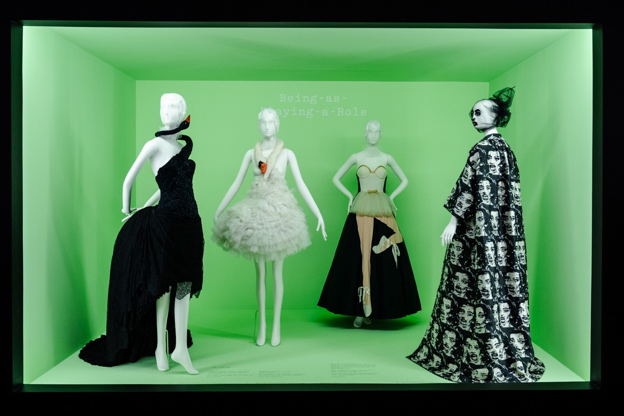
For example, Sontag found this aesthetic phenomenon, for example, in the films of Busby Berkeley and actor Victor Mature, in the Maw West and General de Gaulle films, in Swan Lake, in the Flash Gordon comics, in the tenebrist paintings of Caravaggio, in the chinoiserie style and in the entire Art Nouveau movement. The writer and essayist breaks down in 58 points all the possible acceptances of the term with clear allusions to the cinema, literature, painting or architecture. Regarding the field of fashion, Sontag also notes explicit references: “Camp is a woman walking with a dress made with three million feathers.”
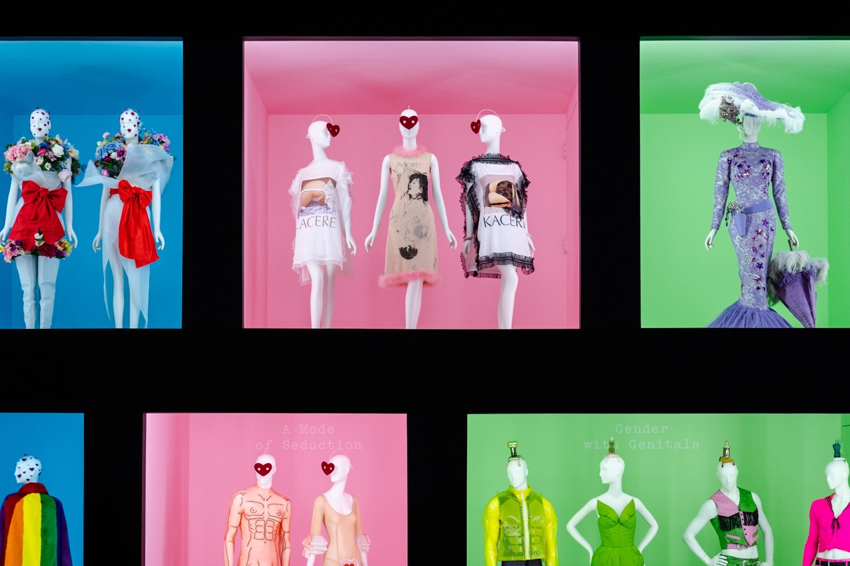
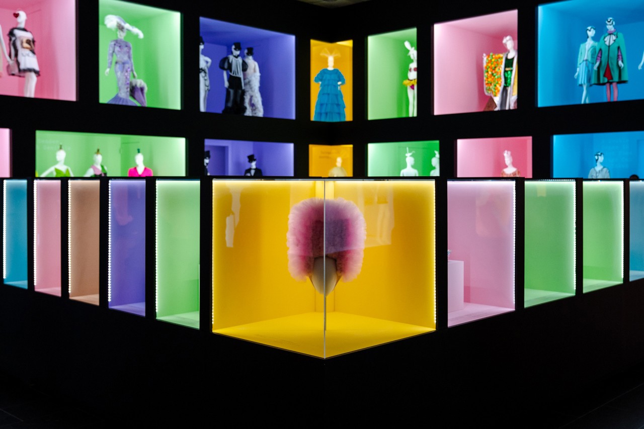
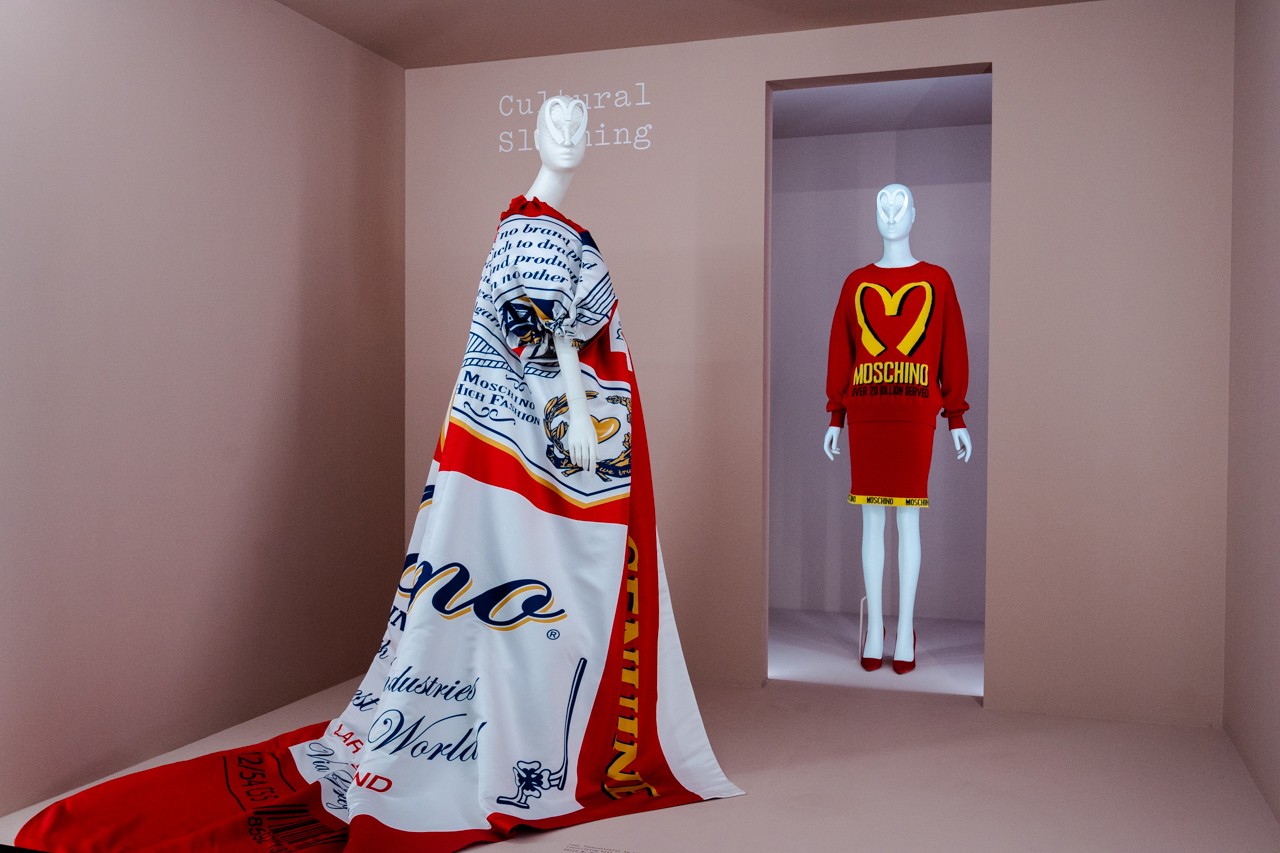
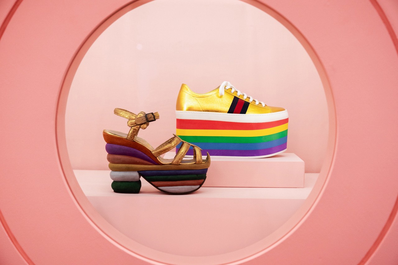
Precisely this week opens in The Metropolitan Museum of Art the exhibition that shapes this whole phenomenon through more than 250 objects that date from the 17th century to the present. An exhibition that explores the origins of this exuberant aesthetics and has a sponsorship luxury that is leading precisely one of the firms most aligned with this movement: Gucci creative director Alessandro Michele represents n now a new inspiration from Camp in the XXI century.

Where does the Camp come from?
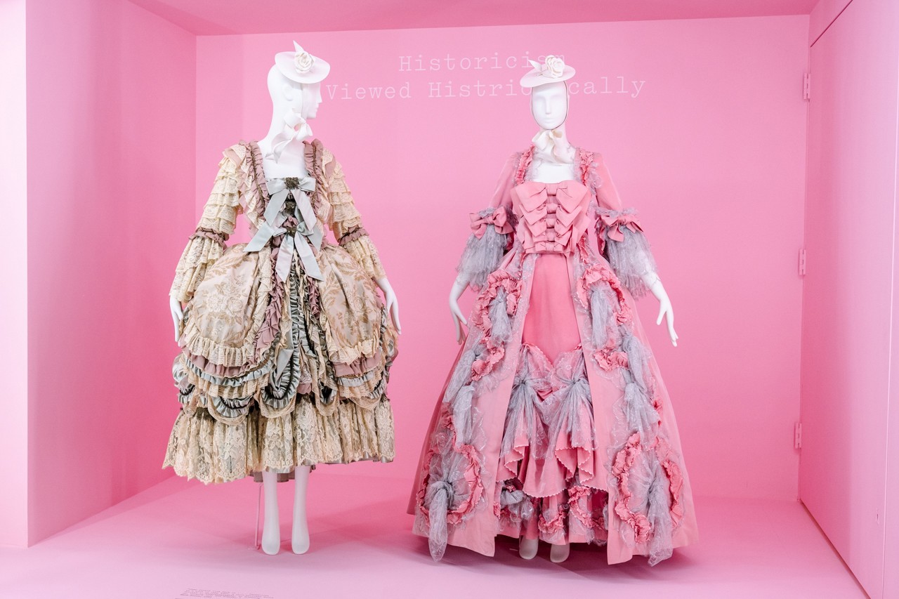
Susan Sontag It situates its origins in the seventeenth century in the French court under the reign of Louis XIV. The same Sun King built Versailles, a powerful fortress and a dazzling showcase for the nobility to be gathered for enjoyment and enjoyment of the monarch. They went to the ostentatious rooms of Versailles where a protocol and demands for clothing for the king and his court were elaborated, which forced to squander large sums of money to keep up appearances. Literally.
At the death of Louis XIV flourished the Rococo style in fashion, characterized by excess, volumes, architectural and mammoth silhouettes that served mainly for the ornament, accompanied by accessories, ties, embroidery, wigs … that enhanced this artificiality. The opulence reached its peak around 1770. After some anecdotal incursions in the 19th century, the word gained popularity at the beginning of the 20th century among homosexuals of the time, where they found in the Camp all a language full of meanings. An accessory in particular, a fabric in a shoe, a tight-fitting clothing, a certain color. Later, Andy Warhol was also inspired by the term to make it his own within pop culture. Designers like Elsa Schiaparelli , Jean- Paul Gaultier, John Galliano, Marc Jacobs, Erdem, Cristobal Balenciaga and Thom Browne enter the Camp, as well as the new generation as Molly Goddard , Richard Quinn, Matty Bovan or Palomo Spain, to name a few. In the exhibition “Camp: Notes on Fashion “is also cited other emblematic and legendary designers such as Paul Poiret, Marc Jacobs and Karl Lagerfeld through various dresses and looks that make up the exhibition.

Lo Camp at the MET Gala
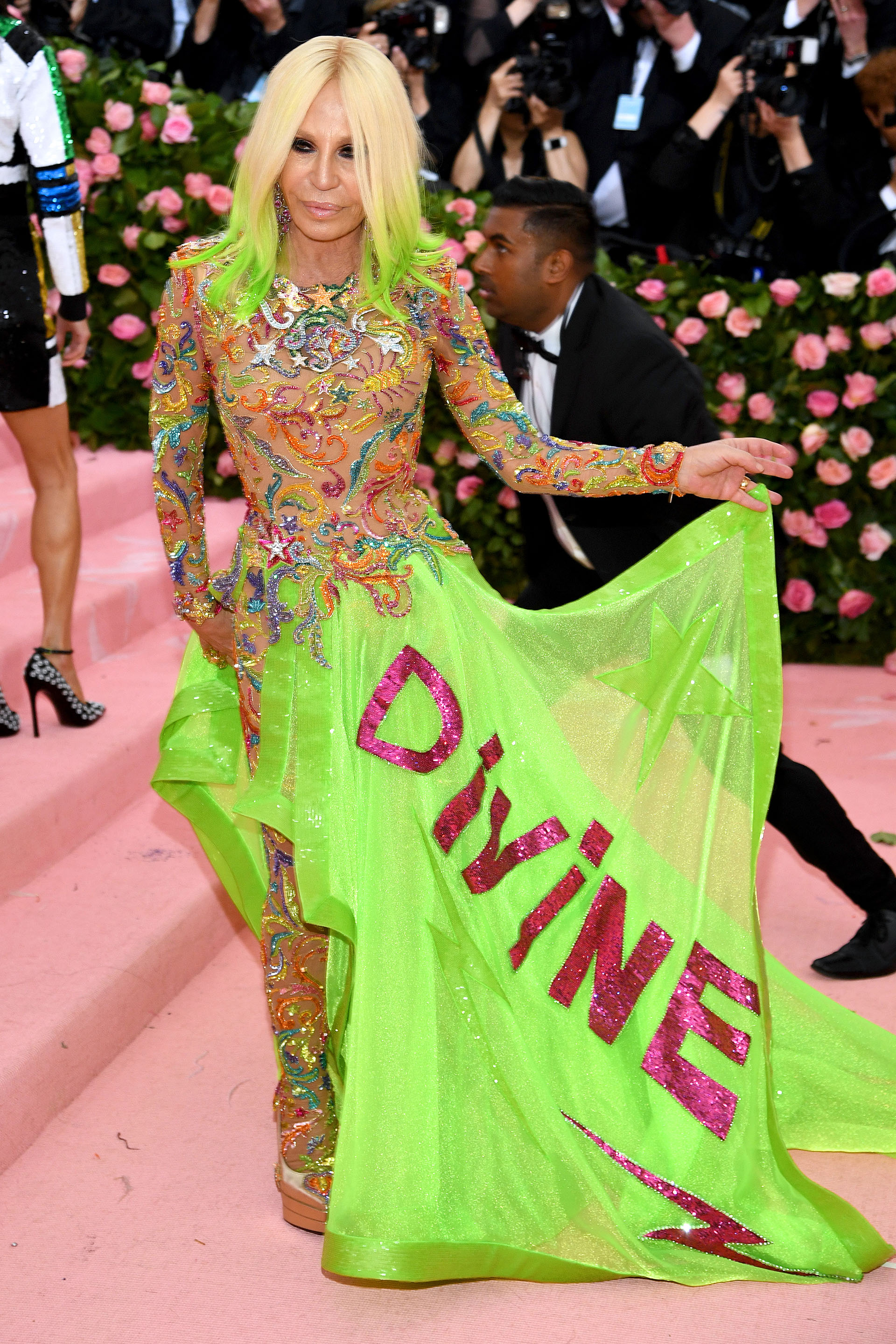
As an aperitif to the exhibition, the Metropolitan Museum of Art in New York received the most stylish celebrities and philanthropists on the planet in the traditional festival Anna Wintour organizes each year: the MET Gala that is celebrated every first Monday of May in this emblematic New York location. A solidary party that is equated with the Oscars at the media level. Thus, with a cloud of flashes on the pink carpet and the hashtag # MetCamp on social networks, the invited media exhibited their extravagant outfits inspired, as it could not be otherwise, in the theme of the exhibition, Camp: Notes on Fashion. In fact, it was the British Andrew Bolton, chief curator of the Institute of Clothing, responsible for choosing the theme.
In addition to the famous editor of the ubiquitous Vogue USA, the party counted as hosts with Alessandro Michele leading Gucci, pop queen Lady Gaga, singer Harry Styles and tennis player Serena Williams.

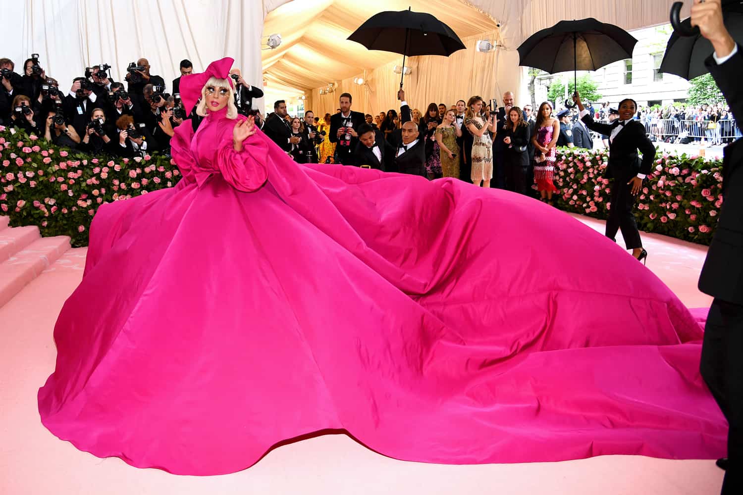
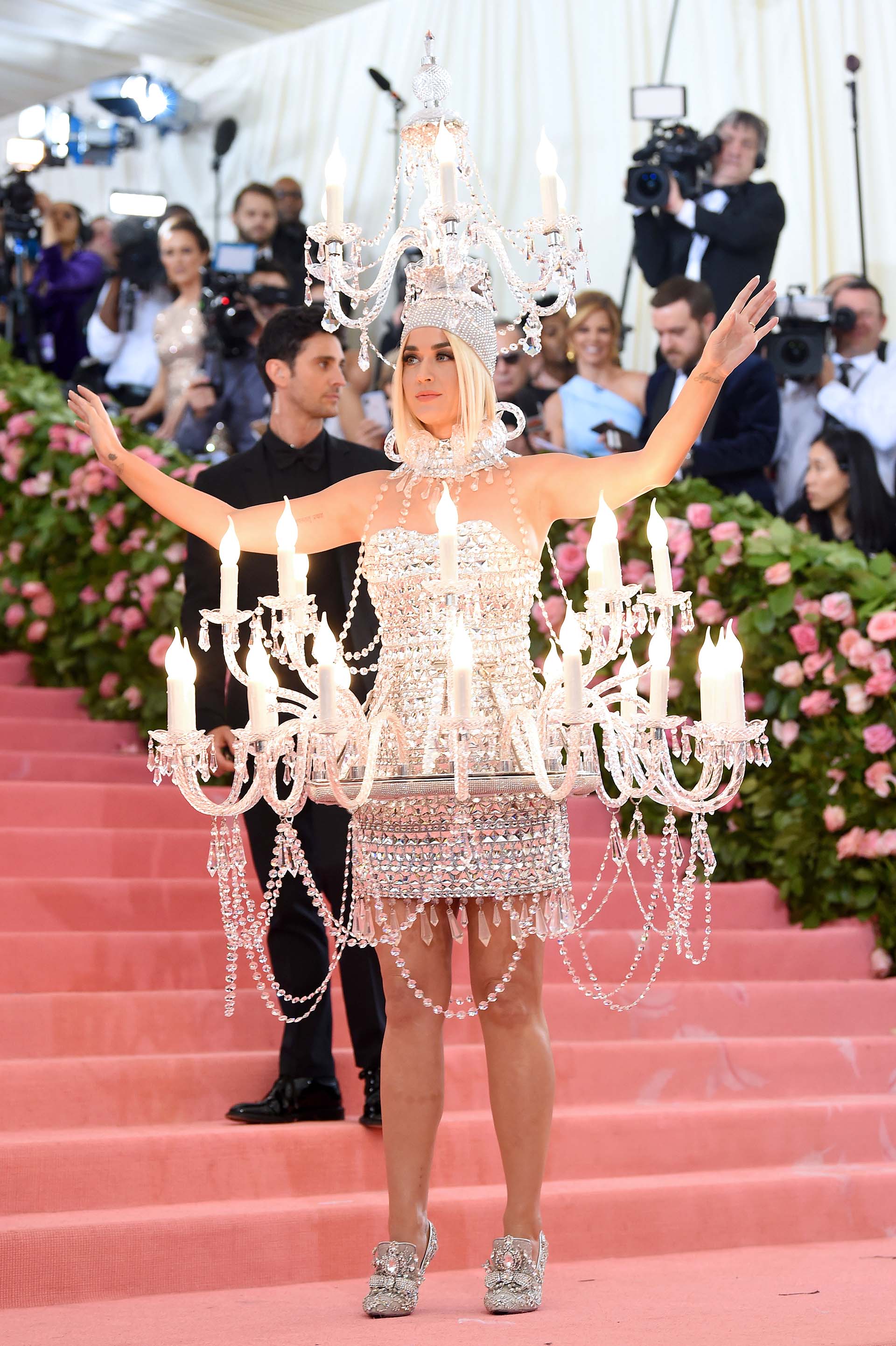
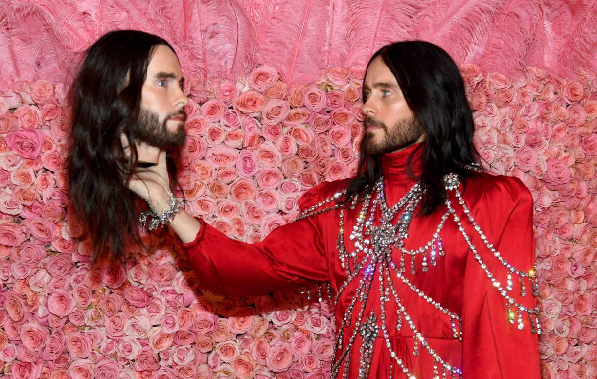
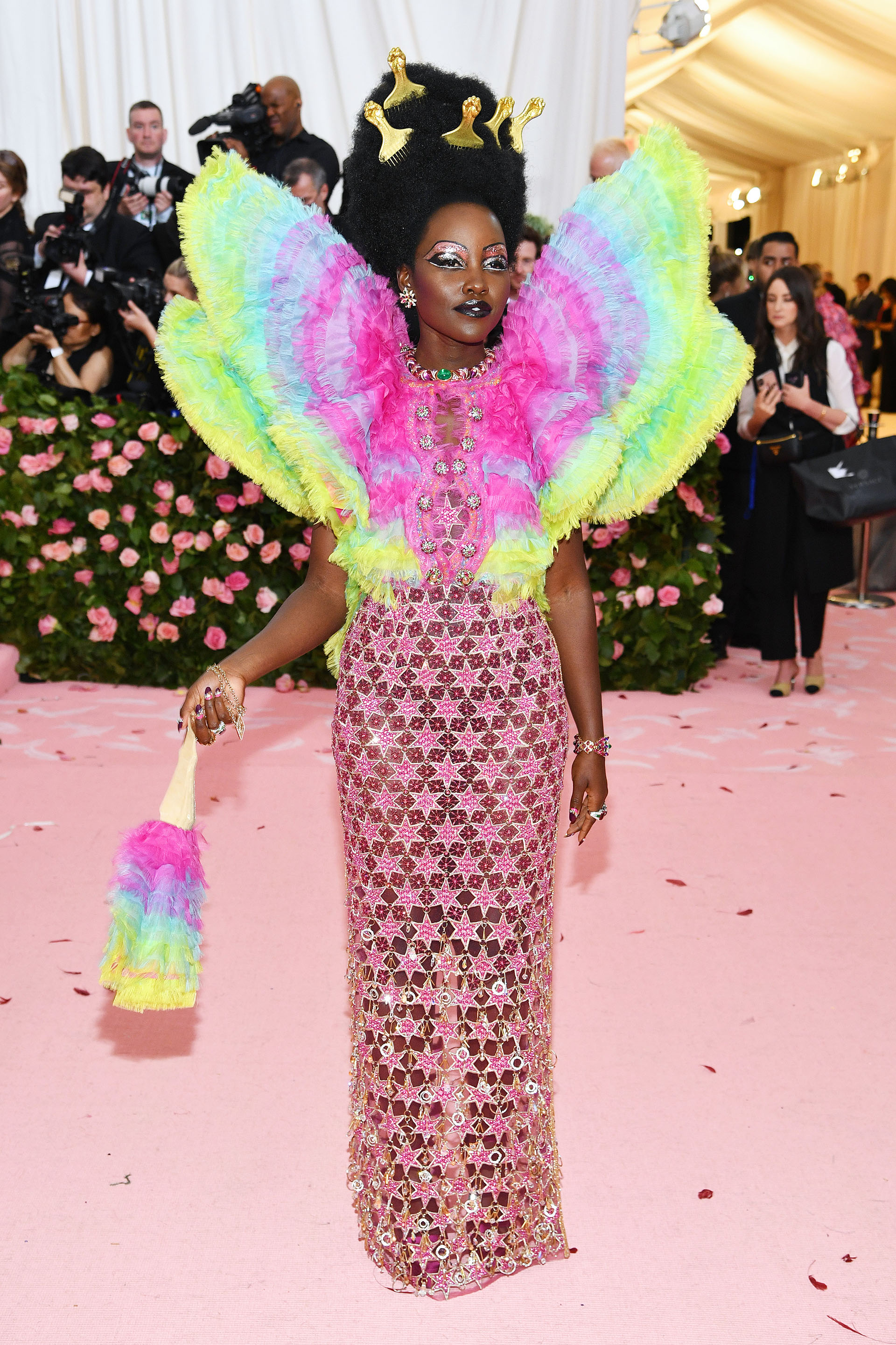
Between this popular parade of vanities there were successes and mistakes, the theme is not easy precisely. Many were the looks that surprised us and we will cite some that inspired us as, for example, the performance that Lady Gaga did with her stunning fuchsia dress by Brandon Maxwell that was removed little by little, with two other changes to stay at the end with a lingerie set, some fishnet stockings and platform boots. Or the light that Katy Perry brought dressed in a candelabra, a work by Moschino. De Gucci were many celebrities, although Jared Leto stood out, posing with a replica of his head as the models of the Italian firm did in their fall-winter 2018 fashion show. The Cara Delevinge top appeared with an amazing Dior multicolored couture inspired by bow -iris. The actor Billy Porter, known for the Pose series, gave the audience a golden moment by presenting himself as an authentic Egyptian deity. The actress and singer Zendaya became a modern Cinderella by grace of Tommy Hilfiger or the always risky Janelle Monae was visited as a work of art thanks to the designer Christian Siriano.
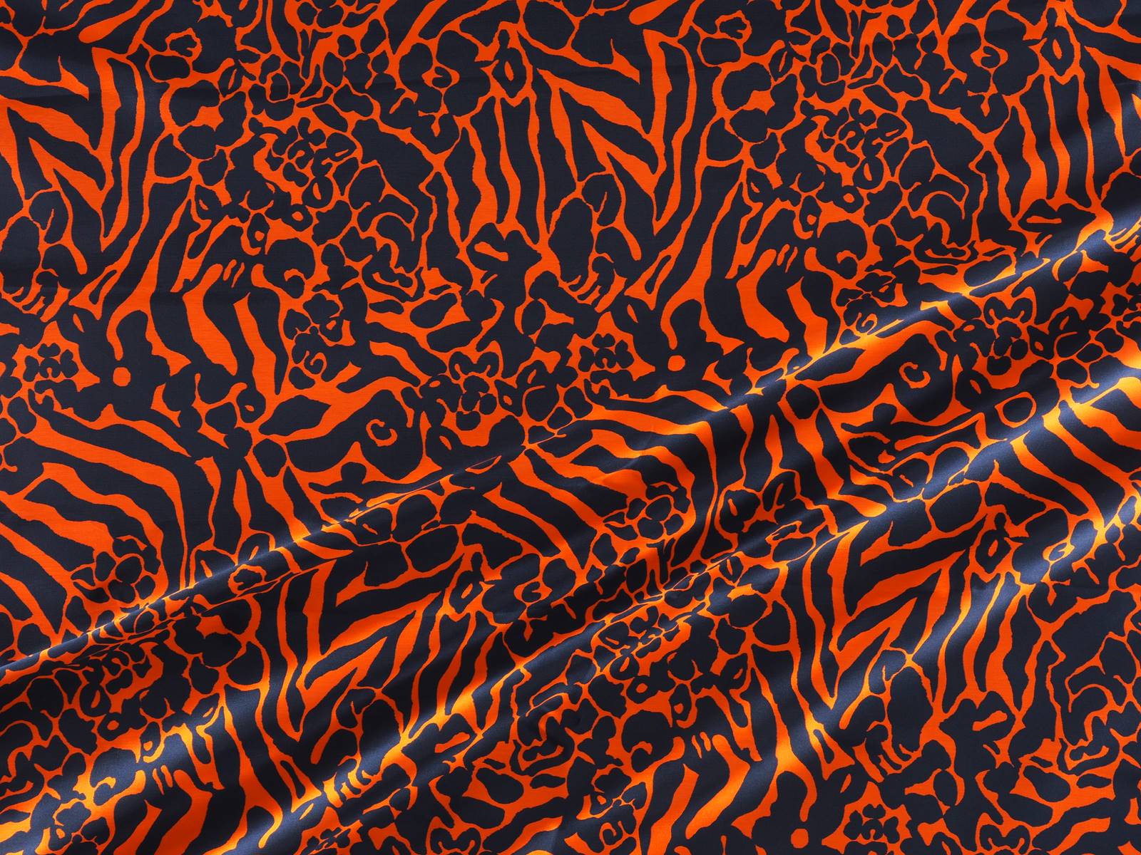
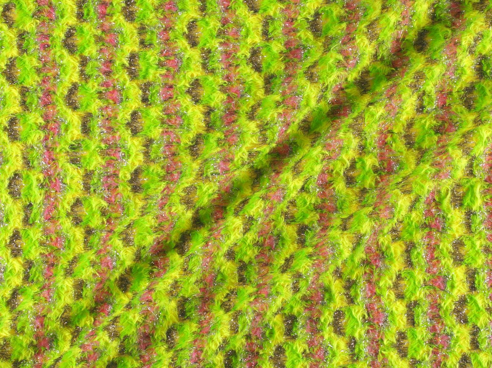
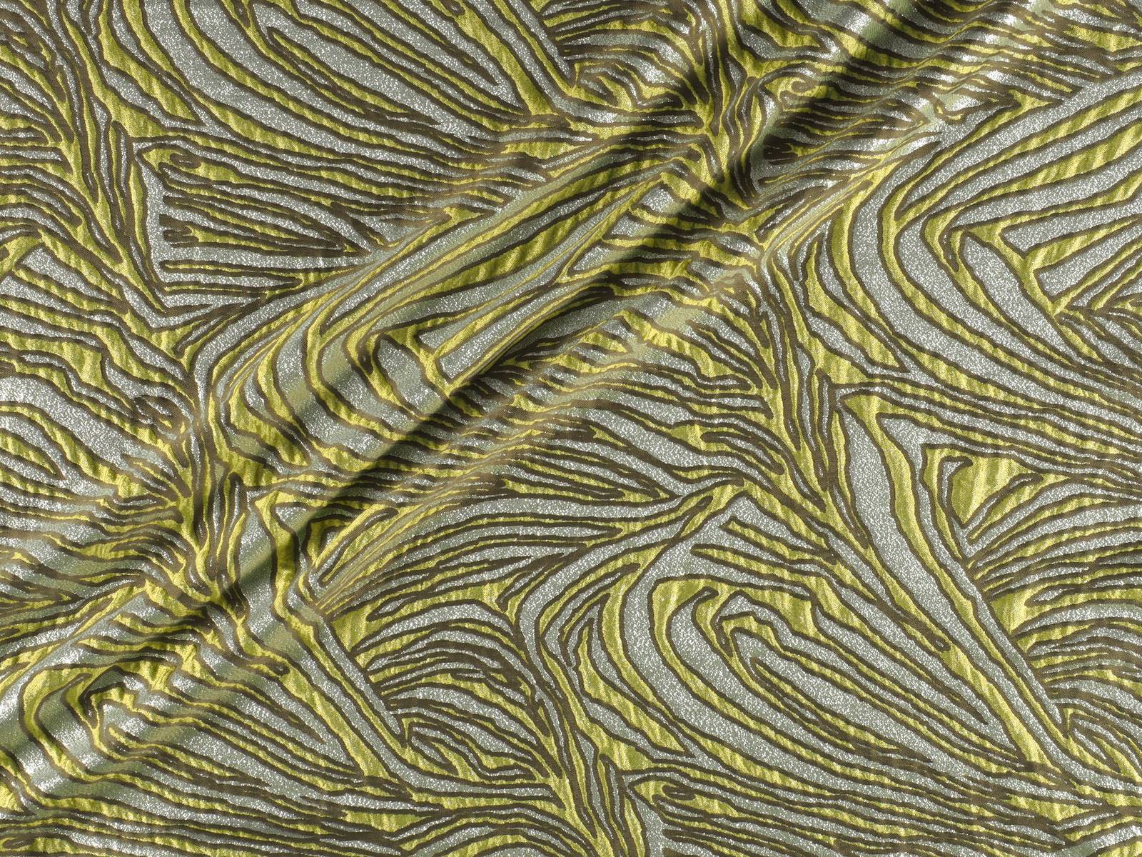
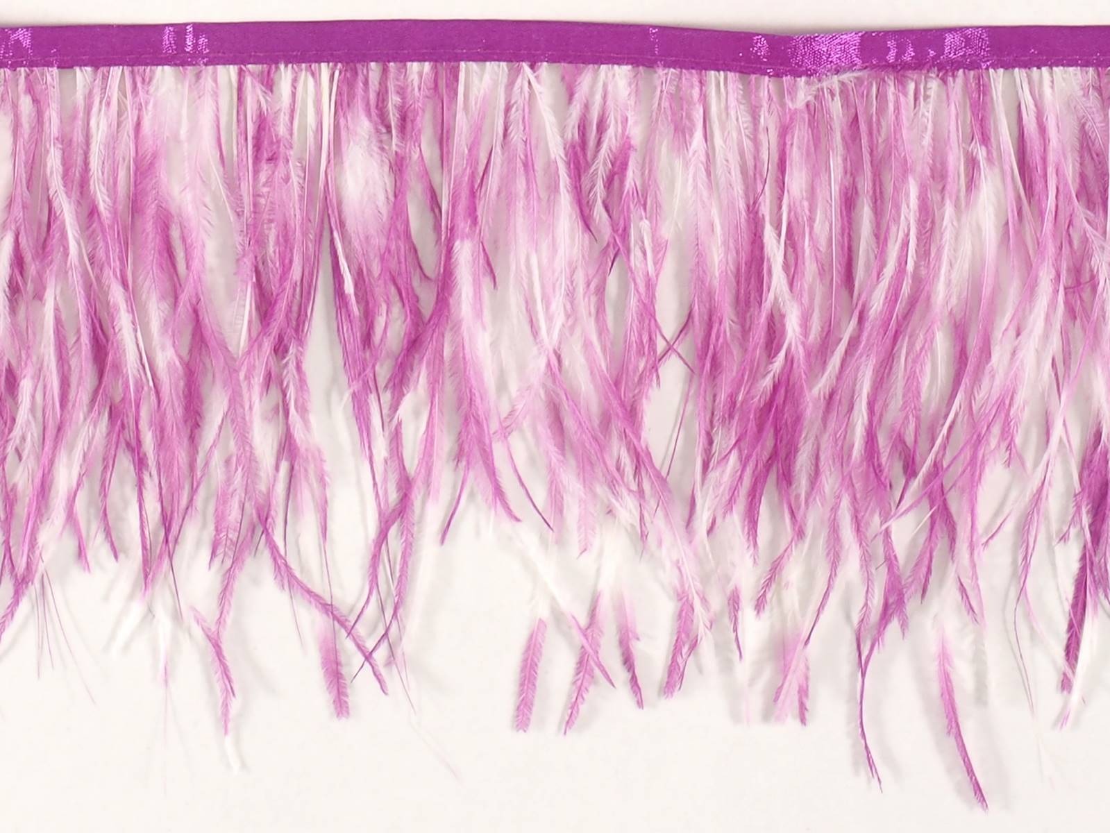
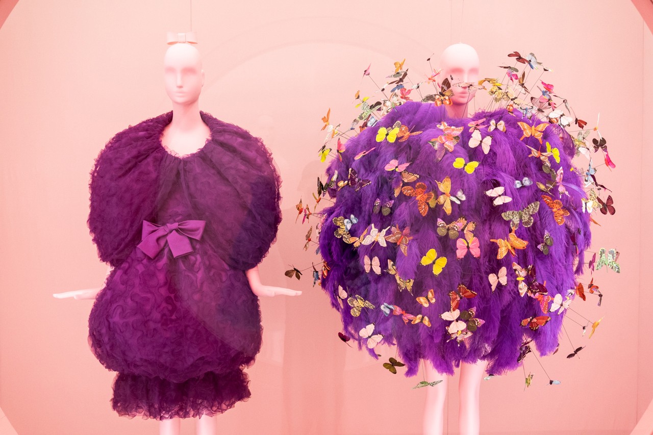
Many were the proposals in one of the most unforgettable nights of the year where creativity was given free rein. Indeed, feathers were not missing either. From Gratacós we have also been inspired by the fabrics that suggest this Camp aesthetic under the motto: L or artificial as a trend.


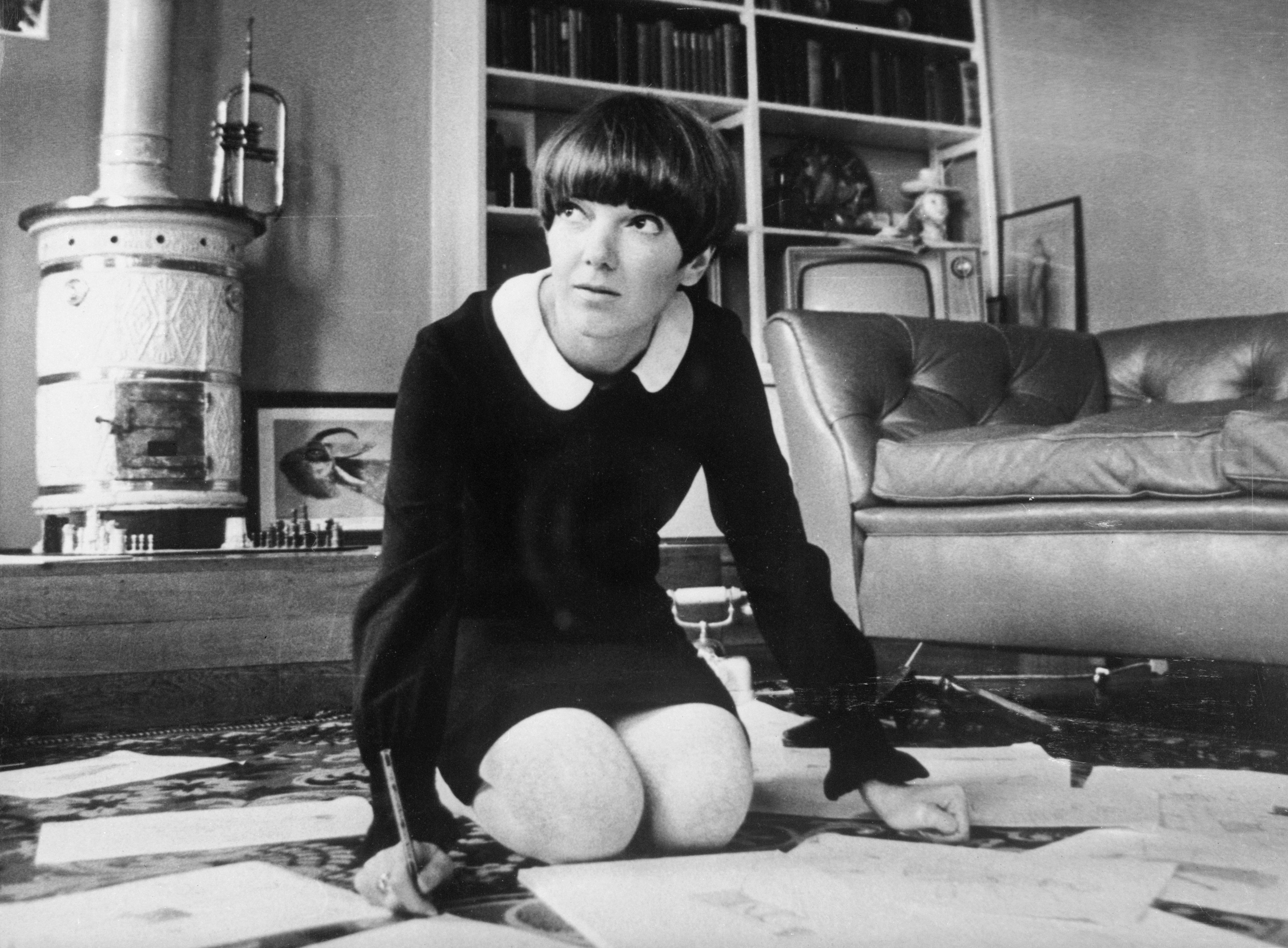
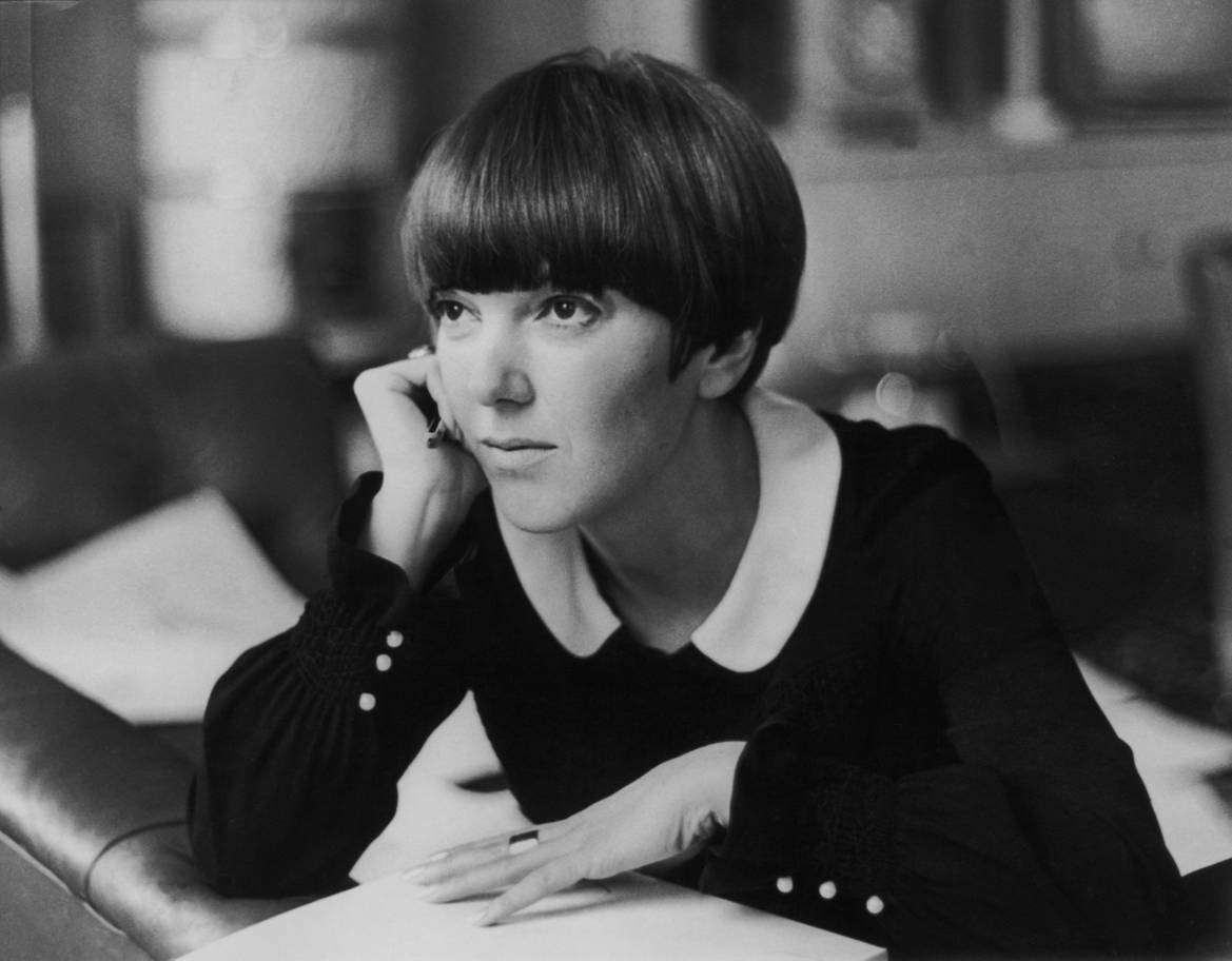
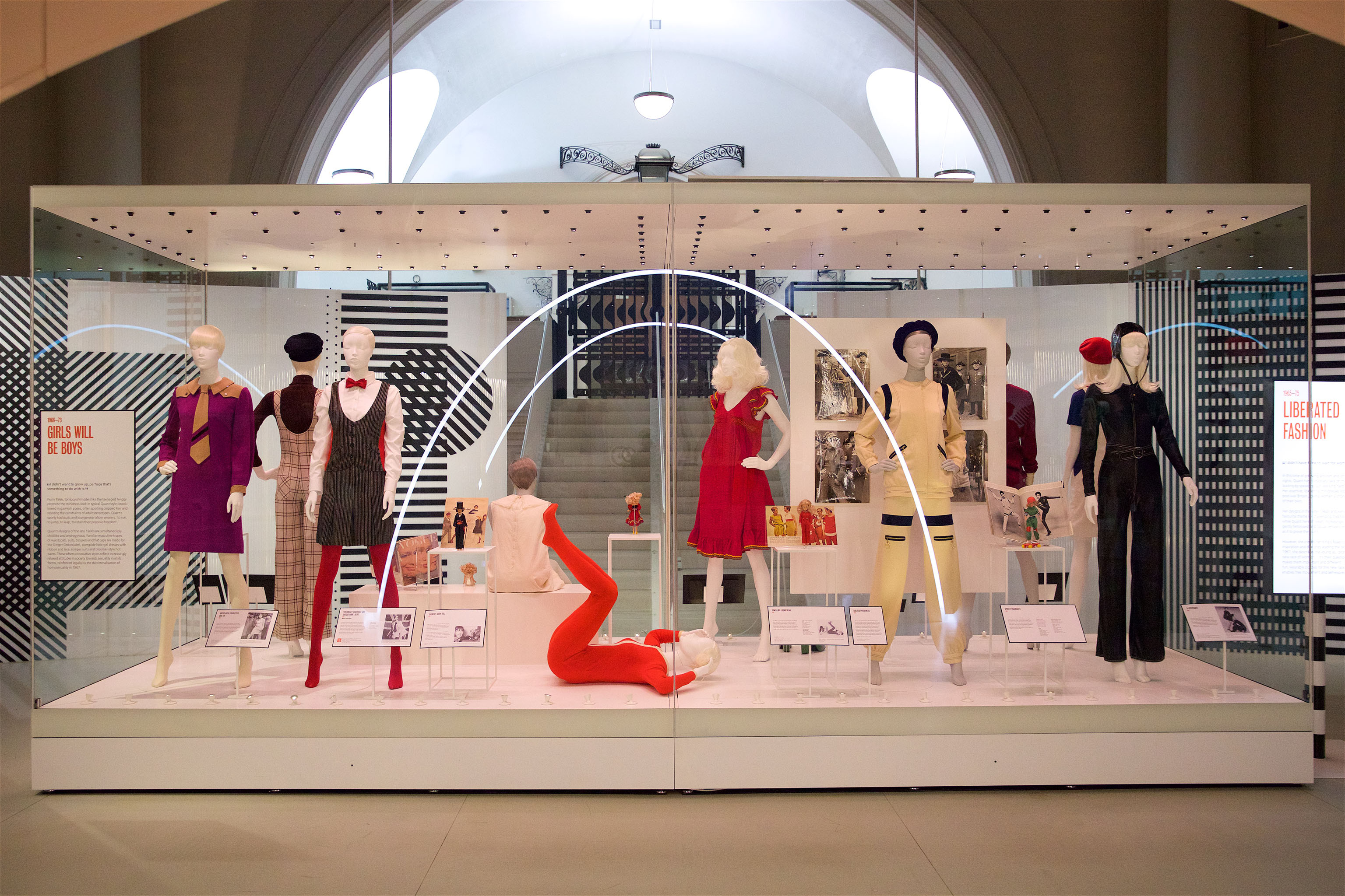
London pays tribute to Mary Quant (England 1930), living legend of fashion and guilty of stirring a whole era: the 60s with a garment of the most irreverent, the miniskirt. Although the authorship of such garment is disputed with the French couturier André Courrèges, “the mother of the miniskirt” knew how to popularize it and bring it closer to the whole world. “The goal of fashion is to make clothing available to everyone,” he used to remember. Now the Victoria & Albert museum praises this designer who revolutionized the fashion scene in that boiling decade so that the new generations know their great contribution up close. In the words of Jenny Lister, one of the curators of the exhibition, “Mary Quant is known as the architect of the democratization of fashion in the United Kingdom”.
The origin of the miniskirt is connected to the music, dance and urban fashion of the moment. It is said that he was born at the end of the 50s in North America and to dance the new rhythms of swing and rock, the skirts little by little were shortened. Who captured this progressive regression and this change was Quant, who in 1955 opened a small boutique called Bazaar in the street of King’s Road in the Chelsea neighborhood. To give visibility, Quant was among the first to adopt this garment that exposed the legs, knees and some calves, a real scandal in an era where conventions were challenged. Little by little, from her small store in London, the designer caught the attention of young people and the industry she saw in her miniskirts and brightly colored breastplates and brilliant finishes a glimpse of rebellion, transgression and freshness, three concepts that linked with the way of thinking of the new generations.

Mary Quant is the architect of the democratization of fashion in the United Kingdom
Quant had no specialized training in fashion and in fact her creations were the result of a personal apprenticeship that included experimentation with different materials. It was that courage and rebellious attitude that seduced the industry and became a reference for women of the time. Along with the modelTwiggy, Mary Quant made this short garment became the trademark not only of his clothing brand but also for a decade. A symbol was born. So much was his success that, in 1966, Queen Elizabeth II granted him the medal of the Order of the British Empire for his contribution to fashion, a distinction he picked up in Buckingham wearing one of his miniskirts.
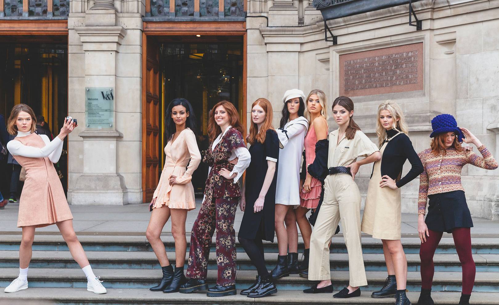
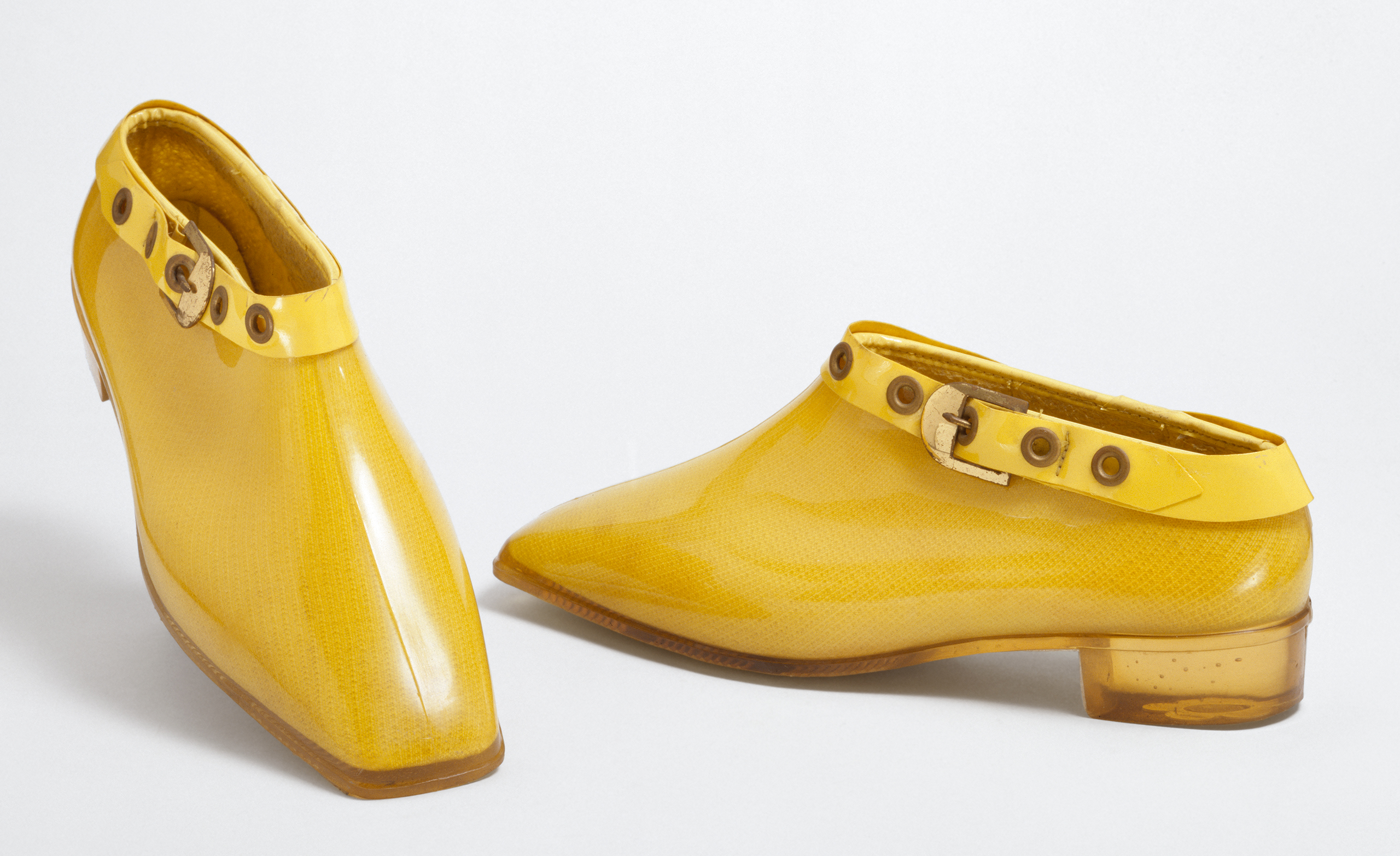
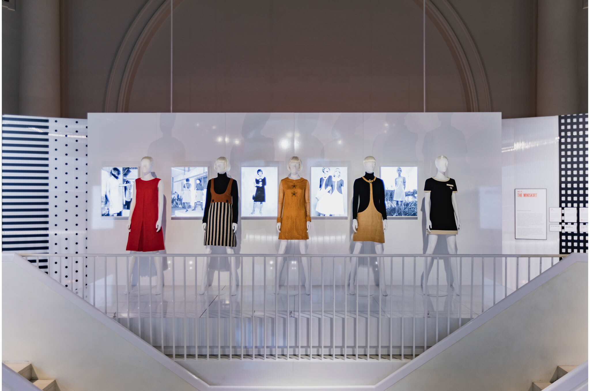
The exhibition exposes 200 pieces in which the colorful and innovative identity of the British designer is reflected. It includes the famous skirts along with other designs, as well as accessories and cosmetics, in a striking chronological journey that covers from 1955 to 1975. Among accessories and dresses, the museum also collects a selection of clothing and photos of anonymous women wearing the designs of Quant which shows the importance of the miniskirt for a decade’s fashion. The exhibition will be open to the public until February 16, 2020.


Sorry, this entry is only available in European Spanish.
Sorry, this entry is only available in European Spanish.

The Colour Community has just presented the new report of colours and materials that will influence the Autumn-Winter season 2020-2021 in the world of design and fashion. The initiative, led by three colour professionals , was presented, as usual, in the Old Estrella Damm Factory in Barcelona before the watchful eye of a hundred enthusiasts from the sector. We remind you that the founding team is made up of the architect Pere Ortega , the designer specialized in Colour & Trim , Eva Muñoz ; and Rosa Pujol , Textile & Colour Stylist from Gratacós . In each issue new partners are added to this “mother team”who bring their vision and help shape the new range of colours and materials that will inspire the new season. It is an initiative that is repeated twice a year and that has our support. ” Gratacós always has the doors open to our fashion- area, for every lover of fabric, texture and colour,” declares Juan Gratacós at the beginning of the presentation of the report .
Juan Gratacós : ” Our fashion-area is always open to lovers of fabric, textures and colour”
On this occasion the season is based on the concept of ‘ Multiple ‘ and consists of a reflection in a positive key about the future society where the line between the real and the virtual will be more diffuse than ever . ” Currently this virtual reality exists on social networks or in videogames but little by little it will become as tangible as what we now call reality,” explains Pere Ortega in presenting the report. The ‘ Multiple ‘ proposal , in turn, is articulated through four colour ranges and materials which are named On , Inside , Balanced and Metronome .
Pere Ortega: “Currently this virtual reality exists on social networks or in videogames but little by little, it will become as tangible as what we now call reality”

1.- On
The first inspiration appeals to dynamism, to the creation of a dialogue with new realities that are virtual. It is a dynamic and versatile range that creates products connected to the human being in a digital environment. The shades chosen to conceptualize it are the cold ones in their most attractive version: metallic greys, iridescents, smoky blues, bright blacks and touches of yellow that play in contrast. The range of industrial and futuristic themes plays with plastic, oily materials, straight and curved architectural lines and artificial shapes. Fantasy under control.

2. Inside
The second range is more dense and theatrical than the first. It works with the realities that look back at the past, in a kind of retrospective. The shades that are used to give it shape are the browns, purples, deep blues and the metallic range that always appears in each of the four inspirations as a common link. Floral prints, organic shapes, sinuous lines, elements of nature, upholstery … all these elements influence this intimate range that takes as its model the baroque of Versailles in its most contemporary version.
3. Balanced
The third inspiration is based on the concept of balance and chromatic harmonies. It is a modest range that is inspired by the shapes and textures of nature and works with craftsmanship in a very folky way. The predominant colours refer to autumn: the beiges, earth-coloured , whites, metallics and forest greens mixed with vibrant blues. Rough surfaces,skins, the most basic geometric elements and tribal influence are also treated in this folk range.

4. Metronome
Finally, the fourth inspiration is based on the metronome’s rhythm, with elements in movement that follow its beat: it is a work of colours that come and go and in turn play on the contrasts. This range belongs to the world of the city: it is urban, cosmopolitan and youthful. It is inspired by all the multiplicity of people, tribes and individuals that coexist within the same community. There are plenty of grey shades, silver and metallic details on smooth surfaces that contrast with graphic elements and arty patterns. Denim and overlays of garments, understood as a show of expression, configure the different identities that make up the same city.


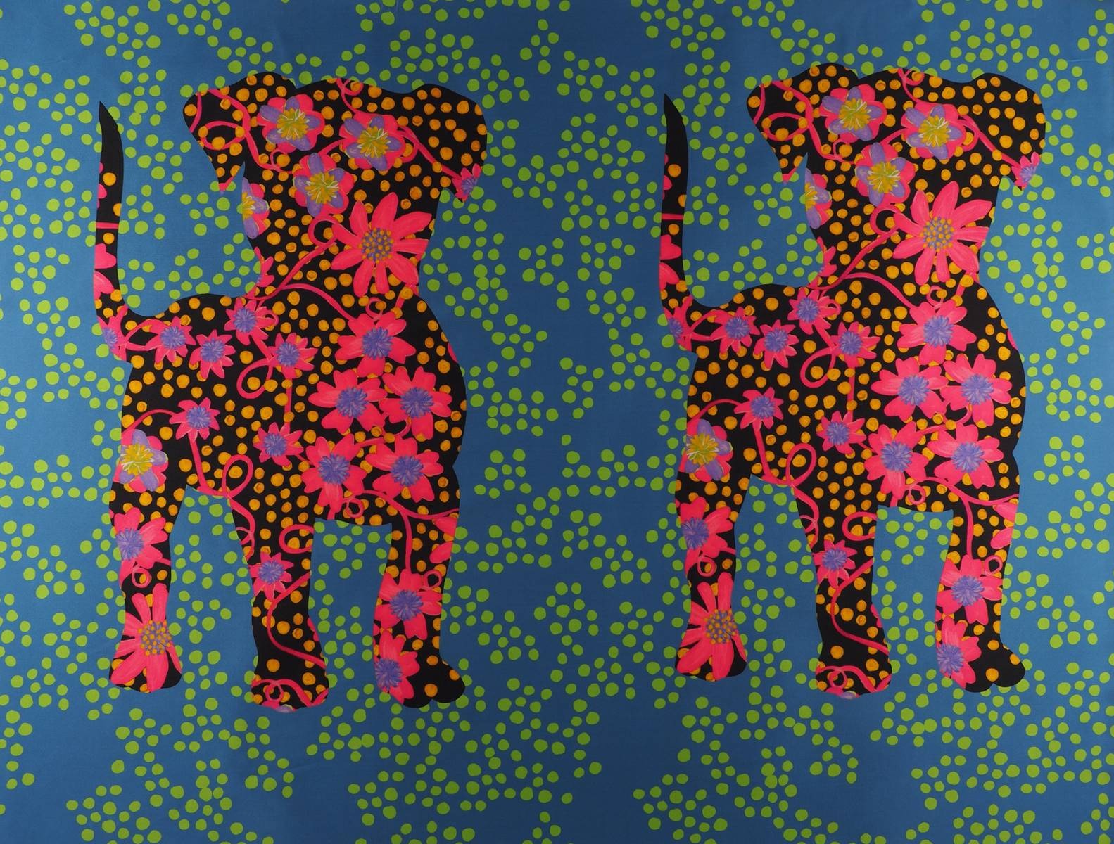
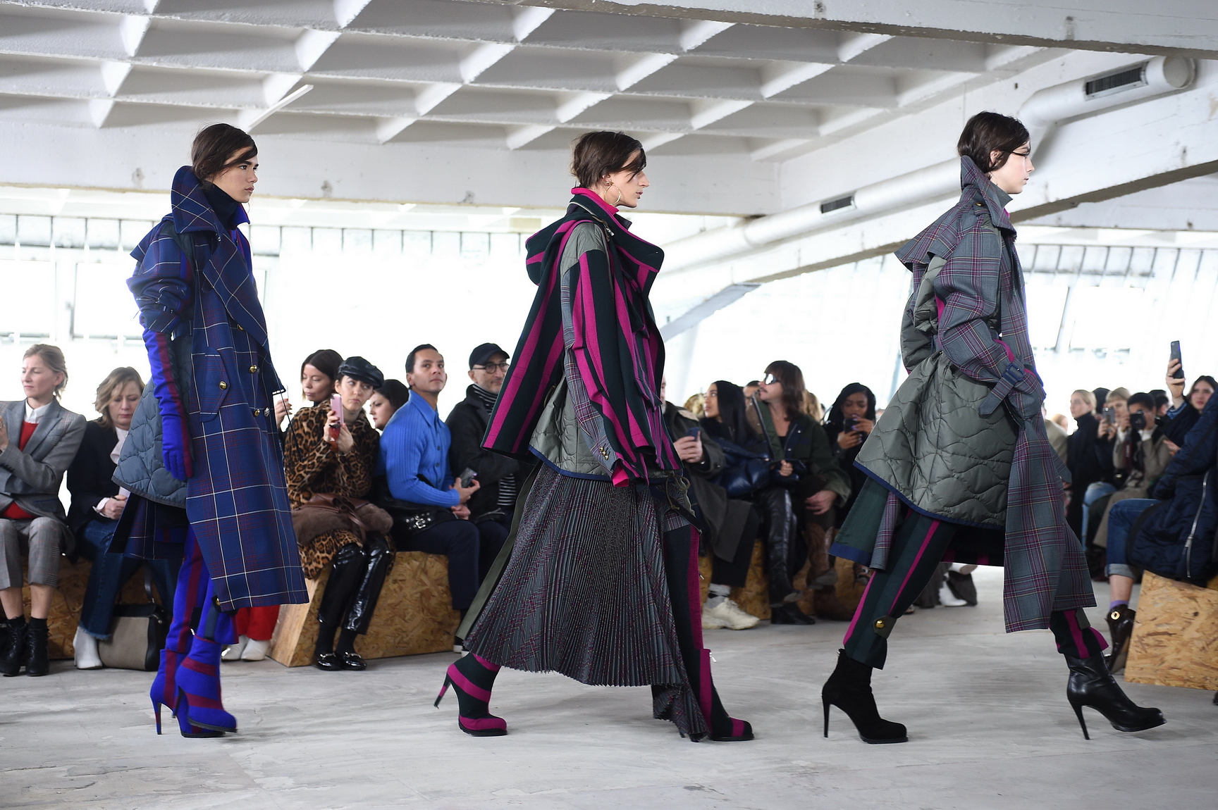
Are you ready to play? To play the game in its broadest sense. The game as fun, where there is space for experimentation mixed with hints of entertainment and large doses of curiosity. In this new season that we are premiering we pay homage to leisure, to recreation, to freedom in a collection that is inspired, as could not be otherwise, by the concept of ‘ Play ‘. It is a presentation which is both sophisticated and casual, which focuses on colour, movement with light fabrics and craftsmanship for the warmer months of the year. This Spring-Summer 2019 collection has a large dose of creativity and ingenuity on the part of our design team, who make Gratacós a luxury fabric company with a defined style and personality. So let’s enjoy the latest creation we have prepared with the intention once again to surprise and excite. Let’s play together: Let’s play!
“Play is a sophisticated and casual presentation which at the same time goes for colour, movement and craftsmanship”
General concept
‘Play’ is a sympathetic collection that seeks at first glance to combine apparent simplicity with products that are attractive and appealing. It is an aesthetic presentation based on timeless articles far away from extravagance and artificiality, but these have to provide a distinctive feature, a certain personality. We are not seeking the versatile and basic, which is somewhat insipid, but rather to give it a creative turn. In parallel we are bringing back the characteristic features of folk culture and opting for craftsmanship to present traditional fabrics with rustic aspects and manual details.

“We are seeking to combine apparent simplicity with attractive and seductive products at first glance”
Fabrics
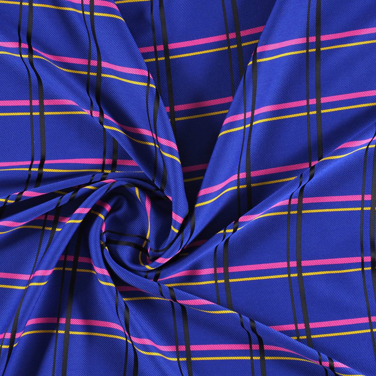
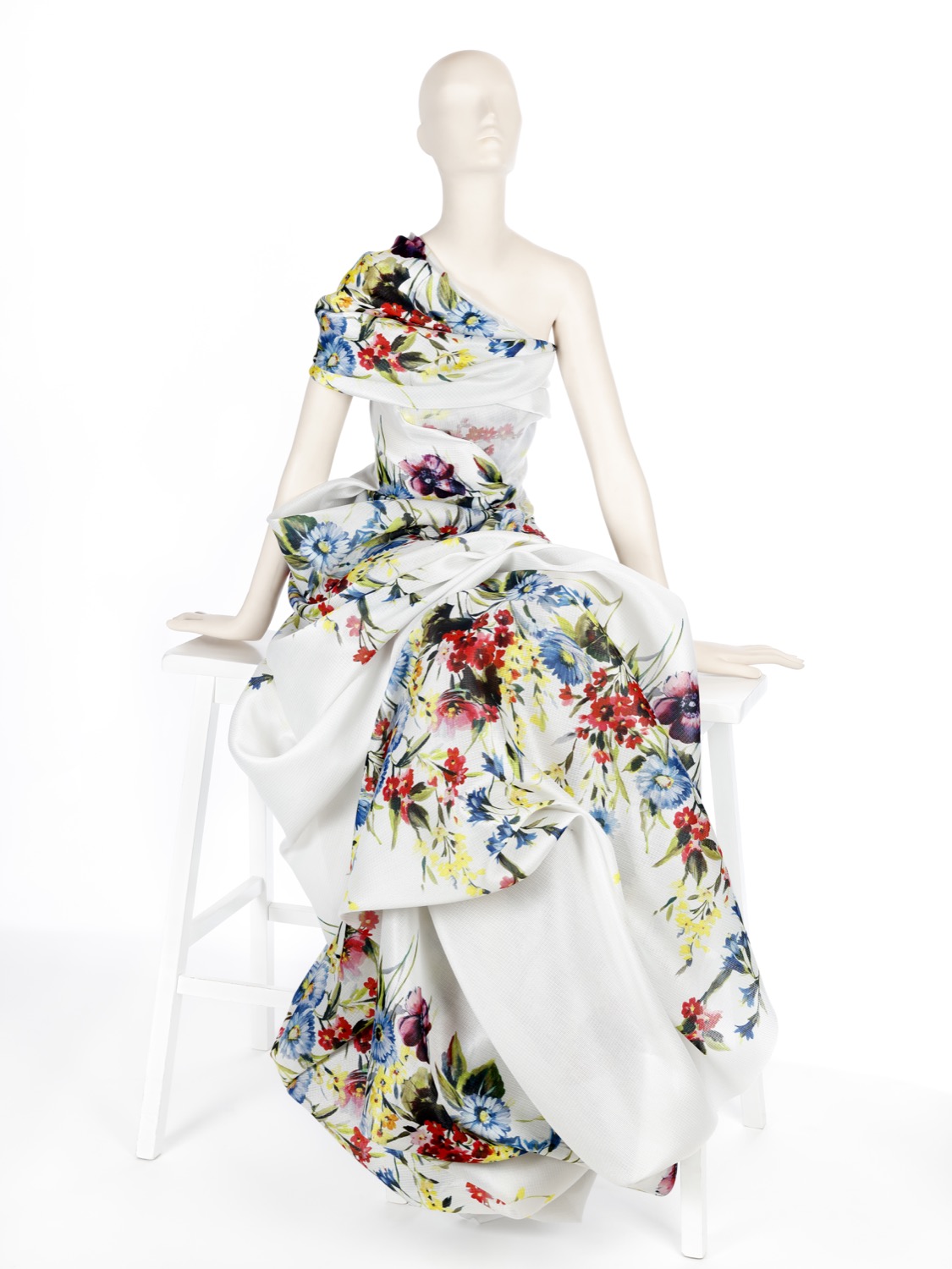
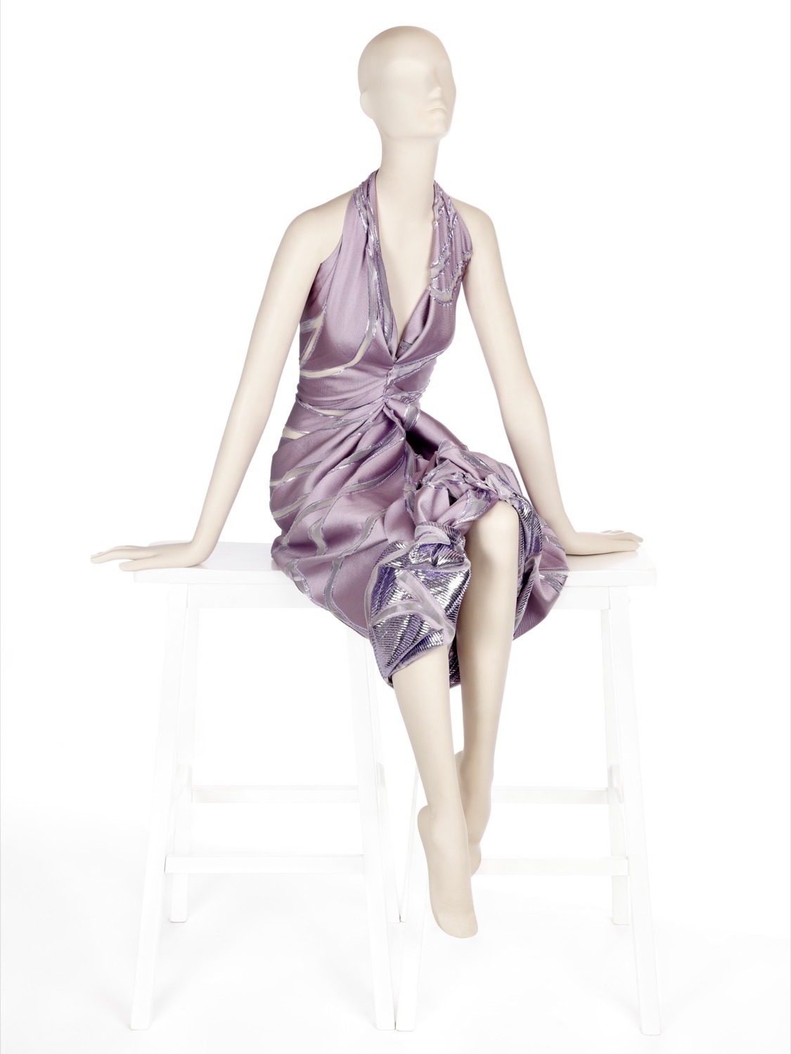
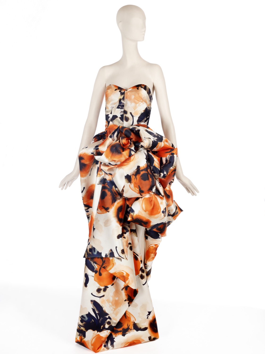
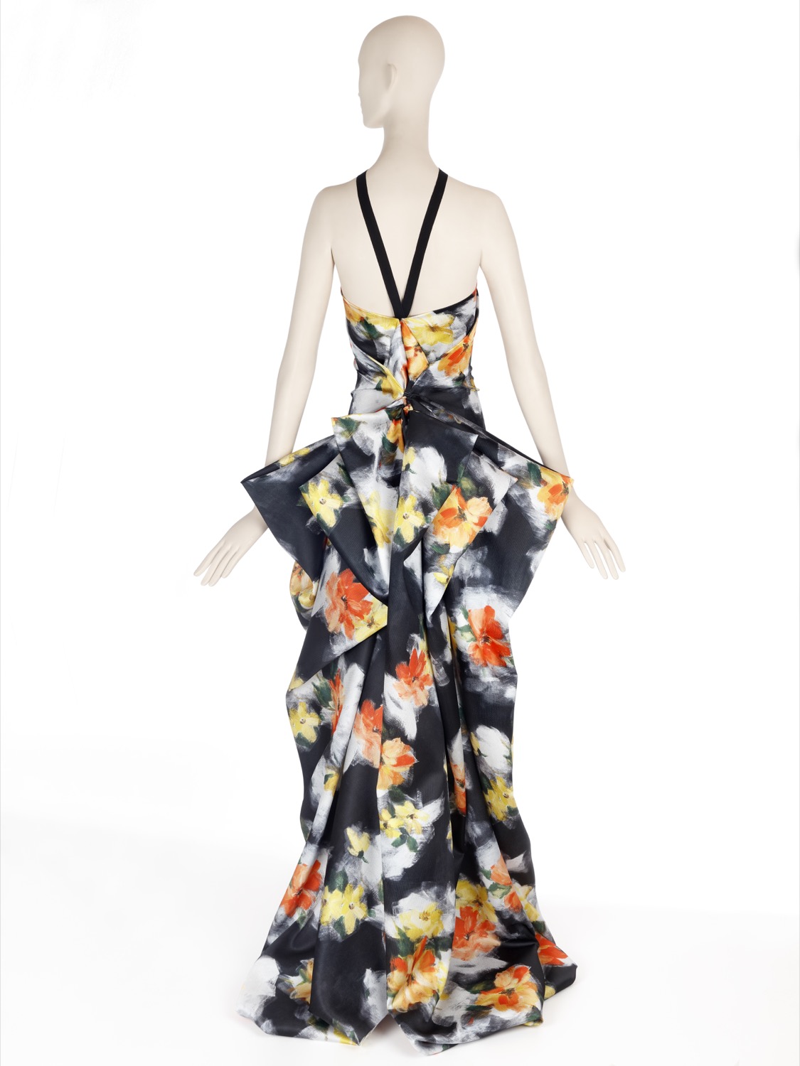
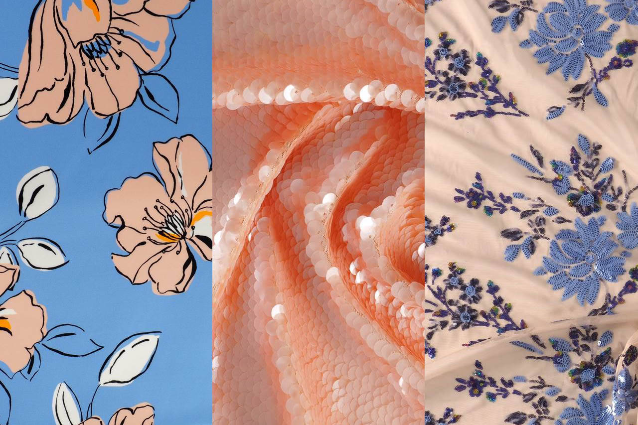
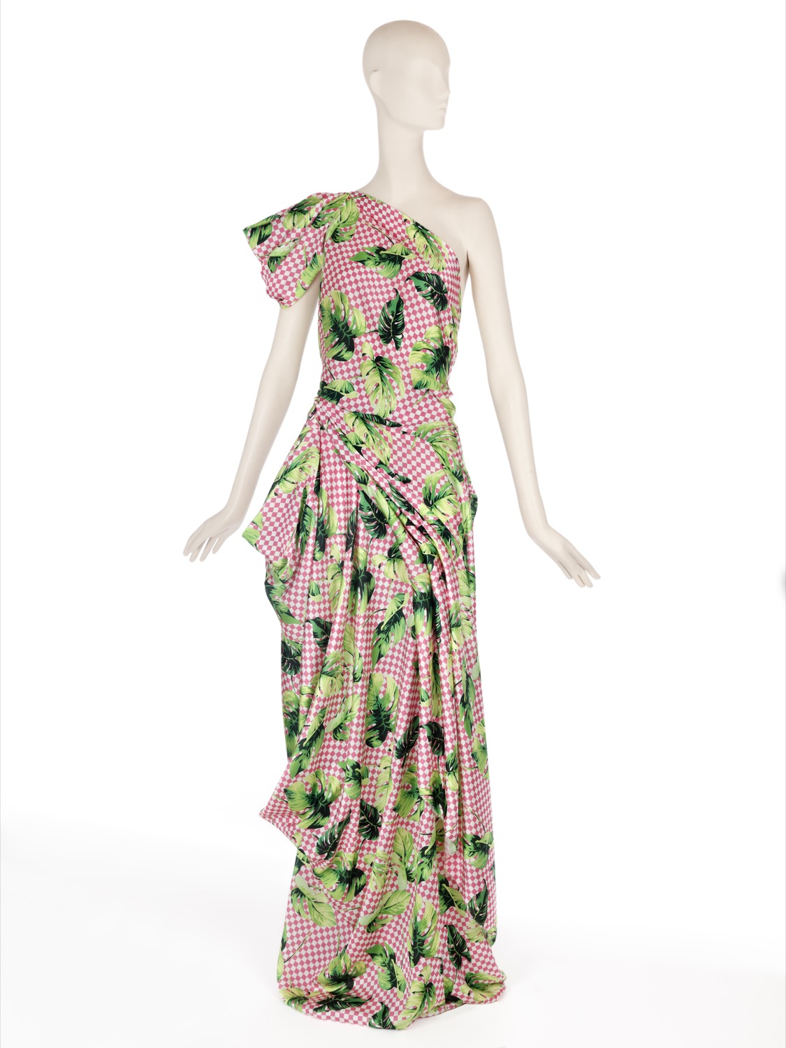
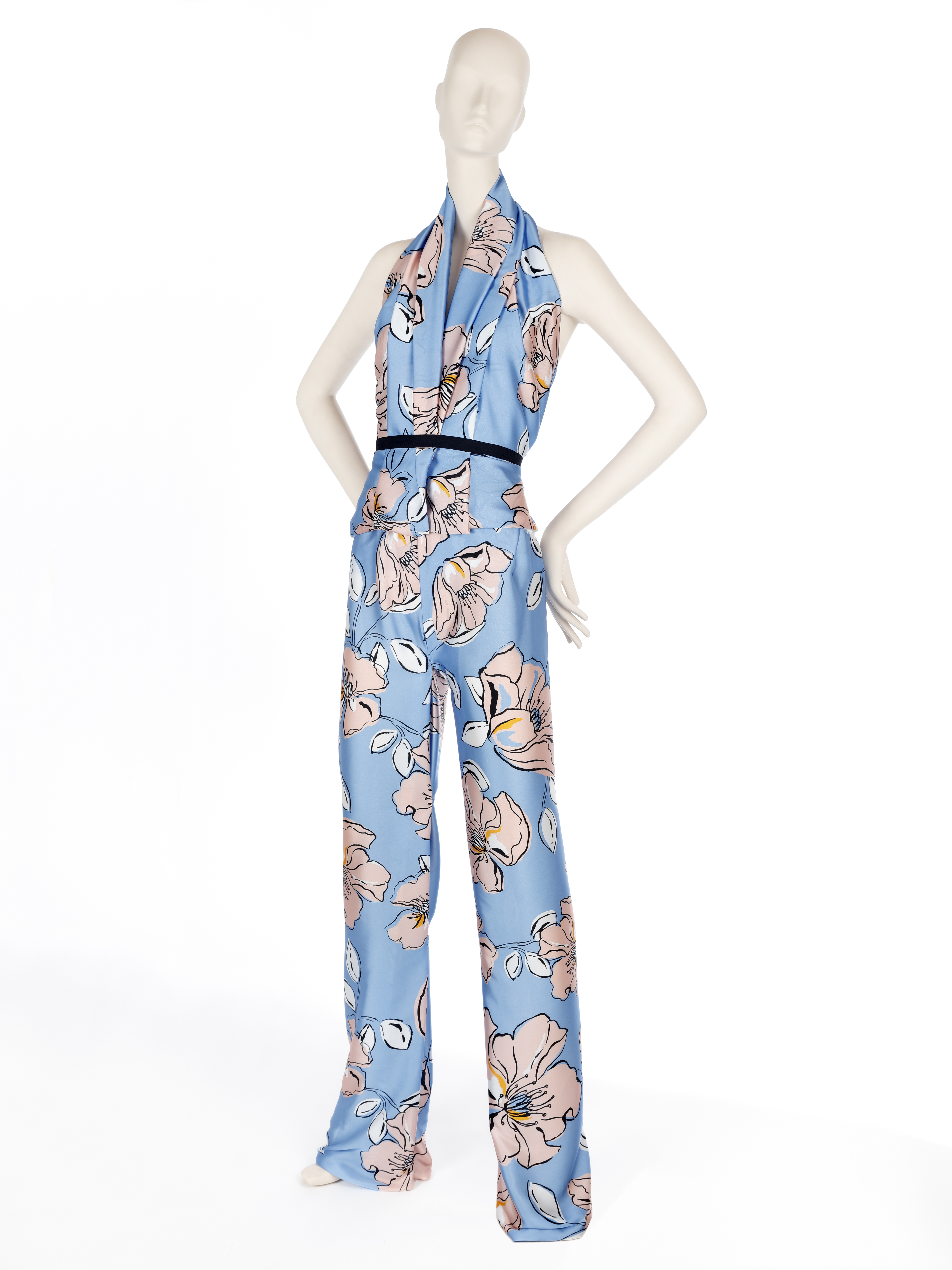
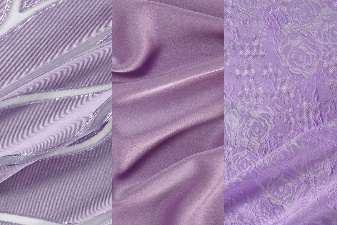
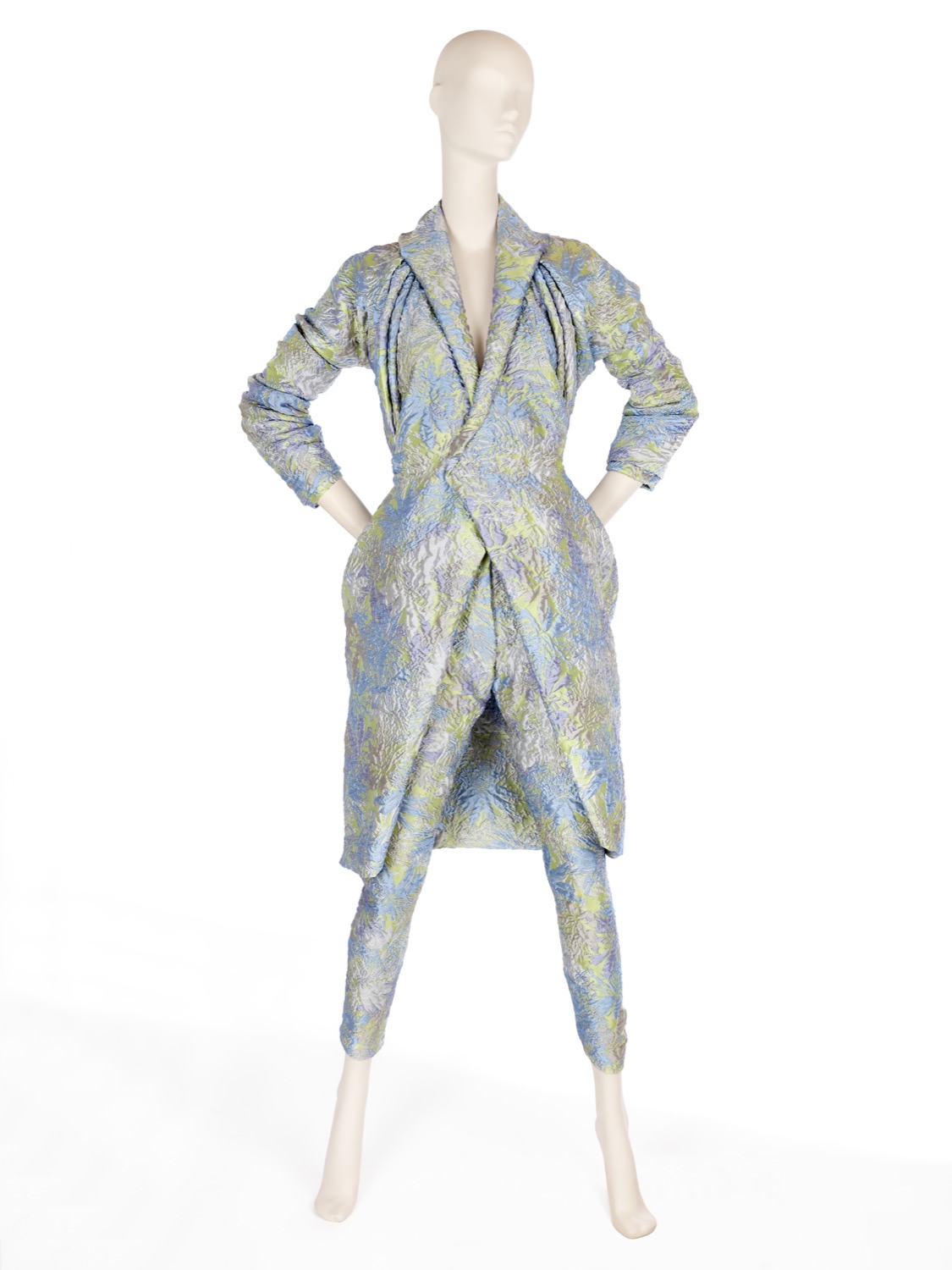
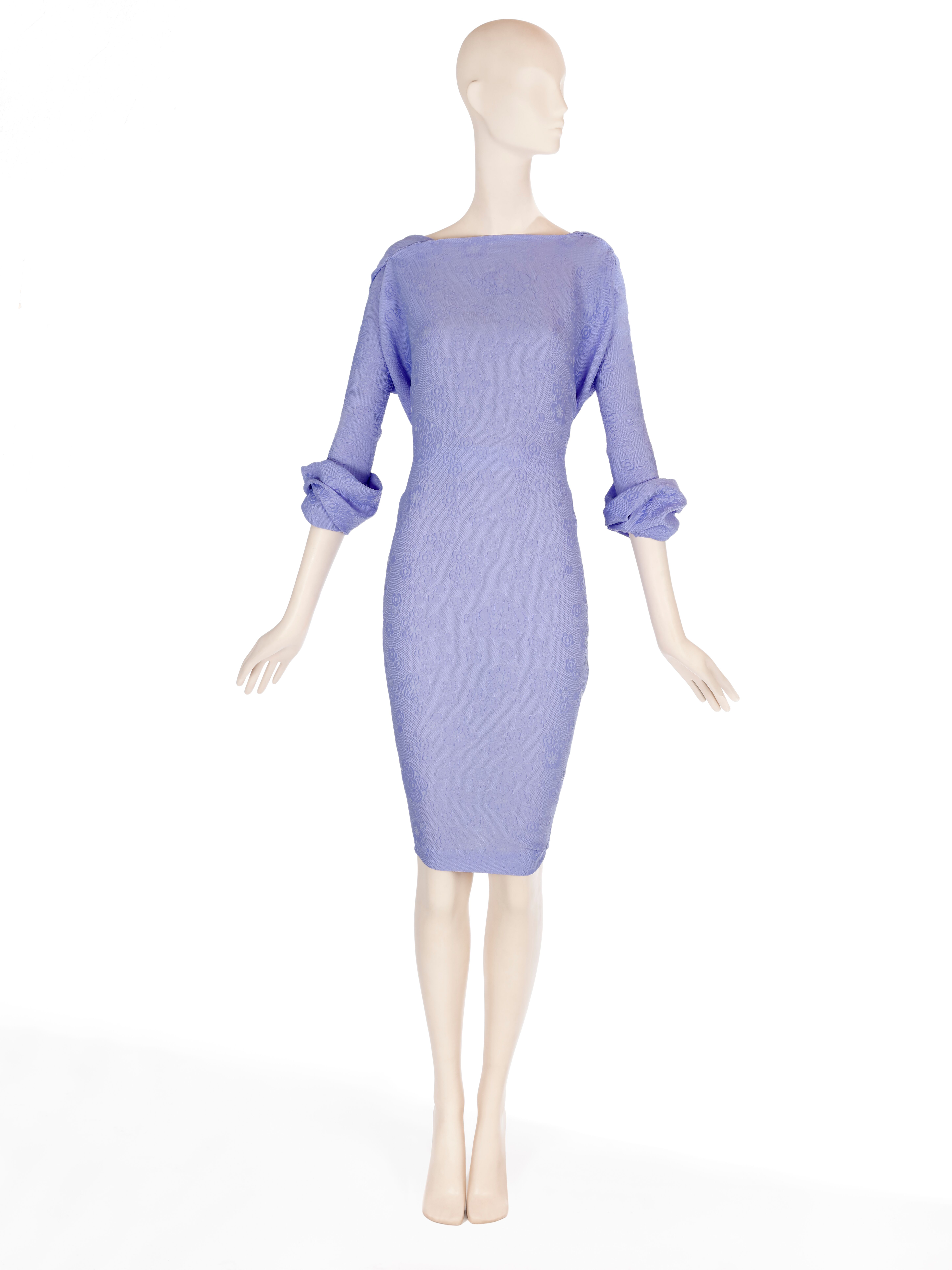
The objective of this collection is to revitalize the luxury of textures and materials. To achieve the new basics we use impeccable fabrics with clean and serene appearances. We also go for colourful Jacquards with tactile reliefs, fluid fabrics of silk or polyester of delicate appearance, gauzes with transparencies, dense satins, iridescent materials that captive the light or floral prints of watercolors. At the same time, within the folk trend, we are bringing back granular textures, fibrous and light aspects that show the relief through the thread-work, the hand-made reliefs and the embroidery with motifs inspired by nature.
“We are revitalizing the luxury of textures and materials”
Colours
The range of colours evolves from the natural to the artificial. Thus pastel shades and soft,sweet shades give way to the most vivid colours in a smooth transition and in a key feminine way . The most vibrant tones are used for details. ‘Play’ is also a collection dedicated to light, that’s why it also opts for the iridescent, transparent and nacreous with a nod and a wink to things nautical.
Discover some inspirations in our new lookbook Spring – Summer 2019! click here.


Sorry, this entry is only available in European Spanish.


