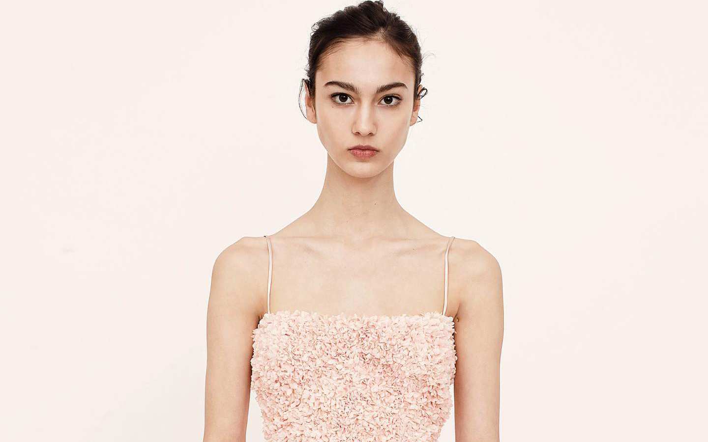
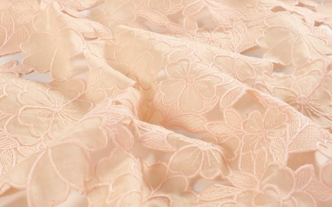
 Creative collage featuring looks by Marta Martí, By Sophie, and Mariano Moreno.
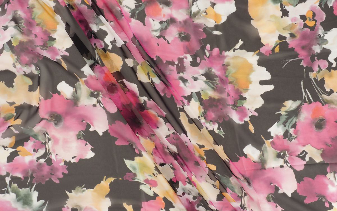
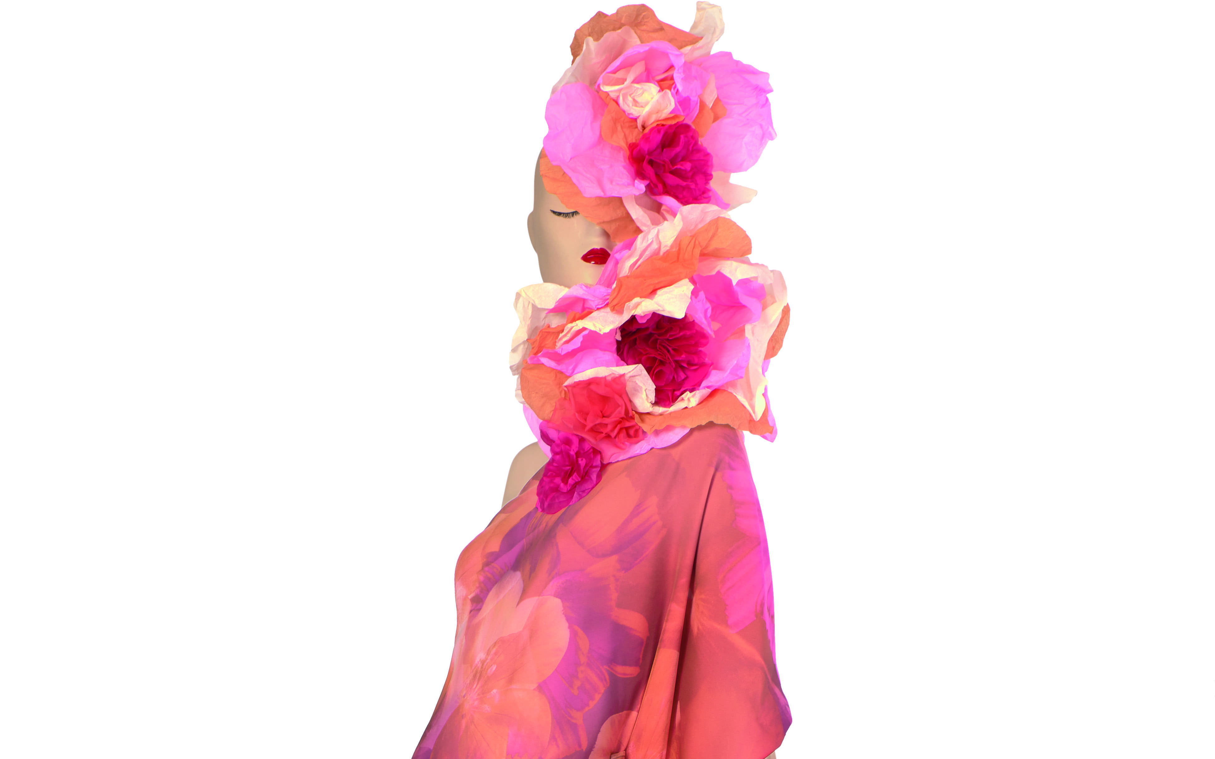
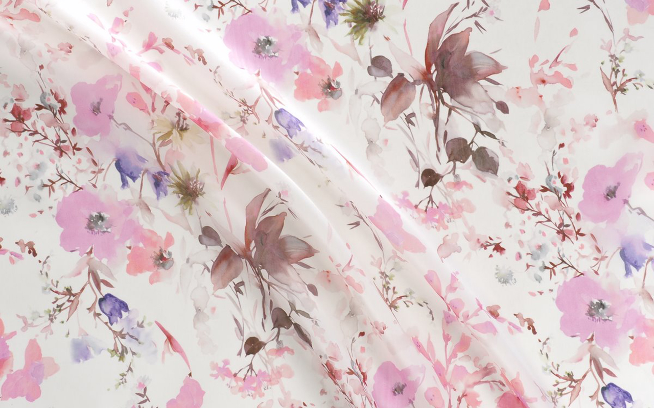
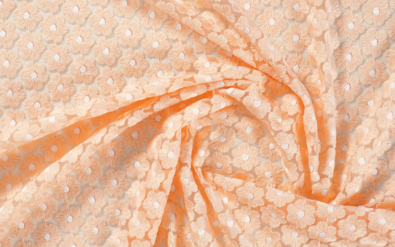
Traditionally associated with spring, floral prints are stepping out of their comfort zone to take on a new role during the cold season as well. This trend demonstrates its beauty, versatility and timelessness, characteristics that are ideal for a wardrobe that is not so concerned with passing trends, but with a style that lasts and is therefore immune to the passage of time.
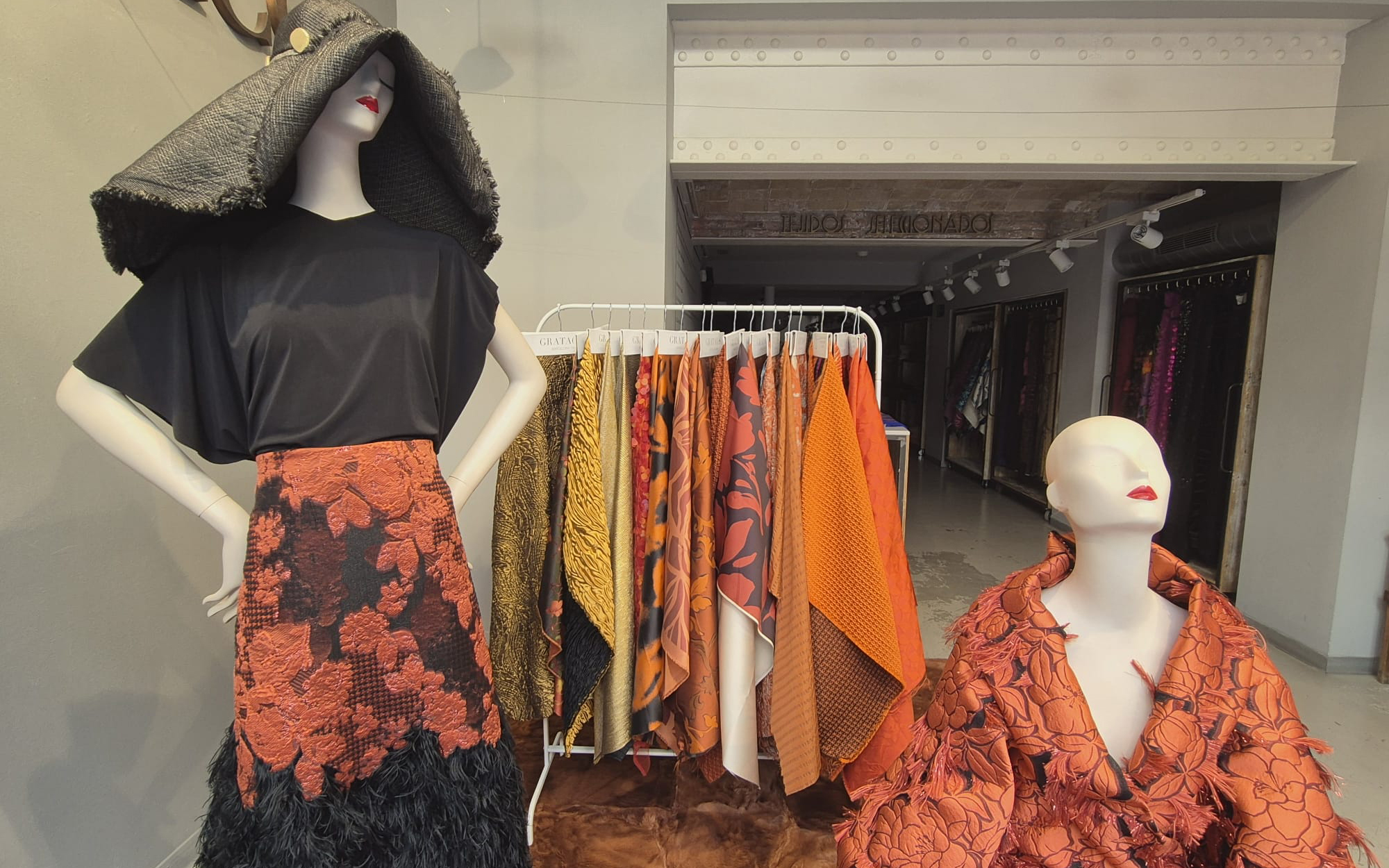
This autumn, flowers are once again taking centre stage, proving that they can also provide warmth, colour and elegance during the colder months. An example of this is the new September window display that we have just launched in our space in Barcelona, embraced in warm colours ranging from brown to maroon and orange, with leaf and flower prints evoking the beginning of autumn.
Below, we will explore the origin of floral prints, their evolution in the fashion world, current trends and how major brands have reinterpreted this trend in their most recent collections. Without forgetting, of course, the new fabrics and items that we already have available in our online store.
Origin and popularization of floral prints
Floral prints have a long history dating back centuries. Originating in Asia, particularly China and Japan, textiles with floral motifs arrived in Europe via the Silk Route. In the 17th century, Indian fabrics with floral prints, known as “chintz”, became popular in Europe, sparking a trend that has continued to evolve.
Their popularisation in contemporary fashion is historically more recent. The rise of floral prints can be traced back to the late 19th and early 20th centuries, when the Art Nouveau movement adopted flowers as a key motif in textile design. However, it was in the 1960s and 1970s that these prints really reached a large number of people, thanks to the hippie and bohemian countercultural movements, which embraced nature as a form of personal expression and a symbol of rebellion against the values of society at the time.
Why do flowers never go out of style?
As we mentioned at the beginning of the article, floral prints have stood the test of time thanks to their versatility , adding a touch of romance and femininity. These designs can be adapted to a wide variety of styles, fabrics and garments, being essential both in a light summer dress and in an elegant transitional jacket. Floral prints bring freshness to any outfit. In addition, there is an emotional connection with nature that awakens feelings such as love, renewal, life and serenity. In a world increasingly dominated by technology and artificiality, floral designs connect us with nature and remind us of the ephemeral beauty of flowers.
Floral prints are also incredibly adaptable to different styles and eras. Among the most recognizable categories are:
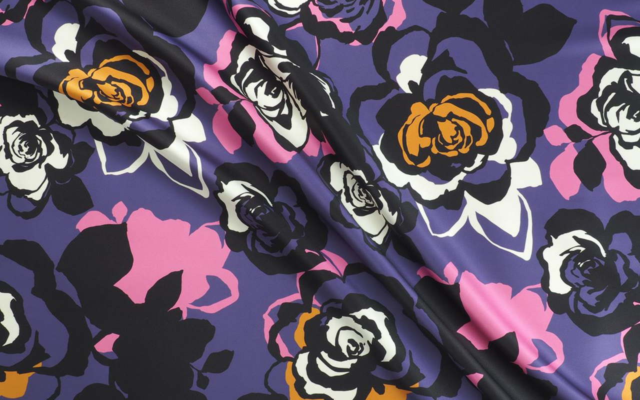
1. Abstract Flowers: Modern designs with artistic strokes that mix colours and unusual shapes.
2. Botanical flowers: Motifs that imitate nature or scientific illustrations, with a more realistic style.
3. Vintage Flowers: Inspired by the 1960s and 1970s, with warm colours and psychedelic shapes.
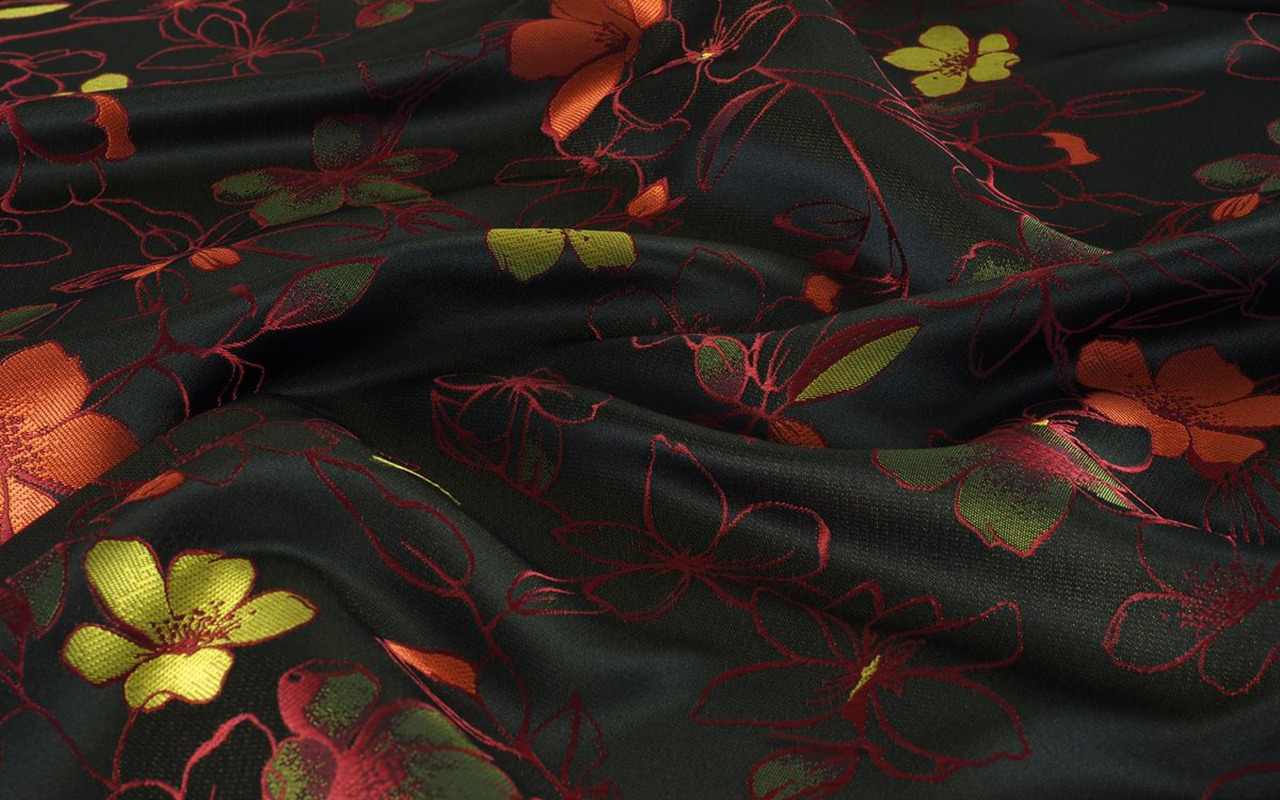
4. Dark flowers: With deep tones and dark backgrounds, which provide an air of sophistication and mystery.
Another reason why floral prints never go out of style is that they are an expression of individuality and define each person’s style. A bold and striking floral print in vibrant tones is not the same as a more subtle and delicate one in neutral tones. In between the two extremes, there is an infinite variety of options to choose from.
The beauty of flowers has also been a recurring theme in the inspiration of artists throughout history, from the Renaissance, through botanical art and the vision of the Impressionists, to the most avant-garde designers. Today, it continues to be an inexhaustible source of inspiration in various contemporary disciplines. In fact, in the field of fashion, practically no collection of the main luxury brands completely omits floral prints. And finally, a less obvious aspect: floral prints are flattering for all ages . They are visually pleasing and harmonious patterns that bring joy, vitality and freshness to the face, raising self-esteem. For this reason, floral prints remain a constant trend in all seasons.
How are floral prints being worn this season?
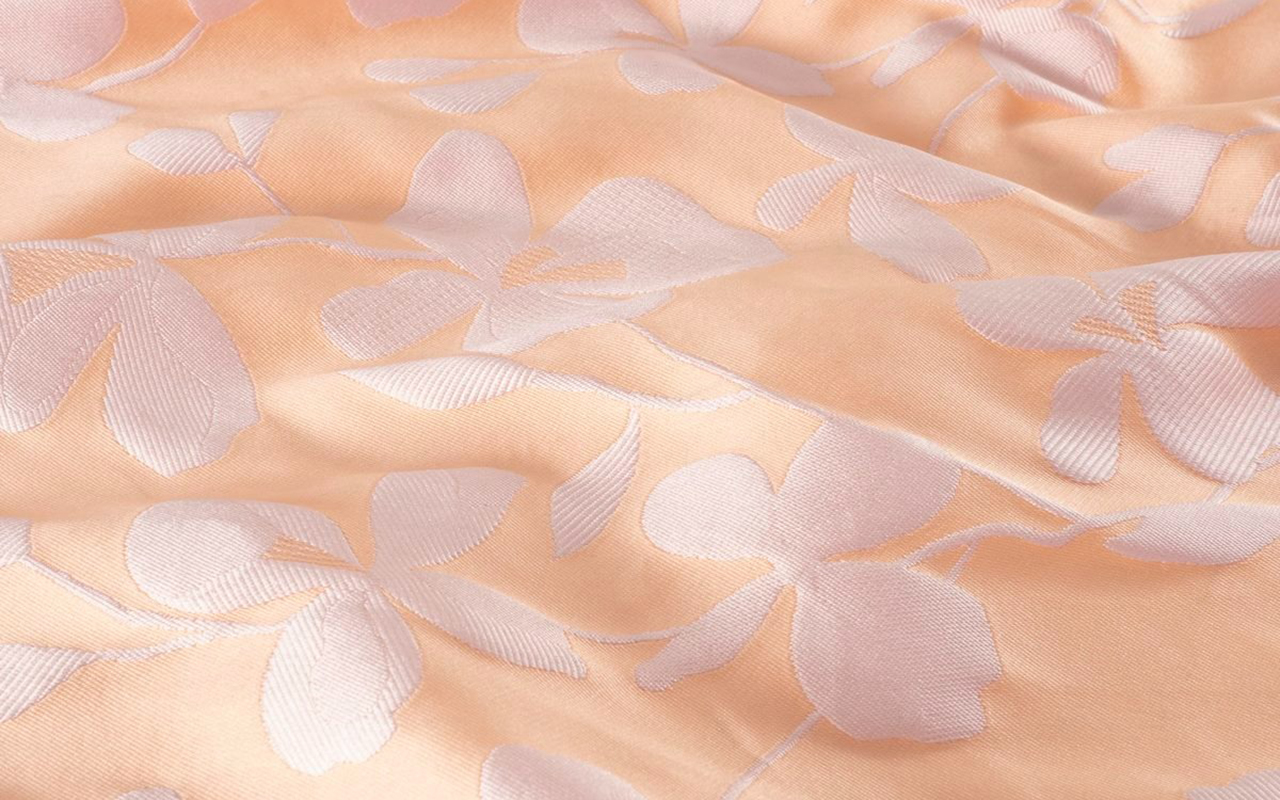
For the autumn-winter 2024/2025 season, floral prints are presented in innovative ways. Key combinations include layering and contrasting, mixing floral pieces with garments in textures such as wool, leather or denim for a modern contrast. The “total floral look ” also stands out, i.e. flowers from head to toe through long dresses and coordinated outfits with floral prints of different sizes. In the cold season, flowers predominate on dark backgrounds in shades such as burgundy, olive green, mustard and navy blue, perfect for autumn. In addition, accessories with floral details, such as bags, scarves and shoes, complement the more sober outfits and bring a fresh touch.
Discover the floral prints that suit your tastes and needs in our new season catalogue. Here you can find what suits you best!


Sorry, this entry is only available in Español.
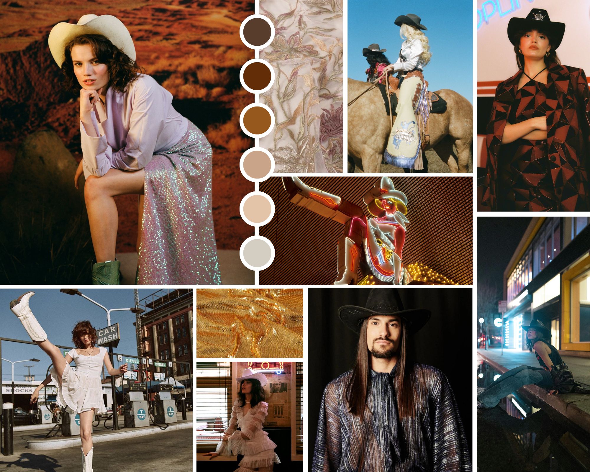
Collage cowboycore. Credits: Joplin Atelier, Free Form Style y Vanessa Mooney’s.
Every year we delight in a new microtrend that shakes up seasonal fashion in a whimsical way. The styling of an influential artist, the latest collection from a luxury brand, a revolutionary album, a blockbuster movie or the trends that accumulate the most hearts and likes on TikTok or Instagram. Social networks, which already create their own crushes, influence the creation of these passing trends that reach consumers like a gale and are established in editorials and fashion bazaars, also reinforcing themselves in the shop windows of fast fashion stores. Another phenomenon that confirms a microtrend is that as soon as they emerge, they disappear just as quickly.
If last year the fashion spotlight illuminated microtrends Barbiecore and Mermaidcore , inspired by the Mattel doll and the magnetism of mermaids, this spring season experiences a change of register, focusing on the aesthetics of Wild West cowboys. And yes, Beyoncé and her new country album have a lot to say about it. Indeed, the cowboycore style leaves the great American plains to capture the imagination of designers, celebrities and the general public with a contemporary interpretation of the western that renews style codes to get closer to the new generation, but maintains its hallmarks.
Why is cowboymania returning? The current resurgence of cowboycore can be attributed to a mix of nostalgia and a desire for authenticity. In an increasingly digital and globalized world, people seek to connect with styles that evoke a sense of history and tradition. Additionally, the trend toward sustainable and artisanal has made classic western garments, many of which are made from durable materials, even more attractive.
Origins of the trend
Cowboycore finds its roots in Western fashion, a recurring aesthetic in popular culture for decades. Classic western films, new adaptations, television series from the 60s and country music, with artists who capture the essence of deep America, have helped maintain this fashion that is perceived as a symbol of freedom and rebellion. Key pieces of this trend include all types of denim clothing, fringed leather and suede jackets, long ruffled dresses, and shirts with floral or check print motifs. As for accessories, country boots, wide-brimmed hats and belts with large metal buckles are essential. All this in a fusion of styles and other trends, such as glam and streetwear, creating unique and eclectic looks. This has been perceived on the streets of Milan and Paris among stylists and influencers who have worn their own interpretation of the cowboy – or cowgirl – aesthetic, coinciding with the main fashion weeks.
Cowboycore has been the protagonist in several fashion collections for 2024 and 2025, demonstrating its relevance and adaptability. Some notable fashion houses that have adopted this trend are, for example, Dior in its Pre- Fall 2024 collection, with fringed leather jackets and decorated cowboy boots. Also Balmain, with Olivier Rousteing incorporating elements of the microtrend in his Spring/Summer 2024 collection, fusing western aesthetics with glam and futuristic details. Calvin Klein reinterpreted the aesthetic in question with clean lines and a neutral colour palette, highlighting durability and classic style. Earlier this year, Pharrell Williams was inspired by the Old West and collaborated with Dakota and Lakota artists on his men’s collection for Louis Vuitton, filling the runway with turquoise stone bolo ties, pointed-toe cowboy boots (printed, by the way , with cacti) and worn jeans that looked like they had been worn during several rodeos. Finally, in the proposals of Ralph Lauren or Roberto Cavalli you can also find elements to the aesthetics of deep America.
 Credit: Joplin Atelier
Cowboy fashion among influential artists
Celebrities play a crucial role in its popularization. One of the most influential figures to showcase this trend is Beyoncé, who, beyond her new country music album, has incorporated the Wild West style into her stage costumes and music videos. Her ‘ Renaissance ‘ tour has witnessed numerous looks inspired by the trend, with a modern and glamorous touch, cementing her status as the queen of this fashion.
Artists like Lil Nas X and Miley Cyrus have also embraced the western aesthetic, combining western elements with modern touches. The American rapper has made this style a central part of his image, wearing cowboy boots and hats in his performances and music videos. Kacey Musgraves, a country star, has also popularized cowboycore, mixing traditional western elements with bright, futuristic details in her stage outfits. Her style has influenced both country and mainstream fashion.
The relationship between fashion and music is deep and symbiotic, and cowboycore is a clear example of this. Country music has been a constant source of inspiration for western fashion, and vice versa. Artists like Orville Peck, with his enigmatic style and cowboy mask, have brought the style to new audiences, fusing Western aesthetics with a more theatrical, but sophisticated touch at the same time.
The pop genre has also adopted elements with artists such as Billie Eilish and Post Malone incorporating cowboy boots and denim jackets into their personal styles, showing the versatility and universal appeal of this trend.
Beyond music
The impact of the microtrend extends beyond fashion and music, infiltrating other cultural spheres such as cinema, television and the visual arts. Recent movies and television series, such as “Yellowstone” and “The Power of the Dog “, have presented characters with styles that reflect Western fashion, contributing to its resurgence.
In contemporary art, the cowboycore aesthetic manifests itself in works that explore themes of identity, nostalgia and rebellion. Visual artists such as Richard Prince have incorporated elements of the west into their works, creating a dialogue between popular culture and high-end art.
These are just some examples of how this microtrend has demonstrated its ability to evolve and adapt to new contemporary languages, creating a unique fusion of styles. From the catwalks to the streets, and from music to art, cowboycore continues to influence and be influenced by various cultural spheres. Its enduring appeal and ability to reinvent itself ensure that it will continue to be a relevant force in fashion and beyond.
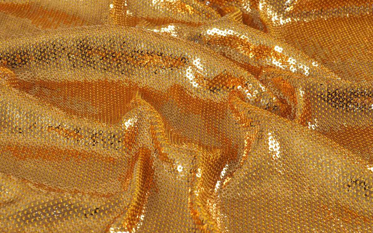
At Gratacós we have found in the current collection some fabrics that subtly refer us to this aesthetic. Here we leave you our inspirations:


 Exhibition ‘Dressing a Garden’. All photos published are provided by: Museum of Costume CIPE.
It has been a while since we recommended an exhibition, and we have just found a surprising exhibition that connects head-on with some of our most recurring inspirations and, specifically, with the floral theme of the 2024 Lookbook. The Madrid Costume Museum has just released the ‘Dressing a Garden’ exhibition, an exhibition curated by Gema Batanero that focuses on connecting nature with fashion through floral motifs as the backbone.
A historic binomial
Since ancient times, nature, and especially floral motifs, have been a constant source of inspiration for human beings. Like the self-portrait, flowers have focused attention and have become the first themes that humanity has captured in art and in all its cultural manifestations. This connection has endured over the centuries, especially in the field of fashion and interior design, where decorating with flowers meant a way of maintaining ephemeral beauty and union with the natural environment: the gardens, the countryside, the forests… In fact, each era has had its peculiar way of linking fashion and textiles with the language of flowers and doing so in an extraordinary way.
Starting from this historical premise, the exhibition “Dressing a Garden” at the Costume Museum explores how floral motifs in fashion evolved between the Baroque and the Enlightenment. This exhibition reveals how these floral representations reflect the profound changes in the relationship between humans and nature and the emergence of new artistic, scientific and philosophical ideas. Furthermore, the exhibition highlights how commercial exchanges and technological advances influenced the rapid transformation of these floral designs, making them a key testimony of the aesthetic taste of the 18th and early 19th centuries. Through the leitmotif of flowers, the exhibition also vindicates the study of creative and technical processes as a fundamental part in understanding the phenomenon of fashion, raising its transversality and continuous dialogue with different cultural fields.
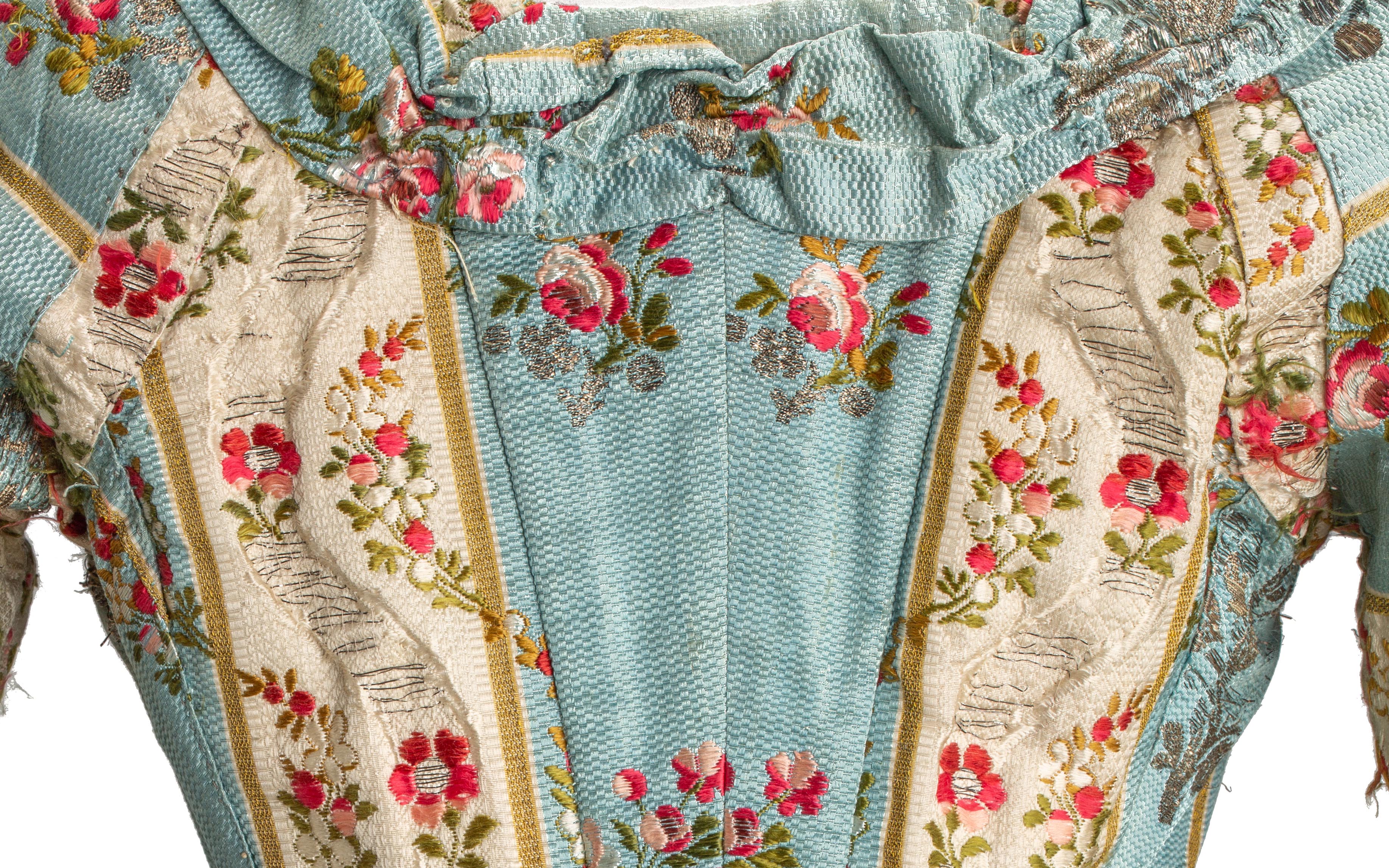
 Detail of an 18th-century dress from the exhibition ‘Dressing a Garden’. All photos published are provided by: Museum of Costume CIPE.
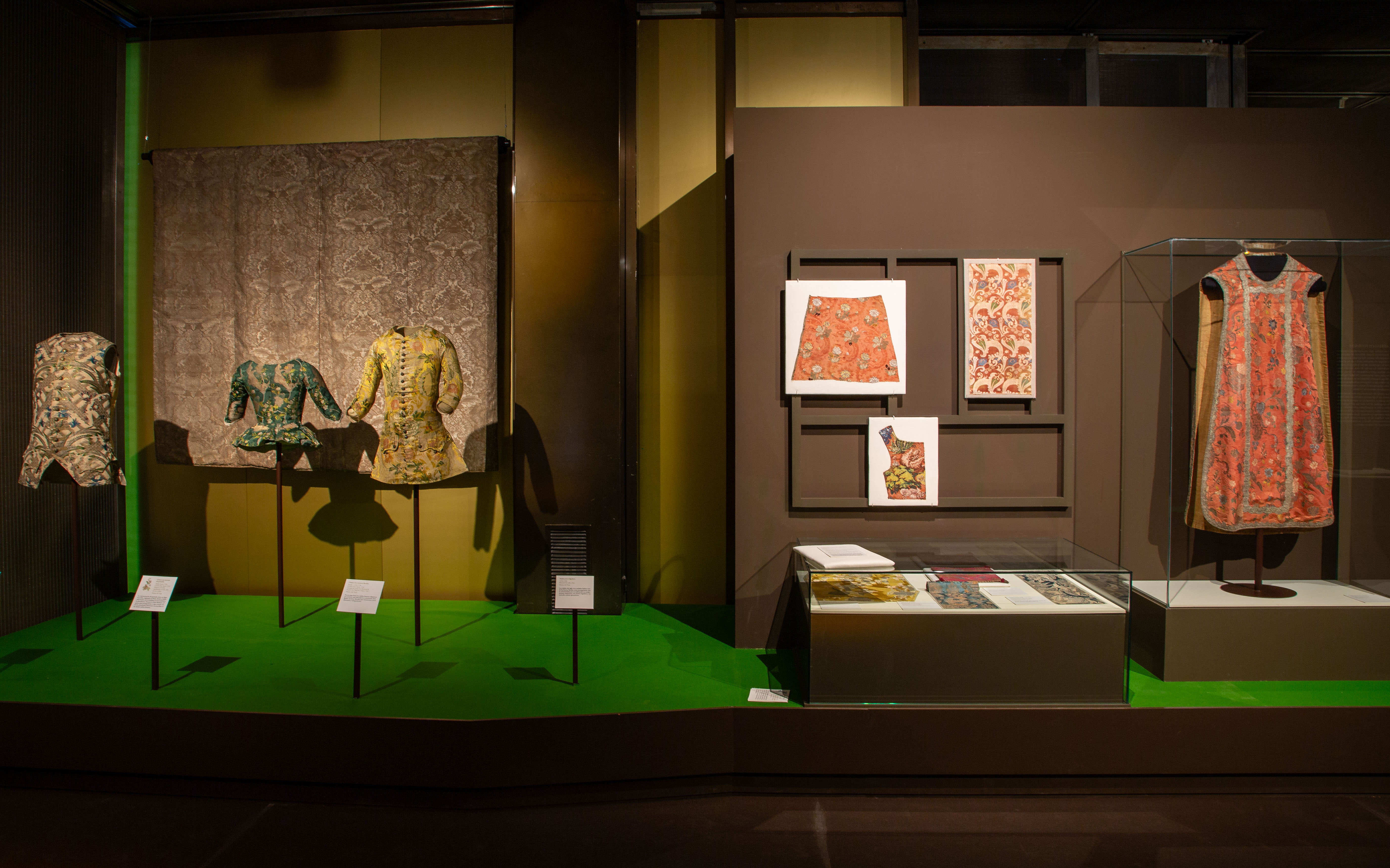
Floral motifs in more than a hundred pieces
The exhibition includes around 120 pieces, the core of which are collections of historical clothing and textiles from the 18th century and part of the 19th century from the Costume Museum. These pieces are accompanied by documentary and bibliographic collections, painting, ceramics and decorative arts from institutions such as the National Prado Museum, the National Archaeological Museum, the National Museum of Decorative Arts and the Royal Botanical Garden.
The first stop on the tour is titled “The Forest of the Furies” and places the visitor in the 18th century with an explosion of textile creativity: unusual fabrics, also called furies, due to the passionate and vibrant character of their decorative motifs. The exhibition continues with “A naturalistic still life”, which shows how, during the 1830s, the fanciful bizarre vegetations gave way to much more naturalistic representations. Starting in the 1940s, “The Line of Beauty” marks the evolution towards the Rococo style, characterized by its lightness and refinement.
Next, “The Flowers of Enlightenment” addresses the development of Enlightenment ideas and the return to the ideals of the classical world, marking a profound aesthetic change with respect to Rococo taste. “Gardens of the East” discusses how indianas, a textile phenomenon from India and the Middle East, made its way to Europe. The note of bucolic celebration is provided by “A country party”, which addresses the genre of the gallant party in Rococo and alludes to the social enjoyment of the countryside. Finally, the tour culminates in “The Return of Spring”, a space that explores how the relationship with nature is a constant in the lives of human beings, and how floral motifs, although they experienced an unprecedented boom in the centuries XVIII and XIX, are repeated cyclically throughout the history of fashion.
The exhibition is completed by a catalogue created by the General Subdirectorate of Publications and Palaces and Museums, which further develops the areas covered in the exhibition. The exhibition ‘Dressing a Garden’ can be visited for free until September 29th at the Madrid Costume Museum. A good opportunity to delight in this inspiring pairing: nature and fashion.
We took advantage of the exhibition to bring out some of our floral fabrics, which maintain a similar dialogue with some pieces on display. Let’s give rein to our imagination!


Sorry, this entry is only available in Español.
The new SS24 collection is already blooming in all its splendor. We brought it to you at the end of February coinciding with the end of the winter sales, but now we provide you with all the details of this exciting proposal that was very well received when it was presented at Première Vision Paris.
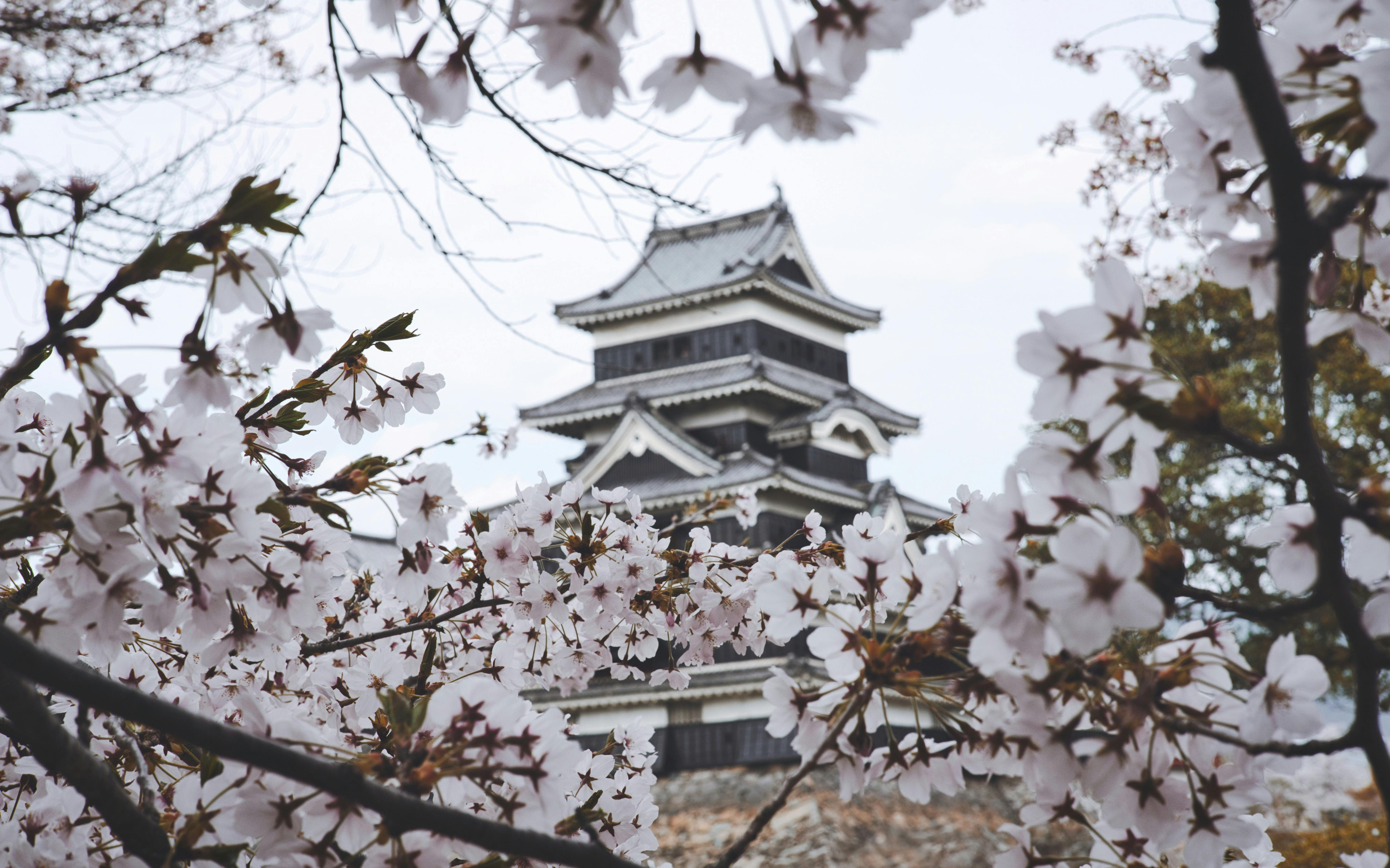
Under an inspiring concept, Hanami , the new collection focuses on the Japanese tradition of appreciating the beauty of flowers. This contemplative practice coincides with the beginning of spring and invites us to value the art of flowering. Hanami , which literally means “looking at the flowers”, carries with it a very representative image in Japan: that of the cherry blossom trees, known as sakura, which cover their parks and mountains with a pink mantle every spring for a very limited period that coincides with the beginning of this season.
This particular tradition dates back centuries, when the flowering of cherry trees marked the beginning of Spring and, therefore, signaled the ideal time to plant rice, a crucial food for the Japanese. During this period, cherry trees were considered sacred beings and the souls of the mountain gods were believed to reside in them. According to local beliefs, when the pink sakura flowers were in full bloom, the deities would come down to the villages and turn into rice fields to assist in rice production. Nowadays, with each new flowering season, thousands of Japanese gather under cherry trees, whether in parks, gardens or mountains, and enjoy a picnic surrounded by sakura, while a shower of delicate flowers turns everything pink.
Broadly speaking…
Returning to the proposal, the new Hanami collection maintains this double duality: it invites us to pause and reflect, but it is also a moment to let ourselves be carried away by fantasy and the evocative power of nature, activating all our senses.
This season, flowers are the clear protagonists of the collection, but we go much further. Plant motifs, organic reliefs, natural volumes and prints inspired by the wild nature of the fields or the multicoloured flora of urban gardens, all taken care of in detail. From the precious work of the botanical architects to the sensitivity of the signature florists, all of this makes up a poetic, stimulating and bold collection that appeals to emotions through creativity. At Gratacós, we do not understand fashion without art and culture, and we make craftsmanship one of our fundamental pillars.
Summer 2024 collection in detail, the colour becomes more vivid and bright, playing with different harmonies that reflect the light and contrasts present in nature. The fabrics are carefully selected in terms of materials, composition and combinations that recreate organic shapes. We once again give a new dimension to quality, because it is a necessary, clear and real value that distinguishes us.
“We don’t understand fashion without art and culture, and we make craftsmanship one of our fundamental pillars.”
Colours
The Gratacós proposal immerses itself in a world of colour, where various harmonies intertwine to create fresh and dynamic combinations. The contrasting colour palette will transform the fabrics, offering a richness of nuances that will energize the final results. The colours selected to star in the new season will give life to poetic, timeless and versatile collections, transmitting feelings through an intriguing interaction of strength, femininity and beauty, captured in the different textiles.
These colours transport you to a magical landscape, evoking a digital Eden where precious tones work with a enticing freshness of cold light. In times of uncertainty, who doesn’t yearn to use the power of highlighter pink, yellow, blue or green in a sheer frou-frou dress to experience a moment of happiness?
Fabrics
This season, the pleasure of creating and designing will be our impetus to develop new highly crafted fabrics with a sophisticated look. Our fabrics will be characterized by a renewed importance in the quality of the products, seeking a necessary and real authenticity. We have opted for soft lines, using light and transparent fabrics adorned with sequins to evoke the shine and clarity of water. This sense of summer vibrancy is reflected in graphic bursts of colour that extend throughout the collection.
Transparency will play an important role, conveying a fragility that is only apparent. For this reason, we have created light fabrics in various versions and transparencies, with sophisticated effects for a line of products with sweetened fantasies.
Aspects
This season’s fabrics magnificently explore texture, with volumes that are delicate in appearance, but solid in their construction. The creative department has worked to give the items a three-dimensional dimension, taking advantage of the twists of the yarns and the fantasies of the threads with a more organic appearance. The importance of the reliefs and embossed finishes stands out, with ultralight padding ideal for summer.
Jacquard takes on a leading role this season, presenting repetitive geometries and designs with sequential rhythms without interruption. We often overlook the technical complexity of small motifs, which is why it is crucial to revalue them. In addition, we have worked to create laminates with beautiful and sophisticated reflections, amplified by light to obtain a striking and elegant shine. In both jacquards and embroidery, the result will be dazzling, with shiny surfaces thanks to lame, iridescent threads and sequins.
The embroidery technique, as a universal method of beautification, is back in fashion. They bloom into unexpected and beautiful creations, with free settings and vibrant, fresh colours.
Designs
Overall, geometry will continue to be a prominent theme this season, especially as we explore flat and smooth handcrafted geometries, infused with special touches to create essential ingredients for this upcoming summer. The graphics in general will be soft, fresh and exquisite, with careful work on the designs.
Florals will play an important role, like a sweet perfume that permeates the entire collection, through the abundant and varied use of floral prints. Botanical motifs centered on leaves, vegetal ornaments and ambiguous jungles will also be highlighted.
Finally, in this new season, it is essential to mention the influence of art in the designs of the collection, as well as the influences of the metaverse, which present natures that hybridize between the real and the digital.
From Gratacós we invite you to discover Hanami , our particular Eden.
 Pantone has established a tradition that colour enthusiasts eagerly await as a prelude to the Christmas holidays. It is about the choice of the shade that will set the direction of trends in 2024 and that will influence art, design, fashion, decoration or advertising, among other creative disciplines directed by professionals who draw on the latest developments on the market, also chromatic.
A sincere, tender and empathetic colour
Following its vocation of naming colours with subtly sensual names, Pantone has chosen the winner for next year. The colour in question is called Peach Fuzz 13-1023 and it is a peach shade that evokes sincerity and tenderness, and conveys, according to the world authority on colourimetry, a desire to take care of ourselves and others. A soft and velvety shade whose enveloping spirit enriches the mind, body and soul. This is how Laurie Pressman, vice president of the Pantone Colour Institute, explains it in a statement about the colour that will take over everything in 2024. “We were looking for a hue that expresses our innate desire for closeness and connection, so we chose this radiant colour that exudes warmth and modern elegance. It is a colour that exudes empathy, wraps us in a hug that we can almost feel and naturally combines the youthful with the imperishable.” This warm and comforting tone stimulates the desire to unite with others or have moments of stillness, and the feeling of protection that this generates.
The tone of calm and inner peace
According to Pantone, Peach Fuzz 13-1023 is an alluring peachy hue, carefully balanced between pink and orange, that inspires belonging, relaxation and the opportunity to care, evokes calm and offers a space in which to live, feel, heal and prosper. Therefore, the colour of 2024 is comforting and encourages inner peace and well-being. Peach Fuzz 13-1023 has both an idea and a sensation and stimulates all the senses, as it makes one perceive its tactility and envelops people in its warmth.
A modern tone that takes refuge in nostalgia
Peach Fuzz 13-1023 is a sweet and light colour that evokes a new modernity. It focuses on the human experience of enriching and caring for the mind, body and soul, but it is also a subtly sophisticated, modern and deep peach tone, with a soft but effective luminosity that fills the digital world with beauty. A poetic, romantic peachy shade that conveys cleanliness and a vintage feel, Peach Fuzz 13-1023 reflects the past, but reimagined for modern settings. This last characteristic makes it especially interesting for the world of design and decoration.
The meaning of colour in an unstable context
Peach Fuzz 13-1023 is the colour that replaces Viva Magenta, which was chosen as the colour of 2023. The reasons given were: “A tone rooted in nature that vibrates with energy and vigor. “That descends from the red family and expresses a new sign of strength.” So, now we move from strength to warmth.
“When our lives are affected by instability, our need to care and to have empathy and compassion grows even more, as well as to imagine a future that brings more peace,” Laurie Pressman explains this meaning of the colour that we will see in the coming months throughout Instagram and Pinterest boards, aswell as, probably in the next trends in both fashion and decoration. “In a world where productivity and external achievements are often emphasized, it is crucial to recognize the importance of taking care of our inner self and seeking moments of calm, creativity and connection with other people in the midst of the hustle and bustle of modern life,” adds the vice president of the Pantone Colour Institute. Give value to the bonds, affection and home: “The colour we selected had to express our desire to be close to our loved ones and the happiness we feel when we connect with our own being and enjoy a moment of quiet alone. It had to be a colour that conveyed an enveloping warmth and a message of compassion and empathy,” argues Laurie Pressman.
25 years setting trends in colour
In 2024 it will be 25 years since the Pantone Colour Institute began putting colour on the sensory and creative map for the following year. It was in 1999 when the Pantone Colour of The Year educational program engaged the design community around the world in a conversation about colour. “We wanted to emphasize the relationship between culture and colour to make our audience aware of how what is happening in our global culture is expressed and reflected through colour language,” explains Pressman again. In this first session, a clear winner emerged: cerulean blue (Pantone 15-4020), a shade that returned to the stage thanks to the film ‘The Devil Wears Prada’ and Meryl Streep’s famous speech on how the fashion industry works. “Over the years, the Pantone Colour of the Year program has become a cultural touchstone around the world and has stimulated the imagination of many designers, brands and consumers,” explains Pressman.
To decide on each year’s selection, the Pantone Colour Institute team travels the world in search of new colour influences. They can be found in the entertainment industry (film, television series and even music), works of art and new artists. Of course, in fashion and design, but also in more aspirational places or concepts, such as travel destinations that are starting to become a trend, lifestyles, new technologies and materials, textures or effects (yes, like Instagram filters). that generate interest or capture attention in some way.
What began as a catalogue with 500 colours that served as a guide for graphic arts has grown in such a way that its influence on upcoming trends is comparable to what the biggest celebrity of the moment looks like on the cover of Vogue magazine. The Pantone guide already has more than 2,000 references that are updated every 18 months, with new, more precise shades being added to the list.
Another way to express the evolution as a society
Colour plays a fundamental role in people’s experience. It has a close relationship with emotions and the expression of feelings and its nuances can also be seen in how the story evolves year after year with its cycles of rise and fall. The impact of colour is also noticeable in the world of fashion, in the colours of cosmetics, in household items, in automotive and industrial design, and in products, packaging, multimedia design and retail interiors. “We are very pleased to have encouraged designers and colour enthusiasts around the world to tell their stories through colour language and show their creativity in their communities. We hope to continue doing this for many more years ,” concludes Pressman.
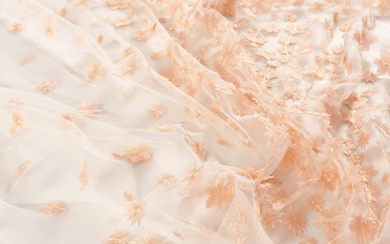
At Gratacós we also wanted to pay our particular tribute to Peach Fuzz 13-1023 with a selection of collection fabrics in peach tones so that you can think about a possible design for this 2024. You will find them here : Give free rein to your imagination!
Un color sincero, tierno y empático
Siguiendo su vocación de bautizar los colores con nombre sutilmente sensuales, Pantone ha elegido el ganador para el año que viene. El color en cuestión se llama Peach Fuzz 13-1023 y es una tonalidad melocotón que evoca sinceridad y ternura, y transmite, según la autoridad mundial en cuestiones de colorimetría, un deseo de cuidar de nosotros y de los demás. Una tonalidad suave y aterciopelada cuyo espíritu envolvente enriquece la mente, el cuerpo y el alma. Así lo explica Laurie Pressman, vicepresidenta del Pantone Color Institute, en un comunicado sobre el color que lo teñirá todo en 2024. “Buscábamos una tonalidad que expresara nuestro deseo innato de cercanía y conexión, así que escogimos este radiante color que rebosa calidez y elegancia moderna. Es un color que despide empatía, nos arropa en un abrazo que casi podemos sentir y aúna con toda naturalidad lo juvenil con lo imperecedero”. Este tono cálido y reconfortante estimula el deseo de unión con los demás o de tener momentos de quietud, y la sensación de protección que esto genera.
El tono de la calma y de la paz interior
Según Pantone, Peach Fuzz 13-1023 es una atractiva tonalidad amelocotonada, cuidadosamente equilibrada entre el rosa y el naranja, que inspira pertenencia, relajación y la oportunidad de cuidar, evoca calma y ofrece un espacio en el que se puede vivir, sentir, sanar y prosperar. Por lo tanto, el color de 2024 es reconfortante y fomenta la paz interior y el bienestar. Peach Fuzz 13-1023 tiene tanto de idea como de sensación y estimula todos los sentidos, ya que hace percibir su tactilidad y envuelve a las personas en su calidez.
Un tono moderno que se refugia en la nostalgia
Peach Fuzz 13-1023 es un color dulce y ligero que evoca una nueva modernidad. Se centra en la experiencia humana de enriquecer y cuidar de la mente, el cuerpo y el alma, pero también es un tono melocotón sutilmente sofisticado, moderno y profundo, con una luminosidad suave pero efectiva que llena de belleza el mundo digital. Un tono amelocotonado, poético y romántico que transmite limpieza y una sensación vintage, Peach Fuzz 13-1023 refleja el pasado, pero reimaginado para ambientes modernos. Esta última característica la hace especialmente interesante para el mundo del diseño y la decoración.
El significado del color en un contexto inestable
El Peach Fuzz 13-1023 es el color que substituye el Viva Magenta, que fue elegido como color de 2023. Lo defendían así: “Un tono arraigado en la naturaleza que vibra con energía y vigor. Que desciende de la familia roja y expresa una nueva señal de fuerza”. Así, ahora pasamos de la fuerza a la calidez.
“Cuando nuestra vida se ve afectada por la inestabilidad, crece aún más nuestra necesidad de cuidar y de tener empatía y compasión, así como de imaginar un futuro que traiga más paz”, explica de nuevo Laurie Pressman sobre el significado del color que veremos en los próximos meses a lo largo y ancho de todo Instagram y de tableros de Pinterest, así como, probablemente en las próximas tendencias tanto de moda como de decoración. “En un mundo en el que se suele enfatizar la productividad y los logros externos, es crucial reconocer la importancia de cuidar de nuestro interior y buscar momentos de calma, creatividad y conexión con otras personas en medio del ajetreo de la vida moderna”, añade la vicepresidente del Pantone Color Institute. Valorar los vínculos, el cariño y el hogar: “El color que hemos seleccionado tenía que expresar nuestro deseo de estar cerca de nuestros seres queridos y la felicidad que sentimos cuando conectamos con nuestro propio ser y disfrutamos de un momento de quietud a solas. Tenía que ser un color que transmitiera una calidez envolvente y un mensaje de compasión y empatía”, argumenta Laurie Pressman.
25 años marcando tendencias en color
En 2024 se cumplirán 25 años desde que Pantone Color Institute empezó a poner el color en el mapa sensorial y creativo del año siguiente. Fue en 1999 cuando el programa educativo Pantone Color of The Year involucró a la comunidad del diseño de todo el mundo en una conversación en torno al color. “Queríamos poner énfasis en la relación entre la cultura y el color para destacar ante nuestro público cómo lo que está ocurriendo en nuestra cultura global se expresa y refleja a través del lenguaje cromático”, explica de nuevo Pressman. En esta primera sesión salió un claro vencedor: el azul cerúleo (Pantone 15-4020), una tonalidad que volvió al estrado gracias a la película ‘El diablo viste de Prada’ y el célebre discurso de Meryl Streep sobre cómo funciona la industria de la moda. “Con los años, el programa Pantone Color of the Year se ha convertido en un referente cultural en todo el mundo y ha estimulado la imaginación de muchos diseñadores, marcas y consumidores”, explica Pressman.
Para llegar a la selección de cada año, el equipo de Pantone Color Institute recorre el mundo en busca de nuevas influencias cromáticas. Pueden encontrarse en la industria del entretenimiento (cine, series de televisión e incluso música), obras de arte y nuevos artistas. Por supuesto, en la moda y el diseño, pero también en lugares o conceptos más aspiracionales, como puedan ser destinos de viaje que empiezan a ser tendencia, estilos de vida, nuevas tecnologías y materiales, texturas o efectos (sí, como los filtros de Instagram) que generen interés o acaparen la atención de alguna forma.
Lo que comenzó siendo un catálogo con 500 colores que sirviese como guía para las artes gráficas ha crecido de tal manera que su influencia en las próximas tendencias se equipara a lo que la mayor celebridad del momento luzca en la portada de la revista Vogue. La guía Pantone cuenta ya con más de 2.000 referencias que se van actualizando cada 18 meses, con nuevos tonos más precisos que se van añadiendo a la lista.
Otra manera de contar la evolución como sociedad
El color desempeña un papel fundamental en la experiencia de las personas. Tiene una relación cercana con las emociones y la expresión de los sentimientos y en sus matices se aprecian también en cómo evoluciona la historia año tras año con sus ciclos de auge y descenso. El impacto del color también se nota en el mundo de la moda, en los colores de los cosméticos, en los artículos para el hogar, en el diseño automovilístico e industrial, y en los productos, embalajes, diseño multimedia e interiores de los comercios. “Nos complace enormemente haber estimulado a diseñadores y entusiastas del color de todo el mundo a contar sus historias a través del lenguaje cromático y a mostrar su creatividad en sus comunidades. Esperamos poder seguir haciéndolo durante muchos más años”, concluye Pressman.
Desde Gratacós también hemos querido hacer nuestro particular homenaje al Peach Fuzz 13-1023 con una selección de tejidos de colección en tonos melocotón para que vayas pensando un posible diseño para este 2024. Los encontrarás aquí: ¡Da rienda suelta a la imaginación!
Mi�rcoles 22 noviembre 2023
 Pics: Museo del Traje CIPE.
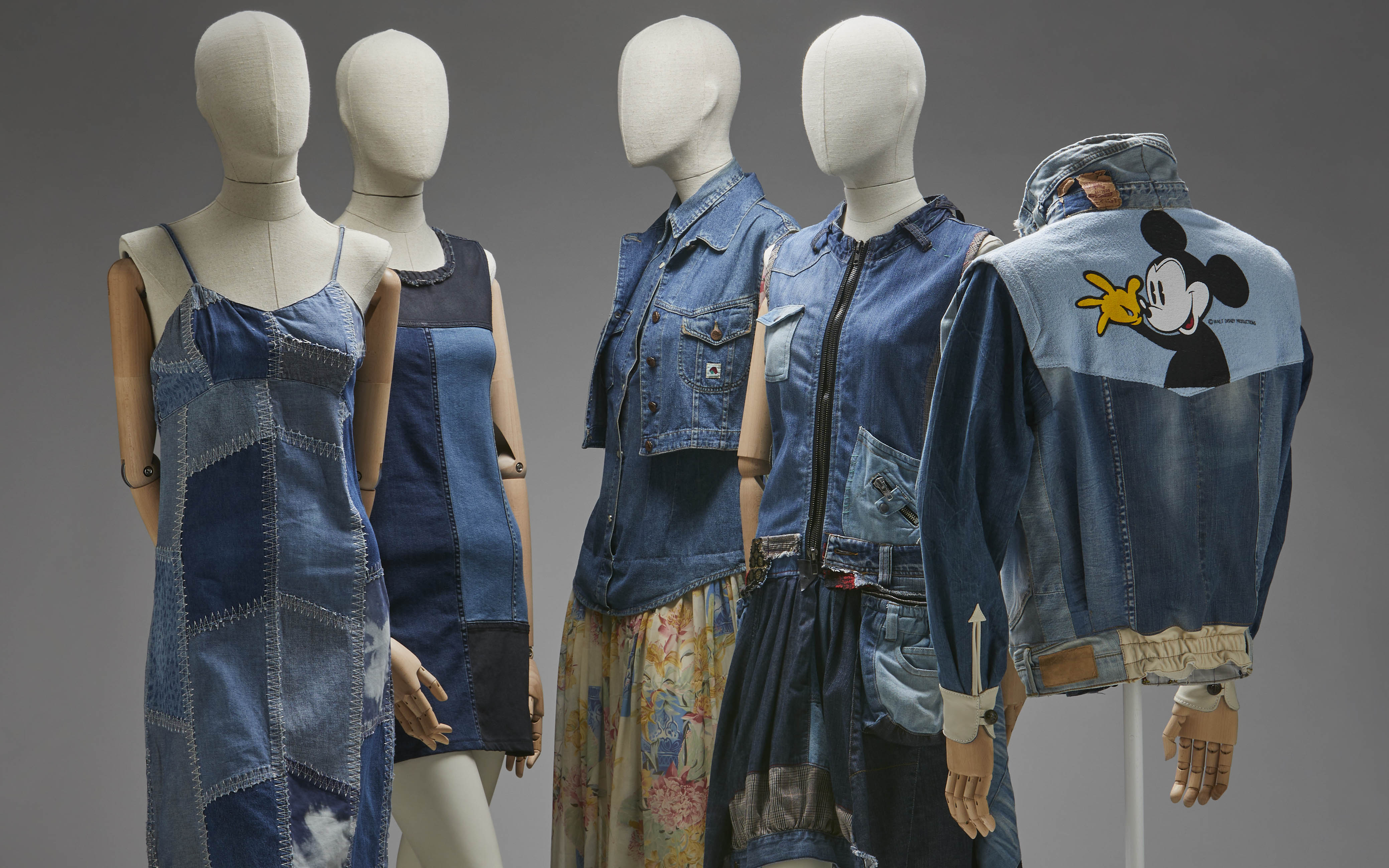
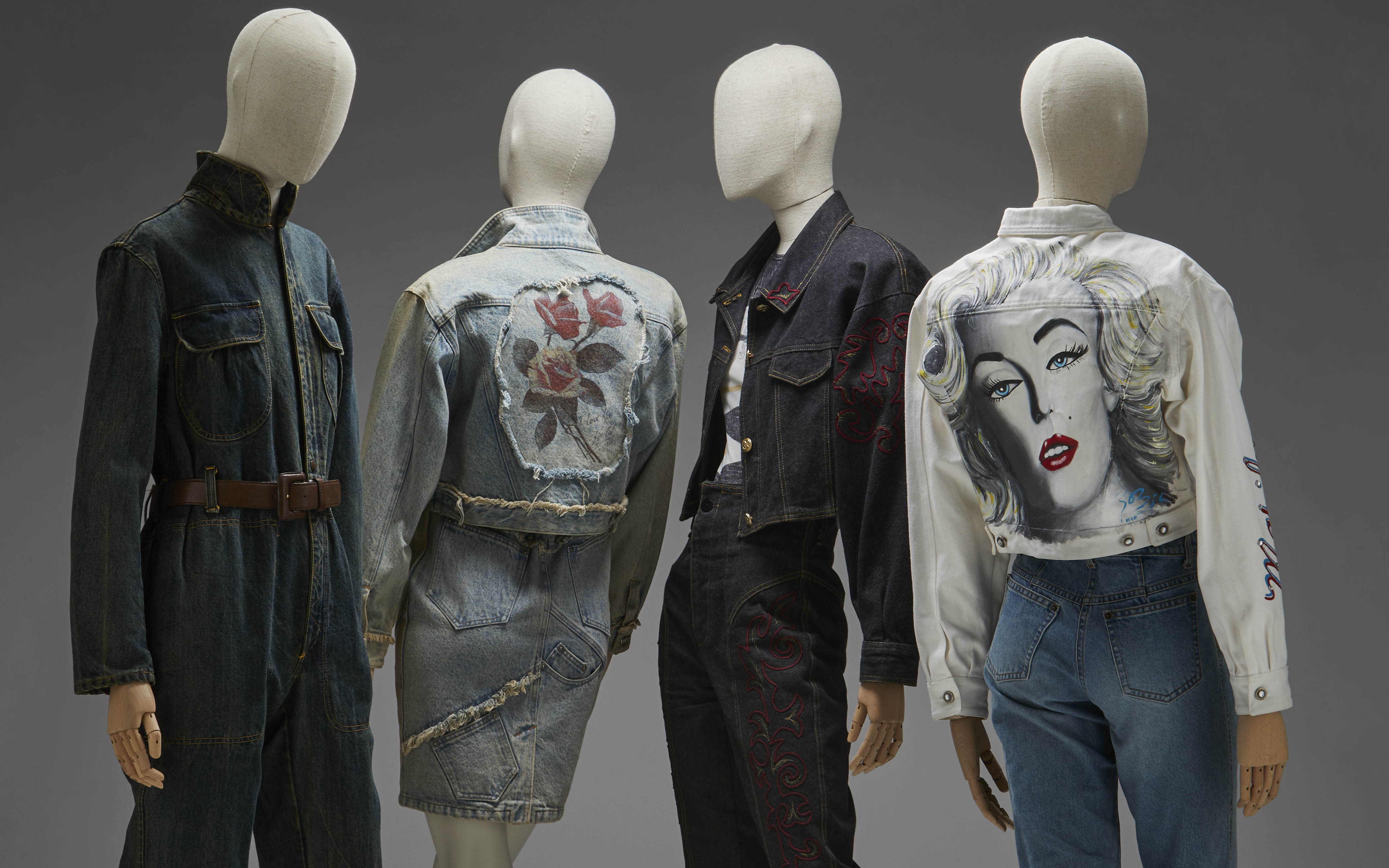
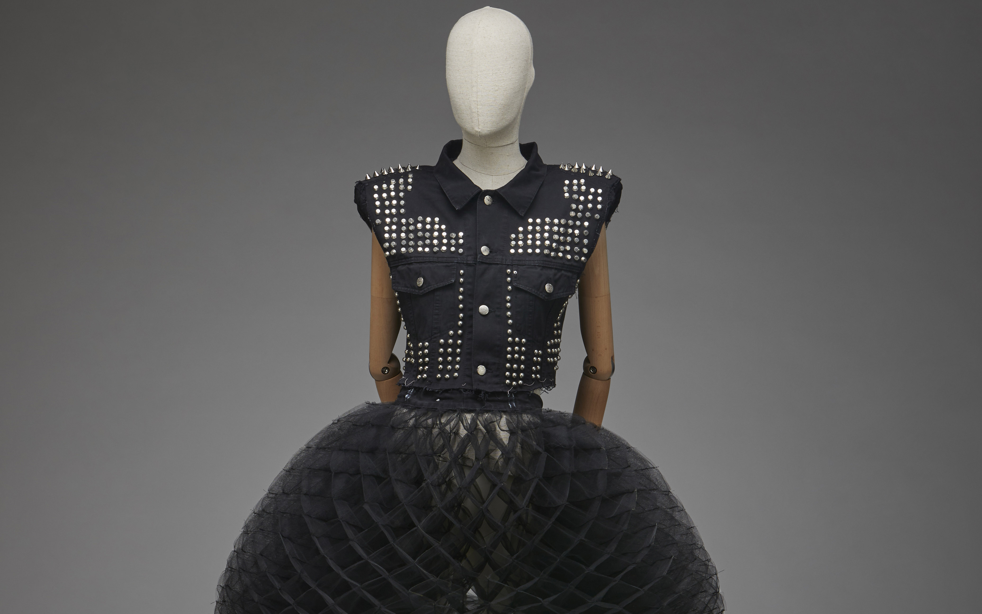
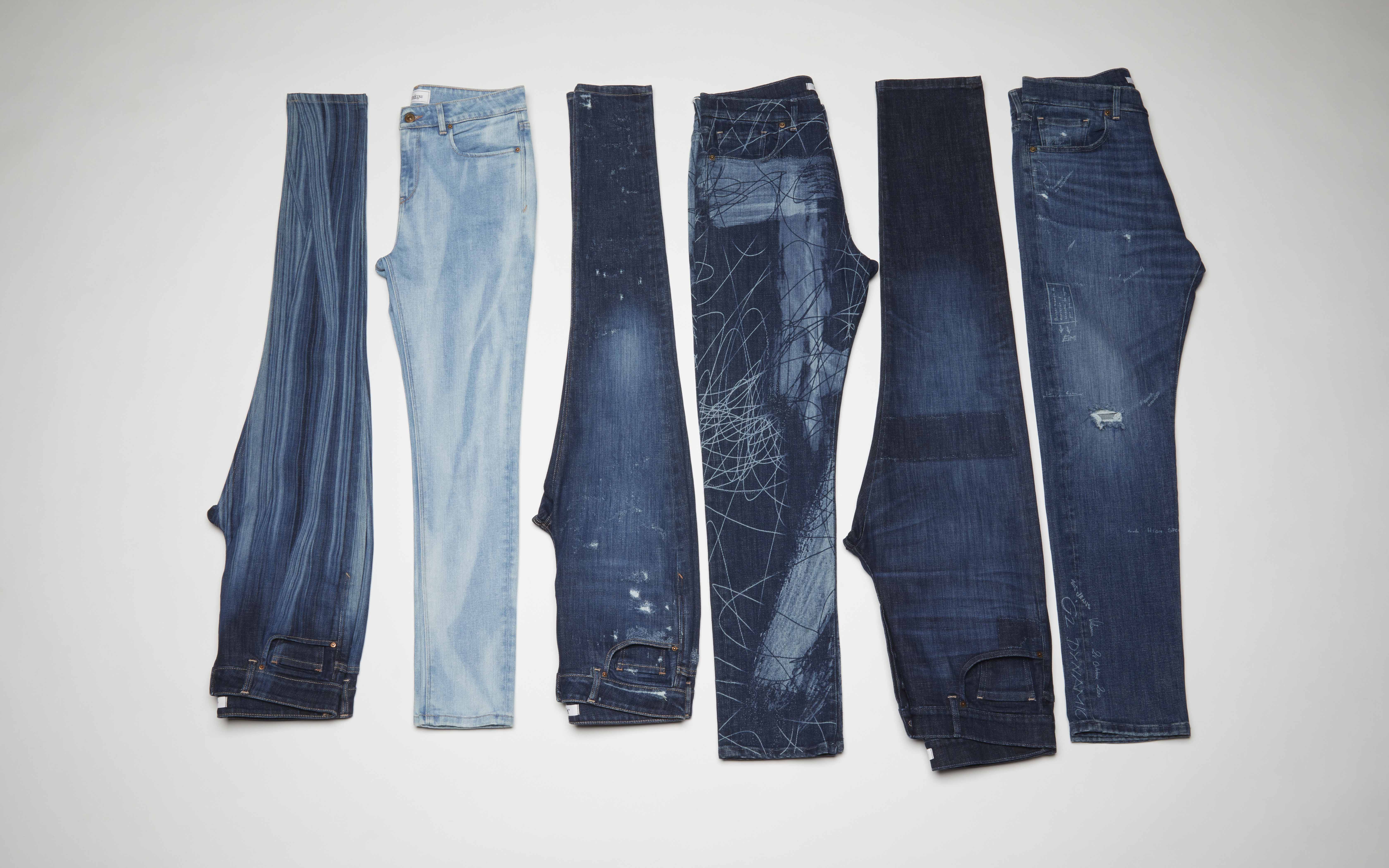
How many jeans do you have in your closet? Or, rather, how many garments made with denim? Surely, the mental figure would occupy double digits if we start counting the number of trousers, skirts, dresses, shirts and jackets that hang on the hangers and are made with the world-famous denim, without a doubt, the king of fabrics.
Jeans and denim clothing are some of the most universal elements in contemporary fashion. These garments transcend social class barriers around the world and, although they initially emerged as utilitarian garments for the working classes, over time they have become common items that unify all wardrobes.
From the pioneer Levi’s, founded in 1853, to today’s ready-to-wear brands and luxury houses. If we had to define the 20th century to the present day in one piece, it would surely be a pair of jeans: whether it be a model with large tears, patchwork elements and misaligned hems, or the stylish model that Kaia Gerber wore at Valentino for the show Haute Couture Fall-Winter 2023-2024. In the words of Pier Paolo Piccioli: “Strength is not in the outfits, but in the clothes.”
Aware of the universal power and conceived as a symbol of our contemporary culture, the Costume Museum wanted to pay tribute to the eternal jeans with the exhibition ‘Jeans, from the street to the Ritz‘.
Curated by Josep Casamartina i Parassols and Ismael Nuñez Muñoz of the Fundació Antoni de Montpalau and coordinated by María del Mar Belver, the exhibition pays tribute to the cowboy. How? Through a journey through the history of denim fabric, from its origins as a material in the 18th century, through the birth of the jean in the mid-19th century and its enormous expansion throughout the 20th century and the beginning of the 21st, to its infinite formal and textile variations, but also symbolic and social.
The proposal includes more than 200 pieces of clothing accompanied by graphic documentation and accessories from the Fundació Antoni de Montpalau, completed with loans from the private collections of the collector Josep M. Rovira, the historical archive of the Lois brand and the collector Paco Sifre, as well as the companies Jeanología and Evlox. Among them, classic brands dedicated to making jeans stand out, such as Levi Strauss, Lee, Lois or Pepe Jeans, but also brands such as Cavalli, Armani, Kenzo, Paco Rabanne, Gloria Vanderbilt, Calvin Klein, Thierry Mugler, Jean Paul Gaultier, Dolce & Gabbana, Moschino, Versace, Gori de Palma or Christian Lacroix.
From Europe to the United States. The origins of denim
The origins of this fabric date back to the 17th and 18th centuries, until the mid-19th century when the garment that takes its name from the fabric itself was born. Denim is a cotton twill made with very strong and durable twisted threads. The beginnings of the industry are located between Nimes – this is where the name comes from – and Genoa, where most of the factories that produced the fabric were concentrated. Jeans as such were not “invented” until 1860, when Levi Strauss began using twill fabric to make work clothes. Without disconnecting from the United States, the exhibition follows the course of history and strips the cowboy of its exclusive association with the working class, explaining how it came to be a symbol of masculinity and, later, a garment of female empowerment through its outstanding diffusion in the world of cinema, music or urban movements.
The exhibition also presents a section on denim production in Europe, with an industrial network of brands dedicated to denim clothing that would soon achieve great international dissemination. In fact, Spain was one of the most prominent producers, with companies in Catalonia, Valencia, the Basque Country and Castilla la Mancha.
A constant metamorphosis
Starting in the 1970s, the fashion world adopted denim and integrated it without complexes. The industry moved forward in search of new horizons and gave rise to countless variations in the types of denim garments. It is curious that, although jeans were born to last, at the end of the 20th century a taste for worn and torn jeans arose. In the same way, it was used to recreate modern versions of historical pieces totally removed from utilitarian clothing. Pleats, draping, puffing, pleating, extravagant prints and all kinds of embroidery flooded jeans in the world of luxury. In fact, the exhibition also explains how major luxury brands adopted denim and introduced jeans into the world of glamour, generating a kaleidoscopic denim universe.
Precisely, the exhibition culminates with a “brunch at the Ritz”, where the aim is to emphasize how denim has become a prominent part of the social elite. With a nod to the famous quote by Yves Saint Laurent, who proclaimed “Down with the Ritz! Long live the street!”, the exhibition shows how jeans would end up taking over the Ritz in their own right thanks to their enormous versatility and their role as absolute kings of the street.
The sustainable vision
Jeans, from the street to the Ritz’ also highlights an uncomfortable issue. Beyond being the most popular and durable fabric in the world, denim also has a dark back: it is the fabric that demands the most water resources. To produce a single pair of jeans, 3,000 liters of water are needed. In one of the challenges posed for the new century, the exhibition also addresses, although cautiously, the ecological implications of the manufacturing process and the search for sustainable alternatives for its production.
‘Jeans, from the street to the Ritz’ will be open to the public until the 17th March, 2024.

Sorry, this entry is only available in Español.
Mi�rcoles 27 septiembre 2023
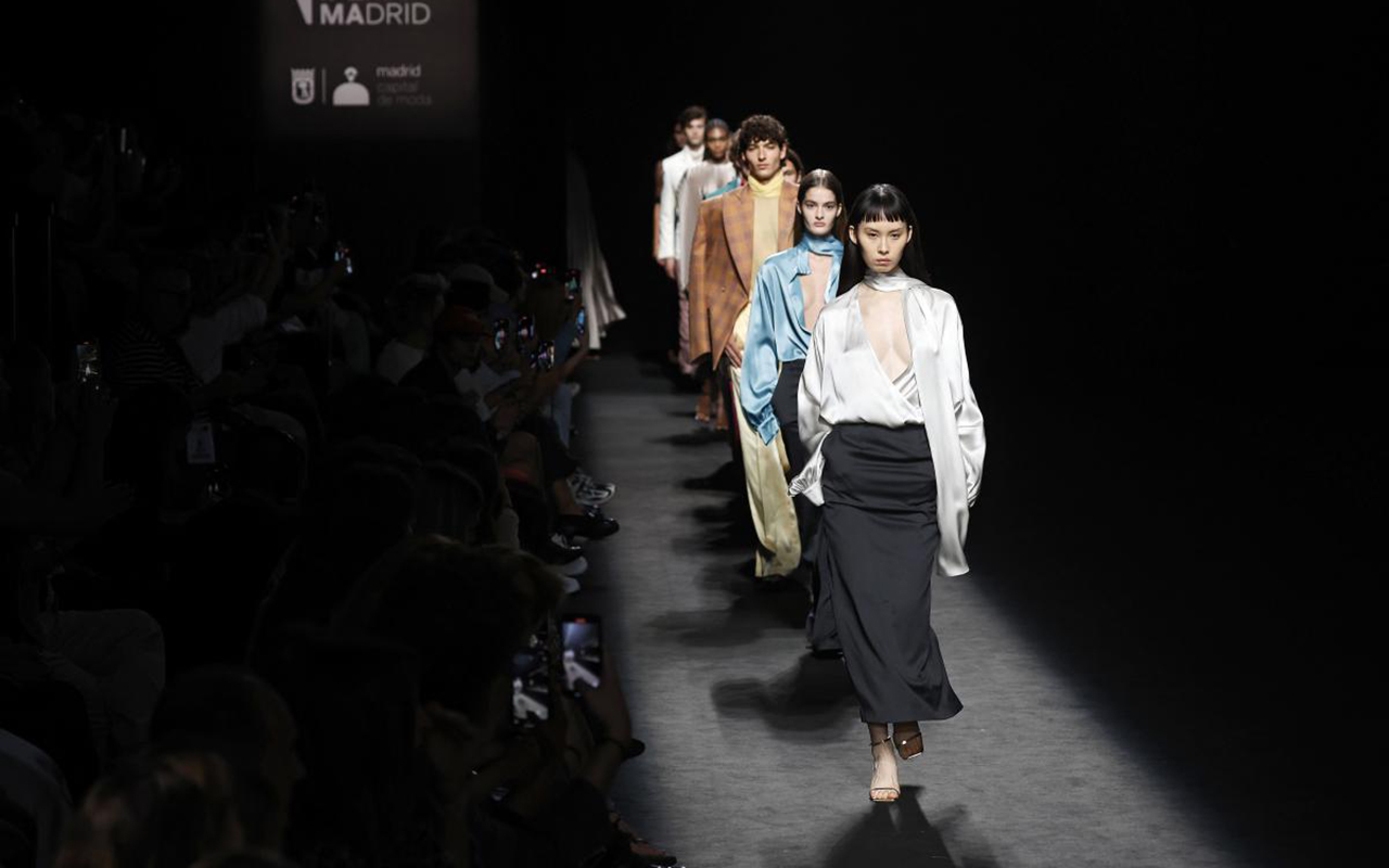
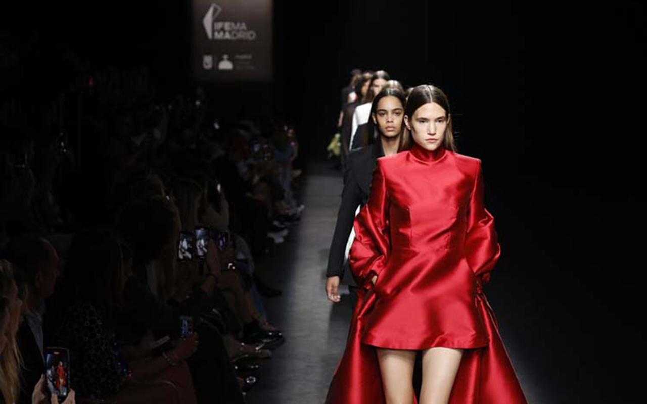
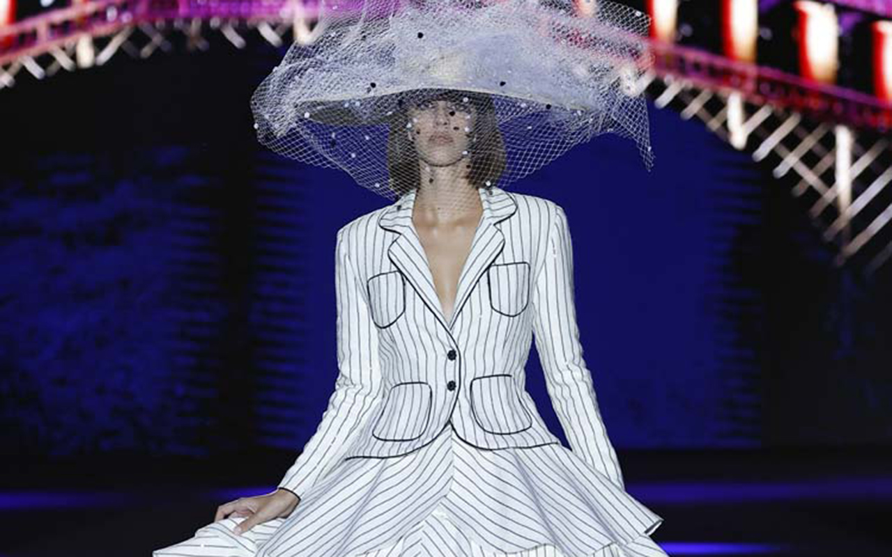
Gratacós has once again set foot on the main Spanish fashion catwalk by starring in some of the most representative looks of the designers who participated in the last edition of Mercedes -Benz Fashion Week Madrid. In each edition we feel admiration and deep respect for the creators who trust us and turn each fabric into a unique and singular creation, adapted to the language and aesthetic codes of each brand. In this latest edition of the Madrid catwalk, we thank Aurelia Gil, Fely Campo, Hannibal Laguna, JC Pajares, Mans, Paloma Suárez, Teté by Odette and Yñesuelves for having placed their trust in us. Below, we reveal a brief summary of the collections for the upcoming Spring -Summer 2024.
Aurelia Gil
Aurelia Gil returned to Mercedes-Benz Fashion Week Madrid for the second consecutive year. On this occasion, the designer from Las Palmas de Gran Canaria presented her new ‘Tiempo’ collection, which represents a milestone in her constant effort to create conscious and sustainable fashion. To understand Aurelia Gil’s work, it is necessary to know her passion for craftsmanship, which can be seen in each of the pieces, the careful selection of fabrics and the ethereal femininity that permeates each silhouette, with an exquisite result in every sense.
If we delve into the new collection, in ‘Tiempo’ there are plenty of relaxed silhouettes and lines, as well as flowers, which on this occasion are presented from the printing of scarves to surprising fabrics such as silks, tulles and cottons. There is also no shortage of crochet elements, embroidery and lurex printed here and there.
Fely Campo
Fely Campo creatively traveled to Cuba to carry out an exercise in hedonism, freedom, opulence, nostalgia and glamour. The collection presented is called ‘Zigurat’ and consists of 25 looks that are impregnated with the Art Deco aesthetic through pure patterns, which are built with the cleanliness and sobriety of the most whimsical buildings in Havana. Silhouettes and geometric cuts are intertwined with fabrics inspired by ornamental language: brocades flooded with 3D visual games with natural and geometric motifs; organic mosaics that contrast with the verticality of the ottoman’s lines and the bolder tweeds. Against the voluminous calm of the taffetas, the sinuous shapes of the moving satins emerge. The colour palette is impregnated with fluorescent tones, lamé and metallic finishes. A landscape of vivid colours on off-white tones that are enveloped and penetrated by ornaments with iridescent shine and glassy reflections.
JP Pajares
JP Pajares presented its fourth annual collection on the Madrid catwalk, where summer, winter and timeless garments are combined through designs with artisanal, innovative and environmentally friendly touches. Thus, the ‘ Annual ‘ proposal follows in the wake of the brand’s latest collections with new artisanal luxury and stands out as one of the most special collections thanks to the new collaboration with artisans from Castilla-La Mancha. This union continues to revive and contribute new aesthetic codes to centuries-old techniques that are on the verge of disappearing.
In ‘ Annual ‘, nothing is left to chance and every detail counts: bobbin lace, ceramics, blown glass, hand embroidery, leather, crochet, hand-painted prints and fabrics made on centuries-old looms are intertwined in a collection that consolidates the character, style and brand identity. Innovative and sophisticated patterns, sensual and oversized silhouettes, feathers, pleats and cuts materialize in proposals for both day and night, thanks to fabrics such as wool, silk, silk crepe, cotton, taffeta, denim, tulle, technical fabrics and neoprene, among others. The collection follows a chromatic journey from black to white, passing through earth tones and the brand’s most characteristic solid colours.
Mans
Mans believes in the elegance and sophistication of classic pieces, but offers a broader vision of fashion through collections that are freed from aesthetic limitations, allowing each person to express themselves with freedom, fluidity and confidence. On this occasion, the brand of creative director Jaime Álvarez, which is committed to impeccable and exuberant tailoring, presented its first women’s collection, maintaining the aesthetic codes it uses for the men’s line.
The collection is structured with a first series of women’s tailored garments that includes tuxedo-style jackets and narrow trousers that elongate the female silhouette. Pencil skirts are also included to maintain the sartorial essence of our brand. With shades such as charcoal grey, black and pearl tones for the wide blouses that seem ethereal, a sober collection is created that evolves towards the 60s in terms of pure straight dresses, some above the knee, others of midi length and others . that rub the ground. They all share vibrant colours and varied fabrics such as taffetas, technical fabrics and adorned with sequins with a “crowskin” effect. The Mans women’s collection show culminated with a bride completely embellished and veiled with silk tulle of more than 5 meters.
Odette Alvarez
Teté by Odette , the brand of the Cantabrian designer Odette Álvarez, finds in Venice the perfect inspiration to dress women in the next SS24 season. The influence of the world of cinema, the glamour of the city of bridges and canals, the exuberance of carnivals, love and the designer’s personal experiences are condensed in the ‘Venezia’ collection.
This proposal is characterized by fabrics rich in ornaments and beads, elements and silhouettes that evoke the typical Venetian wardrobe, and a vibrant colour palette that includes aquatic green tones, pink and the classic black and white combination, reinterpreted from a contemporary perspective. As for fabrics and materials, luxurious taffetas, silks and lurex stand out, along with more urban fabrics such as denim or stretch silk knit. In addition, there is no shortage of sequins, crystals and rhinestones, distinctive elements of the brand. The nautical stripe print on linen with micro sequin details is transformed into party and wedding dresses, closing a collection full of symbolism and tradition. It is an emotional collection made up of “garments that are easy to wear and hard to forget.
Paloma Suarez
Paloma Suárez presented her new collection ‘ Glow Up’ for the next summer season, starting from a premise that the Canarian creative frequently addresses: ‘What would you say to your past self?’. With the aim of achieving the best version of herself, the designer, considered one of the great promises of Spanish fashion, has evolved her aesthetic codes, giving them a new interpretation. The proposal represents a reflection on the past to gradually narrate the personal and creative growth of Paloma Suárez that has taken her to the present. The collection highlights the incorporation of soft colours and midi- length garments, maintaining the prominence of the colours and textures that are so characteristic of the brand and that have become its hallmark.
Ynes Suelves
Finally, María Osorio and Ynés Suelves , mother and daughter, reflect the magical union between fashion and painting. In its new collection, the brand has explored textiles to the maximum, focusing on the movement of its garments and seeking to transmit emotions through colour. In this collection for next summer, the Spanish brand has opted for a more feminine silhouette than ever and has been characterized by a rich variety of textures. Unlike other occasions, this collection is full of different fabrics and prints.
Pics: Mercedes Benz Fashion Week Madrid