Viernes 30 diciembre 2022
At the end of the year the evaluation lists come out: the best books, the most influential characters, the must-see series, the trends that have marked each season, the new fashionable words that we incorporate into the dictionary… At Gratacós we carry out our particular revival exhibiting the shop windows that have been created at the entrance of our space in Barcelona. In fact, it is nothing new that we bet on creating windows that attract attention. We have always done it and each window represents a new visual letter of presentation because it speaks of who we are and what we do in a creative, spontaneous and current way, using new languages of expression that go beyond fashion.
During this year of return to “neo normality” we have dressed our mannequins with spectacular fabrics from the new season, but we have also had the support of the students of the design schools we collaborate with, the creativity of brands made in Barcelona and some artists linked to Gratacós . All of them have put their grain of sand to build new windows that create that attraction effect to those who come to our physical store. We review them below:
February 2022. Echoes of spring
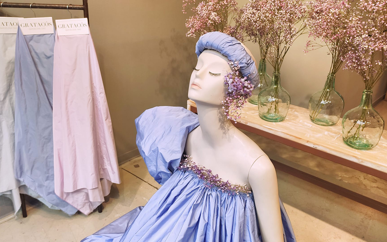
Winter was short-lived in 2022 and the high temperatures, unusual in February, were unknowingly a foretaste of what would come next and would remain the usual trend throughout 2022, one of the warmest years on record. In the traditionally coldest month of the calendar, we took a look at our shop window betting on the incipient spring that was already rearing its head. The first green shoots, the white and pink flowers of the almond trees and, in general, a new awakening of the flora that we express through taffetas (Picasso) and colour in its softest tones.
March 2022. An arty twist
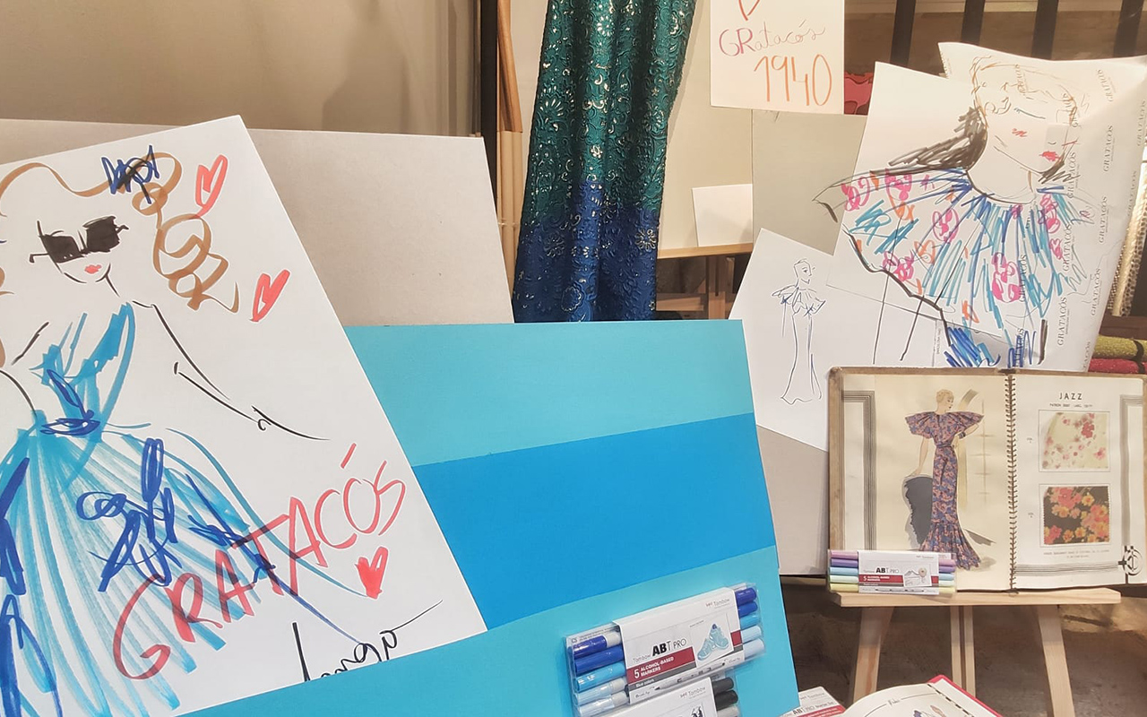
In March there was an artistic turn towards fashion illustration with the identifiable stroke of Joel Miñana, where his colourful mannequins were the absolute protagonists of the window. Using coloured pencils, markers and geometric lines, Joel interpreted some of the key fabrics of the season in an arty key . This contemporary vision was complemented with cuts from vintage dresses, fabrics from other seasons, and classic drawings that review the history of Gratacós, offering two visions that define our company: tradition with modernity.
April 2022. A book to remember
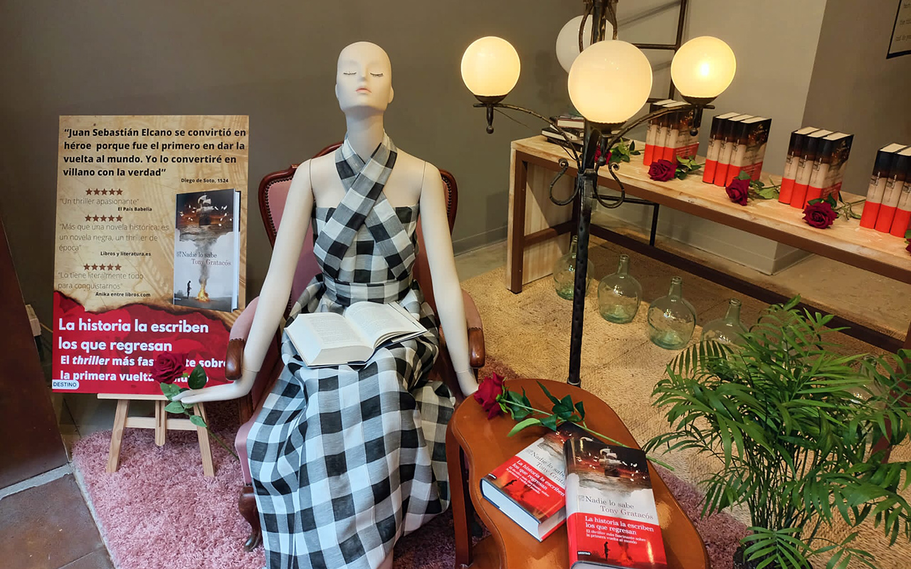
In the month dedicated to literary culture, we wanted to do our part by paying tribute to a specific book: ‘Nobody knows’ (Planeta, 2022) by Tony Gratacós . A historical thriller about some of the mysteries of the first circumnavigation of the world. The author gives a twist to the figure of the navigator Juan Sebastián Elcano, one of the few survivors of the Magellan expedition in an ambitious story that immerses us in one of the most splendid and fascinating periods in the history of Spain and that hides a secret that has taken five hundred years to come to light. The shop window could not miss some signed copies, roses and a mannequin with an imperishable fabric, the Gingham linen check that is renewed every year without losing its classic essence.
May 2022. The brides of the year
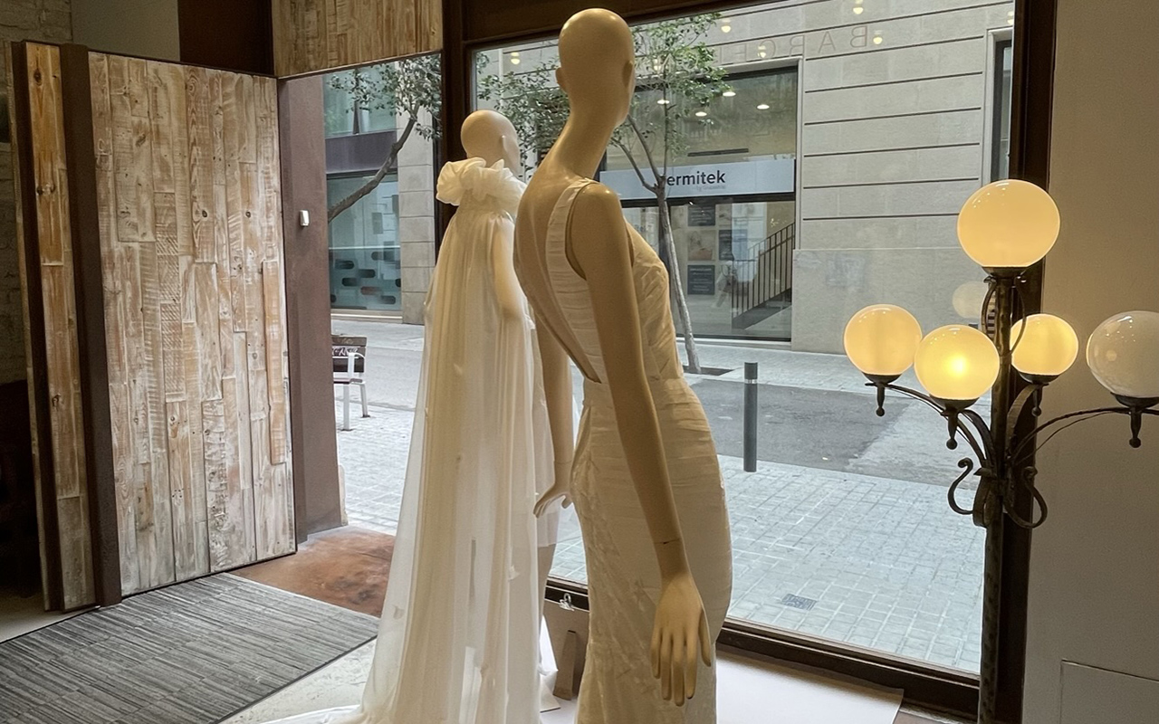
The bridal showcase took place in May this time, making visible the work of the last two winners of the contest IED Barcelona that the school organizes every year through their postgraduate course in Bridal Gown Design. On this occasion, the moulages by Myrian Medina, winner of 2022 and Nicole Claux , winner of 2021. Two wedding dresses, one made of georgette (Danubio) and the other made with mikado on the bodice and sequin embroidery on the tail of the skirt. The fabrics provided by Gratacós together with the unique cutting and sewing technique gave way to one of the most special showcases of 2022.
June 2022. Studio 54 returns
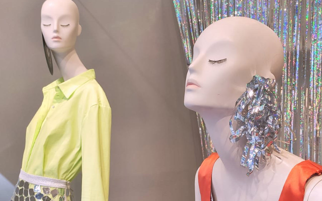
In June we welcomed what would be the longest summer of the 21st century, recalling the disco aesthetic of the 70s. Iridescent materials, reflective crystals and subtle shimmering fabrics to kick off a time full of outdoor celebrations. The bling bling aesthetic was achieved by Joplin Atelier, the Barcelona born firm of Laura and Aida Molano who succeed with their glam rock style , creating feminine and opulent looks in volumes, colours and fabrics. The mannequins wore two looks in lime cotton and orange silk satin combined with pieces made with mirror effect appliqués on tulle as a miniskirt.
July and August 2022. Sales time
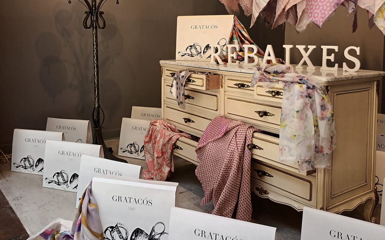
The sales were the stars of the holiday months and we showed a selection of our best seasonal fabrics in various shades of pink and ecru: jacquards , prints and embroidery mostly. The shop window recreated a feminine room with a certain air of disorder, through a chest of drawers with a vintage spirit , where sumptuous fabrics sprouted from each of the drawers. A tribute to the carefree divas of classic cinema brought to our land.
September 2022. Back to school
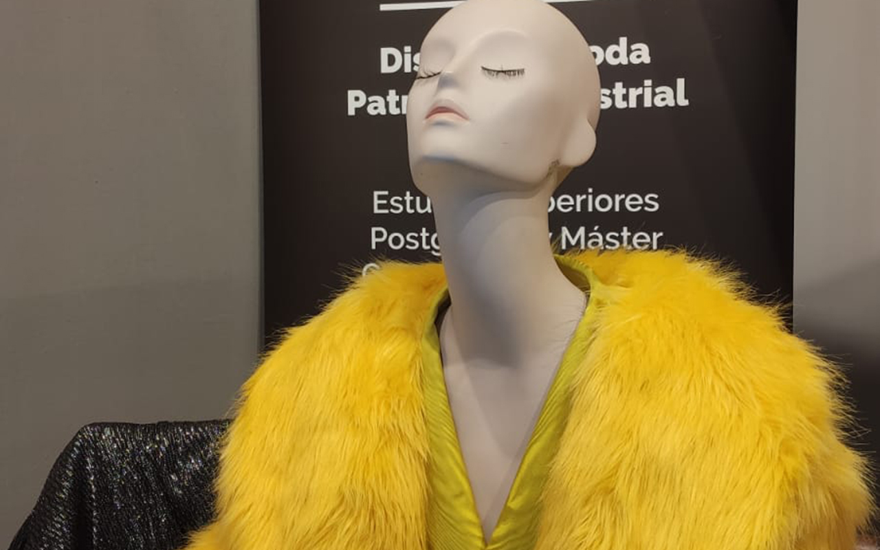
In the fashion industry, the year traditionally begins in September, coinciding with the change of season, the new catwalk calendar and the most powerful magazines in the world invest in million-dollar covers to compete in sales. This month, the designer Emile Albretch from the ICM school exhibited her latest models through pieces made with different jacquards , knitted with lamé and moiré. The result was an interesting mixing exercise with a colourful result that hooks the new generations.
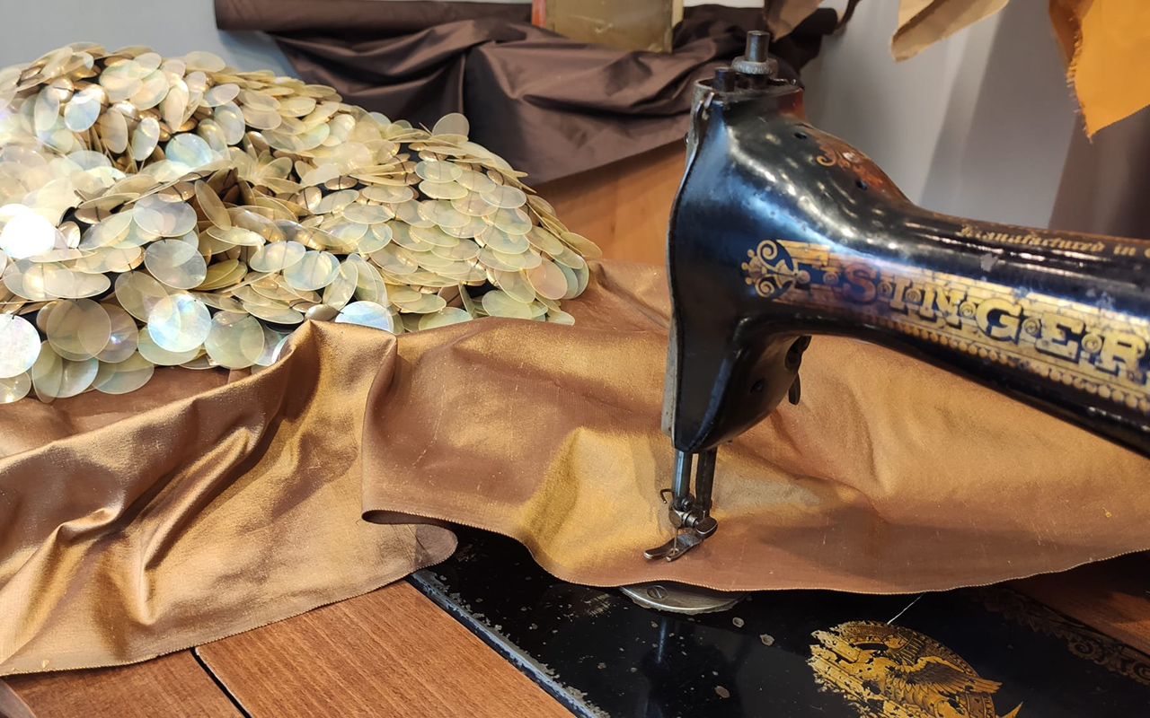
October and November 2022. Home sweet home
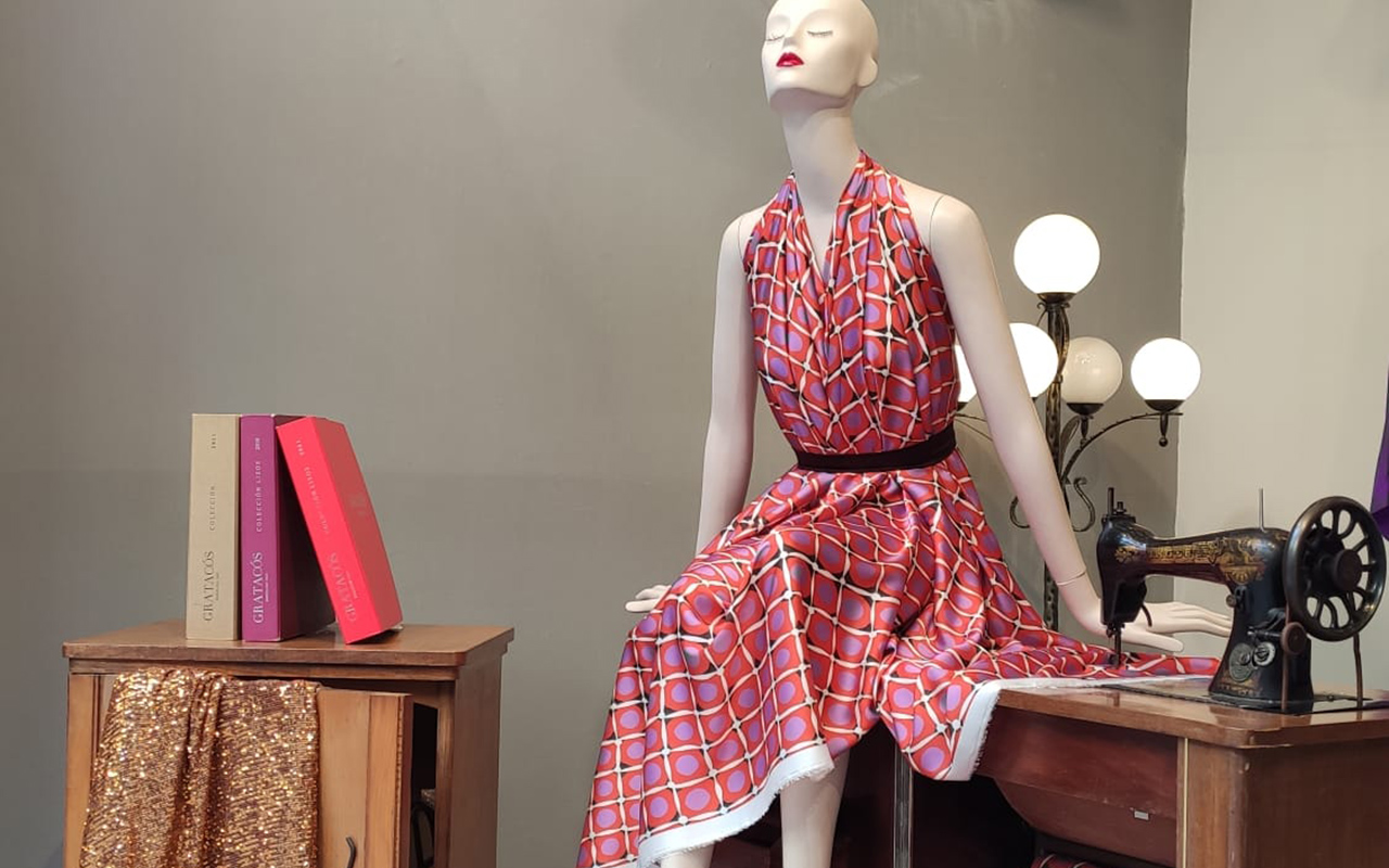
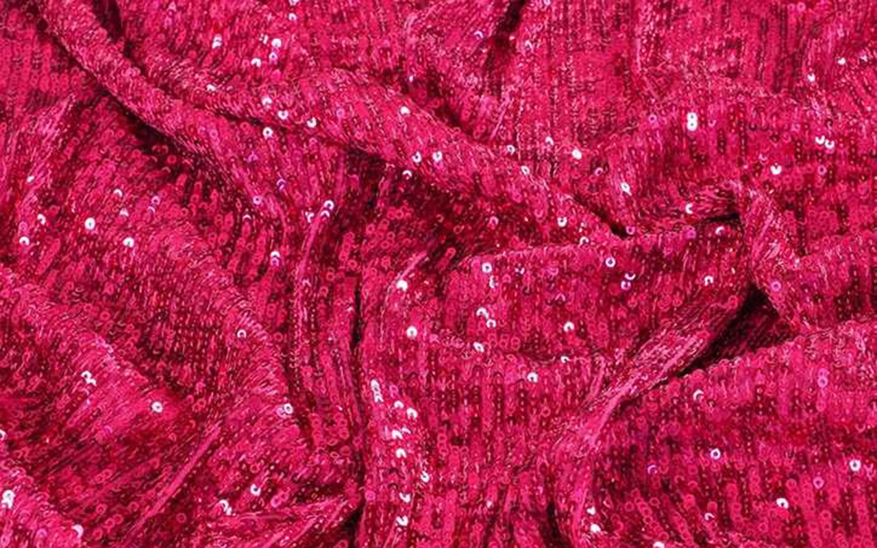
The quintessential autumn months were dedicated to exploring the traditional universe of the home. Sewing, cutting and sewing, leisurely hobbies that require the work of the hands with a dose of creativity, perseverance and patience. From this intimate refuge, the dreams of tomorrow are woven through wonderful fabrics such as wild silk in gold or transparent XXL paillettes.
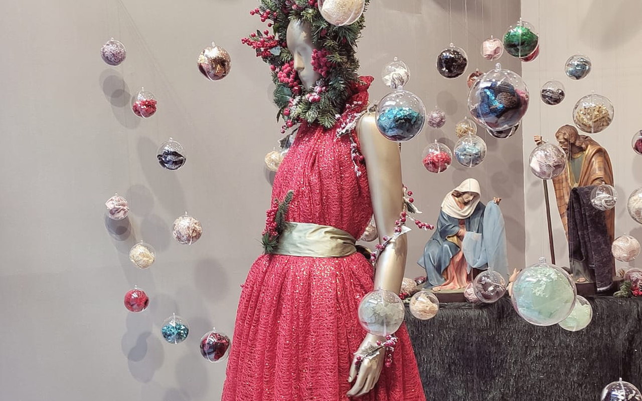
December 2022. Red Christmas
We say goodbye to the year with a classic tribute to Christmas. Crystal balls that enclose remnants of fantastic fabrics, the traditional nativity scene that reminds us that no matter how times change, there are customs that remain intact over time, and a spectacular mannequin in the centre dressed in red sequins with winter decorations that remind us that winter has already begun, despite being just as atypical as at the beginning of the year. What will 2023 bring us? Regardless of the desires of each one, we await the arrival of new shop windows that will surprise you and invite you to enter our space in Barcelona. Happy New Year!
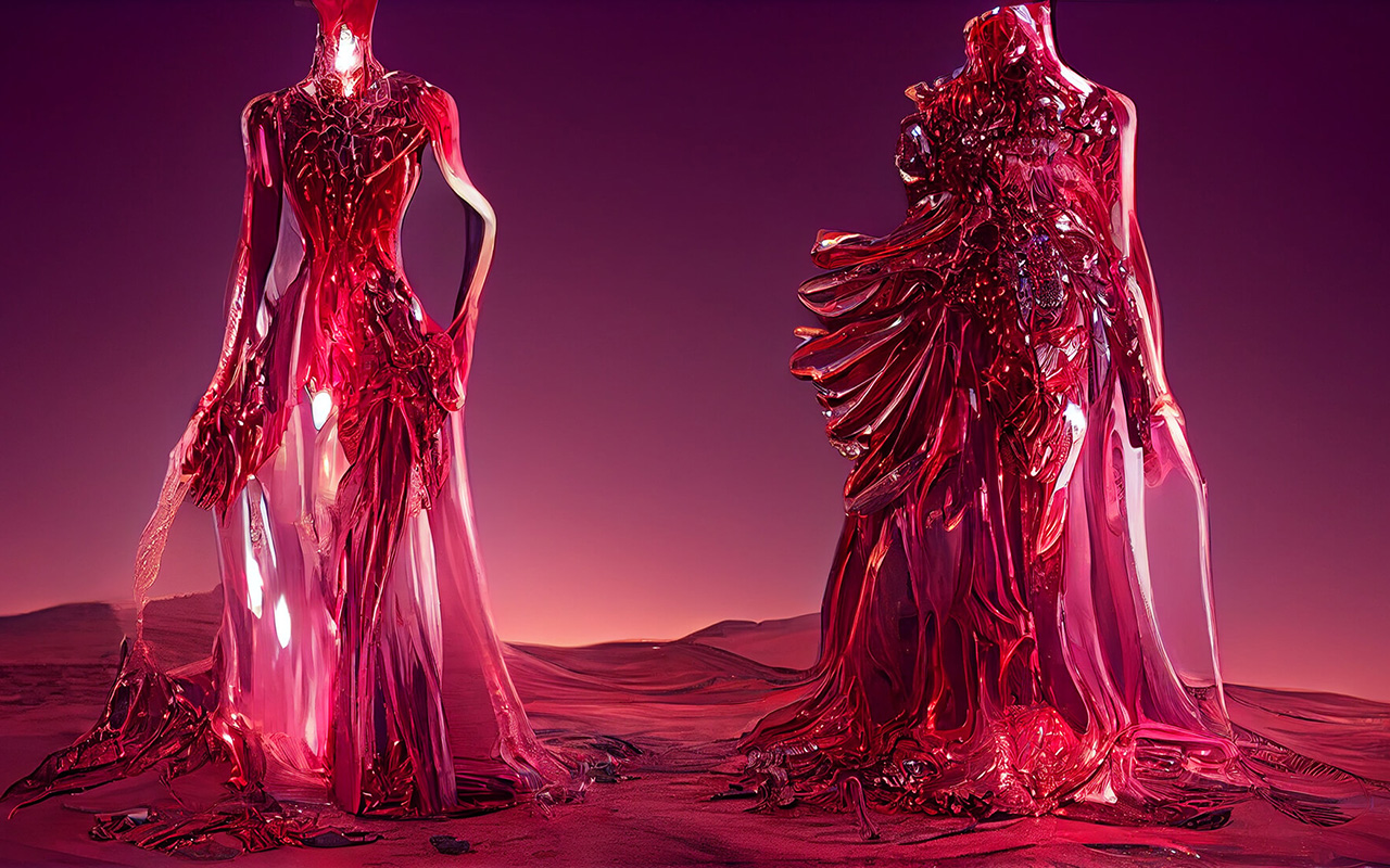 All About Viva Magenta, the Color of the Year 2023. Pic: Pantone
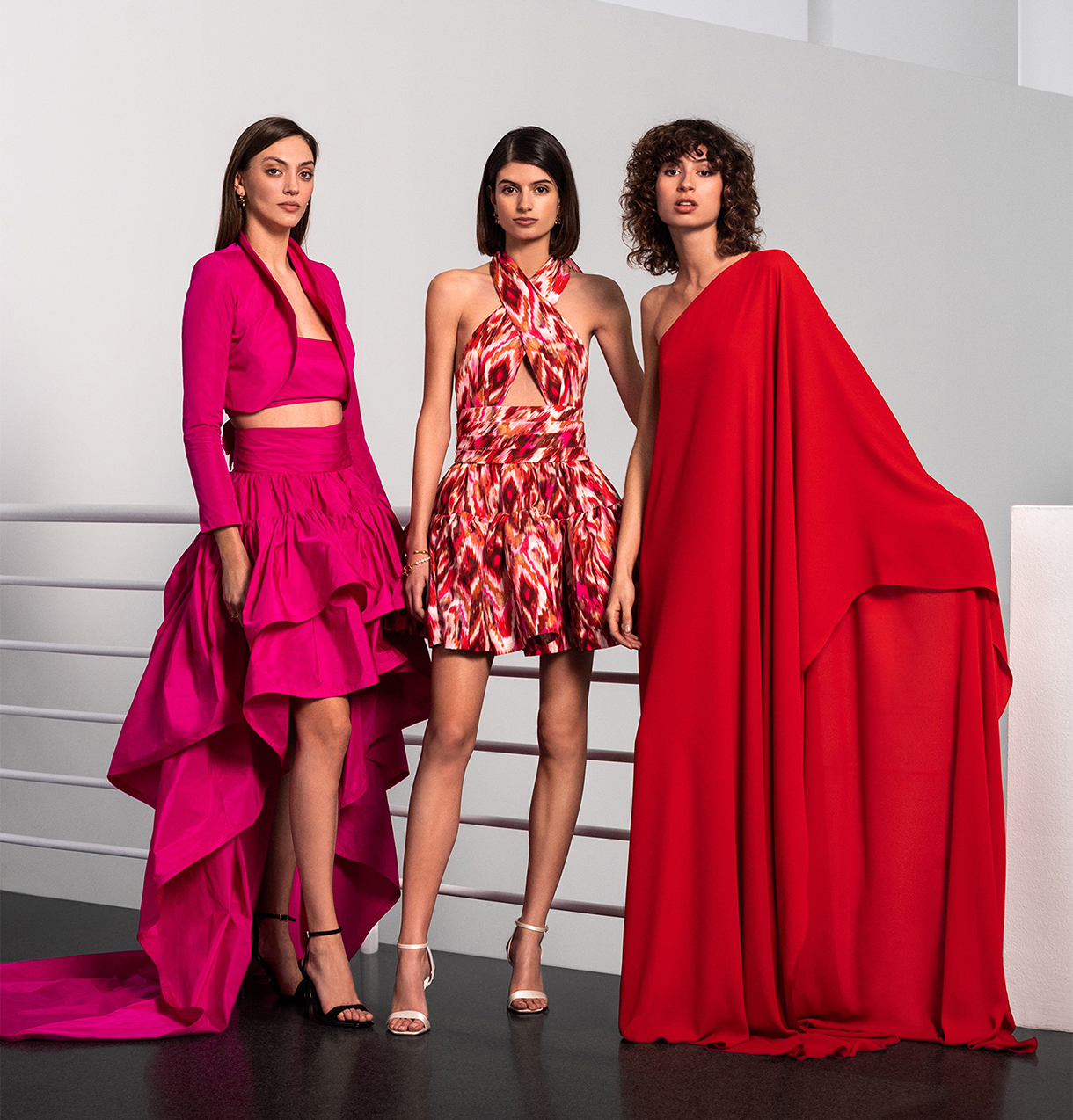
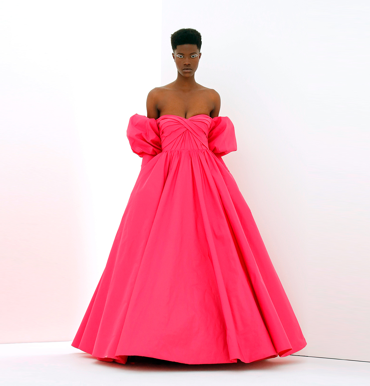
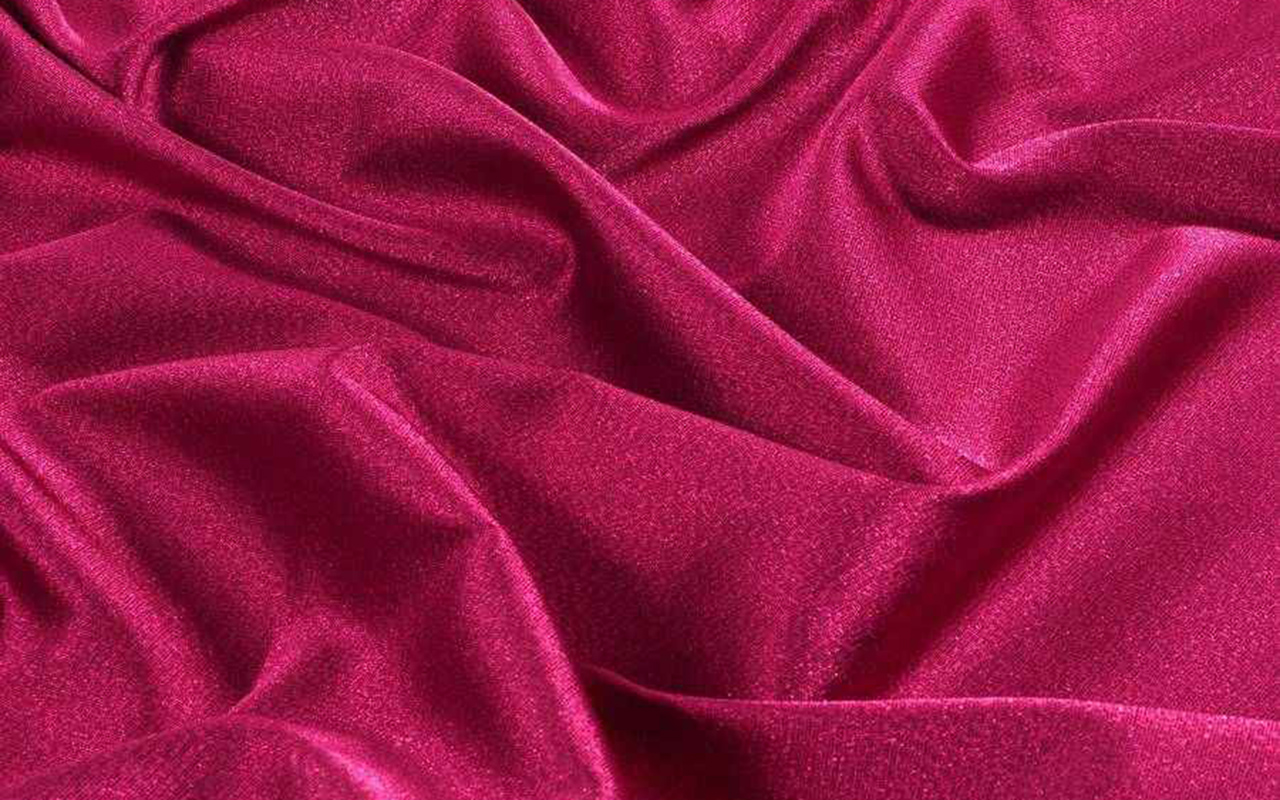
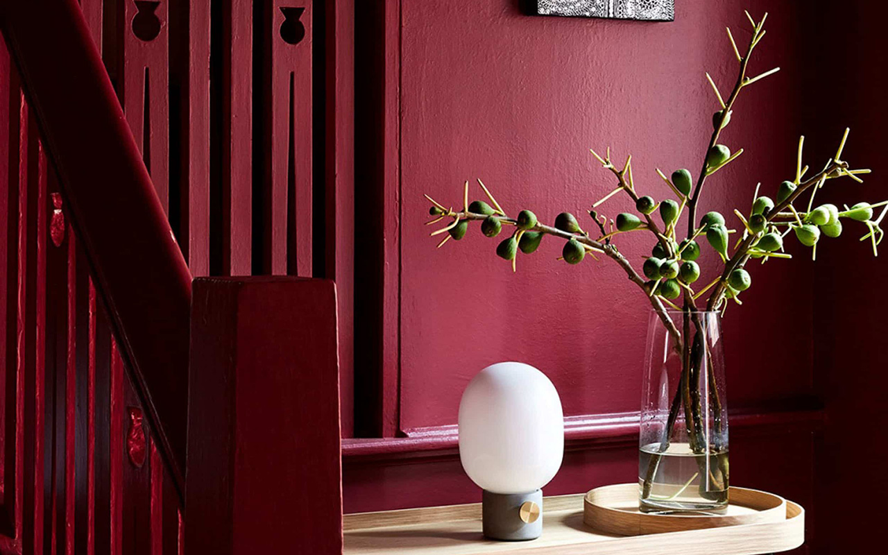
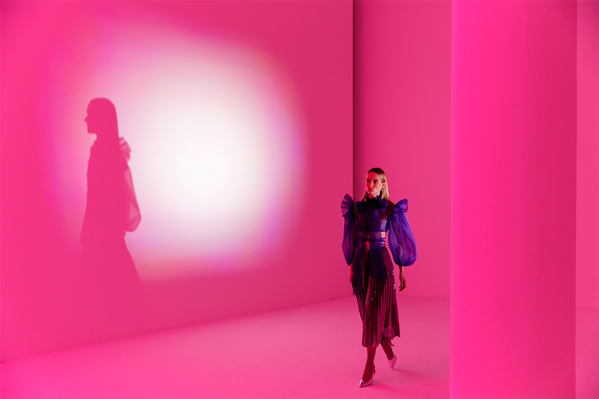
Is it rosy red? Reddish purple? Perhaps crimson red or rather, a deep raspberry hue. All these nuances that transition between red, pink and purple define the unique Viva Magenta , the colour that Pantone has chosen to guide 2023 and inspire disciplines related to art and design .“ It is brave and intrepid, and a pulsating colour whose exuberance promotes a joyous and optimistic celebration, writing a new narrative”, declared Leatrice Eiseman , Executive Director of the Pantone Colour Institute . Viva Magenta 18-1750, this is its technical name, is a tone that vibrates with energy and vigor. “A lively red that encourages experimentation and unrestrained self-expression. An electrifying, limitless tone that comes through with a bold statement,” said Eiseman .
“Viva Magenta promotes a joyful and optimistic celebration, writing a new narrative”
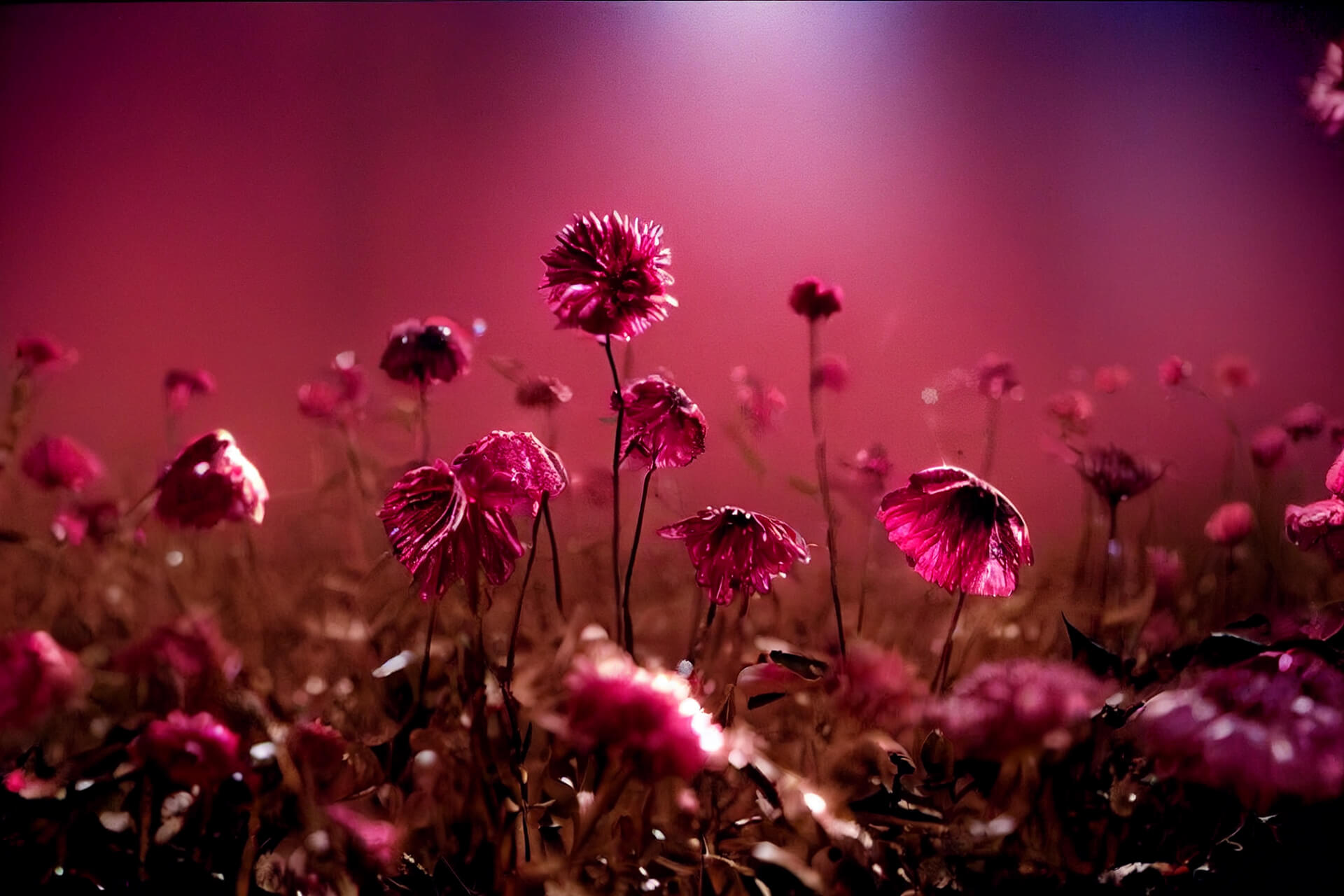
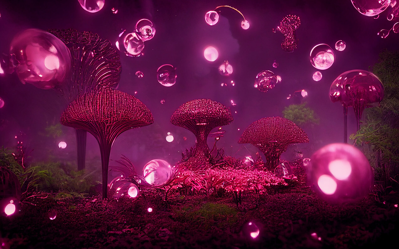
The arrival of this enigmatic red is not accidental. Pantone introduced the Viva Magenta shade in 2019, but it quickly rose in popularity to rise to stardom as the Colour of the Year 2023. This boom has been largely fueled by events in society in recent years. As Laurie Pressman, vice president of the Pantone Colour Institute , put it, “It’s an unconventional colour for an unconventional time.” The experience of Covid and its social and economic consequences have forced changes that, voluntarily or not, have transformed people’s lifestyles. And there, after two years of uncertainty expressed through cold tones ( Very Peri, 2022) or dual (Ultimate Gray + Illuminating , 2021), now comes a hybrid tone with enough personality to be able to light up 2023. Unlike its predecessor, Viva Magenta combines coldness and warmth in the same colour, and aims to mix the physical with the virtual, a dichotomy that cannot be more relevant today with the rise of virtual reality.
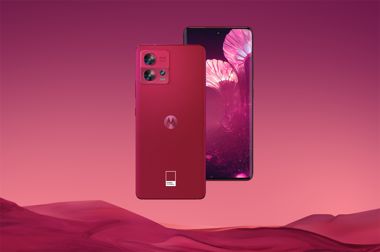
“It’s an unconventional colour for an unconventional moment”
Viva Magenta has already been spotted by trendhunters who work at the Pantone Colour Institute This choice is never the result of whim or chance, on the contrary, it is the result of a deep sociological and anthropological analysis of today’s society. Choosing the colour that will mark the year combines research, method and instinct. And magenta was there, in worlds as varied as fashion, cosmetics, concept store design , digital art, social networks or decoration. The question was, why pay attention to that carmine red that is already present in society and what emotional and psychological values is it transmitting? Pantone quickly looked up its meaning. According to the international authority on colour, in this era of technology, the aim is precisely to be inspired by nature and what is real. Pantone 18-1750 Viva Magenta is inspired by cochineal red, one of the most precious of all natural dyes, as well as one of nature’s strongest and brightest hues. Therefore, rooted in the primordial, the colour of 2023 reconnects with the original matter, revitalizes the spirit and helps build a new inner strength. “We set our sights on a colour that highlights our need to shift our perspective, highlights our desire to feel empowered, and gives us the strength to boldly, possibly, and fearlessly launch into a new path with complete confidence.” Pressman expressed.
“We have set our sights on a colour that makes us want to feel empowered”
Seen this way, Viva Magenta is a hue that is presented as a revitalizing balm that connects our interior to project ourselves strongly to the exterior.
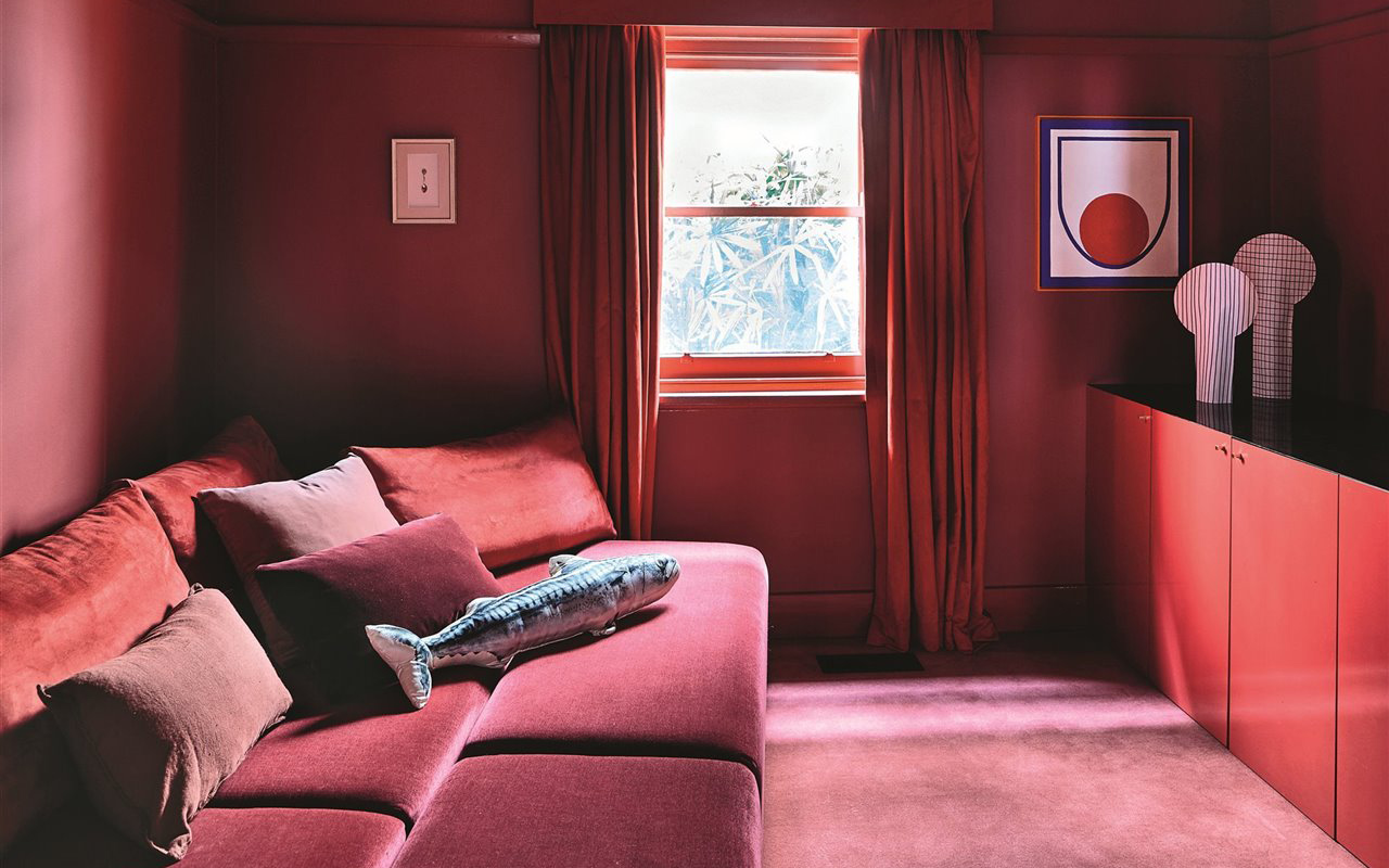
How to apply Viva Magenta in our daily lives?
Reddish tones and explosive mixtures such as intense pink-red have been imposed everywhere, from the catwalks to the metaverse, and where it has the most possibilities of expansion is in interior design, be it a private home or a commercial establishment. According to Eiseman, kitchens (and appliances), which have long harbored a respect for red, can now be imbued with “a touch of novelty” through Viva Magenta and its ability to break away from the “same red hue of always”, which defined previous generations. Pantone 2023 colour is also suitable on glassware or any other reflective surface, and can even nestle in cushions and other small decorative items to make a “beautiful, dramatic and theatrical statement” in your home. Although such a lively colour can intimidate or condition the current of neutral tones that are prevailing in decoration, the truth is that Pantone affirms that consumers are more prepared than ever to begin to embrace all the possibilities of colour.
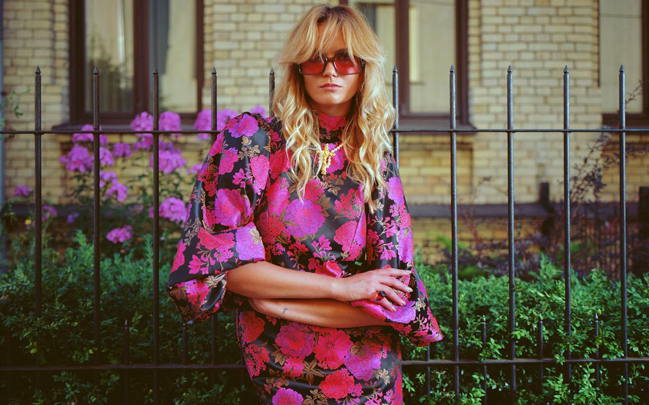 Acuamona AW22/23. Pic: Acuamona
And in fashion, how is it appreciated?
There is no doubt. The fashionable colour of 2022 has been the brightest fuchsia pink, a faithful ally of Valentino and its explosive Pink PP shade, and emblem of the entire Barbiecore aesthetic. Now, Viva Magenta is presented as a natural evolution of that hue, providing less stridency and keeping its magnetism intact. In truth, red has been one of the most repeated tones on the winter catwalks and for summer it returns with force, but it remains to be seen how the next collections that are being developed for 2023/2024 evolve so that Viva Magenta appears even more strength.
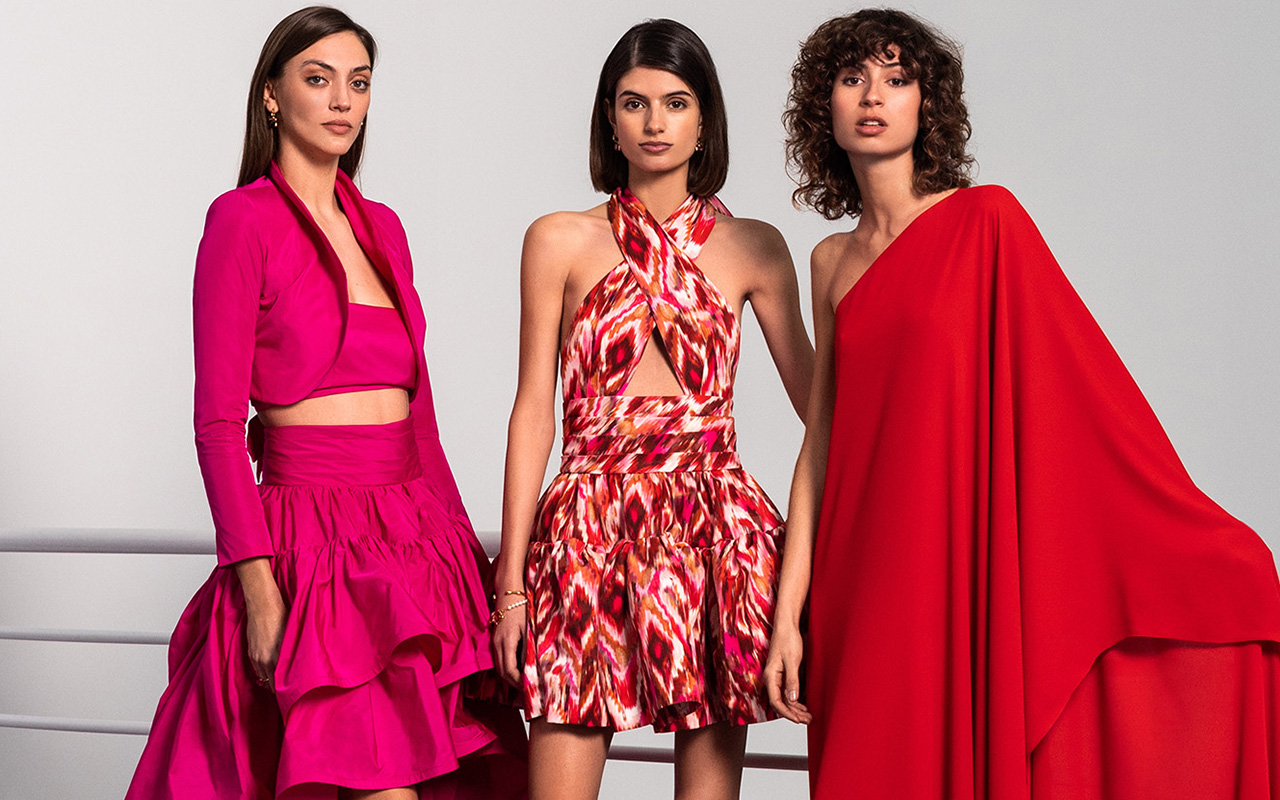
As the powerful colour that it is, Viva Magenta does not go unnoticed and takes centre stage in any outfit, even if it appears in small doses. On the one hand, it feels perfect surrounded by neutral tones such as black or white, or both together. They are the colours that best suit you with effortlessly flattering looks. On the other hand, for a more groundbreaking result, the colour of 2023 combines with its chromatic range: pastel pinks, lilacs or fuchsias, and also with complementary blues or greens, providing a touch of rebellion and transgression. In any case, if fashion needs a dose of optimism, strength and joy, to move forward it will inevitably embrace Viva Magenta. We’ll see it…
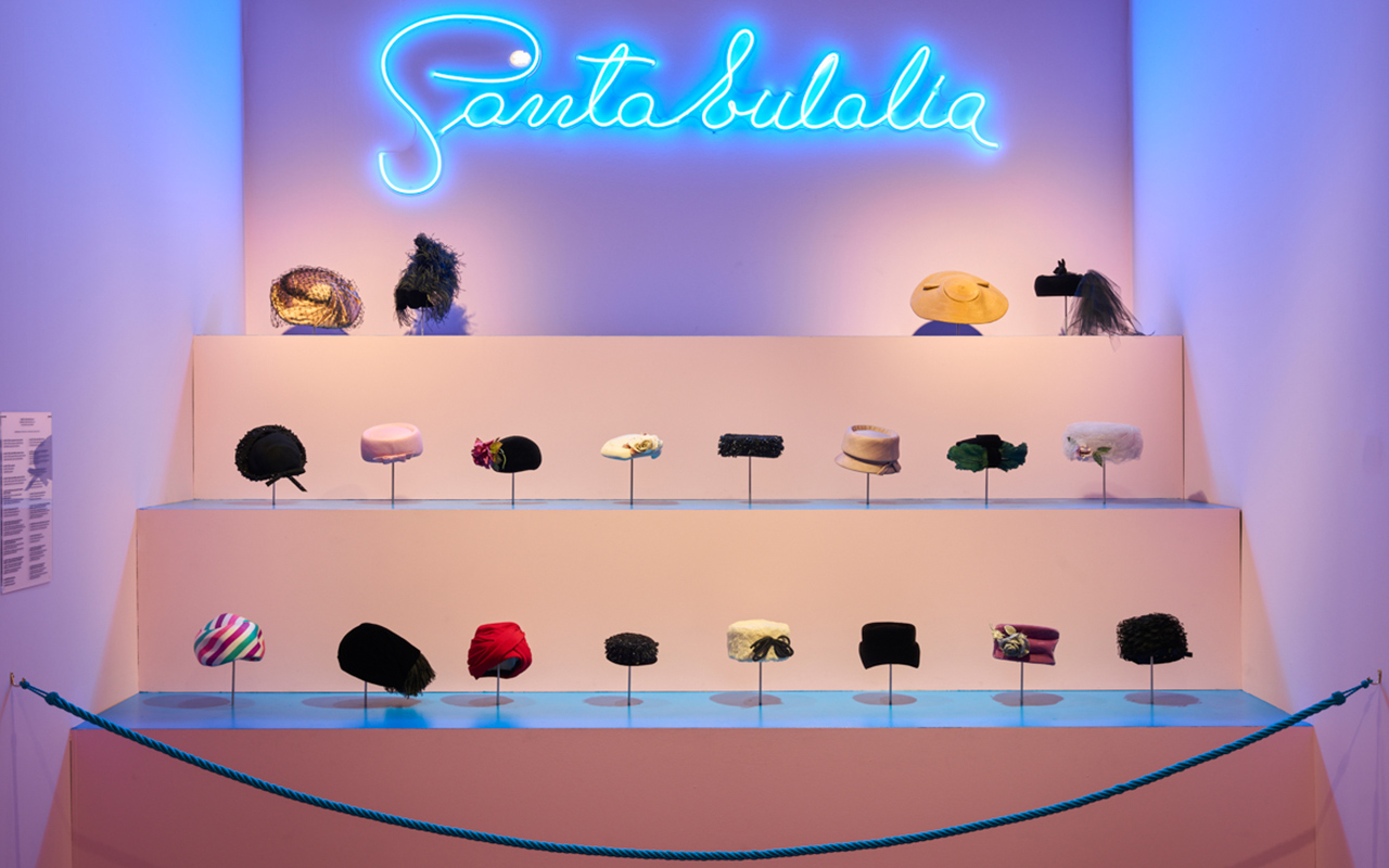
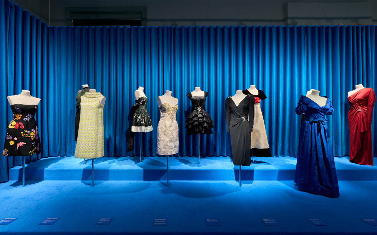
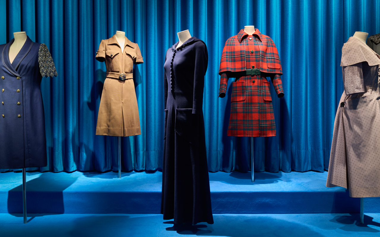
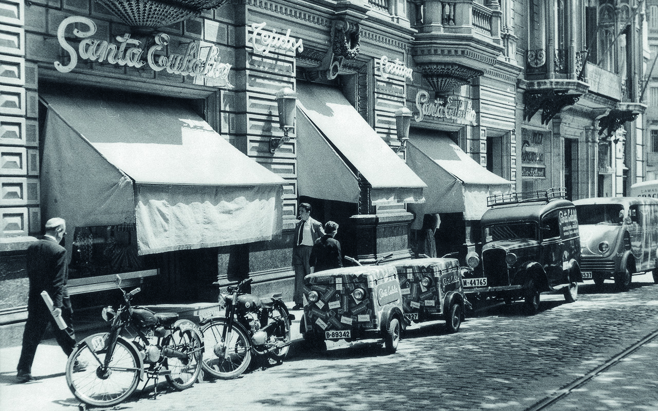
As a family-owned fabric company that blends tradition with innovation, we’re enthusiastic about long-standing businesses that have that respect for heritage, without losing sight of essence or curiosity to see out new things. Saint Eulalia It is one of those houses that has crossed generations and has established itself on its own merit as a reference emblem in Barcelona and abroad for elegant fashion. Now, an exhibition premiered in Palau Robert pays homage to her career through the most representative dresses of the golden years of haute couture in a brief but symbolic tour where the beauty of the festive models are the protagonists of this unique sample of anniversary.
A brief historical tour
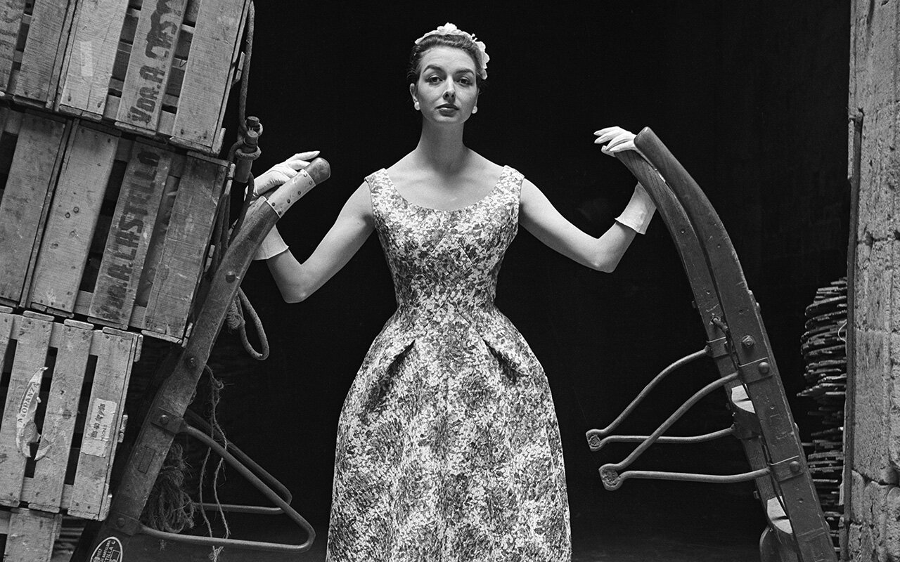
The history of Santa Eulalia is intertwined with the story of Barcelona. It was originally founded in 1843 and was installed in Calle Boqueria as a textile store. Over the years, the space changed and the business expanded to also house shirts and tailoring made to measure. With the fall of the medieval walls of the city and with the urban projection of the new Ensanche, where the Catalan bourgeoisie quickly settled, the establishment moved at the beginning of the 20th century to Paseo de Gracia, where it is currently located. There is a date that marks a before and after: 1926. It was when Santa Eulalia held the first haute couture show, being a pioneer in Barcelona of this new formula from Paris for presenting fashion. An initiative that took place fruit of the talent of Pedro Formosa, creative director of the house until 1970. Since then, the most elegant handmade dresses and hats in the city have come out of his workshops and have dressed the wealthy classes of Barcelona and beyond. Good art and know-how in clothing arose from the Santa Eulalia workshops thanks to the meticulous craftsmanship of the tailors and dressmakers who worked to create exclusive designs for their distinguished clientele. There is another date that deserves to be remembered that denotes the work and prestige of the establishment. In 1941, Santa Eulalia formed part of the Cooperativa de Alta Costura and led fashion together with Pedro Rodríguez, Asunción Bastida, Manuel Pertegaz and El Dique Flotante, recognized as the Big Five of Spanish Couture; honors that they shared, in parallel, with Cristóbal Balenciaga.
The legacy through the dresses
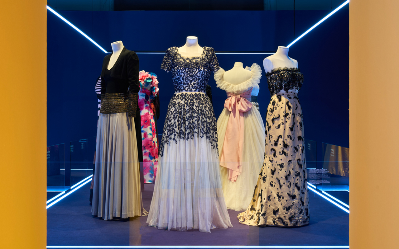
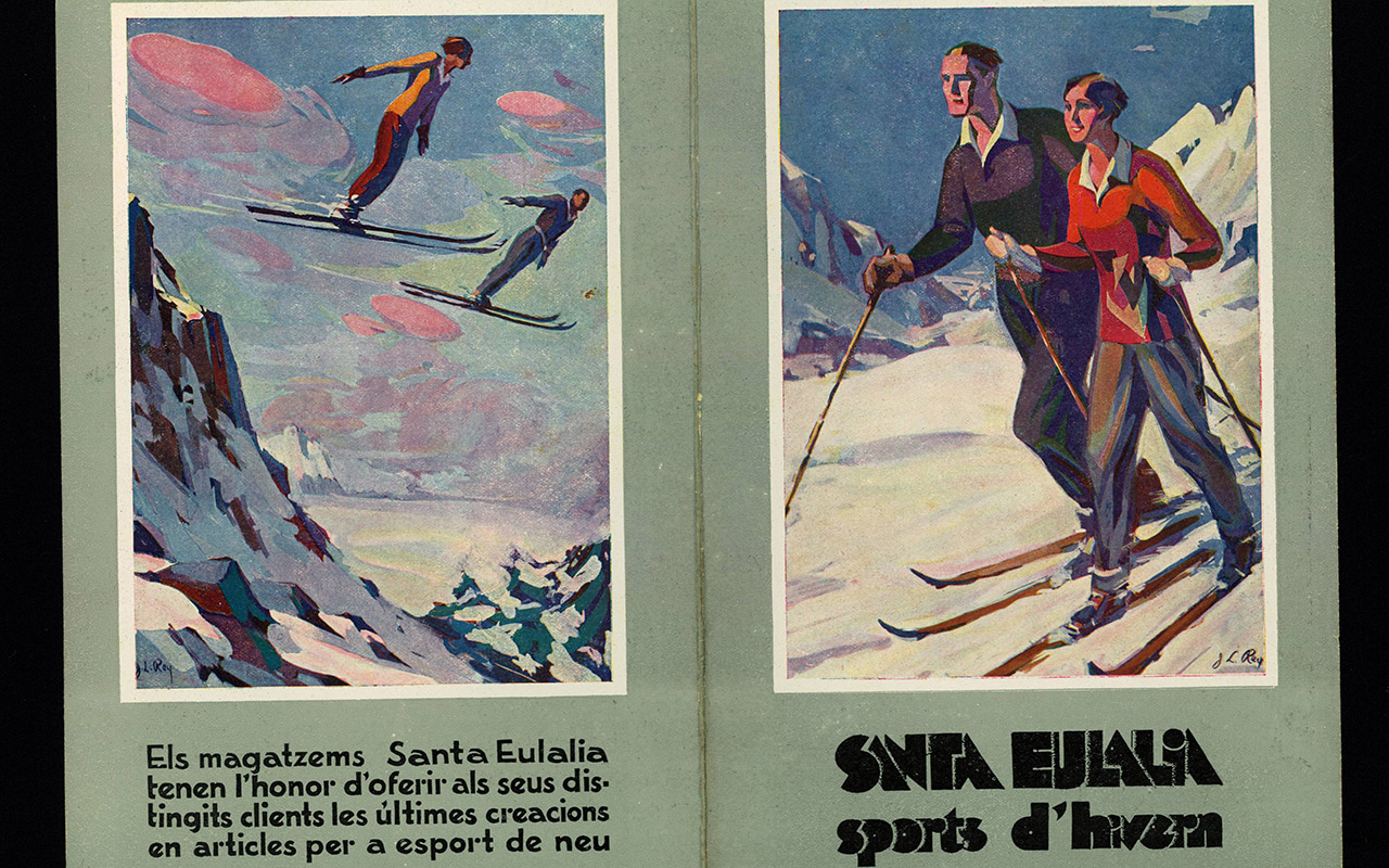
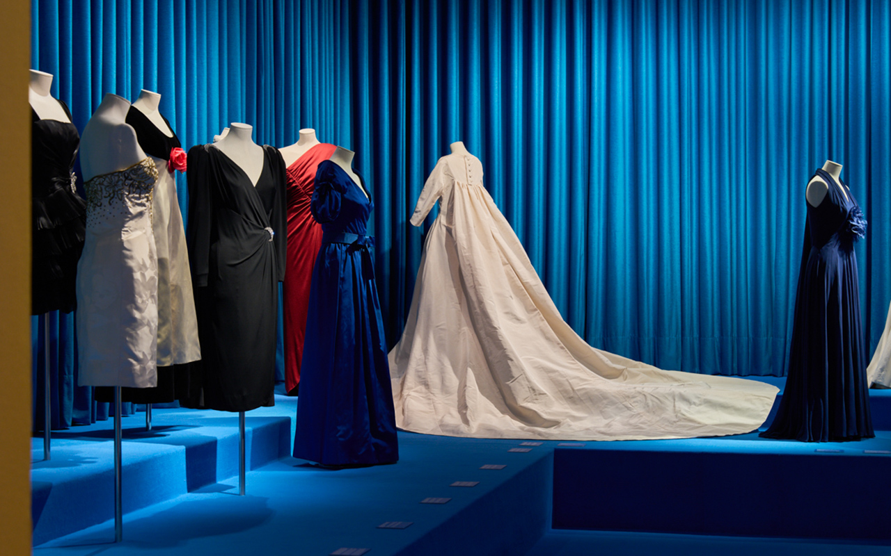
Under the name ‘Santa Eulalia, 180 years of fashion’, the exhibition proposes a journey of 70 years (1930-1990) to enjoy a time in which Barcelona, with Santa Eulalia as a reference, was a leader in fashion design. Throughout four different rooms, organized by types of Street and Day, Night, Long Dresses and Brides, the visitor will be immersed in the wonderful world of Haute Couture through carefully selected dresses and hats, as well as one audiovisual piece that also includes advertising posters, fashion photographs and communications from Santa Eulalia that evoke the golden age of Haute Couture.
The exhibition has been led by Josep Casamartina, a renowned art historian specializing in the history of fashion, who has structured a fascinating journey bringing together 40 pieces (of the 500 pieces recovered) not only from the Santa Eulalia own archive but also others from the Fundació Antoni de Montpalau, the Barcelona Design Museum (DHUB), the Terrassa Textile Museum and Documentation Centre, and the Madrid Costume Museum.
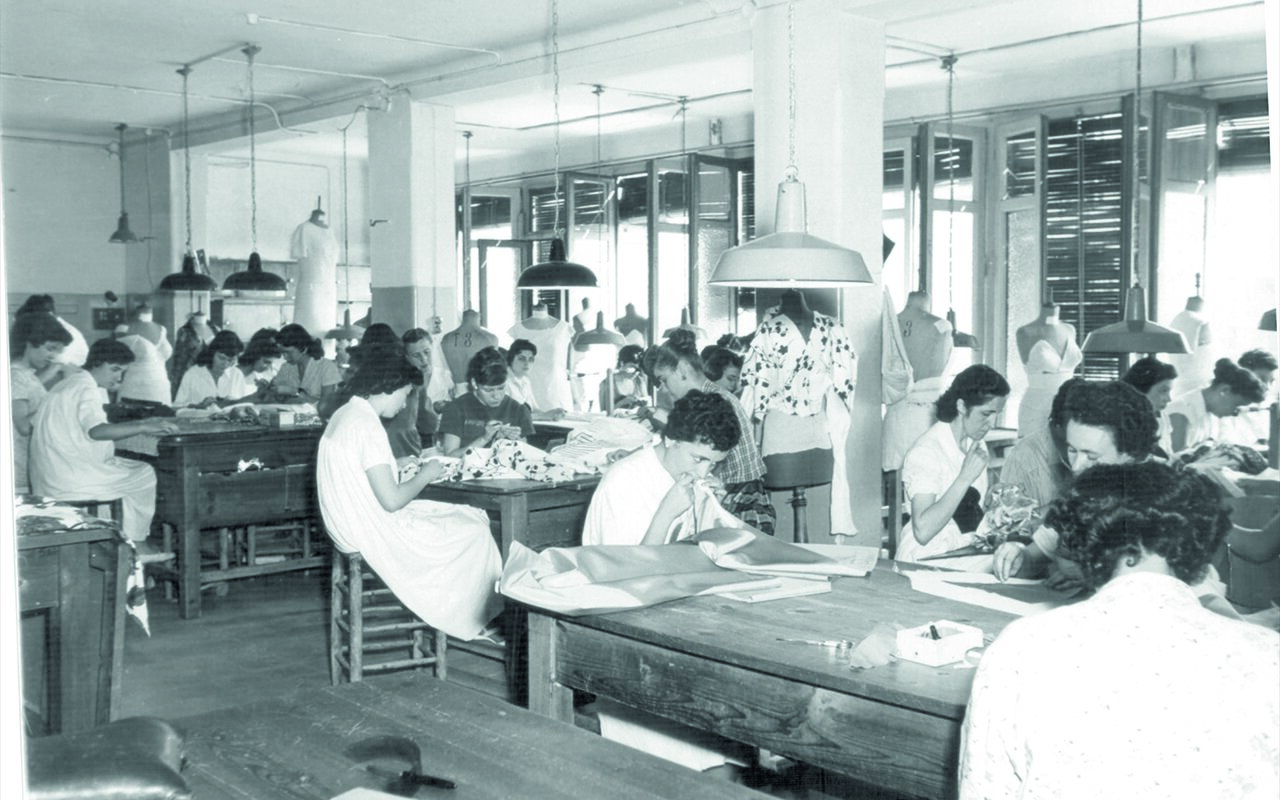
All the dresses recreate the beauty of the craftsmanship of Santa Eulalia characterized by a very refined pattern and quality fabrics perfectly turned into elegant designs far from the stridency, which maintain contemporaneity over the years. There are designs that bear witness to a time of celebrations: dances, cocktails, evening gowns or operatic premieres at the Barcelona Lyceum, brought together the women of the time in society and were special occasions to wear a Santa Eulalia dress for the first time. . The evolution of the models, according to the trends of each decade, feminine details or fantasy elements are present throughout the exhibition.
On the other hand, the creative and scenographic direction has been carried out by Nacho Alegre, who is in charge of the Apartamento Studio project. Alegre has also been the editor of the catalogue that accompanies and collects the content of the exhibition in an absorbing retrospective that brings together fashion photographs, historical archive material and previously unpublished objects from private collections. The catalogue is published in a limited edition of 4,500 copies and can be found both in Palau Robert and Santa Eulalia and in selected bookstores. The free access exhibition will remain open until the 22nd January, 2023.
Santa Eulalia, today
Today Santa Eulalia maintains its status as one of the most influential fashion stores in the sector internationally and continues to be a benchmark for luxury in Barcelona. The establishment, which each season offers the collections of the international designers most desired by the new generation of consumers, is currently led by Luis Sans, a member of the fourth generation of the owner family, and his wife Sandra Domínguez. This marriage, which is also a business one, adapts to the new times to maintain the artisanal essence and the good knowledge of Santa Eulalia, without losing sight of the latest trends that are triumphing in the market.
Viernes 04 noviembre 2022
Sorry, this entry is only available in Español.
Sorry, this entry is only available in Español.
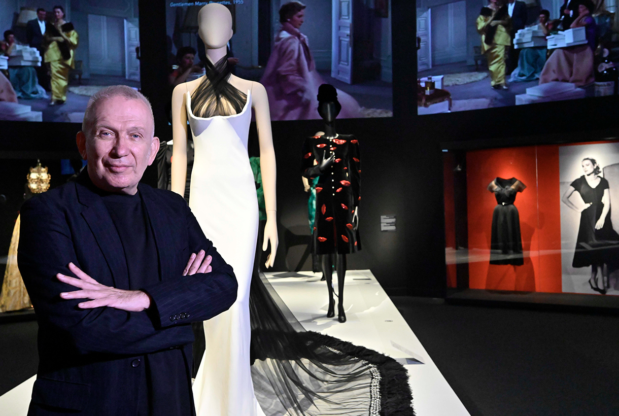 El diseñador de moda y director artístico de la muestra, Jean Paul Gaultier, en CaixaForum Barcelona.
Jean Paul Gaultier is the enfant terrible of fashion in his own right. Although he is no longer creatively spearheading his namesake brand, now spearheaded by his successor Olivier Rousteing, Gaultier will always be Gaultier. A self taught genius. Transgressive and irreverent, but from his kind facet. A free verse of fashion that he revolutionized in the 70s, 80s and 90s exalting difference, celebrating diversity, breaking stereotypes and exploring the beauty of the margins. Gaultier was not interested in the classic or the conventional, but he did investigate how he could empower the women of his time through clothing. His designs were the perfect armor for a new generation that wanted to express their strength, dynamism and freedom through clothing. One of Gaultier’s icons, the pointed corset worn by Madonna on the ‘Blonde Ambition’ world tour in 1990 was created thanks to the influence exerted by the woman who has most inspired him: his grandmother and her extensive lingerie wardrobe reminiscent of the enfant terrible from his childhood.
This iconic garment, among others, can be seen live in the new exhibition premiered at CaixaForum Barcelona: ‘Cine y moda. Por Jean Paul Gaultier’. An exhibition co-organized by the La Caixa Foundation and La Cinémathèque francaise that proposes an eclectic journey that intertwines cinema and fashion with great creators and artists, from the personal point of view of the controversial creator, as a costume designer and as a movie buff. For Gaultier there is no cinema without fashion, and vice versa.
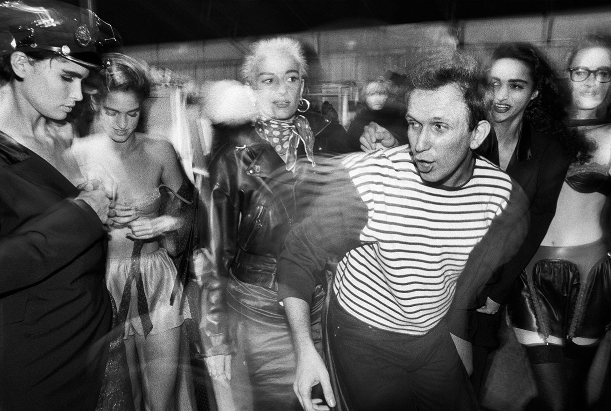
Backstage, desfile de Jean Paul Gaultier, colección Barbès, 1984, prêt-à-porter de mujer otoño-invierno 1984-1985. © William Klein.
Divided into five areas, the author’s exhibition where Gaultier captures his gaze, reviews the presence of the world of fashion in cinema, the collaborations of great designers in film costumes and the creation of male and female archetypes. The enfant terrible of fashion emphasizes key aspects that are present in his career as a designer such as female empowerment and pays attention to heterodox figures of male and female warriors, androgynous and transvestites, as well as the influence of rock, punk and and queer that have marked fashion so much in recent years.
After passing through Paris and Madrid, the exhibition, dedicated to the memory of the filmmaker Tonie Marshall, brings together in Barcelona a heterogeneous set of more than 100 pieces of clothing that are shown in nearly 70 looks, fragments of more than 90 films and 125 graphic representations (posters, sketches, frames and photographs), between originals and reproductions, mostly from the prestigious collection of La Cinémathèque Française and complemented by works from more than twenty national and international lenders.

Díptico Marlene Dietrich. Masque & Narcisse, 2021. © Bastien Pourtout i Edouard Taufenbach, colección Pierre Passebon, 2021.
Among the nearly 70 iconic film looks are dresses worn by Grace Jones in ‘A View to a Kill’ (1985), Catherine Deneuve in ‘8 Women’ (2002), Grace Kelly in ‘Rear Window’ (1954); Sharon Stone in ‘Basic Instinct’ (1992); Marilyn Monroe in ‘Nude Eve’ (1950); ‘Tay Garnett’s Seven Sinners (1940); Brad Davies in ‘Querelle’ (1982) or as we said at the beginning, the famous pink corset that graced Madonna on her world tour.
Also, the ‘Superman’ suits (which Christopher Reeve wore); ‘The Mask of Zorro’ (1998), with Antonio Banderas; the shorts that Sylvester Stallone wore in ‘Rocky’, or Victoria Abril’s wardrobe in ‘Kika’ (1993) which, together with that of other films such as ‘Bad Education’ (2004) or ‘The Fifth Element’ (1997) , was designed by Gaultier. In this line, haute couture designs by Coco Chanel, Pierre Cardin, Hubert de Givenchy, Manuel Pertegaz, Balenciaga and Sybilla, among others, are also on display.
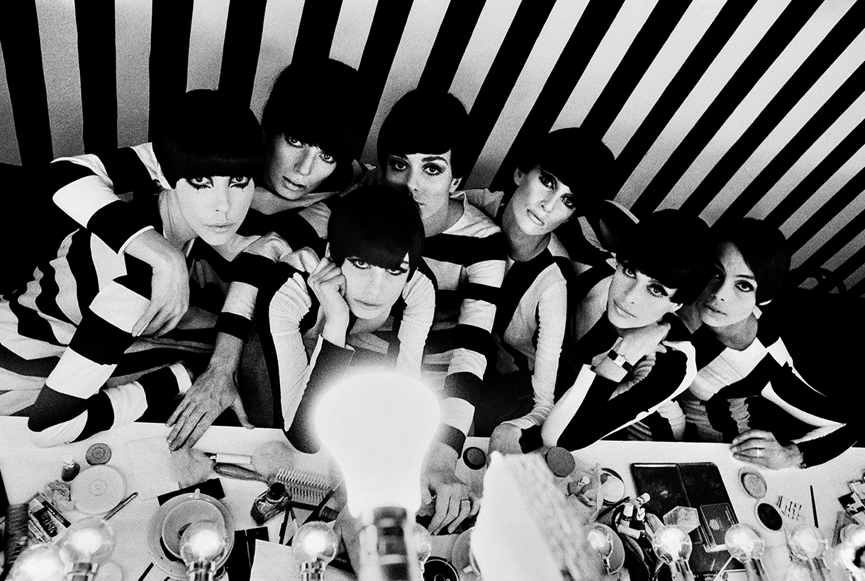
Fotografía entre bastidores de la película ¿Quién eres tú, Polly Maggoo? 1966 © William Klein/ Films Paris New York.
Two films that mark the beginnings of Gaultier
Among all the parade of looks, projections and key garments, there are two films that take pride of place in the exhibition and have to do with the origins of the designer. The first would change the course of his life. Gaultier was then 13 years old when he first saw Jacques Becker’s ‘Falbalas’ (1945). A melodrama starring a seamstress and set in the hustle and bustle of a sewing house during the postwar period. This film is the “culprit” of his desire to dedicate himself to the world of fashion. From there he began to design figurines that he would later transform into designs. The other film that has marked the French creator has been ‘Who are you, Polly Maggoo?’ (1996) by William Klein, who in the film analyzes his time with a keen eye and lays bare the then incipient reality shows. It is a satire of the egocentric delusions of the world of haute couture, where at that time the space age dominated and everyone from the misanthropic couturier to the most versatile editor-in-chief fell.
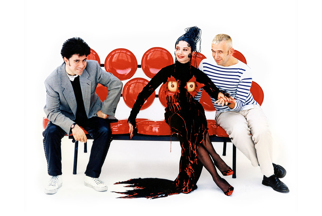
Pedro Almodóvar, Victoria Abril y Jean Paul Gaultier en el plató de Kika, 1994 © Nacho Pinedo.
Moda y arte, actividades en paralelo
The exhibition ‘Cinema and fashion. By Jean Paul Gaultier’ will be open to the public until October 23. On this occasion, to investigate the close relationship between fashion and art, CaixaForum Barcelona has organized a cycle of conferences in September that proposes dialogues on how art and fashion influence each other: is art the source of inspiration for fashion or are fashion codes the ways the artist chooses to develop his poetics? The French philosopher and sociologist Gilles Lipovetsky, the architect Manuel Blanco, the journalists Isabel Margalejo and Carlos Primo, the popularizer Charo Mora (responsible for the cycle) or the model Sita Abellán, are some of the names that will illustrate the links between fashion and art, architecture, literature and music.
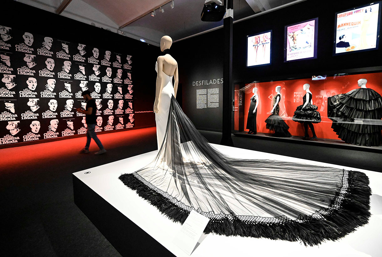
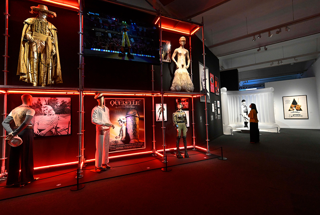
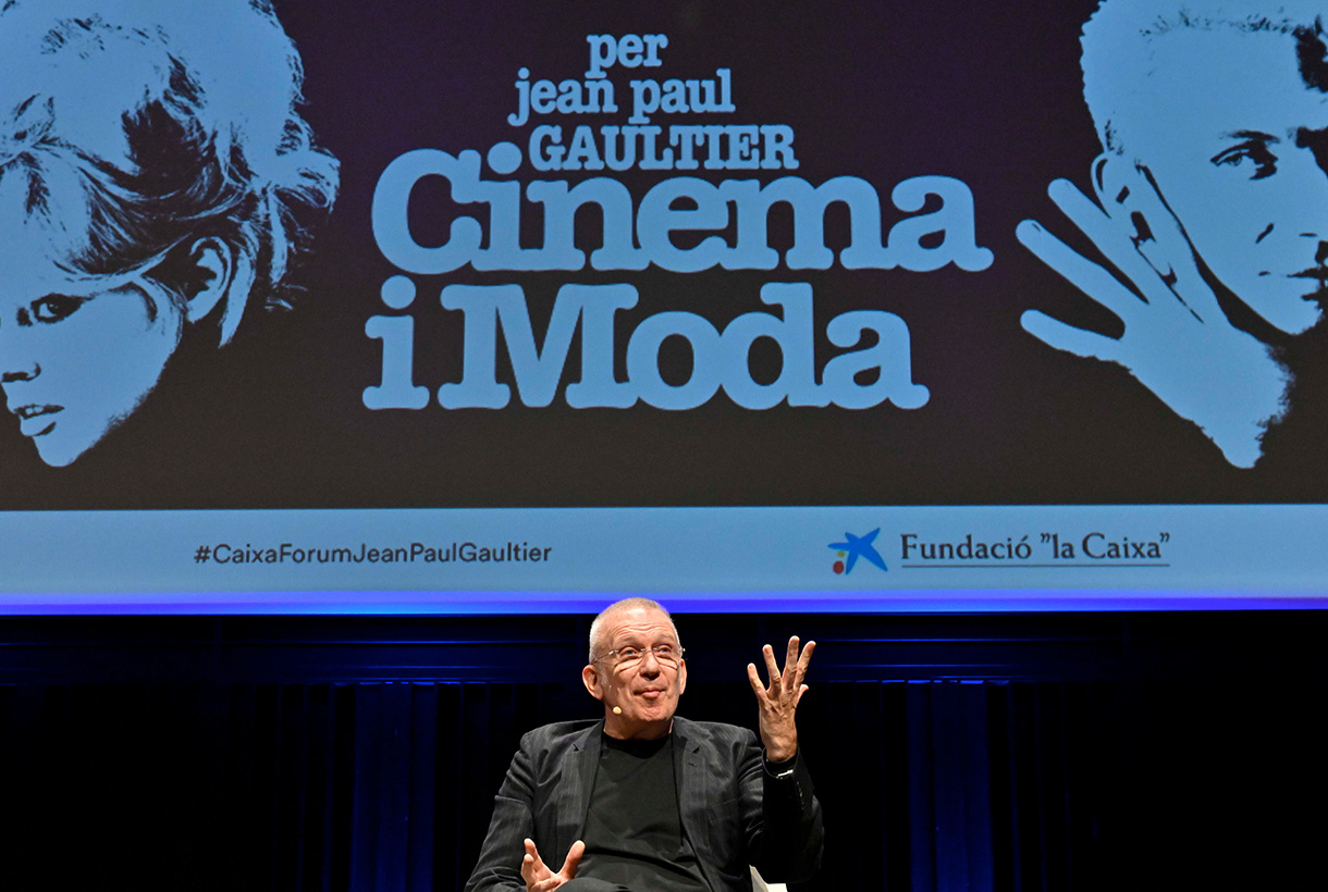
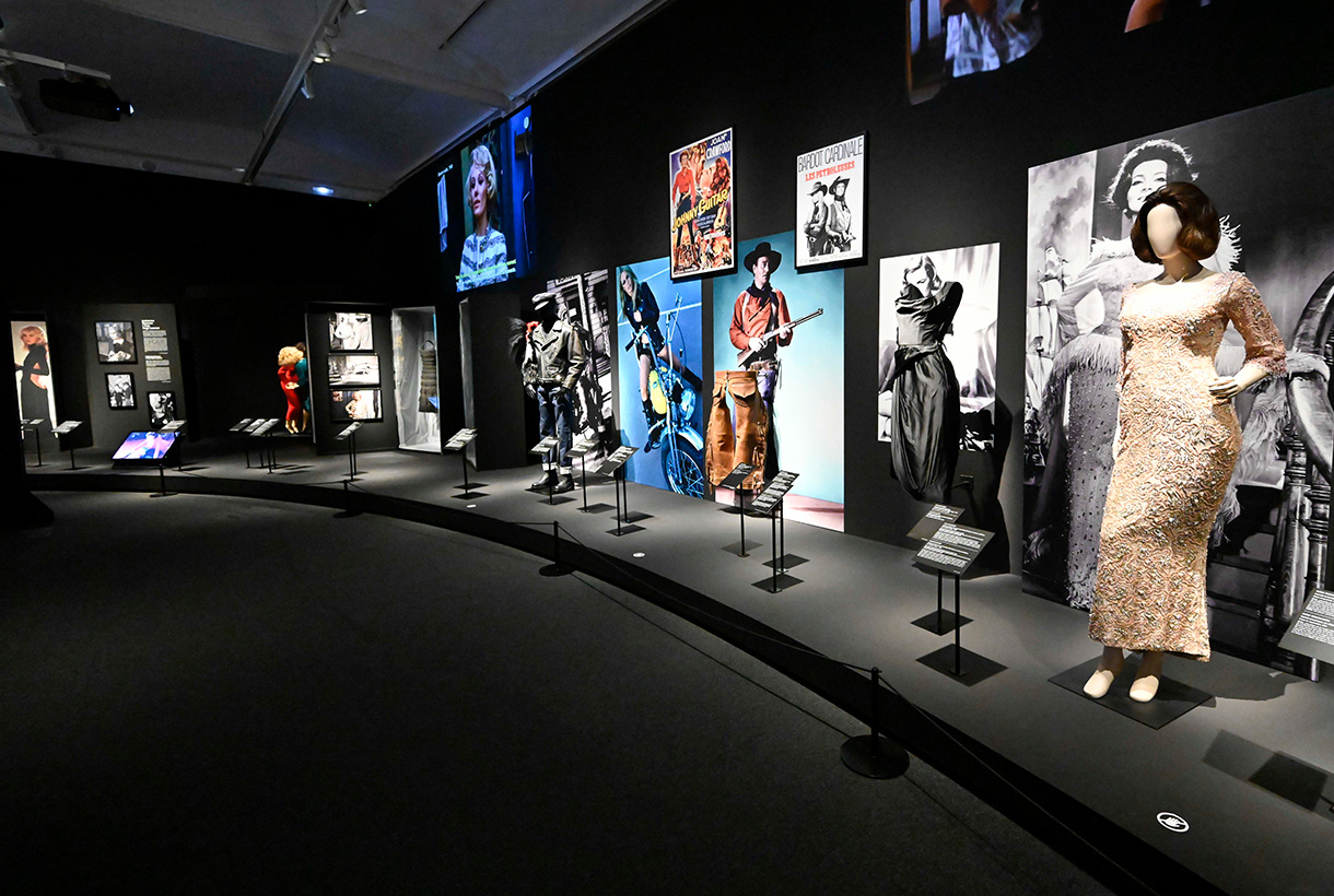
Detalles de la exposición ‘Cine y moda. Por Jean Paul Gaultier’
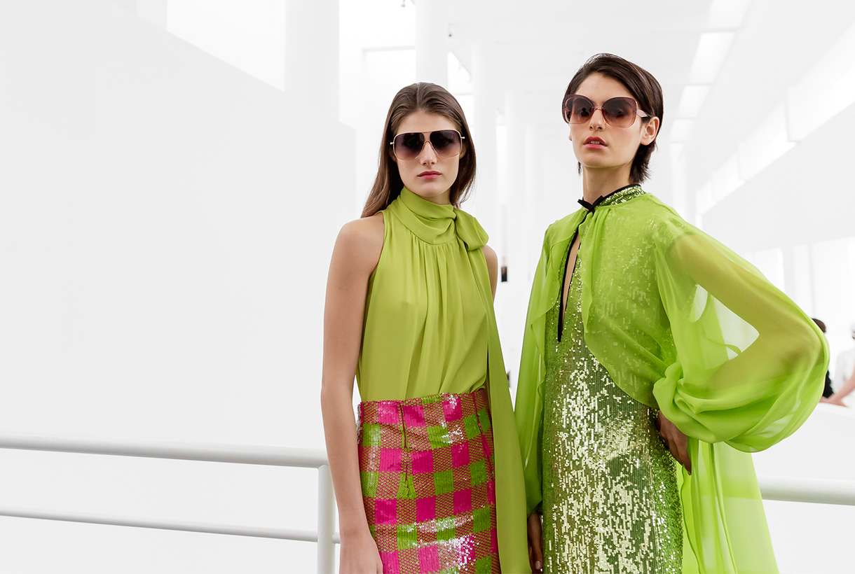
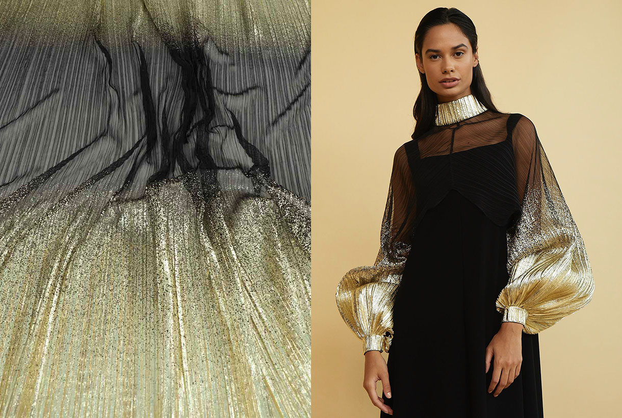
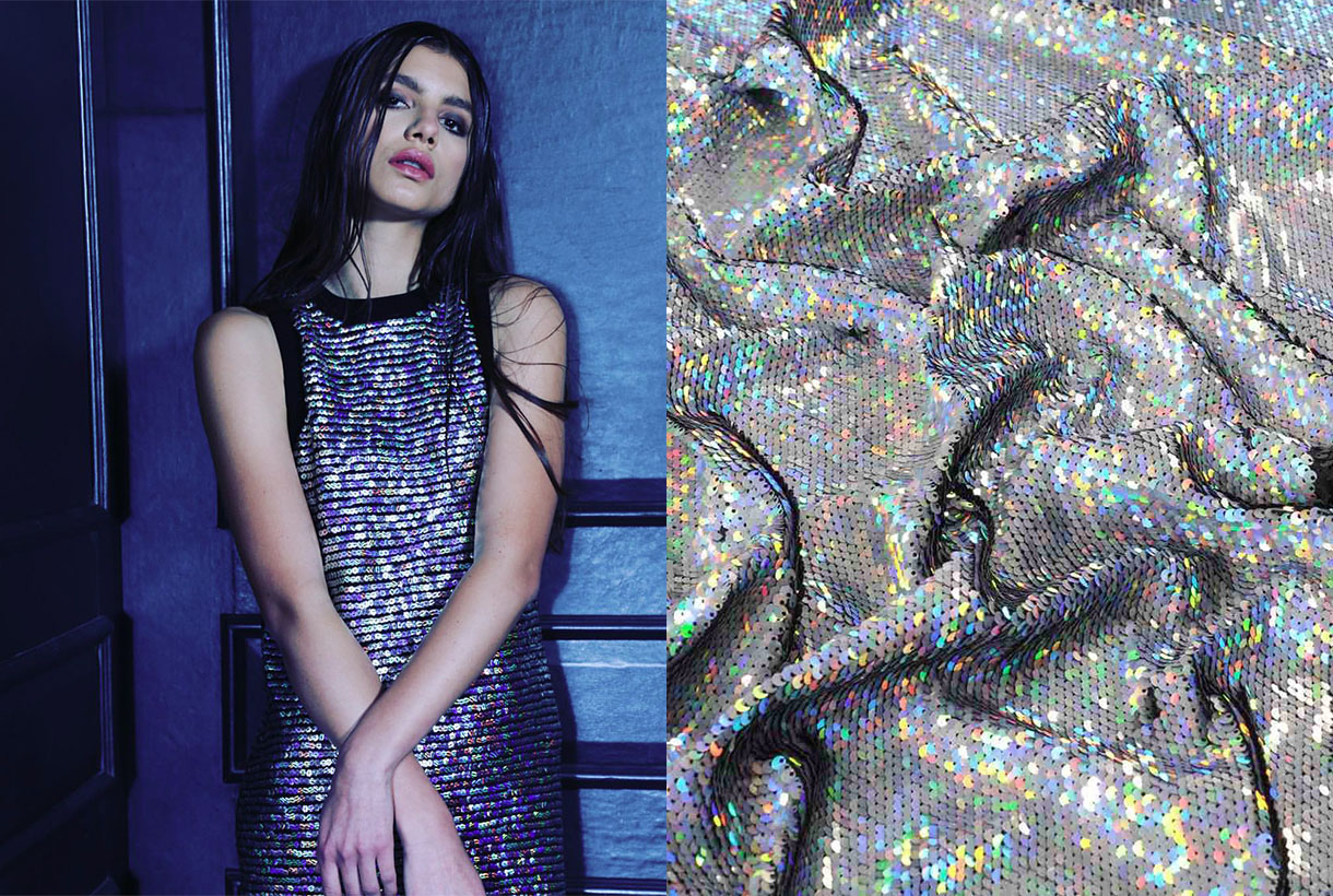
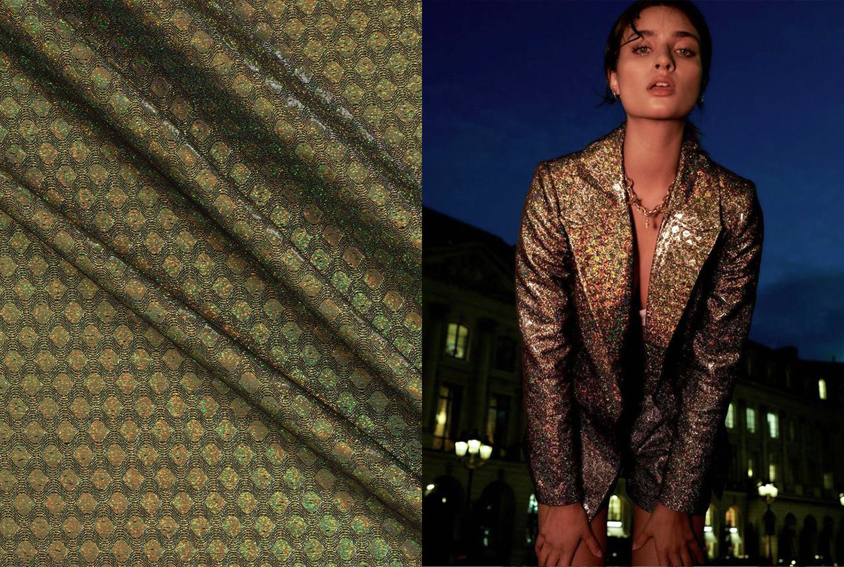
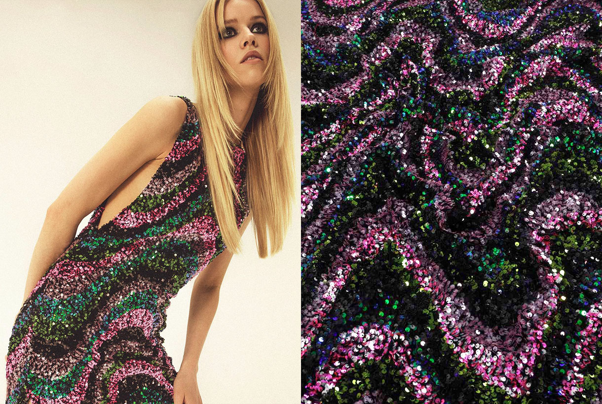
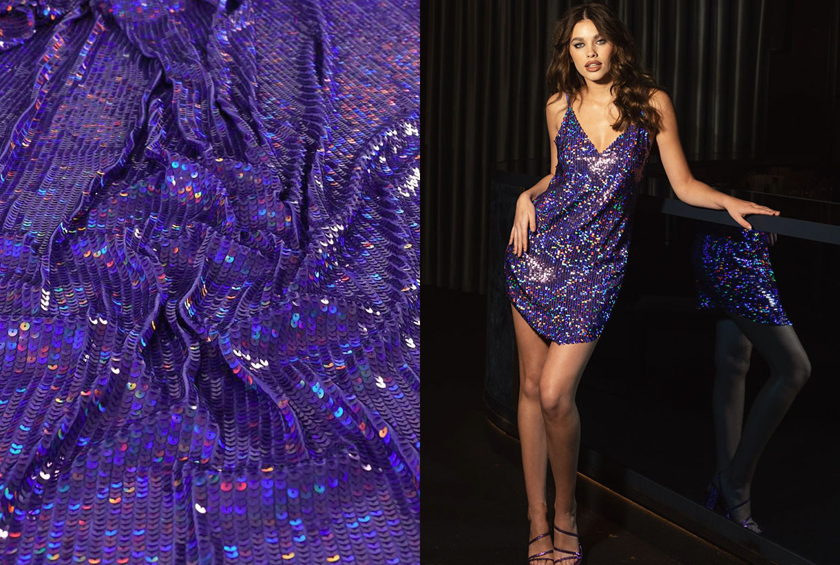
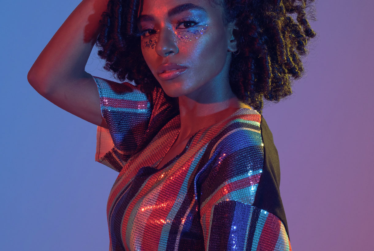 The summer season begins with a trend less and less reserved for special occasions: sequins, which with their glitter catch all eyes. Disconnected from their comfort zone, these small metallic sheets sewn into the fabric become the protagonists of the moment together with other materials that dazzle on their own, such as iridescence or satin finishes that produce a more discreet shine.
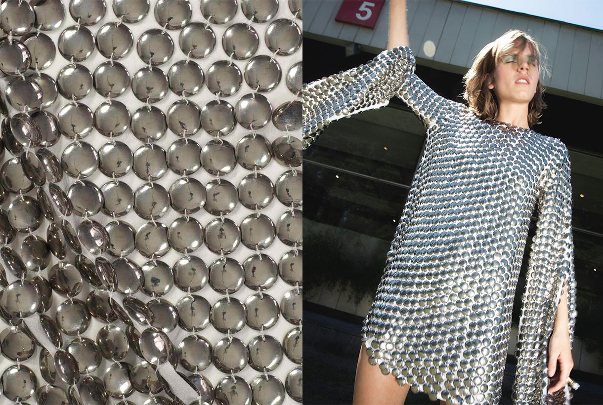
On this occasion, sequins, along with fluorescent colours and transparencies, have featured on the fashion shows of the SS22 collections of Tom Ford, Michael Kors, Loewe, Valentino or Rodarte and are set to invade the street through resplendent outfits. The key to sequins, until now reserved for specific celebrations such as New Year’s Eve, is that there are many options to show them off successfully in garments to wear at all hours. Day and night without paying attention to brightness or excesses. From the rock & roll looks of Saint Laurent, to the sophistication of Chanel and Celine that combine them with tweed or in key details such as Gucci, Balmain or Paco Rabanne, creator of the iconic metallic mesh.
From Tutankhamun to Leonardo da Vinci
The origin of sequins dates back to Ancient Egypt, where small gold and silver discs were sewn onto the clothes of the pharaohs and their consorts as a sign of wealth. In fact, it was during the discovery of Tutankhamun’s tomb in 1922 that archaeologists found, among other objects, clothing decorated with shiny metal disks. A time that coincided, in turn, with the metallic fever of the Roaring 20s, embodied by the costumes of the flappers and the Egyptomania that unleashed this fact, which inspired the designers of the time to design outfits with metallic discs to stand out on the dance floor.
In English, the word sequin (sequin, is linked to the Arabic term sikka (coin) and al zecchino, a golden coin minted in Venice during the 13th century. The first sequins were coins sewn onto clothing, for reasons ranging from displaying wealth and status to making life difficult for thieves. It is also said that Leonardo da Vinci, one of humanity’s great inventors, devised a machine to produce small metal discs. A prototype that was never manufactured, but that already establishes the age of the sequin.
Later, in the 17th and 18th centuries, wallets and cases began to be used, and pockets appeared. Therefore, in men’s and women’s clothing it was no longer necessary to sew the coins to the clothes to keep them safe, and the small metal disks became a purely aesthetic ornament.
The sequin shines in the 20th century
Sequins as we know them emerged in the 20th century. Its sparkles began to adorn the rich dresses of the Belle Époque, added touches of light to the creations of the 1920s and returned to adorn the garments of the sensual 1950s. Actresses like Marilyn Monroe or Rita Hayworth succumbed to the sparkle of sequins with innumerable outfits that shimmered on and off the celluloid. A sparkly dress from the era that connects with today is the iconic beige dress that the blonde diva wore when she sang ‘Happy Birthday’ to President John F. Kennedy in 1962. That same crystal-covered gown was worn by Kim Kardashian in the Met Gala 2022.
The materials used to create the sequins also changed over time. The metal of the first prototypes evolved into gelatin in the 1930s. The latter material was lighter, but it was brittle and did not withstand changes in temperature well. Later, they became plastic, flexible and resistant to washing. Thanks to this change, sequins became more practical, less expensive and more affordable than their previous versions.
An ornament linked to music, movement and excess
With the innovation of new materials and the triumph of prêt-à-porter in the sixties, the use of sequins became popular in more common clothing that became daring, lively and colourful. The objective? Adorn the silhouette, empower it and become the center of attention. This manifested very well in the seventies with disco fever. In the countercultural movements, sequins and all shiny fabrics became a symbol of rebellion against the system they considered serious and boring. That’s when the glam rock era began . A sensual, androgynous, eccentric and revolutionary movement whose symbol was David Bowie with his iconic alter ego: Ziggy stardust . The man with the stars, and other singers of the time, wrapped themselves in lamé suits, sequins and lots of glitter.
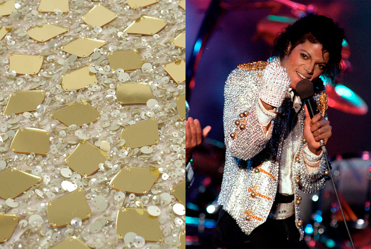
Shiny fabrics, with sequins being the favourite, shone again in the 1980s. Michael Jackson was responsible for bringing glitter and pharaonic garments back to life with memorable performances where the King of Pop donned suits covered in sequins and rhinestones.
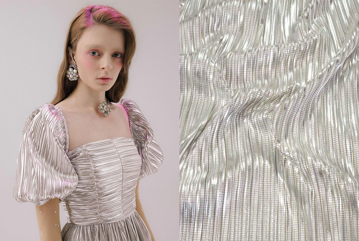
Nowadays, sequins, as well as other shiny fabrics, are subjected to the ups and downs of cyclical fashion. Its material is still based on plastic, now mostly recycled, but with special coatings. What has not changed is its meaning. Sequins spark the imagination, become visible and illuminate people’s daily lives. They are an element of escapism, something to cling to other fantasy worlds. And we already know that fashion is a dream and at Gratacós we like to make you dream through our sequin fabrics. Here we leave you a selection of the most innovative so that you shine with your own light.
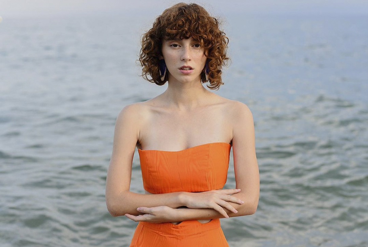 Orange is a more common colour than we think, although its role in history has always been relegated to the background. This hybrid shade between red and yellow provokes an immediate reaction when recognized. It activates, stimulates, surprises and entertains. Not surprisingly, this striking colour is always associated with the unconventional. Its uniqueness has played an important role in art, history and design. Since ancient times orange was present in Ancient Egyptian rituals, it has been considered a sacred colour in various Asian cultures and has come to fall in love with artists such as Vincent van Gogh and Toulouse-Lautrec who used orange in their paintings. We reveal some anecdotes about this exotic colour, often underestimated.
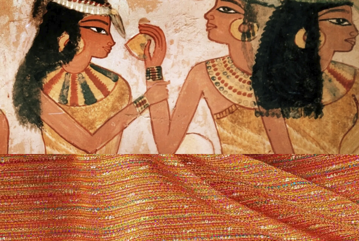
Orange in ancient times
The ancient Egyptians were the first to use a shade between yellow and orange that they extracted from the mineral realgar to decorate their tombs. The pigment that was extracted was toxic – it contains arsenic – and was used by the Chinese to drive away snakes, as well as being used in the country ‘s traditional medicine . Another related mineral, orpiment was also used as a pigment and was considered a highly valued trade commodity in ancient Rome. In the Middle Ages the orange pigment was used during the Middle Ages in manuscripts.
In Asia, orange was considered a symbol with different interpretations depending on the culture of each country. This tonality is present in many of the Asian religions. In Buddhism, orange is a sacred colour: it is considered the tone of enlightenment and the search for knowledge and for this reason, the clothing of Buddhist monks is traditionally of this colour. For Confucianism, orange symbolizes the colour of transformation. In Hinduism, the dress worn by Krishna – one of the most revered personified deities – is always in this brilliant hue. The name of the colour in India and China derives from saffron which in turn was the most expensive dye in the two countries. These Asian powers considered that orange represented the perfect balance between the perfection of yellow and the power of red.
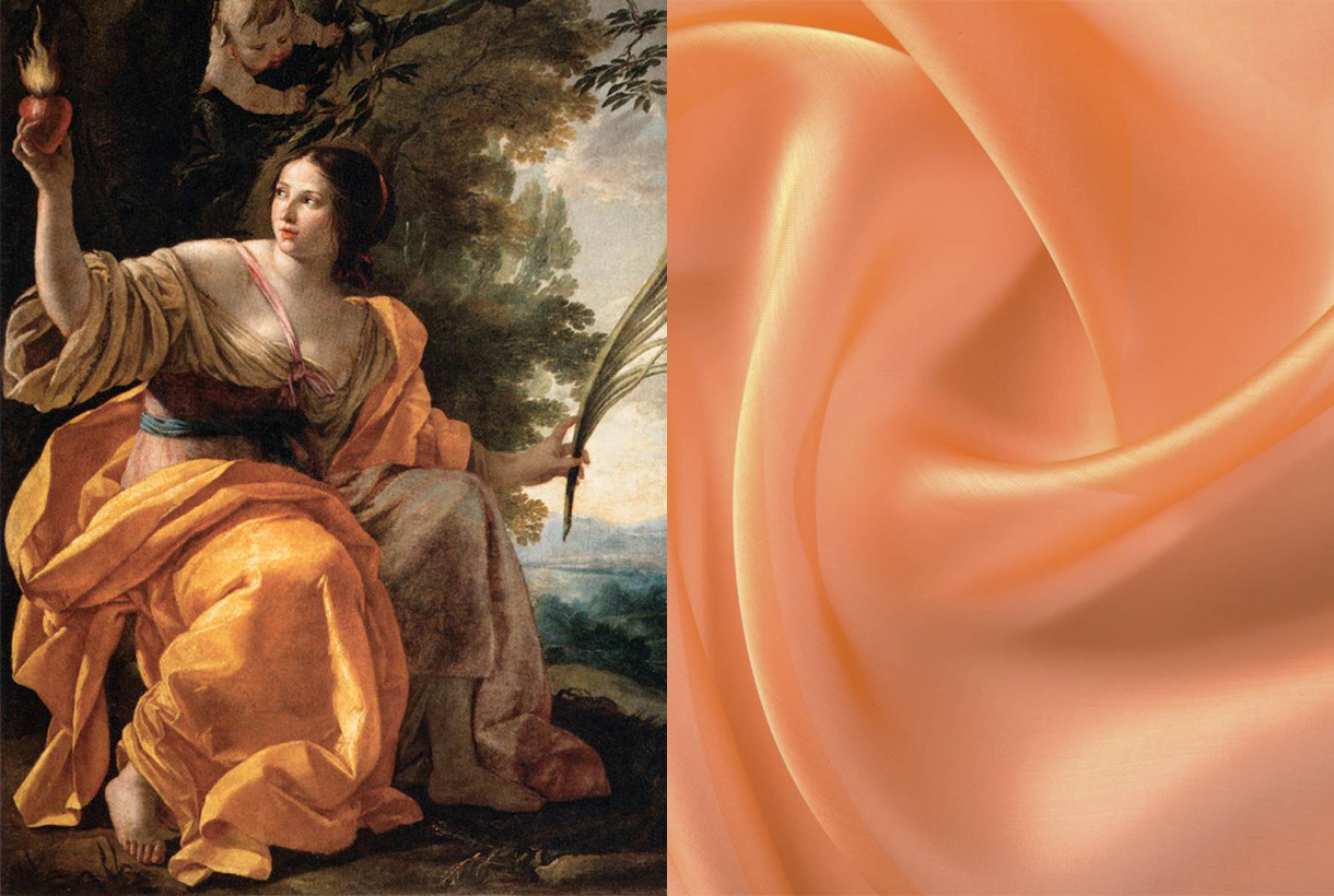
A nameless colour
In Asia, orange was a revered hue. On the other hand, in Europe the colour did not have a name until the 16th century when Portuguese merchants brought from India and China the most exotic fruits of the time: oranges and tangerines, tinged with a colour that Europeans called reddish yellow until then. This striking colour imported from the Far East via orange trees was named after the fruit itself. Orange in Spanish, orange in english, arancia in italian and orange in Portuguese.
Another curiosity: today orange is a colour that connects on a psychological level with the world of flavours and is pleasing to the eye when linked to food. Peaches, apricots, mangoes, carrots, prawns, prawns, salmon, pumpkins, curries… Orange can be an appetizing colour, right?
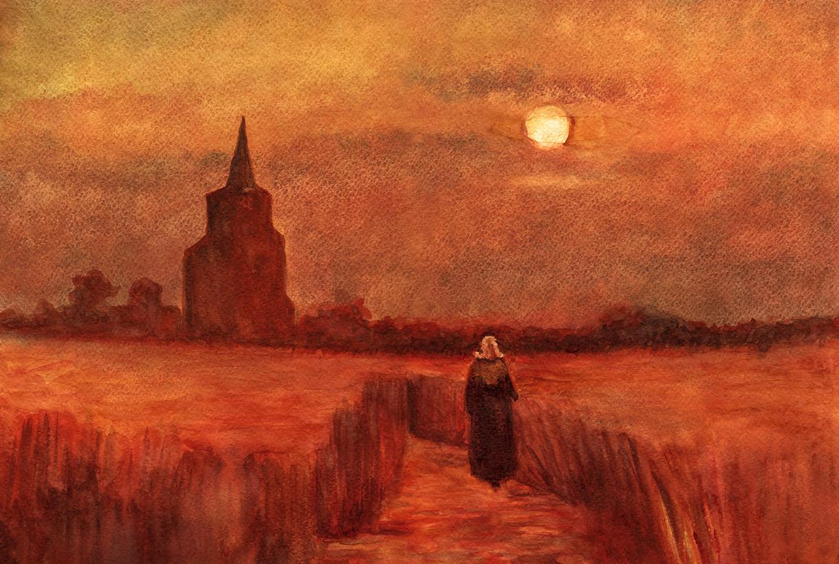
Orange in art
In Western European art, the use of orange became common as from the 19th century, when the first synthetic orange pigment called chrome orange was produced. This tone was a favourite of Pre-Raphaelite and Impressionist painters, who made use of colour to capture the effects of natural light. Artists such as Monet, Gauguin, Renoir, and Toulouse-Lautrec used colour extensively to elicit feelings of warmth, escapism, and playfulness. If there is an artist who was directly linked to the colour orange, it was Vincent van Gogh, who through painting mixed his own shades of orange and used them in contrast to the blues and purples characteristic of his work.
A seasonal colour in 2022
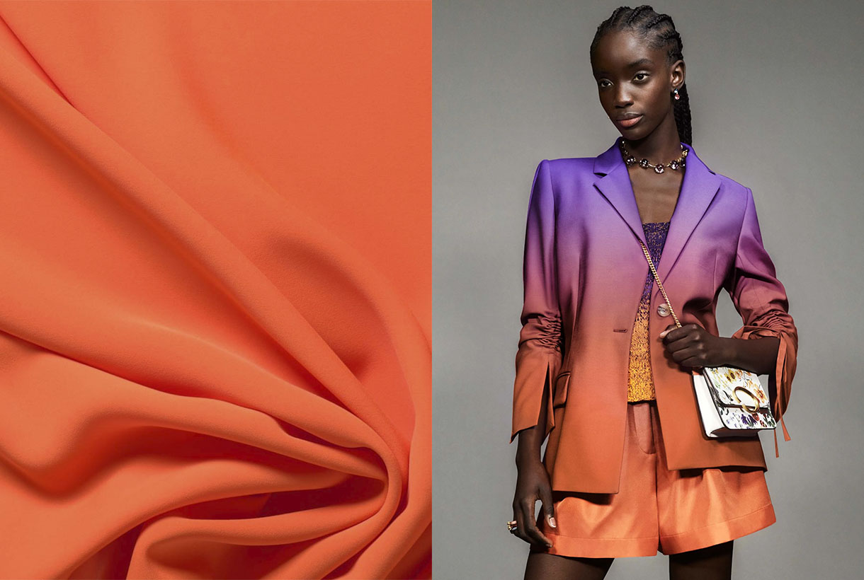
Although Pantone crowned Very Peri lilac as the colour of the year in 2022, the truth is that the fashion industry seems to have set its sights on a more intense and vital hue to lift the spirits. On catwalks through the summer and pre-fall collections , on the street style of fashion weeks , in the windows of the big firms… orange has emerged as one of the star shades of the season in all its possible ranges.
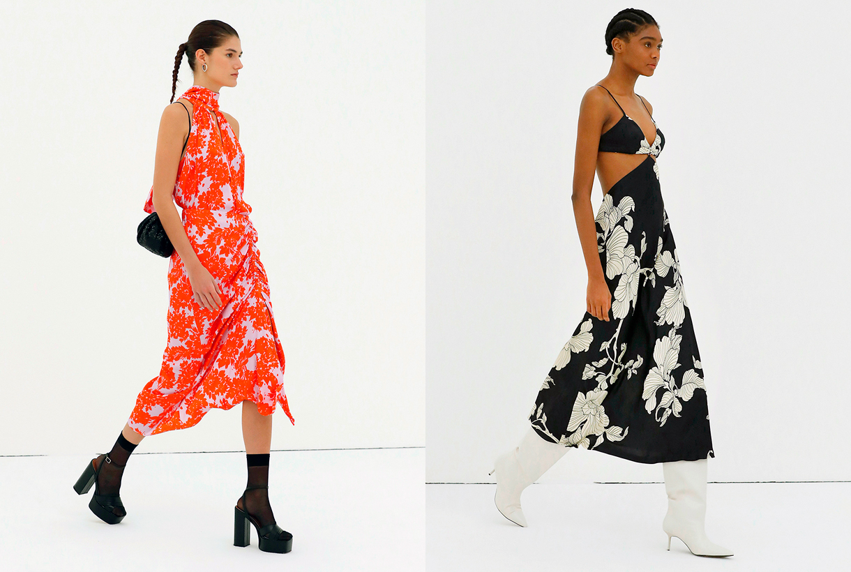
Orange has been present in the current SS22 collection by Christian Siriano, Collina Strada or Proenza Schouler, transmitting optimism and joy to the clothes presented, but it is in the transition collections that it gains more strength. For example, Erdem is one of the firms that has opted for this colour, but in its softer versions such as boiler orange for satin dresses with black motifs and looks that play with textures and use the same tone. For its part, Chloé has opted for pastel shades giving it a less aggressive look. Oscar de la Renta has given orange reddish nuances, always accompanied by other colours or in bag format. Instead, Gucci has opted this season for a vitamin orange that dyes a multi-layered skirt in the same tone.
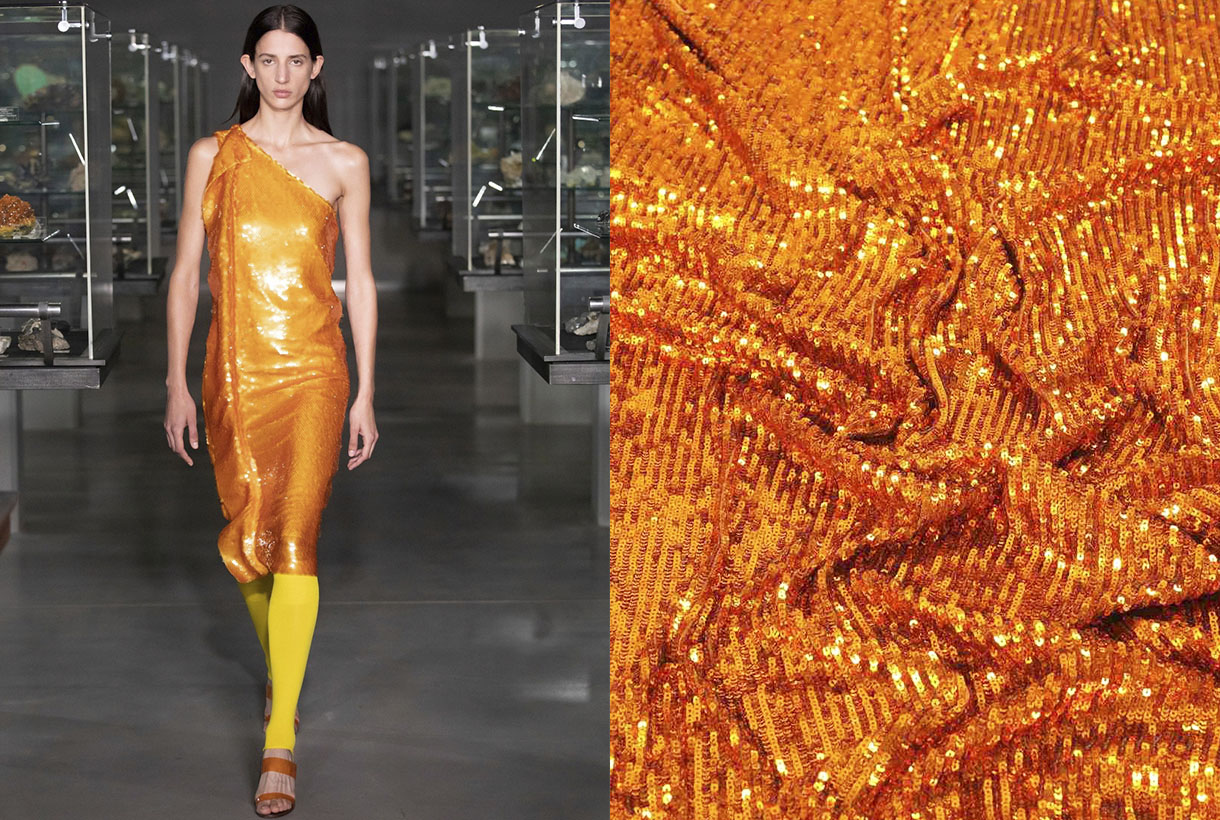
The namarillo is once again stepping strongly on the catwalks. A hybrid shade halfway between orange and yellow that became popular in 2016 among the spring collections and caused a furor due to its showiness and luminosity, being the summer shade at the time. Now Prabal Gurung has recovered this vitamin tone and has incorporated it into a large part of the looks of its latest collection. In a slightly more subdued tone, Staud has turned it into knitted sets with microshorts and Chanel into jumpsuits that are the hallmark of its creative director, Virginie Viard .
How to combine it?
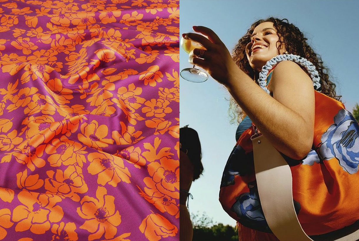
Sometimes what is seen on the catwalk does not necessarily end up being worn on the street. And orange seduces at first sight, but it is not an easy colour to wear nor is it discreet. Still, the street style of the fashion prescribers or the looks exposed by the celebrities in the network carpets are the best reference to demonstrate the chromatic possibilities that orange has in the wardrobe.
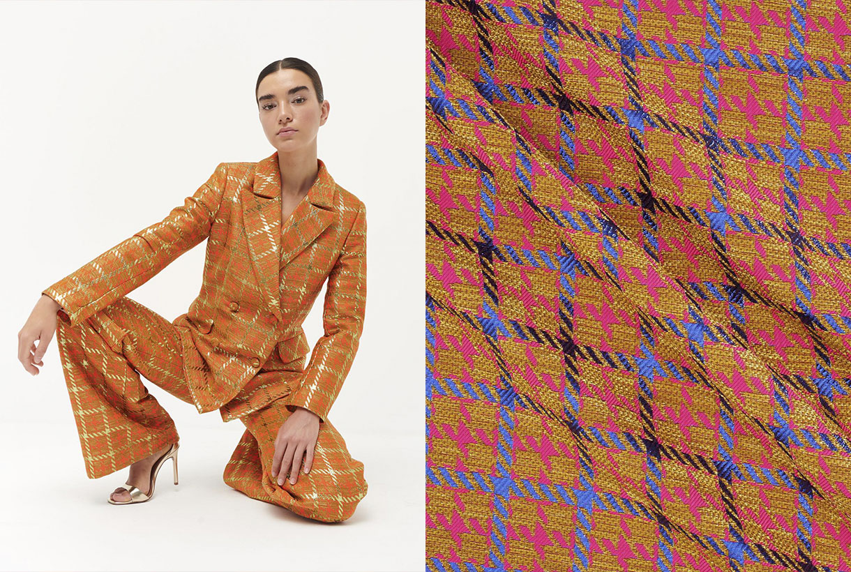
The easiest way to get started in the colour orange is to do it in small doses through a single garment or simply relegating it to accessories. The tones that always go well with orange are the neutral ones: white, black and beige tones or makeup that creates a base effect. On the other hand, if your level of daring is high, orange looks great in a total look through dresses, jacket suits or combinations of tops with skirts. As for risky combinations that enhance this vitamin colour, there are some that are often repeated on the catwalk that flow due to their contrast: orange with fuchsia for maximum daring; orange with intense green to play with the complementary ones; orange with light blue or pale pink to reduce intensity; orange with purple to claim prominence; orange with gray for rainy days, or obviously, orange with orange for a harmonic visual game. This colour accepts more shades than you would have imagined!
Finally, we show you some of our most vitamin-rich fabrics for the new season. What do you imagine designing with them?
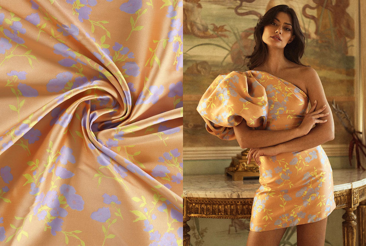
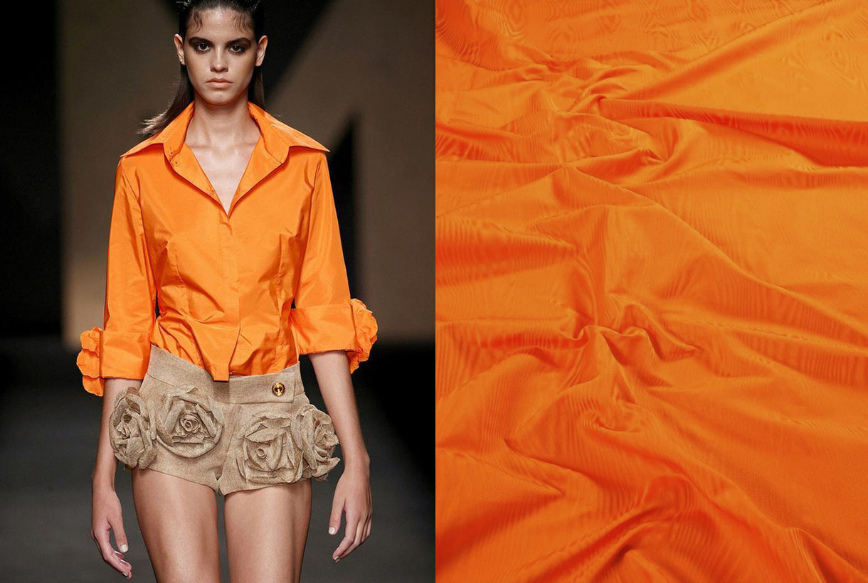
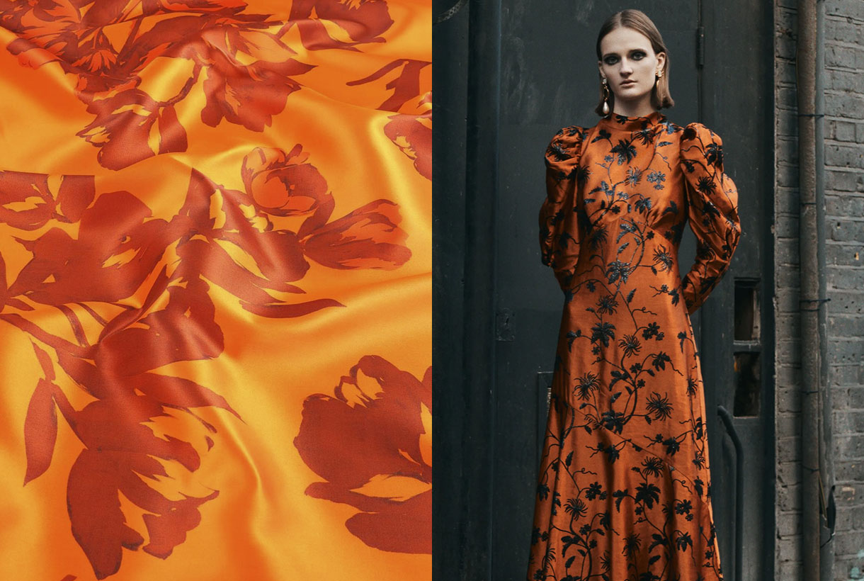
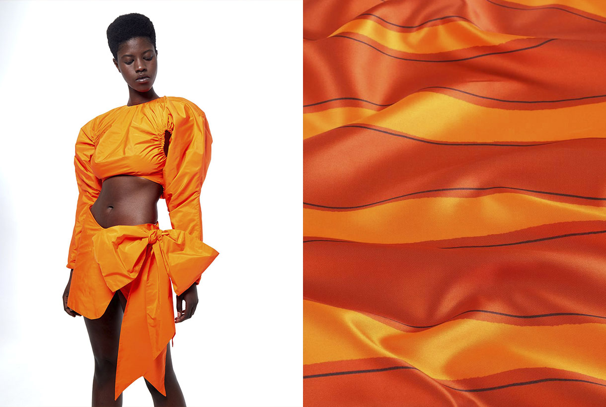
 April is the month of fashion in Barcelona. Prior to a new edition of Barcelona Bridal Fashion Week, a week ago saw the start of the latest edition of 080 Barcelona Fashion, with 22 virtual parade shows and designers who presented the new season in the Macba, within the rationalist building designed by the architect Richard Meier. A new staging of the imaginative creativity exhibited by brands via Fashion Films, seasonal collections that can be followed visually on the website of the Catalan catwalk. Gratacós has also followed the latest fashion trends to check once again how our fabrics have taken shape thanks to the designers who habitually trust in us: Avellaneda, Eiko Ai, Menchen Tomás, Yolancris and Victor Von Schwarz. We review the new creations and some of the key looks.

Summer nights
Faithful to his hedonist philosophy the dandy Juan Avellaneda transposes us to tropical latitudes in his new summer collection to continue exploring the most relaxed elegance, inspired by warm paradises in the north of Africa. The central feature of the creation is via natural fabrics, luminous or fiery shades such as pink, orange and coral, and patterns that in general lack rigidity. There are also several models of jacket, the fetish garment of the brand of this Barcelona designer, which oscillate effortlessly between male and female wardrobes. The prints move away from the banal to embrace a Mediterranean version of delicateness that gives character to ethereal skirts and smoking-jackets which rebel against the boring. The garments evoke the practical elegance of Saharan and classic tailoring by those mid-century holiday-makers who immortalized Slim Aarons. Blouses caress the body and intertwine. Trousers dance and dresses cling to the skin or deploy fabulous volumes and flyers, another 100% Avellaneda detail. In Au réveil il était midi all the clothes combine with everything, they harmonize and flow for a perfect summer.

The warm sunlight
Eiko Ai dazzles us with Lucid Dreams, a radiant collection inspired by the vitality of solar energy. In addition to this inspiration Glò Lladó’s formula remains firm in each of her designs and consists of promoting feminine beauty by playing with delicacy and sensuality. And how does she achieve it? Via vaporous silhouettes, ethereal fabrics which give glimpses of skin and via evocative stamping that mixes sophistication without abandoning the casual and cosmopolitan spirit of this Barcelona company. The new summer creation from Eiko Ai enhances the kimono dresses, fluid blouses and two-piece combinations featuring transparencies, subtle glitter and faded prints with other florals that pay tribute to that mystical vision of woman as an urban nymph. The palette of the collection goes for positivism, summer life and golden light via intense oranges playing with the range of yellows, pinks and whites and brushstrokes of intense blue sky.

Class is class
For his part, Menchen Tomás reminds us of the importance of inheritance in Old Money, a collection that is inspired by the way of dressing and living of American families who have managed to pass fortune, class and status from generation to generation. An aesthetics characterized by sophistication, the fusion between the classic and the contemporary and timeless elegance, far from the culture of logo and ostentation. With that interpretation the Barcelona company brings together garments such as dresses and midi-skirts, pinned wide trousers, voluminous poplin shirts with other sporty garments that could be used for a day in a country-club or dinner in a garden on a summer night. Regards fabric details there is no shortage of silks, organzas and tulle flowers in a vibrant chromatic palette: blue, lime green, yellow, fuchsia-pink and bright-red.

Fashion without gender
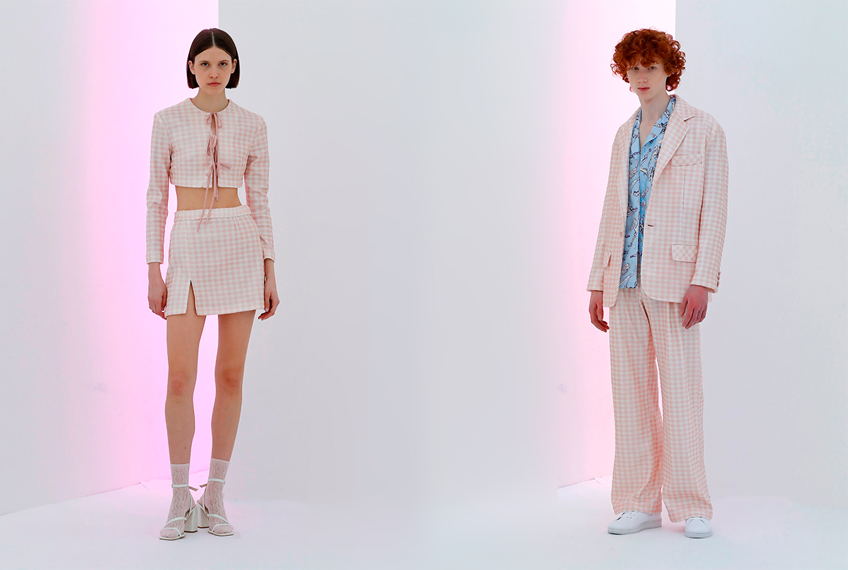
Victor von Schwarz is part of the new generation of young talents that bring creativity and freshness on the 080catwalk. This time, the designer Barcelona presented a collection inspired by the Asian Mafia films of the 80s and 90s, whose centre of operations was the red neighbourhoods of cities such as Taipei or Hong Kong. Victor von Schwarz is committed to fashion without gender. Therefore, the designer, inspired by oriental clothing, creates open pieces, which anyone can wear, regardless of sex or gender. The silhouettes of the new summer creational are divided into two blocks. The first is very bright, with volumes, drape and transparency features that give a glimpse of skin. The second, part of a much more square silhouette and with variations of the classic tailored jacket. In this collection the fabrics are characterized by their imaginativeness. Sequins are prominent, from Vichy print to bright degrade. We also highlight bright laminates based on viscose and tulles with silver prints. As for colours, pastel shadestones and splashes of colour are a feature of this genderless creation.

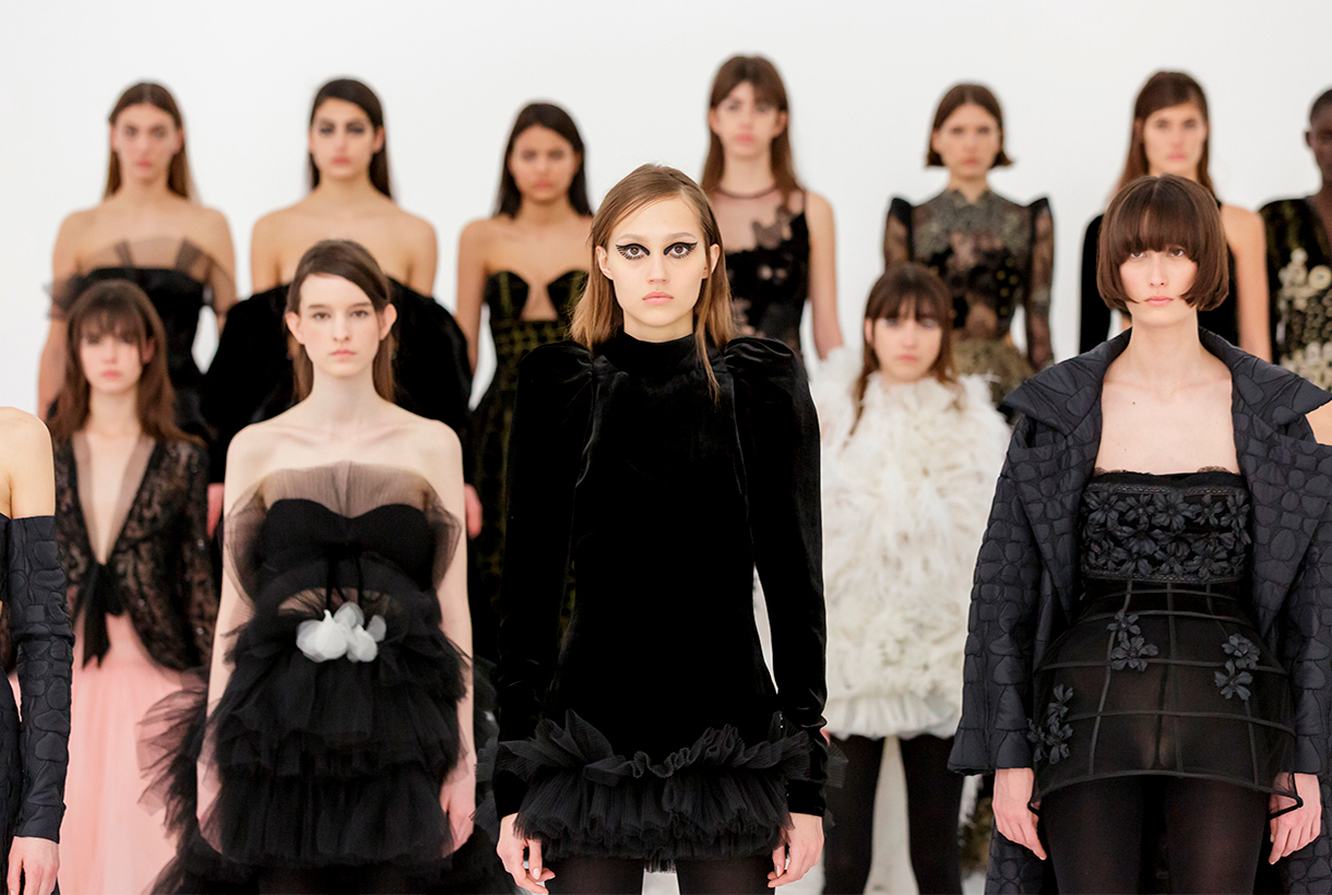
Black velvet
Yolancris this time participated in the 080 Barcelona Fashion with her party collection, leaving aside her more experimental project Y Como. The new creation highlights the craft-work redolent of her own workshop itself where the accent is on velvet, flesh-colour and black. With regard to detail, velvet is mixed with golden threads, embedded French lace and macramés in an attractive combination. Binomies of colour also dominate: gold-black and white-black, and are separated with explosions of monocoloured dresses: red and powder pink. As for silhouettes, the collection brings together some classic pattern ideas combined with some more daring features, evident, for example, in the openings of the dresses. In general Yolancris’s creation aims to be timeless so as to offer an expansive wardrobe for special occasions.


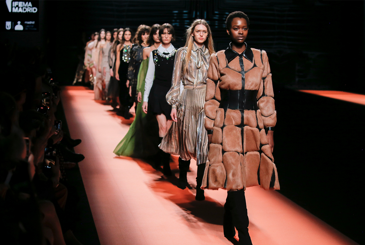
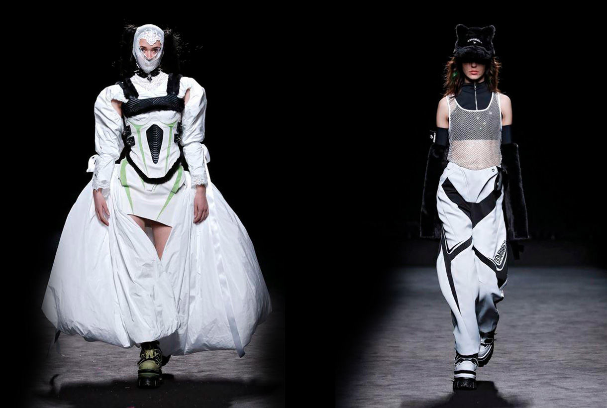
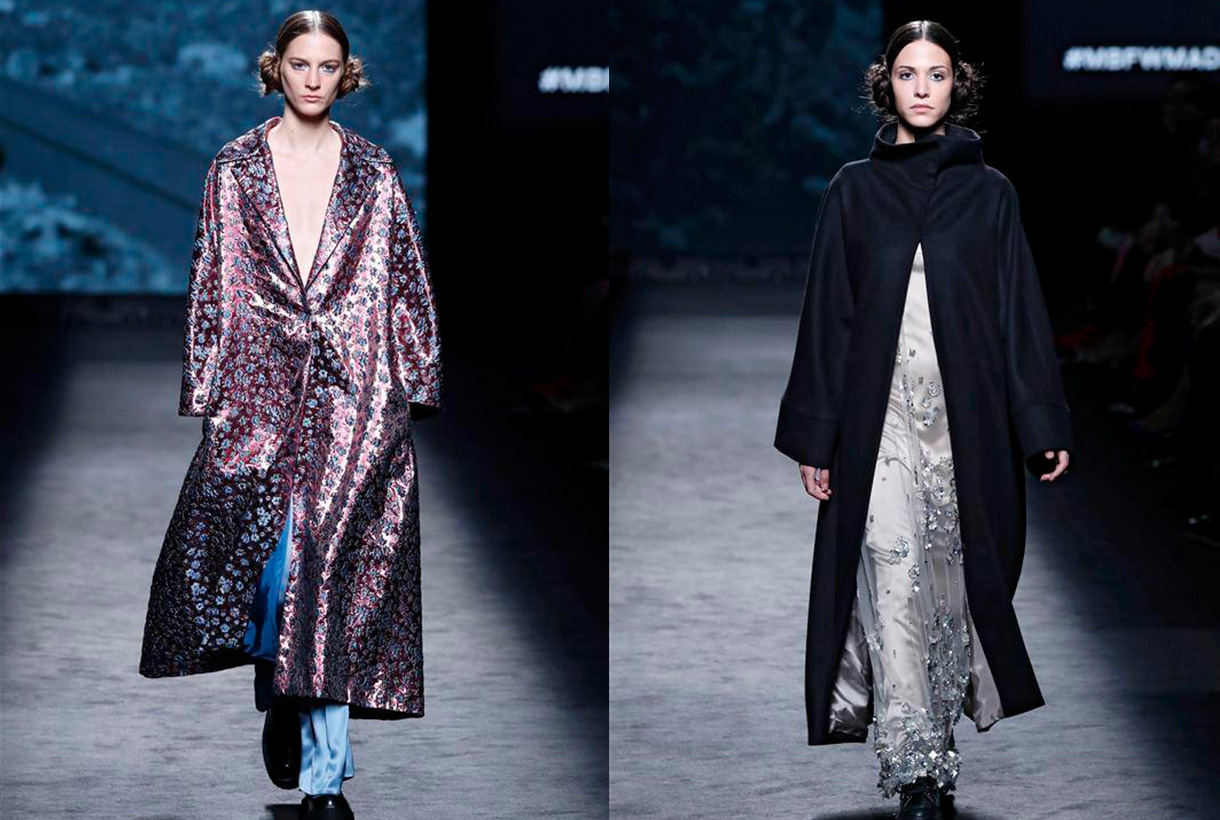
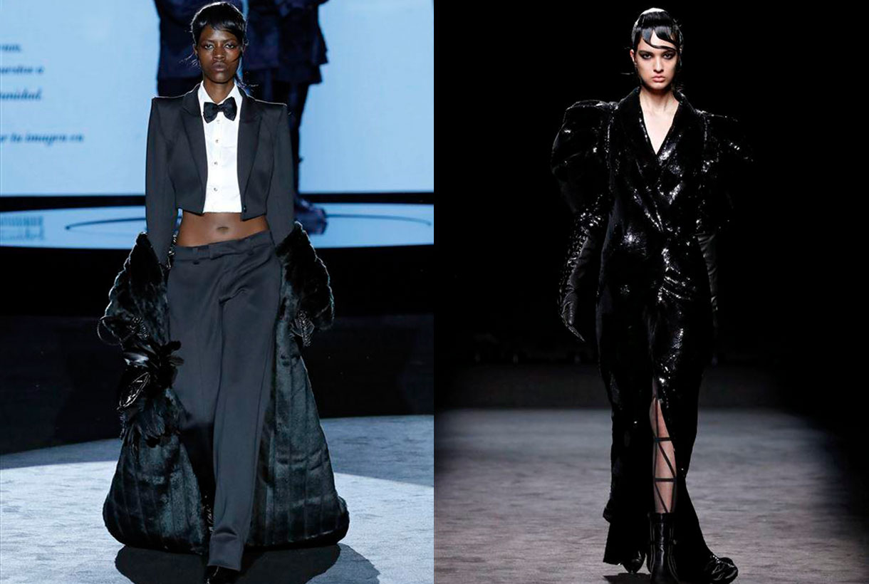
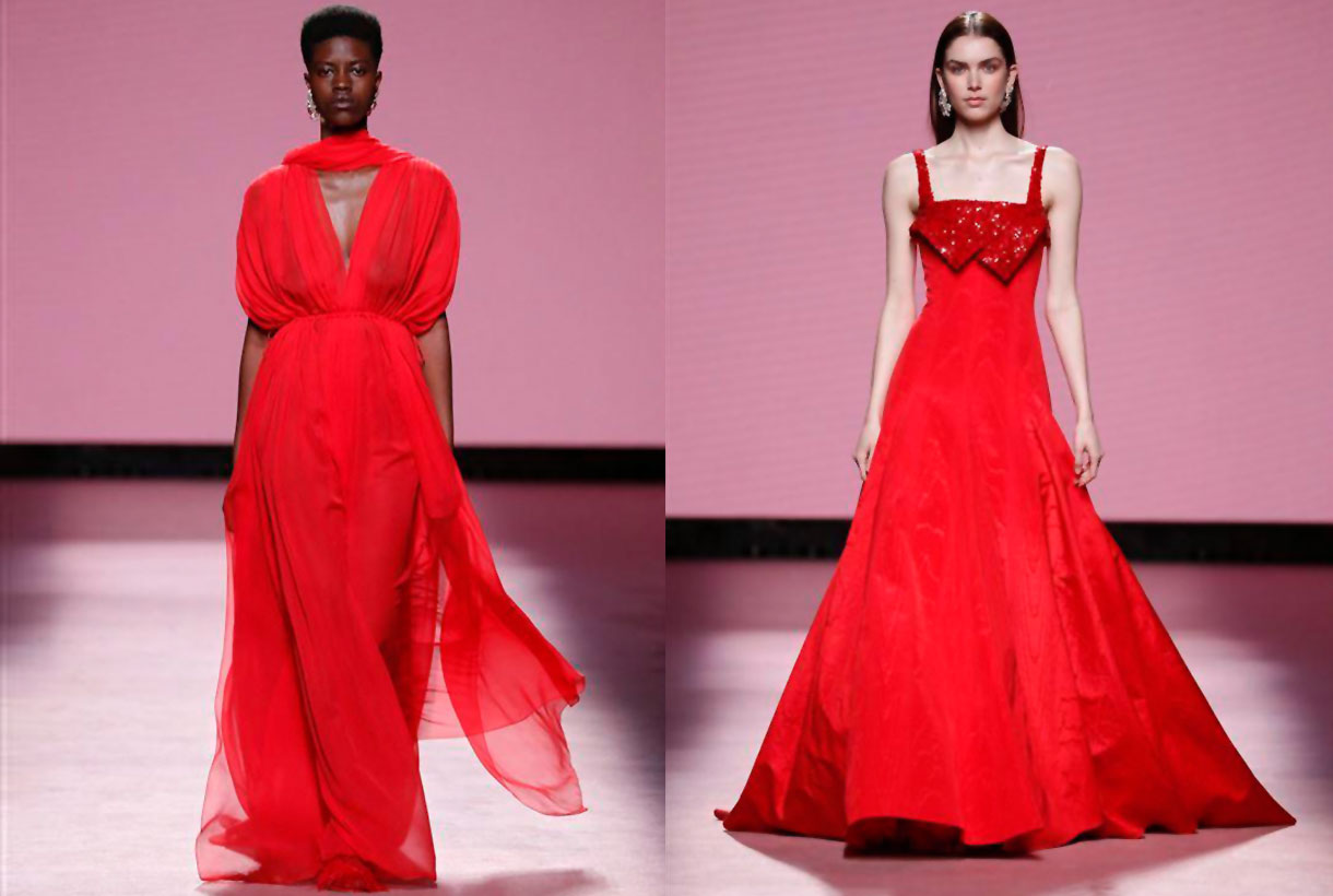
Another edition, Gratacós fabrics have made their appearance at Mercedes-Benz Fashion Week Madrid that was held in the Spanish capital at the beginning of March. Companies such as Brain & Beast, Dominico, Fely Campo, Malne, Redondo Brand and Teresa Helbig have trusted in our creations with new designs for the Autumn-Winter Collections 22/23. As always we have put together some of the most prominent looks with gratacós fabrics as well as the spirit that each designer wanted to transmit. It is worth remembering that it is an honour to have the confidence of these Spanish designers who, year after year, are opting for our family-run business.

Brain & Beast
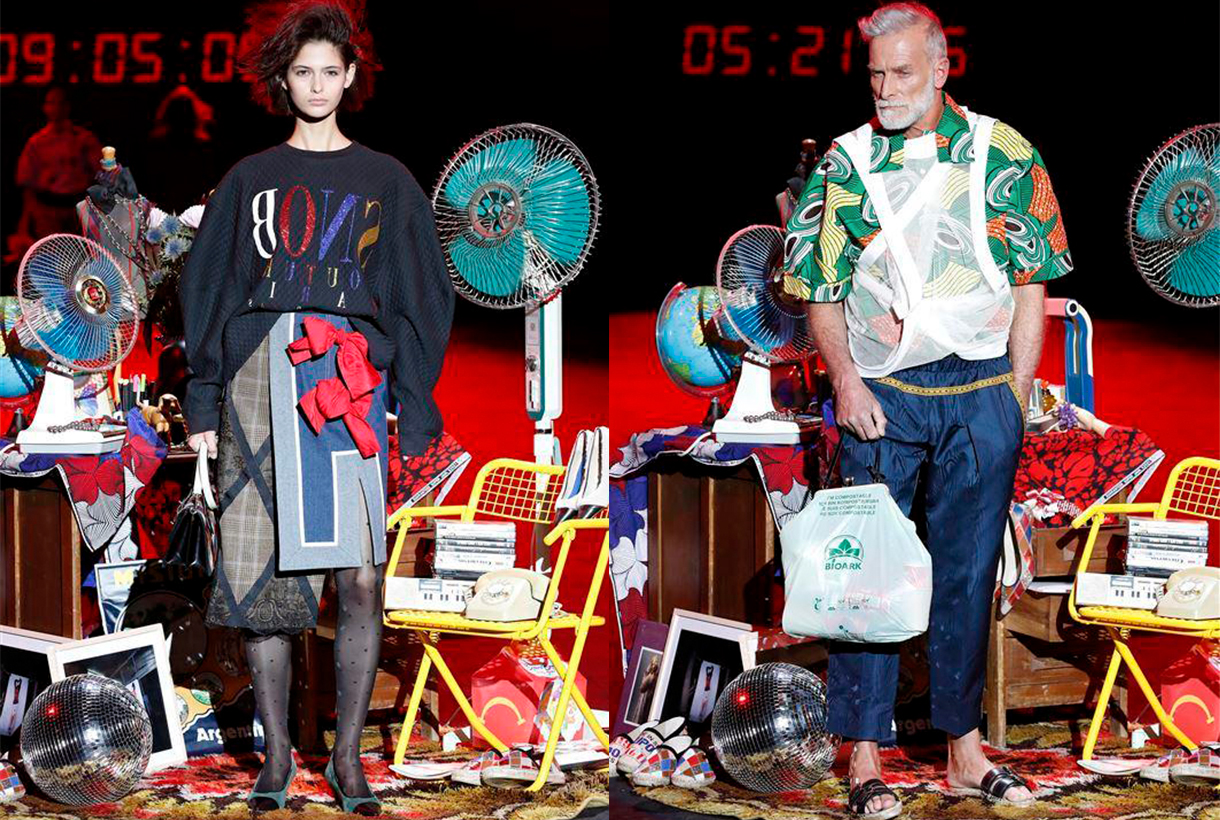
Brain&Beast returned to the Madrid catwalk – after an absent edition – to claim the heritage of this Barcelona company with its usual style characterized by humor, riddles and double meanings via colour, print, unstructured patterns and references to the idols of contemporary culture. This time in Puzzle, Ángel Vilda presented a seasonless collection – irrespective of all seasons – which exhibited the playful DNA of the most rebellious company at Mercedes-Benz Fashion Week Madrid. Garments with deconstructed phrases, patterned collage, as one that mixes the faces of Alain Delon and Catherine Deneuve, denim everywhere and impossible mixes of prints that seem to coexist effortlessly. In short, daring and casual outfits that go beyond trends because what they seek is to vindicate authenticity, a trait not always appreciated in the fashion industry.

Dominnico
Domingo Lázaro, winner of the Who’s on Next 2021 prize, with his creation Lovercross took us to a dystopian future to dive into the origins of Cyberpunk and Grunge via silhouettes of aerodynamic lines with the retro futurism of the 90’s as a connecting thread. In the new Dominnico creation proposal there is no shortage of volume or intermingled textures: Tweed, Lamé, mesh with rhinestone, laminates, taffetans, Renylon or 3D textured foams, present in long cloaks, evening dresses with asymmetric neckline or impossible hair-pieces. The dark inspiration is also represented with skewers, black leather and metallic details. As for the chromatic palette used, the Barcelona company created in 2016 is committed to primary colors and acidics, such as neon orange, fuchsia, green lime and apple and Klein blue to contrast with black, white and silver. In general this new Dominnico creation recalls the world of the motor-bike which the singer Rosalía also explores from her own private vision. We will see if together they establish a new dialogue between music and fashion.

Fely Campo
If there is a designer who has made our fabrics visible on the Madrid catwalk it is Fely Campo. The designer from Salamanca presented a luxury prêt-à-porter collection inspired by the natural beauty of the balconies of the Arribes and its landscape. This admiration is transmitted via the creation named Diafonía for the contrast of textures: the subtle beauty of nature give it the fine details, the transparencies, the vaporous tissues and the delicate reflections that open out onto the ruggedness of a more abrupt landscape, composed of coats which are firm and strong in the touch, such as those in wool. The most sober collection lines are composed of tailored volumes and oversize garments which are presented like a breastplate. Diafonía truly has constructed a feminine wardrobe which reflects the hardness and delicacy of an inspiring landscape via aesthetic counterpoint.

Malne
“Fashion is the glare of a moment, and it is also the immortality of beauty. Fashion is as ephemeral as unforgettable. ” Under this premise was framed the new Splendor creation from the Malne designers Paloma Álvarez and Juanjo Mánez. On the catwalk this winter collection is evident in the fusion of fabrics in the same garment or in the composition of each look, volumes in key garments with details ranging from pearls to feathers and the black and white binomial to represent the mystery and the brightness of fashion. For the feminine wardrobe it is an elegant and timeless creation for all those special occasions.

Redondo Brand
Jorge Redondo, creative director of Redondo Brand, gives a contemporary twist to party styles by reinterpreting the classics of elegance. The designer remembers his childhood when he admired the spectacular dresses that were exhibited on the red carpets and how one of his dreams would be to dress the celluloid stars. That glamour is behind a company that defines itself as “a very democratic guest brand” because it adapts the main trends on the catwalk to those of a real woman. In his new creation the eclecticism of americana becomes the central axis of the winter collection, an inspiration that merges with the essence of Redondo Brand to create natural volumes, asymmetric silhouettes and colour blends. Natural fibres such as silk, cotton or wool appear in different finishes and together with embroidered, glass or shiny pieces coexist between the more acidic and the most harmonizing tones. For the designer Jorge Redondo this sophisticated creation led to the L’Oréal Award for the best collection of the MBFWM at its 75th edition.


 The summer season begins with a trend less and less reserved for special occasions: sequins, which with their glitter catch all eyes. Disconnected from their comfort zone, these small metallic sheets sewn into the fabric become the protagonists of the moment together with other materials that dazzle on their own, such as iridescence or satin finishes that produce a more discreet shine.


 Orange is a more common colour than we think, although its role in history has always been relegated to the background. This hybrid shade between red and yellow provokes an immediate reaction when recognized. It activates, stimulates, surprises and entertains. Not surprisingly, this striking colour is always associated with the unconventional. Its uniqueness has played an important role in art, history and design. Since ancient times orange was present in Ancient Egyptian rituals, it has been considered a sacred colour in various Asian cultures and has come to fall in love with artists such as Vincent van Gogh and Toulouse-Lautrec who used orange in their paintings. We reveal some anecdotes about this exotic colour, often underestimated.


 April is the month of fashion in Barcelona. Prior to a new edition of Barcelona Bridal Fashion Week, a week ago saw the start of the latest edition of