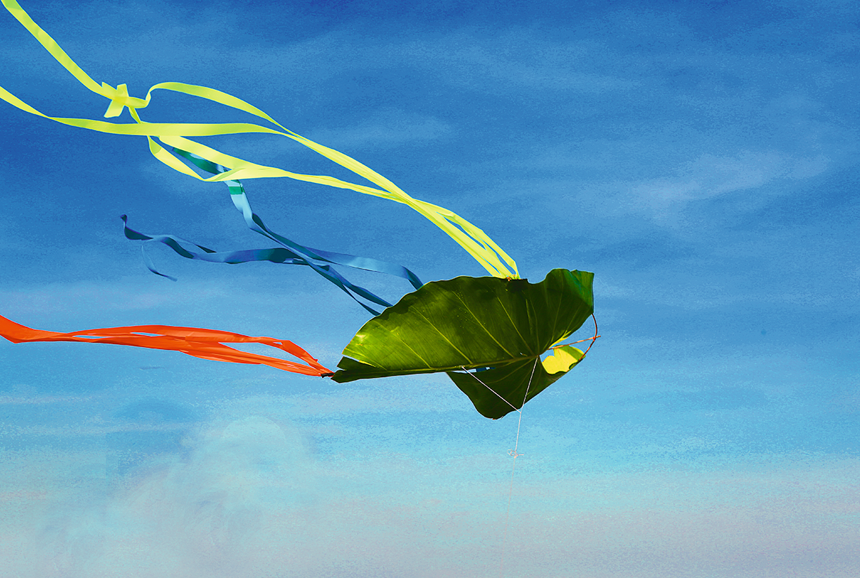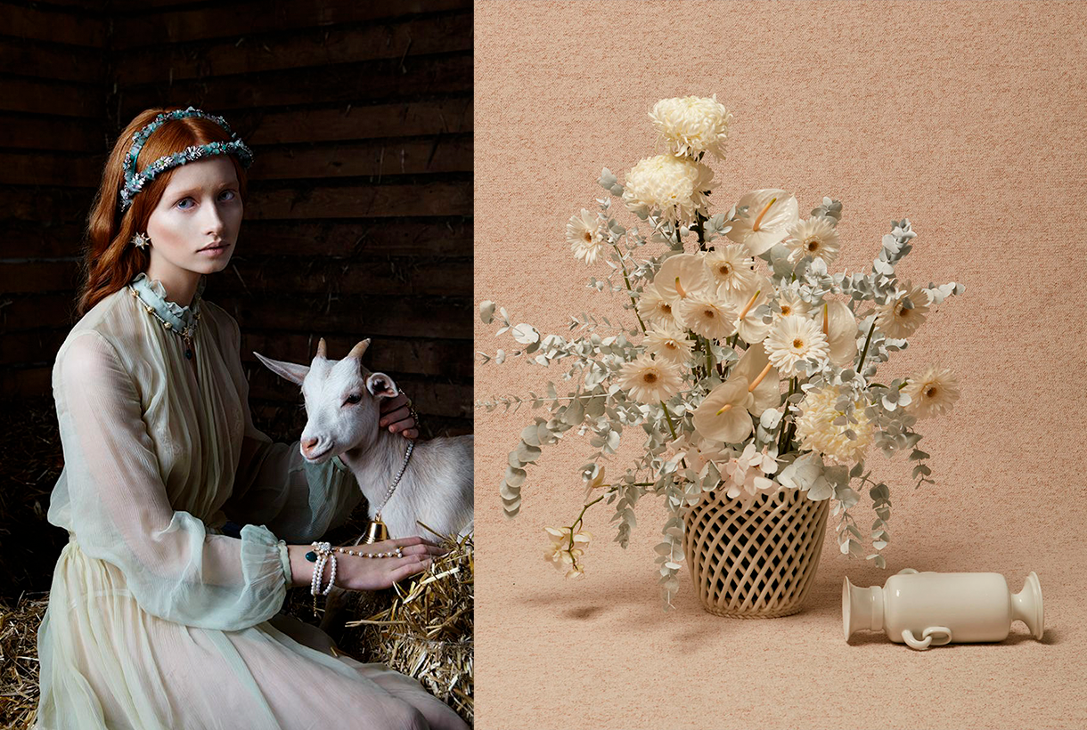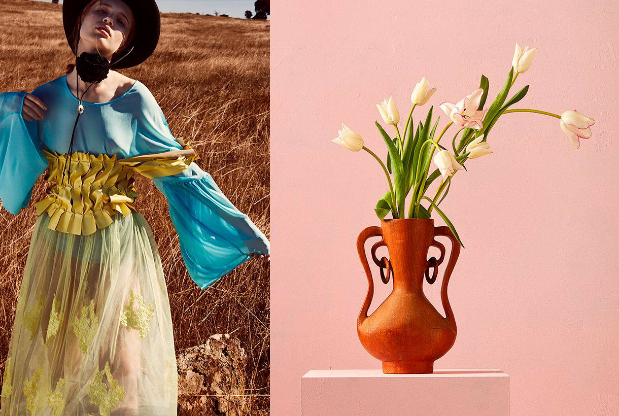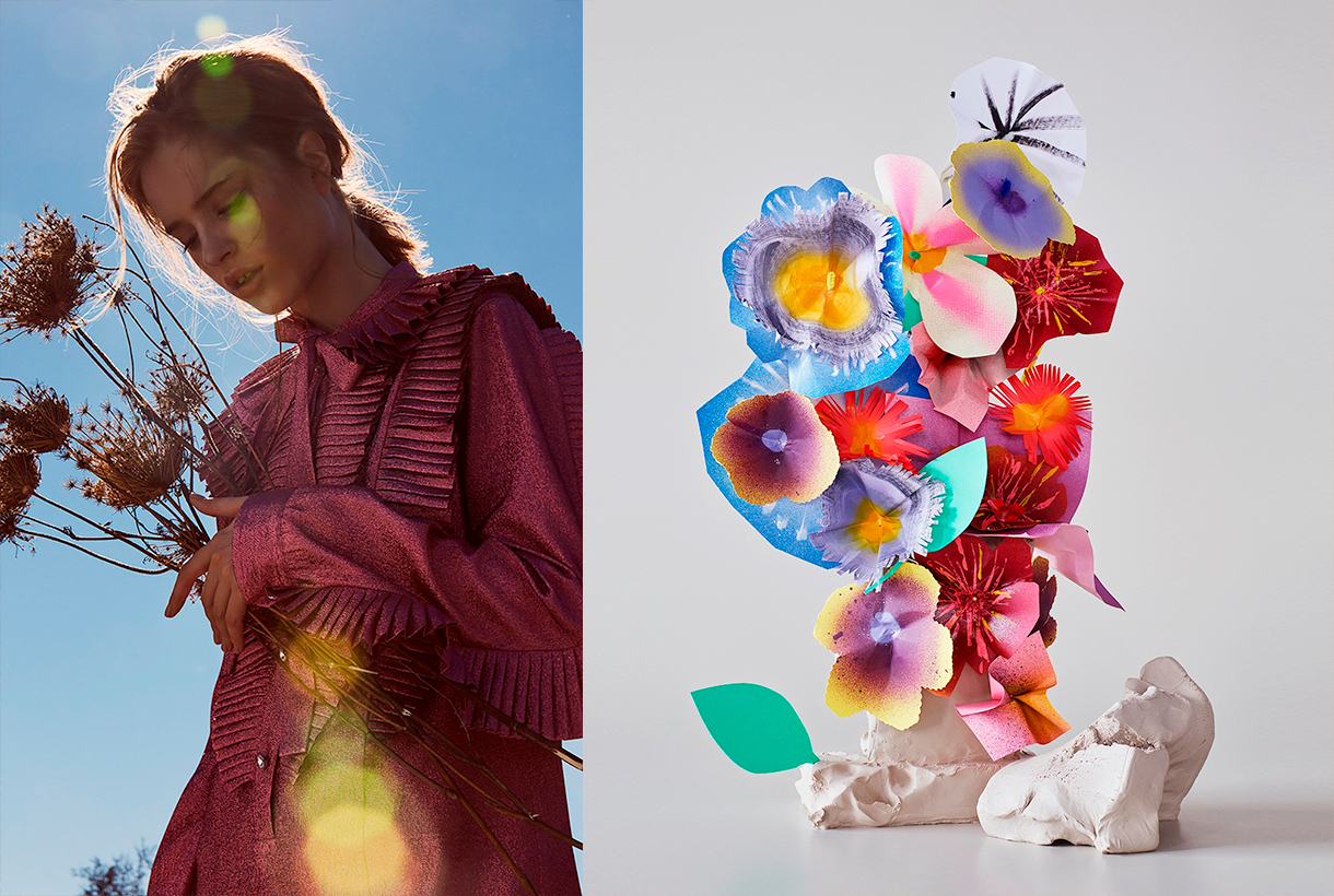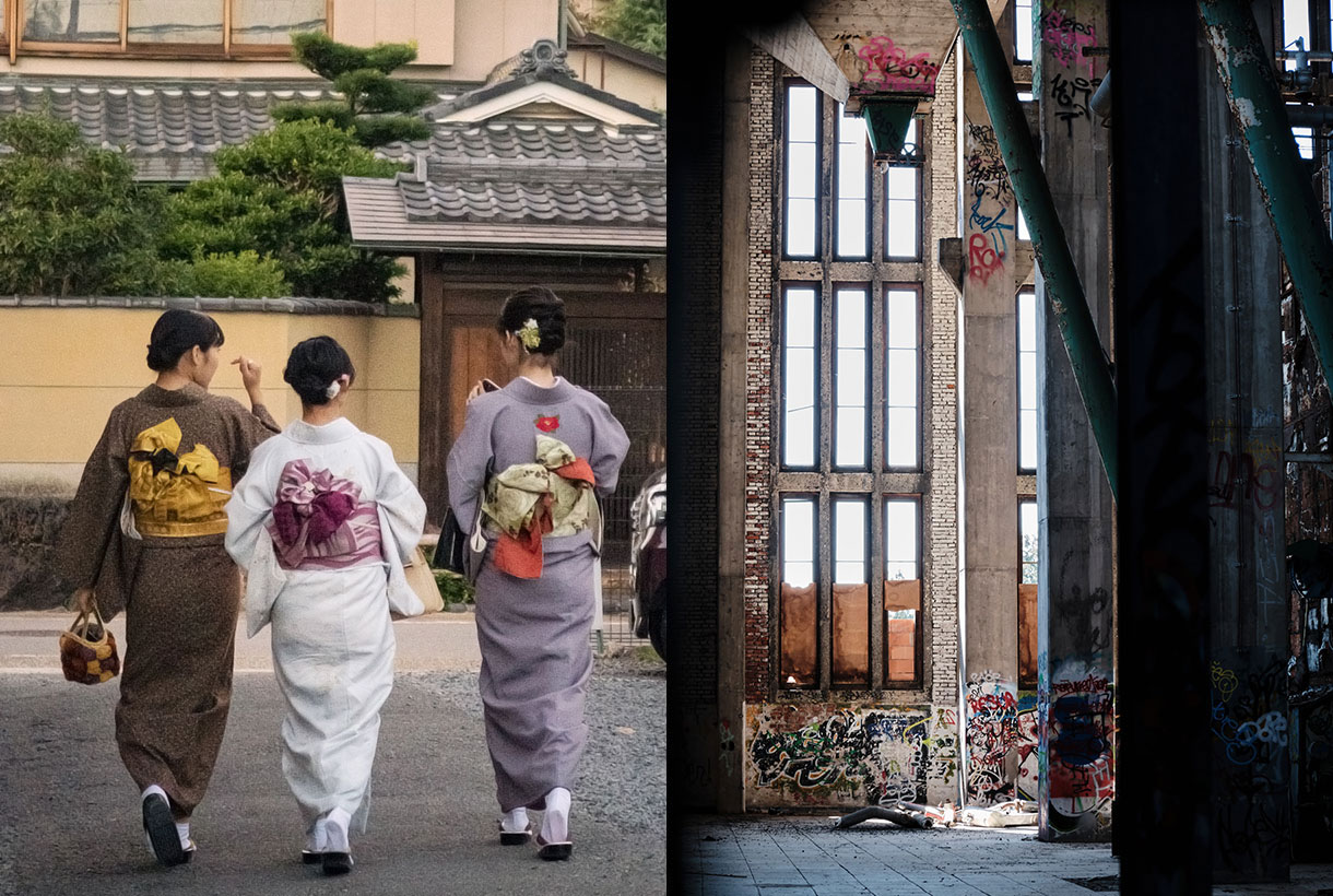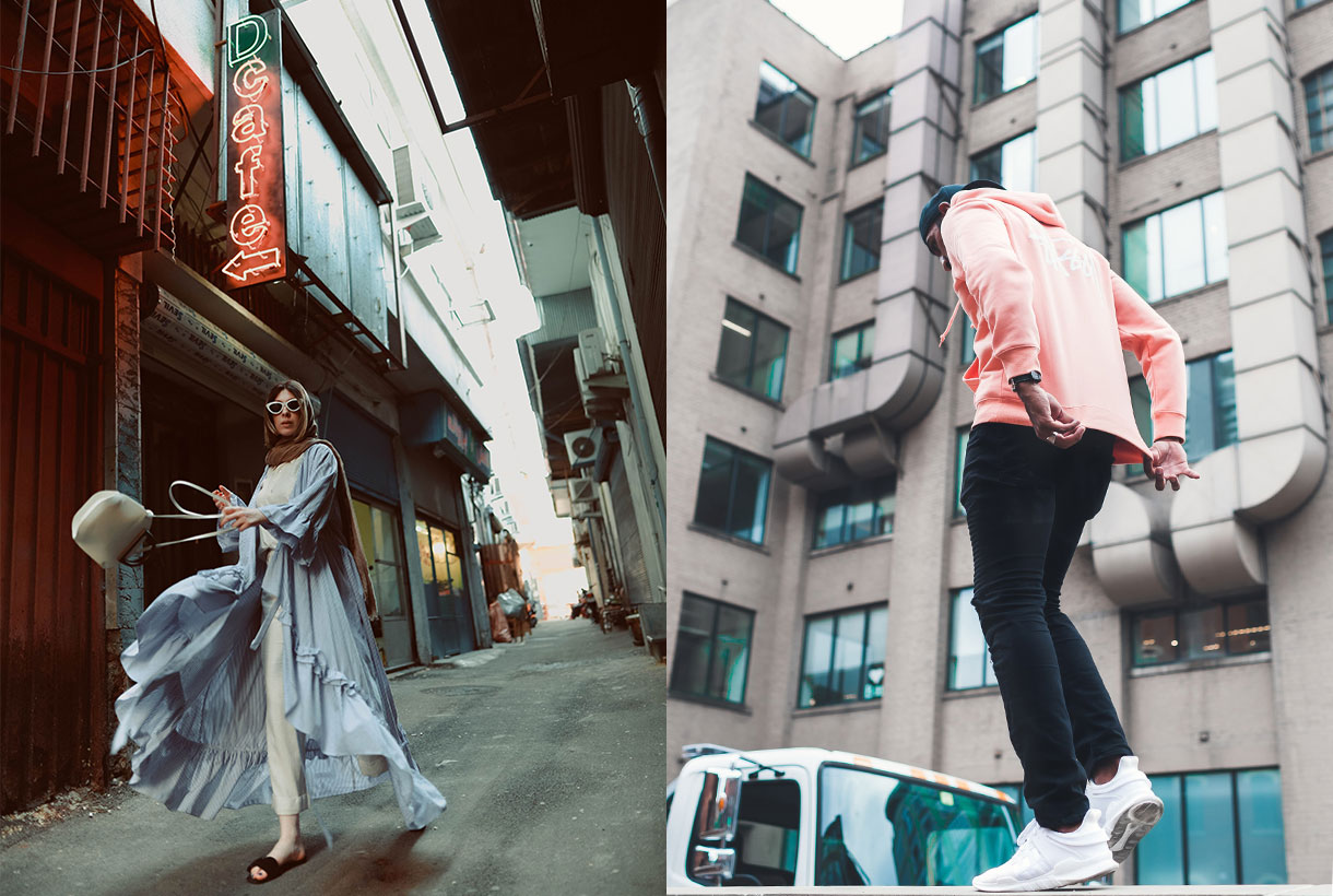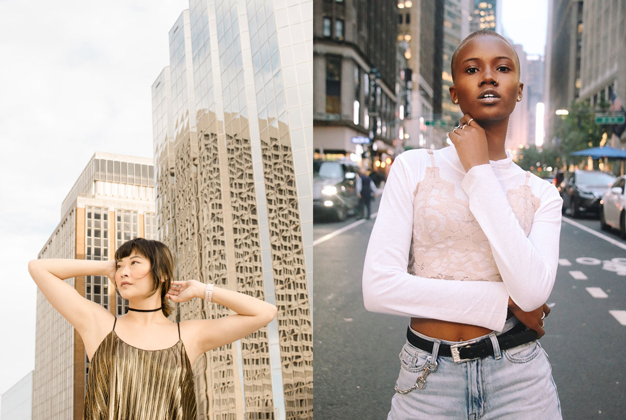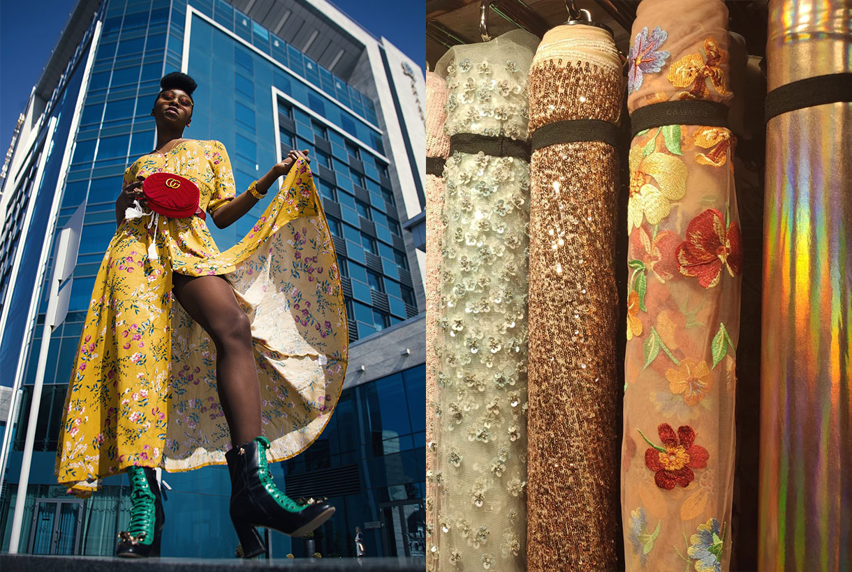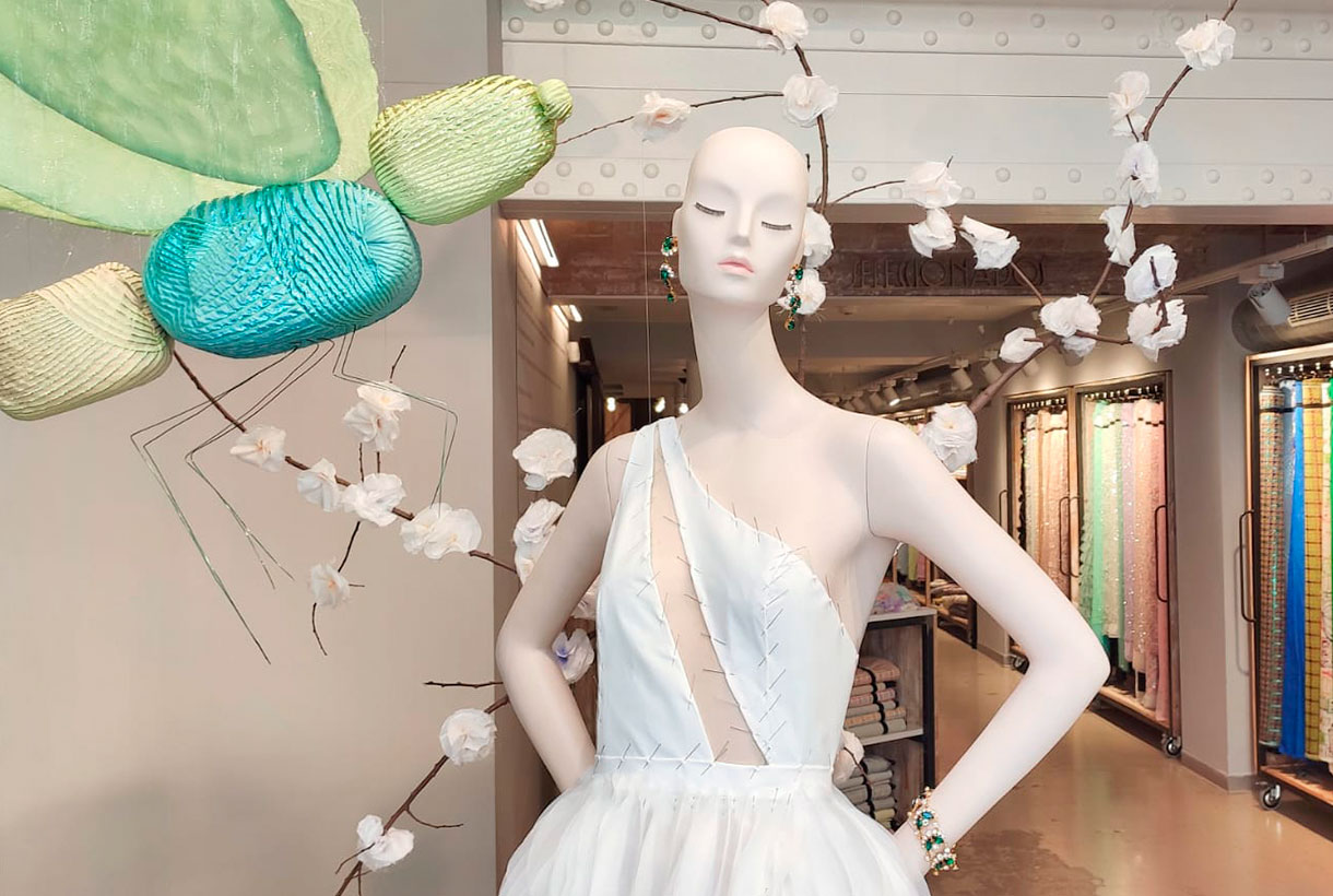
The showcase is a visual presentation of who we are, what we do and how we do it. An aesthetic entrance that attracts the visitor, but also justifies our work: the creation of quality fabrics that allow you to dream. During this uncertain year we have tried to surprise you with artistic windows that play with concepts that represent us such as luxury, elegance, fantasy, escape or everyday life through our mannequins that have been dressed in the most spectacular fabrics of the season along with other elements that we hope have surprised you. A wedding moulage, a chic picnic or a female interpretation of the Magi. These are some of the scenes that you have been able to observe through the window of our Gratacós space.
Now, before welcoming the new year, we take advantage of this post to say goodbye to 2021 with the certainty that it has been a year of transition that has allowed us to remain stable thanks to the cohesion between teams and your support and trust in this brand of family fabrics. We have new perspectives for 2022 and we want to move forward with new articles that will stand out for their quality, creativity and ability to surprise. Get excited, in short. Happy New Year!
March 2021. New direction
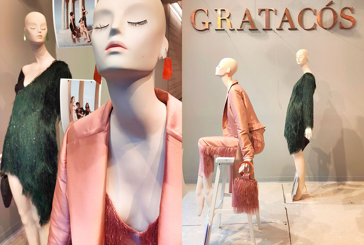
One year after the start of the pandemic, we awake dreaming of planning the upcoming holidays with a relaxation of restrictions. Easter, the May bank holidays and the not so distant summer disconnection. The beginning of spring also marked a minimalist-inspired showcase featuring two mannequins dressed for the occasion to pay tribute to those bridal celebrations that were returning to the fore. Tailoring, feather details and two antagonistic tones that capture the incipient change of season: forest green and dusty pink.
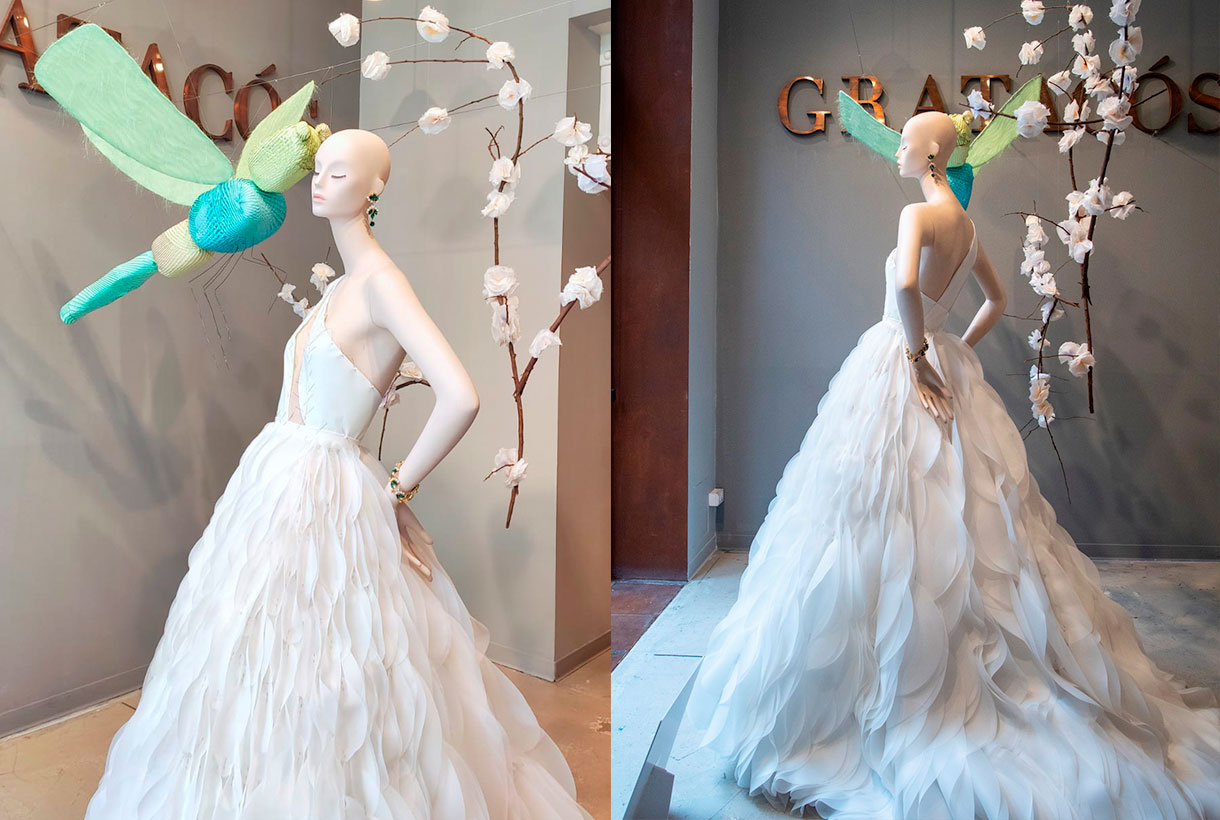
April 2021. Wedding bells
As tradition dictates, April is the bridal month par excellence and from Gratacós we always reserve this shop display to show off the work of one of the winners of the IED Barcelona. wedding dress design postgraduate moulage contest. This is an opportunity we offer to showcase the work of new talents in bridal design. This year, Eva Escudero created this impressive wedding dress with an asymmetrical design and a large flowing skirt, following in the footsteps of this unique tailoring technique.
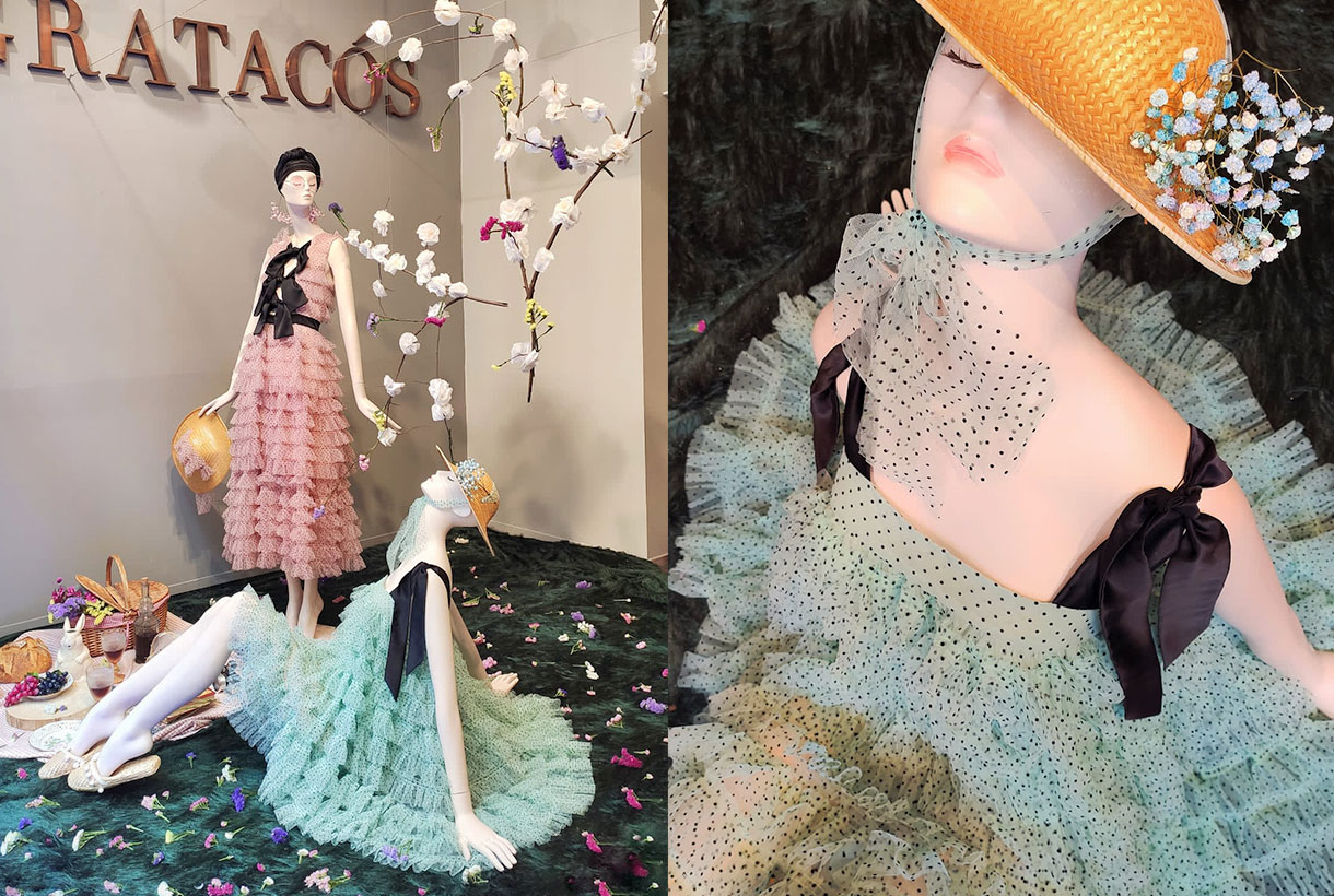
May 2021. Country spirit
In the month of flowers, the Joplin Atelier company of the sisters Laura and Aida Molano turned our entrance space into an urban picnic with a Provencal air. The tulle dresses with small polka dots made with our fabrics, the details in bows and the pastel tones starred in a chic showcase with a multitude of details to carry out this picnic in the open air. An artistic representation that portrays the spirit of escape that connects us with nature.
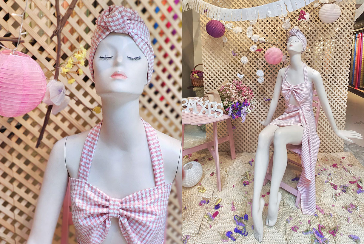
July 2021. Time to escape
The summer month par excellence is a tribute to festivals, fun and feeling carefree, maintaining that hedonistic attitude to take life a little more lightly, enjoying all the earthly pleasures. July has a fresh, youthful and daring character, as evidenced by the outfit of our mannequin in pink gingham fabric. Let the party begin!
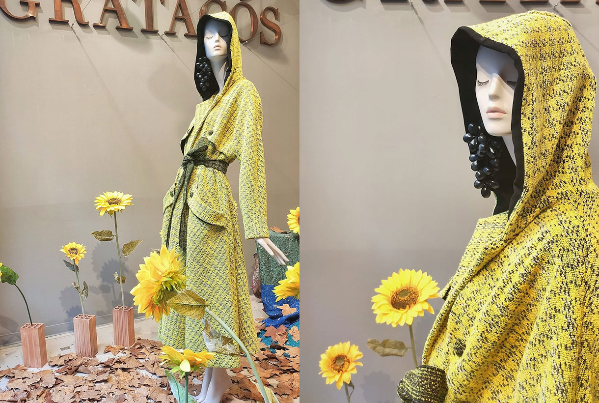
September 2021. Start over
September is the official month of beginnings. The new season, the change of season, the return to routines … we illustrate the busiest month on the calender by paying tribute to comfort through a bathrobe-type trench coat made of pistachio green tweed, all very daring dyed yarn, with a wool touch and thick weight. A carpet of dry leaves marks the beginning of autumn, which in Barcelona is light and soft.
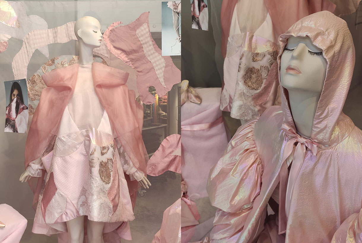
October 2021. The Pink month.
It is called the pink month because it is recognized worldwide with this feminine color to raise awareness in men and women about breast cancer and promote self-examination and check-ups to be able to detect it early. Our tribute to the most delicate, subtle and romantic month was made by Rosa Cano, a student at ESDI, Escuela Superior de Diseño with these contrasting fabric models that play with the entire range of pastels and nudes. One of the most spectacular showcases of the year!
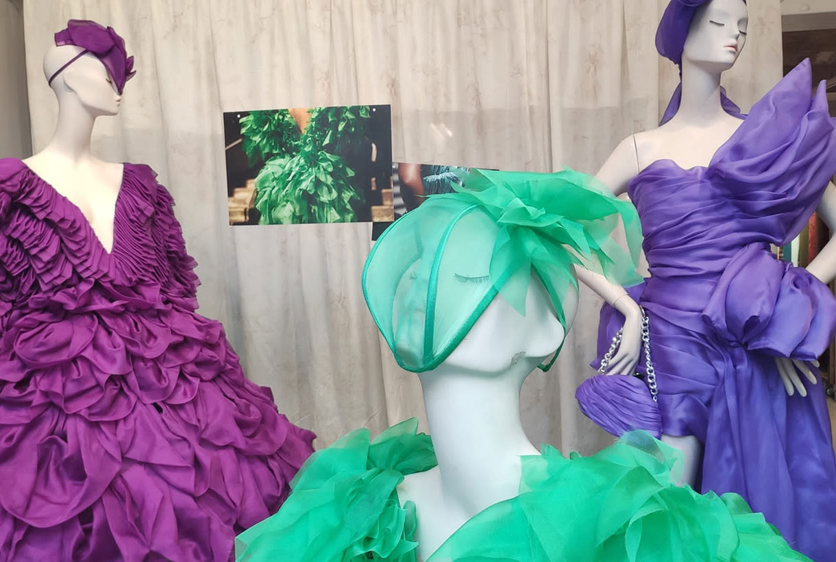
November 2021. Let the party commence!
The proximity of the Christmas holidays makes November a month of preparations. A headstart on shopping, lights that turn on and the search for the most surprising outfits to fill the holidays with magic. The designer Claudia from the Institut Català de la Moda (ICM) presents three models from the ‘Ritmos’ collection. Voluminous dresses with meters and meters of suggestive organza for celebrations full of fantasy.
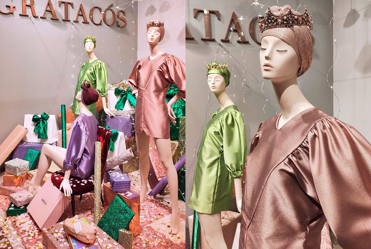
December 2021. The three queens
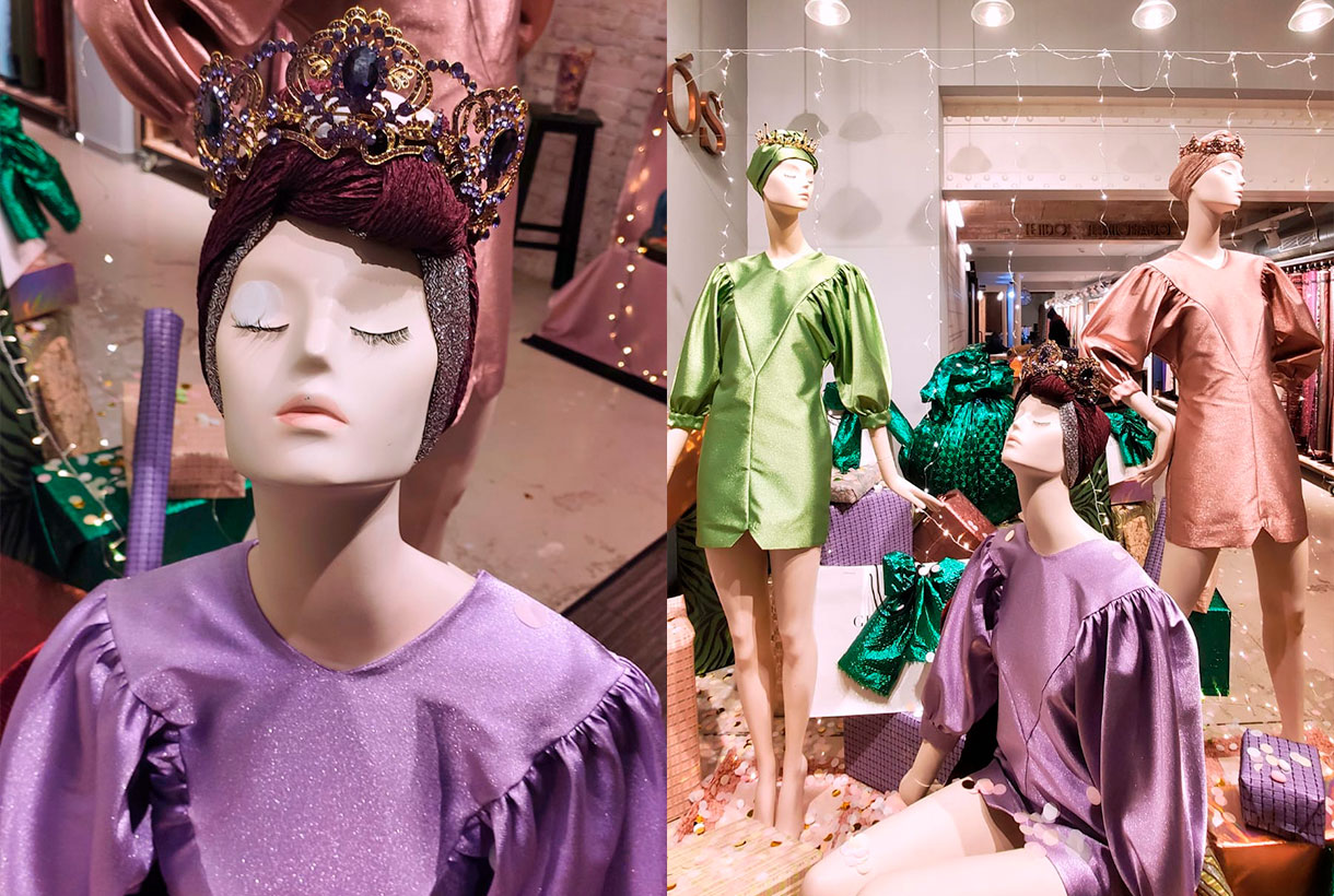
We ended the year again in collaboration with Joplin Atelier and its proposal in a feminine key. Our “Three Magical Queens” are a tribute to the strength of women, capable of dealing with all areas of their lives with determination and mastery. They are the philosopher’s stone of many families and especially during the hustle and bustle of the Christmas holidays. The mannequins share a turban and crown to match their short dresses with a closed neck and puffed sleeves made from acetate satin with lamé. Under their feet they protect all the gifts, the symbol of the act of sharing (and receiving).
Viernes 10 diciembre 2021
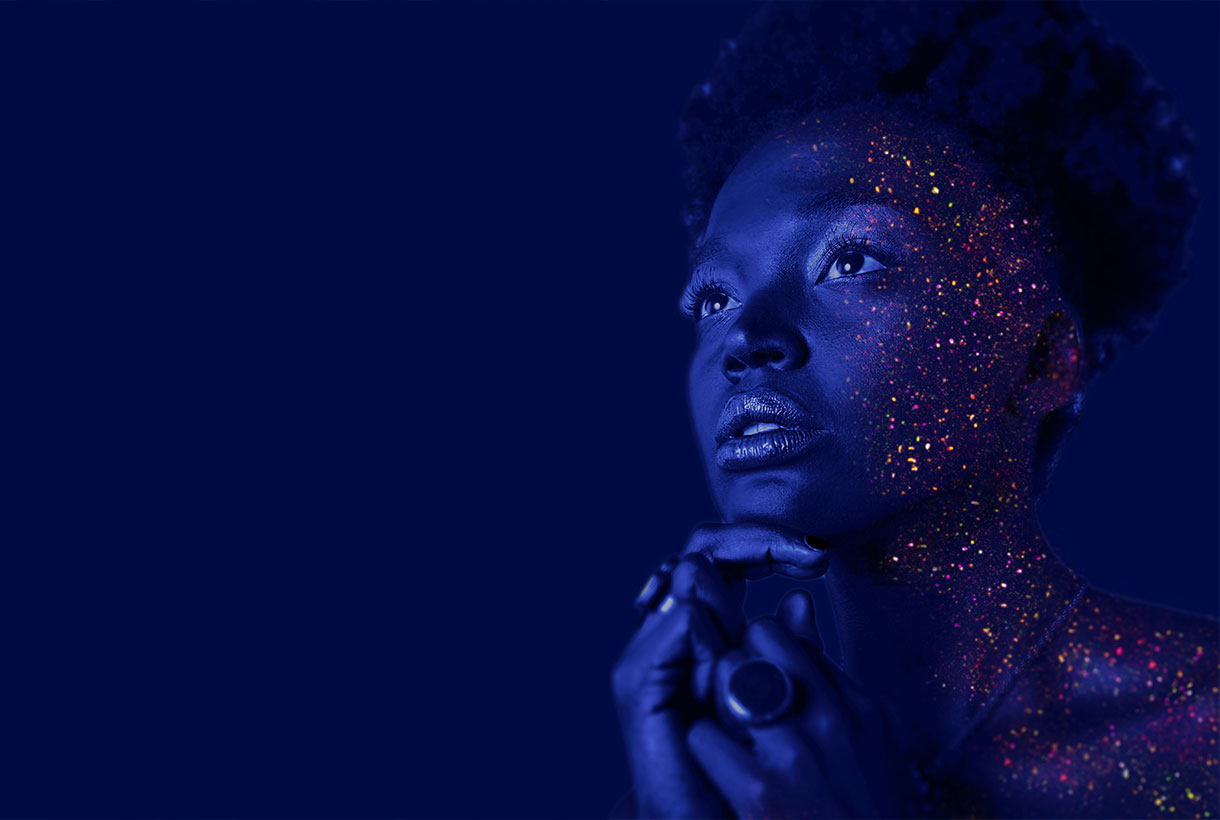 December is the month of rituals and traditions marked especially by Christmas and the closeness to our loved ones. For designers, there is one thing that is awaited for with enthusiasm: finally knowing the colour that will mark the following year and that will be announced at this time, Pantone. The world authority of colour has once again communicated the tonality that will mark the year 2022 in areas as multidisciplinary as design, art, advertising or fashion. It’s called Very Peri and it’s a novel shade based on lilac that, they say, “maintains a daring presence and stimulates ingenuity and personal creativity.” Do you have a better cover letter?
As you already know, the annual choice of a colour is not done randomly or is the result of whim because it involves a deep study and analysis of trends by the trendhunters of the Pantone Colour Institute. With an in-depth study of the impact that various exhibitions, works of art, films that will be released next year, the most popular destinations, new technologies and all together, the global mood, they have a meticulous discussion and dimension the impression that every aspect will have. Before closing the year, experts have revealed what 2022 holds for us.
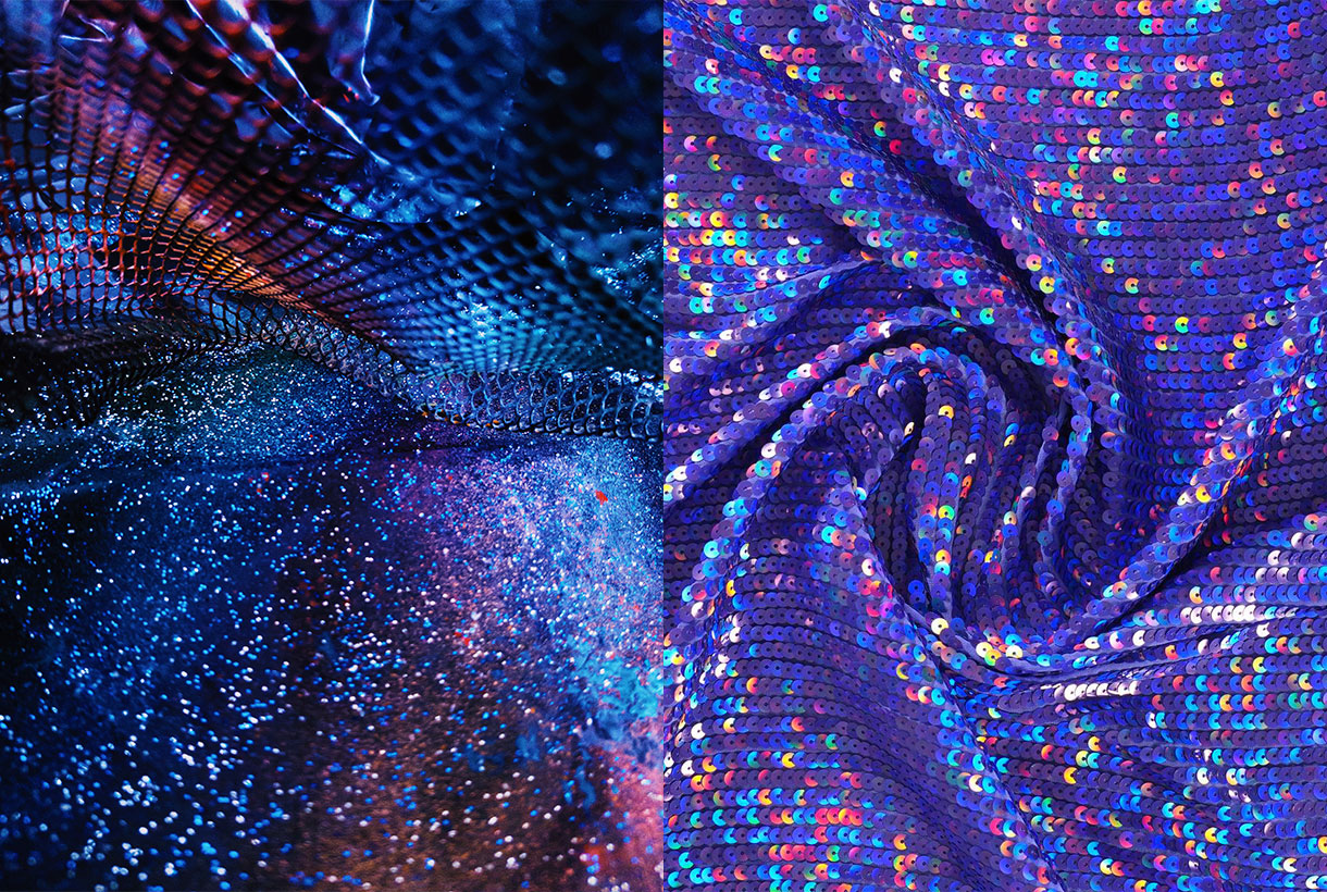
“Creating a new colour for the first time in the history of our colour program is a reflection of a process of innovation and transformation at a global level,” said Laurie Pressman, vice president of the Pantone Institute of Colour.
“The Pantone Colour of the Year is a reflection of what is happening in our world culture and expresses the answer to what people are looking for in this colour,” says Laurie Pressman, vice president of the Pantone Colour Institute. ” He adds: “The creation of a new colour for the first time in the history of our educational colour program Pantone Colour of the Year is a reflection of a process of innovation and transformation on a global level. As society recognizes colours as a fundamental form of communication and as a way of expressing, capturing, connecting and influencing ideas and emotions, this new and complex blue hue fused with purplish red highlights the range of possibilities that are presented to us. “
In this case, by encompassing the qualities of blues and, at the same time, having a purplish-red hue, PANTONE 17-3938 Very Peri displays a cheerful and lively attitude, as well as a dynamic presence that stimulates the courage to create and an imaginative expression.
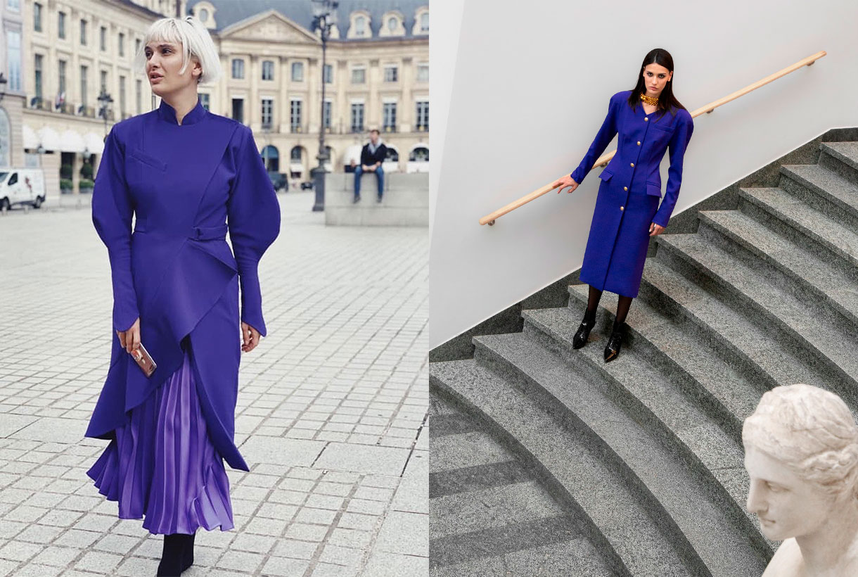
Deciphering the enigmatic tonality of 2022
Very Peri represents the perfect fusion between blue and red. A bridge between two primary tones that are interrelated giving way to this enigmatic tone. According to Pantone, Very Peri is the result of carefree confidence and daring curiosity that encourages our creative, inquisitive and inclusive spirit. The authority of colour considers that this tonality helps to embrace this altered landscape of possibilities and opens a new vision so that each one can rewrite their own life. Rekindling gratitude for some of the qualities blue represents complemented by a new perspective that resonates today, PANTONE 17-3938 Very Peri puts the future ahead in a new light.
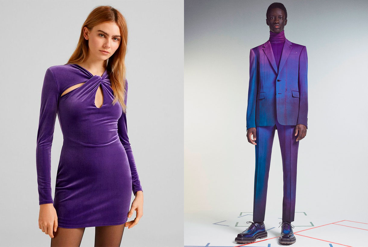
Very Peri displays a cheerful and lively demeanor, as well as a dynamic presence that stir up courage to create and an imaginative expression.
In times of transformation, Very Peri is a symbol of the spirit of our current global age and the transition we are experiencing today. As the period of isolation, marked by the global pandemic, is emerging, notions and standards are changing and people’s physical and digital lives have merged in new ways creating hybrids. This tonality also symbolizes the rise of digital design, which helps to stretch the limits of reality, opening the door to a dynamic virtual world where you can explore and create new colour possibilities. With trends in gaming, the growing popularity of the metaverse, and the growing arts community in the digital space, PANTONE 17-3938 Very Peri illustrates the fusion of modern life in correspondence with colour trends in the digital world and how together they are manifest in the physical world and vice versa.
This colour illustrates the fusion of modern life in correspondence with colour trends in the digital world and how together they manifest in the physical world and vice versa.
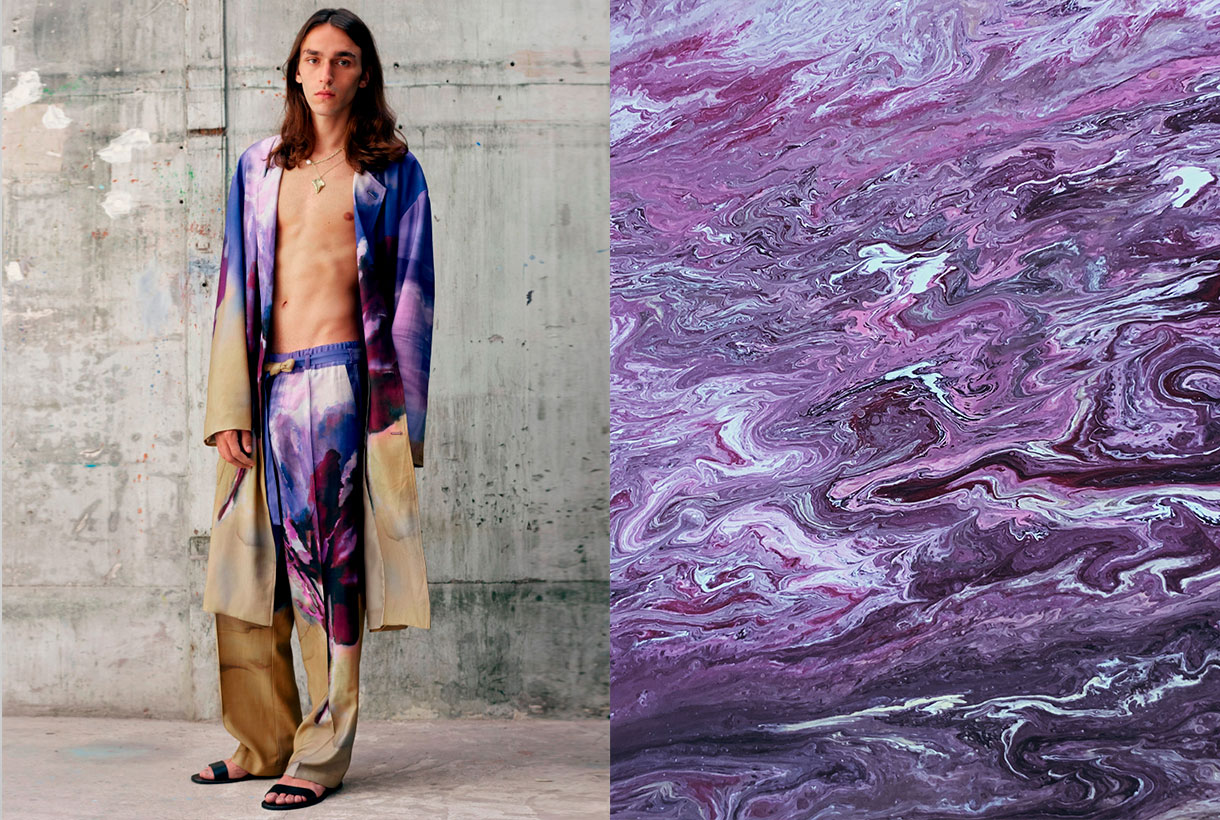 How do we apply Very Peri in the world of fashion?
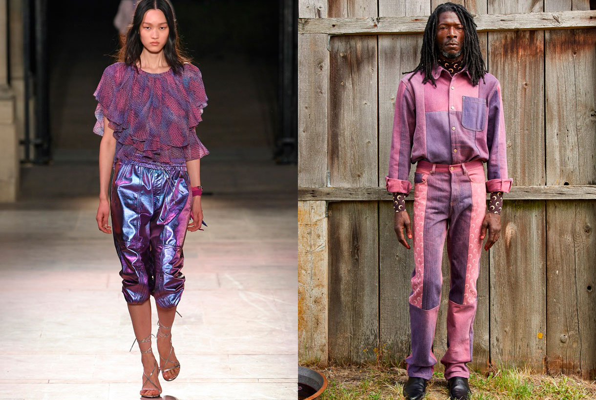
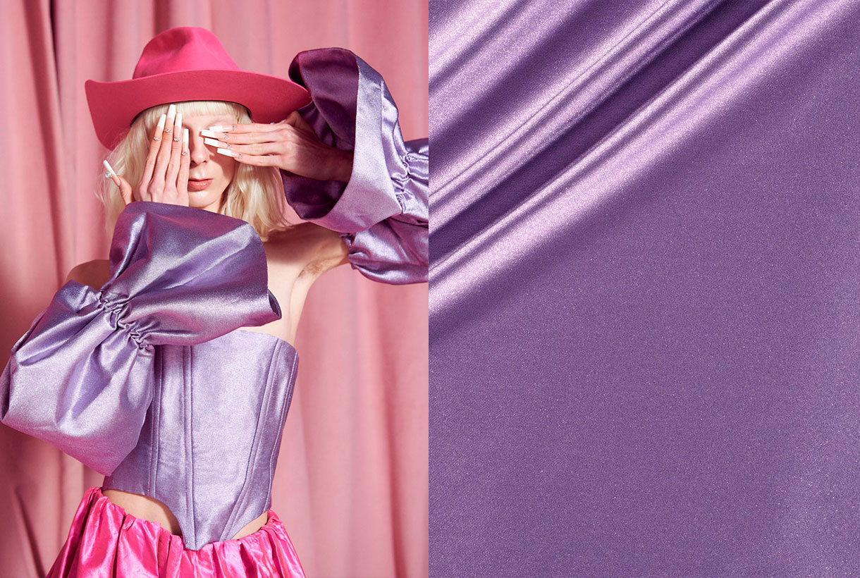
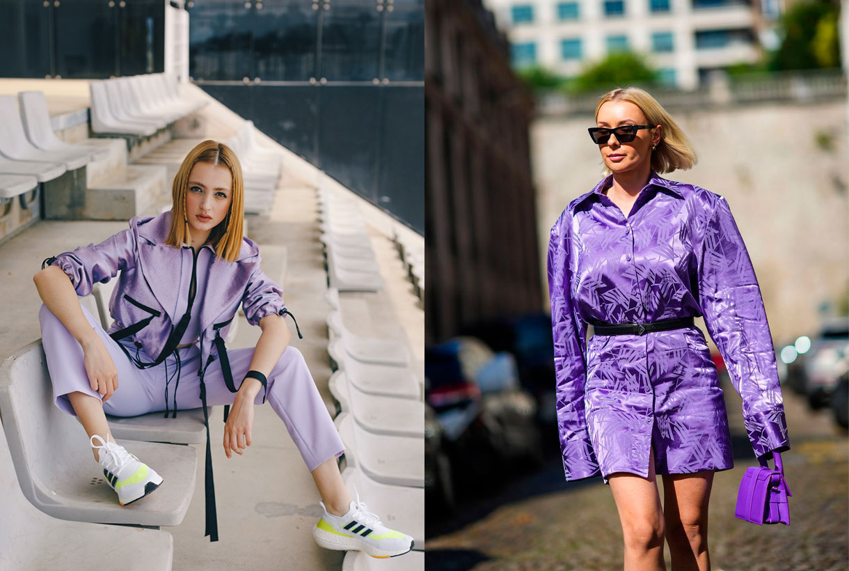
We said it at the beginning. Very Peri is the colour that seeks to convey courage, boost reinvention and stimulate creativity by displaying carefree confidence and infinite curiosity. It is a fresh, versatile and genderless shade that adapts to a wide variety of fabrics, textures and reliefs, provides a touch of colour and does not go unnoticed at all. On the catwalks, this hue has starred in monochrome looks in the shows of the new summer collections by Isabel Marant, Balenciaga, Thom Browne or Ermanno Scervino. Other firms such as Lanvin or Marine Serre have chosen to combine this violet tone with arty prints and neutral tones.
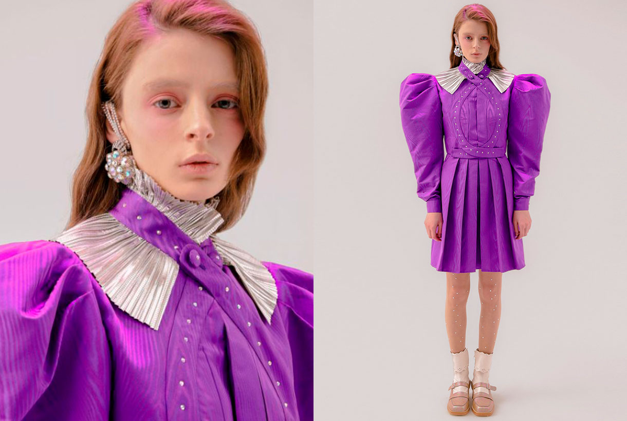
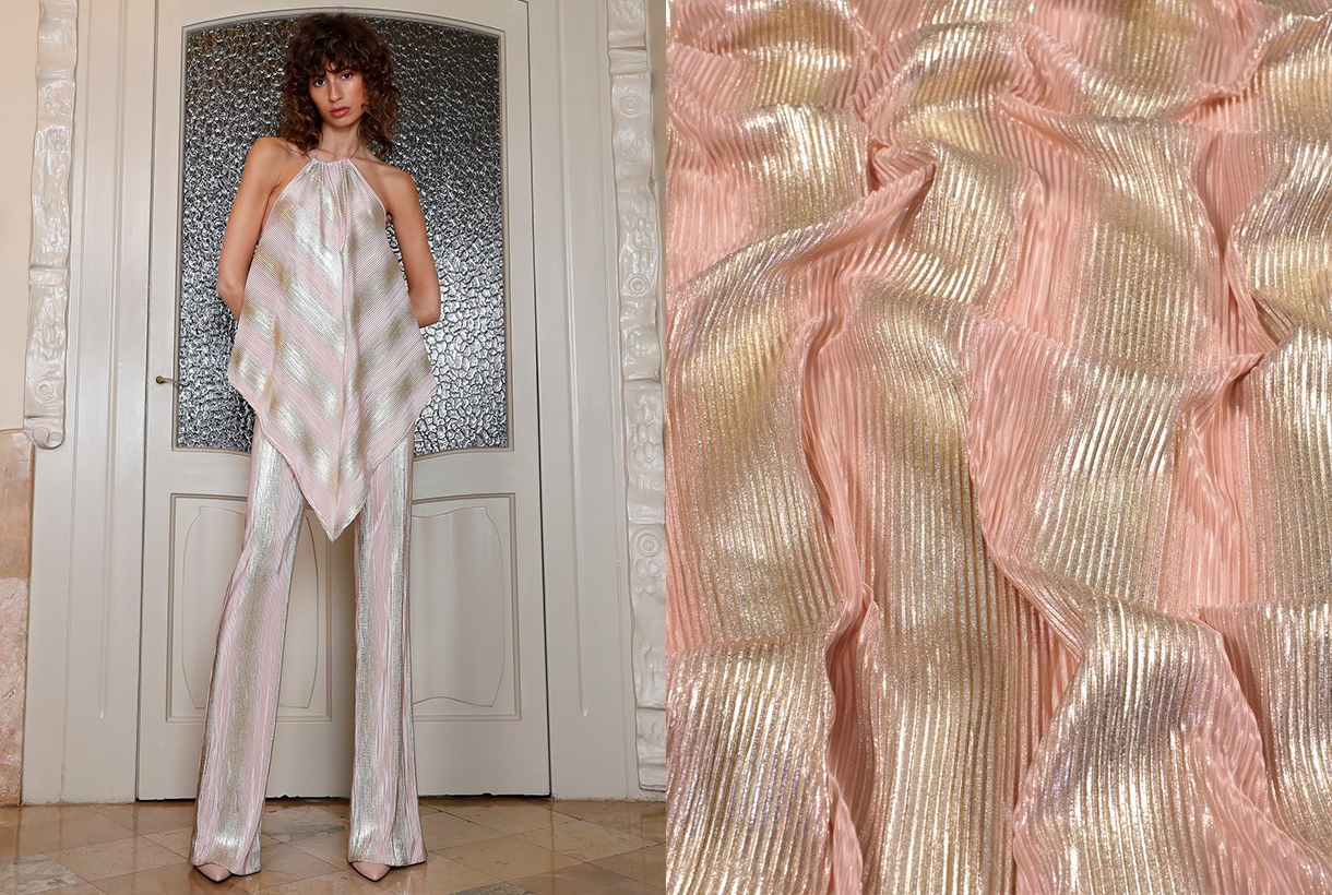
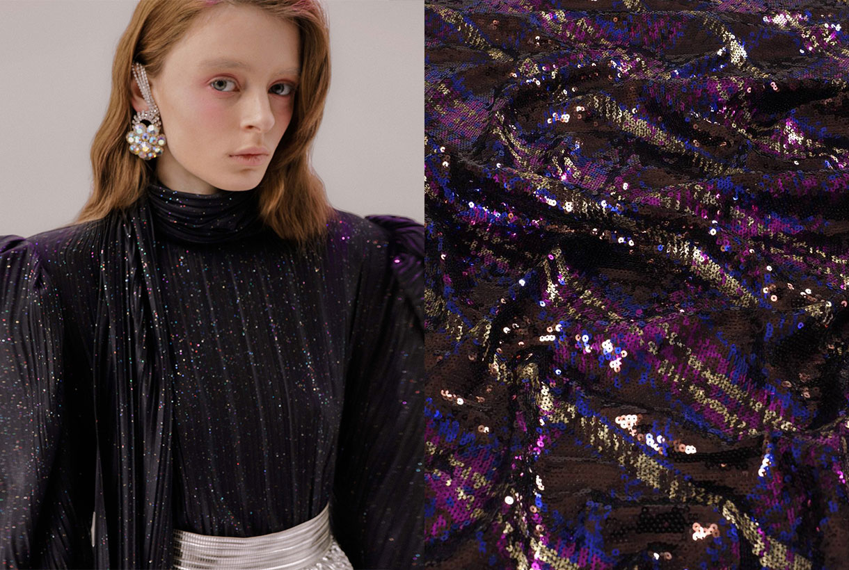
In Gratacós we have several seasonal fabrics where the Very Peri colour is present. You will find it in plain items and through prints or in its more sophisticated version with reliefs, iridescence and rhinestones. Take the opportunity to rediscover the collection that we have on offer in our online store.
Sorry, this entry is only available in European Spanish.
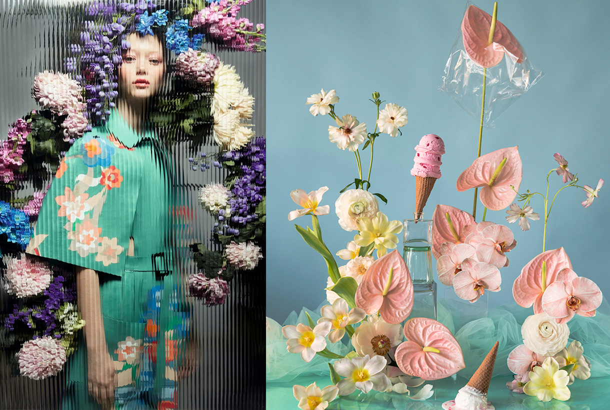
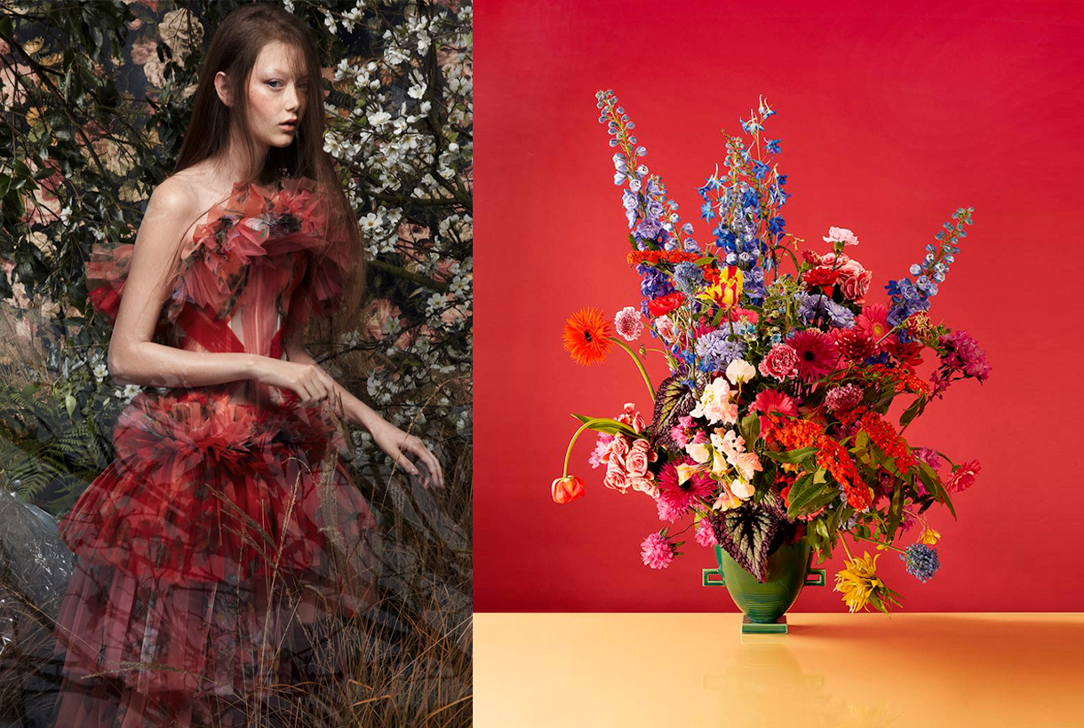
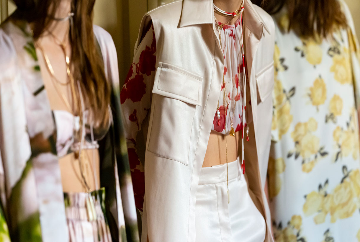 Although in fashion they do not have seasonality, flowers triumph in spring: they sprout in all fabrics and take over the main trend-setting outfits, whether romantic spirit, eighties aesthetics, sports or boho-chic style. In addition, this season the motifs of small and delicate flowers coexist with other tropical-inspired maximalists in bright and radiant colours. In fact, if there is something that unites the spring floral prints, it is the explosion of colour that they use to enliven the looks of the moment.
At Gratacós we propose to organize our seasonal prints according to three inspirations:

Poppies, daisies, dandelions, hollyhocks, lavenders… The most common wildflowers found in the field make the leap onto the catwalk and are presented individually or in colourful bouquets that add a youthful touch to the garments in which they star. Wild flowers tend to link with the looks of a folk spirit in flowing dresses, asymmetrical jumpsuits or extra- long tunics.
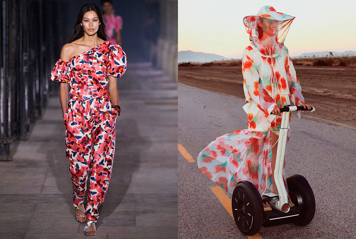
The flowers that live in the garden are a constant source of inspiration for designers when they create their dress designs for the summer collections. Hydrangeas, carnations, peonies, geraniums are some of the flowers that also appear in celebrity guest looks. For yet another season roses are the queen of flowers and are amongst the most prominent of floral prints because they represent romance, mystique and femininity. At Gratacós this season we are committed to combining roses with other garden flowers, creating patterns with attractive and very colourful visual play.
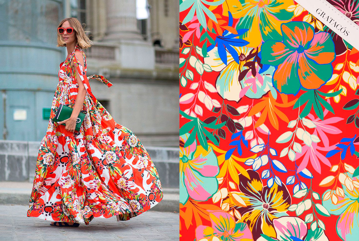
Prints inspired by the flora and fauna of tropical paradises are a classic that never fails in Spring-Summer collections, especially in lighter fashion garments with holiday-inspired clothing. Exotic flowers such as hibiscus, abundant vegetation and some animal print motif sneak into these more relaxed and carefree designs with bold colours that help to enhance a suntan.
These are some of our suggestions, but you already know that in our online store or in our shop in Barcelona you can discover all the floral prints of the new collection. What designs can you imagine yourself creating with seasonal floral fabrics?
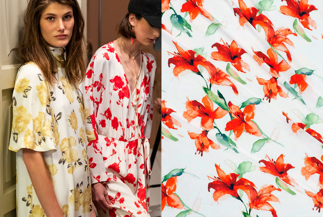
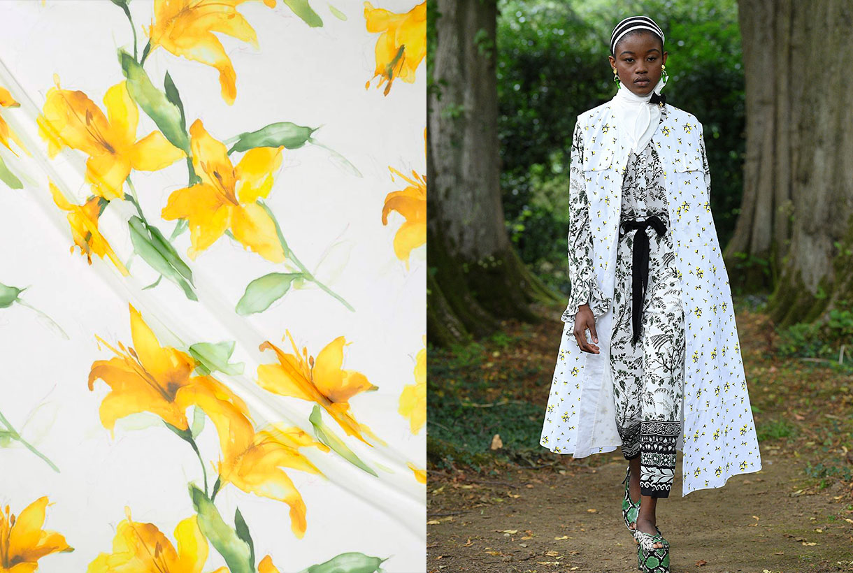
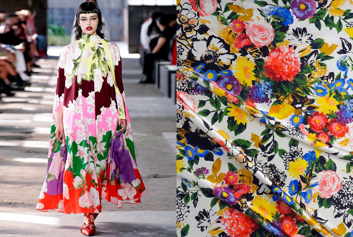
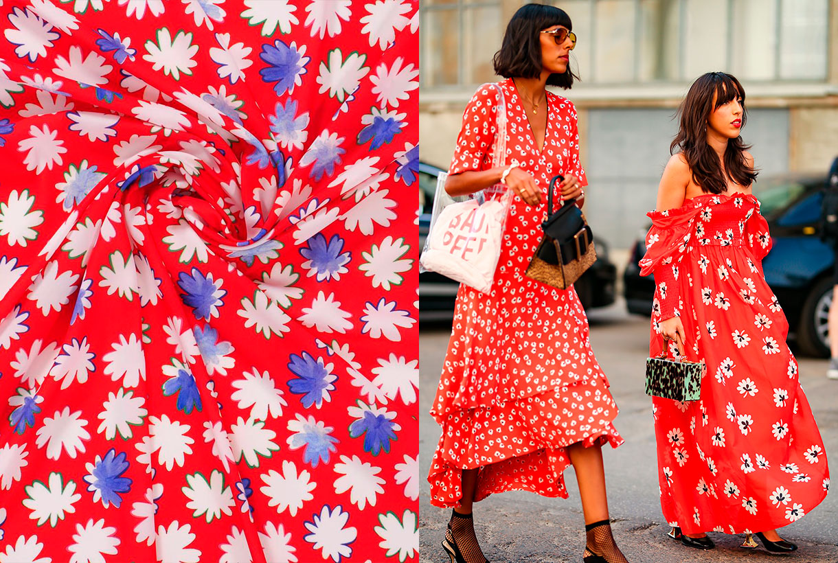
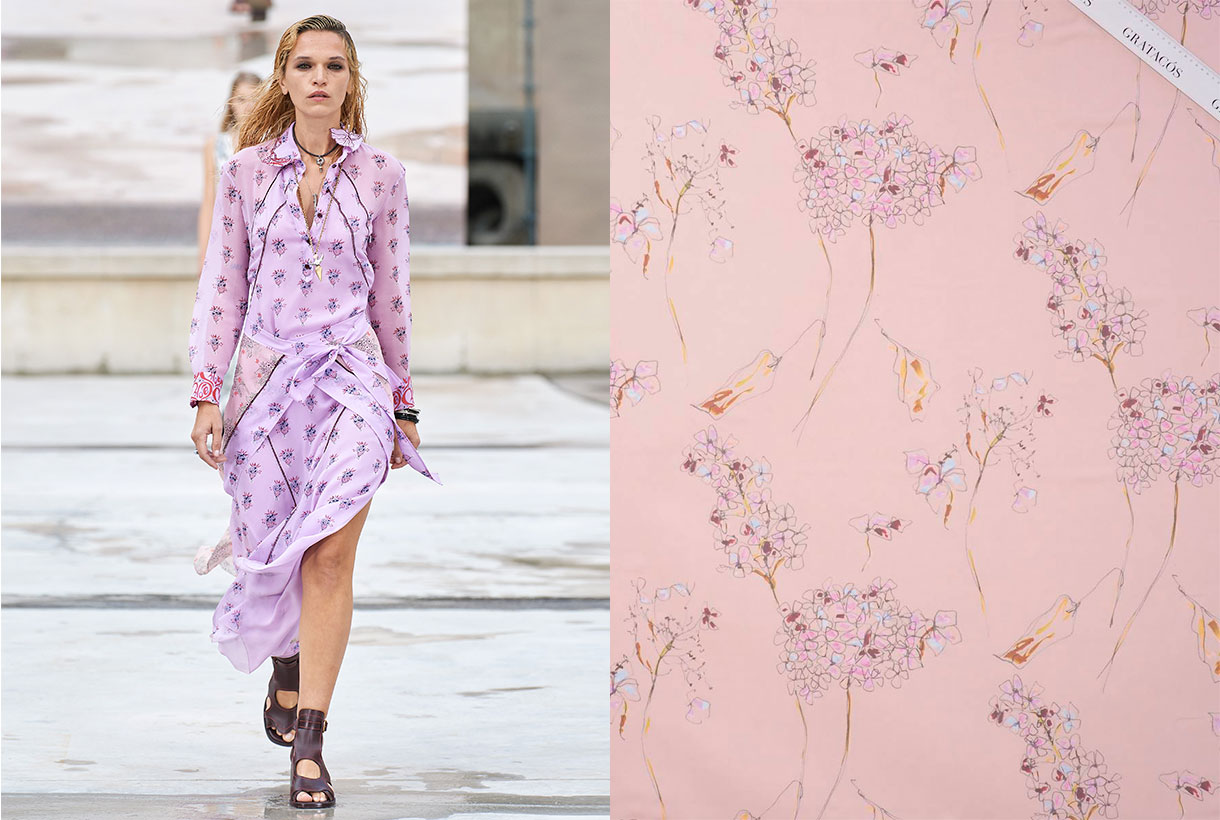
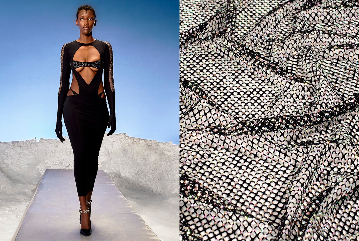
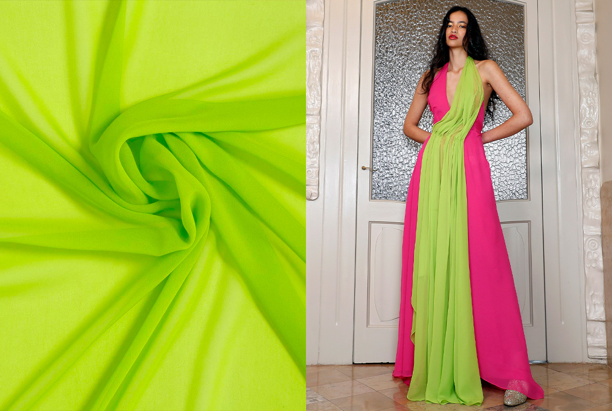
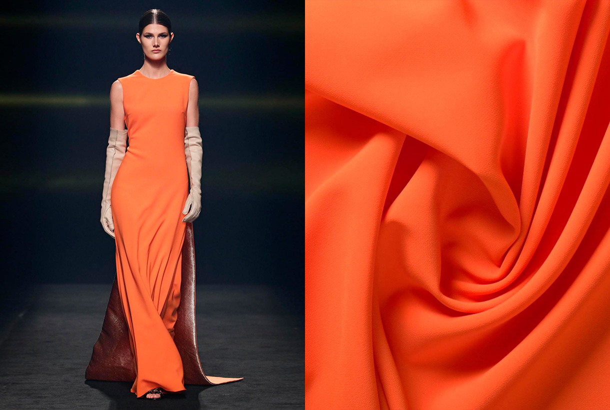
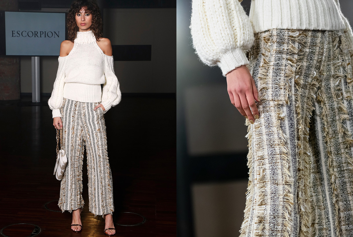
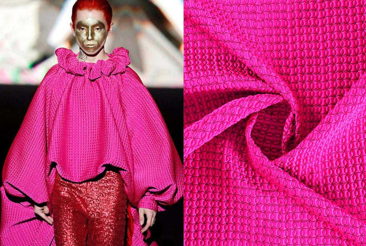
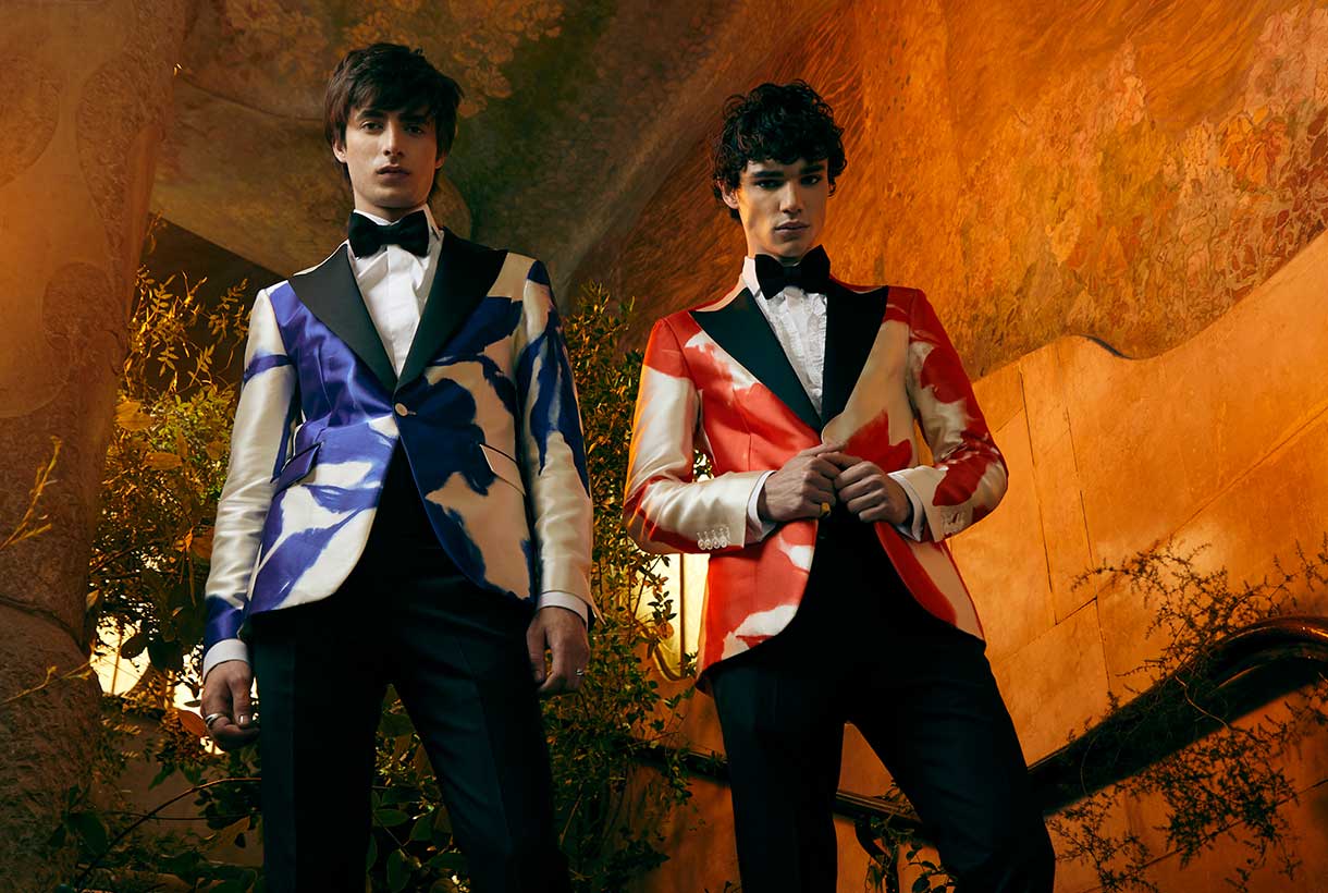 Gratacós ends the month of April by reviewing the first Spanish catwalks of the year: Mercedes-Benz Fashion Madrid in hybrid format and 080 Barcelona Fashion with collections presented through fashion films. These are the proposals, designs and looks that we have found on the catwalks and that are made with various seasonal fabrics. Thanks to all the designers for trusting in us!
Mercedes-Benz Fashion Week

Brain & Beast souvenirs
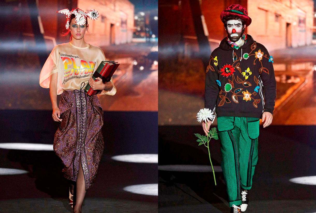
Ángel Vilda, the alma mater of Brain&Beast has transmitted the concept of memory and nostalgia to the Madrid catwalk, via family memories with his new creationl ‘Souvenir’. Thus this daring designer, who turns shape, volume and colour upside down in each collection, has reverted to his childhood to reproduce garments that have marked him and that constitute valuable objects in themselves: the patterns of the dress his grandmother wore at her mother’s wedding, a coat that recalls the dressing-gown she wore on her holidays in Salou, a reconstruction of his grandfather’s dressing gown … All this personal memory takes shape via his customary design tics: oversize patterns, overlapping layers and textures, geometric motifs and some symbols inspired by contemporary culture that mix irony and humour. This company combines powerful social discourse with a strong visual identity and has managed to establish itself within the scene with its irreverent style. At Brain & Beast nothing is left to chance.

The art of volume by Isabel Sanchís
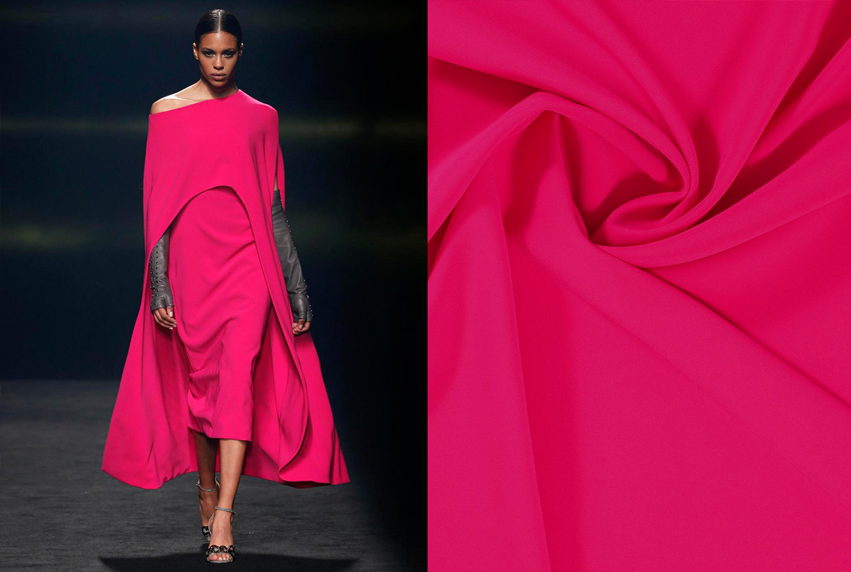
The Valencian designer once again magnifies the femininity of women via a new Autumn / Winter collection 2021/2022 full of pieces with intense silhouettes and volumes of sculptural inspiration that appeal to the five senses. To recreate these architectural figures, Isabel Sanchís uses elements such as shoulder- pads that provide volume and a certain futuristic air, drapes, embroidery, intertwined motifs, fringes and silicone appliqués. With regard to colour neutral tones, especially in grey, accompany touches of fuchsia, yellow and orange in strategic looks that reduce volume and enhance the feminine silhouette.

Maison Mesa, life is a party
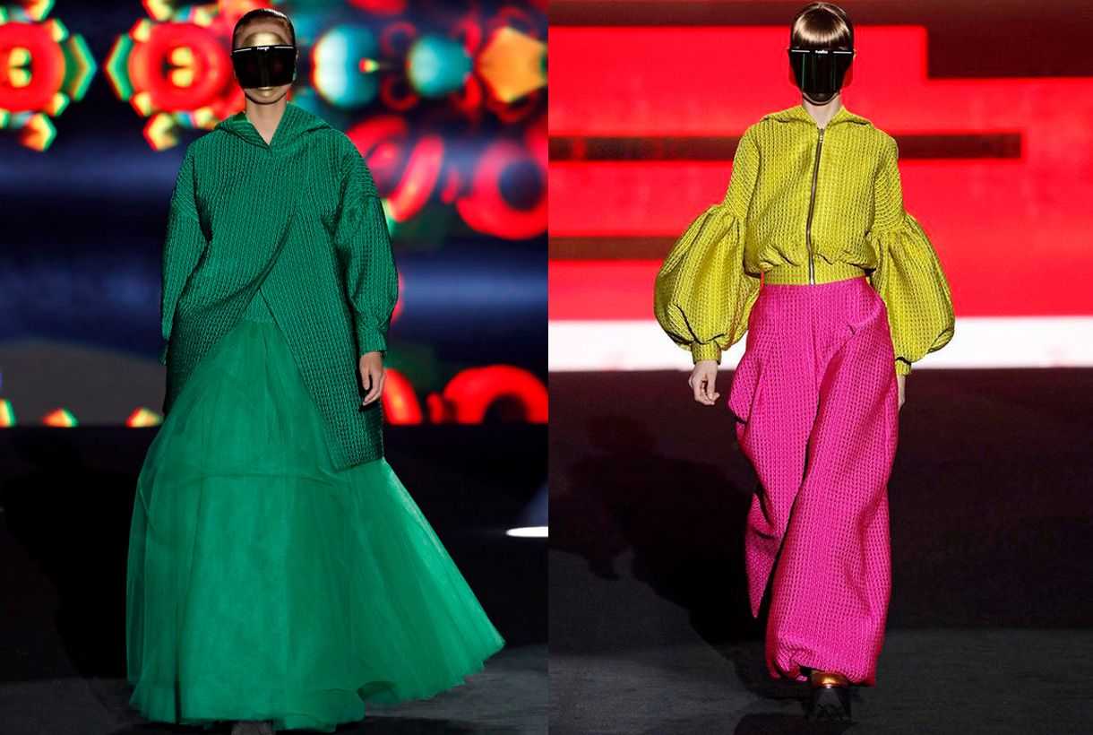
Juan Carlos Mesa has actively contributed to the visibility and development of Spanish fashion. With his own company, Maison Mesa created in 2017, the designer exhibits his unique vision of fashion in a contemporary key, combining tradition (materials, classic and artisanal sewing techniques) with new technologies (3D printing and experimental materials). Under this concept the latest collection entitled ‘Rave’ was presented, inspired by the history and evolution of those bohemian parties born in London in the 50s that have been transformed over the decades into well-known electronic music events.
To represent this spirit of escape via partying Juan Carlos Mesa goes for clean and simple lines, full of references to urban clothing that stand out for their comfort and freedom of movement: wide pants and overalls, baggy pants and oversize garments. , cargo pockets, hoods and zippers, rubber or automatic, which hark back to sport garments. In terms of fabrics the designer uses a surprising mix of combinations: wool, satin and lurex twill, mixes of crepes with denim or quilted fabrics with a 3D effect together with tulle. All, within a colour range that ranges from the purest and primary colours such as yellow, green or magenta, to burgundy, indigo, grey, white or black along with touches of gold and silver.

The OFF catwalks
Parallel to the official calendar for the Mercedes-Benz Fashion Madrid, OFF shows were also scheduled, featuring young fashion designers.
In these alternative shows we highlight designers who habitually trust our fabrics, like Dominnico. This time Domingo Rodríguez Lázaro is inspired by the social crisis of coronavirus to create an imaginary uncertain future through the eyes of a generation of young people who want to socialize at a moment of emotional breakdown. To recreate this concern Dominnico goes for an upcycling exercise, recovering part of the brand’s fur leather inventory to create new pieces. In addition the denim fabric that appears with exclusive prints and also a new genderless fashion line is given prominence.

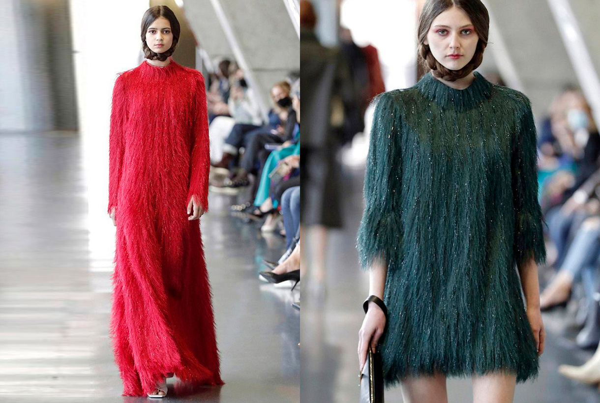
For her part, Pilar Torrecillas from the company Pilar Dalbat has presented a collection dedicated to the figure of Mariano Fortuny Madraza, taking as reference the 150th anniversary of the birth of this famous painter from Granada. We highlight the feminine designs featuring our fabrics with small fringes creating an interesting hair effect.

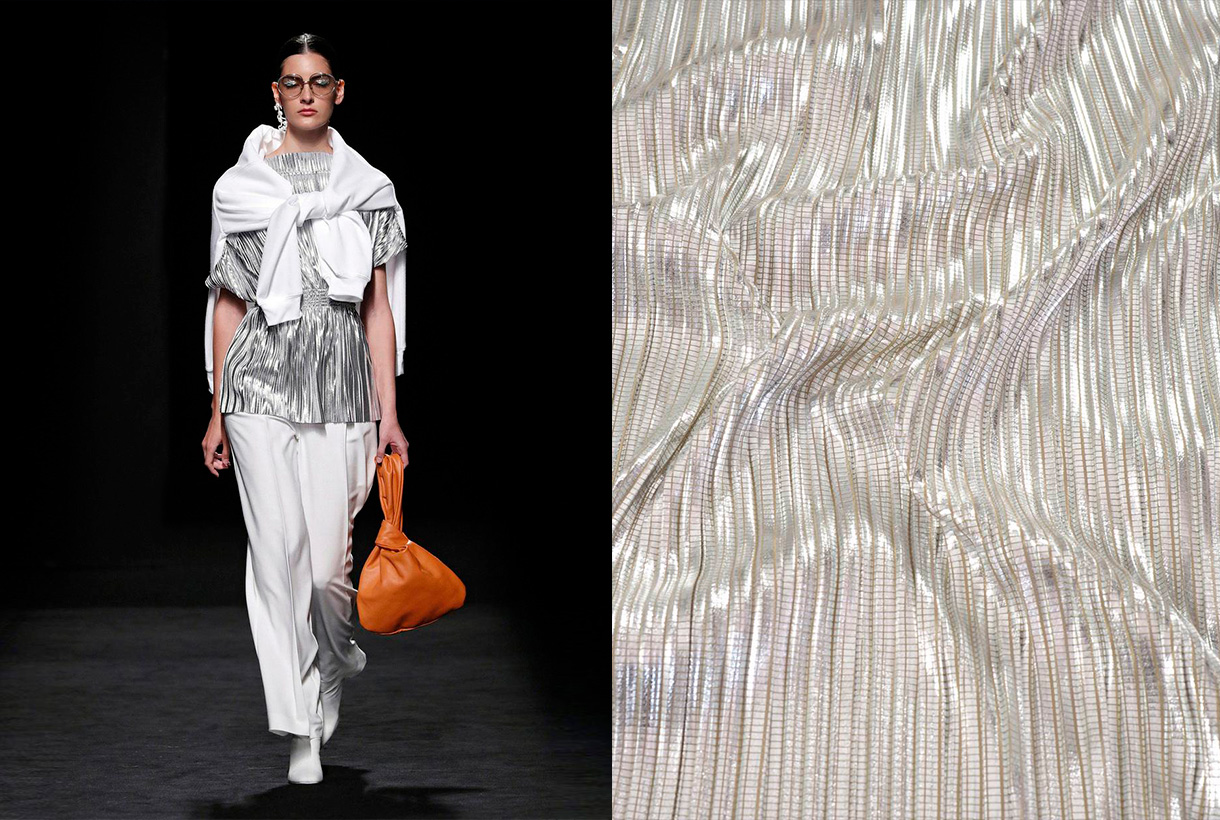
The Corsicana firm of Paula Currást tends to merge different disciplines and interests for its catwalk shows: fashion, design, cinema or music all appear together. The latest collection focuses on the home as a space for inspiration. ‘La Casa’ represents reflections on an environment of intimacy and introspection via fluid designs of urban inspiration, sartorial garments and pleated fabrics that are combined in a very controlled colour range.

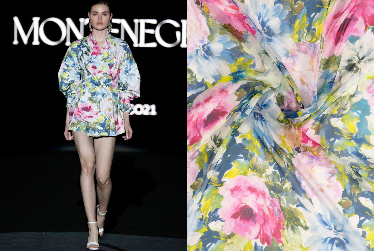
Finally, Montenegro, the debut of Nicolás Montenegro on the Madrid catwalk with a ready-to-wear proposal inspired by southern Morocco. The Sevillian’s creations abound in shirt dresses inspired by Moroccan djellaba with materials such as silk. The extremely striking cuffs and collars with character are some of the details that the creator applies to his shirts. Exceptional pieces that are dotted with lace, ruffles and delicate finishes, always topped by the company’s hand-made buttons.
080 Barcelona Fashion

The glamour of Avellaneda invades the Catalan catwalk
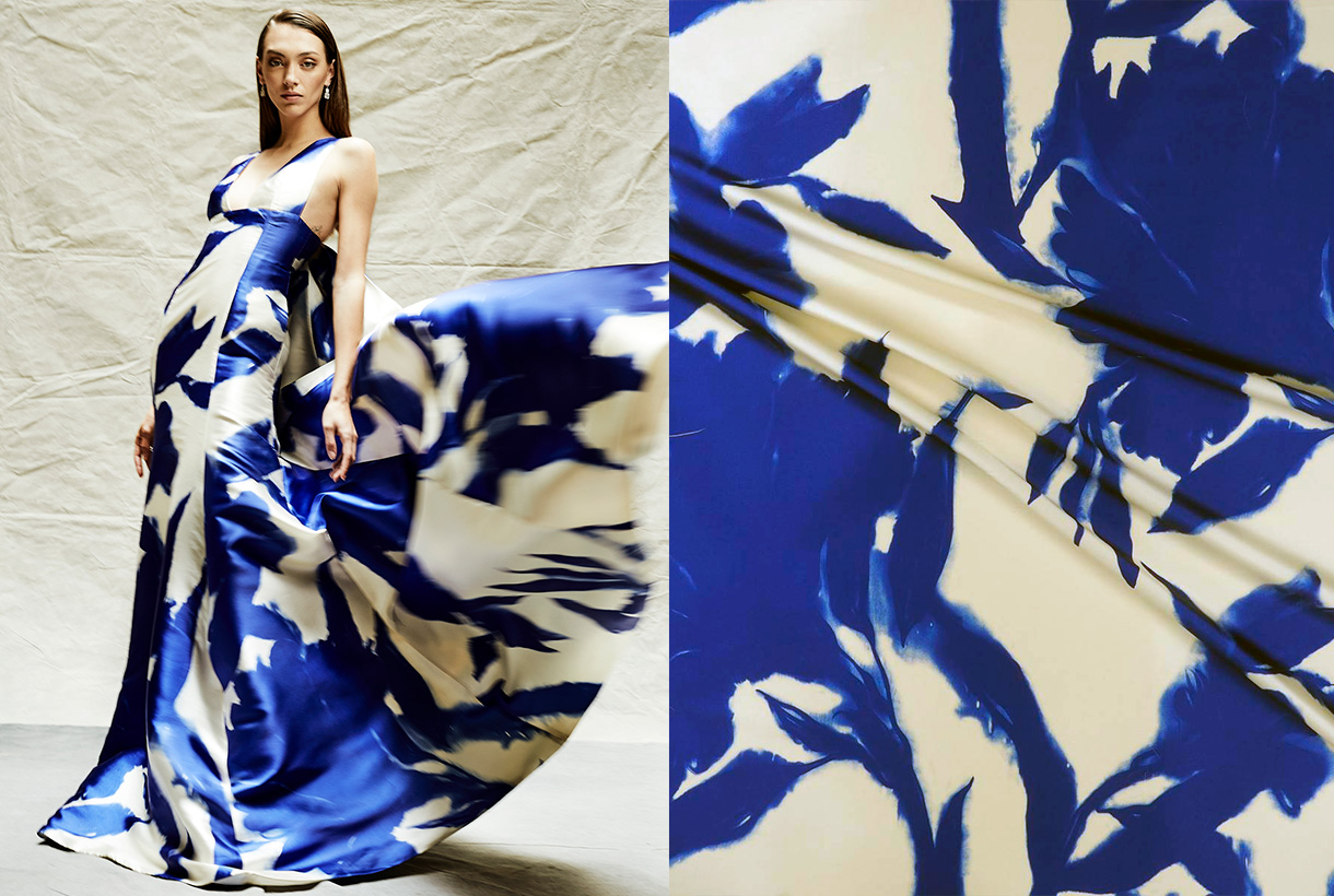
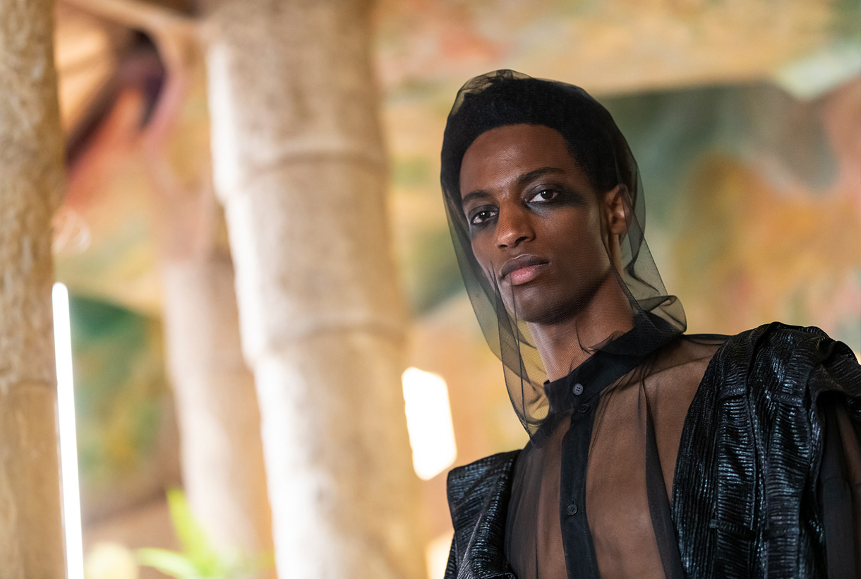
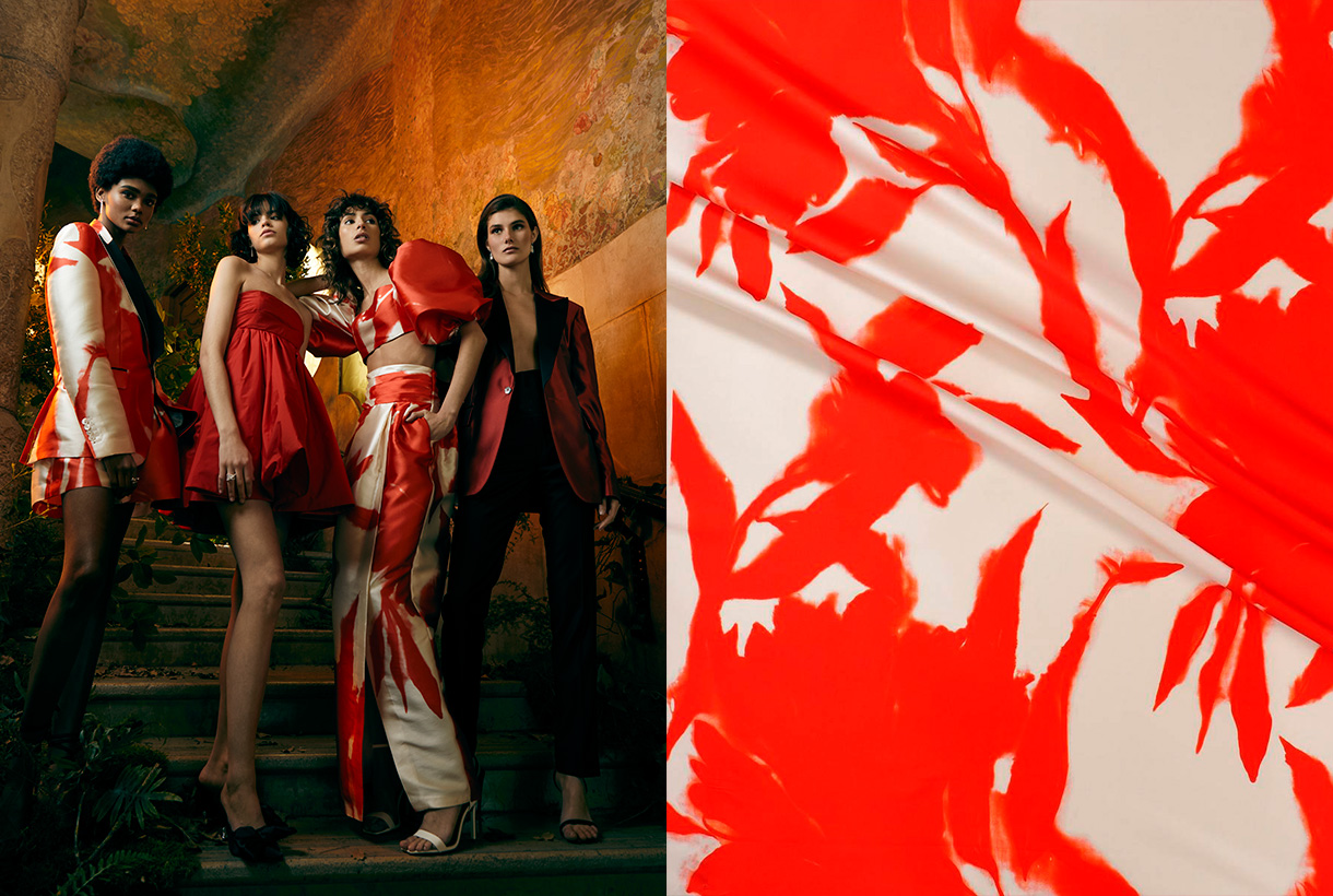
Juan Avellaneda has opened the 080 Barcelona Fashion calendar with a proposal that invites you to dream via sophisticated looks full of fantasy that connect with beauty, joy, escape and the desire to celebrate life. Thus in the proposal ‘La nuit éclairée’ the celebrity designer opts for the characteristic features that make up his DNA: tuxedos for men and women together with classic shirt and tailoring patterns, introducing novelties such as porcelain-china inspired prints and a collection of dresses inspired by tailored garments. The chromatic range makes a return to essentials via pure and energetic colours such as white, black, red and Klein blue that suggest Mediterranean culture and its celebration of the essential.

The magic of Menchén Tomàs
Menchén Tomás is inspired by the ‘Duende’ for the next Spring-Summer 2021 collection, that is, by the innate and intangible talent that causes almost magical sensations in those who witness it. In a fairy tale atmosphere and with various elements that refer to the tarot, Olga Menchén showed off her usual design skills through a sophisticated and feminine collection, full of volatile volumes, iridescent fabrics, radiant colours, evocative long dresses where craftsmanship is appreciated: prints suggesting astral charts, embroidered flowers and a laboriously- created wedding dress with almost a hundred hand-sewn pieces that closed the show. The use of oriental-inspired silk and patterned gauze with colours such as porcelain- blue, apple- green or mandarin- orange give the collection an energetic air.

The experimental craft of Y_Como
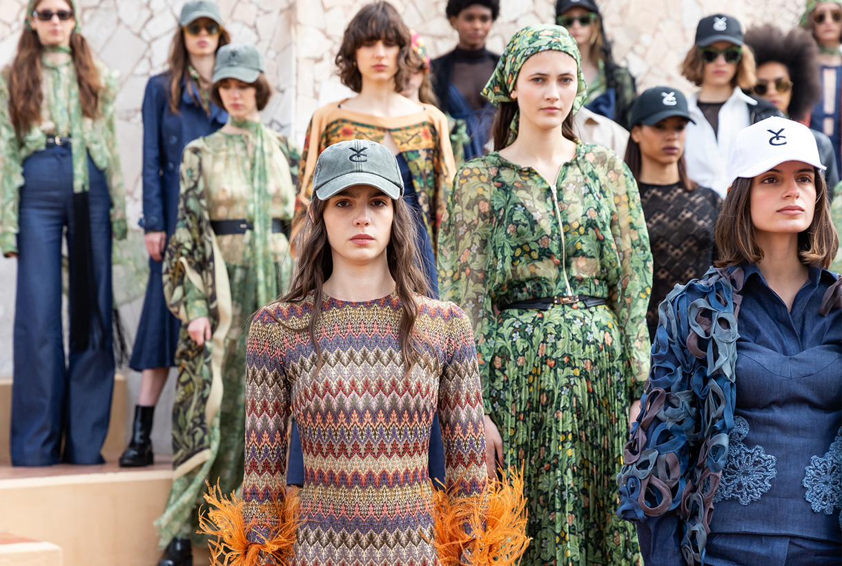
Born during lock-down, Y_Como is the new adventure of sisters Cristina and Yolanda Pérez, founders of Yolancris, the Catalan haute couturehouse that has catwalked in Paris. This new brand was born with the desire to explore the creative processes of the pieces, experimenting through innovative techniques, fabrics and silhouettes. The debut collection was actually presented at 080 Barcelona Fashion and is a declaration of intentions: it reclaims the spirit of freedom via the humanist poem ‘If’ by Rudyard Kipling in a manifesto that also combines the Arts & Crafts movement of designer William Morris and the naturalist architecture of Antoni Gaudí. Thus this proposal of great visual richness is in practice a great exhibition of the craftsmanship and experimentation of its designers. Particularly noteworthy is the meticulous way in which they have worked denim through draping, pleating and hand embroidery, together with hand-made prints and embroideries with floral and plant motifs. An exquisite hand-made proposal makes such a difference.

The free love of Paola Molet
Finally we also highlight Paola Molet who has made her debut on the Catalan catwalk with her own company, which was created 6 months ago. Her style is defined as neo-romantic and the collection is genderless, non gender-specific, with pieces that can be interchangeable. The proposed creation for next winter deals with how society understands love and the pursuit of happiness, whether following established canons or not. The young designer transmits this search in design through rigid, dense, hard and straight-shaped looks that are combined with de-constructed silhouettes and contrasting fabrics. The proposal is mostly black and white, with a touch of red.
I hope you enjoyed the collections as much as we did!


Sorry, this entry is only available in European Spanish.
Mi�rcoles 16 diciembre 2020

This anomalous 2020 has also upset the calendar of the interesting informative talks by the Color Community. association. A private initiative, which we have followed closely since its creation, led by a group of three professionals who love colour: the architect Pere Ortega; the designer specialized in Colour & Trim, Eva Muñoz; and Rosa Pujol, Textile & Colour Stylist and creative director of Gratacós.
This year, the biannual and face-to-face meetings at the Old Damm Factory in Barcelona have been converted into digital format, thus via screen respecting the security measures imposed by the current health situation. Despite the difficulties, Colour Community was able to present the new colour chart that will serve as a guide for the Spring-Summer season 2022 in an orientation report that serves as a source of inspiration for creative professionals who are dedicated to fashion, design, advertising or architecture, among other areas.
Within a current social and economic context marked by instability and uncertainty, the new broad and global creative proposal Wait… SS22. A concept that articulates the entire chromatic range and which symbolizes the preamble to an infinity of optimistic possibilities, guided by the real need to make better decisions as a society and also in relation to the environment. This “waiting” is essential, according to the association, “to appreciate and value life with humility and simplicity, and its functional daily life to structure the whole future.” For this reason, it will be necessary to design from practicality, but without forgetting beauty or creativity.
“The new creation symbolizes the preamble to celebration,
play and optimism”
“Wait…” also symbolizes the beginning of celebration, play and optimism, opening seamlessly to coexistence with digital reality. As for colour, it materializes like never before, conveying human emotions and being the conductive support of these senses.
In turn, the ‘Wait…’ colour scheme is structured through four ranges of colours, textures and materials named Wait… & Listen, Wait… & Wish, Wait… & Enjoy and Wait… & Grow Up. Colour Community sums it up with a claim to a final message of hope: “Wait… & tomorrow”. Wait and there will be a tomorrow.
Below, we summarize each creative proposal:

Wait… &Listen
This first range is inspired by attentive waiting: ” one that is willing to receive information and learn from it “. A proposal that is based on learning from the proximity of natural society and human knowledge. Wait… &Listen is built from neutrality and naturalness, presenting colour with renewed subtlety. That means that we speak of natural realism, of materials and finishes that connect with a well-manipulated origin, worked from harmony and sustainability. As for the colour palette, relaxing neutral tones abound, such as natural white, basic ecru and calcareous grey, among other soft colours that structure and soothe. The designs mark a return to the simplicity with linear shapes and geometric basics such as the circle. Rough textures, natural and imperfect finishes, wrinkles and rustic aesthetics return. This trend is also seen in fabrics that are expressed without decorative excesses. Clean-looking matt cotton, linen, hemp, poplin and satin threads abound. Finally, natural fibres coexist with recycled and regenerated synthetics.

Wait… &Wish
The second range appeals to desire, this concept that cannot be materialized and that activates the most creative part of the human being. According to Colour Community: “desire is not satisfied with the tangible and looks for something else as far as possible”. Under this premise, Wait… & Wish seeks to rediscover the secrets of craftsmanship, revaluing all its specific features. In turn this range also focuses on the plant world, but this time it focuses its attention on that nature that we know, but that we rarely touch or experience consciously. The colour is inspired by the apparent chaos of natural beauty, its uniqueness and exuberance with rich, bright and contrasting chromaticism: vegetal green, bright blues, gold foils or crimson brushstrokes. The designs seek to seduce by their elemental, organic and abstract geometries, hand-drawn striped prints, paintings in their freest version and colour combinations that reflect the chromatic chaos of nature. As regards materials there are many works with artisan natural dyes, semi-gloss yarns, die-cuts and laser cuts, utilitarian clothing and satin looks. Finally, in fabrics we are committed to sustainability and comfortable and practical fabrics that do not abandon design. In the fantasy section, Jacquards abound with geometric structures, mesh fabrics, nets and refined weavings such as reliefs and embossing.

Wait… &Enjoy
The third inspiration is the opposite on a conceptual level to the first two: it wants to project the future in an optimistic and creative way, exploring concepts such as freedom, evasion and extroversion. A creative enjoyment that will become limitless, but consistent and thoughtful with the common good. In this range, Colour Community features a creation enriched and loaded with subjective personality, but always coherent and respectful with the environment. The colour palette is based on fresh, cheerful, playful and sensual tones full of positivity and ready to be combined with neutrals. Vital tones such as geranium, fresh mint, chlorophyll, pink and vitaminised lime which combine with neutrals like white and sand-coloured. The designs are seduced by the power of the flowers and the magnetism of the most exuberant vegetation. Leaves, petals, gardens, green spaces … plant nature also takes centre-stage in summer fabrics. In addition to the flower motifs there are beautiful yarns for new colour sensations, shiny fibres, fluid fabrics that create transparency, textured organza with iridescent yarns, Jacquards with reliefs and piqué. In general, the fabrics express that intention to celebrate and dance again through movement.

Wait… &Grow Up
Finally, Wait… & Grow Up represents an evolution of the previous range. It is based on the imperfection of growth, the acceptance of the passage of time and integration of the past in order to understand the future. This range is “a reunion with the most chromatic geometry with a high expressionist content”. Products designed from a future perspective, with this range of colours, will be approached with a stimulating and light-filled mentality in which multicoloured harmonies generating multitone patterns will play a prominent role. The colour palette is thus multifaceted, symbolic, versatile and adaptable to all sectors: mauve, yellow, intoxicating pink, coral, orange, green, grey, blue and sophisticated brown. In designs a mixture of antagonistic, strange motifs and visual surprises is prioritized. With regard to fabrics this last range follows the line of the previous three and has a clear intention: to better production via recovered or recycled yarns, reducing the chemical impact and water consumption, in order to face a future with hope. Finally, the proposal is based on tactile fabrics that provide an extroverted, colourful and highly visible look.


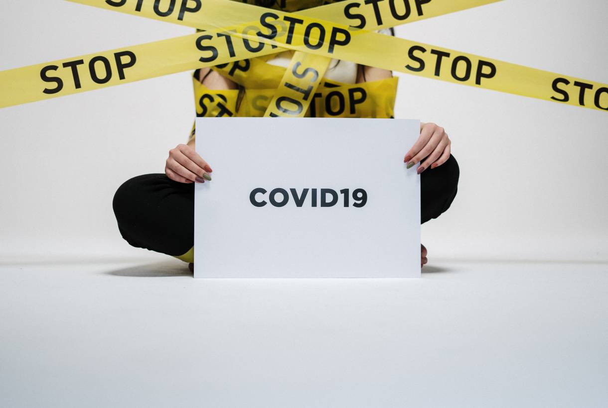
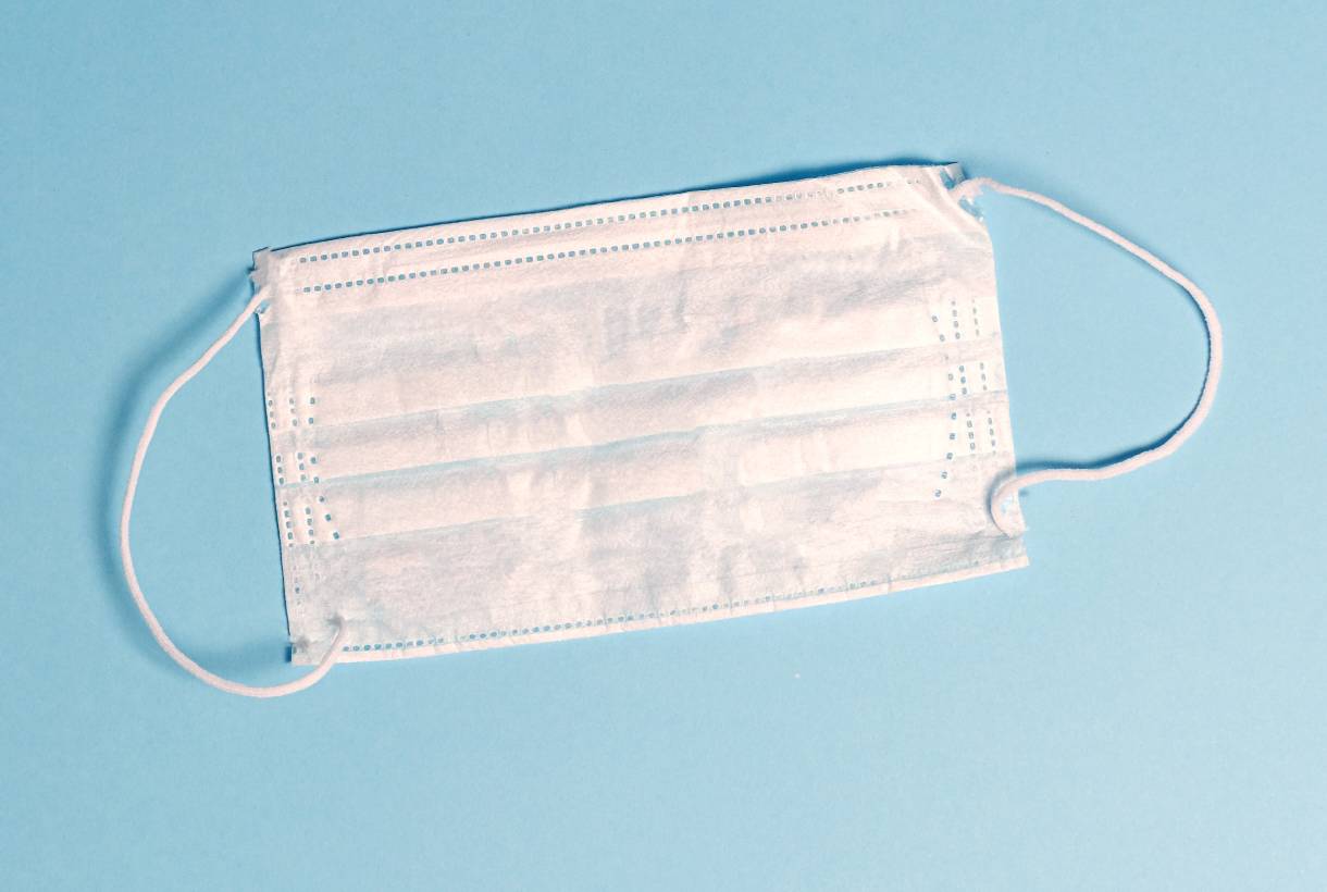
Together we are stronger – and this is more necessary than ever in unstable times that shake the foundations of the current economy. The textile industry (national and international) could not be left out of the emergency caused by the coronavirus, and it is admirable how in recent weeks it has joined efforts to manufacture on a large scale basic medical supplies to help cut the chain of contagion of the disease, and thus slow down the pandemic.
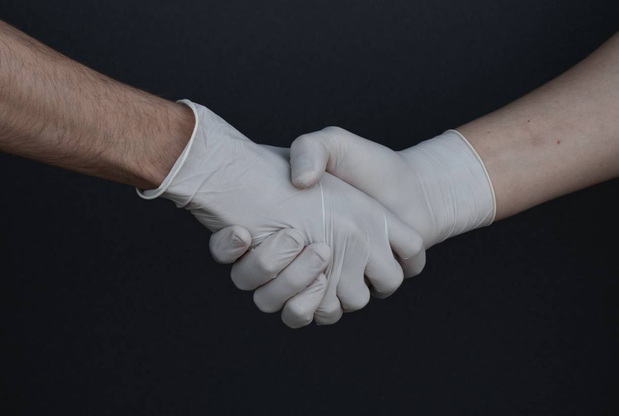
In extraordinary situations shock measures are needed. In our country, Spanish textile companies, as well as cosmetics, automotive and beverage sectors, have heard the government’s call to convert production to make masks, gloves, assisted breathing equipment or disinfectant gels to the maximum speed. This reconversion serves to supply hospitals, residences and essential service workers who urgently need this material to face the battle against the epidemic. Until now lack of resources was one of the black holes that gave wings to the coronavirus.

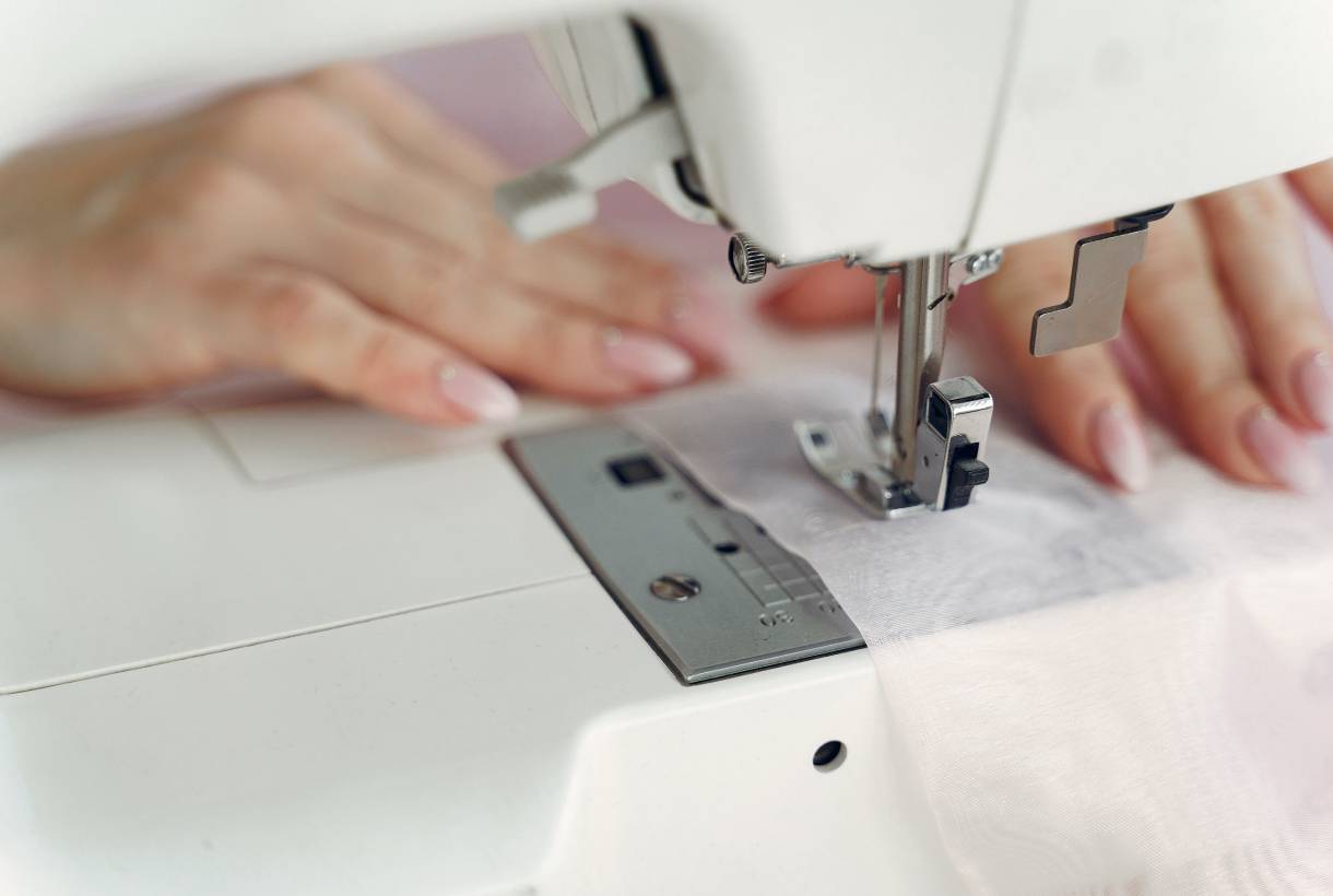
In the case of the textile industry, the companies that are joining the initiative have gone from sewing pants or dresses to making surgical masks and “use and throw” gowns that are used by thousands in hospitals. To date the sector has the necessary machinery, patterns and fabrics ready and once they comply with all the requirements and approvals approved by the Textile Technological Institute (AITEX), mass production will begin. Estimates are indeed encouraging: they calculate that up to 160,000 masks a day and about 50,000 disposable gowns can be manufactured.
The big international fashion brands have also gone to work with special productions accompanied by financial donations dedicated to providing current resources in hospital centres and promoting scientific research to accelerate the race to find the vaccine that eradicates the coronavirus. For their part, the Spanish fashion giants (Inditex, Mango, Tendam and Desigual) also have an army of suppliers around the globe to obtain more medical supplies. Things are already moving in this regard.

An army of volunteers fights for the cause
Beyond unity, if there is something that is happening in a positive key in almost every corner of the planet and that is teaching us a valuable lesson in humanity these days, it is solidarity. Everyone wants to join in and help as much as possible to slow down the pandemic. Apart from private initiatives, which are many and diverse, one of the projects related to fashion that has contributed its grain of sand has been Modistas Solidarias, an initiative promoted by the designer María Cordero, alter ego of the Spanish firm Wolflamb. Its goal has been to convert all the cotton fabrics into masks to supply the hospitals near its workshop in Valencia, and for this reason all seamstresses on the team are involved. This small project has gained in strength by the addition of small workshops and individuals spread throughout Spain. Along with anonymous volunteers, well-known names such as Ariadne Artiles, Eugenia Silva, Blanca Padilla, Paz Vega and designers Vicky Martín Berrocal and Juan Avellaneda have also joined the initiative.

Gratacós is also committed
At Gratacós we have not stood idly by and we are aware of our social responsibility as a fabric company. We too wanted to join forces in the fight against the coronavirus. So far we have supplied and shipped dozens of cotton fabrics to local workshops and neighbourhood companies for mask manufacturing. We are aware of the state of emergency and in the coming days we shall be studying how to encourage more actions to alleviate this social, economic and health crisis. We will inform you through social networks. Look after yourselves at home!


No one denies the obvious. Culture and leisure in its most traditional exhibition formats have been one of the biggest victims of the coronavirus. The closing of movie and concert halls, museums, exhibitions, theatres and libraries, among others, and the subsequent confinement in the home have hampered consumption habits via physical methods. Even so, culture is subversive and in difficult times it has always found alternative ways to spread knowledge through other media. And, in this case, despite the confinement, cultural life continues behind the screen in fully digital terrain.
The virus has not stopped the immense power of culture with its multiple channels of expression that allow it to keep its objectives intact: to spread knowledge, contemplate beauty, stimulate the imagination and create critical opinion. In fact, in the last week confinement has put to the test the ingenuity and creativity of many artists who have devised new proposals to experience culture from the sofa at home. From sporadic festivals to virtual visits, streaming talks or improvised courses. Every day new and original small-format initiatives emerge, in addition to those promoted by the world’s main art centres, to expand the list of cultural activities offered as an alternative to entertain and animate the days when people are shut-in at home.
Here we suggest some ideas for continuing to feed the intellect from home.

Virtual art
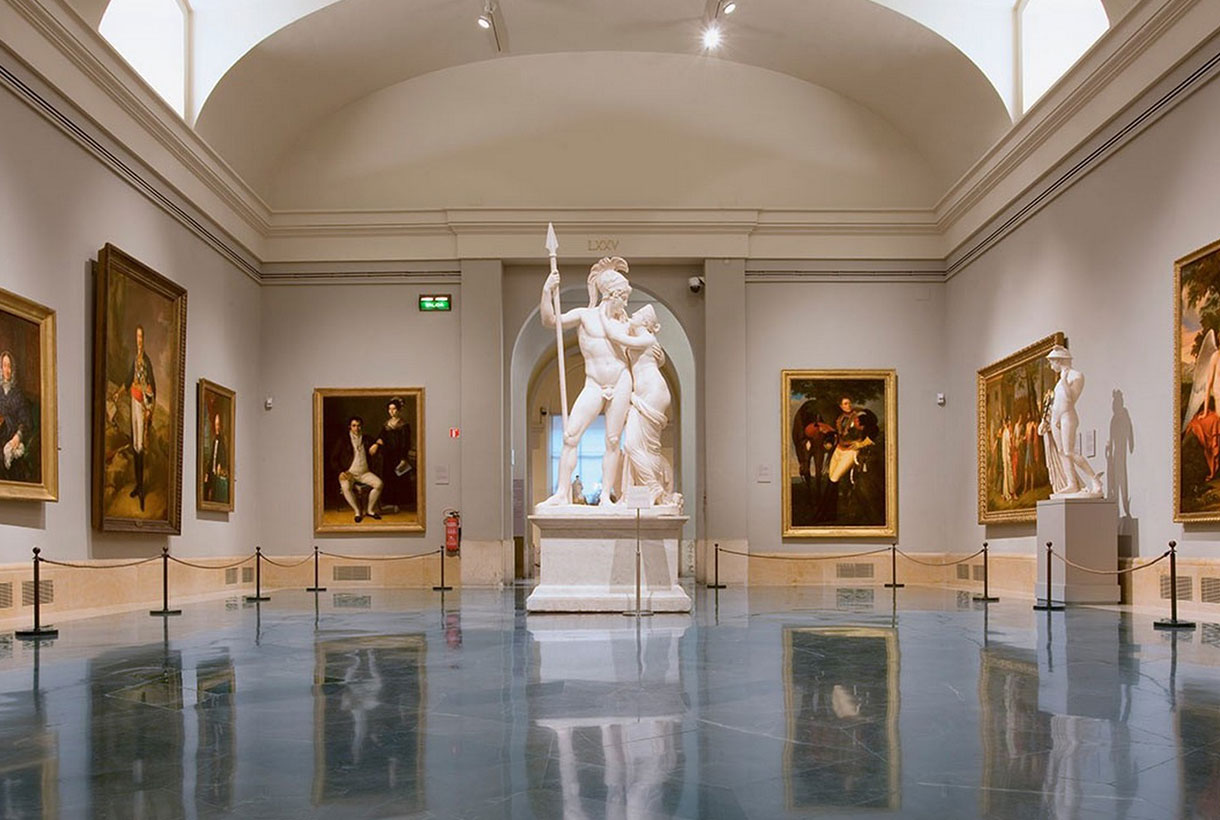
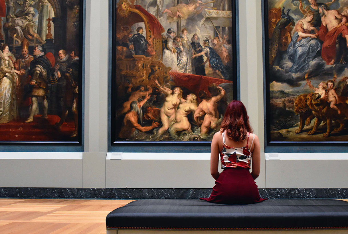
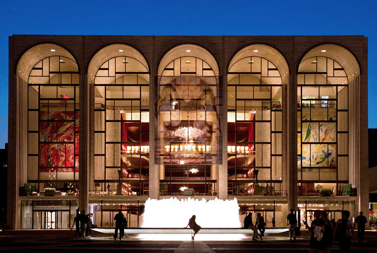
Museums and cultural centres around the world are still open virtually. This is the example of the Thyssen, the Prado, the Reina Sofía or the Museu Nacional d’Art de Catalunya, which offer virtual tours, videos, audios, conferences and even online courses to enjoy the cultural activities of these Spanish cultural venues. Internationally the Uffizi in Florence, the Vatican Muses, the Louvre, the Metropolitan in New York and the National Gallery in Washington stand out, for example, which also show visitors their online collection. For its part, Google,via its app, Arts and Culture, offers virtual reality guided tours of museums, masterpieces and even the construction of the statue of Liberty in New York. In fact, the almighty Google collects more than 7,000 virtual exhibitions from all over the planet. The difficult thing in this case, is to choose the sample to look at. For its part the benchmark for contemporary art, the MOMA, is also offering 6 interesting courses related to fashion, art, photography and design, all for free and without leaving home.

Theatre and performing arts
The performing arts also offer facilities to digital users. The Teatroteca of the Ministry of Culture is available with more than 1,500 plays, circuses and dance with works available to users such as ‘The house of Benarda Alba’, ‘Life is a dream’ or ‘Blood weddings’. Anyone can access them through a free online registration through Bibliotecacdt.mcu.es. For its part the New York Metropolitan Opera is offering great classics of the genre in streaming such as ‘Carmen’, ‘La Boheme’, ‘La Traviata or‘ Il Trovatore ’.

Series and films
Digital payment platforms for viewing audiovisual content have experienced a new boom in subscriptions that show the increasing consumption of series, documentaries and films among confined users. Apart from the kings of streaming, there are also other public websites such as RTVE or Televisió de Catalunya that offer series and movies for free and legally. Other pages such as Efilm.online and Ebiblio.es have a catalogue of free movies, books and magazines for those who have a library card. Libraries, such as Nacional or Catalunya, and websites such as Google Books also offer free reading.
Live music
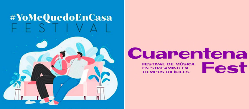
Music knows no borders. And less in difficult times, where it shows the great ability to break barriers and reach all corners and audiences. Initiatives of all kinds have emerged from social isolation: from sporadic concerts through Instagram grouped in hashtags that are running like wildfire on the Internet such as #YoMeQuedoenCasa to alternative music festivals such as the Quarantine Fest to make the state of confinement more bearable. This latest initiative brings together 50 bands that offer private concerts from their homes through YouTube. Some anonymous artists have even come out onto their balconies to perform songs a cappella, or with their musical instruments, to offer impromptu live concerts to their neighbours.

In the coming days, the cultural offer will increase to maintain a certain normality from home. Evidently the consumption format changes because coronavirus has reduced the aesthetic experience to the window of a screen. Also missed is that essential social component that sustains culture: to climb on a stage, to comment on some works that excite,to walk through an exhibition… but we are sure that when this situation is over we will perceive (and appreciate) beauty in another way and from all possible areas. One last tip: keep your wifi well-connected!

March, like September, is the month of rebirth. From the blooming of the new season that hitherto has been hibernating in our stores, waiting for its turn: the official presentation to society. And we really wanted to show the new collection of fabrics, this time absorbed under the Double Poetry concept.
Double Poetry appeals to poetry that hides duality. A dual year (2020) inspires a spring-summer collection that moves between two waters. On a creative level we are inspired by the antagonisms that are related to each other, especially in work processes: the mental and the irrational, technology and emotion, what develops in a cerebral way and what is guided from the heart. We provide the most advanced technology with poetry and human emotion to create a rational and tangible proposal, but with high doses of sensitivity.
Under this concept of extremes that complement each other, the Spring-Summer 2020 proposal is developed in two directions:

1. A turn to contemporary classics
The classic does not have to be predictable or boring, especially when it undergoes a transformation that shakes and rejuvenates it. We like to get out of our comfort zone with disruptive proposals. This line contemplates fabrics that retain a certain timeless primitivism. They are easily recognizable products, close to the domestic and that convey security and everyday life: wear a Jacquard out of the festive season or look for a type of cotton that conveys a message, why not? A range of traditional fabrics (drapery, tweeds and wool items are coming back), some of them rustic looking and which interact with the latest technologies to include us in contemporary fashion.

Within this line the tactile fabrics are grouped, with certain reliefs: granulated, obvious crepes, flamed, flexible volumes, synthetic glitters, silver lurex worked in a delicate way and without stridencies. These products stand out because they seek to enhance the beauty of the raw material. They are handmade and rustic fabrics, but at the same time technologically sophisticated and they show these imperfections (reliefs and volumes) with pride. In terms of design, contemporary classics are inspired by the ethnic universe in a minimalist key: in a natural folk style with firm strokes, sinuous and organic shapes. This category also abounds with repetitive, almost elementary geometries, with or without symmetry: clean frames and essential stripe patterns. Finally we are not forgetting floral prints with delicious compositions with petals and motifs that are inspired by the surfing universe of vibrant colours.
In this first block neutral tones abound, an earth palette with golden nuances, the unbeatable black and white or navy blue combinables.

2. An ode to the urban landscape
The second address of the Spring-Summer 20 collection puts us in an urban environment. The city as the core of human relations. We seek that direct connection with our glass and concrete home and within this line we embrace experimentation with surprising combinations of materials and textures with vital, luminous and energetic colours that can be confronted face to face to create an interesting dialogue in tune with the urban landscape.

In this second block fabrics of a young and fresh luminosity abound, with intelligent and emotional shades at the same time. We seek to appeal to the emotions with this mix and we let ourselves get carried away by intuition. Thus the fabrics we are suggesting stand out for their evidenced volumes, they are dense in appearance, with artificial compositions and elegant textures for a seduction that enters daytime terrain. Feminine and fluid fabrics with light and fresh reliefs because we want to communicate energy and spontaneity through the materials. In turn the products have a clean appearance, technical touches only in finishes and they have a spontaneous and energetic design for a look that stands out within the city. The fabrics seek some theatricality and joy with giant graphics for the outdoors, aquatic reflections and botanical-inspired prints. A line that encourages us to rethink aesthetic codes and experiment without questioning the beauty or the need for the final products.
In this second block mineral colours abound ranging from blue to pale pink or lavenders, oranges and a palette of greens and limes. Vibrant tones that are exhibited for their own sake.
We invite you to discover the new Spring-Summer 2020 collection through the online store or in our Gratacós space in Barcelona. Let yourself be seduced by the materials, textures and patterns of the fabrics!


 December is the month of rituals and traditions marked especially by Christmas and the closeness to our loved ones. For designers, there is one thing that is awaited for with enthusiasm: finally knowing the colour that will mark the following year and that will be announced at this time,


 How do we apply Very Peri in the world of fashion?


 Although in fashion they do not have seasonality, flowers triumph in spring: they sprout in all fabrics and take over the main trend-setting outfits, whether romantic spirit, eighties aesthetics, sports or boho-chic style. In addition, this season the motifs of small and delicate flowers coexist with other tropical-inspired maximalists in bright and radiant colours. In fact, if there is something that unites the spring floral prints, it is the explosion of colour that they use to enliven the looks of the moment.


 Gratacós ends the month of April by reviewing the first Spanish catwalks of the year: