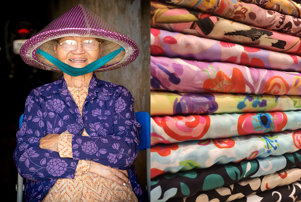
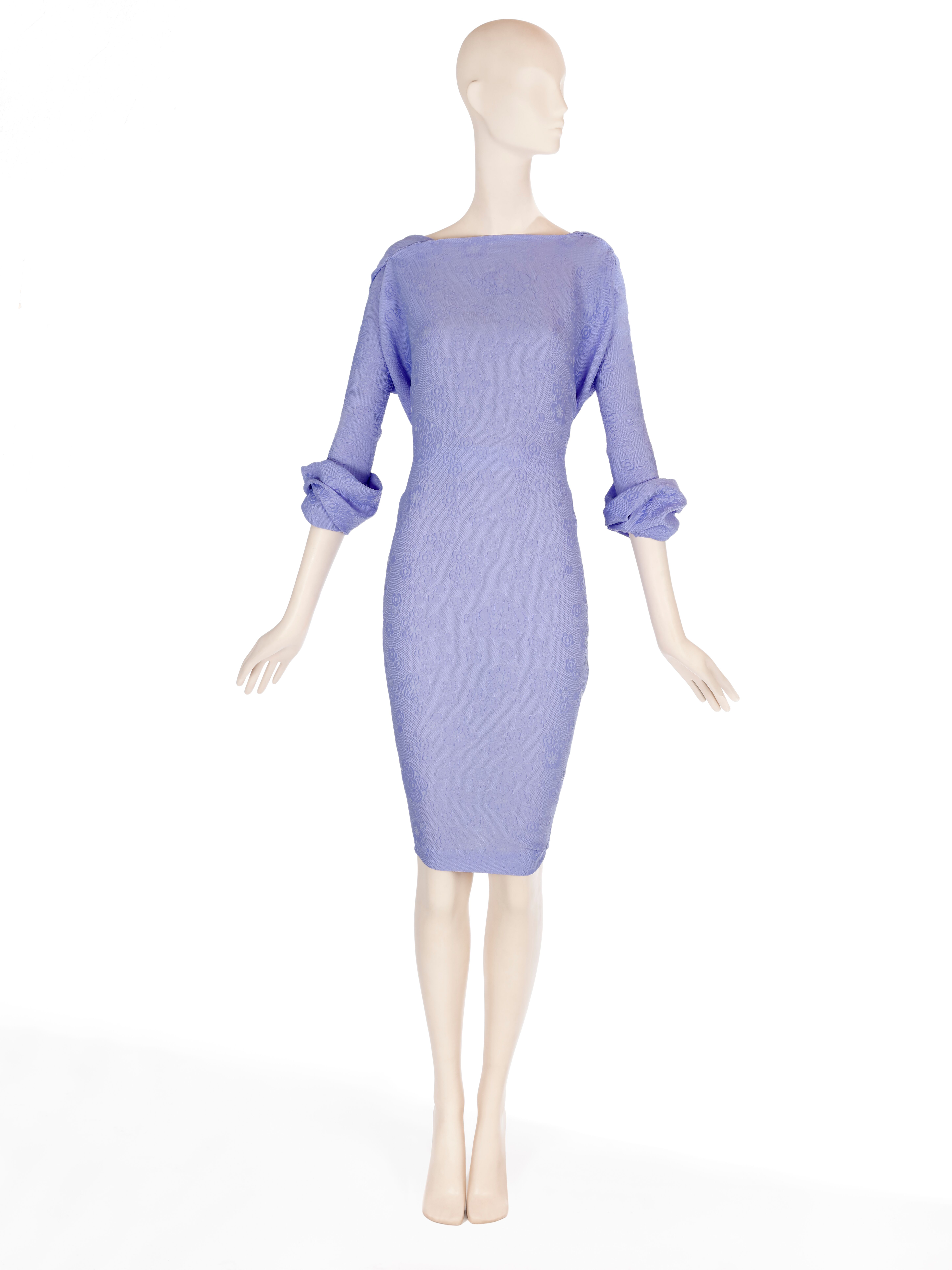
March, like September, is the month of rebirth. From the blooming of the new season that hitherto has been hibernating in our stores, waiting for its turn: the official presentation to society. And we really wanted to show the new collection of fabrics, this time absorbed under the Double Poetry concept.
Double Poetry appeals to poetry that hides duality. A dual year (2020) inspires a spring-summer collection that moves between two waters. On a creative level we are inspired by the antagonisms that are related to each other, especially in work processes: the mental and the irrational, technology and emotion, what develops in a cerebral way and what is guided from the heart. We provide the most advanced technology with poetry and human emotion to create a rational and tangible proposal, but with high doses of sensitivity.
Under this concept of extremes that complement each other, the Spring-Summer 2020 proposal is developed in two directions:
1. A turn to contemporary classics
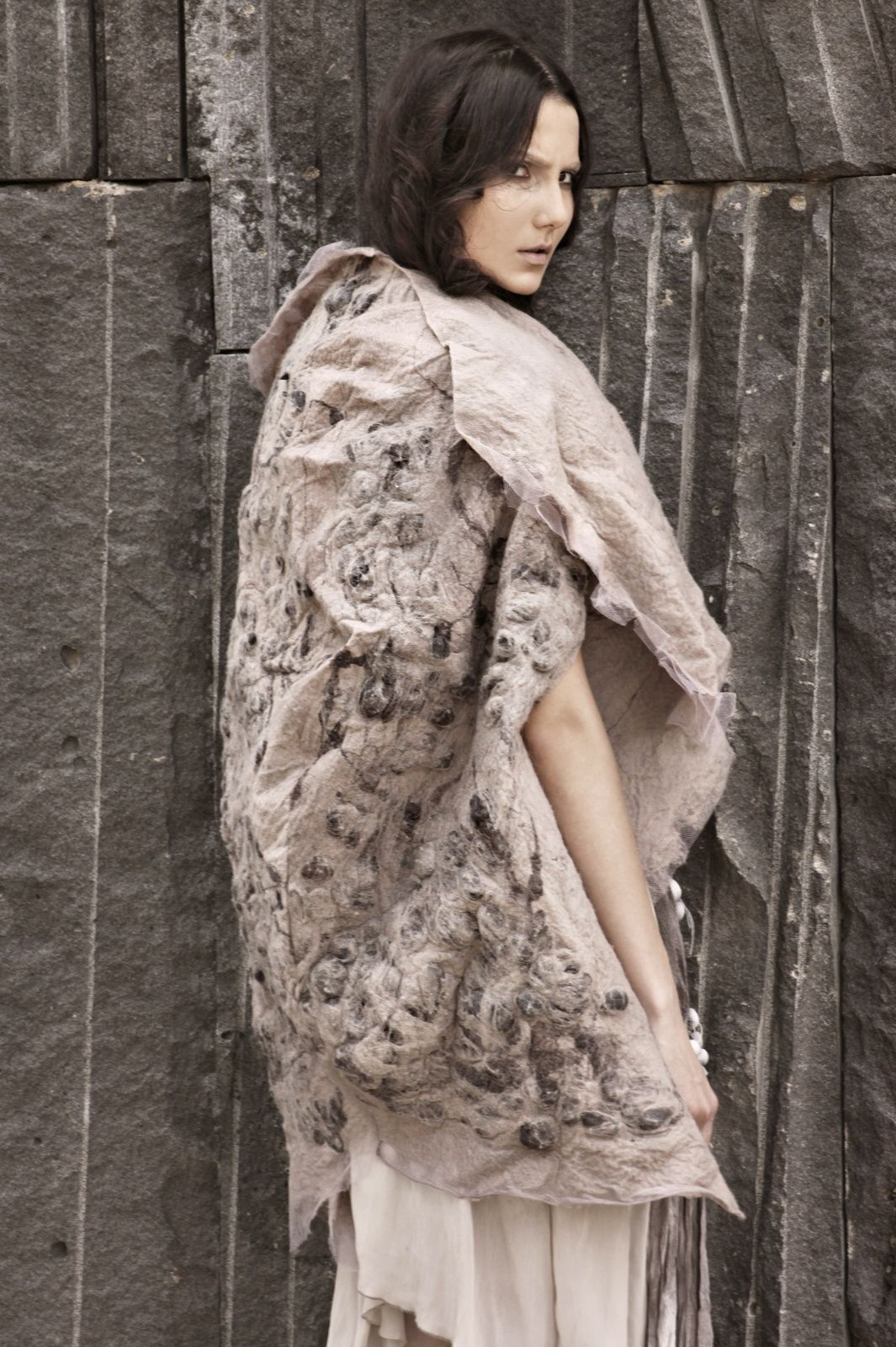
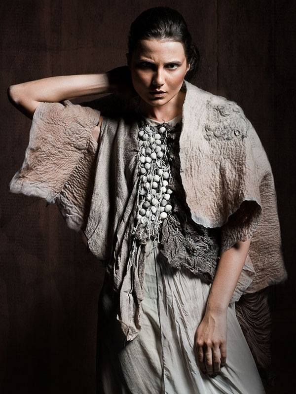
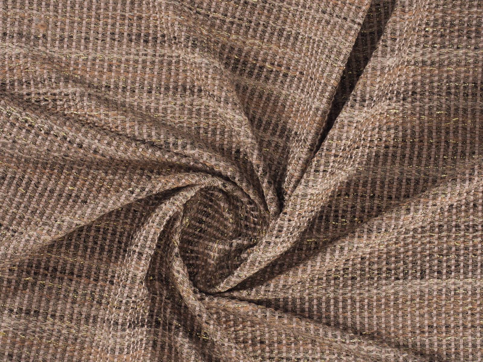
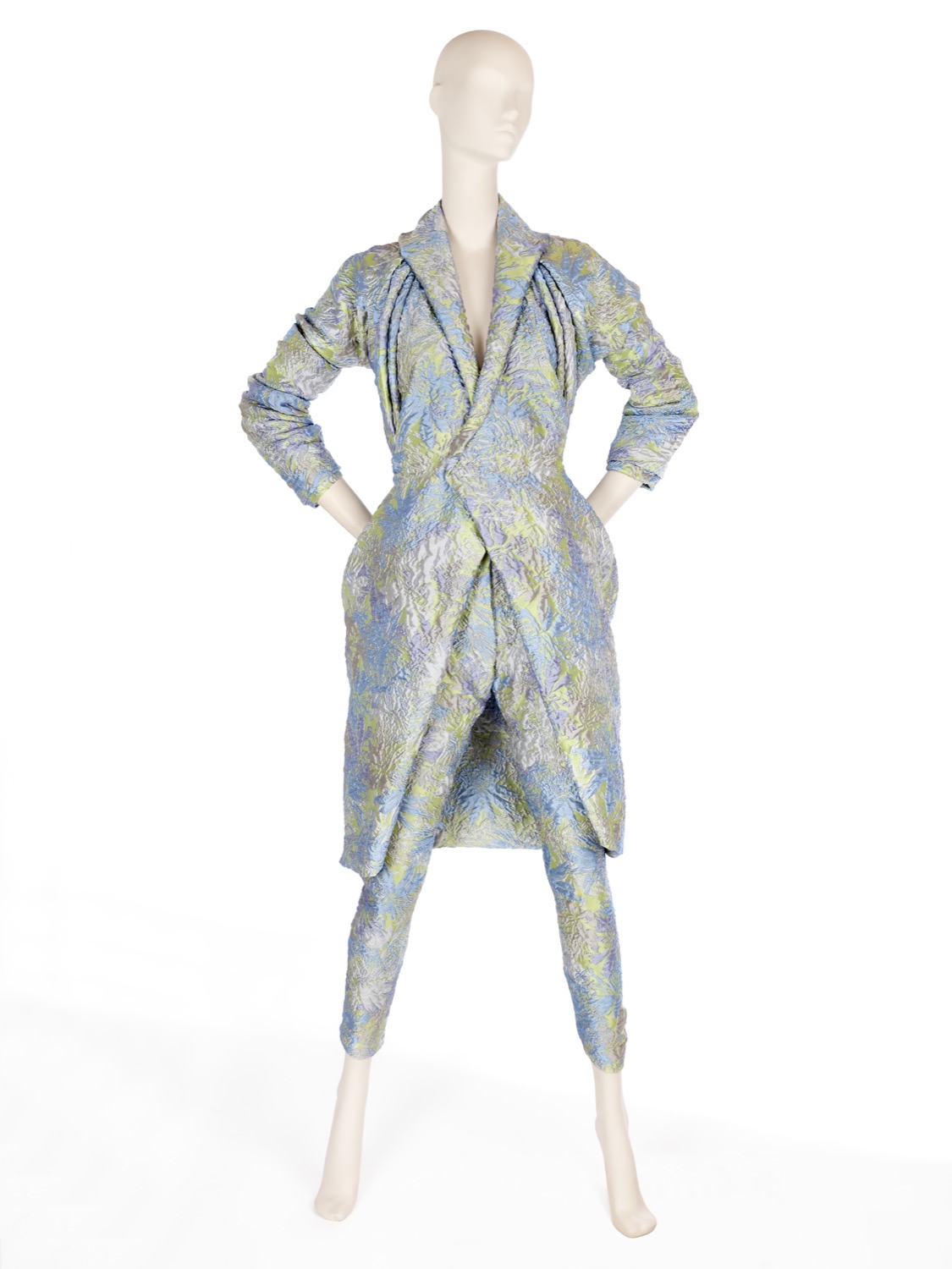
The classic does not have to be predictable or boring, especially when it undergoes a transformation that shakes and rejuvenates it. We like to get out of our comfort zone with disruptive proposals. This line contemplates fabrics that retain a certain timeless primitivism. They are easily recognizable products, close to the domestic and that convey security and everyday life: wear a Jacquard out of the festive season or look for a type of cotton that conveys a message, why not? A range of traditional fabrics (drapery, tweeds and wool items are coming back), some of them rustic looking and which interact with the latest technologies to include us in contemporary fashion.
Within this line the tactile fabrics are grouped, with certain reliefs: granulated, obvious crepes, flamed, flexible volumes, synthetic glitters, silver lurex worked in a delicate way and without stridencies. These products stand out because they seek to enhance the beauty of the raw material. They are handmade and rustic fabrics, but at the same time technologically sophisticated and they show these imperfections (reliefs and volumes) with pride. In terms of design, contemporary classics are inspired by the ethnic universe in a minimalist key: in a natural folk style with firm strokes, sinuous and organic shapes. This category also abounds with repetitive, almost elementary geometries, with or without symmetry: clean frames and essential stripe patterns. Finally we are not forgetting floral prints with delicious compositions with petals and motifs that are inspired by the surfing universe of vibrant colours.
In this first block neutral tones abound, an earth palette with golden nuances, the unbeatable black and white or navy blue combinables.
2. An ode to the urban landscape
The second address of the Spring-Summer 20 collection puts us in an urban environment. The city as the core of human relations. We seek that direct connection with our glass and concrete home and within this line we embrace experimentation with surprising combinations of materials and textures with vital, luminous and energetic colours that can be confronted face to face to create an interesting dialogue in tune with the urban landscape.
In this second block fabrics of a young and fresh luminosity abound, with intelligent and emotional shades at the same time. We seek to appeal to the emotions with this mix and we let ourselves get carried away by intuition. Thus the fabrics we are suggesting stand out for their evidenced volumes, they are dense in appearance, with artificial compositions and elegant textures for a seduction that enters daytime terrain. Feminine and fluid fabrics with light and fresh reliefs because we want to communicate energy and spontaneity through the materials. In turn the products have a clean appearance, technical touches only in finishes and they have a spontaneous and energetic design for a look that stands out within the city. The fabrics seek some theatricality and joy with giant graphics for the outdoors, aquatic reflections and botanical-inspired prints. A line that encourages us to rethink aesthetic codes and experiment without questioning the beauty or the need for the final products.
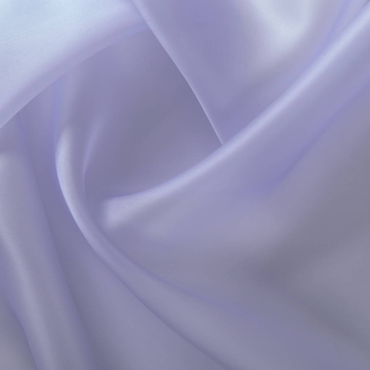
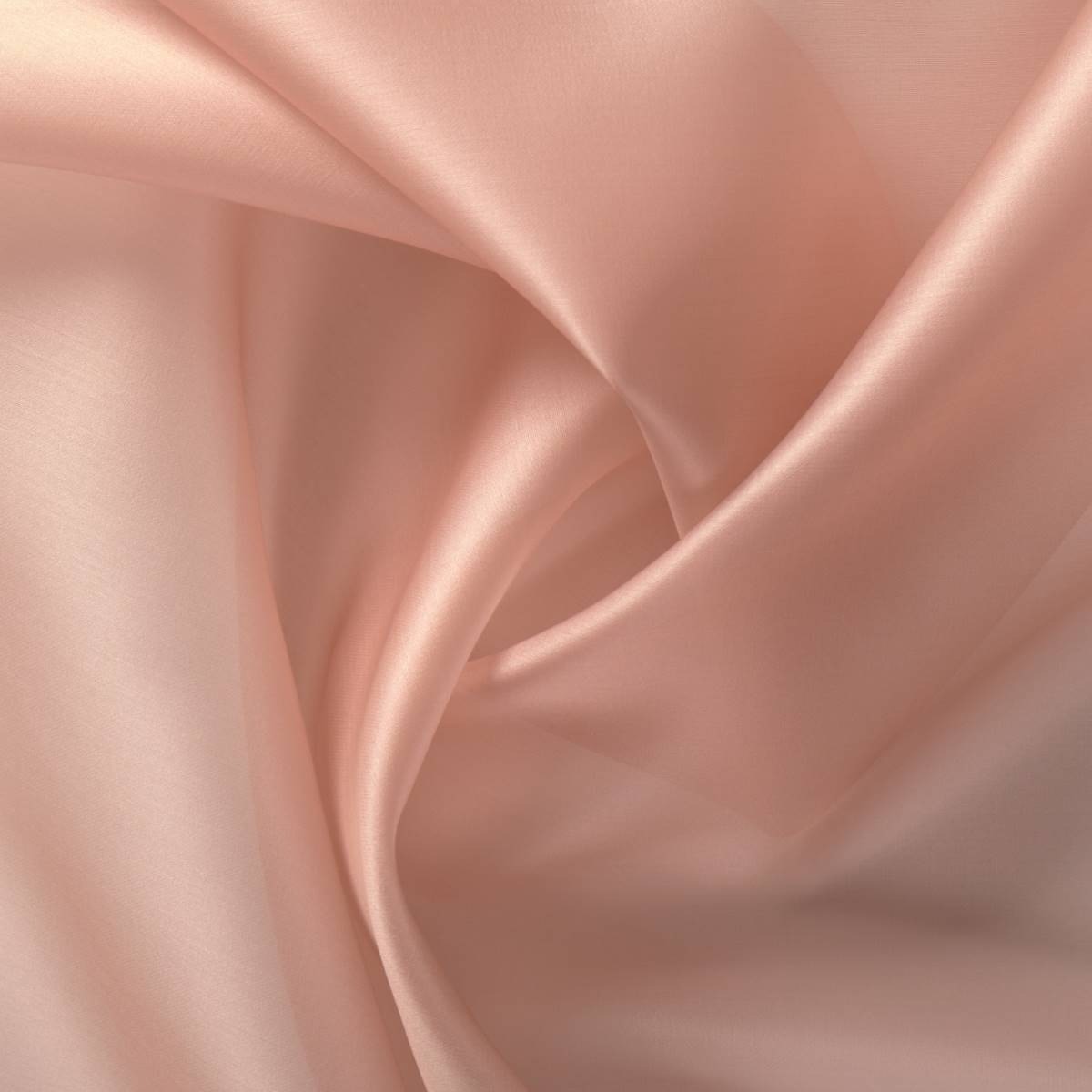
In this second block mineral colours abound ranging from blue to pale pink or lavenders, oranges and a palette of greens and limes. Vibrant tones that are exhibited for their own sake.
We invite you to discover the new Spring-Summer 2020 collection through the online store or in our Gratacós space in Barcelona. Let yourself be seduced by the materials, textures and patterns of the fabrics!
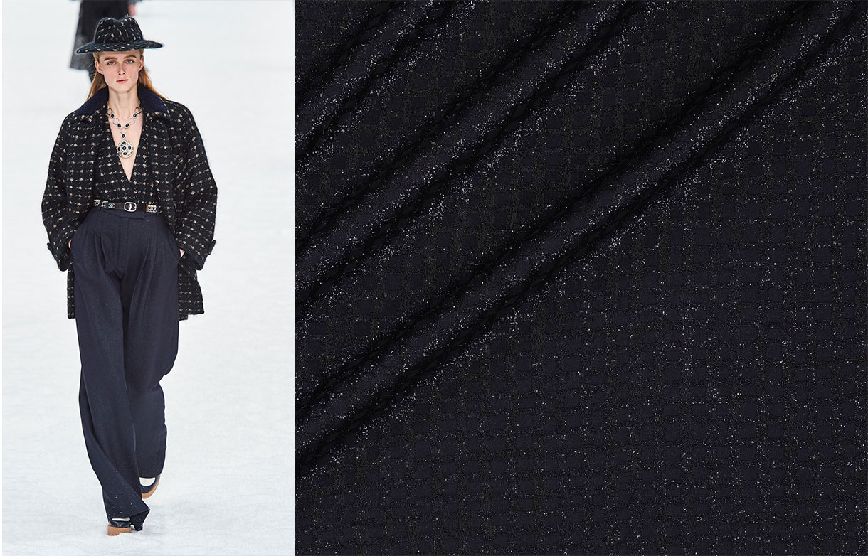
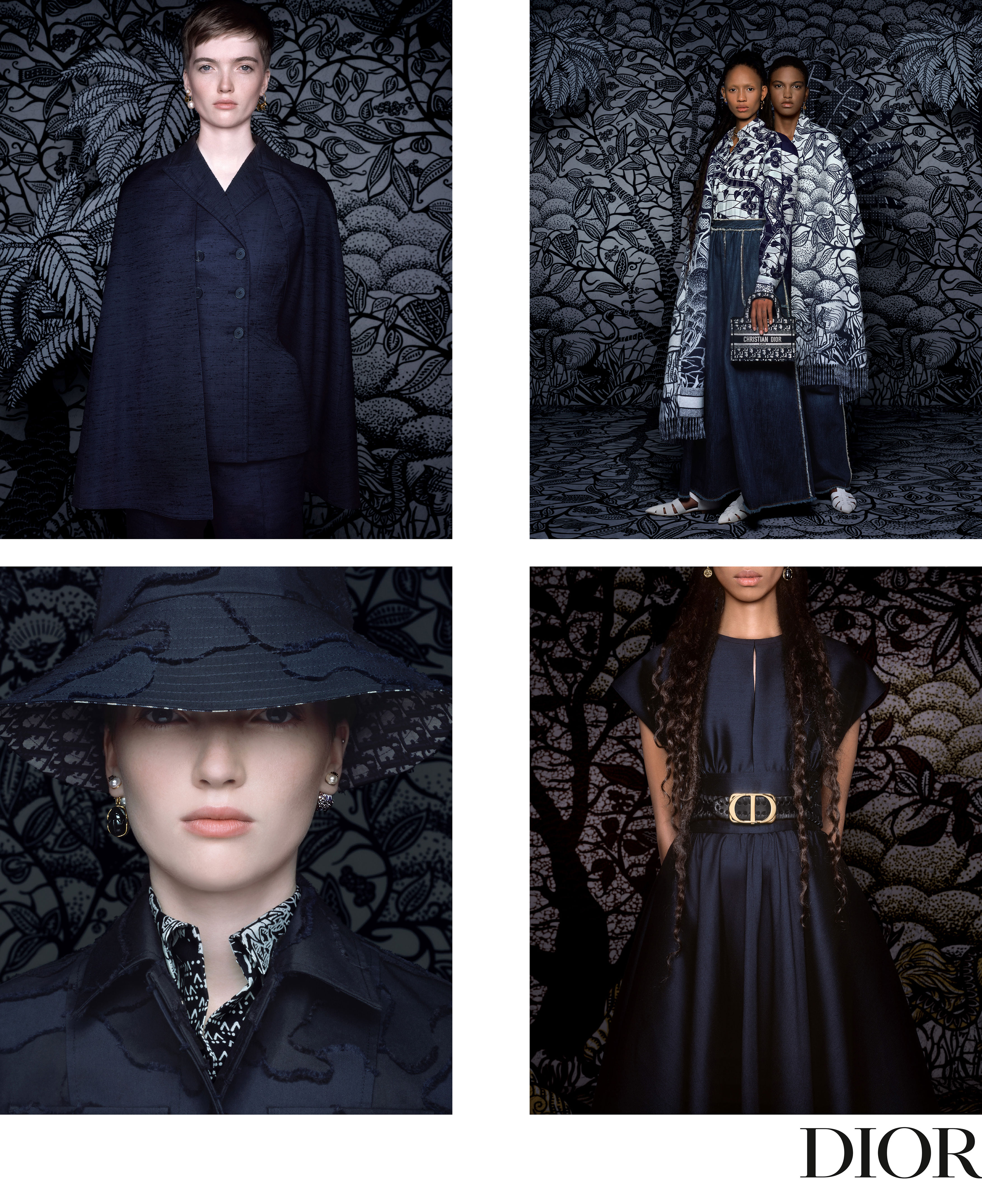
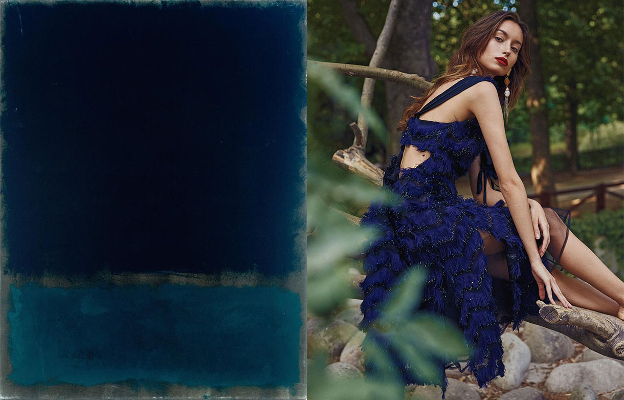
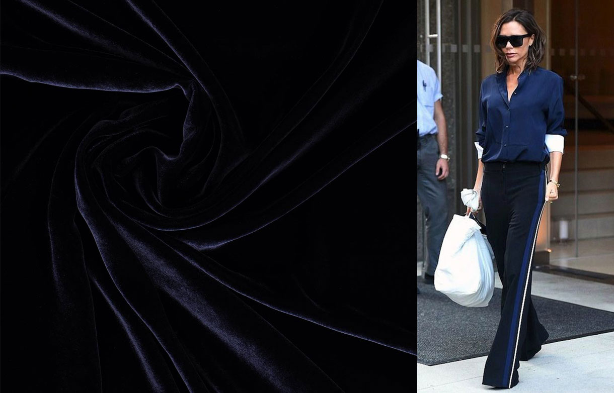
They call it the new black for its versatility and functionality, appealing elegance with discretion. Navy blue was never a risky tone, nor did it pretend to be because it is precisely through harmony, balance and timelessness that it seduces, which makes it a safe bet inside the wardrobe, one which goes beyond the cycles and fashions dictated by the sector. And it is already well-known that the classic never dies. For this reason the colour in question borders on immortality.
Here are some curiosities about enigmatic navy blue:
The origin of navy blue
Navy blue owes its name to the dark blue that was used in the uniforms of several navies. The first to adopt this shade was the British Royal Navy in 1748 and subsequently it was extended to most of the world's navies. In fact it offered the advantage that being almost black the loss of colour was avoided. Thus during the 18th century it was used as a base to dye uniforms.
During the 19th century the use of navy blue extended to other professions and quickly conquered the street. Then the colour black continued to maintain dominance in clothing which was considered serious. However, dyers used Prussian blue and indigo pigments to launch the fashion of navy blue fabrics and dresses, which became a social phenomenon. Navy blue maintained the sobriety of black, but it proved to be less hard and above all cheaper. In fact the colour of the clothing was generally not a matter of taste, but rather of money. After World War I this dark hue displaced black in many professions such as sailors, military, gendarmes, fire-brigade, police or civil servants.
Dior adopts it as a feminist symbol
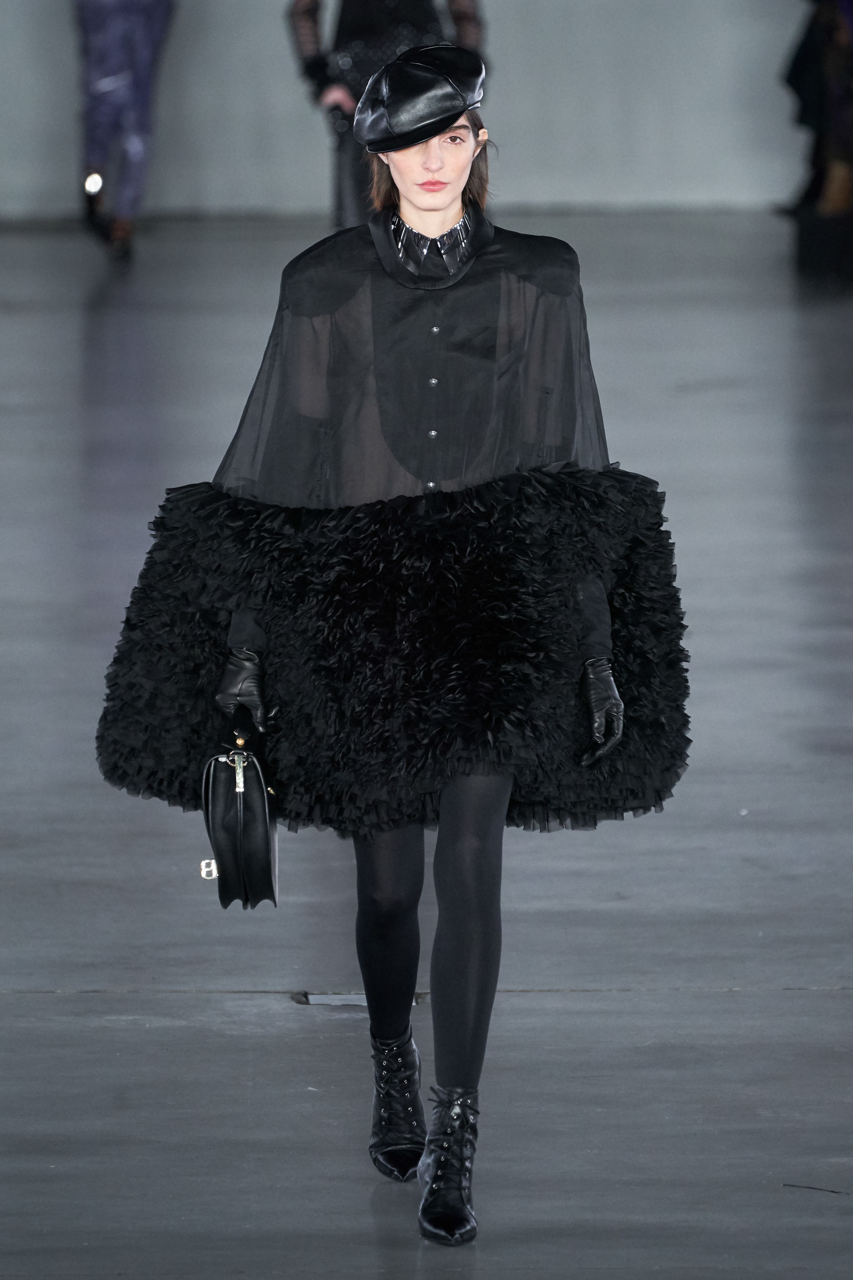
“Among all colours navy blue is the only one that can compete with black, by presenting the same virtues.” This phrase by Christian Dior has also guided the last stage of the French maison led by Maria Grazia Chiuri, the first woman to lead the creative direction since 2017. Navy blue was Chiuri’s second collection for Dior, rebelliously picking up the heritage of the French designer with creations brimmed with items never seen on the catwalk such as jeans or a black leather beret as a star accessory.
Thus evening dresses, with transparencies and brightness, alternated with other looks for trouserss and workers’ overalls, as if they were factory uniforms combined with printed handbags. Navy blue represents equality and uniformity for Chiuri. There is no distinction of classes or genders. “The worker’s look is a way of saying that we have to work towards equal opportunities,” she argued at the time. Since then this colour has become a common resource in Dior collections that in lesser or greater proportion have adopted navy blue.
The most classic blue will also be the colour of 2020
2020 will also be dyed in blue. The justify Institute, a world reference in chromatic themes, has chosen the Classic Blue 19-4052 as the colour that will influence next year in such creative sectors as design, fashion or advertising. According to the institution it is a “lasting blue shade for our times, elegant in its simplicity”. It suggests the sky at sunset and its calming qualities, such as the promise of protection, ”said Laurie Pressman, vice president of the Pantone Colour Institute.
According to the institution Classic Blue tends to surge at convulsive moments of change and this tonality evokes the desire to consolidate reliable and stable foundations on which we can build. In this sense, it offers us a refuge: “We live in an era that demands trust and faith, and this type of blue offers a solid and reliable feeling that encourages us to broaden our thinking and challenges us to see things in depth,” explains Leatrice Eiseman, the executive director of Pantone.
The Pantone colour of the year is chosen by the directors of the company and about 40 experts from around the world, who take into account factors such as the economic situation, films and popular songs or social issues, among other variables. Thus Classic Blue is taking over from Living Coral, the colour of 2019.
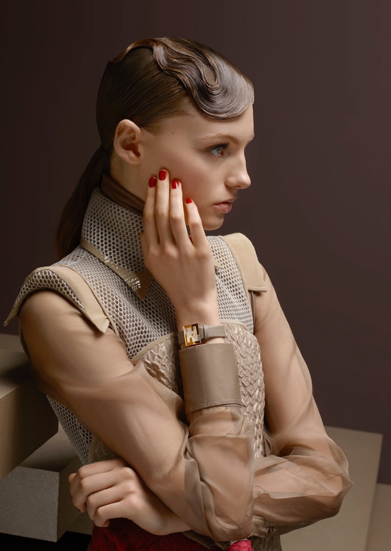
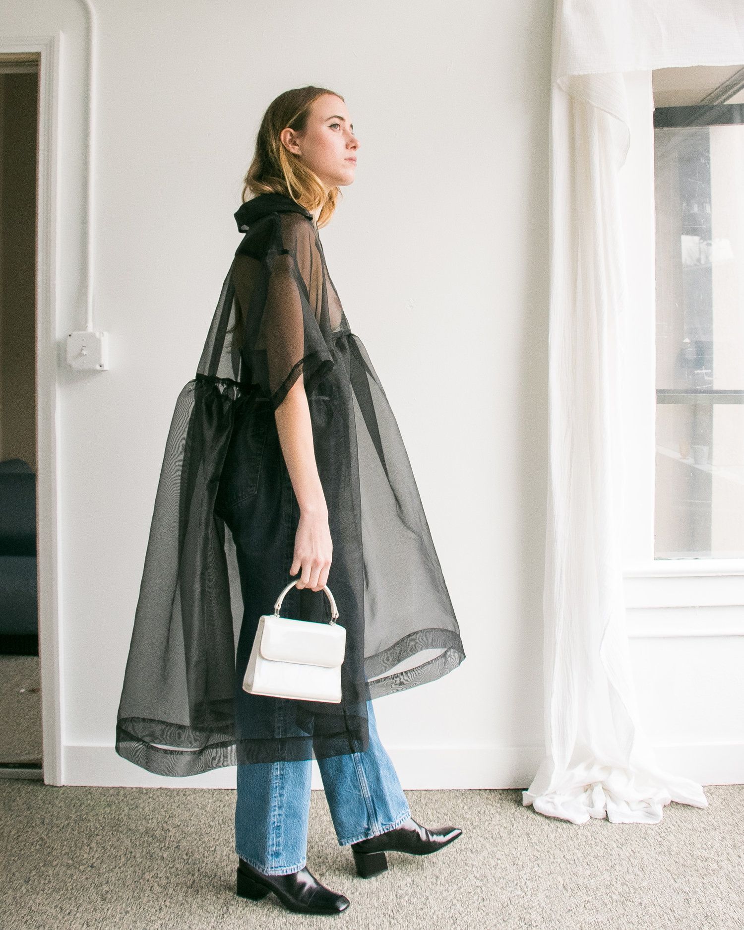
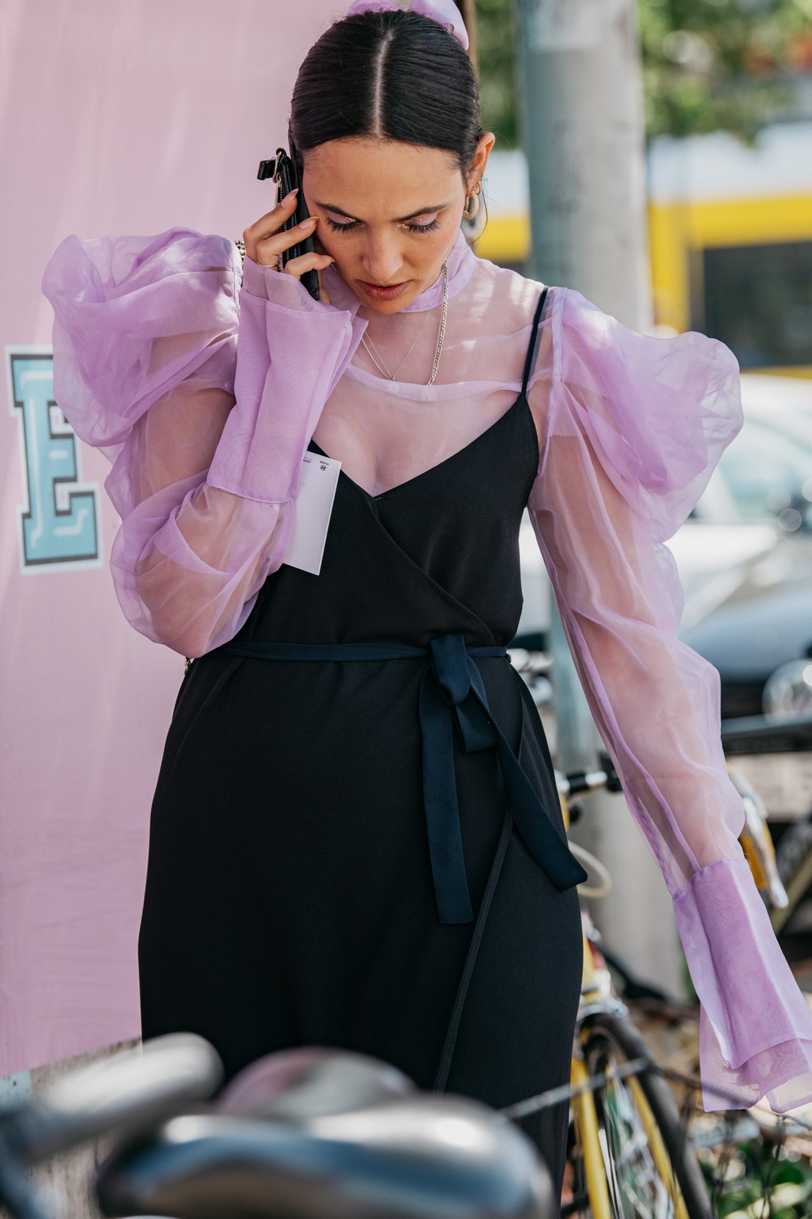
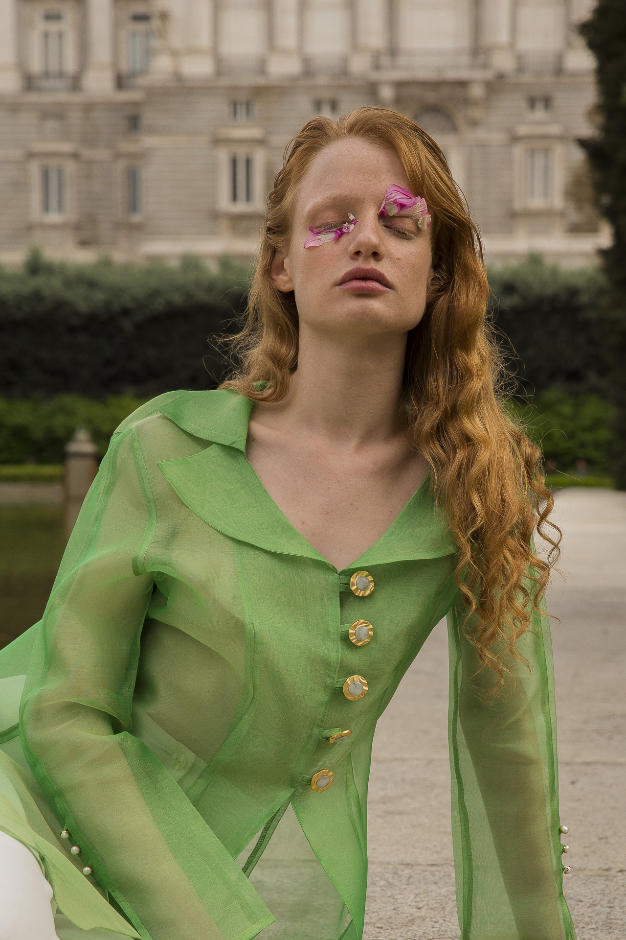
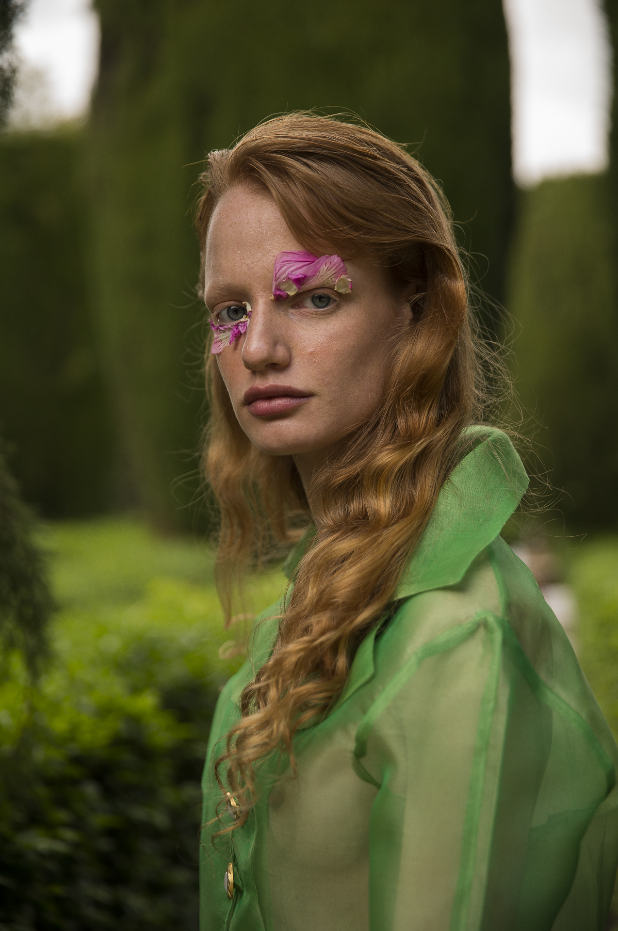
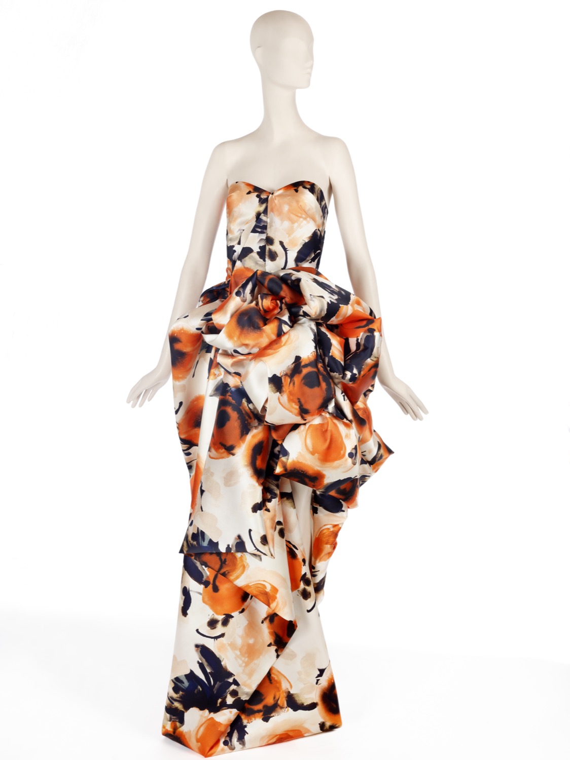
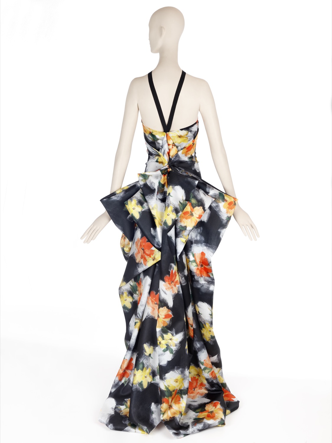
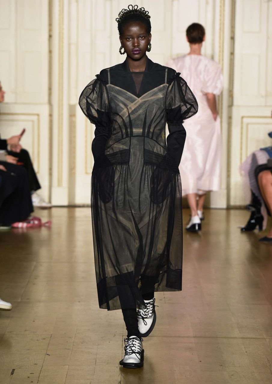
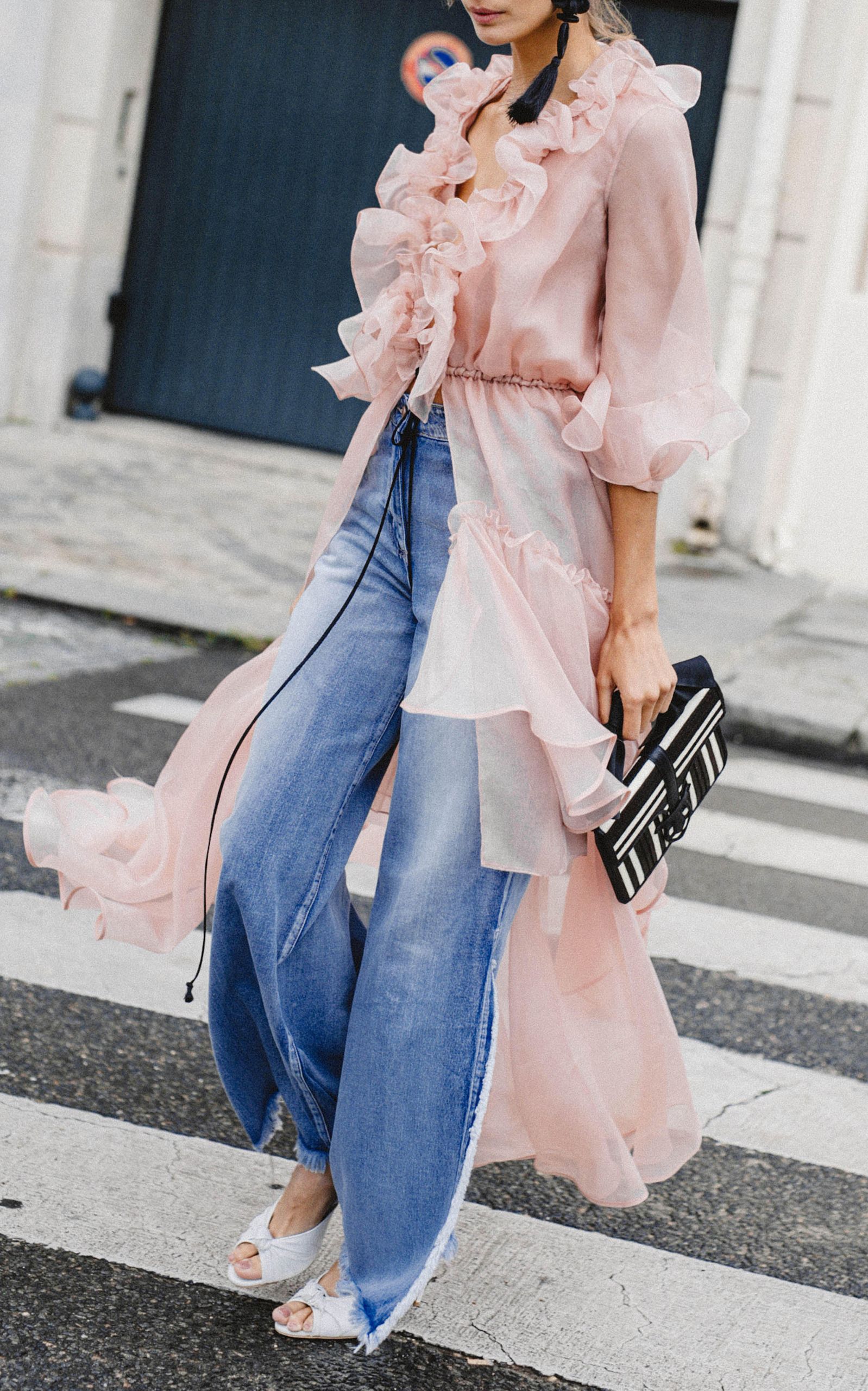
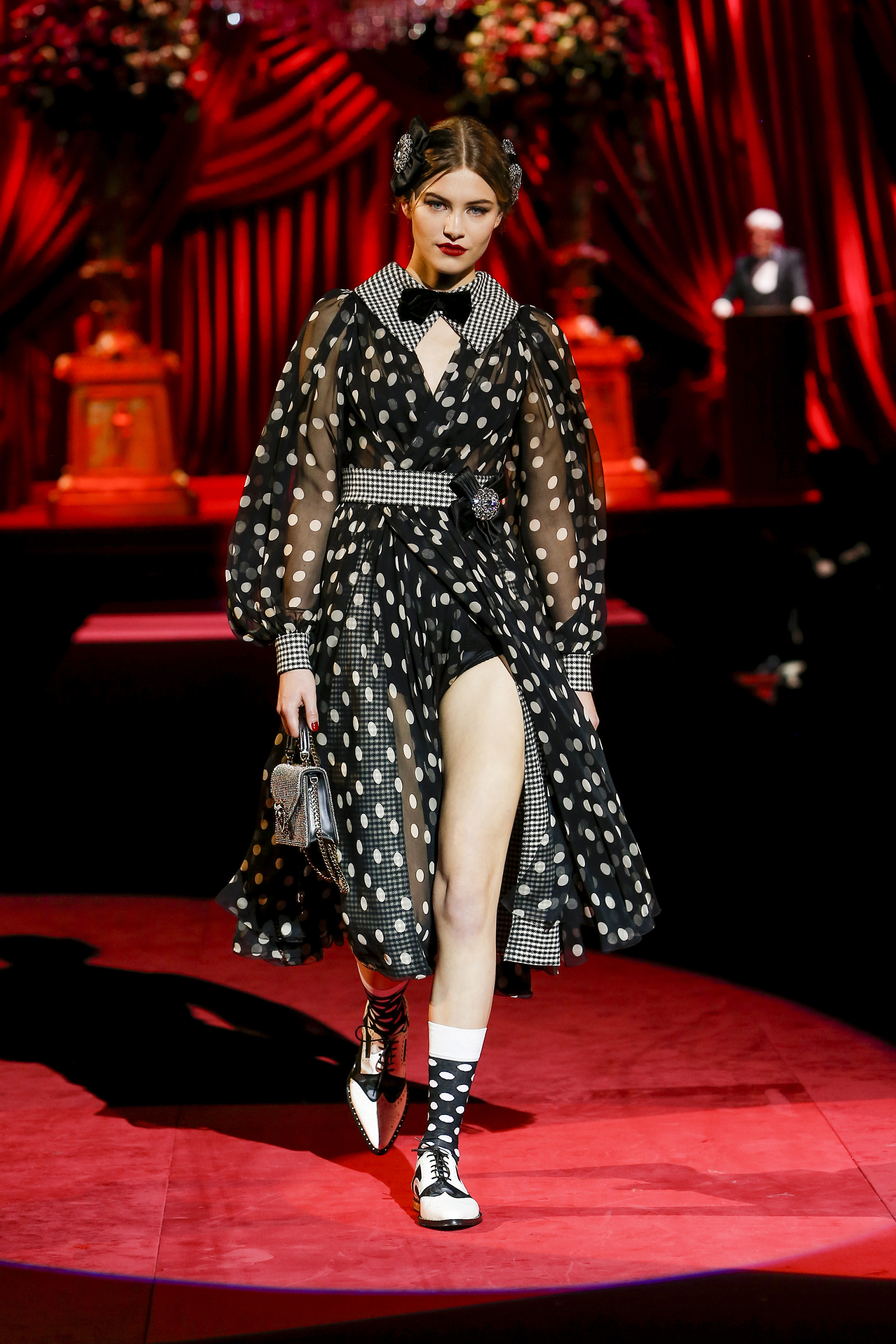
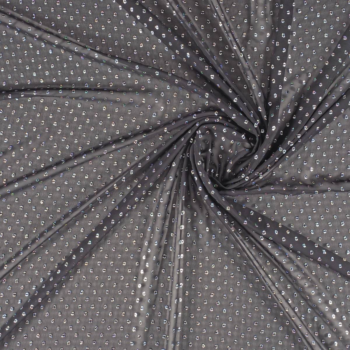
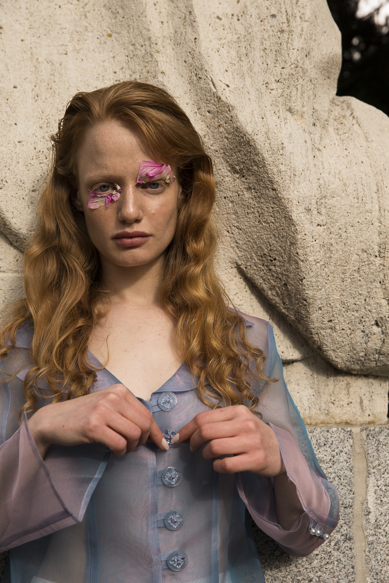
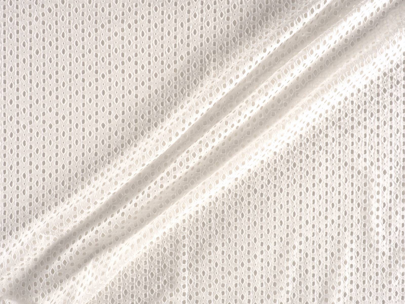
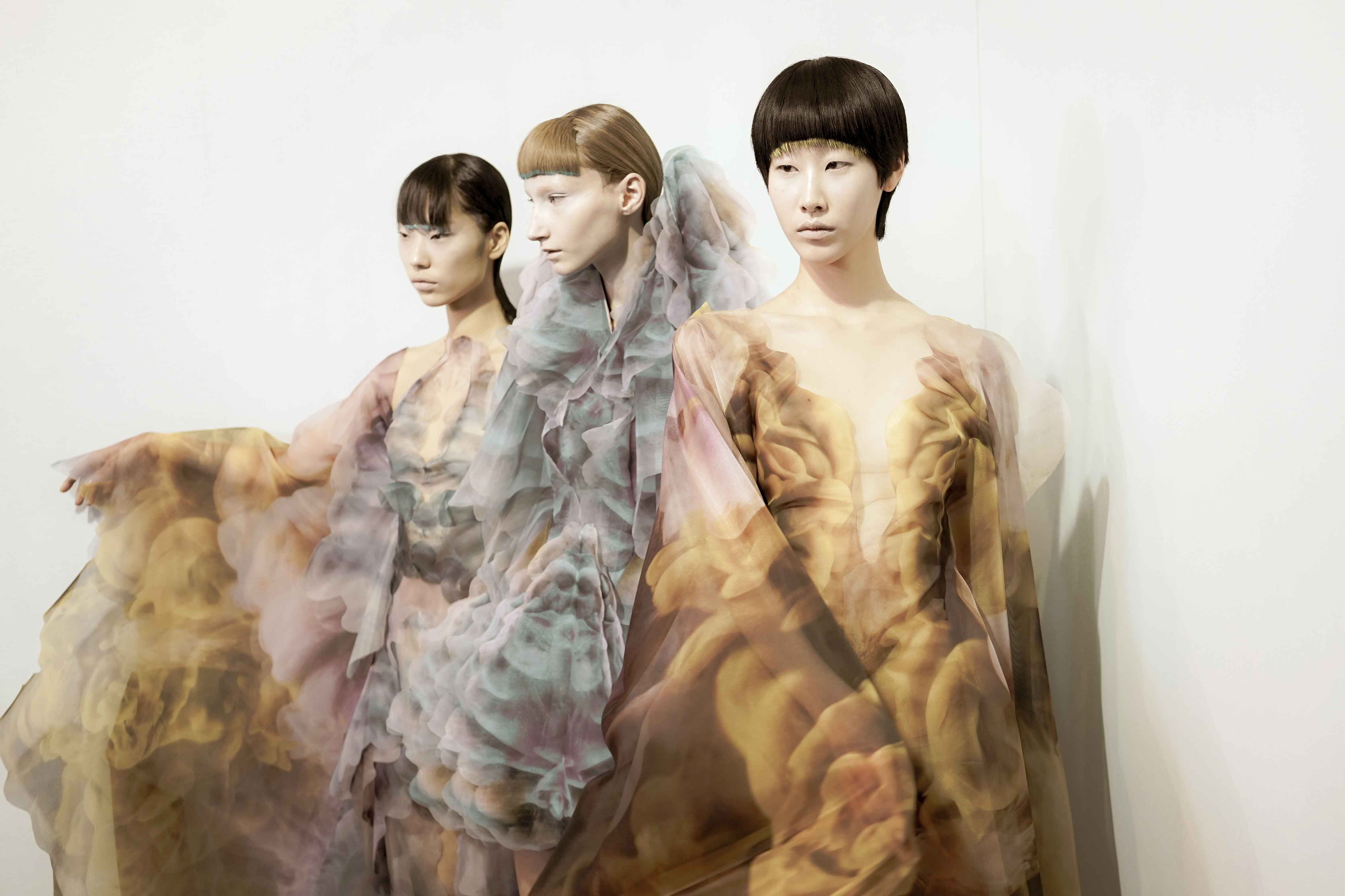
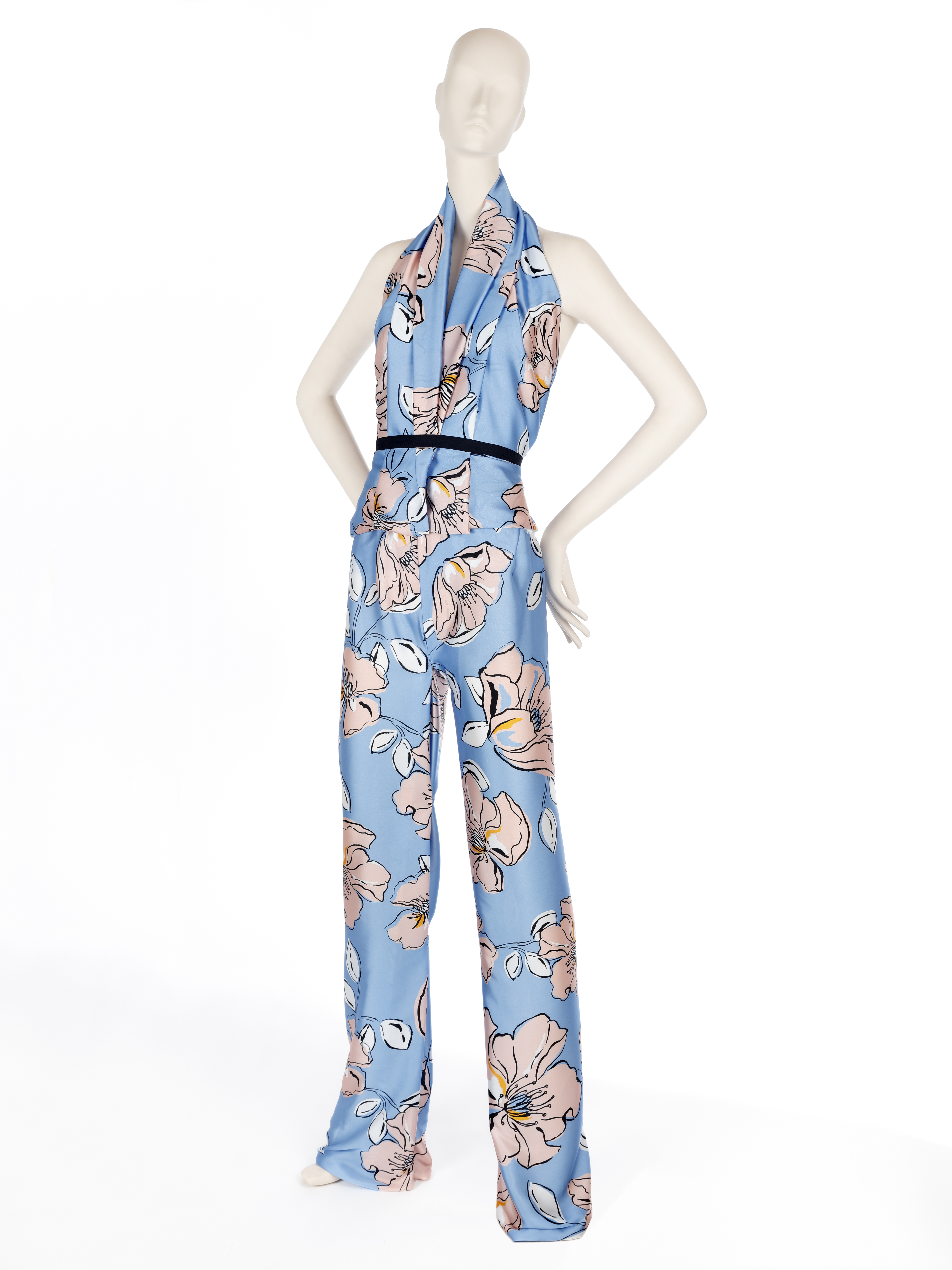
Transparencies are associated traditionally to the mild or warm months of the year, where the high temperatures justify the apparent nudity these translucent fabrics given to garments. Until now, it was the norm or accepted by a majority and obeyed, in turn, to market demands and needs of the consumers. In the end, everything applied to a simple rule: more transparent and light fabrics in summer, more thick and opaque fabrics in winter. Nowadays, transparencies have lost their usual seasonality and designers of large firms have been responsible for the public wanting them at any time of the year by gradually including them in their collections. Laces, tulles, transparent embroideries … all the fabrics that show the skin in an insightful way. However, there is one particular one that grabs the limelight so far this year: the organza.
Brief historical evolution
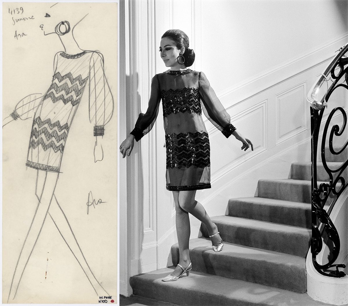
Organza is a very fine silk fabric that is treated to maintain a certain stiffness that gives it that starchy appearance. Its name comes from Urgenc, a city in Uzbekistan and arrived in Europe from India in the 18th century. Despite being present in the continent and after its initial links to the maids of the aristocracy, it was not until the twentieth century when this fabric became popular to all social strata. The person responsible for this was Yves Saint Laurent who placed this fabric in the altars of the trends. It was in 1966 when Yves revealed his first look with transparencies. At first, the organza subtly revealed some parts of the body, but the scandal came two years later when she designed a bold dress that completely showed the chest. In the decade of the 80s, the organza allied with frills and volumes typical of that time to make exaggerated combinations, in line with the fashion of the moment that immortalized icons such as Molly Ringwald, Liz Taylor or Ladi Di. In the 90s, the fabric came back to life again thanks to the 1997 spring-summer Prada collection that homaged transparency and the triumph of minimalism. Interestingly, the Italian firm was among the first to rescue this fabric last year, probably influenced by the new furor that organza currently relives.
 |
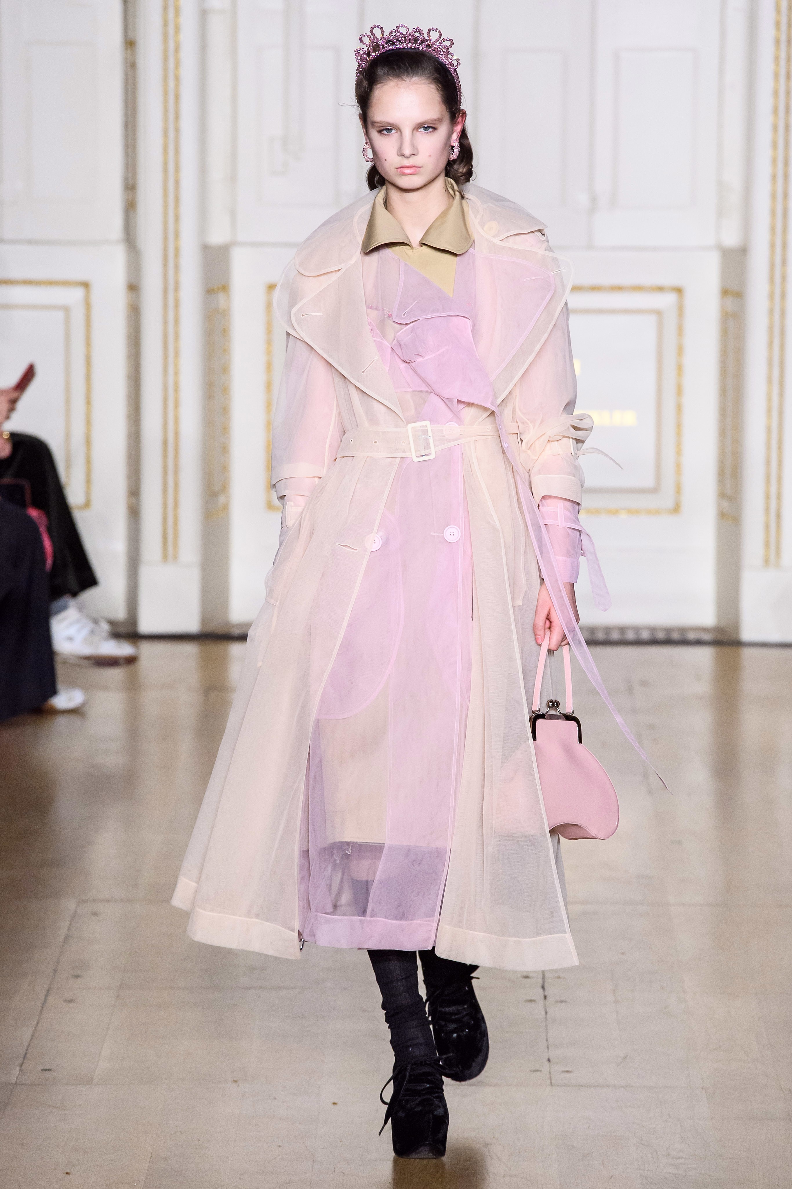 |
The revelation fabric of the season
This fine, translucent and rigid fabric has the peculiarity of adding elegance, delicacy and a certain romanticism and therefore, can boost any look with a simple garment. So far, the organza had also been linked in the exclusive field of celebrations, and although it remains there, the demand for this fabric, for other occasions, has not stopped growing.
On the catwalks today, organza has been present in the collections of Ralph Lauren, Balmain, Dolce & Gabbana Simone Rocha and Fendi, to name a few firms, but also in the chains of high street fashion that have democratized its use to make it accessible to the general public. For example, Zara presented in summer a collection of blouses, skirts and dresses made with organza that had a fulminating success, running out of stock.
From the catwalk to the high street
If a fashion is adopted in parallel by international fashion prescribers, success is more than assured and will end up arriving sooner or later to the general public. Thus, of all the pieces made with organza, the clear favourite is the blouse with puffed sleeves, being the best ally to reinvent a pair of jeans. This piece gives a romantic touch to the looks without needing other accessories. Despite the triumph of the neutrals (white, black, beige …), it also takes the colour that can range from the most vibrant palette to the pastels, our favorites. This garment works even with volume skirts or palazzo trousers.
From Gratacós we want to show you some organza from our current collection and the upcoming seasons. In our space in Barcelona you will find a good assortment of fabrics to decide if you want to use the organza on a festive occasion, or you decide to join the trend and dazzle with a garment made with this fabric for dayime wear.

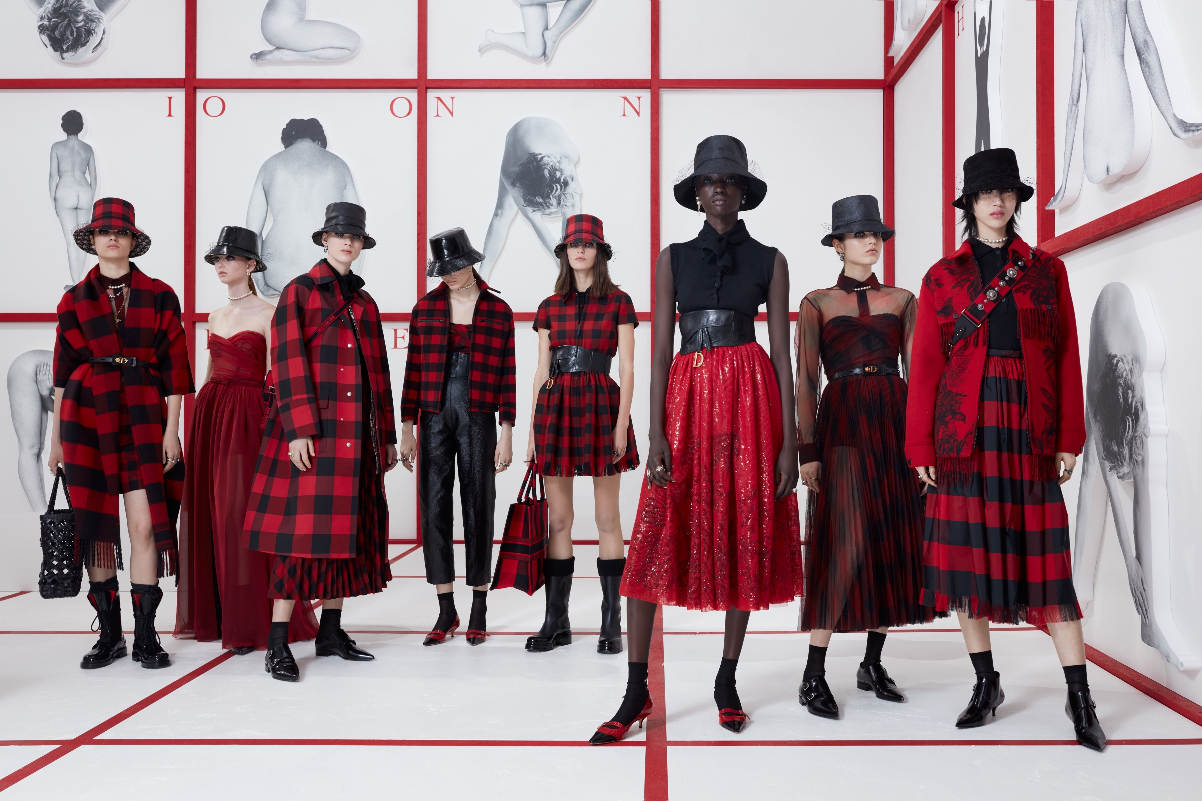
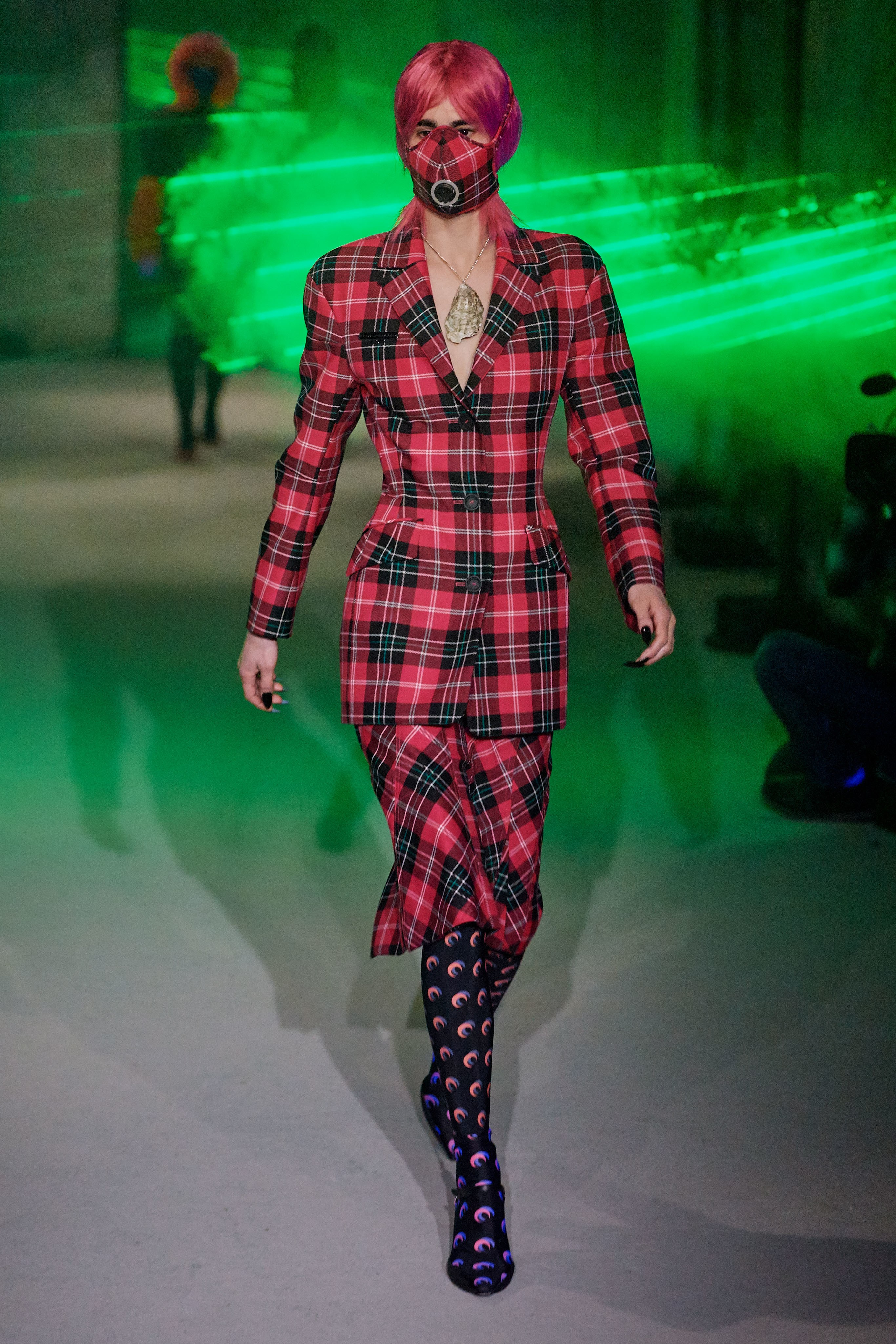
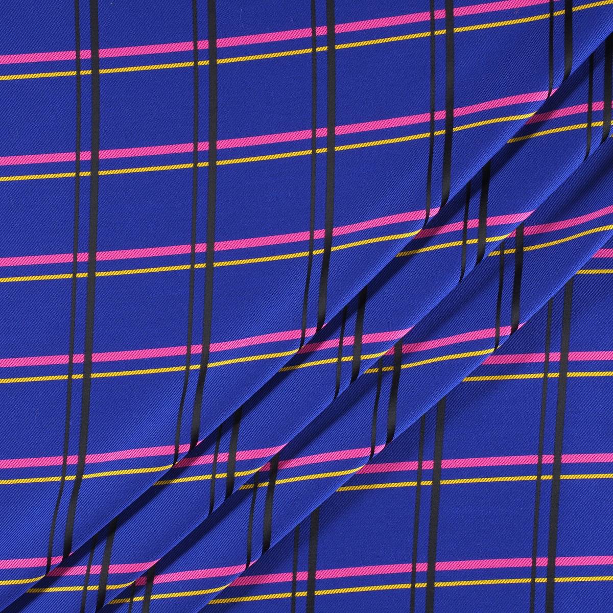
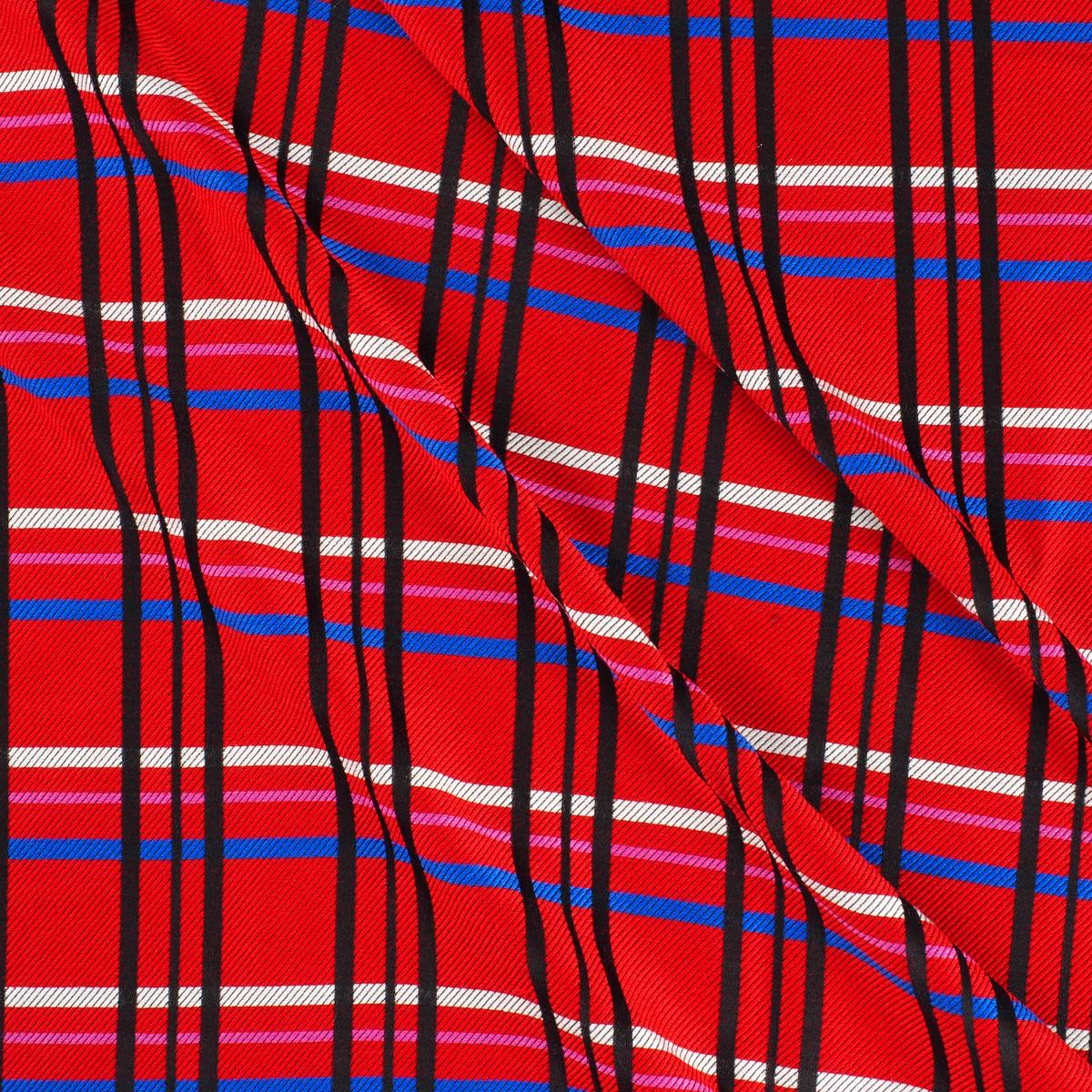
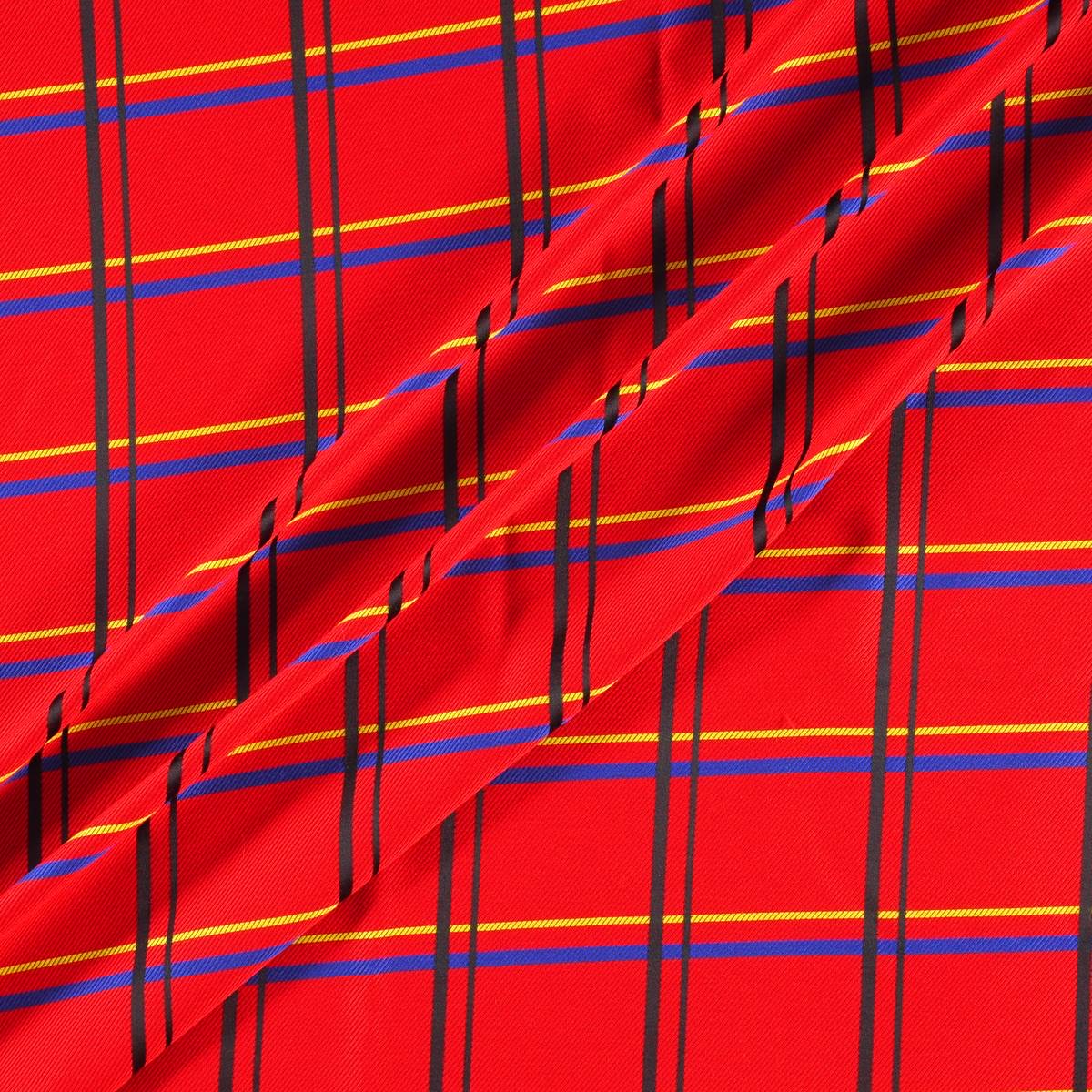
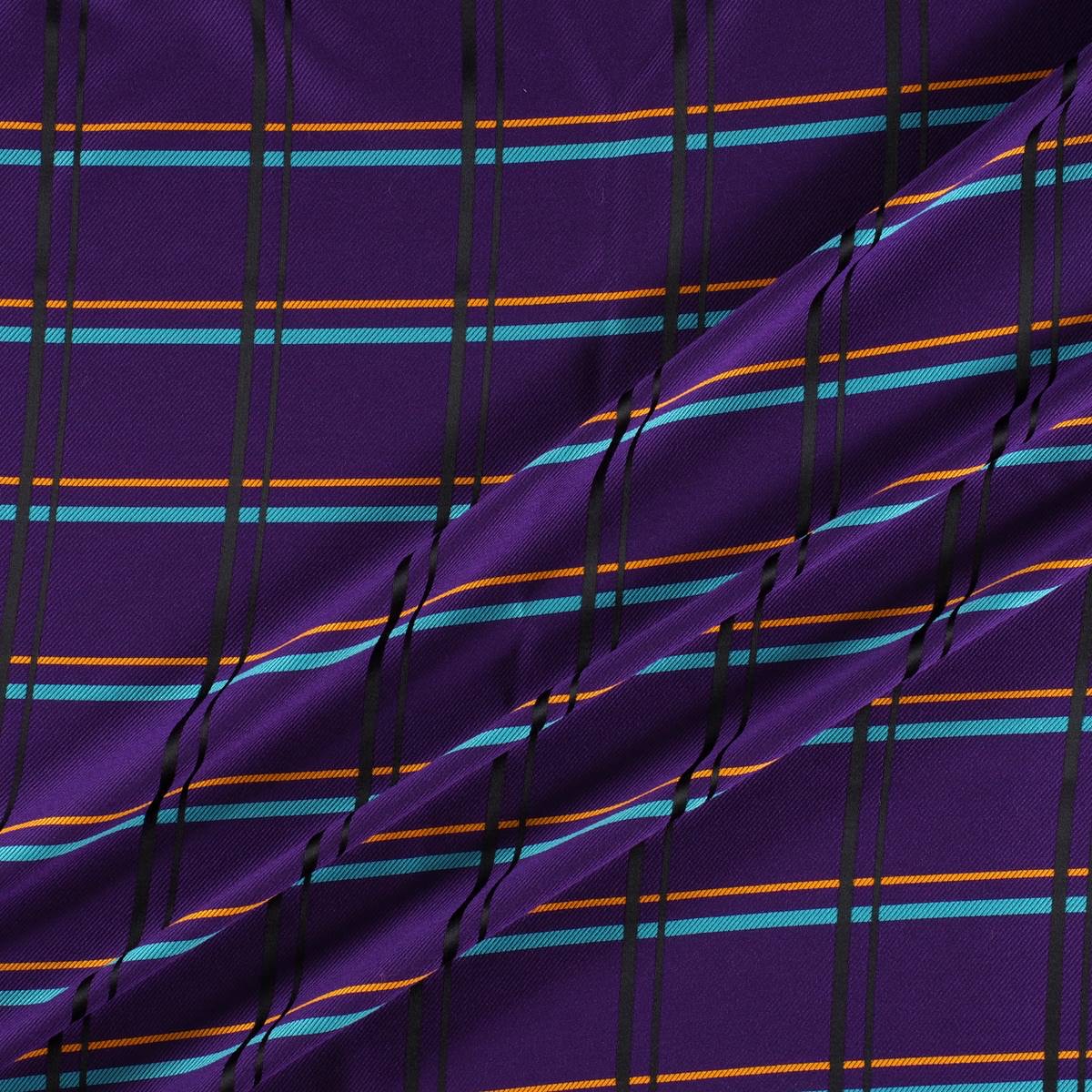
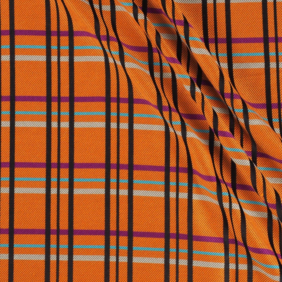
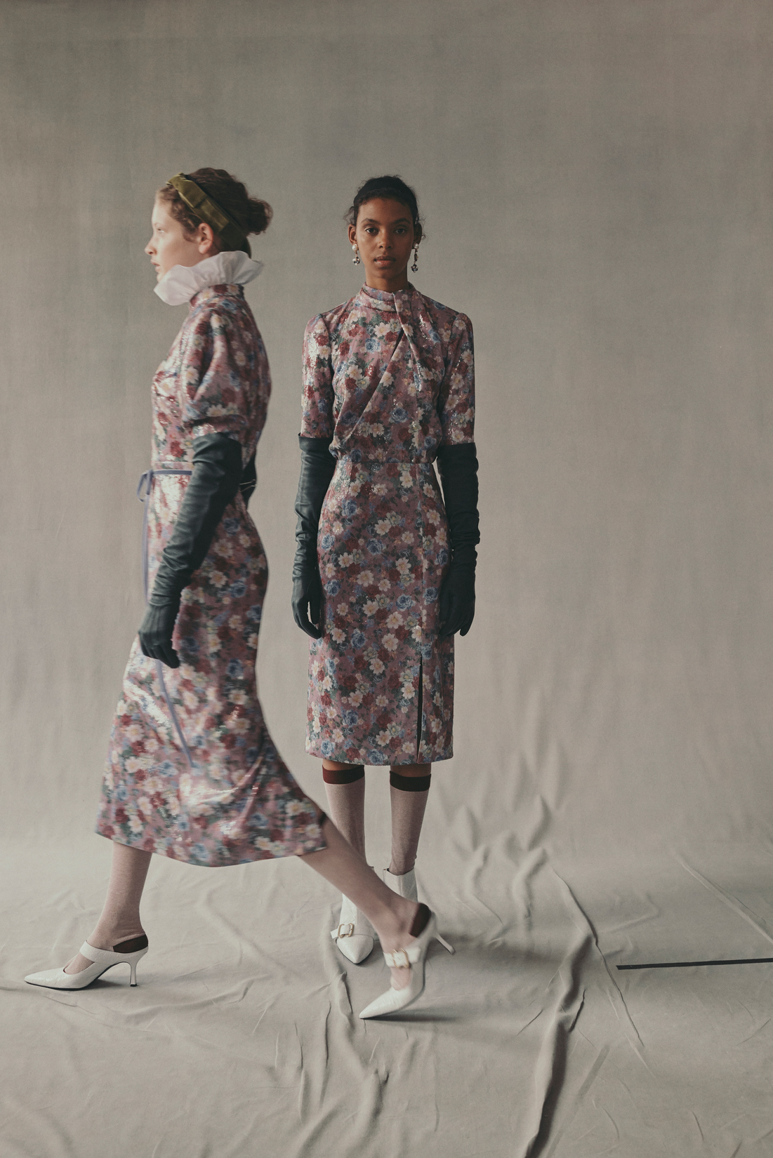
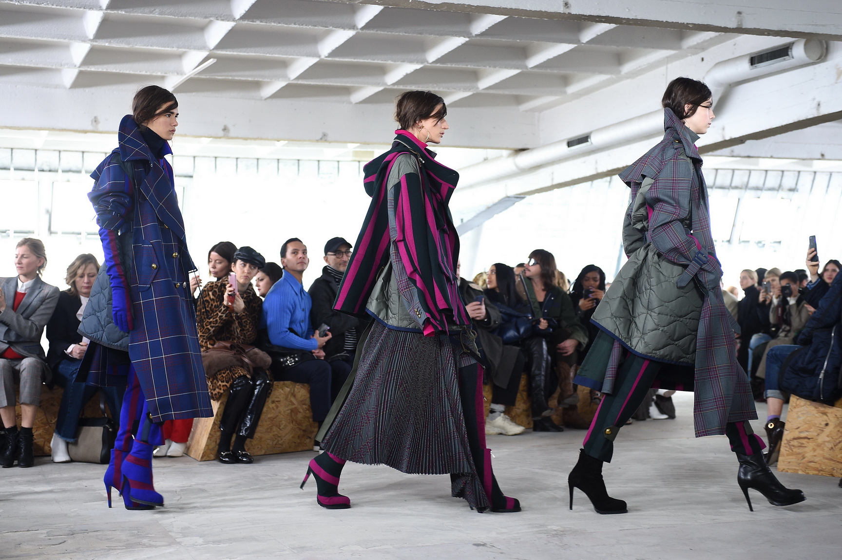
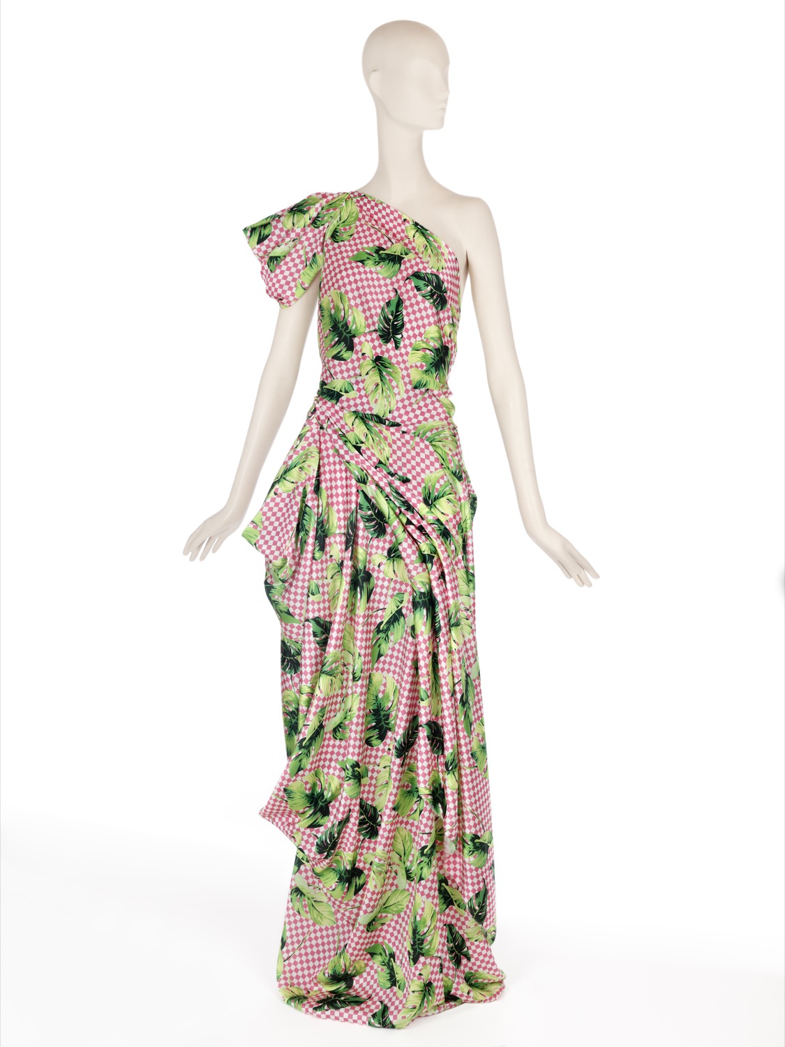
Checks have always been present in the history of contemporary fashion. Moreover, they are part of those unperturbed tendencies, oblivious to cycles, which are repeated and renewed without losing their identity.
A priori, when we talk of a check print the British style comes to mind with its classic costumes, the tartan reminiscent of the Scots or the vichy checks that refer us to the age of innocence. It is always time to opt for checks, whether in the winter or summer collections. The novelty is that today many checks break barriers and leave their comfort zone as they take over garments, accessories or complements which hitherto were less conventional.
We are going to analyze the three most common check prints on the cat-walks of the new Autumn-Winter 2019/2020 season:
Prince of Wales
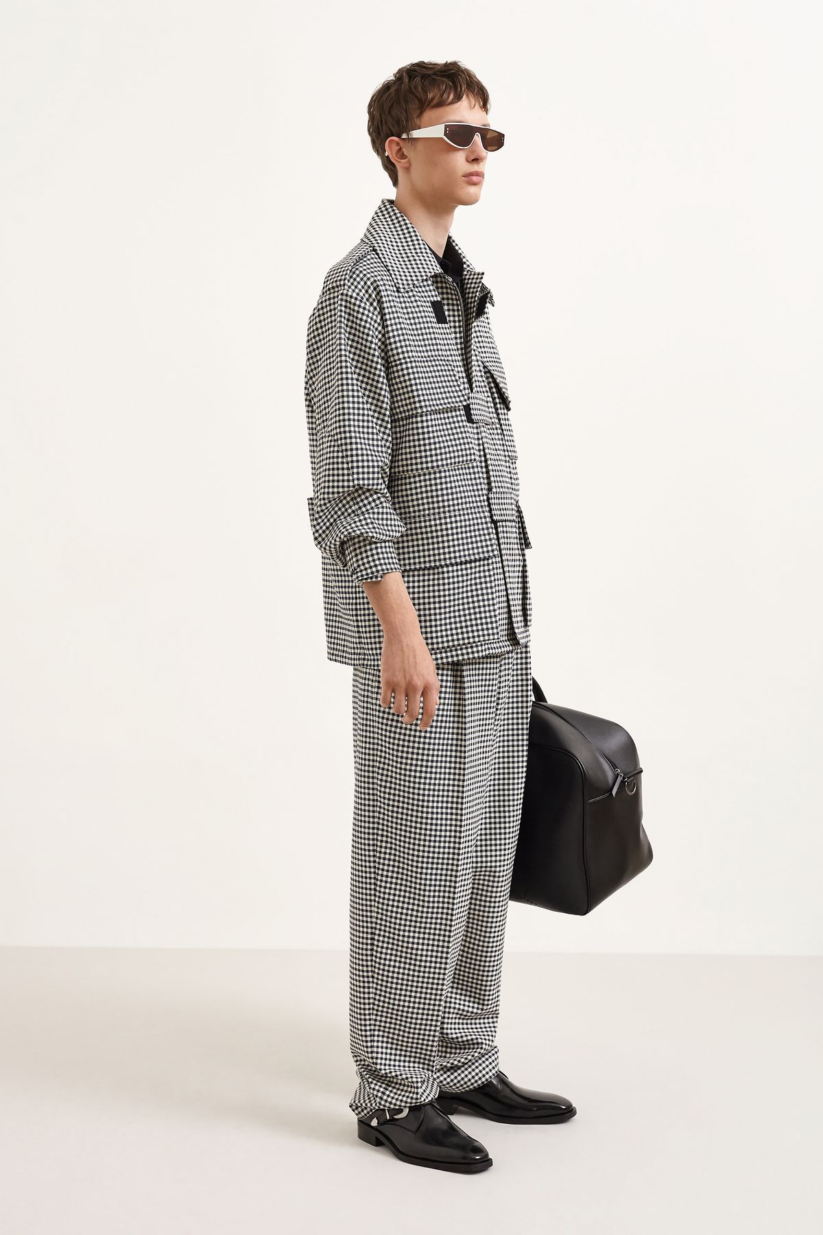
It is a type of two-colour fabric design in the form of complex frames, sometimes with a third colour as a profile. It alternately combines large checks with a milrayas design along with smaller squares in crow’s feet. Frequently the different grey scales (or muted colours) are used as base colours and sometimes one more colour is added to that base tone, usually blue. The origin of this print is popular as it is a fabric used by the workers, although it was the Duke of Windsor (Eduard VIII) who ended up popularizing it in the 1930s and spreading it throughout the world.
When playing with the black and white binomial, this type of plaid print becomes a timeless classic, perfect in any wardrobe. This season, under a preppy style seen especially on cat-walks of Marc Jacobs, Prada, Givenchy, Balenciaga, Chloé and Marni, together with many others who opt for this pattern.
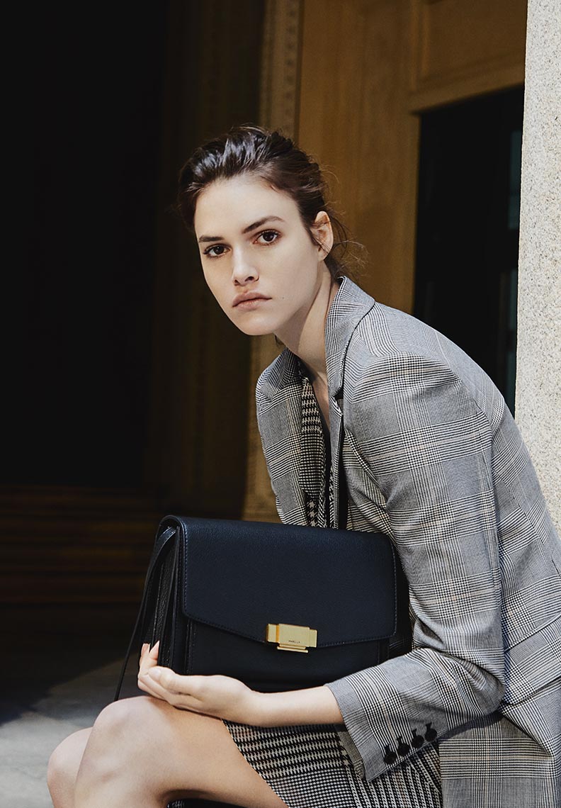
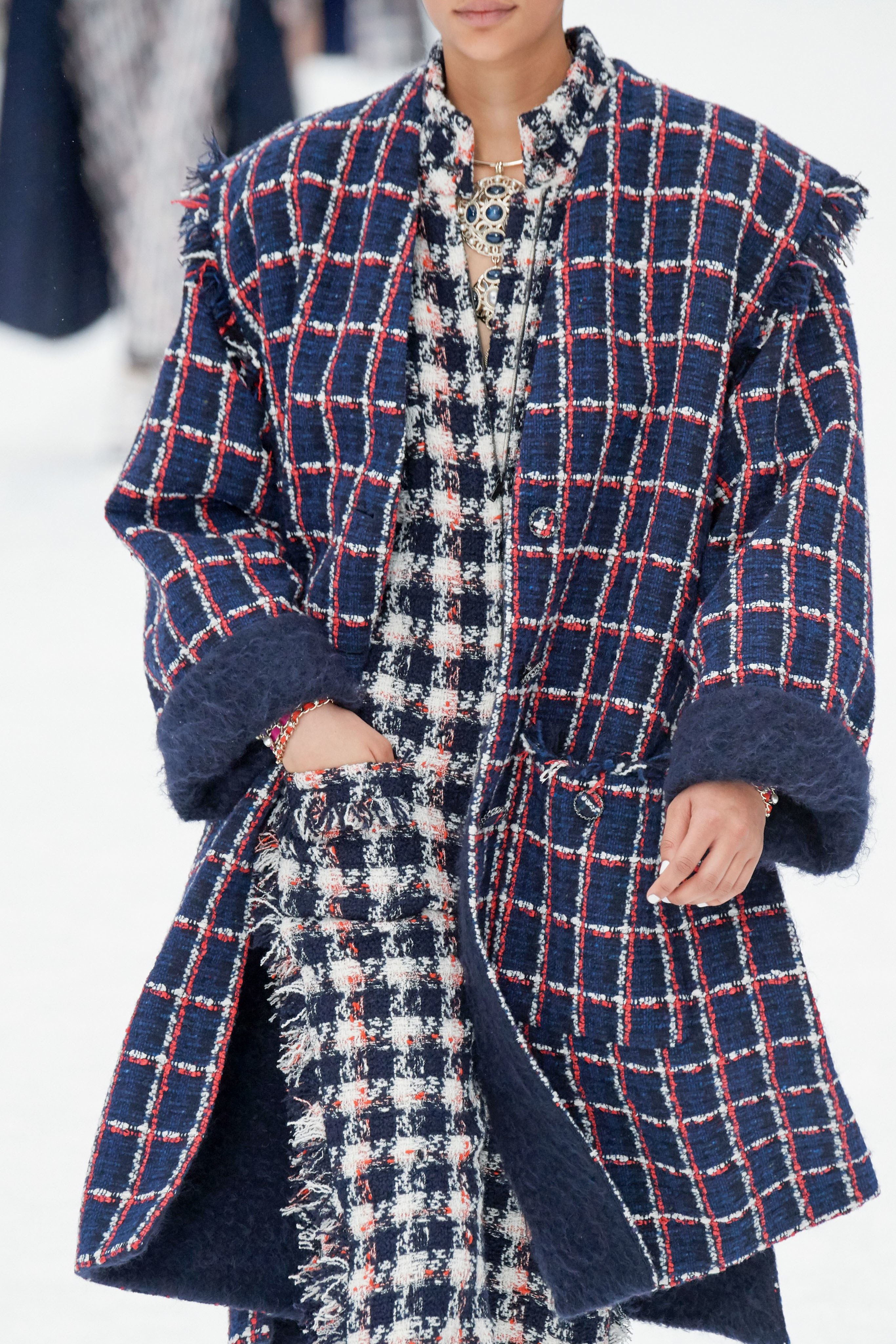
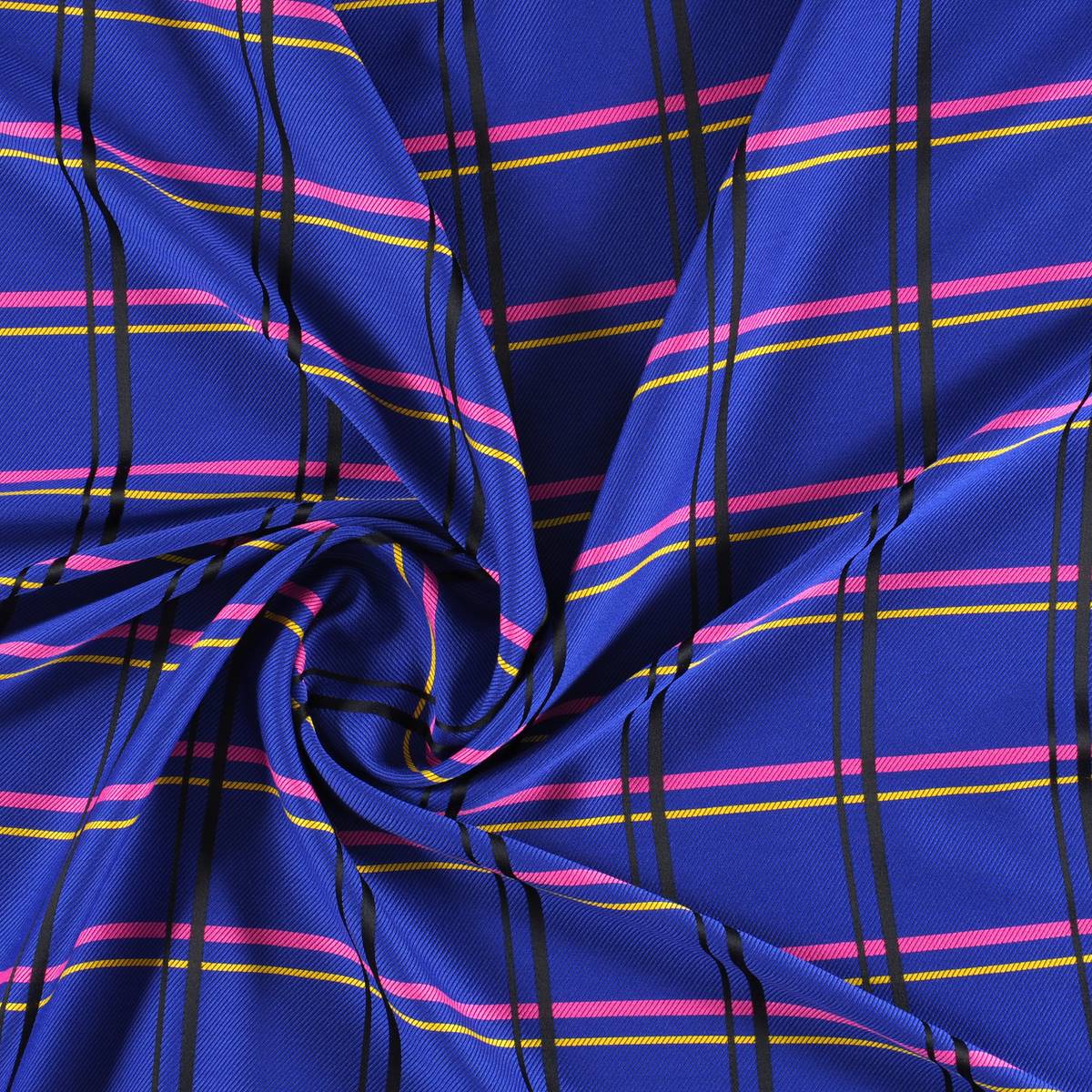
Tartan
It is perhaps the most identifiable picture. A fabric whose pattern is formed by horizontal and vertical lines that draw pictures of different colours. Of Scottish origin, tartan is associated with the clans that used them to distinguish themselves. Each family adapted particular designs, as well as colours that identified them as members of each clan. There are named tartans like McAndrew, McQueen, Douglas … even modern designs like the Royal Stewart, created by Vivienne Westwood. In its origin the tartan was made of wool, although today it is shaped through several fabrics. At present, with the appearance of new materials the word tartan has gone from defining the fabric to the design, regardless of where it is shaped.
 |
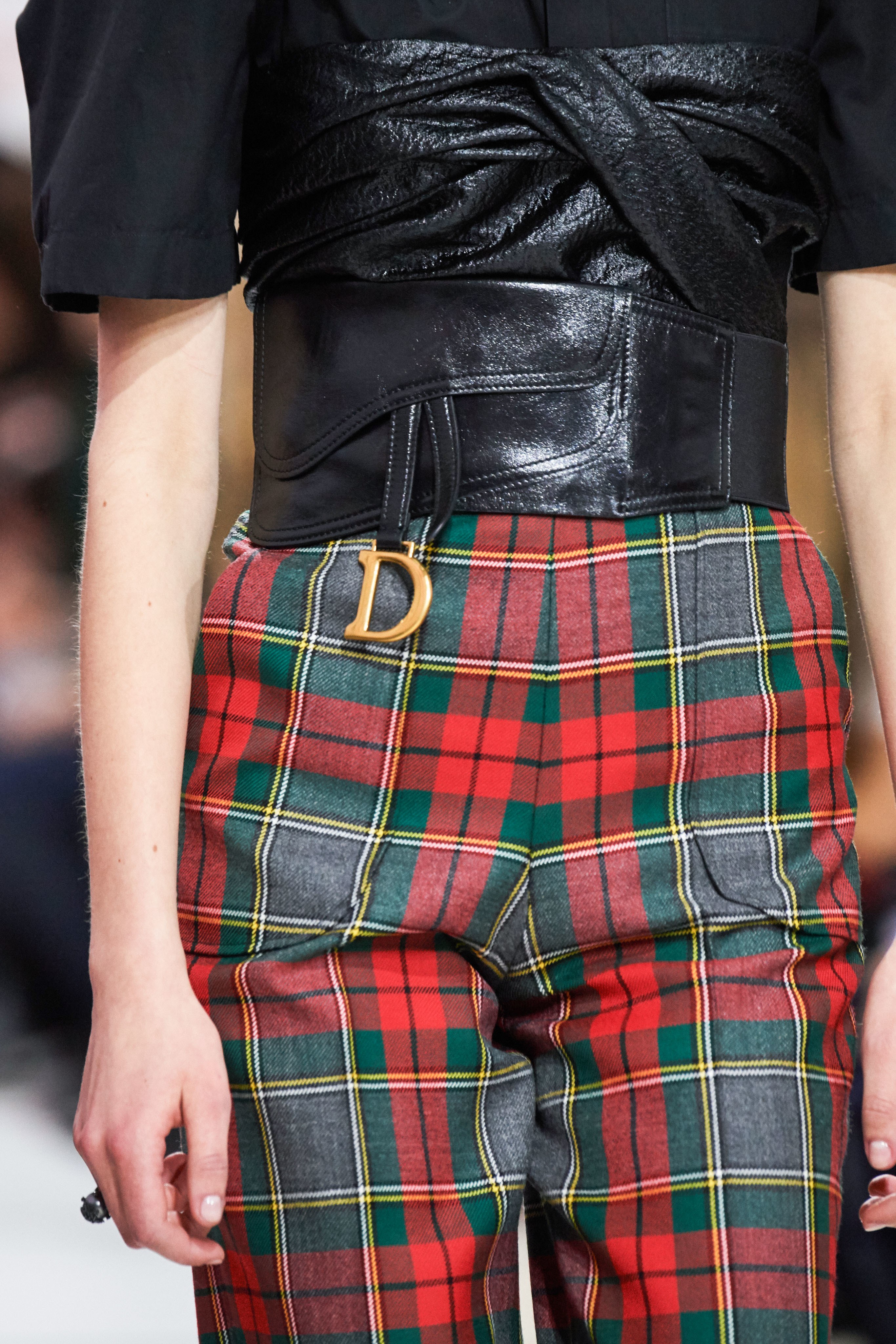 |
Tartan accepts countless colours and different combinations, the key lies in personal taste. The most common are the most classic in red or green or black and white and in XXL size. In the late twentieth century tartan was also associated with a more transgressive aesthetic and found adherents in the punk movement of the late 70s with designers such as Vivienne Westwood and grunge and its nineties counterculture. To cite some examples, at this time John Galliano and Alexander McQueen adapted it.
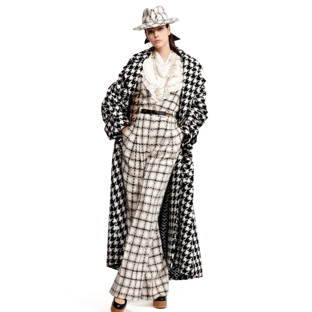
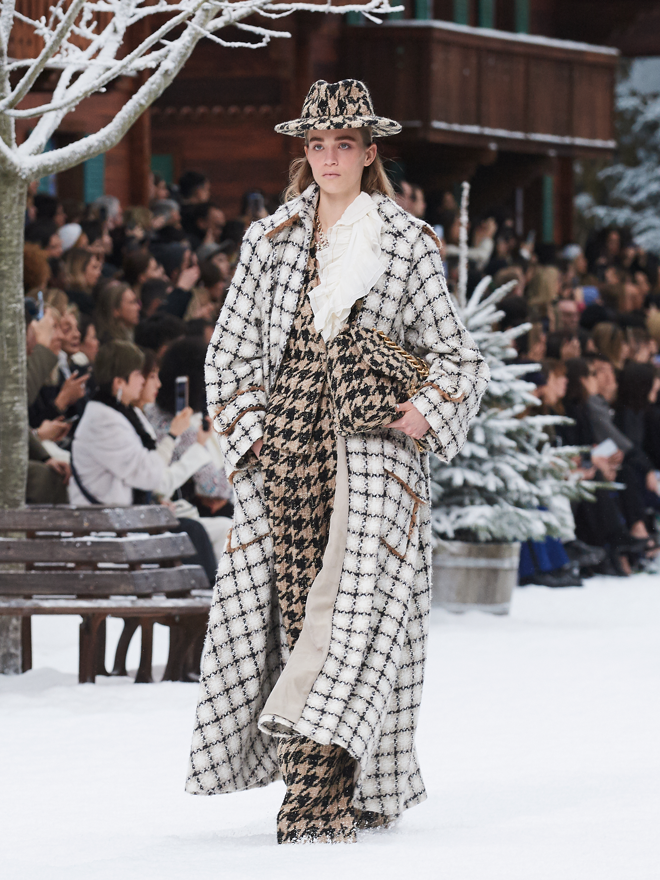
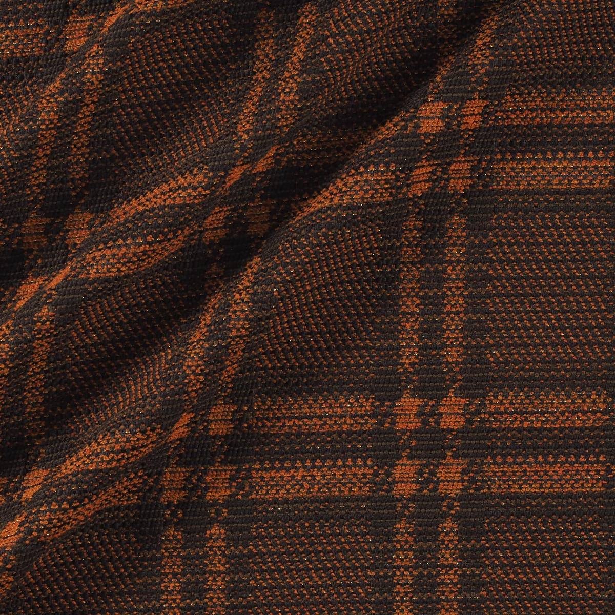
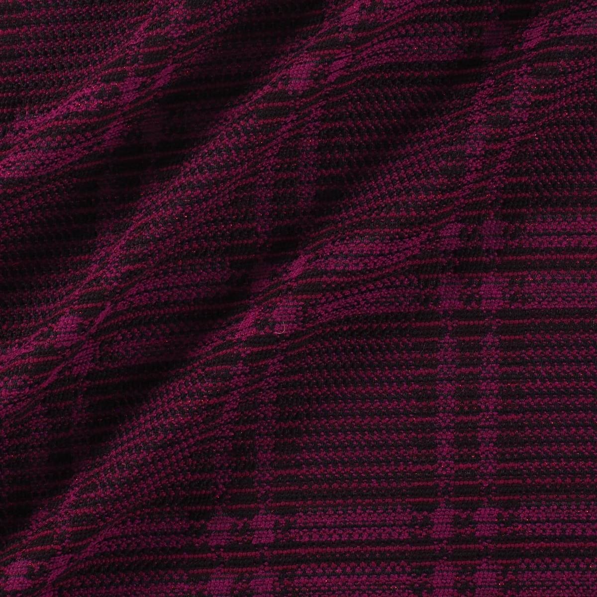
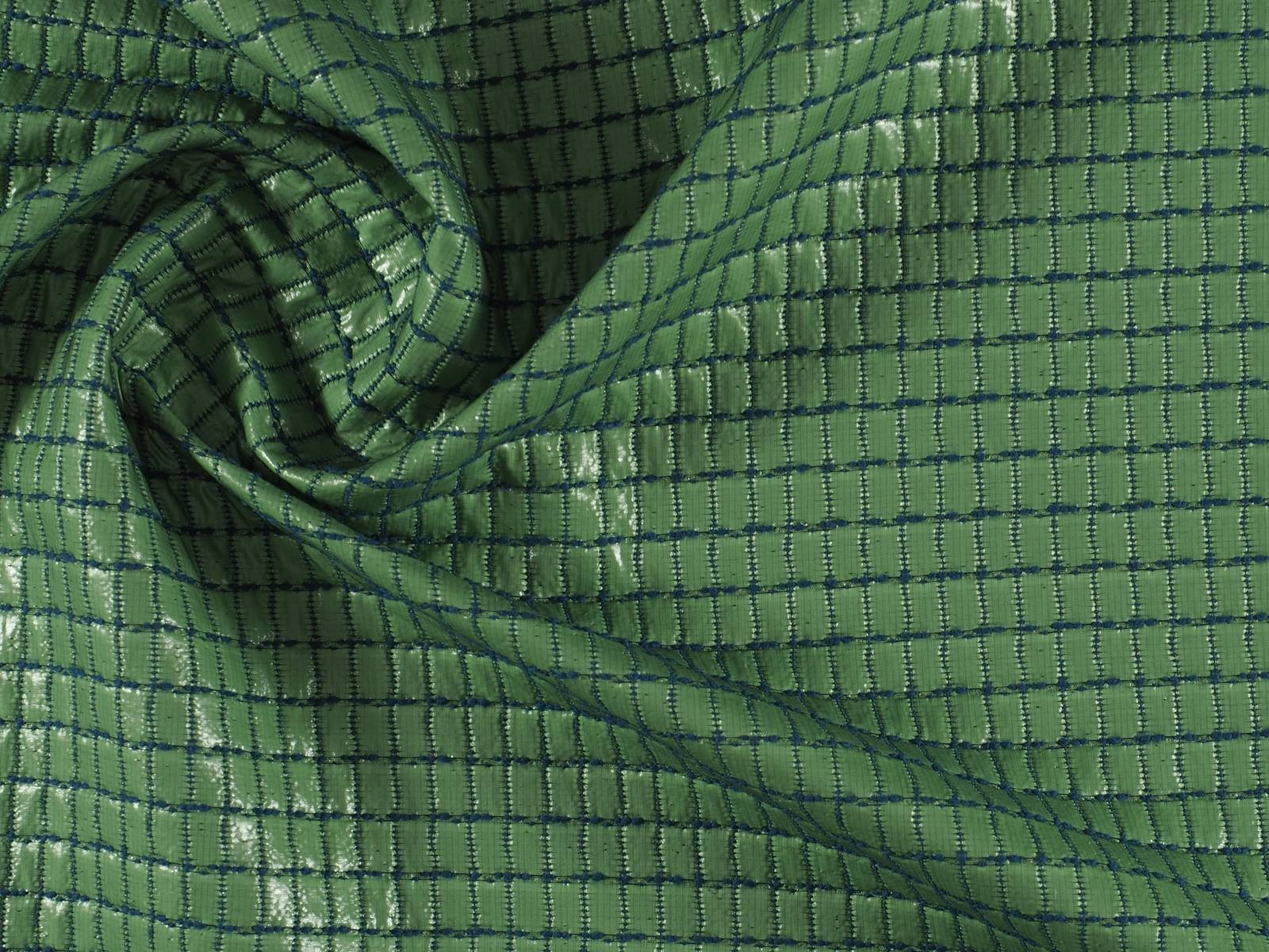
Window frame checks
We are talking about a type of simple frame that makes squares thanks to the fine lines that make it up. Thus on a dark background a light line is added that draws a broad picture. As a base the window frame can have a tartan (with finer wool) or a tweed (which gives it a more rustic look). This type of check became popular in the 30s in Britain when people began to look for more daring and informal prints that maintained that classical dandy image, but with certain licenses.
Today window frame checks are widespread and are used almost equally in winter and summer fashion collections. We refer you to the last collection made by Karl Lagerfeld for Chanel where you can observe these types of checks mixed with other fabrics and prints.
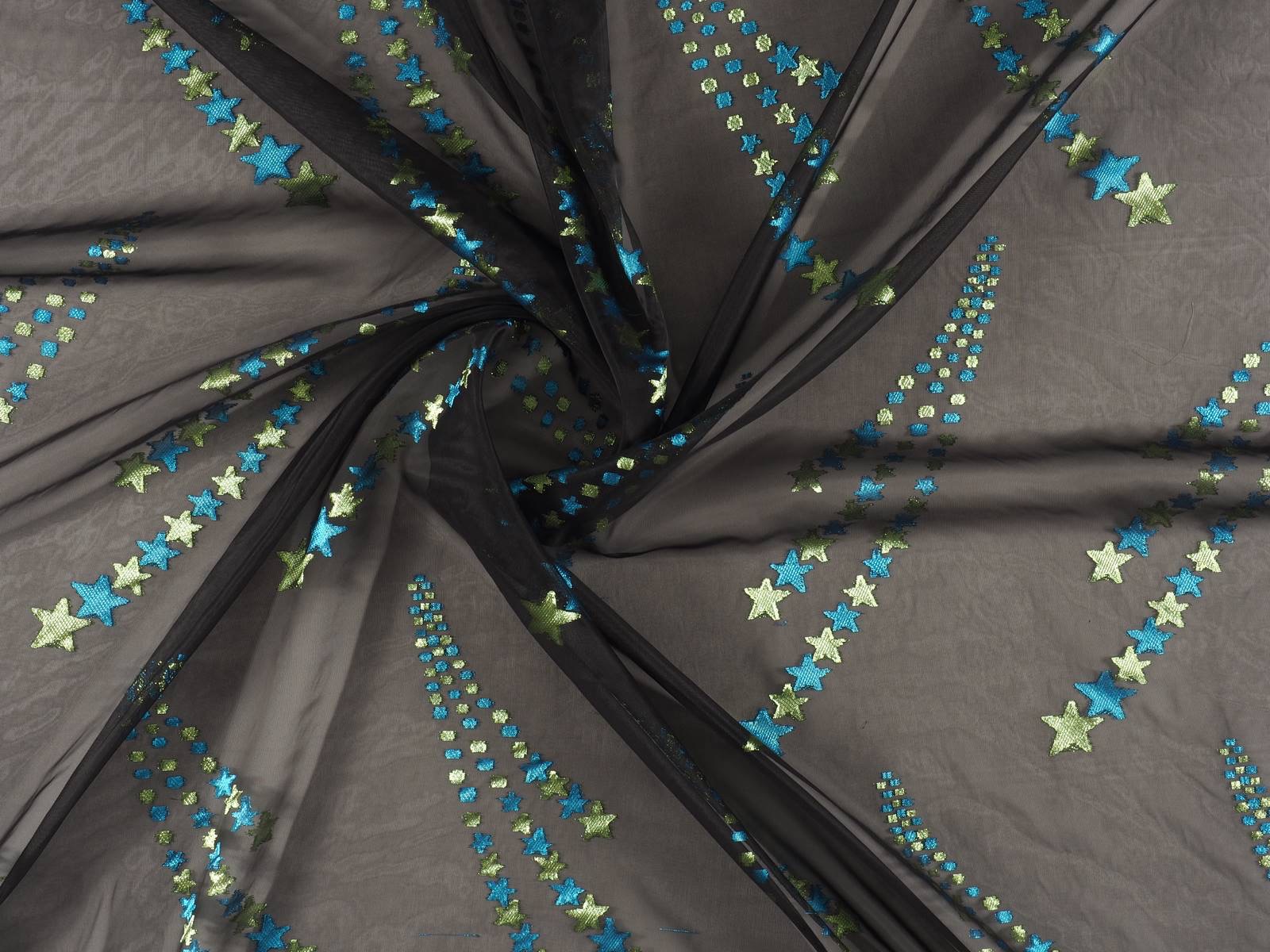
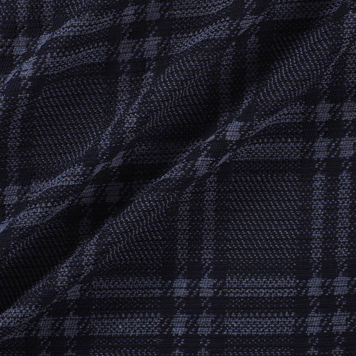
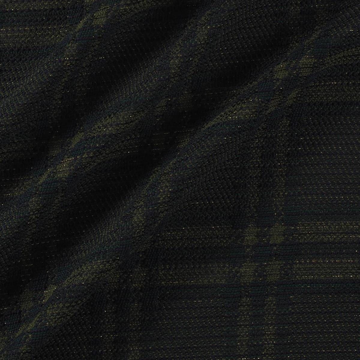
The current Gratacós collection also contains many plaid fabrics. Here are some references for you to get inspired.

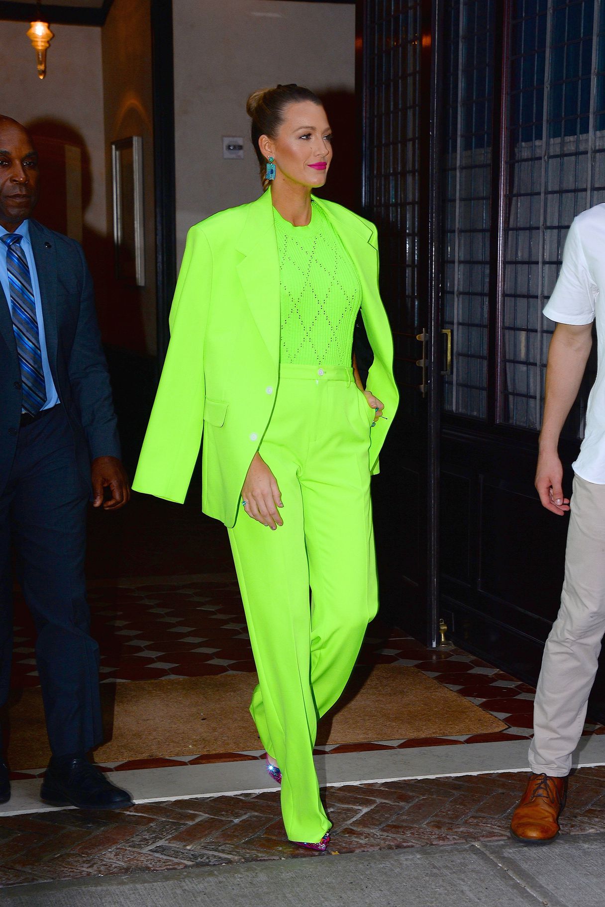
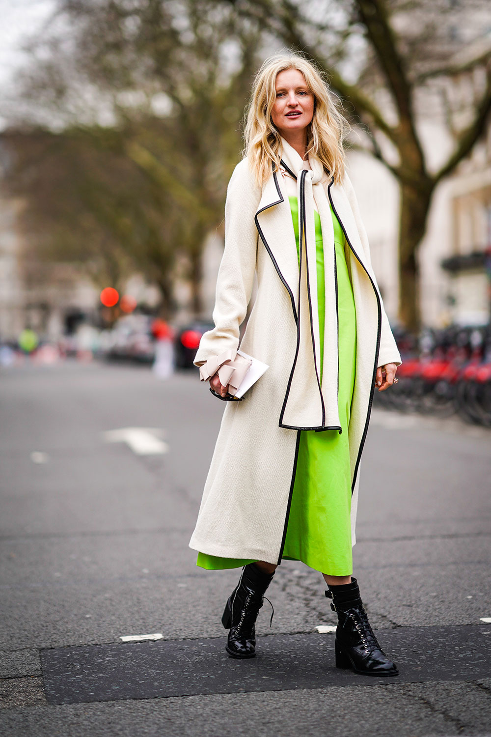
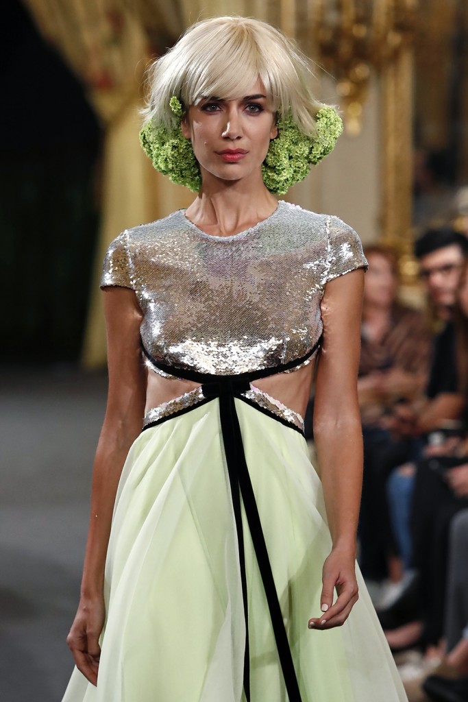
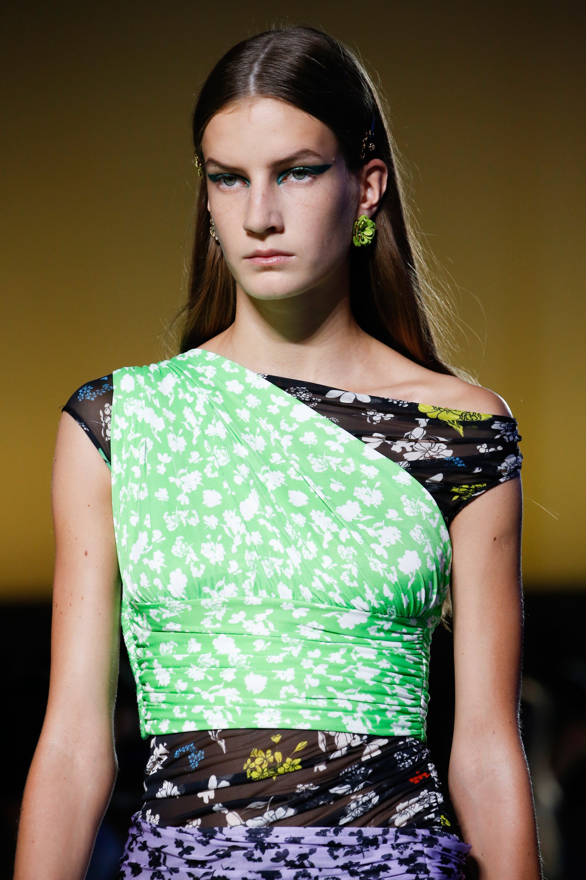
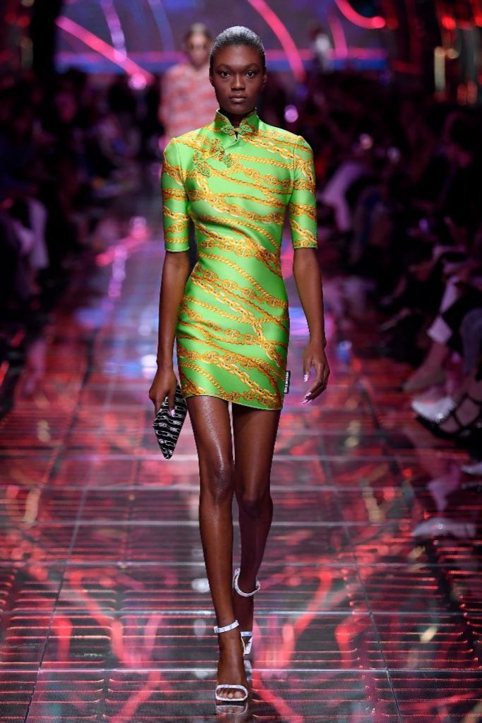
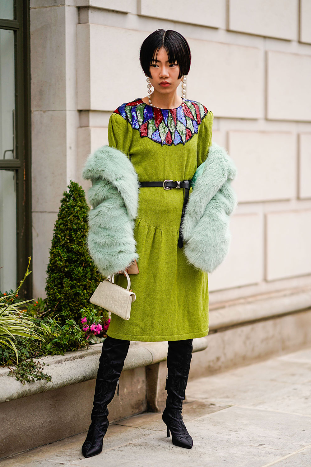
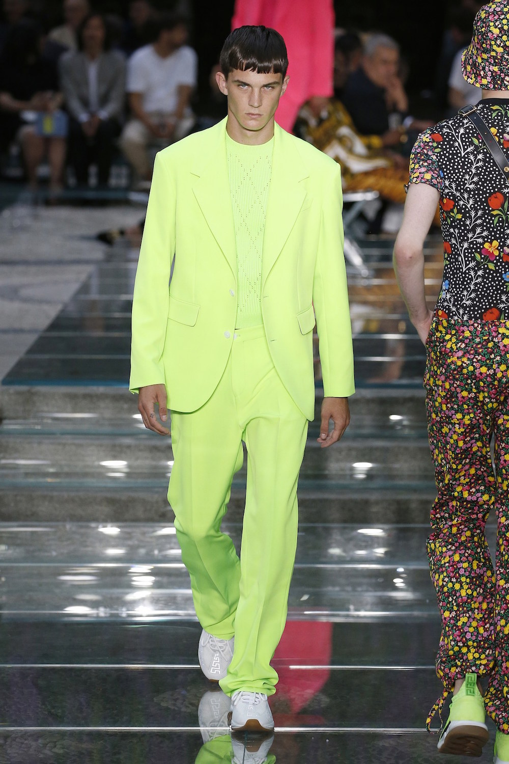
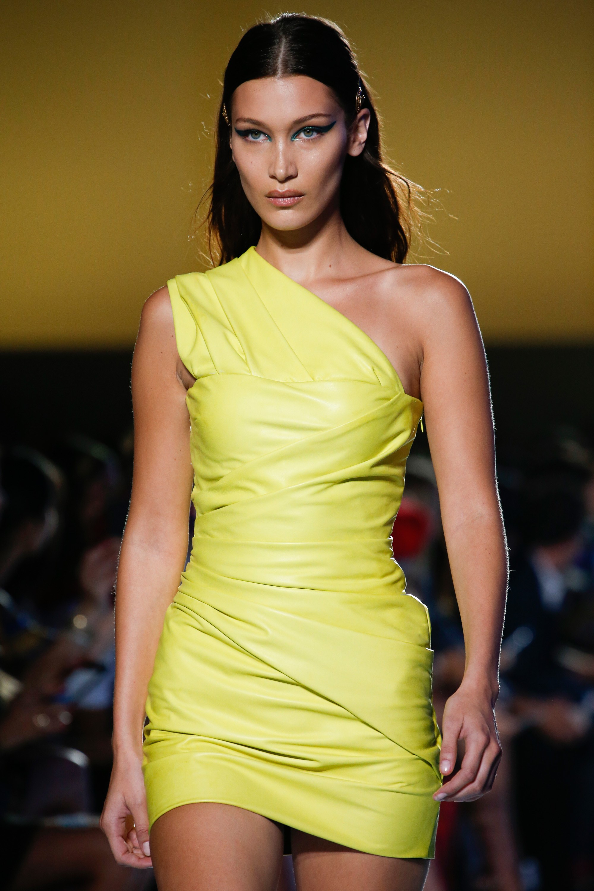
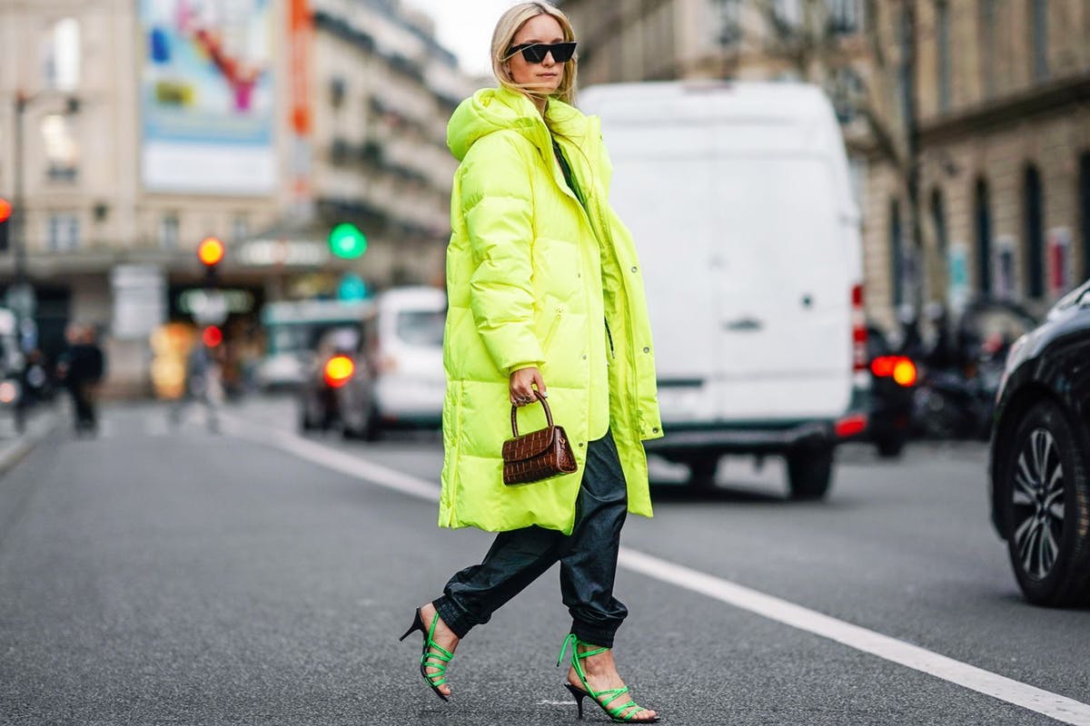
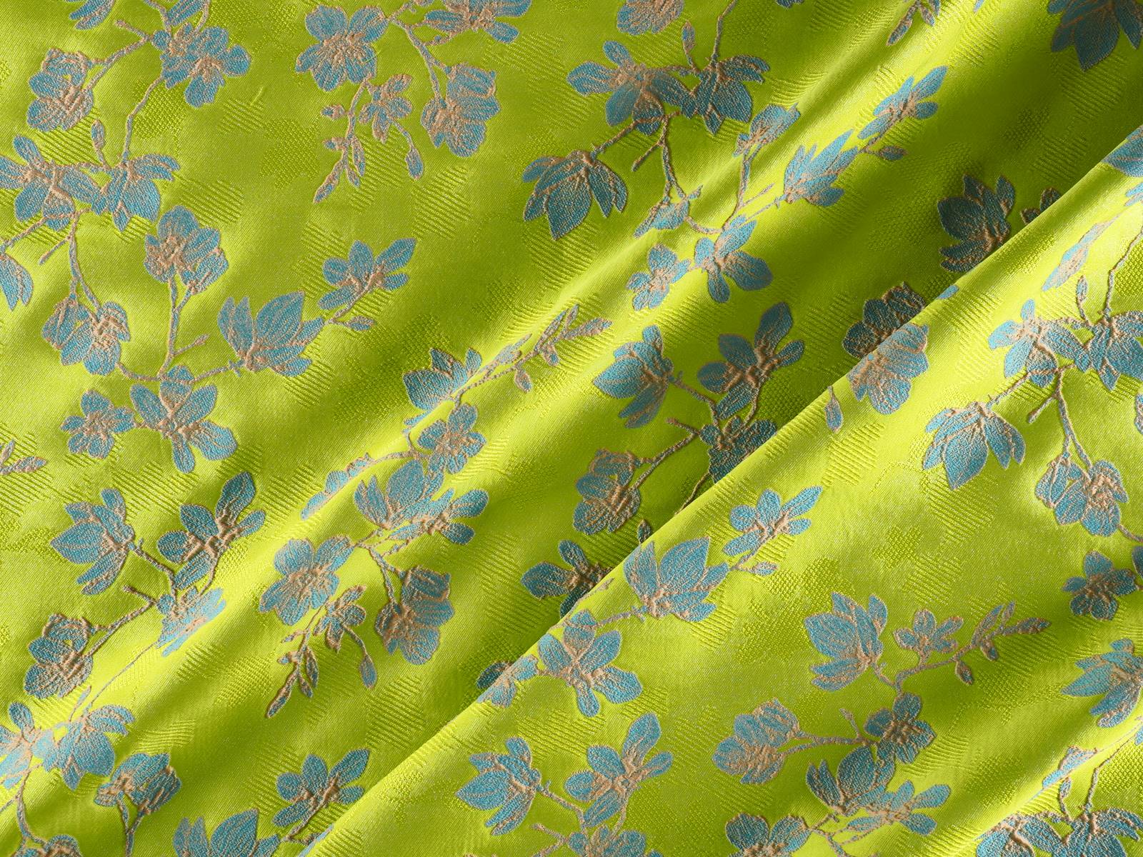
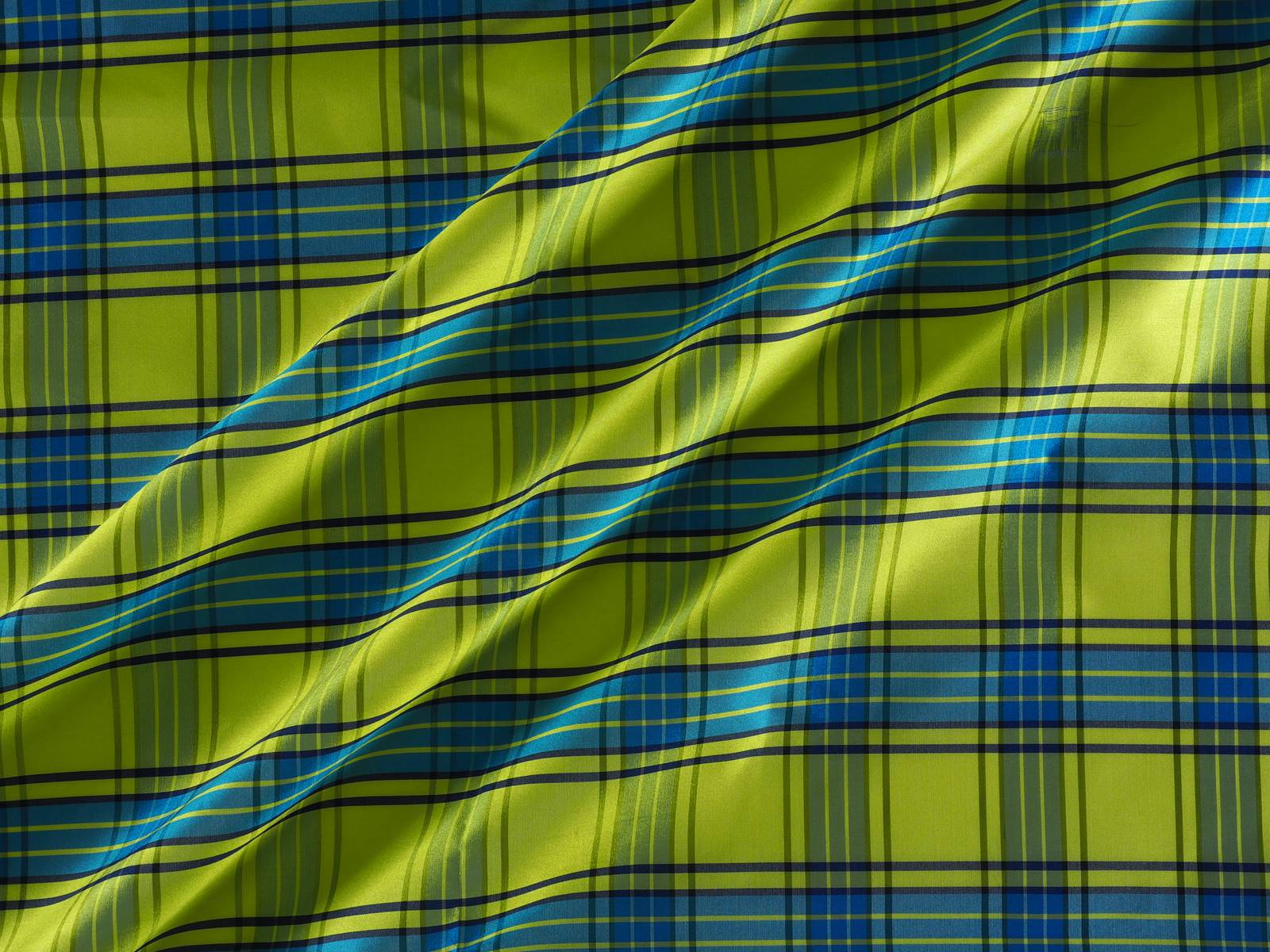
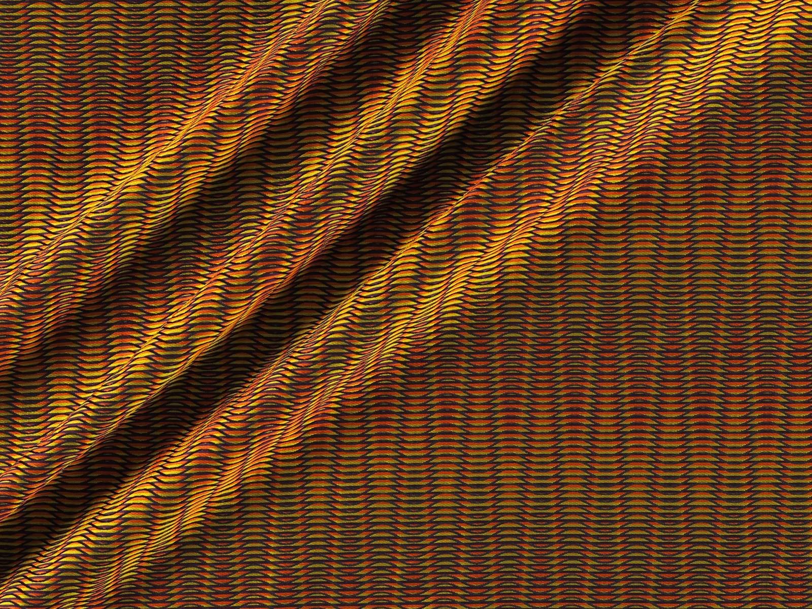
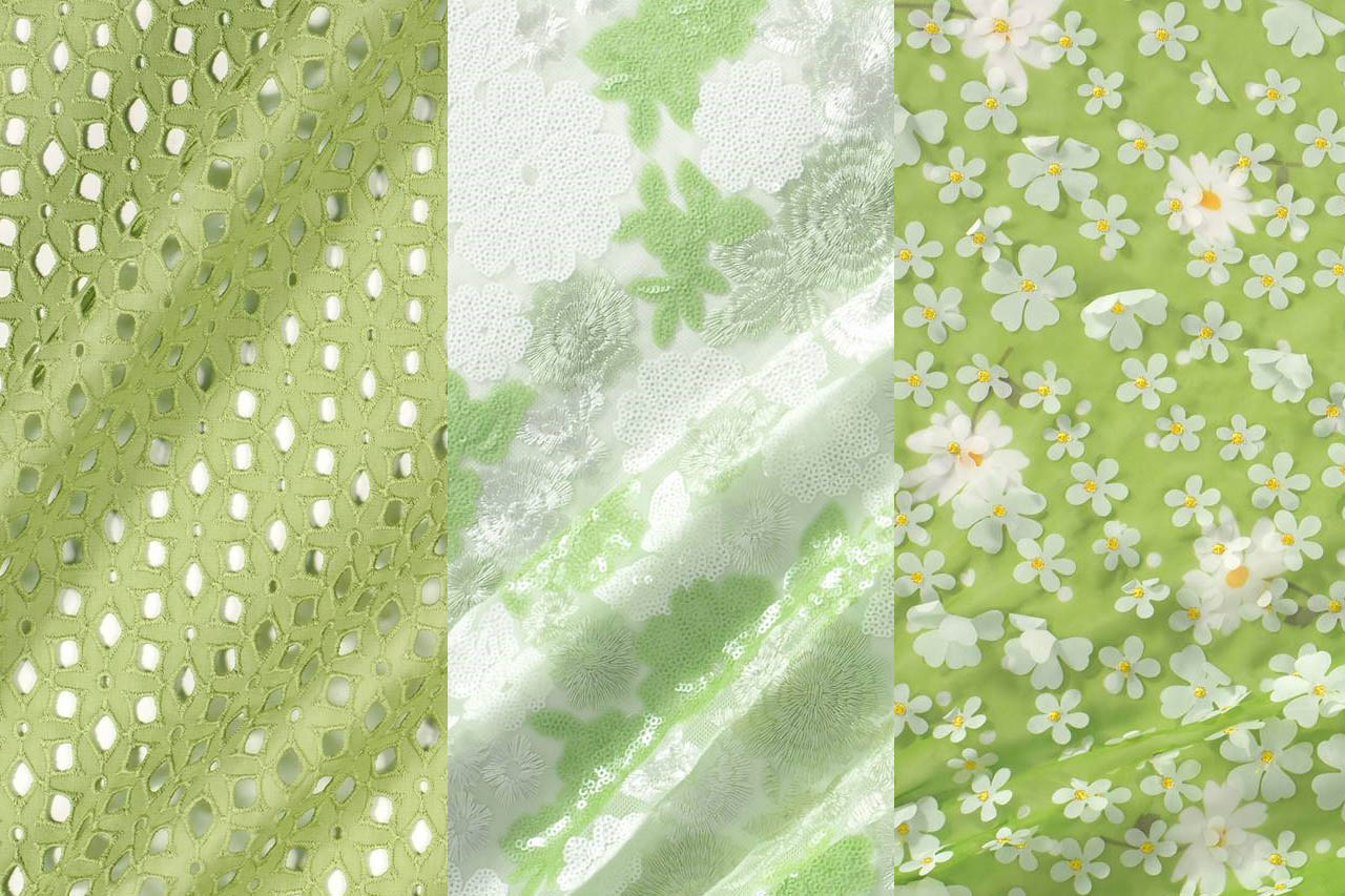
It is not a novelty this season, but it is reluctant to abandon the podium of trends. It has no rival in terms of strength, brightness and daring and has gone from being a simply radiant colour to becoming a symbol for generation Z. We are talking about the most shocking green: in neon, lime or pistachio. It is the true “king” of summer that permeates the street style with its rebellion and youth.
Almost a year ago this carefree colour began to resonate as a trend. Lime green in its fluorine version was slipping into the winter closet . The greatest impact was achieved through Instagram when it stormed surprisingly into the timelines of various fashionable influencers. This gaudy tone caught everyone’s eye through one viral garment: a tight-fitting perkins-neck sweater that was displayed brazenly with the same blinding force of a lightning bolt . Fluorescent green in all its glory! This garment was shown in different versions and by several different companies – both design and low cost – who adapted it in their own way. The lime green jersey became the most coveted trend of the moment.
 |
 |
Subsequently this vibrant tone was one of the most repeated and adapted by those attending the international parades. It was worn in trousers, dresses and coats, also flirting with accessories-though to a lesser extent. The big brands reinforced their power by protecting neon colours -including the green in question – as one of the trends this summer. It is curious that of all the newly-popular colours this type of green was the best-acclaimed in the street, the thermometer which helps the sector to know what really people will wear or not, regardless of what fashion dictates.
A prominent role was played by the power of attraction of world-wide influencers and celebrities , who did not hesitate to dress in lime green: Kendall and Kylie Jenner , Chiara Ferragni and Blake Lively dressed in looks favouring this colour and even dared to wear it in makeup. On the cat-walk this shade has seduced Balenciaga, Versace , Stella McCartney, Vetements , Gucci and Dolce & Gabbana, all of which have not hesitated to include lime green in their latest summer collections. Long live the most fashionable indiscretion!
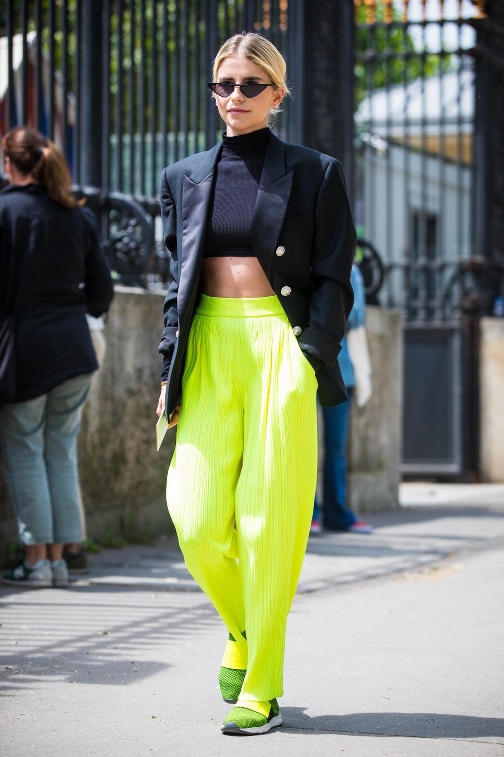
And how is it worn ?
It is not easy to combine lime green. The key lies in the alliance of neutral tones such as the range of beiges and skin-colours or the incombustible white and/or black that represent the simplest and most practical option. Satin fabrics give the lime green more light and are flattering in flowing garments like skirts and dresses with movement. Smooth or stamped? Although the first option would be the most effective, it can also be mixed with prints and textures with relief . Our choice is for fabrics which play as different shades of lime green through geometric motifs, floral prints or embroidered sequins and in turn introduce other harmonious colours. Sometimes you don’t need to go for the strident version, you can still be trendy by discreetly opting for pastel colours. Here we are leaving you our inspirations in bold lime green. What do you think?


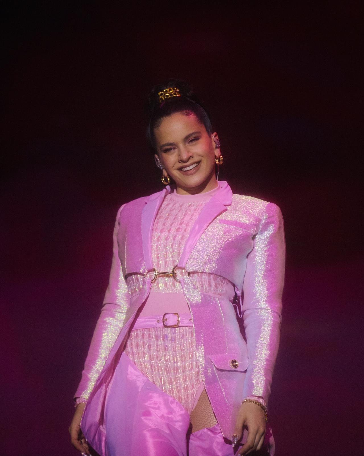
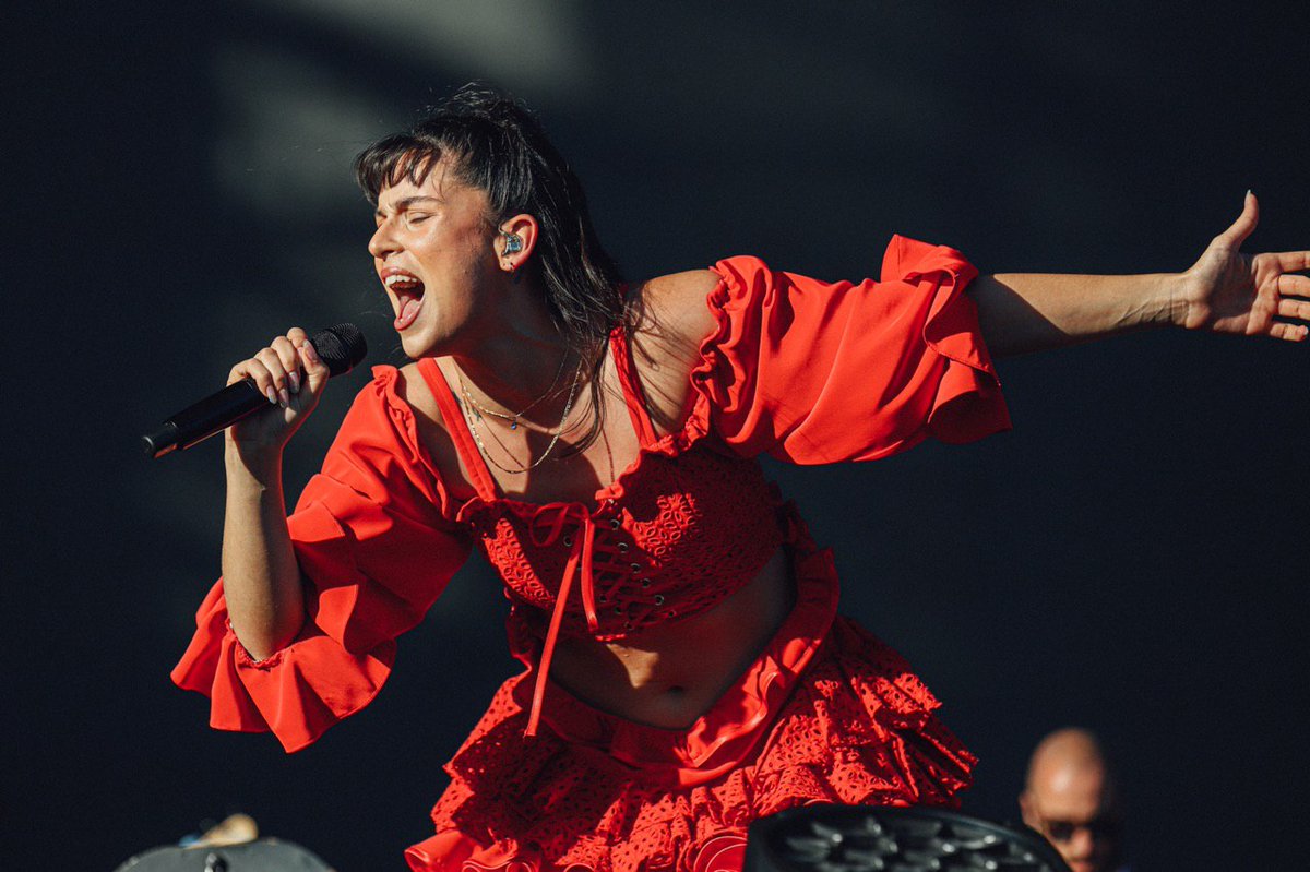
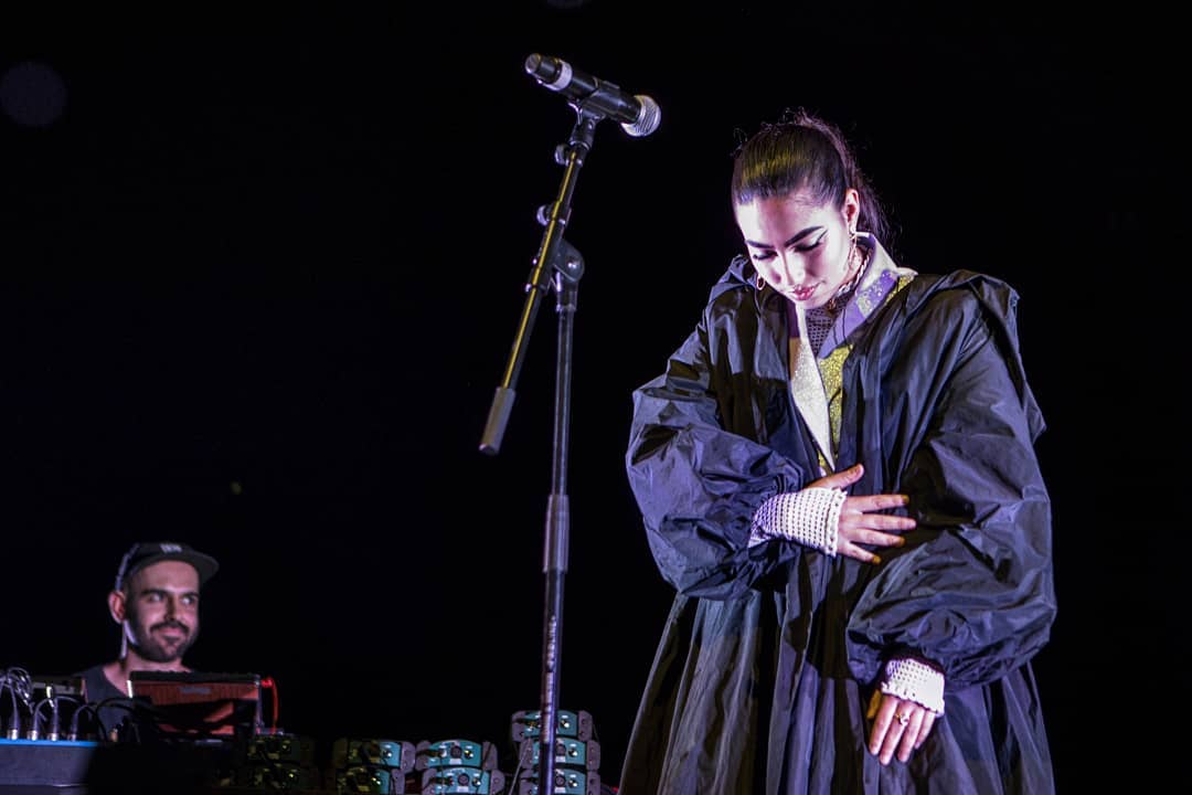
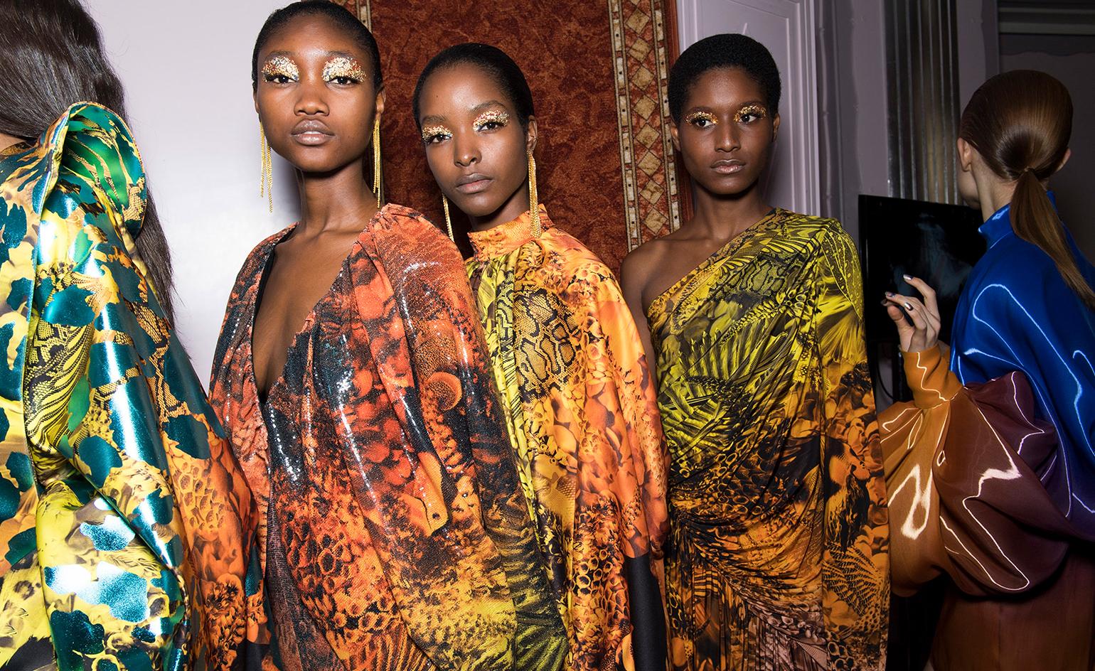
There are powerful alliances, which work perfectly because they arise naturally and spontaneously. And the result is most impressive when a whole team of professionals coordinates to achieve a single goal which goes beyond surprise or emotion. In this cTase we are talking about the union between fashion and music through our latest collaborations which can be seen in the latest edition of Primavera Sound with some talented names within each discipline. Yes, we are pleased to say that Gratacós has jumped onto the stage via the wardrobe of three young artists with a lot of potential: Rosalía, Nathy Peluso and María José Llergo.
What was the collaboration?
Following one of our principles as a company, which is to support future professionals within the sector, whether young talents or established designers, as well as to develop cooperation with them, we faced a very motivating challenge earlier this year. The companies Dominnico, headed by the Alicante designer Domingo Lázaro Rodríguez and Colmillo de Morsa, from Barcelona contacted us offering a collaborative project which had us hooked from the very first moment. These companies were going exclusively to design the costumes of Rosalía and Nathy Peluso, designs that the artists would exhibit in person during their promotional tours around the world. In the case of Primavera Sound we also had the collaboration of Manuel Bolaño who sought to surprise with a design created for the performance of the singer María José Llergo.
These companies, which are friends and customers, were looking for something innovative, exclusive and of high quality for the costumes of the artists, something that would cause a real stir for its creativity and exclusivity! They know that we as fabric designers can count on a range of creations which meet these needs. Moreover, sometimes it is through the raw materials – in this case the fabric – that from the start the craziest ideas take their shape. And that point of slightly mad experimentation is what we adore and are entertained by ! In addition we firmly believe in the project of these three companies and the people behind them. So we were delighted to collaborate in the project of dressing three young divas of contemporary music at Primavera Sound .
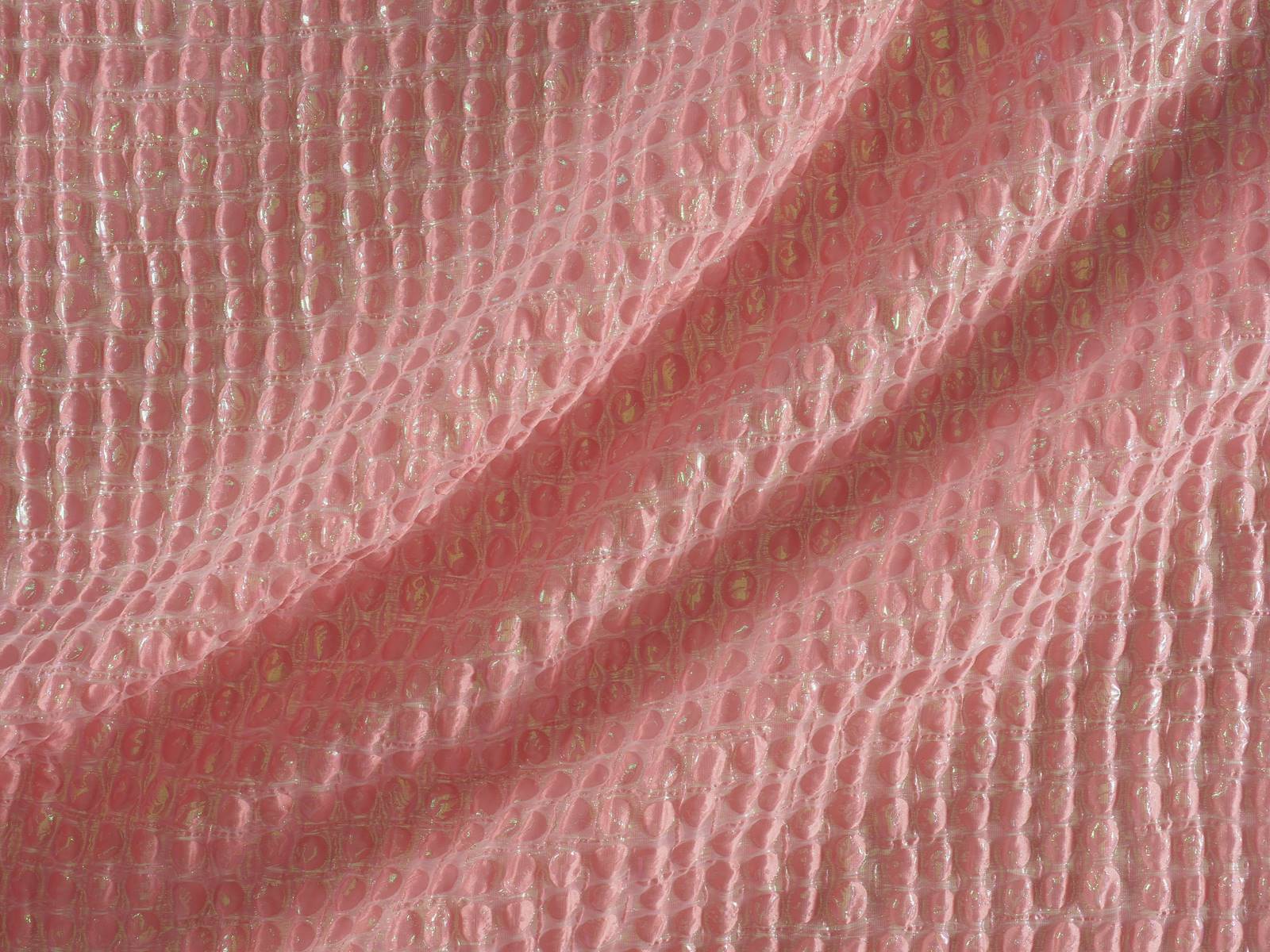
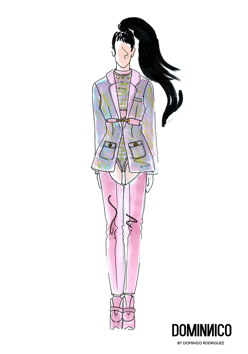
For the occasion Dominnico chose a wonderful Jacquard padded in bubblegum pink with iridescent stitchings to create that stunning amazon look worn by Rosalia in her performance at Primavera Sound. That fabric was present in the corset which the Catalan artiste wore with pronounced shoulder pads . The outfit was complemented by a jacket and matching leggings, which were defined at the waist with gold appliques. This bold outfit,which was inspired by the ‘ Dirty ‘ style of Christina Aguilera also bore the design and styling of Daikyri , Rosalia’s sister.Nobody was left indifferent by this wardrobe . We should mention the sure value of Domminico , which already counts as clients other international fashion and show artists such as Lady Gaga, who has worn the brand on three occasions .
In the case of Colmillo de Morsa , the challenge was to dress Nathy Peluso , the Argentinian artist now based in Barcelona whose successful music ” is capable of making hip-hop danceable and accompanied by jazz”, and whose trap aesthetic captivates the young generation Z. They also recently designed for Berskha a capsule collection which embodied their aesthetic references. The designer Elisabet Vallecillo chose a cotton embroidery to make the countless metres of ruffles that she used to design the spectacular cascaded skirt and the top with crossed neckline worn by the Argentine artist. The embroidery was white and the designer dyed it afterwards to achieve this reddish tone so exuberant for an outfit inspired by Havana.
Finally, Manuel Bolaño was commissioned to devise a spectacular coat for María José Llergo . The Cordovan singer of 24 years , resident in the Gràcia district of Barcelona, is one of the young promises of singer-songwriting, as she writes and composes with a very unique style of flamenco rooted in and linked to her land of origin. Bolaño chose black taffeta to make for her a beautiful and impressive maxi coat that did not go unnoticed among the spectators of Primavera Sound .
The most appreciated is that in the three looks the designers respected the aesthetics of each artist, without losing their essence as creators. It is here when that magical fusion between fashion and music takes place. It is an art, through and through!

Dominnico,
gratacos,
Gratacós1940,
looks Primavera Sound,
manuel bolaño,
María José Llergo,
Nathy Colmillo de Morsa,
Nathy Peluso,
Primavera Sound,
Rosalía,
Rosalía Dominnico
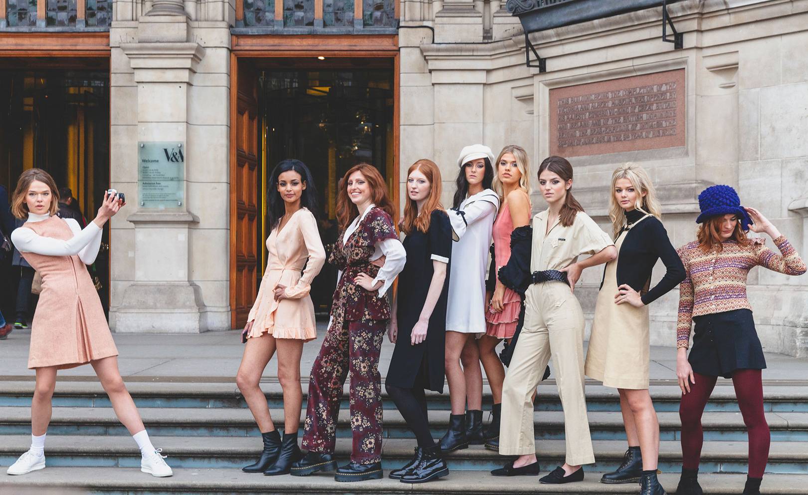
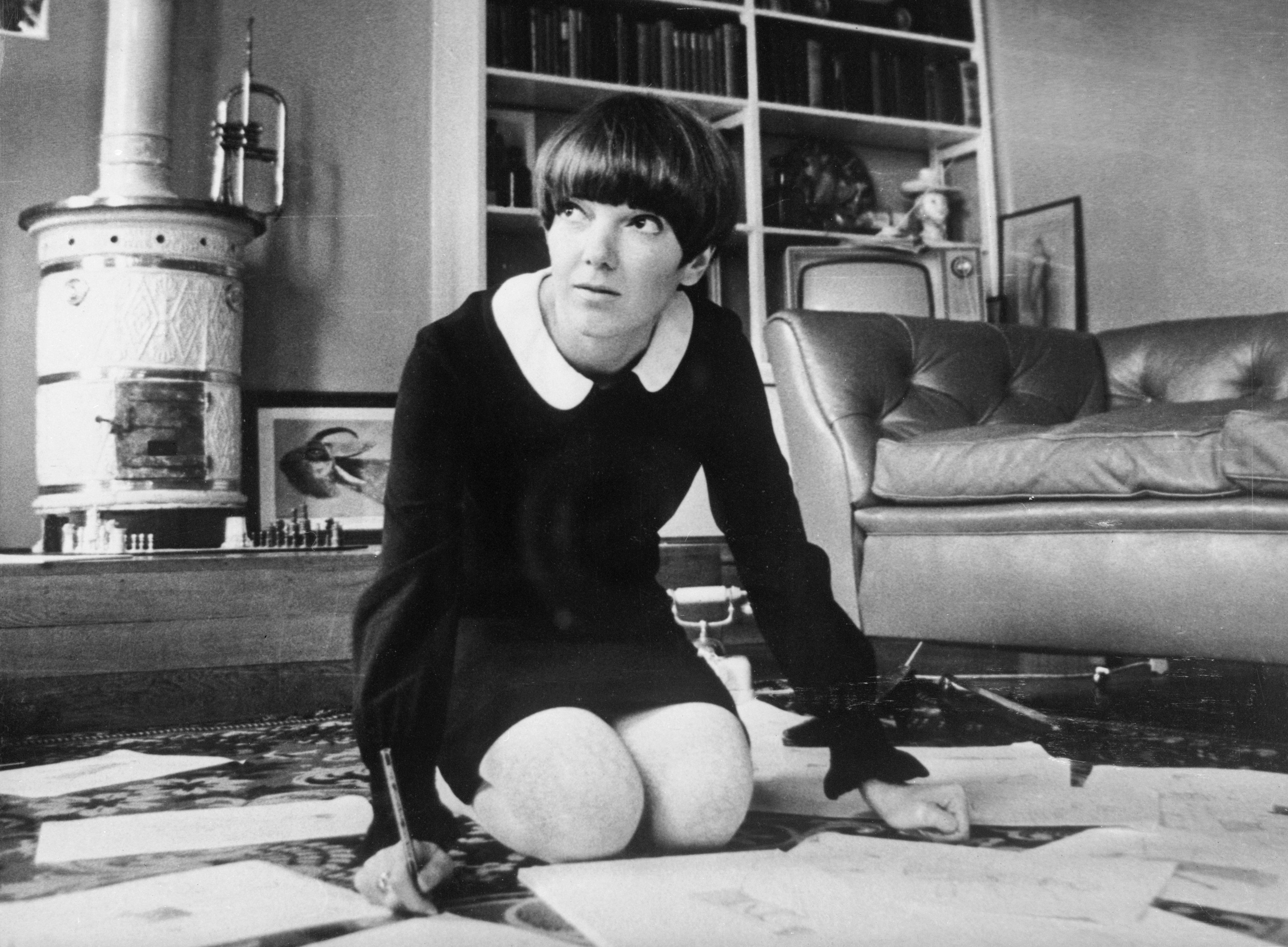
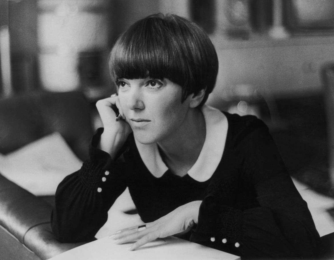
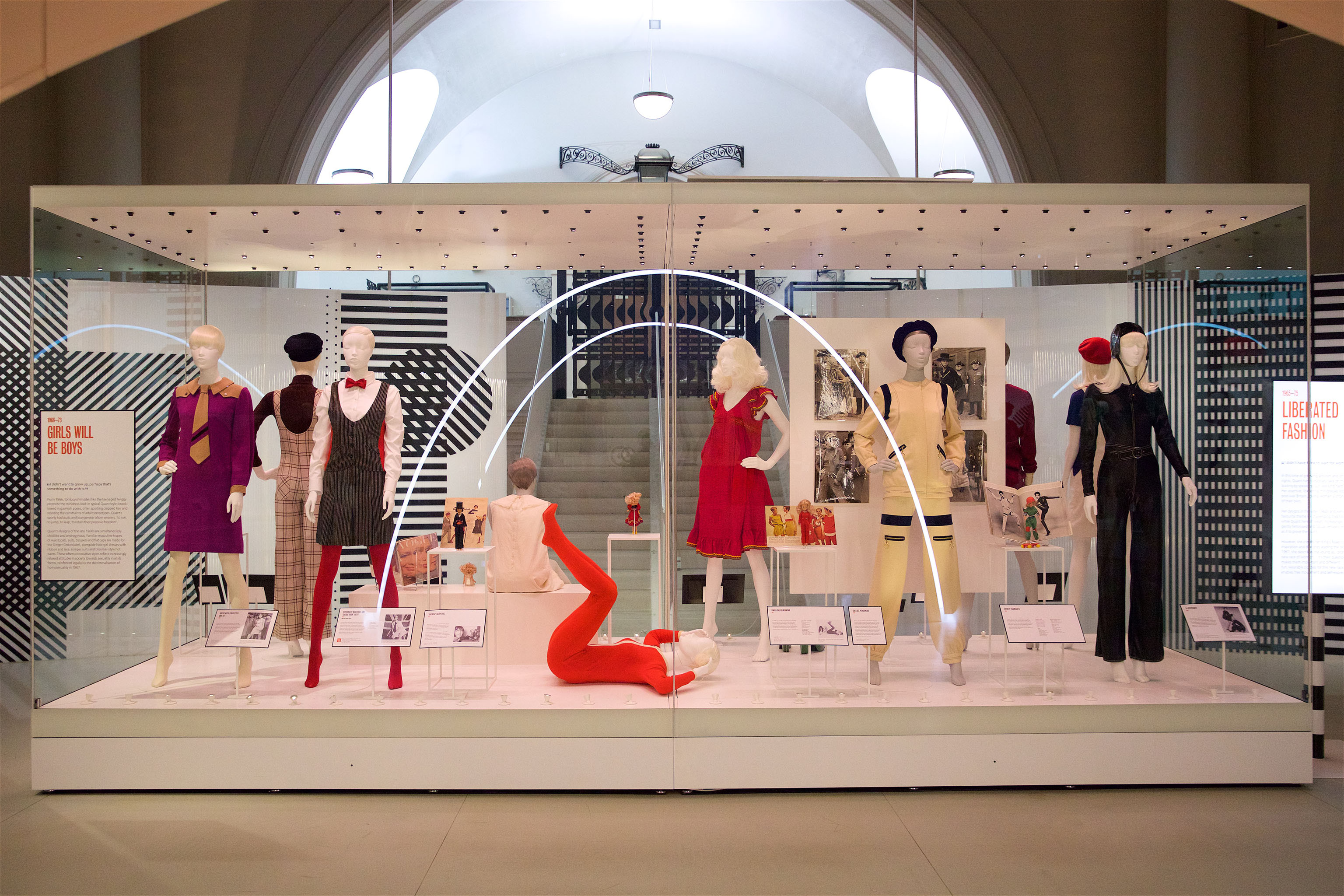
London pays tribute to Mary Quant (England 1930), living legend of fashion and guilty of stirring a whole era: the 60s with a garment of the most irreverent, the miniskirt. Although the authorship of such garment is disputed with the French couturier André Courrèges, “the mother of the miniskirt” knew how to popularize it and bring it closer to the whole world. “The goal of fashion is to make clothing available to everyone,” he used to remember. Now the Victoria & Albert museum praises this designer who revolutionized the fashion scene in that boiling decade so that the new generations know their great contribution up close. In the words of Jenny Lister, one of the curators of the exhibition, “Mary Quant is known as the architect of the democratization of fashion in the United Kingdom”.
The origin of the miniskirt is connected to the music, dance and urban fashion of the moment. It is said that he was born at the end of the 50s in North America and to dance the new rhythms of swing and rock, the skirts little by little were shortened. Who captured this progressive regression and this change was Quant, who in 1955 opened a small boutique called Bazaar in the street of King’s Road in the Chelsea neighborhood. To give visibility, Quant was among the first to adopt this garment that exposed the legs, knees and some calves, a real scandal in an era where conventions were challenged. Little by little, from her small store in London, the designer caught the attention of young people and the industry she saw in her miniskirts and brightly colored breastplates and brilliant finishes a glimpse of rebellion, transgression and freshness, three concepts that linked with the way of thinking of the new generations.
Mary Quant is the architect of the democratization of fashion in the United Kingdom
Quant had no specialized training in fashion and in fact her creations were the result of a personal apprenticeship that included experimentation with different materials. It was that courage and rebellious attitude that seduced the industry and became a reference for women of the time. Along with the modelTwiggy, Mary Quant made this short garment became the trademark not only of his clothing brand but also for a decade. A symbol was born. So much was his success that, in 1966, Queen Elizabeth II granted him the medal of the Order of the British Empire for his contribution to fashion, a distinction he picked up in Buckingham wearing one of his miniskirts.
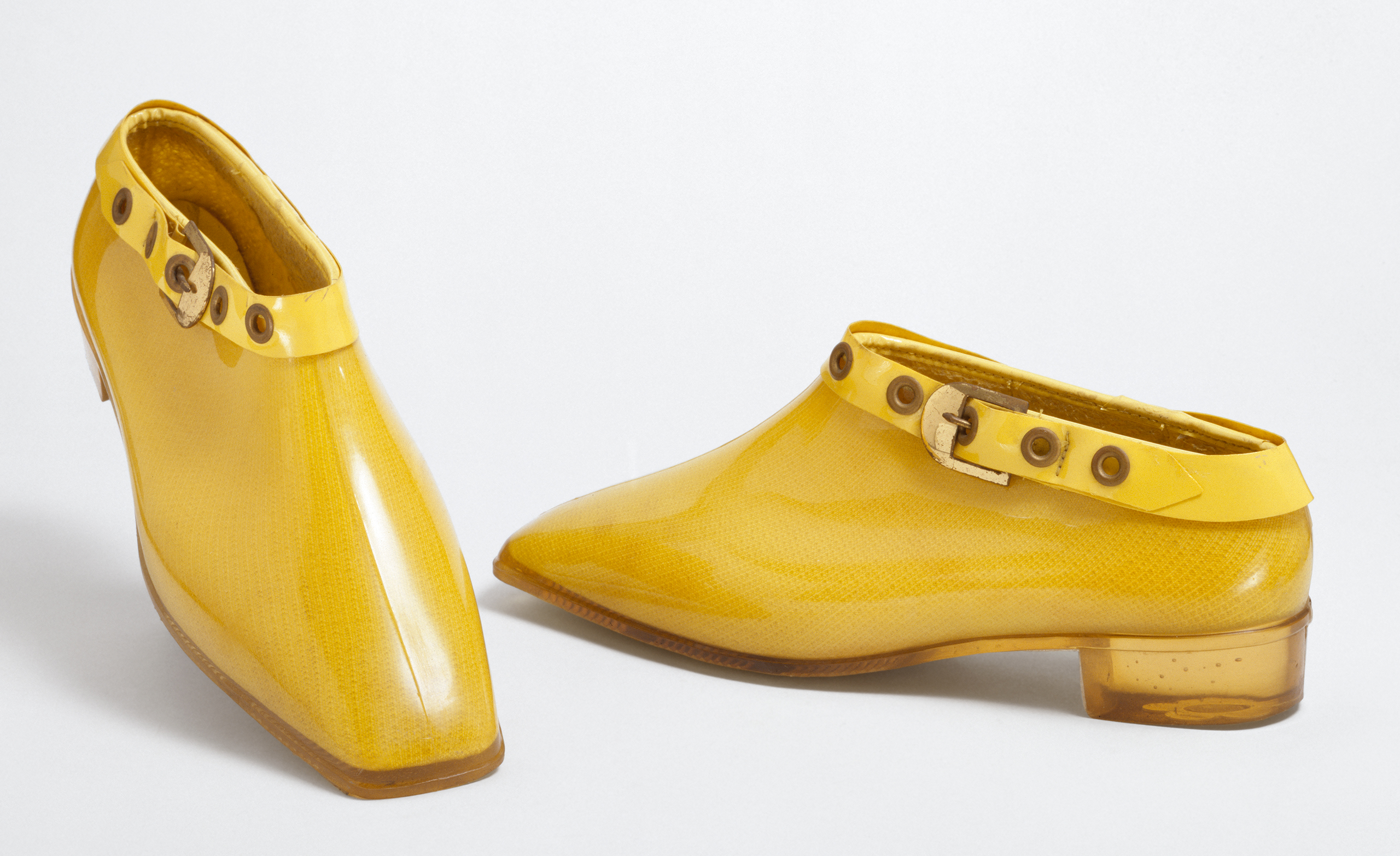
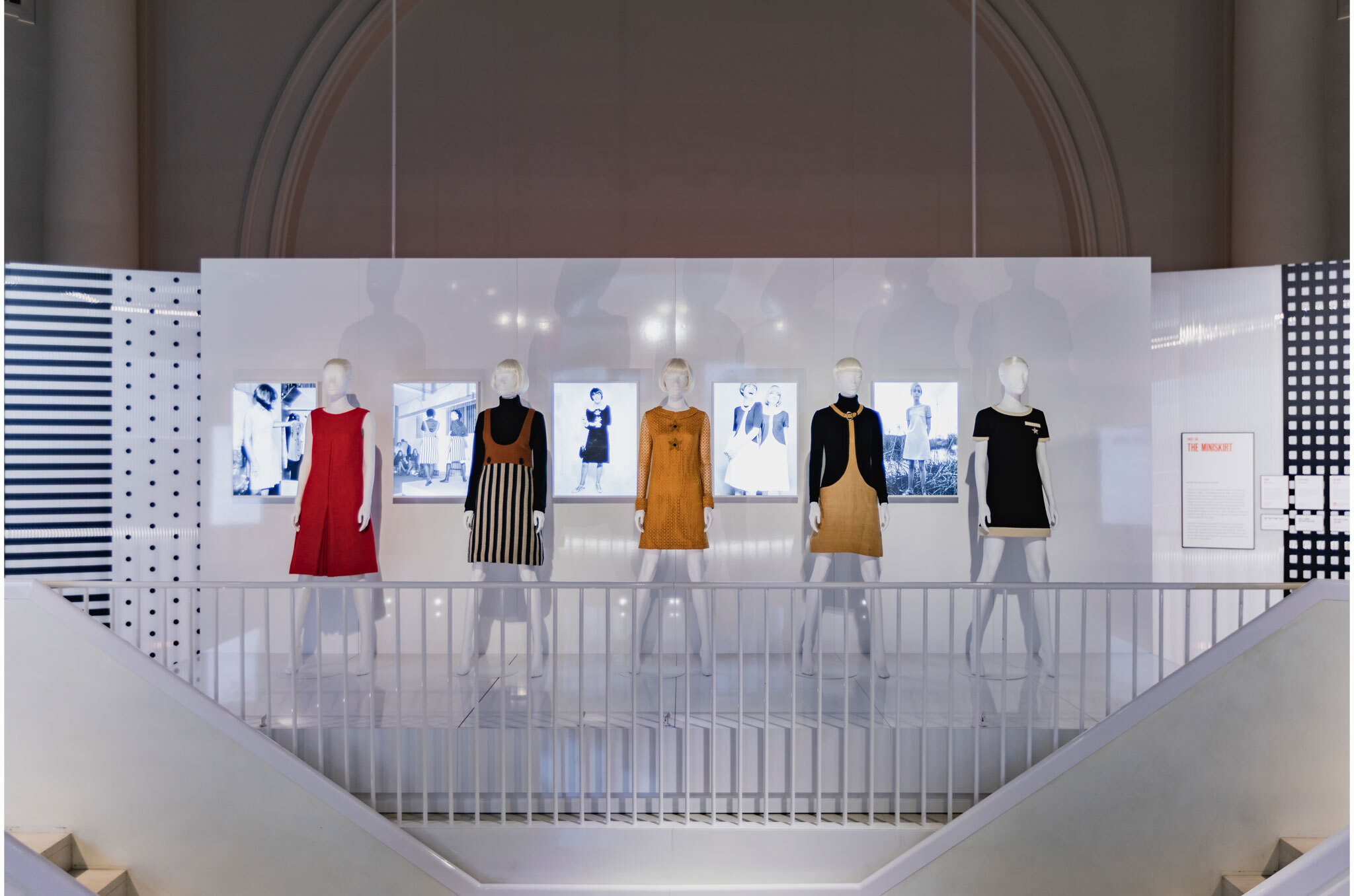
The exhibition exposes 200 pieces in which the colorful and innovative identity of the British designer is reflected. It includes the famous skirts along with other designs, as well as accessories and cosmetics, in a striking chronological journey that covers from 1955 to 1975. Among accessories and dresses, the museum also collects a selection of clothing and photos of anonymous women wearing the designs of Quant which shows the importance of the miniskirt for a decade’s fashion. The exhibition will be open to the public until February 16, 2020.

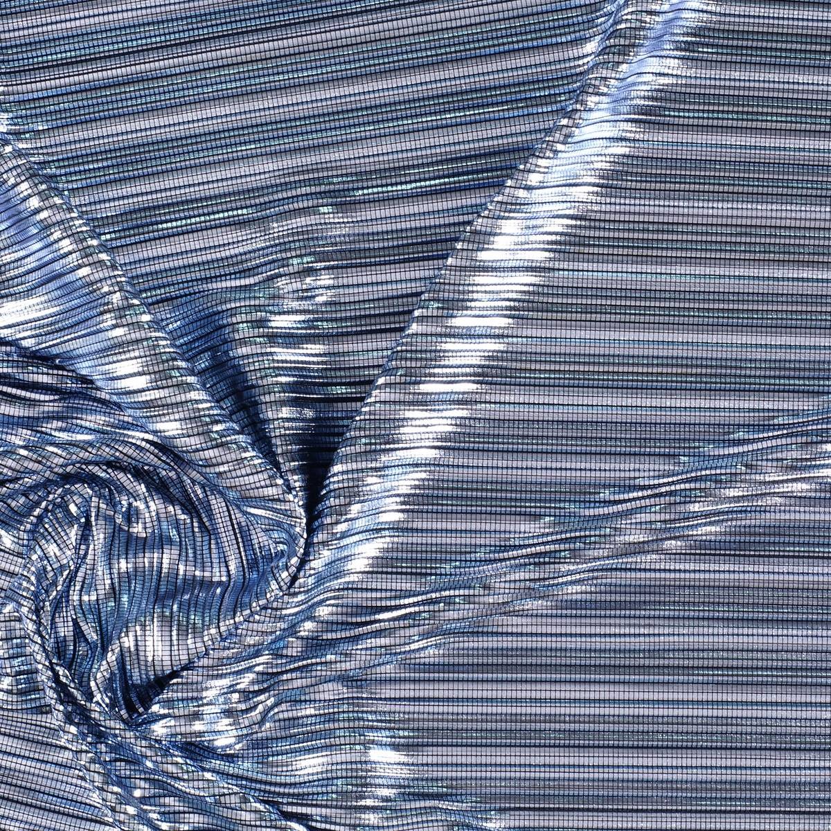
The Colour Community has just presented the new report of colours and materials that will influence the Autumn-Winter season 2020-2021 in the world of design and fashion. The initiative, led by three colour professionals , was presented, as usual, in the Old Estrella Damm Factory in Barcelona before the watchful eye of a hundred enthusiasts from the sector. We remind you that the founding team is made up of the architect Pere Ortega , the designer specialized in Colour & Trim , Eva Muñoz ; and Rosa Pujol , Textile & Colour Stylist from Gratacós . In each issue new partners are added to this “mother team”who bring their vision and help shape the new range of colours and materials that will inspire the new season. It is an initiative that is repeated twice a year and that has our support. ” Gratacós always has the doors open to our fashion- area, for every lover of fabric, texture and colour,” declares Juan Gratacós at the beginning of the presentation of the report .
Juan Gratacós : ” Our fashion-area is always open to lovers of fabric, textures and colour”
On this occasion the season is based on the concept of ‘ Multiple ‘ and consists of a reflection in a positive key about the future society where the line between the real and the virtual will be more diffuse than ever . ” Currently this virtual reality exists on social networks or in videogames but little by little it will become as tangible as what we now call reality,” explains Pere Ortega in presenting the report. The ‘ Multiple ‘ proposal , in turn, is articulated through four colour ranges and materials which are named On , Inside , Balanced and Metronome .
Pere Ortega: “Currently this virtual reality exists on social networks or in videogames but little by little, it will become as tangible as what we now call reality”

1.- On
The first inspiration appeals to dynamism, to the creation of a dialogue with new realities that are virtual. It is a dynamic and versatile range that creates products connected to the human being in a digital environment. The shades chosen to conceptualize it are the cold ones in their most attractive version: metallic greys, iridescents, smoky blues, bright blacks and touches of yellow that play in contrast. The range of industrial and futuristic themes plays with plastic, oily materials, straight and curved architectural lines and artificial shapes. Fantasy under control.
2. Inside
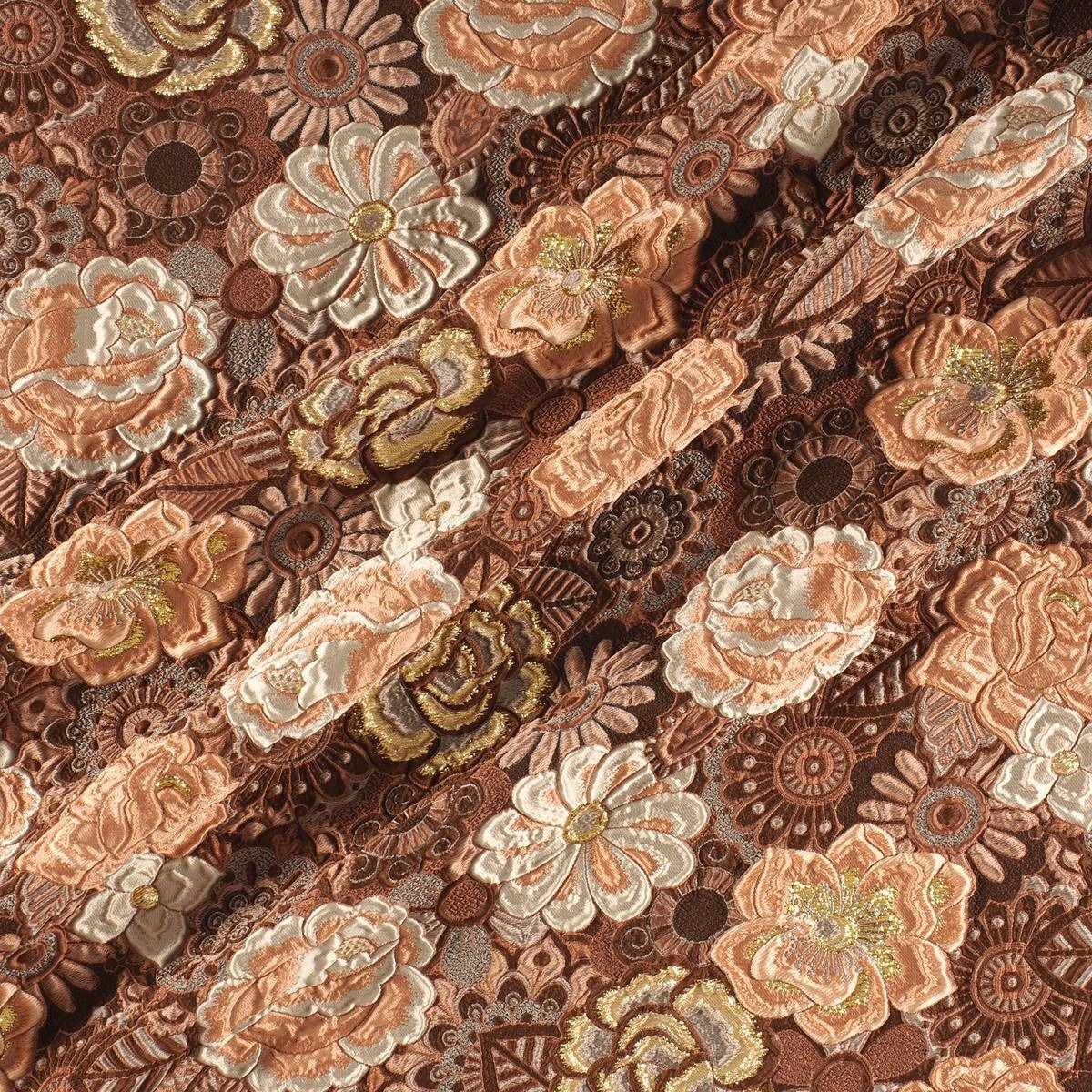
The second range is more dense and theatrical than the first. It works with the realities that look back at the past, in a kind of retrospective. The shades that are used to give it shape are the browns, purples, deep blues and the metallic range that always appears in each of the four inspirations as a common link. Floral prints, organic shapes, sinuous lines, elements of nature, upholstery … all these elements influence this intimate range that takes as its model the baroque of Versailles in its most contemporary version.
3. Balanced
The third inspiration is based on the concept of balance and chromatic harmonies. It is a modest range that is inspired by the shapes and textures of nature and works with craftsmanship in a very folky way. The predominant colours refer to autumn: the beiges, earth-coloured , whites, metallics and forest greens mixed with vibrant blues. Rough surfaces,skins, the most basic geometric elements and tribal influence are also treated in this folk range.
4. Metronome
Finally, the fourth inspiration is based on the metronome’s rhythm, with elements in movement that follow its beat: it is a work of colours that come and go and in turn play on the contrasts. This range belongs to the world of the city: it is urban, cosmopolitan and youthful. It is inspired by all the multiplicity of people, tribes and individuals that coexist within the same community. There are plenty of grey shades, silver and metallic details on smooth surfaces that contrast with graphic elements and arty patterns. Denim and overlays of garments, understood as a show of expression, configure the different identities that make up the same city.
Are you ready to play? To play the game in its broadest sense. The game as fun, where there is space for experimentation mixed with hints of entertainment and large doses of curiosity. In this new season that we are premiering we pay homage to leisure, to recreation, to freedom in a collection that is inspired, as could not be otherwise, by the concept of ‘ Play ‘. It is a presentation which is both sophisticated and casual, which focuses on colour, movement with light fabrics and craftsmanship for the warmer months of the year. This Spring-Summer 2019 collection has a large dose of creativity and ingenuity on the part of our design team, who make Gratacós a luxury fabric company with a defined style and personality. So let’s enjoy the latest creation we have prepared with the intention once again to surprise and excite. Let’s play together: Let’s play!
“Play is a sophisticated and casual presentation which at the same time goes for colour, movement and craftsmanship”
General concept
‘Play’ is a sympathetic collection that seeks at first glance to combine apparent simplicity with products that are attractive and appealing. It is an aesthetic presentation based on timeless articles far away from extravagance and artificiality, but these have to provide a distinctive feature, a certain personality. We are not seeking the versatile and basic, which is somewhat insipid, but rather to give it a creative turn. In parallel we are bringing back the characteristic features of folk culture and opting for craftsmanship to present traditional fabrics with rustic aspects and manual details.
“We are seeking to combine apparent simplicity with attractive and seductive products at first glance”
Fabrics
The objective of this collection is to revitalize the luxury of textures and materials. To achieve the new basics we use impeccable fabrics with clean and serene appearances. We also go for colourful Jacquards with tactile reliefs, fluid fabrics of silk or polyester of delicate appearance, gauzes with transparencies, dense satins, iridescent materials that captive the light or floral prints of watercolors. At the same time, within the folk trend, we are bringing back granular textures, fibrous and light aspects that show the relief through the thread-work, the hand-made reliefs and the embroidery with motifs inspired by nature.
“We are revitalizing the luxury of textures and materials”
Colours
The range of colours evolves from the natural to the artificial. Thus pastel shades and soft,sweet shades give way to the most vivid colours in a smooth transition and in a key feminine way . The most vibrant tones are used for details. ‘Play’ is also a collection dedicated to light, that’s why it also opts for the iridescent, transparent and nacreous with a nod and a wink to things nautical.
Discover some inspirations in our new lookbook Spring – Summer 2019! click here.
Sorry, this entry is only available in Español.