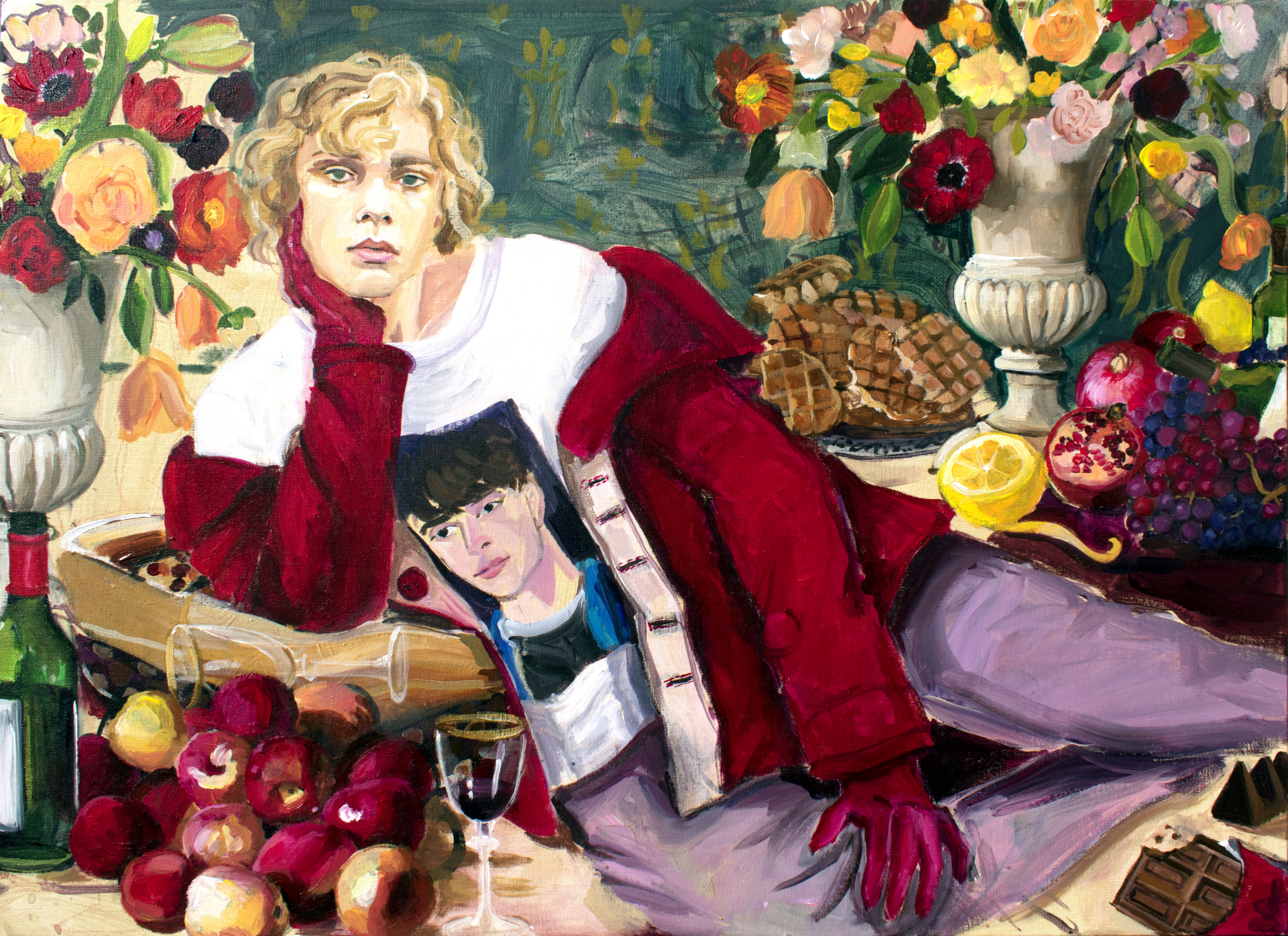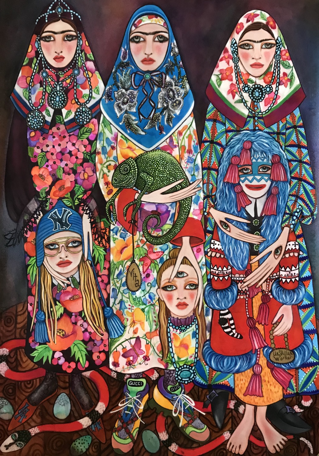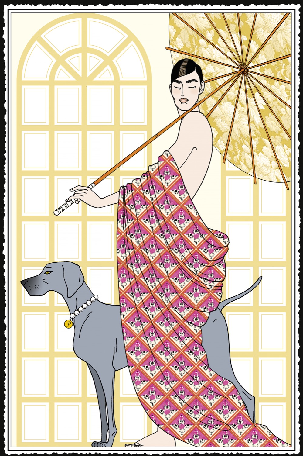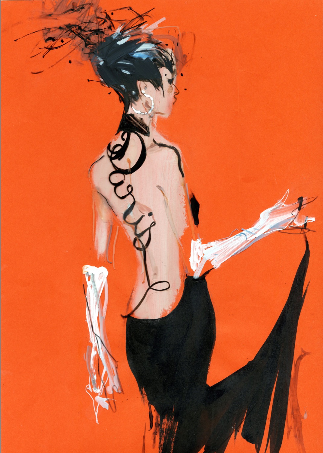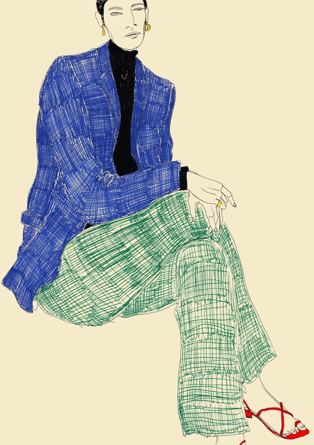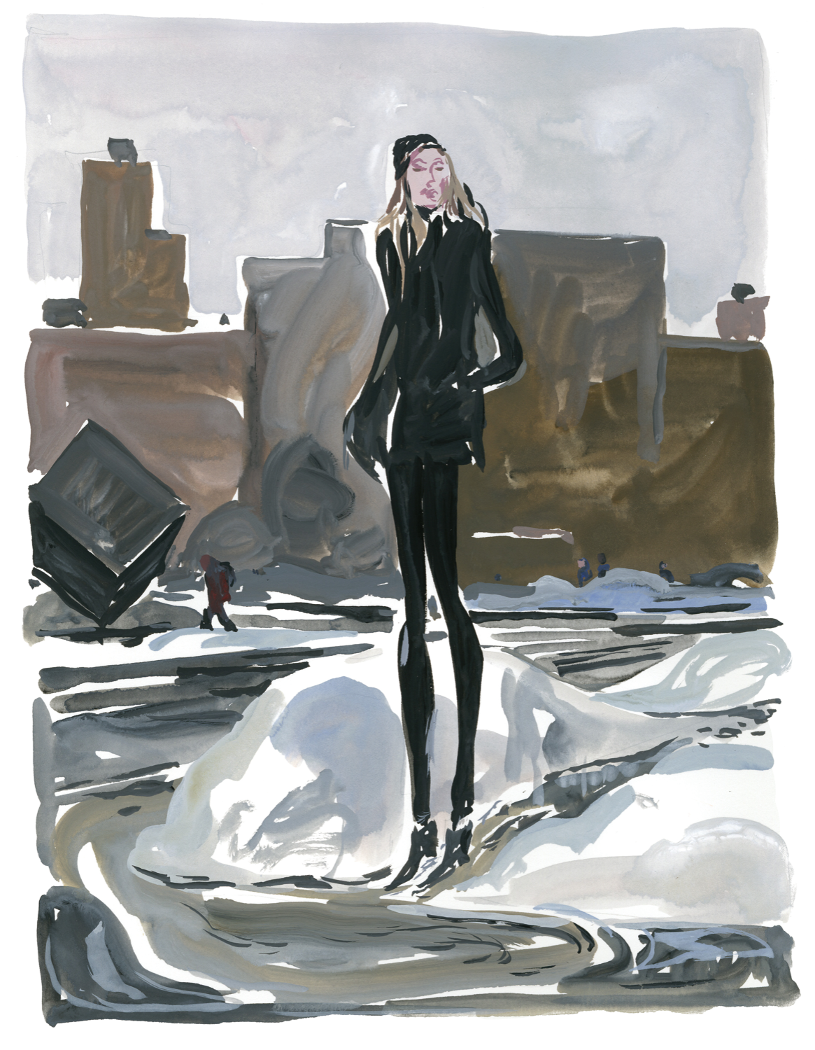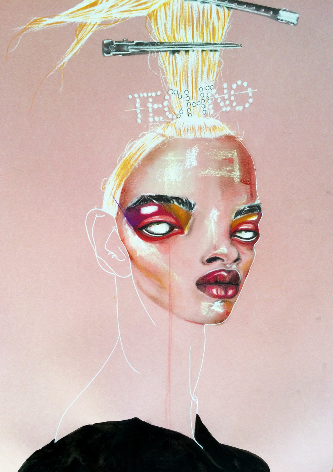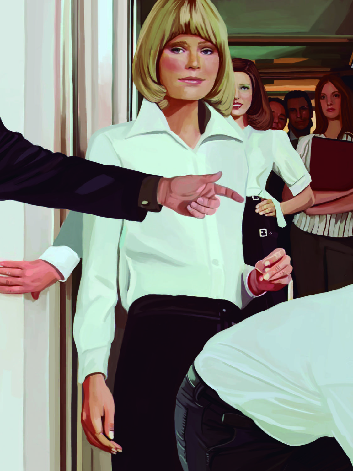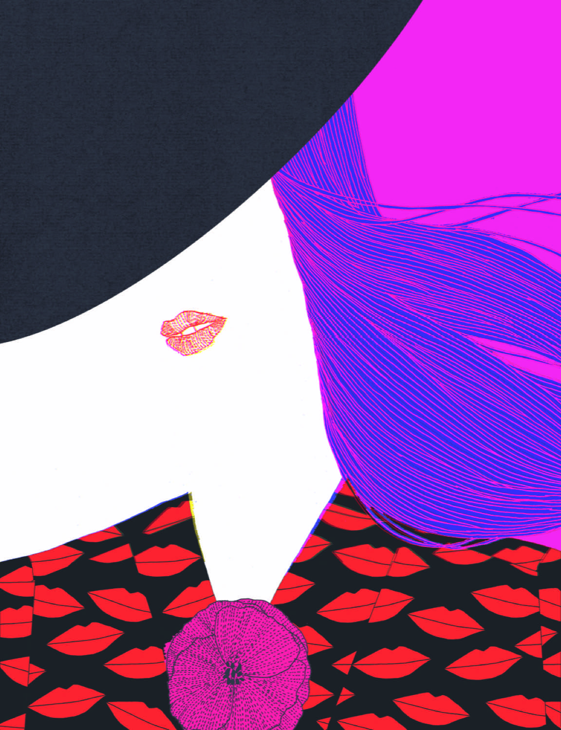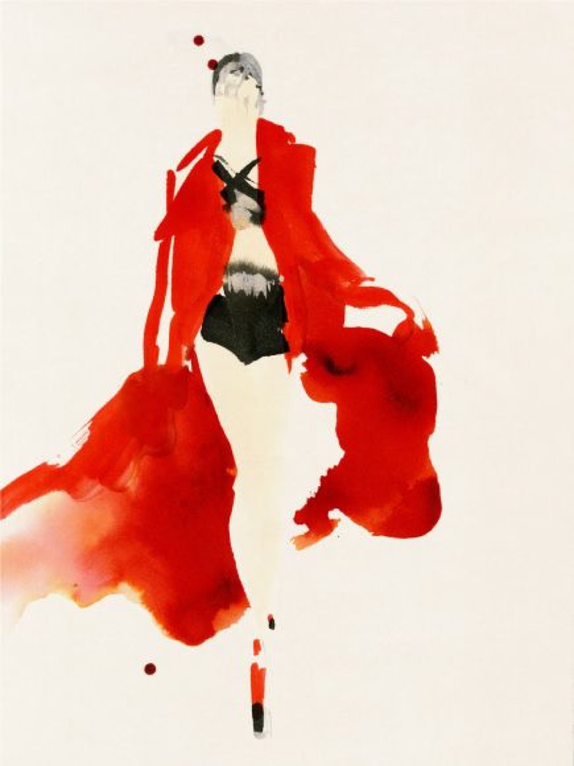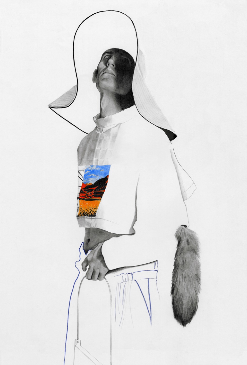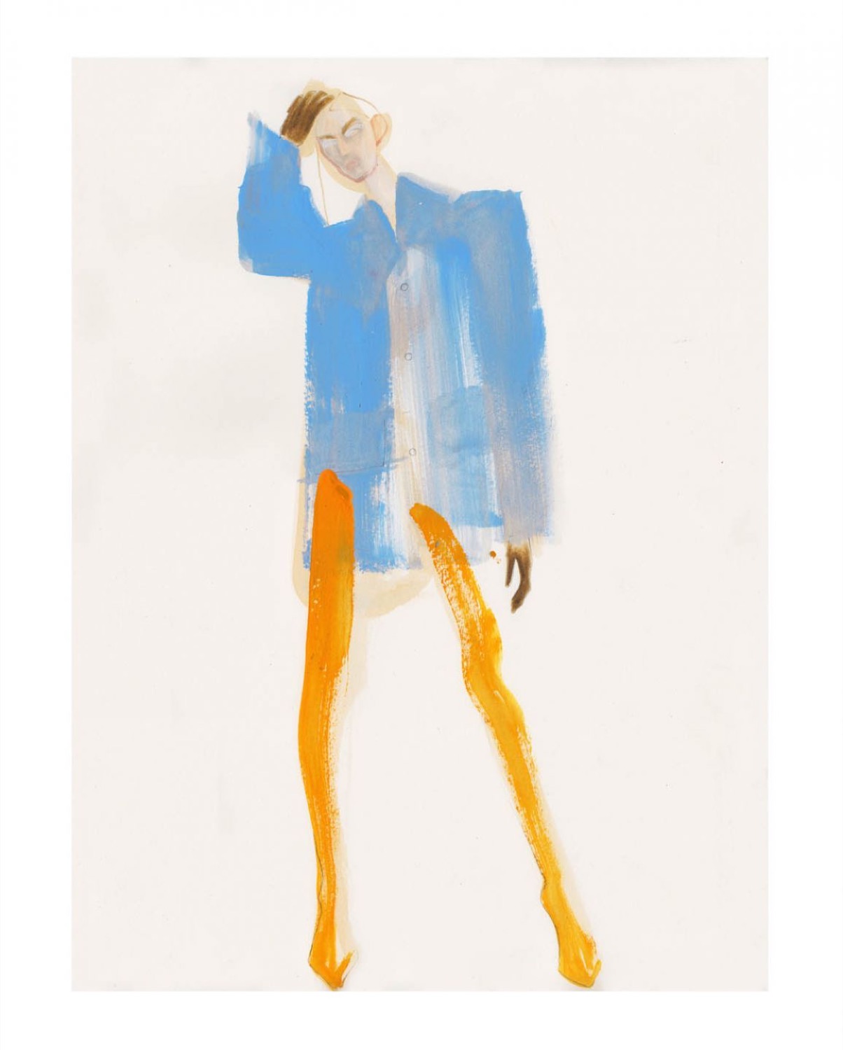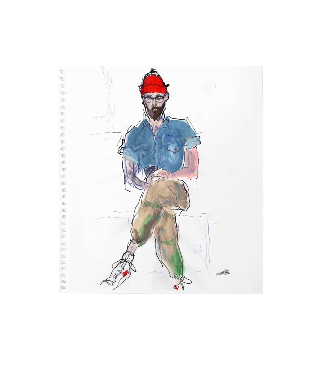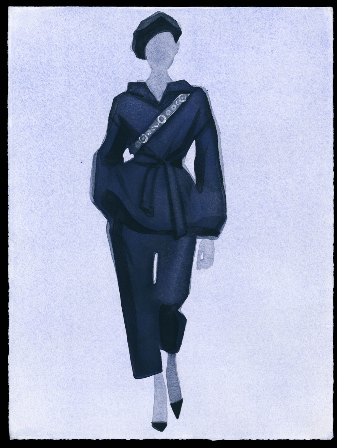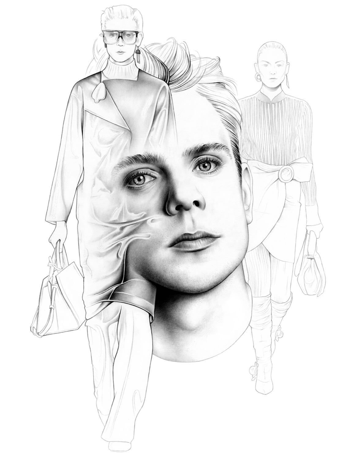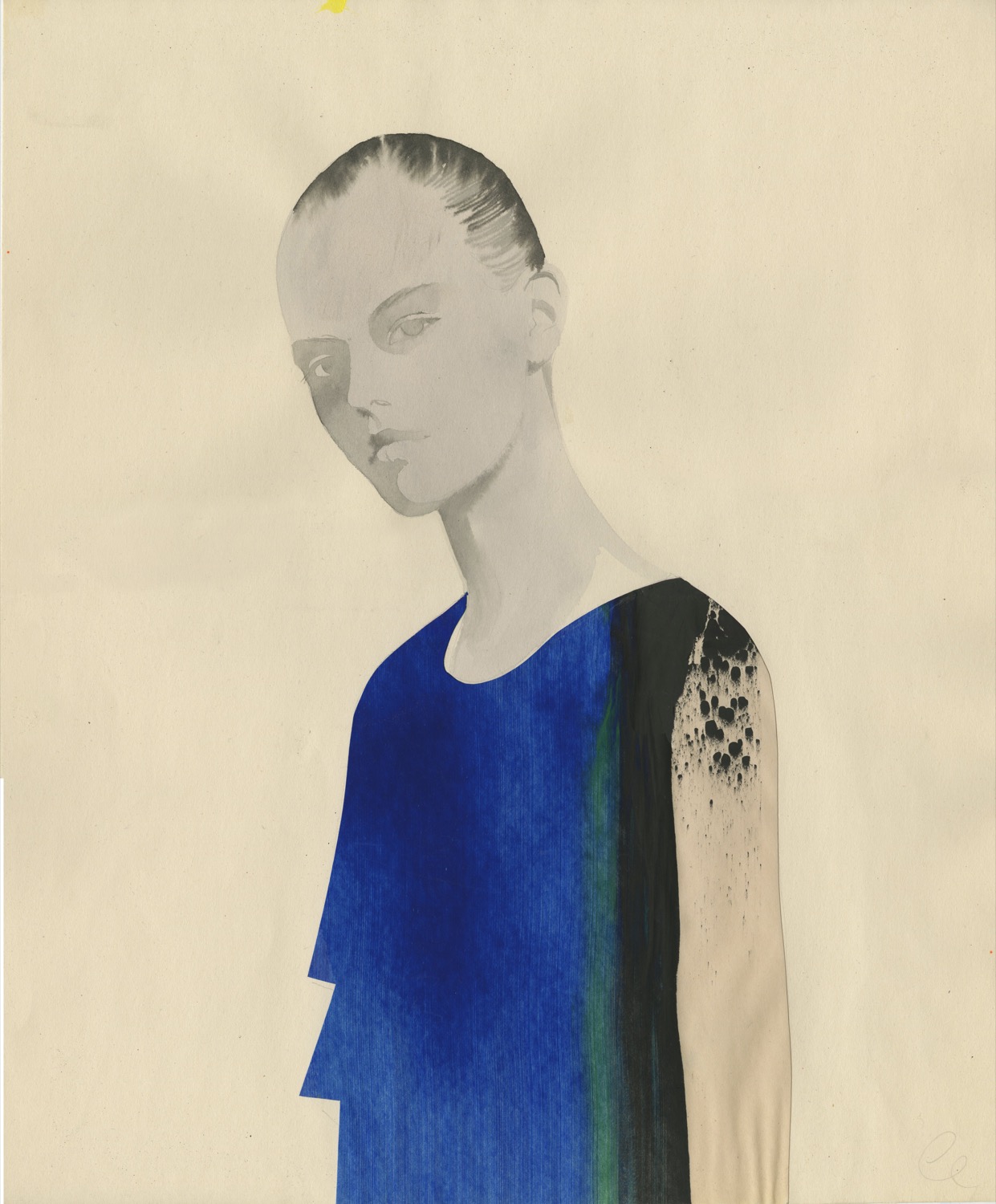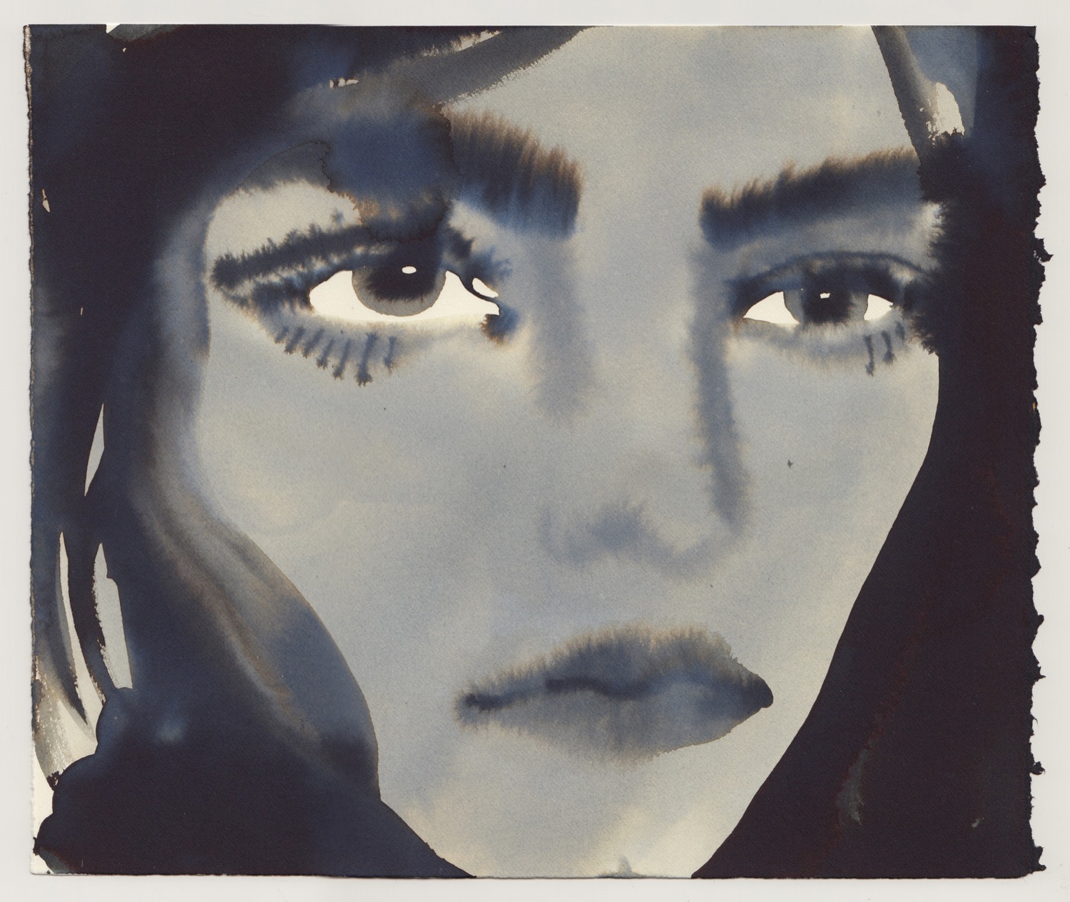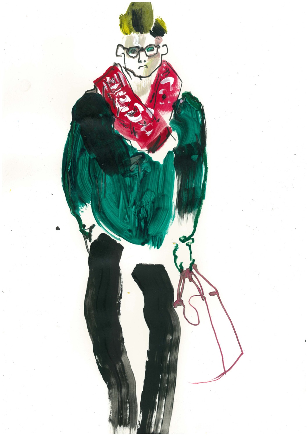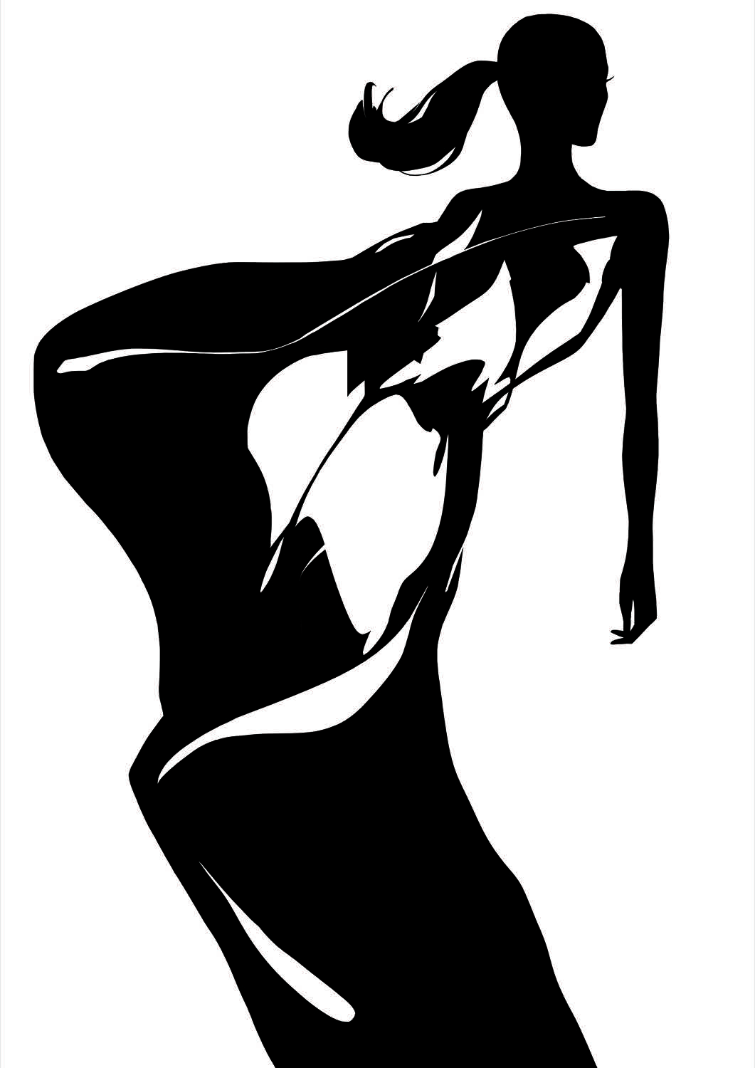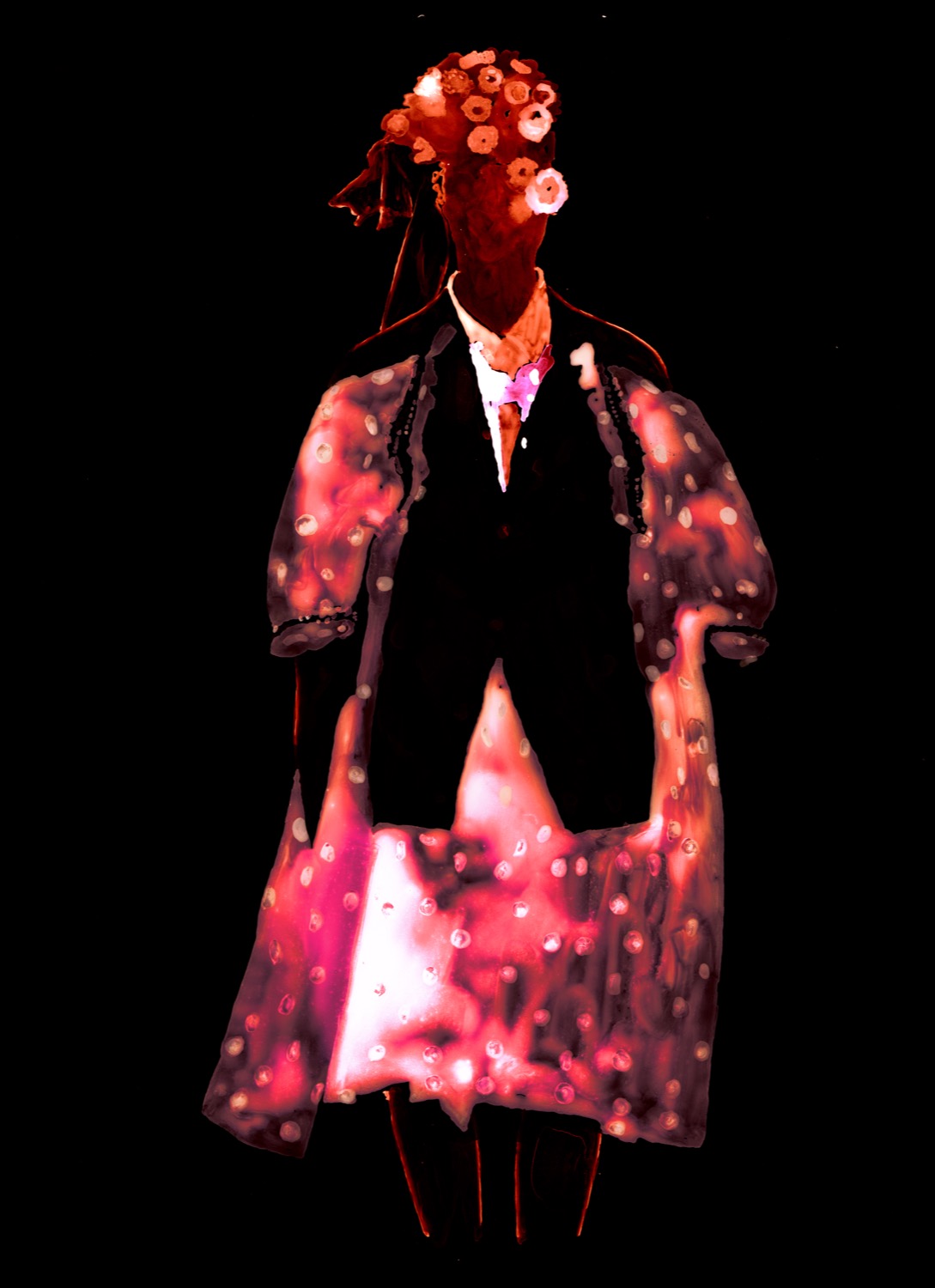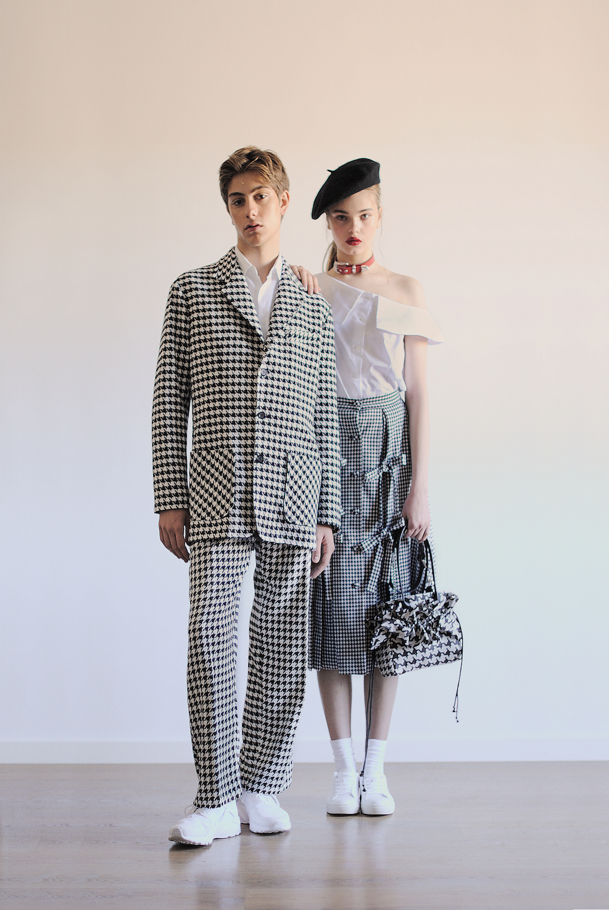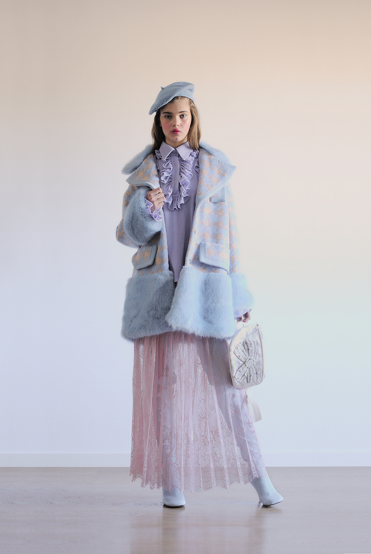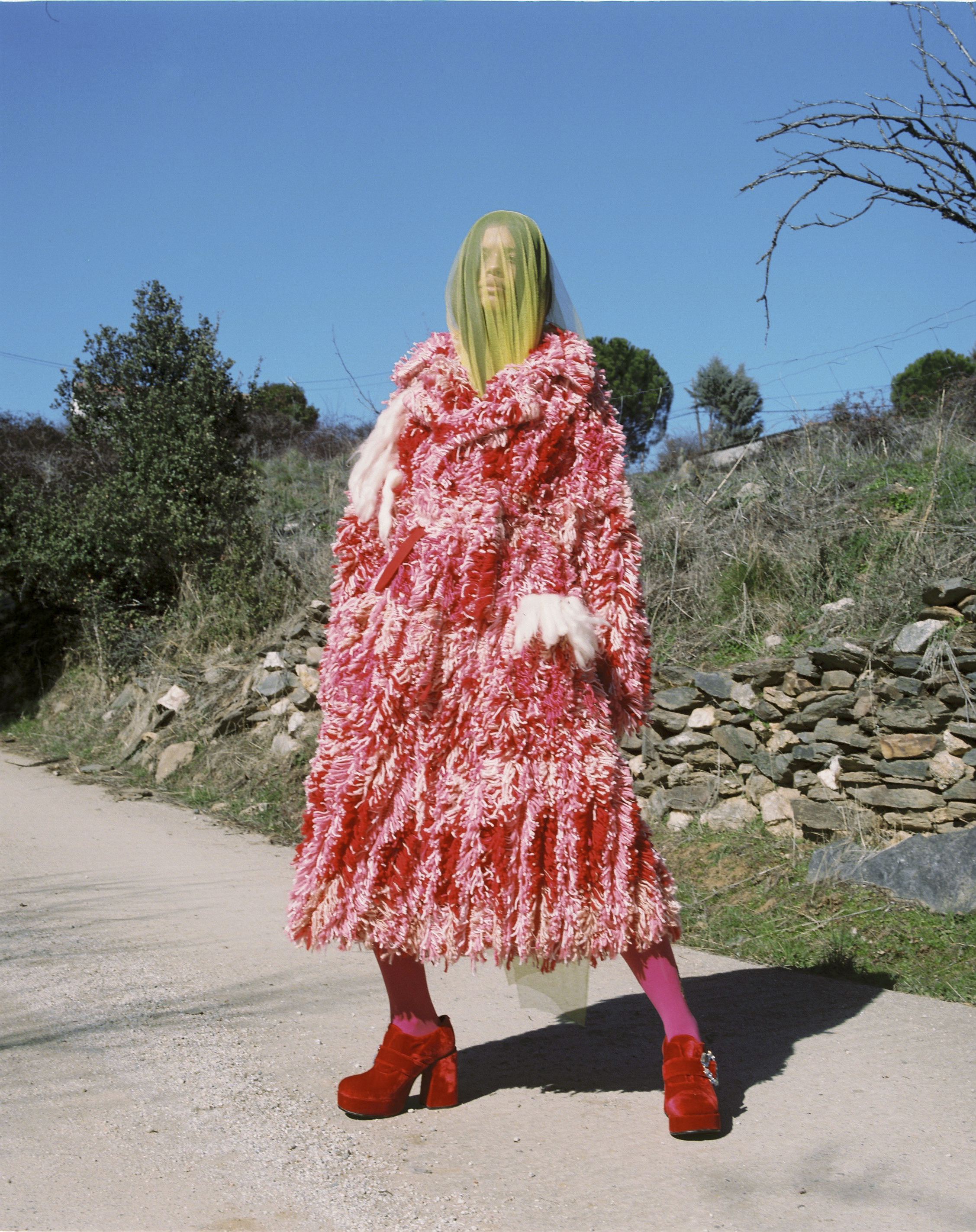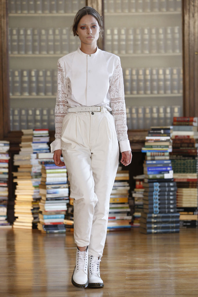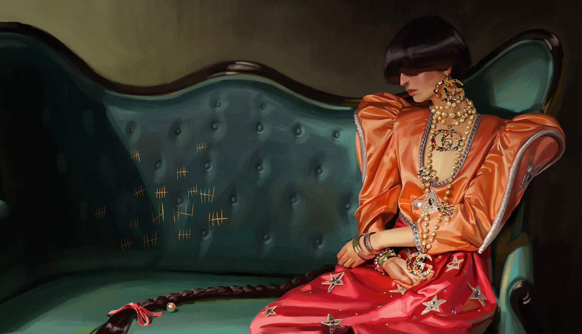
Fashion and illustration have always maintained a very close bond. In fact this alliance is not a new phenomenon. In the last century drawing was used as a vehicle for transmitting trends, shaping the most creative designs in the sector. The illustration creates a visual language that connects with art and provides added values such as originality, authenticity, identity. This discipline is also capable of appealing to consumers, especially young people, who see in the illustration a channel of genuine expression to show a product or a brand.

Currently the illustration is undergoing a golden new era with a batch of artists who translate into advertisements, campaigns, collections, lookbooks, fashion magazines … their unique approaches to the rhythm of the business they represent, increasingly innovative supports that manage to create that desired surprise effect. These neo-illustrators become known through social networks (especially on Instagram) as a platform for global dissemination of their work. The well-known digital revolution of individual work where each like makes the work of the artist more universal.
This boom has also led to the fact that, in recent years the line between art and fashion illustration has faded and these creators no longer become described with the adjective “commercial”. Today, many contemporary art collectors are desperately searching for original works by these illustrators, while at the same time specialized art galleries are emerging. It is the moment for claiming fashion illustration as an art form in itself.

Aware of this new boom and power, the ABC Museum has promoted an exhibition that covers the phenomenon closely. Thus, under the title ‘Fine stamp. Illustration and fashion ‘, the exhibition includes a total of twenty-two artists (national and international, emerging and established) who work with illustration and the catwalk, with more than 150 original works on display. “It is the moment for claiming fashion illustration as an art form in itself, and what better than coinciding with its Second Golden Age and bringing together those creators who have revolutionized the sector in recent decades” said Jesús Cano, curator of the exhibition.

“It’s the moment for claiming fashion illustration as an art form in itself”
The story begins with the companies of maestros such as Mats Gustafson, David Downton, Aurore de la Morinerie, François Berthoud, Jean-Philippe Delhomme, Unskilled Worker, Gill Button, Hiroshi Tanabe, Jason Brooks, Tanya Ling or Jordi Labanda, and which continues with voices like Ricardo Fumanal, Richard Haines, Jowy Maasdamme or Richard Kilroy. More than half of the selected artists are women who are leading the way. Among them we find names such as Blair Breitenstein, Laura Gulshani, Inés Maestre, Hellen Bullock, Amelie Hegardt, Cecilia Carlstedt or Rosie McGuinness.

The exhibition #FINAESTAMPA_ aims to synthesize this precise moment through works, aesthetics and techniques that are used in the second decade of the 21st century. It is an X-ray of a subjective and abstract discipline that creates emotions and proximity, where the product stops being something physical to turn into an abstract, appetizing and inspirational entity. The exhibition is also a tribute to the personal story of each illustrator featuring in the exhibition.
#FINAESTAMPA_ can be seen from January 15th to May 19th at the museum’s headquarters and is part of the official programme of the second edition of the Madrid Design Festival.


Sorry, this entry is only available in Español.

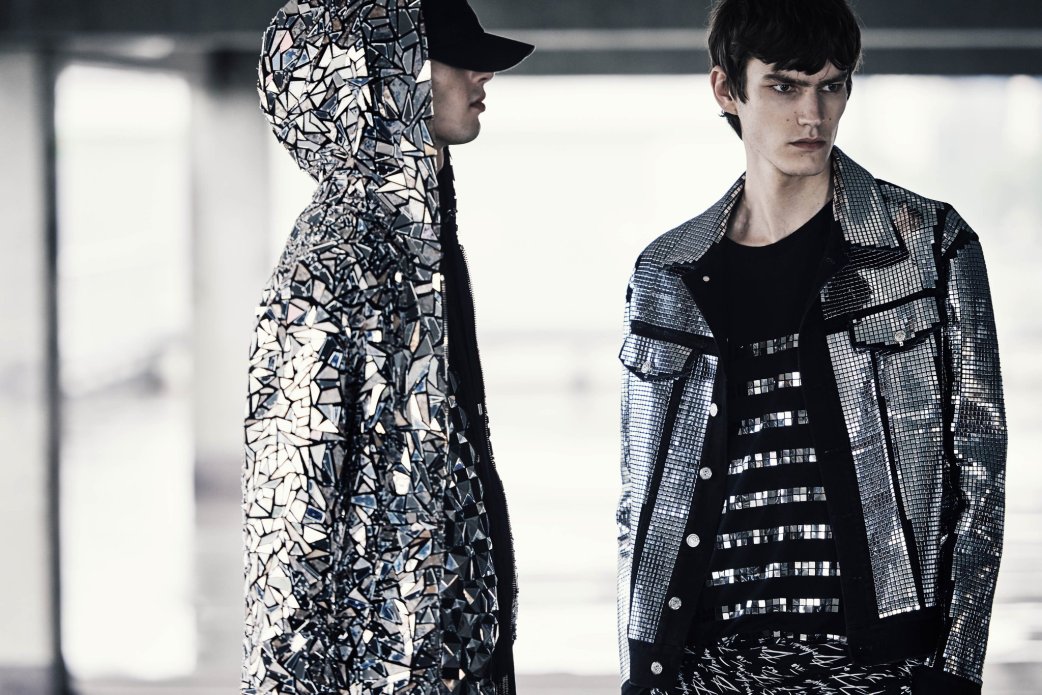
These are good times for metallic shades, which acquire their own identity within fashion, beyond their traditional connection with parties, luxury and excess. Thus in the past seasons we have seen how metallic fabrics have gradually taken over the catwalk in garments, accessories and complements that embrace a more casual style, exploring the urban and the sporty in an aesthetic festival that interweaves contrasting forms and volumes.

Yet the proximity of the Christmas season almost “forces us” to recover the conventional facet of metallic tones because it is precisely at this time of year when they have more presence within the festivities. From among all the fabrics that radiate their own light we are focusing on the two brilliant colours par excellence that are sometimes opposed: gold and silver.
Gold Rush
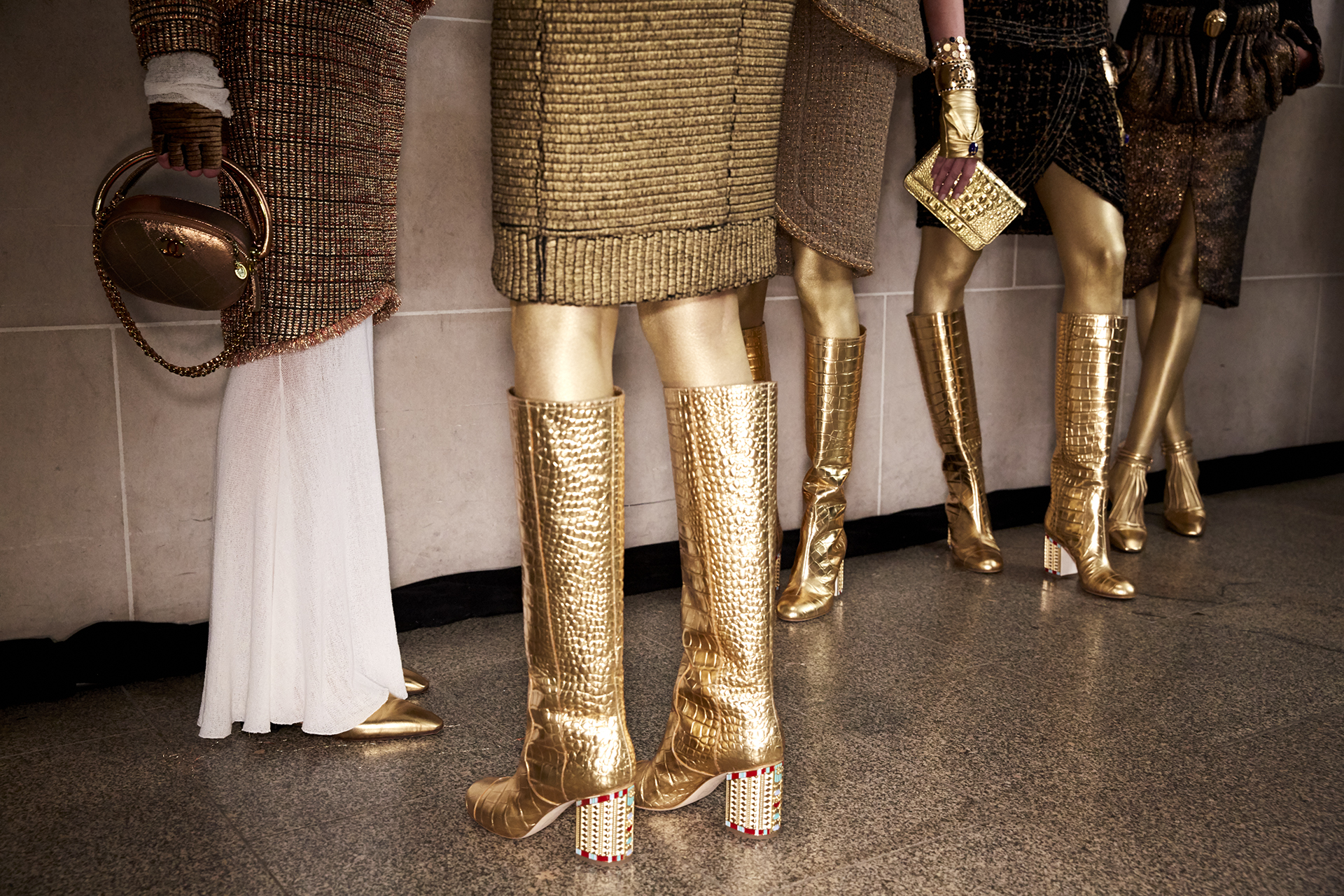
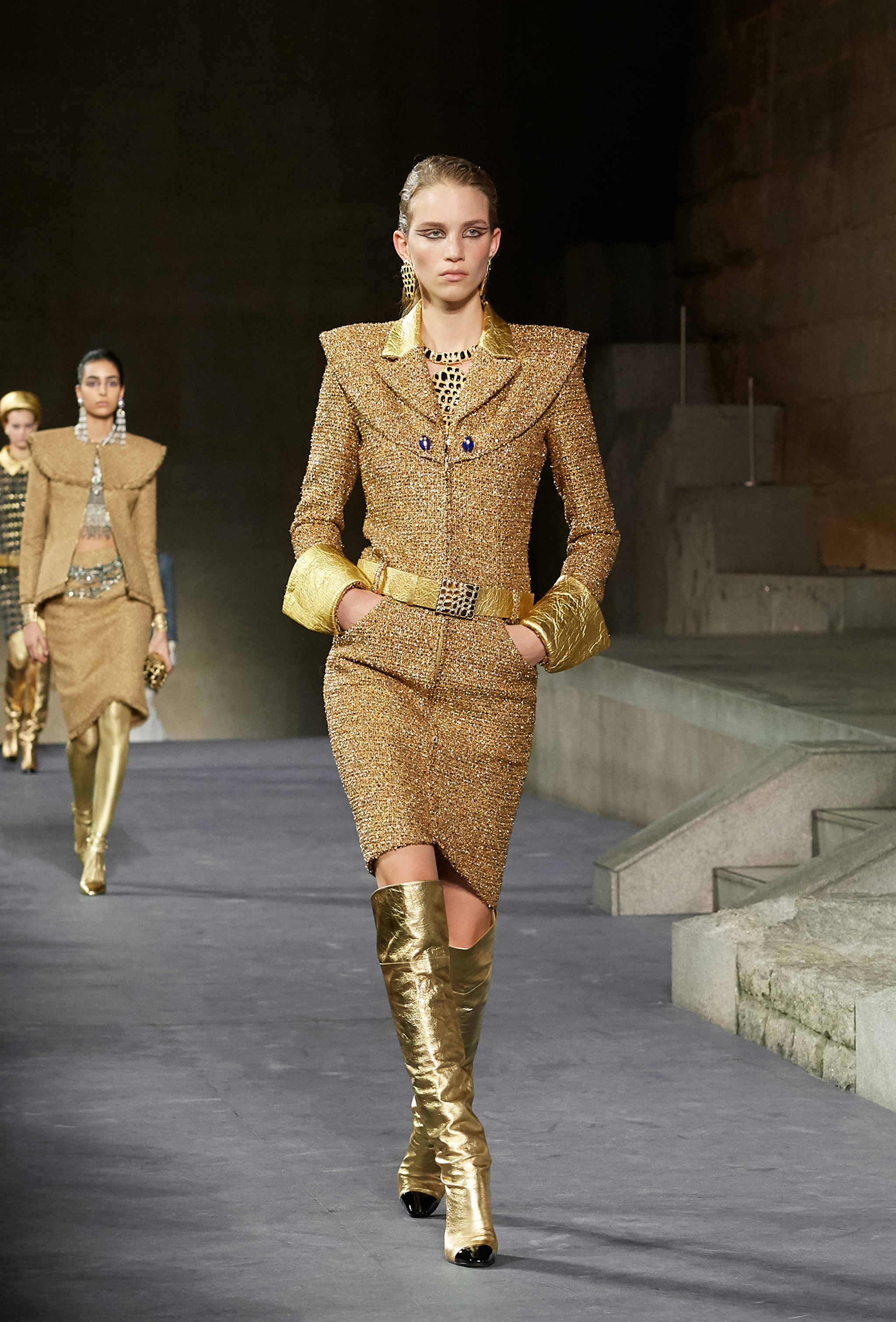
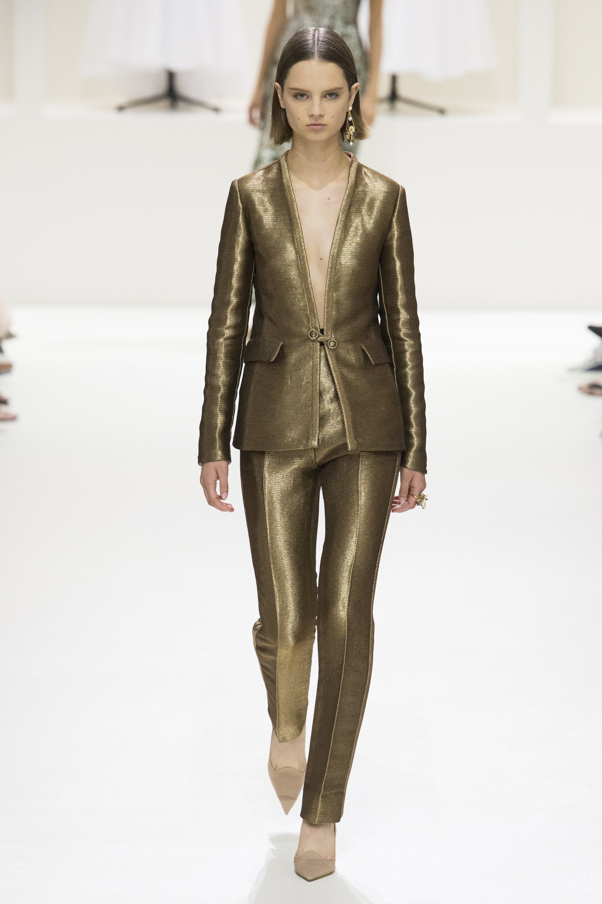
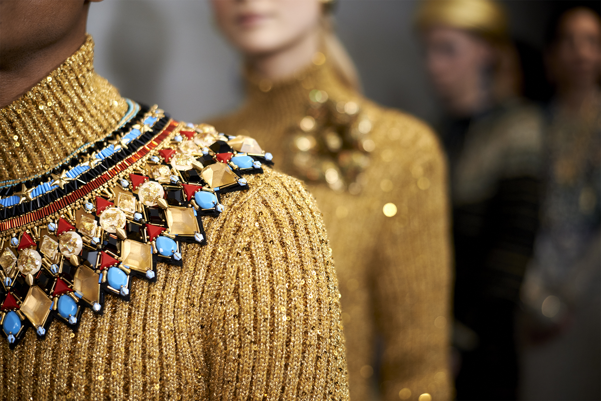
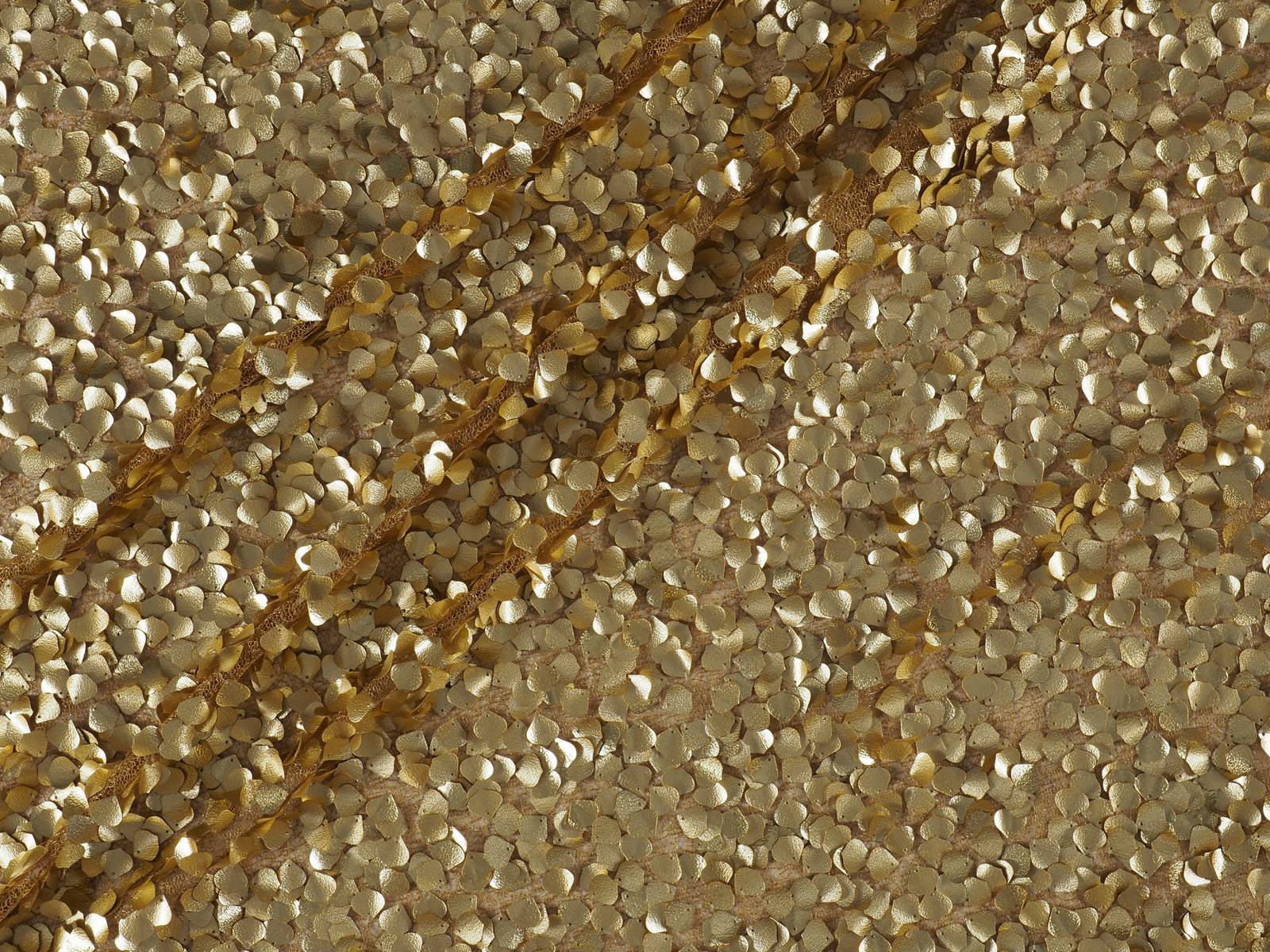
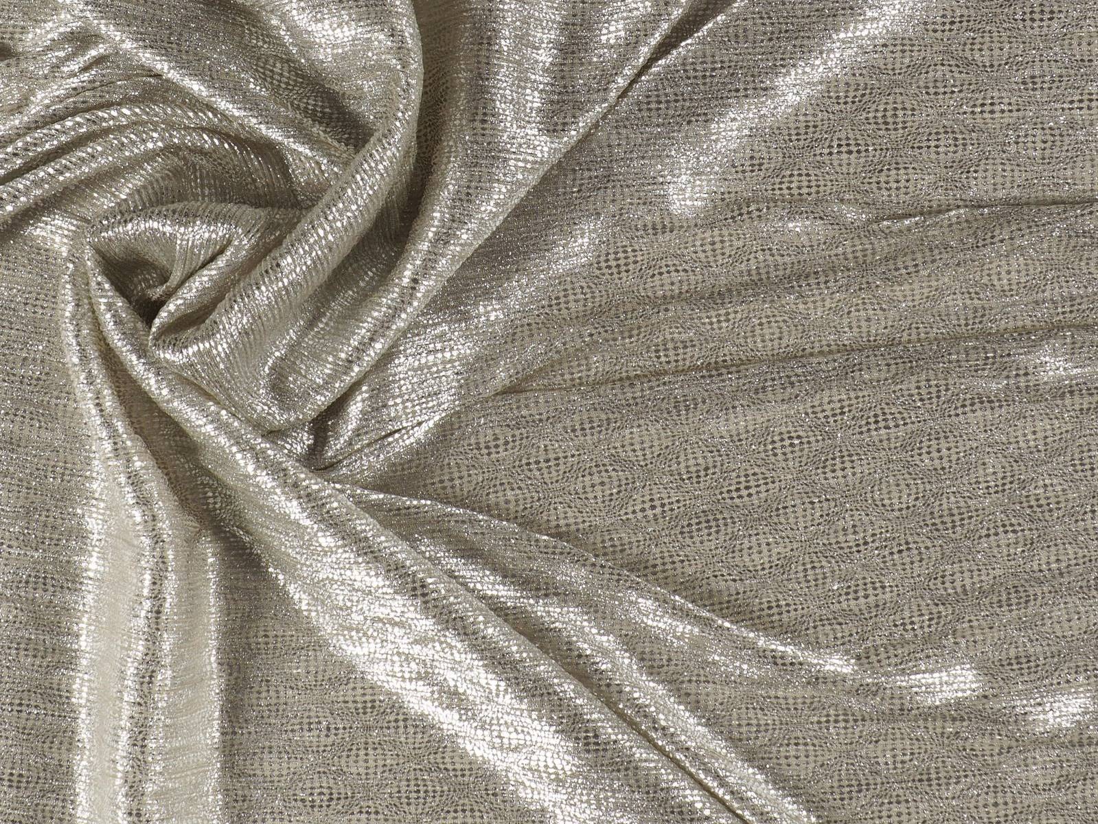
Gold has always been associated with opulence, classic style, baroque ornamentation and luxury at its best. It is the colour of wealth and majesty, of the taste for excess, a warm and ultra-luminous shade that empowers, shines and overwhelms in turn because it does not accept half measures. The favourite of King Midas moves between the classic and the modern with fabrics that capture the attention of all eyes. It is impossible to go unnoticed!

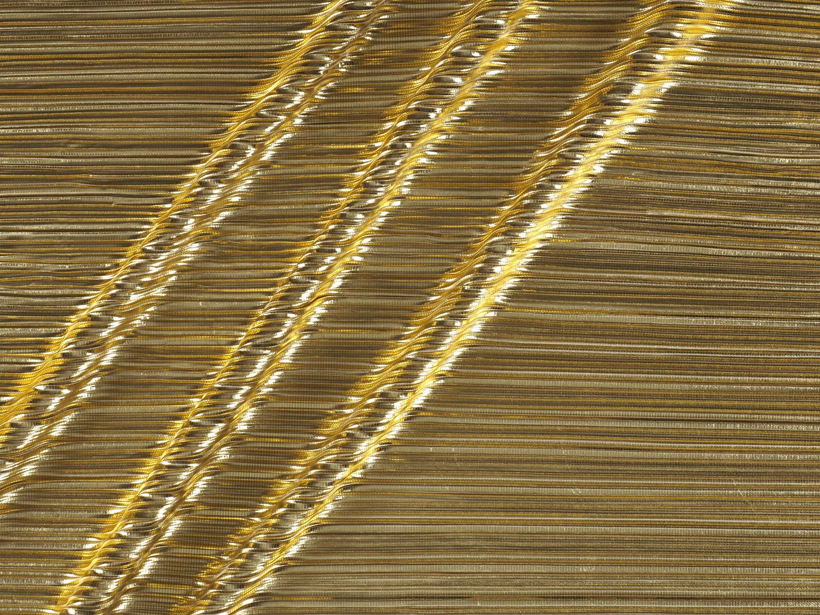
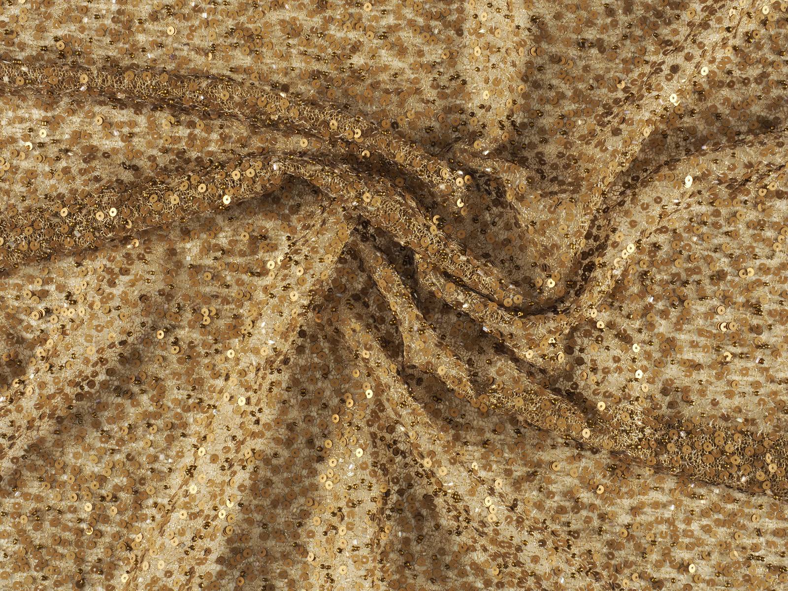
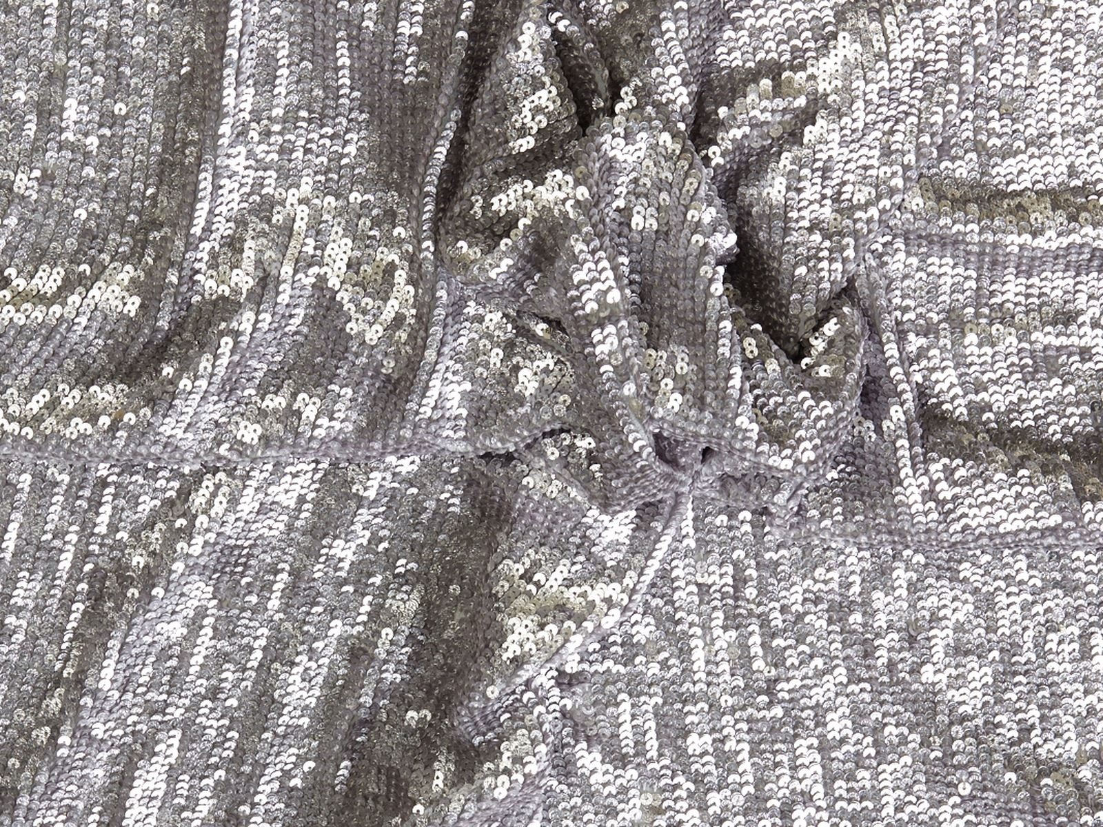
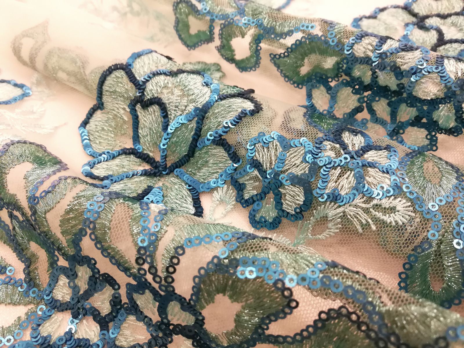
Gold takes over, for example, in fabrics with rhinestones, in pleats and Iamé, creating golden patinas that create fascinating optical games. It is also present in fabrics with sequins, together with other more discreet shades such as old gold or in rich floral embroidery combined with other colours such as red or black.


Futuristic silver
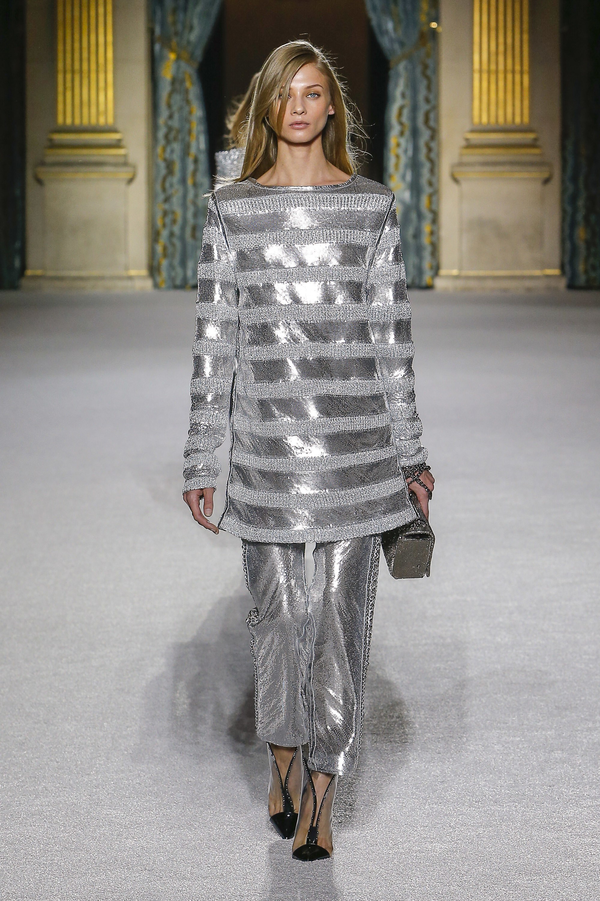
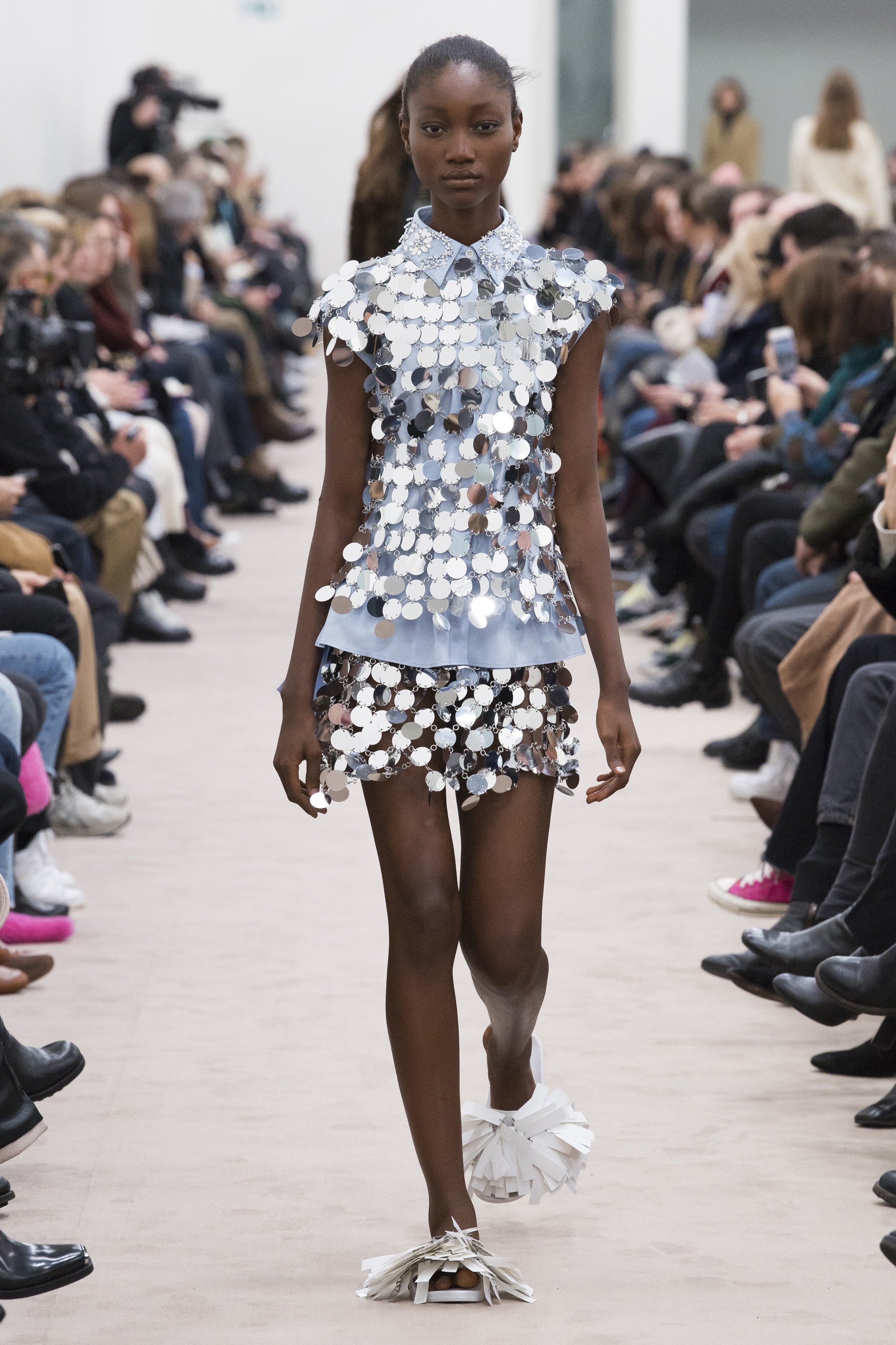
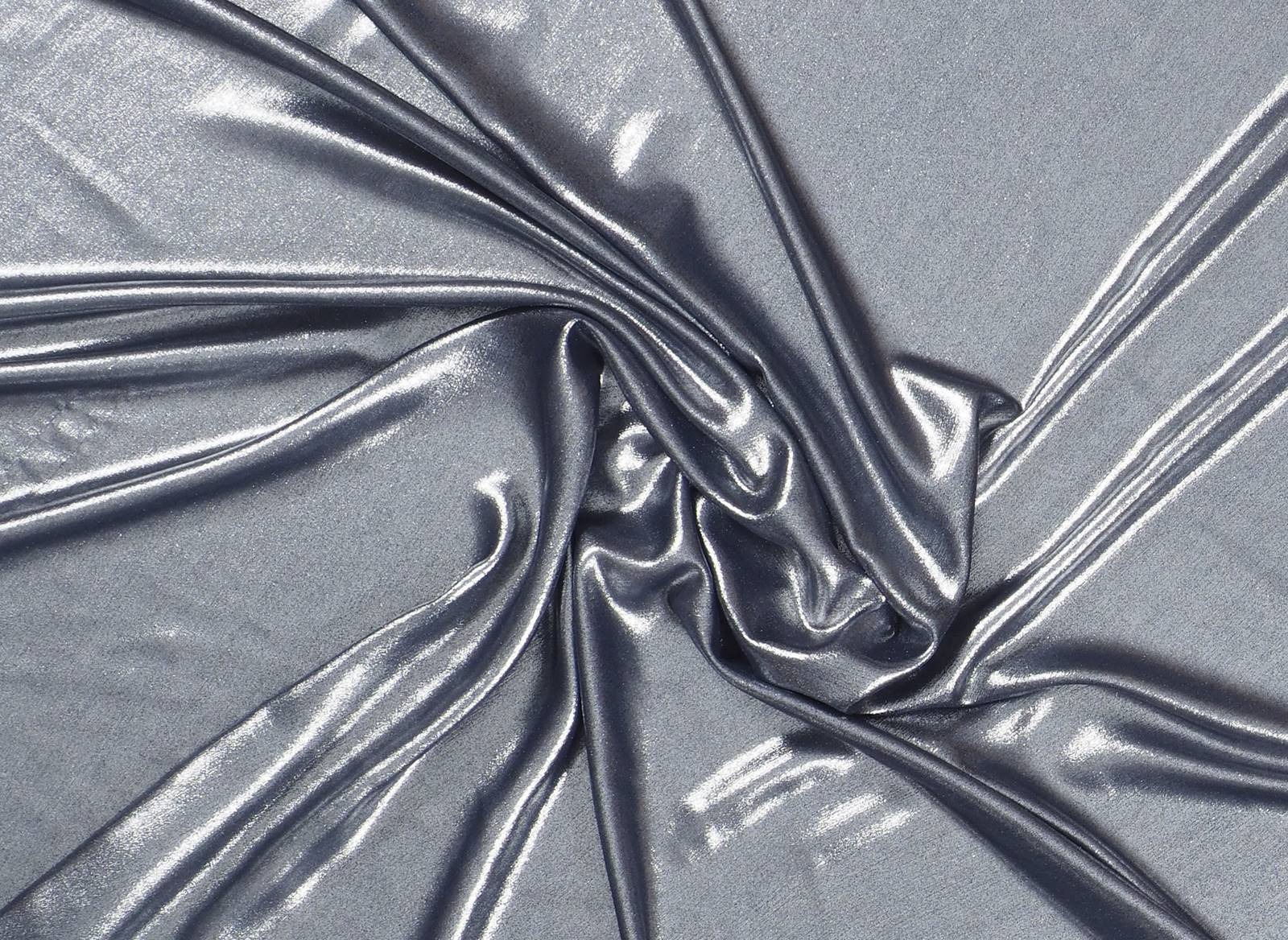
Far from being “the younger brother” of gold, the colour silver has in recent seasons acquired its own identity by exploring its most rebellious facet. In fashion it is also a luxurious hue that is associated with modernity, movement, technology and innovation. In this sense the colour silver is seen as the symbol of progress, of the functional, dynamic and technical, showing a great power of attraction linked to future advances such as in the field of space engineering. Hence the colour silver is sometimes linked with futuristic utopias.
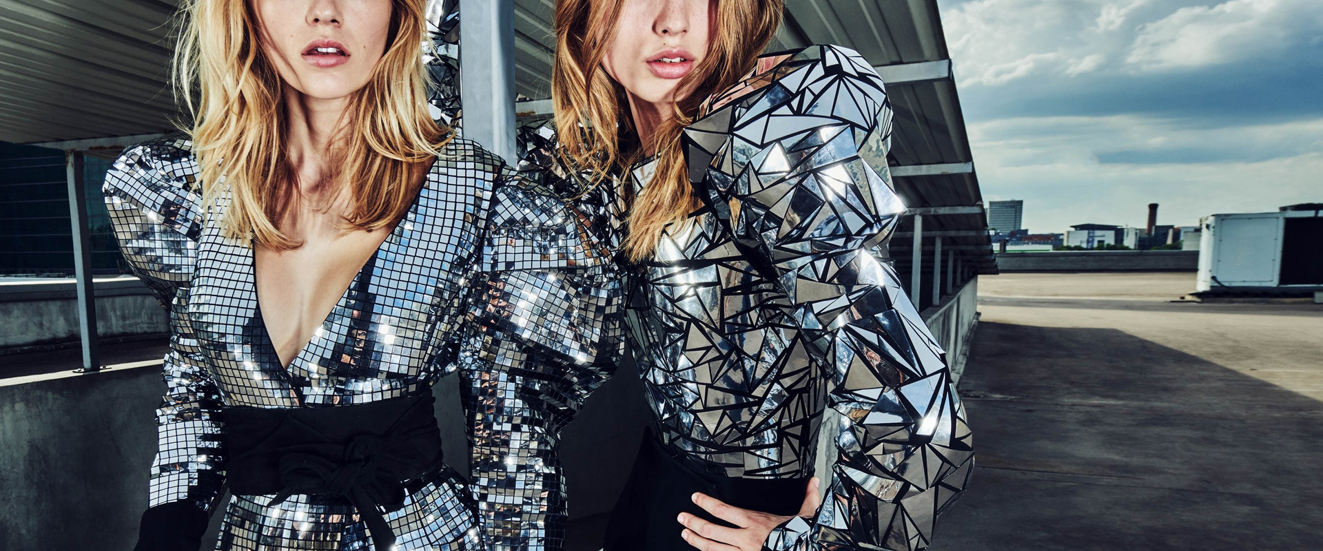
This cool shade moves away from smooth fabrics and appropriates original textures such as the wrinkles associated with aluminum foil. On the catwalks of the current season there are Calvin Klein dresses 205W39NYC, iridescent nuances from Emporio Armani or fabrics with Balmain hologram effect. Finally mesh fabrics and large shiny sequins are also abundant, creating a seductive mirror effect, two classics that form the essence of Paco Rabanne.


Jueves 27 septiembre 2018

“Thank you Delpozo for these six wonderful years. I have felt as if we were one family, and I am very proud of all the things we did together. ” This is the farewell phrase that Josep Font left last Tuesday on his Instagram, after six years leading the artistic direction of the company. At the same time Delpozo, for his part, thanked people for their excellent work over the years. It was an exchange of thanks which terminates a fruitful and successful collaboration.

Josep Font was responsible for the “rejuvenation and continuation of the legacy of Jesus del Pozo ” according to Pedro Trolez, president of Perfumes and Design Group and owner of the company, making the Spanish brand one of the most coveted at an international level. “He has an extraordinary ability to mix colours, textures and volumes, turning them into delicate and feminine collections. I am grateful for his loyalty and for having been a part of this first stage for Delpozo, “added Trolez .
 |
 |
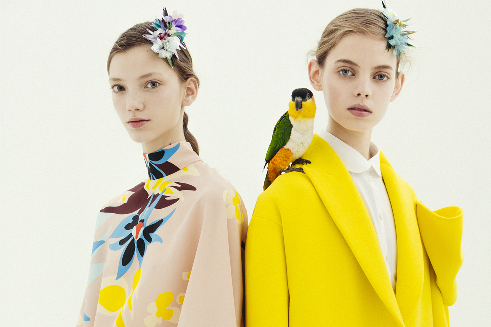
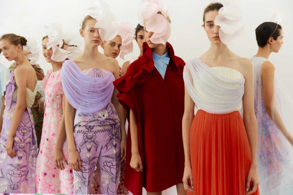
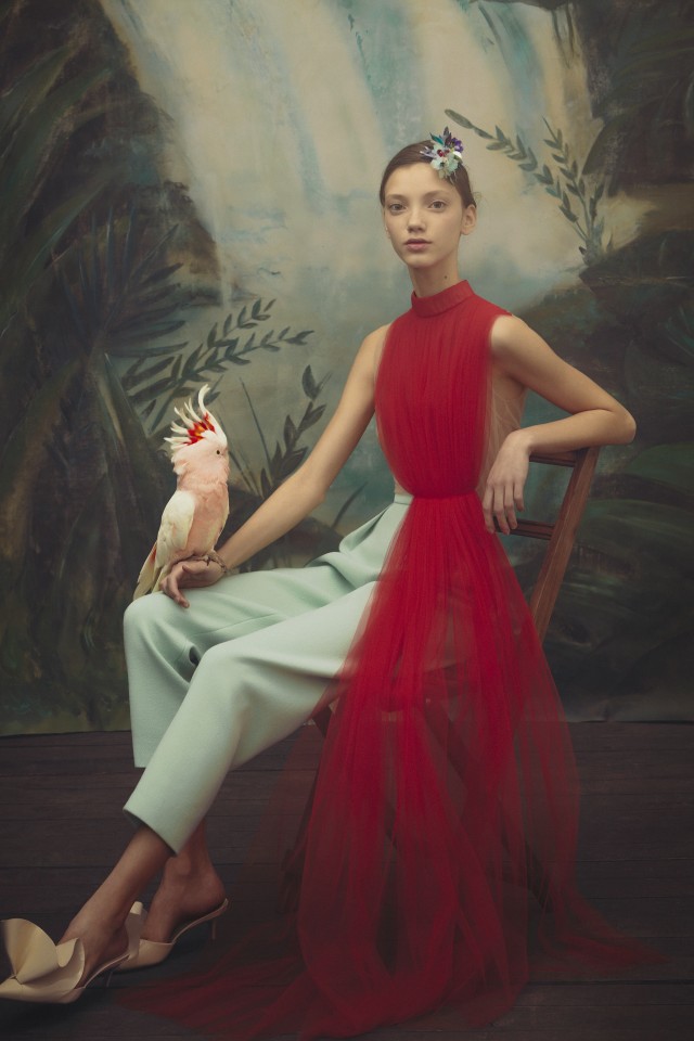
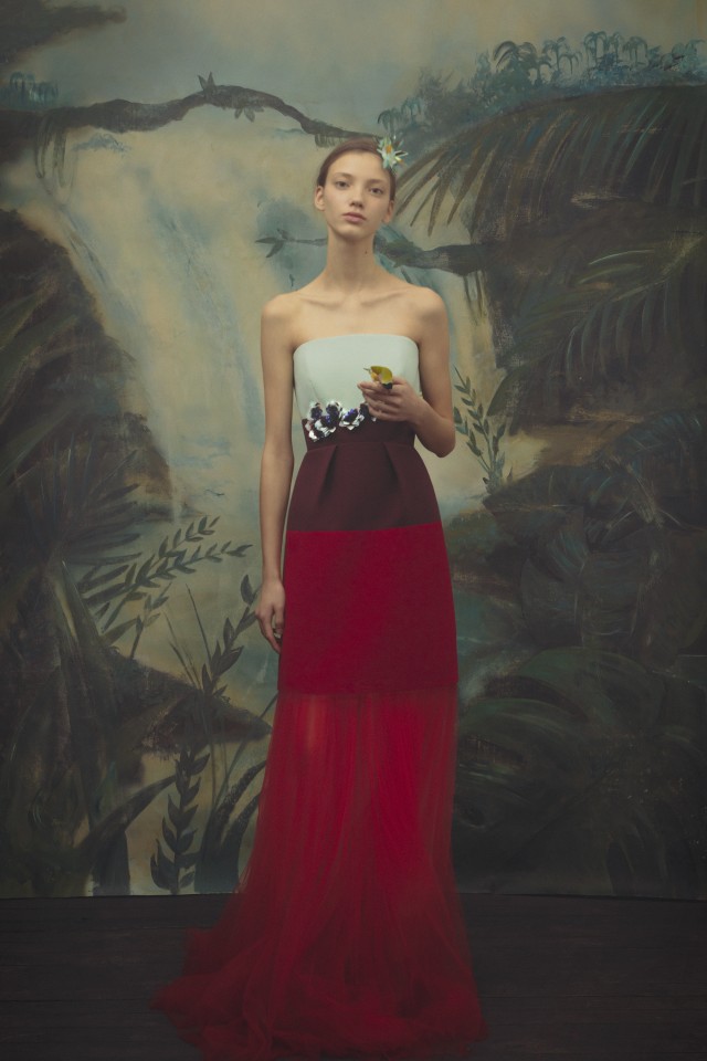
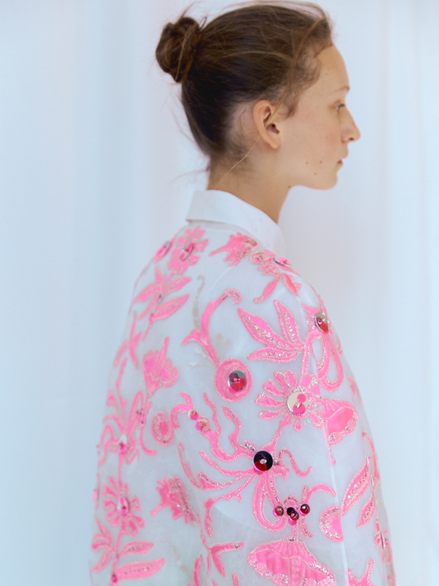
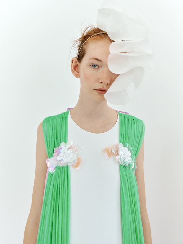
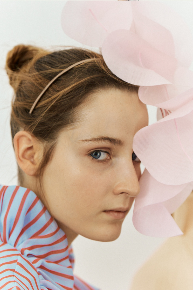
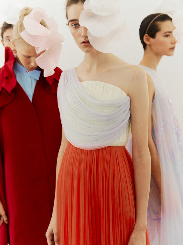
An architect by training, Josep Font joined the Delopozo project a year after the death of Jesús del Pozo, who founded the company in 1974. In these six years, Font was responsible for renewing the identity of the Delpozo woman and giving her global projection via a parade first in New York and then in London, the two latest two parades . Apart from the reformulation of the name for commercial purposes(Jesús del Pozo became renamed DelPozo ), the Catalan designer devised his own language inspired by the forms of nature to create voluminous, ethereal and delicate designs in a very colourful palette characterized by its magnificent contrasts: it dances between the most dream-like pastel shades and fully saturated shades.
 |
 |
Apart from nature the designer has also fed from art, music and architecture to create each new collection,each of which was more surprising and more applauded. Passionate about craftsmanship, Font also opted for quality embroidery by recruiting suitable staff for his workshop., a task which bears witness to that minuteness of detail and to finishes in garments closer to haute couture than prêt-à-porter , presenting an incomparable vision of the feminine wardrobe. For all this, Josep Font has shown the value of well-made pieces, slow-cooked fashion, architectural silhouettes, tulle, ethereal volumes and good taste without excesses. All this through Delpozo .
At the moment Delpozo has not given clues as to who will be the designer to relieve Josep Font as the head of artistic direction. It is also not known what the next step will be for this Catalan designer, who has managed to fulfil the dreams of privileged women able to be dressed by Delpozo in the Josep Font era.

Jueves 13 septiembre 2018
Sorry, this entry is only available in Español.

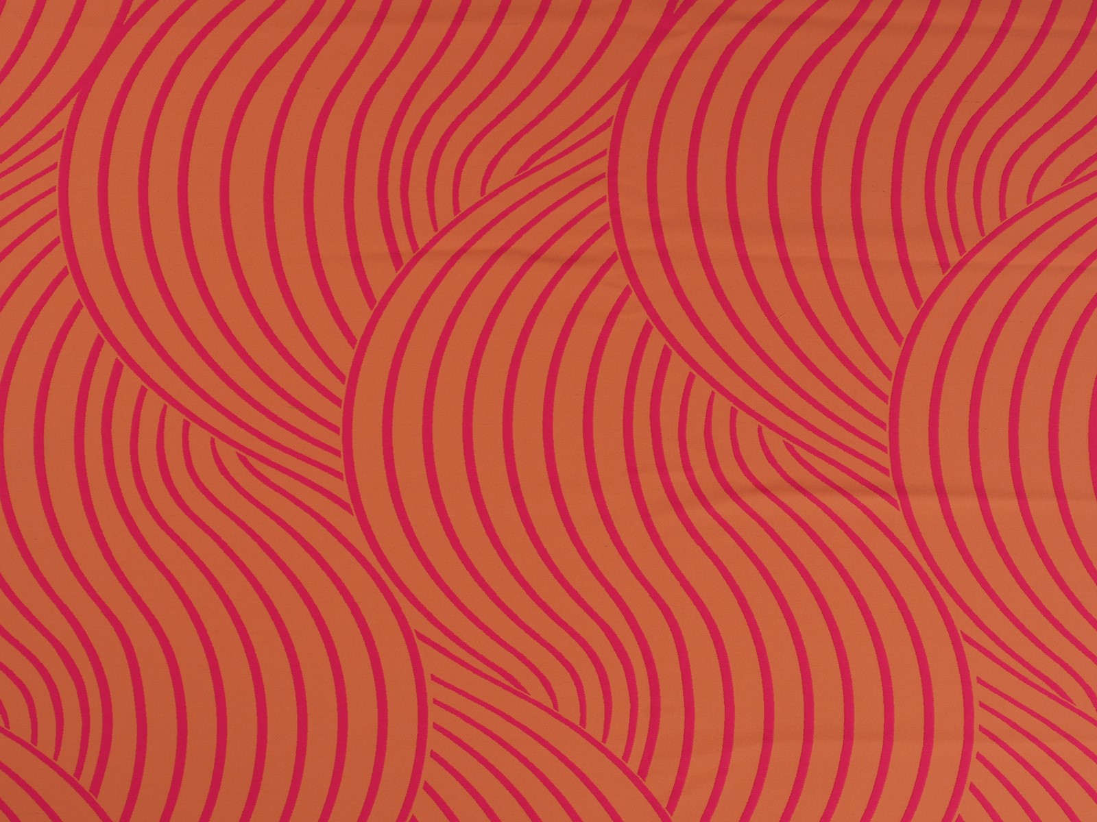
In fashion and speaking in general terms, what is the deal with us and orange? It is appealing to the naked eye, favours the skin tone and with its vitality lights up garments in neutral tones, brightening up any summer or winter look. Knowing all these goods traits, why are consumers so reluctant to bet on this colour? Hereunder, we position orange in the place it deserves.
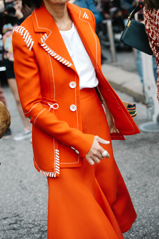
It is true, orange is not an easy colour to carry off and the excess of stridency that the hottest tones sometimes entail, makes it difficult to mix with the majority. However, there are many celebrities and professionals in the industry who have opted for this tone so far this year in the street style of the main fashion catwalks. And if the sector has surrendered to radiant yellow, the hardest tone of all, why would the same thing not happen to orange?
 |
 |
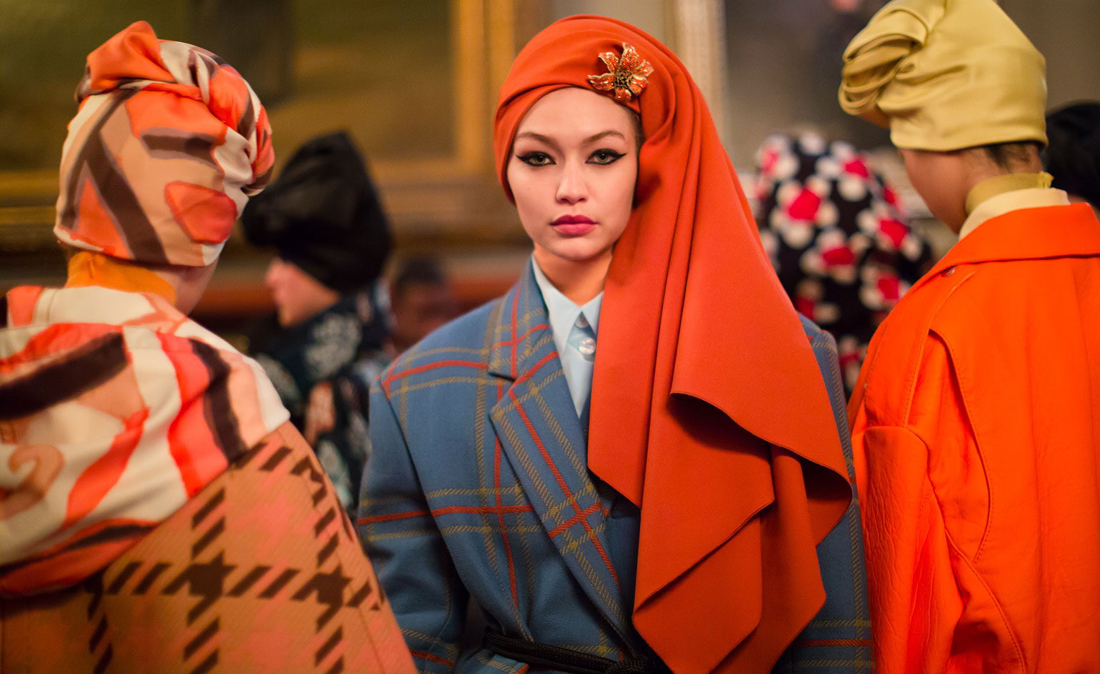
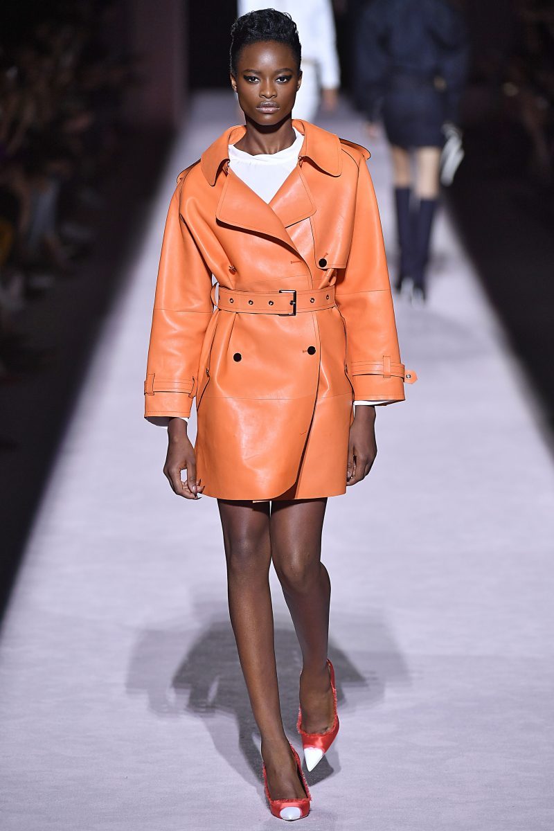
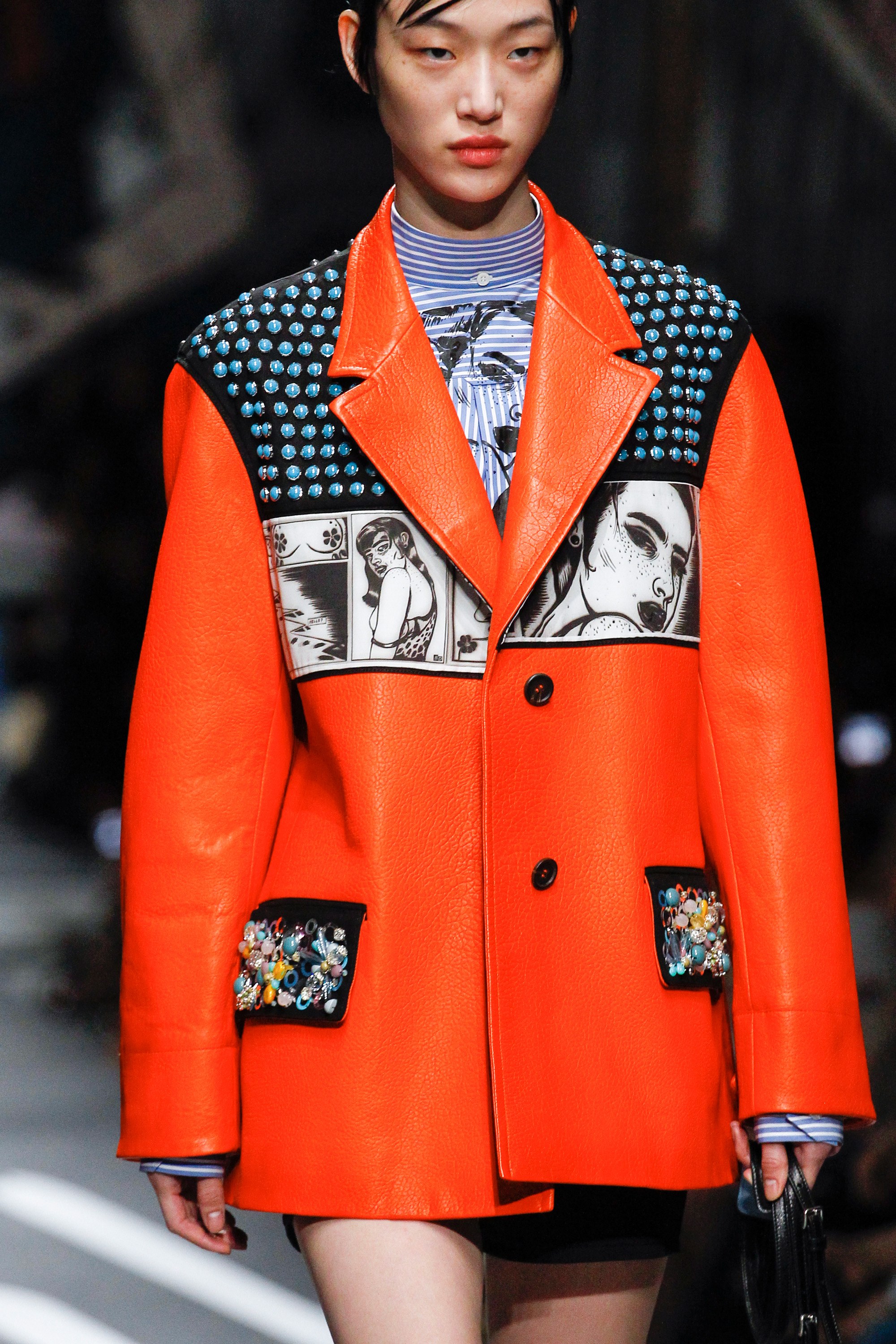
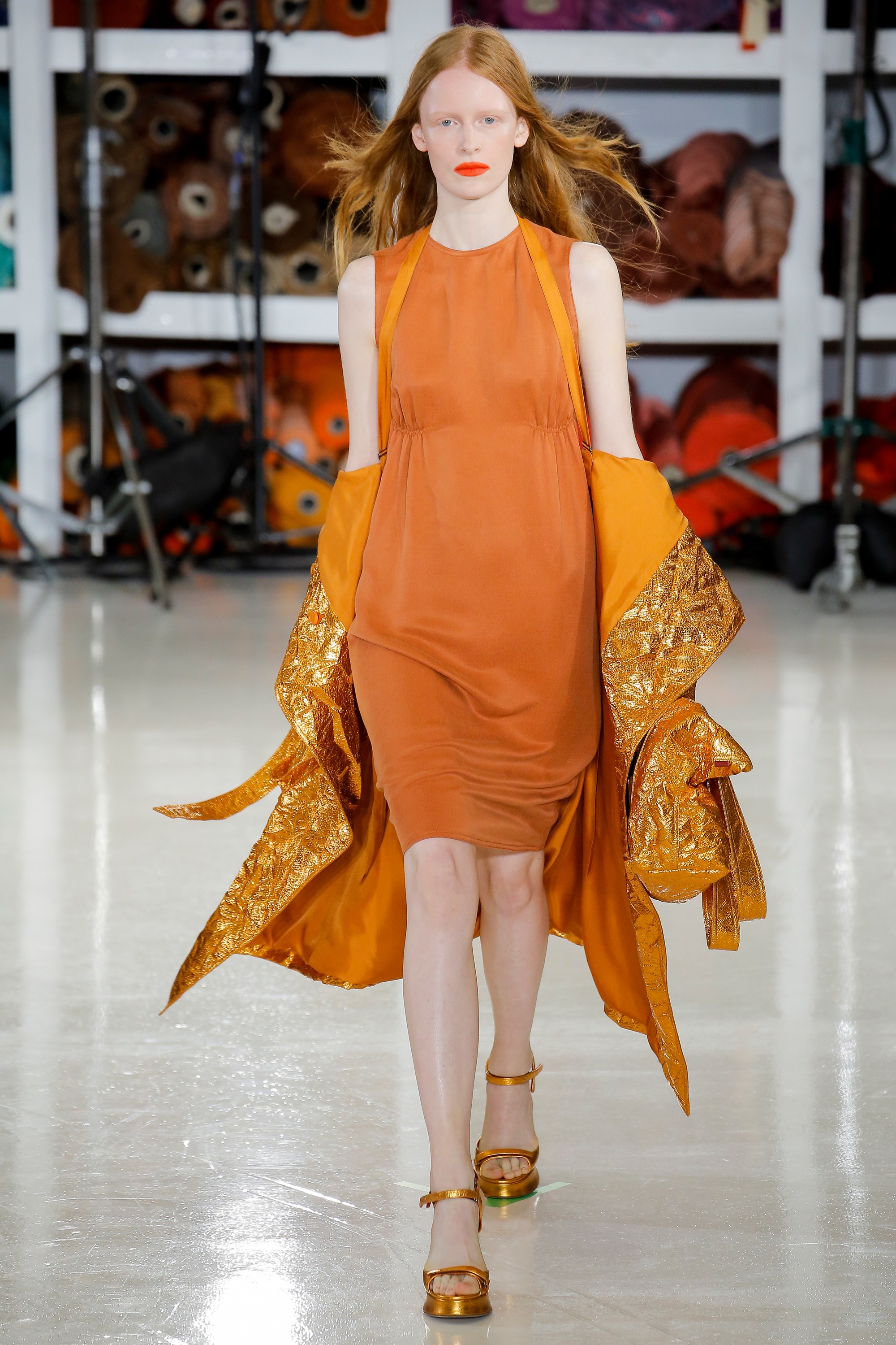
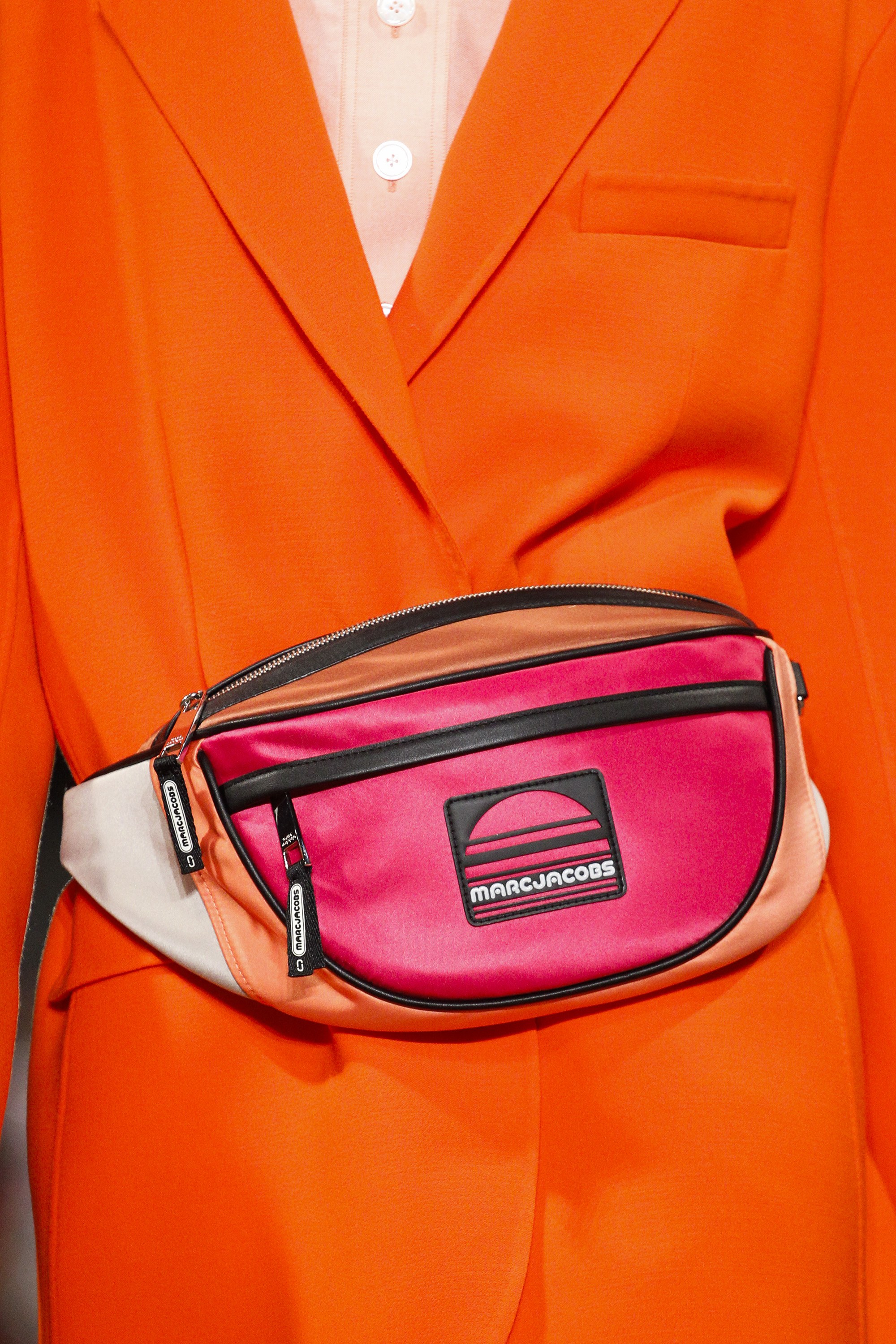
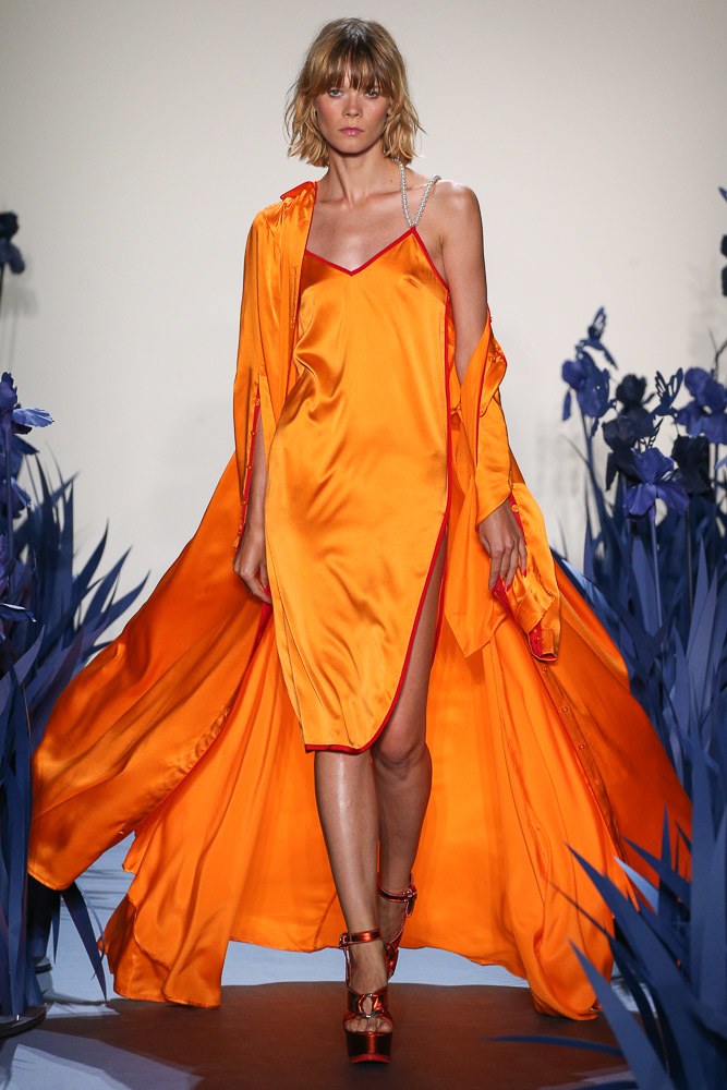
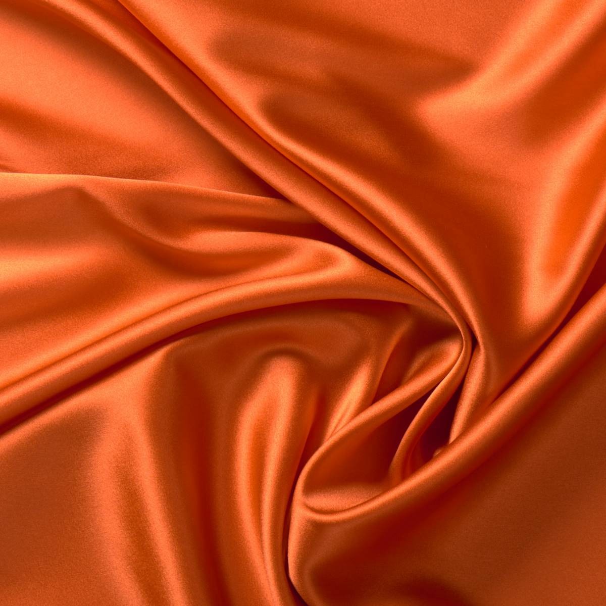
Orange is a warm color that radiates enthusiasm, energy, joy and freshness. It is the tone that is linked to creativity, fun, triumph and spontaneity. A tone that can be vibrant and dull in turn, without losing all of its attributes. This Spring- Summer 2018 season, the colour that has dominated the catwalk, according to Pantone is called Safety Orange. A striking and bright tone, which pulls towards neon and attracts everyones attention. A colour ironically translated into “security orange” that contrasts with the rest and rarely goes unnoticed, tos ay the least it is practically impossible. Firms such as Jeremy Scott, Tom Ford, Adam Selman, Marc Jacobs or Calvin Klein have not hesitated to take it on stage.
 |
 |
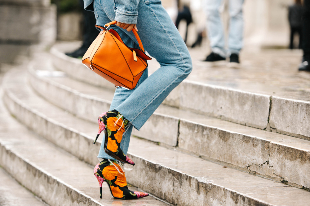
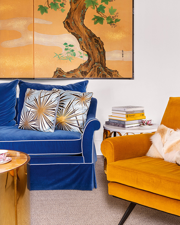
And how is it combined? The first and most daring option is to wear it in its total look version: from head to toe in the same tone or varying the hue to others more pale like peach: one bright garment mixed with a duller one. In this case it works with a long dress, jumpsuit or a two piece outfit. The most daring combination would be with fuchsia pink or Klein blue creating attractive colour blocks. The second option involves opting for an orange garment that is excessive and that highlights the whole look. The rest will therefore have to be combined with neutral tones such as nudes , earths, beige or rose so that they do not steal the garment’s protagonism. A good idea, for example, would be to opt for a jacket with soft textures or a printed blazer where orange is the main color. Orange also works very well with jeans and denim garments, adding that elemento of joviality and ease to any outfit. Finally, a combination that also works is to delegate this energetic color in a modest background playing only with accessories such as bags or shoes. Any detail counts!

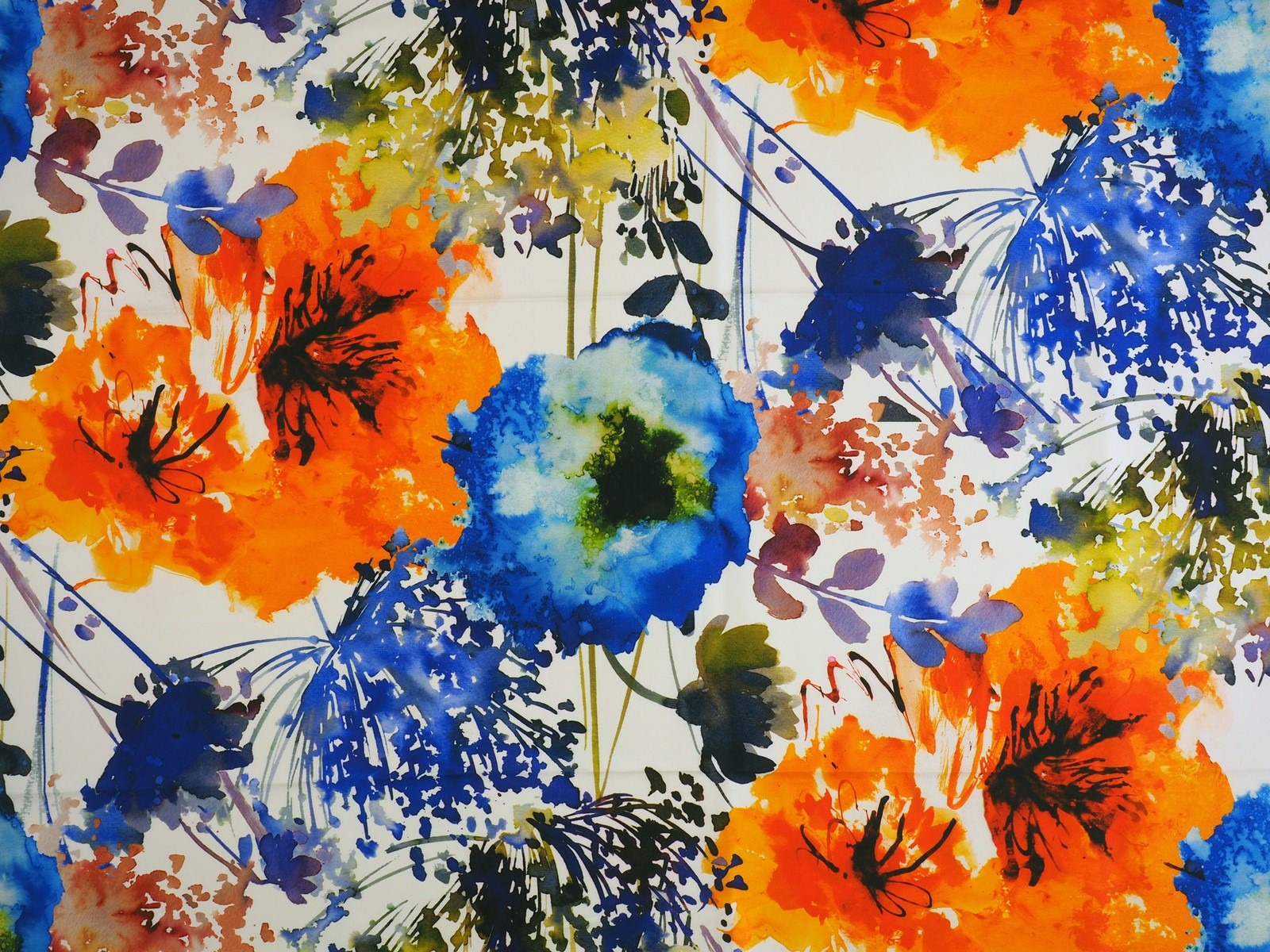
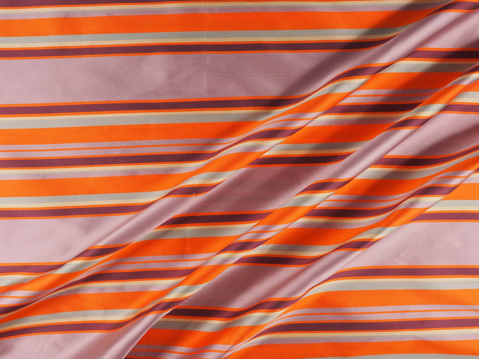
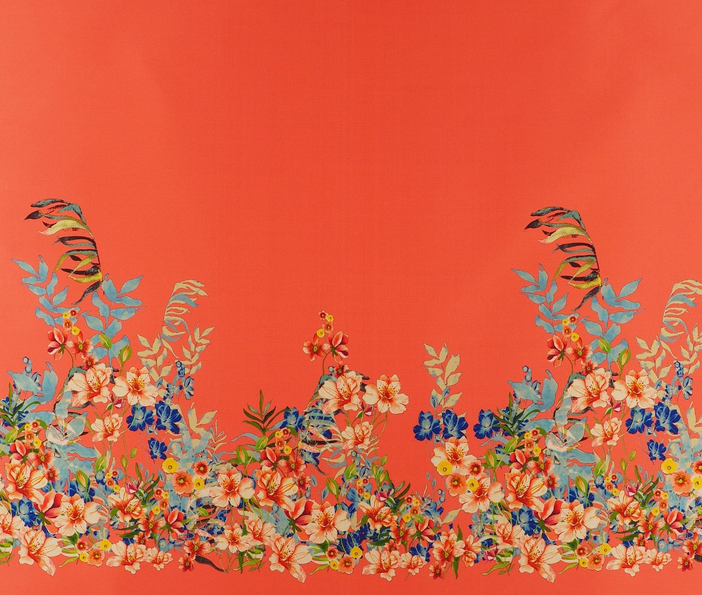
In Gratacós we like orange in any season. Whether it be in its most lit up version in silks, tulles or chiffons, or in pastel shades in subtle jacquards or fine texture embroidery. We also like prints where orange intermingles with other colours in the form of flowers, stripes or fantasy prints , to cite a couple of examples. We invite you to discover the whole selection!


2018 is the year of the new MODA-FAD . Located in the Disseny Hub de Barcelona, the fashion association integrated in the FAD (Promotion of Arts and Design) gives voice and visibility to local designers. It is an entity formed by fashion professionals from different areas, from clothing to footwear, which presents initiatives that help to give continuity to designers with a commercial vocation, a titanic task in these times.
In April MODA-FAD emerged with a new board of directors and with commitments, challenges and projects that value the professionals of fashion, design and craftsmanship that we hope will set a new clarion cry. In this first stage of the association the designer Edgar Carrascal assumed the presidency accompanied by his right hand, Mireia Playà, who specialises in vegan footwear. Also participating in the initiative are Elisenda Oms and Elisabet Carlota of Carlota Oms, Antonio Calderón and Pau Esteve.
The spirit of the new Association for the Promotion of Fashion makes clear its intentions to defend the Barcelona brand and to seek internationalization, to contribute to the business development and the industrial fabric of the country and the “dignification” of trades related to fashion. It also has the didactic aim of sharing knowledge and assuming a teaching role in the consumption of fashion, aiming to provide the necessary tools for conscious and sustainable consumption.

The MODA-FAD Awards
Within the framework of Barcelona Design Week, the new MODA-FAD Awards are to be promoted in a ceremony and afterwards a party that will take place next Wednesday June 6 in the Disseny Hub Barcelona. Awards are aimed at recognizing the work of professionals and companies in the world of fashion and who have made contributions to the sector during the last year. In total prizes will be awarded in three different categories: Merit in Fashion Design, Merit in Fashion Innovation and Talent of the Year Award. Special recognition will also be granted to a designer or brand that is not active, but whose contribution in the fashion sector is valued.
The winners
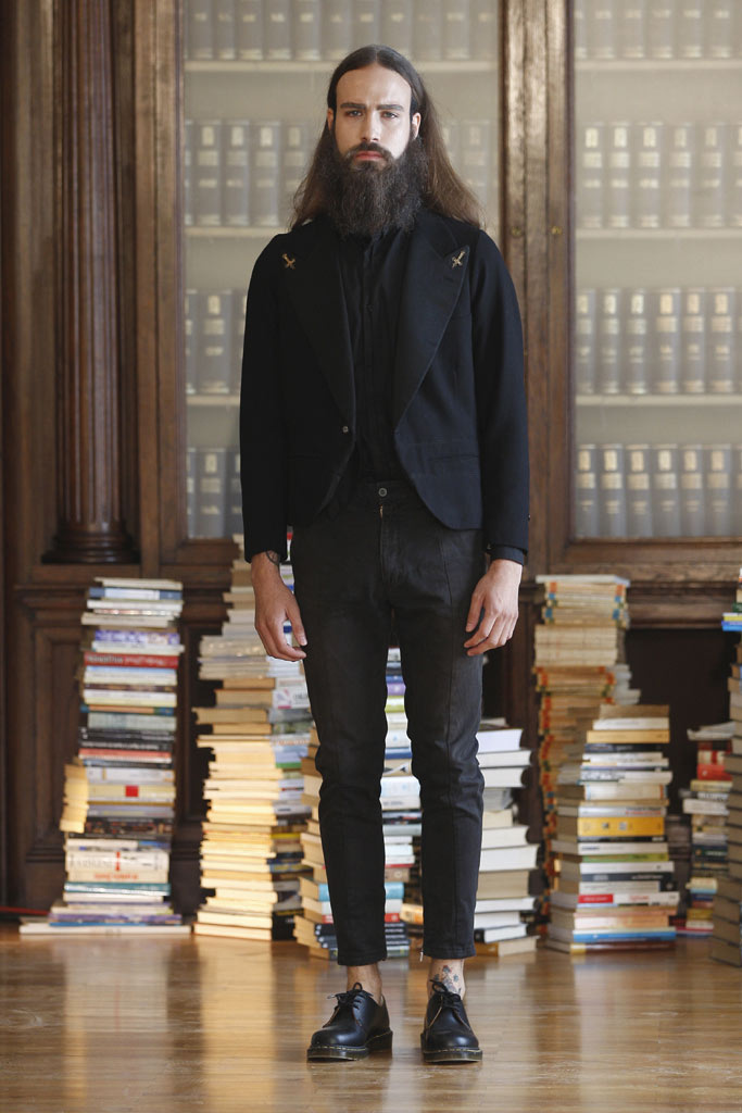
In this first edition the designer Víctor von Schwarz with his Double Life collection, 2018 is the winner of the Merit Award in Fashion Design . His tendentious presentation highlights the precariousness of the sector and the difficulties faced by emerging designers, “the new generation” whose double life between creativity and reality usually lasts no more than 10 years. As a representation of this ‘Double Life’ the collection is divided into two parts: one purely in black and white with shapes that are inspired by office attire, the other more imaginative with glitter, voluminous shapes and pastel shades.

The Merit Award for Innovation in Fashion goes to Piñatex ® by Ananas Anam, a company that is developing a product in which commercial success is integrated and social, ecological and cultural development is promoted in parallel. Working from this perspective, Piñatex ® opts for a non-woven natural base material that consumers can use as a sustainable alternative. The material is made from pine leaf fibres, a product from the agricultural industry that does not require large amounts of land, water or pesticides to produce the raw material.

The Talent of the Year Award goes to Pepa Salazar, one of the most promising talents in Spanish fashion. Established in Madrid, this Valencian designer presented her first collection in 2013 for which she won the Mercedes-Benz Fashion Award Talent in the next edition. In the Autumn-Winter 18/19 collection, the designer presents a universe marked by the images of the absurd, fictitious and utopian, belonging to the mythology and paganism of primitive cultures. The jury considered that her latest creation is rich in colours and textures, has character and strength and an identity of its own recognisable in all of Pepa Salazar’s collections.
Finally Gori de Palma receives the Special Award from the Board of the New MODA-FAD. The essence of the designer is condensed into the industrial and the dense, all within a post-punk filter. Her signature is that of a refined and obscure author, with a perverse touch based on sub-cultural movements.
In the first edition of the awards tribute will also be paid to the figure of the Catalan dressmaker and businesswoman Carme Martí Riera (1872-1949), a professional with strong ideals who fought to dignify the profession of dressmaker, besides being the creator of the Martí System , the first technique of pattern making with a technical rigour that was celebrated world-wide.
Attendees of this annual celebration of Barcelona’s fashion talent will also be able to see the exhibition “The best design of the year”, where pieces by the winners of these awards will be on display. This sample in addition brings together 500 finalist works and winners of the different prizes awarded by the associations of the FAD in the various design disciplines.
Sorry, this entry is only available in Español.

Colour communicates and expresses moods. It is a key variable that designers take into account when presenting their collections. There is nothing fortuitous. The more radiant the colour, the more expressive capacity it transmits. And it is already known that in spring there is a desire to express oneself with colour, after a season of neutral, dark and muted tones, traditionally linked with winter.
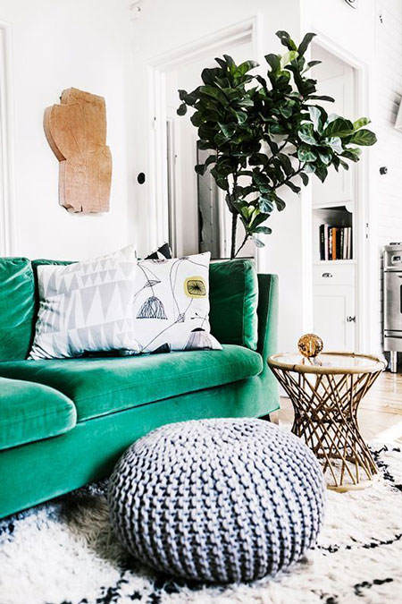
Living with sorbet colors, another range of tonalities emerges that are positioned right at the other extreme. They are bright colours, which radiate energy, optimism and confidence driving a new vitality towards fashion trends. In this more daring chromatic range you can find a colour inspired by the most fantastic natural landscapes: Arcadia .
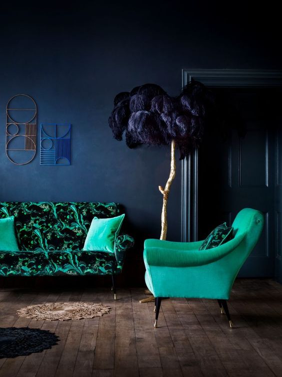
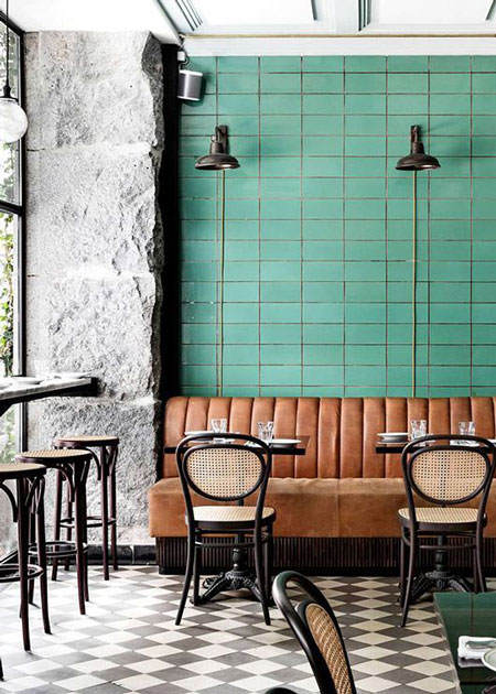
Make no mistake, green has never been an easy colour to wear. On the catwalk it dazzles for its freshness and spontaneity, however it is not one of the habitual preferences in consumption. There is a certain “curse” around this colour that only yellow equals. Something different happens in decoration, where it is a habitual tone because it revitalizes the neutral spaces and enhances the natural textures and the rustic finishes. It is a tone that is used in textiles, upholstery, auxiliary furniture and sometimes on a wall.
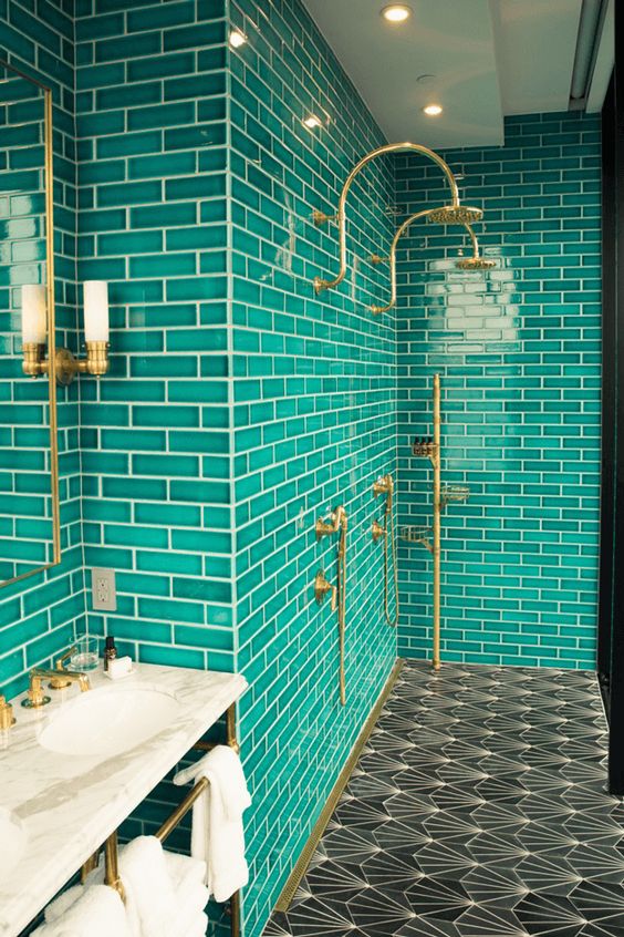
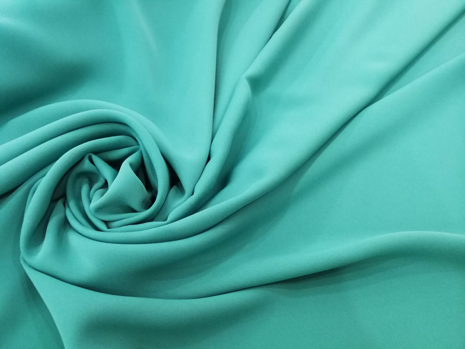
Arcadia is a different green, highly recognizable visually and with a complex spirit. According to Pantone this tonality “implies the retro and at the same time the modern”. The international authority of colour assures us that “ it is a fresher and cleaner version of the green that, with its blue background nuance, takes us to a new direction for this season”.
 |
 |
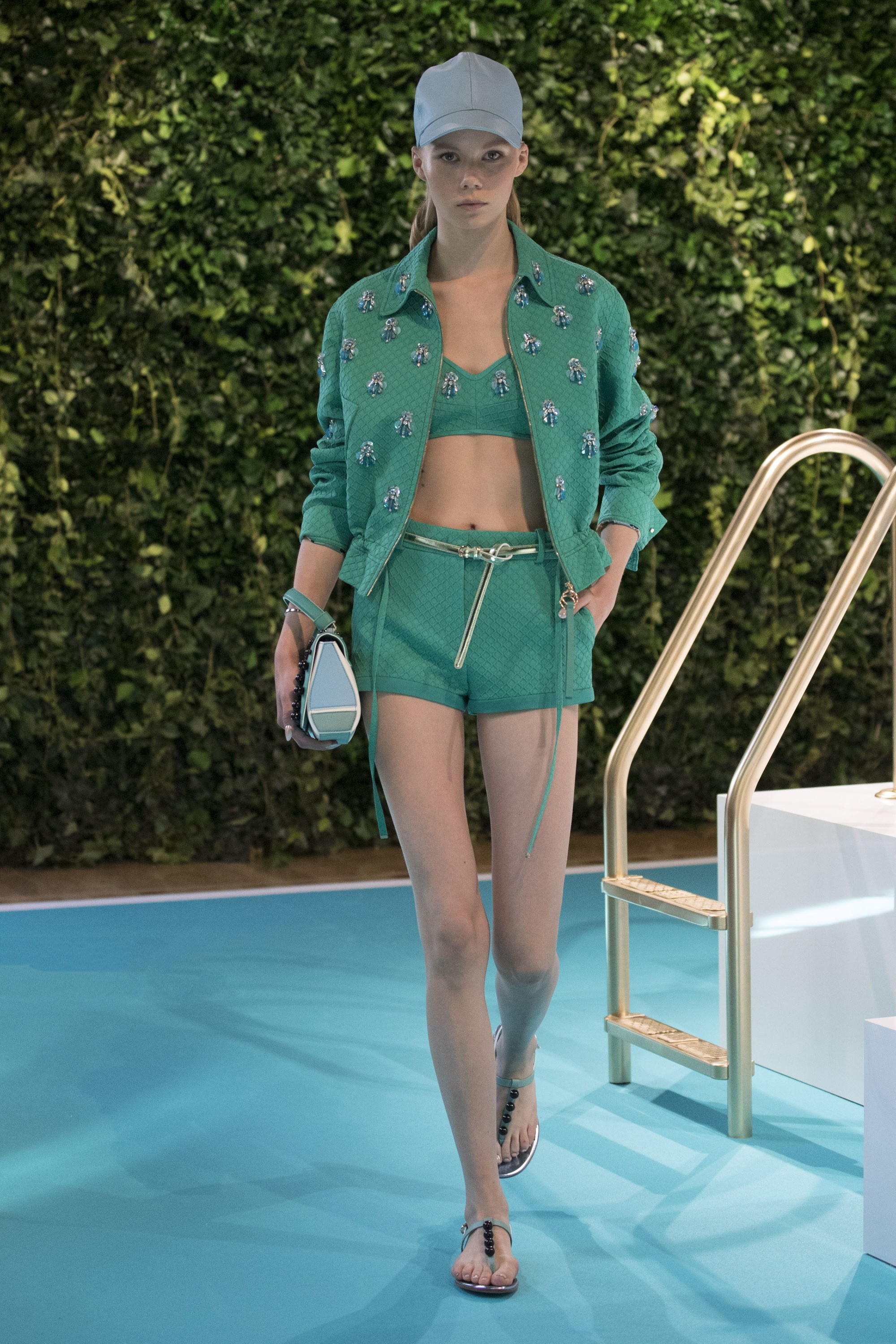
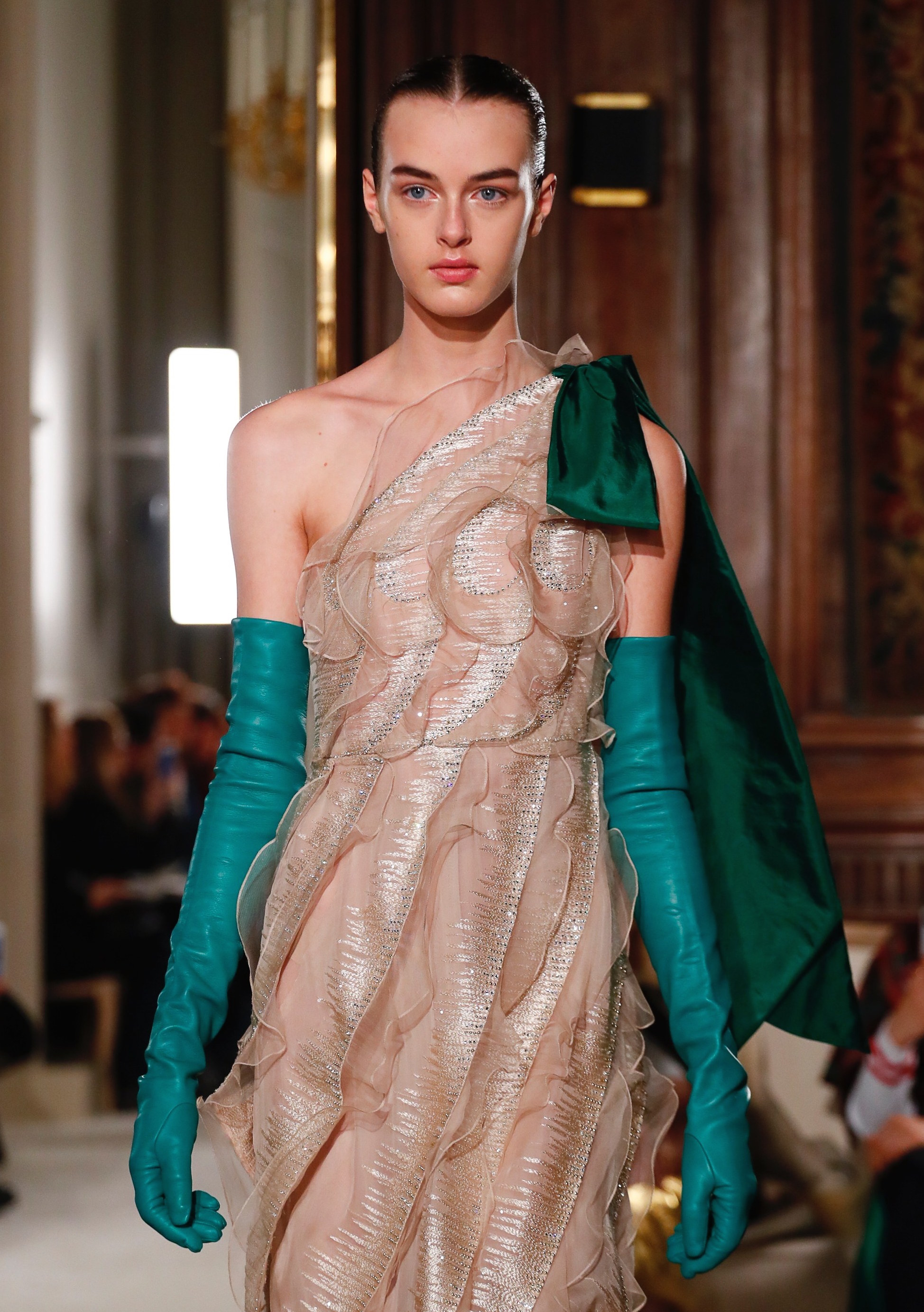
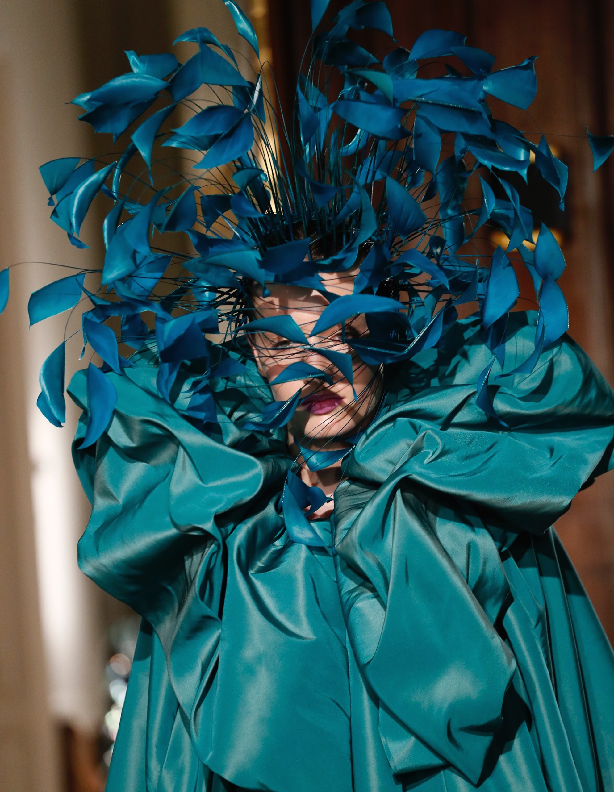
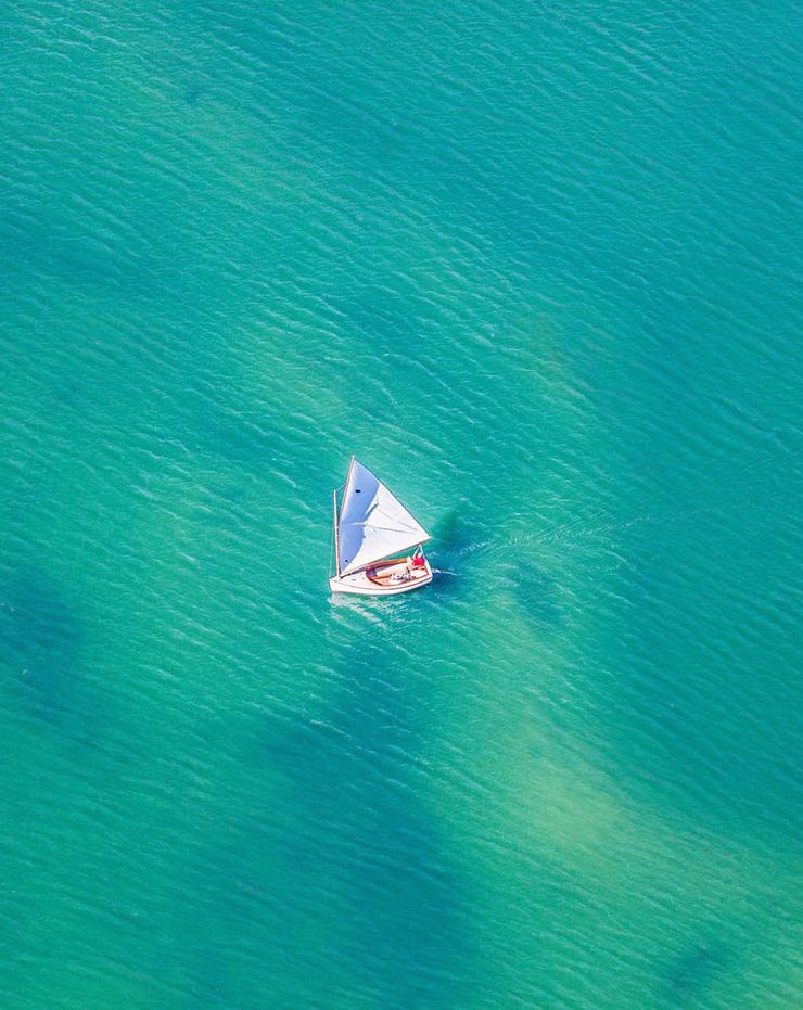
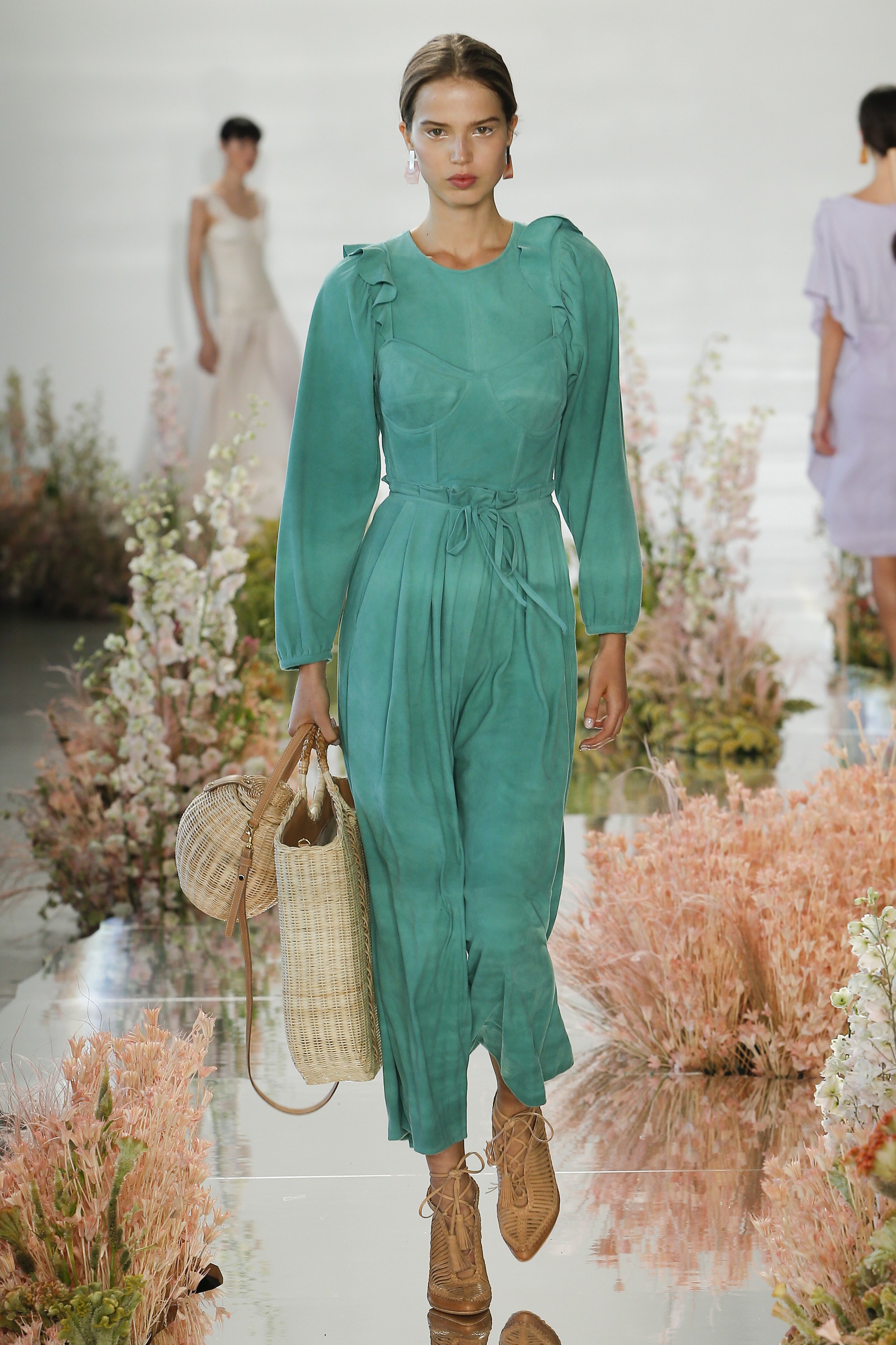
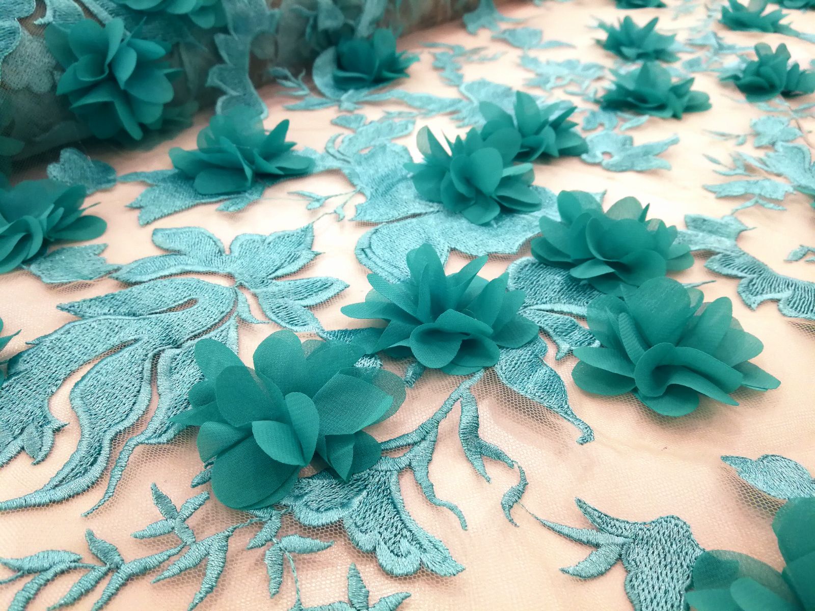
This striking variation of turquoise is inspired by the crystalline waters of the tropical oceans and reminds us of purity, nature and fun. The colour Arcadia is above all casual, halfway between the evocative and the transgressive. Obviously, there is no luxury company that has made an integral commitment to this shade, but it has appeared in fair measure in the collections of Tibi , Sportmax or Ulla Johnson in its most sporty version, in unstructured silhouettes and loose garments of synthetic fabrics . Or showing off its more sophisticated side through steamy, navy- inspired dresses like Elie Saab or through capes and accessories in leather seen in Valentino.
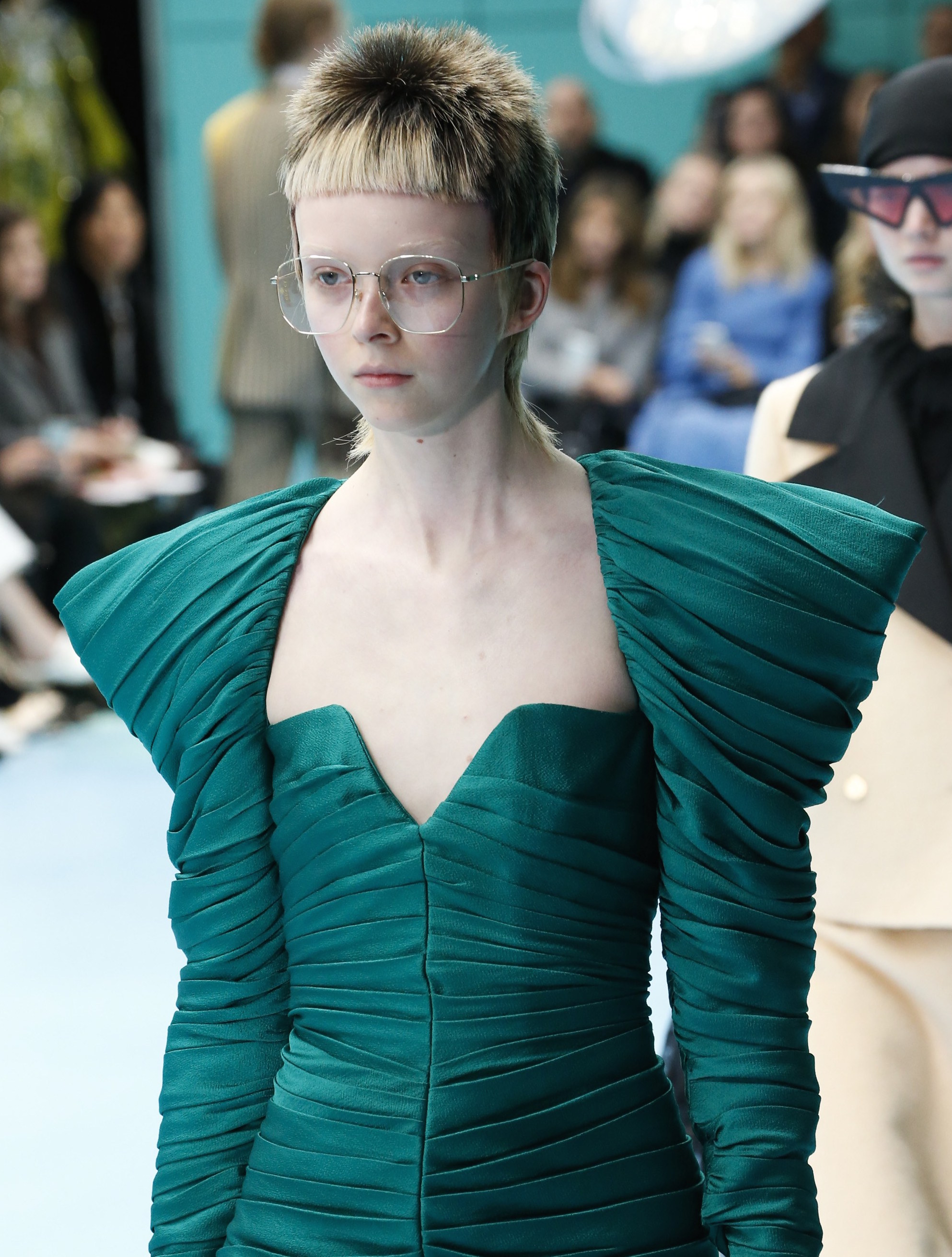
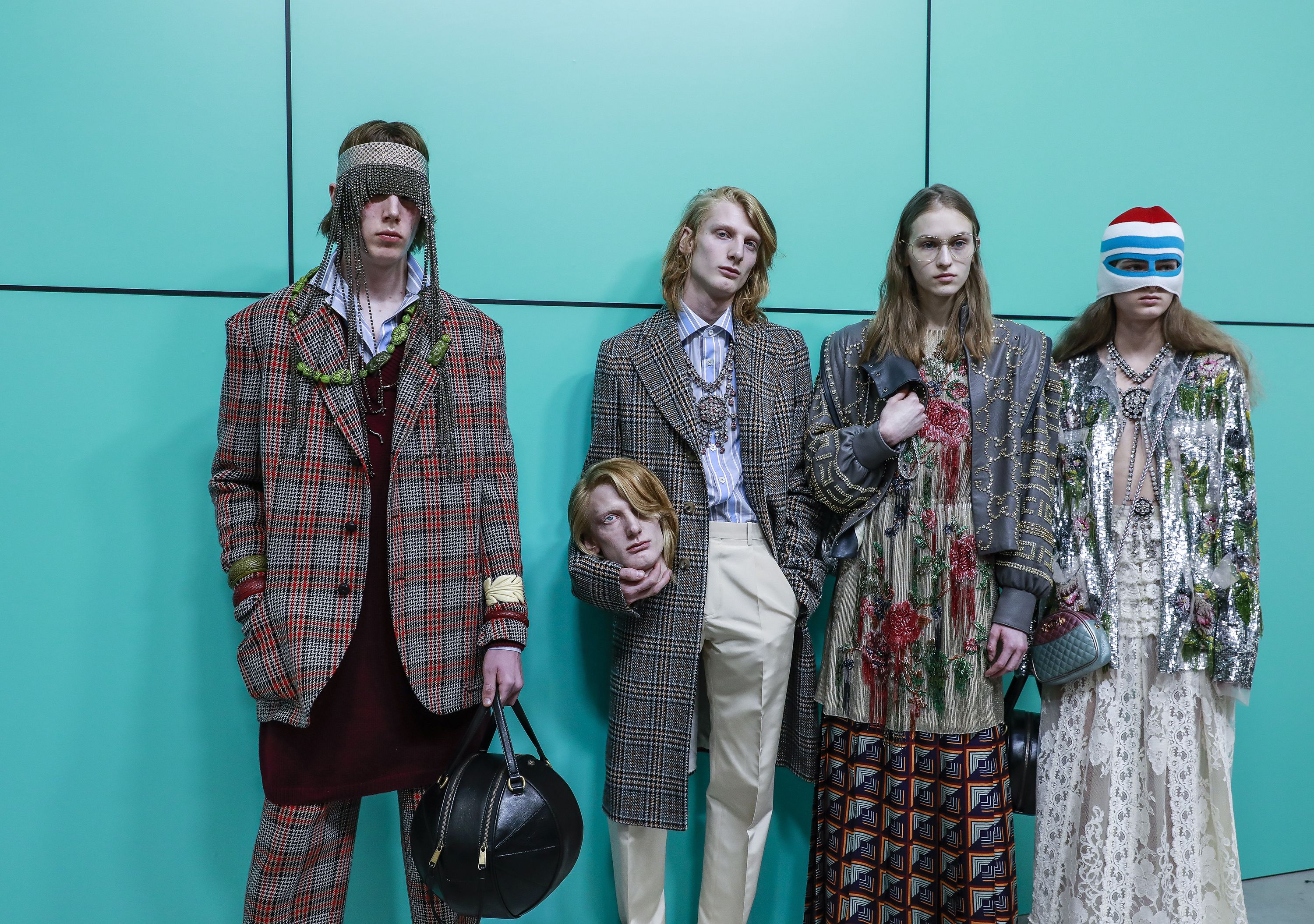
 It is usual to see this colour in Gucci , “the green dog” of fashion. In the next autumn-winter season 2018 there are Arcadia brushstrokes in eighties aesthetic dresses with volumes on the shoulders and a blazer with bright fabrics. What is more interesting is that Alessandro Michele used it to contextualize his latest parade, which was more eccentric than usual, a symbol that in this case the creative director of the popular Italian company wanted to use to highlight the youthful and imaginative side of his next collection.
Also discover in Gratacós the fabrics that are dyed in Arcadia or in most similar tones. You will surely give green a new opportunity. It is well worthwhile….


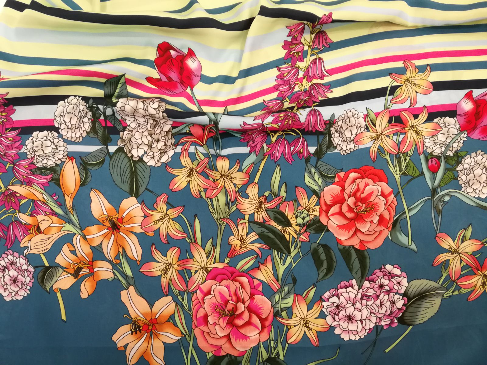
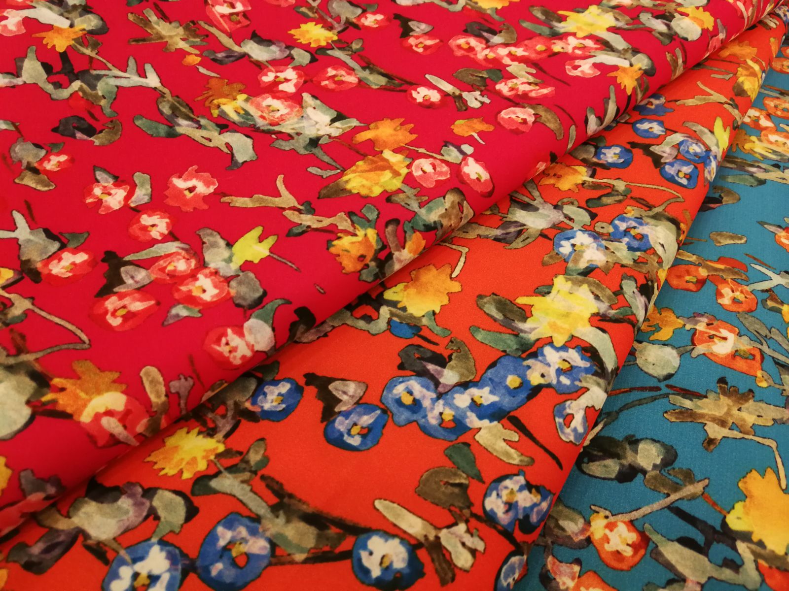
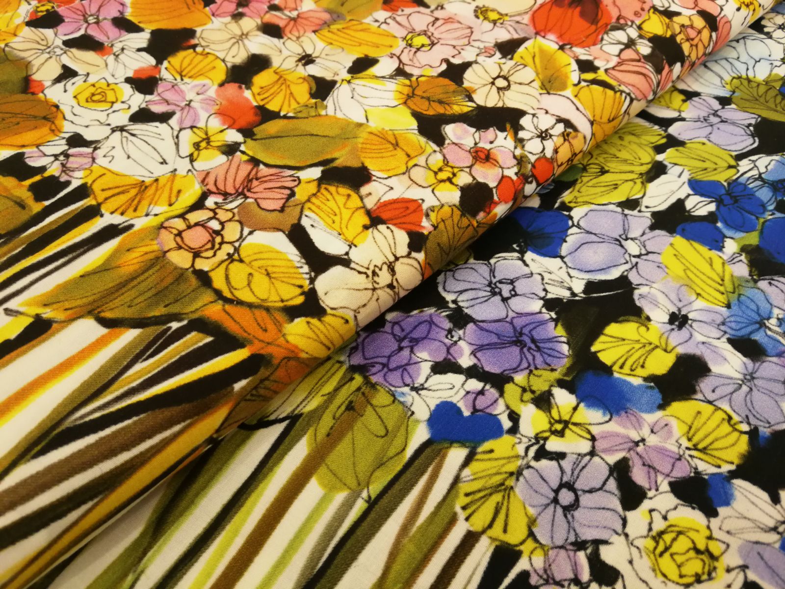
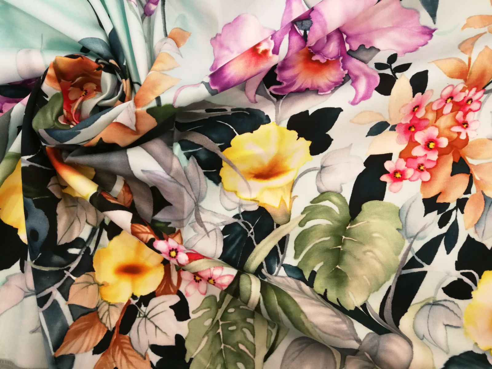
Spring brings a new awakening of botanical motifs with original floral prints that pay homage to nature and its plants. Vivid tones, in various sizes, in surprising combinations … We review the prints that most inspire us in a season rich in colour and textures, with flowers as a common denomination.
French Countryside
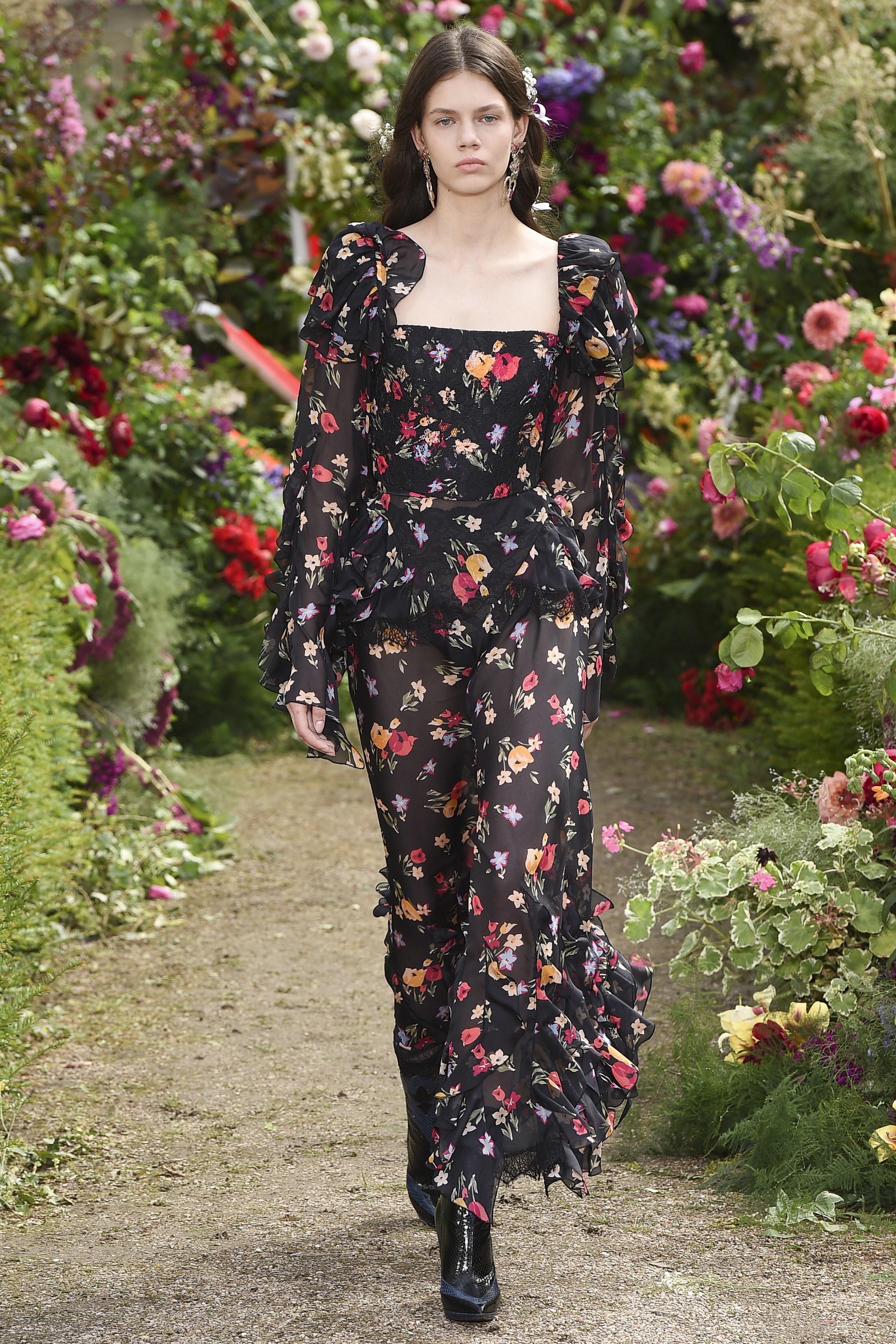
We move to the interior of the French Provence in the middle of the rough fields of wild flowers: poppies, lavenders, sunflowers … that fill this country environment with colour. On the catwalk, flowers also sprout in their most mini version – the Liberty pattern is imposed – on all types of fabrics and in soft tones, providing delicacy and a certain nostalgia. Long romantic- inspired dresses, asymmetric tops with Brigitte Bardot style ruffles and flowing skirts abound in the Chloé , Paul & Joe , Loewe and Marni spring-summer 2018 collections . A pattern that reflects the most bucolic beauty of nature.
Exotic Polynesia
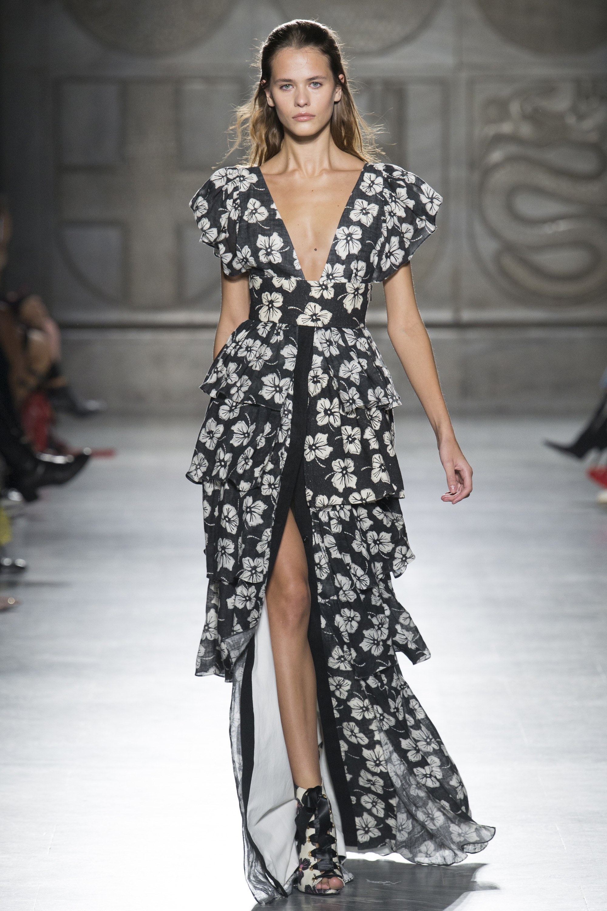
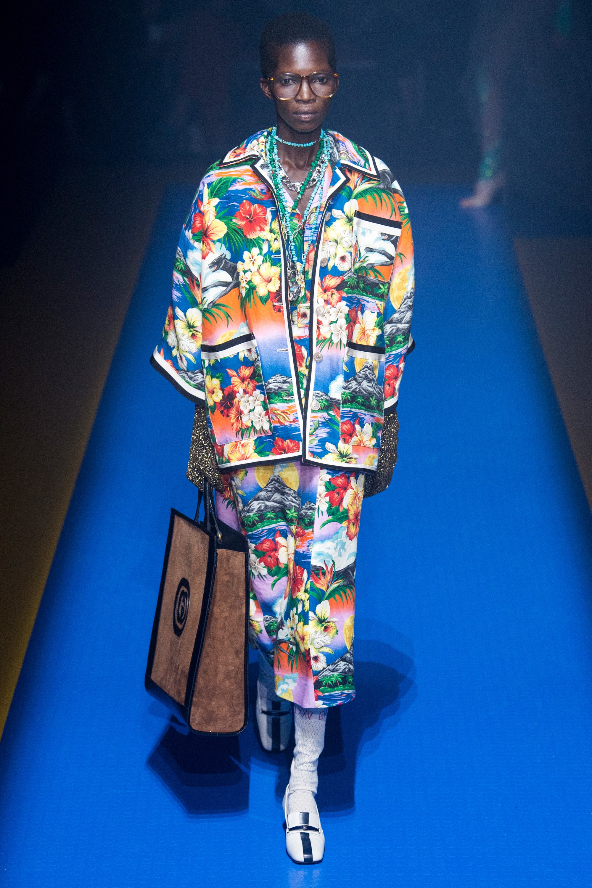
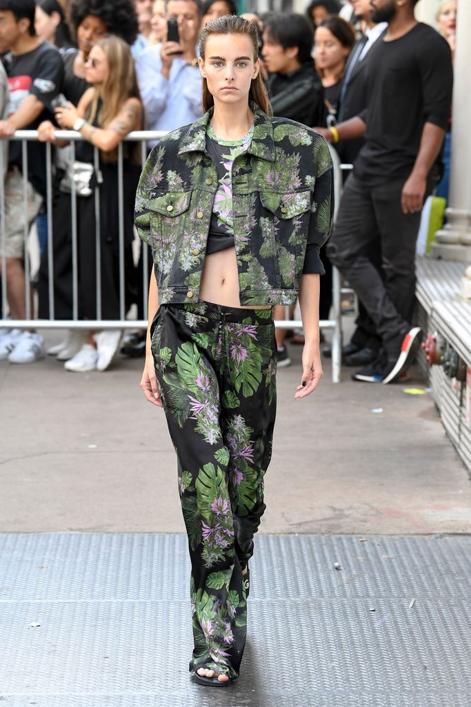
At the other end of the first trend in floral prints, is the exoticism of Polynesia. Thus, the flora and fauna of these Pacific islands inspire the most daring summer prints with large format flowers that invade all types of garments, bringing colour, joy and vitality. A tropical spirit inspired by Hawaii or Taití with two main flowers: the hibiscus and the gardenia, wrapped in abundant vegetation. The chromatic palette focuses on warm and vibrant tones such as yellow, orange, fuchsia or vermilion.
Wild jungle
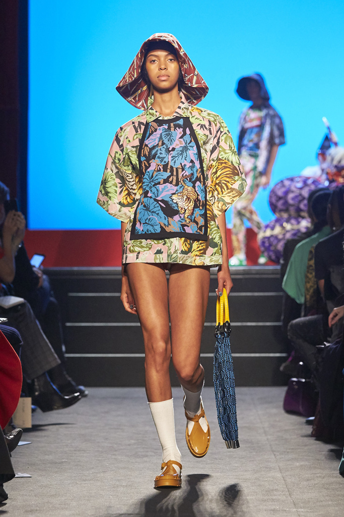
The flowers are still present, giving prominence to the fruits, the leaves of the palm trees, and the most diverse wild fauna in this type of very vivid print full of natural references to these exotic paradises full of foliage. The fabrics emulate a floral motif that intermingle with vegetation and animal prints. A tropical print that renews itself season after season and is present in the collections of Kenzo o Escada, for instance.
In Gratacós you will find several floral fabrics that follow these three seasonal trends amongst other inspirations. You will find them in our online store or in the physical space of Barcelona.
