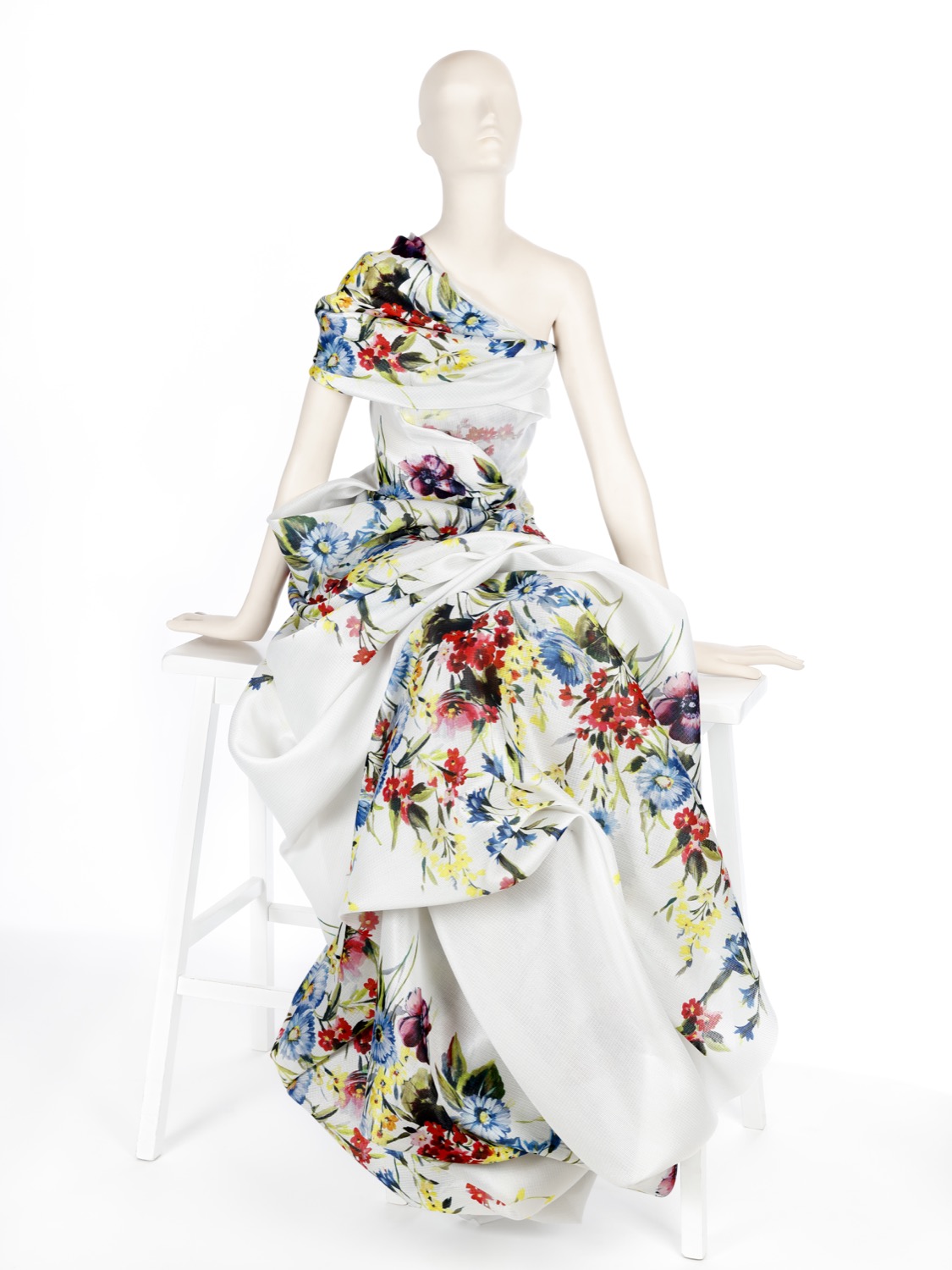
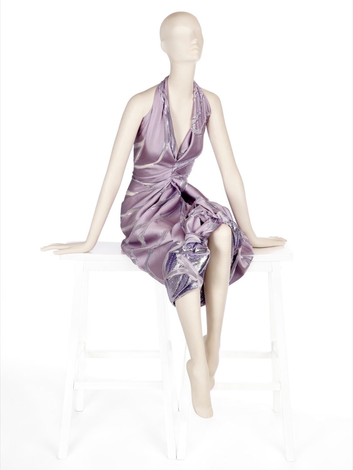
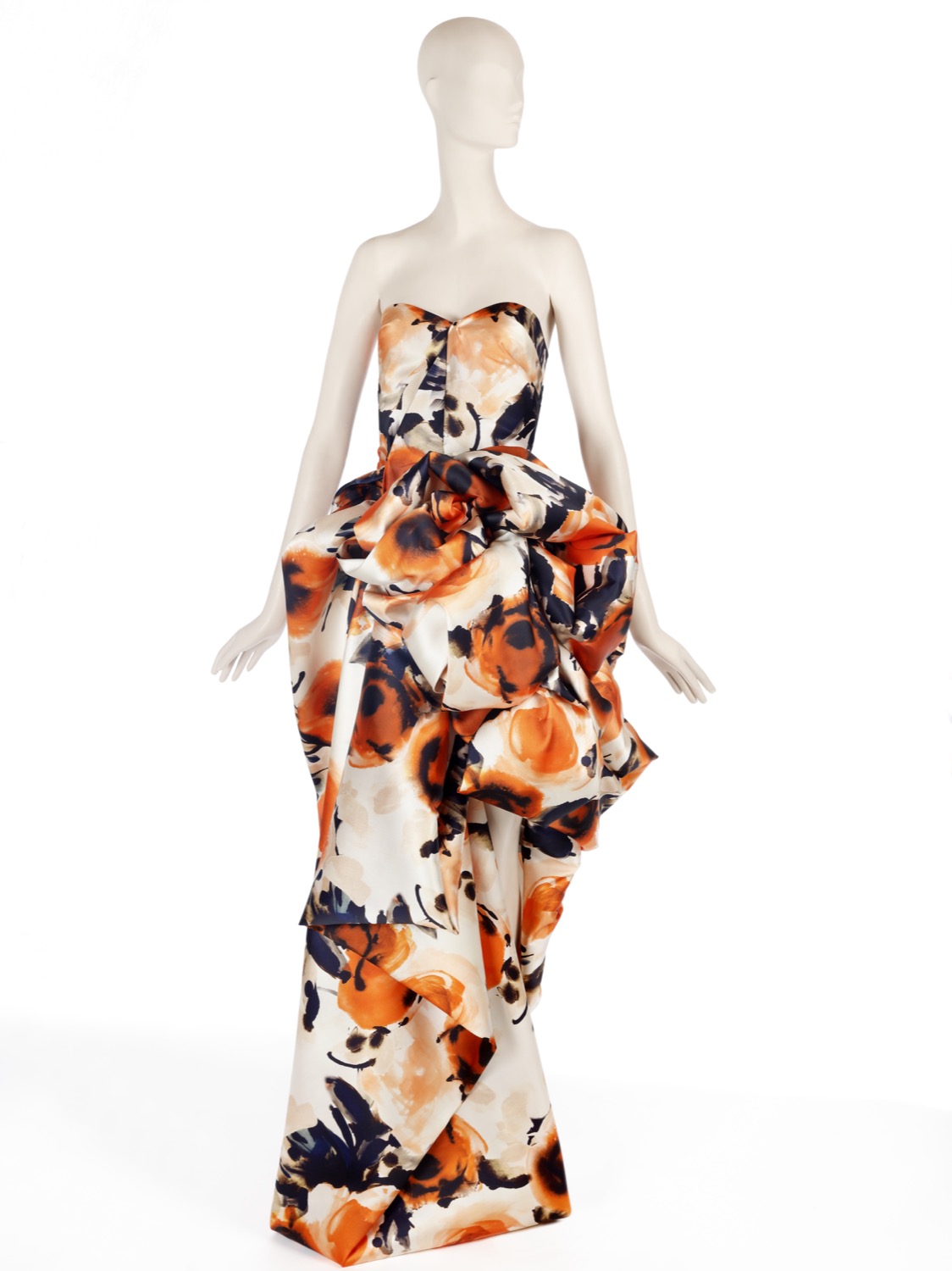
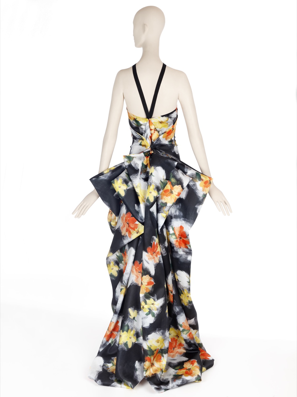
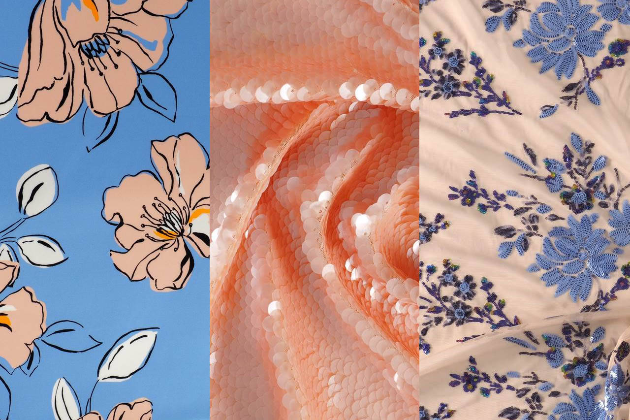
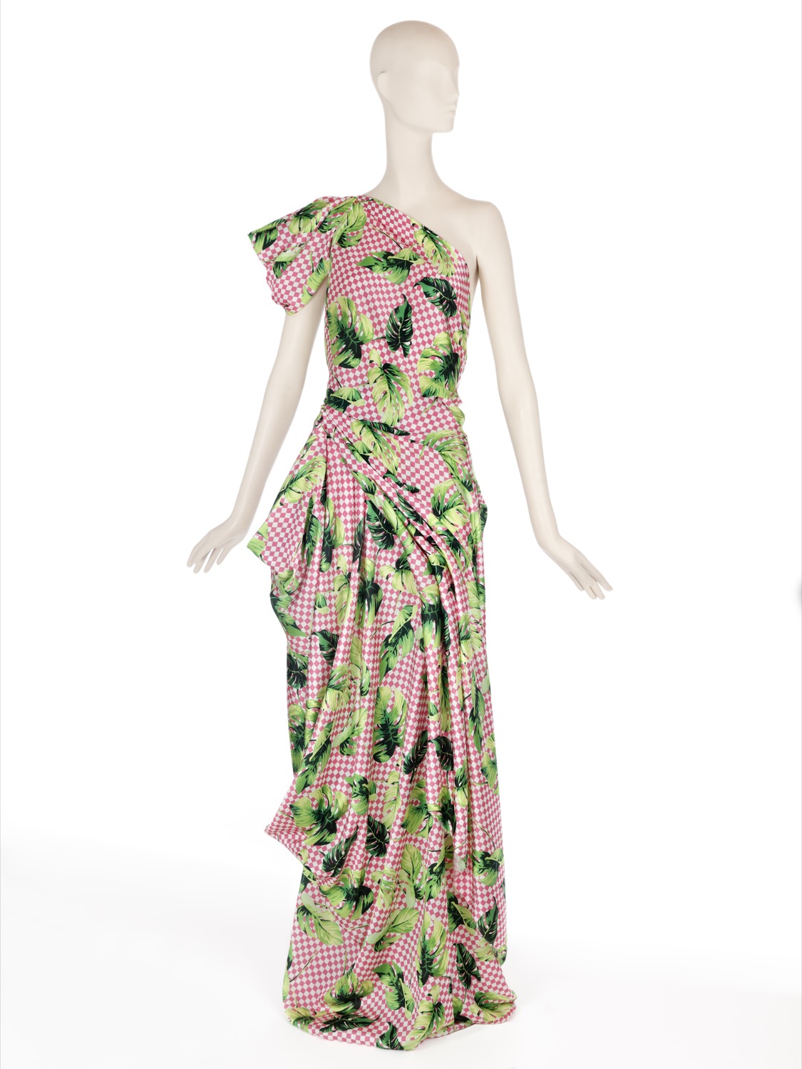
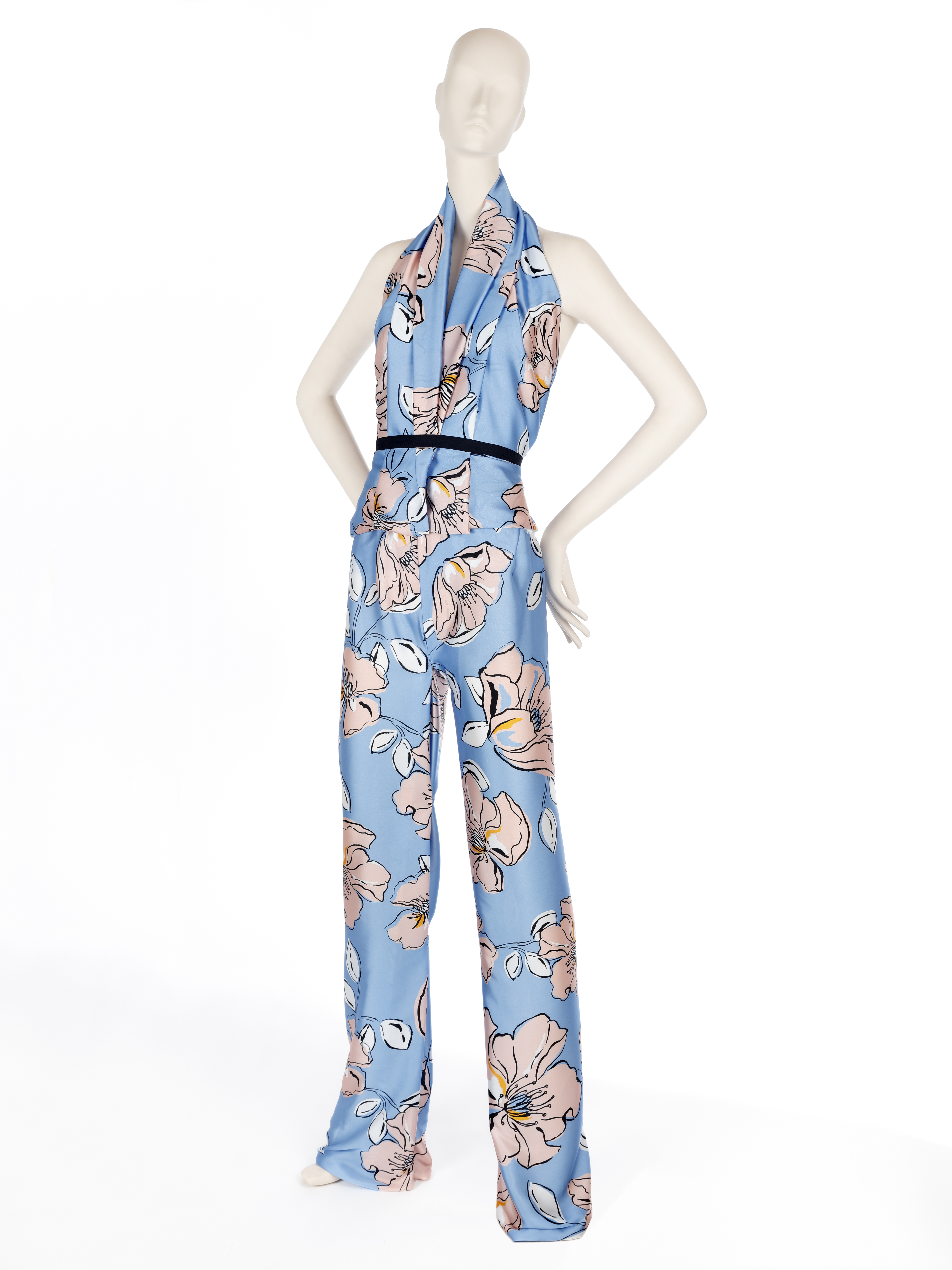
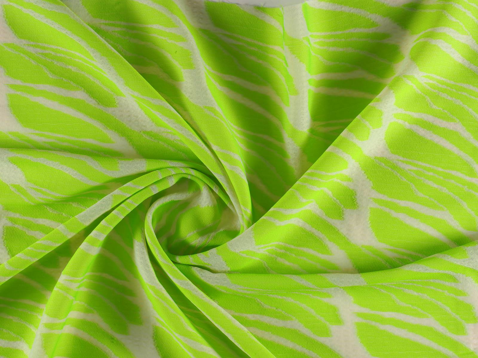
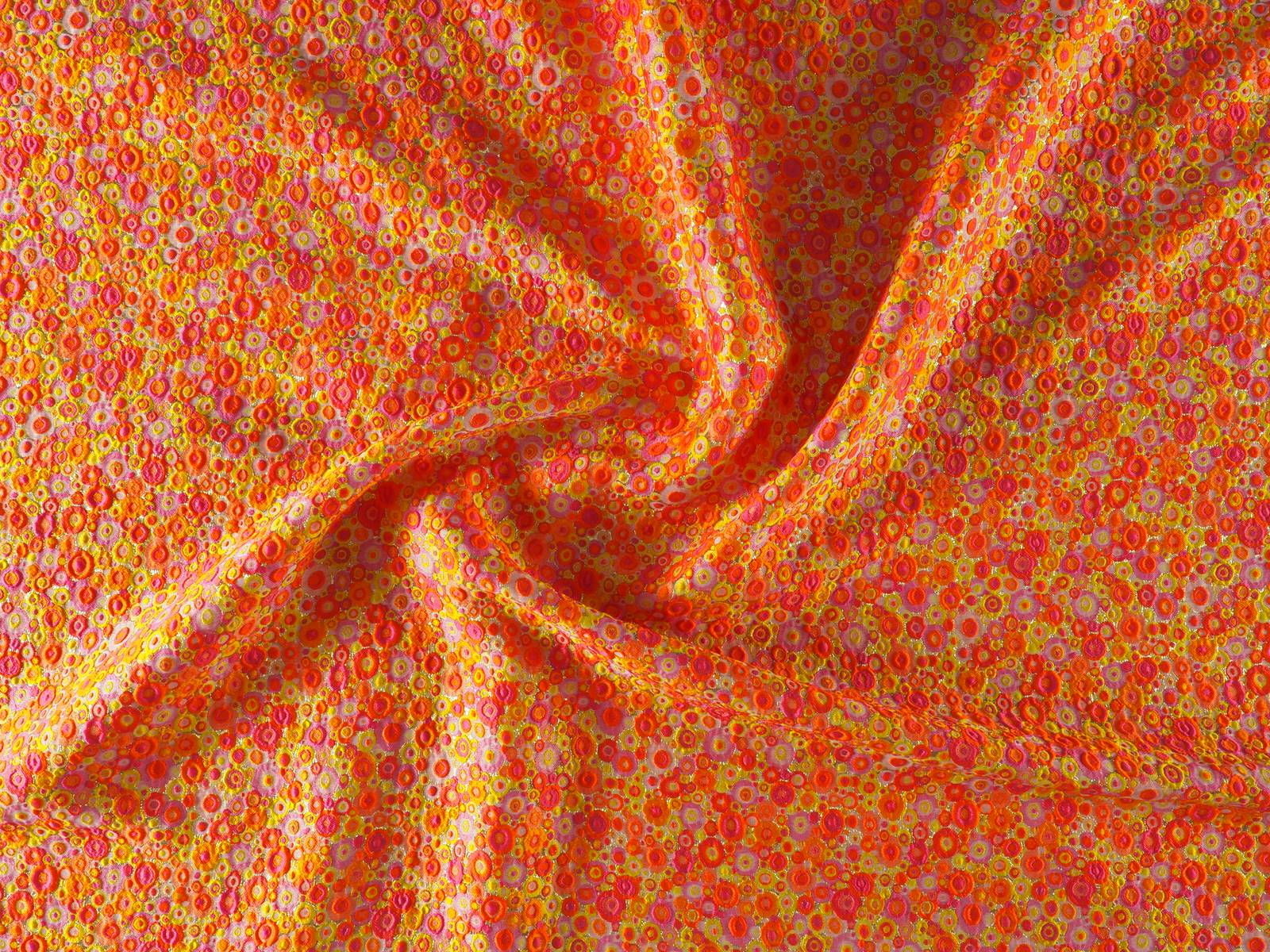
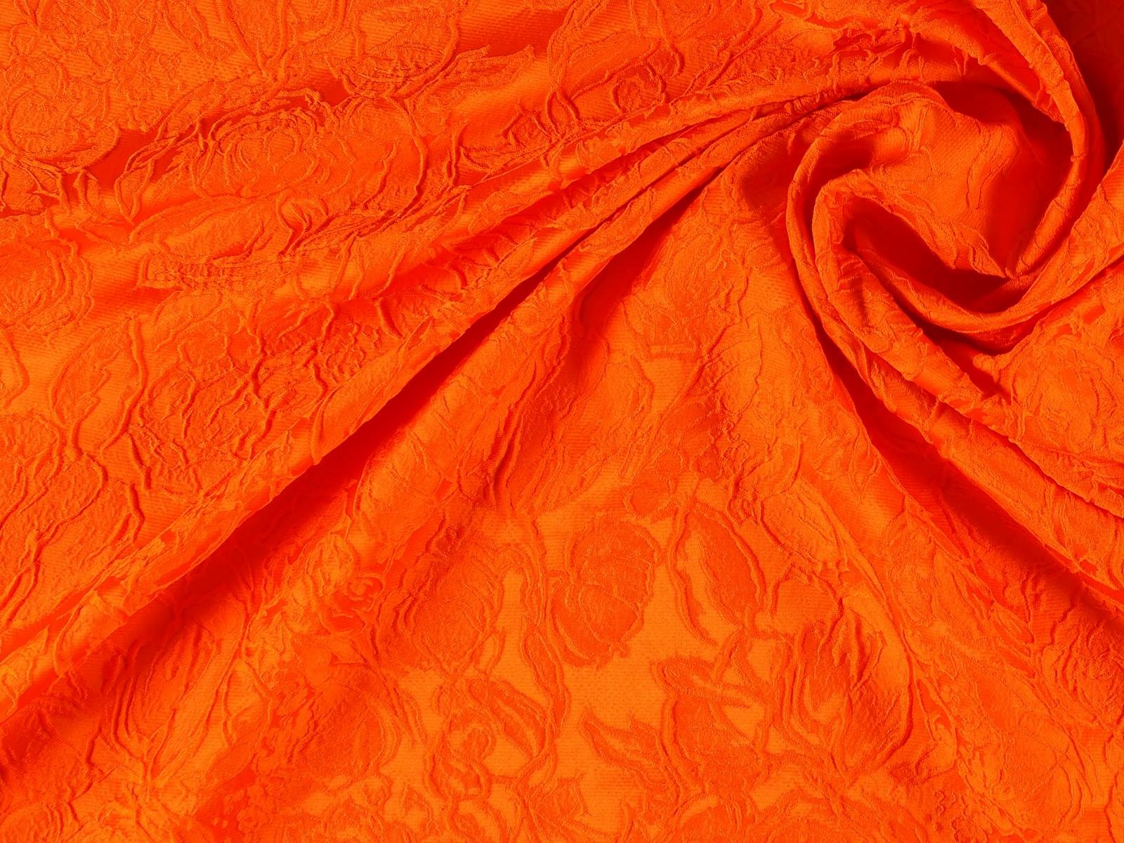
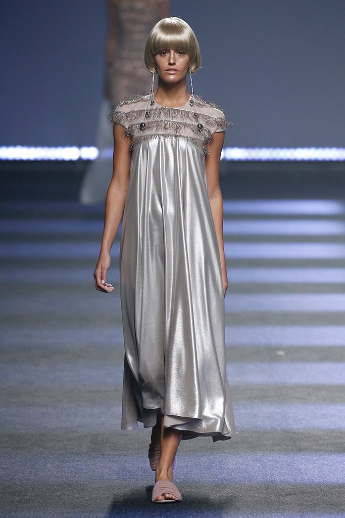
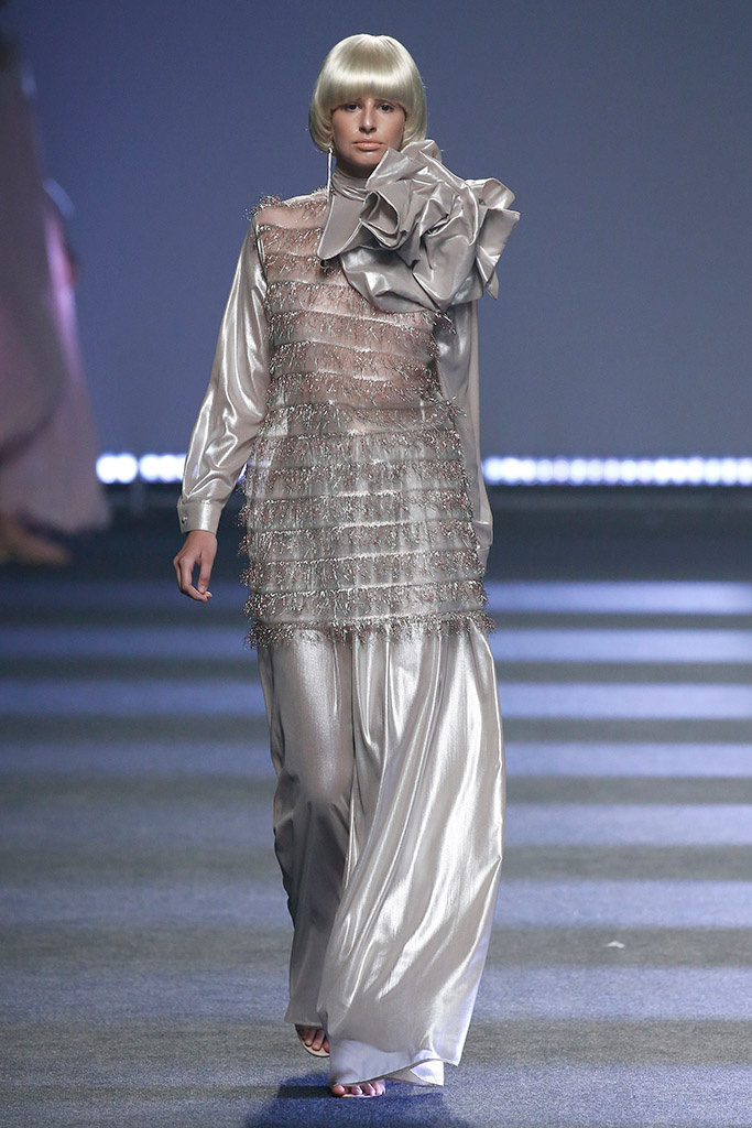
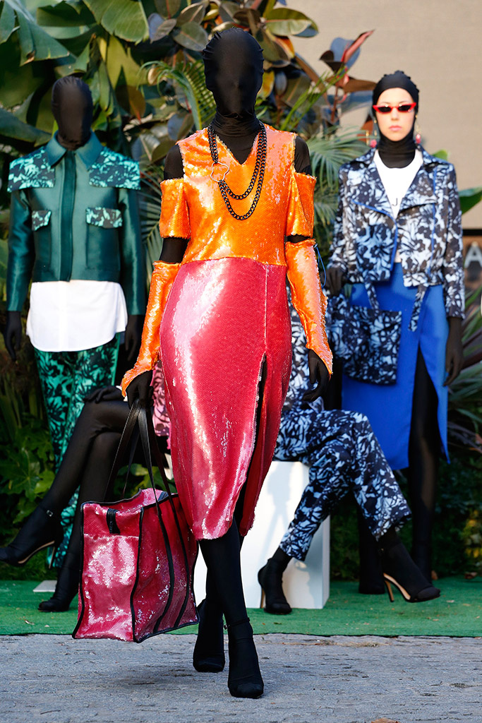
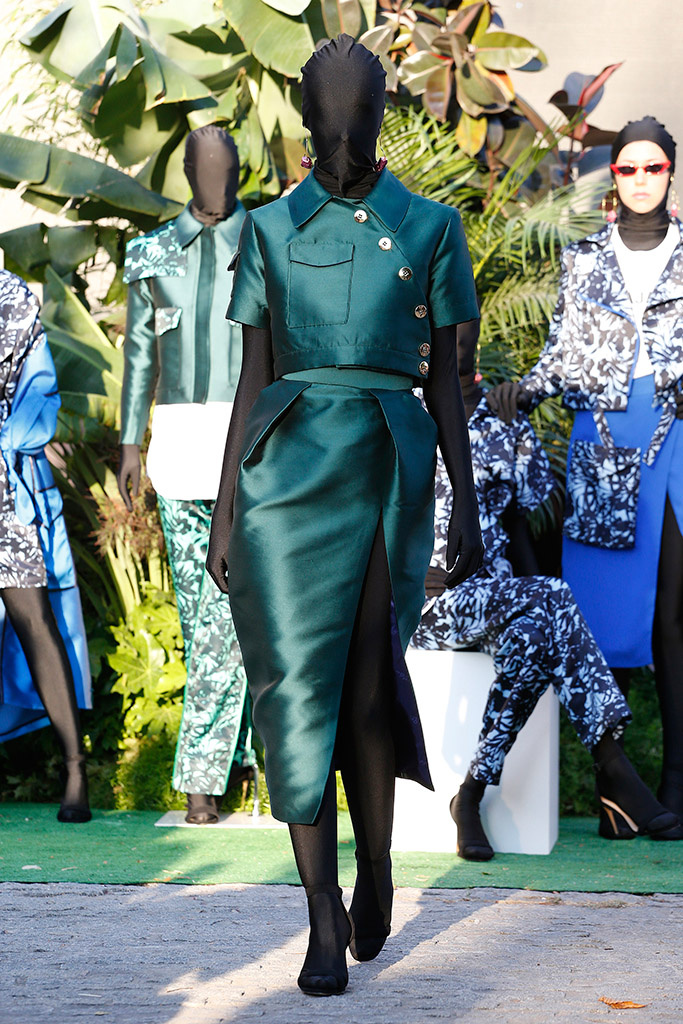
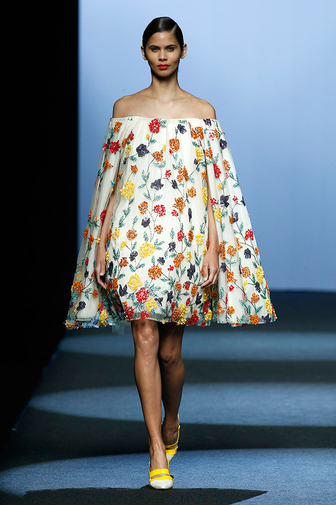
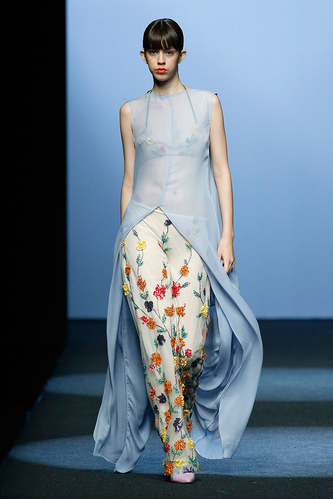
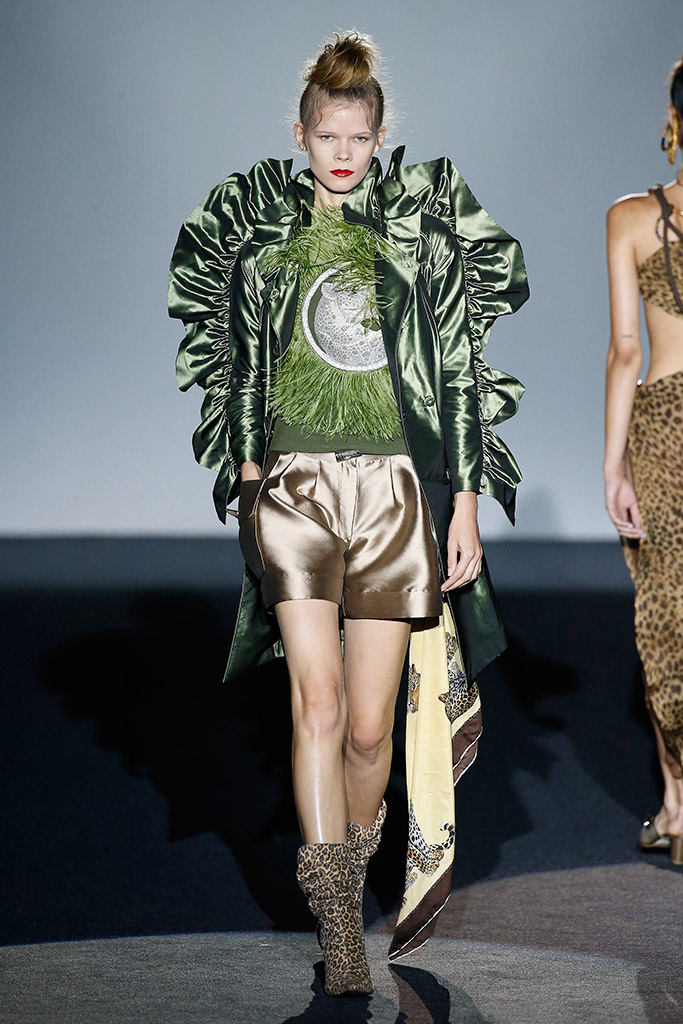
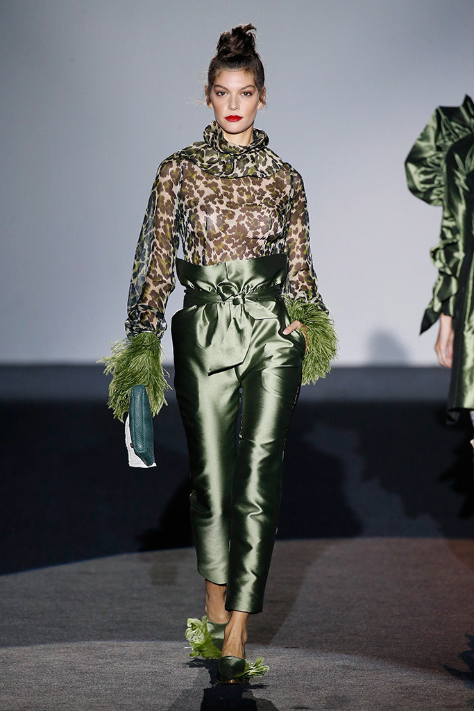
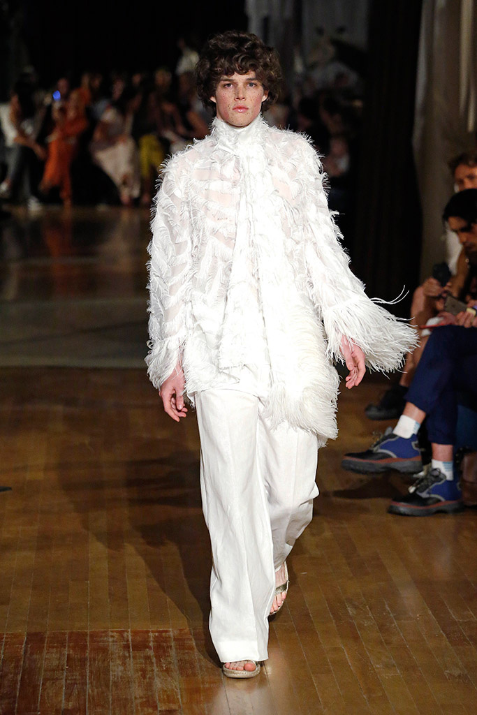
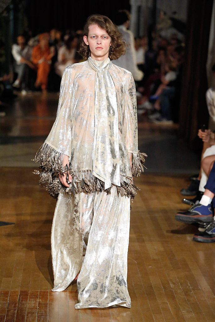
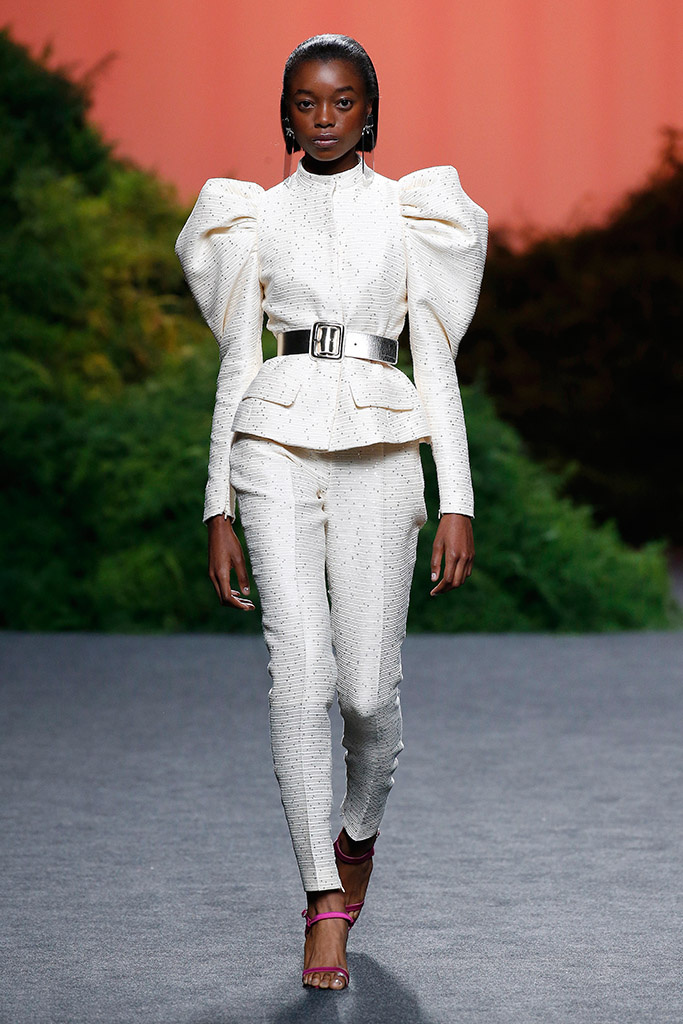
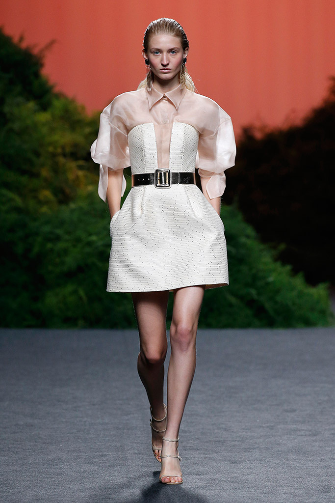
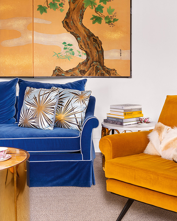
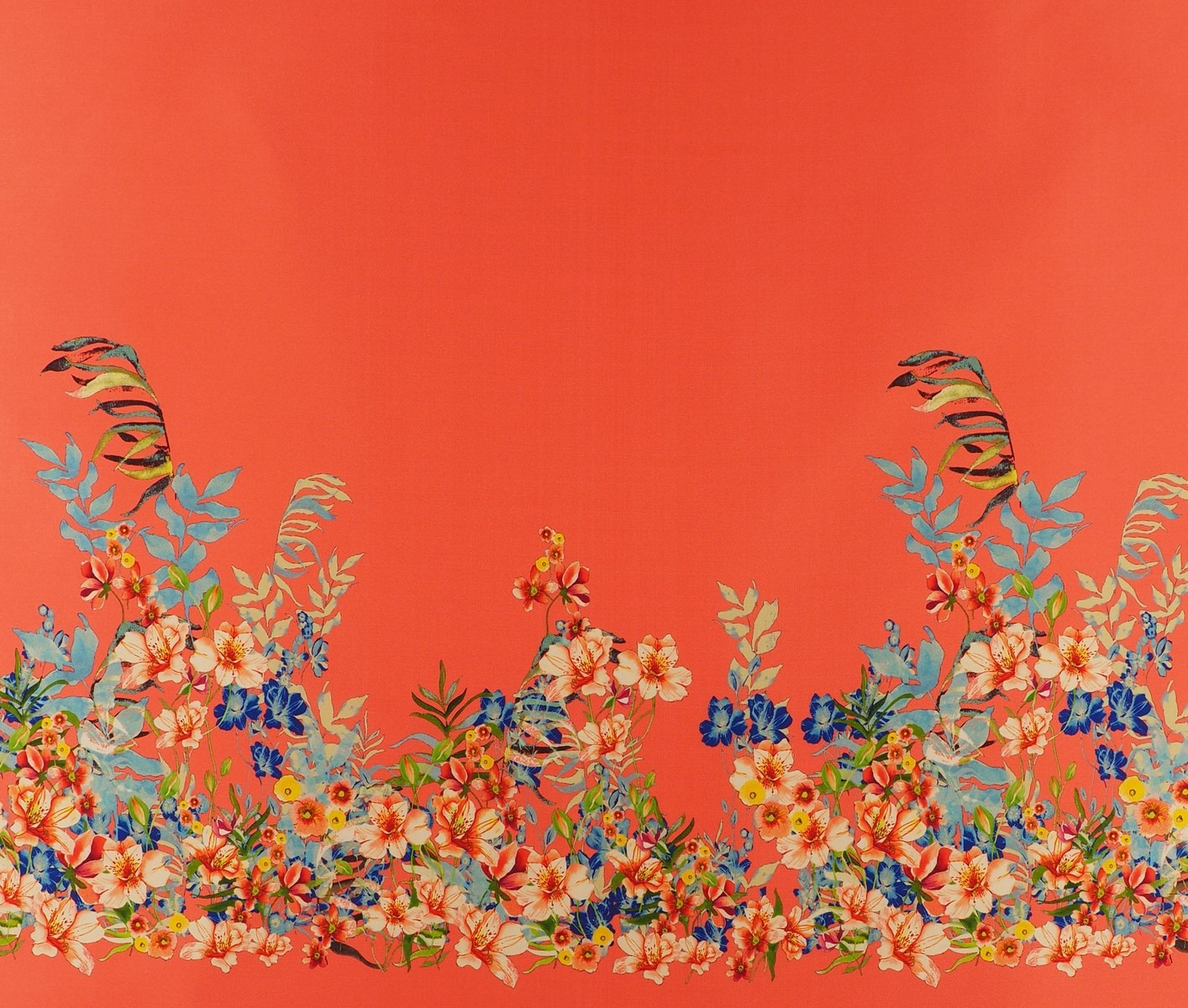
Are you ready to play? To play the game in its broadest sense. The game as fun, where there is space for experimentation mixed with hints of entertainment and large doses of curiosity. In this new season that we are premiering we pay homage to leisure, to recreation, to freedom in a collection that is inspired, as could not be otherwise, by the concept of ‘ Play ‘. It is a presentation which is both sophisticated and casual, which focuses on colour, movement with light fabrics and craftsmanship for the warmer months of the year. This Spring-Summer 2019 collection has a large dose of creativity and ingenuity on the part of our design team, who make Gratacós a luxury fabric company with a defined style and personality. So let’s enjoy the latest creation we have prepared with the intention once again to surprise and excite. Let’s play together: Let’s play!
“Play is a sophisticated and casual presentation which at the same time goes for colour, movement and craftsmanship”
General concept
‘Play’ is a sympathetic collection that seeks at first glance to combine apparent simplicity with products that are attractive and appealing. It is an aesthetic presentation based on timeless articles far away from extravagance and artificiality, but these have to provide a distinctive feature, a certain personality. We are not seeking the versatile and basic, which is somewhat insipid, but rather to give it a creative turn. In parallel we are bringing back the characteristic features of folk culture and opting for craftsmanship to present traditional fabrics with rustic aspects and manual details.

“We are seeking to combine apparent simplicity with attractive and seductive products at first glance”
Fabrics
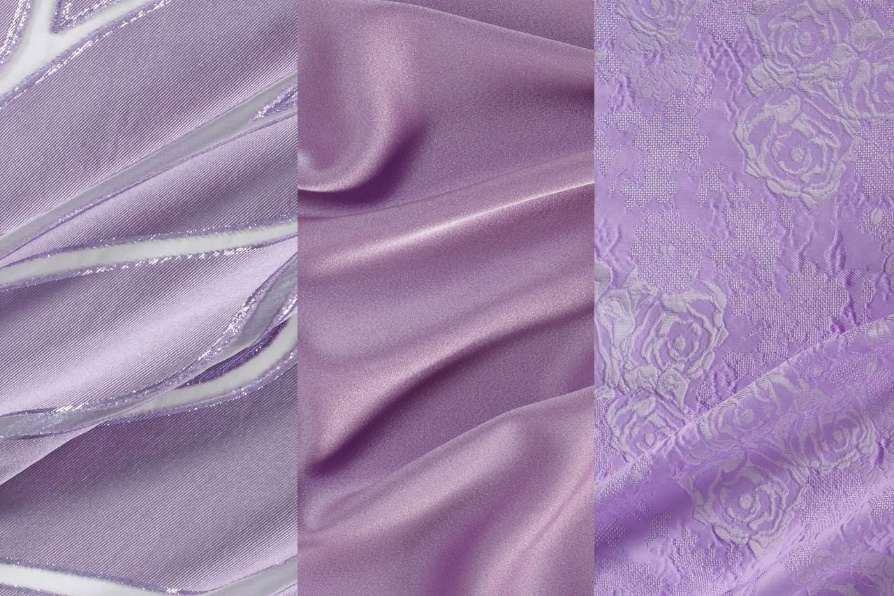
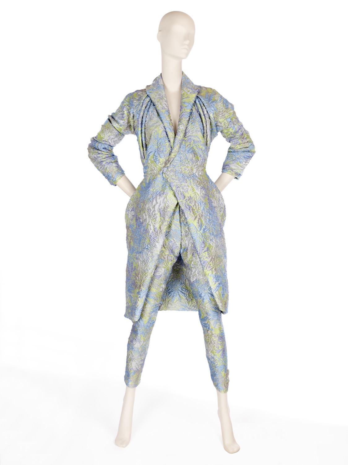
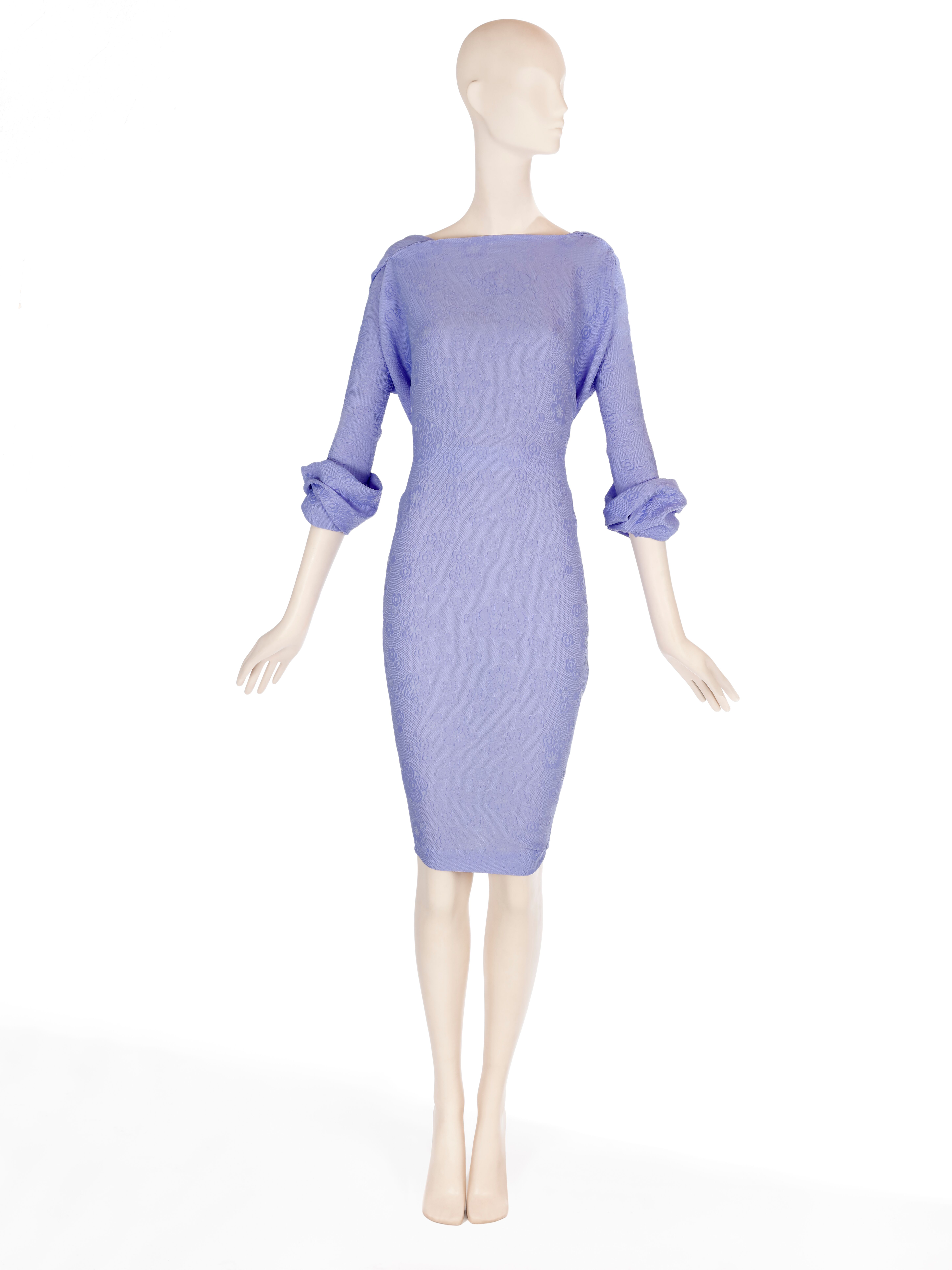
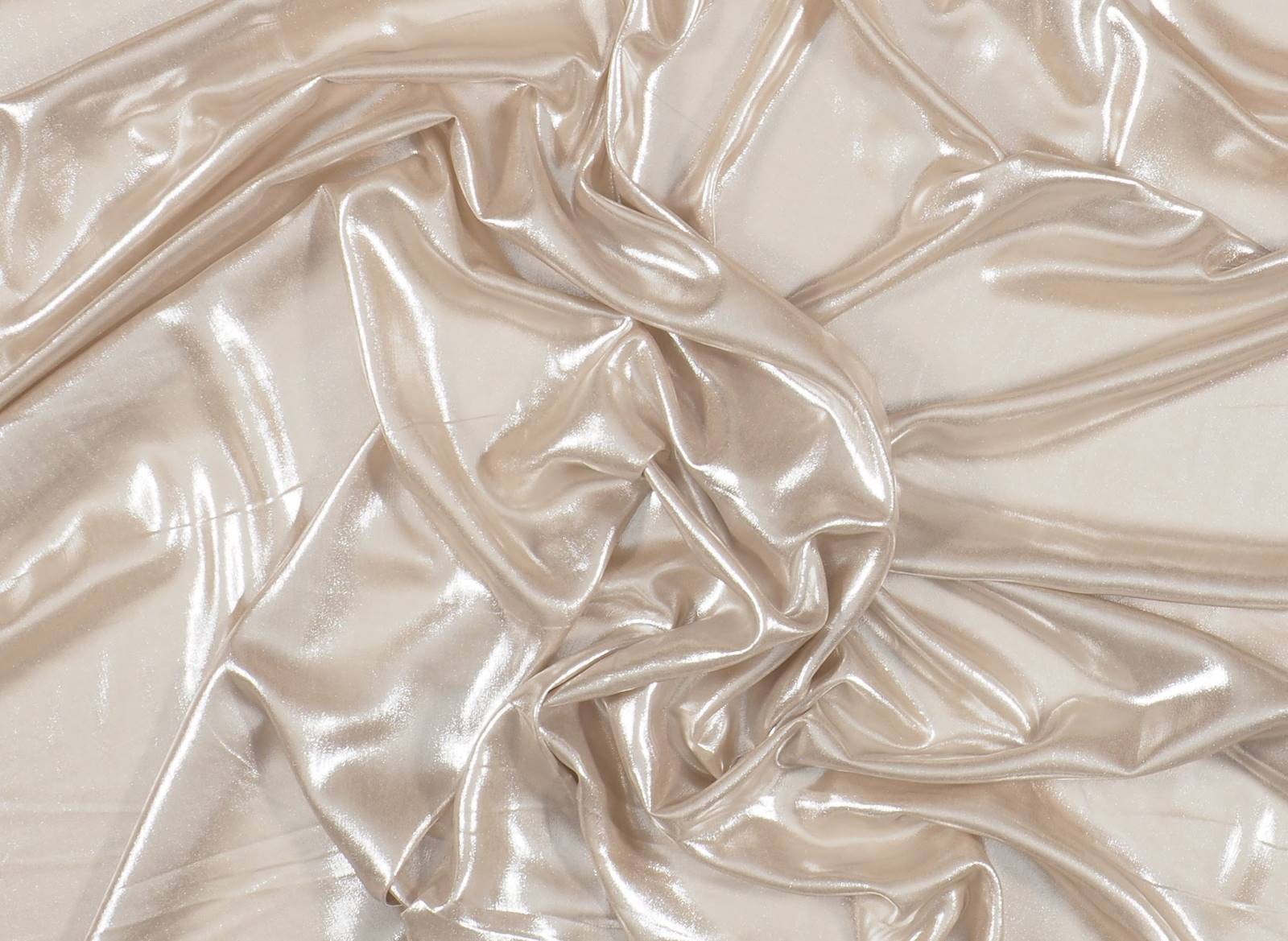
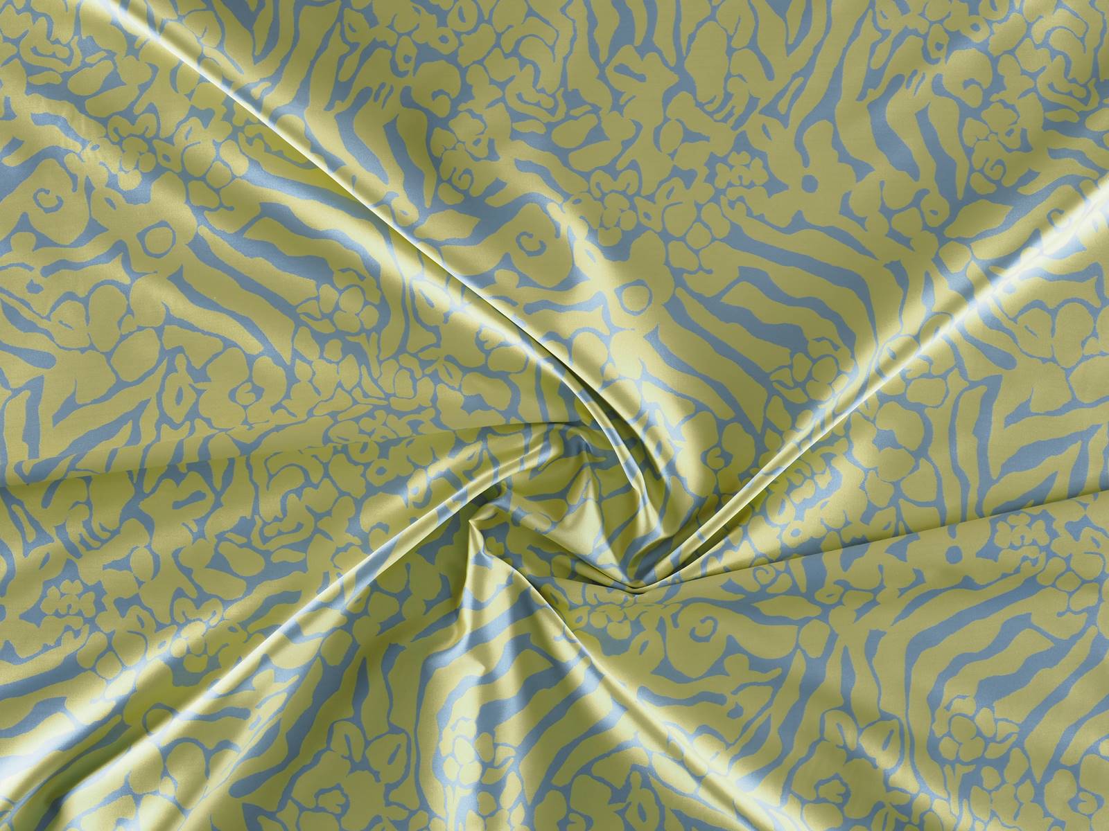
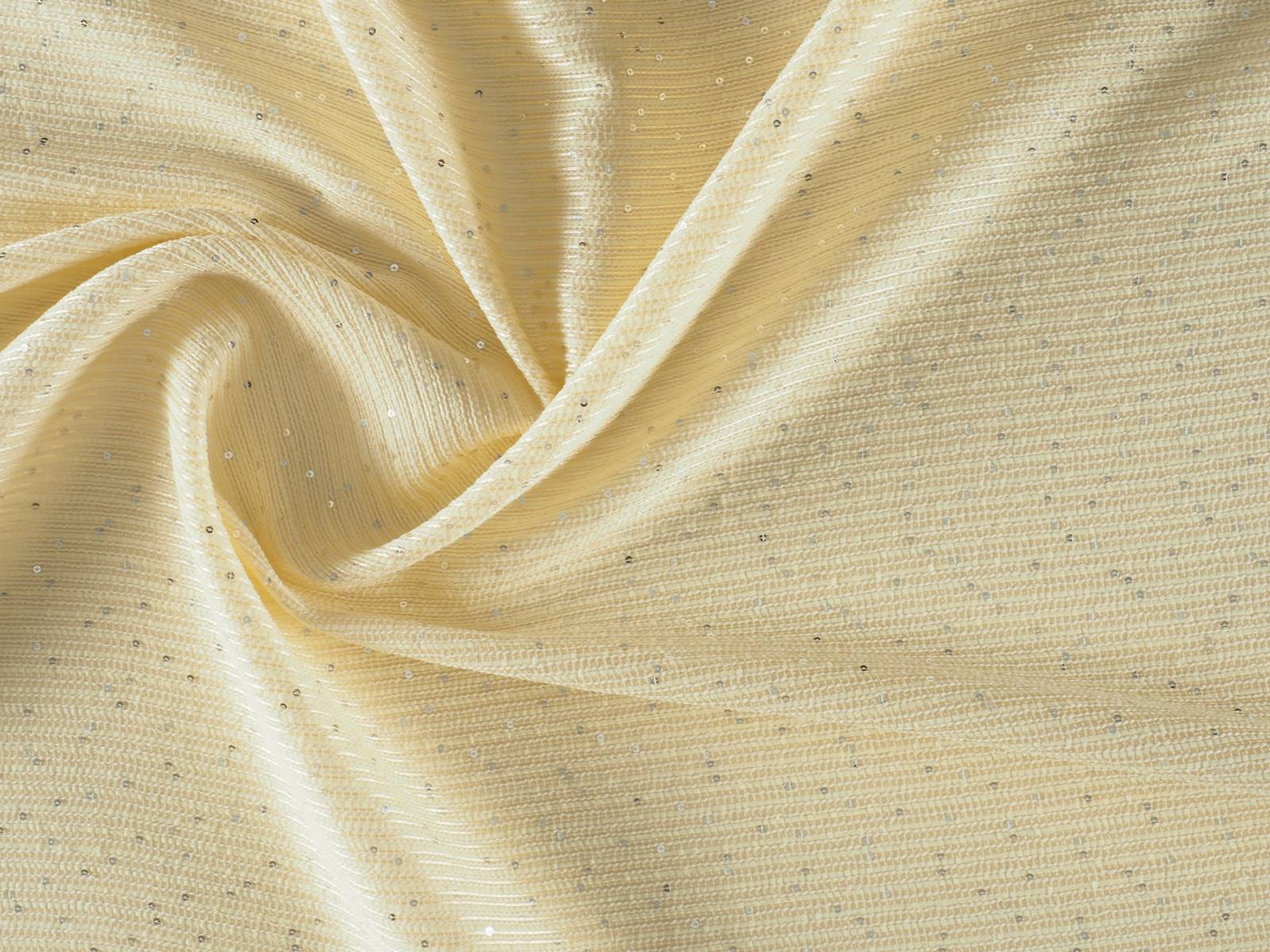
The objective of this collection is to revitalize the luxury of textures and materials. To achieve the new basics we use impeccable fabrics with clean and serene appearances. We also go for colourful Jacquards with tactile reliefs, fluid fabrics of silk or polyester of delicate appearance, gauzes with transparencies, dense satins, iridescent materials that captive the light or floral prints of watercolors. At the same time, within the folk trend, we are bringing back granular textures, fibrous and light aspects that show the relief through the thread-work, the hand-made reliefs and the embroidery with motifs inspired by nature.
“We are revitalizing the luxury of textures and materials”
Colours
The range of colours evolves from the natural to the artificial. Thus pastel shades and soft,sweet shades give way to the most vivid colours in a smooth transition and in a key feminine way . The most vibrant tones are used for details. ‘Play’ is also a collection dedicated to light, that’s why it also opts for the iridescent, transparent and nacreous with a nod and a wink to things nautical.
Discover some inspirations in our new lookbook Spring – Summer 2019! click here.


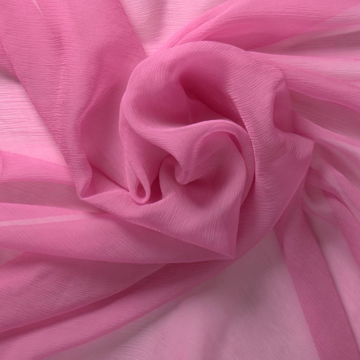
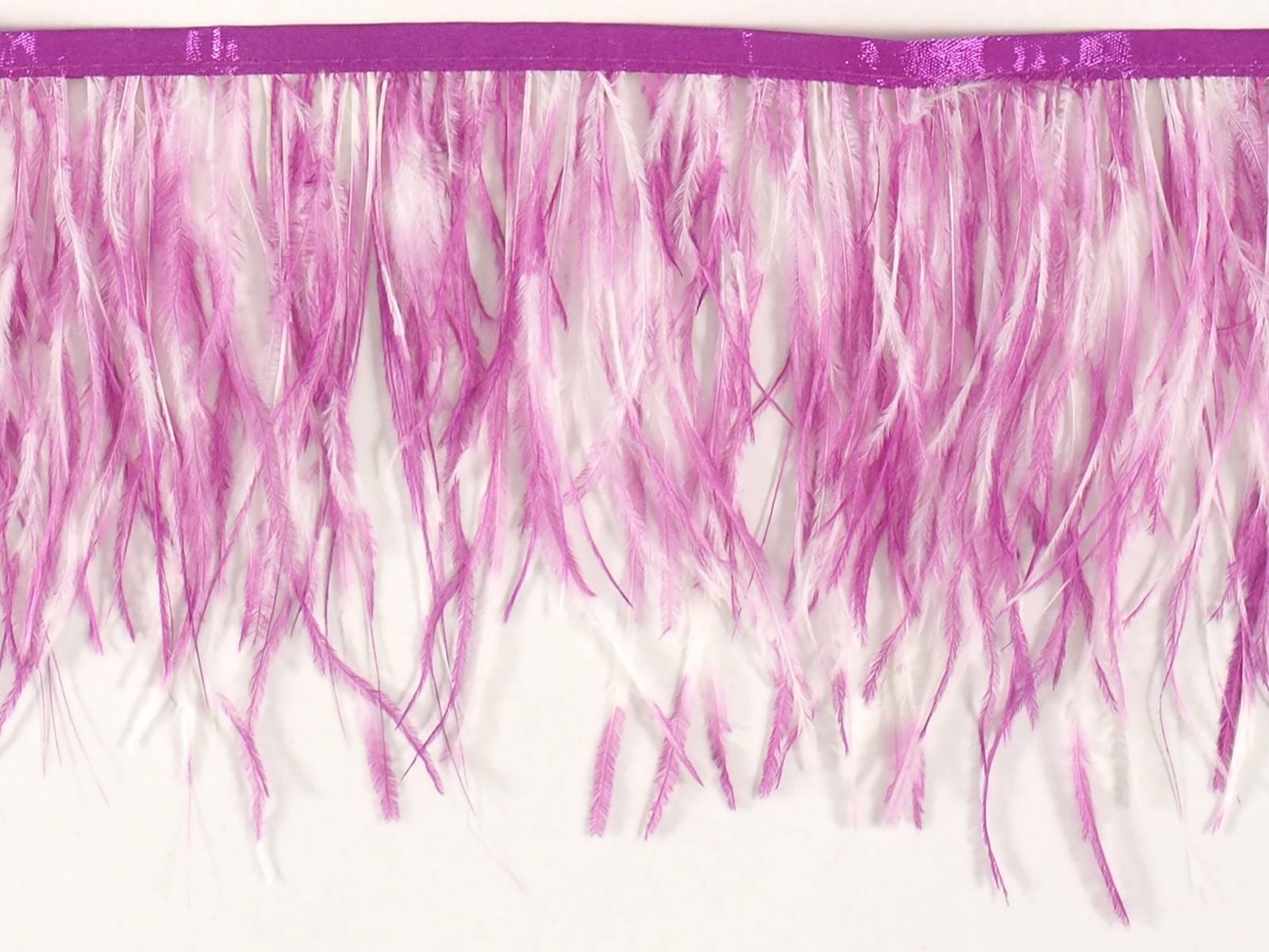
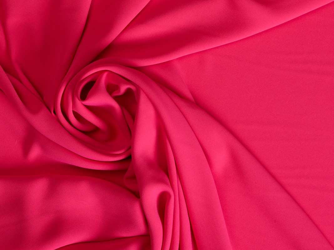
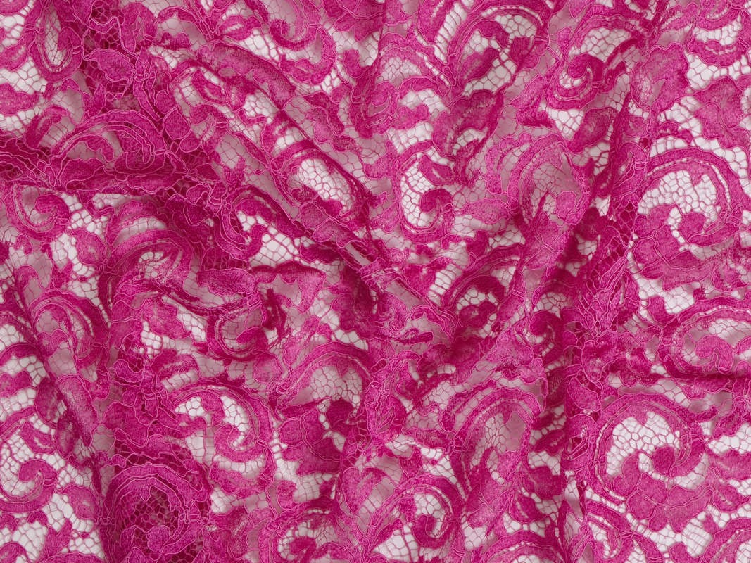
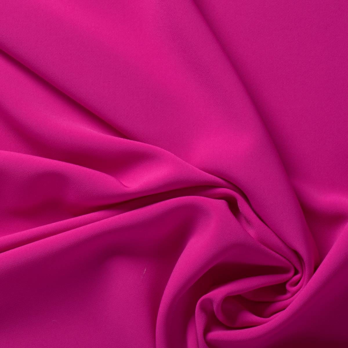
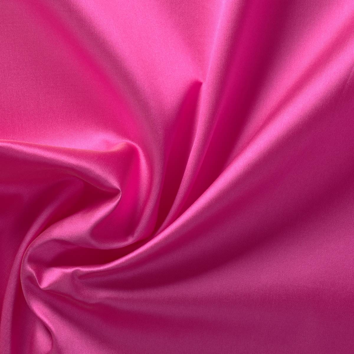
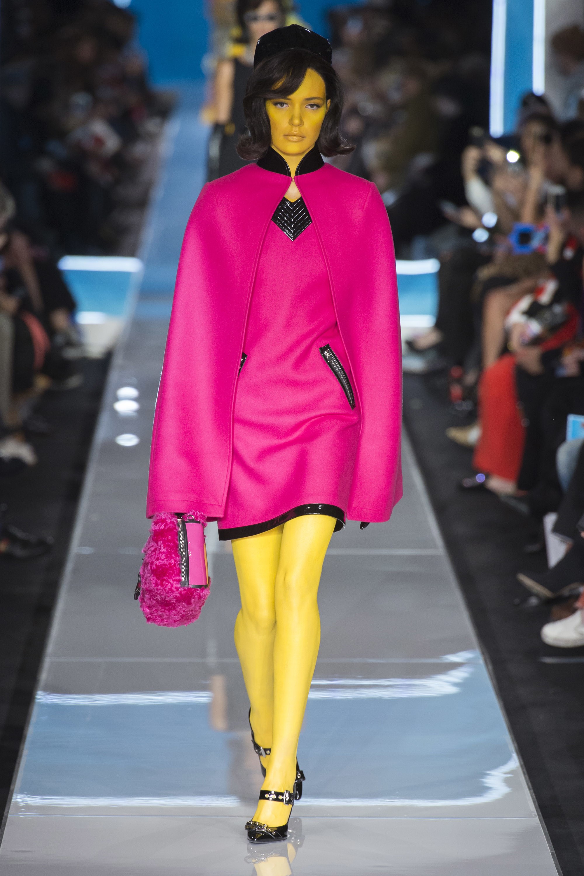
Pink is no longer just a colour traditionally attributed to femininity, charm or politeness. The shade that comes from the name of a flower has been stripped of its delicate attributes to present brand new symbolisms that evoke courage, strength or bravery. Pink Power has arrived in the fashion industry. We are not talking about just any pink. This shade of pink refers to a shocking pink, the strong and bright pink that has something of violet and that the colour experts call “magenta “.

Did you know…
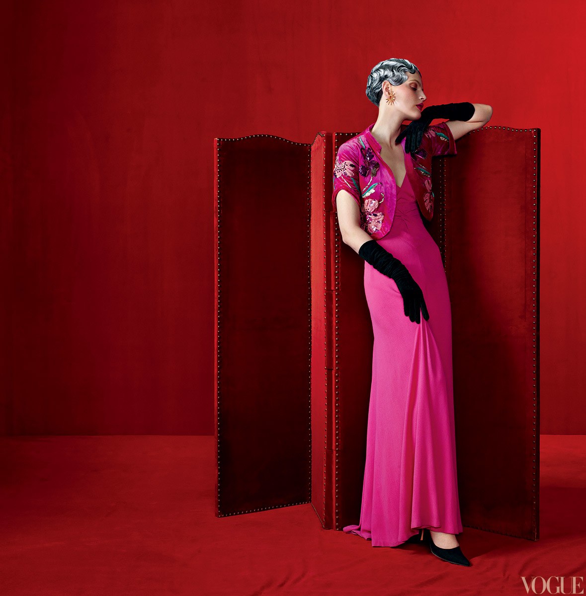
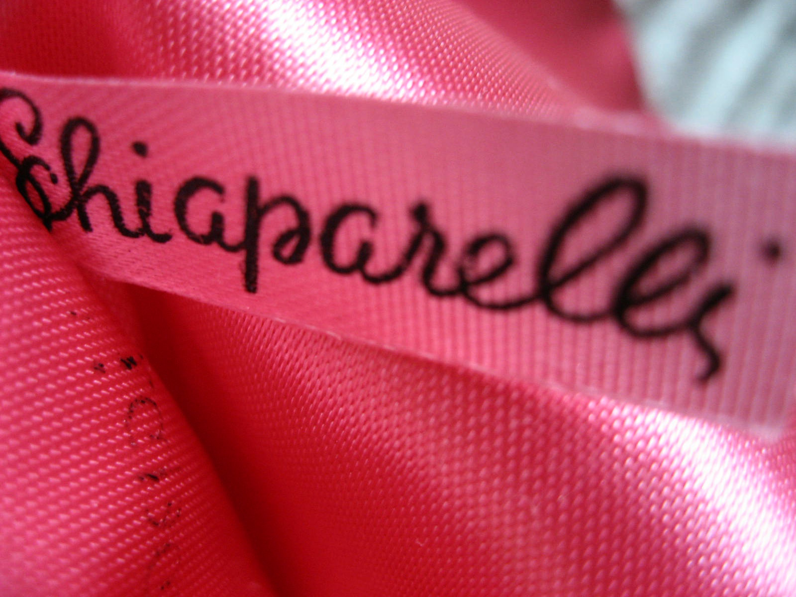
Italian fashion designer Elsa Schiaparelli , who brought the ideas of surrealist painters to fashion, launched a new colour in 1931: shocking pink , a mixture of magenta and a hint of white (similar to fuchsia),a colour that the designer used in fashion to provoke and challenge the established norms. In parallel he also created a perfume with the same name and it was sold in a box of that colour, inside which was a bottle with the shape of a female bust. This launch literally left the audience in shock because nobody had believed that pink could be so aggressive. This pink does not have any of the traditional feminine qualities.

The pink revolution
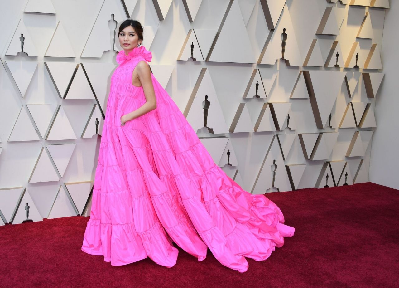
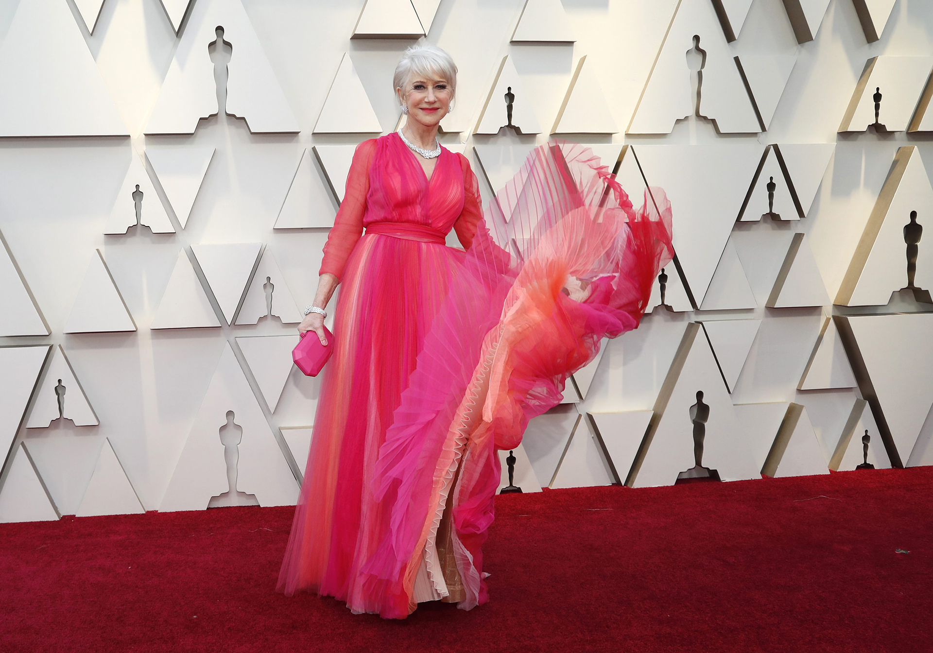
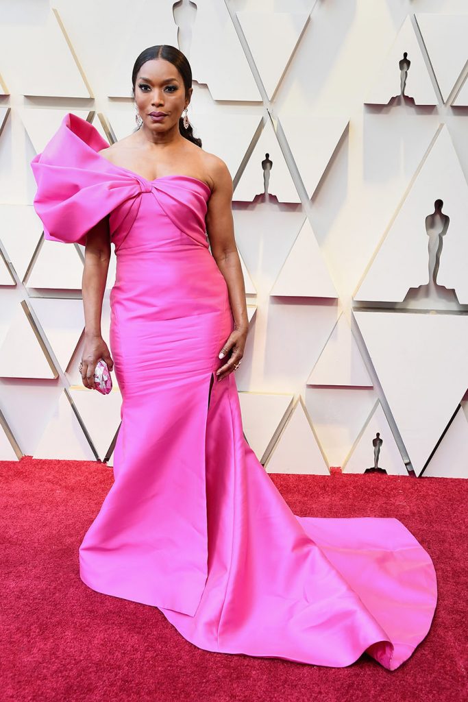
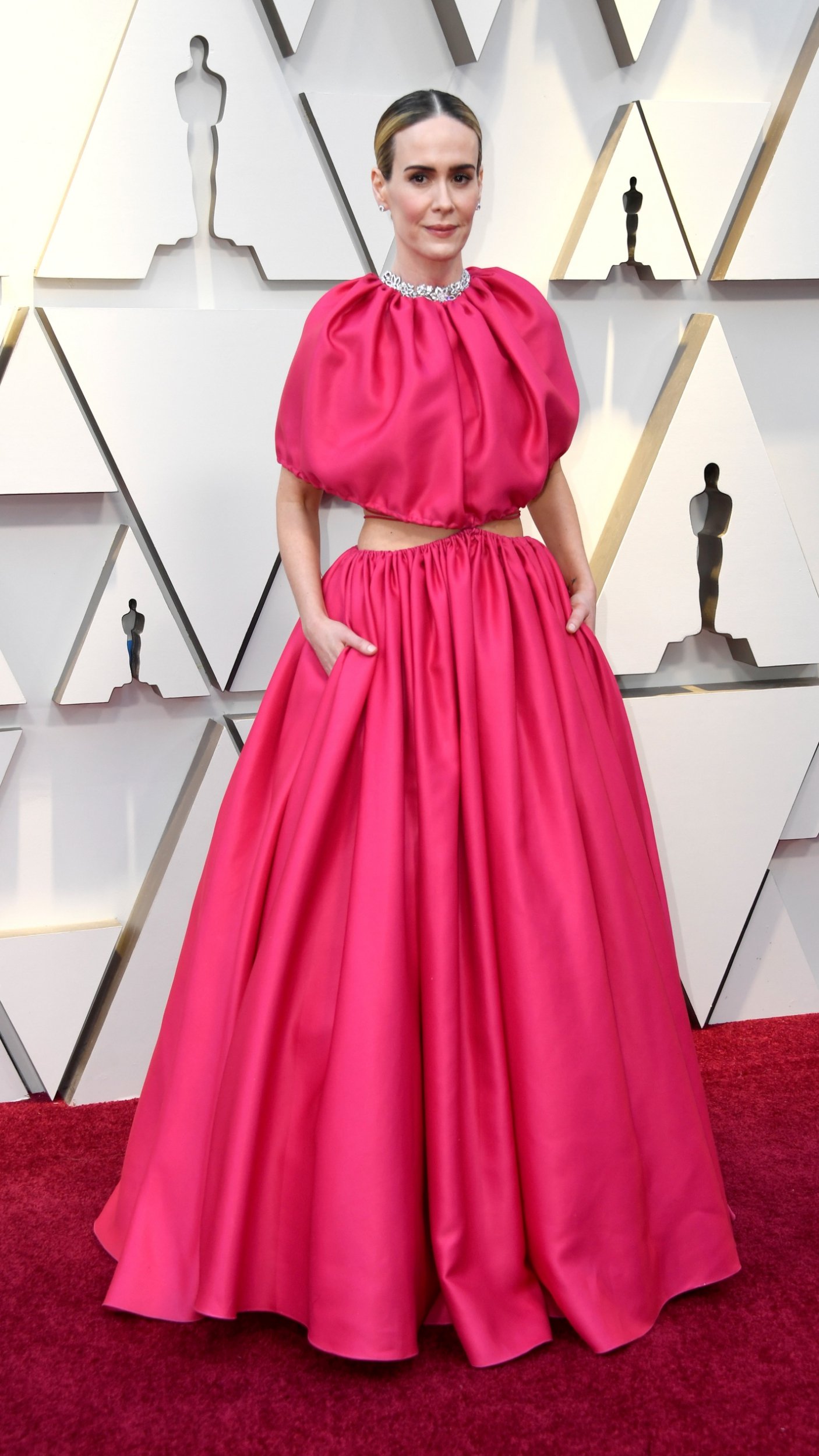
Pink is and still is in vogue. Apart from the shade linked to a generation, millennial pink, the fashion industry has taken advantage of the pull of popularity of this controversial colour to increase the presence of the shade in clothes, complements and accessories with its brightness and a certain rebelliousness. Pink shows charisma. It was not for nothing that it was one of the favourite colours displayed on the red carpet of the 2019 Oscars. And it is well-known that on the most powerful and influential red carpet in the world there is nothing left to chance.
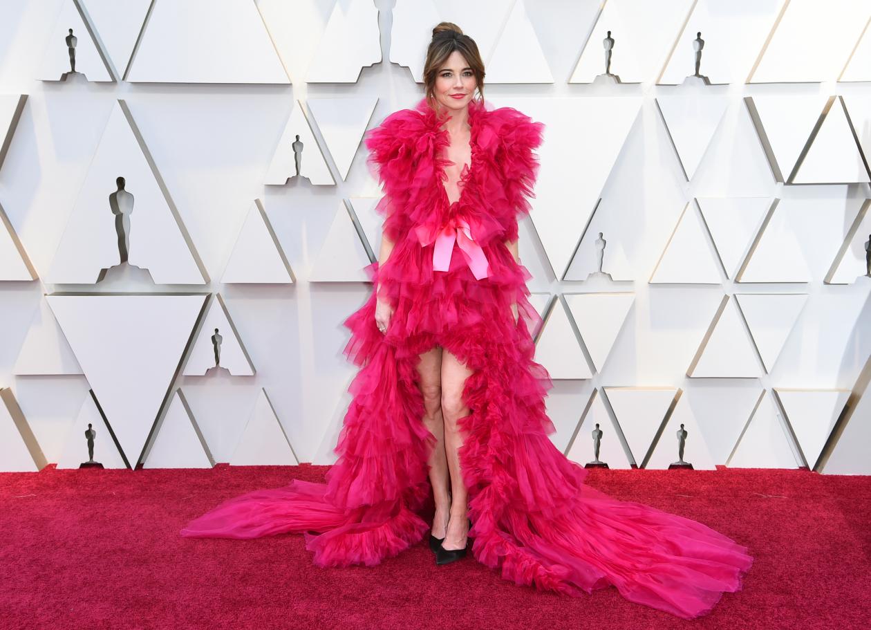
The actress Julia Roberts wore pink when she presented the award for best film ‘Green Book’ clad in a dress by Elie Saab, a design with asymmetrical cut, gathered at the waist and low with ruffles of different length that put the finishing touch to the gala. Also in vibrant pink was the much- commented styling of Linda Cardellini signed by Schiaparelli made in tulle with V-neckline, asymmetric length and a delicate tail that extended along the floor. Or the stunning design by Valentino with a raised neck worn by British actress and model Gemma Chan.
Pink was also the favourite color for Sarah Paulson, the actress of ‘American Horror Story ‘ who succumbed to its power with an expansive dress with a cut- out opening by Brandon Maxwell. For her part the British actress Helen Mirren wore a flowing dress by Schiaparelli, a creation with V-shaped neckline and ruching at the waist that played with different intensities of pink. Angela Basset, one of the actresses in the film ‘Black Panther ‘ also opted for the brightest and most metallic version of this colour in a ReemAcra model with asymmetric neckline.
There is no doubt that pink will give us much to talk about in 2019.


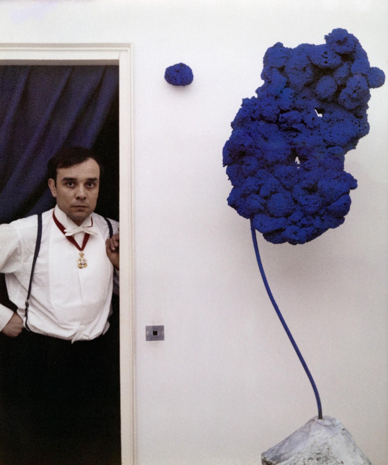
here are few artists whose works are linked to one single colour. An identifying tone, existential and full of meaning. The force of this tonality is so great that it acts as a true symbol to understand the creator himself, way beyond his artistic career.
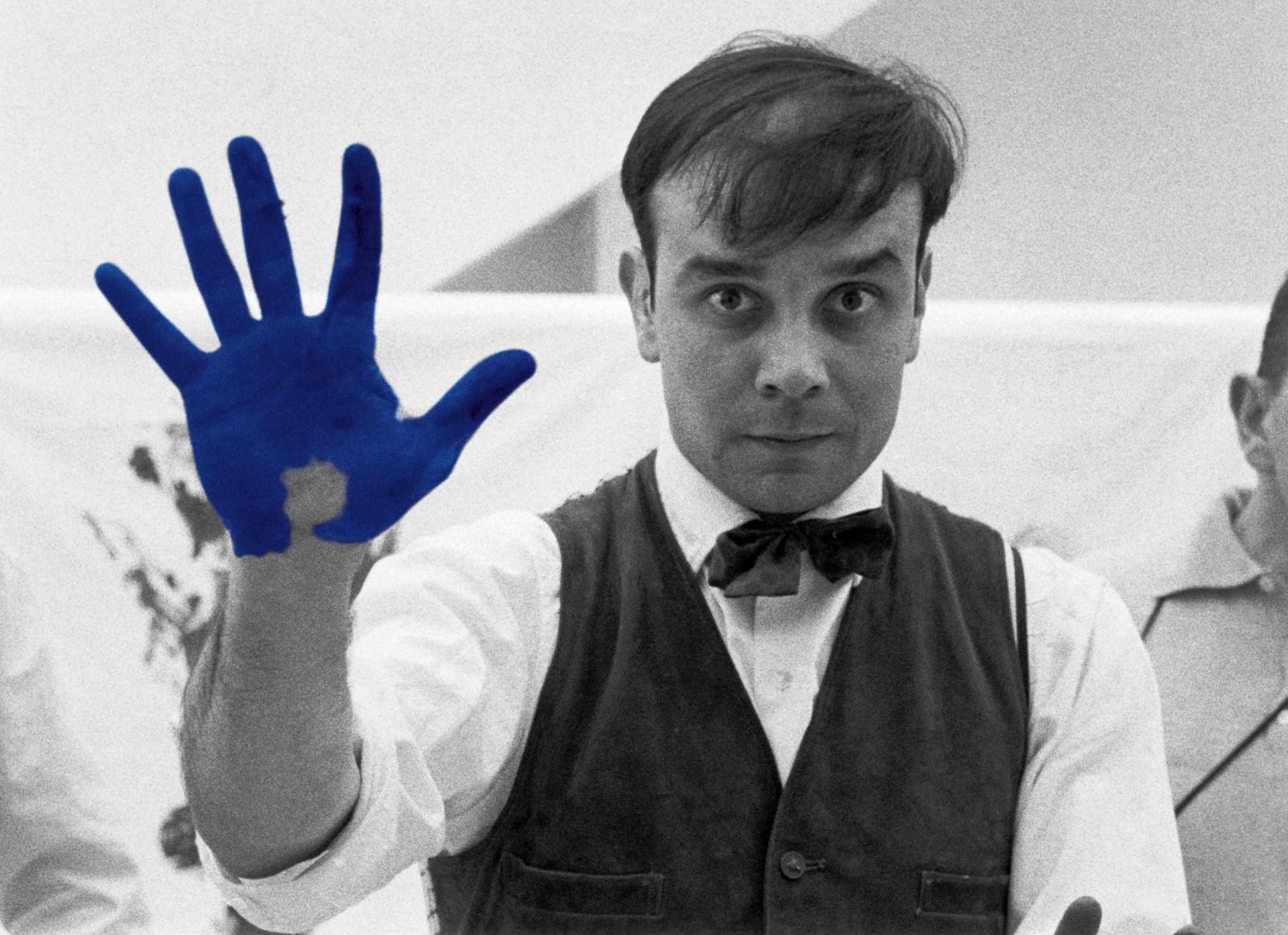
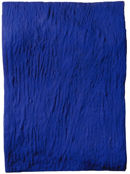
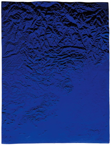
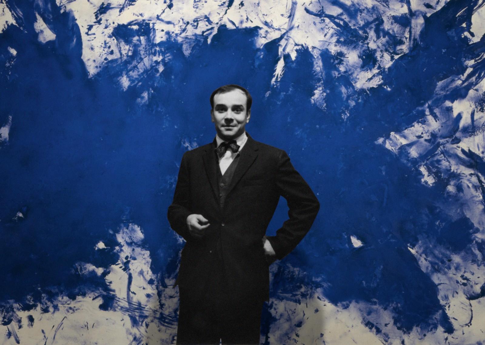
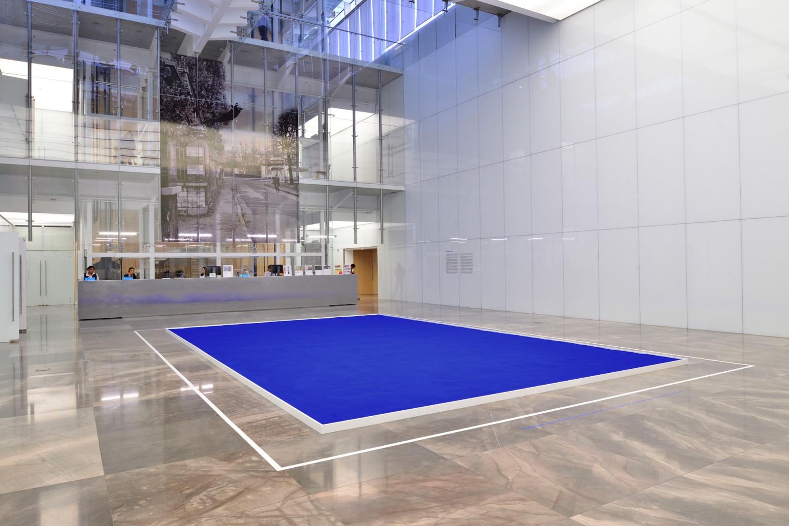
One of these names, that goes into the history of art for its totally identifiable chromatic fingerprint, was the experimental Yves Klein (Nice 1928-Paris 1962). This versatile artist and showman, was the inventor of a tone that had never existed before. As a ” father ” , he baptized and registered it in 1960 under his own name: International Blue Klein (IBK) . A deep tonality of blue that maintained the visual impact of its prized ultramarine blue, as well as the thicknesses and textures that Klein used to apply on his canvases.

How did this devotion for blue occur?
In several biographies of Yves Klein, it is explained anecdotally that one summer day in 1947, the French artist was with two friends sitting on a beach in Nice in southern France. To kill time, they decided to play a game and spread the world among them. One chose the animal kingdom, another the kingdom of plants and the young Klein examined the infinite blue of the sky and chose the mineral kingdom. That contemplation changed the destiny of his life and when he addressed his friends he announced: “The blue sky is my first work of art.”

Enchanted by the cosmos and esotericism, the blue symbolized the spiritual, the mystical and the religious, and little by little, this deep tone was gaining ground with other colours present in his work such as gold or rose. It was in 1954 when he began his eclectic paintings of monochrome fields, which at the beginning were of different shades but which he eventually reduced to ultramarine blue. Klein erected around the blue colour an artistic theory that was articulated around two principles: absolute colour and emptiness, that he limited by creating what he called the “zones of immaterial pictorial sensibility.
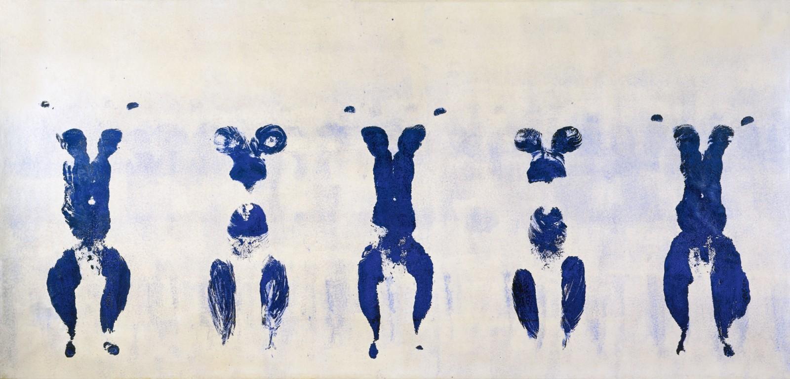
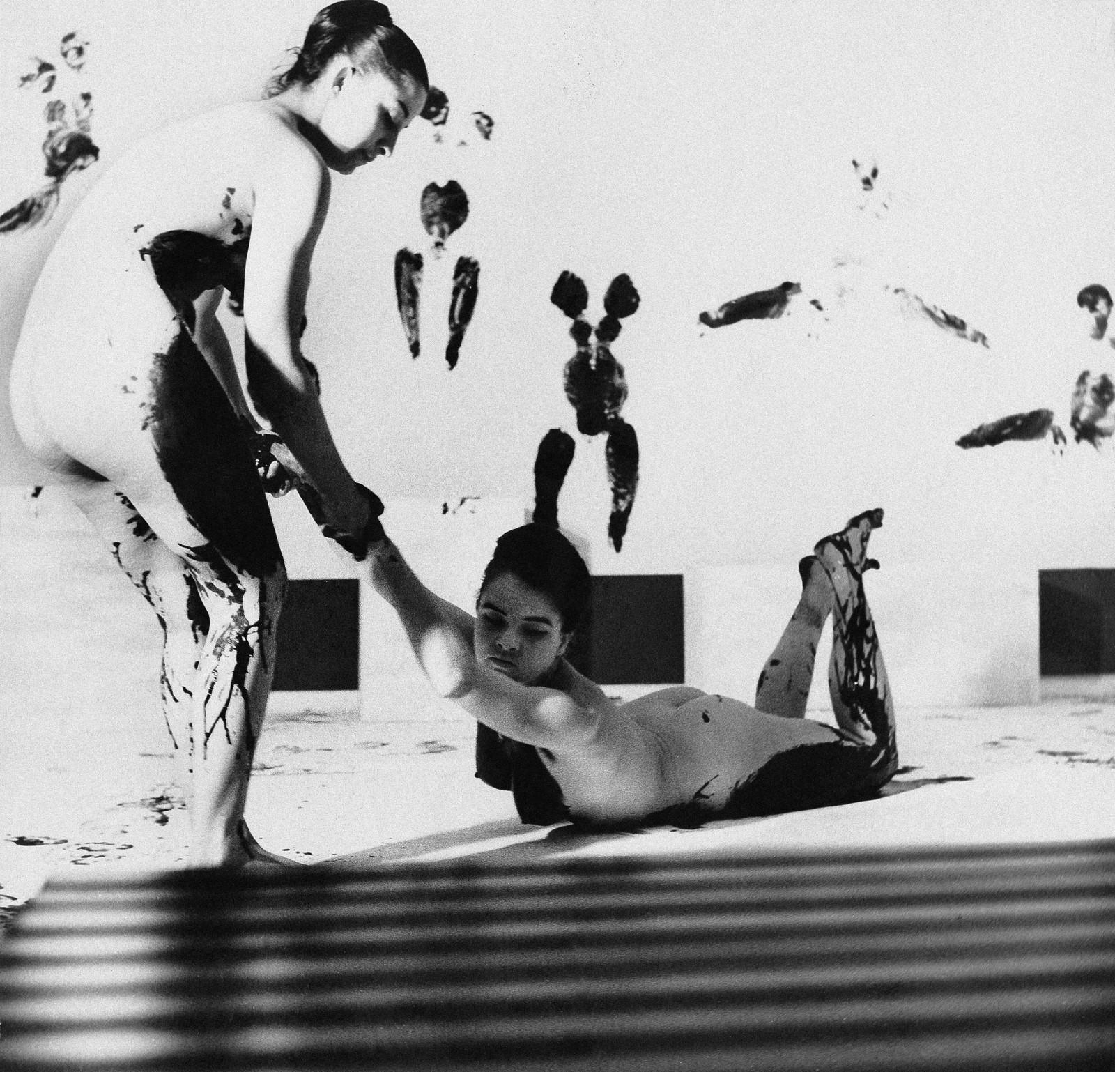
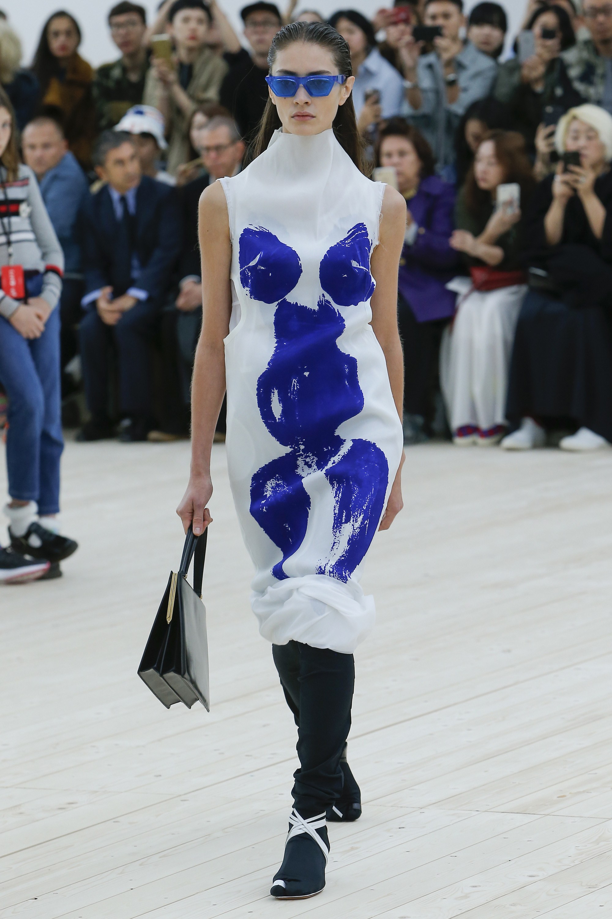
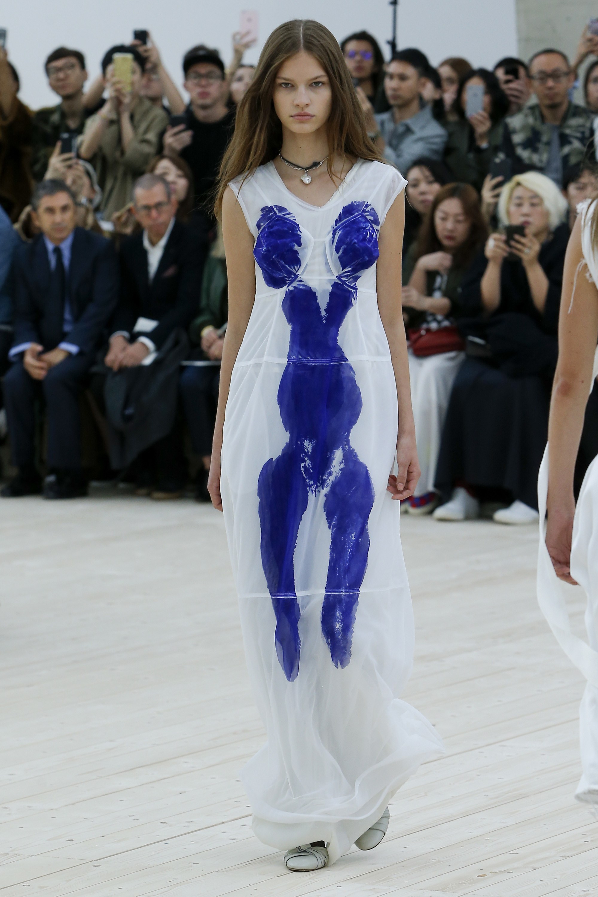
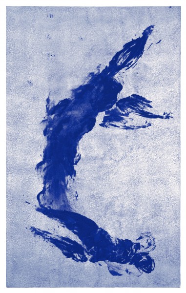
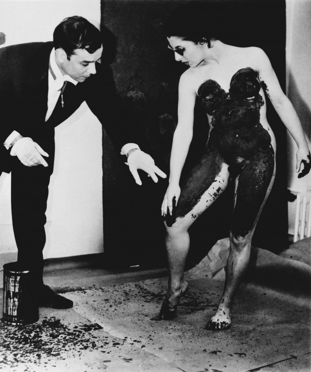
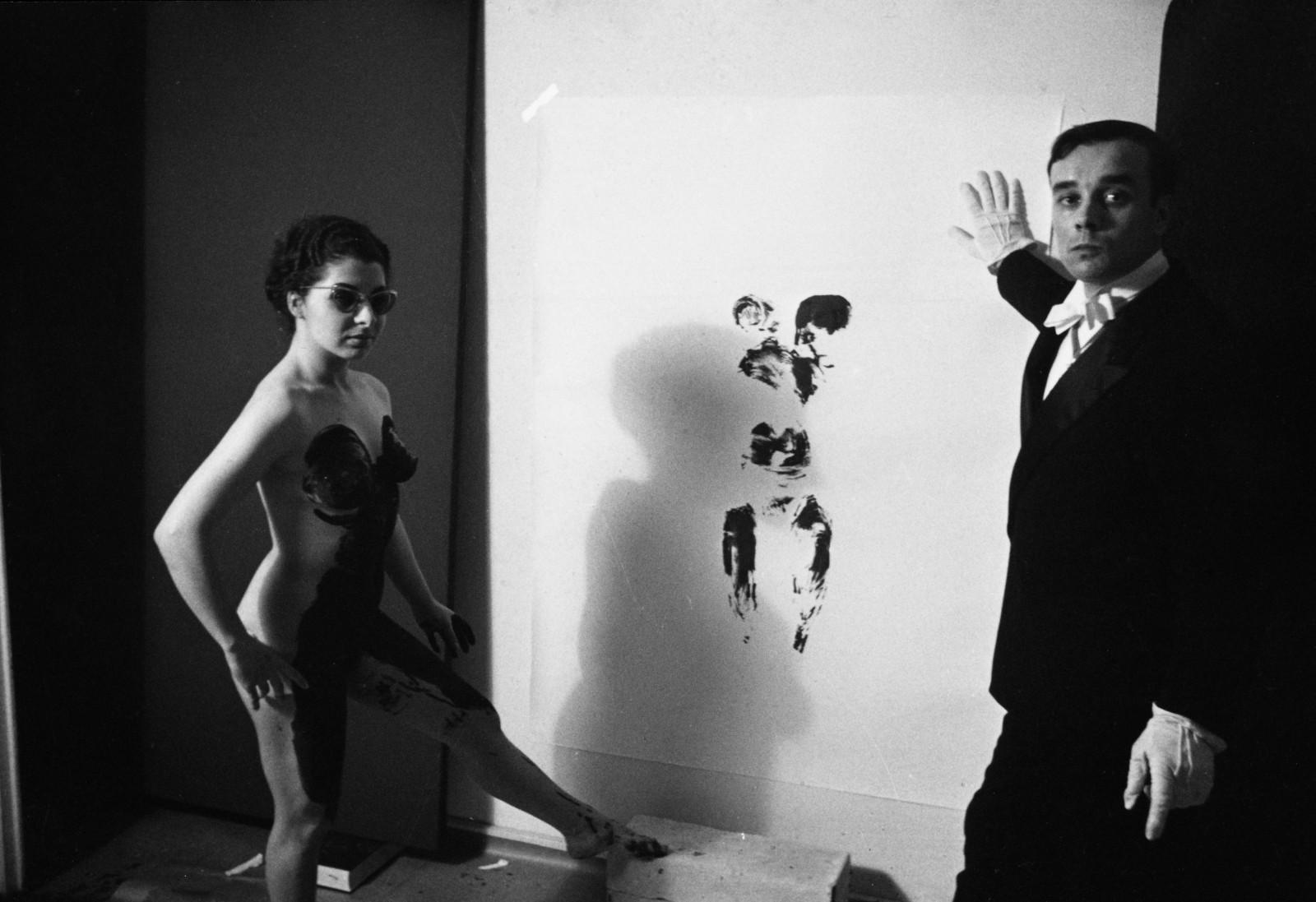
Beyond the blue period and fire paintings, Yves Klein’s artistic career is also known for his Anthropometries, where he explored his most provocative and experimental side with paintings made by nude women that were daubed in IKB blue and turned into a continuation of the artist’s brush when they left the imprint of their bodies on stretched canvases on the wall or floor. Occasionally, he organized authentic happenings with live audiences and musicians who entertained the experimental painting sessions. What today we would call performances.
Yves Klein had a very short but intense artistic career that was especially concentrated during the last eight years of his life. He died in 1962 of a heart attack at only 34 years of age. Despite his youth, Klein defined the course of Western art and its colour, the intense International Blue Klein (IBK) has become immortal, an icon of the legacy of what is considered “the last French artist of great international impact”.
Recognition on the catwalks
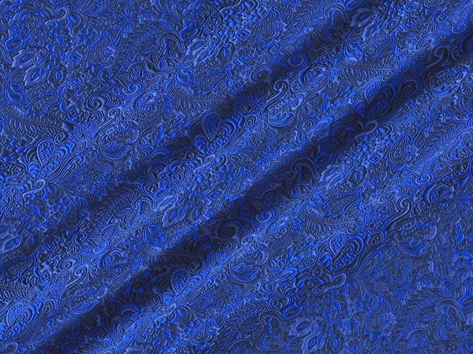
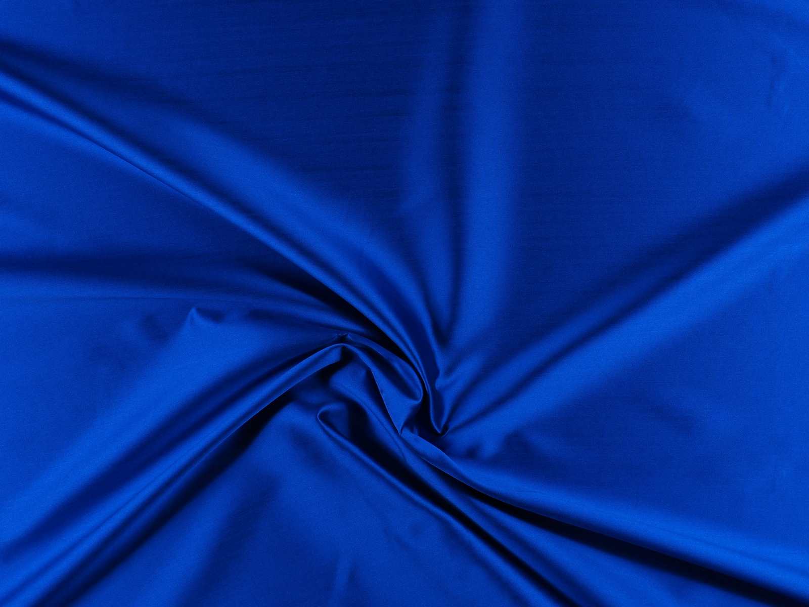
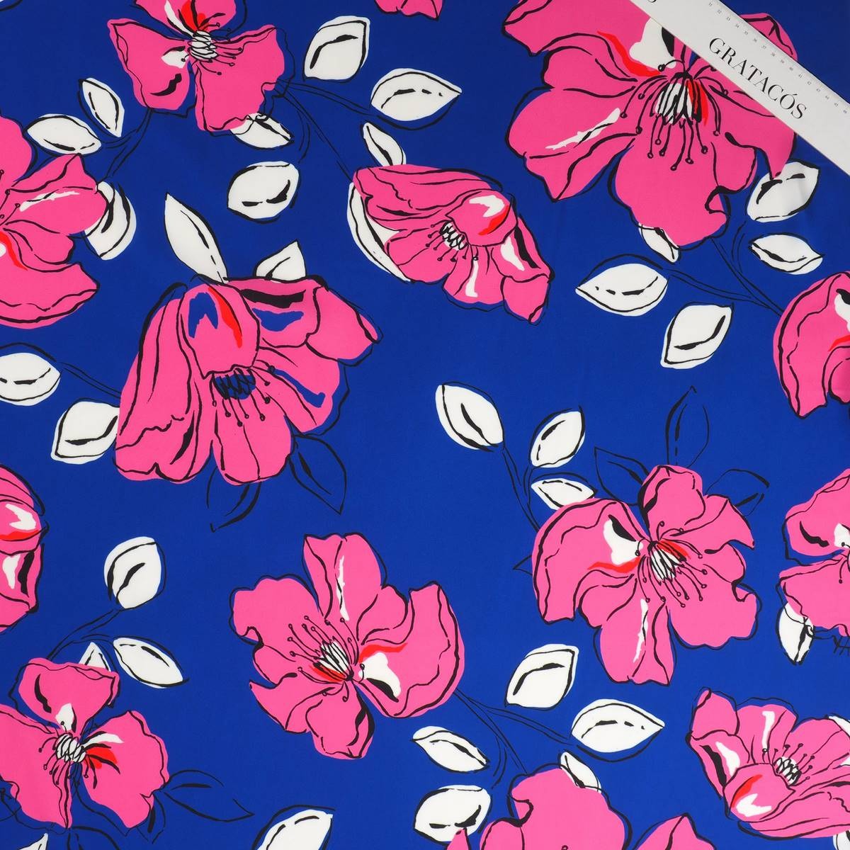
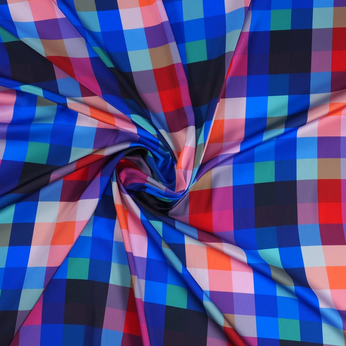
Two years ago, Yves Klein’s Anthropometries were present on the catwalk in Paris with Céline. The creative director at the time, Phoebe Philo wanted to capture in two dresses of the Spring-Summer 2017 collection, the blank canvases with the silhouettes of the bodies of the women that were smeared with Klein blue paint. A recognition of this imaginative creator of contemporary art. From Gratacós, we are fascinated by the vibrant blue of the master Klein and we pay homage through some fabrics of the current collection that capture the intensity of this totally evocative blue.


Sorry, this entry is only available in European Spanish.
Jueves 13 septiembre 2018
Sorry, this entry is only available in European Spanish.
Jueves 06 septiembre 2018

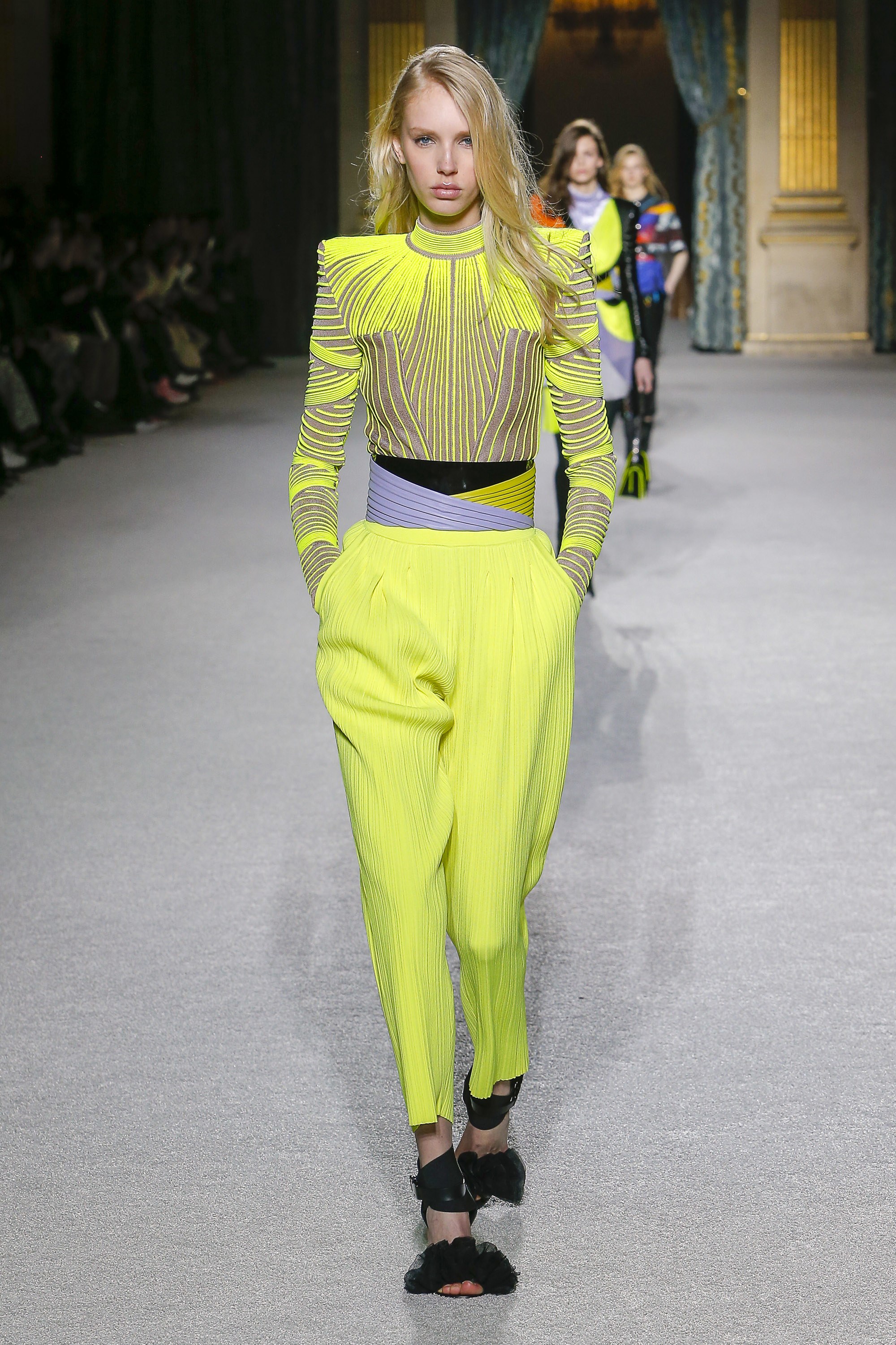
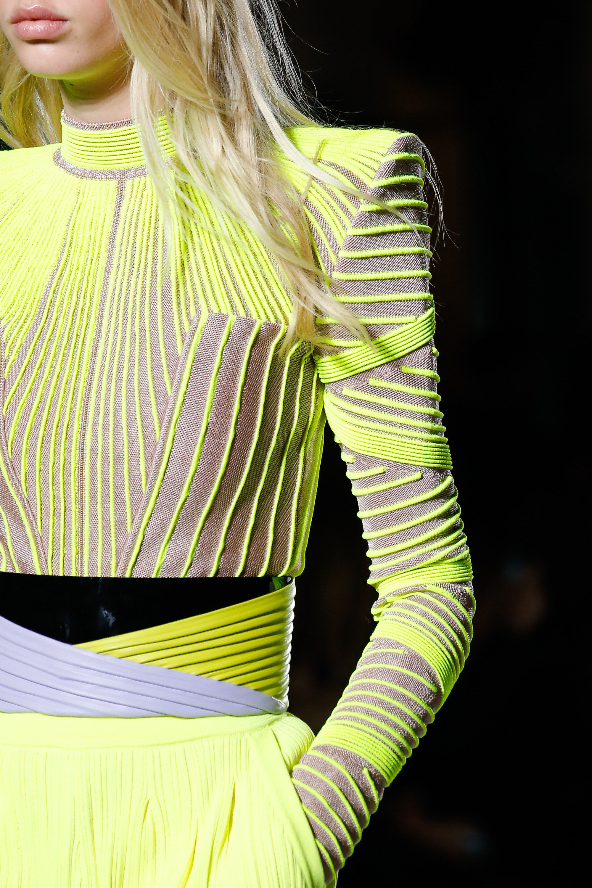
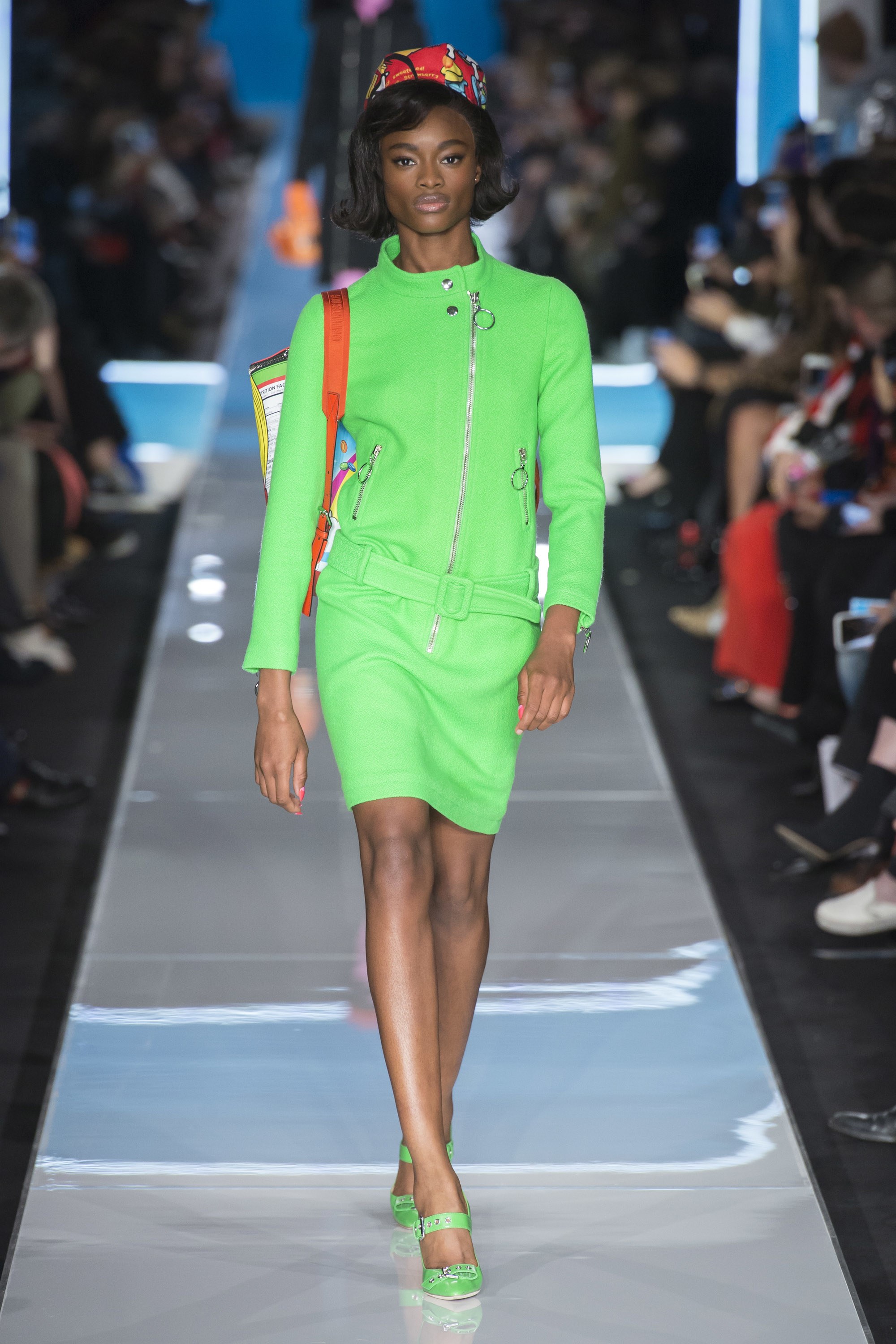
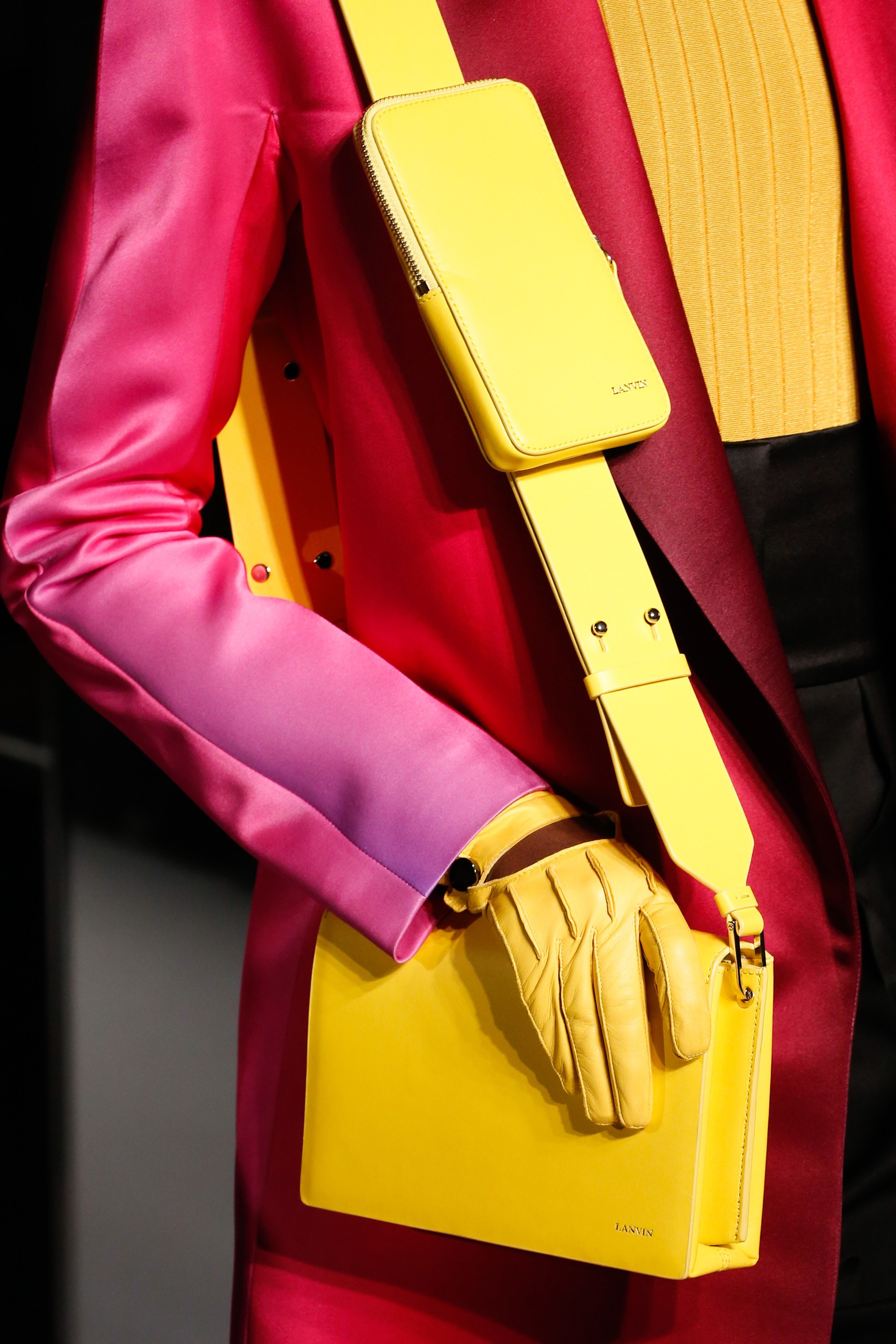
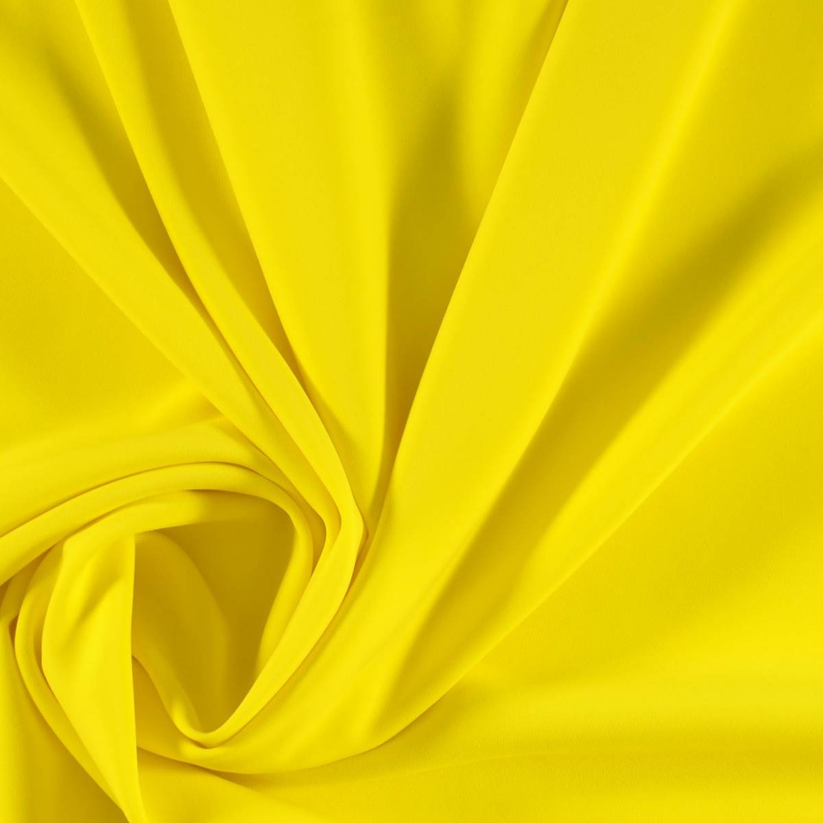
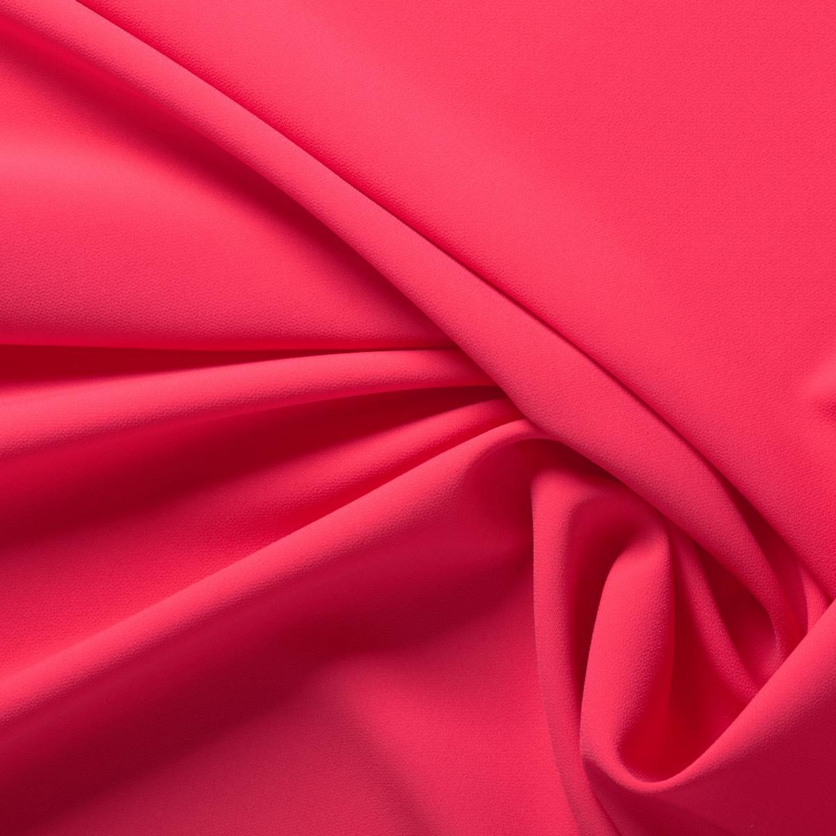
2018 has been filled to the brim with pastel shades: the millennial pink still resists, the soft lavender tone of last winter, the calming baby blue, mint green… After this feast of sweet colours, fashion marks just the opposite with shades willing to revolutionize customer’s retinas: fluorescents. Therefore, with the summer still marking the calendar, we welcome the autumn with this daring chromatic trend that has been rescued from the 80’s to bring a little light to our traditional winter wardrobe.
 |
 |
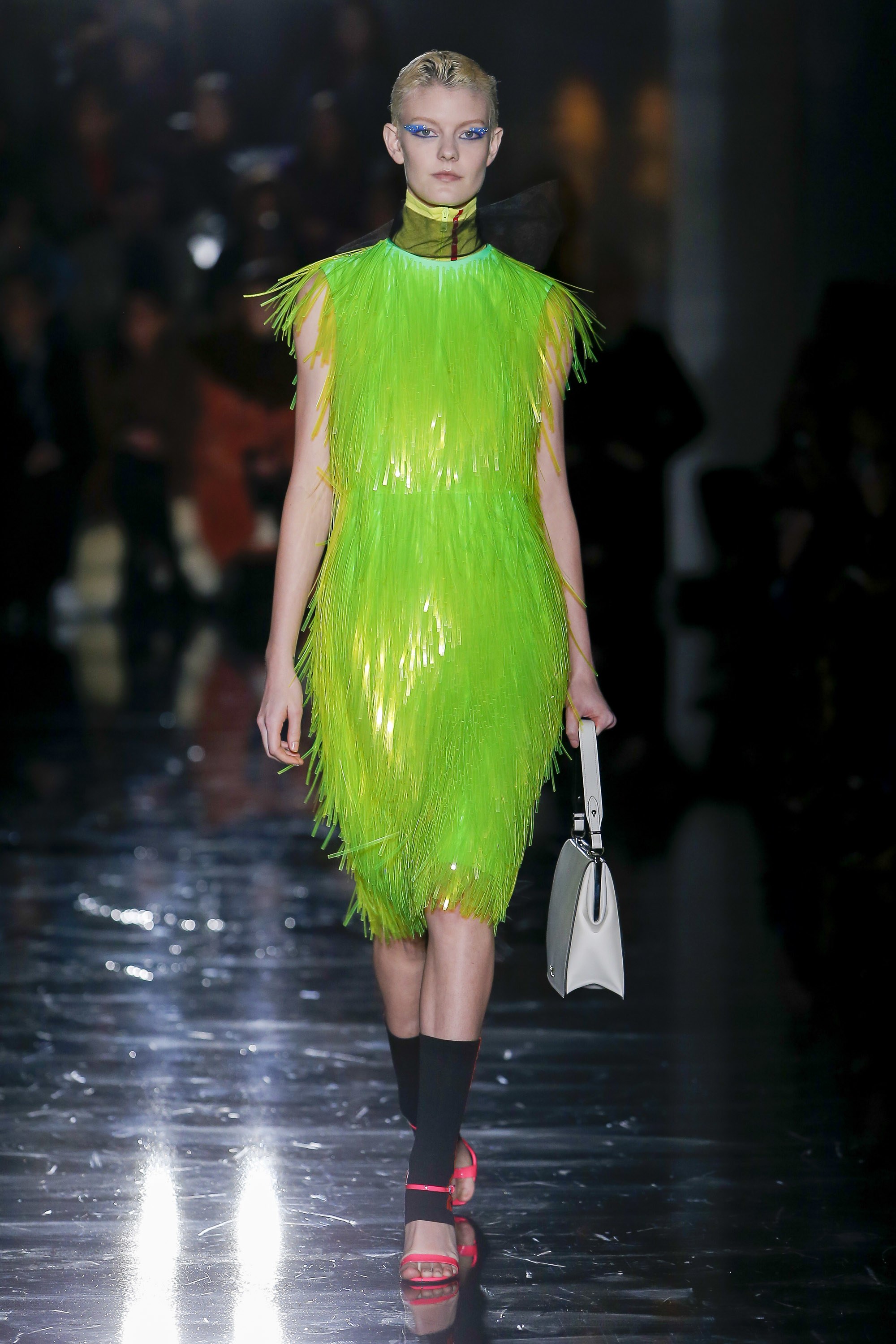
The return of neon colours is not something new. In fact, almost a decade ago they were back in apparel sporty style inspired by the outfits worn by rappers and hip hop artists, who sported it in accessories such as shoes, sunglasses and other details on clothing as sidebars that shone in the darkness. Now, some designers rescue this fever for fluorescent colors and they do so with new approaches and conceptual arguments. The two most obvious or representative have been Calvin Klein and Prada, although neon shades have also seen on the Moschino, Marni or Balenciaga catwalks.
The creative director of Calvin Klein 205W39NYC, Raf Simons celebrates his first year in the job by exploring the universe of American culture. In this case, fluorescent shades are used to highlight the concepts of “safety” and “protection” with garments that refer to reflective safety jackets, overalls and balaclavas and where these tones are used for fashion purposes.
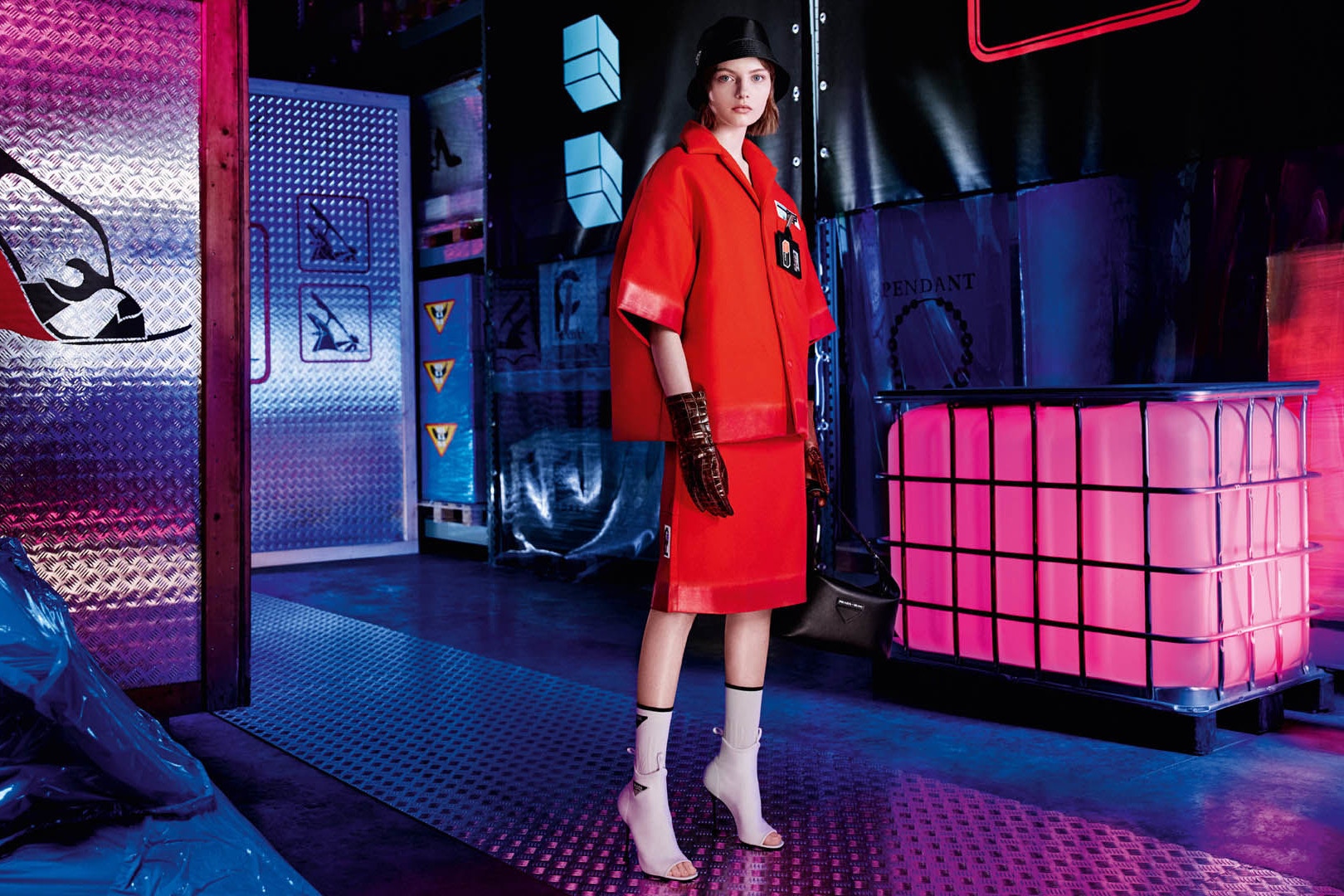
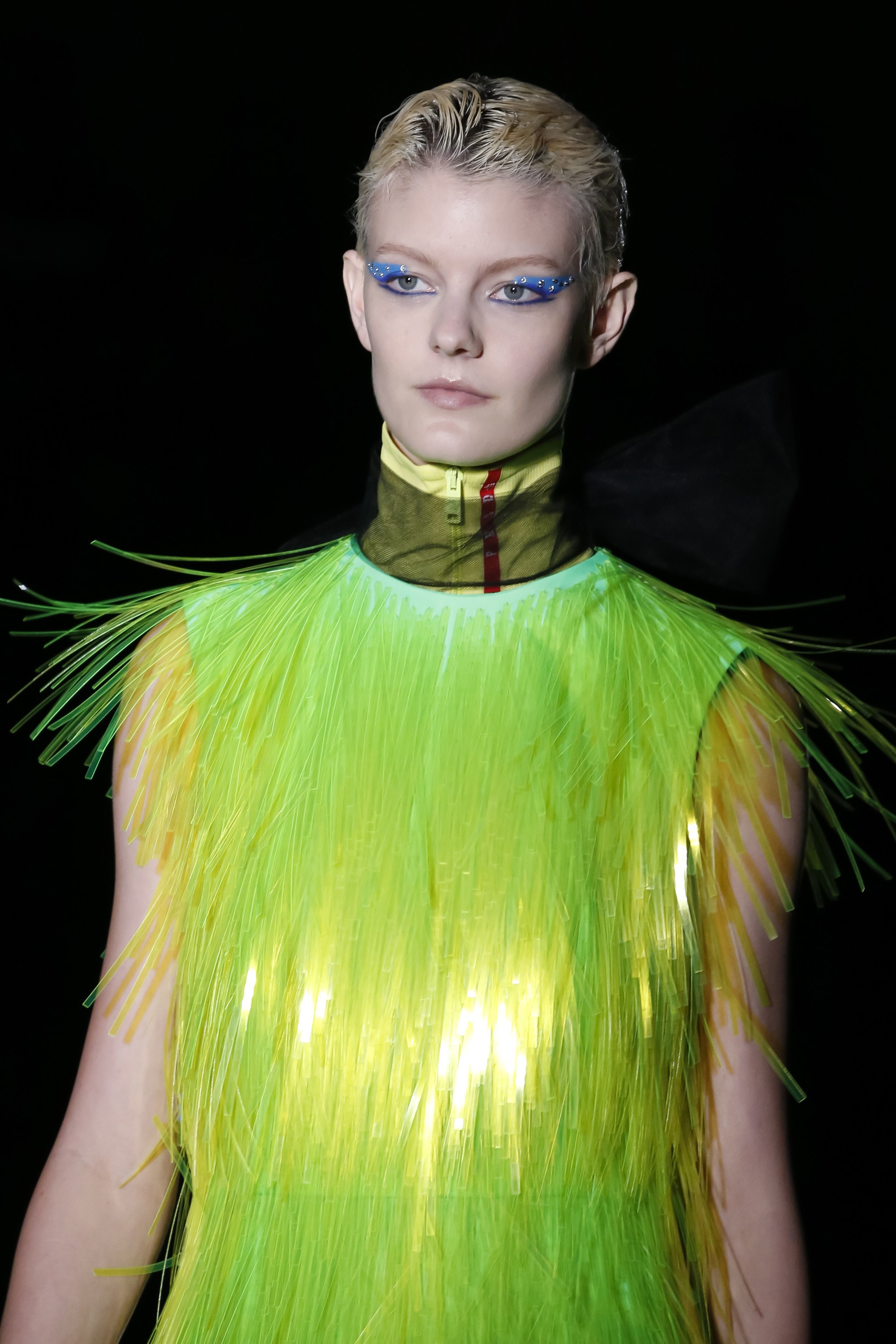
This season, Prada does a review of sporty style in futuristic key with oversized garments Inspired by outdoor sports. Waistcoats, windproof jackets, trench coats, wellies, fisherman hats in fluorescent colors, luminescent fringes that adorn dresses and superimposed fabrics that create an attractive iridescent effect on the catwalk.
 |
 |
And how do the fluor tones combine? They are colours that transmit dynamism and transgression and are associated with youth and fun. This power of visual attraction they exert is, in turn, their greatest defect because in the same way they entice, they repel instantly. It is easy to get fed up with them! The most risky option is to wear them with athleisure- style garments, in parkas, raincoats and windbreakers or in jackets that cut the formality of a closed dress or a midi skirt with a shirt. The most discreet way is to relegate them to small accessories or details such as side stripes or zips. The colours that best accompany them are white and black along with the range of neutrals.
In Gratacós we welcome neon tones with some daring fabrics that do not go unnoticed in the store. Do you want to come and see them and touch them for yourselves?


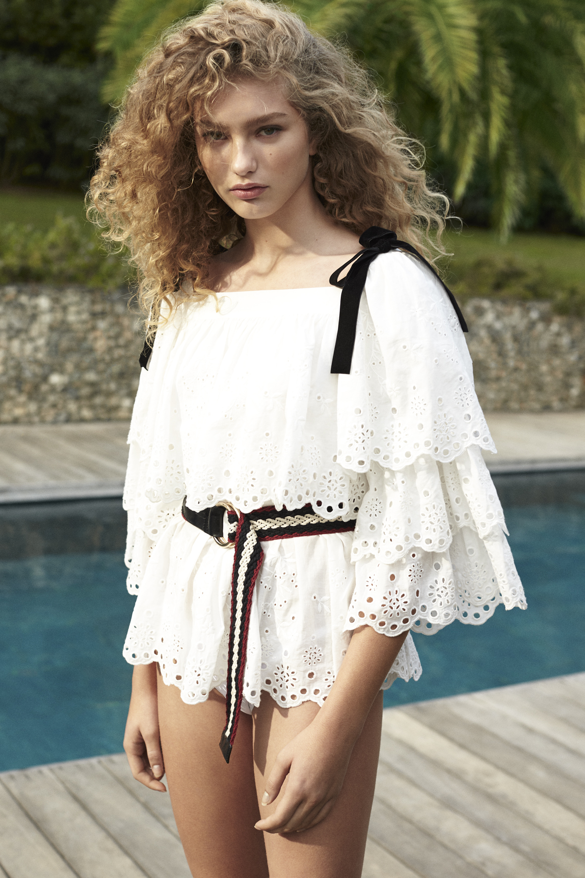
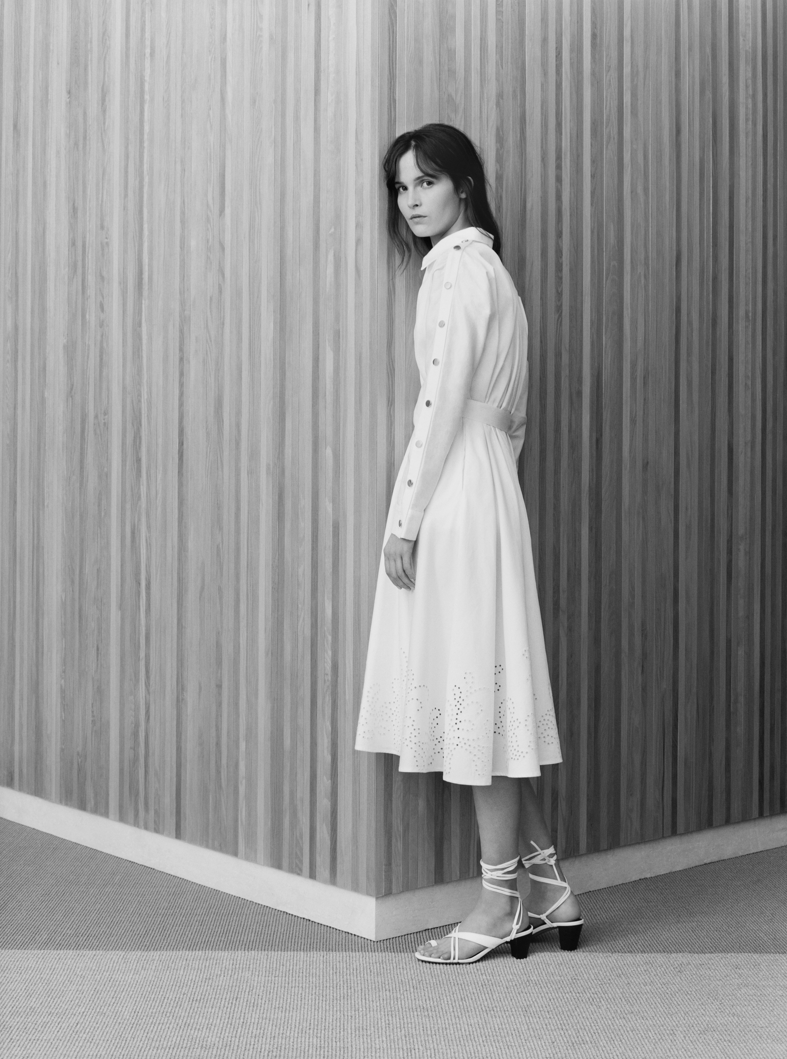
Although we have an eye on the 2020 collections – we are working on those fabrics likely to be in fashion in the next couple of years – we want to send off the current collection by focusing our attention on the freshest and lightest fabrics that to a lesser or greater extent always have a certain presence in what is on offer for summer. We’re talking about perforated fabrics that can be presented in various ways as sensual cotton embroidery, with a die-cut effect, in the form of net or laser-cut, which allows just a glimpse of skin. Hinting, but not revealing.
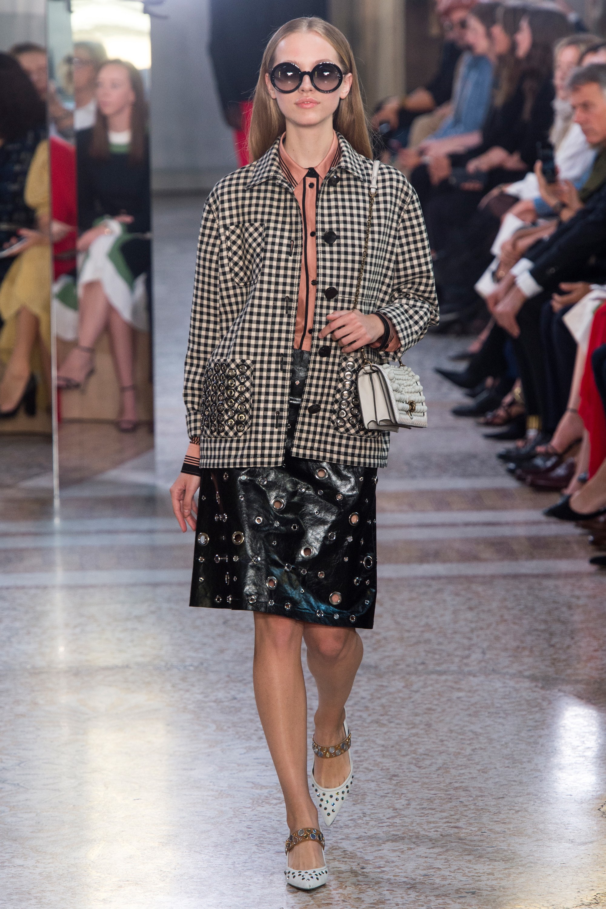
From our analysis of the catwalks we give some examples of these fabrics and notice a chromatic tendency that is practically timeless because it is no longer subject to any season: the black-white binomial.
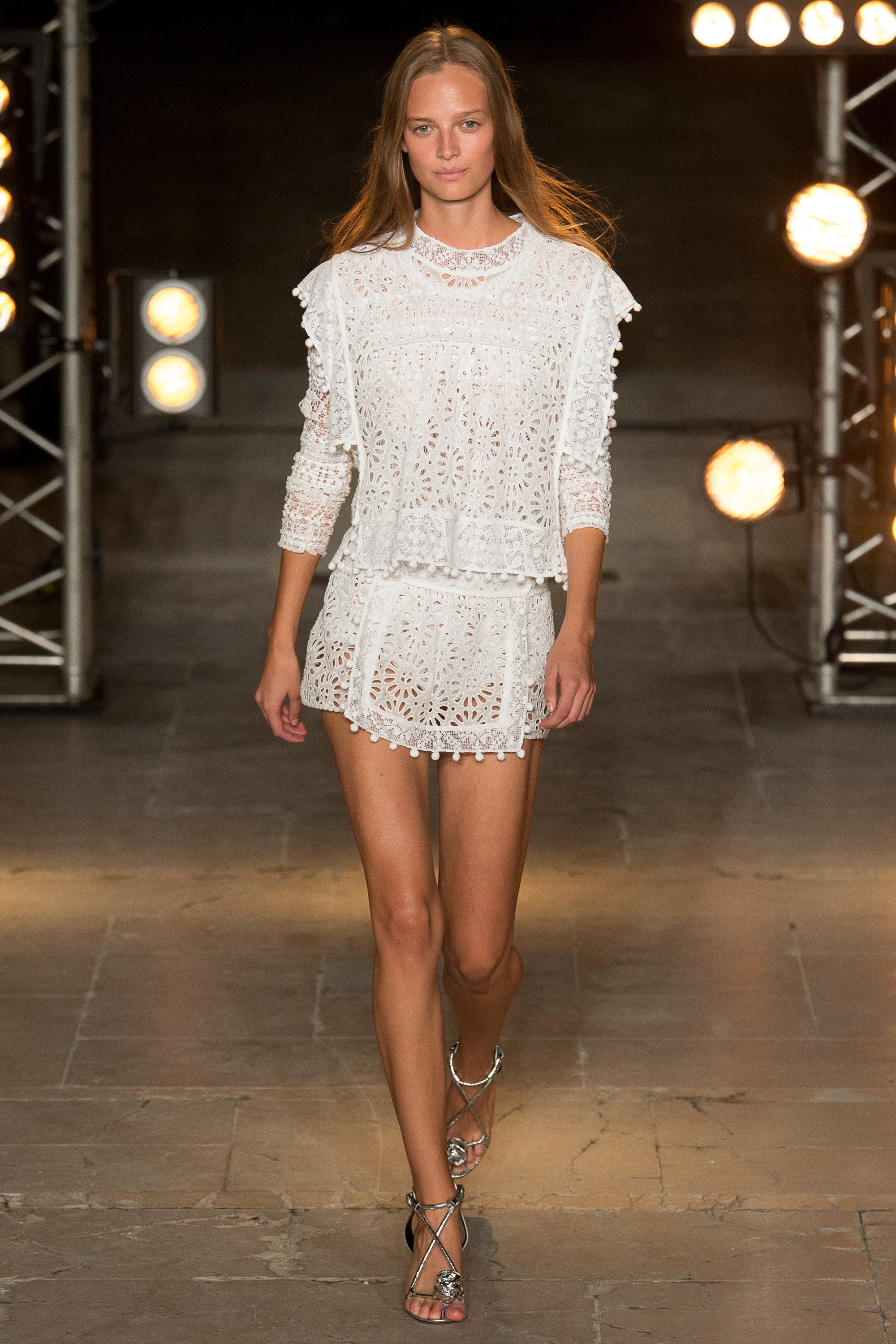
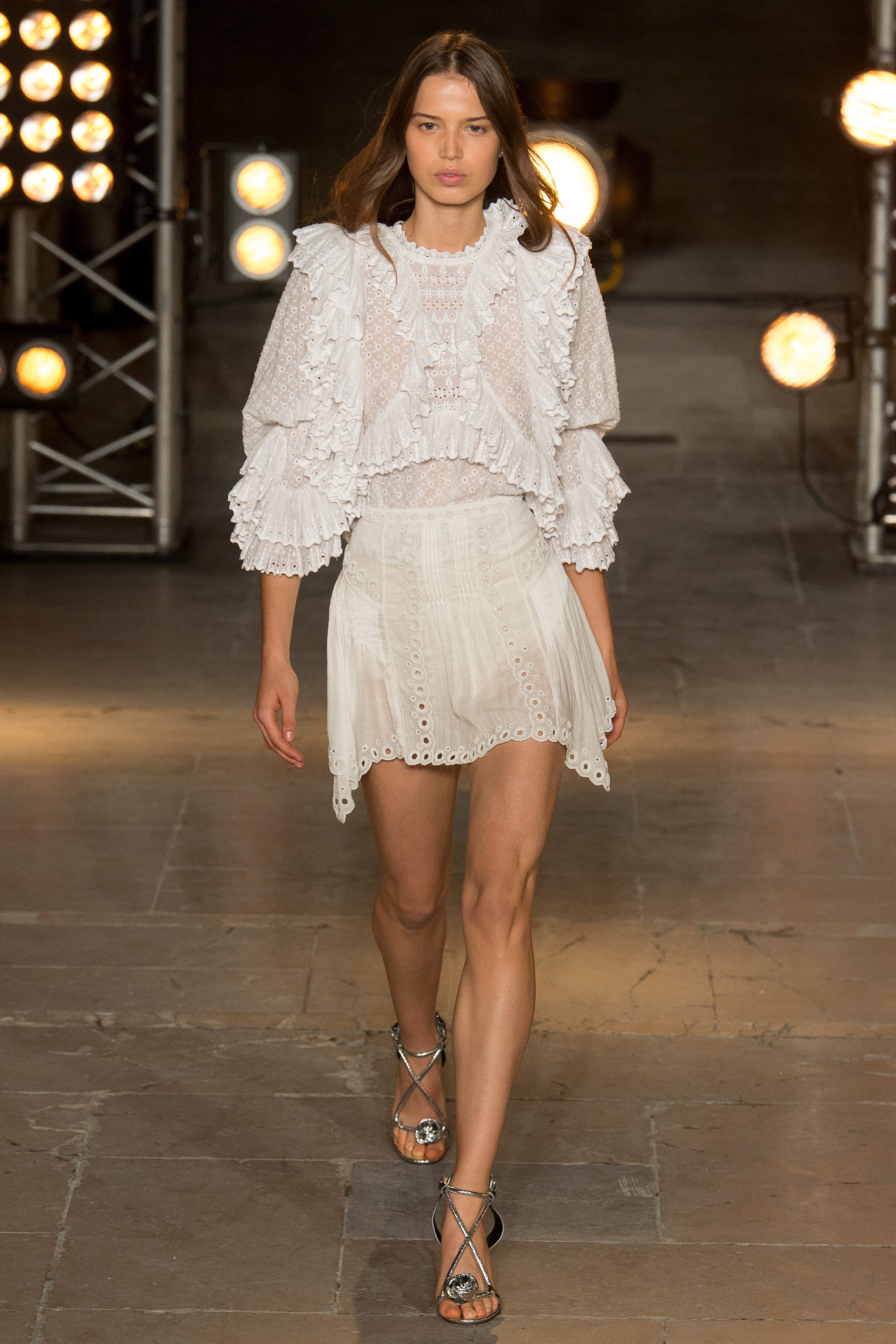
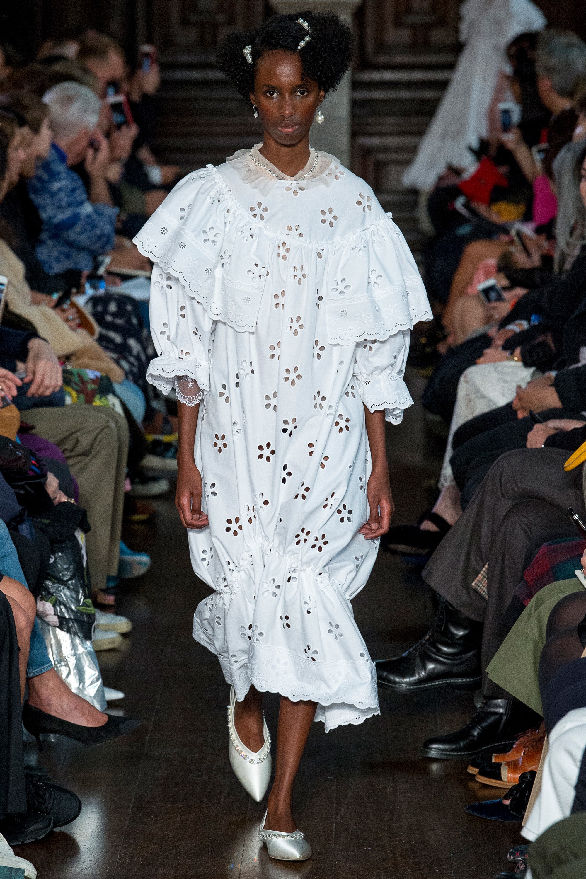
Cotton embroidery
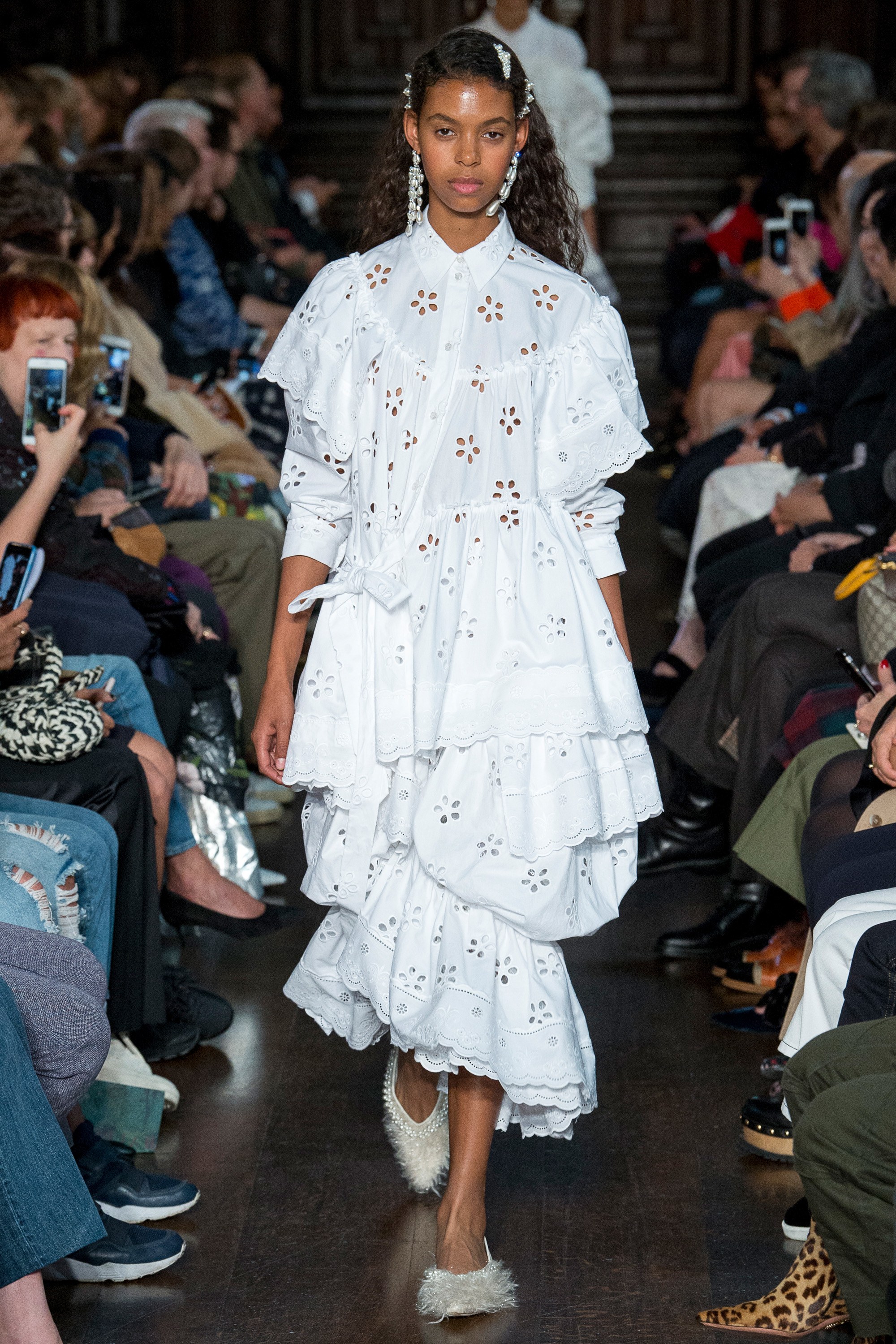
Cotton embroidery is associated especially with the boho -chic style through oversized garments with maxi volumes. As an example , the designer Isabel Marant has used these fabrics in puffed blouses accompanied by skirts and shorts.
For her part this same fabric also forms part of a dream-like creation from Simone Rocha, through whose designs women can be both naughty and innocent at the same time. Here we focus on her wide cotton dresses, some with stamped fabrics which give them this quality of apparent naïvity. The preferred colour for the die-cut continues to be a pristine white.
Net effect
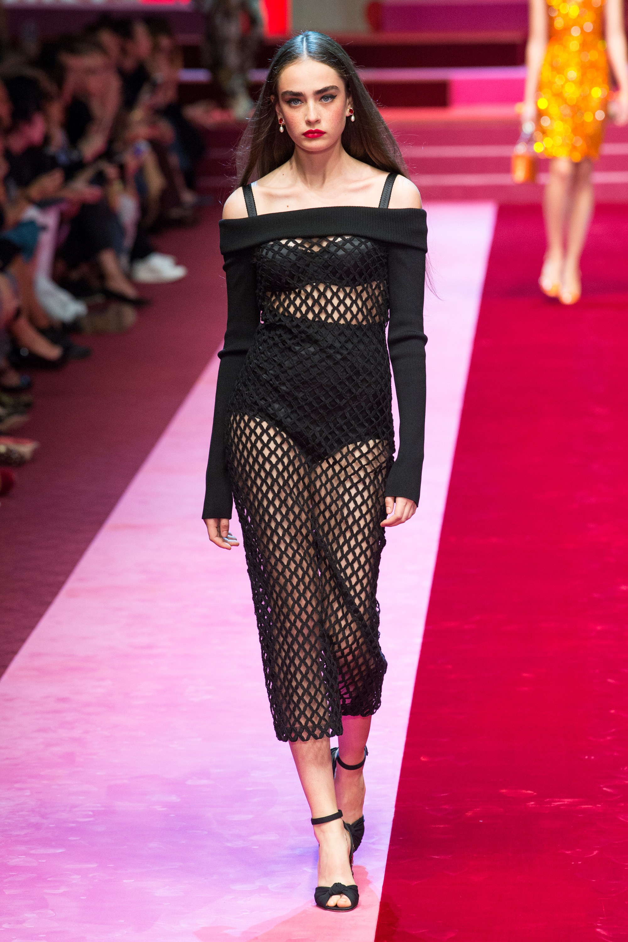
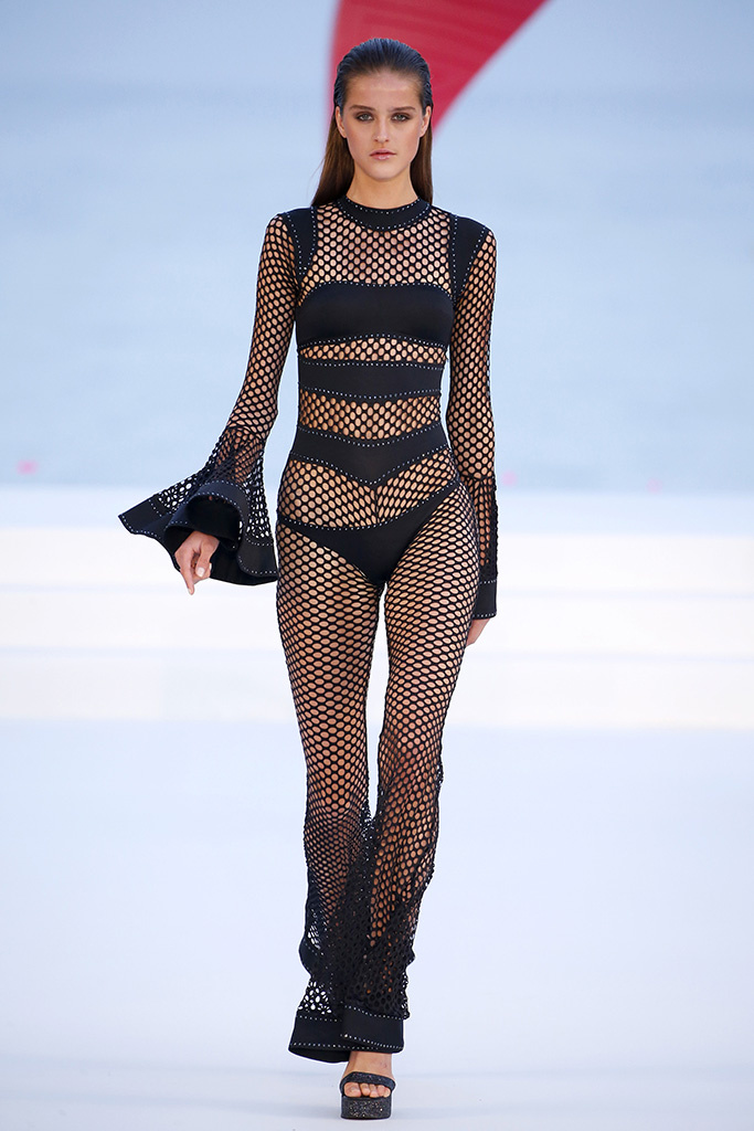
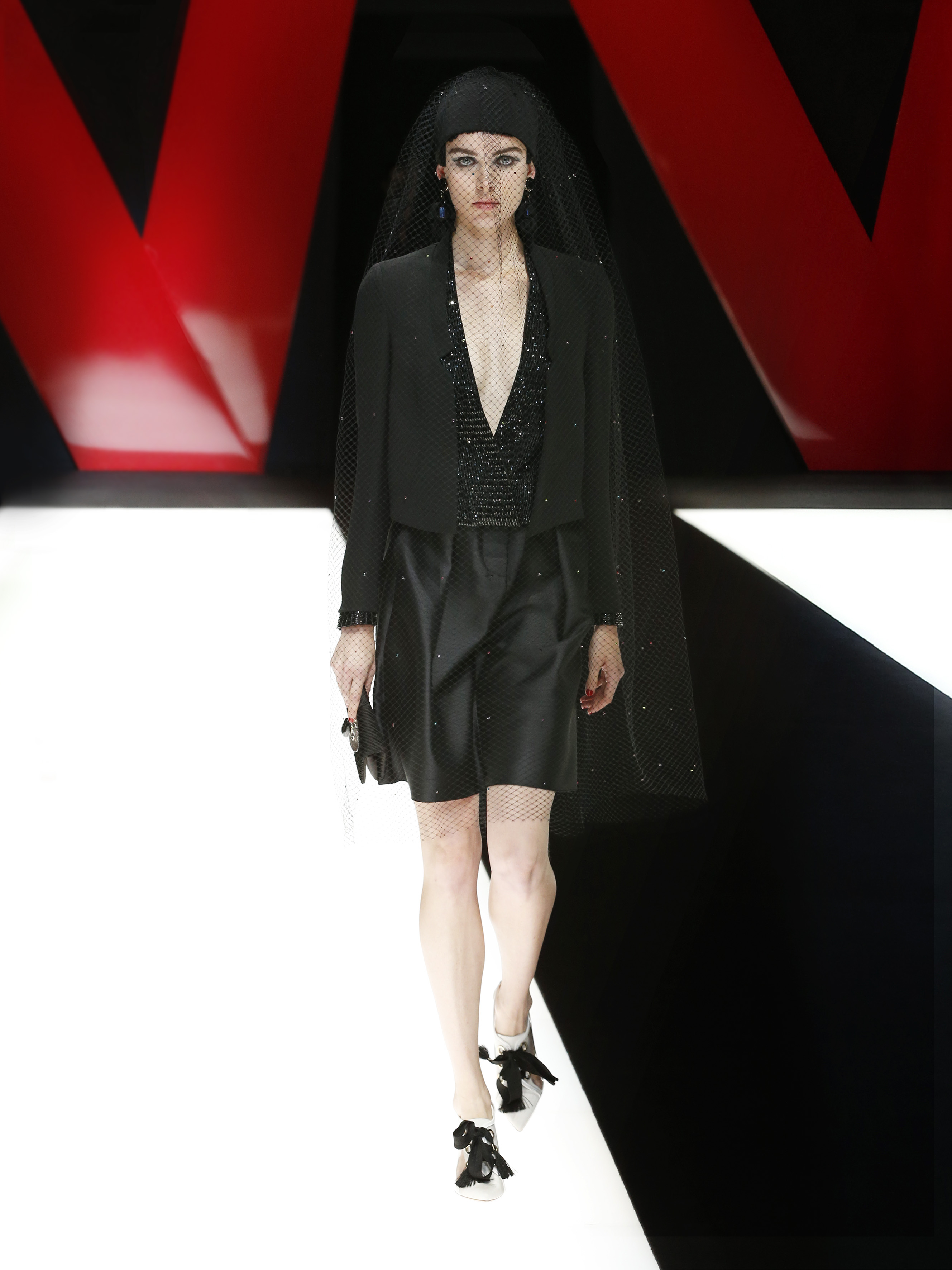
If before we focused on a more romantic and evocative proposal, net fabrics are at the other extreme in that they highlight the more urbane and contemporary side of women. Woven fabrics are living a moment of splendour by abandoning intimate fashion and conquering new feminine garments such as skirts, dresses and sports-inspired tops. Net effects are combined with each other or superimposed, leaving in their wake a sensual play of transparencies.
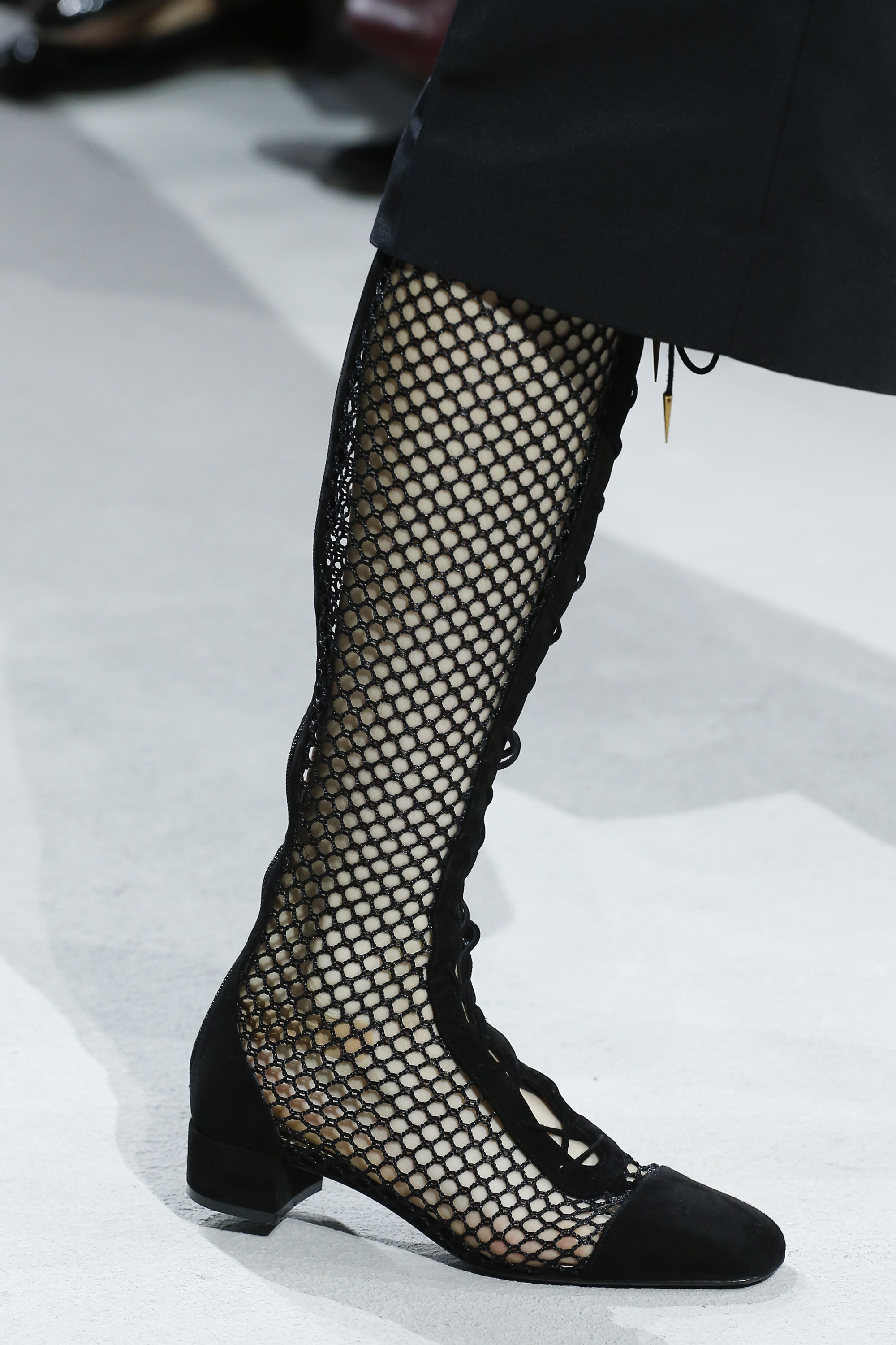
From net fabrics we highlight two novelties that have surprised us this season : that of opting almost entirely for the colour black – rejecting all those colourist fantasies – and the application of this fabric to all kinds of complements and accessories. Proof of this are the summer collections by Emporio Armani and Dior.
Perforated
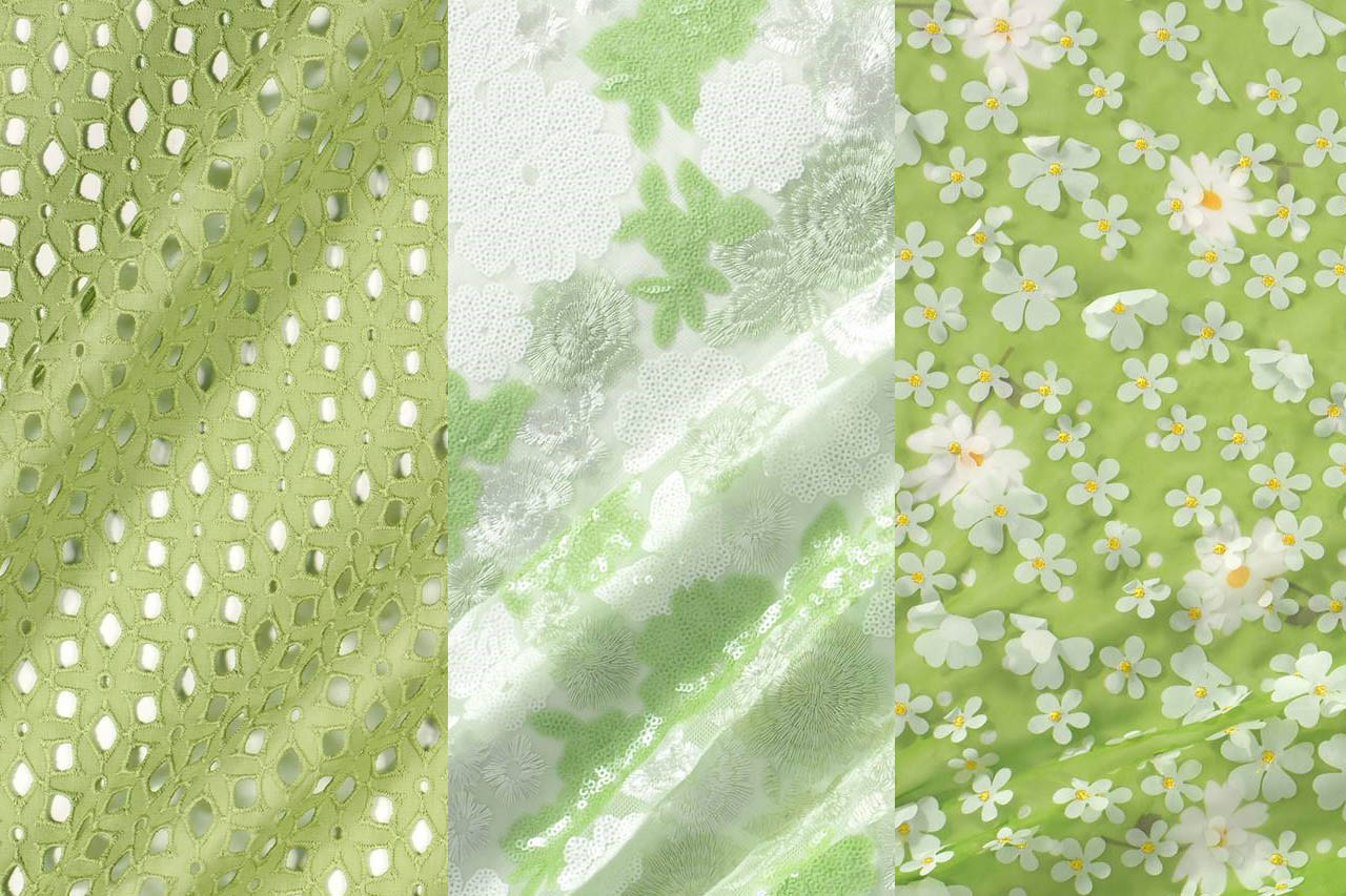
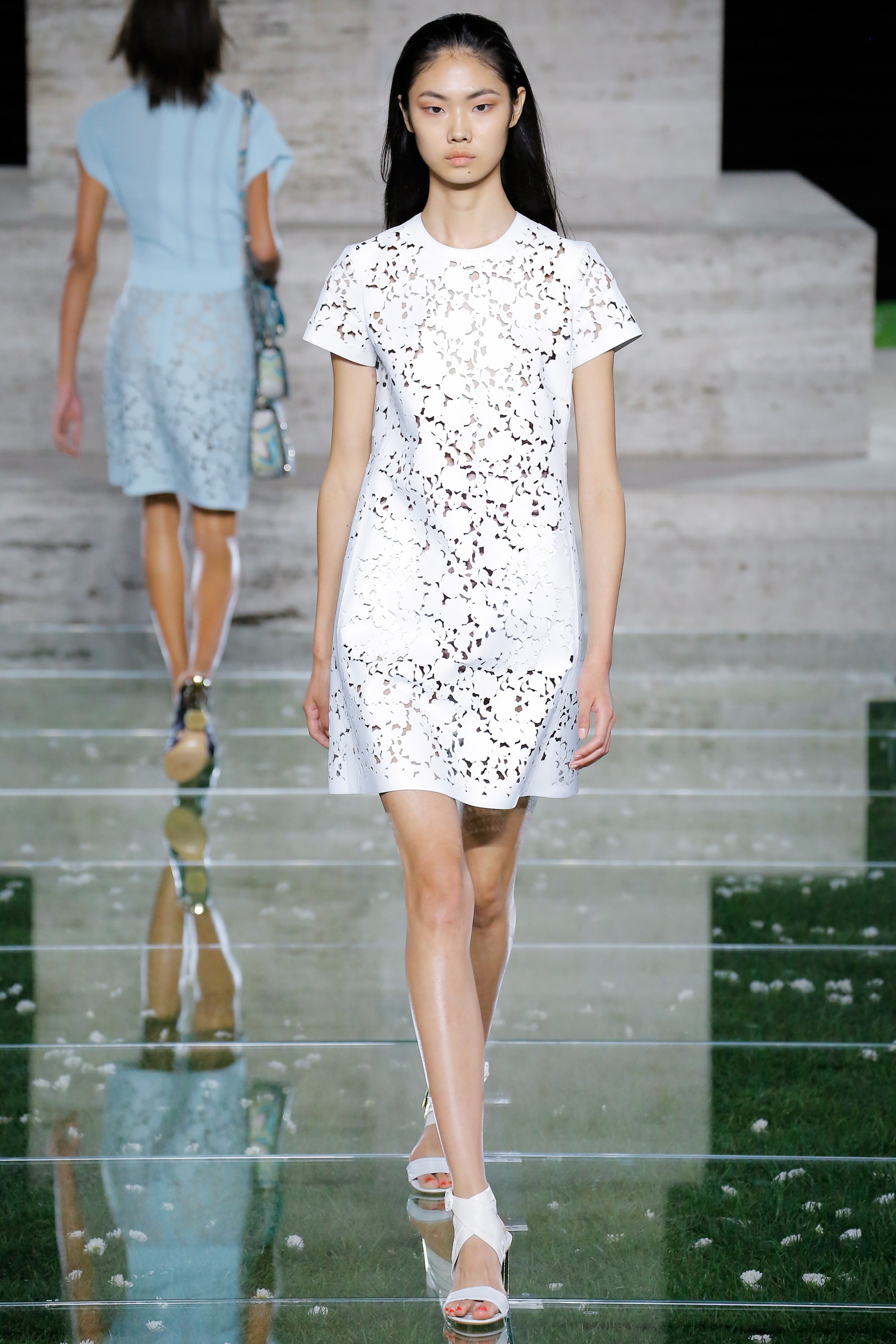
Finally we are highlighting those perforated fabrics where small circles reveal glimpses of the skin and laser cuts on leather or other light, transpirable fabrics. These create unique floral or fantasy prints that emulate the tattoo effect on the skin. In this case we are highlighting the looks of Salvatore Ferragamo, which go beyond mere white to include more daring pastel tones.

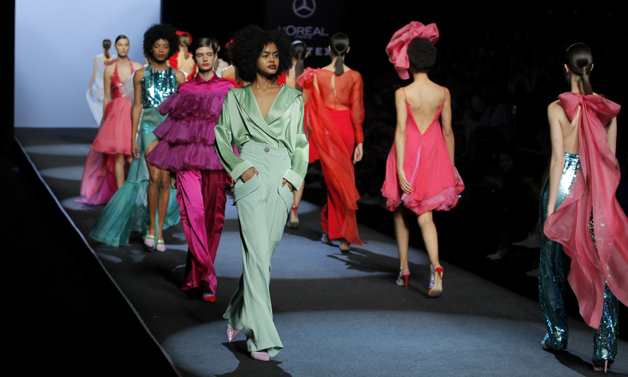
As usual, the Gratacós fabrics have also been present in the latest edition of the Mercedes-Benz Fashion Week Madrid in the Spring-Summer 2019 collections presented by the best designers of current Spanish fashion. Consolidated firms that confide in us such as Juan Duyos, Menchèn Tomás, The 2nd Skin, Malne, Moisés Nieto, Palomo Spain and also young designers who are building a promising future in the sector such as Juan Carlos Pajares who is already integrated into the official calendar of the Madrid show, after his participation in the catwalks of emerging talents.
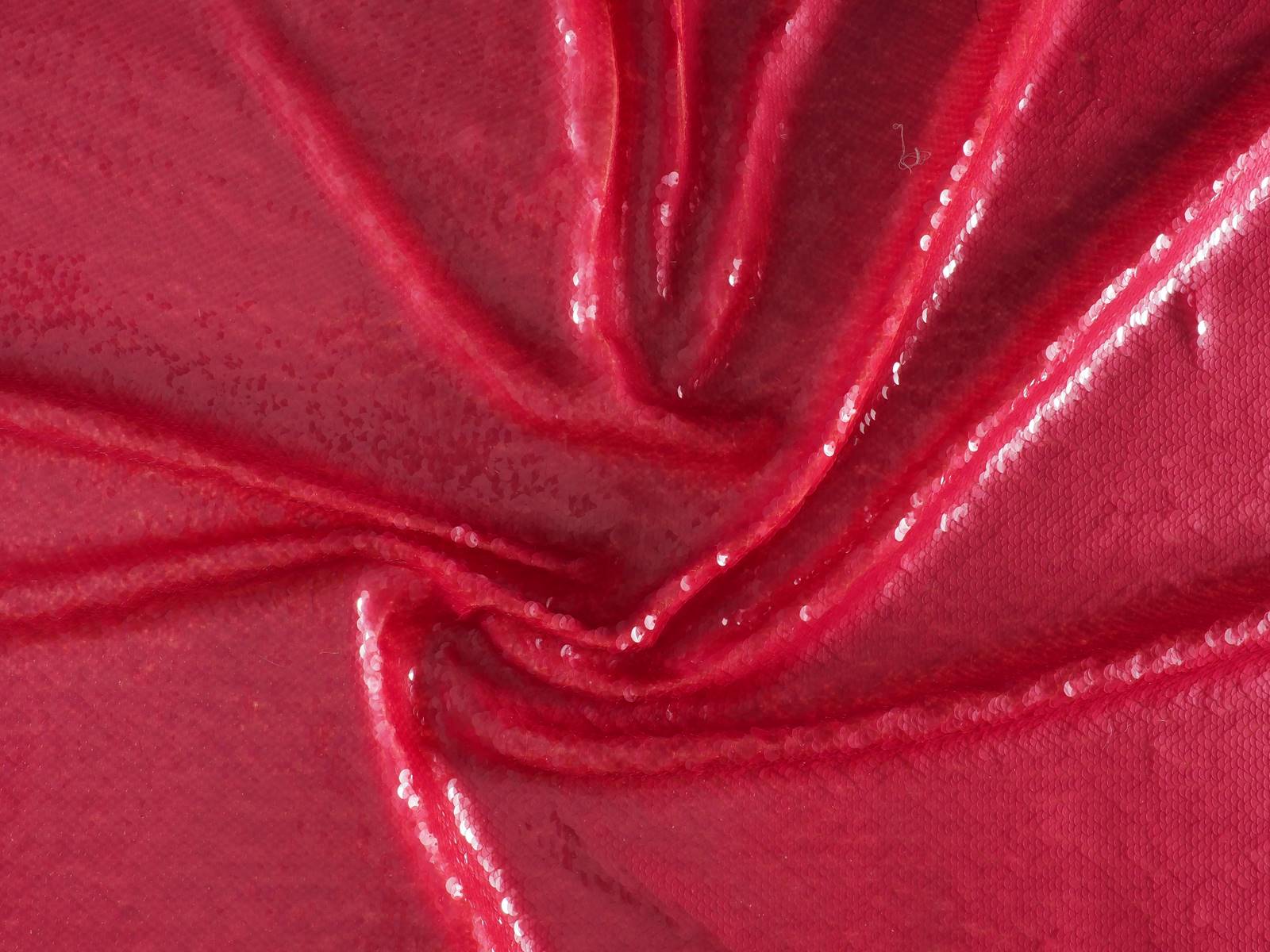
Here we reveal some details of the collections for the next summer season, as well as the fabrics and colours that were shown that most caught our attention. Roughly speaking, we would highlight the success of colour, the fabrics that radiate light, the metallic fibres and the sequins that also conquer the street looks and add that air of sophistication.
Duyos’ light
Juan Duyos pays homage to the light, in an ode to feminine beauty that shines the brightest. It is for this reason that in the collection ‘Light’, luminous fabrics such as metallic, paillettes, lurex, lame and several metallic threads stand out and capture all the flashes – and looks – on Madrid’s catwalk. In contrast to the bright materials, this proposal is tinted in ice green, lavender, lime or peach that coexist with gold and silver.
The strength of Anonymous women
Juan Carlos Pajares, one of the most successful emerging talents of Spanish fashion always surprises on the Spanish catwalk. This time, the designer from Madrid has found in the Amazons his source of inspiration in a collection that pays tribute to all those women who hid behind pseudonyms and even had to stop working or doing what they were passionate about. In the show, this spirit is transmitted through colour with a palette that includes pinks, greens, oranges, blues and greys. The blends of textures, oriental reminiscence prints and the superposition of urban garments made in formal fabrics are also noteworthy: mikado and silk ottomans, cottons, neoprenes, crepes, paillettes or vichys with touches of lurex.
In cuban lands
“Me desordeno, amor, me desordeno”, recites the poem by Carilda Oliver, one of the most reknowned contemporary poetesses in Cuba who has inspired the new Menchén Tomàs collection together with other artists such as Catalina Lasa and Lidia Ríos who lived in the greatest splendor of Cuban society before the revolution. It is precisely in the heart of the Havana where the Barcelona designer finds inspiration for her spring-summer fashion show. A sophisticated proposal arranged in three parts. The first begins with pure white, “the colour of Santeria” according to the designer ” with textured details. In the second part, the clothes turn quartz, the stone of the subsoil of the island. In the last part, there is an explosion of colour resulting in a happy and optimistic result.
Malne and the empowered woman
The creative duo behind Malne: Paloma Álvarez and Juanjo Mánez have presented a collection that plays with the mix & match in fabrics and prints for women who feel strong and free and transmit that spirit of rebellion. The animal print combines perfectly with dancer touches and maxi volumes with ruffles and feathers forming a solid and well-constructed proposal that structures the entire collection. Only suitable for the daring…
Palomo Spain
The enfant terrible of Spanish fashion, who revolutionizes the male wardrobe with his glamorous looks. This time he has inspired himself in the cabinets of curiosities to dress men in sophisticated style. Thus, Alejandro Gómez Palomo fills the catwalk with his exotic models that include wild silks and extravagant volumes, tortoiseshell buttons, sophisticated outfits in velvet jersey that are crowned with luxurious mosquito-net hats inspired by the explorers of the XIX century. The proposal by Palomo Spain is enriching, the kaftans, the jacket sets and the skirts in laminated fabrics and linen for the pure and traditional lines.
A full volumen Spring
Juan Carlos Fernández and Antonio Burillo presented ‘The Garden’, a dreamlike proposal inspired by a romantic garden. In this spring collection, The 2nd Skin focuses on dresses as main axis, maxi volumes, oversize garments and floral print as the basis of this evocative collection with a marked eighties air. In terms of fabrics, the mikados stand out, embroidered sequins -symbol of the brand- along with other lighter ones like tulle or silk chiffon.


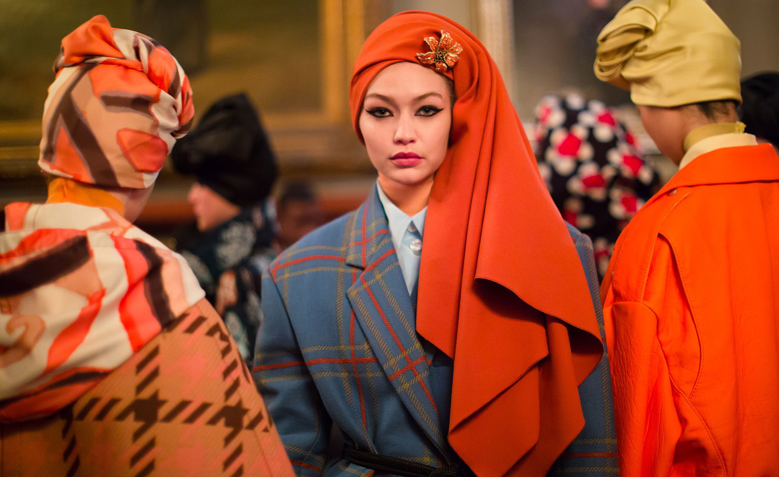
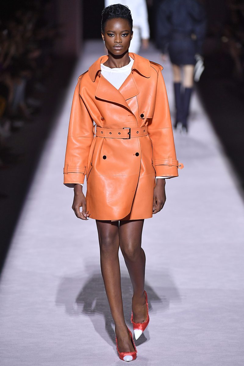
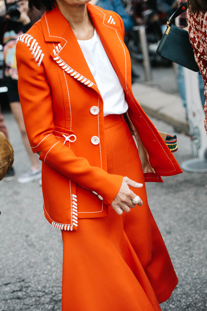
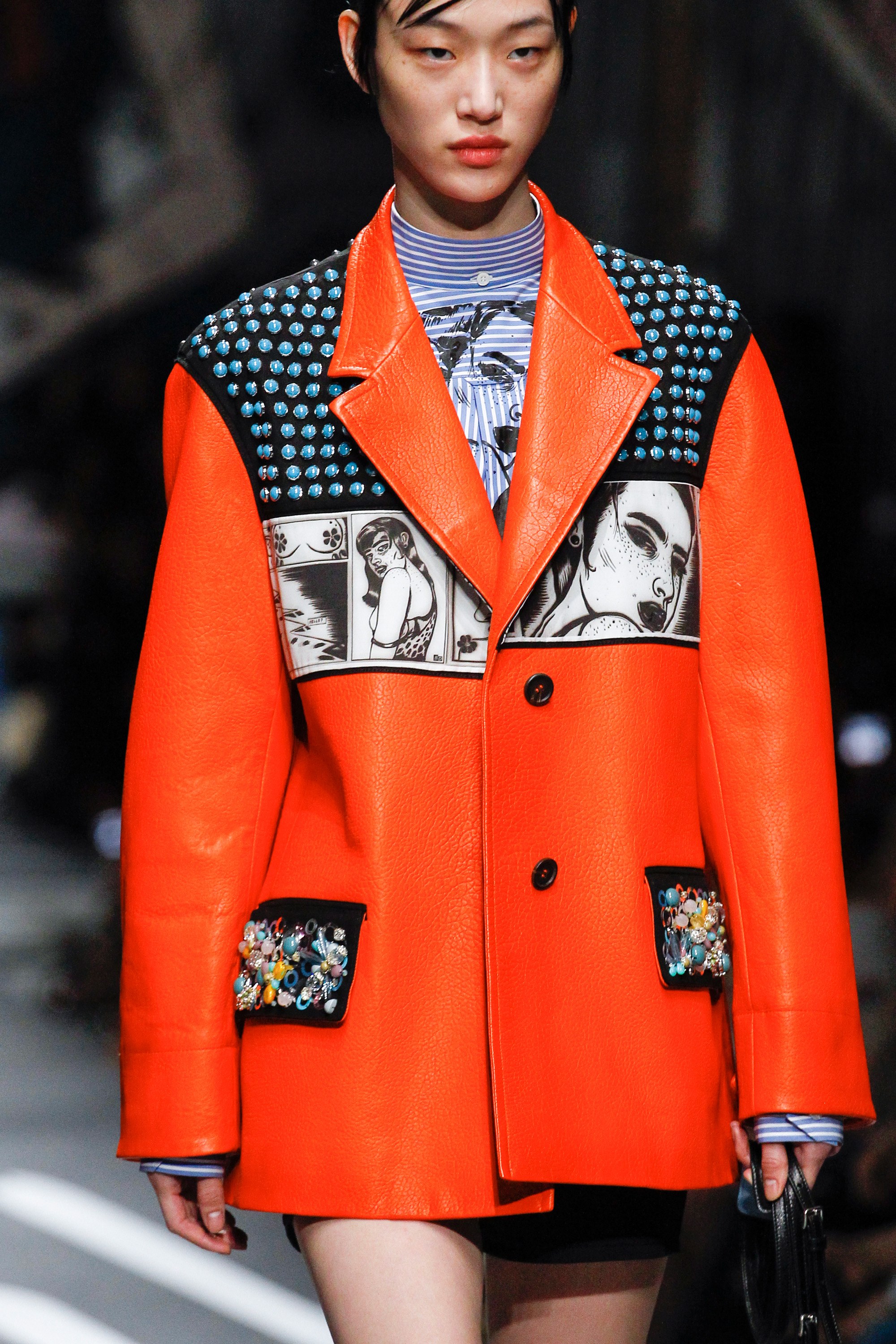
In fashion and speaking in general terms, what is the deal with us and orange? It is appealing to the naked eye, favours the skin tone and with its vitality lights up garments in neutral tones, brightening up any summer or winter look. Knowing all these goods traits, why are consumers so reluctant to bet on this colour? Hereunder, we position orange in the place it deserves.
It is true, orange is not an easy colour to carry off and the excess of stridency that the hottest tones sometimes entail, makes it difficult to mix with the majority. However, there are many celebrities and professionals in the industry who have opted for this tone so far this year in the street style of the main fashion catwalks. And if the sector has surrendered to radiant yellow, the hardest tone of all, why would the same thing not happen to orange?
 |
 |
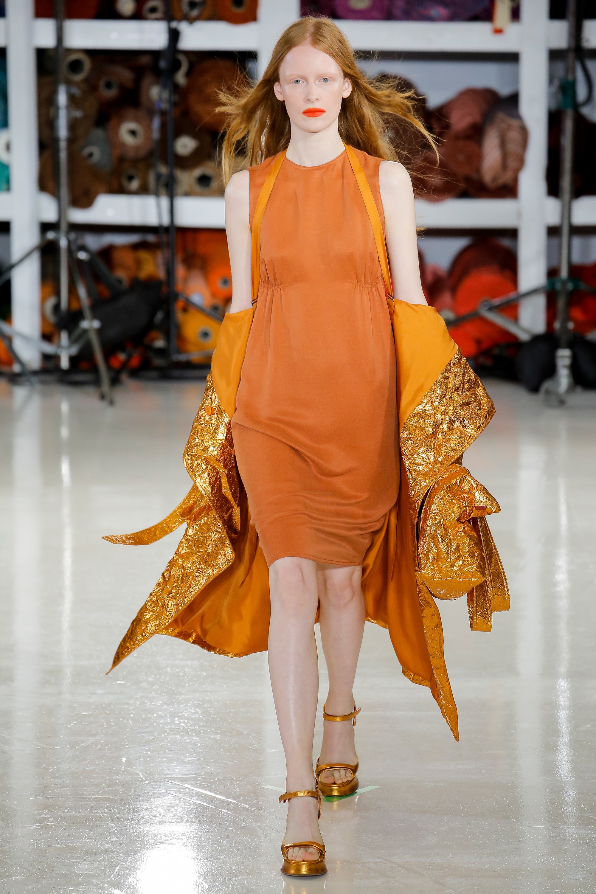
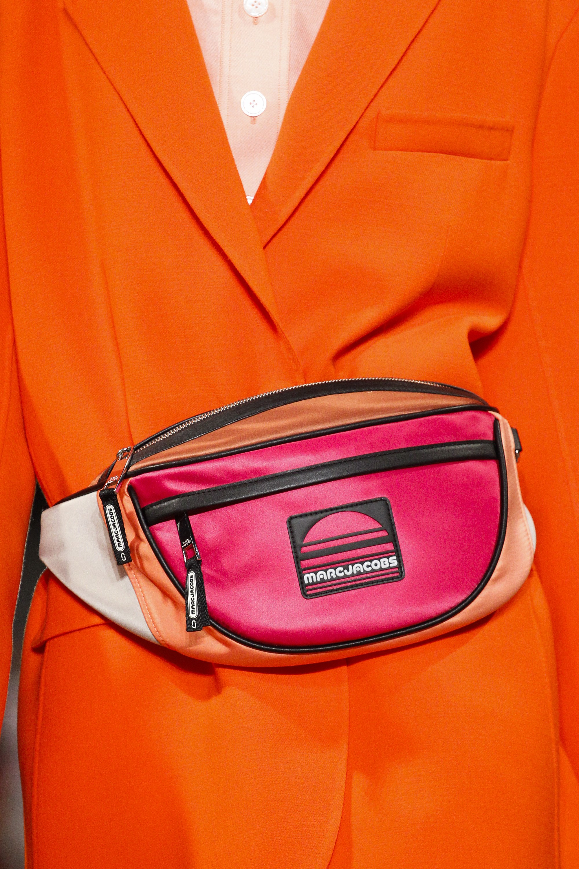
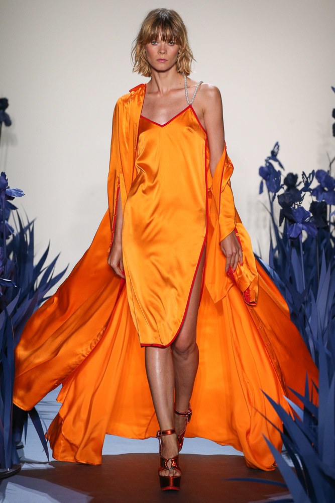
Orange is a warm color that radiates enthusiasm, energy, joy and freshness. It is the tone that is linked to creativity, fun, triumph and spontaneity. A tone that can be vibrant and dull in turn, without losing all of its attributes. This Spring- Summer 2018 season, the colour that has dominated the catwalk, according to Pantone is called Safety Orange. A striking and bright tone, which pulls towards neon and attracts everyones attention. A colour ironically translated into “security orange” that contrasts with the rest and rarely goes unnoticed, tos ay the least it is practically impossible. Firms such as Jeremy Scott, Tom Ford, Adam Selman, Marc Jacobs or Calvin Klein have not hesitated to take it on stage.
 |
 |
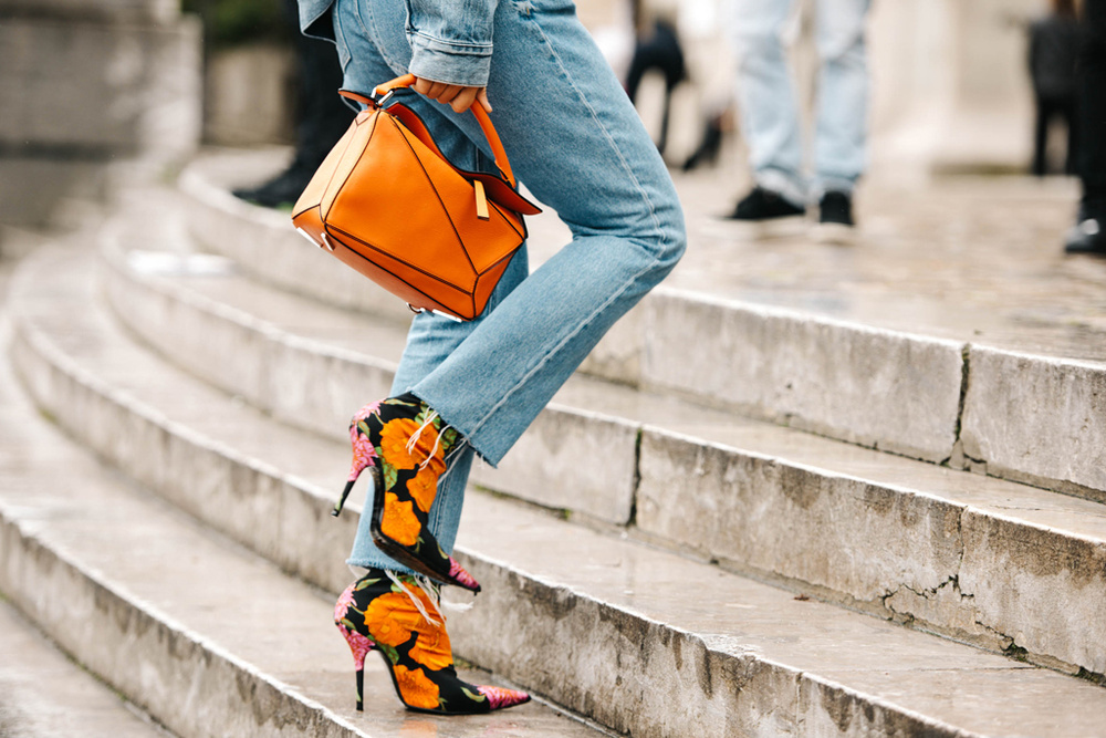
And how is it combined? The first and most daring option is to wear it in its total look version: from head to toe in the same tone or varying the hue to others more pale like peach: one bright garment mixed with a duller one. In this case it works with a long dress, jumpsuit or a two piece outfit. The most daring combination would be with fuchsia pink or Klein blue creating attractive colour blocks. The second option involves opting for an orange garment that is excessive and that highlights the whole look. The rest will therefore have to be combined with neutral tones such as nudes , earths, beige or rose so that they do not steal the garment’s protagonism. A good idea, for example, would be to opt for a jacket with soft textures or a printed blazer where orange is the main color. Orange also works very well with jeans and denim garments, adding that elemento of joviality and ease to any outfit. Finally, a combination that also works is to delegate this energetic color in a modest background playing only with accessories such as bags or shoes. Any detail counts!

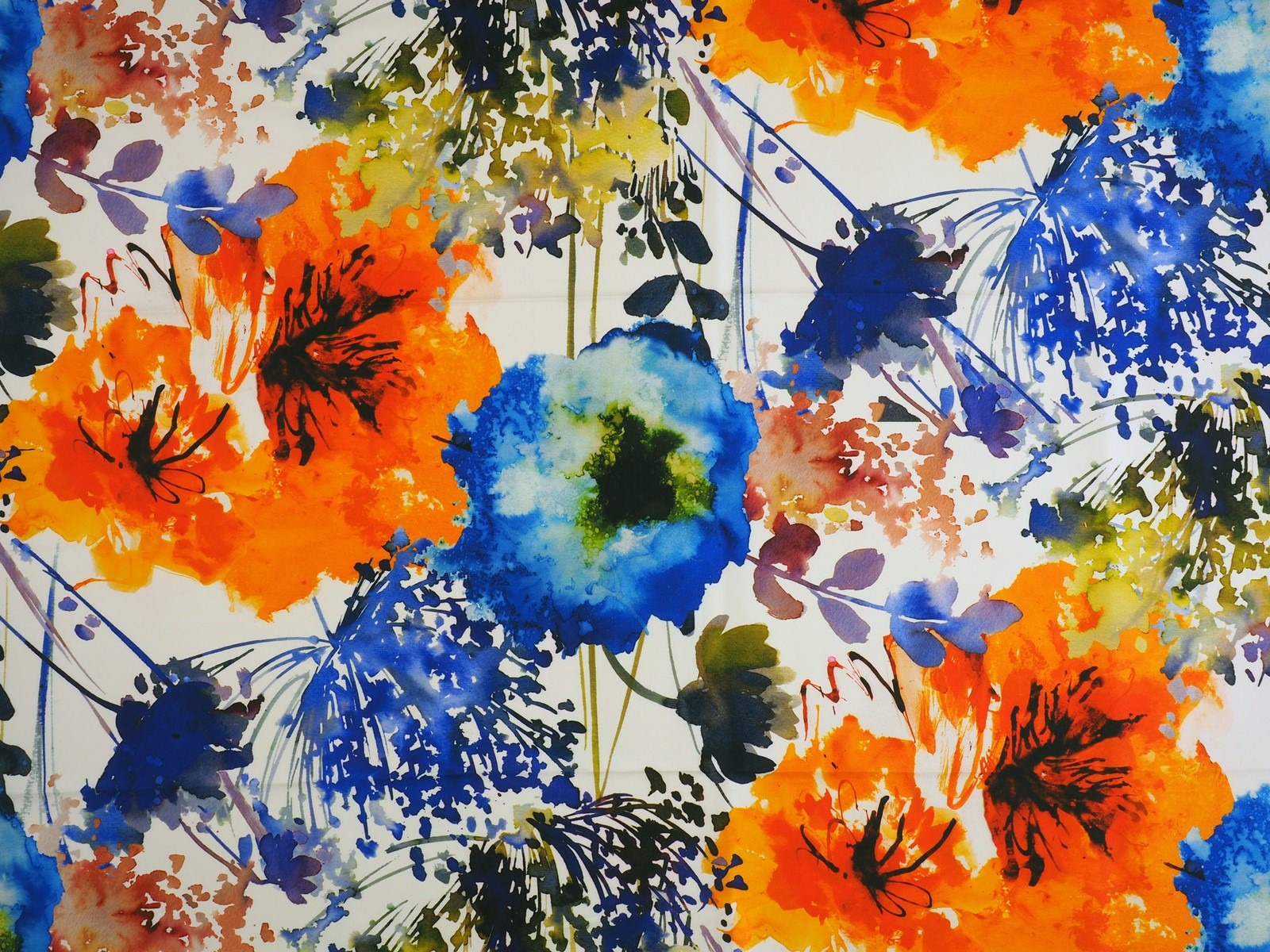
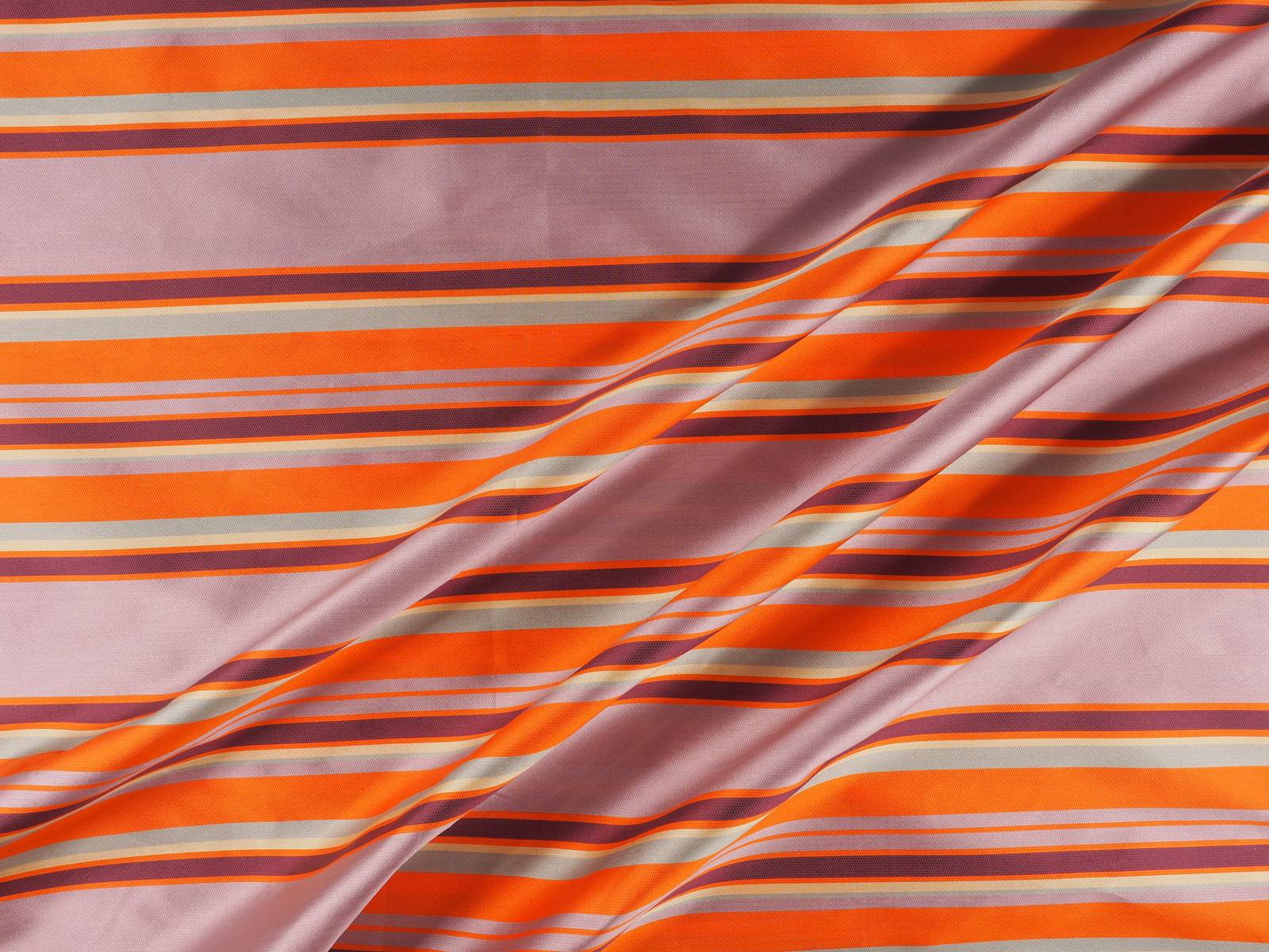
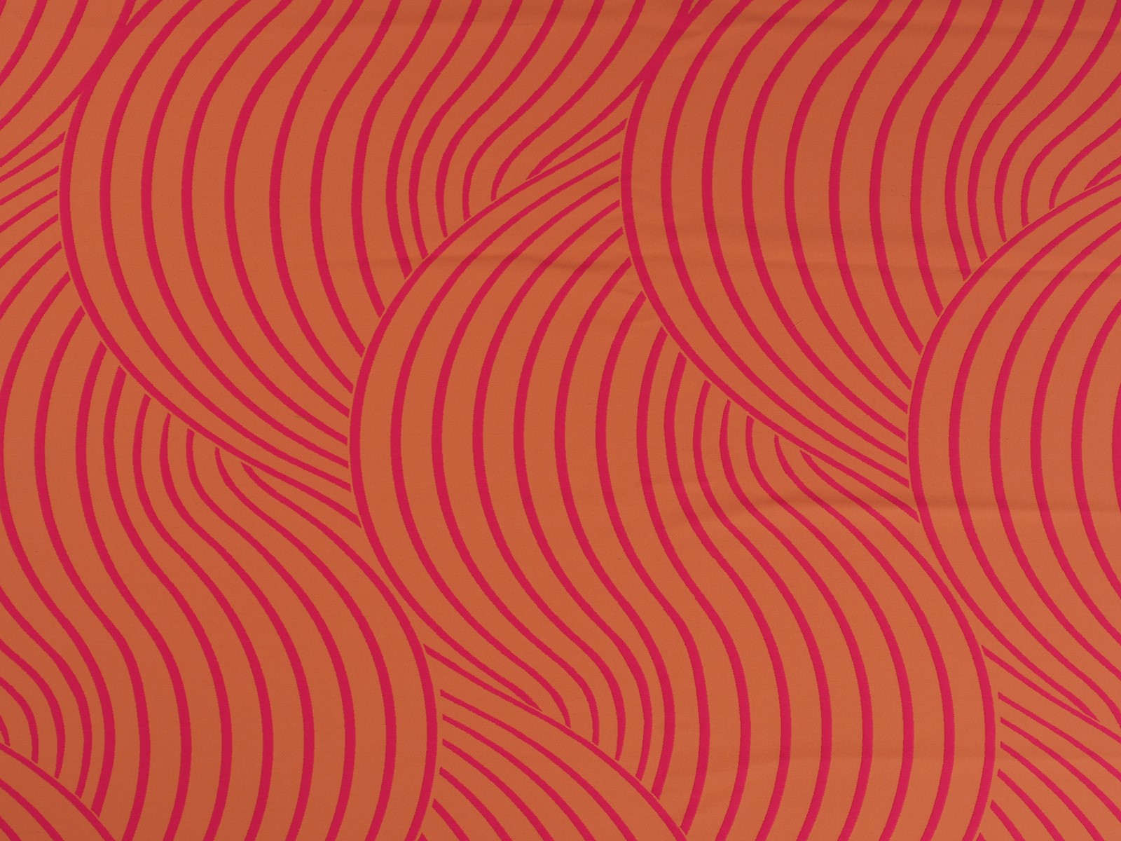
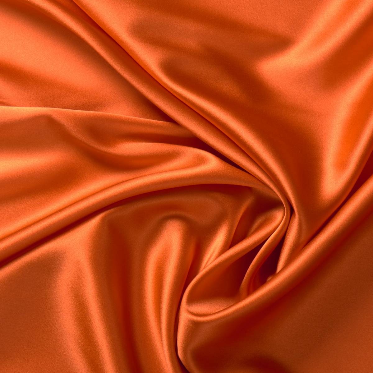
In Gratacós we like orange in any season. Whether it be in its most lit up version in silks, tulles or chiffons, or in pastel shades in subtle jacquards or fine texture embroidery. We also like prints where orange intermingles with other colours in the form of flowers, stripes or fantasy prints , to cite a couple of examples. We invite you to discover the whole selection!


Sorry, this entry is only available in European Spanish.
