(Español) El 080 Barcelona Fashion más marítimo
Palomo Spain conquers Paris

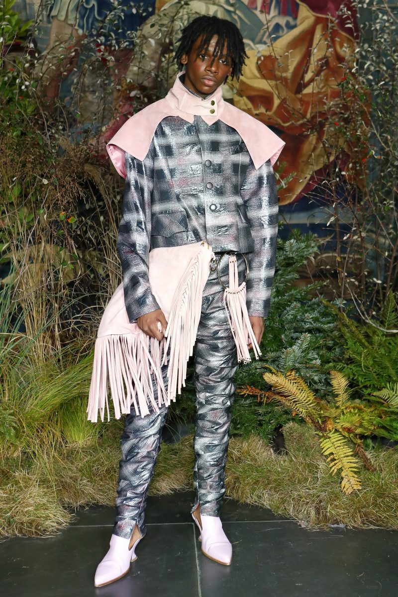
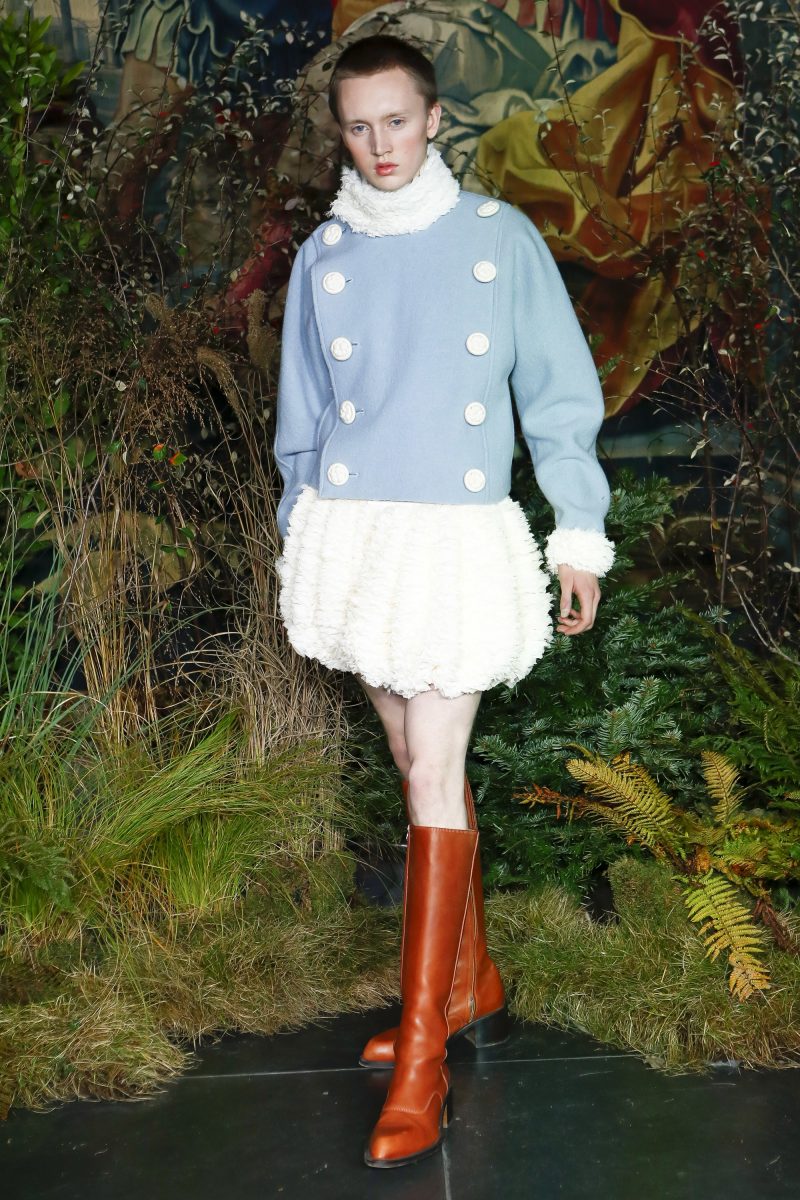
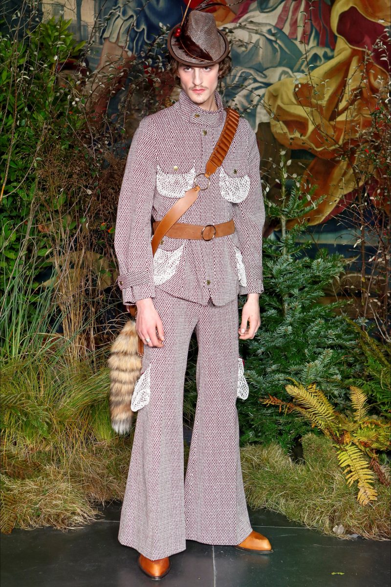
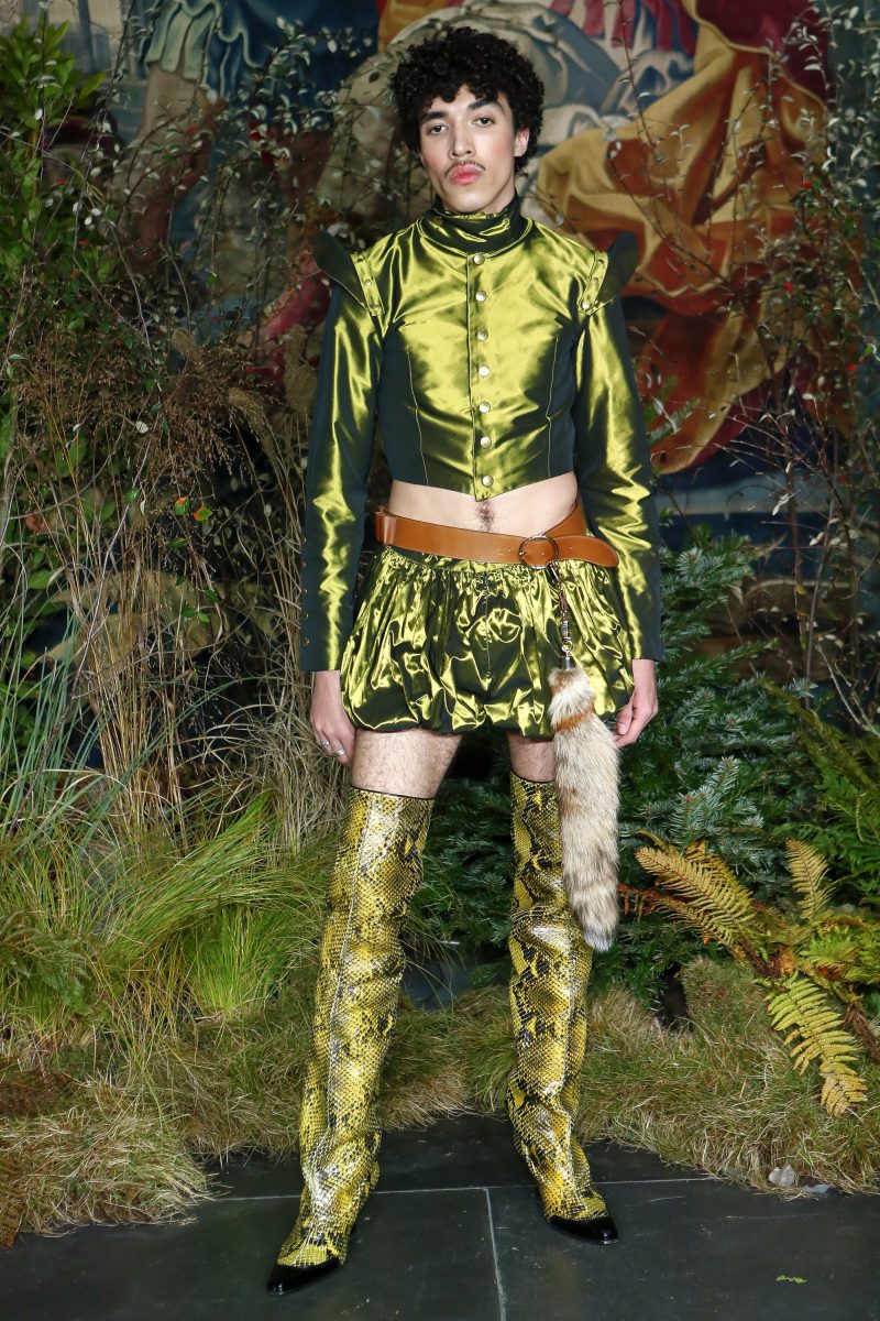
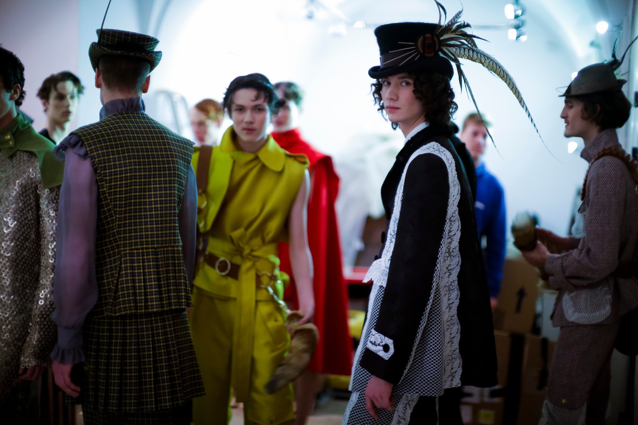
Palomo Spain has hit the heights and is heading for success. In two years the company of the Cordoba Designer Alejandro Gómez Palomo (Posadas, 1992) has passed from anonymity to be on everyone’s lipse. And the critics predict him a good future in the fickle fashion industry. He is not lacking in merit. The key to his success has been to revolutionize the masculine wardrobe with clothes that boast transgression, creativity and colour without limits: provocation as a flag. Palomo Spain dresses men in traditionally feminine articles of clothing creating a peculiar eighties universe with an Almodovan aesthetic. His creations are fresh and innovative, with garments that are equipped with all luxury of details and silhouettes that blur gender barriers.
 |
 |
The firm not only designs for men in its more feminine offerings. Palomo Spain takes a step further. Artists such as Miley Cyrus and Rossy de Palma have exhibited his creations on the red carpet. In fact, the fame of this designer grew exponentially when Beyonce chose a gown by the Spanish company for the public presentation of her twins last July. In November Rita Ora appeared in a bathrobe by Palomo Spain at the MTV Europe Music Awards.
After having gone through several fashion weeks, such as that of New York, Alejandro Palomo’s company was chosen to open Paris Male Fashion Week, one of the most important events in the sector, held in mid-January in the French capital.
 |
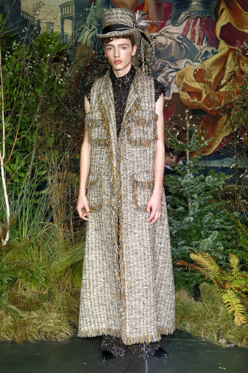 |
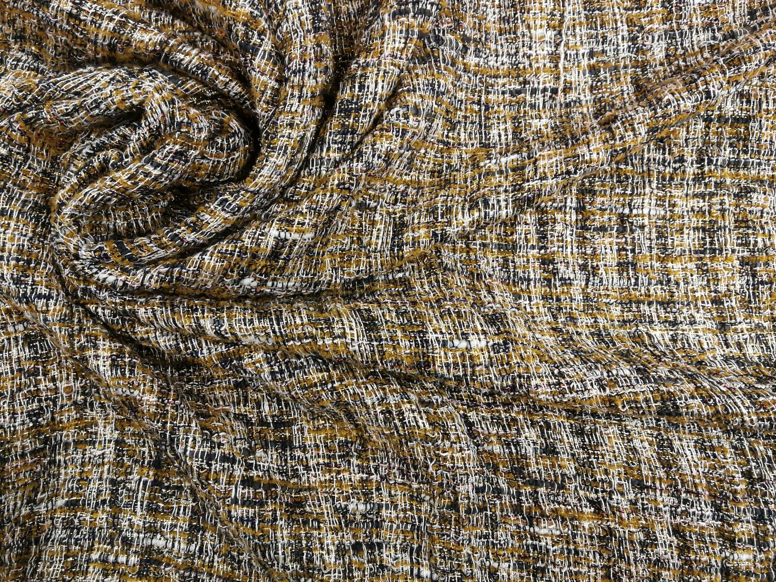
The collection which he presented for next autumn-winter 2018 / 2019, is entitled ‘The Hunting’ and is inspired by the aesthetics of hunting, combining the more masculine English essence with the spirit of the South, much more folky and ornate, full of colour and prints that are distinctive features of the Cordoba brand. In the designs there is no shortage of furs, tweed, tartan, velvet or wool in classic cuts of the Montería, such as full skirts, corsets, capes and coats. It is an offering of green, persimmon, red and orange tones full of details, as are the line of accessories by Tolentino of Seville that accompanied the winter collection: traditional hats, felt forras… that give the finishing touch to the glamorous hunting looks.
 |
 |
In February, Alejandro Palomo will also have his spot on public television, participating in the new talent show by Spanish Television, Master Seamsters, a fashion programme that displays the art of the designer, emphasizing everything that is behind the fashion media spotlights. It is a contest in which the young designer will act as jury and mentor along with veteran designer Lorenzo Caprile and the Valencian María Escoté.
Gratacós support the talent of Palomo Spain and wish him many more successes.
La zona neutral
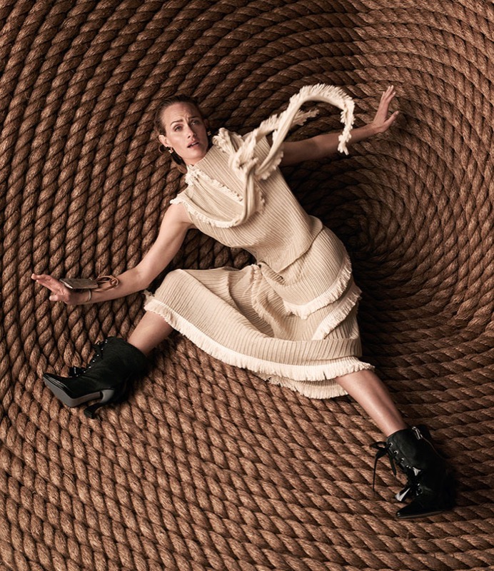
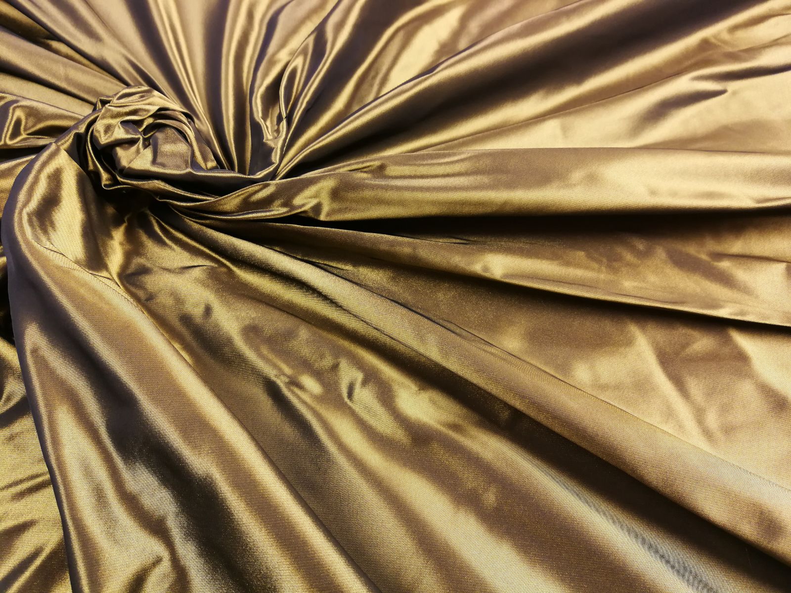
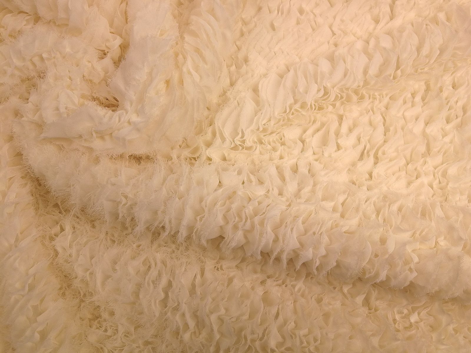
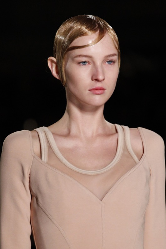
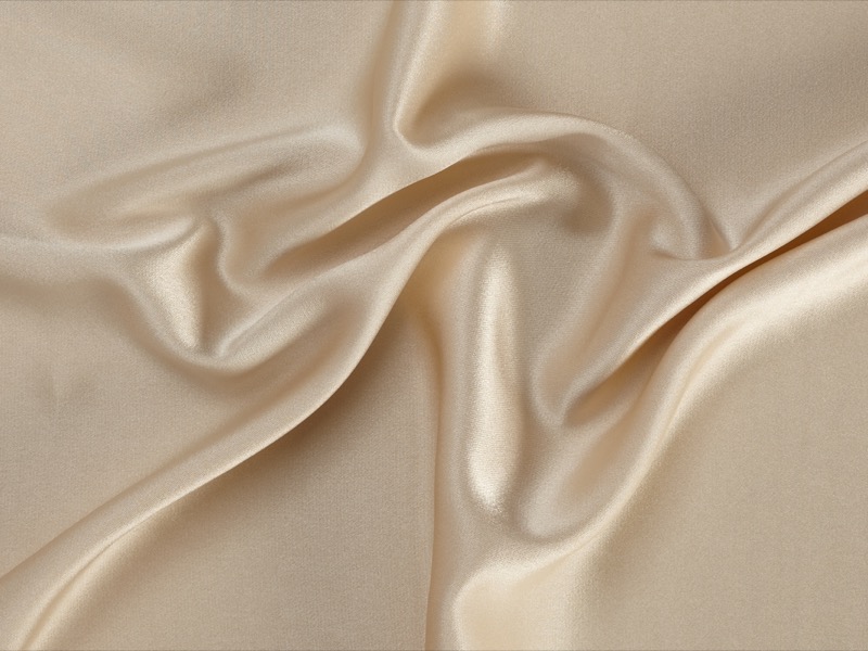
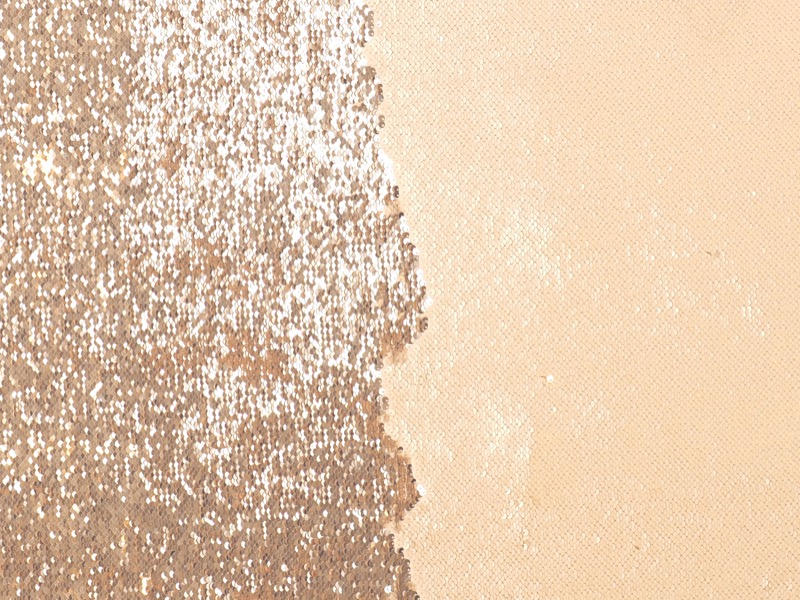
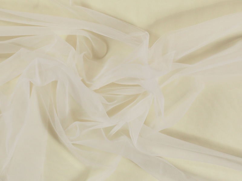
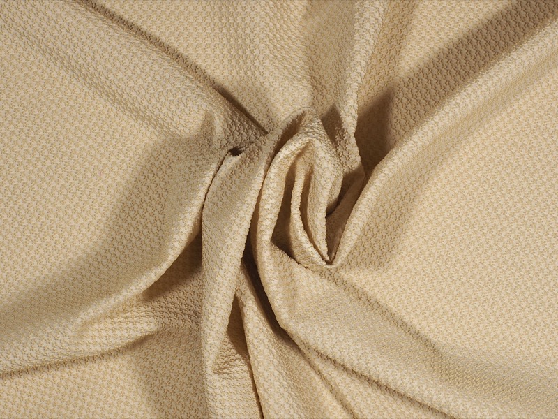
Hazelnut, beige, tan, brown, makeup, nude … Neutral colours are in fashion this summer 2017. In fact, regardless of the trend this year, the cream tones are classic and modern at the same time. Timeless colors that soften the face and skin, and do not necessarily have to fall in the monotony if you know how to combine with small details in other pigmentations to make an evocative contrast.
 |
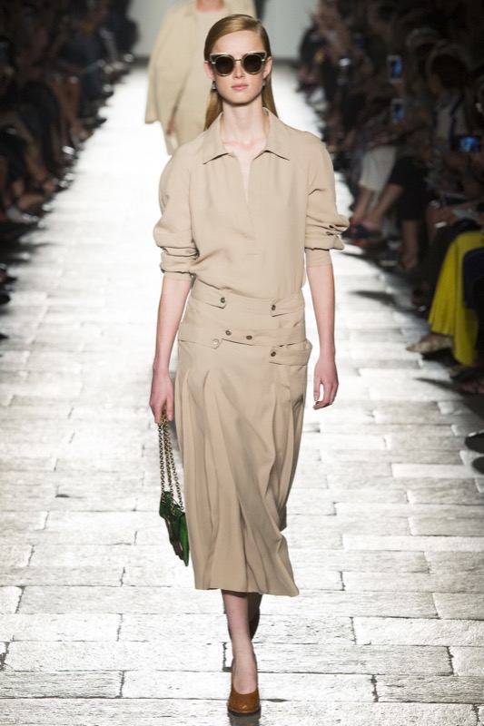 |
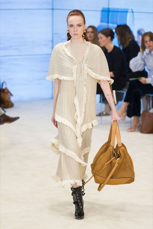
This season neutral tones can be seen on the catwalk shows of the luxury brands with a clear tendency to single – colour blocks with some minor variations in tone. What has changed are those embossed fabrics, the focus on pleated loose clothing and volumes around the shoulder area and attenuated at the bottom. For example, DelPozo exhibits a skirt and jacket outfit in butter colour with wide sleeves; Bottega Veneta goes for fluid dresses insinuating the body without marking it and finally, Chloé gives prominence to floral embossed fabric dyed in dusty pink.
 |
 |
How to combine neutral tones?
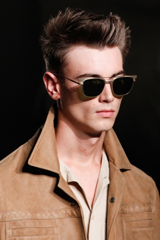
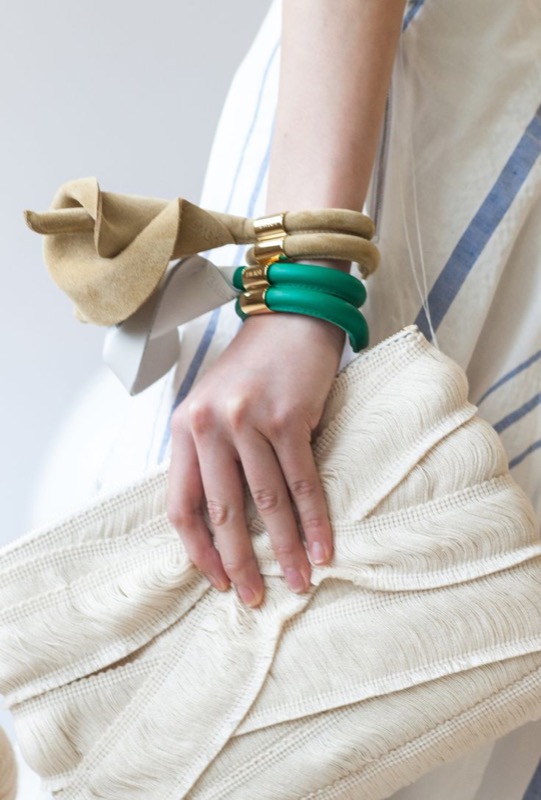
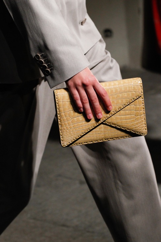
Neutral tones are fresh, bring warmth and are present in the most relaxed looks of summer. They soften out and are discreet enough to make the details of the garments stand out. In this sense, they easily pass fade into the background with an unexpected colour touch. This season, the neutrals combine with stylish burnt orange, chocolate-brown appeasers, the ivory tones – the fake whites – and the pink tones. It is not a season of excessive contrasts, rather of complementary shades that are simple and elegant without effort. Blessed discretion!
 |
 |
Embossed fabrics
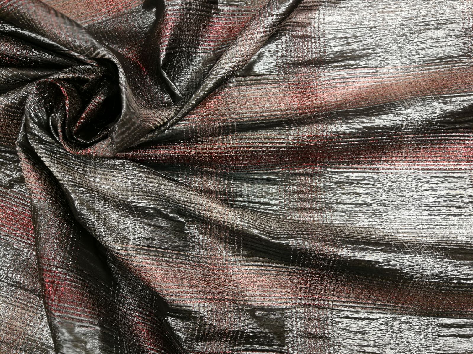
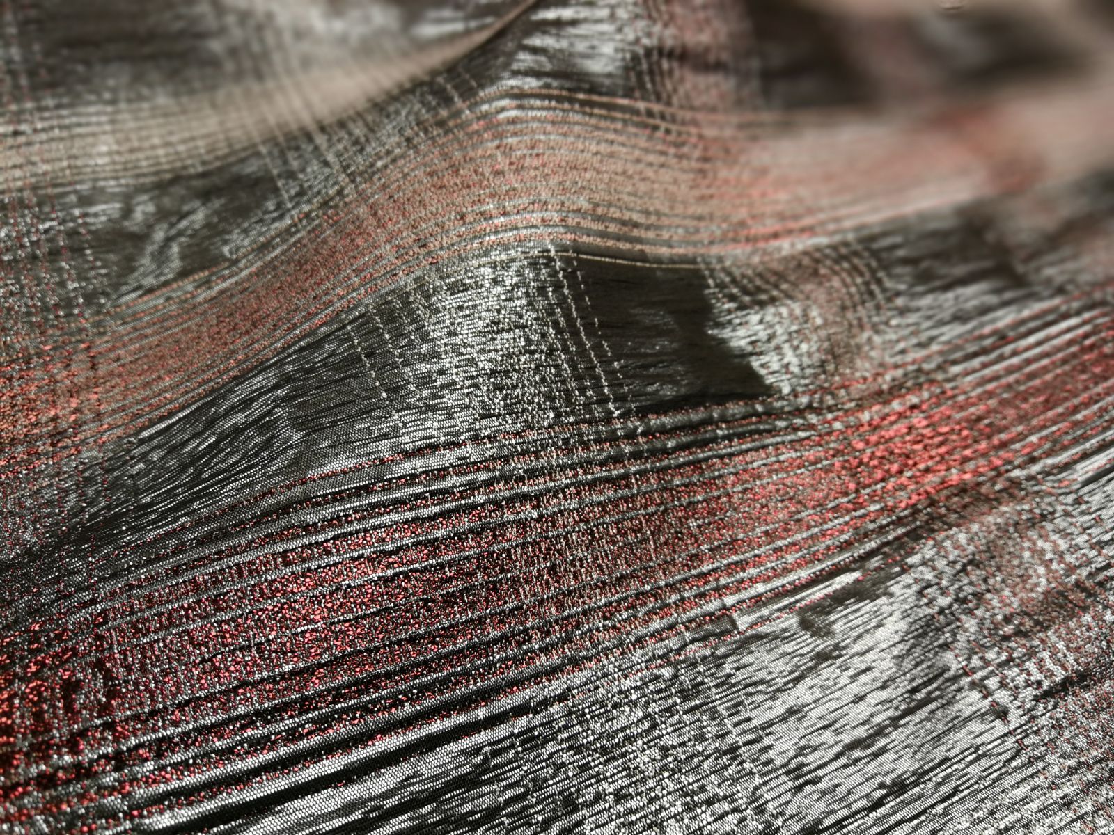
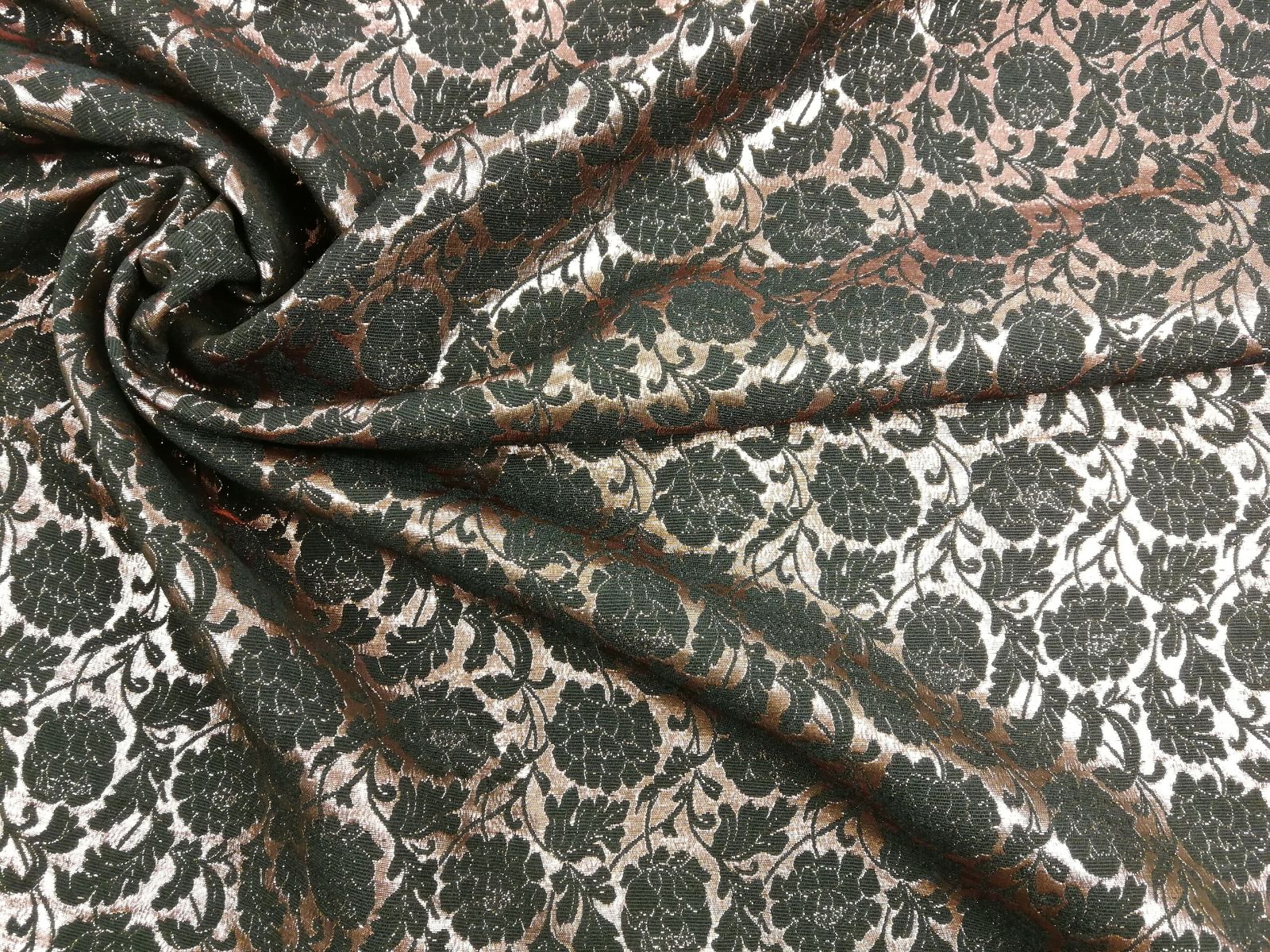
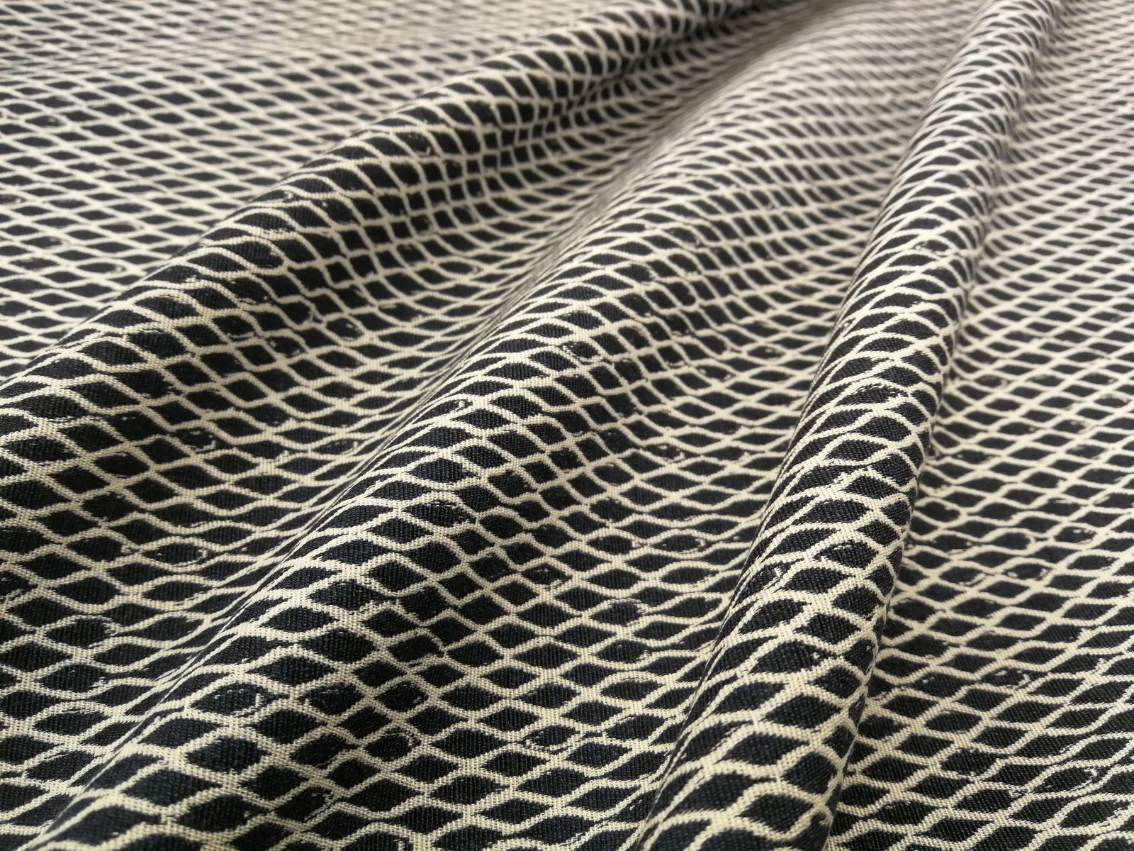
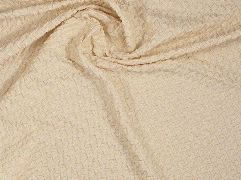
As we noted above, the colour gives prominence to the fabric as you can see in the trend “Flor de Cala Blanca” on our website. Textures, outlines, floral motifs … give this counterpoint to details with fabrics that are pleasing to the eye and touch. Also to be seen are blends such as chiffon and silk combined with crochet and the most original jacquards. Finally, matt textures prevail. Better without shine.
If you want to discover the universe of neutral tones and textures, we invite you to discover the seasonal fabrics in our shop where we can advise you better.
Flamante rojo
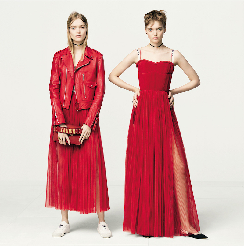
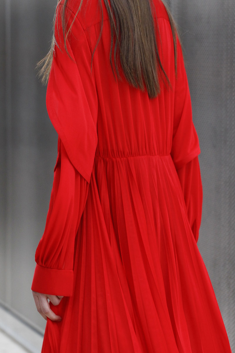
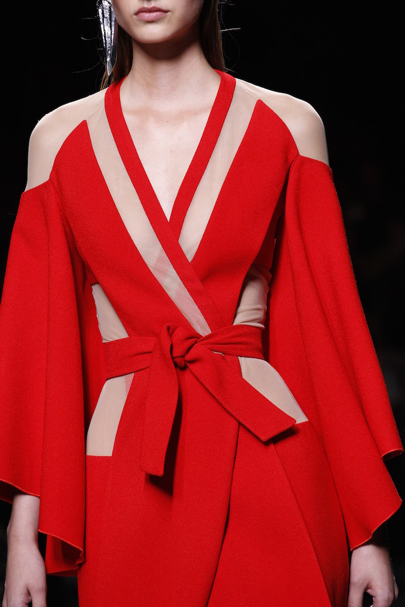
The hottest month of the year coincides with the colour that makes us blush: flame red with orange hues that reminds us of flames in motion. This lively and passionate tonality ignites summer looks with its fascinating power of attraction.
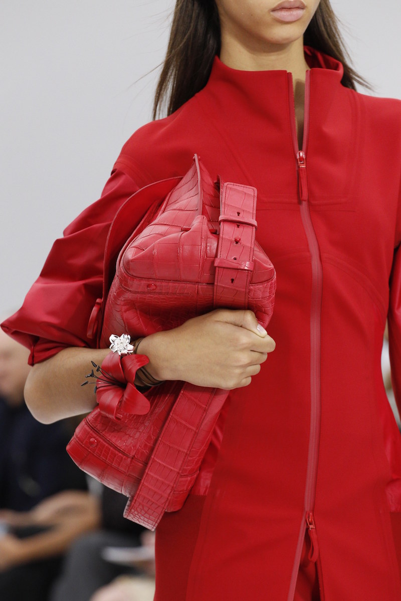
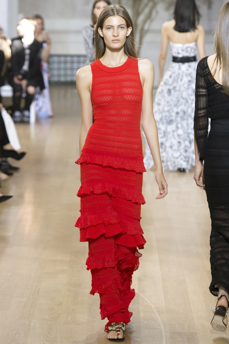
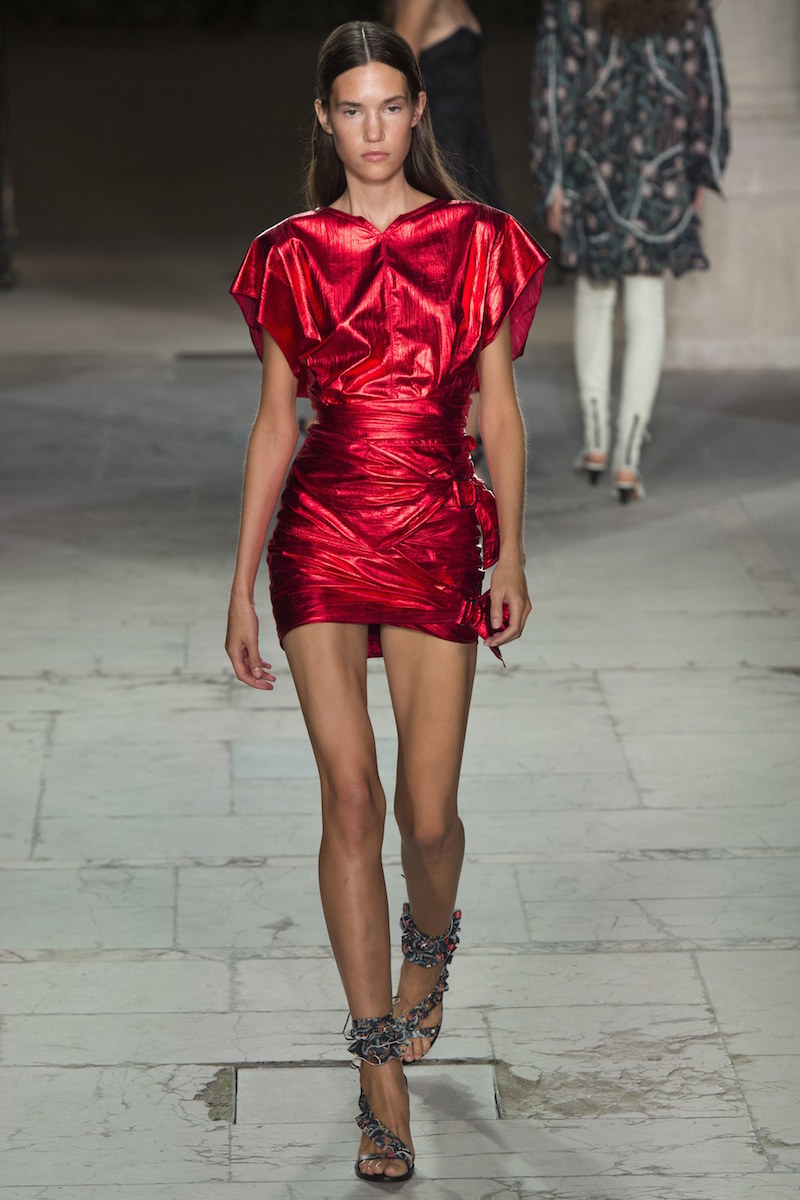
This season red is being worn in monochrome blocks maximizing its visibility: carmine, garnet, red currant, scarlet or coral shades in matt or glossy fabrics. The key is the same colouration. On the catwalk, for example, companies such as Valentino have not hesitated in going for flame reds in dresses with subtle prints, Dior too with their transparent tulle skirts and Kenzo or Balmain with low - cut garments. As well Oscar de la Renta with ruffles on dresses, Salvatore Ferragamo with original two - piece suits or Isabel Marant, who presents this vibrant color with metallic sparkles in an throw-back to to outfits inspired by the eighties.
How to combine red?
Red is a flattering color that works by itself, although sometimes the combination with other tones makes it acquire new nuances. Beyond the classic blends with white or navy blue so characteristic of the looks of Mediterranean - style red is allied with other less frequent colours to take us out of our comfort zone. For example, Emilio Pucci goes for mixing it with turquoise, where red is relegated to the background. Valentino and Gucci intermingle it with pink in one of the most striking chromatic alliances. Meanwhile Balmain dares to align red with purple in a glaringly strident combination.
Burning fabrics
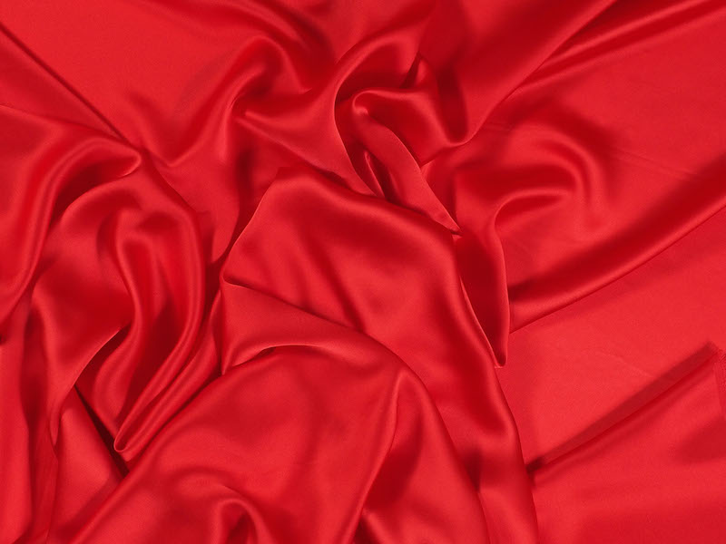
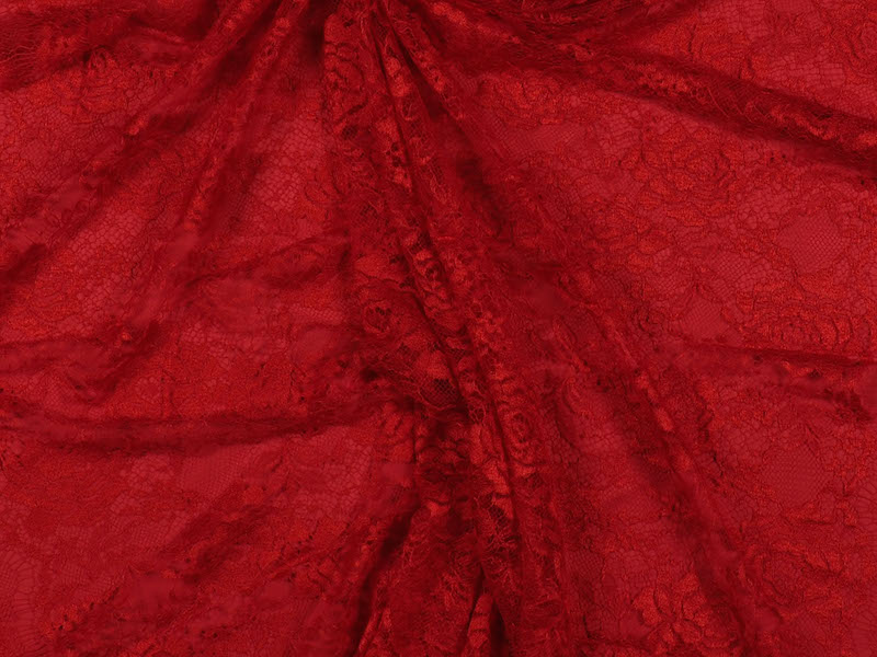
The reddish hues constitute one of our inspirations of the season, as you can see in the trend “Hawaiian Flower” on our website. In it you can find an assortment of fabrics with totally different textures, all with the same common denominator: red. Some flirt with floral lace, silk satin sheen, embossed mikados or jacquards with geometric motifs. Diversity is the taste.
At all events, we invite you to discover all the fabrics impregnated with the most ardent Pantone colour in our shop where we will be able to offer you further advice.
