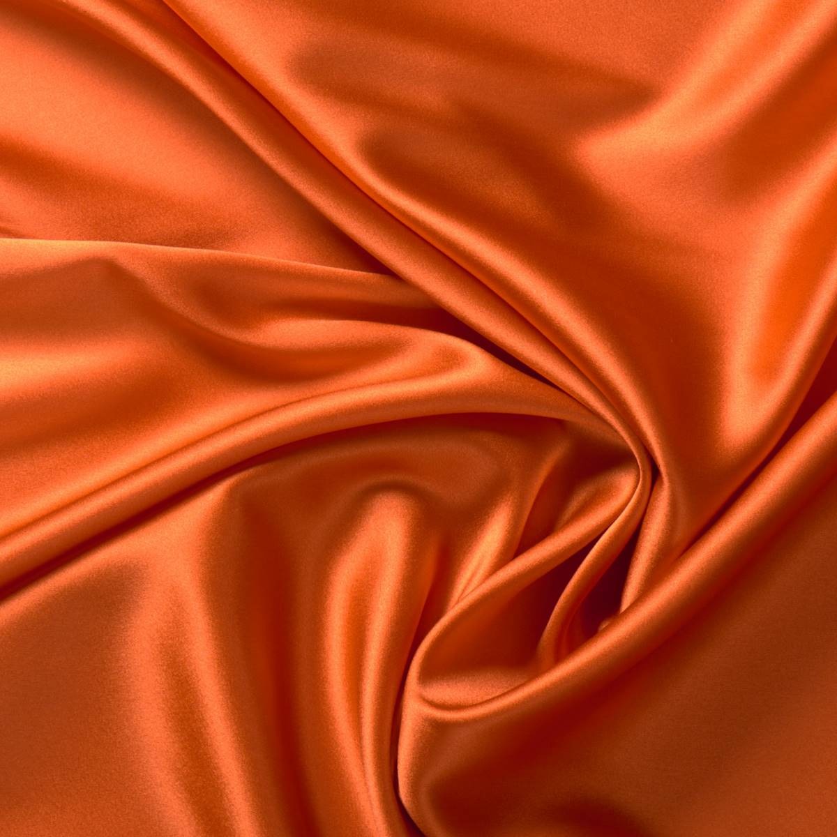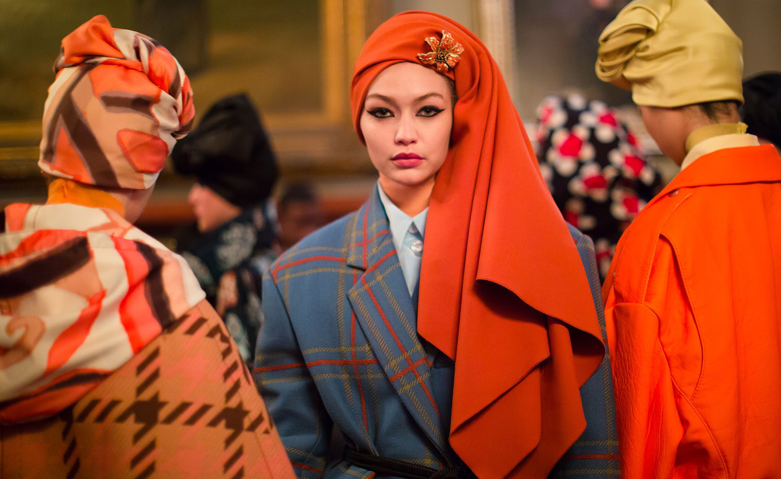
In fashion and speaking in general terms, what is the deal with us and orange? It is appealing to the naked eye, favours the skin tone and with its vitality lights up garments in neutral tones, brightening up any summer or winter look. Knowing all these goods traits, why are consumers so reluctant to bet on this colour? Hereunder, we position orange in the place it deserves.
 |
 |
It is true, orange is not an easy colour to carry off and the excess of stridency that the hottest tones sometimes entail, makes it difficult to mix with the majority. However, there are many celebrities and professionals in the industry who have opted for this tone so far this year in the street style of the main fashion catwalks. And if the sector has surrendered to radiant yellow, the hardest tone of all, why would the same thing not happen to orange?
 |
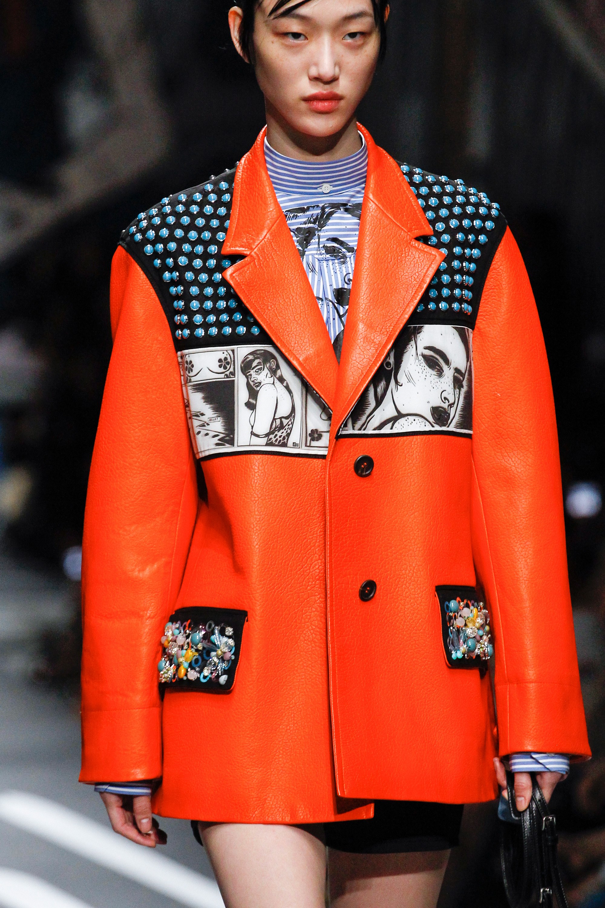 |
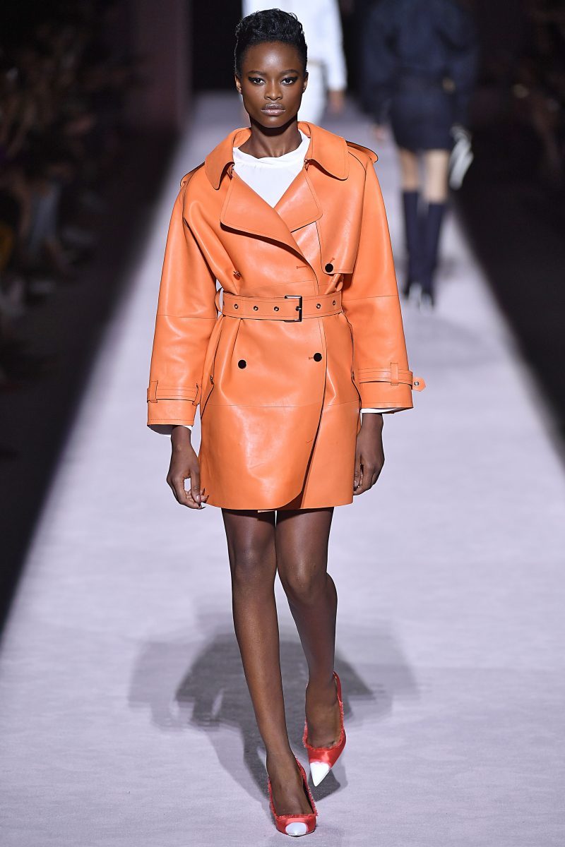
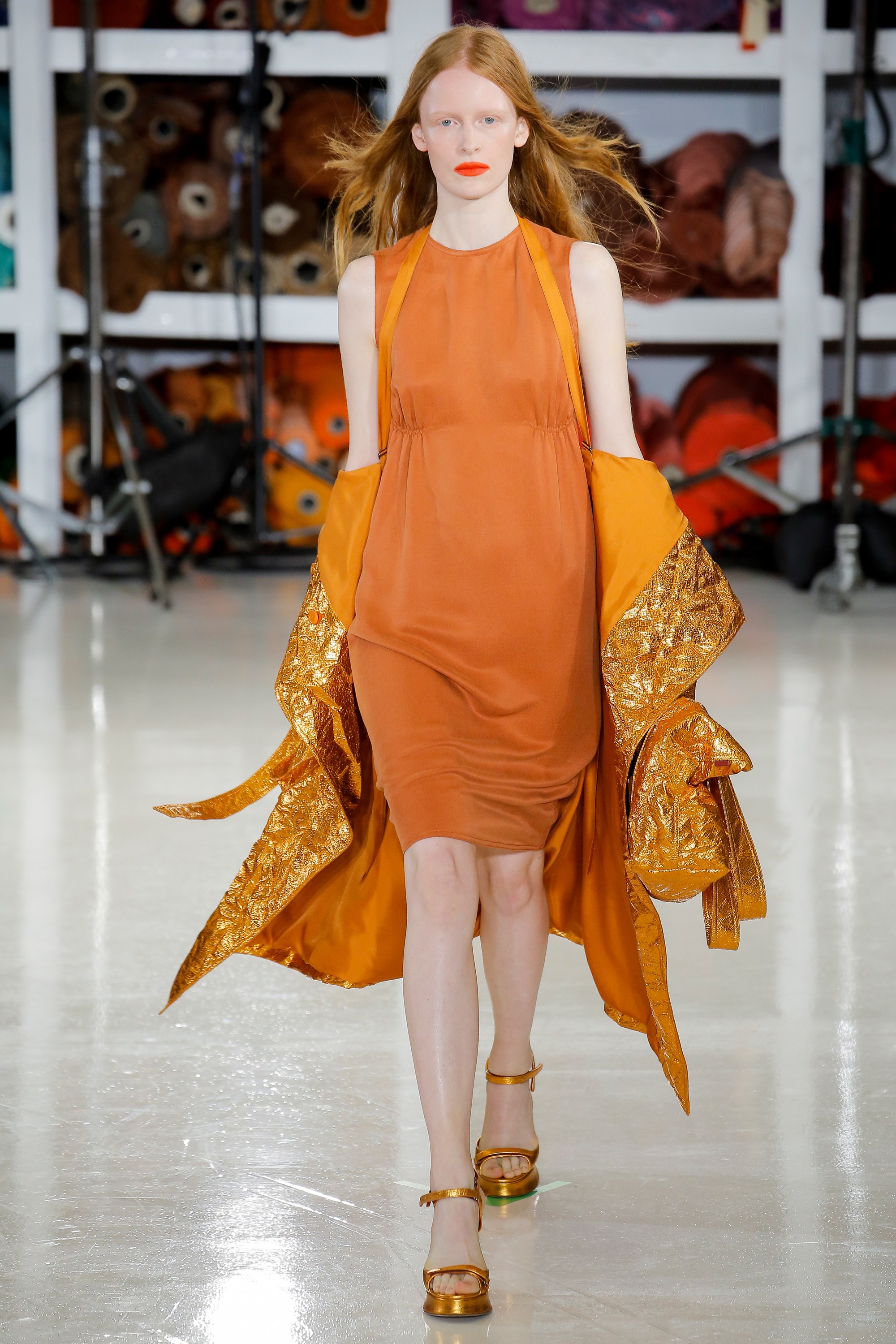
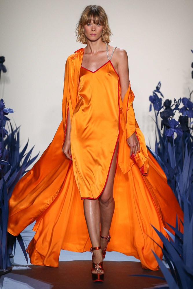
Orange is a warm color that radiates enthusiasm, energy, joy and freshness. It is the tone that is linked to creativity, fun, triumph and spontaneity. A tone that can be vibrant and dull in turn, without losing all of its attributes. This Spring- Summer 2018 season, the colour that has dominated the catwalk, according to Pantone is called Safety Orange. A striking and bright tone, which pulls towards neon and attracts everyones attention. A colour ironically translated into “security orange” that contrasts with the rest and rarely goes unnoticed, tos ay the least it is practically impossible. Firms such as Jeremy Scott, Tom Ford, Adam Selman, Marc Jacobs or Calvin Klein have not hesitated to take it on stage.
 |
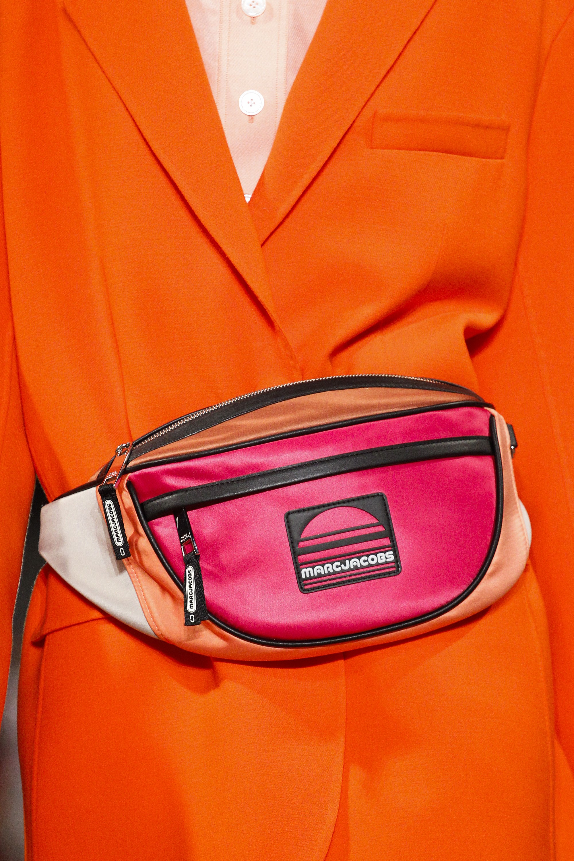 |
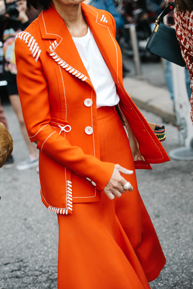
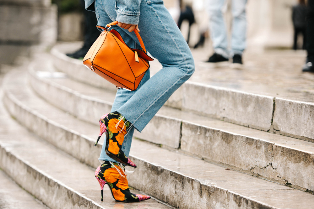
And how is it combined? The first and most daring option is to wear it in its total look version: from head to toe in the same tone or varying the hue to others more pale like peach: one bright garment mixed with a duller one. In this case it works with a long dress, jumpsuit or a two piece outfit. The most daring combination would be with fuchsia pink or Klein blue creating attractive colour blocks. The second option involves opting for an orange garment that is excessive and that highlights the whole look. The rest will therefore have to be combined with neutral tones such as nudes , earths, beige or rose so that they do not steal the garment’s protagonism. A good idea, for example, would be to opt for a jacket with soft textures or a printed blazer where orange is the main color. Orange also works very well with jeans and denim garments, adding that elemento of joviality and ease to any outfit. Finally, a combination that also works is to delegate this energetic color in a modest background playing only with accessories such as bags or shoes. Any detail counts!
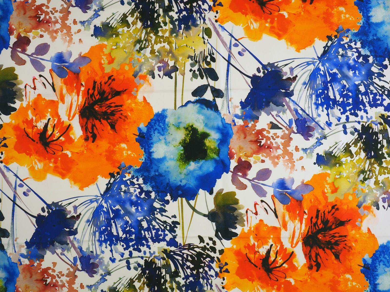
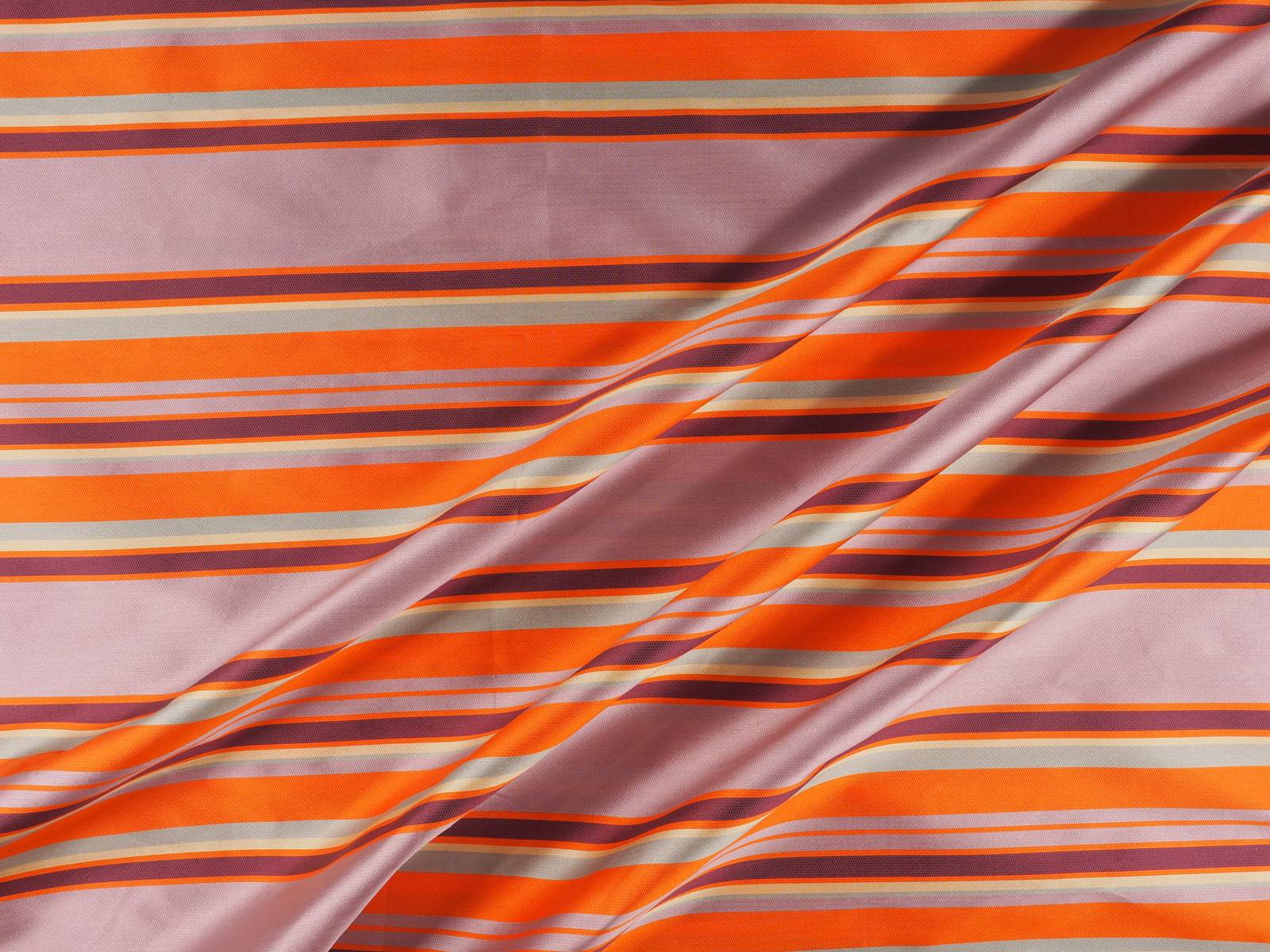
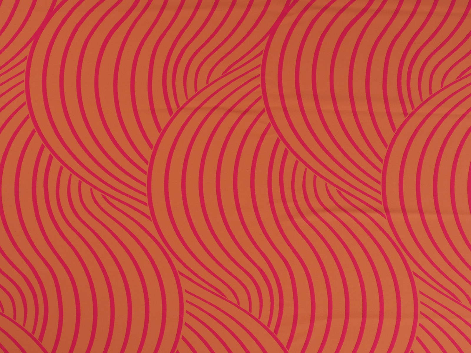
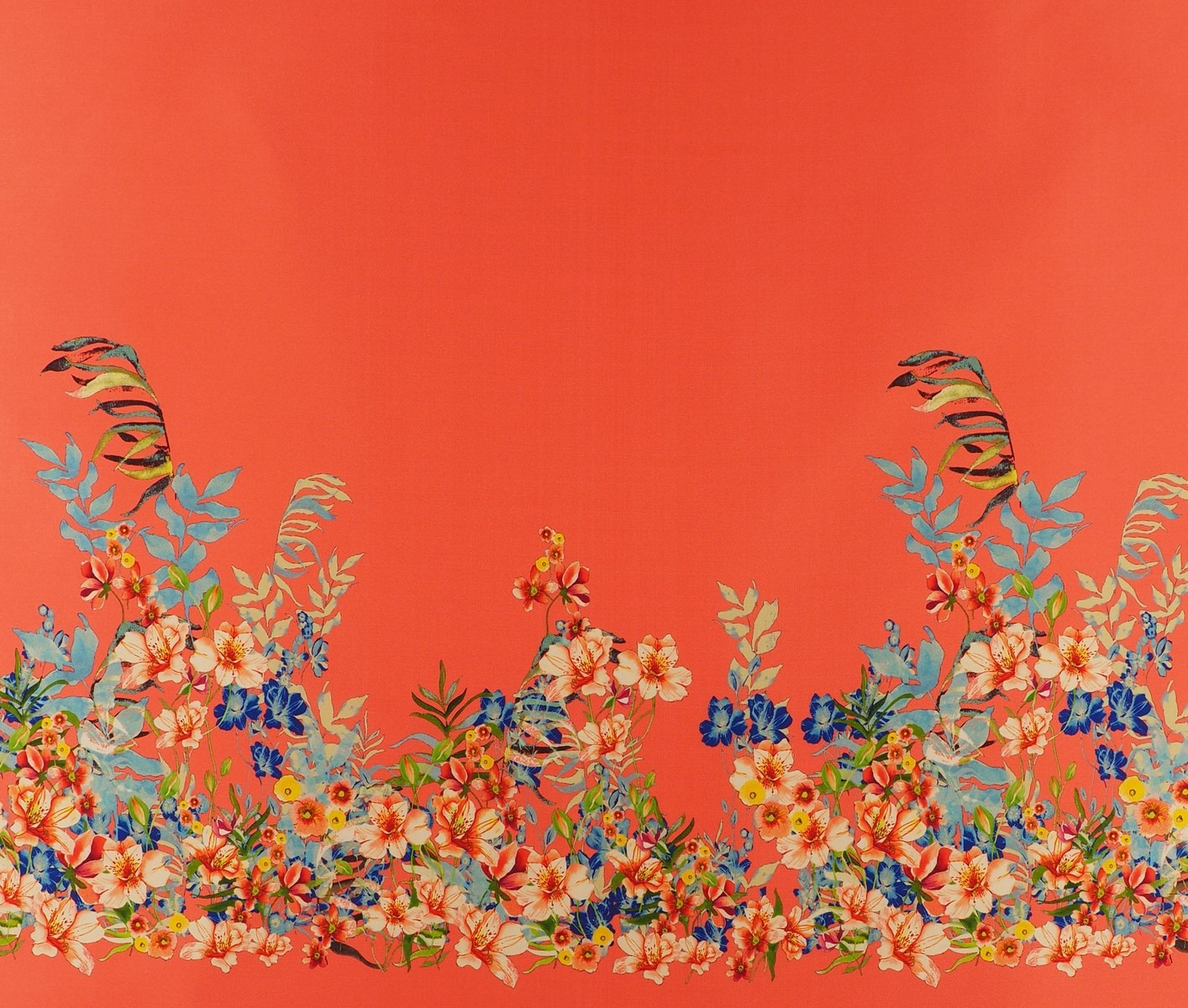
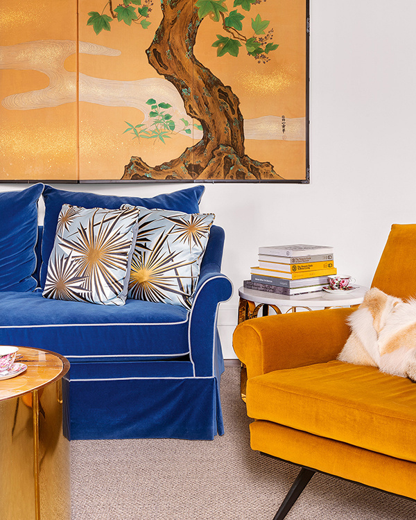
In Gratacós we like orange in any season. Whether it be in its most lit up version in silks, tulles or chiffons, or in pastel shades in subtle jacquards or fine texture embroidery. We also like prints where orange intermingles with other colours in the form of flowers, stripes or fantasy prints , to cite a couple of examples. We invite you to discover the whole selection!
 |
 |
